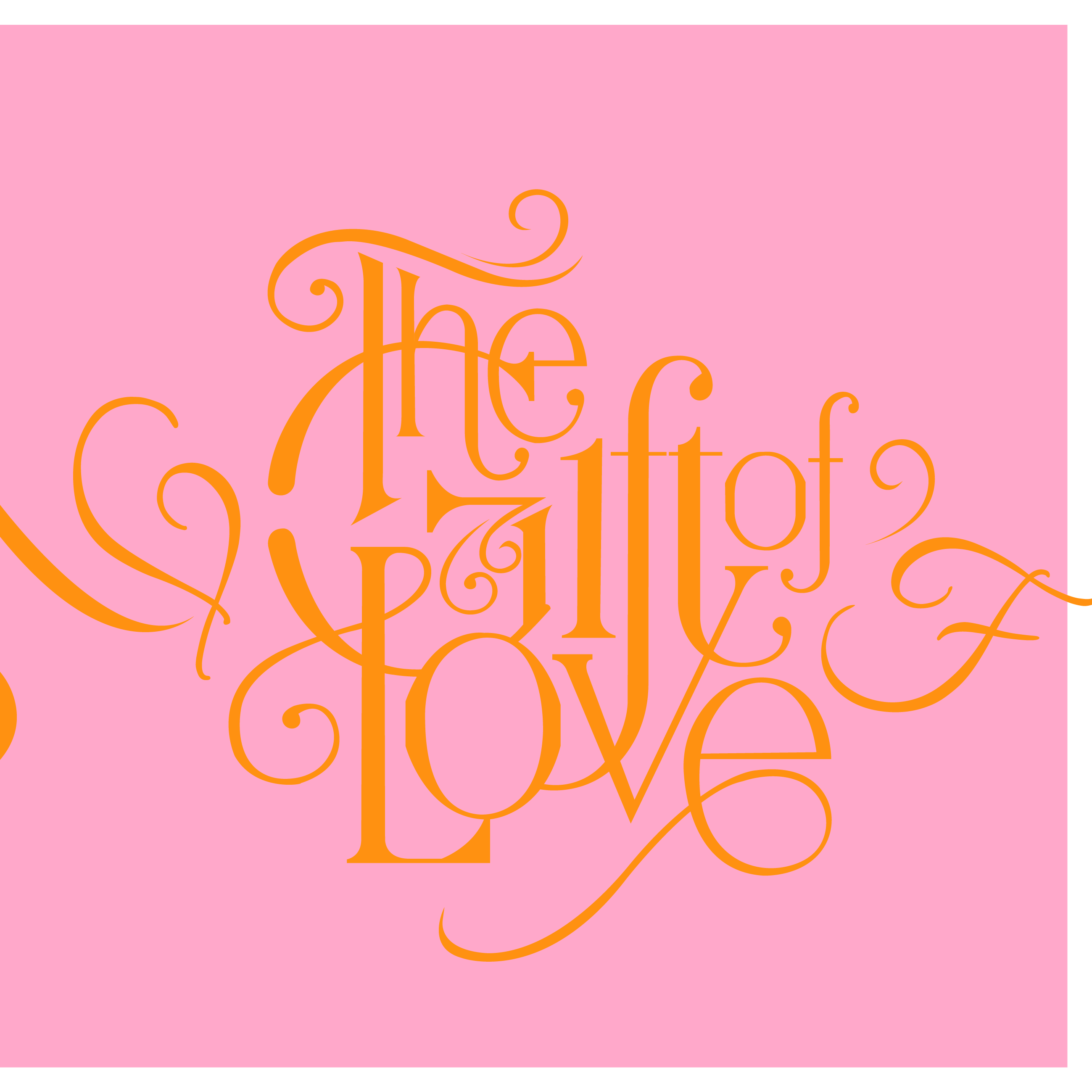
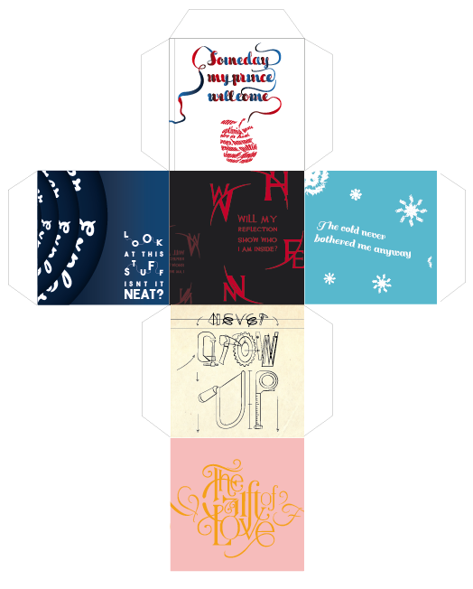
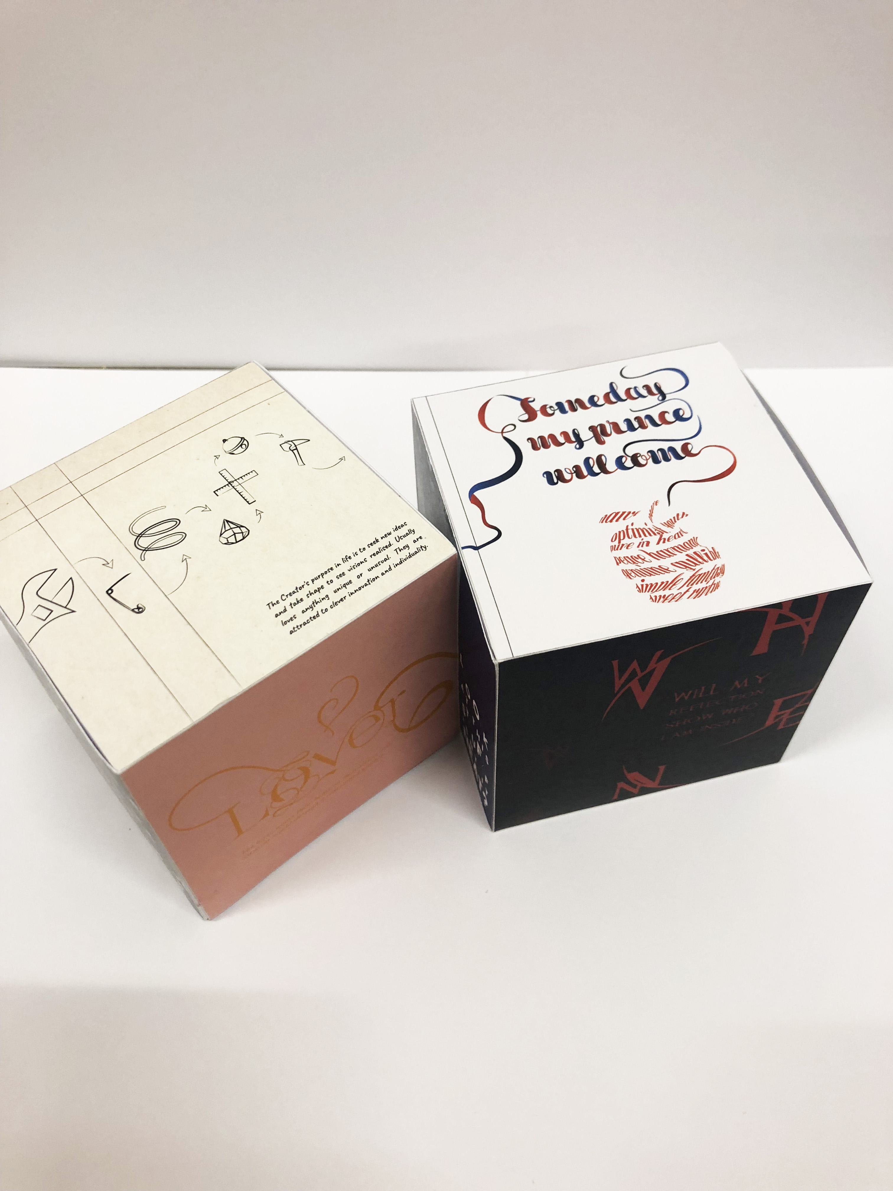
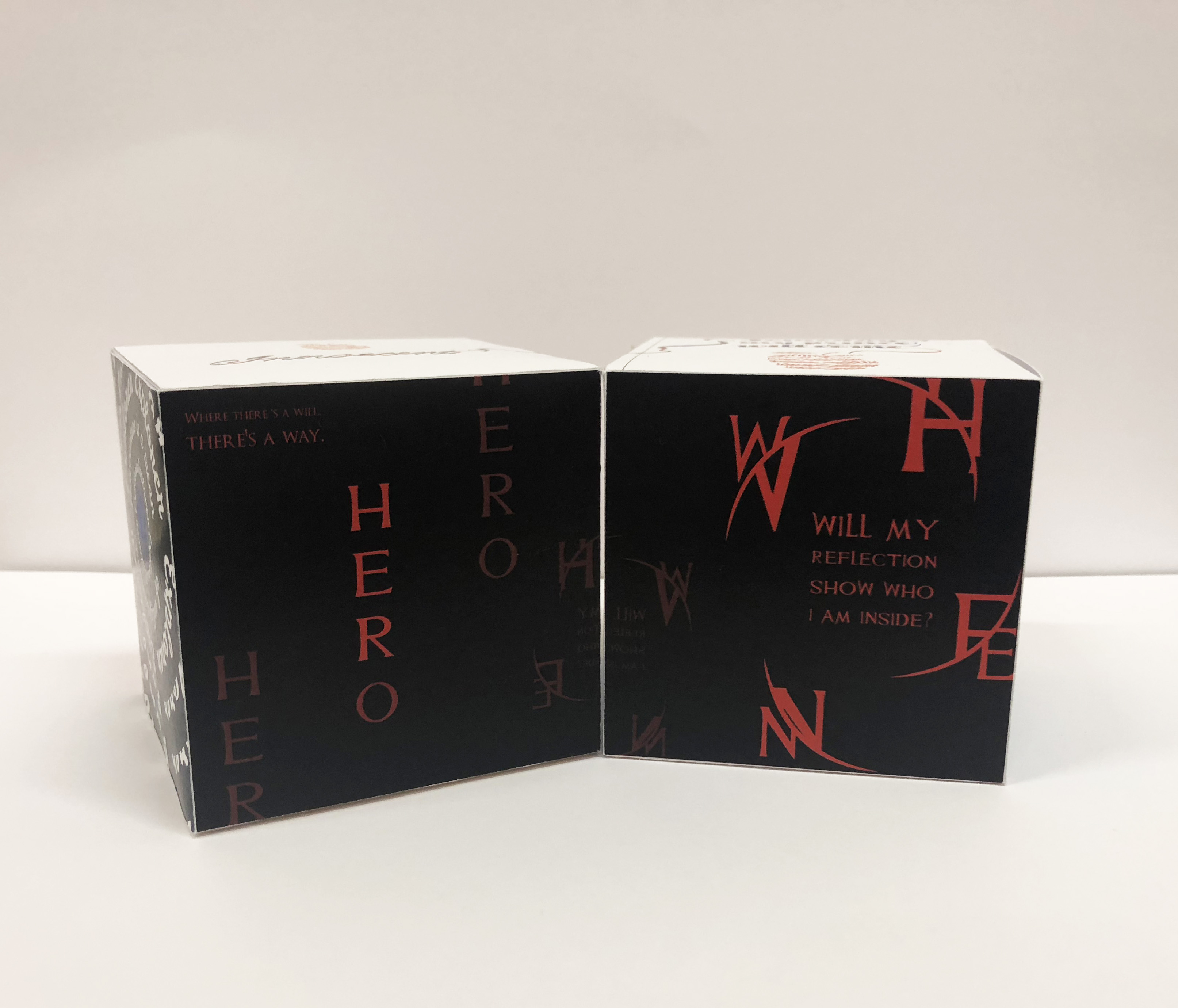
During the first brief of this assignment, I had no idea how I would execute and show my type in referencing to the archetypes learnt. Hence, I started brainstorming and researching on brands to learn how they played on the chosen archetypes. It took me quite some while till I came up with a theme to form a unity. I have chosen to take on a theme of Disney Original Princesses to show the following chosen archetypes: Lover, Hero, Innocent, Ruler, Creator and Explorer. To make it more interesting, I went to experiment on a 3D shape to present my designed faces through a cube (in presenting the idea of a game dice). It holds the idea of a game for kids where you have to match up the two cubes together, in resulting the same connecting face/ archetype.

Initial ideas + process:
For each archetypes, I tried to find a scene from the movie to help inspire me with the layout and following design .
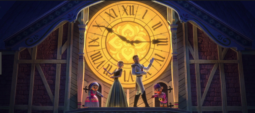
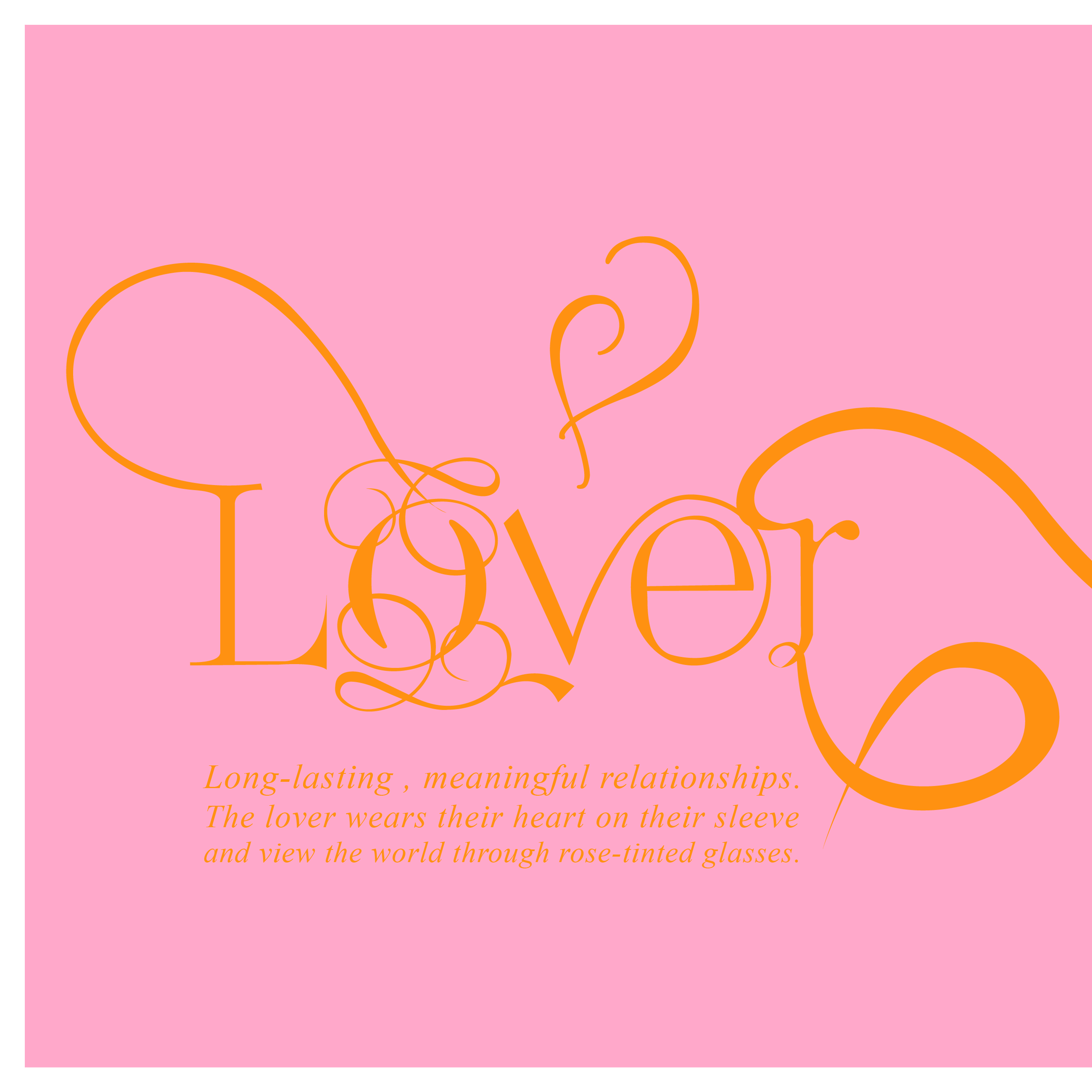
1. Lover – Anna, Frozen
(Reference Image/ Inspiration)
Scene: Love is An Open Door
https://www.youtube.com/watch?v=EgMN0Cfh-aQ
I chose this scene as I personally think it really sets out the archetype, the lover, well where she puts her heart on her sleeve and giving it to someone she just met.
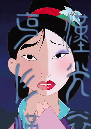
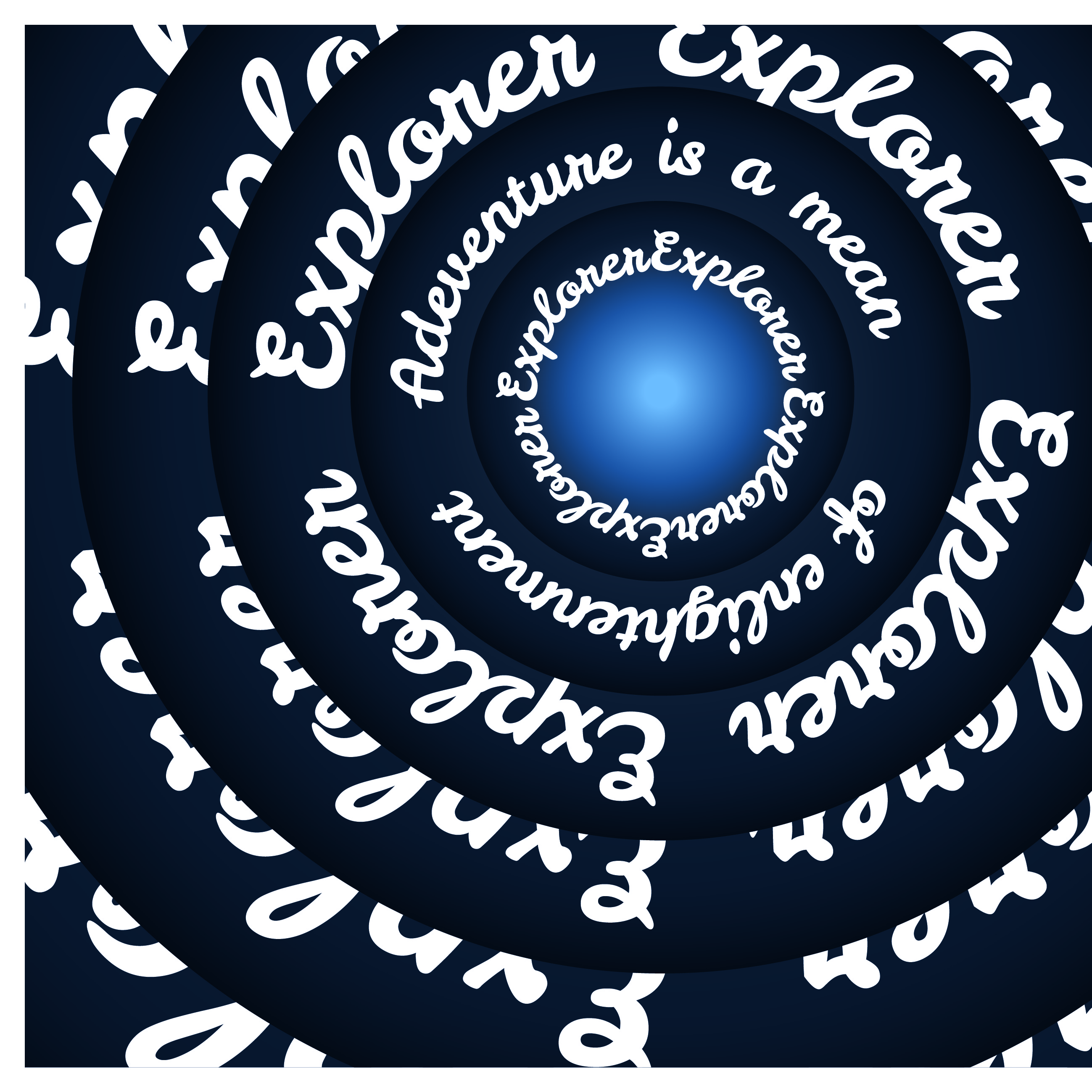
2. Hero – Mulan
(Reference Image/ Inspiration)
Scene: Reflection
Instead of choosing a scene that really captures Mulan’s heroic actions like the battle field scene or the end scene. I wanted to capture the beginning of a hero where you are still in self-doubt and an unquestioned identity.
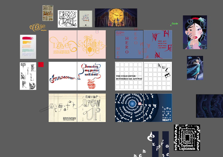
3. Innocent – Snow White
I did not choose a specific scene for Snow White as I believe her actions and gullibility towards the bite of an apple shows it all. Thus, I went to form a bitten apple with type. Instead of choosing a cute rounded font, I went with a handmade ribbon font as I feel like it would suit Snow White better in the sense of innocence and sweetness.
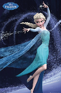
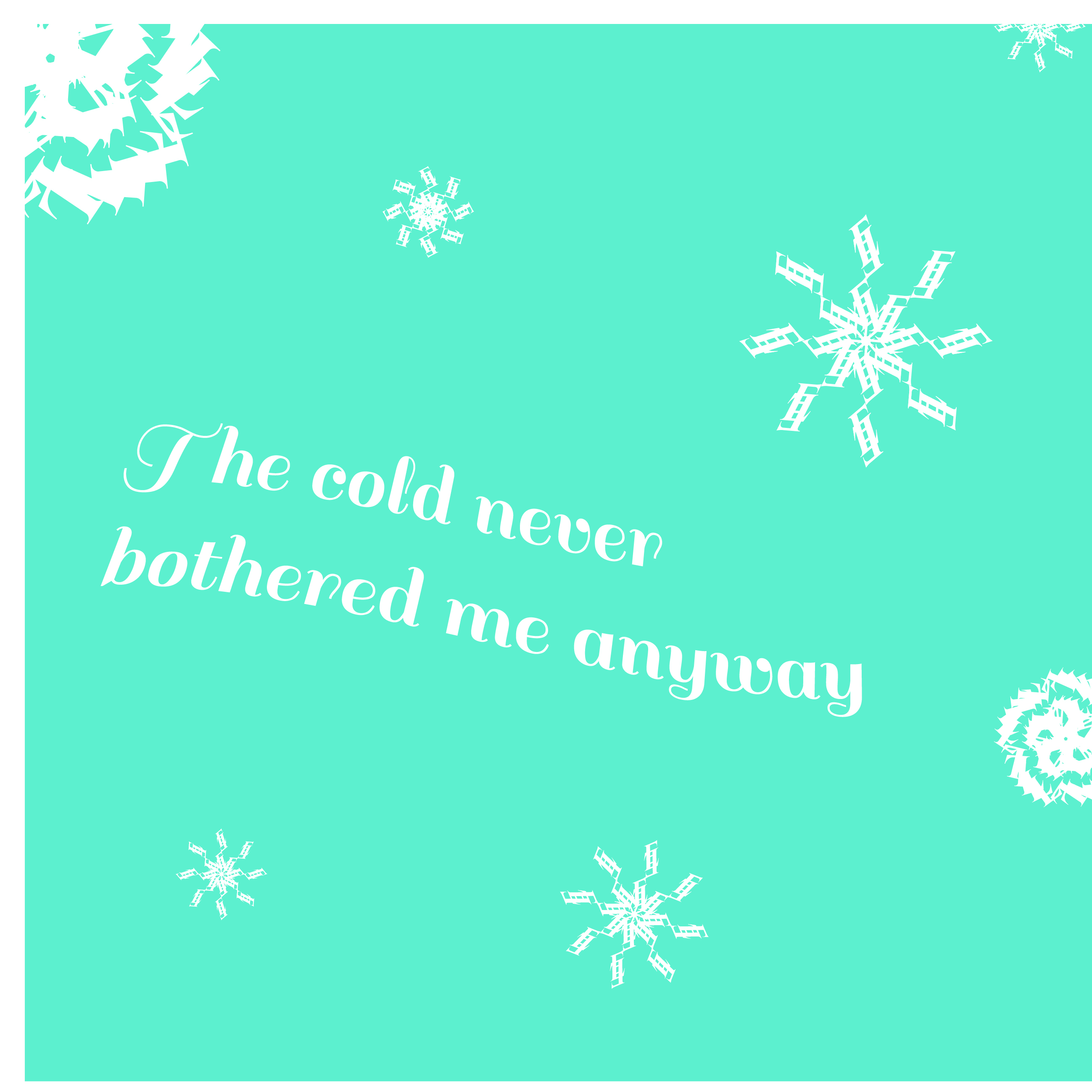
4. Ruler – Elsa, Frozen
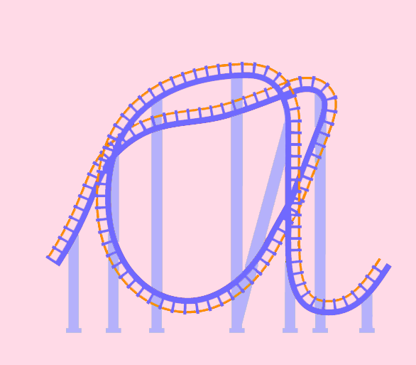
I referenced this picture for my layout to portray the swirl of Elsa’s powers. To add more elements, I placed snowflake letters, transform and distort, like how we learnt in class. It was truly an amazing skill to learn!
(Reference Image/ Inspiration)
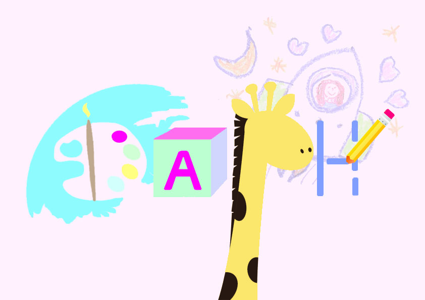
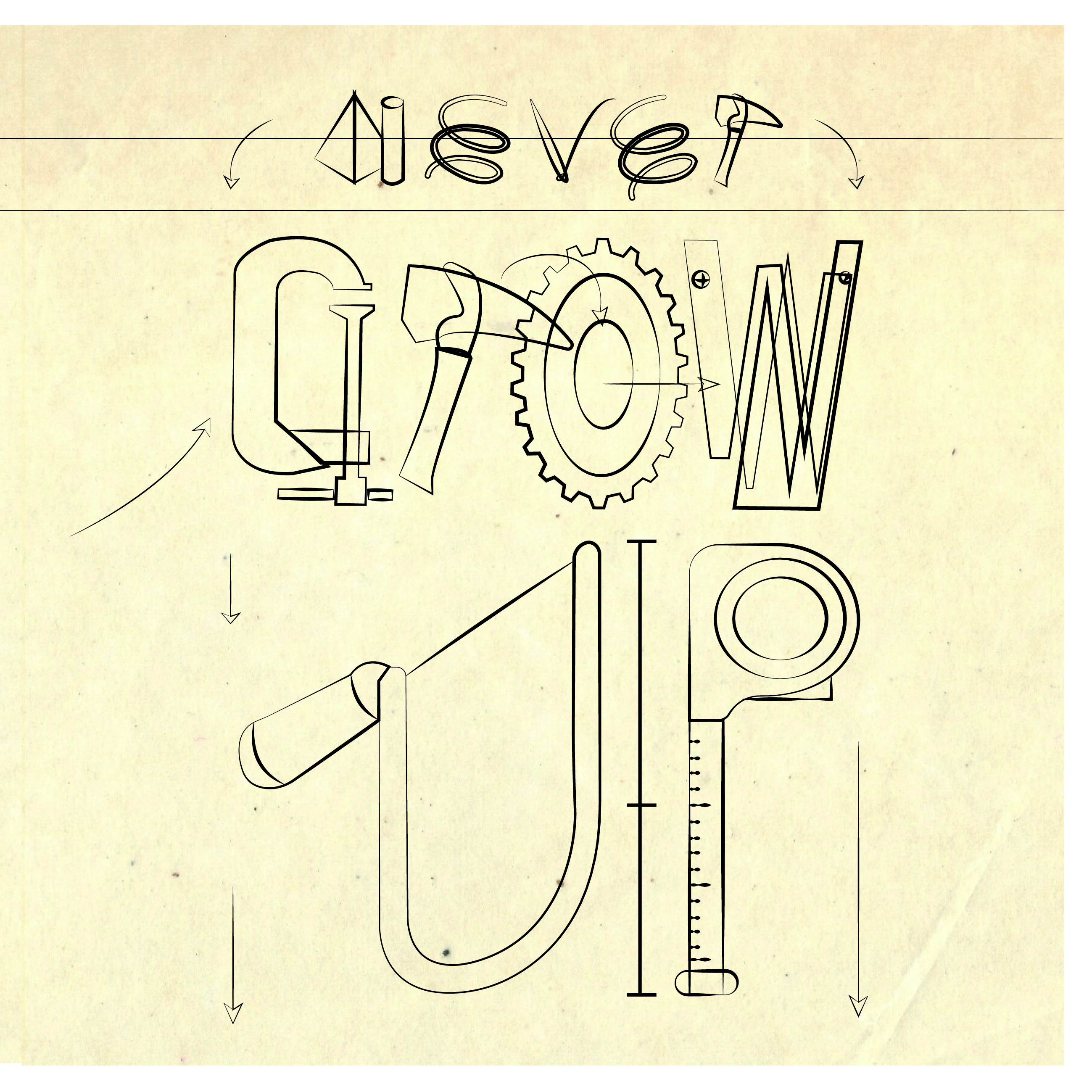
5. Creator – Tinkerbell
Instead of choose a typeface, I went out to spice things a bit by using graphic forms of Tinkerbell’s tools in creating my type. Just like in the movie, where she creates a blueprint on an old textured paper. Thus, I used this idea to design my font.
(Reference Image/ Inspiration)

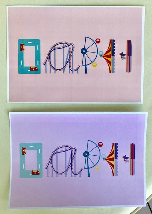
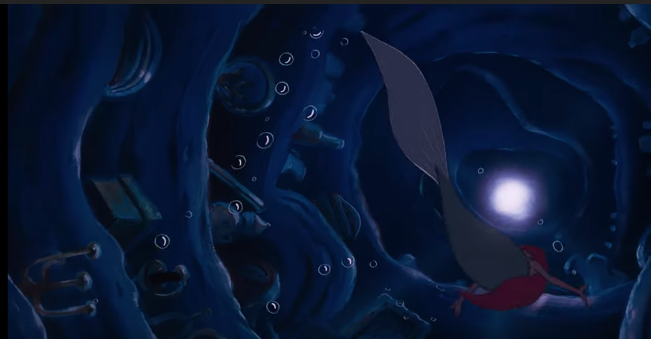
6. Explorer – Ariel, The Little Mermaid
(Reference Image/ Inspiration)
Scene: Part of your World
Last but definitely not least, I build upon Ariel’s curiosity to explore the other world as my inspiration layout. Designing a ongoing tunnel- like layout like the image below. I chose to form a rounded tunnel to reflect the infinite curiosity and exploration the archetype holds.
ROUGH COLOR PALETTE CHOICE:
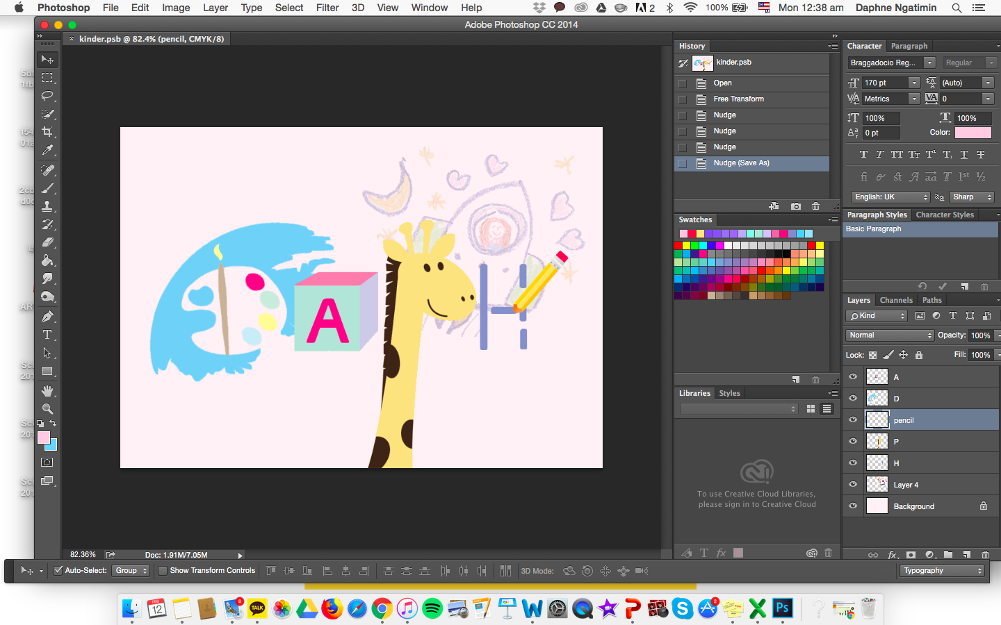
 INITIAL PROGRESS SHOT:

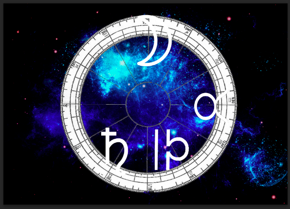
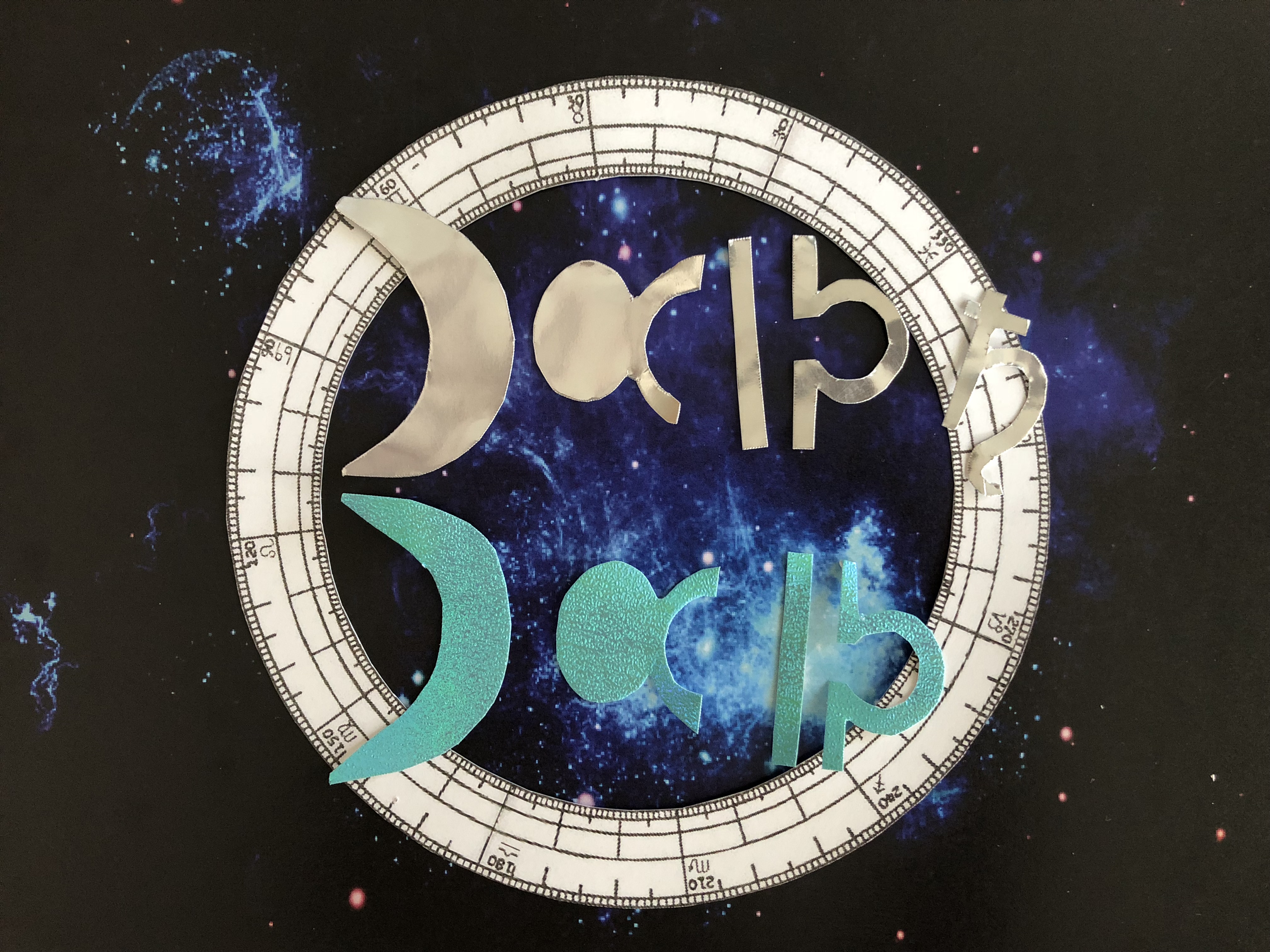
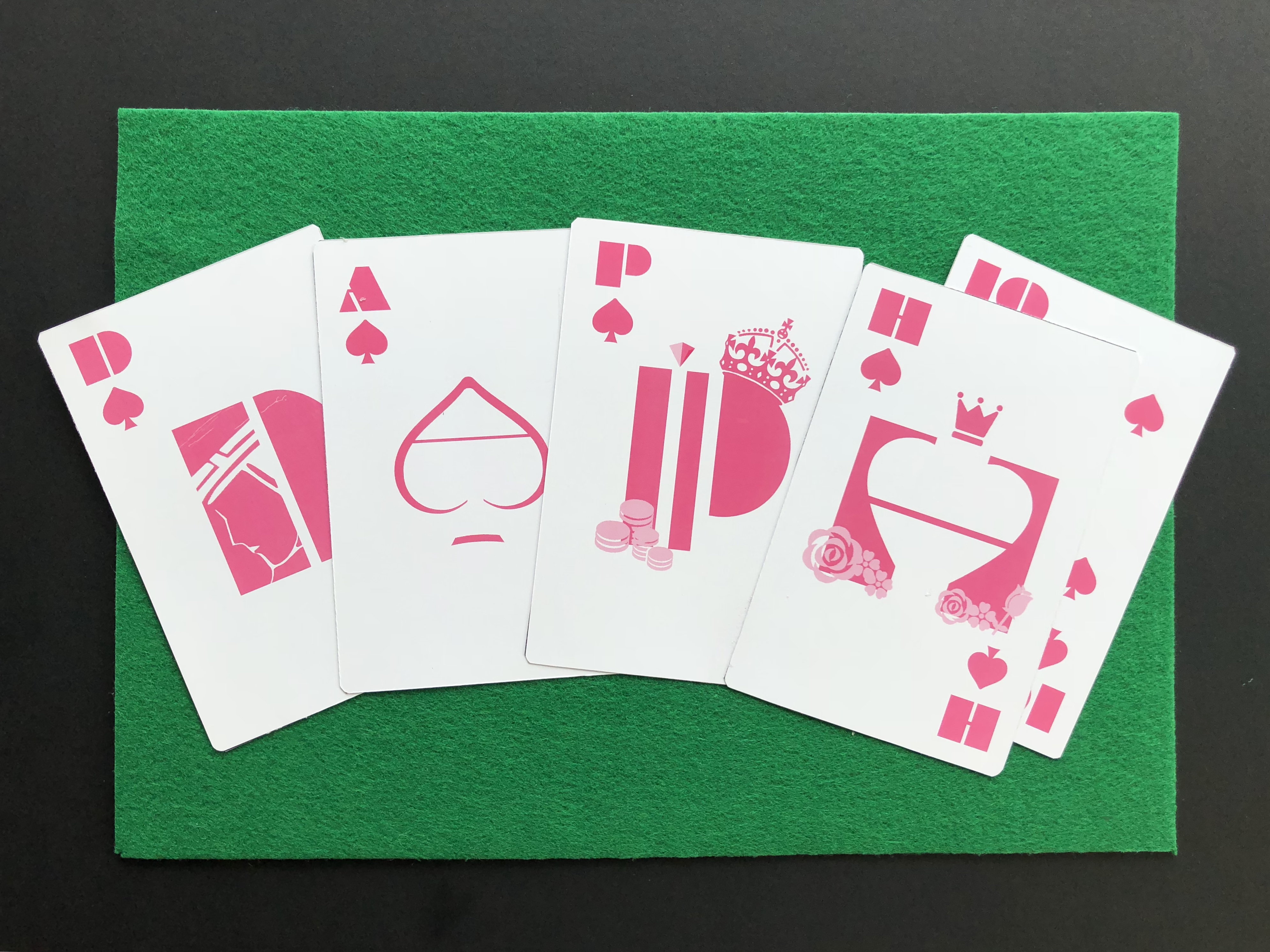
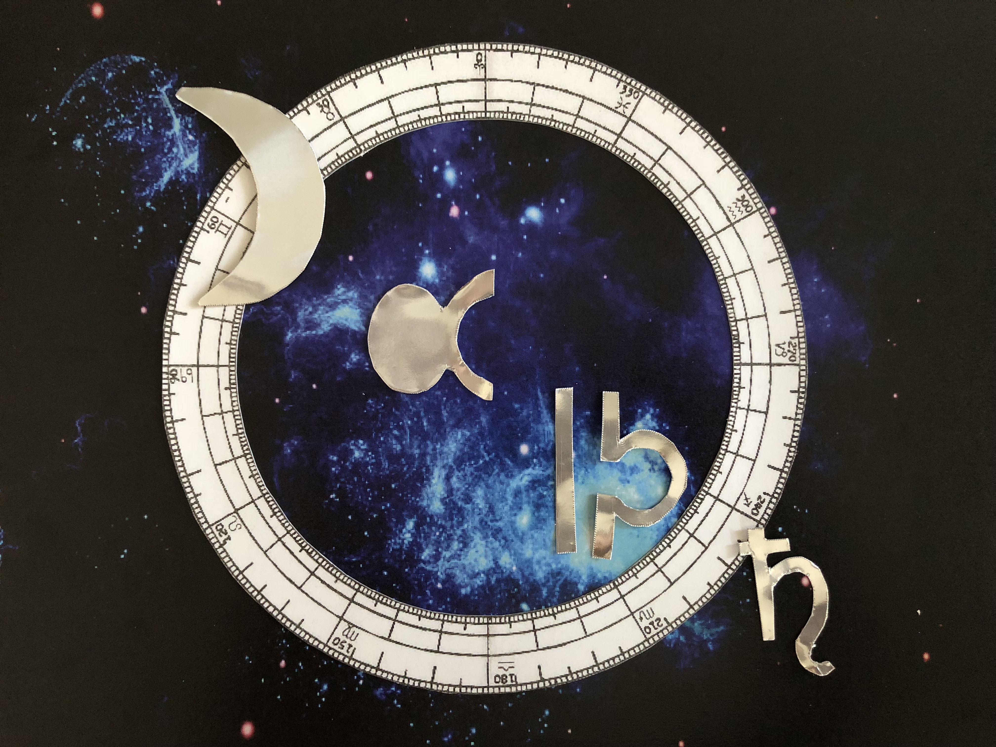
FACES+ Archetype Pairs: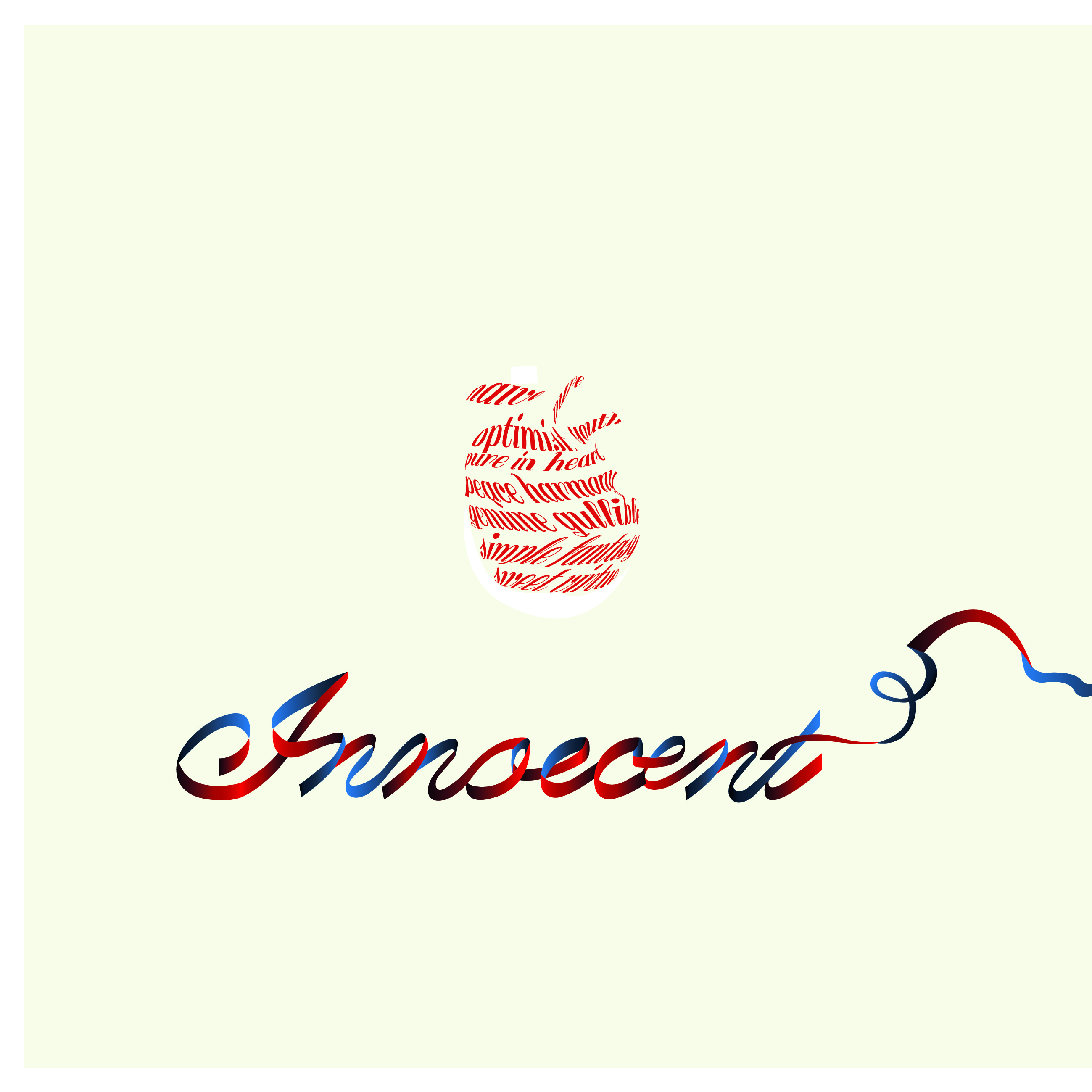


CUBE TEMPLATE: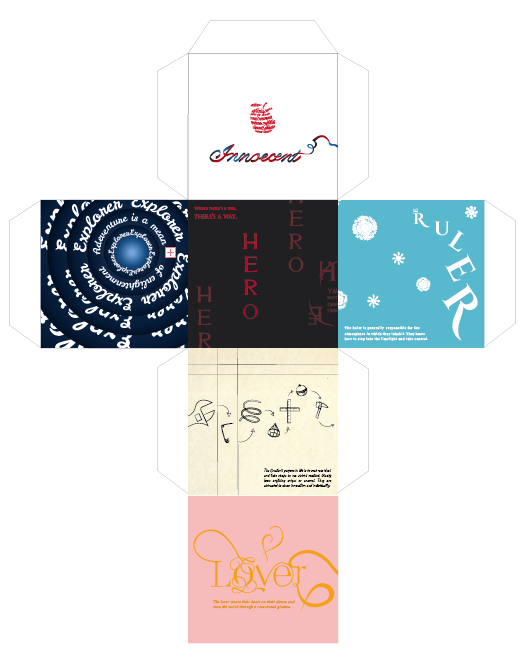
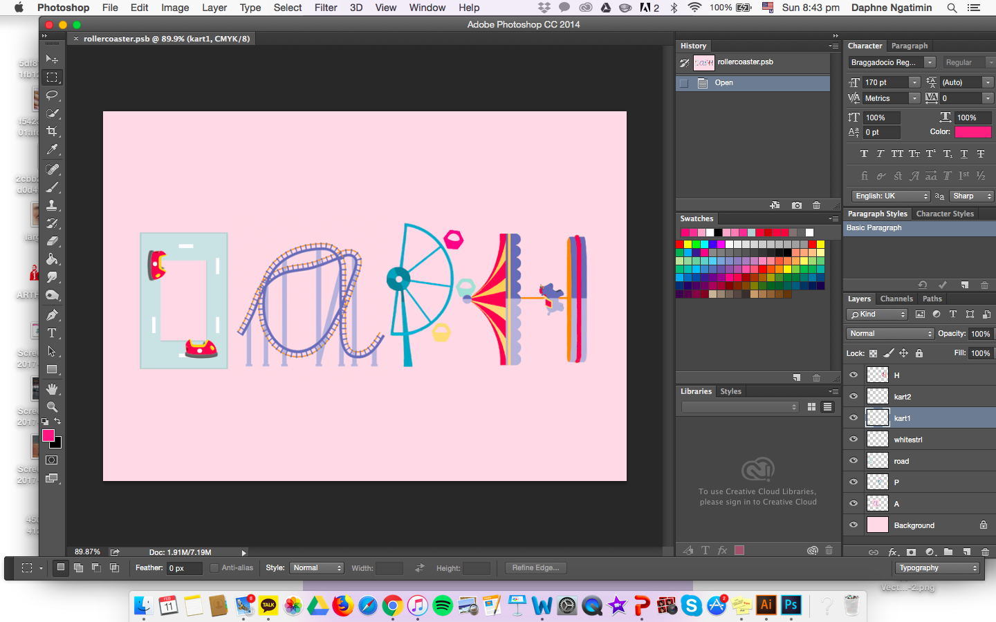
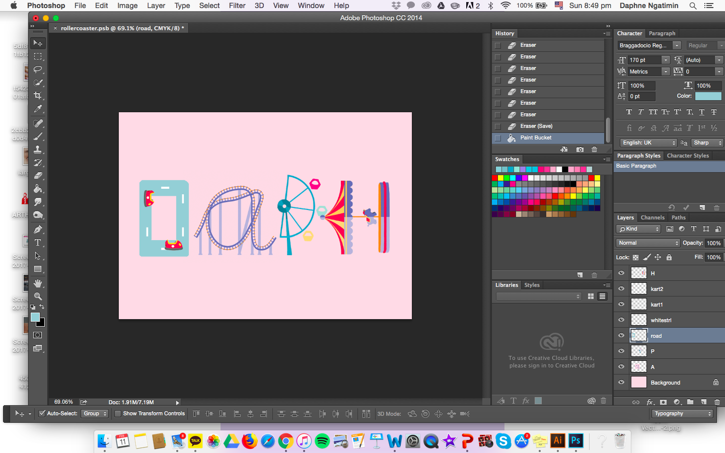
 FINAL PRODUCT:


 3.
3.