Zine Your Way


Let the creation begin!

New Beginnings

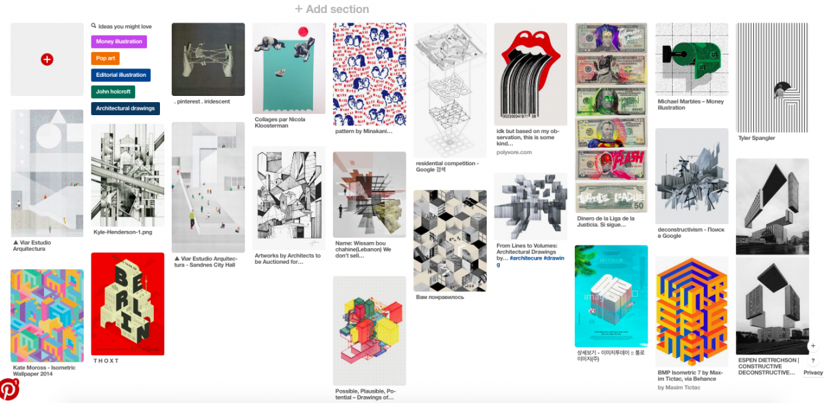
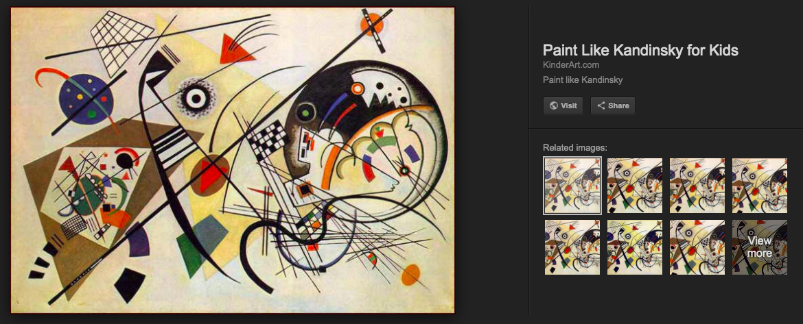
Initially, I wanted to focus on the form, shapes and patterns of the buildings to represent Shenton Way by looking at cubism. This would also convey the movement of a fast-paced, growing atmosphere. I wanted to also capture the organised and steady rhythm Shenton Way gave off with the buzz of the workers. I first researched some graphic design that gave off a messy and hectic feeling. On the other hand, I went off to pinterest to collect some inspiration in creating a moodboard. However upon research, some of the graphics gave off an upbeat party vibe instead of a paced working vibe.

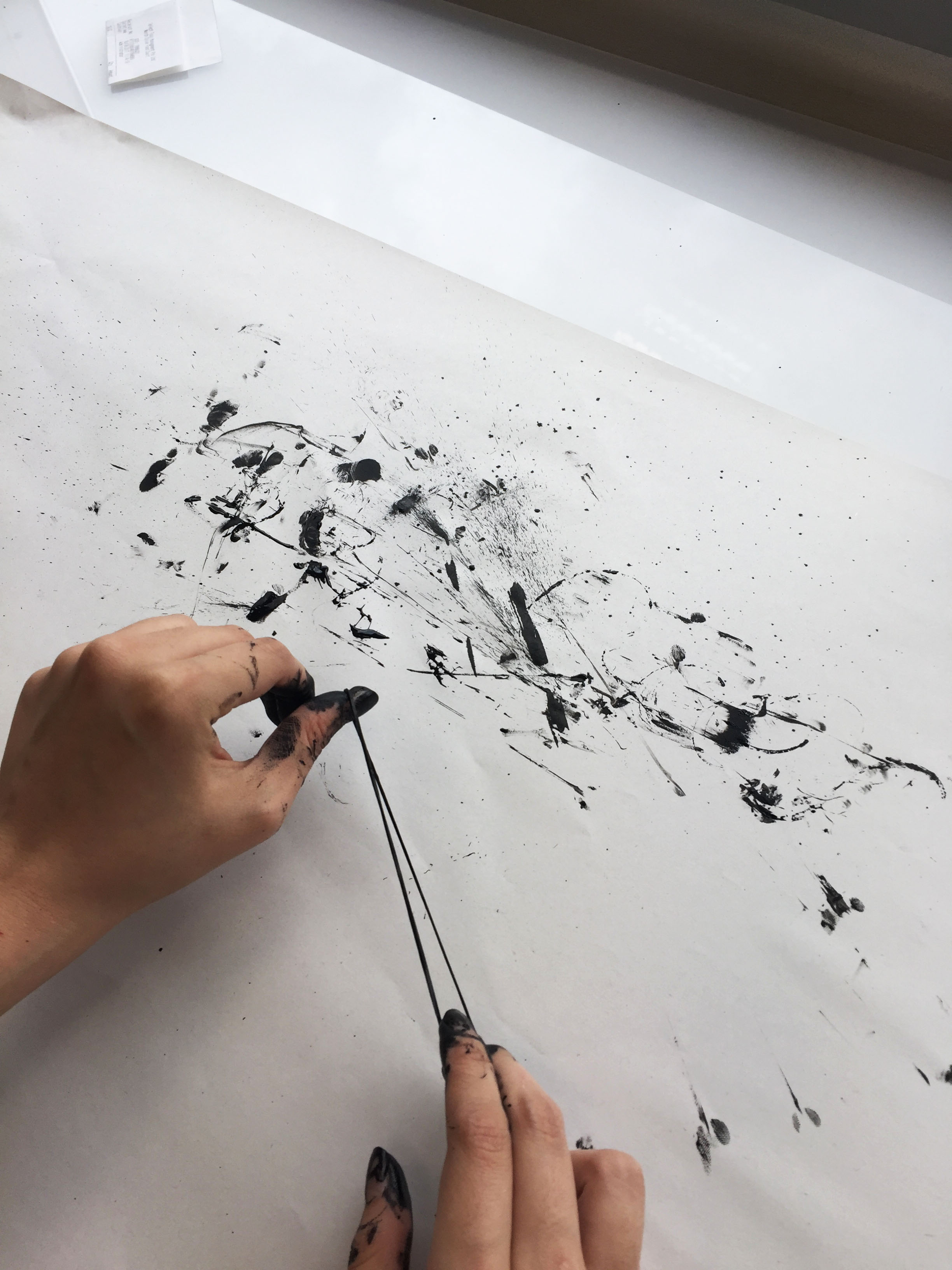
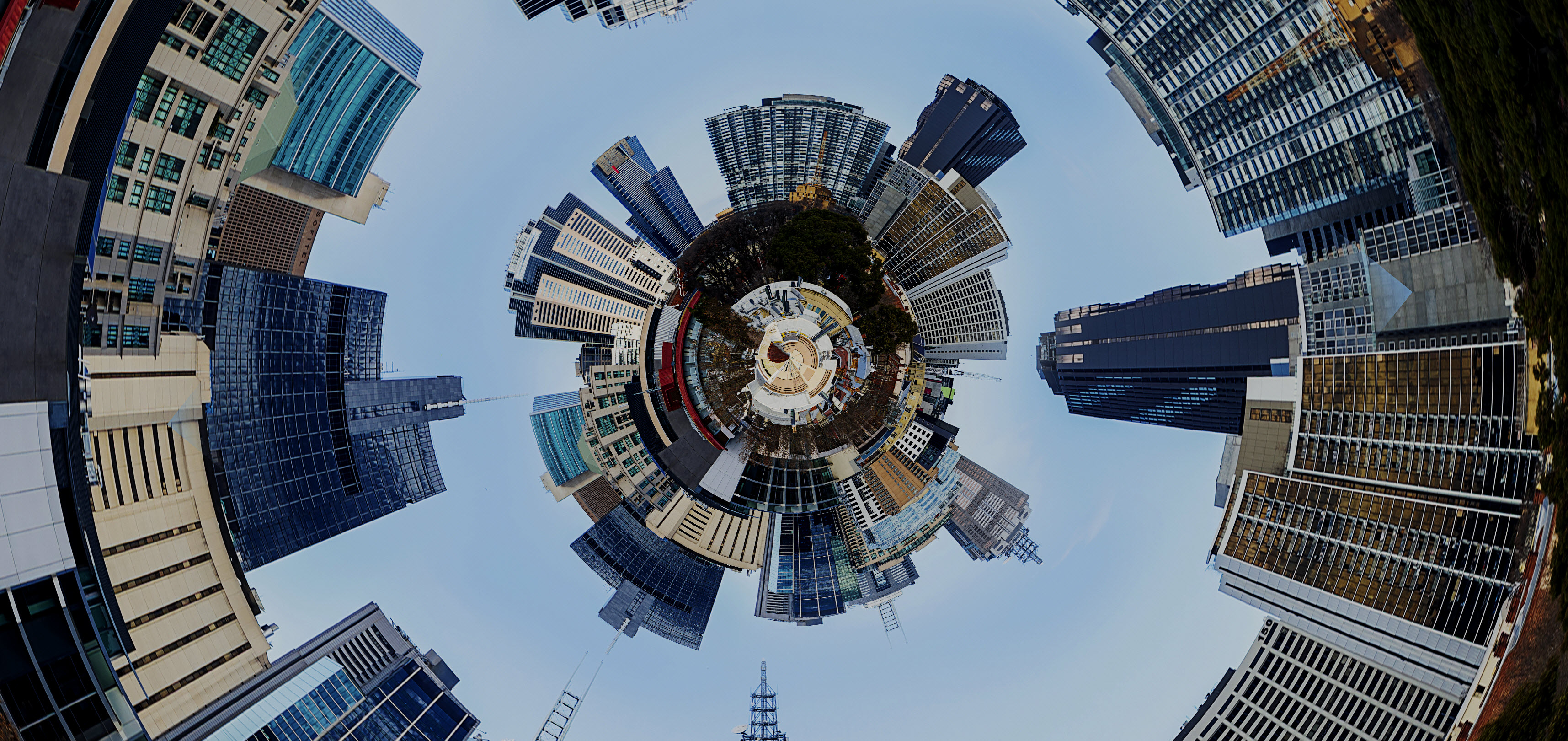
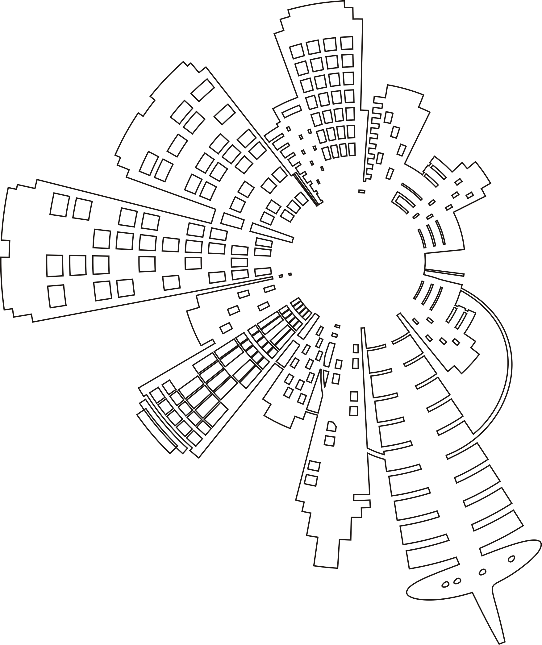
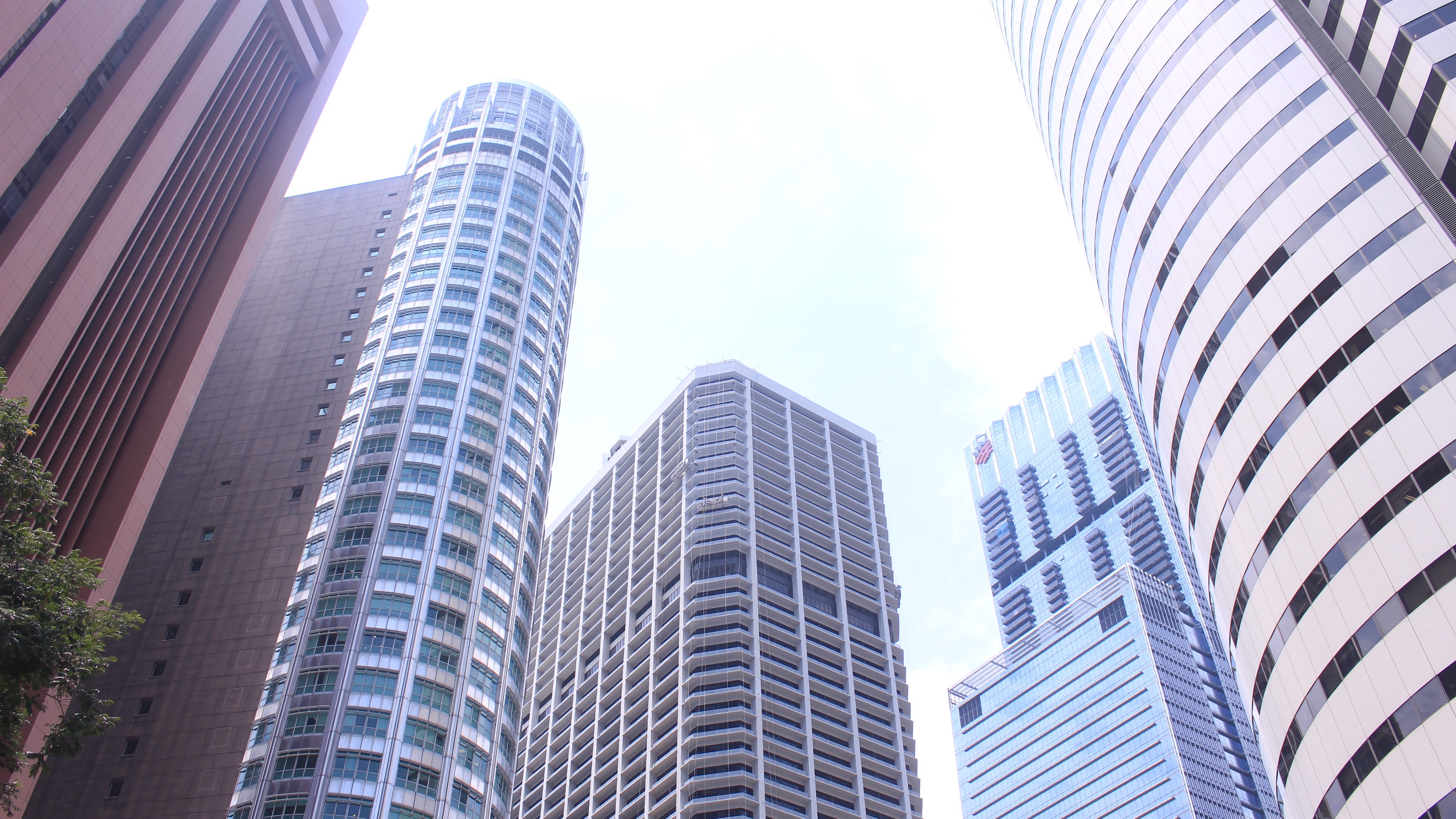
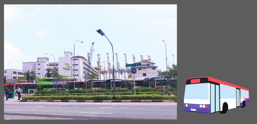
I first began looking into the architecture elements of the building, be it the use of lines, colours or shapes. I started looking at the photos I took in Shenton Way and started sketching and illustrating on Illustrator. I collaged my photos on Photoshop and morphed it into a 360 degree view to make it interesting- rather than a plain landscape vectorised illustration. I was inspired to do this when I saw an Instagram post similar to this:

https://insuranceblog.accenture.com/digital-insurers-can-present-a-360-degree-insurance-value-chain

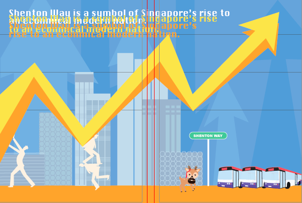
Adding on, I created a building made with blocks of squares and rectangles to show the reflective-glass features on Shenton way buildings. Mimi commented that my overall design was inconsistent, separated and it looked more like an architectural zine. She advised me to bring out a narrative story on Shenton Way to make the zine more appealing. How do I balance my vision of the place with my ideas and also express Shenton Way from an outsider’s perspective; I wondered. This got me into a ‘designers block’. This led me into further research on more graphic forms of the economy and banking in Shenton. I wanted to give off the essence of the economical growth in Shenton Way, since it is designated as the financial and banking hub. It is also a a symbol of Singapore’s rise to a modern nation.

I experimented on designing the cover page by playing with the idea of a building with office workers intertwining in the title. However, upon completion, it seemed boring and uninteresting so I decided to scrap it off. (as shown below)


After consulting with Mimi, I decided to take another look at my photos I took in Shenton Way. I think one of the obstacles along the way was drifting off with the idea and concept you initially had, ignoring the actual essence of the location and the photos you took.  I also re-looked at the write-up I wrote for Shenton Way. This gave me a new and clearer picture on how I wanna stylise and design the zine.

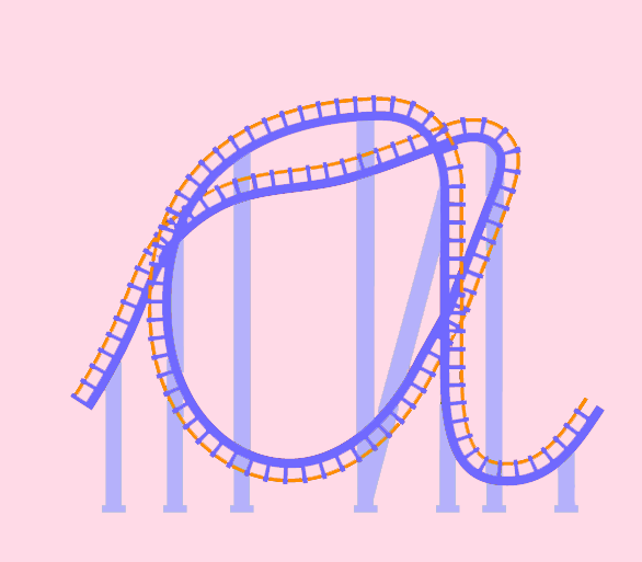
MAIN PICTURES I REFERENCED:

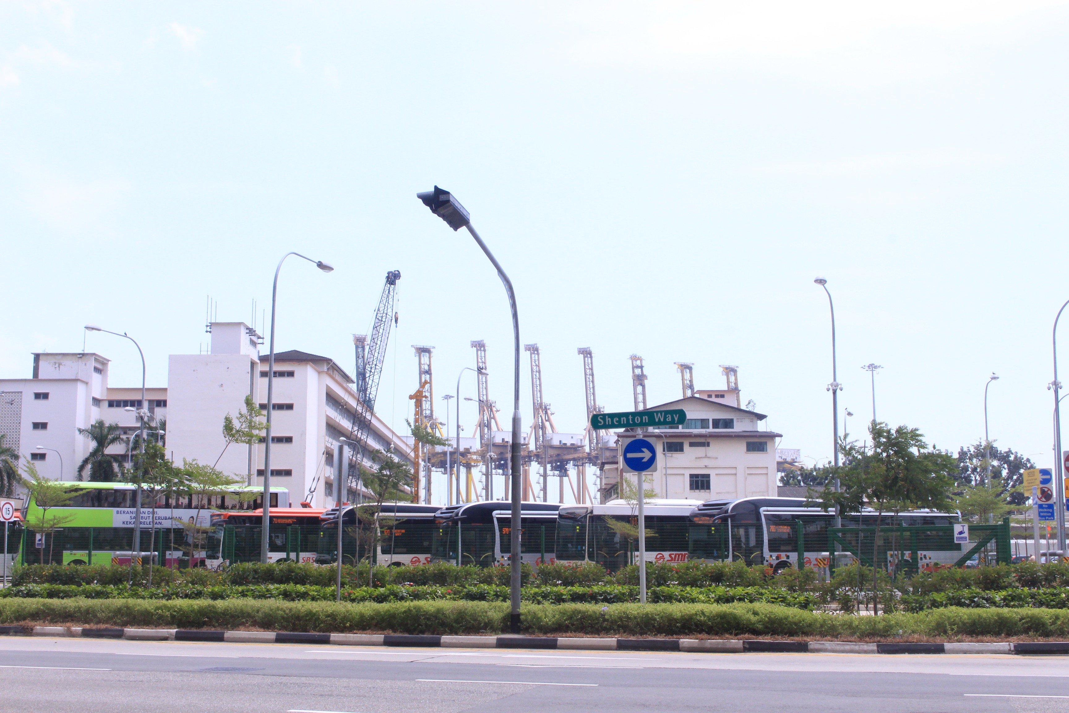
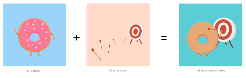
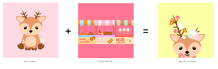
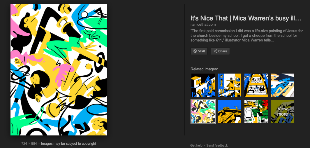
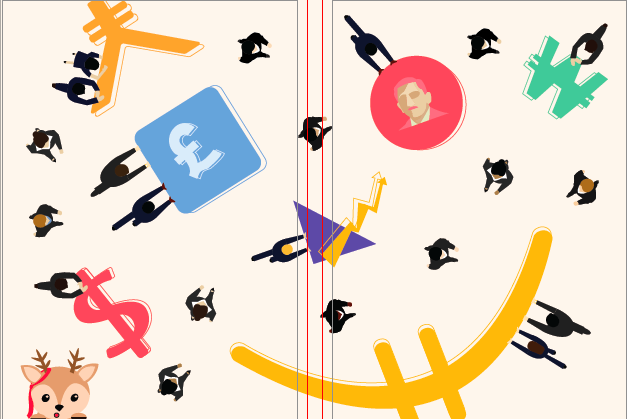
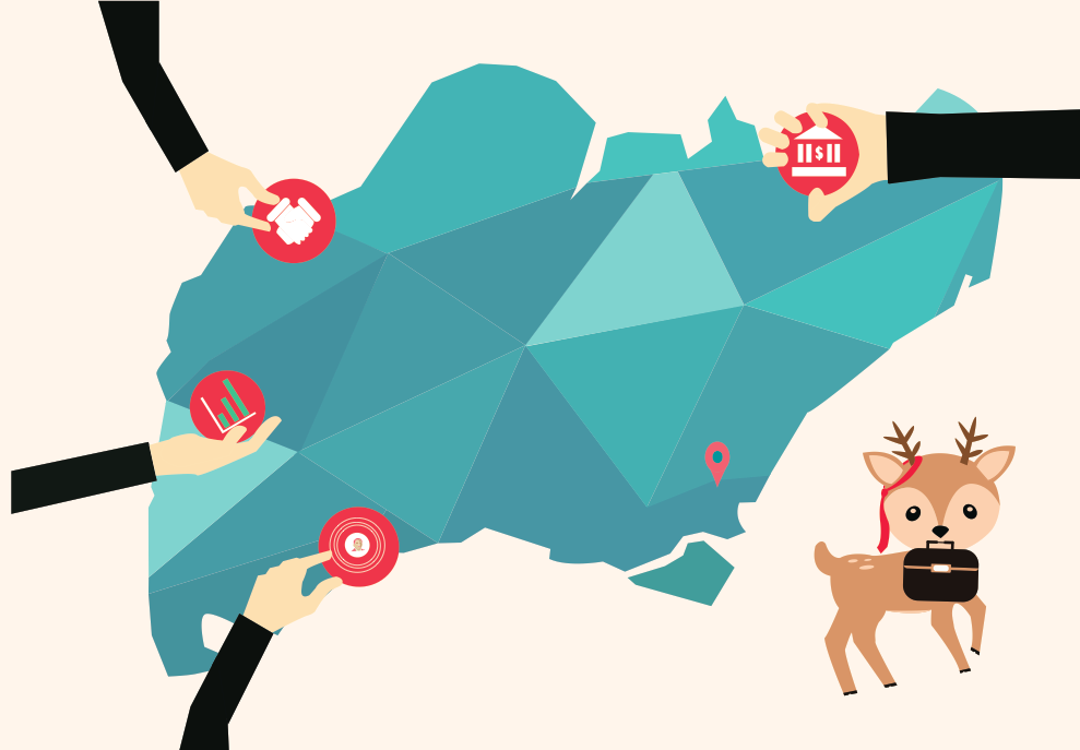
Shenton Way is known as Singapore’s Wall street- banking and financial hub. When I break down these words ‘finance’ and ‘banking’ – currency exchange comes into my mind. Hence I focused on the idea of currency exchange. I depicted this by creating vectors of the different currencies of the world: Yen, Euro, Dollar, Pound, Won and of course including the SGD (showing Singapore’s first president, Yusuf Ishak since the location is in Singapore). I also added office workers walking around and pushing the currencies to portray the financial office life around the area. Moreover, to make it more of a narrative I included a character, a deer, to represent me wandering around the place. A character that is out of place and holds the curiosity of what goes on in this area. As a whole you may think that the deer does not fit into the scene and feels unnecessary, but this is what I wanted to portray. This led to the graphic design below.

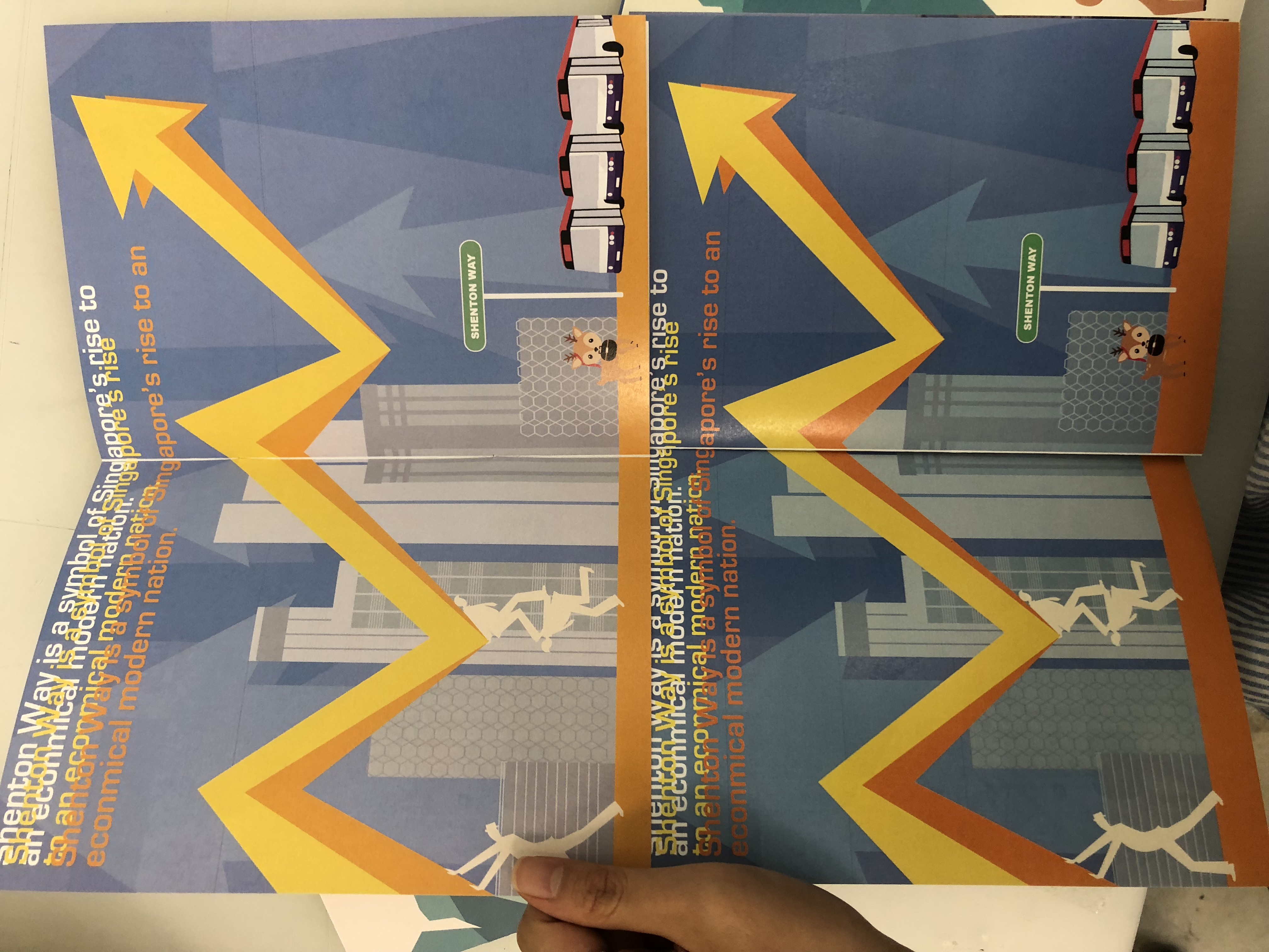
Keeping in mind that Shenton Way is a symbol of Singapore’s rise from “a small fishing village” to a modern nation. I wanted to portray this, as well as the new bus interchange built to serve commuters in the Central Business District in June 2017. Thus leading me to design an economical graph with iconic buildings of Shenton Way and the bus interchange. I also added overlapping text to add a sort of glitch or the messy incoming information and data that goes in the offices of Shenton Way.

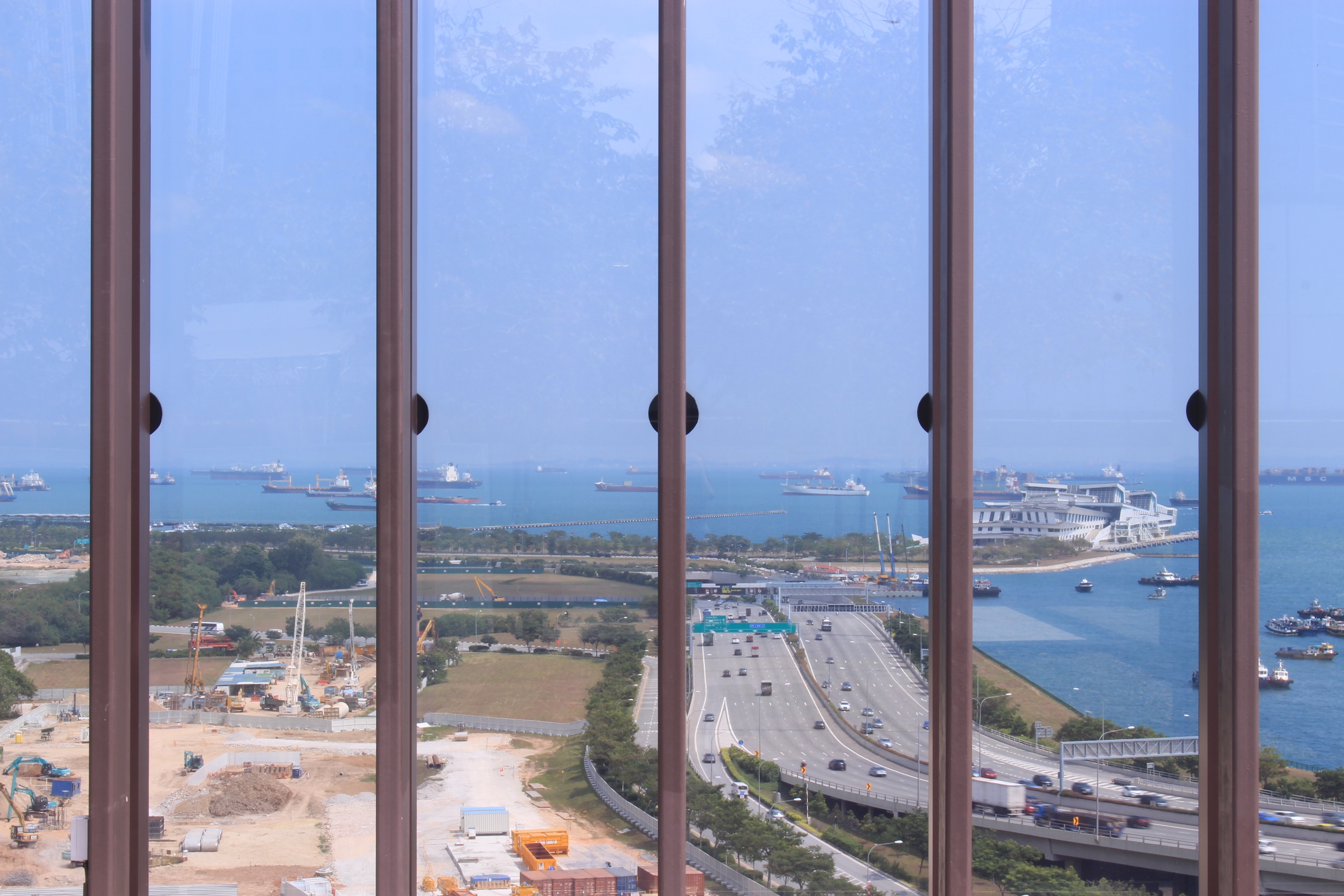
For the last double page of my Zine, I decided to incorporate my favourite spot in Shenton Way, where I unexpectedly came across.  I left the photo raw as I wanted to show the beauty of the raw land where its is under construction that may be built on for a future building. The allurement of the flat land before a rise of new modern buildings. This spot is from the Singapore Chinese Cultural Centre rooftop garden. I decided to work my graphics on it to shows the element of  ‘growth’ by using the crane and the office workers inserting coins into a piggy bank. Furthermore, I wanted to add my thoughts into this page by inserting a comment by the deer.

Overall, I chose to do a double-spread page for all my pages to create a landscape to give a bigger impact on the location. Moreover, I chose a colour scheme of toned-down solid colours crossing over to pastel colours to make it vibrant to reflect the lively energy in Shenton instead of a systematic monochrome colour scheme – implementing complementary colour pairings.

Cover Page

I did not want my cover page to reveal where my location is and what the zine is about as I felt it should be shown through the graphics on the pages. Thus, it should only give a sneak-peek into the direction of the zine and an introduction of the character.

The first draft of the cover page (shown in the initial stage) was plain and predictable – not abstract enough. Thus I designed a cover where it shows the overall essence of the location without revealing the name of the place. Upon my completion of the design, I still felt like it was lacking and could be further improved but I was stuck on ideas for a double spread cover. Thus settling for the less. I feel like I can do better!

Printing

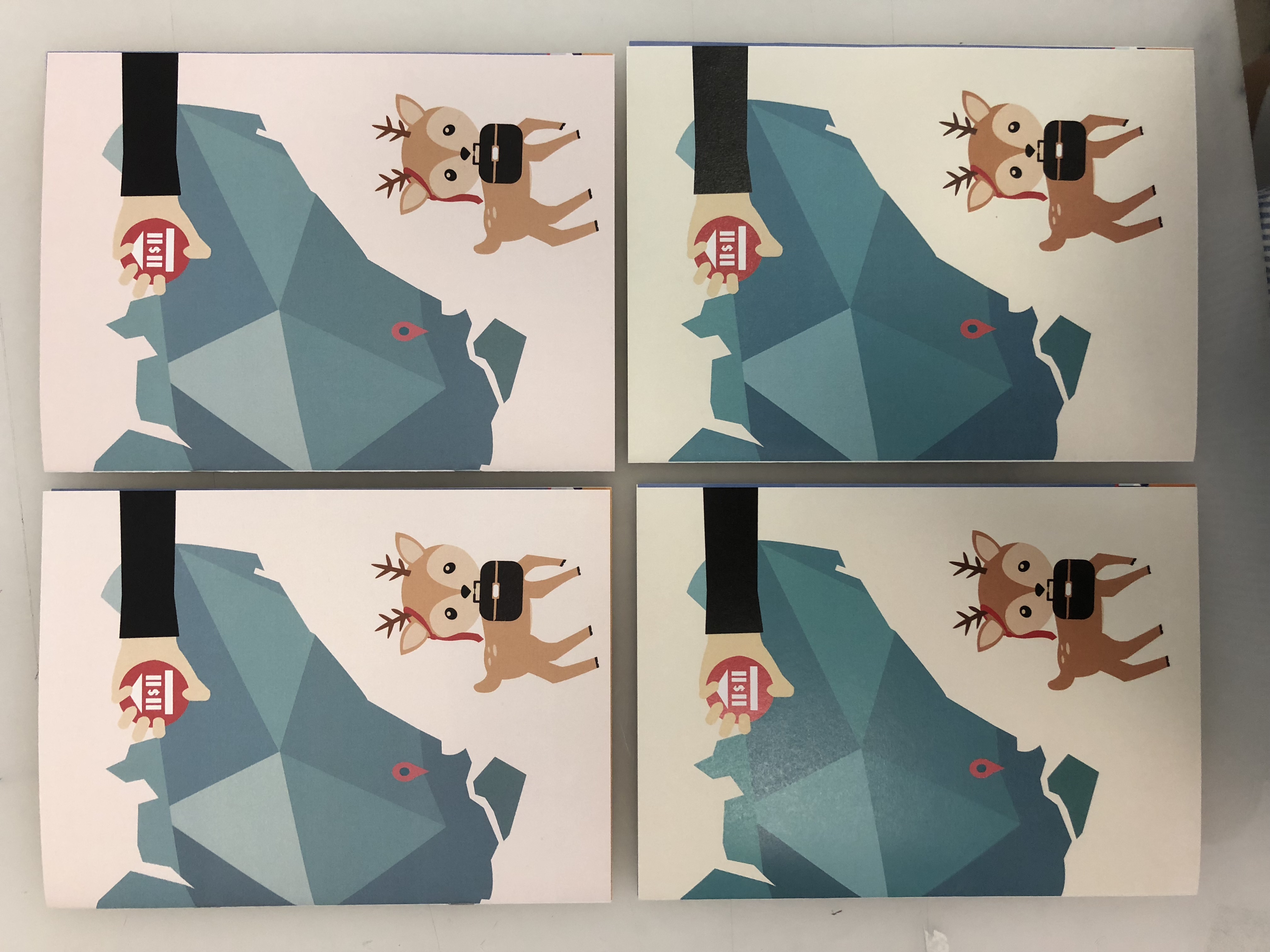
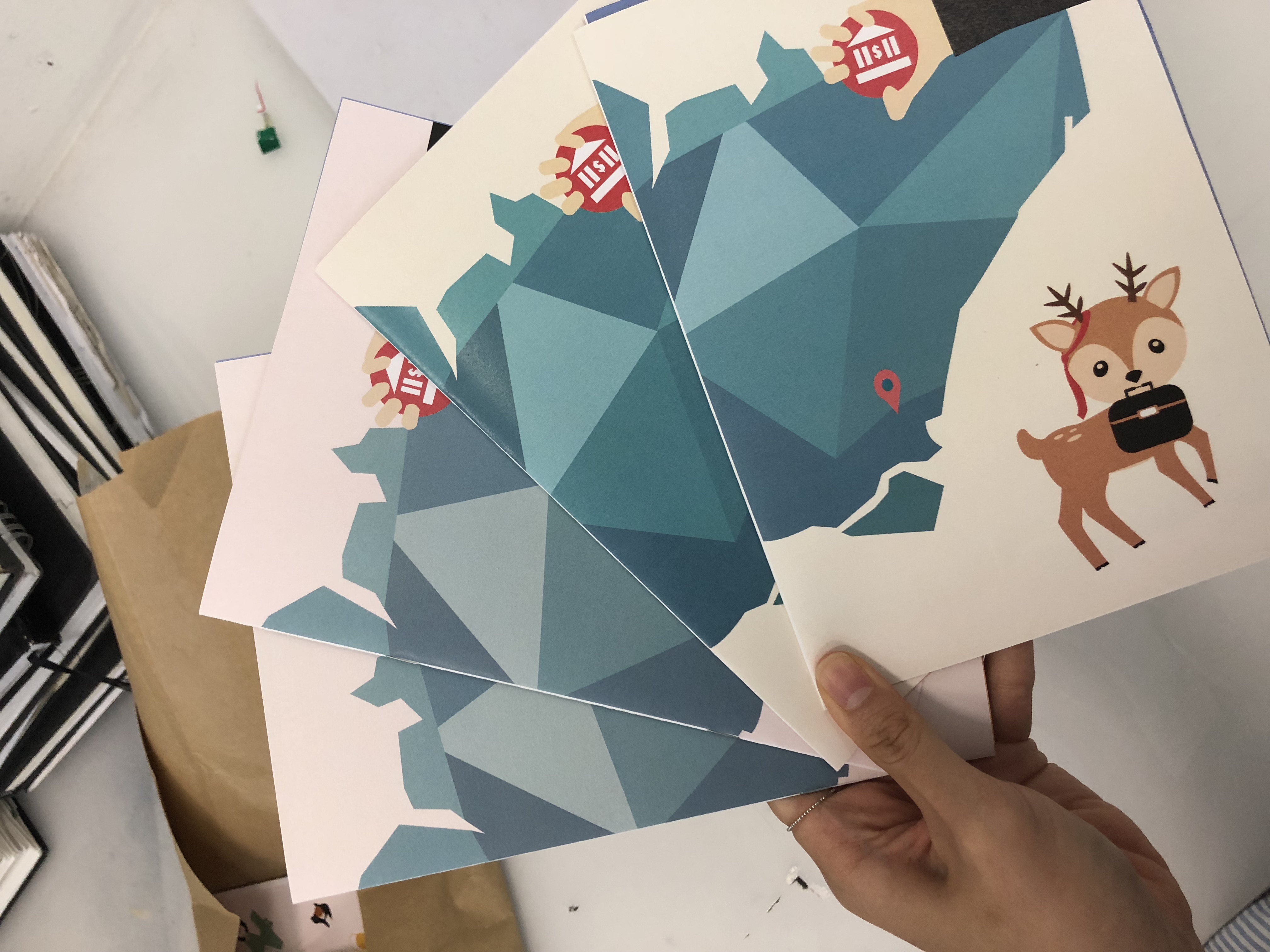
Onto the printing stage! Mimi suggested that we head over to RJ papers to see what they had to offer. To my surprise, they held collections of wide varieties of paper that made me overwhelmed with my choices. Being indecisive, I tried my best to cut to 3-4 different types of paper that I liked. It also surprised me how cheap it was even though I am buying 8 sets of each. I am definitely coming back in the future for my future projects. The aunt over there told me to buy more since I came this far and the price was very reasonable. I thought 24 A4 sized paper was more than enough for test prints and my final zine. Little did I know, during my test print, I used up 16 out of 24 before my final! I must say test printing is so crucial, which tested my patience in aligning and colour correcting the designs on paper. It is also an important medium to match with the concept of your graphics that can further emphasise your ideas. Nonetheless, i enjoyed the whole process in the creation of my zine!


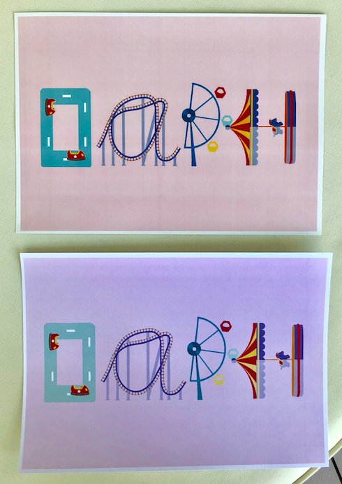
Different textured paper + Different printer printed off a slight differentiation of colour and shading:

….AND OFF TO THE FINALE OF MY ZINE!


Image Making Through T Y P 3


To get our brain up and running for this project, we learnt about why humans see faces in inanimate objects, which associates with a condition where one perceives a pattern in random things, called Pareidolia. It also follows one of the principles of psychology where “Human beings are social animals with a basic need to belong”, in this case, to find a face or language in order to relate with, decreasing the sense of unfamiliarity. Following on, we did a simple class exercise where we had to find alphabets in ordinary objects around the school. Here is what my partner and I spotted (can you spot it too?): 


brainstorming:

Img1 Img2

Making a mind-map on my sketchbook, I came up with several occupations with mini-sketches that could fit into this project. The occupations that I came up with are the ones that I felt would best represent me, something I was passionate about or even my childhood dream job. I shortlisted it to the top four jobs and started to explore different factors by deconstructing and factoring elements that relate to the job.

  1. Poker Player
  2. Amusement Park Owner
  3. Kindergarten Art Teacher
  4. Astrologist

Research + Process

OCCUPATION #1: Poker Player

https://fineartamerica.com/featured/playing-cards-royal-flush-on-black-background-natalie-kinnear.html

First, I decided to experiment with the deck of cards or poker coins to show the occupation, whilst, engraving my name. However, I wanted to show some consistency and the occupation itself. I decided to go by playing about with the set of the ‘Royal Flush’, which is the highest win in poker.  Changing the King, Queen, Jack into letters of my name D, P and H.

After placing the letters onto each card, it seemed rather plain and I was debating between to create a pictorial design or if I should play around with the alphabet itself. Following from my consulting with my tutor, it was better to place an alphabet since it is a typography assignment, additionally making it more clear and alluring.

OCCUPATION #2: Amusement Park Owner

Ideas+ Inspiration board:

https://www.pinterest.co.uk/pin/50243352069095745/

Below, I experimented and created an A with the idea of a rollercoaster which can be found in an amusement park, inspired by the picture from pinterest above.

Instead of creating a consistent font of the idea of the rollercoaster as alphabets, I explored and created other fonts through different rides that can be found in the amusement park, enhancing the essence and elements of the occupation.

Over here, I changed the color of the D from more of a greyish tone to a blue-grey pastel tone to match with the other fonts.

Above shown is the two print, one (above) in glossy and the other (below) in matte.

OCCUPATION #3: Kindergarten Art Teacher

Before starting this, I broke down the components and aspects of a Kindergarten art teacher. Paper drawing, painting, simple boxes, dotted lines and animals. I went with a baby pastel and light colors to match with the theme of a child-like feel. I felt that by placing a face on the giraffe made it grab the viewer’s attention rather than the name, hence, omitting the face out.


OCCUPATION #4: Astrologist

I chose this occupation as my passion and curiosity towards astrology grows. Even though it might not be an actual occupation, it is one of my spare time hobbies to read about the horoscope and constellation set in the universe. I used signs within the world of astrology to construct my name. At first I wanted to incorporate LED lights within the piece but it looked a little messy and uncoordinated. This led me to think more of a pop-up style where I will use the 360 degree astrological chart on top of the cosmos background, and top it off with a reflective silver effect lettering for my name (in order to pop out from the background). I painted a cosmic background by using blue and white on a black background and photo manipulated it in photoshop.
D- Moon Sign
A-Taurus Sign flipped sideways
P- Libra Sign flipper sideways
H – Pieces Sign / Saturn Sign


When placed in this arrangement, I realised that it was quite hard to read my name in the order of my astrology sign, capricorn. Thus, I rearranged it in a diagonal order, not as boring as a straight line but something easy to read. 

While I was in Art Friends getting my materials, a reflective aquamarine lured me and I was wondering if I could use this instead of a reflective silver. Hence, I bought it to try it out whether it would fit and tie in the colors together but somehow it seemed off, leading me to stick to my original thought of using the reflective silver material as my font base.

FINAL OUTCOME

1.

My name isand I am a Poker Player.

2.

My name isand I am an Amusement Park Owner.

3.

My name isand I am a Kindergarten Art teacher.

4.

My name is
and I am a Astrologist.

TO conclude, I felt that I have taken a lot from this assignment. Not only, did I get to brush up my illustrator skills, but also tease my brain to think more creatively and looking at fonts in a more pictorial yet typographic way. For this project, I used both photoshop and illustrator to help me project what I wanted and achieved. I enjoyed this project as an introduction to Graphic Form and is excited to see what is to come in the future!

FINAL: EGO IN DIFFERENT SETTINGS

“Design is a journey of discovery. In design, color plays a significant role. It does not only play with the aesthetics but it also reinforces the design in harmony.”

Being the only project where we are allowed to play with color, this places great emphasis in manipulating the harmonies of color to produce our desired outcome. I wanted to choose a color palette that reflects both my style of illustration and I. Thus, I chose a pastel color scheme, playing with both complementary and analogous colors. I chose to illustrate through vectors and flat illustration which plays with shapes and the choices of colors.

B R A I N S T O R M of me + setting = ???

  1. me (a deer) + a food market/festival = food coma w food on my antlers lying down w a big belly ?
  2. me (a peach) + stacks of assignments/ squashed under = escape – dream (pressing esc button or parachute with papers flying around?)
  3. sleeping/tired me (a pig) + coffee = hyper pig bouncing off the walls
  4. me (a donut) + trapped in a room filled w negative F = donut worry be happy (fills up w jam) turns the F to an A
    me (a donut) + failure ( fail to hit target) = do whatever it takes to achieve target
  5. me (a curious fennec fox) + map/GPS = exploring a bizarre world/ new world

Before I ventured on to the final illustrations, I created a moodboard/inspiration board to refer back on how I would want the whole format and illustrations to be like. Taking reference and inspiration from pinterest, to fully visualise the desired outcome.


Top Row: A pictorialization of a bizarre world/ new world
Second Row: me (a deer) + a food market/festival
Third Row
me (a peach) + stacks of assignments/ squashed under
Fourth Row: me 
(a sleeping pig) + coffee = hyper pig bouncing off the walls/ dancing
Fifth Row: me (a donut) + failure

CHOSEN COLOR PALLETTE


I chose a cool pastel color scheme to play with as it is my favorite color scheme. It reflects off a soft, dainty, sweet and delicate feeling which mirrors the vibe I give off (according to my friends). It is also aesthetically pleasing and fulfils the outcome I want to display.

________________________________________________________________________________________

FINAL
. I decided to go off with these four ideas for my final illustrations.

  1. me (a curious fennec fox) + a map/GPS = exploration of a bizarre world/ new world
  2. me (a peach) + stacks of assignments = escape (pressing esc button with shades on)
  3. me (a donut) + failure to hit target = will do whatever it takes to achieve target (places the arrow on the bullseye)
  4. me (a deer) + a food market/festival (food stalls) = food coma // food on my antlers (gets everything) 

In each boxes, each rows, I try to vary the composition of each frame such that there is a sense of dynamism yet consistency in framing in each story. As well as, an unified color scheme as a whole instead of focusing on individual rows.

ROW 1

I started the equation with me as a fennec fox as I’ve always found them adorable and since they were pretty apt for the chosen setting, with their curious nature, I decided to go for it. In addition, I’ve heard that if I was an animal, I would resemble a fox. In the first frame, I’m portrayed as a cheerful fennec fox, with smiling eyes. Following, when given a map or GPS (a chance to venture off), I would head into a new world. This row reflects one of my personality, in which of my curious nature, I love wandering and exploring new places.

For the choice of color palette, I did not go for any color schemes but to harmonise as a whole. Starting with the fennec fox with a touch of neutral tones of nude beige and white + hints of complementary colors of “red and green”, in this case, turquoise and pink. In the second frame, I went with the color blue to represent the sky and sea, a sense of vastness and boundless, conveying the feel of endless exploration. It also carries on colors from the first frame, in order to harmonise as a whole. In the last frame, I made it more colorful with different pops of colors yet unifying, to achieve a sense of excitement and wonders in a ‘new world’, inspired by an album cover referenced in my moodboard. An attempt of subtle complementary and triadic colors.
Simple and centrally composed to bring focus on the main illustration in the first two frames – me and the setting. It ends with a more crowded composition encircling the depiction of me, in a sort of welcoming manner to achieve the sensation of wonder and positivity.

ROW 2 

Depicting a peach to represent me, when meets an overload of work equals to “vacation needed please – press to escape.”

For this row, I went with a complementary color scheme of yellow and purple as the background. As usual, I kept the first frame clean and central, following with an overwhelming squeezed composition depicting various sizes of stacks of assignments, to give off the sense of suffocation and overload in a box. Ending with a fresh cut illustration in the last frame which keeps it simple and direct. In this row, I carried over hints of the colors used from the previous row to give more of a unified look.

ROW 3

A donut. I went for more of a blue + neutral tones in this row, again, trying to incorporate colors from before. In the first frame, I chose a color that could make the donut ‘pop out’ against the background, as well as, pleasing to the eye. The second frame, I decided to tone it down by using a neutral color scheme and analogous colors with a touch of warm red. The last frame, I went for the complementary colors of red and green, with the donut in a neutral tone to balance the color composition of choice.
Compositionally, I positioned the illustrations in central and consistent for my first frames in each row. Whereas the dynamism of composition comes from the last frame. In the second frame, initially, I made the arrows more of an orderly touch with identical sizes (as shown below). However, I re-arranged it to a composition of big to small, in order to create a sense of depth and also incorporating a leading line. This row was more focused on a simple, clean-cut composition, thus directing the viewers focus to the main illustration and story line.


ROW 4

A deer. Deers are usually known to have an elegant and petite vibe where they are imaged to eat when accessible or less. I played with this image and contrasted it with a deer who is both playful and loves to eat, reflecting myself in the deer. The first frame is the portrayal of a typical quiet and still deer, but when situated in a food festival, out comes the playful, greedy-eyed me as I start getting all the food! The first frame of the deer remains a pinkish-neutral tone as its docile and elegant nature before meeting the joy of life (food festivals)^^ Food festivals are known to be lively and festive, hence this piece also incorporates a colourful bright touch of complementary colors (orange-blue, yellow-purple, red-green), as shown in the second frame. The last frame portrays a playful yet innocent-like deer with food stacked on it’s antlers while eating a donut. This plays an irony on the fact that deers are usually not seen as big nor greedy eaters, which reflects me…. Compositionally, I wanted to keep things consistent and simple by positioning the stalls as a row rather than a clutter of stalls. The last frame, I played with the depth and framing of the deer. I placed it as a near-shot where only the head could be seen with its antlers, making it more ‘interactive’ with the audience. With the colors cautiously chosen during the process, this row characterises a sort of ease, cheerfulness and docility.

FINAL 

To conclude, through this project I got to explore the world of colors (which I love using). I enjoyed composing my illustrations and picking out different color schemes to fit in as a whole. This mirrors the strategic planning and exploring of color schemes that would compose the 12 frames as a whole, like Instagram. I reflected myself and mood through the colors and illustration depicted in the 12 frames. This project makes you self-reflect in the knowledge of whether you are assertive or turbulent in knowing who you are, what you think you are and finding how others perceive you. Thus, using these perceptions into colored illustrations. I do not have any BIG takeaways but it did let me get back into digital drawing/illustrating through photoshop. AND most importantly, the joy in creating and completing this project.

Thank you so much Shirley for everything! I really enjoyed this class, in the bonus of your guidance and teaching that made me LOVE it even more ♥‿♥

“Be a pop of color in a world of black and white.”

Mark Making Journey

Mark Making Journal on Sketchbook (Bookwork)
pg1.pdf pg2 pg3 pg4 pg5

Different marks are visualisations of different forms of meaning.

  • Thin Lines suggest frailty or it can also convey a sense of small elegance
  • Thick Lines suggest boldness and strength
  • Horizontal Lines suggest calm and steadiness
  • Vertical Lines suggest stability, especially when thicker and bold actions
  • Curved Lines expresses fluid movement and is rather dynamic in direction; differs when the curve is small or large
  • Zigzag Lines create sudden excitement or quick movement; it can also suggest nervousness

Experimentation in class using different materials with black ink/paint.

During the start of my experimentation, I have not chosen 6 specific emotions yet and was exploring with the different marks different material makes.
I started with using a rubber band with ink to create a line splattered effect. I quite like the outcome of this (image shown below) as it produces different print each time I ‘pull & release’/sling the rubber band around the sheet.


Moving on from using the rubber band and creating textures on the paper, I used a small piece of crumpled paper to experiment what mark it would make.

I also experimented with placing a long chain on ink and subtly dragging and smacking it on to the newsprint paper. It created a sort of repetitive yet asymmetrical pattern. It somewhat resembles a pacing movement… maybe it could fall into the emotion of anxiety?…


Taking a piece of a broken disc, I made small tore marks on black inked paper to represent the emotion of irritation. The emotion of irritation would drive me to tear and break things out of releasing my frustration within, resulting the mark made below.

Comparing tore on ink and without:
I feel like the tore without ink has a clean cut vibe and does not show much of the emotion ‘irritation’ whereas the tore with ink shows the emotion much more, emphasised by the dry brush strokes.

Over here, I used bubble wraps with black paint to stamp on paper to mirror pacing steps from the emotion, anxiety.  Splattered watered down paint using a brush to explore the different mark it produces.

Paint on masking tape:

Using a palette-knife with ink to create an explosion-like to make a firework structure for the emotion, zest.  

THE 6 EMOTIONS

Zest
Definition: great enthusiasm and energy
My Interpretation: a burst of great energy; an imitation of fireworks. I used a palette knife black paint on acrylic paper to create the lines, creating a circular lined shape. I tried experimenting with ink or splatting paint on paper but it did not mark off the way I pictured zest.

Surprise
Definition: an unexpected event +/-
My Interpretation: To me, I like to see surprise as a positive noun. I had interpreted this surprise into something bubbly and positive. Therefore, I experimented with different materials to create round bubbled circles in the light of positivity, adding on a range of different sizes and style of a circle to represent the different surprises. 

Affection
Definition: A gentle feeling of warmth and softness.
My Interpretation: the feeling of wholeness; brings about a soft fuzzy feeling. Instead of using round and smooth curves or lines, I wanted to show the fuzzy feeling you get from affection as well as an interaction piece where the viewers can touch. Affection is something shared between two or more people, so I created a ‘3D’ form where it is more interactive, which is by using cotton as it is a soft and puffy. By covering the whole sheet with cotton, it suggest the wholeness from an affection.

Sadness
Definition: sorrow; unhappy
My Interpretation: faded out; grey. When I think sadness, I think of a mellow grey field. This lead me to water down the ink or paint and I wanted to bring in the dripping/flow effect of the stability yet toned down feel as the emotion creeps on you. It is not a sudden emotion but a mellow calm emotion that slowly weighs you down. I experimented this on a plexiglass acrylic but it did not capture the grey tone as much as the acrylic paper, which is why I had chosen to use at the end. 

Irritation
Definition: the state of feeling annoyed and slight anger
Through irritation, it is that slight burning annoyance in your heart that would lead you to drive a pen crazily on a paper that rips it. This is the picture of the emotion, irritation in my head. I tried creating scratch/ripping marks on wood and acrylic paper but it did not show the effect I had in mind until I tried it on newsprint paper. The crumpled effect it gives with unclean tears. I added the marks of black watercolour paint using a dried marks to show the rough ‘scratch’ effect to emphasise the negativity of this emotion.

Nervousness
Definition: easily agitated; anxiety
My Interpretation: fidgety actions; pacing back and forth. When were nervous we tend to bite our nails, fiddle with our fingers or an object, or even walk back and forth out of panic. I wanted to show these actions on a print when this emotion comes and we suddenly start to panic. First, I experimented with metal chains, repetitive slice marks and zig zag cross lines to show the jitters, tangled up conscience and the continuous pacing of our steps. At the end, I came about using a bubble wrap with black paint (with some diluted black water colour paint to show the faint conscious grip we have and a moment of anxiety). It mirrors the pacing of our foot steps back and forth, all around crossing the same marks all over the sheet till its no longer a simple white sheet but a lost of thoughts that is all over the place.


FINAL MARK MAKING OUTCOME

Overall, I had enjoyed this project although it was quite difficult for me to express emotion without colour. I always pictured emotion with colours better than printed words or marks, so, through this project I learnt how to express different emotions through a variety of experiments with different mediums, medias and tools to create the mark of an emotion b&w. Especially with positive emotions, I learnt to think more out of the box on how to show the emotions, through various experimentations as it is quite hard to produce the coloured images/ideas in your mind and printing it out as a black and white form.