” Creativity, which is what Modernism is all about, is a constant searching process that promises a greater chance for failure than it does for success.”
– Bierut, Michael. Looking Closer. Allworth, 1997
Tracing back to the History of Design, artists and designers were trying to push forward the creative industry by creating a set of new principles. This led to the birth of Bauhaus. For example, the well-known Kadinsky used his proposed color theory with shapes to create art – reducing everything to its most expressive form. This reflects the key idea of Modernism, something that was never done before.
As proposed by Kadinsky’s basic color and shapes theory:
“A dull shape like circle deserves a dull color like blue. A shape with intermediate interest like a square deserves an intermediate color like red.
A dynamic, interesting shape like a triangle deserves an energetic, luminous, psychotic color like yellow.”
Thus portraying this color concept into my artwork below.
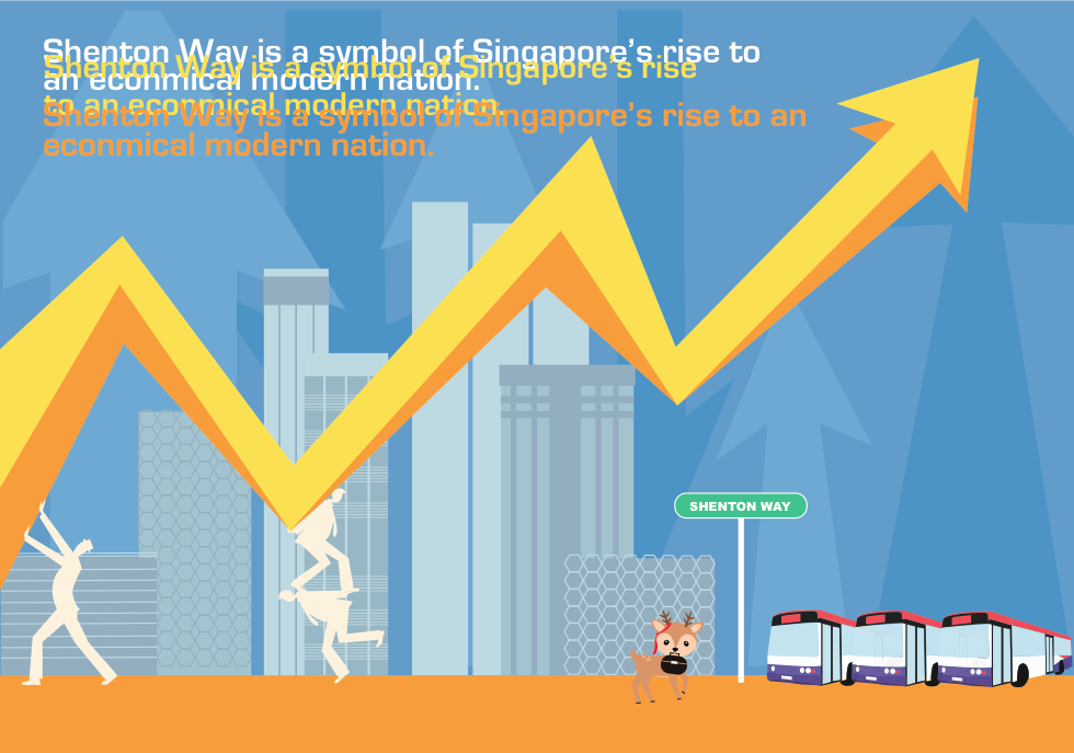
Singapore is a small country filled with a culture of collectivist, radiating a sense of home and warmth. This led to the idea of “Family” in the style of Bauhaus. Majority of people in Singapore lives with their family with different generation, even if you had graduated college. For example, your grandparents, your parents, your ‘siblings’ and you living under one roof. Imagine the amount of familial warmth it holds. Although some might oppose to this idea, yes there is some family that does not get along due to numerous reasons and thus lives separately. However, I wanted to portray the picture perfect family that every kid draws when they were young. A happy family, a house in the background with the sun drawn in the corner of the paper. Yet, when you look close inside the grains and the rough strokes of a crayon – there will always be flaws and imperfection inside a what it seems to be a picture perfect image. Nothing can be 100% perfect but the idea is to push your limit to reach 100% – the progress and development is what matters. This reflects to the concept of Modernism where it is essentially utopian as suggested in the reading, Looking Closer by Michael Bierut. An idealistic society that possesses nearly perfect qualities for its citizens. Yet there will always be flaws in the nook and cranny of a Utopian. Despite this, it also contradicts another idea of Modernism of creating things that is out of the structure, out of the ordinary or else it would be redundant.