The Age of Information

Massimo Vignelli is an Italian designer who dappled in a vast range of design: branding, packaging, housewares, furniture, showroom design and etcetera.  One of his ethos was that “If you can design one thing, you can design everything.” This ethos was reflected in his work within the Modernist tradition. Vignelli focuses on simplicity and clarity of design through the use of basic geometric forms in all his work. He sees himself as an “information designer”. His aim was never to design for the aesthetics but to solve problems for the people through design.
Thus the quote “Design is utilitarian, art is not.” This infers that design is designed to be useful or practical rather than attractive.

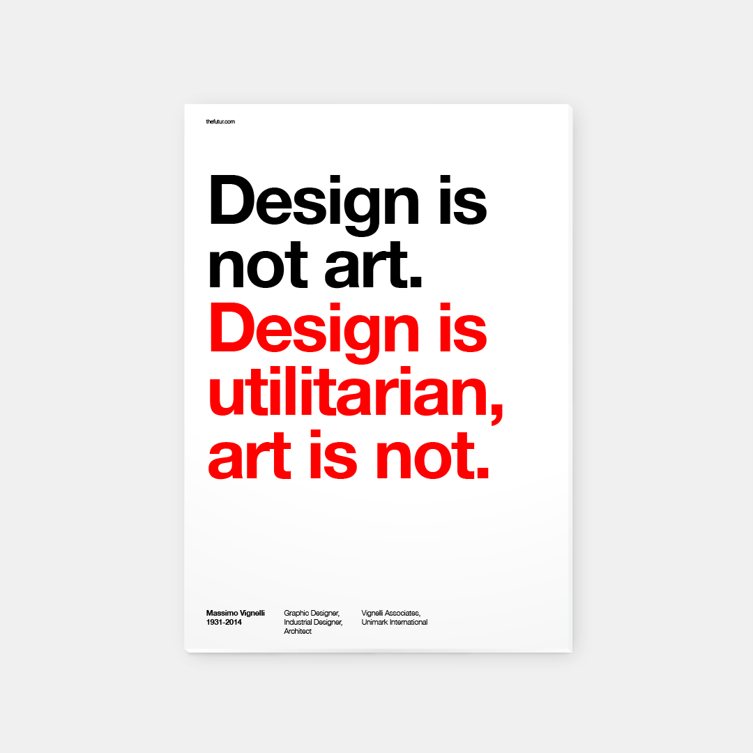
Massimo Vignelli is one of the most important figures in the history of design. He has designed graphic systems that has a use for people in every day life . His design and cultural commitment has produced a foundation to the world of Modernism in the Early 20th century. He has taught us to appreciate the practicality and the elegance of simplicity, to present information in a visual and structural form.


The next article, focused on the rise of corporate identity, which portrays Vignelli’s design-with-purpose methodology. The visual communication we get from a brand can be affected by many factors such as the media, society and consistency. Corporate identity is definitely a make or break in the marketing industry, especially in a consumer’s point of view. In a fast-paced revolutionised modern society, brands have to keep up with the trend in order to catch the eyes and heart of the people. These visual informations are what consumers observe and judge upon on. The stronger and constant brand identity it holds, the stronger the impact and consumerism it holds. Thus the importance of the contextual meaning and design of brand identity.


References:
http://www.eyemagazine.com/feature/article/reputations-massimo-vignelli
http://www.designishistory.com/1960/corporate-id/

Bauhaus? Bauhaus.

” Creativity, which is what Modernism is all about, is a constant searching process that promises a greater chance for failure than it does for success.”
– Bierut, Michael. Looking Closer. Allworth, 1997

Tracing back to the History of Design, artists and designers were trying to push forward the creative industry by creating a set of new principles. This led to the birth of Bauhaus.  For example, the well-known Kadinsky used his proposed color theory with shapes to create art – reducing everything to its most expressive form. This reflects the key idea of Modernism, something that was never done before.

As proposed by Kadinsky’s basic color and shapes theory:
“A dull shape like circle deserves a dull color like blue. A shape with intermediate interest like a square deserves an intermediate color like red.
A dynamic, interesting shape like a triangle deserves an energetic, luminous, psychotic color like yellow.”
Thus portraying this color concept into my artwork below.

Singapore is a small country filled with a culture of collectivist, radiating a sense of home and warmth. This led to the idea of “Family” in the style of Bauhaus. Majority of people in Singapore lives with their family with different generation, even if you had graduated college. For example, your grandparents, your parents, your ‘siblings’ and you living under one roof. Imagine the amount of familial warmth it holds. Although some might oppose to this idea, yes there is some family that does not get along due to numerous reasons and thus lives separately. However, I wanted to portray the picture perfect family that every kid draws when they were young. A happy family, a house in the background with the sun drawn in the corner of the paper. Yet, when you look close inside the grains and the rough strokes of a crayon – there will always be flaws and imperfection inside a what it seems to be a picture perfect image. Nothing can be 100% perfect but the idea is to push your limit to reach 100% – the progress and development is what matters. This reflects to the concept of Modernism where it is essentially utopian as suggested in the reading, Looking Closer by Michael Bierut. An idealistic society that possesses nearly perfect qualities for its citizens. Yet there will always be flaws in the nook and cranny of a Utopian. Despite this, it also contradicts another idea of Modernism of creating things that is out of the structure, out of the ordinary or else it would be redundant.

What The Singlish ??!1?

To begin with, I felt like the use of typography and collaged images in Dadaism was the perfect style to convey this piece.  I was inspired by Theo van Doesburg and Kurt Schwitters, Kleine Dada Soirée as shown in class. I love how the mess of overlapping typography can be kept in minimal by the choice of colors. It is not as overpowering for the eyes to see but to adore.

https://www.moma.org/learn/moma_learning/2562-2

Being a Third Culture Kid has definitely colored my identity into where I belong. Although I’ve lived in Singapore for quite some time, I’ve never fully immersed myself into the true local culture.  Singapore is a culture filled with diversity. In a diverse city, there are multiple languages and dialects being used around. Thus, this leads to my perspective on Singapore’s own society language called “Singlish”. It is an unavoidable language in this country. As a foreigner to this language, I had to slowly pick up terms, phrases and their definitions in my first year of university. Coming from an international school, I have never really paid attention to it and felt like they are words being thrown around in the community. It felt like an informal language that give Singaporeans a sense of bond, comfort and belonging.

This piece shows my perspective on Singlish and how it is not taught to you but more of a self-learn where you can get buried under between Singaporeans. I’ve used a typeface that comes out to me as an informal- formal to reflect how I see the language, with a big grey question mark pushed to the corner. Duct-taped over my mouth and buried under this interesting culture.

PS. I am still to learn more of these interesting phrases.


Image Sources:
https://www.moma.org/learn/moma_learning/2562-2
http://pngimg.com/imgs/people/tongue/
http://www.stickpng.com/img/people/mouths/open-mouth-teeth
Lux Lip Crème- Dark Rose
http://pluspng.com/musical-notes-png-285.html
http://www.stickpng.com/img/objects/duct-tape/piece-of-duct-tape