From UX to HX

A response to Humans, not Users: Why UX is a Problem by Johannes Ippen.

The use of mobile phones has been embedded in our lives that it has become apart of our identity. It plays a prominent role in shaping aspects of human behaviour. According to research at Penn State, we use a gadget for 10 hours and 39 minutes on average (Cimino, 2018). Based on Harvard stats, 73% of us have experienced anxiety over losing our phones (Hartley, 2019). This anxiety and fear is now a recognisable psychological disorder called Nomophobia. This highlights why the way we utilise and interact with technology is significant; hence the need to pay closer attention to user experience, also known as UX.

Design is more than a language. It is a powerful tool that can influence and manipulate people. It is not only about creating aesthetically pleasing visuals, but also a decision of making things accessible and functional. Additionally, designers also create interactions and experiences, eventually generating a routine for people. 

Many products in the market are continually developing to provide the best user experience to achieve high user engagement rate. The force driving behind successful products is a great user experience design. Applications such as Instagram or TikTok are dominant in their space because of great UX. They know how to create addictive and feel-good experiences for their users. But this is also a problem. These products are services that target the mass audience, and they monetise through advertisement. Product designers and business strategists have found the perfect ratio of content and ads to place on their interface to make users come back for more. The higher the retention rate, the more money they earn. Every click, like, comment or share, is a recorded data for programmers to calculate and form a probability to curate a preferable content for the user. The designers base their decision on these metrics to produce a greater experience.

In Johannes Ippen’s TEDtalk, he mentioned how Snapchat had created what may seem like a fun feature to a concern. Snapchat, a direct communication tool, made a feature where if you send a ‘snap’ back and forth for a few days, you get rewarded by having a streak which is represented by a fire icon. The number beside the icon will gradually increase, the longer you keep the streak going (the number represents the days the two users have been ‘snapping’). And users of Snapchat do take this very seriously. Johannes commented on how a feature that emphasises the building of relationships could result in something that drives anxiety and labour. Thus a designer’s job is upmost crucial in creating not only the experience but also to consider the aftermath. Designers tend to make these design decisions to optimise longer usage and underestimate the impact it may have on relationships, health and how people may enjoy life. Ever since the launch of social media, the majority seek the need to document and publicise on social media instead of genuinely enjoying the small moments. We have formed a habit of publishing the best of life on social media and photoshop reality. This links back to a post I wrote in response to Wittkower’s article, “A Reply to Facebook Critics”.(https://oss.adm.ntu.edu.sg/daph0017/everything-is-not-what-it-seems/

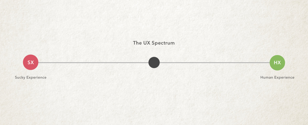
Designers have created these products that cause the fear of missing out, also known as FOMO in the millennial language. Although, this may mean that designers have succeeded in creating great user experience or customer experience. However, with the rise of societal issues, designers lack broader thinking. Designers need to stop basing decisions on short-term goals upon longer usage and to start understanding the impact it may carry. Johannes explained that designers need to shift the way they are thinking about design and to move beyond the engagement metrics and users. He further added that designers need to start designing products when they are not being used. Johannes tells the audience to imagine the human being and to develop a product for their needs and purpose in life. The product is a part of their life without creating negative impacts. He then continues explaining how designers can design a product that waits for their human to come back, rather than spamming them with notifications and alerts. Johannes encourages designers to stop thinking about user experience and to start designing for humans, also known as the human experience (HX). This would help human beings fulfil their purpose and respect their off-screen time, diminishing an addictive system and routine. 

It made me reflect that UX design can create a positive impact if designers direct their attention to it and not solely focus on monetisation. Thus, a switch of perspective is what designers need. To create a product that guides and aids human through HX—and not set up rabbit holes in the application. 

HX provides a more holistic, human-centric approach than UX. Its purpose is more than designing for the users to engage in or consume the product; it is to give life more meaning with the support of the product. In HX, there are three key areas to consider: happiness, empathy and emotional well-being. It provides designers to be more mindful of what they are creating for society and the next generation. It will enable designers to understand the consumer’s emotional journey within the application and how we may improve it. Henceforth, with the approach of HX in designers, the design decisions we make can lead to a better impact on the relationship between technology and human.

I would like to end with this quote:

“ There are only two industries that refer to their customers as ‘users’, one is of course IT, the other is the illegal drugs trade.”

— Edward Tufte

References
Cimino, A. (2018, February 21). IST 110: Introduction to Information Sciences and Technology. Retrieved November, 2020, from https://sites.psu.edu/ist110pursel/2018/02/21/americans-devout-more-than-10-hours-a-day-to-screen-time-and-growing/

Hartley, S. (2019, February 27). Dopamine, Smartphones & You: A battle for your time. Retrieved November, 2020, from http://sitn.hms.harvard.edu/flash/2018/dopamine-smartphones-battle-time/

TEDTalk by Johannes Ippen:
https://www.youtube.com/watch?v=dpXBV3COwJM&ab_channel=TEDxTalks

Creative Industry Report: Sou Fujimoto

Sou Fujimoto, Sou Fujimoto Architects, Architecture Is Everywhere, 2015, MOMA, New York.

During my visit to The Museum of Modern Art (MOMA) in New York, I chanced upon Sou Fujimoto’s work. Instantly, it left a deep impression on me and is one of the notable works I saw.

Abstract:
Architecture is Everywhere, by Sou Fujimoto uses various unexpected materials to construct unconventional miniature architectural models on pedestals. He seeks a different understanding of nature and exercises what we have around. For example, he would use everyday used objects such as potato chips, binder clips, or the sponge by the sink, and equates that to something as significant as the buildings we encounter daily by playing with scale, hence creating surreal situations with new meanings. The tiny structures are labelled with short aphorisms and are accompanied by small white human figures that interact with the spaces. Fujimoto creates whimsical and intricate architectural designs that ask the viewer to question their own space and how they relate to the ordinary objects around them—reflecting the notion of “found architecture”.

Fujimoto’s notion of “found architecture” proposes a new way forward for architecture and design. He suggested how we could harmonise the old and new, nature and human-made; creating a path to find the in-between. I admire his ability to incorporate humour and practicality into effortlessly stunning architectural pieces.

Architecture Is Everywhere also questions the curatorial process; like how Duchamp’s Fountain questioned the definitions of art and the context of the display. It led me to wonder if Fujimoto’s installation was not part of an exhibition with reputable artistic directions, and is presented differently, what would the outcome be? 

Design inspiration could come from anywhere, even the mundane objects. The smallest insignificant thing could be an inspiration for a deeper meaning, and it lies within how we can manipulate or curate it. From Fujimoto, I can take away his notion of “found architecture” and challenge myself how I can restructure and improve what has been done into something innovative. To respect and work with what already exists to create a higher quality of design.


References:
Floor Nature. (n.d.). Biography of the Architect: Sou Fujimoto. Retrieved September, 2020, from https://www.floornature.com/sou- fujimoto-120/

Fujimoto, S., & Architects, S. (2019). Sou Fujimoto, Sou Fujimoto Architects. Architecture Is Everywhere. 2015: MoMA. Retrieved September, 2020, from https://www.moma.org/collection/works/200335

Japan House. (n.d.). Who is Sou Fujimoto? Retrieved September, 2020, from https://www.japanhouselondon.uk/discover/stories/who-is-sou-fujimoto/

Quintal, B. (2015, October 23). AD Interviews: Sou Fujimoto / Chicago Architecture Biennial. Retrieved September, 2020, from https://www.archdaily.com/775921/ad-interviews-sou-fujimoto-chicago-architecture-biennial

Waldek, S. (2016, June 22). Architect Sou Fujimoto Discusses 7 of His Favorite Projects [Digital image]. Retrieved September, 2020, from https://www.architecturaldigest.com/gallery/architect-sou-fujimotos-favorite-projects?mbid=social_facebook

Response to The Grid System

The Grid System


Grids act as a tool to help give consistency and order to page elements such as images and texts. 

“It allows you to think less about basic design principles and more about finding a design solution. This allows you to design at a more advanced level, being more able to think about advanced concepts like page rhythm.”


Applying grid and format: 

  1. Define the size of the page
  2. Define where the text will be placed
  3. Choose a font (best to stick to one and play with the typeface) 
  4. Test until you are satisfied with the type
  5. Decide how many units/columns you want your grid to be
  6. Create and apply grid
  7. Redefine the type area – play with certain composition and layout 
  8. Check how easy it is to read, how heavy it looks and how the type is positioned. Check on the gutters and leading.

There is no set rule on the number of grids you can create. However, the less divisions you have the more articulate and minimal your design will seem. The more divisions you create, the more complex the grid becomes to work with in keeping consistency. On the other hand, the more flexible your grid becomes, giving you various choices to play with your composition. There are multiple grid systems in the design world, but they each have their unique personality and uses. The final choice is up to the designer to articulate and choose what fits their design purpose the most.

Column Grid
Column grids are good to use when discontinuous information needs to be presented. It can be dependent or independent from each other, and crossed over by images/graphics, creating a different visual layout. One column might be used for text, another for images, and another for captions or quotes. This gives the page layout flexibility when organising texts onto the page. You can separate blocks of texts by placing them in different columns yet show a flow between them. It should also be able to accommodate legibility, too narrow of a column can make reading difficult.

Examples of a Column Grid System:

A symmetric column grid has all columns the same width. For example, the most common symmetric column grid will be found on printed newspapers to help organise information and stories.

An asymmetric grid has columns proportionally thinner or wider than others.

Other examples:

Modular Grid
Modular grids are like column grids but has consistent horizontal divisions from top to bottom in addition to vertical divisions from left to right. Between the column, row and the gutter creates a module. It allows you to arrange text in many various ways, thus this is good for complex projects that require more control than a column grid. The beauty of modular grid is that you can replace or add any module without affecting the rest of the system. Giving the whole page a consistent and structured aesthetic.

Examples of a Modular Grid System:

Resources:
http://www.typophile.com/sites/default/files/old-images/How%20you%20make%20a%20grid.pdf
http://www.thegridsystem.org/pdf/grids_are_good.pdf
https://ayapeters.com/emotions-in-grid

4 Types of Grids And When Each Works Best

A Quick Look at Types of Grids for Creating Professional Designs


Pinterest

Typographer of the Week: Herb Lubalin

Herb Lubalin is a spirited American designer who has won wide recognition for his innovations in advertising, publications and books. At the age of seventeen, he entered Cooper Union and was enticed by the world of typography. He was captivated by the various interpretations one could execute by changing one typeface to another. Lublin is one of the pioneers of expressive typography and an influential figure in the ‘creative revolution’ that has transformed American advertising in the 1960s.

”You can do a good ad without good typography but you can’t do a great ad without good typography.’’ – Herb Lubalin

Lublin once declared that a good art director should know the strong points of every one of the many typefaces that existed and how to use them best. However, the existing typefaces were not good enough for him, thus, creating his own. Lubalin designed four typefaces: ITC Avant Garde Gothic (1970),  Ronda (1970), Lubalin Graph (1974), a slab serif and ITC Serif Gothic (1974). One of his prominent faces was ITC Avant-garde. It is also mostly known for being a revision of art deco. He customises serifs, ascenders and descenders to his liking.

https://www.linotype.com/483/herb-lubalin.html

Lubalin puts the stress on bold headlines and graphic simplicity. For example, he used flashy layouts and strikingly elaborate graphics for a magazine called Eros, which carries a more sensuous content.

https://www.pinterest.com/pin/324470348138298242/?lp=true
http://www.historygraphicdesign.com/the-age-of-information/the-new-york-school/681-herb-lubalin

Lubalin took Modernism into the palm of his own hands with the use of geometry and tightly constructed compositions. He also adds slight humor, sensuality and flourishes. For example, his hand lettering for The Sound of Music Programme to the whisper-thin justified stack for Cooper Union. He was also commissioned with a project for Sprite in creating a new package, logotype and ad. He also did graphics for everything from Bazooka bubble gum and Chicken of the Sea tuna to Ebony magazine.

http://www.eyemagazine.com/feature/article/up-close-and-tight

What caught me by surprise was that Lubalin holds a stand in the use of graphic design in advertisement of products or services.

“I don’t particularly like to advertise products and help clients sell products that I have no particular use for. And very often I turn down a product because I just think it detrimental for people to buy certain products.”  – Herb Lubalin

This got me intrigued that there are designers out there that still holds there morals to the ground in the belief of pure graphic design, to communicate your own voice, choice and beliefs. He also rejected Swiss modernism in favor of a more humanistic ‘graphic expressionism’. He felt that it did not fit in with American culture and imagination. This idea links back to Erik Spiekermann’s manifest on how fonts must be altered and varied to ones culture. The different lifestyle and perceptions may affect the people’s opinion on a certain typeface. Hence, it is important to have designs stylized into cultures for it to be understood, absorbed and well functioned. Lubalin commented that the Americans react to new ideas and that they are a “concept-conscious society”. Thus, the creation of graphic expressionism by Lubalin.

In 1979, Lubalin wrote an article for Print magazine and said: “Graphic Expressionism is my euphemism for the use of typography, or letterforms, not just as a mechanical means for setting words on a page, but rather as another creative way of expressing an idea, telling a story, amplifying the meaning of a word or a phrase, to elicit an emotional response from the viewer.”
He illustrates human emotion through impactful juxtaposition. His constant search for something innovative and fresh made him one of the most successful art director/designer of the 20th century.

(Yet another designer that I found myself adoring.)

Herb Lubalin’s sketches + design work:

https://humanbeing.co/design/herb-lubalin/

http://www.famousgraphicdesigners.org/herb-lubalin

References:
http://www.eyemagazine.com/feature/article/up-close-and-tight
https://www.linotype.com/483/herb-lubalin.html
http://www.lubalin100.com/day-7/

Ten (or More) Things You Didn’t Know About Herb Lubalin


https://www.aiga.org/medalist-herblubalin

Herb Lubalin


Finale of my Zine

FINAL OUTCOME:


Reflection

Although I am not 100% satisfied with the final outcome, I  had enjoyed the process and experience in the creation of my zine. I have learnt a lot from this experience and to keep in mind to further push myself out of my boundaries for future projects. Even though I managed to capture the essence of an economical and banking concept I wanted to show in reflection of Shenton Way, many times along the way I had certain ideas but had no idea how to carefully well execute it. Things that I would like to improve in my Zine is how I curate my narration as well as the cover page. I feel like I can make it more alluring in a certain way without revealing the name of the location. I could also take the texts out of the 2-3 page as it was commented to be distracting and the graphics has shown this well enough. Upon completion, I had encountered some printing obstacles which led me to understand the importance of multiple test prints and the play with different types of paper. It was frustrating when the designs were not aligned or cut off during printing where u have to digitally readjust during this stage. My zine also came off with a white line across the middle where I was not sure how to get rid off… This tested my patience which made me visit the printing shop twice. For my final, I had to cut bits of the ends to create a proper alignment between the double spread graphic design. If I have a project similar to this in the future, I would like to break my comfort zone in trying different styles of graphic form. Nonetheless, it was an insightful and memorable experience where I would love to do again!


Thank you Mimi for all the guidance and push! I will try to take more risks in my future projects to expand my range of stylistic designs. I appreciate your patience and teachings in class. I enjoyed this class very much 🙂

Zine Your Way


Let the creation begin!

New Beginnings

Initially, I wanted to focus on the form, shapes and patterns of the buildings to represent Shenton Way by looking at cubism. This would also convey the movement of a fast-paced, growing atmosphere. I wanted to also capture the organised and steady rhythm Shenton Way gave off with the buzz of the workers. I first researched some graphic design that gave off a messy and hectic feeling. On the other hand, I went off to pinterest to collect some inspiration in creating a moodboard. However upon research, some of the graphics gave off an upbeat party vibe instead of a paced working vibe.

I first began looking into the architecture elements of the building, be it the use of lines, colours or shapes. I started looking at the photos I took in Shenton Way and started sketching and illustrating on Illustrator. I collaged my photos on Photoshop and morphed it into a 360 degree view to make it interesting- rather than a plain landscape vectorised illustration. I was inspired to do this when I saw an Instagram post similar to this:

https://insuranceblog.accenture.com/digital-insurers-can-present-a-360-degree-insurance-value-chain

Adding on, I created a building made with blocks of squares and rectangles to show the reflective-glass features on Shenton way buildings. Mimi commented that my overall design was inconsistent, separated and it looked more like an architectural zine. She advised me to bring out a narrative story on Shenton Way to make the zine more appealing. How do I balance my vision of the place with my ideas and also express Shenton Way from an outsider’s perspective; I wondered. This got me into a ‘designers block’. This led me into further research on more graphic forms of the economy and banking in Shenton. I wanted to give off the essence of the economical growth in Shenton Way, since it is designated as the financial and banking hub. It is also a a symbol of Singapore’s rise to a modern nation.

I experimented on designing the cover page by playing with the idea of a building with office workers intertwining in the title. However, upon completion, it seemed boring and uninteresting so I decided to scrap it off. (as shown below)


After consulting with Mimi, I decided to take another look at my photos I took in Shenton Way. I think one of the obstacles along the way was drifting off with the idea and concept you initially had, ignoring the actual essence of the location and the photos you took.  I also re-looked at the write-up I wrote for Shenton Way. This gave me a new and clearer picture on how I wanna stylise and design the zine.

MAIN PICTURES I REFERENCED:

Shenton Way is known as Singapore’s Wall street- banking and financial hub. When I break down these words ‘finance’ and ‘banking’ – currency exchange comes into my mind. Hence I focused on the idea of currency exchange. I depicted this by creating vectors of the different currencies of the world: Yen, Euro, Dollar, Pound, Won and of course including the SGD (showing Singapore’s first president, Yusuf Ishak since the location is in Singapore). I also added office workers walking around and pushing the currencies to portray the financial office life around the area. Moreover, to make it more of a narrative I included a character, a deer, to represent me wandering around the place. A character that is out of place and holds the curiosity of what goes on in this area. As a whole you may think that the deer does not fit into the scene and feels unnecessary, but this is what I wanted to portray. This led to the graphic design below.

Keeping in mind that Shenton Way is a symbol of Singapore’s rise from “a small fishing village” to a modern nation. I wanted to portray this, as well as the new bus interchange built to serve commuters in the Central Business District in June 2017. Thus leading me to design an economical graph with iconic buildings of Shenton Way and the bus interchange. I also added overlapping text to add a sort of glitch or the messy incoming information and data that goes in the offices of Shenton Way.

For the last double page of my Zine, I decided to incorporate my favourite spot in Shenton Way, where I unexpectedly came across.  I left the photo raw as I wanted to show the beauty of the raw land where its is under construction that may be built on for a future building. The allurement of the flat land before a rise of new modern buildings. This spot is from the Singapore Chinese Cultural Centre rooftop garden. I decided to work my graphics on it to shows the element of  ‘growth’ by using the crane and the office workers inserting coins into a piggy bank. Furthermore, I wanted to add my thoughts into this page by inserting a comment by the deer.

Overall, I chose to do a double-spread page for all my pages to create a landscape to give a bigger impact on the location. Moreover, I chose a colour scheme of toned-down solid colours crossing over to pastel colours to make it vibrant to reflect the lively energy in Shenton instead of a systematic monochrome colour scheme – implementing complementary colour pairings.

Cover Page

I did not want my cover page to reveal where my location is and what the zine is about as I felt it should be shown through the graphics on the pages. Thus, it should only give a sneak-peek into the direction of the zine and an introduction of the character.

The first draft of the cover page (shown in the initial stage) was plain and predictable – not abstract enough. Thus I designed a cover where it shows the overall essence of the location without revealing the name of the place. Upon my completion of the design, I still felt like it was lacking and could be further improved but I was stuck on ideas for a double spread cover. Thus settling for the less. I feel like I can do better!

Printing

Onto the printing stage! Mimi suggested that we head over to RJ papers to see what they had to offer. To my surprise, they held collections of wide varieties of paper that made me overwhelmed with my choices. Being indecisive, I tried my best to cut to 3-4 different types of paper that I liked. It also surprised me how cheap it was even though I am buying 8 sets of each. I am definitely coming back in the future for my future projects. The aunt over there told me to buy more since I came this far and the price was very reasonable. I thought 24 A4 sized paper was more than enough for test prints and my final zine. Little did I know, during my test print, I used up 16 out of 24 before my final! I must say test printing is so crucial, which tested my patience in aligning and colour correcting the designs on paper. It is also an important medium to match with the concept of your graphics that can further emphasise your ideas. Nonetheless, i enjoyed the whole process in the creation of my zine!


Different textured paper + Different printer printed off a slight differentiation of colour and shading:

….AND OFF TO THE FINALE OF MY ZINE!


Mark Making Journey

Mark Making Journal on Sketchbook (Bookwork)
pg1.pdf pg2 pg3 pg4 pg5

Different marks are visualisations of different forms of meaning.

  • Thin Lines suggest frailty or it can also convey a sense of small elegance
  • Thick Lines suggest boldness and strength
  • Horizontal Lines suggest calm and steadiness
  • Vertical Lines suggest stability, especially when thicker and bold actions
  • Curved Lines expresses fluid movement and is rather dynamic in direction; differs when the curve is small or large
  • Zigzag Lines create sudden excitement or quick movement; it can also suggest nervousness

Experimentation in class using different materials with black ink/paint.

During the start of my experimentation, I have not chosen 6 specific emotions yet and was exploring with the different marks different material makes.
I started with using a rubber band with ink to create a line splattered effect. I quite like the outcome of this (image shown below) as it produces different print each time I ‘pull & release’/sling the rubber band around the sheet.


Moving on from using the rubber band and creating textures on the paper, I used a small piece of crumpled paper to experiment what mark it would make.

I also experimented with placing a long chain on ink and subtly dragging and smacking it on to the newsprint paper. It created a sort of repetitive yet asymmetrical pattern. It somewhat resembles a pacing movement… maybe it could fall into the emotion of anxiety?…


Taking a piece of a broken disc, I made small tore marks on black inked paper to represent the emotion of irritation. The emotion of irritation would drive me to tear and break things out of releasing my frustration within, resulting the mark made below.

Comparing tore on ink and without:
I feel like the tore without ink has a clean cut vibe and does not show much of the emotion ‘irritation’ whereas the tore with ink shows the emotion much more, emphasised by the dry brush strokes.

Over here, I used bubble wraps with black paint to stamp on paper to mirror pacing steps from the emotion, anxiety.  Splattered watered down paint using a brush to explore the different mark it produces.

Paint on masking tape:

Using a palette-knife with ink to create an explosion-like to make a firework structure for the emotion, zest.  

THE 6 EMOTIONS

Zest
Definition: great enthusiasm and energy
My Interpretation: a burst of great energy; an imitation of fireworks. I used a palette knife black paint on acrylic paper to create the lines, creating a circular lined shape. I tried experimenting with ink or splatting paint on paper but it did not mark off the way I pictured zest.

Surprise
Definition: an unexpected event +/-
My Interpretation: To me, I like to see surprise as a positive noun. I had interpreted this surprise into something bubbly and positive. Therefore, I experimented with different materials to create round bubbled circles in the light of positivity, adding on a range of different sizes and style of a circle to represent the different surprises. 

Affection
Definition: A gentle feeling of warmth and softness.
My Interpretation: the feeling of wholeness; brings about a soft fuzzy feeling. Instead of using round and smooth curves or lines, I wanted to show the fuzzy feeling you get from affection as well as an interaction piece where the viewers can touch. Affection is something shared between two or more people, so I created a ‘3D’ form where it is more interactive, which is by using cotton as it is a soft and puffy. By covering the whole sheet with cotton, it suggest the wholeness from an affection.

Sadness
Definition: sorrow; unhappy
My Interpretation: faded out; grey. When I think sadness, I think of a mellow grey field. This lead me to water down the ink or paint and I wanted to bring in the dripping/flow effect of the stability yet toned down feel as the emotion creeps on you. It is not a sudden emotion but a mellow calm emotion that slowly weighs you down. I experimented this on a plexiglass acrylic but it did not capture the grey tone as much as the acrylic paper, which is why I had chosen to use at the end. 

Irritation
Definition: the state of feeling annoyed and slight anger
Through irritation, it is that slight burning annoyance in your heart that would lead you to drive a pen crazily on a paper that rips it. This is the picture of the emotion, irritation in my head. I tried creating scratch/ripping marks on wood and acrylic paper but it did not show the effect I had in mind until I tried it on newsprint paper. The crumpled effect it gives with unclean tears. I added the marks of black watercolour paint using a dried marks to show the rough ‘scratch’ effect to emphasise the negativity of this emotion.

Nervousness
Definition: easily agitated; anxiety
My Interpretation: fidgety actions; pacing back and forth. When were nervous we tend to bite our nails, fiddle with our fingers or an object, or even walk back and forth out of panic. I wanted to show these actions on a print when this emotion comes and we suddenly start to panic. First, I experimented with metal chains, repetitive slice marks and zig zag cross lines to show the jitters, tangled up conscience and the continuous pacing of our steps. At the end, I came about using a bubble wrap with black paint (with some diluted black water colour paint to show the faint conscious grip we have and a moment of anxiety). It mirrors the pacing of our foot steps back and forth, all around crossing the same marks all over the sheet till its no longer a simple white sheet but a lost of thoughts that is all over the place.


FINAL MARK MAKING OUTCOME

Overall, I had enjoyed this project although it was quite difficult for me to express emotion without colour. I always pictured emotion with colours better than printed words or marks, so, through this project I learnt how to express different emotions through a variety of experiments with different mediums, medias and tools to create the mark of an emotion b&w. Especially with positive emotions, I learnt to think more out of the box on how to show the emotions, through various experimentations as it is quite hard to produce the coloured images/ideas in your mind and printing it out as a black and white form.