Strangers Art: Play Draw Point

Group Members:
Daphne Ngatimin, Elizabeth Quek, Francesca Nio, Yeoh Zhen Qi

Inspired by the works of Blast Theory, a UK-based performance group that creates interactive performances that engage the public community in site-specific locations, we were assigned to recreate similar collaborative performances using Singapore as our stage. We will be using the social media, Instagram as a secondary platform, with the public as participants and viewers. The performance that we create aims to stretch art into life, breaking the boundaries between the artist and the audiences while incorporating the concept of #DIWO (collaborative art). 

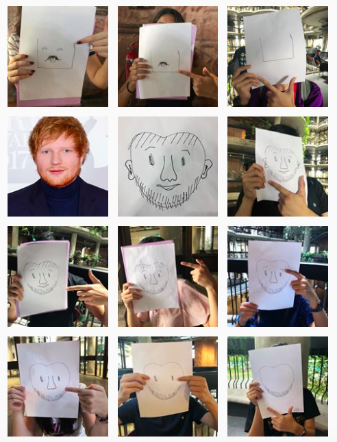
Introducing our on-location performance project, “Play Draw Point,” which will devise a narrative that plays off interactions with strangers and the media. The players will be the artist of the game by collaboratively drawing a portrait and then associate the drawing to a “look-a-like”. The incentive that these players get is that they will become part of the performance as co-artists, creating a collaborative art piece, hence creating a sense of shared experience and community.

HOW ITS PLAYED?

  1. From a list of facial features we curated, the player would have to pick out one feature to draw from the box.
  2. Up to the player’s interpretation, he/she would have to draw out the feature which was chosen – starting from the face shape.
  3. The drawing would then be passed to the next player (another stranger) until the drawing is completed.
  4. After each drawer’s turn, they would have to take a picture with the drawing and point towards a specified direction such that the pictures would link up on our secondary platform, Instagram. If we are rejected in participation, we will upload a blank black space representing the glitch in our project- breaking the narrative.
  5. At the end of each portrait, another player would  be required to guess the identity of the drawing based on their own interpretation, regardless if it a celebrity, cartoon character or even someone they know.

The drawing/list of features written down does not lead to a specific identity, as such the interpretation of the drawing is fully dependant on the player to create an interesting association with one. This shows how the brain is malleable, in a way it associates objects/people with certain links. Another interesting point is that the players become part of the art work and the artists to curate the drawing. Each of them have different drawing skills and interpretation which allows the drawing to be ‘glitched’ and morphed into an individuals interpretation – whether it becomes a cartoon drawing or a portrait, or even an unguessable form!

Test Run (ADM)
In order to ensure there are no failures or actual bumps of the project on the actual day, we decided to have a short trial in ADM – without telling them anything, which leaves them to their own interpretation as well.

PROJECT PLAY DRAW POINT:

On the day of the actual experimental project, we went off around NTU, looking for players to become co-artists. At the end, we obtained 6 complete drawings, involving approximately 60 players in total!

In order to document and to show the small add ons of each drawing, the players along with their drawing are uploaded to our Instagram. Moreover, to give the players an idea of the game, our Instagram page was also given to them in order for them to understand the whole game and narrative of the project.

https://www.instagram.com/letsplaystrangerthings/

TO Conclude, the way we curated our project was giving the control to the players, being co-artists and creators of the game itself. It is up to them to glitch it up and down. One thing that I caught my attention was that the phenomenon of a linkage of glitch. For example, when someone rejected us, there will be a higher rate of upcoming rejection (glitch). In a way our project has been influenced by a lot of telematic art that uses collaborative art and leaving the outcome to the players – such as Yoko Ono’s cut piece, Douglas Davis’s World’s Longest Collaborative Sentence, Ken Goldberg’s Telegarden or even the exquisite glitch micro project. Our final project has explored the idea of the social practice in including the audiences into the piece, making it an interactive experience that included both ourselves and the audiences, as co-artists! Creating a community of artists that anyone can be a part of!

On Location Performance: Strangers Art – Play, Draw & Point

fiInspired by the works of Blast Theory, a UK-based performance group that creates interactive performances that engage the public community in site-specific locations, we were assigned to re-create similar collaborative performances using Singapore as our stage. We will be using the social media, Instagram as a secondary platform. The performance that we create aims to stretch art into life, breaking the boundaries between the artist and the audiences. Introducing our on-location performance project, “Let’s Play Stranger’s Art,” which will devise a narrative that plays off interactions with strangers and the media. The players will be the artist of the game by collaboratively drawing a portrait. #DIWO

Our game plan will be to first approach a random stranger around the chosen location to help us draw a facial feature starting from the face shape. This will connect to the next stranger to draw another type of feature chosen and so on, building a chain of artists drawing a face. The facial features will be chosen in random by the player from a mystery box filled with different types of  facial features. Once the face is completed, another stranger will be asked to guess who the drawing portraying. The stranger can guess any identity without restrictions (any cartoon, celebrities or influencers). We will be filming the process, as well as documenting it on the performance’s Instagram to see the evolution of the portrait. Of course, there will be rejections from the crowd along the way; this adds to the unexpected mess and glitch towards our performance. We will represent this glitch by posting a black blank post on Instagram. Towards the end of the performance, we will have a collage of the process, the final portrait drawing, the ‘look-alike’, and black glitches along the way.

The incentive that these players get is that they will become part of the performance as co-artists, creating a collaborative art piece, hence creating a sense of shared experience and community. Our performance will create a connection between the players found in the location, building a bridge between them, us and the performance. The performance will be carried out around Nanyang Technological University (NTU), a space that is vibrant and spontaneous. The safety and privacy of these participants will be taken seriously since we understand that some of them would not be comfortable taking part in this performance. Overall, we simply want to create a performance that is fun yet thought-provoking. More importantly, we want to apply what we have learnt in Experimental Interaction into it!

FINAL: EGO IN DIFFERENT SETTINGS

“Design is a journey of discovery. In design, color plays a significant role. It does not only play with the aesthetics but it also reinforces the design in harmony.”

Being the only project where we are allowed to play with color, this places great emphasis in manipulating the harmonies of color to produce our desired outcome. I wanted to choose a color palette that reflects both my style of illustration and I. Thus, I chose a pastel color scheme, playing with both complementary and analogous colors. I chose to illustrate through vectors and flat illustration which plays with shapes and the choices of colors.

B R A I N S T O R M of me + setting = ???

  1. me (a deer) + a food market/festival = food coma w food on my antlers lying down w a big belly ?
  2. me (a peach) + stacks of assignments/ squashed under = escape – dream (pressing esc button or parachute with papers flying around?)
  3. sleeping/tired me (a pig) + coffee = hyper pig bouncing off the walls
  4. me (a donut) + trapped in a room filled w negative F = donut worry be happy (fills up w jam) turns the F to an A
    me (a donut) + failure ( fail to hit target) = do whatever it takes to achieve target
  5. me (a curious fennec fox) + map/GPS = exploring a bizarre world/ new world

Before I ventured on to the final illustrations, I created a moodboard/inspiration board to refer back on how I would want the whole format and illustrations to be like. Taking reference and inspiration from pinterest, to fully visualise the desired outcome.


Top Row: A pictorialization of a bizarre world/ new world
Second Row: me (a deer) + a food market/festival
Third Row
me (a peach) + stacks of assignments/ squashed under
Fourth Row: me 
(a sleeping pig) + coffee = hyper pig bouncing off the walls/ dancing
Fifth Row: me (a donut) + failure

CHOSEN COLOR PALLETTE


I chose a cool pastel color scheme to play with as it is my favorite color scheme. It reflects off a soft, dainty, sweet and delicate feeling which mirrors the vibe I give off (according to my friends). It is also aesthetically pleasing and fulfils the outcome I want to display.

________________________________________________________________________________________

FINAL
. I decided to go off with these four ideas for my final illustrations.

  1. me (a curious fennec fox) + a map/GPS = exploration of a bizarre world/ new world
  2. me (a peach) + stacks of assignments = escape (pressing esc button with shades on)
  3. me (a donut) + failure to hit target = will do whatever it takes to achieve target (places the arrow on the bullseye)
  4. me (a deer) + a food market/festival (food stalls) = food coma // food on my antlers (gets everything) 

In each boxes, each rows, I try to vary the composition of each frame such that there is a sense of dynamism yet consistency in framing in each story. As well as, an unified color scheme as a whole instead of focusing on individual rows.

ROW 1

I started the equation with me as a fennec fox as I’ve always found them adorable and since they were pretty apt for the chosen setting, with their curious nature, I decided to go for it. In addition, I’ve heard that if I was an animal, I would resemble a fox. In the first frame, I’m portrayed as a cheerful fennec fox, with smiling eyes. Following, when given a map or GPS (a chance to venture off), I would head into a new world. This row reflects one of my personality, in which of my curious nature, I love wandering and exploring new places.

For the choice of color palette, I did not go for any color schemes but to harmonise as a whole. Starting with the fennec fox with a touch of neutral tones of nude beige and white + hints of complementary colors of “red and green”, in this case, turquoise and pink. In the second frame, I went with the color blue to represent the sky and sea, a sense of vastness and boundless, conveying the feel of endless exploration. It also carries on colors from the first frame, in order to harmonise as a whole. In the last frame, I made it more colorful with different pops of colors yet unifying, to achieve a sense of excitement and wonders in a ‘new world’, inspired by an album cover referenced in my moodboard. An attempt of subtle complementary and triadic colors.
Simple and centrally composed to bring focus on the main illustration in the first two frames – me and the setting. It ends with a more crowded composition encircling the depiction of me, in a sort of welcoming manner to achieve the sensation of wonder and positivity.

ROW 2 

Depicting a peach to represent me, when meets an overload of work equals to “vacation needed please – press to escape.”

For this row, I went with a complementary color scheme of yellow and purple as the background. As usual, I kept the first frame clean and central, following with an overwhelming squeezed composition depicting various sizes of stacks of assignments, to give off the sense of suffocation and overload in a box. Ending with a fresh cut illustration in the last frame which keeps it simple and direct. In this row, I carried over hints of the colors used from the previous row to give more of a unified look.

ROW 3

A donut. I went for more of a blue + neutral tones in this row, again, trying to incorporate colors from before. In the first frame, I chose a color that could make the donut ‘pop out’ against the background, as well as, pleasing to the eye. The second frame, I decided to tone it down by using a neutral color scheme and analogous colors with a touch of warm red. The last frame, I went for the complementary colors of red and green, with the donut in a neutral tone to balance the color composition of choice.
Compositionally, I positioned the illustrations in central and consistent for my first frames in each row. Whereas the dynamism of composition comes from the last frame. In the second frame, initially, I made the arrows more of an orderly touch with identical sizes (as shown below). However, I re-arranged it to a composition of big to small, in order to create a sense of depth and also incorporating a leading line. This row was more focused on a simple, clean-cut composition, thus directing the viewers focus to the main illustration and story line.


ROW 4

A deer. Deers are usually known to have an elegant and petite vibe where they are imaged to eat when accessible or less. I played with this image and contrasted it with a deer who is both playful and loves to eat, reflecting myself in the deer. The first frame is the portrayal of a typical quiet and still deer, but when situated in a food festival, out comes the playful, greedy-eyed me as I start getting all the food! The first frame of the deer remains a pinkish-neutral tone as its docile and elegant nature before meeting the joy of life (food festivals)^^ Food festivals are known to be lively and festive, hence this piece also incorporates a colourful bright touch of complementary colors (orange-blue, yellow-purple, red-green), as shown in the second frame. The last frame portrays a playful yet innocent-like deer with food stacked on it’s antlers while eating a donut. This plays an irony on the fact that deers are usually not seen as big nor greedy eaters, which reflects me…. Compositionally, I wanted to keep things consistent and simple by positioning the stalls as a row rather than a clutter of stalls. The last frame, I played with the depth and framing of the deer. I placed it as a near-shot where only the head could be seen with its antlers, making it more ‘interactive’ with the audience. With the colors cautiously chosen during the process, this row characterises a sort of ease, cheerfulness and docility.

FINAL 

To conclude, through this project I got to explore the world of colors (which I love using). I enjoyed composing my illustrations and picking out different color schemes to fit in as a whole. This mirrors the strategic planning and exploring of color schemes that would compose the 12 frames as a whole, like Instagram. I reflected myself and mood through the colors and illustration depicted in the 12 frames. This project makes you self-reflect in the knowledge of whether you are assertive or turbulent in knowing who you are, what you think you are and finding how others perceive you. Thus, using these perceptions into colored illustrations. I do not have any BIG takeaways but it did let me get back into digital drawing/illustrating through photoshop. AND most importantly, the joy in creating and completing this project.

Thank you so much Shirley for everything! I really enjoyed this class, in the bonus of your guidance and teaching that made me LOVE it even more ♥‿♥

“Be a pop of color in a world of black and white.”