Manifesto

With the aftereffects of the Great Depression and war in the 1950-60s, American consumerism burst into the persona of art. Designers produce objects with psychological needs of the users where it is responsive and organic; as it was believed that happiness could be achieved through the purchase of goods and services. Artists made popular culture their subject matter by appropriating images and objects such as common household items, advertisements from consumer products, celebrity icons and mass-media imagery. Pop Art reflected the simplicity of graphics and the directness of consumer packaging and advertising. This indicated the rise of drive in art for consumerism. Artists had no choice to embrace the market and social culture in order to survive.

Till today, you may think that design may still be in the palms of consumerism. In the contrary, I think that consumerism is in the palms of design. Design plays a key role in society and is seen everywhere. It is an immaculate visual communication. It should be expressed freely and displayed for the better. Thus, design should hold the concept of beauty for the eye, for the mind, for the heart and soul. An embodiment and resonation with emotion, without a form. 

Hyperessay: Tracking Transience 2.0 by Hasan Elahi

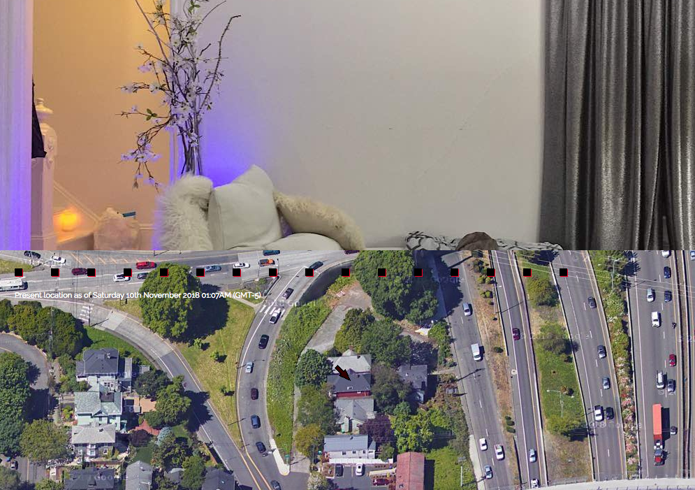
Art and technology has advanced to an age where it is a new intertwined notion. The use of technology has been embedded into our lives that it has become apart of our identity. Hasan Elahi views art and technology as a creative problem solving between the digital world and society. Tracking Transience, was more than an art project, it was a conceptual work that started from a mistaken identity of terrorist activities into a question of identity.

https://www.ted.com/talks/hasan_elahi

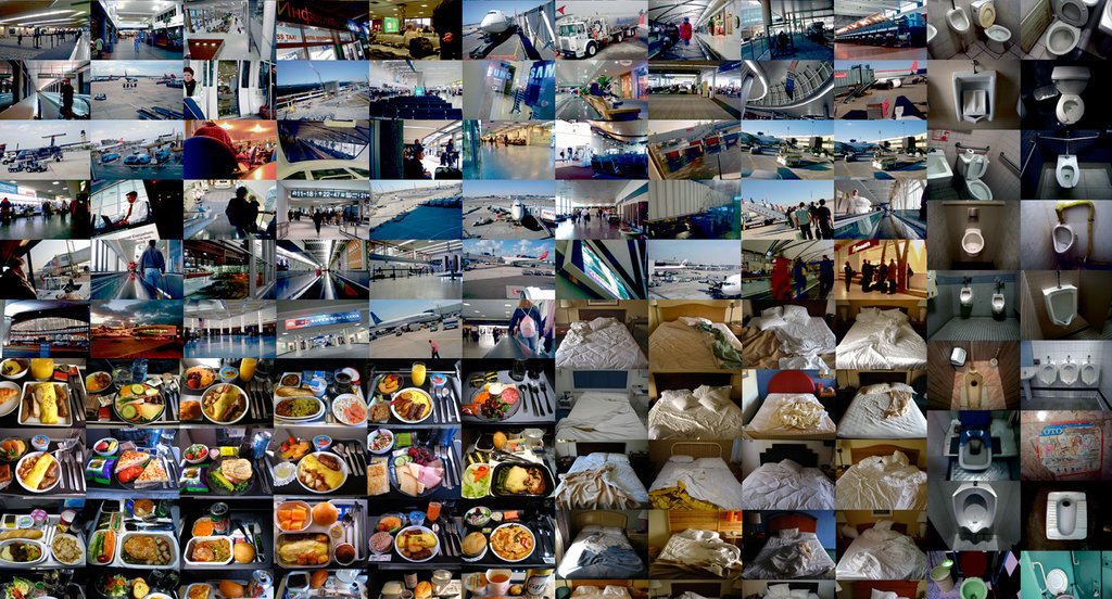
Hasan Elahi is a Bangladeshi-born American artist who plays with the concept of identity and privacy in the technological filled 21st century. He shows us how to use technology, which often overexposes our digital identity, in a way that ensures him more privacy. In 2002, Hasan Elahi was returning from one of his frequent trips abroad when he was detained in the airport. The FBI opened an investigation on him, which they pursued for the next six months. Instead of panicking or resisting, he decided to collaborate by starting Tracking Transience, which he calls “a project in self-surveillance.” He documents the locations and minute details of his day-to-day activities, such as the airports he’s been to, documentation of meals, hotel beds, toilets he has used, parking lots he has been to and so on. Elahi makes these compiled databases available to the public and the FBI through his website. Thus, giving the public visual and textual information about his whereabouts and doings. Moreover, there is an independent third party, his bank, which verifies his location and time where these point cross-reference through his purchases. These documentation creates a collage of himself exploring and interacting with the world. Elahi commented in an interview that a work that takes place online and the internet forms a conducive one-to-one interaction between the audience and the information given online.

http://elahi.umd.edu/track/
http://elahi.umd.edu/

Every photo taken in Tracking Transience 2.0 holds a sense of candidness, not staged nor organised into a peculiar manner. However, it is not ‘live’ enough as the artist could take the pictures anytime of any day and upload into the cloud whenever he feels like. This then invites the audience to question Elahi and if he is telling us the whole story or just what he wants us to see. In an interview, he stated that what he post may not be what it seems.

“As artists, we try to create experiences. The end result of Tracking Transience is the experience of going through the information and realising the reversal that’s taken place. By telling you everything, I’m really telling you nothing. I actually live a private and anonymous life and that you know very little about me. Telling you one part of my story.”

– Hasan Elahi

Through this project, Elahi brings a point where we have become a global society of surveillance. He has tapped into this phenomenon by giving up his data willingly and profusely on a daily basis by merging art, technology and his daily life. Giving excess information to everyone and sharing everything which devalues private information. In the contrary, he is also able to access the logs of who is viewing him on his website. So who is watching who? As Elahi commented in his TEDtalk, has watching unconsciously become apart of entertainment in our lives that may lead to a creation of a digital identity that might not be what it reflects? Elahi also questions that is the project still considered art if everyone such as the billion people out there did it. Living in the age of technology and social medias, creating your own individual archives has become the norm. Yet, to give someone information directly gives an individual a different persona in the third space. The use of social medias and online platforms, hypermedias, are also an extension tracker of our daily lives. It holds personal information that is beyond to what we want to display online. Each click, each link, each like tracks our online activity that it is ultimately stored in a cloud database. On the other hand, what we can control is how we shape our online personas and the reality to co-inhabit with new age technologies, using them to our advantage. This reflects the idea of cybernetic vision where not only it shapes modern science and technology but also bridge fields of knowledge in improving artificial control and communication. It can assist in the evolution of art through the use of computer and archive that holds the database in the cloud. This shares a growth concept from the dynabook.

An article by Wittkower, “A Reply to Facebook Critics,” brought up a point that one thing could mean thousands of different things or it could mean nothing to someone. Each of us see value in a variety of aspects. The norm in society just sets a standard where society could follow and share similarities with others in order to connect and feel ‘belongness’. Following on the psychology principle of socio-cultural, all human beings are social animals and has a need to belong. It may not necessarily apply to you as you could think otherwise. Living in a harsh and judgemental society whom may not be brave enough to voice out, this could lead to a creation of identity that may not be even true. Just as Elahi pointed out in Tracking Transience, everything that is out there is not what it may seem. Just like Facebook or Instagram, we post what we want to post to let others see and hide the things we do not want to show. We shape our profile in a certain way to be accepted in society. Or is it that the Facebook generation has shaped the way we are, what we want to share or hide, what we want our lives to look like in a profile page. Have we lost our true selves while creating a digital identity in a reflection of who we want to be but not necessarily who we are.

Overall, the evolution of new media history has derived vastly. It has become apart of our lives that gives us the access to manipulate different platforms in peer-to-peer communication. It has shaped the new age into an advancement where we have a choice to take it as an advantage to our society and arts.  With art and technology in hand, hypermedia improves mass engagement and creates opportunities for expression and interaction which allows the members of society, such as artists, activists and other political and cultural groups to disagree and challenge the dominant narratives set by norm. Till today, Tracking Transience 2.0 has been running and tracking the artist, Hasan Elahi without fully exposing his identity. Everything may not be what it seems, it is up to us to decide what to believe in and what to judge upon.

References:
http://elahi.umd.edu/
http://elahi.umd.edu/track/
Interview between Hasan Elahi and Randall Packer
I share everything. Or do I?
https://www.ted.com/talks/hasan_elahi (TEDTalk: Hasan Elahi vs. the FBI: The Art of Self-Surveillance)

An Interview with Artist Hasan Elahi


Artist Choice: Hasan Elahi Tracking Transience

WHY I CHOSE HIM AND THE ARTWORK:
Tracking Transience 2.0

https://www.ted.com/talks/hasan_elahi/transcript

Hasan Elahi is a Bangladeshi-born American artist who plays with the concept of identity and privacy in the technological filled 21st century. He uses this concept and manipulates art and technology in a distinctive way that has gotten me in awe. Hasan Elahi shows us how to use technology, which often overexposes our digital identity, in a way that ensures him more privacy.

He commented that “As artists, we try to create experiences. The end result of Tracking Transience is the experience of going through the information and realising the reversal that’s taken place. By telling you everything, I’m really telling you nothing.”

In 2002, Elahi was mistakenly associated with terrorist activities. He was returning from one of his frequent trips abroad when he was detained in the airport. The FBI opened an investigation on him, which they pursued for the next six months. Instead of panicking or resisting, he decided to collaborate by starting Tracking Transience, what he calls “a project in self-surveillance.” He documents the locations and minute details of his day-to-day activities, then makes them available to the public and the FBI on his website and in his final art piece. Not only does Elahi gives visual and textual information but there is an independent third party, his bank, which verifies his location and time where these point cross-reference through his purchases. Thus, Tracking Transience was a response to a case of mistaken identity. An innovative art that can be created from someone else’s mistake, but then again in this modern day, what is the underlining of what art is or what has the meaning of art turn to?

History of American Design

History of American Design
American Modern (1925-1940): Design for a New Age

The 1925 Paris Exposition Internationale des Arts Décoratifs et Moderne was a key event that initiated the beginning of American design. This provided designers and producers the opportunity to display the skill and achievements of their nation’s fine craftsmen and manufactures. Subsequently, the Great Depression in 1929 served as a great divide between the 1920s -1930s, and between American modernist designs. The distinct moods of the two decades radically affected the arts and design production. Struggling manufacturers needed an innovation to get people consuming again in order to revive the economy. Thus the two main objectives at that moment was to innovate new products or improve the basic operating characteristics of existing ones.

The outset of American design was heavily dependent on contemporary modernist design movements in France, Germany and Scandinavia. This is due to the vast amount of immigrants that had fled from the political oppression of their home country, or the sight of new economic opportunities. From the movement of Art Deco, American designers adapted the style of clean lines, pure geometric forms and machine-made materials of the Bauhaus movement. This led to an intertwining European into the new style of American design. The Great Depression enhanced the manifesto of the Bauhaus movement into creating objects that were aesthetic and affordable for the mass. One eminent response was shown by Paul Frankl, who produced a series of furniture designs that was inspired by the form of skyscrapers, which reflected the dynamism of American modernity. For example, his “Skyscraper” bookcase (1927) embodies strong vertical lines with staggered forms. However, the notion of a skyscraper design was too eccentric to lead a broad application.

The aestheticism of machinery was an important influence on American design and industrialisation. A study of the machine aesthetic may be best analysed by dividing its development into four stylistic interpretations: moderne, machine purity, streamline and biomorphic, as given by architectural historian Richard Guy Wilson. The moderne style used the look of the machine ornamentally. It was a decorative design, and its machine aesthetic served to conceal the inner workings of the object while calling attention to itself as a machine. Its design was influenced by the perception of parts such as gears, cams, axles or of factory complexes involving many buildings and simple geometrical elements arranged in complex patterns. Following on, the indicative style of machine purity was a simplified geometric form. Machine purists attacked any sense of decoration that exceeded functionality. Consequently, the clean cut contemporary look paved way for a new design manifesto that soon became streamlining. Streamlining was originally developed by aerodynamic engineers as a means of reducing air resistance with its bullet-like and curved lines that shows speed. The streamlined style reflected the desire of the Great Depression-era for a frictionless and static society. It embodies the essence of the modern age and the shape which was most conducive to speed such as the ovoid, or tear-drop. Streamlining symbolised the efficiency, aesthetic and dynamic functionalism whilst reducing waste. It also symbolised the progress of America. Its application to mass-produced items, brought focus to the  “Big Four” of early American industrial design: Norman Bel Geddes, Henry Dreyfuss, Raymond Loewy, and  Walter Dorwin Teague. Last but not least, biomorphic designs captured the forms of nature and the human body. If the ovoid was the symbol of streamlining, the amoeba was the symbol for biomorphic design. The biomorphic design focuses more on how it was produced, not necessarily how it appeared. For example, the “Organic Chair” designed in 1940 by Charles Eames & Eero Saarinen and Russel Wright’s modern tablewares. The highly sculptural forms of these pieces, including the teardrop-shaped pitcher with elongated spout, were inspired from streamlining which represent the triumph of style as marketing strategy. In this style, the machine aestheticism was no longer the prime focus, instead it was the organic form of an amoeba.

The role of an industrial designer itself gained prominence, especially during the Great Depression, when companies relied on designers such as Henry Dreyfuss and Raymond Loewy to create enticing new product designs in an effort to stimulate consumer demand. Organic styling and streamlining increased consumerism, thus boosting the economy. This became the mindset of designers in beauty for the eye and manipulating people’s emotion for consumerism. Styling became equally important as function and the production of goods became the base of consumerism in society.

American designer, Norman Bel Geddes’s “Patriot Radio” (1940), mirrors the American flag and a medal, designed in 1933, to celebrate the 25th anniversary of General Motors, where the stylised profile of an automobile was streamlined through its curvilinear lines streaming over its front hood. In 1940, there was a clear shift in the American taste. The desired style for dynamism, speed, and elegance had preceded to a more relaxed approach that valued comfort. This was observed in the Metropolitan’s 1940 industrial design show. Designers had found a middle ground that holds both the aesthetics for machinery and the nostalgic warmth of hand craftsmanship. Designs were efficient, functional and classical. The pursuit of an authentic new image was created to unify the industry and to propel it out of economic stagnation.

Aside from the Great Depression, the war had also a large play on the influence of American design. After the war, the society struggled to rebuild whilst maintaining meaningful design. The focus shifted to the importance of affordability and producing simple shapes objects for the middle-lower class. Materials that were once used primarily for war purposes, were reformed for furniture applications and stationaries. This established into open space housings in the quest for freedom. Interior spaces would easily open to the outside, expanding the living quarters. With the end of World War II, the dynamic mixture introduced an age of consumer culture, known as Contemporary. The style aimed to reflect all the current and refreshing ideas. Architects approached home design from the inside out, adapting the plan to the direct needs of the clients. Symmetry and geometry did not dictate floor plan arrangements. Daylight became an even more critical element to a contemporary home, blurring the lines between natural and man-made environments. The 1950s was a decade of revival, infectious hope and the uproar to bring form to the relaxed lifestyle of the time. Details mattered and spaces were linked to create a flow. Ribbon windows and curtain walls were reduced in order to maximise natural light and open space, diminishing barriers.

American design epitomises the propagation of machine aesthetics through organic forms and streamlined design. Designers produced objects with psychological needs of the users where it is responsive and organic. With the aftereffects of the Great Depression and war, came the introduction of American design that holds history of foreign influences. Styling became equally important as function and the production of goods became the base of consumerism in society. This mindset and the form of design is still seen to this day, where consumerism and consumption drives the epitome of design. Designs are focused in conceptualising beauty to the eye, as well as functionalism to sell and boost the economy. This shows the great impact American design has carried through time and into the mindset of our era.


References:
Slides provided by Ash

“American Modern, 1925-1940: Design for a New Age.” American Modern, 1925-1940: Design for a New Age, Traditional Fine Arts Organization, 2011, www.tfaoi.com/aa/3aa/3aa216.htm.

Johnson, J Stewart. Metmuseum.org, The MET, 11 Apr. 2000, www.metmuseum.org/press/exhibitions/2000/american-modern-1925–1940-design-for-a-new-age.

Oeltjenbruns, Becky. “1940s & 1950s Furniture and Interior Design.” Cause A Frockus, 4 Nov. 2013, www.causeafrockus.com/2013/11/1940s-1950s-furniture-interior-design/.

OUlearn. “American Industrial Design: Design in a Nutshell (5/6).” YouTube, YouTube, 8 May 2013, www.youtube.com/watch?v=ceKmkvOLD3Q.

Winton, Alexandra Griffith. “Design, 1925–50.” Metmuseum.org, The MET, Oct. 2004, www.metmuseum.org/toah/hd/dsgn2/hd_dsgn2.htm.


Puns (as promised):
1. What do you call a bee that comes from America? a USB!
2. Can February March? No but April May
3. What do you call a pig that does karate? Pork Chop!

The Age of Information

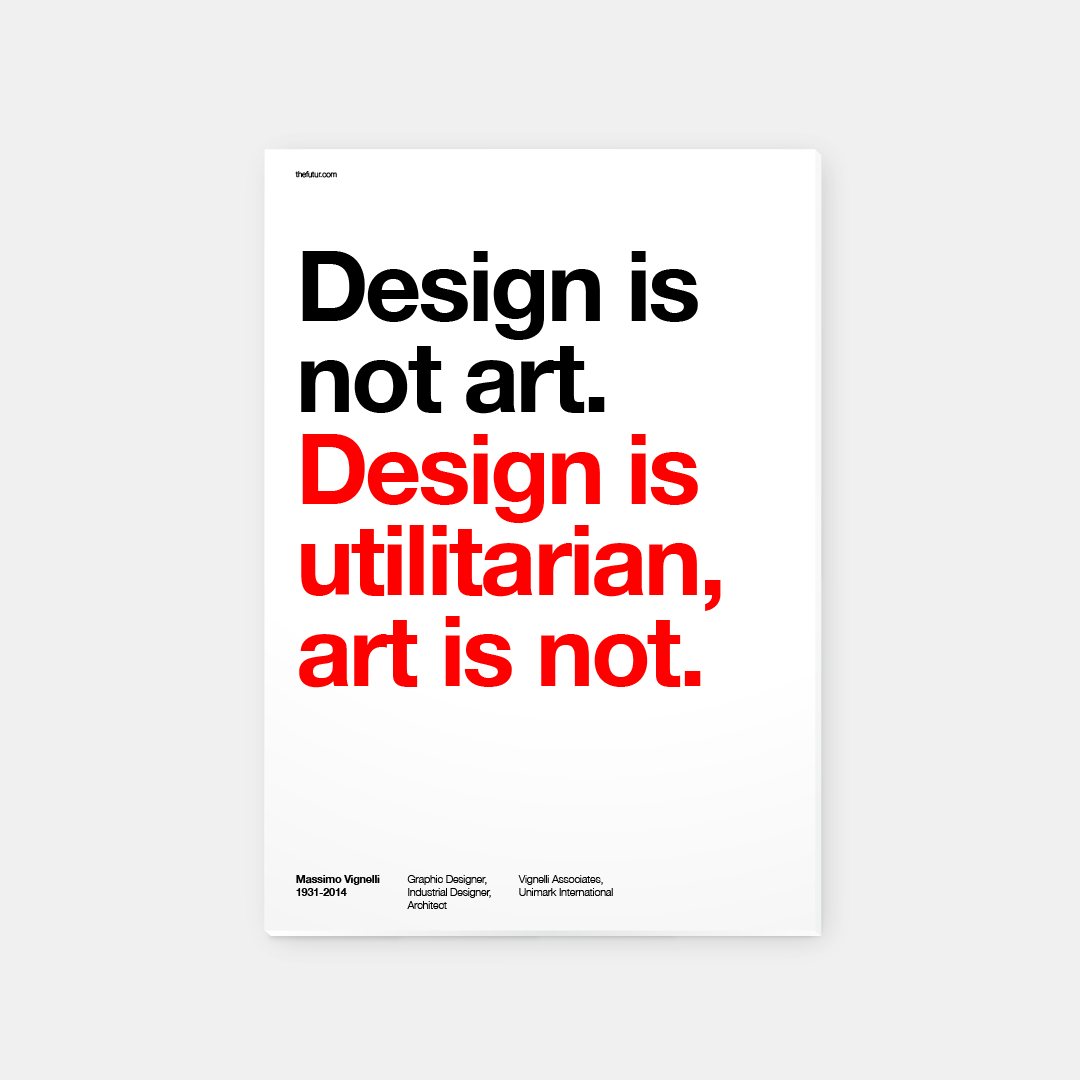
Massimo Vignelli is an Italian designer who dappled in a vast range of design: branding, packaging, housewares, furniture, showroom design and etcetera.  One of his ethos was that “If you can design one thing, you can design everything.” This ethos was reflected in his work within the Modernist tradition. Vignelli focuses on simplicity and clarity of design through the use of basic geometric forms in all his work. He sees himself as an “information designer”. His aim was never to design for the aesthetics but to solve problems for the people through design.
Thus the quote “Design is utilitarian, art is not.” This infers that design is designed to be useful or practical rather than attractive.

Massimo Vignelli is one of the most important figures in the history of design. He has designed graphic systems that has a use for people in every day life . His design and cultural commitment has produced a foundation to the world of Modernism in the Early 20th century. He has taught us to appreciate the practicality and the elegance of simplicity, to present information in a visual and structural form.


The next article, focused on the rise of corporate identity, which portrays Vignelli’s design-with-purpose methodology. The visual communication we get from a brand can be affected by many factors such as the media, society and consistency. Corporate identity is definitely a make or break in the marketing industry, especially in a consumer’s point of view. In a fast-paced revolutionised modern society, brands have to keep up with the trend in order to catch the eyes and heart of the people. These visual informations are what consumers observe and judge upon on. The stronger and constant brand identity it holds, the stronger the impact and consumerism it holds. Thus the importance of the contextual meaning and design of brand identity.


References:
http://www.eyemagazine.com/feature/article/reputations-massimo-vignelli
http://www.designishistory.com/1960/corporate-id/

Bauhaus? Bauhaus.

” Creativity, which is what Modernism is all about, is a constant searching process that promises a greater chance for failure than it does for success.”
– Bierut, Michael. Looking Closer. Allworth, 1997

Tracing back to the History of Design, artists and designers were trying to push forward the creative industry by creating a set of new principles. This led to the birth of Bauhaus.  For example, the well-known Kadinsky used his proposed color theory with shapes to create art – reducing everything to its most expressive form. This reflects the key idea of Modernism, something that was never done before.

As proposed by Kadinsky’s basic color and shapes theory:
“A dull shape like circle deserves a dull color like blue. A shape with intermediate interest like a square deserves an intermediate color like red.
A dynamic, interesting shape like a triangle deserves an energetic, luminous, psychotic color like yellow.”
Thus portraying this color concept into my artwork below.

Singapore is a small country filled with a culture of collectivist, radiating a sense of home and warmth. This led to the idea of “Family” in the style of Bauhaus. Majority of people in Singapore lives with their family with different generation, even if you had graduated college. For example, your grandparents, your parents, your ‘siblings’ and you living under one roof. Imagine the amount of familial warmth it holds. Although some might oppose to this idea, yes there is some family that does not get along due to numerous reasons and thus lives separately. However, I wanted to portray the picture perfect family that every kid draws when they were young. A happy family, a house in the background with the sun drawn in the corner of the paper. Yet, when you look close inside the grains and the rough strokes of a crayon – there will always be flaws and imperfection inside a what it seems to be a picture perfect image. Nothing can be 100% perfect but the idea is to push your limit to reach 100% – the progress and development is what matters. This reflects to the concept of Modernism where it is essentially utopian as suggested in the reading, Looking Closer by Michael Bierut. An idealistic society that possesses nearly perfect qualities for its citizens. Yet there will always be flaws in the nook and cranny of a Utopian. Despite this, it also contradicts another idea of Modernism of creating things that is out of the structure, out of the ordinary or else it would be redundant.

What The Singlish ??!1?

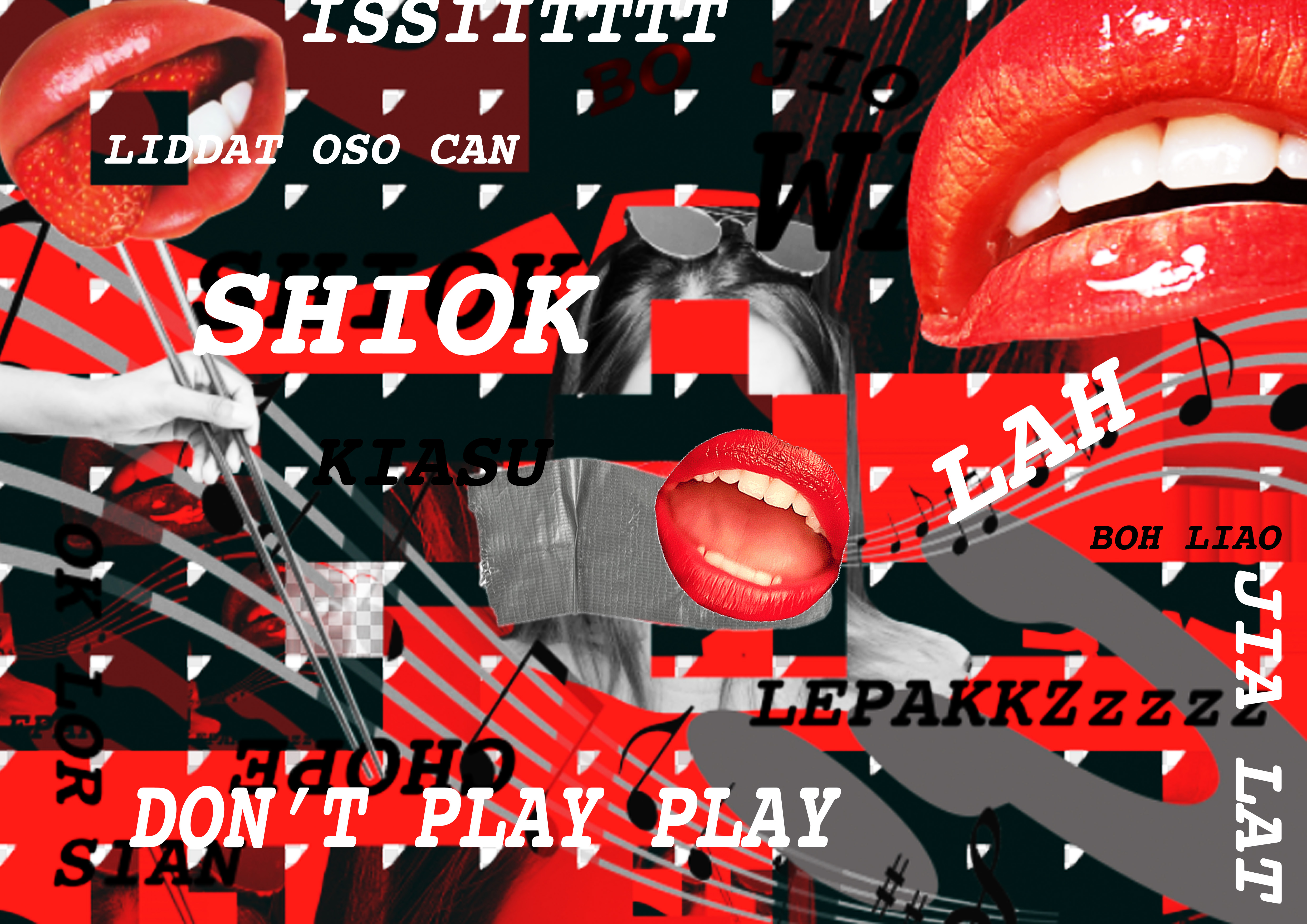
To begin with, I felt like the use of typography and collaged images in Dadaism was the perfect style to convey this piece.  I was inspired by Theo van Doesburg and Kurt Schwitters, Kleine Dada Soirée as shown in class. I love how the mess of overlapping typography can be kept in minimal by the choice of colors. It is not as overpowering for the eyes to see but to adore.

https://www.moma.org/learn/moma_learning/2562-2

Being a Third Culture Kid has definitely colored my identity into where I belong. Although I’ve lived in Singapore for quite some time, I’ve never fully immersed myself into the true local culture.  Singapore is a culture filled with diversity. In a diverse city, there are multiple languages and dialects being used around. Thus, this leads to my perspective on Singapore’s own society language called “Singlish”. It is an unavoidable language in this country. As a foreigner to this language, I had to slowly pick up terms, phrases and their definitions in my first year of university. Coming from an international school, I have never really paid attention to it and felt like they are words being thrown around in the community. It felt like an informal language that give Singaporeans a sense of bond, comfort and belonging.

This piece shows my perspective on Singlish and how it is not taught to you but more of a self-learn where you can get buried under between Singaporeans. I’ve used a typeface that comes out to me as an informal- formal to reflect how I see the language, with a big grey question mark pushed to the corner. Duct-taped over my mouth and buried under this interesting culture.

PS. I am still to learn more of these interesting phrases.


Image Sources:
https://www.moma.org/learn/moma_learning/2562-2
http://pngimg.com/imgs/people/tongue/
http://www.stickpng.com/img/people/mouths/open-mouth-teeth
Lux Lip Crème- Dark Rose
http://pluspng.com/musical-notes-png-285.html
http://www.stickpng.com/img/objects/duct-tape/piece-of-duct-tape