MASSIMO VIGNELLI
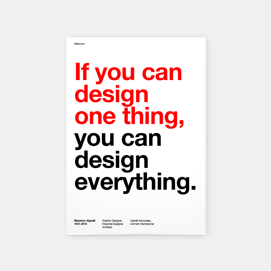
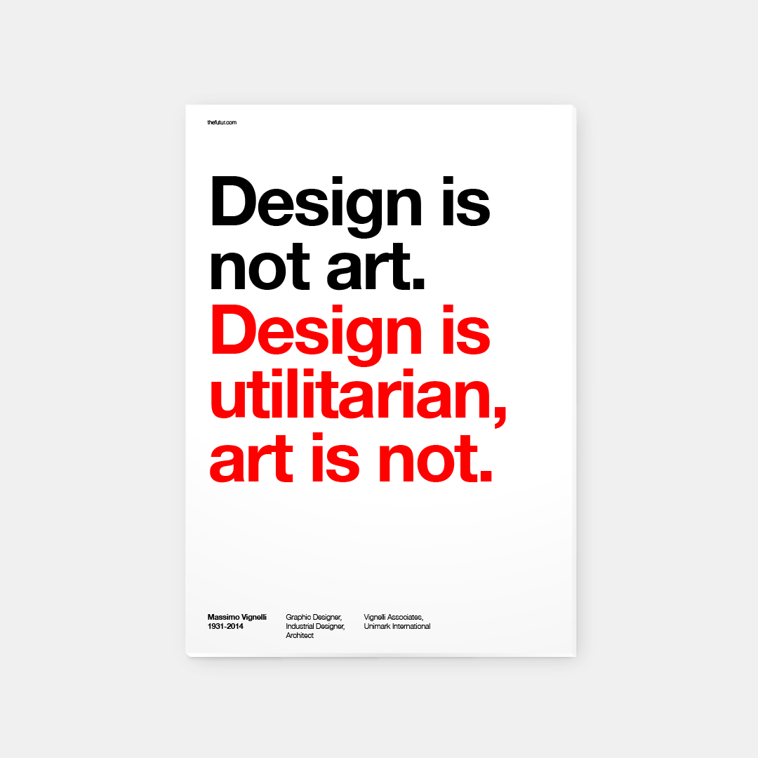
Massimo Vignelli is an Italian designer who dappled in a vast range of design: branding, packaging, housewares, furniture, showroom design and etcetera. Together with his wife, he founded Vignelli Associates. One of his ethos was that “If you can design one thing, you can design everything.” This ethos was reflected in his work within the Modernist tradition. Vignelli focuses on simplicity and clarity of design through the use of basic geometric forms in all his work. He is also a constant user of Helvetica, which can be seen in most of his work.
Vignelli’s first major presence into the field of brand identity was working under Unimark International, which thereafter became one of the largest design studios in the world. He has designed identities for international corporations such as American Airlines, Bloomingdales and Knoll.
American Airlines
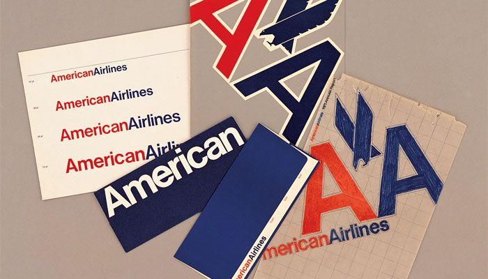
In 1967, Vignelli was commissioned to design the logo for American Airlines. He created a branding that was bold and simple – two capital As, one red and the other blue. The use of the colors was to indicate the company’s pure intent service and professionalism. It was also to symbolise the American flag. He incorporated a geometric shaped X-eagle to represent America. This was the rise of Vignelli, receiving one of the biggest commission.
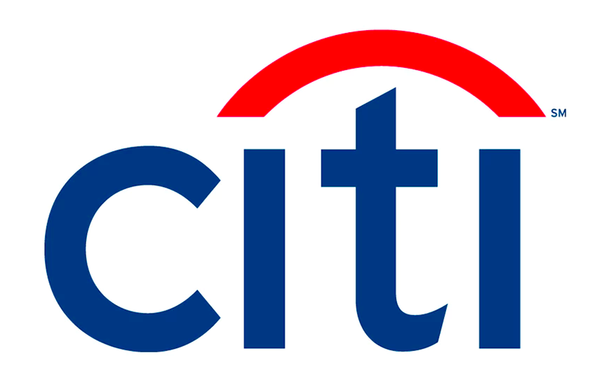
Knoll
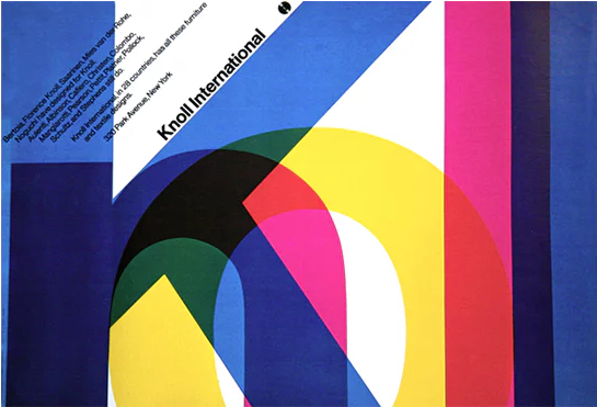
Knoll recruited Vignelli to design and reconstruct its brand identity. He used geometrics, a grid and the type Helvetica to create the following outcome, together with Heinz Waibl.
New York City Subway
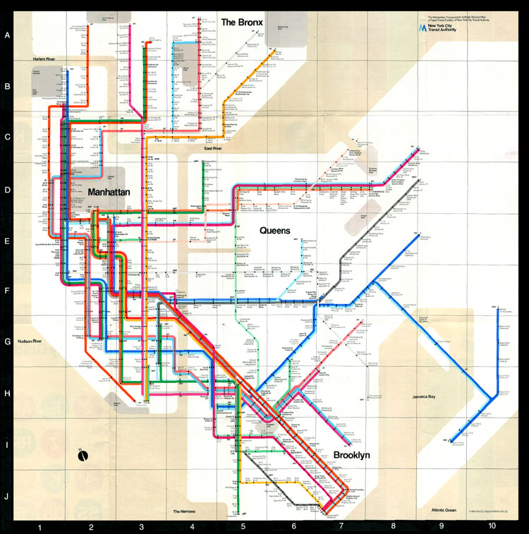
In 1972, Vignelli redesigned the New York subway map to simplify its complex signage system. His map was colorful and based on the right angles, however it distorted the actual dimensions of New York City and the path of subway lines. In 1979, the city decided to replace it with a more geographically accurate map. However, in 2011, the city brought back Vignelli’s version for the display of service changes on weekends. Vignelli’s directory use of the typeface Helvetica has never been changed due to its readability and clarity. It also provides subway users in an interactive way of getting information – information design.
Our Bodoni

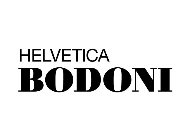
As the number of typefaces increase throughout the years, Vignelli believed that there was only the need of 6 typefaces: Bodoni, Century Expanded, Futura, Garamond, Helvetica, Times Roman. In 1989, he created Our Bodoni, which is a combination of Bodoni and his favourite typeface, Helvetica.
Vignelli suggested whether the context requested something classical, in the sense of something refined, then we would use Garamond. For something more informational we would use Helvetica. Moreover, he inferred that we as designers should set a goal to simplify things.
Massimo Vignelli is one of the most important figures in the history of design. He has designed graphic systems that has a use for people in every day life . His design and cultural commitment has produced a foundation to the world of Modernism in the Early 20th century. Vignelli has taught us to appreciate the practicality and the elegance of simplicity.
To present information in a visual and structural form.
References:
http://www.designishistory.com/1960/massimo-vignelli/
https://99designs.com.sg/blog/famous-design/remembering-massimo-vignelli-modernist-master/
http://www.eyemagazine.com/feature/article/reputations-massimo-vignelli
http://www.designculture.it/interview/massimo-vignelli.html
https://www.pinterest.com/pin/512003051357850035/?lp=true
https://www.pinterest.com/pin/71635450299405430/?lp=true
 2.
2. 3.
3.
 Reflection/Thoughts?