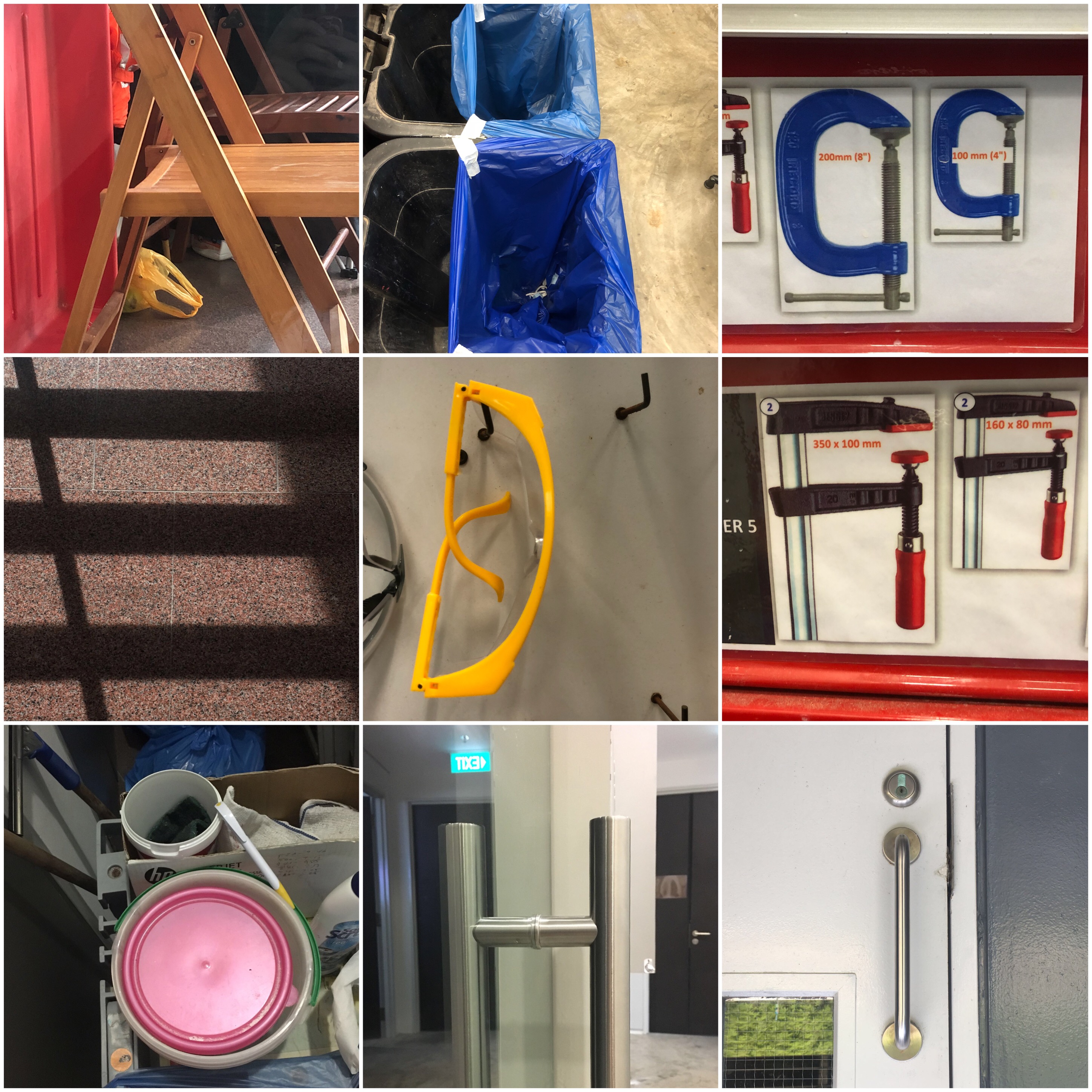
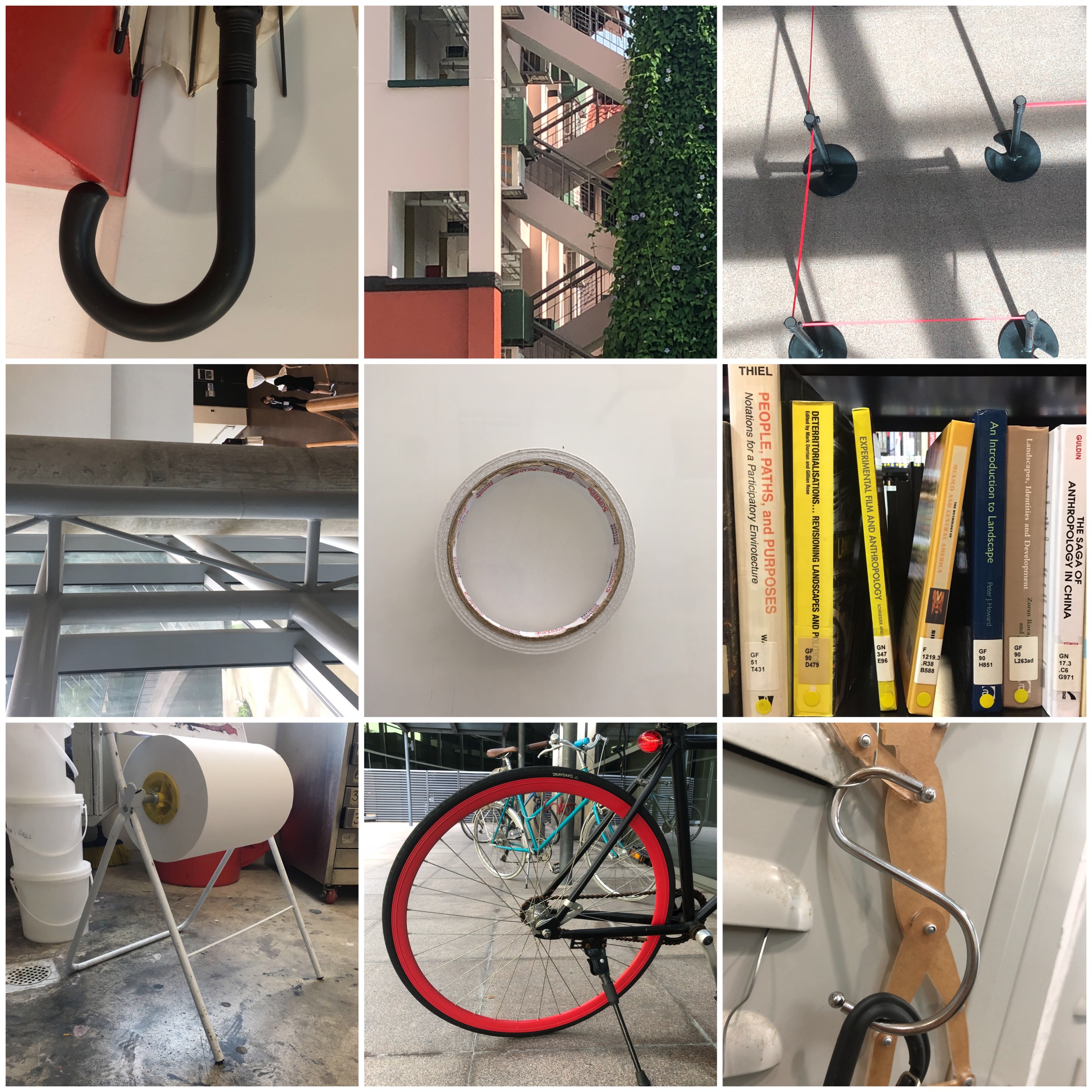
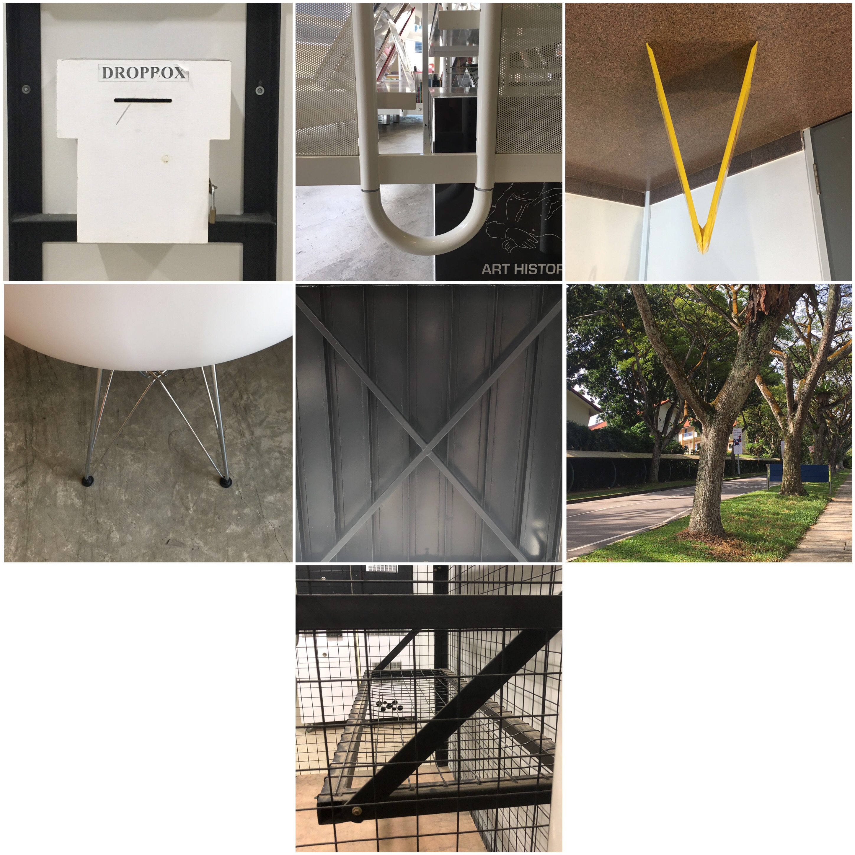
To get our brain up and running for this project, we learnt about why humans see faces in inanimate objects, which associates with a condition where one perceives a pattern in random things, called Pareidolia. It also follows one of the principles of psychology where “Human beings are social animals with a basic need to belong”, in this case, to find a face or language in order to relate with, decreasing the sense of unfamiliarity. Following on, we did a simple class exercise where we had to find alphabets in ordinary objects around the school. Here is what my partner and I spotted (can you spot it too?):
brainstorming:
Making a mind-map on my sketchbook, I came up with several occupations with mini-sketches that could fit into this project. The occupations that I came up with are the ones that I felt would best represent me, something I was passionate about or even my childhood dream job. I shortlisted it to the top four jobs and started to explore different factors by deconstructing and factoring elements that relate to the job.
- Poker Player
- Amusement Park Owner
- Kindergarten Art Teacher
- Astrologist
Research + Process
OCCUPATION #1: Poker Player

First, I decided to experiment with the deck of cards or poker coins to show the occupation, whilst, engraving my name. However, I wanted to show some consistency and the occupation itself. I decided to go by playing about with the set of the ‘Royal Flush’, which is the highest win in poker. Changing the King, Queen, Jack into letters of my name D, P and H.

After placing the letters onto each card, it seemed rather plain and I was debating between to create a pictorial design or if I should play around with the alphabet itself. Following from my consulting with my tutor, it was better to place an alphabet since it is a typography assignment, additionally making it more clear and alluring.
OCCUPATION #2: Amusement Park Owner
Ideas+ Inspiration board:
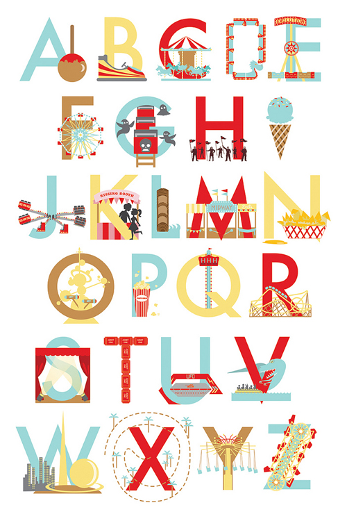
Below, I experimented and created an A with the idea of a rollercoaster which can be found in an amusement park, inspired by the picture from pinterest above.
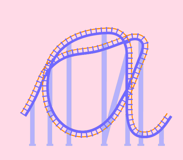
Instead of creating a consistent font of the idea of the rollercoaster as alphabets, I explored and created other fonts through different rides that can be found in the amusement park, enhancing the essence and elements of the occupation.
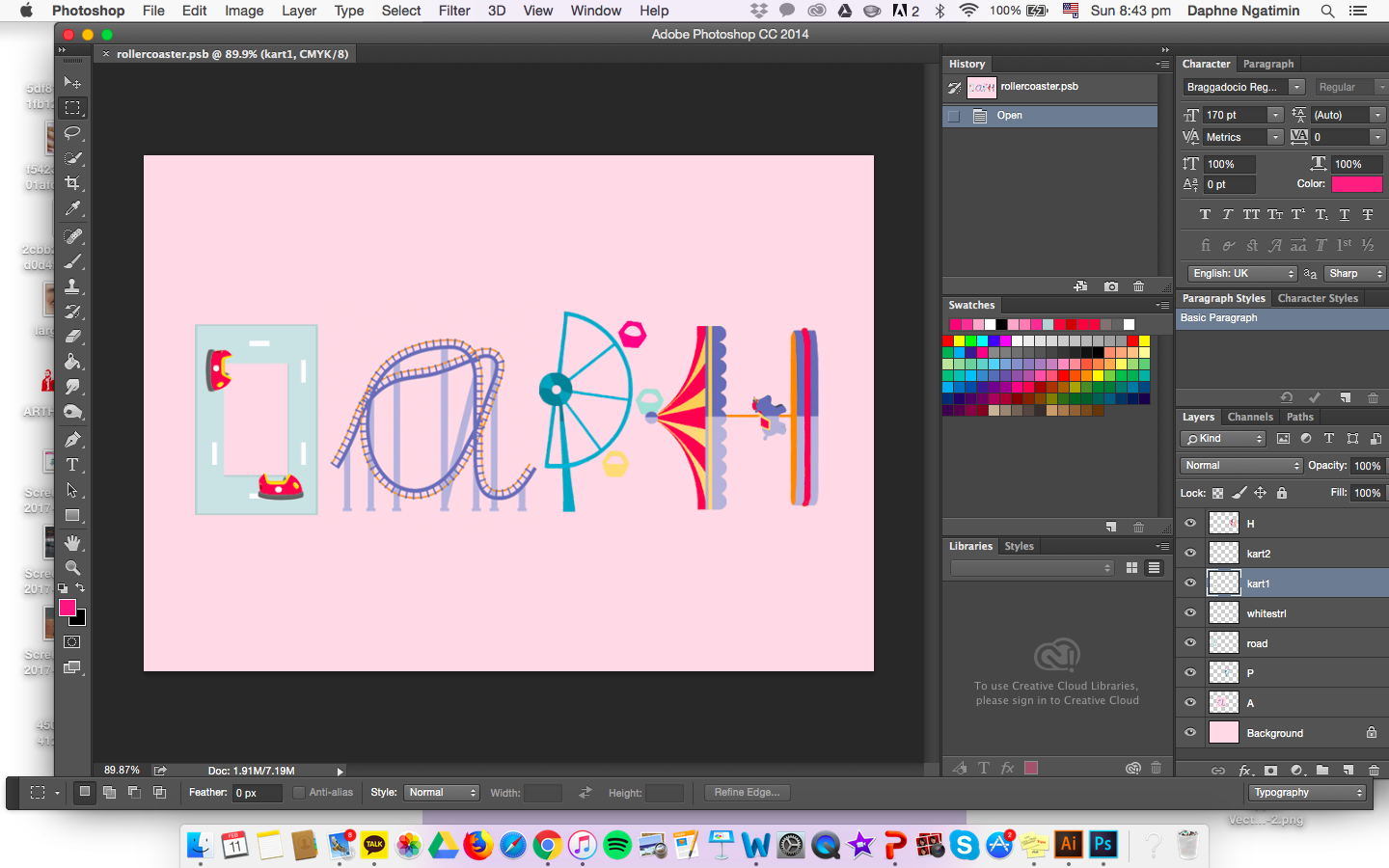
Over here, I changed the color of the D from more of a greyish tone to a blue-grey pastel tone to match with the other fonts.
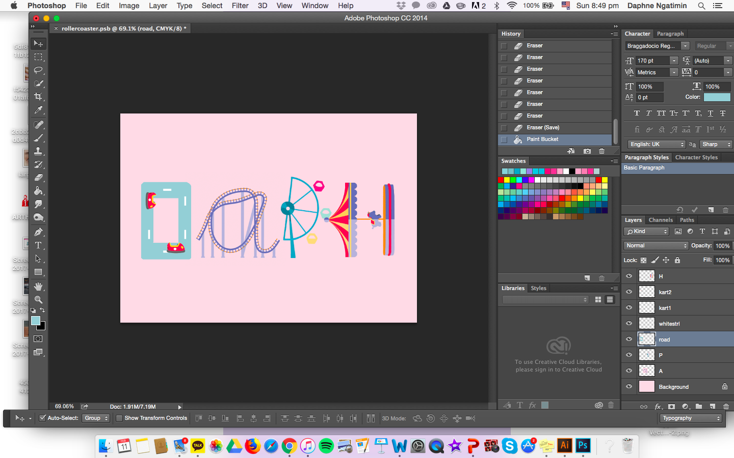
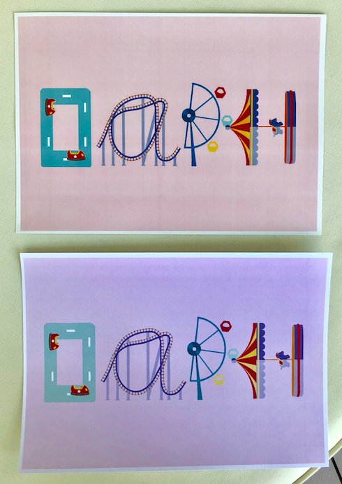
Above shown is the two print, one (above) in glossy and the other (below) in matte.
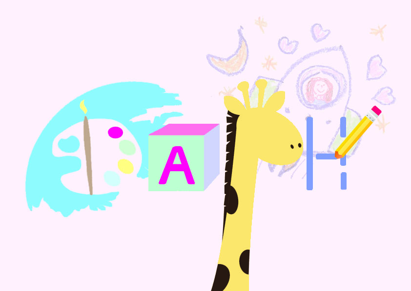
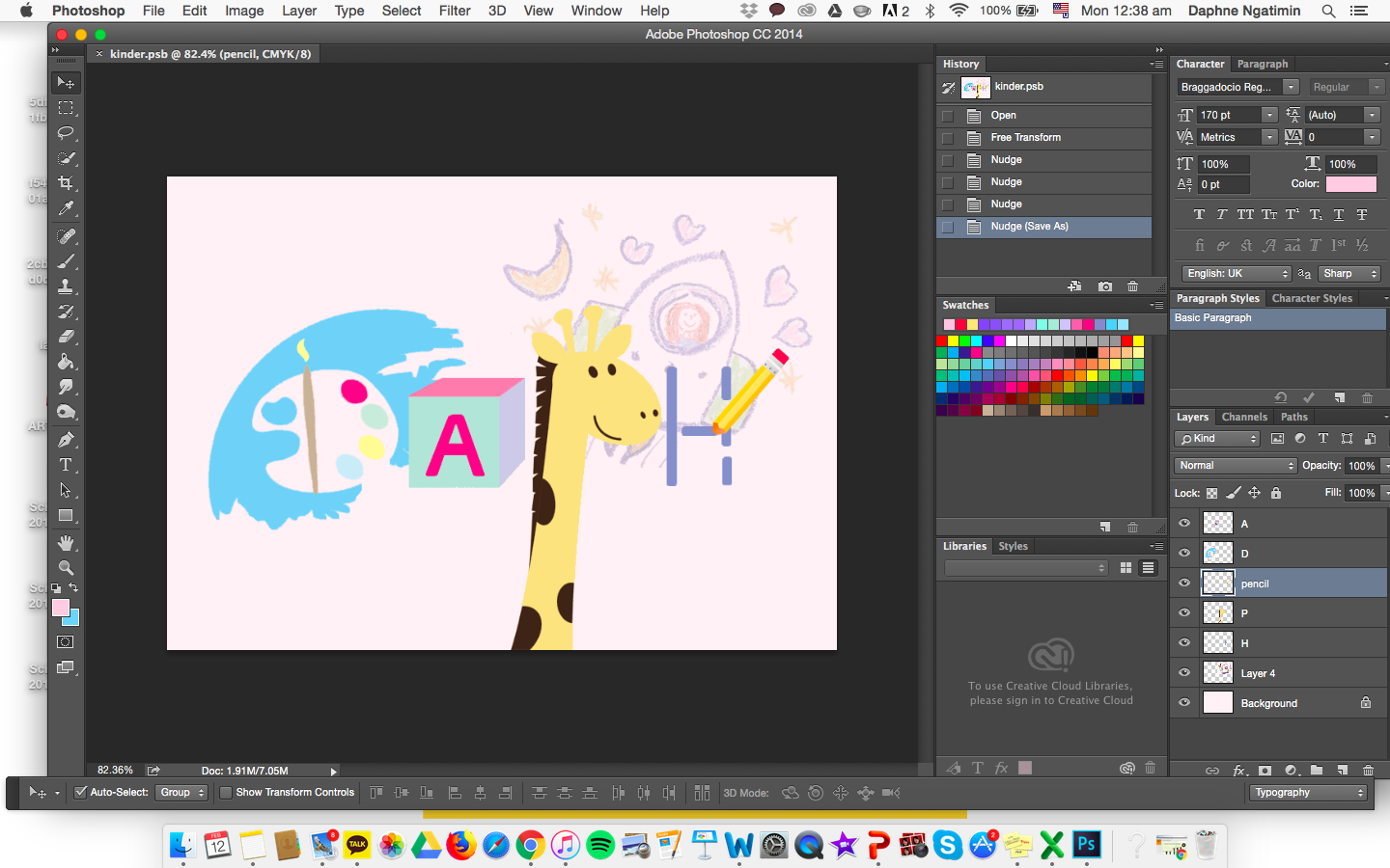
OCCUPATION #3: Kindergarten Art Teacher
Before starting this, I broke down the components and aspects of a Kindergarten art teacher. Paper drawing, painting, simple boxes, dotted lines and animals. I went with a baby pastel and light colors to match with the theme of a child-like feel. I felt that by placing a face on the giraffe made it grab the viewer’s attention rather than the name, hence, omitting the face out.
OCCUPATION #4: Astrologist
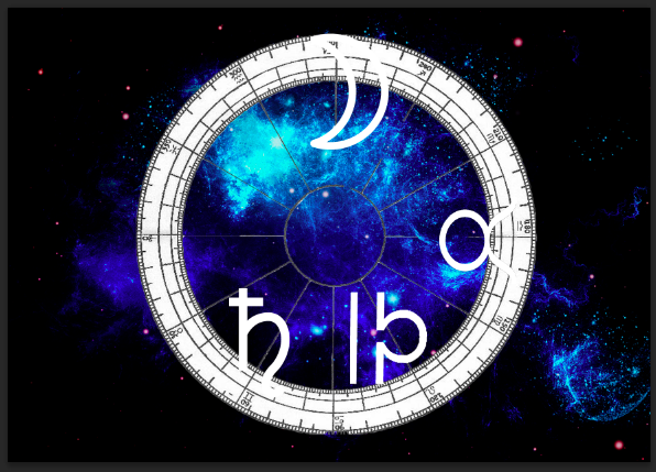
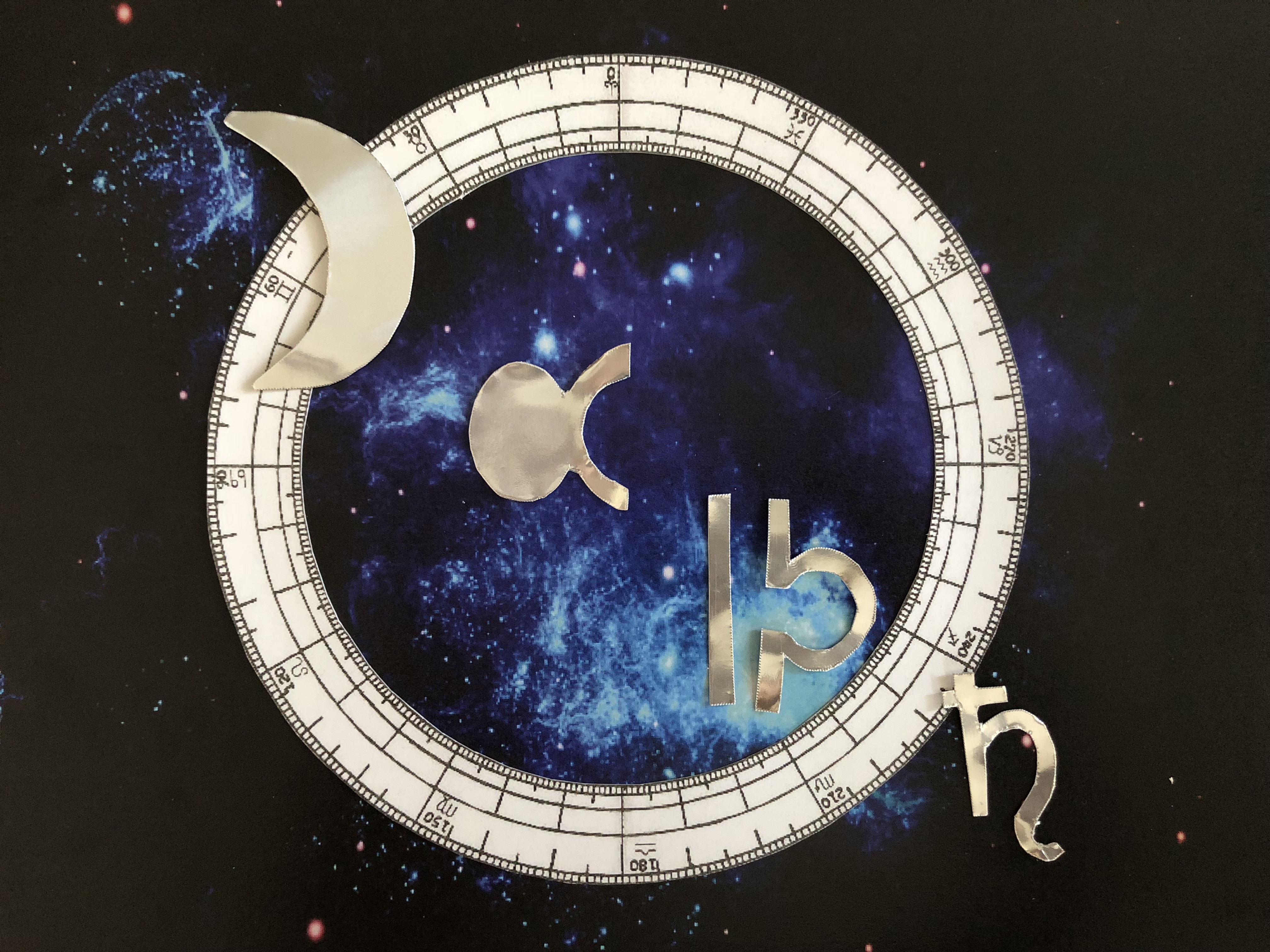
I chose this occupation as my passion and curiosity towards astrology grows. Even though it might not be an actual occupation, it is one of my spare time hobbies to read about the horoscope and constellation set in the universe. I used signs within the world of astrology to construct my name. At first I wanted to incorporate LED lights within the piece but it looked a little messy and uncoordinated. This led me to think more of a pop-up style where I will use the 360 degree astrological chart on top of the cosmos background, and top it off with a reflective silver effect lettering for my name (in order to pop out from the background). I painted a cosmic background by using blue and white on a black background and photo manipulated it in photoshop.
D- Moon Sign
A-Taurus Sign flipped sideways
P- Libra Sign flipper sideways
H – Pieces Sign / Saturn Sign
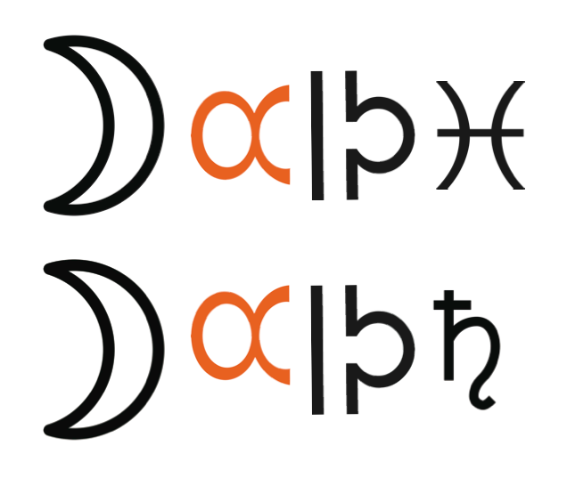

When placed in this arrangement, I realised that it was quite hard to read my name in the order of my astrology sign, capricorn. Thus, I rearranged it in a diagonal order, not as boring as a straight line but something easy to read.
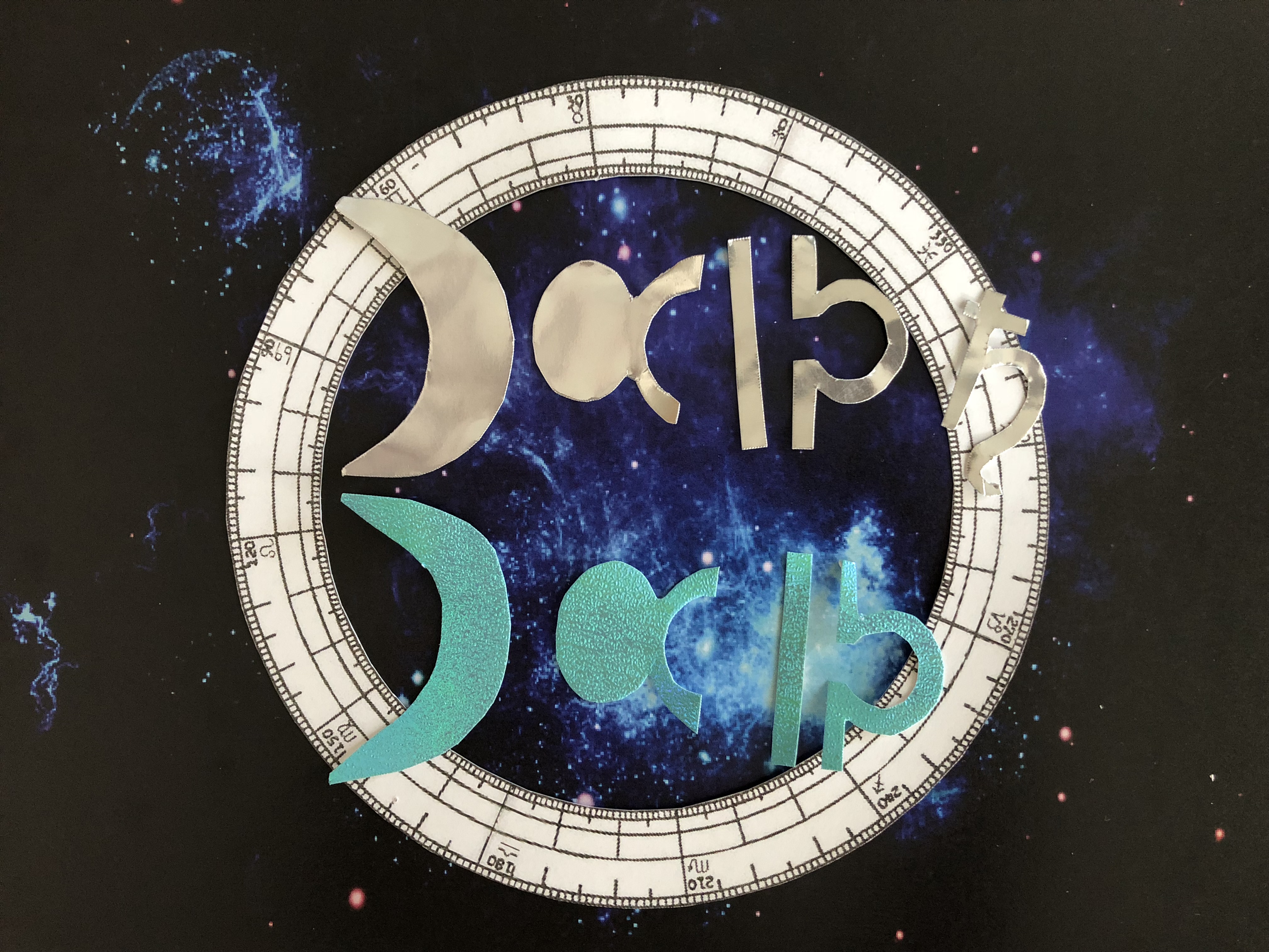
While I was in Art Friends getting my materials, a reflective aquamarine lured me and I was wondering if I could use this instead of a reflective silver. Hence, I bought it to try it out whether it would fit and tie in the colors together but somehow it seemed off, leading me to stick to my original thought of using the reflective silver material as my font base.
FINAL OUTCOME
1.
My name is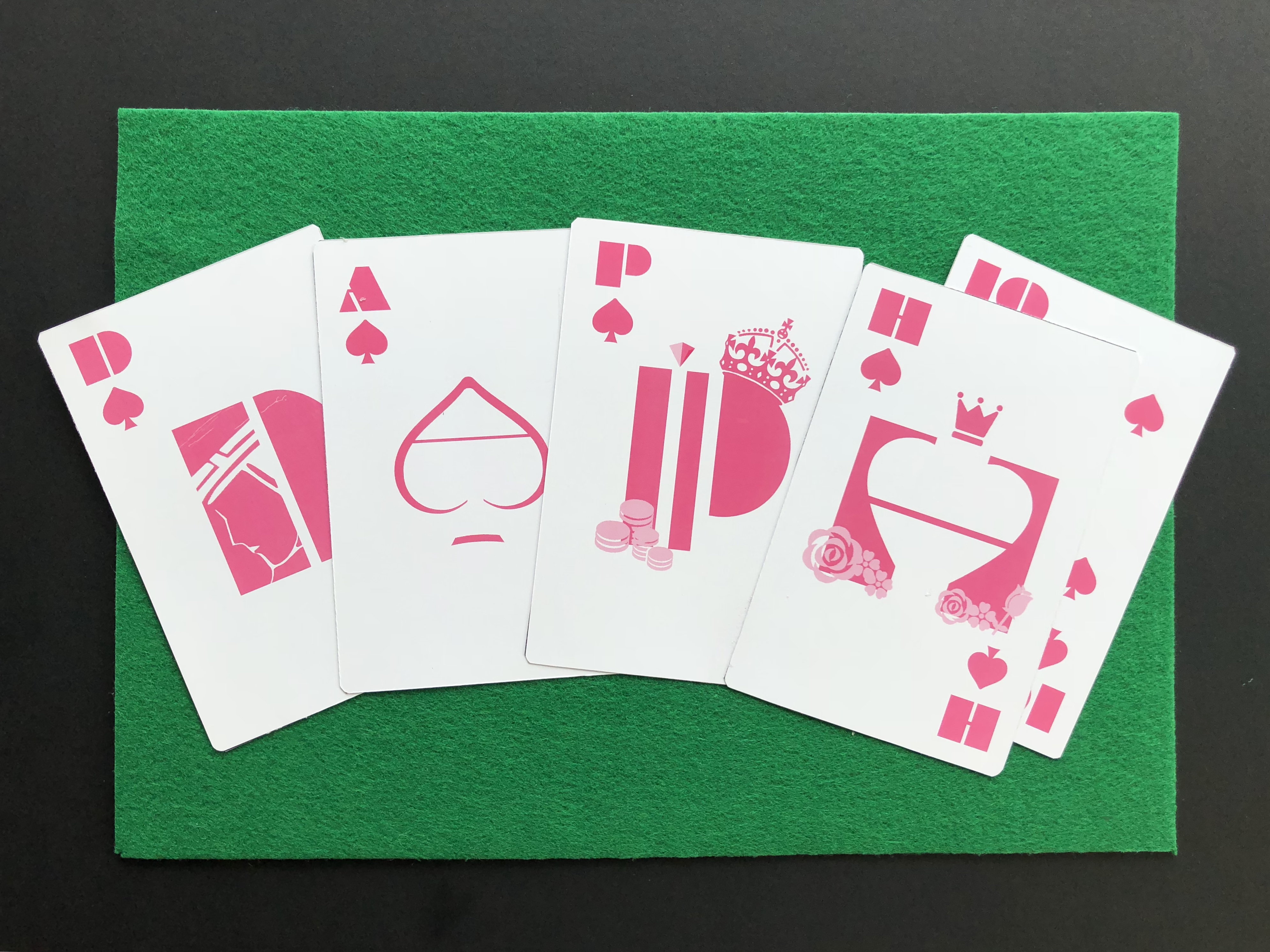 and I am a Poker Player.
2.
My name is and I am an Amusement Park Owner.
3.
My name is and I am a Kindergarten Art teacher.
4.
My name is
 and I am a Astrologist.
TO conclude, I felt that I have taken a lot from this assignment. Not only, did I get to brush up my illustrator skills, but also tease my brain to think more creatively and looking at fonts in a more pictorial yet typographic way. For this project, I used both photoshop and illustrator to help me project what I wanted and achieved. I enjoyed this project as an introduction to Graphic Form and is excited to see what is to come in the future!