Although I am not 100% satisfied with the final outcome, I had enjoyed the process and experience in the creation of my zine. I have learnt a lot from this experience and to keep in mind to further push myself out of my boundaries for future projects. Even though I managed to capture the essence of an economical and banking concept I wanted to show in reflection of Shenton Way, many times along the way I had certain ideas but had no idea how to carefully well execute it. Things that I would like to improve in my Zine is how I curate my narration as well as the cover page. I feel like I can make it more alluring in a certain way without revealing the name of the location. I could also take the texts out of the 2-3 page as it was commented to be distracting and the graphics has shown this well enough. Upon completion, I had encountered some printing obstacles which led me to understand the importance of multiple test prints and the play with different types of paper. It was frustrating when the designs were not aligned or cut off during printing where u have to digitally readjust during this stage. My zine also came off with a white line across the middle where I was not sure how to get rid off… This tested my patience which made me visit the printing shop twice. For my final, I had to cut bits of the ends to create a proper alignment between the double spread graphic design. If I have a project similar to this in the future, I would like to break my comfort zone in trying different styles of graphic form. Nonetheless, it was an insightful and memorable experience where I would love to do again!
Thank you Mimi for all the guidance and push! I will try to take more risks in my future projects to expand my range of stylistic designs. I appreciate your patience and teachings in class. I enjoyed this class very much 🙂
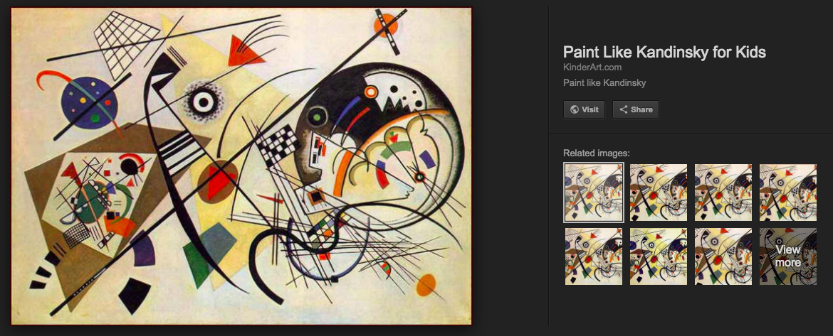
Initially, I wanted to focus on the form, shapes and patterns of the buildings to represent Shenton Way by looking at cubism. This would also convey the movement of a fast-paced, growing atmosphere. I wanted to also capture the organised and steady rhythm Shenton Way gave off with the buzz of the workers. I first researched some graphic design that gave off a messy and hectic feeling. On the other hand, I went off to pinterest to collect some inspiration in creating a moodboard. However upon research, some of the graphics gave off an upbeat party vibe instead of a paced working vibe.
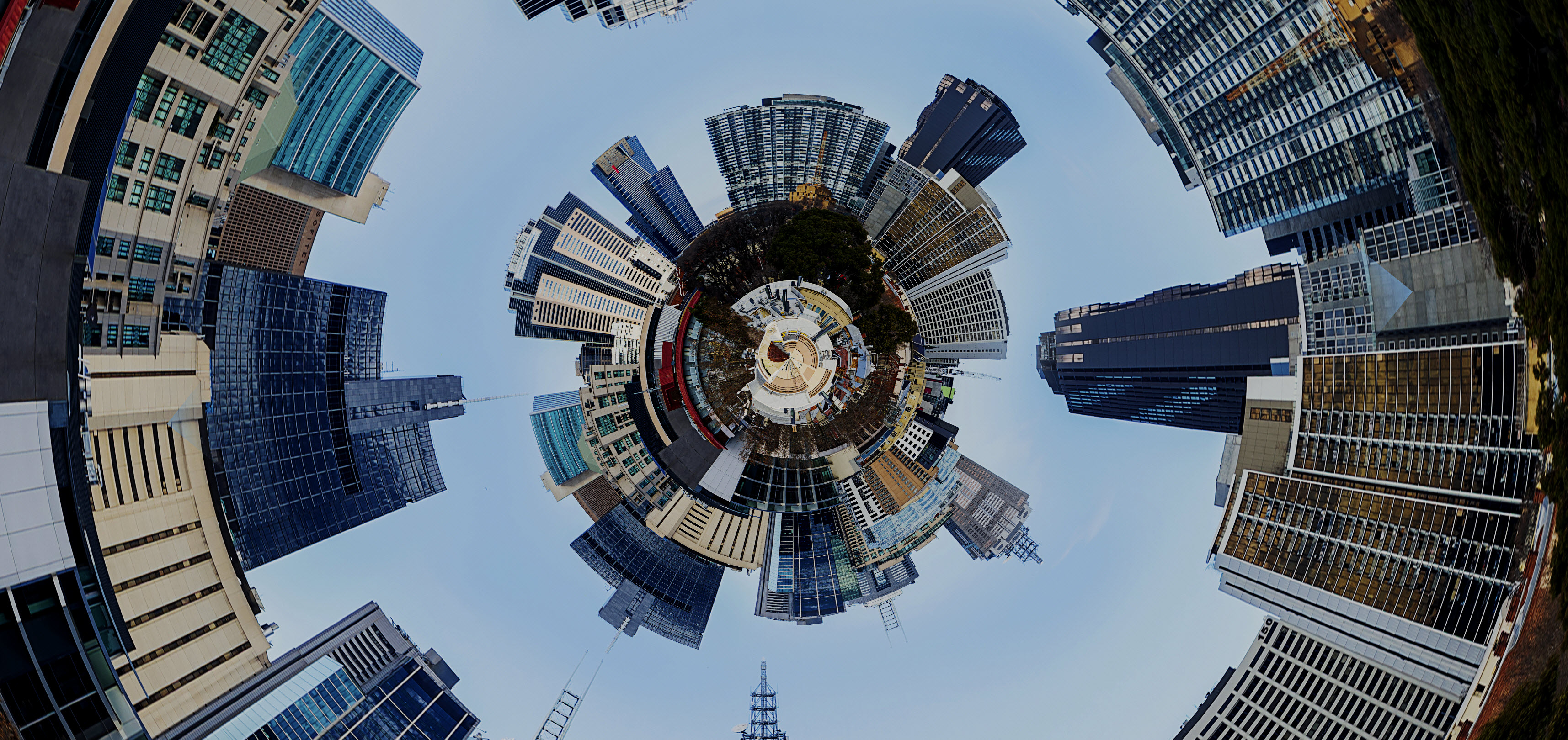
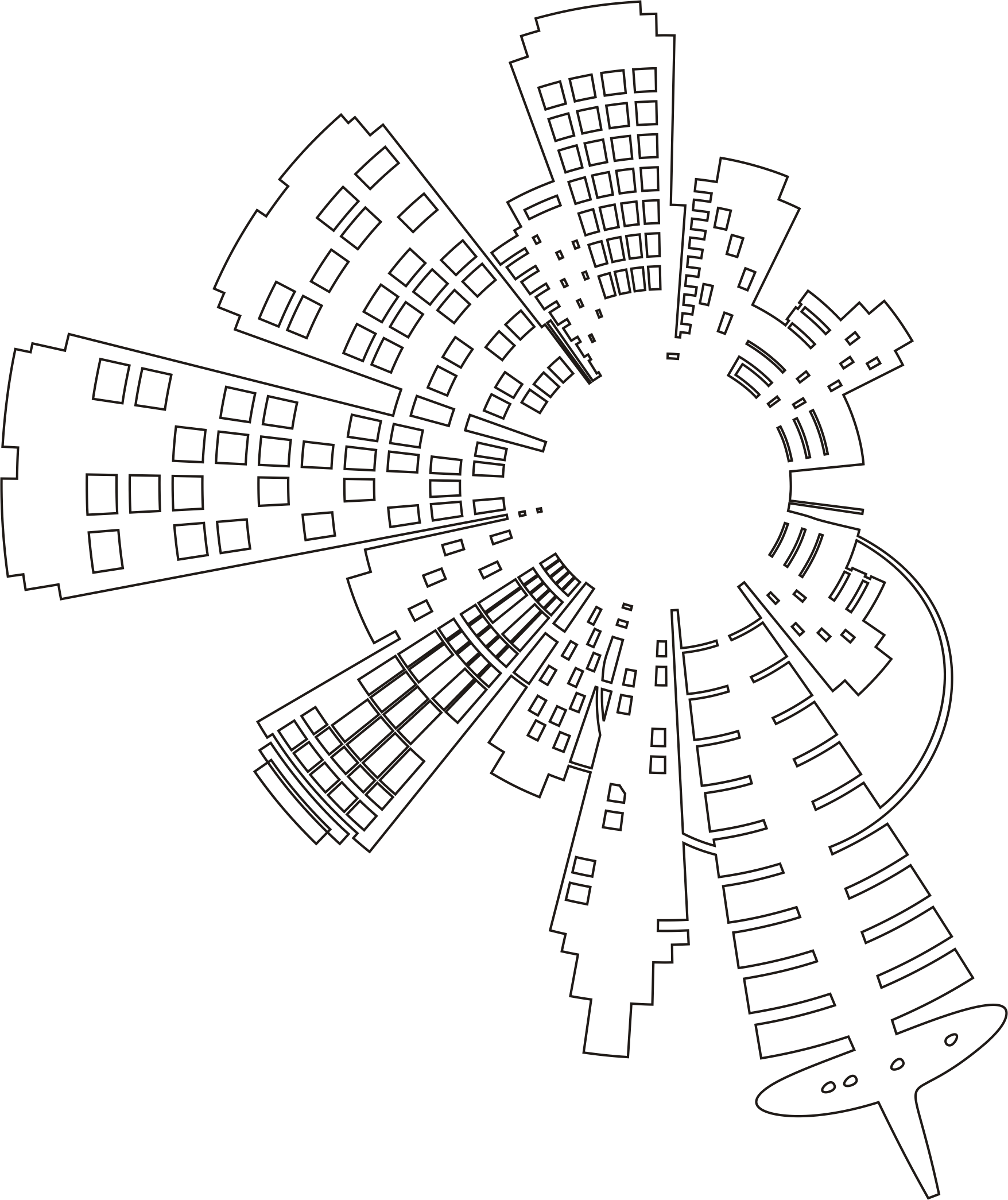
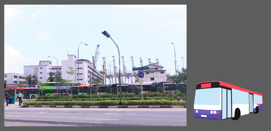
I first began looking into the architecture elements of the building, be it the use of lines, colours or shapes. I started looking at the photos I took in Shenton Way and started sketching and illustrating on Illustrator. I collaged my photos on Photoshop and morphed it into a 360 degree view to make it interesting- rather than a plain landscape vectorised illustration. I was inspired to do this when I saw an Instagram post similar to this:
Adding on, I created a building made with blocks of squares and rectangles to show the reflective-glass features on Shenton way buildings. Mimi commented that my overall design was inconsistent, separated and it looked more like an architectural zine. She advised me to bring out a narrative story on Shenton Way to make the zine more appealing. How do I balance my vision of the place with my ideas and also express Shenton Way from an outsider’s perspective; I wondered. This got me into a ‘designers block’. This led me into further research on more graphic forms of the economy and banking in Shenton. I wanted to give off the essence of the economical growth in Shenton Way, since it is designated as the financial and banking hub. It is also a a symbol of Singapore’s rise to a modern nation.
I experimented on designing the cover page by playing with the idea of a building with office workers intertwining in the title. However, upon completion, it seemed boring and uninteresting so I decided to scrap it off. (as shown below)
After consulting with Mimi, I decided to take another look at my photos I took in Shenton Way. I think one of the obstacles along the way was drifting off with the idea and concept you initially had, ignoring the actual essence of the location and the photos you took. I also re-looked at the write-up I wrote for Shenton Way. This gave me a new and clearer picture on how I wanna stylise and design the zine.
MAIN PICTURES I REFERENCED:
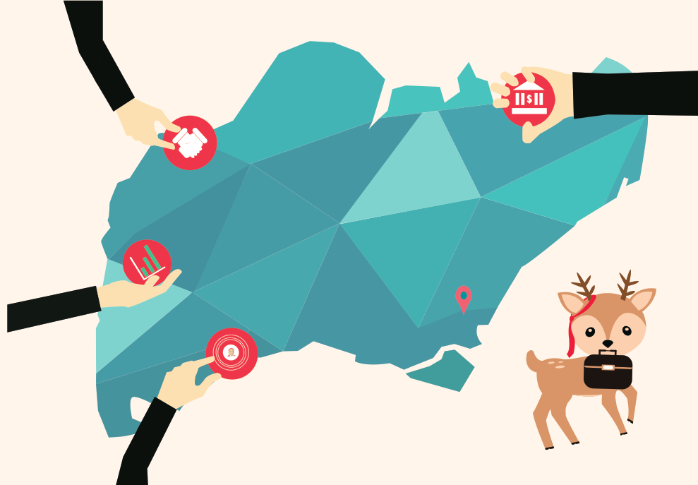
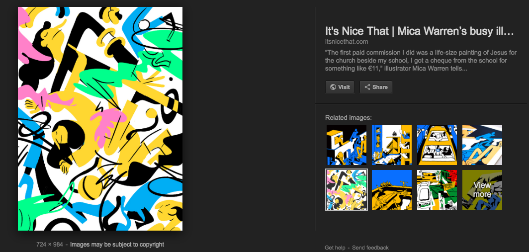
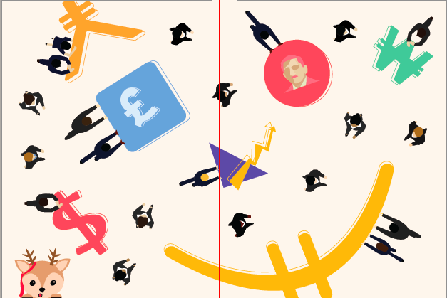
Shenton Way is known as Singapore’s Wall street- banking and financial hub. When I break down these words ‘finance’ and ‘banking’ – currency exchange comes into my mind. Hence I focused on the idea of currency exchange. I depicted this by creating vectors of the different currencies of the world: Yen, Euro, Dollar, Pound, Won and of course including the SGD (showing Singapore’s first president, Yusuf Ishak since the location is in Singapore). I also added office workers walking around and pushing the currencies to portray the financial office life around the area. Moreover, to make it more of a narrative I included a character, a deer, to represent me wandering around the place. A character that is out of place and holds the curiosity of what goes on in this area. As a whole you may think that the deer does not fit into the scene and feels unnecessary, but this is what I wanted to portray. This led to the graphic design below.
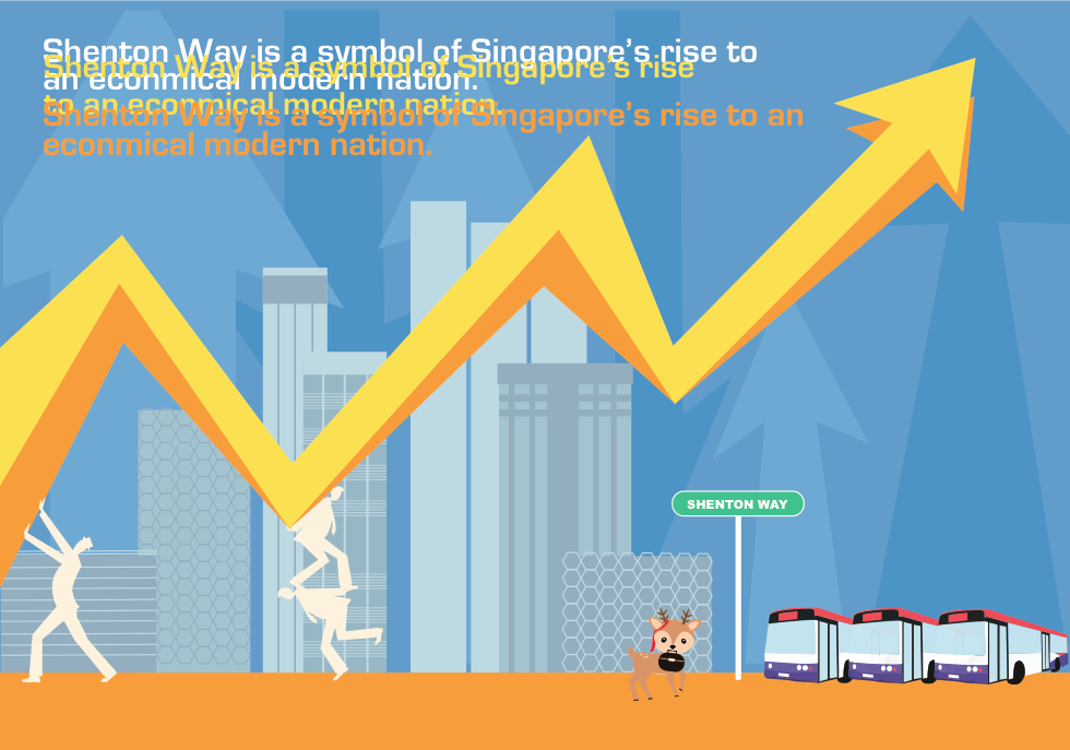
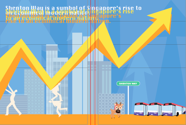
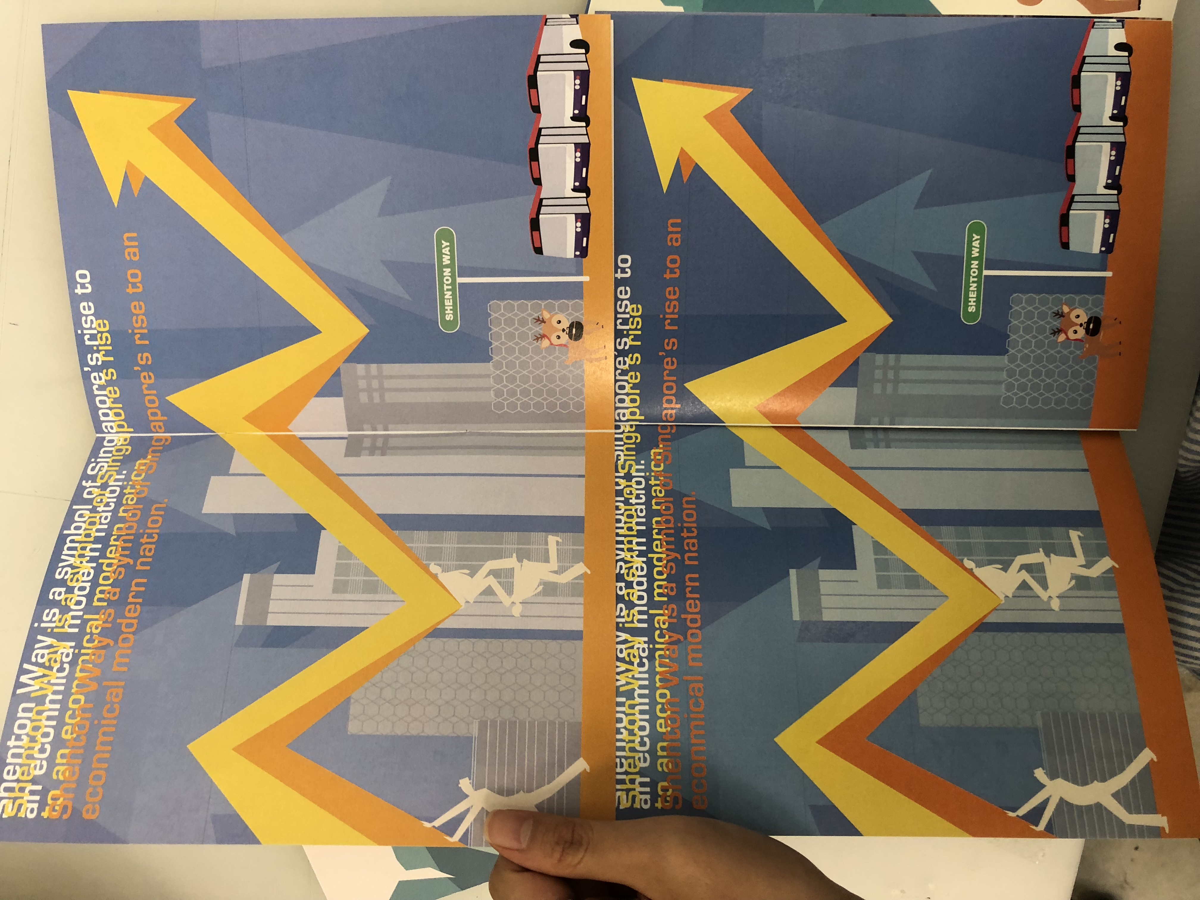
Keeping in mind that Shenton Way is a symbol of Singapore’s rise from “a small fishing village” to a modern nation. I wanted to portray this, as well as the new bus interchange built to serve commuters in the Central Business District in June 2017. Thus leading me to design an economical graph with iconic buildings of Shenton Way and the bus interchange. I also added overlapping text to add a sort of glitch or the messy incoming information and data that goes in the offices of Shenton Way.
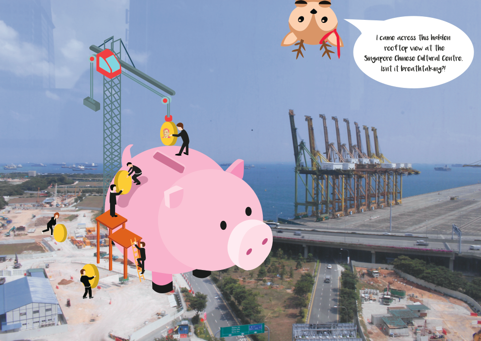
For the last double page of my Zine, I decided to incorporate my favourite spot in Shenton Way, where I unexpectedly came across. I left the photo raw as I wanted to show the beauty of the raw land where its is under construction that may be built on for a future building. The allurement of the flat land before a rise of new modern buildings. This spot is from the Singapore Chinese Cultural Centre rooftop garden. I decided to work my graphics on it to shows the element of ‘growth’ by using the crane and the office workers inserting coins into a piggy bank. Furthermore, I wanted to add my thoughts into this page by inserting a comment by the deer.
Overall, I chose to do a double-spread page for all my pages to create a landscape to give a bigger impact on the location. Moreover, I chose a colour scheme of toned-down solid colours crossing over to pastel colours to make it vibrant to reflect the lively energy in Shenton instead of a systematic monochrome colour scheme – implementing complementary colour pairings.
Cover Page
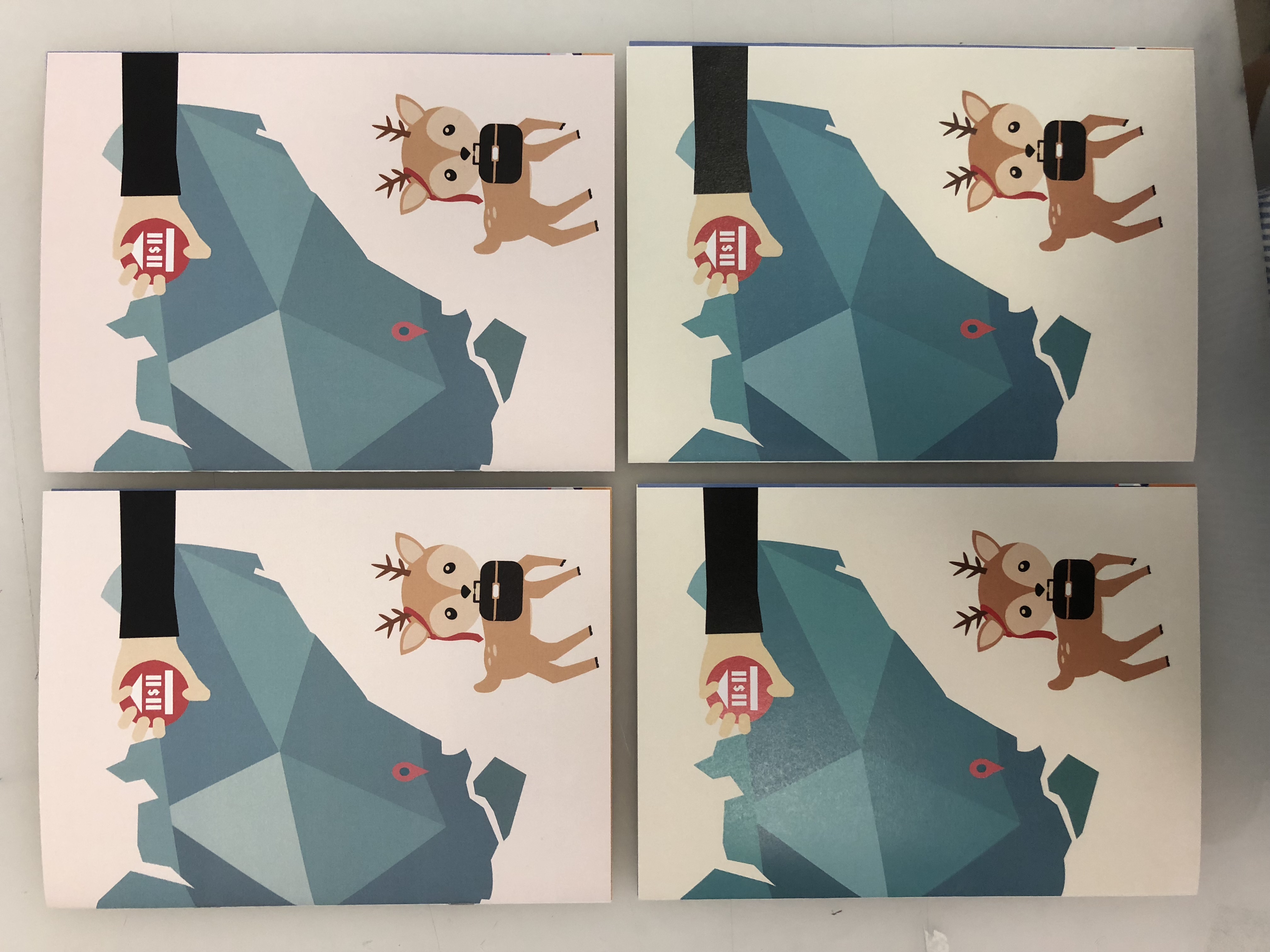
I did not want my cover page to reveal where my location is and what the zine is about as I felt it should be shown through the graphics on the pages. Thus, it should only give a sneak-peek into the direction of the zine and an introduction of the character.
The first draft of the cover page (shown in the initial stage) was plain and predictable – not abstract enough. Thus I designed a cover where it shows the overall essence of the location without revealing the name of the place. Upon my completion of the design, I still felt like it was lacking and could be further improved but I was stuck on ideas for a double spread cover. Thus settling for the less. I feel like I can do better!
Printing
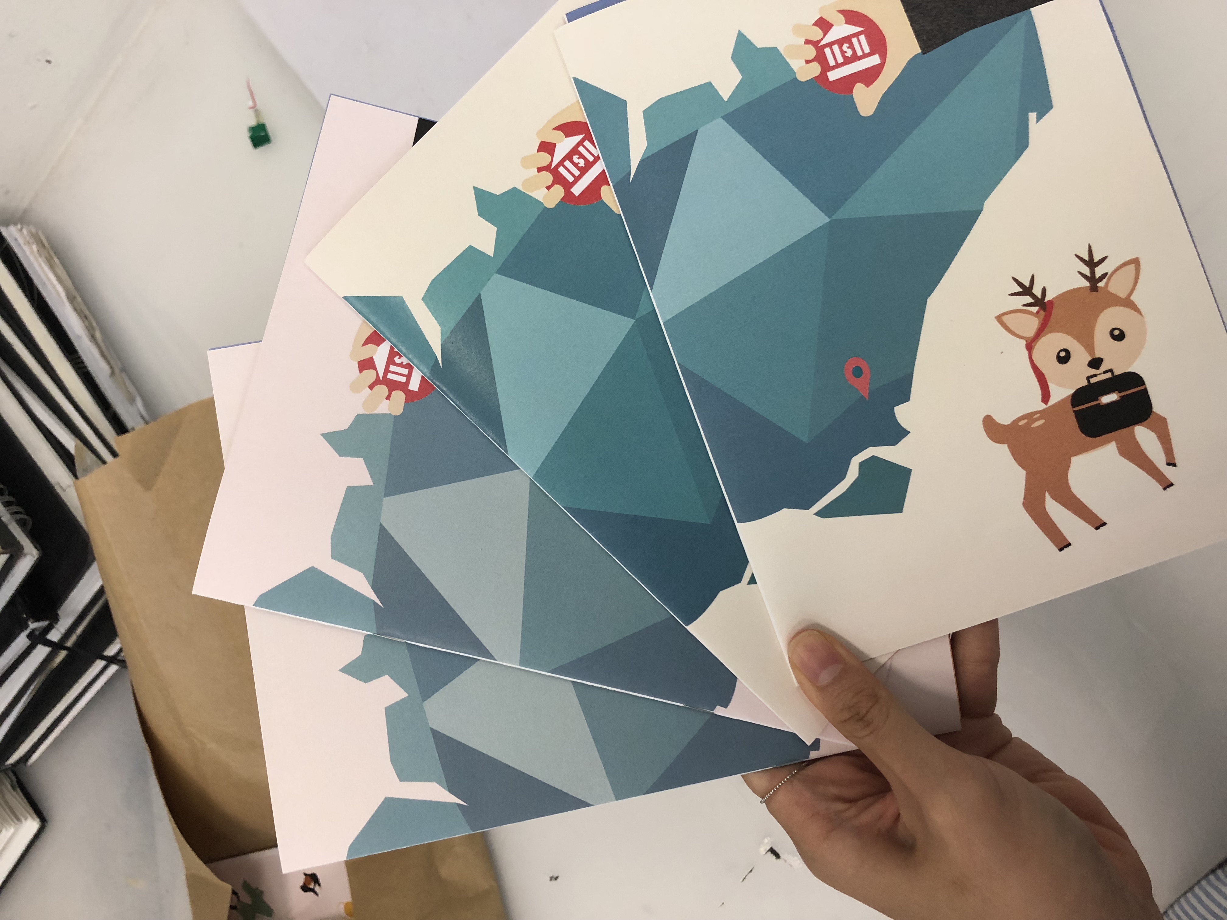
Onto the printing stage! Mimi suggested that we head over to RJ papers to see what they had to offer. To my surprise, they held collections of wide varieties of paper that made me overwhelmed with my choices. Being indecisive, I tried my best to cut to 3-4 different types of paper that I liked. It also surprised me how cheap it was even though I am buying 8 sets of each. I am definitely coming back in the future for my future projects. The aunt over there told me to buy more since I came this far and the price was very reasonable. I thought 24 A4 sized paper was more than enough for test prints and my final zine. Little did I know, during my test print, I used up 16 out of 24 before my final! I must say test printing is so crucial, which tested my patience in aligning and colour correcting the designs on paper. It is also an important medium to match with the concept of your graphics that can further emphasise your ideas. Nonetheless, i enjoyed the whole process in the creation of my zine!
Different textured paper + Different printer printed off a slight differentiation of colour and shading:
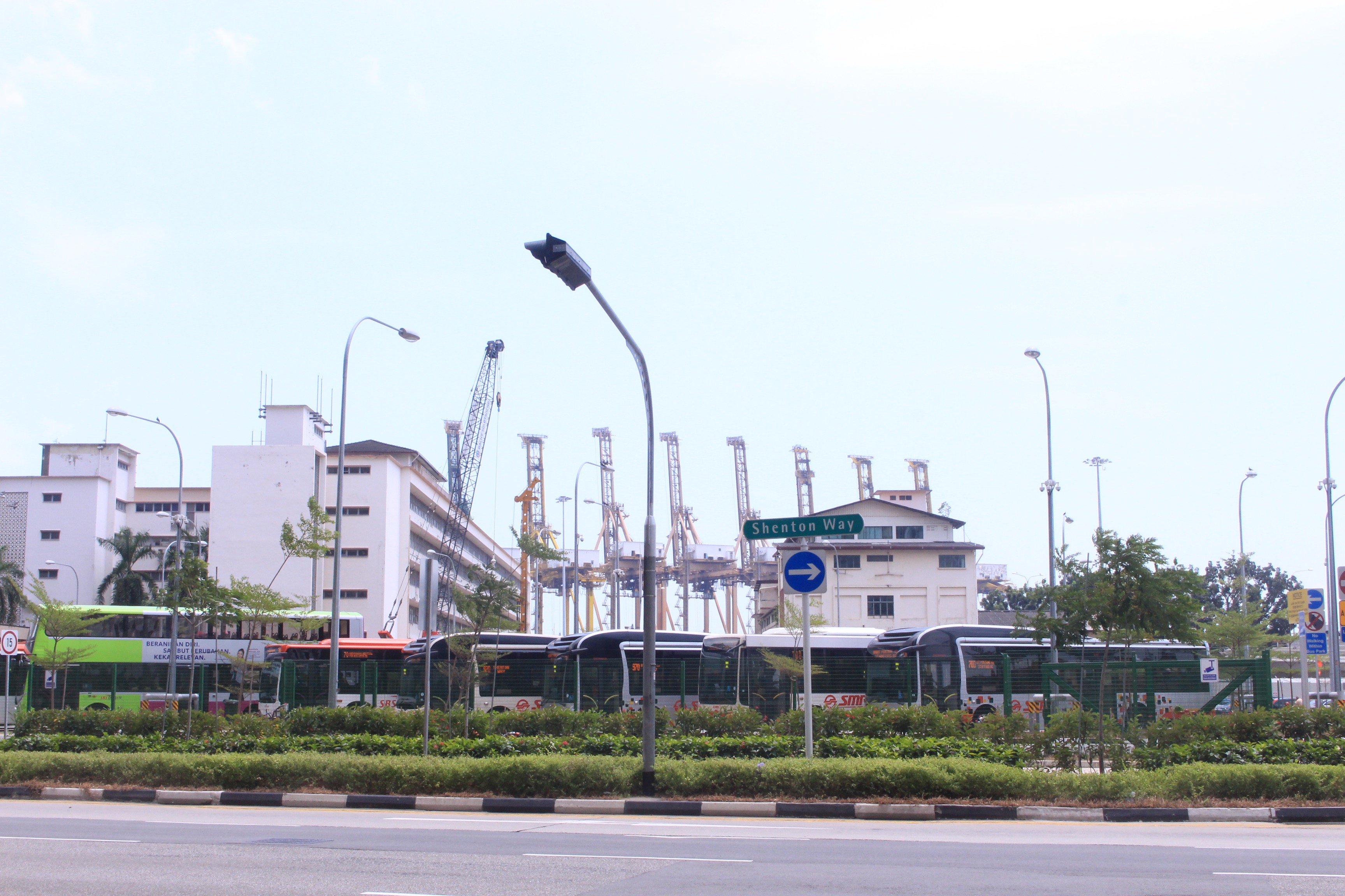
Shenton Way begins at the junction of Boon Tat Street, Raffles Quay and Commerce Street, and ends where it meets Keppel road- in the heart of Singapore’s city centre. The shape of the area resembles an upturned shoe and contains Singapore’s most expensive real estate. It is designated as the financial and banking hub.
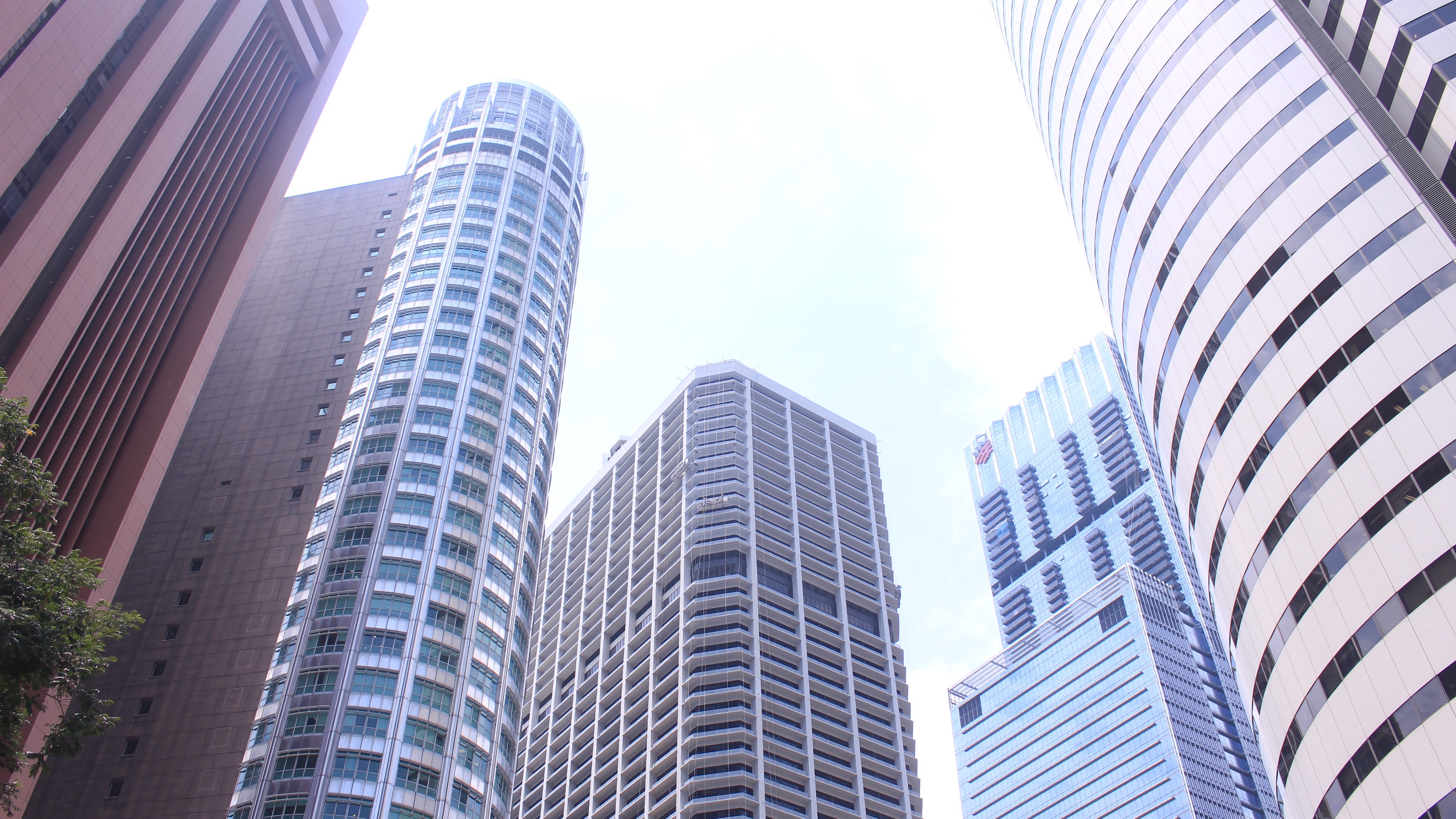
This area is known for commercial skyscrapers. It is also known as Singapore’s wall street.
HISTORY
Shenton Way was named after Shenton Whitelegge Thomas, the governor of the Straits Settlements from 1934 to 1946, as an acknowledgement of his decision to stay in the city during the Japanese occupation. Built on reclaimed land that was part of the Telok Ayer reclamation project completed in 1932, the road was not officially opened until 1951. The road was initially planned to be called Raffles Way, but the decision was revoked as there were already many roads, institutions, and places named after Stamford Raffles.
The very first structure built on the reclaimed land was the first Singapore Polytechnic campus, which was completed at the end of 1958 on Prince Edward Road, off Shenton Way. Designed by colonial architecture firm Sawn and Maclaren, the polytechnic remained there until it relocated to its current Dover Road campus in 1979. Much of the site is still standing today as Bestway Building.
It was not until the 1960s that the first buildings appeared along Shenton Way. Amongst the first modern buildings located there was the Singapore Conference Hall and Trade Union House, which was opened officially in 1965. The building is recognised as a prime example of Singapore’s urban architecture of the 1960s. It was designed to suit the local tropical climate, especially through the use of a cantilevered roof and terraces to provide shade and a natural ventilation system to keep the interior cool.
Besides commercial buildings, the government also located its financial institutions in the Shenton Way area. Among the first were the DBS Building designed by Alfred Wong Partnership. They also shared the same tower-and-podium structure as their neighbours. In 1971, the DBS tower was hailed as a symbol of Singapore’s rise from “a small fishing village” to a modern nation, and it was compared to monuments such as the Taj Mahal of India and the Great Wall of China. In 1987, the Monetary Authority of Singapore (MAS) also moved into the 30-storey MAS Building, and the Ministry of Finance and the Ministry of Trade and Industry into the 52-storey Treasury Building, both in Shenton Way. The DBS Building was acquired by Overseas Union Enterprise (OUE) in 2010, and it has since been redeveloped into a new mixed-use project called OUE Downtown, comprising offices, serviced apartments and retail spaces. (downtown gallery)
In June 2017, a new bus interchange was built in Shenton Way to serve commuters in the Central Business District. The terminal is located off Shenton Way, next to Bestway Building and directly opposite the MAS Building.
Urban rejuvenation in Shenton Way has continued apace in the new millennium, with makeovers for several older buildings.
For my Zine, I would like to focus on the form, shapes and patterns of the buildings to create something abstract (looking at cubism, photomontage and Kadinsky, and maybe psychedelic Japanese art to convey the hectic, fast paced atmosphere) as well as using money metaphors as a theme. Creating a buzz of fast pace environment, a structured area and the hectic workaholic feel.
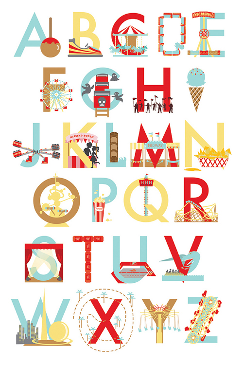
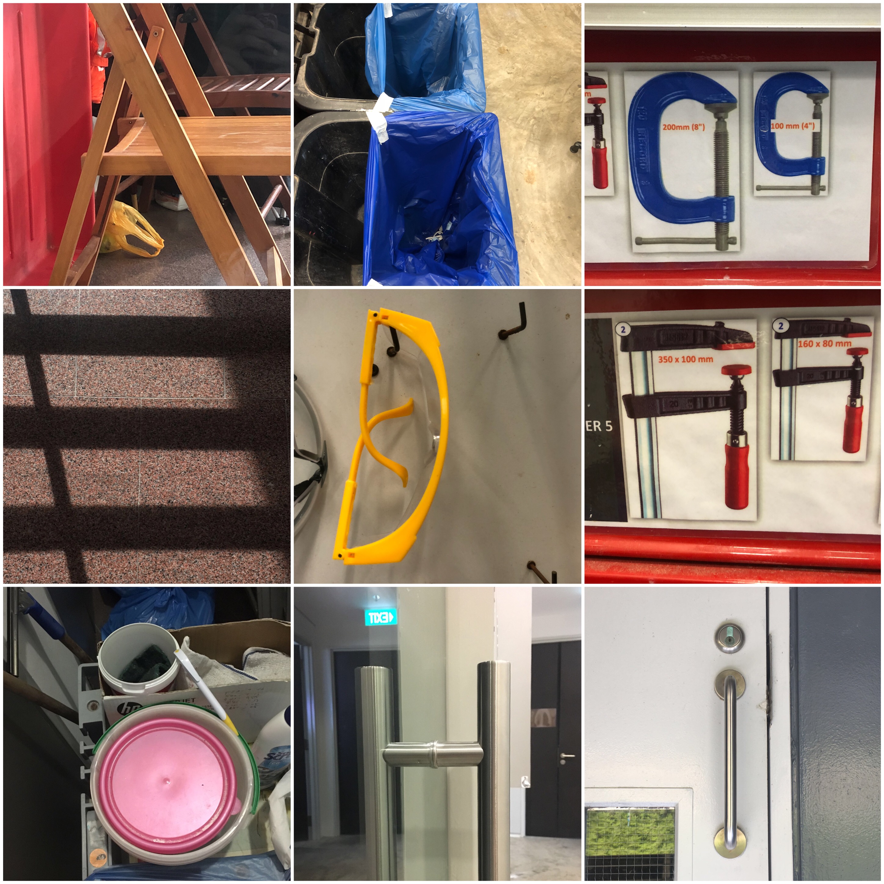
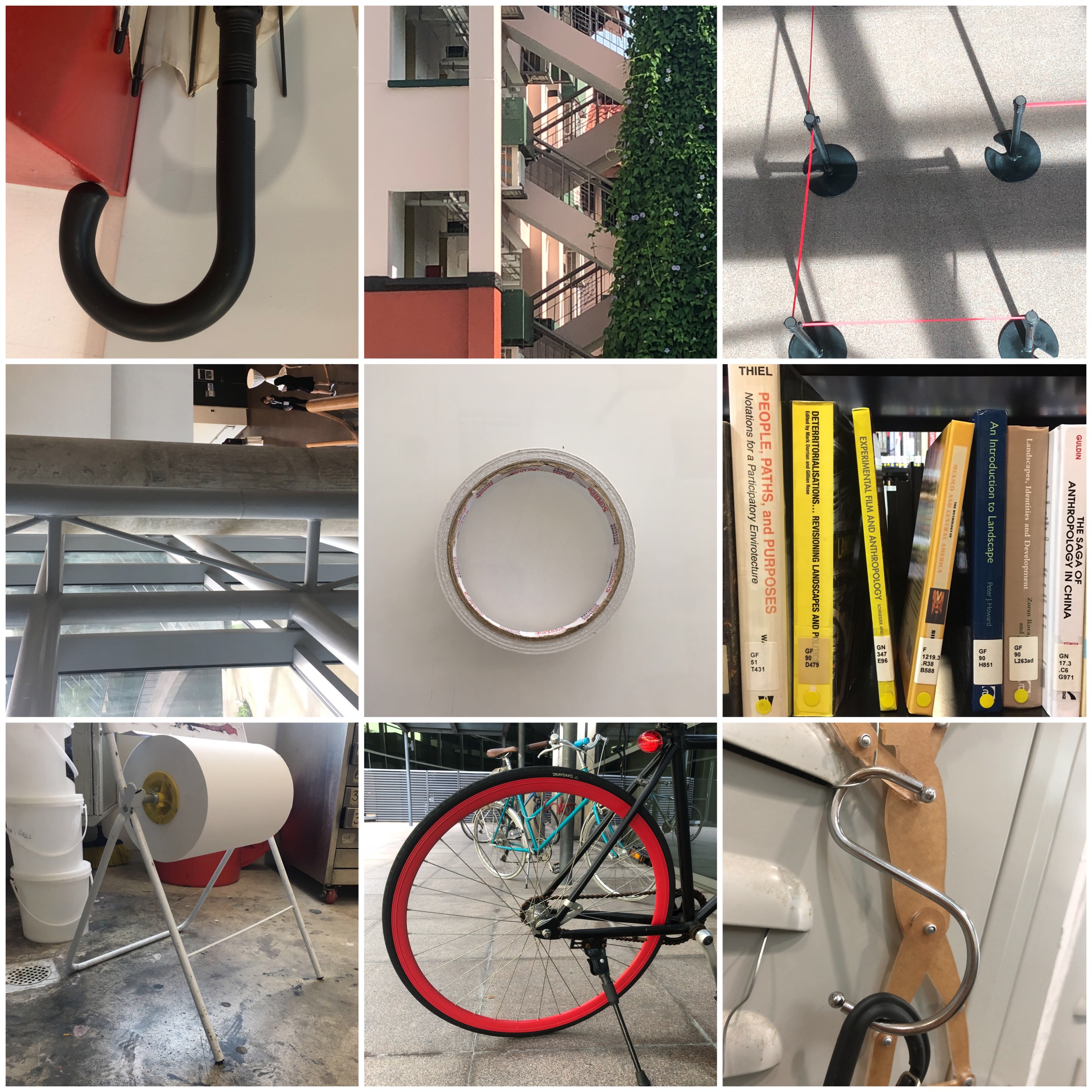
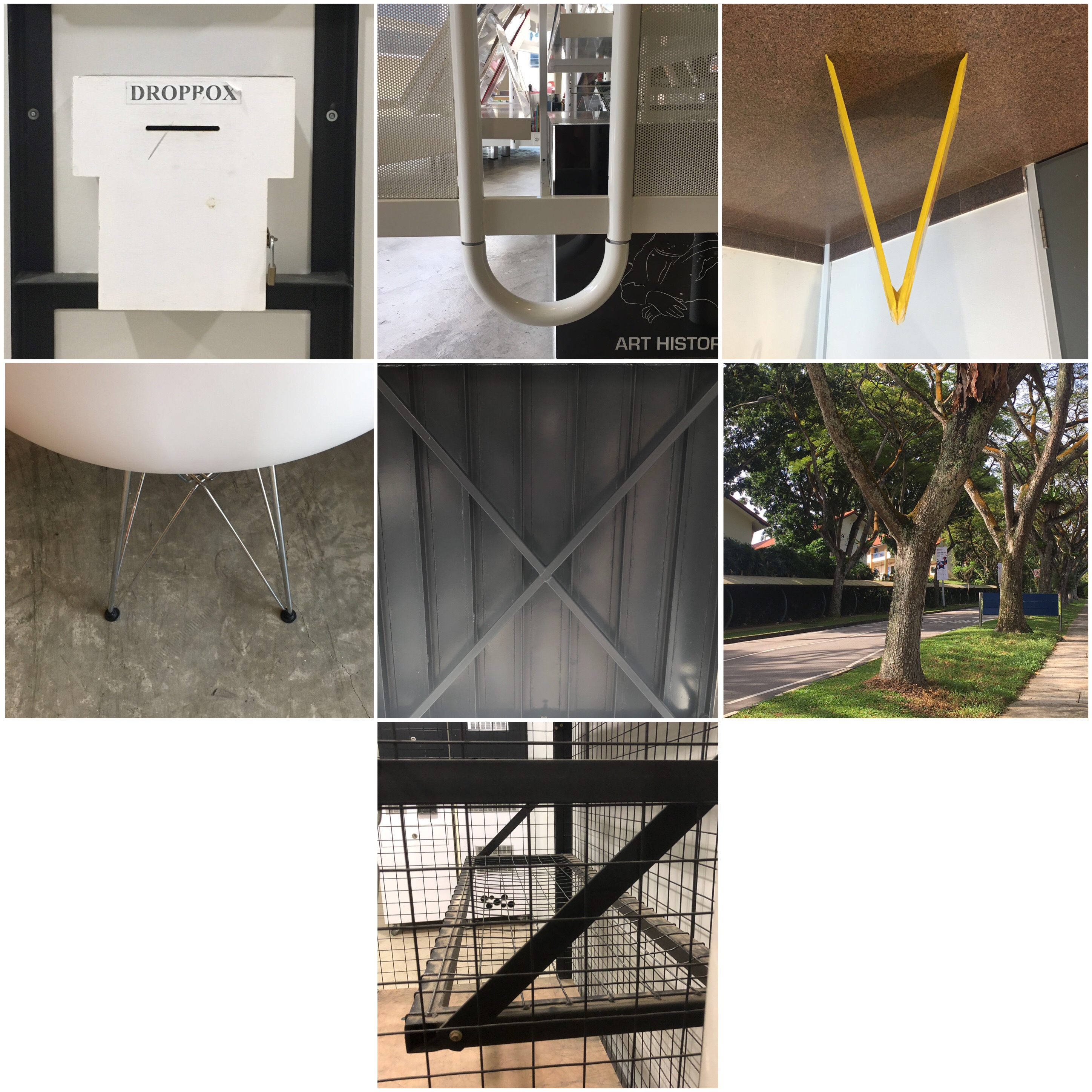
To get our brain up and running for this project, we learnt about why humans see faces in inanimate objects, which associates with a condition where one perceives a pattern in random things, called Pareidolia. It also follows one of the principles of psychology where “Human beings are social animals with a basic need to belong”, in this case, to find a face or language in order to relate with, decreasing the sense of unfamiliarity. Following on, we did a simple class exercise where we had to find alphabets in ordinary objects around the school. Here is what my partner and I spotted (can you spot it too?):
Making a mind-map on my sketchbook, I came up with several occupations with mini-sketches that could fit into this project. The occupations that I came up with are the ones that I felt would best represent me, something I was passionate about or even my childhood dream job. I shortlisted it to the top four jobs and started to explore different factors by deconstructing and factoring elements that relate to the job.
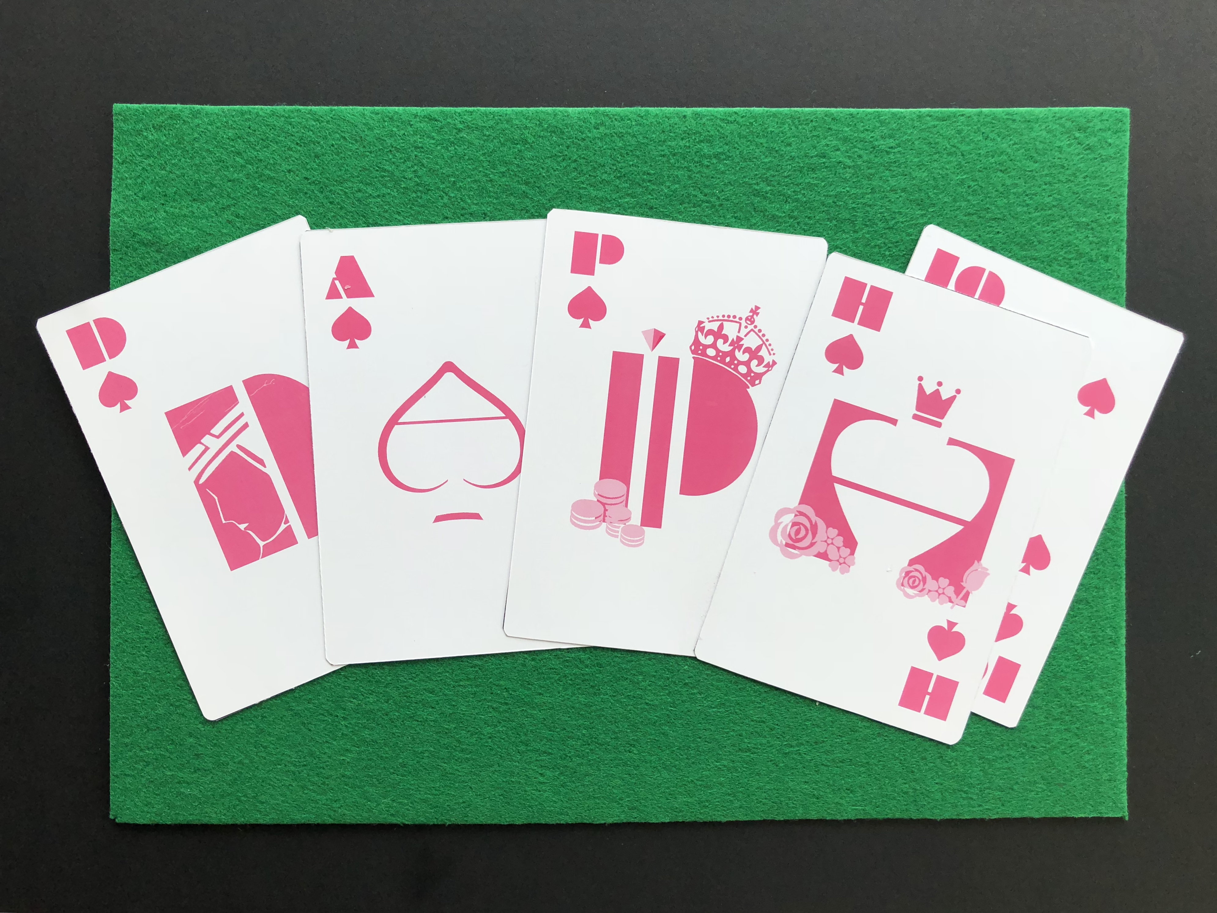
First, I decided to experiment with the deck of cards or poker coins to show the occupation, whilst, engraving my name. However, I wanted to show some consistency and the occupation itself. I decided to go by playing about with the set of the ‘Royal Flush’, which is the highest win in poker. Changing the King, Queen, Jack into letters of my name D, P and H.
After placing the letters onto each card, it seemed rather plain and I was debating between to create a pictorial design or if I should play around with the alphabet itself. Following from my consulting with my tutor, it was better to place an alphabet since it is a typography assignment, additionally making it more clear and alluring.
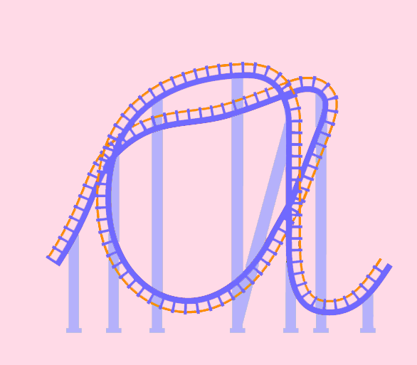
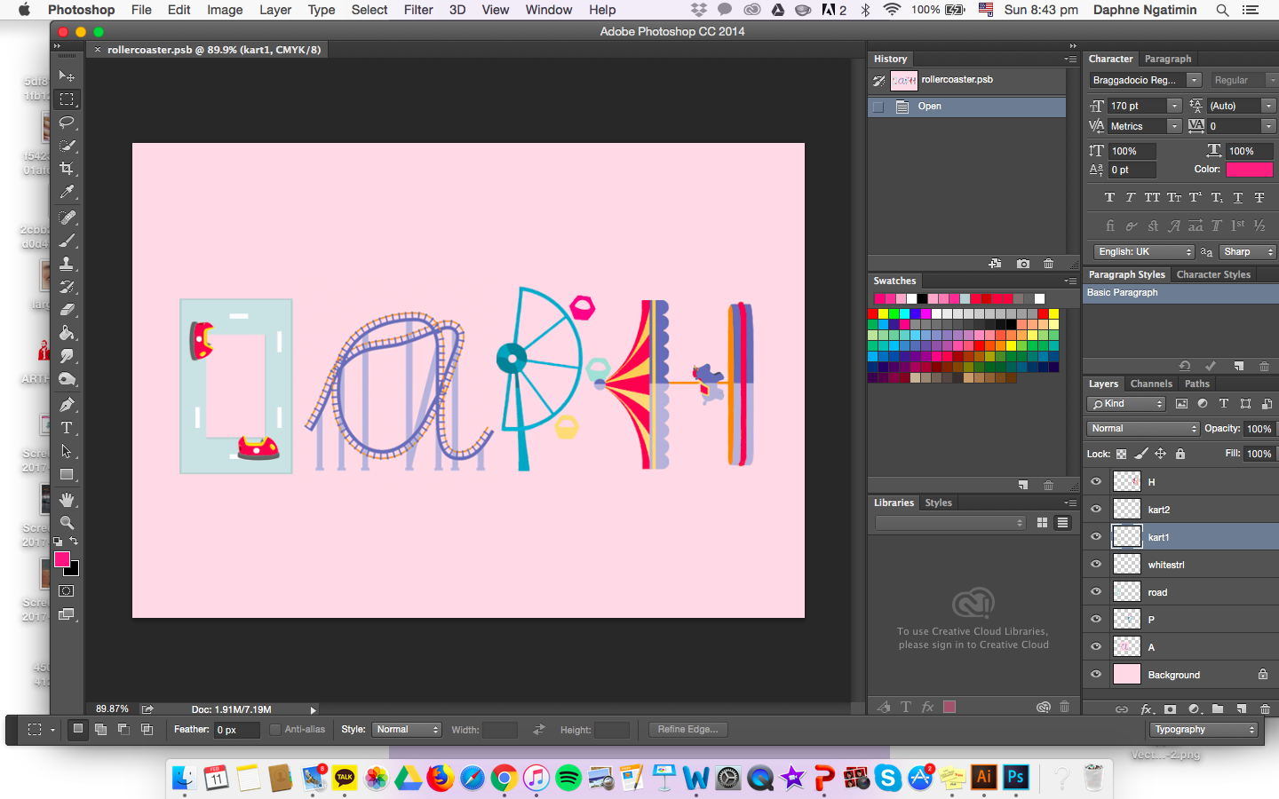
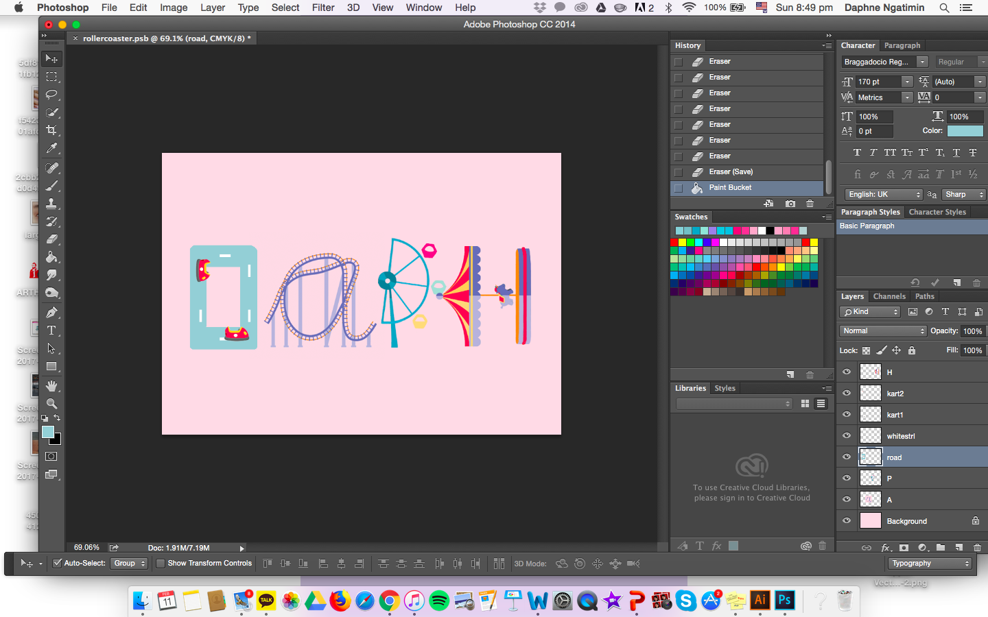
Below, I experimented and created an A with the idea of a rollercoaster which can be found in an amusement park, inspired by the picture from pinterest above.
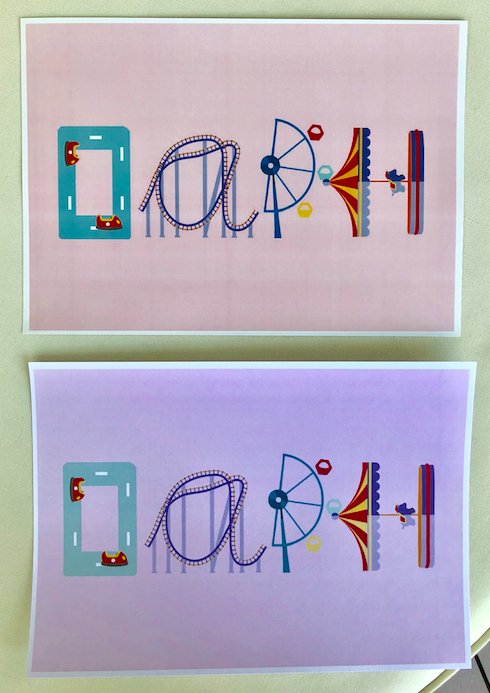
Instead of creating a consistent font of the idea of the rollercoaster as alphabets, I explored and created other fonts through different rides that can be found in the amusement park, enhancing the essence and elements of the occupation.
Over here, I changed the color of the D from more of a greyish tone to a blue-grey pastel tone to match with the other fonts.
Above shown is the two print, one (above) in glossy and the other (below) in matte.
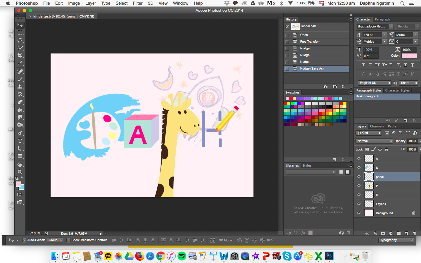
OCCUPATION #3: Kindergarten Art Teacher
Before starting this, I broke down the components and aspects of a Kindergarten art teacher. Paper drawing, painting, simple boxes, dotted lines and animals. I went with a baby pastel and light colors to match with the theme of a child-like feel. I felt that by placing a face on the giraffe made it grab the viewer’s attention rather than the name, hence, omitting the face out.
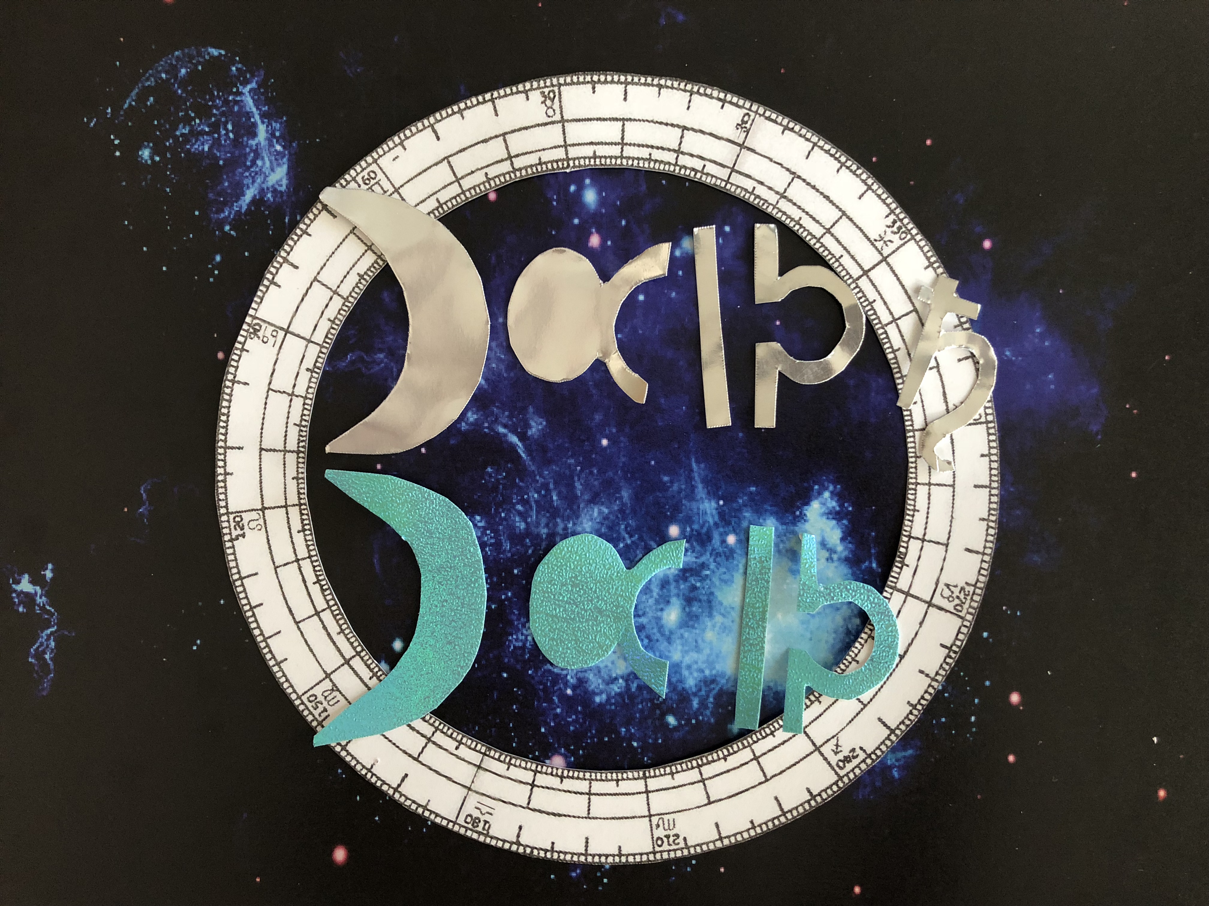
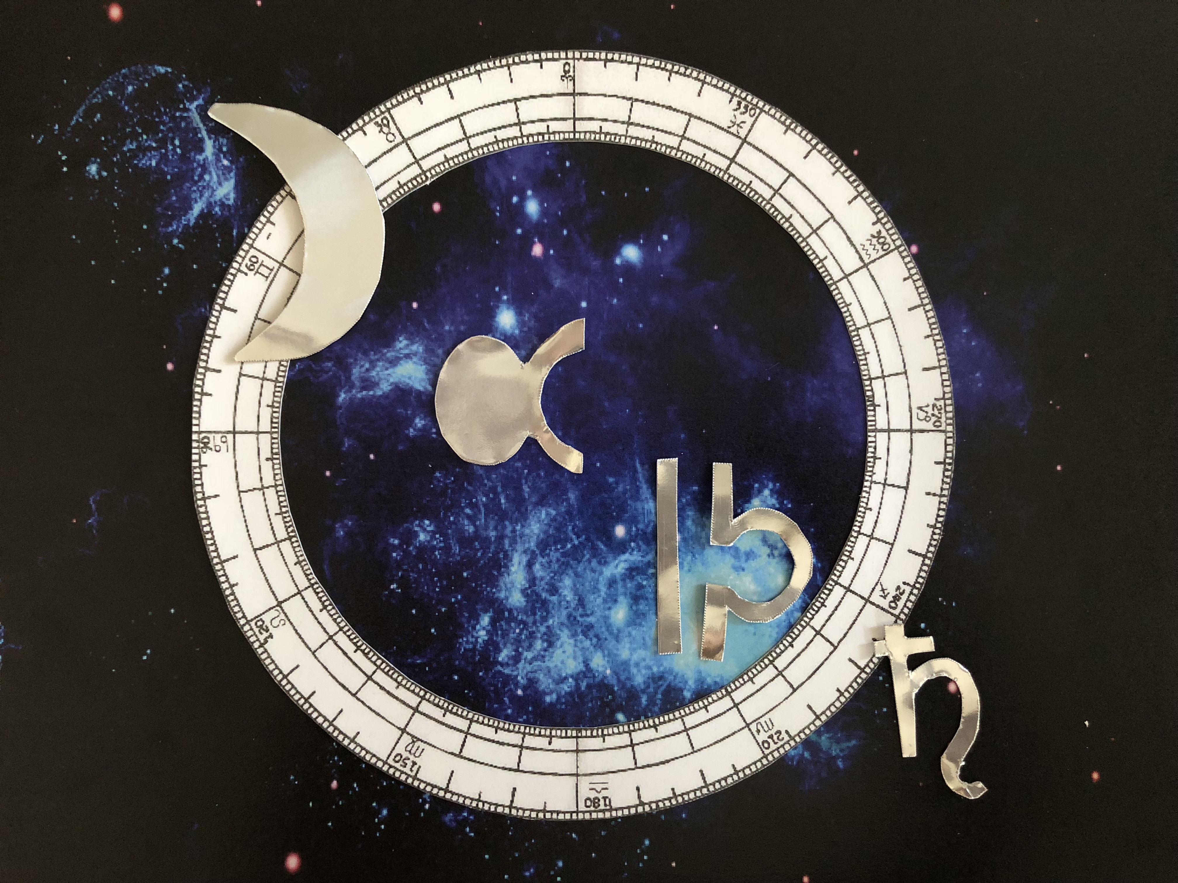
OCCUPATION #4: Astrologist
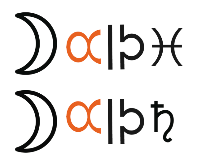
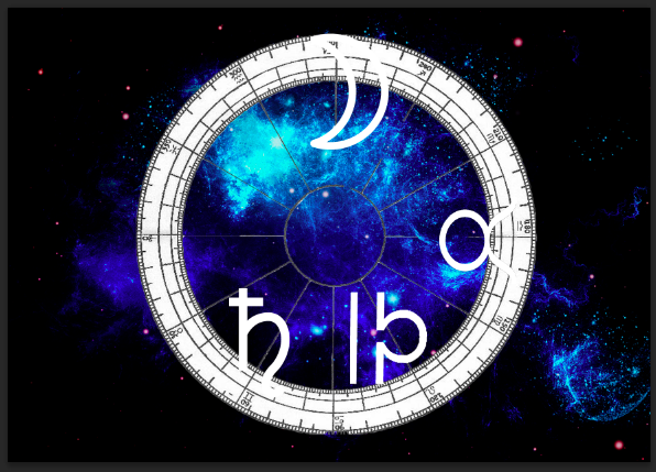
I chose this occupation as my passion and curiosity towards astrology grows. Even though it might not be an actual occupation, it is one of my spare time hobbies to read about the horoscope and constellation set in the universe. I used signs within the world of astrology to construct my name. At first I wanted to incorporate LED lights within the piece but it looked a little messy and uncoordinated. This led me to think more of a pop-up style where I will use the 360 degree astrological chart on top of the cosmos background, and top it off with a reflective silver effect lettering for my name (in order to pop out from the background). I painted a cosmic background by using blue and white on a black background and photo manipulated it in photoshop. D- Moon Sign A-Taurus Sign flipped sideways P- Libra Sign flipper sideways H – Pieces Sign / Saturn Sign
When placed in this arrangement, I realised that it was quite hard to read my name in the order of my astrology sign, capricorn. Thus, I rearranged it in a diagonal order, not as boring as a straight line but something easy to read.
While I was in Art Friends getting my materials, a reflective aquamarine lured me and I was wondering if I could use this instead of a reflective silver. Hence, I bought it to try it out whether it would fit and tie in the colors together but somehow it seemed off, leading me to stick to my original thought of using the reflective silver material as my font base.
FINAL OUTCOME
1.
My name isand I am a Poker Player.
2.
My name isand I am an Amusement Park Owner.
3.
My name isand I am a Kindergarten Art teacher.
4.
My name is and I am a Astrologist.
TO conclude, I felt that I have taken a lot from this assignment. Not only, did I get to brush up my illustrator skills, but also tease my brain to think more creatively and looking at fonts in a more pictorial yet typographic way. For this project, I used both photoshop and illustrator to help me project what I wanted and achieved. I enjoyed this project as an introduction to Graphic Form and is excited to see what is to come in the future!