Week 1 : Research
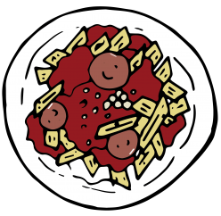
When Joy first introduce us to project 3 on our critique day for project 2. Immediately the initial concept that came into my mind was me + on menses = mood-swing? I really like this concept because firstly it is very easy for me to express and secondly it is very relatable and easy for me to convey the idea to people. And so I went on to brainstorm things that happened to me on certain situation as well as situation that might be common and might also happen to other people. So.. think think think…… Then I remember diarrhea, then automatically things like vomit, fever, urine, dig nose, pimples all sorts of disgusting natural human bodily function starts pouring into my brain. HAHAHAHAHA Judge me all you want! Don’t tell me you don’t poop! Even Queen Elizabeth poop!
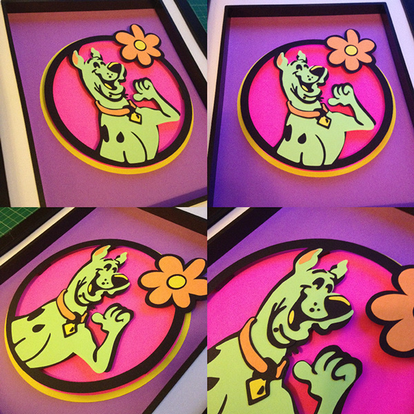
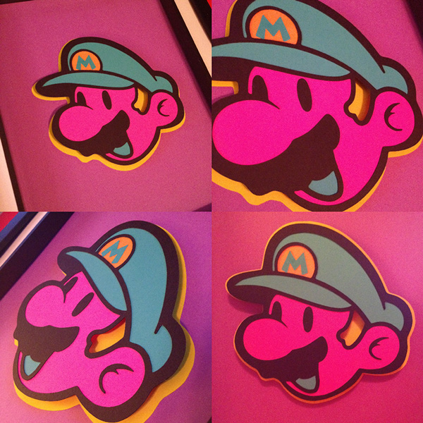
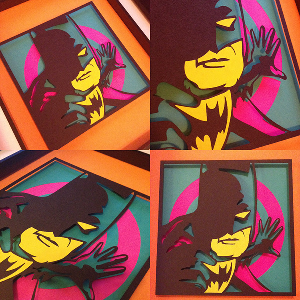
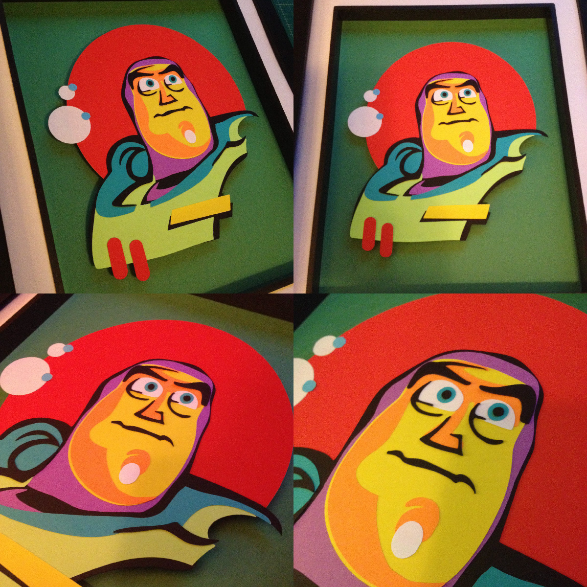
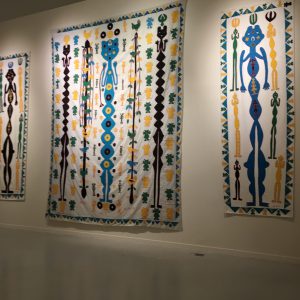
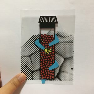
Anyway since there is no limitation with the medium used for this project, and I am more of a hands on person I decided to just go with traditional mediums like paper-cut, painting, water color, color pencil etc. I decided to make used of solid colors to create the composition and pop art is famous for using different solid colors in one composition to create it’s work. After deciding on the concept of bodily function, I went on to do some research:
Color Research: POP ART


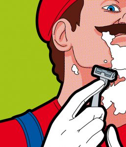

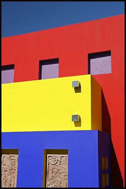
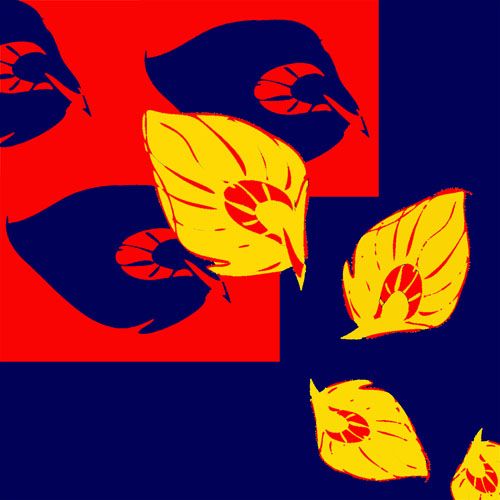
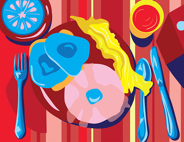
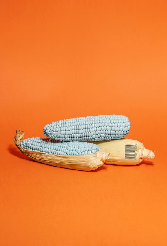
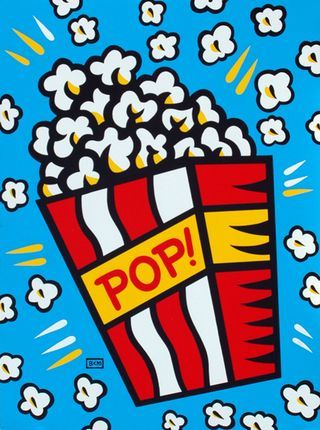
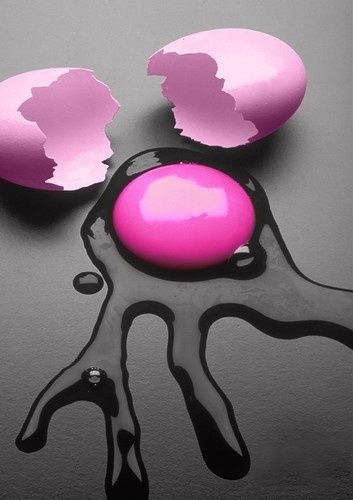
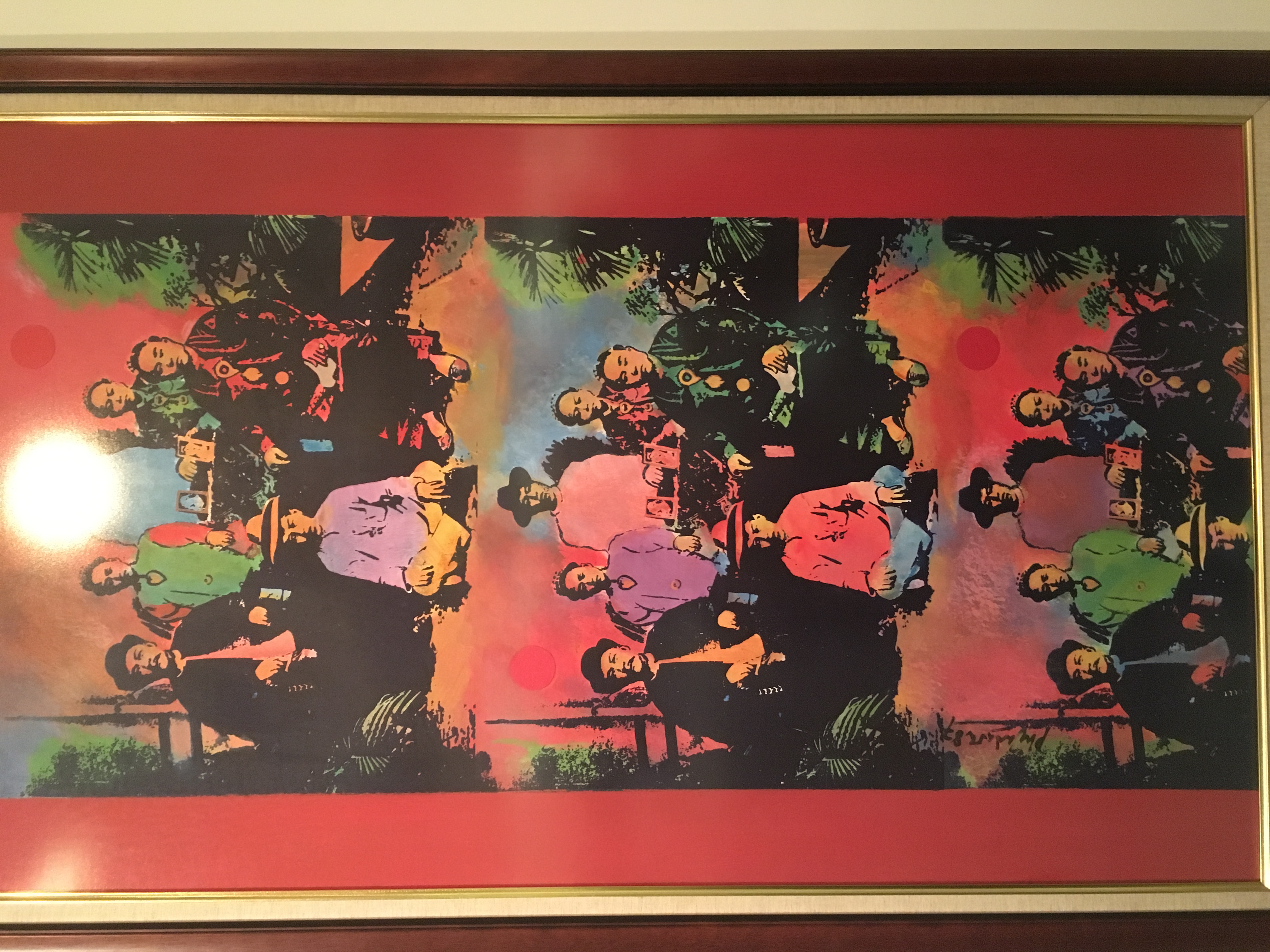
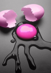
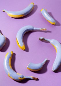
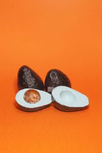
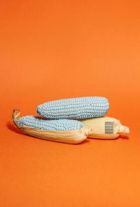
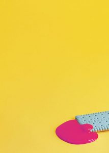
I did some simple research on the style and try to understand the color used for pop art to see if it fits into my concept. I realized that even though the color used in pop art are solid colors. but the colors actually make sense. Lets say pop corn is still in the color of whitish-yellow and skin tone are still beige. Relaying it to my concept of bodily function, I thought that if I were to make use of colors that makes sense like poo is brown or urine is yellow as the color for my composition, the whole composition would probably look really really disgusting. Then i came across with image like these:


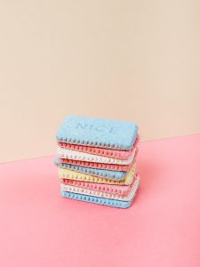
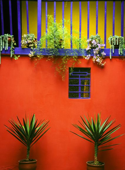
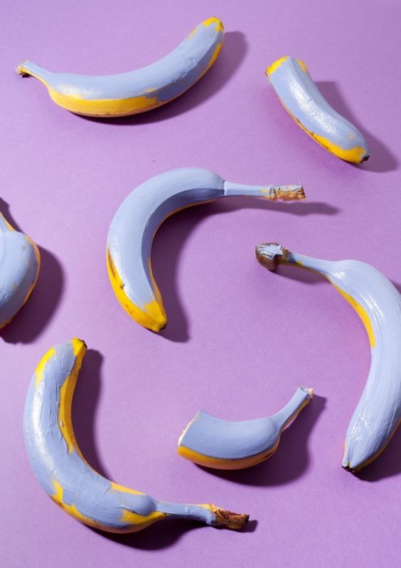
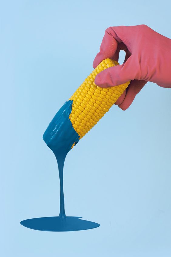
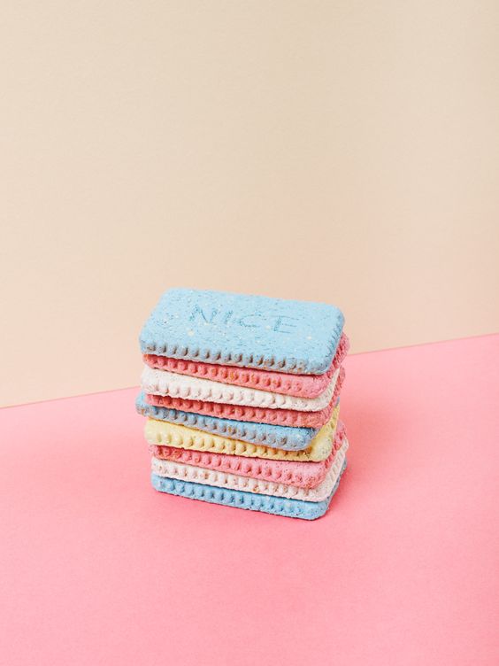
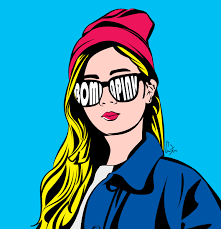
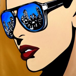
Apparently this is call Color correction, and I decided to include this style into my Project composition, as well as pastel color. Since I want to used traditional hand-on medium and I intend to go with paper-cut. Some example I’ve research would be:


Week 2 : Individual Consultation
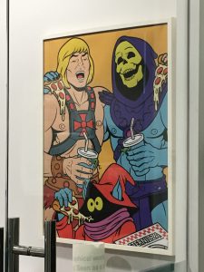
After the Individual Consultation on week 2, I learn that pop art is not just about the style the color but actually there is a certain theory behind pop art. I did some research and understand that pop art is actually about mass consumption, and mass population. Simply putting it, it is not only makes uses of celebrities and fictional icon, it also uses symbols icons and daily Things.
Pop Art uses:
Comic, News, Advertising, Mundane Everyday Object, Celebrities or Fictional Character
Characteristic of Pop Art:
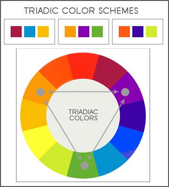
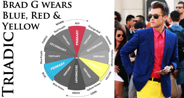
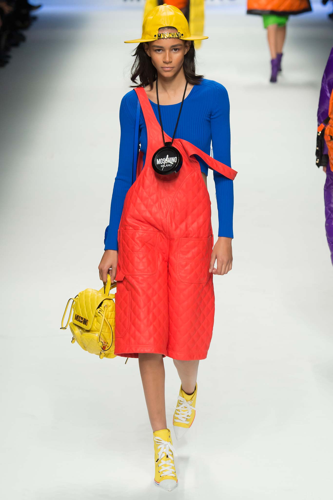
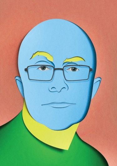
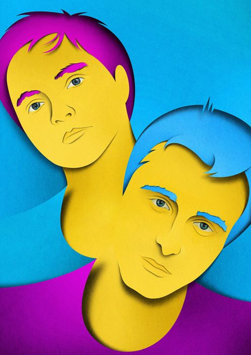
Thick Bold outline, Clear Lines, Solid Color, Triad color, Split complementary colors.
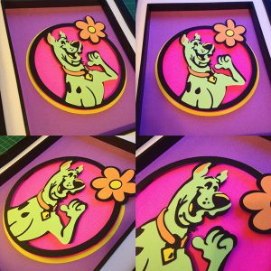
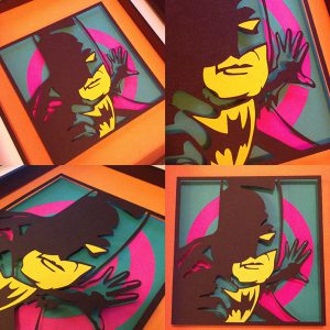
I decided to just use the Characteristic of Pop Art and not the theory behind Pop Art because this is more connected to my concept instead of celebrities or other things that have no link to my concept.

For 3D we went Singapore biennale and I saw different art piece that could be inspiration for this project, Eg, embroidery (ok I know I think too highly of myself) haha! and I also notice a few inspiration around adm.
Week 3 : Group Consultation
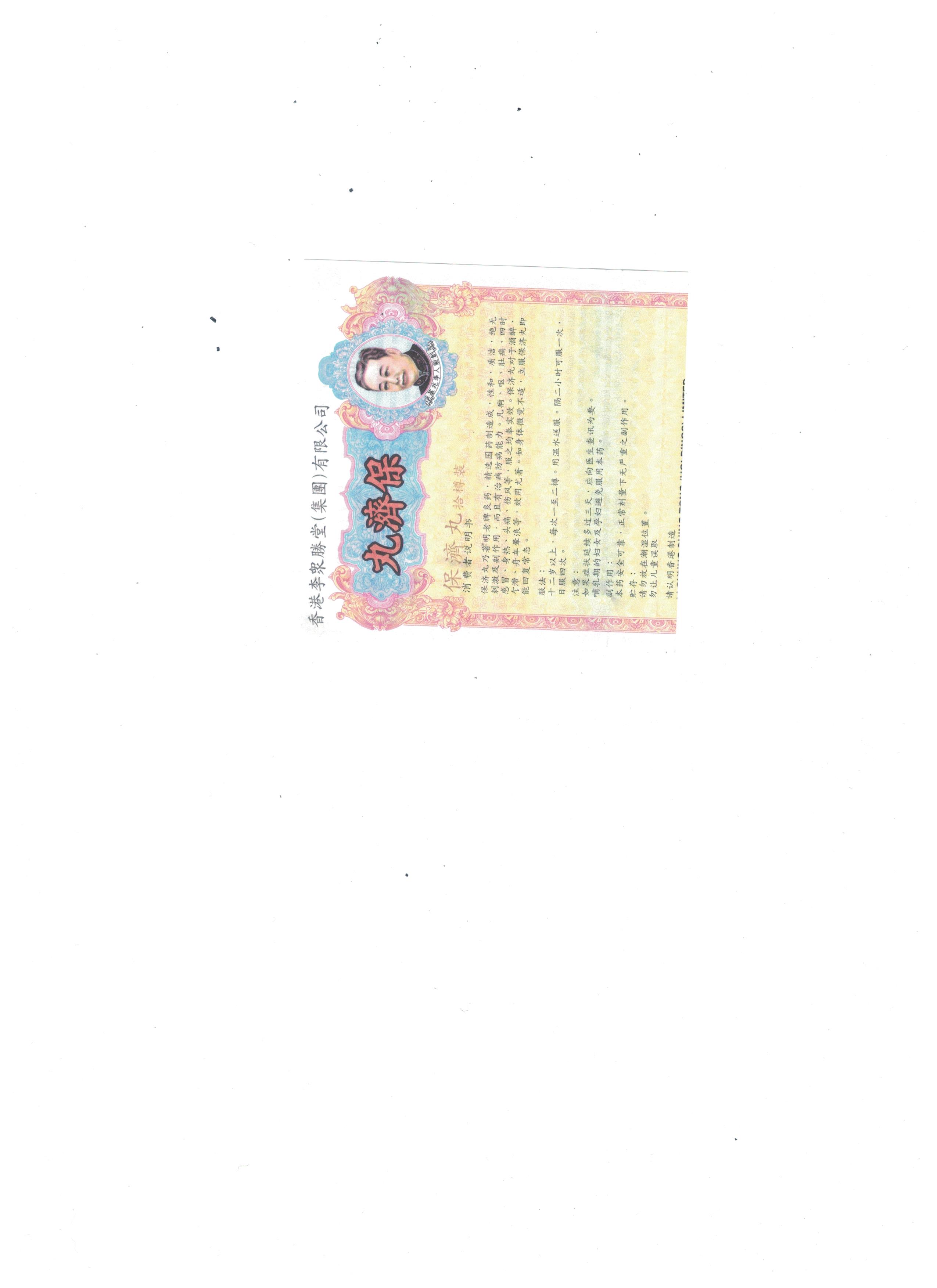
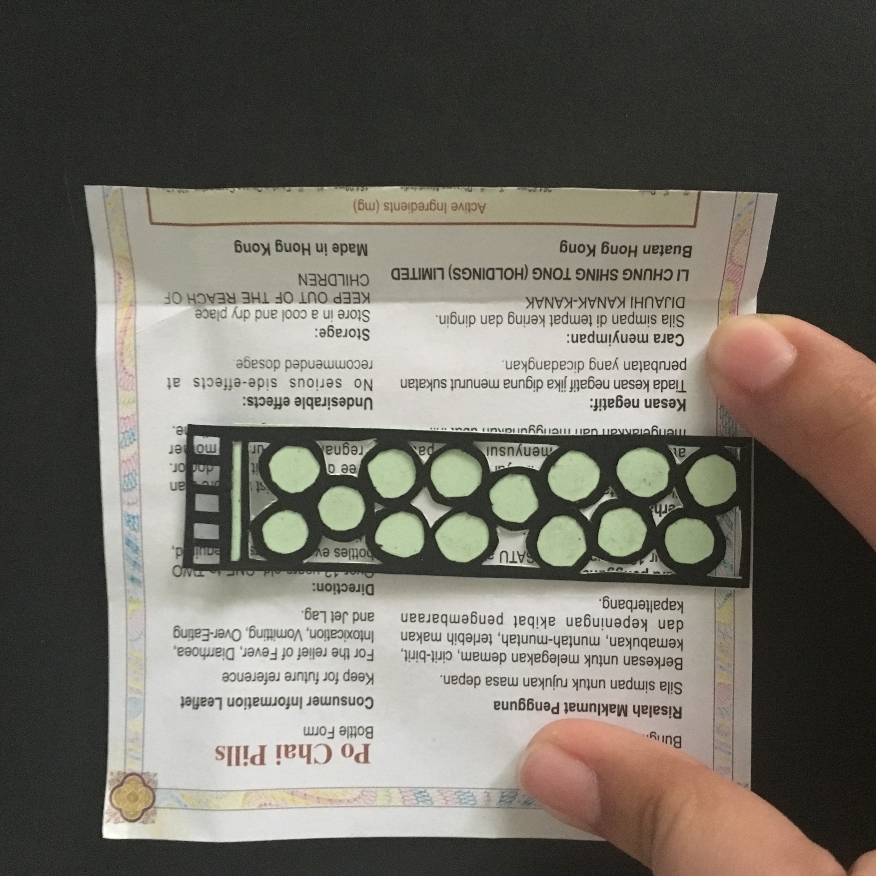
To be honest up until this week I only have 1/12 composition IN MY MIND, not craft out but IN MY MIND! I’m so worried because I didn’t even know how the other composition look like and I haven even had the color I want to use confirm. Oh God, I’m so dead. Because of time constrain and Joy advice that paper cut takes up alot of time. I didn’t want to craft out all 12 composition in paper cut. I start exploring mixed medium. I thought of using ingredient paper found inside bao ji wan box and sanitary pad wrapping paper (ok I know I’m super super gross) or even painting it or using transparency.
BUT EVERYTHING JUST DOESN’T WORK!
It also does not show my understanding in color and I’m drifting further and further away from the project drift.
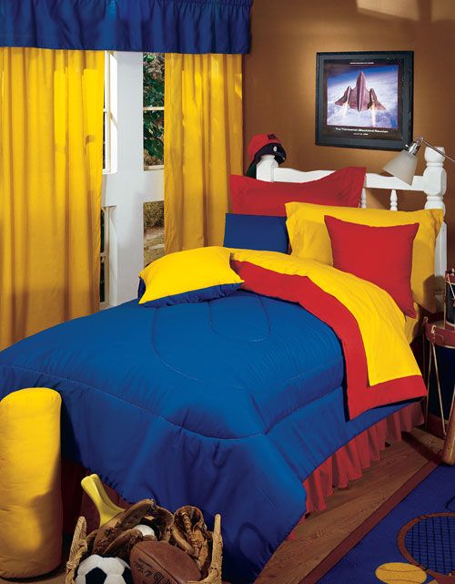
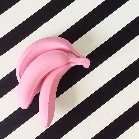
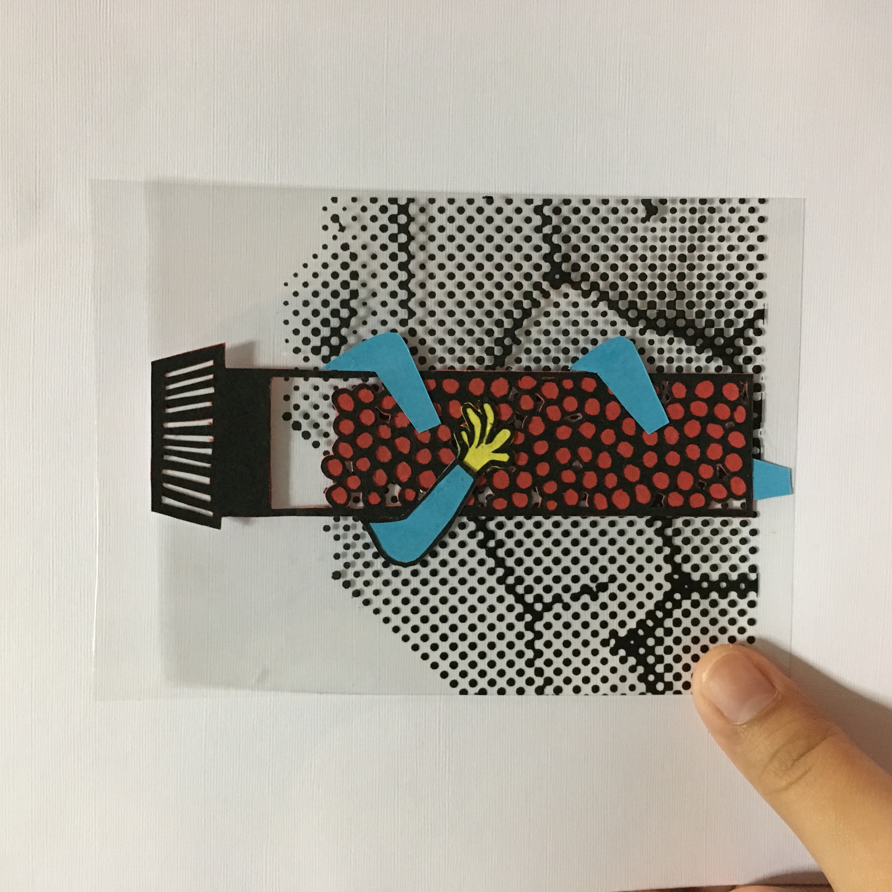
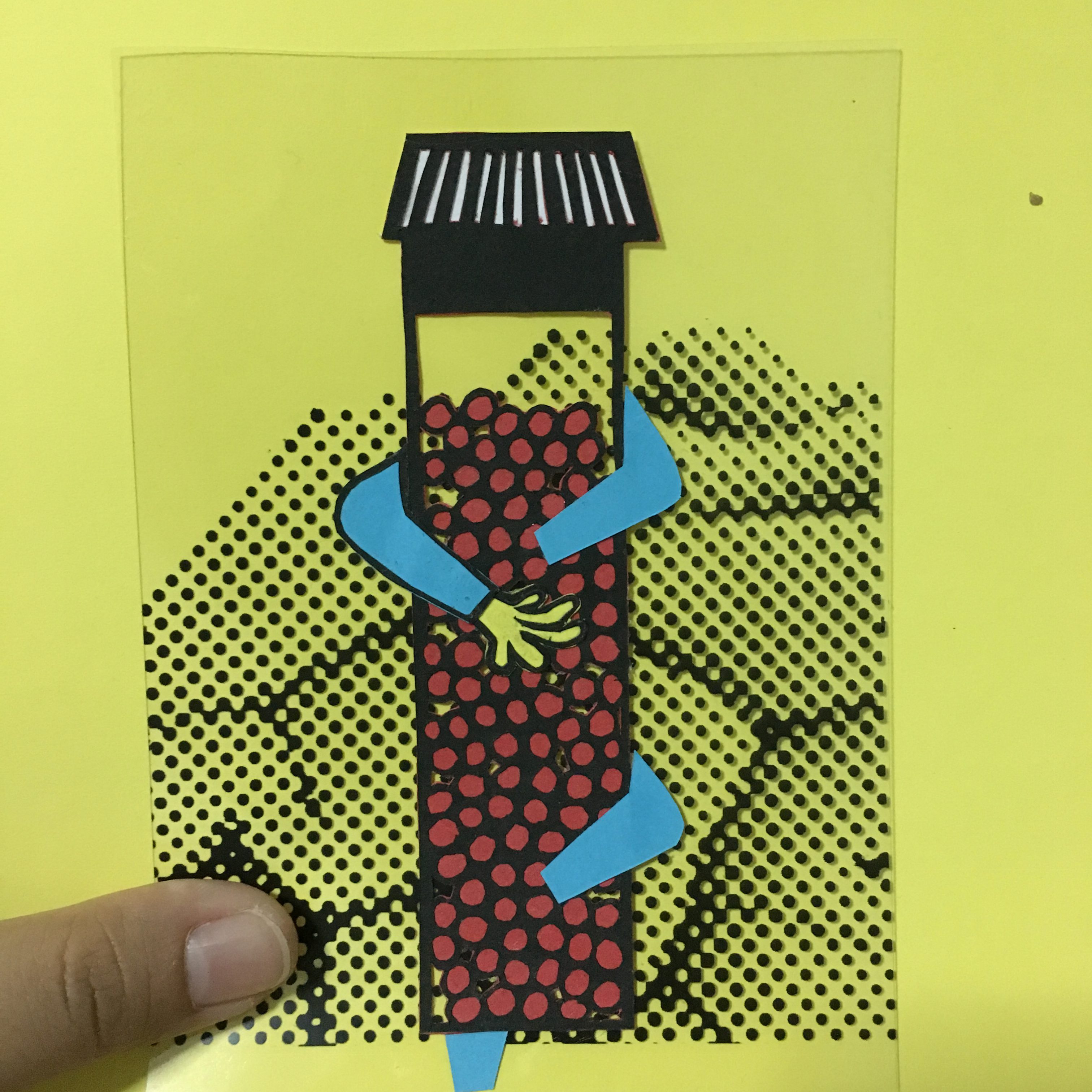
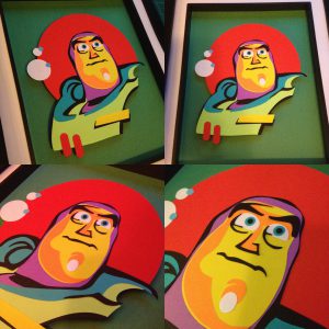
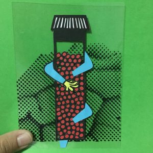
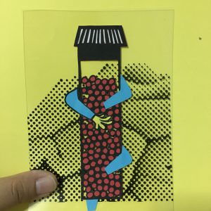
Up until Friday and weekend before my presentation on Thursday that I finally decide on just paper cut my life away, Just cut all 12 composition out rather than stuck here trying to explore the medium with no progress at all! Since I only left exactly 6 days left I need to really hurry up and rush myself. I was really stuck trying to convey the composition I had in mind and draw out in my sketch book and everything just look so ugly when I draw myself. I did a rough one in illustrator to guide myself on how my composition would look like and guide me when cutting. I decided to throw away the idea of pastel color because firstly it is hard to get a variety of pastel colored paper with high gsm secondly, lower gsm paper are too thin and affect the top color if i stack a darker color paper at the bottom of the lighter color. So I carefully pick out correct triad colored paper from fancy paper and think of color emotion, cool/warm colors when allocating specific color for the items and character in the composition. 
Then… Cut till I die…..