3D-(Final Assignment) Modular Construction-FINAL-“ZHAR BO” (2)

Final Work from Hui Min and Rachel(I)

For the final project, We created a lamp Shade called “ZHAR BO” presentation1

It is a combination of :

pptfd02-pptm-recovered

What we Pick Out From our Models:

  • Materials and Softness in Hui Mins Model
  • My Model Spiral Pattern/arrangement
  • The idea of one spiral is one whole strip
  • The idea of combining hardness(the color strips on Hui Min model) and softness(Bottom of Hui Mins Model)

We started off with research, sketches and getting materials, followed by discovering the mystery store room inside the workshop. -.-“

And all the materials we wanted is inside the room. Anyway,

aaddd

We come into a agreement to used wire as our lamp skeleton and to just have two round rings on the top and bottom. So that we could play around with the pattern from the top to connecting to the bottom.

Our initial skeleton was a middle rod in the middle to connect the two ring, then we realized the light bulb problem, then we change to connect the two ring with three rods and the side, but we felt it being too consistence. Finally, we change it to one bigger ring on top and one smaller ring on the problem. 

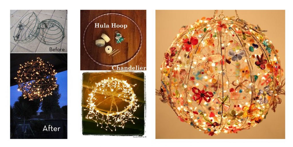
When thinking about material cotton led us to the thought of gauze and the colored wire on Hui Mins model led us to Fiber Optic. As well as having a less rigid material like the wire mesh so that we could explore on the romanesco model spiral pattern.

Then, 

Work Work Work Work Work…..

kk

Test Test Test Test Test…..

img_3316img_3317-min

FINAL

PRESENTING TO YOU………………………..ZHAR BO!!

img_3435img_3440img_3462

We wanted to create a hanging lamp with a soft shadow that is not so glaring. And also both of us really love the little shadow that is instead reflected on the gauze. We uses the little flowery buds of gauze we created and align them in a spiral pattern on the metal mesh. Then attach the metal mesh in a spiral alignment onto the two ring on the top and bottom. Using the fiber optic on the side, it gives a contrast of hardness in compared to the softness the the gauze gives out:)

img_3465

LASTLY, THANK YOU PEEPO AND PETER:) !!! All the fun and laughter we have in class and all the rubbish talk we have, and the amazing field-trip and extra art History Lesson!!!! I SO GONNA MISS THIS CLASS!!!:(


2D-(Assignment 3) Ego- Color Theory (1)

c668874c9c00b4ef4251995f52a2769c

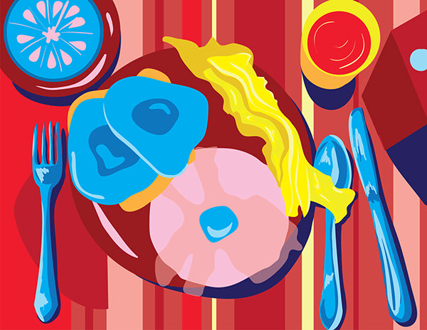
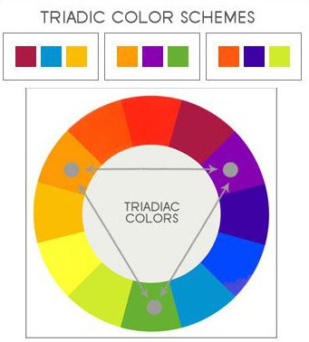
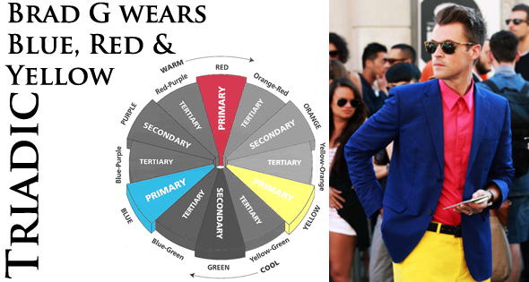
A triadic color scheme uses colors that are evenly spaced around the color wheel.

Triadic color harmonies tend to be quite vibrant, even if you use pale or unsaturated versions of your hues.

To use a triadic harmony successfully, the colors should be carefully balanced – let one color dominate and use the two others for accent.

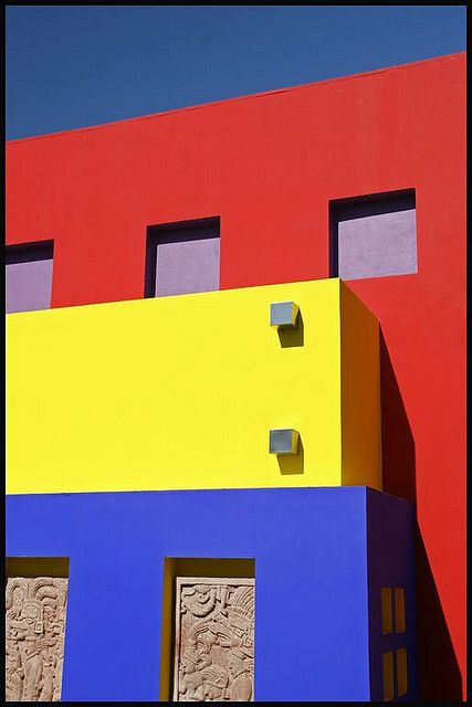
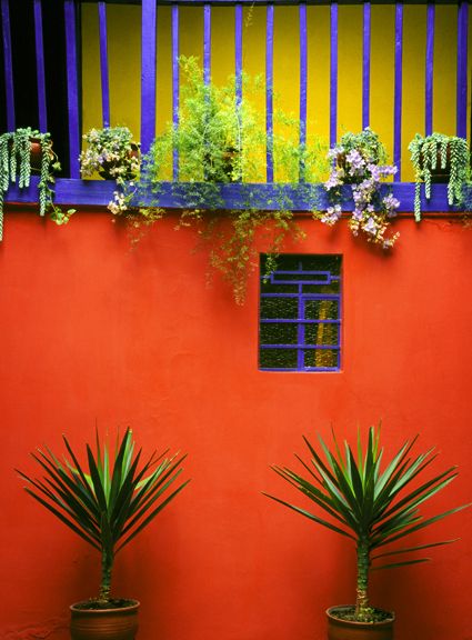
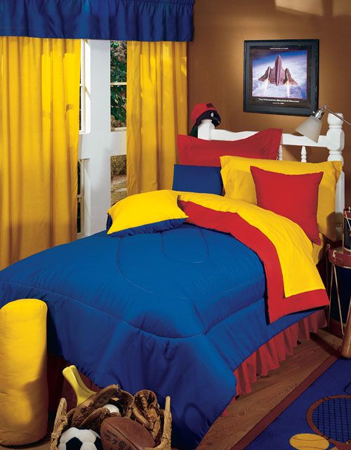
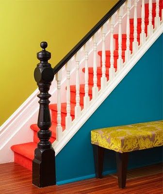
Triadic color can be found in various elements in our daily life:

Buildings and Interior:

0f172e1fbddced794bf80a551dfd0d6d35fcd0ed94461ffb1e506078257e8f759863271348590dc2067b366c363e04dbe3e7774a2b37524994230265421c7244

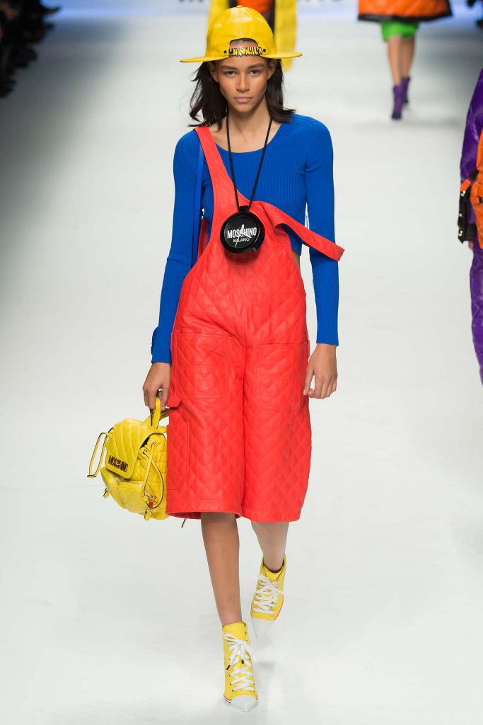
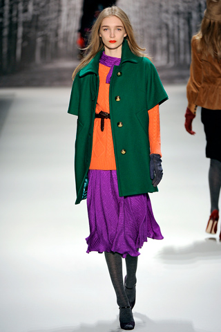
Fashion:

brad-g-triadic-color-blocking

24cc7352b34d65f057e11ce241865b84milly

Art:

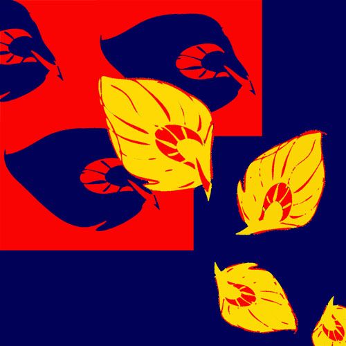
13cb5dec1ebf5f726e210ed7402a9c2d

Breakfast

4D-(Assignment 3) Final 4D Project- Make A Film Trailer- “RE_________”

TRAILER:

https://vimeo.com/192417398

It starts off with Kevin waking up in the hospital. This is the exposition shot for the entire trailer; the present, where Kevin was in a comatose for the past two years. His parents were happy that he was awake.

However, through checks with the nurse, she deduced that Kevin could not remember anything before two years ago. As he continues to survey where he was, he drifted off to sleep.

He was awoken by a flick on the face by his girlfriend, Ariel. Confused, he went off with her, after being told that they would be celebrating his 21st together. Still unaware of what was going on, they continued their date. Ariel handed him his present hidden in his wallet, telling him to open it when he gets back home.

The realisation Kevin happens when he drops his wallet, that he has lived through this timeline before. However, he doesn’t seem to know the tragedy that would happen. With snippets of him realising the tragedy, he wakes up, calling Ariel’s name. It ends of with him forcing himself to sleep, trying to get back to the past.

Outline: A guy who woke up from a two-year coma, with no memory of what caused him to land in his demise, finds himself being able to travel to and fro from his past when he sleeps.

Going back in time to find out what happened to him.

STORY SYNOPSIS:

This story revolves around a guy who just woken up from two-year coma, with no recollection of what happened before he landed in the hospital. However, he soon was transported back into the past, specifically his 21st birthday, as soon as he falls asleep in the hospital bed. He slowly becomes aware of his ability and uncovers the truth as to what landed him in the hospital.

As he slowly discovers the truth, would Kevin be able to change the past for a chance at a better future?

1st act

checkups in the hospital confused about what has happened. He is angry at why he can’t remember anything, confused) heads to sleep. He finds himself transported back in time.

Old Friends came to visit, but what happened still remains a blur.

2nd act

slips back and forth into reality.

Realizes that he has this ability to change the present, tries to get as much information as possible, so that he can

3rd act   

Finally wakes up….. And is happy that he is not transported back to the present anymore.

INSPIRATION:

CHALLENGES:

The biggest challenge we face is to find cast. Firstly we try really hard not to find friends in adm because many of them have assignment to rush and we felt really bad about it. Secondly, it is exam period soon:) Next would be location and props, we have quite a huge amount of hospital scene in our trailer, so we had to really think of where to film and where to get the props:) Initially,  we wanted to “kop” the changing curtains the models used from our foundation drawing classroom, or even filming inside the classroom, but there are classes going on and matching the cast time and the classtime and our time everything just don’t match sometime. But it’s ok! we have Hui Min’s hall who actually legit look like TTS Hospital C Class after setting up! and with her “Sor Da Pia” and tupperware everything make sense! haha:) In terms of technical aspect, time constrain was the bigger issue for us, because even though we might have our time nicely plan on when to film and where to film, we have to really take note of the cast time and how to plan our filming progress according to the best time to suits everyone. As well as having all the other assignment pilling up, it is even harder for us to cope with filming editing and meeting up for discussion! Hence, Skype became our best friend!

Something I’m super proud off

The amazing Schedule we created for the filming day! OH MY GOD!:)

0001

FEEBACKS FROM CLASS:

0004 0005

FIST EDIT:

https://vimeo.com/190685828

FINAL THOUGHTS:

whatsapp-image-2016-11-12-at-3-10-16-am

Thanks to this two girl I really had a wonderful time doing this project. I am relatively new to film, to film editing software to camera and many more. Instead of being irritated with my lack of knowledge in film, two of them didn’t hesitate to guide me along and they taught me many many new things. Like what log sheet is, how to write the log sheet. And how the film industry works. I felt really bad of not been able to give useful suggestion in how to make the trailer better, but both of them took my advice and think through it, which I really really appreciate. Despite how tired we are, we just try our very best to wake each other up to discuss through skype and to jot everything down nicely! All the sinful breakfast we have, mac, xiao long bao. GOSH! But I’m super super proud of the group! Also! I am really grateful for the cast members help! despite having assignment to cope as well as upcoming exams, they still agree to help us and were so on point on acting! Overall, I am really happy of what we have produce and I believe all our hardwork paid off! Love you girls!!!! 

For more information about the shots and the angels please refer to my group mate Hui Min Post 🙂


2D-(Assignment 3) Ego- Ego Final (3)


FINAL!

Work work work work work….

img_3187img_3188img_3192img_3190img_3193img_3200img_3199img_3208img_3211img_3212img_3217img_3218img_3224img_3225img_3227 img_3228

FINAL COMPOSITION!

My final 12 paper cut composition are pretty straight forward. There’s no nice hidden meaning and the whole concept is about bodily function. My reaction to different situation and yet these situation are relatively easy for other people to relate to it.

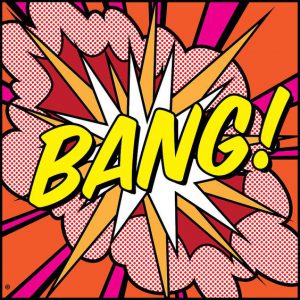
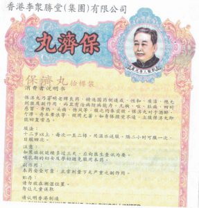
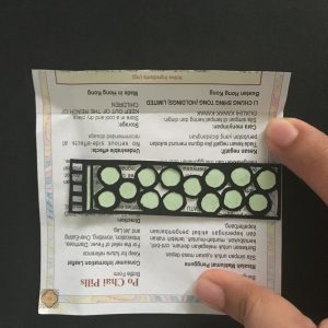
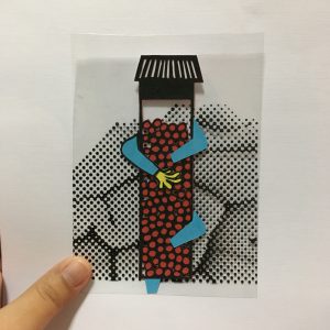
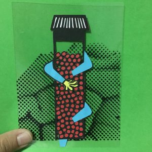
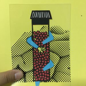
In row 1, composition 1 is me hugging bao ji wan (chinese diarrhea medicine) because I reply on this medicine every time I have diarrhea I use red instead of brown because red is a warm color and using color emotion this medicine give me warm and comfort. In composition 2 the angelic orange and yellow warm color symbolizes sun ray like the warmth and comfort toilet bowl give when we see it during diarrhea. Similar to the angel effect “ahh~” Composition 3 makes uses of direct style from pop art and a little color correction on the explosion.

The 3 composition of the second row I uses more soft color because this row concept is about female and women problem and in color emotion softer color are more feminine. In the 3 composition, I uses cool color like green, purple, light blue, because the idea of this composition is about cold drink.  
 I uses color correction for composition 1 and 2 and pimple are usually swollen red and in pain so I uses pink and red, And these colors also creates a contrasts with the soft light green of the face, and it allows the emphasis the pimple which is the main focus of this row concept. 3 composition is a typical style of pop art in terms of colors, font and layout.This whole row is about the idea of night time, so I tone down the color to more warm color instead of striking light color. And also minimized the usage of a variety of colors. I uses alot of purple in this 3 concept because in color emotion purple tends to be a relax and comfort color. A “nua” color. 

CRITIQUE DAY!

On critique Day I receive feedback regarding the last row of the composition. Joy suggested that I could create a wow factor in last row for example, in the first three row we have wow factor like the shiock, explosion, and lightning strike but the last row seem rather calm and down so I could probably include this factor into my composition. img_3247

 img_3245

Thank GUYS FOR THE FEEDBACKS!! APPRECIATE ALOT!!!!!!

presentation1

IM SOOOOO GONNA MISSED HAVING CRITIQUE SESSION WITH THEM:(

All the “So, class any comments?”….

Silence moment…..

img_3267

2D-(Assignment 3) Ego- Ego Research (2)

Week 1 : Research

When Joy first introduce us to project 3 on our critique day for project 2. Immediately the initial concept that came into my mind was me + on menses = mood-swing? I really like this concept because firstly it is very easy for me to express and secondly it is very relatable and easy for me to convey the idea to people. And so I went on to brainstorm things that happened to me on certain situation as well as situation that might be common and might also happen to other people. So.. think think think…… Then I remember diarrhea, then automatically things like vomit, fever, urine, dig nose, pimples all sorts of disgusting natural human bodily function starts pouring into my brain. HAHAHAHAHA Judge me all you want! Don’t tell me you don’t poop! Even Queen Elizabeth poop! 

Anyway since there is no limitation with the medium used for this project, and I am more of a hands on person I decided to just go with traditional mediums like paper-cut, painting, water color, color pencil etc. I decided to make used of solid colors to create the composition and pop art is famous for using different solid colors in one composition to create it’s work. After deciding on the concept of bodily function, I went on to do some research:

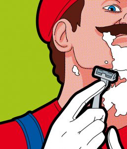
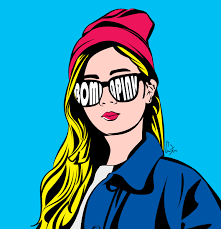
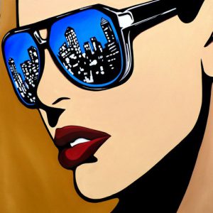
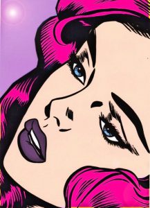
Color Research: POP ART

e04ca31f7a88c96e057bc9ad54307383227634f10e5824cb5a25a6ec83a9f5edimg_3178img_3177
2a7025d763a33beb1b31d4de4bbe3e2c2dc2de1db7d46ba0a1d29aac91b8a24d

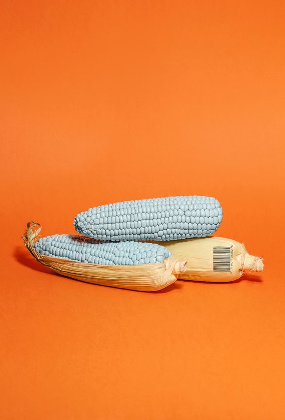
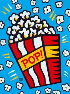
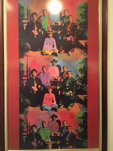
I did some simple research on the style and try to understand the color used for pop art to see if it fits into my concept. I realized that even though the color used in pop art are solid colors. but the colors actually make sense. Lets say pop corn is still in the color of whitish-yellow and skin tone are still beige. Relaying it to my concept of bodily function, I thought that if I were to make use of colors that makes sense like poo is brown or urine is yellow as the color for my composition, the whole composition would probably look really really disgusting. Then i came across with image like these:

6b65748ac8fa6bbfb6eb9fa49cc0e61448b9083874e2a0817cfcf1f58ed611e313c6d06bd9f876c213f7412ecaf2e42fbb56c0485652a5ff642d7a005a1ab6d7c0bf40055e8d83e88290fa0f1dcc52e54e78941b9153c6d56381f261d27f492d61479e7ca37319626fc448eea66a9cfc9871369b80e5c8e5bbc1a98280a1e43c0bf952b9e18575b3027eed68b1b412c4

Apparently this is call Color correction, and I decided to include this style into my Project composition, as well as pastel color. Since I want to used traditional hand-on medium and I intend to go with paper-cut. Some example I’ve research would be:

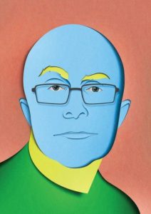
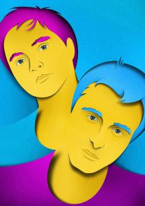
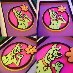
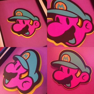
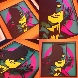
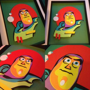
386d9a0734c50da9893eb80ebb845da82d07a34f174dbfa757bca97dc525b6b685acd828840045-55e7caad89089104b7e28840045-55d4c92b3bde265852f28840045-55d4c92b3711e8a460928840045-55e7caad86eaa

Week 2 : Individual Consultation

After the Individual Consultation on week 2, I learn that pop art is not just about the style the color but actually there is a certain theory behind pop art. I did some research and understand that pop art is actually about mass consumption, and mass population. Simply putting it, it is not only makes uses of celebrities and fictional icon, it also uses symbols icons and daily Things. 

Pop Art uses:

Comic, News, Advertising, Mundane Everyday Object, Celebrities or Fictional Character 

Characteristic of Pop Art:

Thick Bold outline, Clear Lines, Solid Color, Triad color, Split complementary colors.

I decided to just use the Characteristic of Pop Art and not the theory behind Pop Art because this is more connected to my concept instead of celebrities or other things that have no link to my concept. 

img_2927img_2928img_3180img_3027img_3057

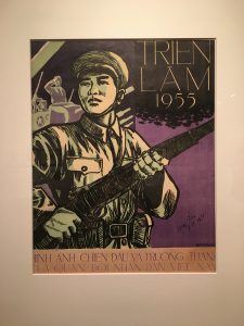
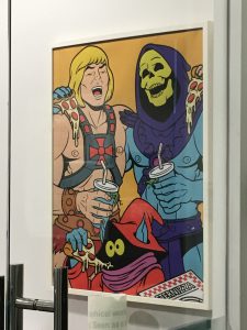
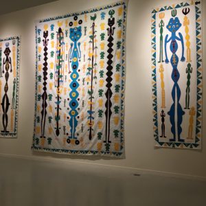
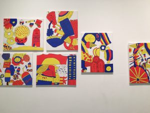
For 3D we went Singapore biennale and I saw different art piece that could be inspiration for this project, Eg, embroidery (ok I know I think too highly of myself) haha! and I also notice a few inspiration around adm. 

Week 3 : Group Consultation

To be honest up until this week I only have 1/12 composition IN MY MIND, not craft out but IN MY MIND! I’m so worried because I didn’t even know how the other composition look like and I haven even had the color I want to use confirm. Oh God, I’m so dead. Because of time constrain and Joy advice that paper cut takes up alot of time. I didn’t want to craft out all 12 composition in paper cut. I start exploring mixed medium. I thought of using ingredient paper found inside bao ji wan box and sanitary pad wrapping paper (ok I know I’m super super gross) or even painting it or using transparency. 

001-3img_3164img_3169img_3170img_3171

BUT EVERYTHING JUST DOESN’T WORK!

It also does not show my understanding in color and I’m drifting further and further away from the project drift. 

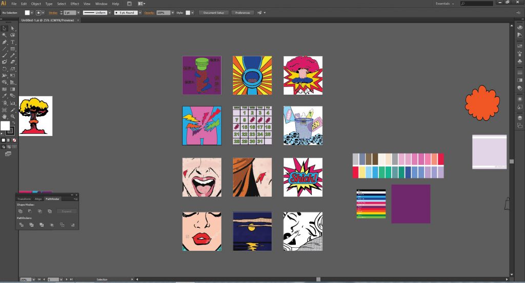
Up until Friday and weekend before my presentation on Thursday that I finally decide on just paper cut my life away, Just cut all 12 composition out rather than stuck here trying to explore the medium with no progress at all! Since I only left exactly 6 days left I need to really hurry up and rush myself. I was really stuck trying to convey the composition I had in mind and draw out in my sketch book and everything just look so ugly when I draw myself. I did a rough one in illustrator to guide myself on how my composition would look like and guide me when cutting. I decided to throw away the idea of pastel color because firstly it is hard to get a variety of pastel colored paper with high gsm secondly, lower gsm paper are too thin and affect the top color if i stack a darker color paper at the bottom of the lighter color. So I carefully pick out correct triad colored paper from fancy paper and think of color emotion, cool/warm colors when allocating specific color for the items and character in the composition. untitled

Then… Cut till I die…..