3D II-(Project 2) – Conceptual Object (Final) – (2)

FINAL!

“Abandoning your inhibition and opening up is not always the best thing to do, bad emotions,feelings and character  are sometimes more suitable to be kept in”

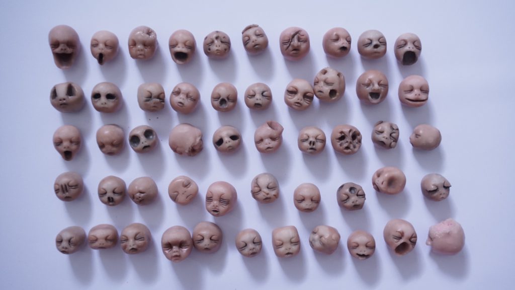
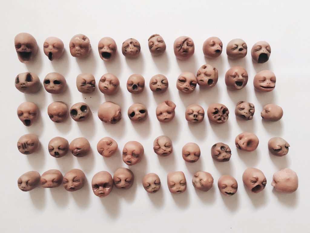
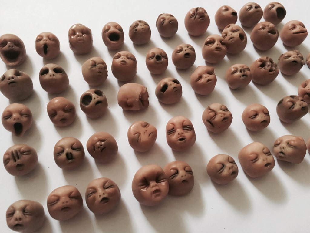
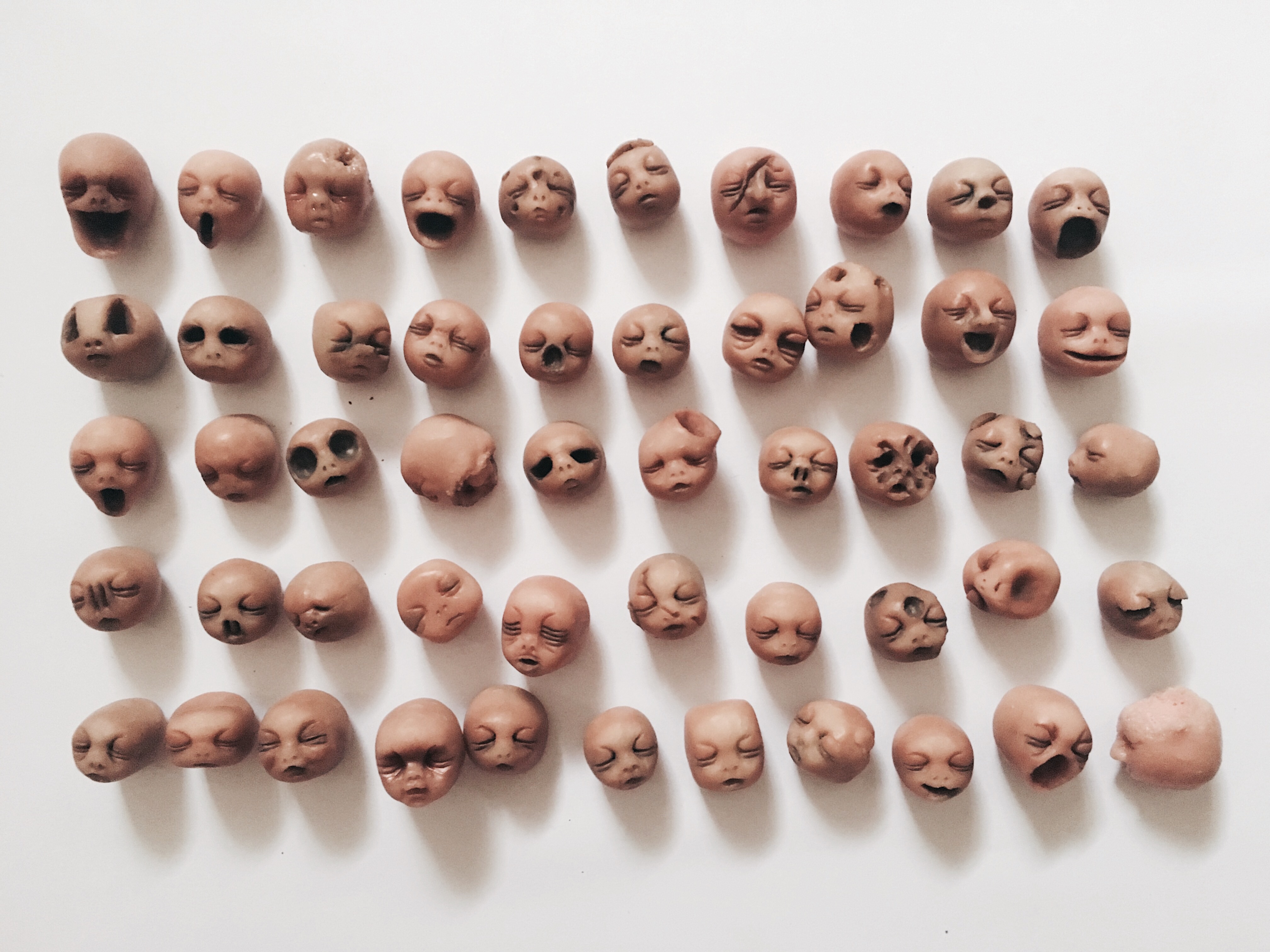
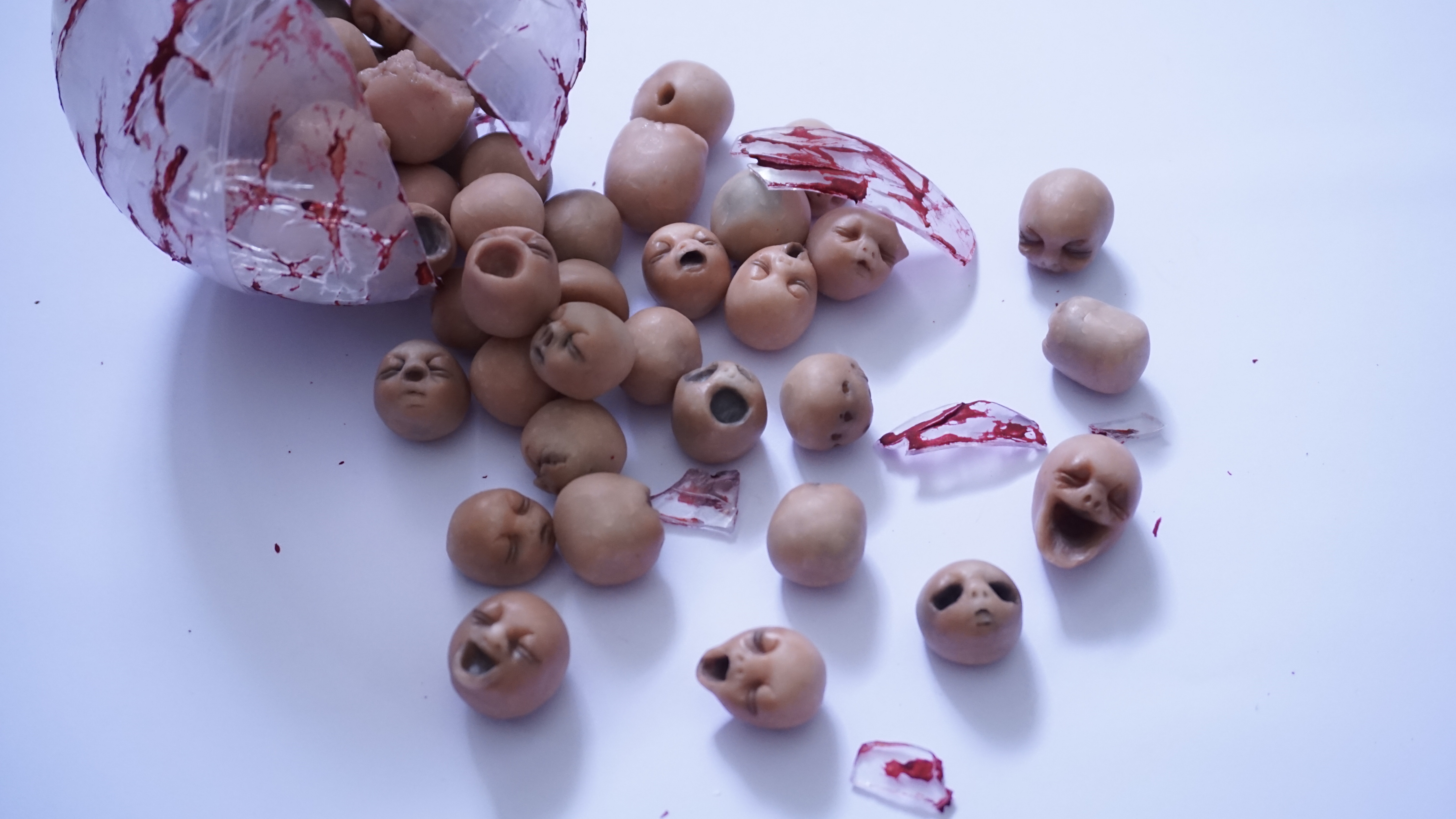
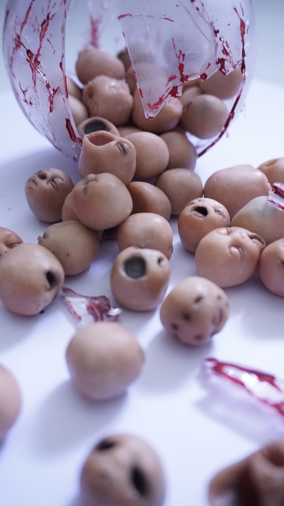
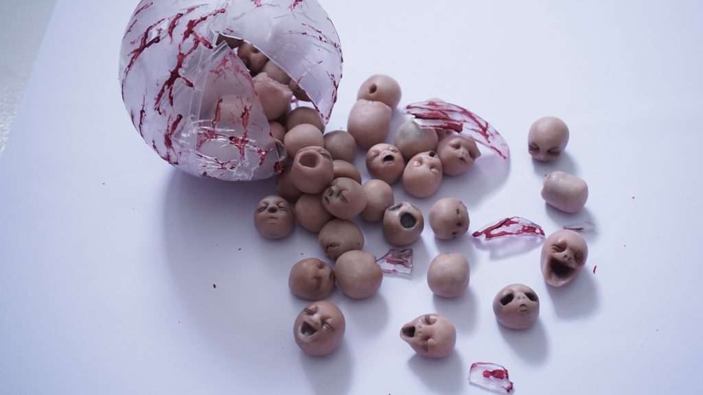
To mimic the idea of a strong and sturdy protective cover (inhibition) that human created for ourself, I want to represent this idea with mother’s womb. A very important Protective Cover for the babies. Stretch marks are also often seen on pregnant ladies stomach so making it bloody symbolizes the hardship, pain and stretching apart people have to go through in order to come out of their comfort zone, opening up and abandoning their inhibition However, letting go and be open up doesn’t always means a good thing, Emotions, feelings and character that flows out might be worse and uncontrollable. It might not be as beautiful as perfect than we expect, just like the creepy babies head. 

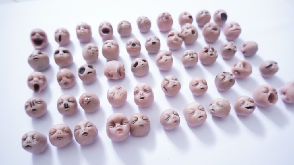
Each and every of this head represent a different feeling, emotion and characters. Each of them are imperfect in their own way. Some have a distorted nose, bulge forehead, elongated mouth, holes in their head, growing boobies on their head (symbolizes feeling naked when opening up), cuts/ slice marks on face or even eyeballess eyes. 


I left my babies head on the self and took this photo in the evening 🙂 I felt that the sunlight actually provided a more creepy look to the babies:)


Thank You!:)

2D II-(Project 1) Que Sera Sera- Final ! (3)

img_5286

FINALLL

For the final presentation, I’ve created a front and back interactive work. The front which is in black symbolizes the stereotype thought I receive from people regarding the job I wanted and the back coloured composition symbolizes what I believe this job means to me. 

The four job I have since a child was:

Cashier
Lorry Driver
Mortuary Make Up Artist
Designer

My Name Is:

untitled-1-page-001untitled-1-page-002

And I Am A Cashier.

output_izggi6-iloveimg-compressed
Please click!:) its a gif

Type: Why I uses this font and why I selected this part of my name

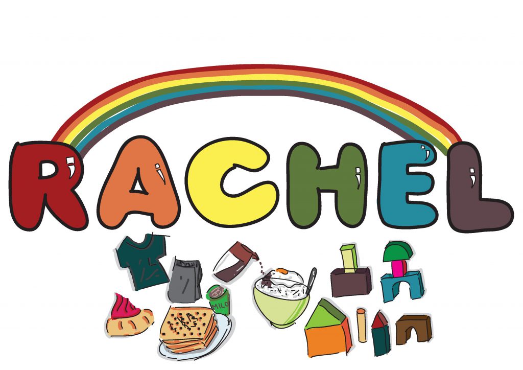
Rachel = Rachel’s very first Job
(Font = bubble, the very first font I use at that young age to draw every thing)

Story behind each illustration:

output_m5syxe
Please click!:) its a gif

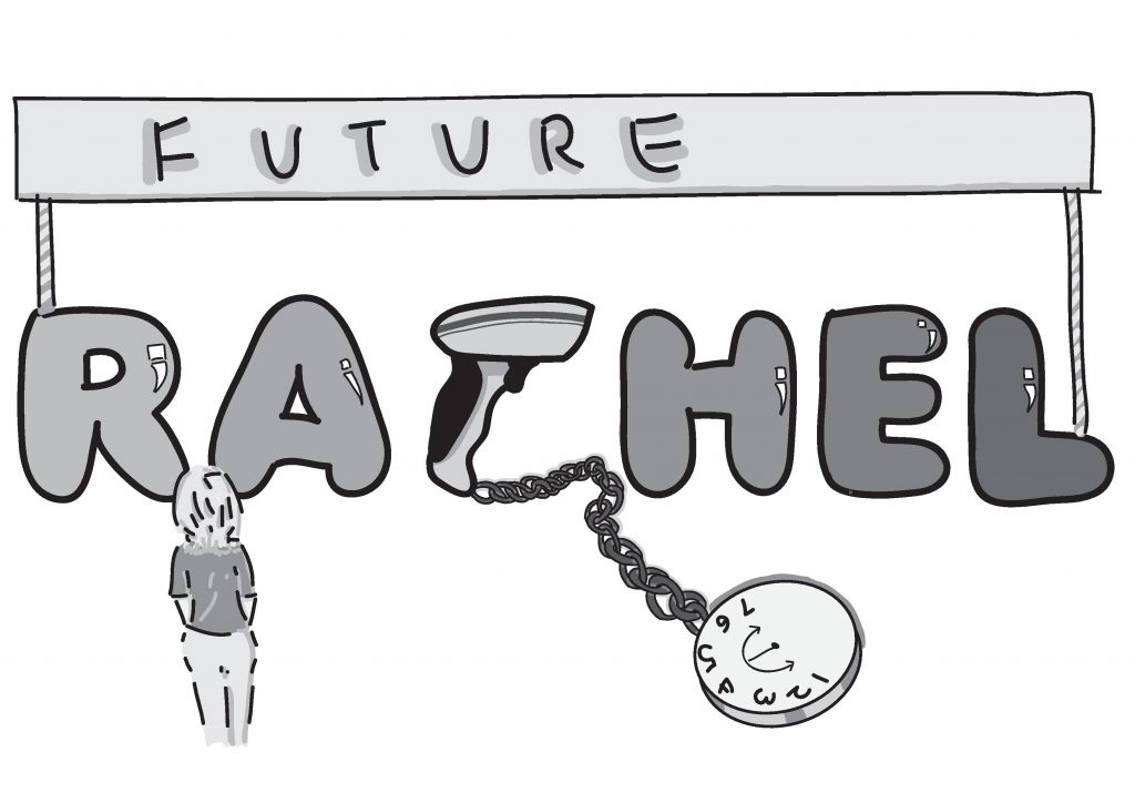
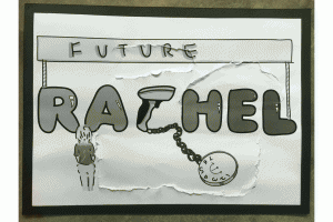
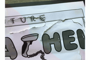
People always assume being a cashier means no future. On the front composition it shows a girl looking at the banner future and never be able to pass it. However, at that young age when I wanted to be a cashier people always tells you that your future is always bright and full of colours. Thinking back now I hope everyone could continue to have that positive mindset towards our future and be confident of what we want to be in our future career. 

output_v0hnq2
Please click!:) its a gif

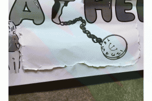
Sometimes we couldn’t blame people to have that thought regarding cashier as a low pay job. I uses the bar code scanner as alphabet C and it is being chain to a clock with only time 1-7 and clock hands who only goes in a U shape meaning that people would forever think this job being tied to a part time life and low pay. However, we can convince people that doesn’t mean a low pay cashier means you would led a hard life. If we flip open it shows how leading a simple life with food like soda cracker with a cup of milo. a bowl of white rice with a fried egg drizzle with soy sauce. Basically if we are contented and led a simple life with the pay of being a cashier is more than enough. 

My Name Is:

untitled-2-page-001untitled-2-page-002

And I Am A Lorry Driver.

output_yrokwl-iloveimg-compressed
Please click!:) its a gif

Type: Why I uses this font and why I selected this part of my name

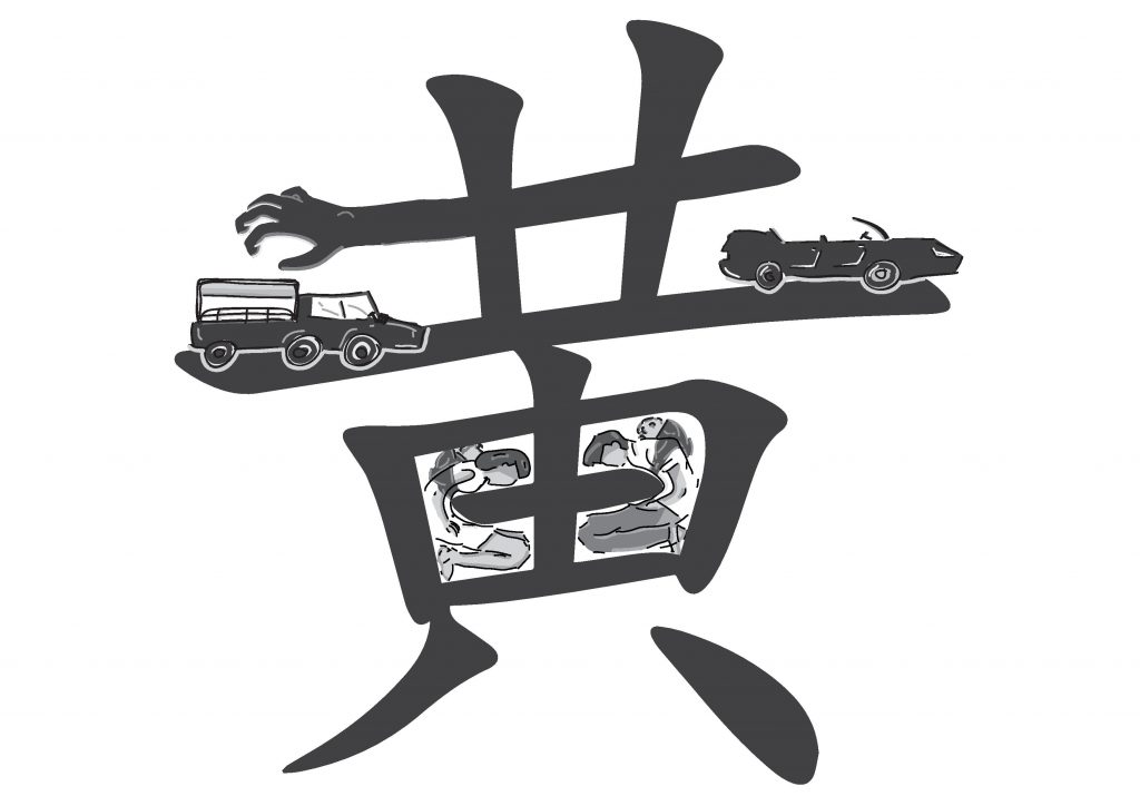
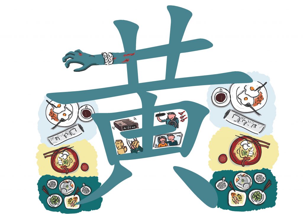
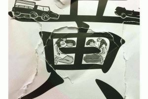
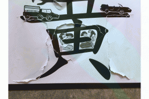
Huang 黄 = Composition inspire from my dad and I am proud of him/he’s and my surname
(Font = Chinese traditional font showing him as a traditional and stubborn person, not rigid)

Story behind each illustration:

output_paukoh
Please click!:) its a gif

When I first told people I wanted to be a Lorry Driver just like dad, people around me would say “why would want to do such a dirty job?” Assume it being low pay and definitely judge it as a low class job. The hand on the front page symbolize the black and dirty hand people thought this job is. But in actual fact people doesn’t see the amount of scars my dad have due to this job. And also to he’s driver colleague. They have constant back pain due to sitting on the driver seats for too long. And also pain in the wrist and cuts for moving goods up and down their lorry. 

output_olooek
Please click!:) its a gif

As a Lorry Driver people also assume it as a Low Pay Job. Similar to being a Cashier people would see drivers family living a tough life struggling with financial (shown in the front cover a couple with their kid squeeze in a small living  space) and that his job would be all about driving and nothing else, nothing meaningful. However, if you try digging into the life of a lorry drive you would realize their day are actually more pack than a office worker. My dad woke up everyday at 4.30am, after leaving home, he had to pick up the workers from their dorm than travel around Singapore to allocate them to various working location for the day. He also have to attend frequent safety lesson and pass various examination in order to carry on holding onto his driving license as well as always helping with the moving of goods up and down the Lorry. and lastly, lorry drivers family do led a happy life:) 

output_seo2k8
Please click!:) its a gif

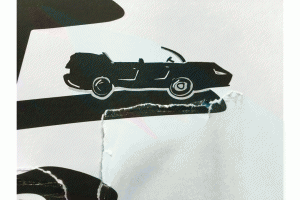
Lastly the word 黄(huang) is form with a slanted horizontal line (横heng) and I make use of that to show how people categorize lorry driver as a low class (bottom of the heng) and branded car driver as the upper class(top of the heng). But the truth is if you open up the front cover, no matter you’re from a low class or a high class, we are all human. We all have to eat three meals to sustain our life. Doesn’t mean you’re in the upper class you only need two meals, we are all equal human being. 

output_q9eqae
Please click!:) its a gif

The second layer letter is also integrated in the first layer letterform. Showing the idea of lorry driver is join to this three meal and branded car driver is also join to this three meal.

My Name is:

untitled-3-page-001

untitled-3-page-002

And I Am A Mortuary Make Up Artist.

output_arfuzz-iloveimg-compressed
Please click!:) its a gif

Type: Why I uses this font and why I selected this part of my name

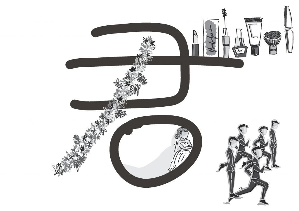
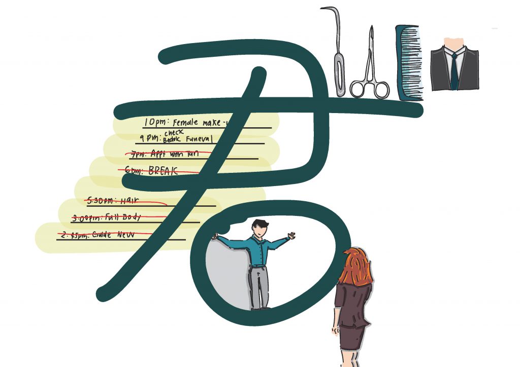
Jun 君 = Because the stereotype thought on this composition is due to traditional reason therefore Chinese name (Font = This is my dream job when I’m in secondary school, this is how I write jun in secondary school)

Story behind each illustration:

output_ph2tzu
Please click!:) its a gif

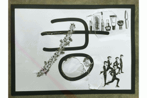
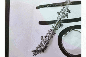
Wanting to be a mortuary make up artist would probably be a big NONONO to many adults. Especially to elderly, people would think this job being a “not clean” job because you have to deal with deceased people everyday. On my front composition I uses the flower to created the (撇pie) of my name because in taoism and buddism flower put inside a bucket of water is being used in funeral for people to wash their hands and face to so call “clean the dirty away” before they leave the place. This flower (撇pie) symbolizes this as a so call “dirty job”. but by talking to my mom friend (he is working in this field) he told me that he does not only stays inside the office doing the cleaning job but also he had to often visit different funeral location because you also need to be a funeral director and once during chinese new year eve while everyone is eating their reunion dinner, he was at mandai waiting for a deceased body.

output_ssxaop
Please click!:) its a gif

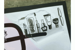
People also simply thought that this job the only requirement you need would be the skill to do make up. and make up and make up. (front composition) But the truth is, in order to work in this position you need to possess skill such as embalming, and also a funeral director as well as a cosmetologist (back composition)

output_kubi2u
Please click!:) its a gif

Lastly, many adults and elderly in the family despise this job because they believe this job would affect your marriage especially for girls. In my composition it shows that the husband all run away and the bride being kept inside this field. But after talking to my mother friend he told me that you just have to look for someone who is willing to step into your circle and accept you for who you are and your job. (back composition)

My Name is:

untitled-4-page-001

untitled-4-page-002

And I Am A Designer.

output_bxeumq-iloveimg-compressed
Please click!:) its a gif

Type: Why I uses this font and why I selected this part of my name

GIN = The name I use for design related work and given by my mom, she supported my design path
( Font = clean and more illustrated font)

Story behind each illustration:

output_p5idyb-iloveimg-compressed
Please click!:) its a gif

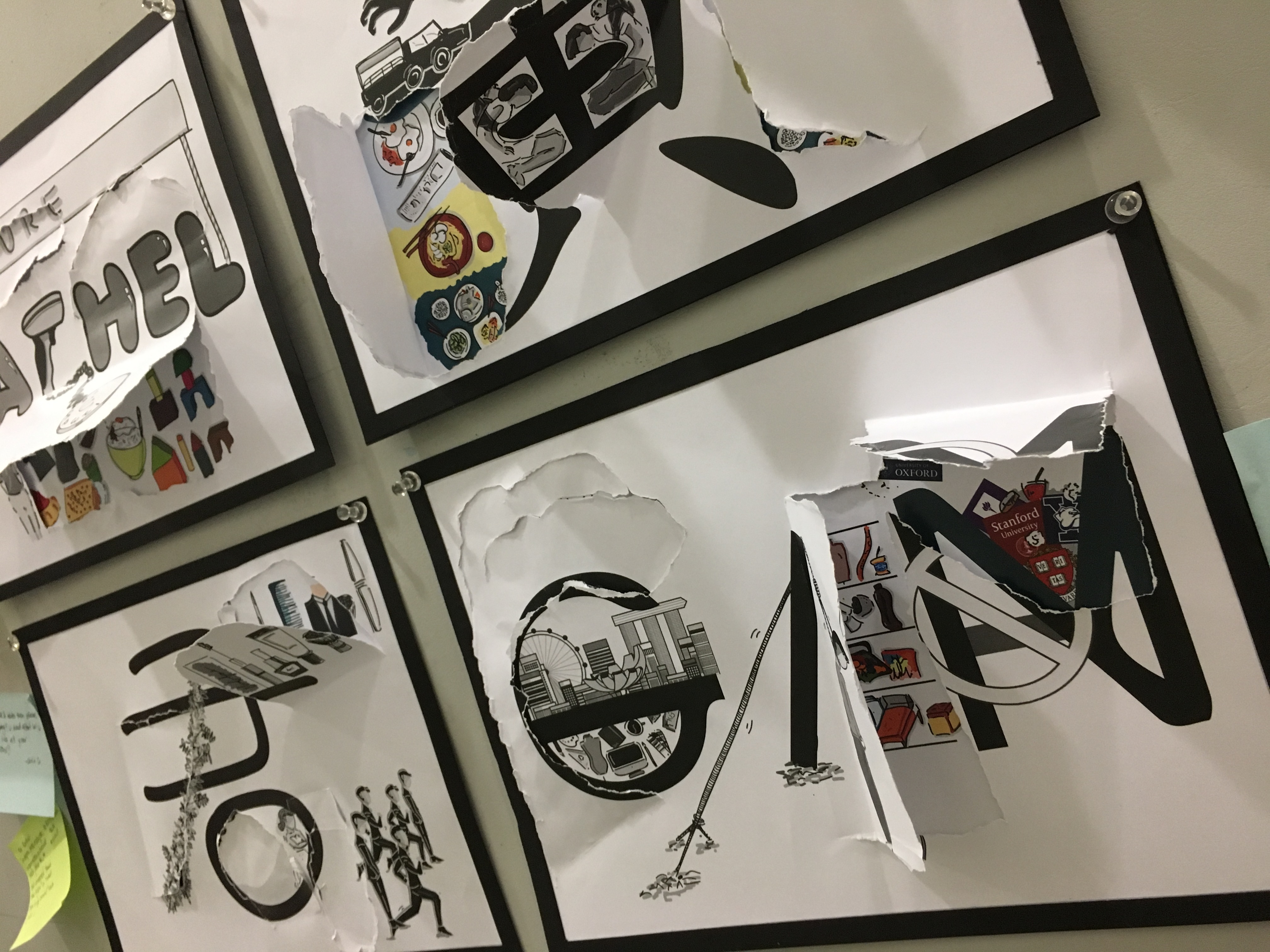
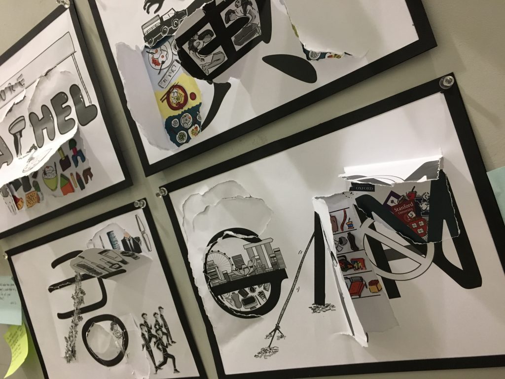
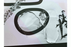
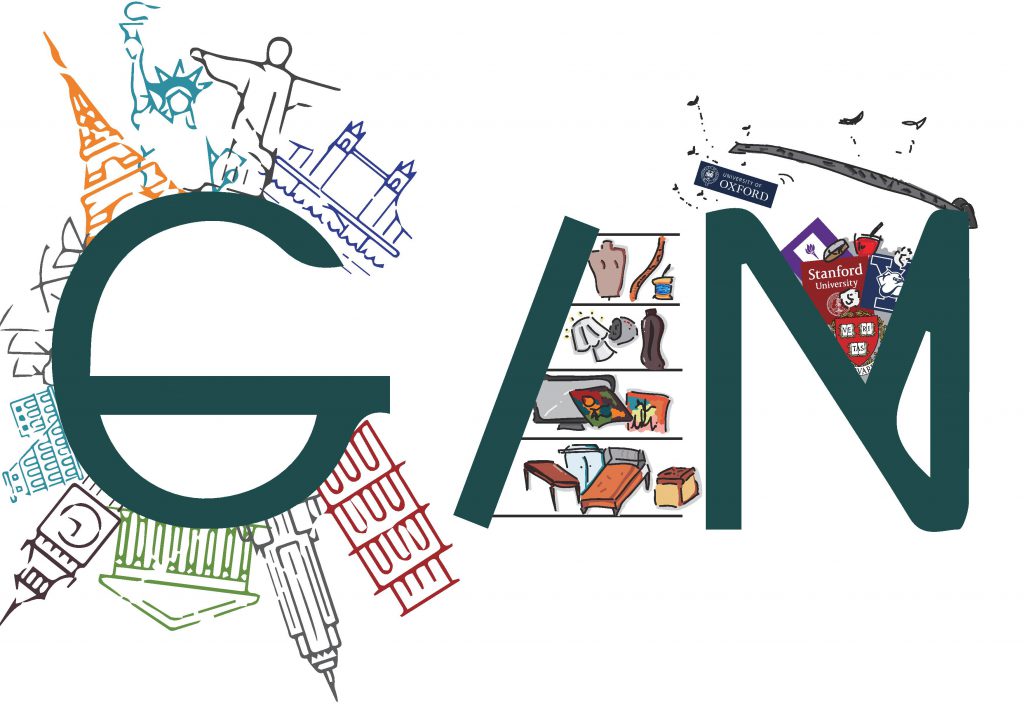
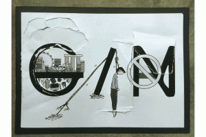
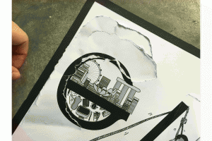
If you’re in the design field you’ll heard people saying design is such a small field. On my fort composition inside the letter G on the top is Singapore being kept within and at the bottom is the design industry being kept within Singapore. But if you tear open the area outside of G you would see that the world is huge, Design industry can venture out of Singapore into the outside world:)

output_opiibj
Please click!:) its a gif

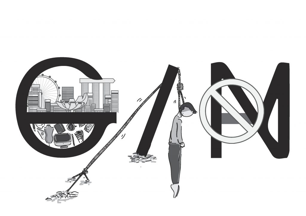
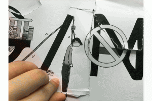
死路一条, Something I heard many times from aunties and uncle around me. The guy committing suicide symbolizes this path as a designer would eventually come to an dead end. But open up this cover your would see that things around you, From furniture, commercial graphic, product, to fashion all require design. 

output_1bpzn8
Please click!:) its a gif

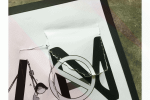
Lastly, people especially parents like to think that studying design means you didn’t score well enough to get into “proper” field like the business or science etc. ( symbolizes in the front cover of the letter A form inside letter N being stamp with a DO NOT sign. But people who study well or phd holders doesn’t mean they could do design. In my back composition you could see famous universities like Yale, Harvard, Oxford, NYU being thrown into a rubbish bin.

So Sorry for the LOOOONG post but this is all for my FINAL!!:)

3D-(Final Assignment) Modular Construction-FINAL-“ZHAR BO” (2)

Final Work from Hui Min and Rachel(I)

For the final project, We created a lamp Shade called “ZHAR BO” presentation1

It is a combination of :

pptfd02-pptm-recovered

What we Pick Out From our Models:

  • Materials and Softness in Hui Mins Model
  • My Model Spiral Pattern/arrangement
  • The idea of one spiral is one whole strip
  • The idea of combining hardness(the color strips on Hui Min model) and softness(Bottom of Hui Mins Model)

We started off with research, sketches and getting materials, followed by discovering the mystery store room inside the workshop. -.-“

And all the materials we wanted is inside the room. Anyway,

aaddd

We come into a agreement to used wire as our lamp skeleton and to just have two round rings on the top and bottom. So that we could play around with the pattern from the top to connecting to the bottom.

Our initial skeleton was a middle rod in the middle to connect the two ring, then we realized the light bulb problem, then we change to connect the two ring with three rods and the side, but we felt it being too consistence. Finally, we change it to one bigger ring on top and one smaller ring on the problem. 

When thinking about material cotton led us to the thought of gauze and the colored wire on Hui Mins model led us to Fiber Optic. As well as having a less rigid material like the wire mesh so that we could explore on the romanesco model spiral pattern.

Then, 

Work Work Work Work Work…..

kk

Test Test Test Test Test…..

img_3316img_3317-min

FINAL

PRESENTING TO YOU………………………..ZHAR BO!!

img_3435img_3440img_3462

We wanted to create a hanging lamp with a soft shadow that is not so glaring. And also both of us really love the little shadow that is instead reflected on the gauze. We uses the little flowery buds of gauze we created and align them in a spiral pattern on the metal mesh. Then attach the metal mesh in a spiral alignment onto the two ring on the top and bottom. Using the fiber optic on the side, it gives a contrast of hardness in compared to the softness the the gauze gives out:)

img_3465

LASTLY, THANK YOU PEEPO AND PETER:) !!! All the fun and laughter we have in class and all the rubbish talk we have, and the amazing field-trip and extra art History Lesson!!!! I SO GONNA MISS THIS CLASS!!!:(


2D-(Assignment 3) Ego- Ego Final (3)


FINAL!

Work work work work work….

img_3187img_3188img_3192img_3190img_3193img_3200img_3199img_3208img_3211img_3212img_3217img_3218img_3224img_3225img_3227 img_3228

FINAL COMPOSITION!

My final 12 paper cut composition are pretty straight forward. There’s no nice hidden meaning and the whole concept is about bodily function. My reaction to different situation and yet these situation are relatively easy for other people to relate to it.

In row 1, composition 1 is me hugging bao ji wan (chinese diarrhea medicine) because I reply on this medicine every time I have diarrhea I use red instead of brown because red is a warm color and using color emotion this medicine give me warm and comfort. In composition 2 the angelic orange and yellow warm color symbolizes sun ray like the warmth and comfort toilet bowl give when we see it during diarrhea. Similar to the angel effect “ahh~” Composition 3 makes uses of direct style from pop art and a little color correction on the explosion.

The 3 composition of the second row I uses more soft color because this row concept is about female and women problem and in color emotion softer color are more feminine. In the 3 composition, I uses cool color like green, purple, light blue, because the idea of this composition is about cold drink.  
 I uses color correction for composition 1 and 2 and pimple are usually swollen red and in pain so I uses pink and red, And these colors also creates a contrasts with the soft light green of the face, and it allows the emphasis the pimple which is the main focus of this row concept. 3 composition is a typical style of pop art in terms of colors, font and layout.This whole row is about the idea of night time, so I tone down the color to more warm color instead of striking light color. And also minimized the usage of a variety of colors. I uses alot of purple in this 3 concept because in color emotion purple tends to be a relax and comfort color. A “nua” color. 

CRITIQUE DAY!

On critique Day I receive feedback regarding the last row of the composition. Joy suggested that I could create a wow factor in last row for example, in the first three row we have wow factor like the shiock, explosion, and lightning strike but the last row seem rather calm and down so I could probably include this factor into my composition. img_3247

 img_3245

Thank GUYS FOR THE FEEDBACKS!! APPRECIATE ALOT!!!!!!

presentation1

IM SOOOOO GONNA MISSED HAVING CRITIQUE SESSION WITH THEM:(

All the “So, class any comments?”….

Silence moment…..

img_3267

3D-(Final Assignment) “Modular Construction” (1)

As part of our Final Assignment we had to find SEM (Scanning Electron Microscope) for a certain object. And for me I choose Romanesco Broccoli:)

romanesco-only

Romanesco Broccoli have 2 type of pattern in total:

romanesco

Spiral:

picture1 

The Whole:

Form by repetitive Spiral Pattern

maxresdefault

The Little Individual Buds:

Form by repetitive Spiral Pattern

Natural Fractal 

picture2

Natural Phenomenon

Repeating pattern

expanding symmetry or evolving symmetry

Natural Fractal (Self Similar)

picture3

picture4

Replica exactly the same- Self-Similar

 SEM (Scanning Electron Microscope)

e6a45e8acd3f91456f5a6ba6e579a9ba

sfsfs

This would be the two main pattern I would focus on:)

Starting our model making

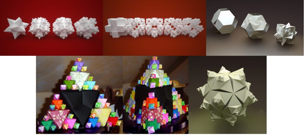
Before going into model making I first started out with some research. My original idea was to make use of geometry shapes to craft out the idea of fractal. Meaning from on square, spit to two, then four and so on. So I went to do some research and test to see how people make use of geometry and the term fractal to create different model and i got some results like:

xvxv

My initial idea was also to use origami to craft out the pattern, I begin by doing some rough sketch of my idea, but the result didn’t turn out well because it is way too hard to control the size of the origami. Even if i reduce the paper size by alot. The shape come out would eventually look similar to the previous one:(

img_2865

img_2858

img_2867

img_2868

img_2869

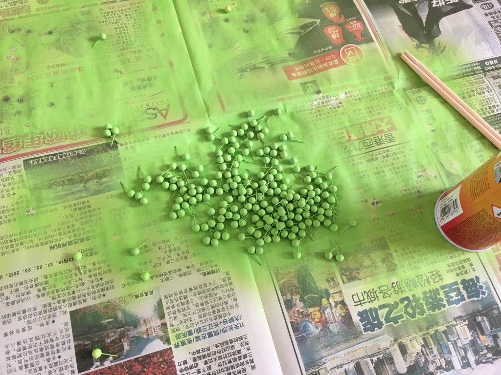
After discussing it in class with Peter he told me that this geomery shape is too different from romanesco. Then I realized that I was probably too focus on the term fractal and forget that I have to use the fractal patter ON ROMANESCO to do my model and not fractal in general. He also told me that first you have to understand the structure and pattern carefully and understand it first so that your could craft it our base on it. Then I told him if I could use Styrofoam cone and poke pins on it? 

img_2866

img_2753

img_2761

img_2743 img_2744
img_2771

img_2811

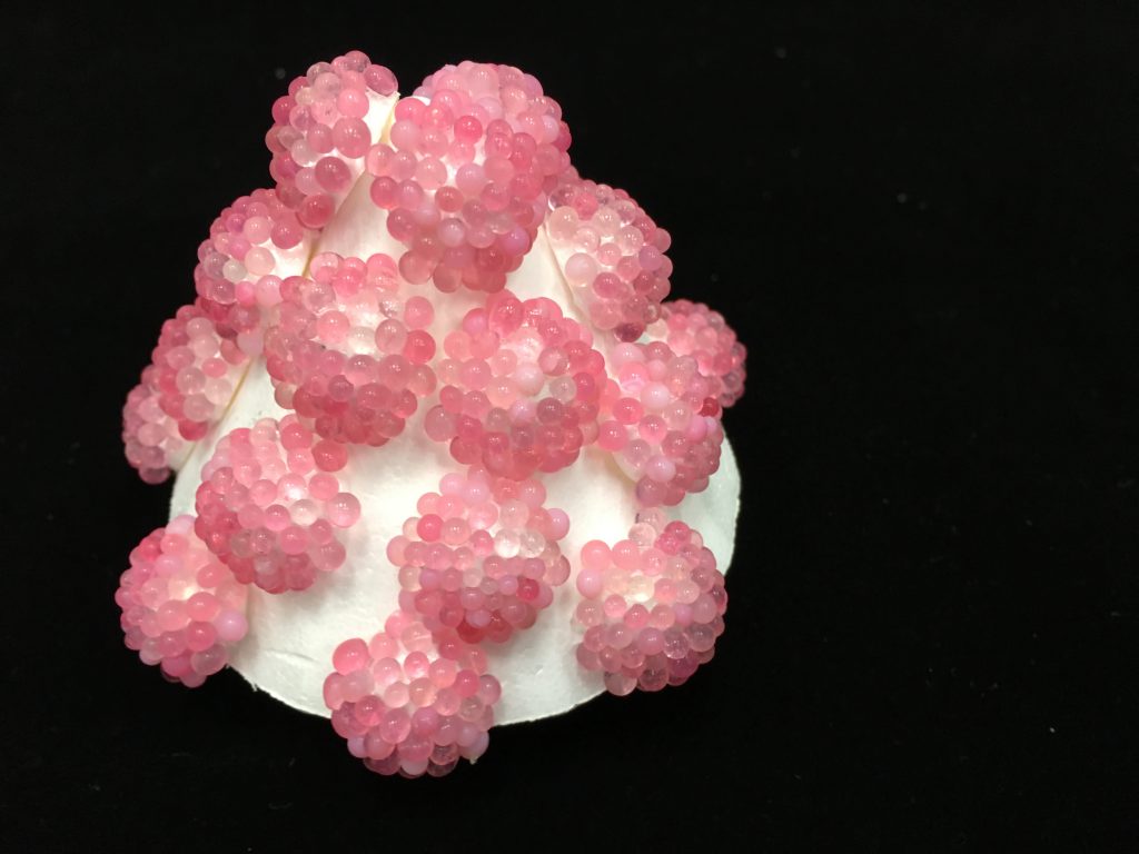
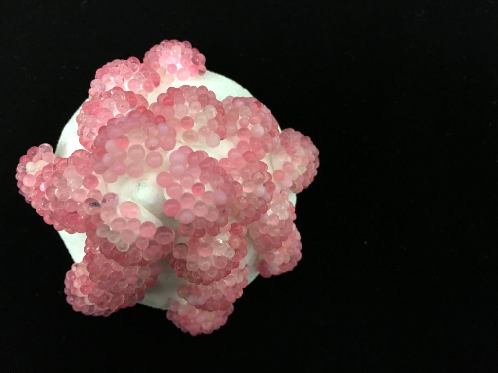
I felt like it came out really bad, to be honest there is a limitation to the size of pins I could use. And therefore it is hard to create the little buds and intricate spiral of the romanesco:( Up till this point to be honest I was pretty worried about what more material I could used for the design. So the night before our submission while I was taking books from my sheleves I saw the bottle of silica gel! And I immediately thought Why not? It is small enough for me to create the spiral on the foam and it loos really small like the little buds!

img_2783

img_2782

img_2787

And TADA my final:) the only part i’m not really happy is that I could probably get smaller Styrofoam of cut Styrofoam into smaller pieces so that it could filled up the empty portion and also create a more variation of unit sizes to look more like the pattern on romanesco. And also even though I’ve tried using smaller silica gel for the tip of the unite so it could have a variation of buds size but when the whole unit is done the small silica gel seems to blend in and go missing:( Nonetheless, I’ve tired and was pretty happy that I manage to use silica gel as a last minute material.

img_2799 img_2804 img_2801 img_2802


2D-(Assignment 2) Forest Gump- Final! (2)

Finally today is the day of our Assignment 2 Critique!!!!!!!!!!!!!!!!!!!!!!!!!!!!!!!!!!!!!!!!!!!!!

Time passes really fast, at first I just met my classmate, then I was introduced to line project 1 then now I’m presenting my Project 2 and later I would be introuduced to project 3! OH MY GWAD!!! SO FAST 🙁 Really sad to leave this class:( Such wonderful People. 

OI back to topic lah! anyway my final decided quotes are:

  1. The deepest wounds aren’t the ones we get from other people hurting us,
    They are the wound we give ourselves when we hurt other people    Edward Scissorhand, 1990
  2. Once you do something, you never forget. Even if you can’t remember    Spirited Away,2001
  3. You cut yourself off from all sorts of experiences because you tell yourself you are
    ‘not that sort of person”, But, I’m not. How do you know? You’ve done nothing, been nowhere.
    How do you have the faintest idea what kind of person you are?    Me Before You, JoJo Moyes, 2016
  4. But if there’s love, dear…. those are the ties that bind, and you’ll have a family in your heart, forever.
    All my love to you, poppet, you’re going to be alright…bye bye   .Mrs Doubtfire, 1993

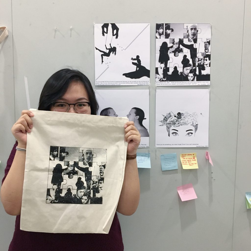
For my compositions I wanted to try different style for each composition, some uses silhouette, some uses illustration, some uses greyscale and some uses images and photographs.

And My Compositions Are:

rachel_ng_gi_gin-edward_scissorhands_1This story behind this quote I’ve said it before so i’m repeating again:) To me this quotes reflects to the relationship I have with my mom. Growing up I believe everyone been through many quarrels with their family members. If you say no, I don’t believe. haha,.. Anyway yes, I’ve quarrel with my mom countless time, when we quarrel, I always felt im the one being blame, being misunderstood and hurt by her and that I’m always wrong, But when I calm down, I always feel really sorry and guilty for the words I’ve said to her. Regretting each and every words I’ve said to hurt her. Feeling so hurt in my heart for causing this quarrel and hurting my love one. And this is where this composition comes about.

The white hair on the left symbolizes my mother, and the one on the left symbolizes me. The reason why is a mirror image is because many many people say we look really really alike like ang gu kueh mold out. Adding on, the sword piercing through my mouth to her meaning that when we quarrel not only I’ve hurt her, But after we quarrel the pain and sorry I got after I regret is more than the hurt I’ve cause her. The constant regret and pain I felt and guiltiness that filled me. Reason why there is only blood from my mouth is because of the greater pain I suffer after we’ve quarrel. And words on my mother’s body showing the idea of once said never taken back so it’s on body and not clothing because it can never changes and would always be reminded that I’ve one said these words to hurt her. 

rachel_ng_gi_gin-mrs_doubtfire_2

This is the same design I printed on my tote bag. Family time is always a very precious time for me. Especially things that could bind us together means even more. The old chinese film is the thing that could bind us together as a family, without electronic devices or doing work or anything else. Everyone just sit together and simple laugh as we watch these movies. The puzzle design meaning that combing these films and pieces of the family on the background together would eventually form a full complete puzzle. And the reason I decided to print this on my tote bag is because firstly I spend alot time on this and only had this on composition on the tote bag printing week. Secondly, this is still happening in my family, we are still watching these movies now and then for our family time. 

rachel_ng_gi_gin-me_before_you_3

I’m the kind of person that always tell myself I can’t do this, I can’t do that, but infact I’ve never step out of my comfort zone and tried things before. For example, I’ve always scare of water, Sports like snorkeling or diving is an absolutely NO in my dictionary. But my sister is always the one behind my back pushing me out of my comfort zone, telling me you never try you would never know and last last year I’ve finally tried snorkeling and to be honest! I really love it, it is scary for me yes, But I would definitely do it again:) So this composition shows my sister(one the right) stepping on the palm or my parents pushing me(one the left) breaking free out of my comfort zone with is symbolize by the line drawn out from baby inside womb. And me sited on the swing with the hands holding onto the strings meaning the words my sister always tells me, No matter how scary that thing is just remember we’re always here holding and rooting for you. So just try..:) 

rachel_ng_gi_gin-spirites_away_4

The meaning behind this composition is trying to say many times in life, we do alot of things and we would go “I don’t remember leh, But I think I got do before” or “I’m pretty sure I got do before” So this quote to me is to constantly remind me that I have to spend time and do family activities with my family. Because of work, my family didn’t have much time and money to travel together. And because I was young, I have no idea how to organized one. Now gown up we finally are able to travel together for the very first time last year. And to me, I would want to do many of such activities together. The activities on the brain in the composition are the things I want to do as a family, things like travelling, movies, picnic, chalet, sports or having seafood. Even if we can’t remember we did that before I believe we would still have a little memory about it. Just like the lighter part and eraser dust on the composition even is one day these memories are erase or we cant remember it, we would still leave a trace or mark in our brains just like when we erase things off paper, we can’t completely erase it clean.

Problem I Faced:

Throughout this project, the first problem I faced was how to link the quotes to myself. I could say I love this quote that quote, But even I myself wonder why I actually like this quote. Secondly, would be finding the right images. When you gave a idea or composition in mind, it’s hard to find the right high resolution image to craft out the picture you had in mind. As well as the adjusting it to black and white. Some image would turn out too dark and some would details non show and you have to match it with the other image in your composition:( I didn’t have much problem with my silk screening process except for the fact that washing takes a long time:)

Critique Day!!:)

Feedback I receive from Joy on Critique Day:)

  • Could have something to link the four compositions together.
  • The composition for “Me before You” could use real hands to show the character identity and age of the person. Parents hand could be slightly older and different between mom and dad hand.
  • Small details could link the four compositions together. Eg, in “Spirited Away” have activities like film and on “Mrs Doubtfire” we can find film being shown as a subject:)
img_2855
Everyone Came EARLY!!!

img_2857

img_2854

img_2850
THANK YOU FOR THE LOVELY NOTES I RECEIVE:)
img_2856
BREAK TIME ALL ZHAO!!!:) HAHA!

2D-(Assignment 1) My Line Is Emo- (End) Chinese Ghost Festival (3)


IMG_1841

IMG_1823

Concept

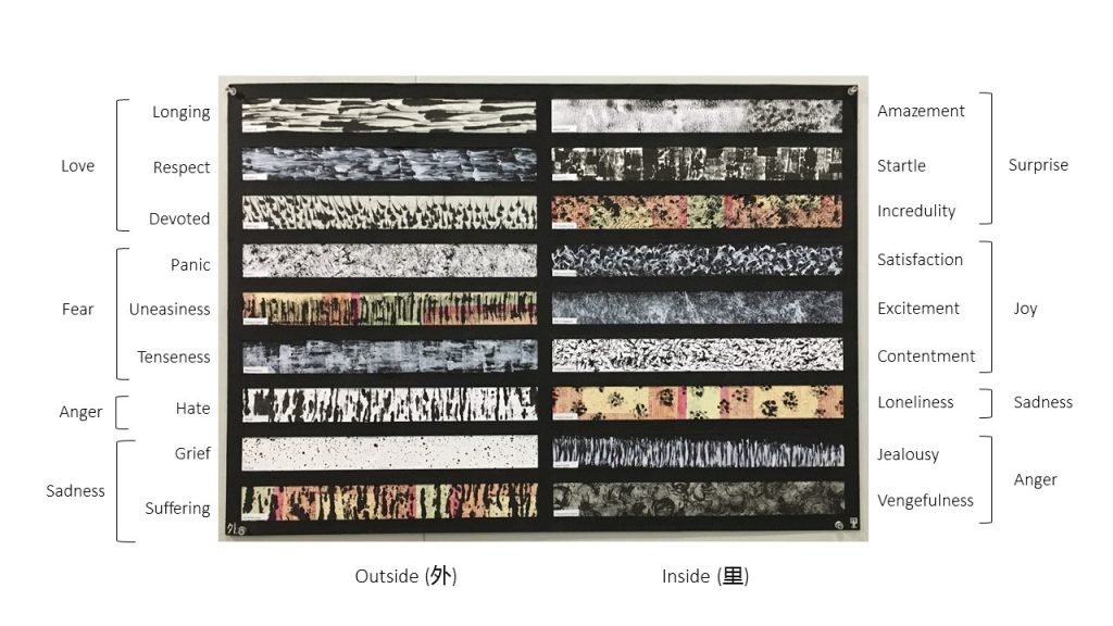
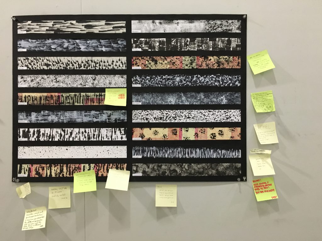
From my tittle you’ll be able to know that my concept is the Chinese Ghost Festival. The six emotions, Love, Fear, Surprise, Joy, Anger and Sadness is subdivided into:
oss

The main idea of this concept is “外面看里面,里面看外面” Outside (us humans see Ghost Festival) vs Inside( Ghost see Ghost Festival. I choose this layout because I want to create two side, one side represent Humans Emotions and one side represent Ghost Emotions. However, the bottom six rows is a mixture of Anger and Sadness because i felt that us human as well the the ghost both contain these common emotions towards the Chinese Ghost Festival. Even though I may not exactly know how the Ghost feel about this festival. But i make uses of traditional believe (Ghost one month holiday where they could eat, take money and have fun) and story behind the Ghost festival to allocate the emotions.

Medium:

Since I’ve uses mainly Chinese ink and White acrylic ink. I decided to play with the paper medium and I’ve realize different paper medium gives a total different effect even with the same technique.

  • Newsprint
  • White Copy Paper
  • Black Paper
  • Paper Money (Kim Zhua)
  • Tracing Paper

Humans

Love: Longing, Respect, Devoted

Fear: Panic, Uneasiness, Tenseness

Longing

Love: Longing

This strip represent longing. The reason why I choose this mark as longing is because Ghost festival happens annually for a month and one of the day Chinese family would pray to their ancestor. And i felt longing represent one of the feeling human have, the thick to thin mark symbolizes that during this day the miss feeling we have to our ancestor e.g grandparents would get stronger and slowly fade away until next year the feeling of miss would get stronger again when the date gets nearer.

Medium use: Rambutan stem draw lines on newsprint

Respect

Love: Respect

Ghost Festival is a traditional occasion, now most people doesn’t continue this tradition and I felt people who continue this tradition is because of the respect they have towards this traditional festival. The mark on the strip symbolizes the lost of people respecting such tradition, from left to right the mark starts to disappear bit by bit.

Medium use: Mu Er draw lines on black paper with white ink

DevotedLove: Devoted 

Devoted represent how faithful people is towards this tradition. despite being a modern world now, every year during this month the same routine would definitely happen again. Hence, the marks symbolizes people praying for the same reason/direction.  How people look up to this festival.

Medium use: Joss Sticks dip in chinese ink hold and push towards the same direction on newsprint

Panic

Fear: Panic

During this month humans get panic over it because of the fear we have towards this festival as traditional believe that during this month ghost are being let out to have fun, eat and get money from the human world. The marks represent the panic emotion humans have, the messy and irritated lines represent the thought in human brain.

Medium use: Facai dabbing on white copy paper

Uneasiness

Fear: Uneasiness

 During this month when we walk alone at night or even in a quiet place we would definitely feel uneasy. Feeling eerie and uncomfortable. Hence this marks represent the emotion, the up and down stroke and uneven mark left because of the chinese ink and kim zhua texture reflects the up and down emotion we have.

Mudium: Joss Sticks dip chinese ink Up and down on Kim Zhua

Tenseness

Fear: Tenseness

 Similar to Uneasiness, we felt tense up during this month. when a plastic bag is stretch  the stretch marks it reminds me of the emotion tense. The mark on the strip represent the emotion tense just like the tightness we have when we tense up.

Medium use: Joss Sticks roll on black paper

Ghost

Surprise: Amazement, Startle, Incredulity

Joy: Satisfaction, Excitement, Contentment

Amazament

Surprise: Amazement

With traditional believe when ghost are let out they would feel amazement when they see the prayer table us human have prepared for them, the ” WAH! ” feeling. Hence, this mark is make up many small dots and it creates a blur vision and a sense of surprise, i felt that this results shows the feeling of amazement and the uneven black tone adds on to the surprise feeling.

Medium use: Apply chinese ink on paper money, flip it and stamp it on white paper

Startle

Surprise: Startle

 Startle refers to the shock the ghost felt when some of them see the prayer table, some table are filled with amazing prayers good whereas some had nothing. In design principal we learn that the tone and value can differentiate different meaning in this design, the different black tone shows the little jerks of shock emotions the ghost feels.

Medium use: Joss sticks roll on tracing paper

IncredulitySurprise: Incredulity

Incredulity means the disbelief ghost have when they come out and realizes no one or family member there to pray them. When we are in shock of disbelief our mind tends to be in a messed, so this strips represent the messed thought they have in their mind.

Medium use: Dao Gi dabbing on Kim Zhua

Satisfaction

Joy: Satisfaction

This strip represent satisfaction. Traditional believe that the throat of the ghost are being narrow when they are in hell, during the ghost festival gods would open up the throat of these ghost for them to eat and hence, they would feel satisfied whenever they filled themselves with food during this month.

Medium use: Joss sticks draw in circular motion on black paper

Excitement

Joy: Excitement

This strip it’s pretty direct show of the emotion. When i try out this medium with the whacking technique the mark straight away reflects the emotion of excitement. Just like us humans when we are let out to party we would definitely feel excited and this apply to the ghost as well.

Medium use: Facai whacking on black paper

Contentment

Joy: Contentment

When the ghost receive money, they would definitely feel contented. I have no idea how they spend but just like us humans we also feel contented. If you look closer the mark looks like little human jumping silhouette and that to me feels like contentment.

Medium use: Longan Stem dotting on white paper

Common Emotions 

Anger: Hate, Jealousy, Vengeful

Sadness: Grief, Suffering, Loneliness

Hate

Anger: Hate

Using the principal of design the color can reflects warm and cold tone. The same technique is use to create the strip hate and suffering, however creating it on different medium can gives a different emotion. The white paper reflects a cold feeling whereby it shows the hate humans felts toward this festival, some people feel it’s polluting the air by burning incense paper, and l creates litter to our environment. and ghost would hate because of the lingering feeling they have towards the human world.

Medium use: Candle Wax portion dip in chinese ink and roll on white paper

GriefSadness: Grief

The splatter effect on the tracing paper created the emotion grief. Humans belief that in these ghost there is their family members. and hence during this month they would feel sad and grief. Ghost also feel this way because once they were humans and they would also missed their family. I uses chinese ink on tracing paper because the diluted watery chinese ink would created a glossy effect on tracing when dry. Hence, it kind of symbolizes the tears of humans

Medium use: Longan stem dip in ink and flick the longan stem with fingers.

Suffering

Sadness: Suffering

The same technique is use for this strip and the hate strip however when creating it on kim Zhua, it red tone gives a more warm feeling just like suffering it felt more bloody and harsh compare to white paper. Humans and ghost both suffers during this month, humans felt the environment being polluted and ghost felt suffering when they misses the human world.

Medium use: Candle Wax portion dip in chinese ink and roll on Kim Zhua

Loneliness

Sadness: Loneliness

When experimenting around i suddenly remember the principal of design when many dots are close together instead of looking them individually you look at them in groups. Just like loneliness, they seems like there is alot of them and people around you but actually your alone. Just like ghost do feel lonely even though they are all in groups because their family members are in human world. and human feel lonely because their love one may have pass on and they are left behind.

Medium use: Candle tip dip in chinese ink and dot on Kim Zhua

Jealousy

Anger: Jealousy

Ghost would feel jealous because they are once humans and so this strip with the skinny lines would represent the jealousy thought slowly eating up their mind

Medium use: Joss Sticks red part zig zag motion on black paper.

Vengefulness

Anger: Vengeful

The messy lines shows the emotion vengeful the ghost have. It it messed up, complicated, dark and mystery. Very harsh in tone and mind would be lost in thought. Just like some ghost would have vengeance on the human world.

Medium use: Facai circular motion on newsprint

Our Critic Day:

IMG_1824 IMG_1829

A BIG THANK YOU TO THE CLASSMATES THAT LEFT ME ENCOURAGING NOTES!! SO GRATEFUL AS WELL AS JOY FOR THE COMMENT!!:)

p.s someone ask me to burn for him/her. Who ar?
IMG_1830

IMG_1888

Behind The Scene

 5687
9101112

13

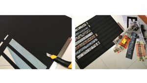
Tips: Change your blade before cutting them! It would save your life!!!!!!!!!!!!
3D-(Assignment 2) “Animal, animal”

After the treasure hunting last week, these are some items i purchase. Honestly, I am pretty curious about the function for some items sold there!

WhatsApp Image 2016-08-25 at 7.55.41 PM

In class today, we were suppose to create and craft out an living organism out of these materials. You probably thought it’s pretty easy but it’s not!

After reviewing my initial ideas with Mr Peter, I decided to scrape off my initial animal design, Bye monkey…:(

After staring at the items for don’t know how long

WhatsApp Image 2016-08-25 at 7.55.41 PM
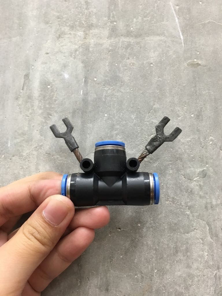
realize that this two parts actually resemble crab pincers
dd
And this part resemble the body and eyes of a crab


Hence, after cutting, gluing and combining them, I GOT A CRAB!

WhatsApp Image 2016-08-25 at 7.49.29 PM
P.S Don’t judge me, we went around looking for this Instagram worthy wall haha!

e1931ae0fa39e84de9bd940e343f5d58

WhatsApp Image 2016-08-25 at 7.50.41 PM

Overall, the lesson was fun and it teaches me to look at things at different perspective and not restrict our self to the imagination we had in mind. It was pretty hard doing this project, we had to view our items in different perspective but sometimes the animal just doesn’t come out, even if it did it’s hard to convince people what animal your item resemble.

Anyway, I have some materials left and I’m going to see if i can create a few more animal!:)


And so i went back home and ask my dad if he have unwanted tools or pieces from his tool box and he gave me this:

IMG_1653
A box full of material he wanted to throw away

After digging and and exploring i came out with two more animal! yes!

A Hedgehog! the feets and nose came in a packet inside the scrap box and the body is actually the left over scrub i used for my 2D mono-printing assignment.

IMG_1656 hedgehog-468228_960_720

A Scorpion!, at first i was worry that i uses too many parts, but then i realized i actually uses four parts and repeat using them.

For example, the metasoma (tail) is actually the same material use for the hedgehog nose i just repeatedly glued (with glue gun) a few of them together and form the curve tail. As for the pincher and stinger i use the feet use for the hedgehog, bend it and glue it. The body is then made up of a whole pieces, it’s a cable connected according to my dad.

IMG_1655

download


I had a fun time exploring these materials and feel so “enlightened” haha whenever i discover a new animal or a creature. Materials that you first pick up and thought “nah,” might be the key parts to make your animal more realistic.  Overall, this task allows me to look things in all perspective, when you happen to turn to the correct angle it would just snap you “ahhh~~ this looks like the…”. SO FUN.