間 MA’s obscure city of voids: Individual moodbox

Modular Structures

Allotment by Antony Gormley

Use of carefully measured units to represent human body

‘Modernism rejected the body, yet 90% of the populations of the western world live within the urban grid. Within this particular spatial system architecture protects and identifies us. To what extent do we form and to what extent do we conform to the dictates of its organized geometry? The body is our first habitation, the building our second. I wanted to use the form of this second body, architecture, to make concentrated volumes out of a personal space that carries the memory of an absent self, articulated through measurement.’ – Antony Gormley

Sound Analysis

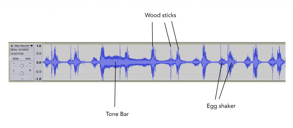
The sound is  light-hearted and face paced. The egg shaker is the recurring base sound. The rhythm sticks set a fast pace. The tone bars is played once every  4 bars.

Tone bars (Sub-ordinate): Resonating and extended sound as seen by the long sound waves

Rhythm sticks (Sub-dominant): Solid sound as seen by the sharp and thin sound waves.

Egg shaker (Dominant): A constant and stable sound in constant intervals that is the most prominent sound.

Initial Moodbox


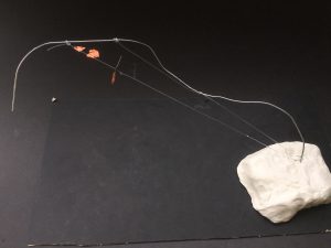
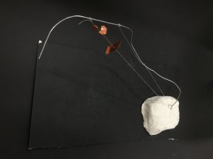
The initial moodbox was a non-literal representation of the sound. The clay base is solid and represents the sturdy egg shaker sound. The wire and strings are a representation of the rhythm sticks that is played thrice in a bar. The subordinate copper sheet portrays the resonating sound bar due to its metallic sound.

However this does not depict the sound well thus I changed the mood box to a more literal representation.
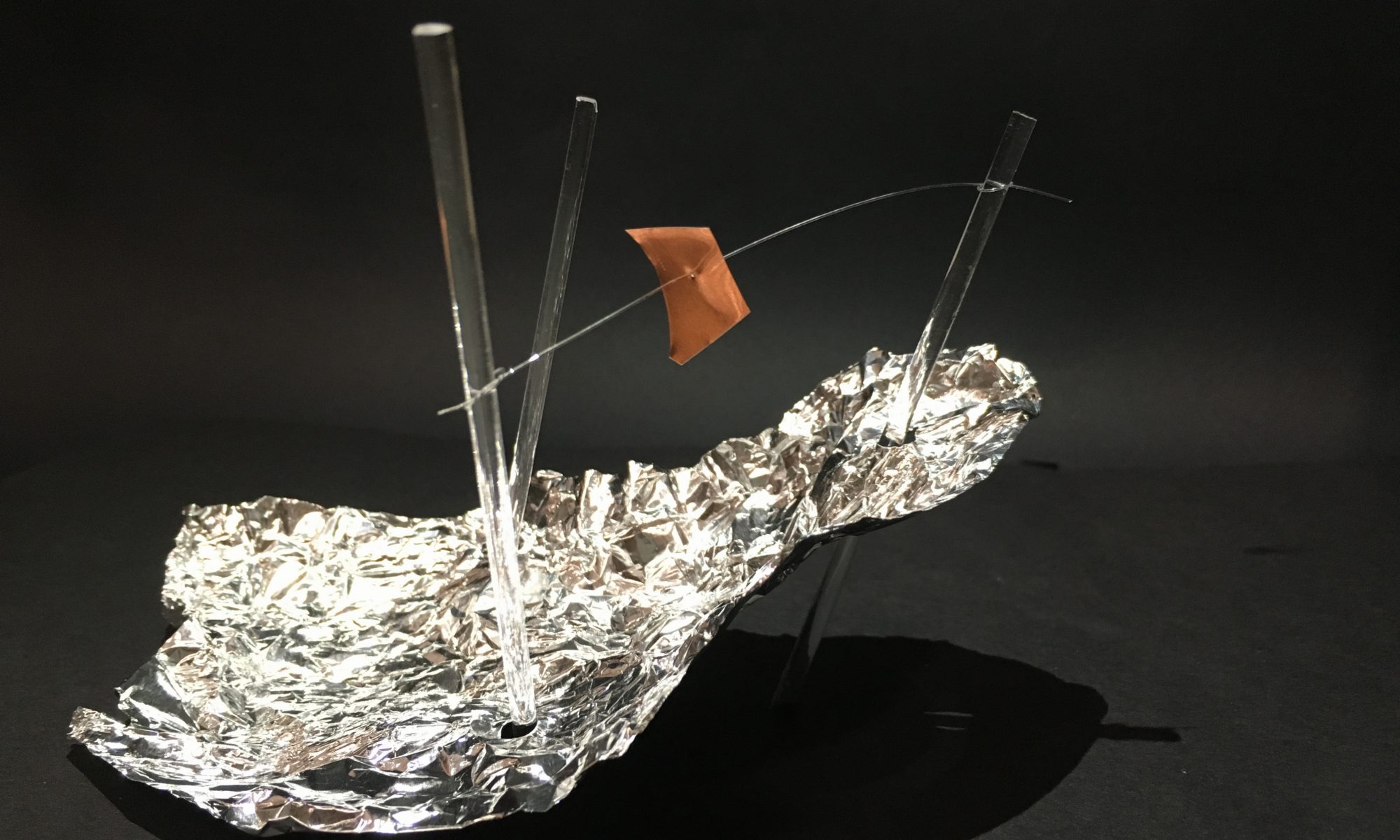
Final Moodbox


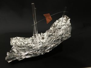
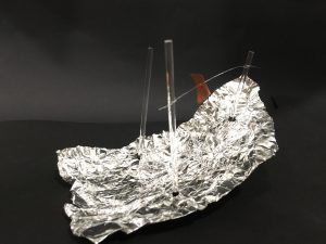
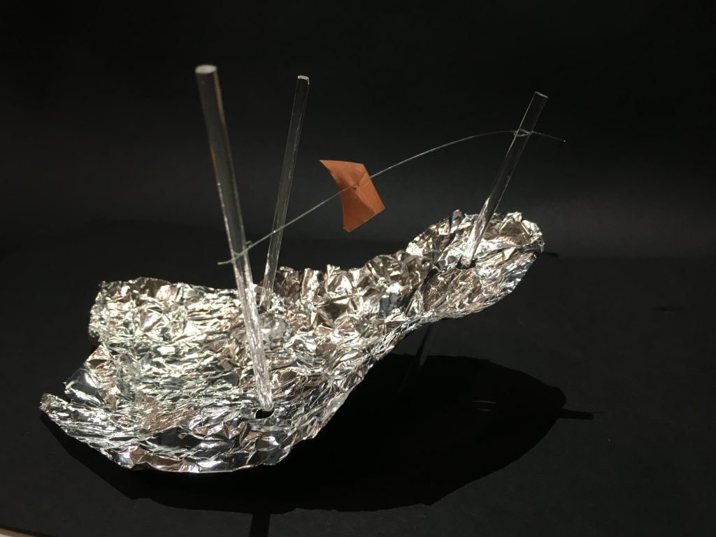
A representation of 1 bar.

Aluminium foil: Crumpled to depict the rough sound of the egg shaker. It has the largest surface area as the egg shaker is the dominant sound.

Rhythm sticks: The solid sound of the rhythm sticks is represented by the acrylic rods and there are 3 sticks as 1 bar contains 3 rhythm stick beats. It is pierced through the aluminium foil as the the egg shakers continues to play in the background when the rhythm sticks are played.

Copper sheet: Portrays the metallic sound of the resonating tone bar. It is suspended as the tone bar has an upward resonating sound.

Ego Project 3 Final

Ego Final


Ego 1

 Cool colours – warm colours – complementary colours

I used cool and warm colours to represent the temperature difference between what I am comfortable in and the environment I am in, and to illustrate the weather. The result is a panel with complementary orange and blue to show that the bear is in contrast with the environment and thus does not fit in.

Ego 2

Neutral – Triadic/ Primary

The clothes of the character is in a neutral colour to represent an inexperienced self does not have a personal style yet. Inspired by Mondrian’s Broadway Boogie Woogie, I used primary colours to represent New York. They represent chromatic pulses, the blinking traffic and the restless motion of the city.  They also represent the excitement and hustling of New York. In the final panel, the character is now in the same colour as the city to show that she is inspired by New York, while the decrease in size depicts that she is also intimidated by the brilliance of the city.

Ego 3


.            

Complementary – Resulting brown (neutral) from blue + orange

I used complementary colours for the first 2 panels to show the contrasting nature of the 1st and 2nd panel. The first depicts frustration while the second depicts serenity, this the contrast in nature. The resulting colour is brown  which is obtained by mixing blue and orange as a calm self is a result of mixing my frustrated self in a calm environment. Neutral colour is also used to show subdued emotions.

Ego 4


Monochromatic colours – natural colours

The first panel is monochromatic to portray a mundane indoors lifestyle. The second and third panel are in natural colours such as blue and brown to show the beauty of wildlife and the natural environment of Australia. The hot air balloon in the last panel is in the same colour as the lamp in the first panel to add coherence and illustrate that they both depict me.

Ego Project 3 Process & Research

Research on colours

Fauvism

One art movement that focused on colour was Fauvism. It separated colour from its descriptive, representational purpose and allows colour to be used independently to create a mood or establish a structure within the work without being true to the natural world.

Process

I decided to base each setting according to different countries I have visited, as I feel that in that the culture and atmosphere of each country brings out different parts of me.

Mediums: Acrylic, watercolour, oil pastels, colour pencils

I used traditional mediums as I prefer the raw colours and brush strokes. However I transferred the drawings to photoshop to tweak certain errors.

Ego 1: 


My first setting is in Singapore.

Materials: For the polar bears, I used oil pastel to make a hairy effect. I used digital colours for the background to keep it neat in contrast to the raw strokes of the oil pastels. I drew HDB flats as they are a symbol of Singapore.

Ego 2:

Mount Fuji is one of the most prominent symbols of Japan. Its symmetry and shape never ceases to amaze me and brings a sense of serenity when I look at it.

Materials: I used acrylic paint Mount Fuji and added texture to make it more dynamic as it has a simple shape. This is done using colour pencils and white oil pastel for the snow on the tip of the mountain. I went for a rough texture for the sky using oil pastels as well.

Japanese Hannya Mask: This mask is used in Noh theatre and given its intimidating and frightening appearance, I used it to depict an angry and frustrated self.

Materials: Since I wanted to focus on the expression of the Hannya mask, I decided to keep it simple with just the outline of the facial features using watercolour, and added a textured background using oil pastel.

The capybara is an animal known to to be calm and still which reflects a soothed self.

Materials: I used oil pastel to create the hairy effect of animals with acrylic as the base. Colour pencils were used to draw the features such as the eyes ears and mouth.


Ego 3


experimenting with using photos as a background


I wanted to capture the free spirited feeling that Australia gives. I chose to depict this through the horizon, the beach,  as well as the sky.

Materials: For this panel, I decided to try something new by making a collage using a photograph and some traditional drawings as I though the ocean is best captured using a raw photograph. I added prominent elements of Australia like koalas and people relaxing at the beach.

Ego 4

Piet Mondrian – Broadway Boogie Woogie
Broadway signs at Times Square
Henri Matisse – The Dance. A work from Fauvism
Initial sketch before editing the composition for the final

The choice of colours for this setting was inspired by Mondrian’s painting which is an abstract piece of a bird’s eye view of Broadway.

The elements are include signboards of broadway shows and art works I saw at New York which inspired me. They are also visual representations of creativity and culture of this city. The signboards are warped in a linear perspective in the final piece as there are tons of signboards in New York which are huge and converge to a vanishing point. I felt this reflected the long and straight streets of the city.


A fashion inspiration: Grace Coddington