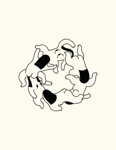
I used cool and warm colours to represent the temperature difference between what I am comfortable in and the environment I am in, and to illustrate the weather. The result is a panel with complementary orange and blue to show that the bear is in contrast with the environment and thus does not fit in.
Ego 2
Neutral – Triadic/ Primary
The clothes of the character is in a neutral colour to represent an inexperienced self does not have a personal style yet. Inspired by Mondrian’s Broadway Boogie Woogie, I used primary colours to represent New York. They represent chromatic pulses, the blinking traffic and the restless motion of the city. They also represent the excitement and hustling of New York. In the final panel, the character is now in the same colour as the city to show that she is inspired by New York, while the decrease in size depicts that she is also intimidated by the brilliance of the city.
Ego 3
.
Complementary – Resulting brown (neutral) from blue + orange
I used complementary colours for the first 2 panels to show the contrasting nature of the 1st and 2nd panel. The first depicts frustration while the second depicts serenity, this the contrast in nature. The resulting colour is brown which is obtained by mixing blue and orange as a calm self is a result of mixing my frustrated self in a calm environment. Neutral colour is also used to show subdued emotions.
Ego 4
Monochromatic colours – natural colours
The first panel is monochromatic to portray a mundane indoors lifestyle. The second and third panel are in natural colours such as blue and brown to show the beauty of wildlife and the natural environment of Australia. The hot air balloon in the last panel is in the same colour as the lamp in the first panel to add coherence and illustrate that they both depict me.
One art movement that focused on colour was Fauvism. It separated colour from its descriptive, representational purpose and allows colour to be used independently to create a mood or establish a structure within the work without being true to the natural world.
Process
I decided to base each setting according to different countries I have visited, as I feel that in that the culture and atmosphere of each country brings out different parts of me.
I used traditional mediums as I prefer the raw colours and brush strokes. However I transferred the drawings to photoshop to tweak certain errors.
Ego 1:
My first setting is in Singapore.
Materials: For the polar bears, I used oil pastel to make a hairy effect. I used digital colours for the background to keep it neat in contrast to the raw strokes of the oil pastels. I drew HDB flats as they are a symbol of Singapore.
Ego 2:
Mount Fuji is one of the most prominent symbols of Japan. Its symmetry and shape never ceases to amaze me and brings a sense of serenity when I look at it.
Materials: I used acrylic paint Mount Fuji and added texture to make it more dynamic as it has a simple shape. This is done using colour pencils and white oil pastel for the snow on the tip of the mountain. I went for a rough texture for the sky using oil pastels as well.
Japanese Hannya Mask: This mask is used in Noh theatre and given its intimidating and frightening appearance, I used it to depict an angry and frustrated self.
Materials: Since I wanted to focus on the expression of the Hannya mask, I decided to keep it simple with just the outline of the facial features using watercolour, and added a textured background using oil pastel.
The capybara is an animal known to to be calm and still which reflects a soothed self.
Materials: I used oil pastel to create the hairy effect of animals with acrylic as the base. Colour pencils were used to draw the features such as the eyes ears and mouth.
Ego 3
experimenting with using photos as a background
I wanted to capture the free spirited feeling that Australia gives. I chose to depict this through the horizon, the beach, as well as the sky.
Materials: For this panel, I decided to try something new by making a collage using a photograph and some traditional drawings as I though the ocean is best captured using a raw photograph. I added prominent elements of Australia like koalas and people relaxing at the beach.
Ego 4
Piet Mondrian – Broadway Boogie WoogieBroadway signs at Times SquareHenri Matisse – The Dance. A work from FauvismInitial sketch before editing the composition for the final
The choice of colours for this setting was inspired by Mondrian’s painting which is an abstract piece of a bird’s eye view of Broadway.
The elements are include signboards of broadway shows and art works I saw at New York which inspired me. They are also visual representations of creativity and culture of this city. The signboards are warped in a linear perspective in the final piece as there are tons of signboards in New York which are huge and converge to a vanishing point. I felt this reflected the long and straight streets of the city.
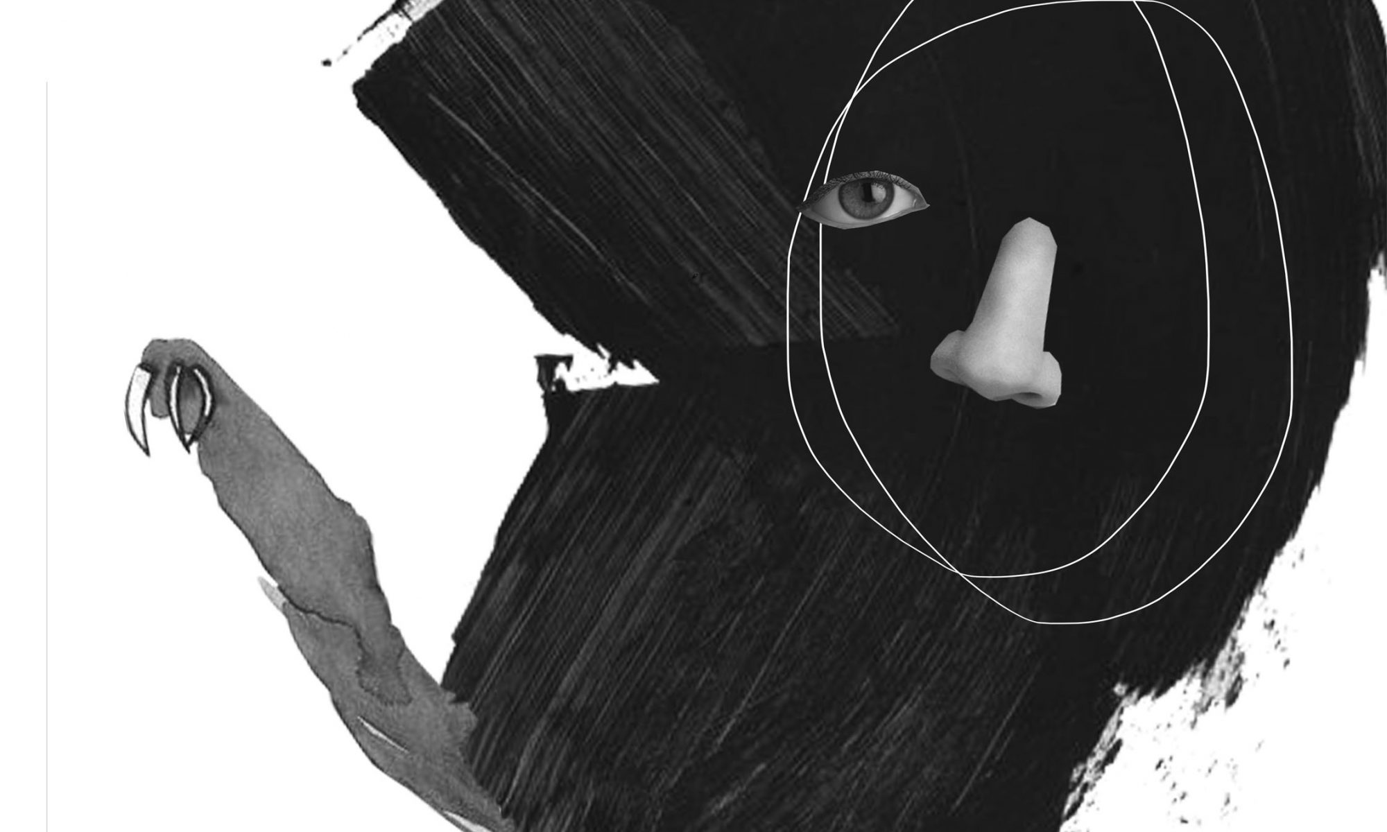
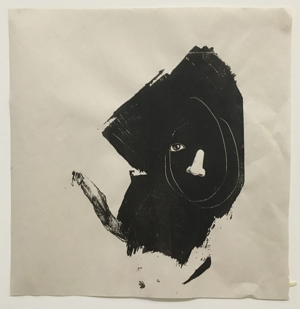
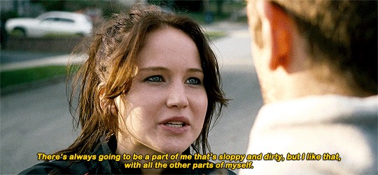
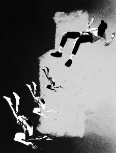
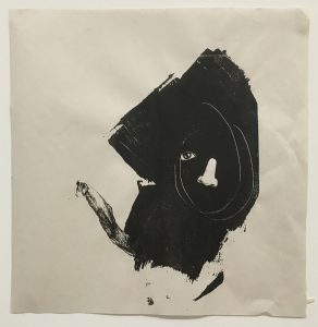
“There’s always going to be a part of me that’s sloppy and dirty, but I like that, with all the other parts of myself.” – Silver Linings Playbook
The eye, nose and head is a physical representation of “other parts of myself.” Sloppiness is portrayed by the hand of the sloth, and dirtiness is expressed using the big acrylic brushstroke which mimics a stain. Since the quote is about learning to love and be proud of our flaws, an eye and the mouth is removed from the face to depict incompleteness of self and the random line scribble of the head is part of being imperfect. This piece creates an aesthetically pleasing composition using components which express flaws, which I feel reflects the quote on being only human.
Principles of Design
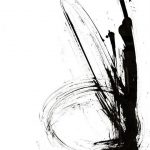
Texture: Implied texture exists on the large black brushstrokes and the smaller marks around it.
Contrast: The extremely thin white line contrasts the huge black brushstroke to create a dynamic composition. The simple abstract shapes from brushstrokes and lines in the composition also contrasts with the realistic eyes and nose.
Balance: The distribution of visual weight in this composition creates asymmetric balance and makes it visually pleasing and interesting.
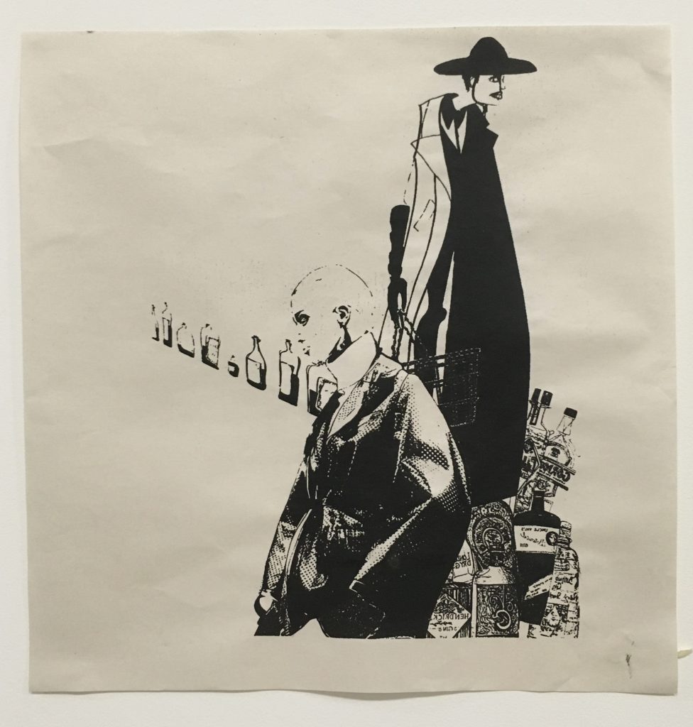
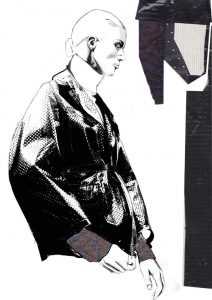
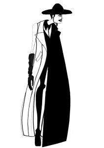
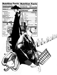
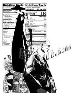
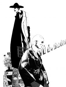
“Sometimes I would buy ‘Vogue’ instead of dinner. I felt it fed me more.” – Sex and the City
This composition is about prioritising interest in fashion over necessities like meals. The 2 illustrations of models are facing different directions to compliment each other and create dynamism, while being much larger in size as compared to the bottles have emphasis. The intersection of the 4 components is placed according to the rule of thirds to create a visually pleasing composition.
Principles of Design
Perspective: The bottles are warped and slanted to create perspective, and is inspired by long fashion runways.
Rhythm: There is a sense of rhythm from the women facing in different directions and placed at different heights.
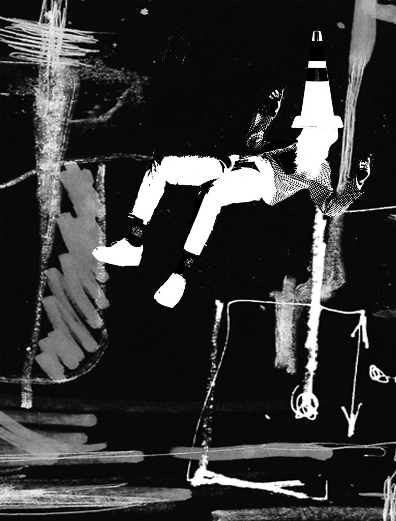
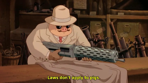
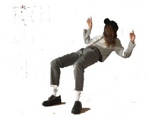
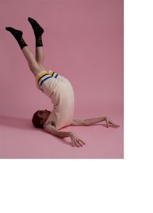
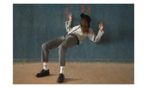
“Laws don’t apply to pigs.” – Porco Rosso
This work combines various representations of “law”. The cone represents traffic laws, symbols in the background represent mathematical and scientific laws and the scribbles depict the process of creating these laws. The woman floats to defy the law of gravity, reflecting my interpretation of the quote where the law can only control those who choose to be controlled by it. The horizontal lines at the bottom implies a ground to create the effect of the woman floating.
Principles of Design
Variety: There are varying textures, tones, and size of the scribbles in the background.
Contrast: The horizontal lines which suggest height contrasts the horizontal lines at the bottom which suggest a ground.
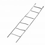
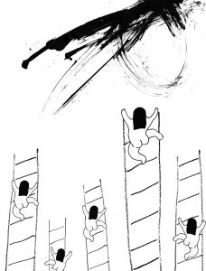
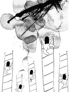
“Do dreams and effort make a flower bloom?” – Himizu
This quote is about wishing to be ordinary, and seeing no point in having aspirations and working hard towards the goal. The women are climbing ladder which represent climbing up the social status, only to find that the ladders lead to nothingness and the patch on top, which encapsulates hopes and dreams, is unreachable.
Principles of Design
Unity & Variety: The women and ladder are the same design but in different sizes. Using the same woman and replicating her expresses being ordinary, and the same as everyone, while making them in different sizes makes an interesting composition which does not become too repetitive.
Emphasis: Emphasis is placed on the women climbing ladder by adding the watercolour background patch, and by varying the sizes.
Movement: The water colour patch also implies movement to direct the viewer’s eyes in the composition.
Rhythm: Rhythm is created from the lines of the ladder and placing the women at various height.
This sentence is about embracing our flaws, imperfections and incompleteness.
Large, black acrylic patch
Sloth: This animal is a representation of “sloppy” due to its slow pace. However to make it less literal, I decided to only use the arm of the sloth which fits nicely to the quote (“parts of myself”)
Eyes/Nose: Body parts to express “parts of myself”. Though the quote meant parts of a person’s personality, I chose to not be literal and instead use physical body parts to represent self.
Acrylic patch: A black patch that mimics a stain to express the imperfection implied in the quote.
I worked by instincts for this composition, to embrace spontaneity. It is my favourite composition, thus I chose not to experiment with other possible composition to this piece.
The acrylic patch is the largest component to make ‘imperfection’ the most obvious focus, because Jennifer Lawrence unashamedly acknowledges her flaws in the quote. The abstract face is a spontaneous scribble I drew which shows character and uniqueness. The right eye and mouth has been omitted to portray incompleteness of a person.
Sex and the City
The quote is about love for fashion which overpowers one’s hunger/ the need to survive with food.
Fashion Illustration by Andrew VossFashion illustration by Zoya Smirnova
from Chanel Collection AW 2014
Fashion Illustrations: I used illustrations to represent Vogue as I personally love fashion illustrations in particular.
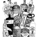
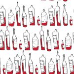
Bottles: Rather than using food, I chose bottles as it is a little less literal representation of dinner.
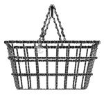
Basket Bag: I chose this piece as I wanted a link between fashion and food, and this basket was designed for Chanel’s runway but has the function of carrying groceries.
Composition 1Composition 2
Composition 1 & 2 differ by the paprika. However I prefer not having the paprika and it looks out of place. The nutrition facts is a representation of fashion being a source of energy to some people the way food is a source of energy. However this was removed from the final design as it is a literal representation. Lastly, the bottles on the right are warped to create perspective, mimicking long fashion runways.
The bottles recede to the back and is of a smaller size as the quote states that fashion is of more importance to the character rather than dinner.
Porco Rosso
My interpretation of this quote is that the law only controls those who choose to be controlled, regardless of whether you are a pig or a human.
Taken from Ader ErrorTaken from Ader Error
People in unnatural poses/ stance: This is the imagery I have of defying laws or rules. The people in the above photos seem to defy laws of gravity/ defy the ways of human structure. To not be literal, I used a person rather than an animal or pig to show that laws may not apply to people too.
Symbols/ scribbles: Symbols, like arrows, are a representation of mathematical or scientific laws. Scribbles portray the process of creating those laws, which involve trials and errors.
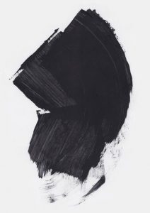
Composition option 1
The background for composition 1 is a large mark which I chose because of the contrast between the darkest area and the white area. However I chose not to use this background for the final as the line that separates the white and black cuts in the middle of the composition which spoils it. I tried using varying sizes to create perspective and placed the woman on the top to make it seem like she was floating, defying gravity.
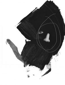
Composition option 2
I retained the floating woman and omitted the man at the bottom as the composition was too crowded. I added a cone which is an indication of abiding to traffic rules and changed the background to one with scribbles and symbols and has no centre. Since my other compositions do not play with negative images, I chose a black background and made the women in negative colour.
Himizu (2011)
To put the quote in context, the homeroom teacher told his students that everyone is a flower. He made them repeat after him, “I’m a flower, one of a kind and I have a dream.” I interpret this quote as a statement that encourages being ordinary, and that having aspirations does not necessarily make a person better than another.
Illustration by Camilla Engstrom
Expressive strokes: Representation of outburst of personality.
Ladder: Symbolises climbing up social status, an expectation of being successful.
Naked woman: I like the anonymity of the character. No clothes to make her stand out, hidden face, and stripped down to the show the body on its own.
Composition option 1
Since the quote is about being ordinary, I used the same character 5 times to show that none of them stand out. All of them are climbing up the ladder to success but the highest point still separates them from success, which is represented by the expressive stroke on the top. I like the composition of the women and ladder but thought that it needed a little more texture.
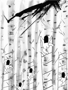
Composition option 2
Next I added tree trunks in the background to add texture to the composition. However the trunks had too much details and made the composition too noisy and distracting.
Composition option 3
I tried using another watercolour patch to compliment the expressive brush strokes to portray success in a more vibrant manner, but the two components drown each other out.
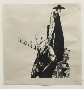
Silk Screen Printing Process
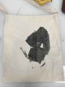
The left design was my first choice to screen print as it is my favourite composition however it was risky due to the thin white line and very black stroke. Thus I tried 2 designs in case the first one does not work out.
Newsprint
The print turned out okay but not the best as details of the texture of the large black stroke was lost. Part of the white line also disappeared possibly due the misalignment of the 2 transparency.
This composition was better than the first as a screen print. The details are not lost and has a clean outcome.
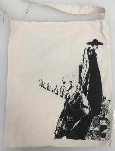
Tote Bag
Due to the different material, the left design cannot be printed well. Thus I chose the right design for the final tote bag. It was printed on the bag as nicely as on the newsprint.
Hope is defined as a feeling of trust, or wanting and expecting for something to happen. The softness and fluffy texture of cotton wool illustrates the vagueness of hope in my opinion. Hope is an emotion that is unreliable as there is no concrete evidence or substance that what we wish for will come true, we only rely on our desire for something to happen. The torn wool also shows the unreliability and fragility of hope which leaves us hanging on a thin thread.
2. Fear: Black pastel on white colour pencil
Fear is an emotion felt when a person is threatened, in danger of pain or sorrow. Fear to me occurs when one does not understand a situation. Because of a lack of knowledge or grasp of what is going on around them, they experience fear. The confusion that occurs initially when experiencing fear is expressed by the messy and tangled white lines. The lines slowly progresses to converge into a single line which shows that a person slowly begins to decipher the situation that they are in. The situation turns truly bleak which is why the background becomes pitch dark and true fear sets in.
This line is made by drawing the line with white colour pencil before covering the whole paper with black oil pastel. I like how the oil pastel cannot cover the white colour pencil line.
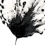
3. Passion: Strings and block print ink
Passion is the intense desire or enthusiasm towards something. The outburst of lines from the black block of ink expresses spontaneity which I feel is an aspect of passion. Most of the time our passion cannot be explained, it just occurs to us naturally. This mark making was done by dragging strings in random motion out of the centre blob of paint.
4. Guilt: Water colour
Guilt occurs when an individual feels that he/she has done something that goes against their own moral conscience or the world’s sense of moral standard.
Guilt to me has a sense of depth and gravity because of the complexity of the emotion. It is a fight between the action we had done and our moral standards. This is expressed by layering the different sizes and darkness of water colour ink. The water colour has a stained and tainted effect which i felt reflects the disdainful emotion of guilt.
5. Outrage: Block print ink
Outrage is an intense emotional reaction of anger or shock. The sharp edges and smudged ink expresses the violence caused by outrage. The strokes which go in all direction also depicts outrage as an uncontrollable emotion.
6. Surprise: Sewn thread on paper
Surprise is an event or emotion that is unexpected, or out of the blue and is usually positive. The element of surprise in encapsulated in the thread being sewed onto paper as sewing in usually done on cloth. Surprise is an emotion I express awkwardly because I rarely feel surprised and this is depicted by the awkward curves of the threads. The thread that springs out at the end is minimal.
I started mark making using a rattan rope. It creates sharp and harsh lines.
My second tool was a square sponge. I explored the fading effect of Chinese ink, by dipping the sponge in ink only once, in a clinical and systematic manner.
Rolling sponge to create soft yet dark marks.
I used rolled lettuce in block printing ink. Though I like the organic lines created, the mark created still resembles a lettuce which i don’t think can be used for the final.
I poured a chunk of block print ink on the paper and dragged a string over the ink to create this burst of ink. The result is quite expressive and can be used for positive emotions such as passion.
My favourite mark making was using a roller to roll a piece of tangled string. It created crisp thin lines which looked like marbling.
Lastly, I used watercolour and layered black paint a few times after drying each layer. I relied on the water to makes jagged edges after it dries.


 Cool colours – warm colours – complementary colours