The overall theme of my Zine is the serenity and remnants of human isolation I observed in Yishun.
Cover Page
The cover is a simplification and close-up of the Yishun map. The overall monochromatic colour scheme gives a quiet effect.
Page 1 and 2
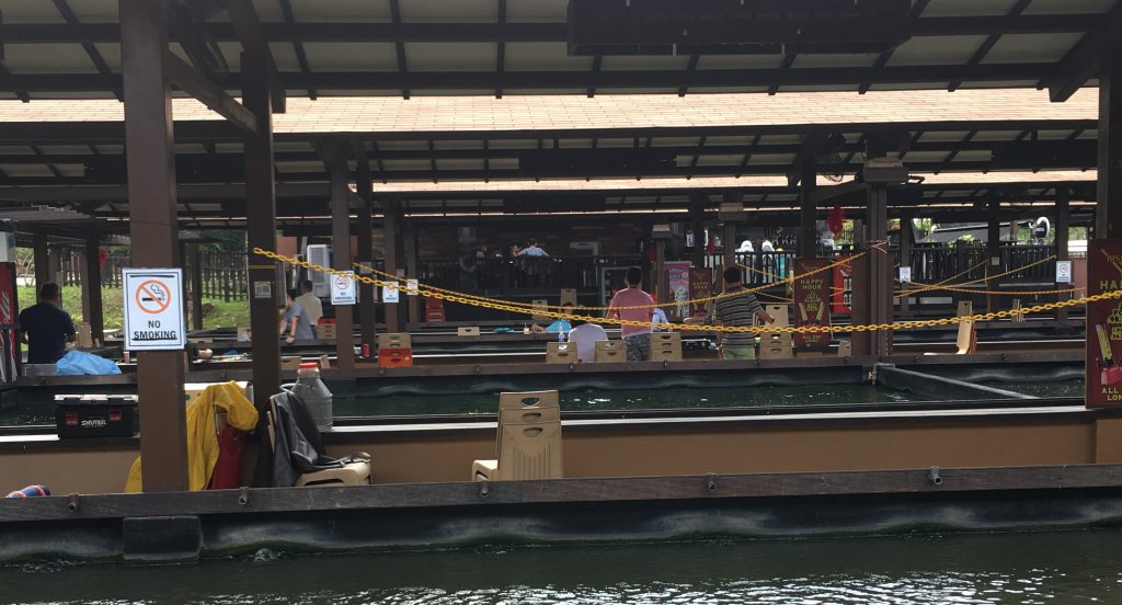
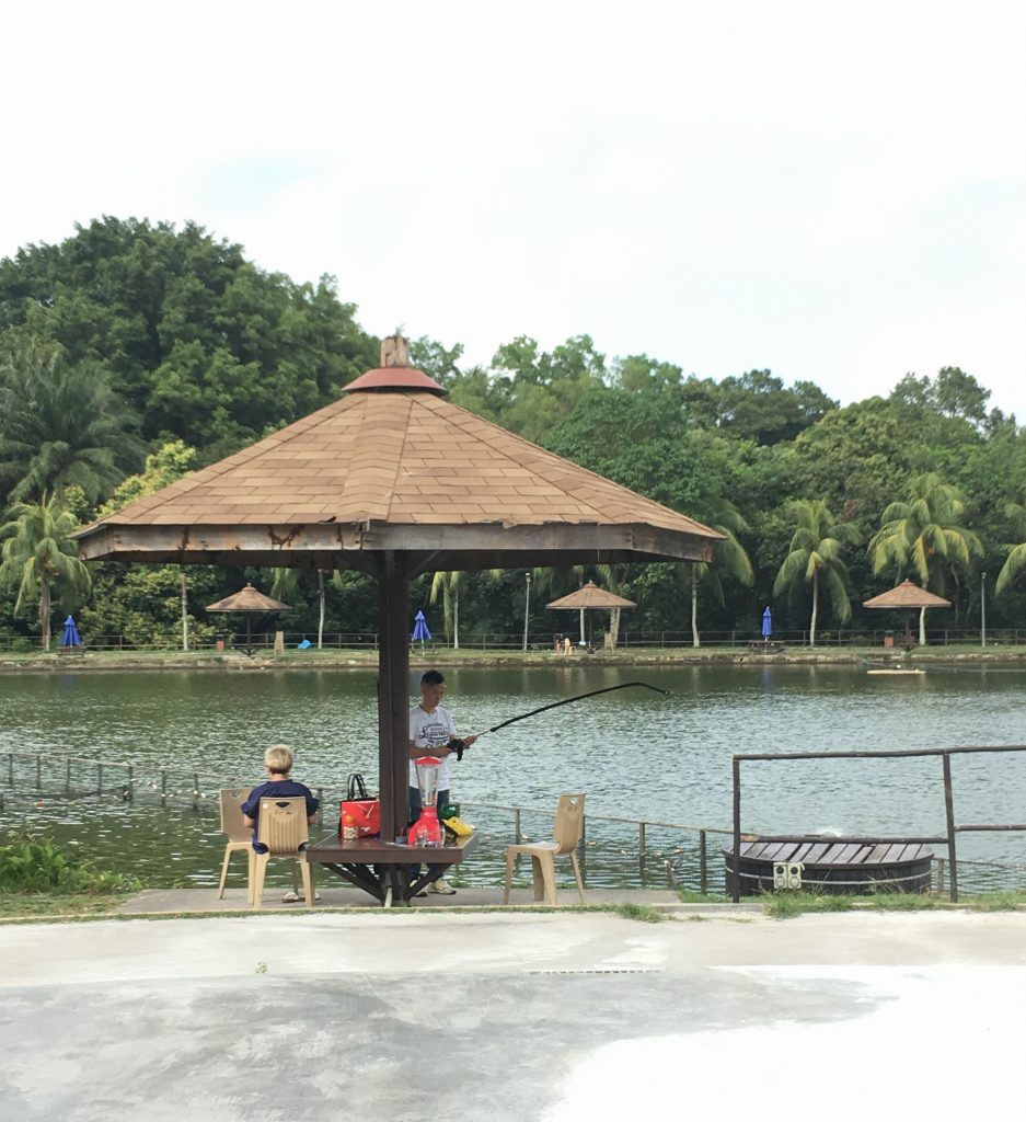
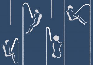
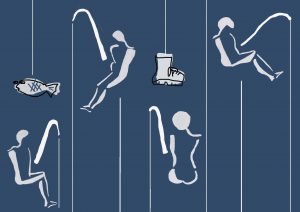
Water bodies are a prominent aspect of Yishun, such as the ORTO and Yishun Dam. The large open area evokes loneliness from how spaced apart the fishing people were. This composition thus expresses the isolation through space by using lines of different line weight to divide the figures in the page. The human figures are abstracted to minimal details to give a sense of loneliness.
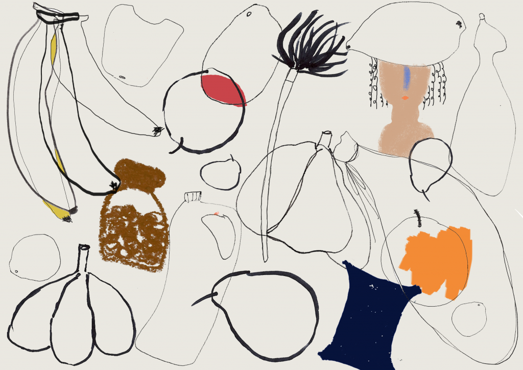
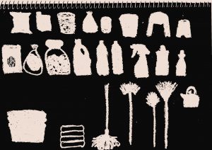
Page 3 & 4
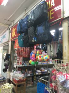
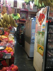
The overlapping line detail and colours of the groceries and products found in mama shops portray the cramped, clustered and overwhelming aspect of the shops. The sheer amount of items separate the owner of the shops and their customers, which showed how items can result in human isolation as well.
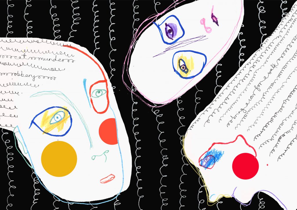
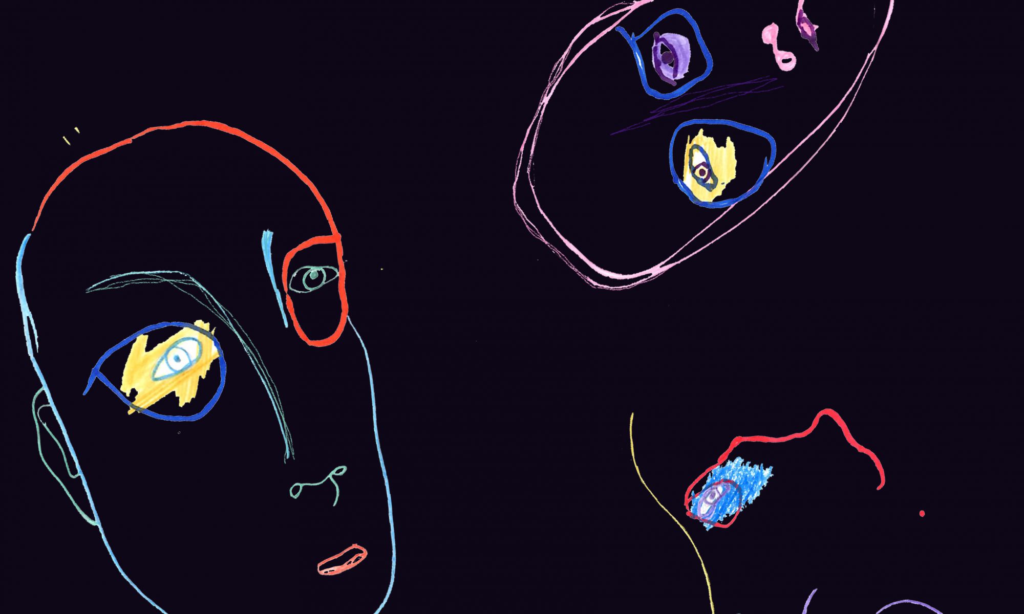
Page 5 & 6
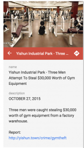
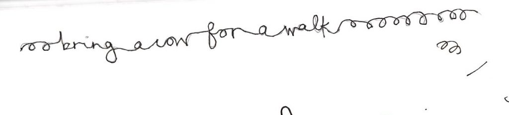
The bright and almost complementary colours captures the eccentric spirit of the people of Yishun, evident from the incidents that occur in the neighbourhood. Such cases include cat murder, robbery, and bringing a cow for a walk, and are include as texts embedded within the curly lines. The words are camouflaged in a way as I feel a person’s thoughts and mind is complex and does not reveal itself easily to others.
I drew inspiration from Japanese matchboxes. The flat style and unique compositions that utilise empty spaces beautifully give a sense of peace.
Process of Zine
Yishun has a lonesome, isolated, and quiet atmosphere. It was rare to see people chatting, and most people would mind their own business without caring much for their surroundings. Yet, there is something soothing about the rustic place with its abundance of nature.
I started of by deciding on 3 main topics for the zine. They are the waterbodies, mama shop, and the hidden mindset of people which I could not fully know just from my trips to Yishun. From the trips to Yishun, there was a sense of human isolation, thus the zine is a reflection of different aspects of it.
1 Human Isolation by Space
I made some digital sketches from images of people fishing at ORTO. Yishun is home to water bodies like ORTO and the Yishun dam, therefore depicting them would capture the natural and serenity aspect of Yishun.
Scenes of people fishing are calming and reflects a slow paced life. I also felt human isolation due to the wide space and water body.
Everyone minded their own business, there was no interaction between them
Experimenting with different line weight to depict the fishing line.
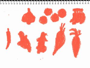
2 – Human Isolation by objects/ items
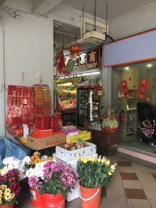
The number of ‘mama shops’ peaked at 3,000 in the 80s, according to the Singapore Provision Shop Friendly Association. Today, fewer than 200 of such shops remain. these kiosks sell a wide range of items including canned foods, stationery, tobacco products and newspapers.
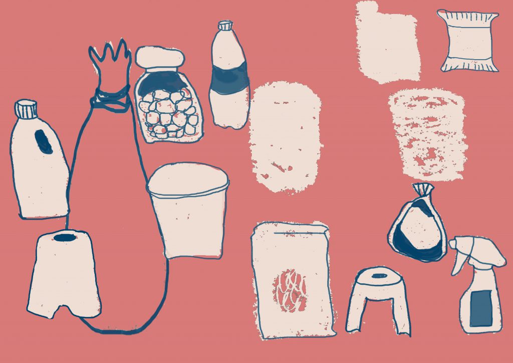
Oil pastel drawings of mama shop products
These are initial drawings that I explored for possible compositions and colour combinations of the Mama shop. I liked the disorganized, cluttered and unkempt effect of Mama shops rarely seen today, and aimed to depict that in this composition.
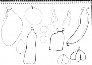
Sketches of people at Mama shops
After trying out different ways of representing items from mama shops, I felt line drawings when overlapped best portrays the messiness and overflowing amount of items displayed in mama shops. I also thought it would be interesting to contrast the overflowing amount of items purely by lines instead of opaque drawings.
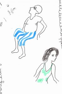
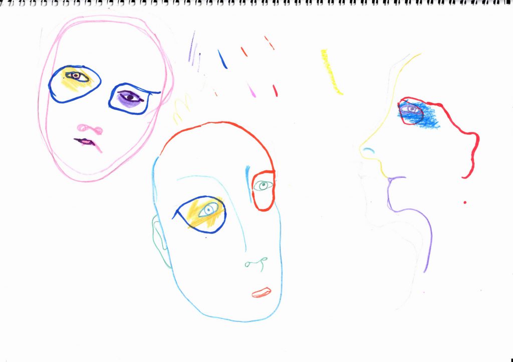
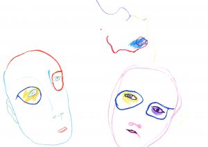
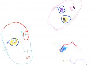
3 Human Isolation through the mind
After spending time in Yishun, I observed that I rarely see people holding conversations with one another, and as a result it felt like the people were isolated and did not rarely bother about each other. You could not really tell what the people were thinking , or their state of mind either.
Initial sketch using Copic markers and colour pencils
Exploration with abstract representation of the human face.
I compared different compositions and colours, and decided upon a combination that expresses isolated minds and eccentricity. This was to reflect the strange incidents and crimes in Yishun.
Incorporation of words of the eccentric behaviour like walking a cow, and crimes. (cases pictured above)
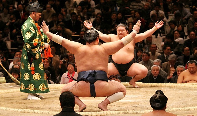
The Sumo-s form my initials ‘NTK’. The alphabets are formed using poses that sumo wrestlers usually are in during their tournament. My design does not consist of colours and is simple to avoid any distractions from the form of the body.
2. Children’s Book Illustrator
The characters are illustrated using traditional mediums – oil pastels, water colour, colour pencils and ink. This was to bring out the spontaneity, playfulness and raw quality that children’s books have. I picked oil pastels to portray N and M as it is my favourite medium to work with.
3. Art Curator
I picture a gallery that I curate to feature subtle and simple works that focus on form, thus I created artworks to portray alphabets while keeping that thought in mind. I like mixing digital and traditional mediums in my works, thus this gallery features both mediums. As a curator, I can exhibit works that other artists have created and my own works, and decided to mix both in this design. The ‘I’ is a portray of Donald Judd’s sculpture, while the rest are works I created.
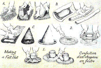
4. Hat Designer
A hat designer would begin the process of designing a hat by illustrating his/her ideas first, thus I chose to portray this job by illustrating a hat design using the alphabets of my name. The alphabets are coloured to bring the focus to the hat, and are in different colours to make it easier to distinguish between them.
The jobs I have decided to work on are: hat designer, art curator, sumo wrestler and children’s book illustrator. I chose them because they are linked to my interests.
Inspirations from Graphic Designers
https://sumally.com/p/1664674
Designed by Mizushima Yoshinari. The use of negative space and colours makes this work dynamic yet simple.
A graphic design on a mint box. The flat and muted colours with simple lines and shapes creates a pleasing design. I like that there are many elements but the design is not over-complicated.
Also by Mizushima Yoshinari, this design has a monochromatic colour scheme, which makes it simple yet beautiful. The simple colour scheme is balanced by dynamic lines and shapes. I would like to try working with a simple colour scheme in my works.
Designing a hat is a complicated process that I feel is often overlooked as more focus is placed on designing clothes. Hats are also a personal favourite accessory, thus I decided upon this job.
From Missoni SS18Fashion Illustration by Jacky Blue
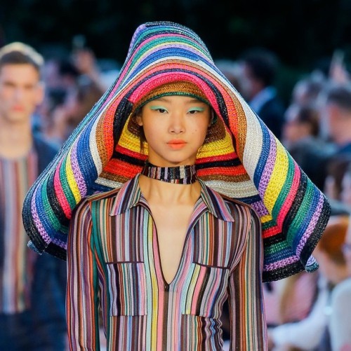
Hat Inspirations from Bessarion SS18
While looking through the process of creating hats, I chanced upon fashion illustrations, which is key to designing as it is the initial stage of creation where the designer brainstorms various possibilities. I like the expressiveness and somewhat haphazard strokes. I then thought to portray designing hats through fashion illustration for my work.
I experimented with different shapes for the alphabets and colours to form a hat. A more colourful palette would be suitable to contrast the simple facial features.
Finally, I added lines to define the face and the hat as the hat looked ambiguous, almost like it could be a hairstyle, just to make the design clearer.
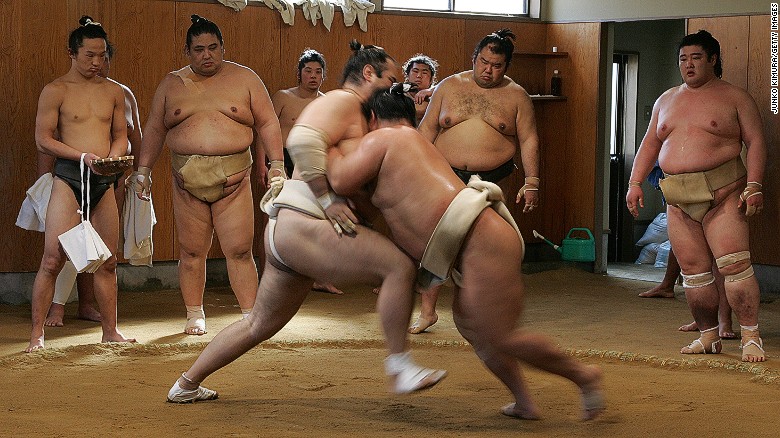
Sumo Wrestling is a Japanese sport that originated in ancient times to entertain deities. It is regarded as a prestigious national sport. I have always found the sport unique due to the size of the wrestlers as well as the uniform they wear.
Sketches of the sumo wrestlers poses as alphabets, inspired by the photos above
I chose to use the whole sumo body to portray alphabets because the body is the main tool in this sport and the form is what makes this sport interesting to me.
I was contemplating between using oil pastels and colour pencils or digital media to draw the sumo, and went with digital as it has a cleaner finish, making the alphabets clearer.
3. Art Curator
Art Curating, taken from Sotheby Institute of Art
Art curators are employed by museums and galleries to develop a collection. They interpret artworks and arrange them into a collection to educate and inspire the viewers. The role of a curator has changed, as currently there are independent curators unattached to museums who make their own exhibitions. There are also artist-curators.
A personal favourite is the curation of works at Chichu Art Museum in Japan. The works of Monet and James Turell is displayed with the architecture of Takao Ando, and includes paintings, sculptures and installations. The curation deals with the way in which we experience nature, and the artworks are mostly lit using natural sunlight. There is a contrast of serenity and intensity in the way these works interact with the environment due to its curation, and I love the simplicity of it all, which I wish to incorporate in this design.
Process
Various designs for the letter ‘M’. The final design is chosen such that it is most easily recognized as ‘M’
A still life is mimicked as I believe in the importance of traditional mediums and drawingSculpture made of wood, a personal favourite material.
I created some pseudo artworks to mimic the shape of the alphabets in my name. I chose to work with simple forms for the artworks to reflect my preference of artworks.
These are 2 possible layouts for the gallery. To better depict it, it is done with perspective, unlike my usual flat works. I chose the first design as the coloured panels take the attention away from the works depicting my name.
4. Children’s Book Illustrator
Oliver Jeffers Studio, taken from pinterest.com
I like children’s books due to the creativity in the storylines as well as the illustrations. There is no need to adhere to logic and no restriction with what the illustrator wants to do.
Illustration by Oliver Jeffers
Oliver Jeffers is an illustrator whose works have a sense of humour and unique usage of traditional mediums. I personally like how he uses them to give a personal touch and texture to the characters. His process in creating characters and stories is spontaneous and fun, and I admire his playful spirit very much.
Playing with textures: scratching oil pastels, using colour pencils etc to create shadows
I made characters that I would feature in my own illustration book. The raccoon would be a cunning character because of their sly personality, the tau gheys are side characters that witness the story without taking any action or voicing their opinions, and the amoebas are fun-loving with retractable legs.