Tag Archives: 2D

Project 3: Ego (Process)

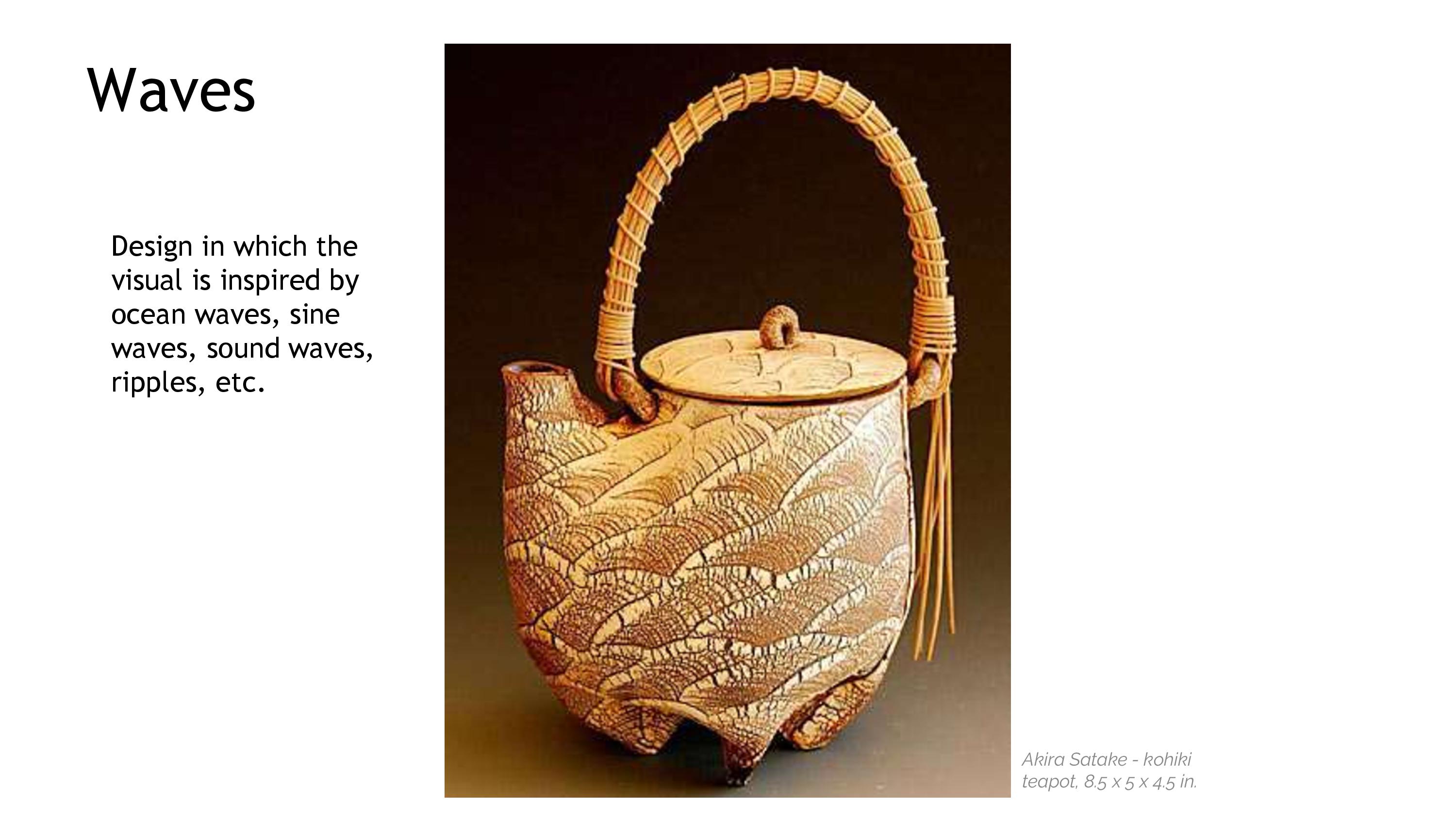
Hi! This is my first post for my  2D Final Project: Ego.
This post is about the inspiration, process and colour theory of each composition.
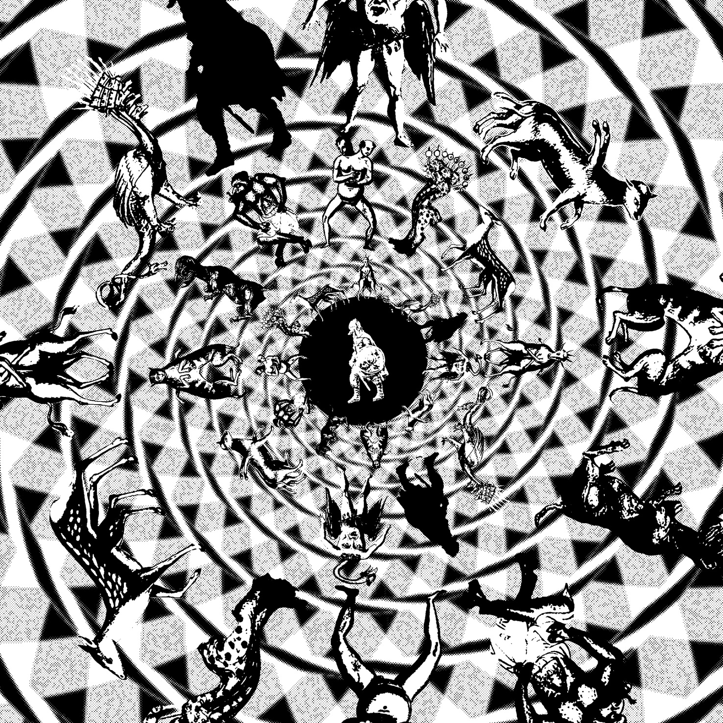
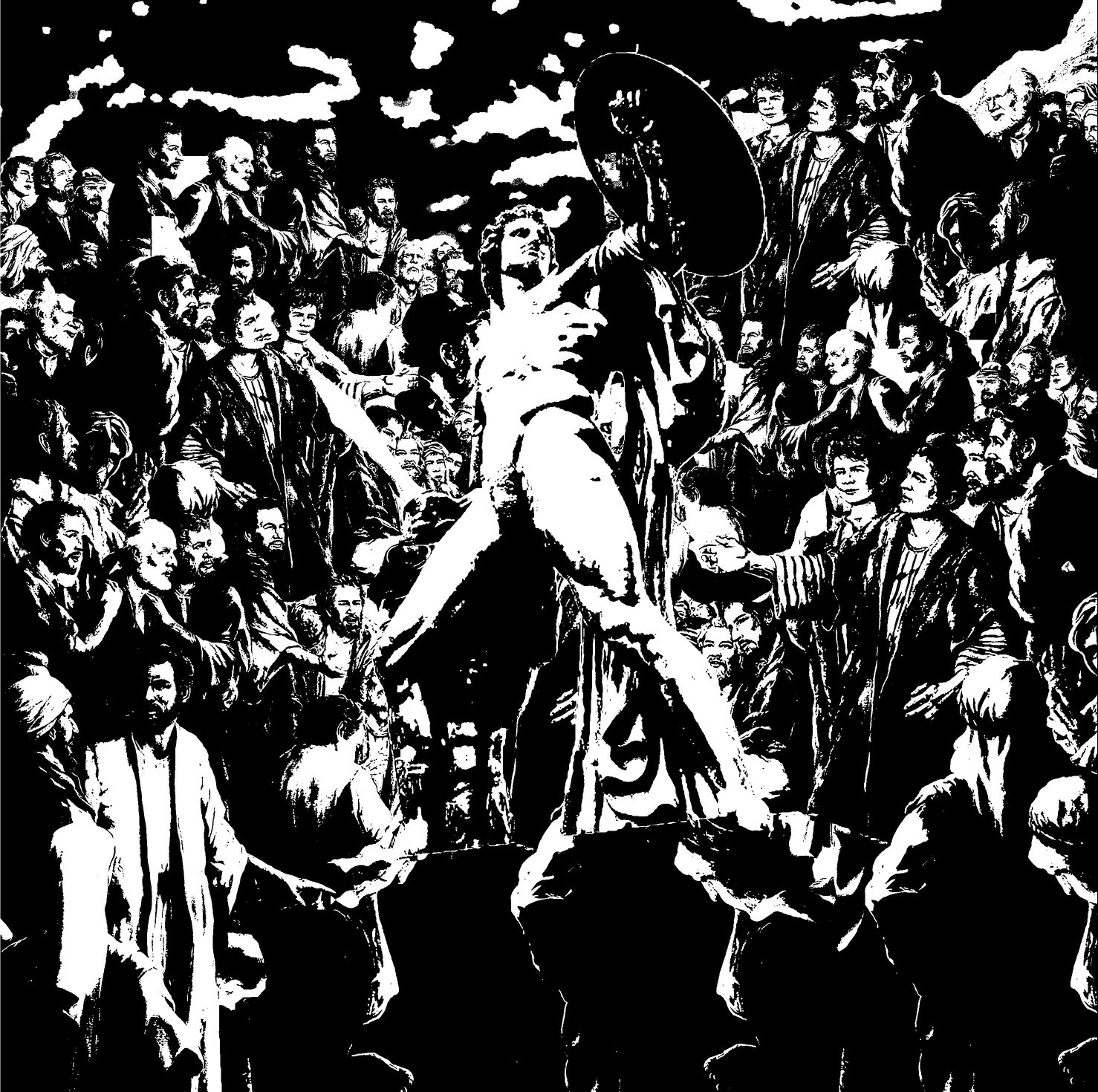
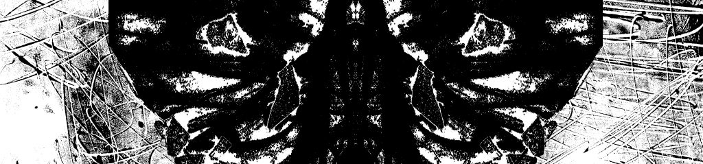
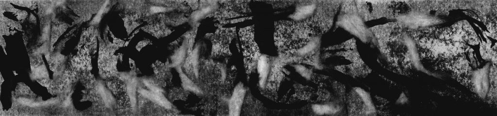
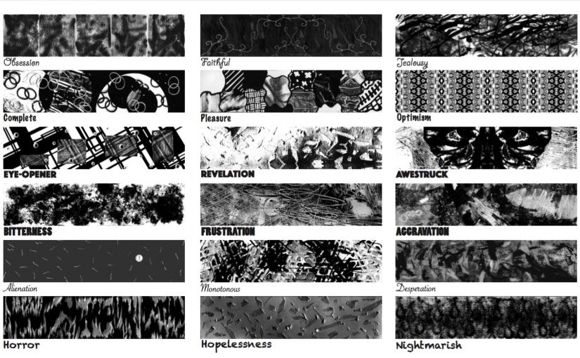
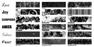
Click here to see the final composition.

coba-ini-minInitial Inspiration:
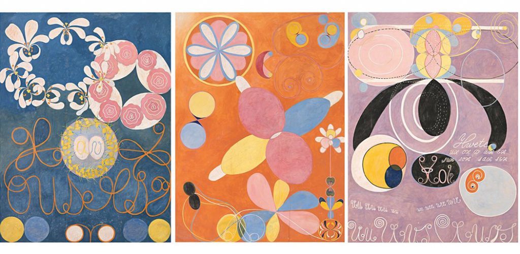
Most of my inspiration is from the book that Ms Ina lent me, Drawn to Stitch by Gwen Hedley. Starting from that book, I research more books in the library which finally lead to the ideation for my Ego composition.
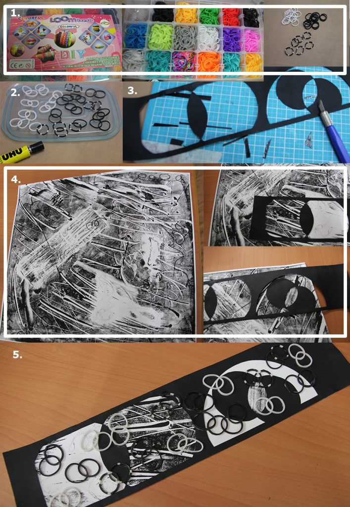
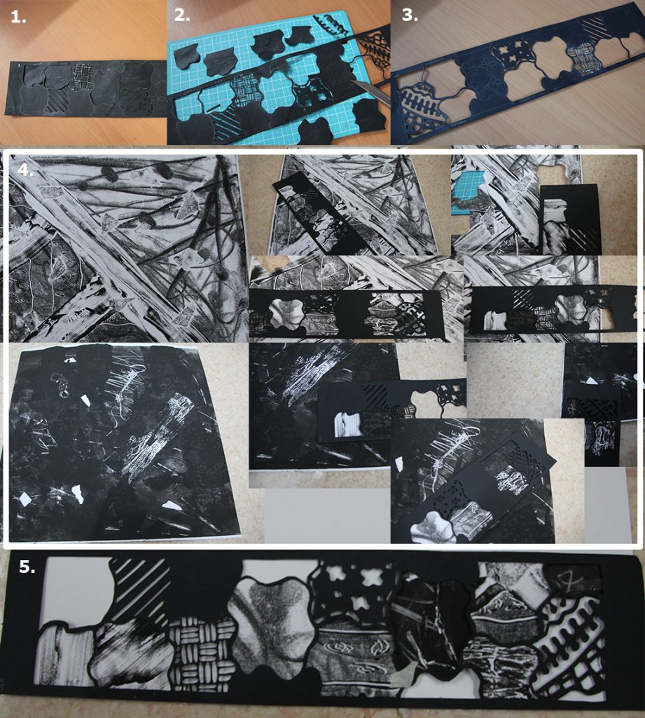
Drawn to Stitch
Drawn to Stitch by Gwen Hedley

General Process:
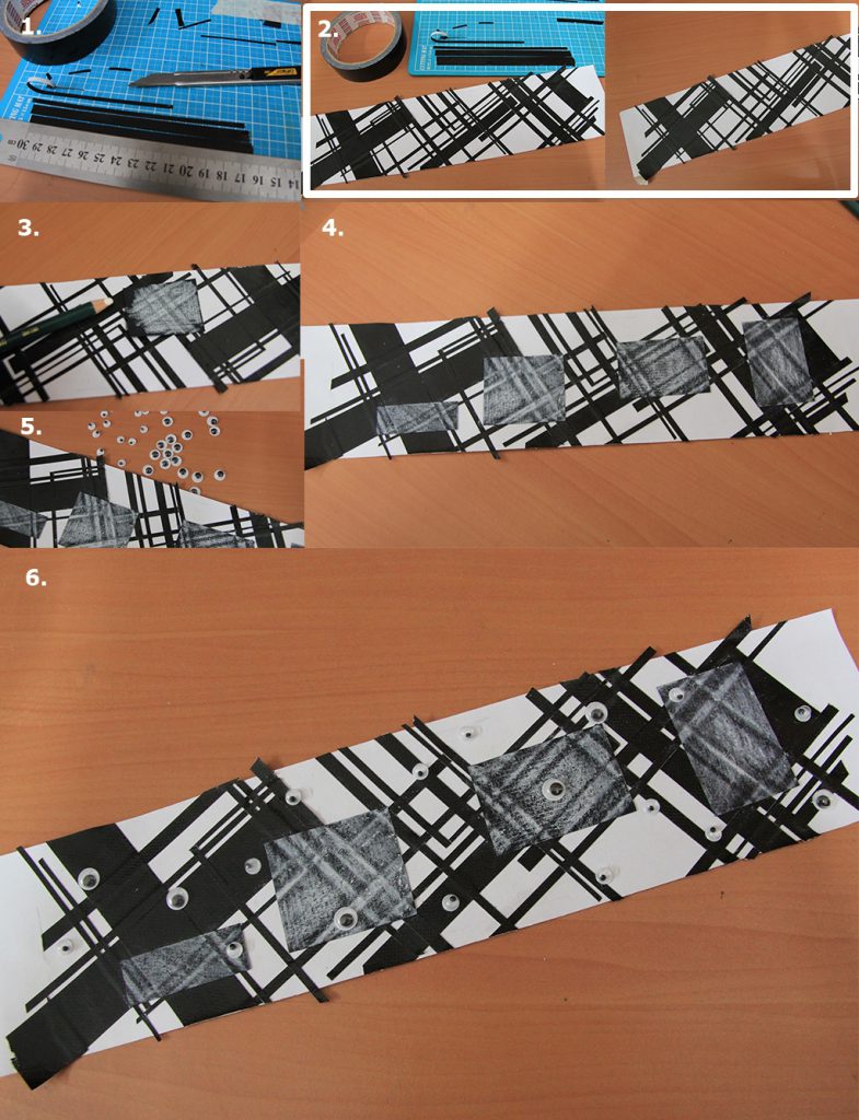
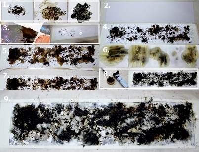
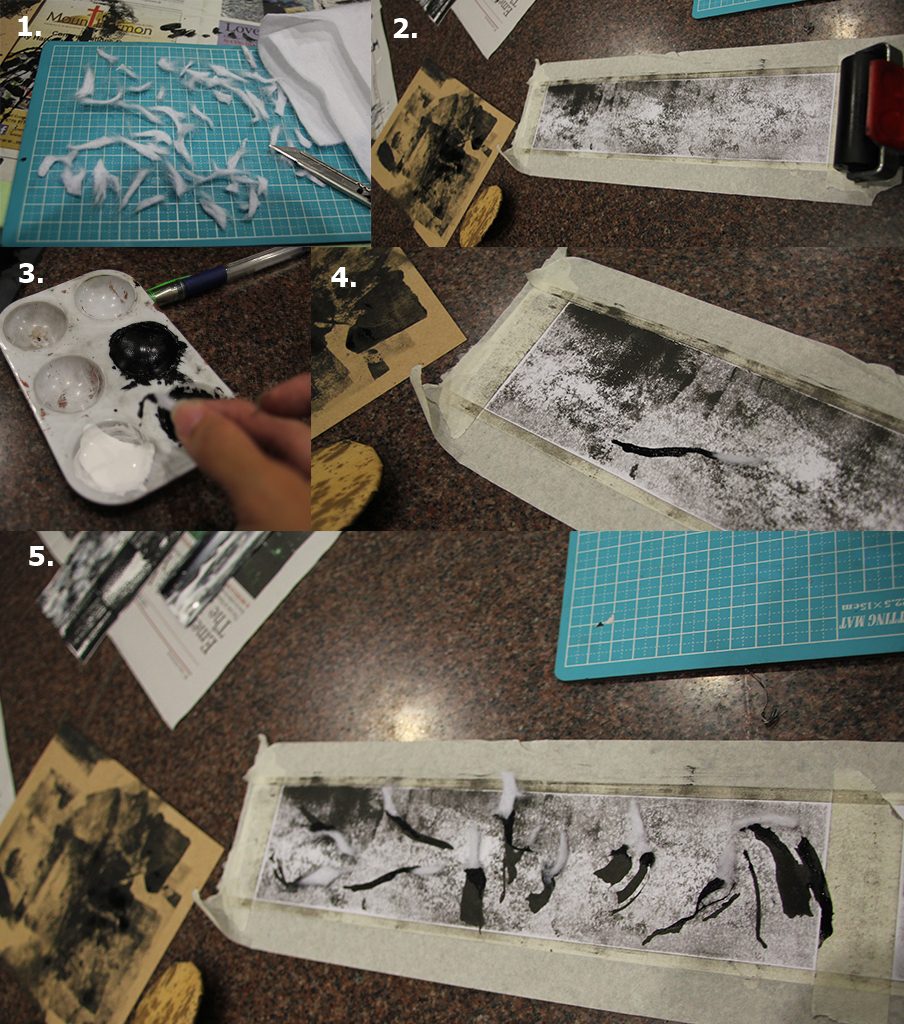
I used watercolour paper for all the base.
For colour, I used Carand’ache Neocolor II in which I used it as oil pastel first then I added water to activate the colour.
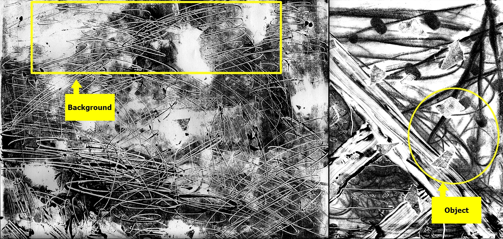
There are some which have printed paper pasted on and some other materials.

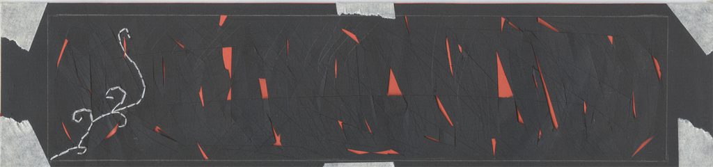
1. Carefree + Singapore = Discipline

part-1-min

Inspiration: Fiber Art Today by Carol K. Russell

Fiber Art Today
Fiber Art Today

Process:
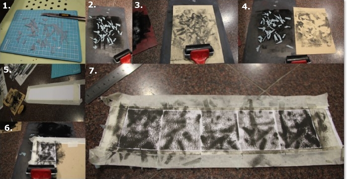
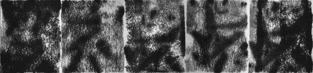
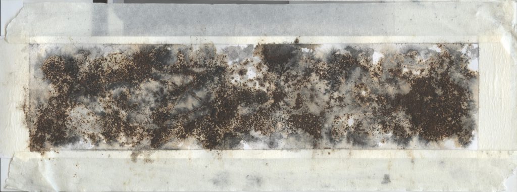
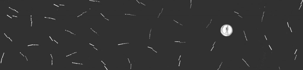
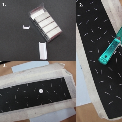
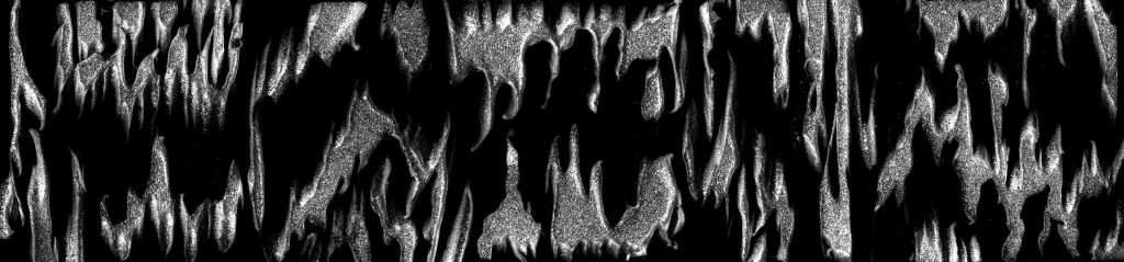
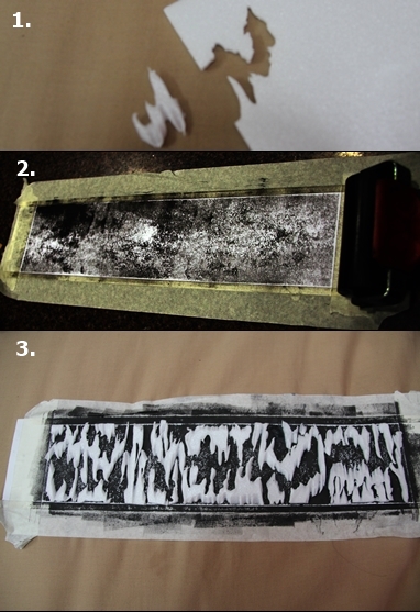
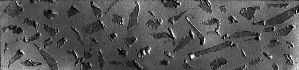
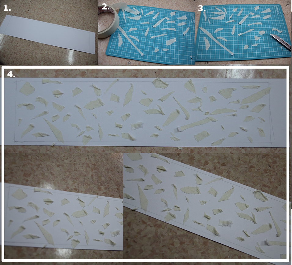
Carefree: It was made by first colouring the rice paper with the oil pastel then adding water to make the colour spread. Then colour the paper as well. Then colour the long paper.

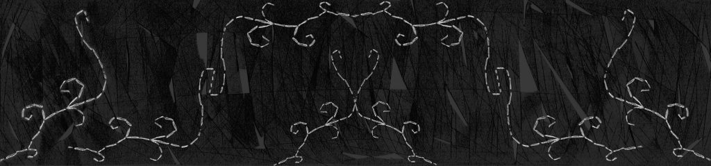
Singapore: paste the photo, then colour the background with blue. then cut wire mesh and paste it by sewing it to the paper.

Discipline: Same process as carefree for the crumpled rice paper, and wire for the Singapore.

proses-1
Some pictures during the process

Colour theory:

colour-1

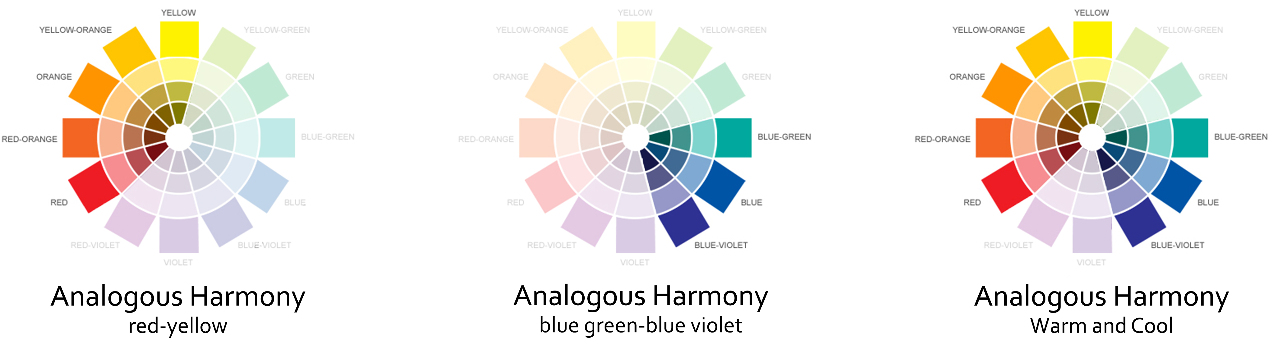
Carefree: Analogous harmony of red to yellow. I used this warm colour to show the happiness and excitement before I came to Singapore.

Singapore: Analogous harmony of blue green to blue violet. It is a likely colour for me as blue represents sadness, the confinement within rules and regulations.

Discipline: Analogous harmony of warm and cool. The balance between carefree and Singapore culture which results in discipline me.

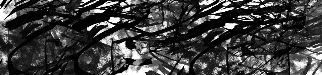
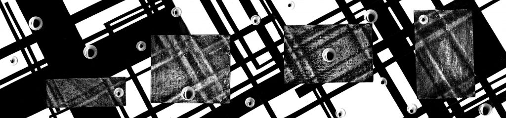
2. Expressive – Indonesia = Faceless

part-2

Inspiration:
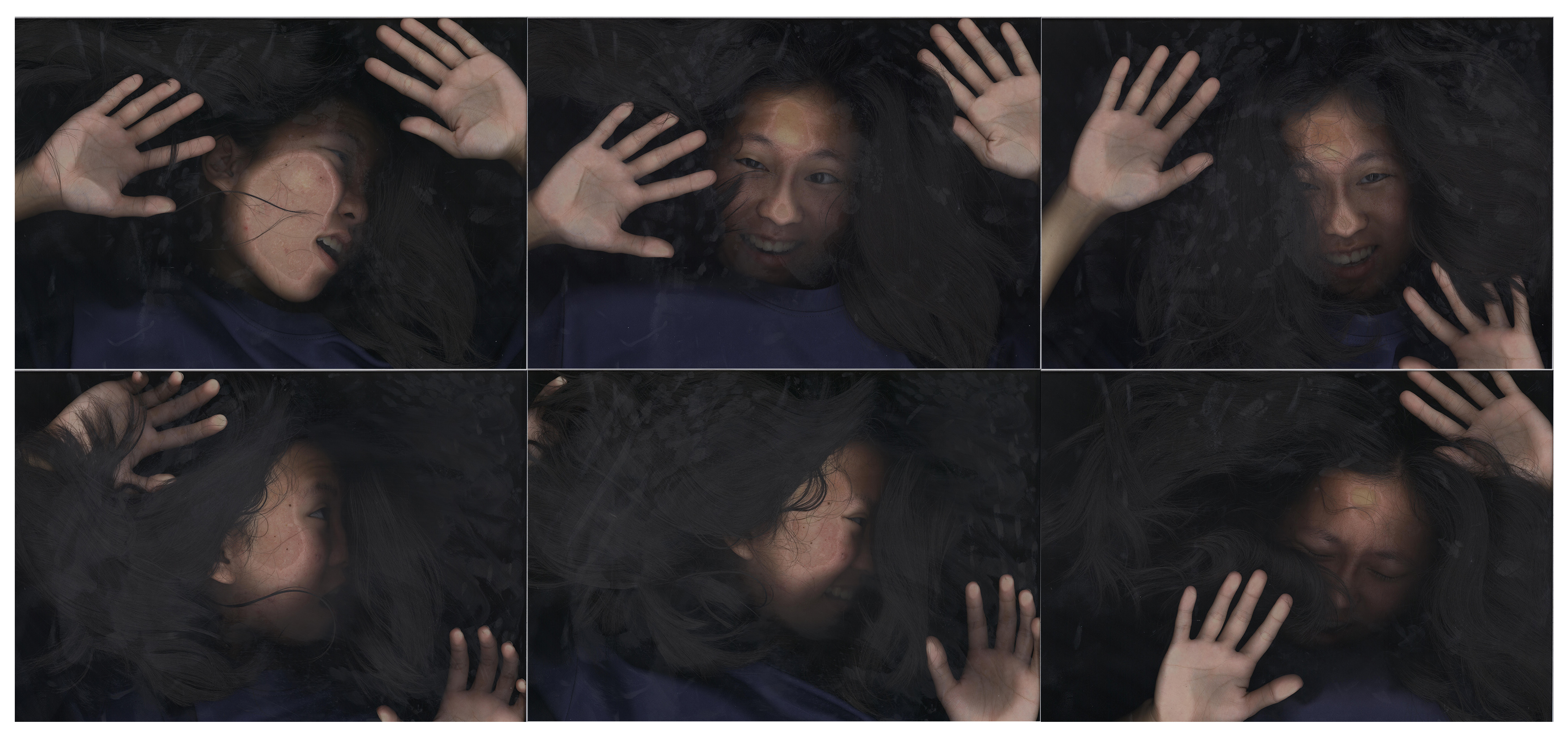
The main idea is from Pinterest’s C. Scanface post where people scan their faces and body part. Ms Ina told me that I can use this method as a way to express me in the compostion.scanface

Process:
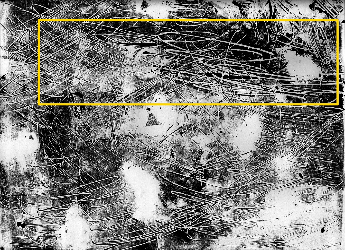
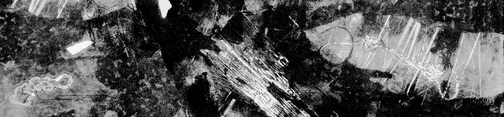
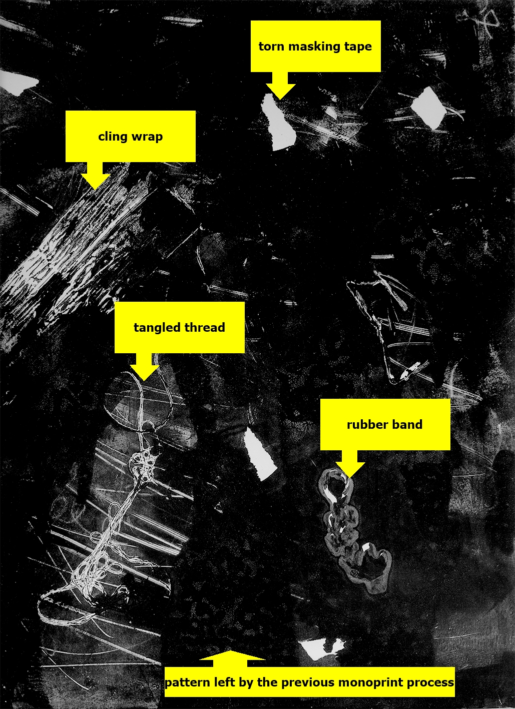
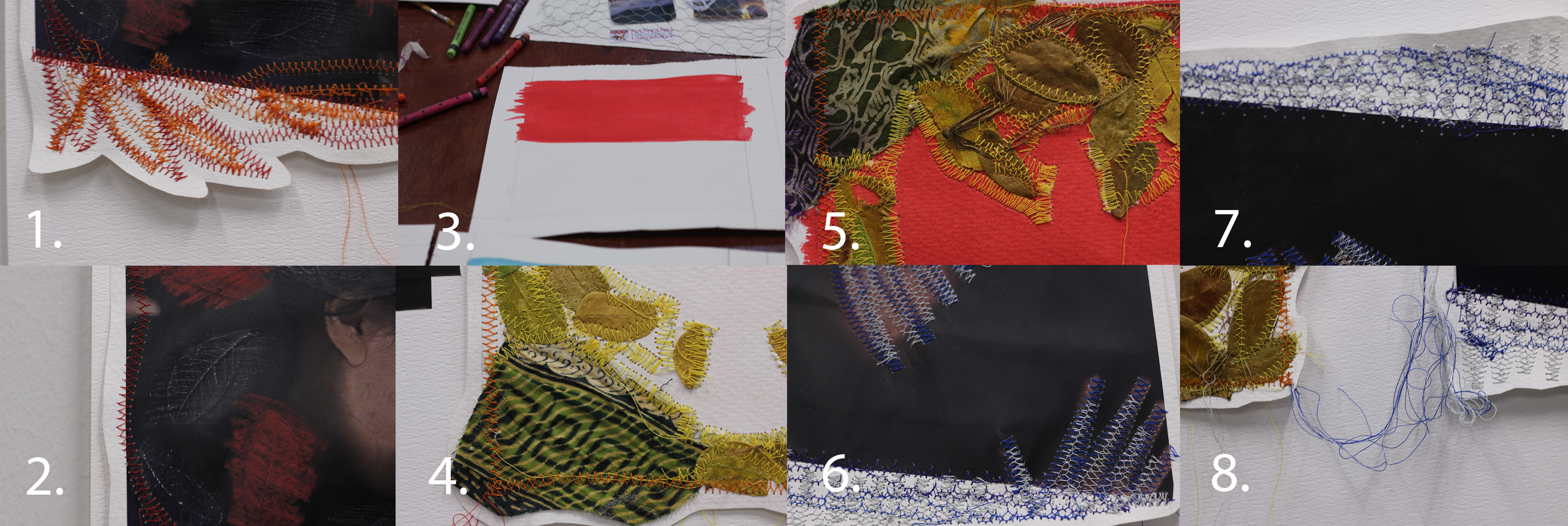
Expressive: I printed the scan imaged of me being expressive, add the leaves pattern using white colour pencil and red oil pastel.  Using sewing machine, I created the pattern using red and orange thread. Trim the sides of the picture to make it more expressive. Then connect the thread to the second composition.

untitled-1
Some scanned images
untitled-2
The chosen scanned image

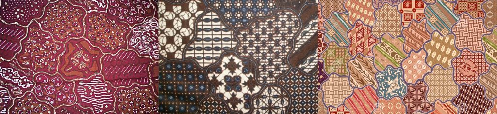
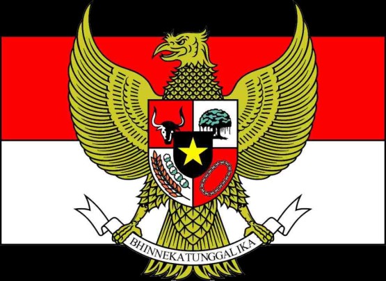
Indonesia: First colour the paper read and white as the background. I cut some batik and collected some leave and twigs. then I pasted it with the shape of Garuda by using sewing machine. Then connect the thread to the third composition.

gambar-lambang-indonesia-garuda-555x405

Faceless: Using the same printed scan image, create the pattern using dark blue and pale blue thread. Trim the sides of the picture to make it more blue.

Process
Some pictures during the process

Colour theory:

colour-2This three compositions have many neutral colours like black and white.

Expressive: Analogous harmony or red and red orange
I want to focus more on the energy in red hence it is a very warm and expressive.

Indonesia: Analogous harmony of yellow and yellow green + red
The composition is mainly yellow green as I used very leaves and purposely picked greenish batik.

Faceless: Analogous harmony of blue green and blue to create the sadness and blue of the lack of identity.

This three composition is makes split complementary harmony when combined together. This is because I want to create a strong visual contrast between the ‘Expressive’ and ‘Faceless’.

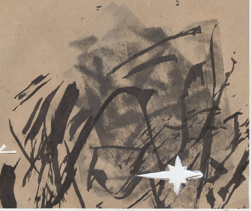
3. Creative x ADM = Passion

part-3

Inspiration: Ghada Amer Red diagonals.

string-felt

Ghada Amer (Egypt, b. 1963), "Red Diagonales," 2000. Arcylic, embroidery and gel medium on canvas, 72 × 72 in. (182.9 cm x 182.9 cm).
Ghada Amer (Egypt, b. 1963), “Red Diagonales,” 2000. Arcylic, embroidery and gel medium on canvas, 72 × 72 in. (182.9 cm x 182.9 cm).

Process:
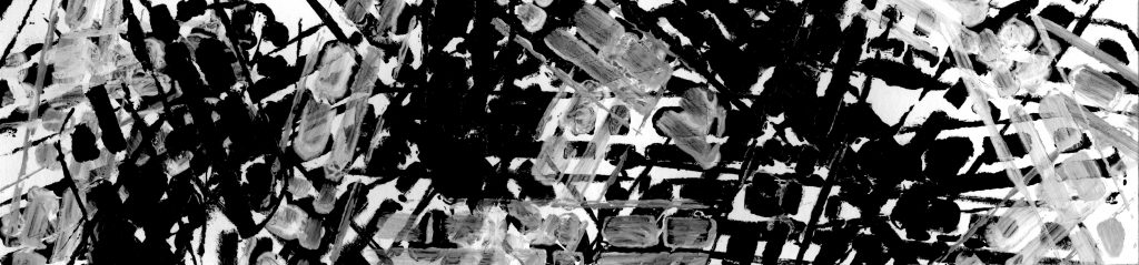
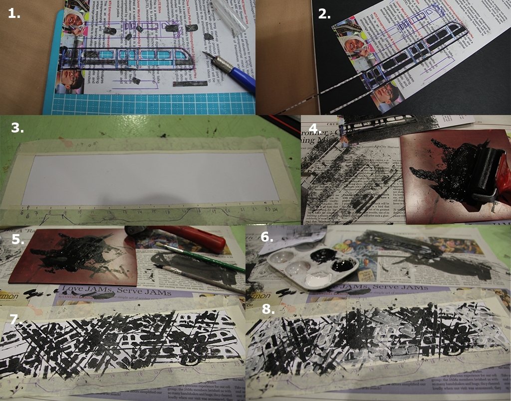
Creative:  I created the splash and drip using oil pastel.Then I created the pattern using green and yellow using sewing machine.

ADM: I painted the ADM building using oil pastel then pasted photos of my work there.

Passion: I coloured the background using oil pastel then sew the fire shape using sewing machine.

Process
Some pictures during the process

Colour theory:

colour-3
Creative: Accented analogic of red violet and yellow to green.
If we break down the relationship, the red violet and yellow green (complementary) gives strong visual contrast which help to emphasise the creativity feature while the green and yellow thread, split complementary of the red-violet, help enhancing the contrast and vibrant of red purple.

ADM: Accented analogic of blue violet and orange to yellow.
The complementary blue and orange contrasts the responsible of blue and happiness of orange, which I feel in ADM.

Passion: Analogous harmony of warm and cool.
This colour scheme really balance the composition and give an interesting harmony. The richness in colour give the feeling of fullness for the passion.

4. Me + Home = Complete

part-4

Inspiration: A HUMUMENT by Tom Phillips.

A HUMUMENT by
A HUMUMENT by Tom Phillips

Process:
Me and Home: Firstly, I cut and give some colour to the photos with threshold effect. Using newspaper as the base, I pasted my photo and outline it with black non water soluble oil pastel. Also, using the same tools created the black wavy pattern

Complete: I prepared black and white threshold photo of my family, then I prepared strips of red, yellow and blue acetate paper. Arrange it in order vertically then horizontally.

Process
Some pictures during the process

Colour theory:

colour-4

Me: Analogous harmony of orange-yellow as I want it to be simple and quite neutral. I picked yellow as for baby it is usually a gender neutral colour, representing its neutrality.

Home: Analogous harmony of green-blue as many family gathering poster are represented by this colour. Moreover, blue and green can be associated with peace, relaxing and calming which represents my home.

Complete: Triadic colour scheme of primary colours. It is the combination of the main colour from ‘Me’ and ‘Home’. It is vibrant and the dominant colour is red. As such, I purposely not use red in the other two to enhance the red vibrancy here. (it is likely to be the first thing spotted on the last line)

Thanks for reading! To continue to the next post here… 😀

Project 2: Forrest Gump (Process 2)

Hi! laughing

So here is the last post on the process that lead to my final Forrest Gump compositions . The previous part of the process, specifically presenting about dragon can be seen here !

My second quote is: ” There are a few warriors amongst us.” In this post I will cover some personal views about the issue of warrior and society.

For my first composition, I portray ‘us’ as various and different type of weird beast and animal (e.g. two heads, six legs, chimera of many animals, etc). However in between those weird creatures there are a few human warriors. I used the spiral pattern to show that the focus is centralized on the real white warrior in the middle. At the same time I gave other warriors in the compositions black color to tell that the they represent the idea of warrior (its shadow), not necessary a warrior in a literal way (e.g. the idea of parents and teacher as warrior for children). I also want to say that everybody can be a warrior in their own way!

Composition 1: my very first Warrior Quote composition

Other than that, I also tried to invert the color of the beast and warrior. I made the beasts to be black (shadow) while the warrior are all white. This composition portray the idea of a true warrior among a fake and unreal condition in the society. Maybe I am hoping anyone who see this can feel the idea of hope (warrior in every field) among the broken society.

Composition 2: the invert effect

I also want to bring a message when planning the next composition. However this one is quite hard to be understood and did not fully successful to portray the Warrior Quote. I collected different types of hat to show different type of occupation and job in the society. I took all the hat from paintings to get the gradient and color effect. I also chose some warrior (military leader) hats (the one with feather, male model only) to bring  the idea of warrior. At the same time, the position of those warriors hats is creating a figure of a woman wearing a hat in a long dress. Basically, I want this composition to show the role of woman as a warrior in the society. Also to break the stereotype of man is the only gender to be warriors. This is the part that is difficult to understand which made me not use it for final submission despite the hidden meaning.

Composition 3: the confusing warrior
Composition 3: the confusing composition for women warriors

Next, another composition is again has the idea of society and the presence of warrior in any type of field in life. For background, I used the a picture of human cell to show that the seed of warrior is actually inside everyone of us. Then, I added chess pieces as my way of showing different role, status and level of people in our society. As for the warrior, I wanted the knight piece to be seen as the warrior among the many pieces. The warrior inside us want to show that whatever you are now, you can be anything you want! Honestly I really like the idea of using human cells, however due to the messy and not so clean edit, this composition may show unclear and confusing message, also giving the idea of laziness.

Composition 4: the warrior inside us

Finally, it is one of the composition I decided to be included as a final submission:

natasya_adistana-the_hobbit_07
Composition 5: the warrior across time

This composition is about how the society is confused and wonder about the presence of a warrior among them. Some may be in awe but many are confused and did not understand how can someone be a warrior in real life and appear in their time. The picture of crowd I used is actually taken from a biblical and religious painting in which Jesus Christ was the real main attention of the confusion of the people. I want to bring the idea of confusion on the presence of a warrior in the society to show the fact that the idea of society warrior is not always accepted and welcomed by the people. Moreover, I purposely put the warrior and crowd that came from different era to show that this problem has been occurring every time despite the era we are living in (e.g. from the rejection of Jesus as Mesiah by the crowd in the past to the rejection of honest political figure because they are not as rich as the corrupt leader now.)

Basically that is all for my process. At the end I decided to use Composition 1 and Composition 5 to represent the Warrior Quote in my final submissions. I hope that this post can share some insights and maybe inspire others!

Thank you for reading! laughing

Project 2: Forrest Gump (Process 1)

Hi!

So here is my 2D Project 2 Process laughing.

I chose the movie Hobbit: An Unexpected Journey (2012). Then I decided to go with 2 quotes: “The dragon has long been on your mind” and “There are a few warriors amongst us”.

I will do it chronologically from the very first composition I made.

I started from the first quote: “The dragon has long been on your mind”

My very first composition
Composition 1: My very first composition

I composed this while learning on posterise and threshold effect on photoshop. The result was not pure black and white and I didn’t really like the colour. Moreover, I didn’t really understand the project a first, hence I made it very very literal. Like literally a dragon is in one’s mind, and the person is represented as a skeleton to show that it has been going on for a long time (a lifetime).

After trying to understand the project and learn about the photoshop effect more ( I really like threshold! ) , I finally able to produce a much more decent composition.

dragon-1-2
Composition 2: My first decent composition

However the idea is still very literal as before. It shows someone from young till death (skeleton) who is having a dragon walking and passing through his head (mind). And I put a mandala to show a kind of explosion on the skeleton mind. I didn’t really like this one as the difference in media (doom taken from painting, some from statue, etc) make the change of age of the person messy.Moreover, I also had feedback that maybe the mandala and dragon composition will be enough.

After exploring more and more possibilities I finally had a composition which I really like.

dragon-2
Composition 3 – black version

I really really like this one.
The pendant is used to represent time (long time) and dragons are coming out from the time. The dragons are taken from different type of media (painting, wood engraving, stone and drawing) to show the many dragon that has been thought of. And choice of weird type of dragon is to give the composition interesting and unusual image. The Medusa represents a person thinking about something and the head is just nicely complement the composition.

However, this after I made the inverse version, the picture come out nicer, less scary and able to portray the quote more. Hence I chose the white version of it to be one of the final compositions.

dragon-2b
Composition 3 – white version

Another composition is below. It was made accidentally but people say that it is the best one out of my compositions.

natasya_adistana-the_hobbit_02
Composition 4: The lucky accident

Initial idea:
“The dragon has been long on your mind” may make the person going crazy from thinking of dragon his whole life, making me want to portray it by creating composition of dancing skeleton and dragon. The person too crazy that it represented by skeleton that endlessly dancing. Hence I used this cheerfully dancing skeletons as I planned to made a festive ritual between the crazy skeletons and dragon.

The dancing skeletons

However, as I keep on duplicating and duplicating the skeleton, a different and opposite mood is created. The final composition feels much more gloomy and dark to me. It is like the skeleton are now sacrifices for the dragon.  As the mood of final composition is very different from my initial plan, I feel that this composition is accidental. But I like it a lot 😀

Finally, my last composition for this first quote:

Composition 5: the dragon and mind

It is a modification of composition 2, however it focuses on the dragon and explosion (mandala) more by removing the confusing human stages. The mandala in composition 2 is changed into the one with an eye in the middle to represent an explosion of mind instead.  The dragon and ‘mind’ is purposely arranged like they are having an eye contact to show their connected and ‘fond’ relationship. However, as I want my final composition the balance (same composition for each quote), I have to choose only the best 2 of all this compositions, which were composition 3 and 4.

Thank you for reading! Post on part 2 process  (the Warrior Quote) is here (coming soon)! And click here to see the final submissions for this project!

Hope you enjoy it ! laughing


Project 2: Forrest Gump (Final)

Hi!

So here is my final best hard copy compositions for our 2D Project 2: Forrest Gump laughing

whatsapp-image-2016-10-17-at-4-40-04-pm
Project presentation during critique session

Here are the details of each composition:

natasya_adistana-the_hobbit_01
Final composition 01
natasya_adistana-the_hobbit_02
Final composition 02
natasya_adistana-the_hobbit_07
Final composition 03
natasya_adistana-the_hobbit_06
Final composition 04

And here are additional compositions I submitted for the Media Wall smile

natasya_adistana-the_hobbit_03
Additional composition 01
natasya_adistana-the_hobbit_04
Additional composition 02
natasya_adistana-the_hobbit_05
Additional composition 03
natasya_adistana-the_hobbit_08
Additional composition 04
natasya_adistana-the_hobbit_09
Additional composition 05
design-8
Additional composition 06

Also, the meaning and concept behind every compositions can be found here (part 1) and here (part 2 coming soon) !

Thank you for reading 😀

whatsapp-image-2016-10-17-at-4-39-55-pm
The final compositions and me!

Project 1: My Line is Emo (Process)

Hi guys! Here is the process of my handmade emo lines!

1. LOVE – Obsession

LOVE - Obsession
LOVE – Obsession
LOVE - Obsession Process
LOVE – Obsession Process
  1. I used pieces of cut foam, put it under the paper and use the roller with thin ink to create the pattern. (image 1-4)
  2. I divided the paper into five parts and roll it with various rolling movement and ink content, e.g. roll the roller vertically/ horizontally/ diagonally with thin ink/ thick ink to get various effect. (image 5-7)
  3. I enhanced the level and brightness as well as contrast of the scanned image.

2. LOVE – Faithful

Love - Faithful
LOVE – Faithful
LOVE - Faithful Scan
LOVE – Faithful Scan
  1. I scratched the black paper to different direction to create the desperate and problematic effect and pasted a red paper behind it to enhance the effect.
  2. I sewed a calm pattern using white thread on the paper.
  3. Made the scanned image black and white, then multiply the sewed pattern to intensify the calmness and faithfulness.

3. LOVE – Jealousy

Love - Jealousy
LOVE – Jealousy
LOVE - Jealousy Scan
LOVE – Jealousy Scan
  1. I used a paper with mono-print pattern as the background then brush chinese ink with different pressure and various stroke direction to get the intended effect.
  2. Edit the scanned image to black and white, multiplied it to intensify the jealousy effect.

4. JOY – Complete

Joy Complete
JOY – Complete
JOY - Complete Process
JOY – Complete Process
  1.  I took black and white loom bands and paired each 2 of them. (image 1-2)
  2. I pen-knifed a black paper to create the vesica piscis pattern. (image 3)
  3. I match the black paper to find suitable monoprint patterns to be included. (image 4)
  4. I pasted the paired bands and created the final line. (image 5)

5. JOY – Pleasure

JOY - Pleasure
JOY – Pleasure
JOY - Pleasure Process
JOY – Pleasure Process
  1. I drew the outline pattern of Batik Sekar Jagad and cut it with pen knife. (image 1-3)
  2. I matched it with various monoprint to give individual effect on each part and created the final line. (image 4-5)

6. JOY – Optimism

JOY - Optimism
JOY – Optimism

SURPRISE - Eye-opener

    SURPRISE – Eye-Opener
  1. It was made from the image of SUPRISE – Eye-Opener (above), the process will be explained at number 7.
  2. The line was scaled down, multiplied and mirrored to create the pattern and final line of SURPRISE – Optimism.

7. SURPRISE – Eye-Opener

SURPRISE - Eye-opener
SURPRISE – Eye-Opener
SURPRISE - Eye-Opener Process
SURPRISE – Eye-Opener Process
  1. I cut line with different thickness from black tape and paste them randomly but diagonally. (image 1-2)
  2. I paste black rectangular black paper on top and trace it with white color pencil to create the reverse color effect due to the tape’s thickness. (image 3-4)
  3. I pasted different sizes of plastic eyes on top to finish the final line. (image 5-6)

8. SURPRISE – Revelation

SURPRISE - Revelation
SURPRISE – Revelation
FEAR - Hopelessness Scan
FEAR – Hopelessness Scan
  1. I used the same scanned image as for FEAR – Hopelessness (above), the process of making will be explained at number 17.
  2. Then I adjusted the level and brightness to create the intended revelation effect.

9. SURPRISE – Awestruck

SURPRISE - Awestruck
SURPRISE – Awestruck
SURPRISE - Awestruck Monoprints
SURPRISE – Awestruck Monoprints Scan
  1. I scan the monoprint and create 2 layers of it.
  2. I used one for background and one for the main object in the middle.

10. ANGER – Bitterness

ANGER - Bitterness
ANGER – Bitterness
ANGER - Bitterness Process
ANGER – Bitterness Process
  1. I did some experiment on coffee powder on paper. From left to right, coffee powder on paper, coffee powder on paper with addition of water, coffee powder on paper with addition of black water color paint. Then I tried to put the in microwave with intention to get a black effect, but nothing happened. (image 1)
  2. I prepared the paper and white glue, spread the coffee powder on it. (image 2-4)
  3. I gave some water and dried it with tissue paper as it was too wet.(image 5-7)
  4. Then I added black watercolor paint. (image 8-9)
  5. The scanned image is edited to black and white and adjusted to give more bitterness.

    ANGER - Bitterness Scan
    ANGER – Bitterness Scan

11. ANGER – Frustration

ANGER - Frustration
ANGER – Frustration
Image (21) d
ANGER – Frustration Monoprint Scan
  1. I did monoprint and use pencil at the back of the paper tho create doodles and random lines.
  2. I scanned the part I want and edit the level to adjust the effect.

12. ANGER – Aggravation

ANGER - Aggravation
ANGER – Aggravation
Image (16) d
ANGER – Aggravation Scan
  1. I created the monoprint using masking tape, cling wrap, rubber band, and thread.
  2. I scanned and cut out the desired part to create aggravation.

13. SADNESS – Alienation

SADNESS - Alienation
SADNESS – Alienation
SADNESS - Alienation Process
SADNESS – Alienation Process
  1. I painted staples (stapler bullet) and thumbtack with white acrylic paint. (image 1)
  2. After put a foam below a black paper, I stapled the staples randomly on the paper and closed the open ends of the staples. (image 2)
  3. I  pasted one white thumbtack to give the alienation effect. (image 3)

14. SADNESS – Monotonous

SADNESS - Monotonous
SADNESS – Monotonous
fsd
SADNESS – Monotonous Process
  1. I created a stencil with the shape of a MRT. (image 1-2)
  2. The paper was prepared, I marked the line from 0600 to 2400 with a graph to indicate the peak hour time of MRT. (image 3)
  3. I tried using roller but the result was not as expected due as the stencil line was too thin. (image 4-6)
  4. I decided to use acrylic paint to create the MRT. Black paint indicate the presence of MRT (the darker, the more peak hour) while white paint indicate the absence of MRT ( the lighter, the more non-peak hour). (image 6-8)

15. SADNESS – Despair

SADNESS - Despair
SADNESS – Despair
SADNESS - Despair Process
SADNESS – Despair Process
  1. I simultaneously tore and cut white felt fabric to create a pieces with many wool coming out of it. (image 1)
  2. I prepared the paper by rolling roller with thin ink to give some light background. (image 2)
  3. Dipping a felt piece to black acrylic and brush it on the paper, I repeated the process until the desired outcome, scanned it and enhance the despair effect. (image 3-5)

16. FEAR – Horror

FEAR - Horror
FEAR – Horror
FEAR - Horror Process
FEAR – Horror Process
  1. I used hot wire foam cutter on white styrofoam at an non-perpendicular angle to create the melting and horror shape. (image 1)
  2. Using roller and thick ink, I colored the white paper to create the mystery and and uneasy effect. (image 2)
  3. I glued the styrofoam purposely with super glue as the glue will ‘eat’ some part of it, giving uneven thickness of styrofoam, enhancing the effect. (image 3)
  4. After scanned, the level was edited and the final line was created.

17. FEAR – Hopelessness

FEAR - Hopelessness
FEAR – Hopelessness
FEAR - Hopelessness Process
FEAR – Hopelessness Process
  1.  After preparing a white paper, I tore of masking tape to pieces then paste it on a cutting mat. (image 1-2)
  2. Then, I scratch it randomly with penknife. (image 3)
  3. I pasted it randomly on the paper, scanned it and edit the level. (image 4)

18. FEAR – Nightmarish

FEAR - Nightmarish
FEAR – Nightmarish
FEAR - Nightmarish Process
FEAR – Nightmarish Process
  1. I created a piece of hanging rope and cut it out. (image 1)
  2. I put the piece of cut rope under a white paper before rolling it with thin ink roller to capture the texture. I repeated the process until the desire effect. (image 2)
  3. I enhanced the effect by scanning it and adjusted the level.

Thanks for reading! I am making a hard copy for this in order to keep the handmades, will be updating this post soon. Hope you enjoy it 🙂

Project 1: My Line is Emo (Final)

My Final Emo Lines

Hi guys! So up there is my final lines for our 2D Project 1 – My Line is Emo 😀

Let’s briefly go through them one by one!

1. LOVE – Obsession

LOVE - Obsession
LOVE – Obsession

This line was inspired by Andy Warhol’s Shadows where he painted a single image 102 times with various light and shadow.

shadow6
Andy Warhol: Shadows

The repetitiveness of the image make me feel his obsession in it.
Hence, my line was made of a single pattern with different direction of roller and ink quantity. However, the shifting of paper cause the material to move around hence there resulted pattern is similar but not the same!

2. LOVE – Faithful

Love - Faithful
LOVE – Faithful

The background was made of paper being scratched by penknife while the front was white thread being sewed in a pattern. The background resembles the trouble and hardship in a relationship while the white thread represents a pure love that stays composed and faithful at all times.

3. LOVE – Jealousy

Love - Jealousy
LOVE – Jealousy

This line was inspired by Edvard Munch painting of Jealousy.

jealousy
Edvard Munch, Jealousy, 1895

On the painting there is the “dark aura” of the jealous man, hence I try to develop and extend the jealous aura to be the line.

4. JOY – Complete

Joy Complete
JOY – Complete

Inspired by Hilma af Klint, an abstract artist who used many symbols in her artwork.

Hilma af Klint, Courtesy of Stiftelsen Hilma af Klints Verk

One of the symbols she used many times was vesica piscis, it is the almond shape arising when two circles overlap and is an ancient symbol for the development towards unity and completion. Focusing on the vesica piscis, the line of complete was created.

5. JOY – Pleasure

JOY - Pleasure
JOY – Pleasure

The line was made inspired by Indonesian famous batik motif of Sekar Jagad, the word “Sekar” means flower while “Jagad” means the universe.

Batik Sekar Jagad
Batik Sekar Jagad

This motif contains the meaning of beauty so that others would be fascinated to see. Taking the definition of beauty which is “the quality or aggregate of qualities in a person or thing that gives pleasure to the senses or pleasurably exalts the mind or spirit”, I decided to choose pleasure as the emotion.

6. JOY – Optimism

JOY - Optimism
JOY – Optimism

The line pattern looks like rays of light coming in from tall windows. Resembling that there are light and hope out there, giving the message that there is always good side in everything and to be optimistic at all times.

7. SURPRISE – Eye-Opener

SURPRISE - Eye-opener
SURPRISE – Eye-Opener

The line is inspired by Ed Moses’ signature diagonal grids in the 1970s.

Ed Moses, A Retrospective of the Paintings and Drawings 1951 - 1996
Ed Moses, A Retrospective of the Paintings and Drawings 1951 – 1996

It was explained in the exhibition advisory that the grid pattern was associated with logic and order. As such, I am adding the opposite colour rectangle shaded with white pencils and craft eyes. These addition were meant to break the ‘order’ and give unexpected enlightenment, eye-opener!

8. SURPRISE – Revelation

SURPRISE - Revelation
SURPRISE – Revelation

Revelation means “an act of revealing or communicating divine truth or  something that is revealed by God to humans”. Inspired by “Revelation Illustrated” artworks, a series of paintings through the scripture message in the Book of Revelation of the Bible.

Illustrator
Revelation Illustrated Paintings

Most of the paintings is identified by the one source of light (represents God) in a darker surrounding of different situations, making the God shining and be the centre of attention. Using such concept, my line is showing one source of light on the left side while the other parts are darker. It resembles God (the light) who is shining (revealing truth) among the darkness, a revelation.

9. SURPRISE – Awestruck

SURPRISE - Awestruck
SURPRISE – Awestruck

The focus on this line is the back pattern that can be seen as a face at a glance. The intense look and stiff face reminded me to Viracocha, a supreme god in the  Incan mythology.

fed
The Incan God of Viracocha

Also known as Huiracocha, Wiraqoca and Wiro Qocha, he was considered the creator god who formed the earth, heavens, sun, moon and all living beings. As such, the emotion is awestruck.

10. ANGER – Bitterness

ANGER - Bitterness
ANGER – Bitterness

Inspired by Cai Guo-Chiang’s gun powder paintings, I tried to create the lines using coffee powder then putting it inside a microwave.

Cai Guo-qiang, Homeland

However there was no visible changes hence I decided to add black watercolour paint to give a darker shade of colour (like explosion). Because of the pattern and coffee powder used, the emotion is bitterness.

11. ANGER – Frustration

ANGER - Frustration
ANGER – Frustration

The deep scratch done during the mono print process was to represent the feeling of being frustrated. The lines made is unorganised, random and very messy. It shows inability to do things clearly and disappointment of unsuccessful work, frustration.

12. ANGER – Aggravation

ANGER - Aggravation
ANGER – Aggravation

The line has many different elements which represents many things happening at once while the time is limited. It gives the feeling of urgency to do them, together with exasperation. And as the feeling is getting worse, it became aggravation.

13. SADNESS – Alienation

SADNESS - Alienation
SADNESS – Alienation

The one and only thumbtack between tens of staples on the paper represents the loneliness of the tack. Also, the contrasting shape different between circular wide thumbtack perfectly contrasts the small straight shape of staples shows the differences that may cause the feeling of not belong, alienation.

14. SADNESS – Monotonous

SADNESS - Monotonous
SADNESS – Monotonous

The line was made of a MRT Stencil. It was arranged from left to right to be time from 6 am to 12 am. The black colour represent the presence of MRT while the white means the absent of MRT. Using the time of peak hour and off-peak hour in Singapore, the darker the area the more crowded the MRT is (peak hour), vice versa. Since travelling is a daily routine for commuter, some may see it as something mundane and monotonous.

15. SADNESS – Despair

SADNESS - Despair
SADNESS – Despair

Pieces of white fabrics were dipped into black paint then used to etch a line on the paper before being pasted. The white fabric represents innocent and pure human while the black paint represents dark and deep problem in life which tinted the pure self while the etch shows the scar that those problems left behind. On the line, the pasted fabrics are means that the problems in life is not ending yet and the high quantity of it showing one’s despair.

16. FEAR – Horror

FEAR - Horror
FEAR – Horror

The pattern can be easily relate to horror and eerie feelings. It looks like the common representation of haunted places and dark caves. It can also be related to blood pouring down, giving the terror and alarm feeling, hence horror.

17. FEAR – Hopelessness

FEAR - Hopelessness
FEAR – Hopelessness

The pattern looks like scattered glass pieces. It resembles loneliness and the break of a life. It also can easily be related common movie scene in which the character is so stressed that they break the mirror, showing the depth of there depression. And many times, such scene ends with the character attempting suicide as they are really portrayed to be hopeless.

18. FEAR – Nightmarish

FEAR - Nightmarish
FEAR – Nightmarish

The line consists of many suicide hanging rope, being put as one like it was an arena to suicide. In a way, it represents hell where many deaths presence, as well as the existence of ghost and supernatural creatures. We stereotype them as bad and hence giving us negative feelings and emotions, not forgetting terrible nightmare!

So, those are my final lines! Will be posting the process soon, hope you enjoy it 🙂