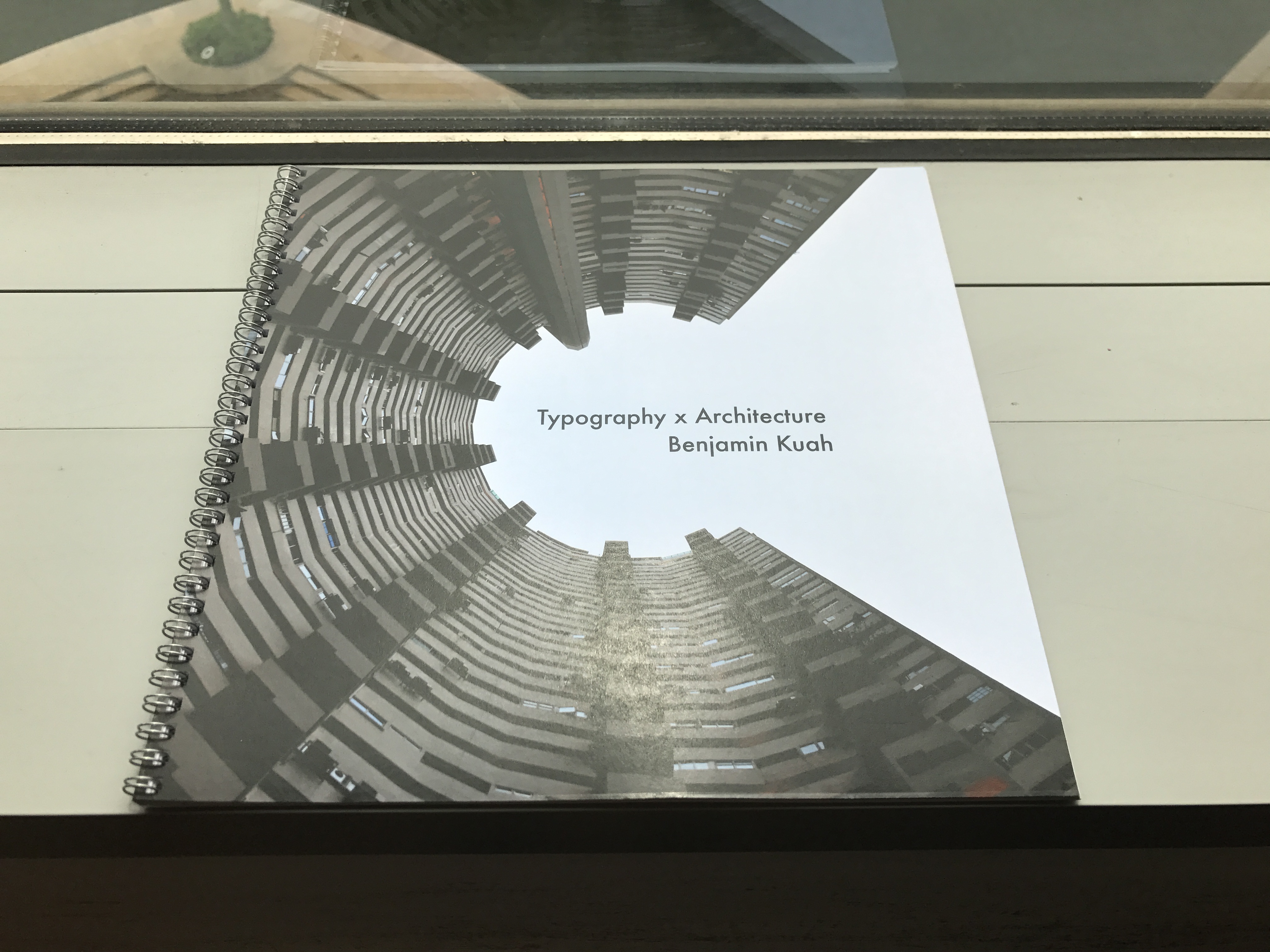
My project’s theme is based on architecture x photography. I aim to use architectural photography to express the 26 letters of the alphabet. This is achieved through composition and cropping of architectural features.
I started off with 2 moodboards with the central themes of type as architecture and type as human anatomy.

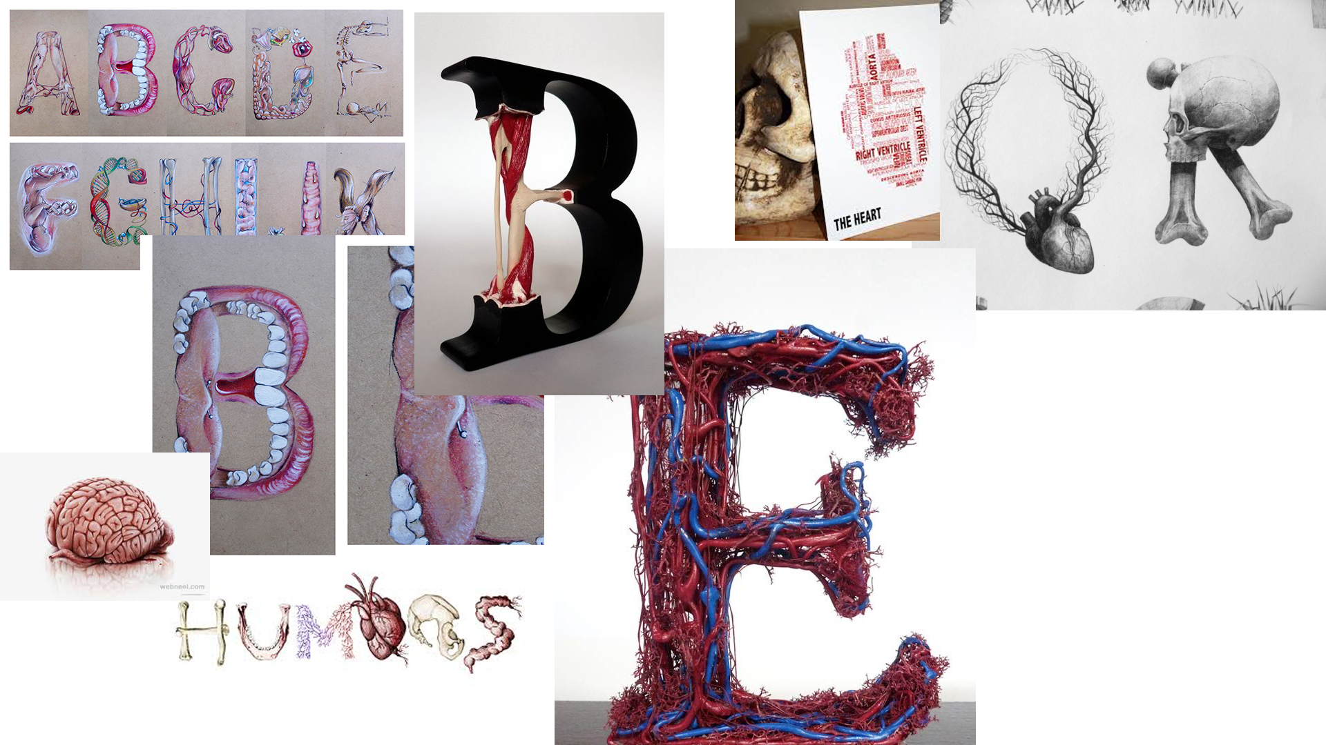
I decided to go with type as architecture as I felt it would be more interesting looking for local architecture with interesting features rather than simply illustrating human organs and morphing them into type.
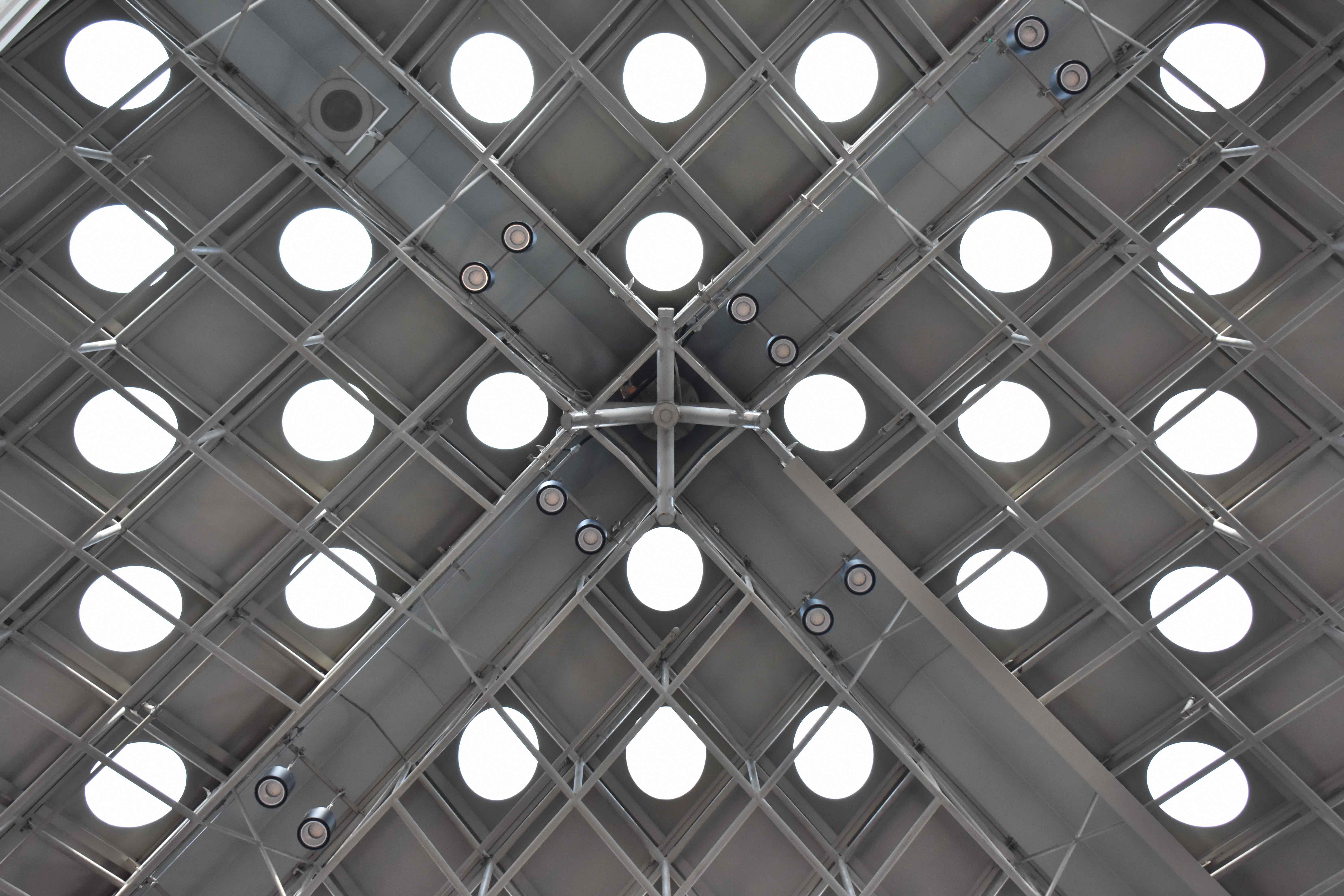
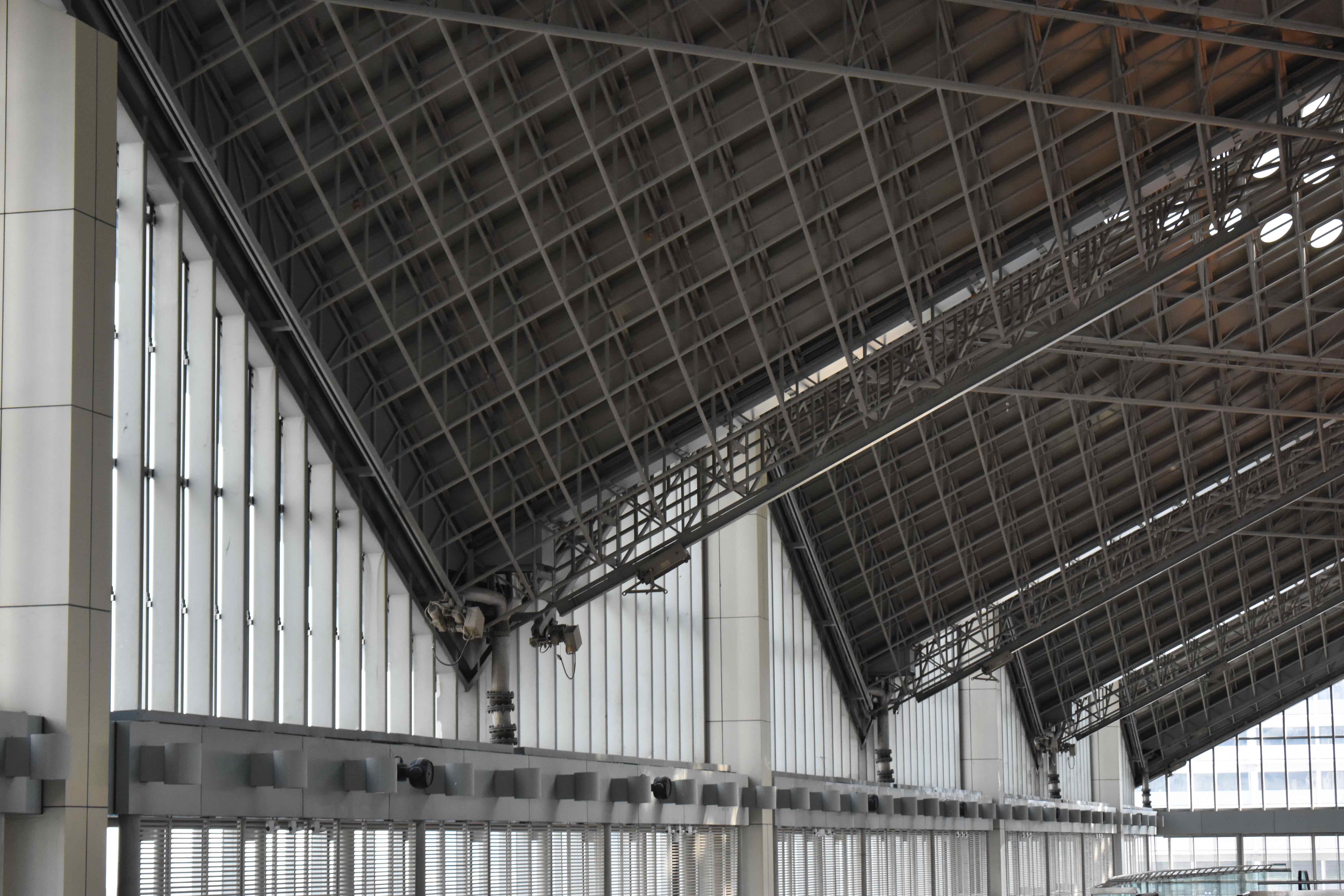
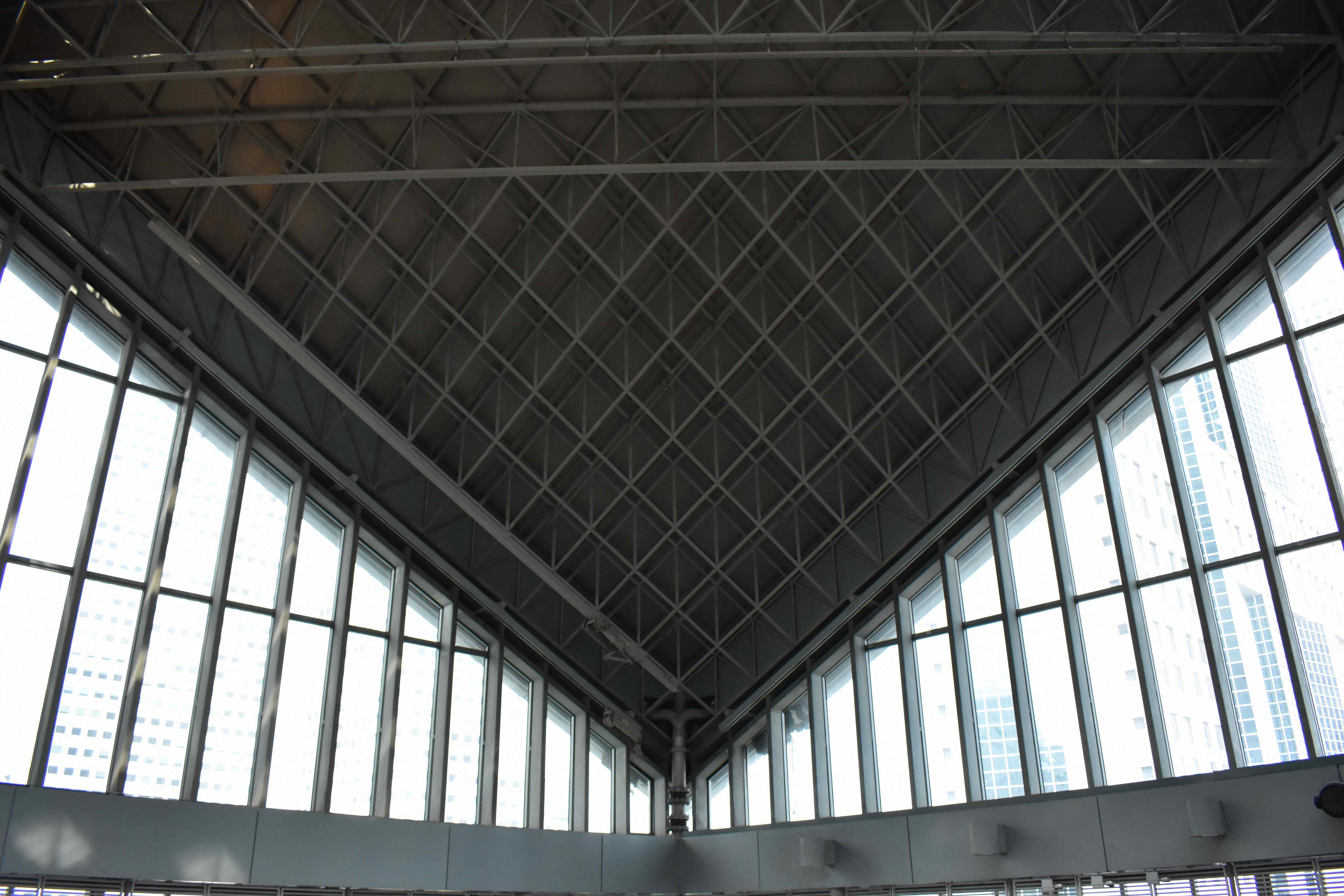
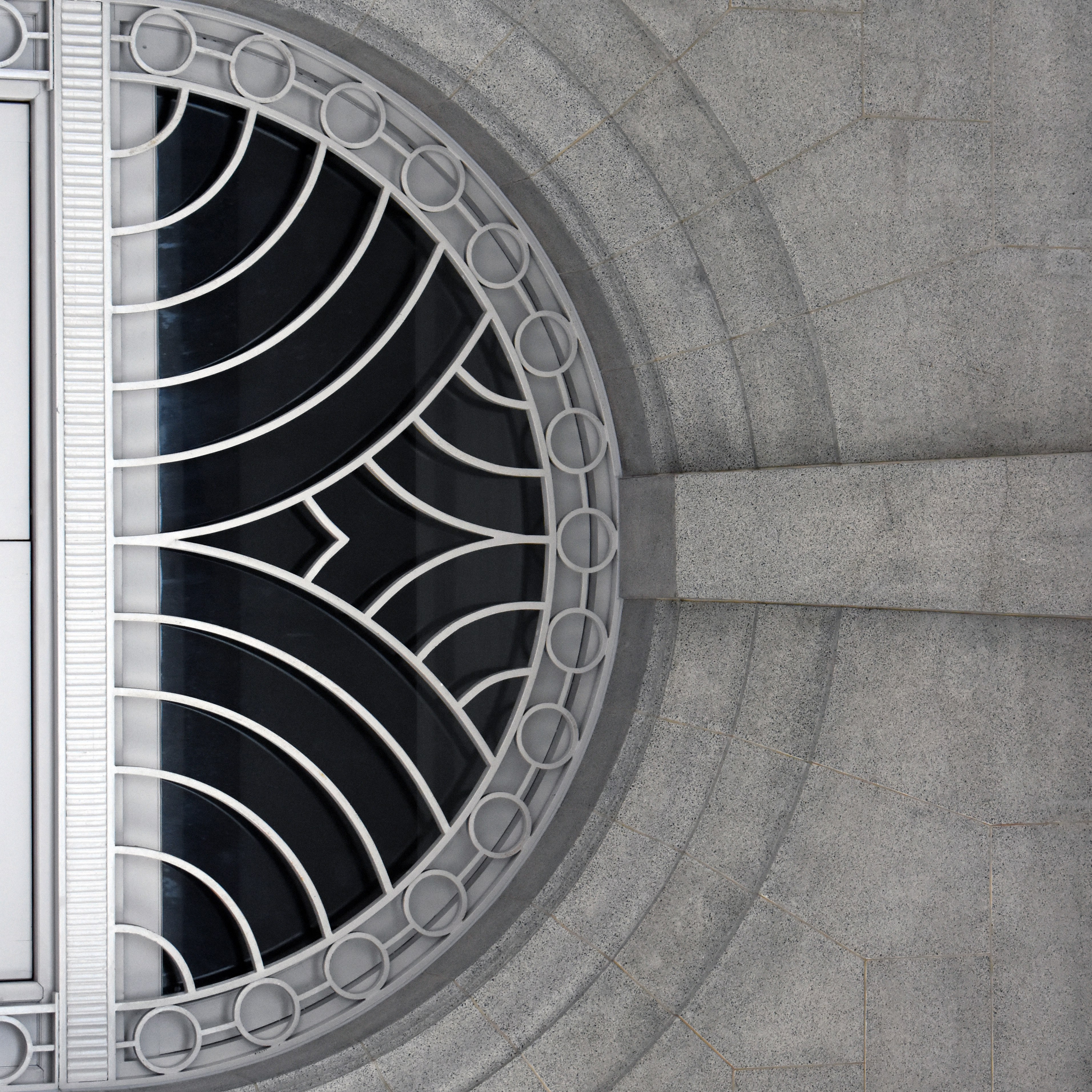
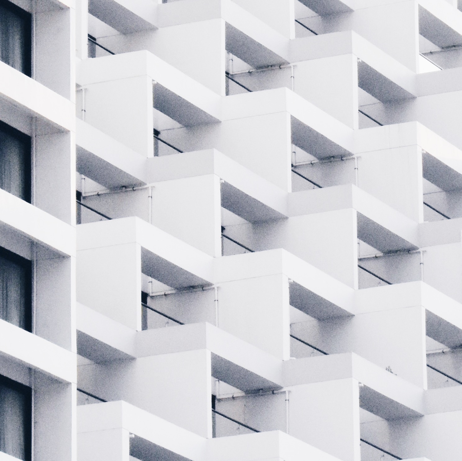
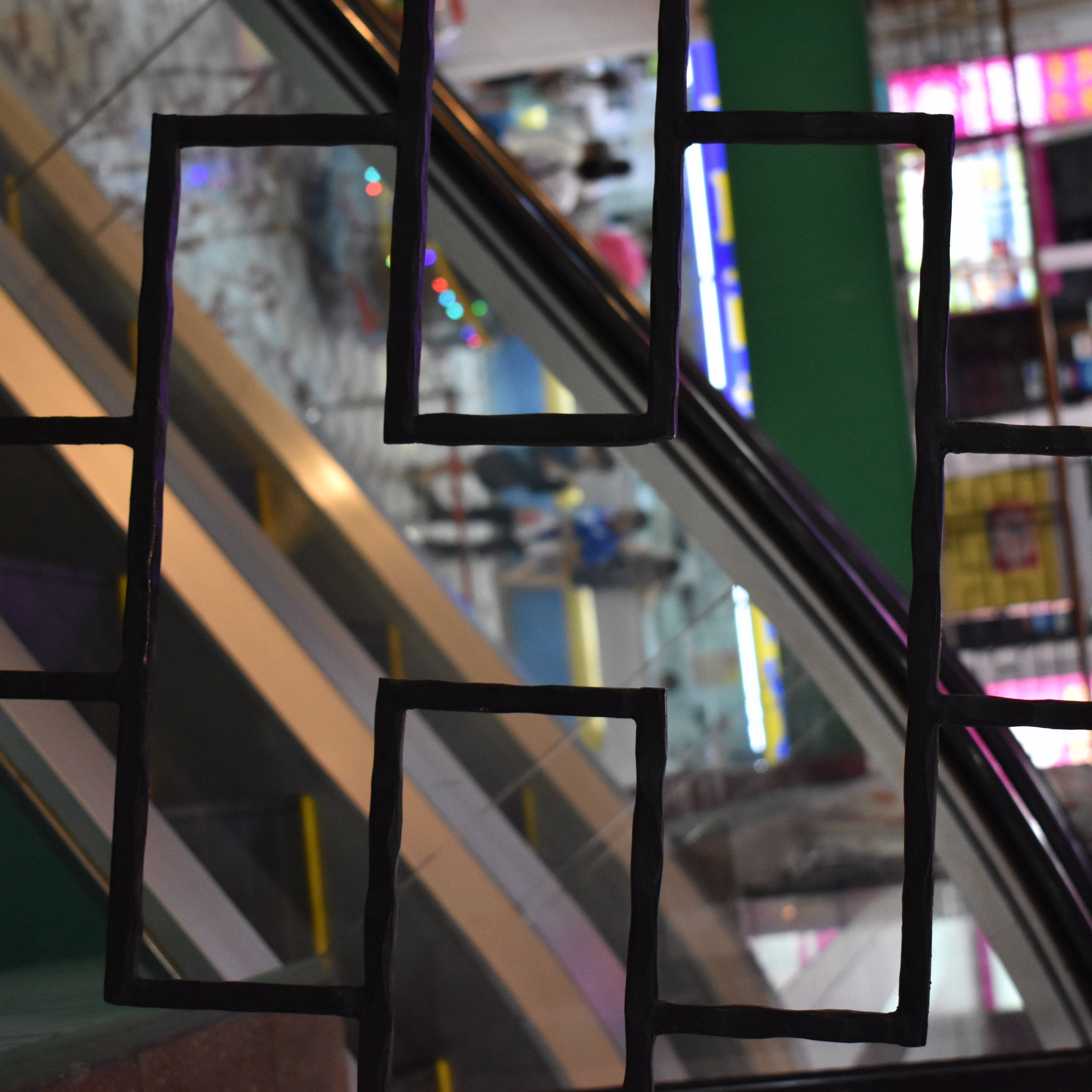
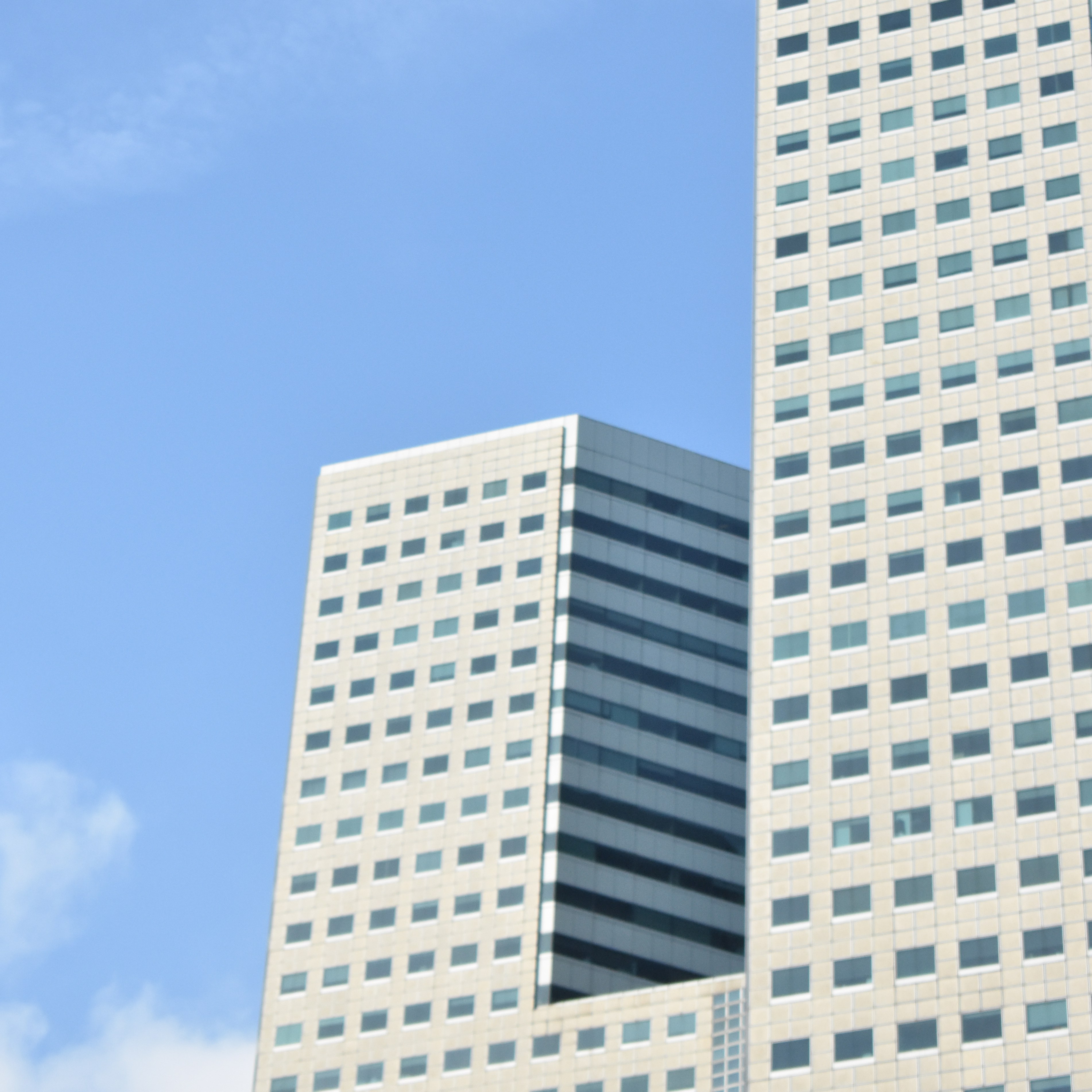
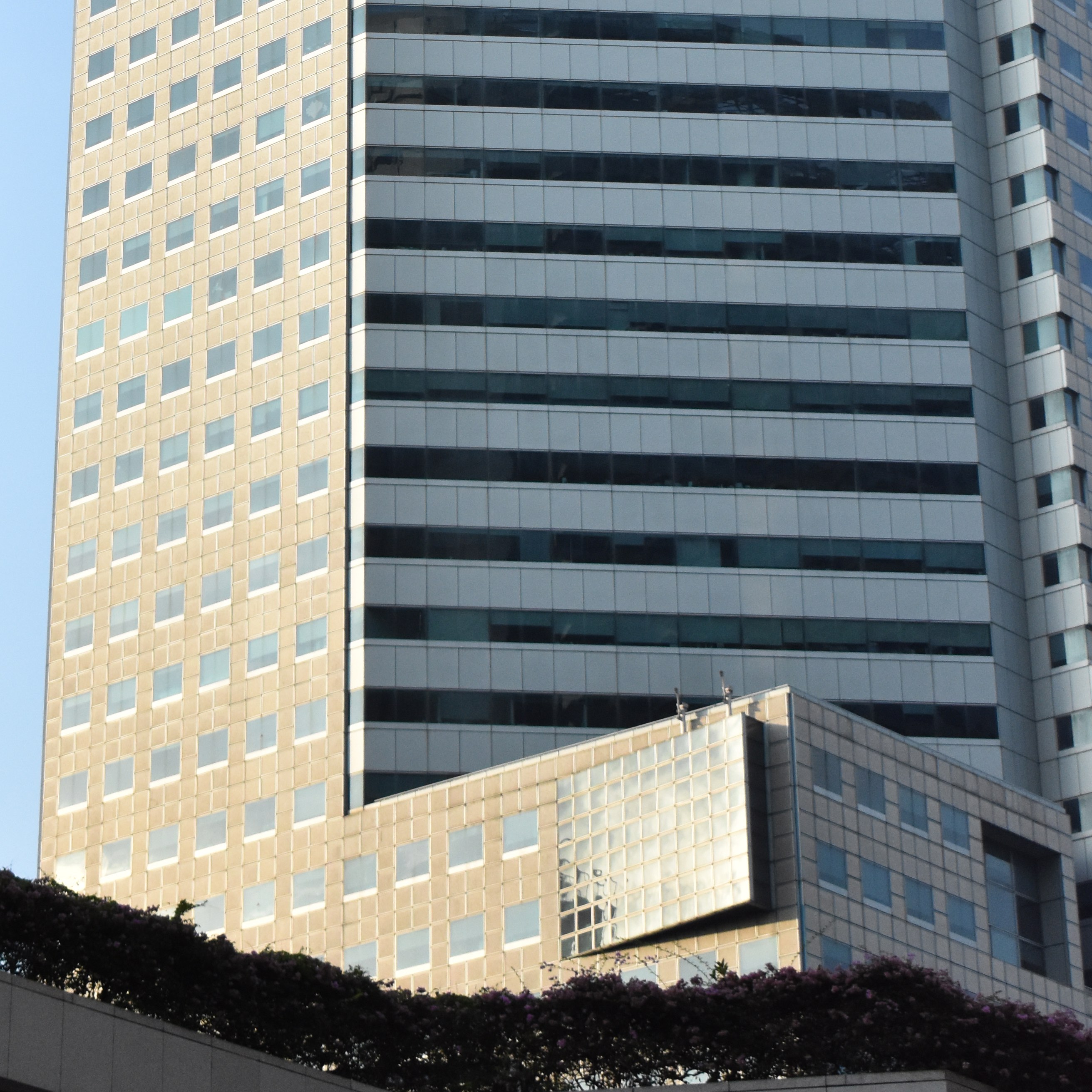
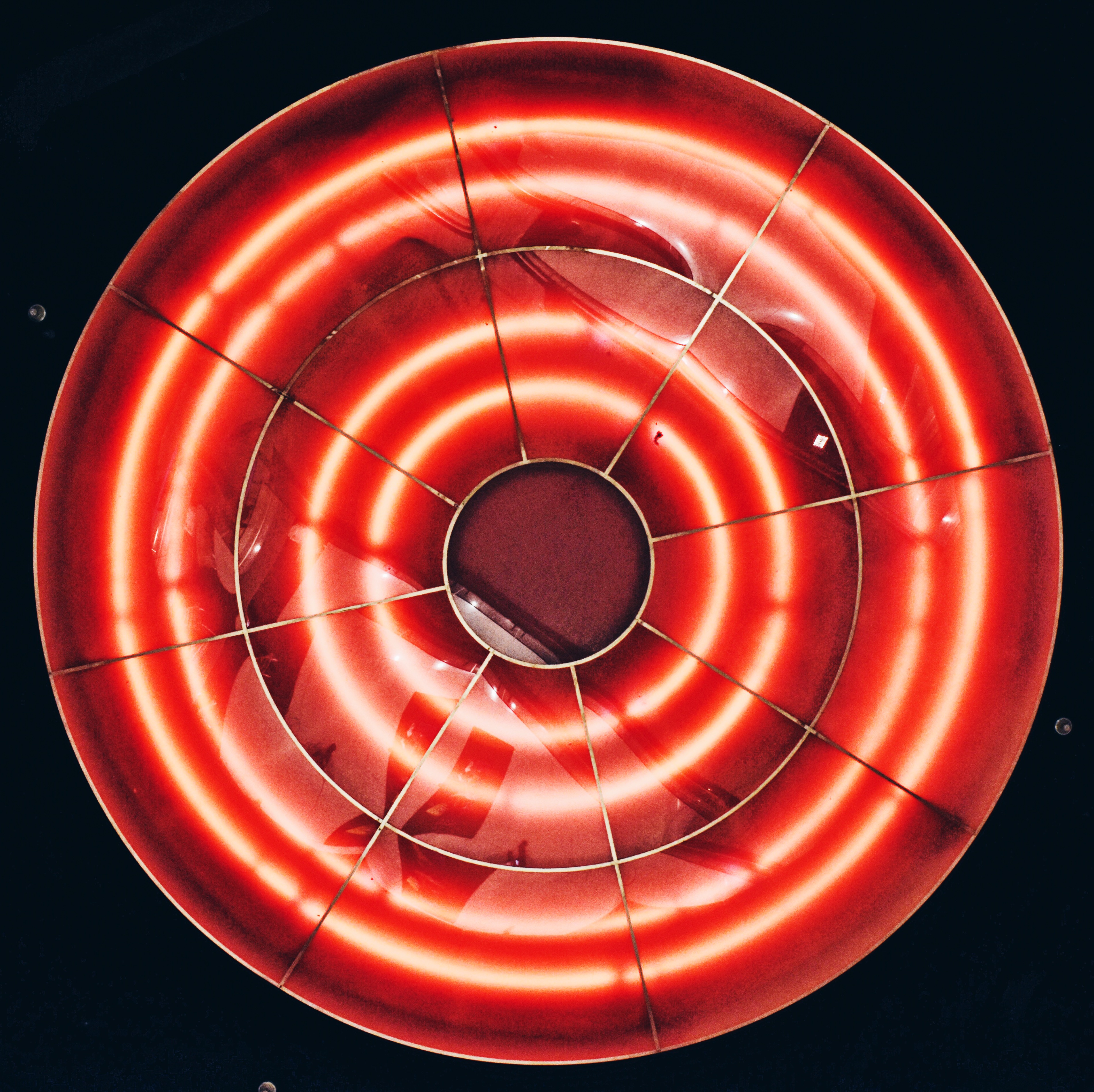
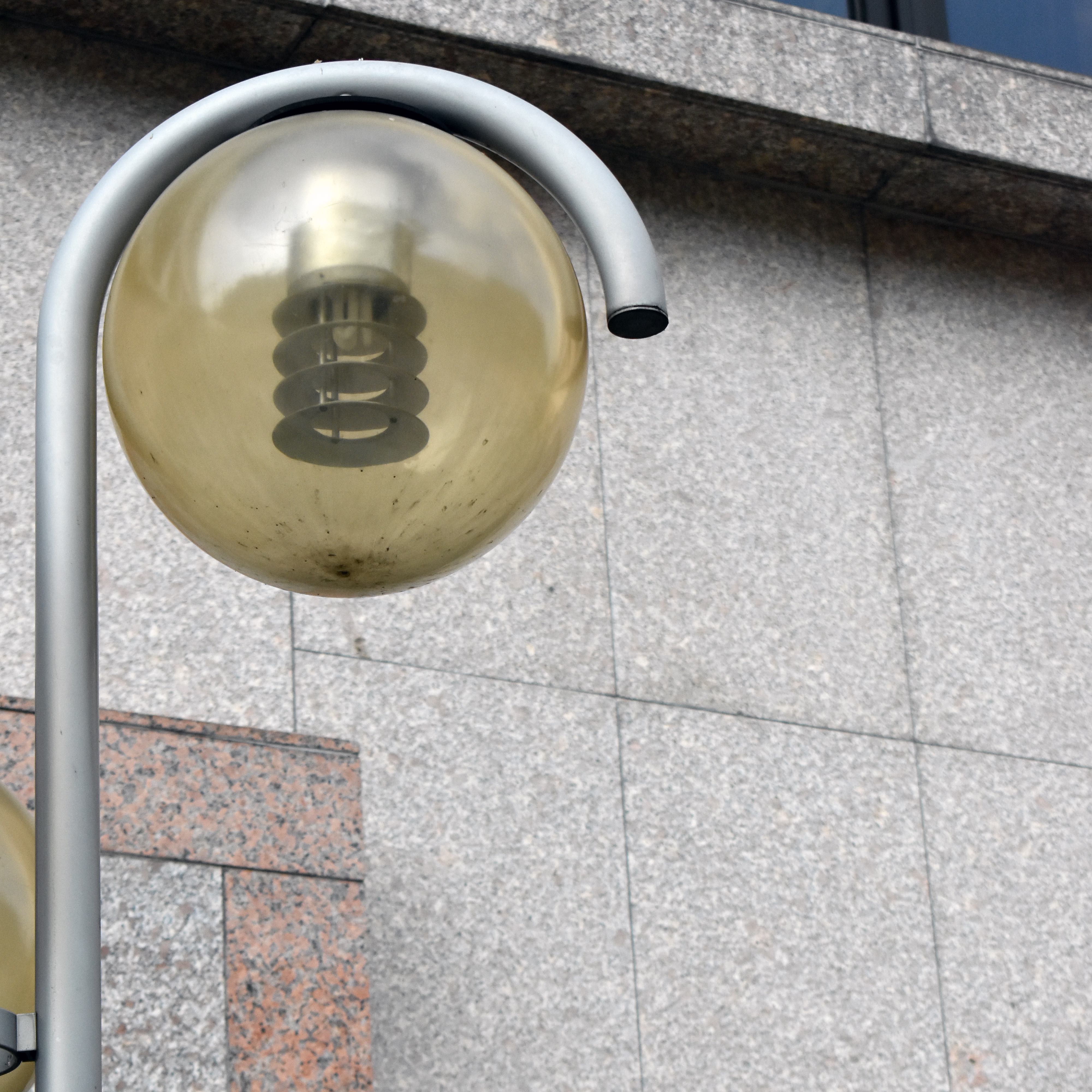
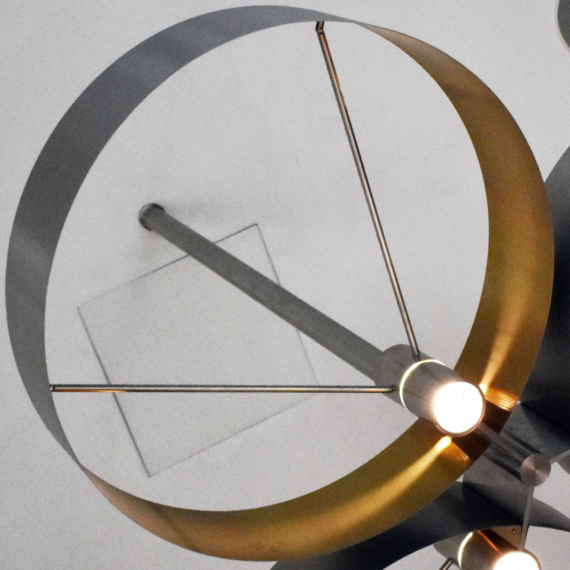
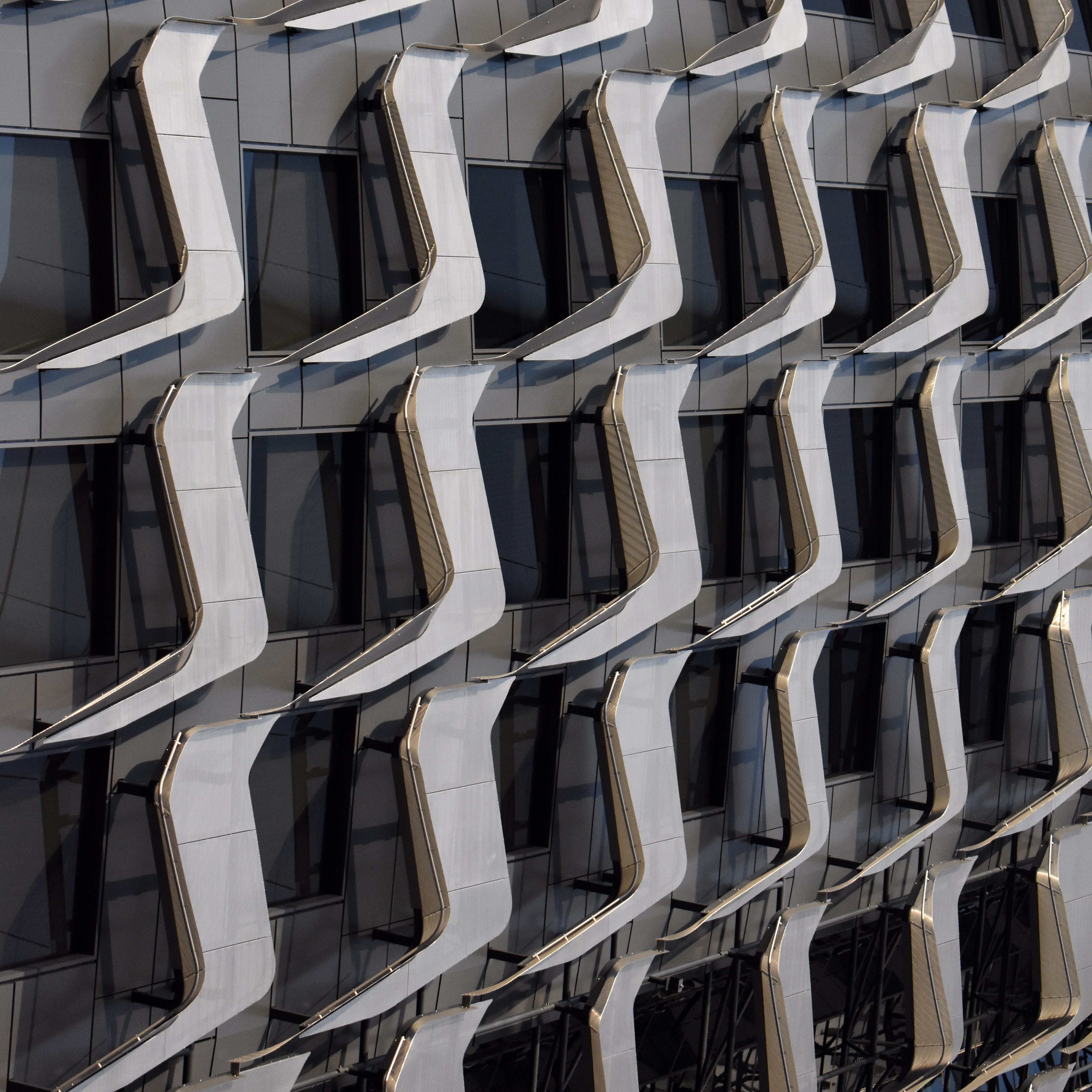
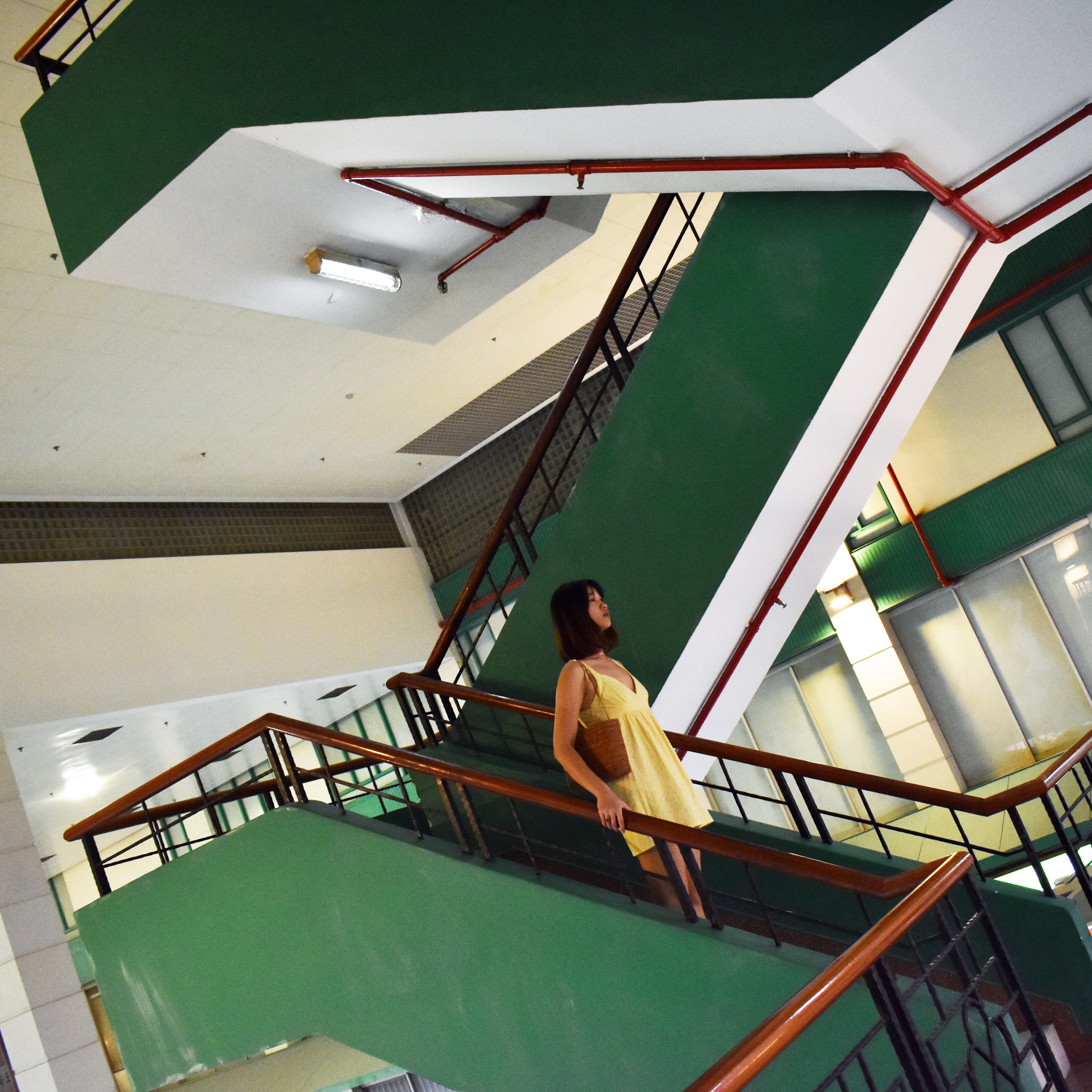
The following are the images taken around (but not limited to) Suntec City, Promenade, City Hall (National Gallery, Victoria Concert Hall), Outram Park (People’s Park Complex, Pearl Bank Apartments), Clarke Quay, Bencoolen MRT station, Victoria Street, Dhoby Ghaut.


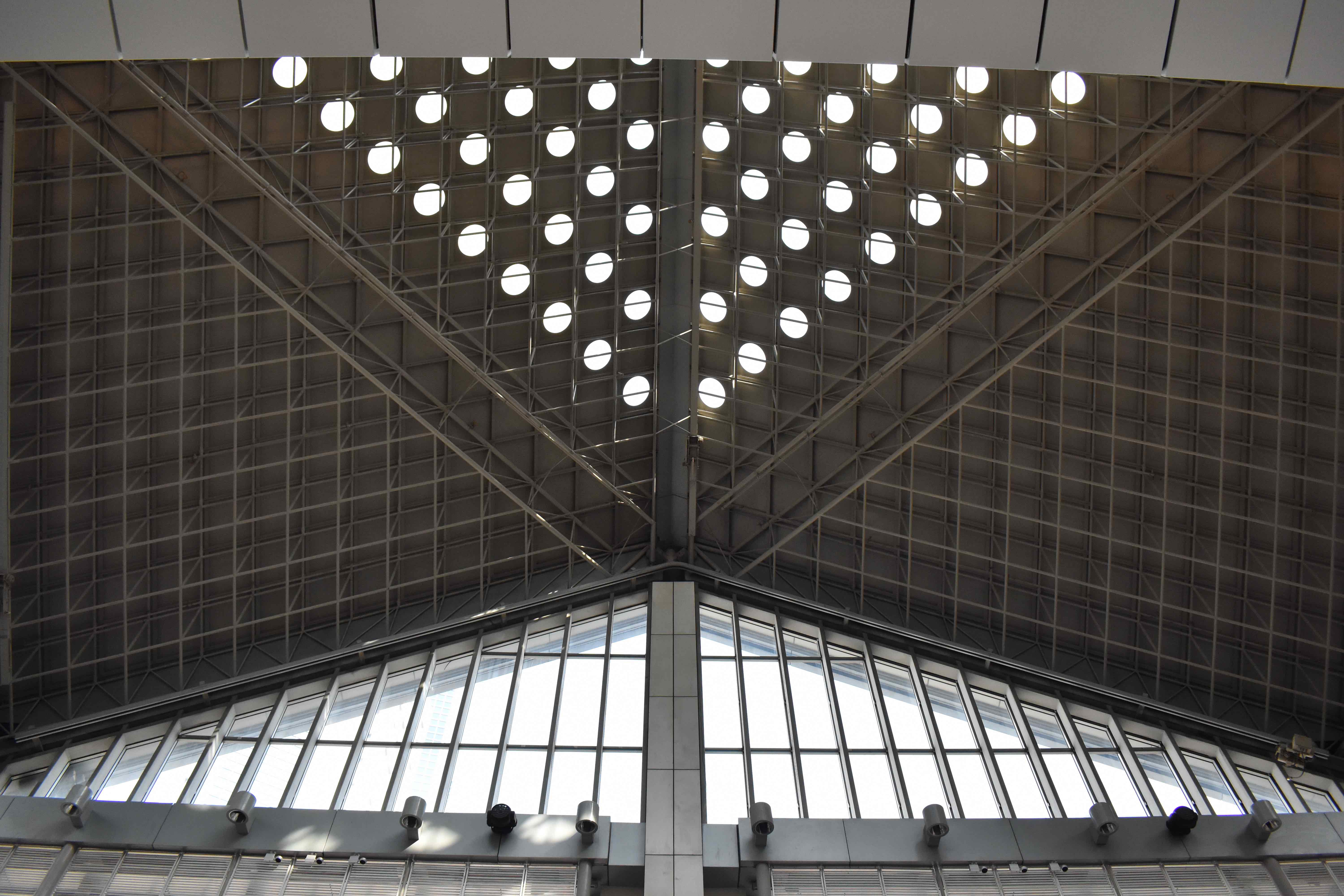
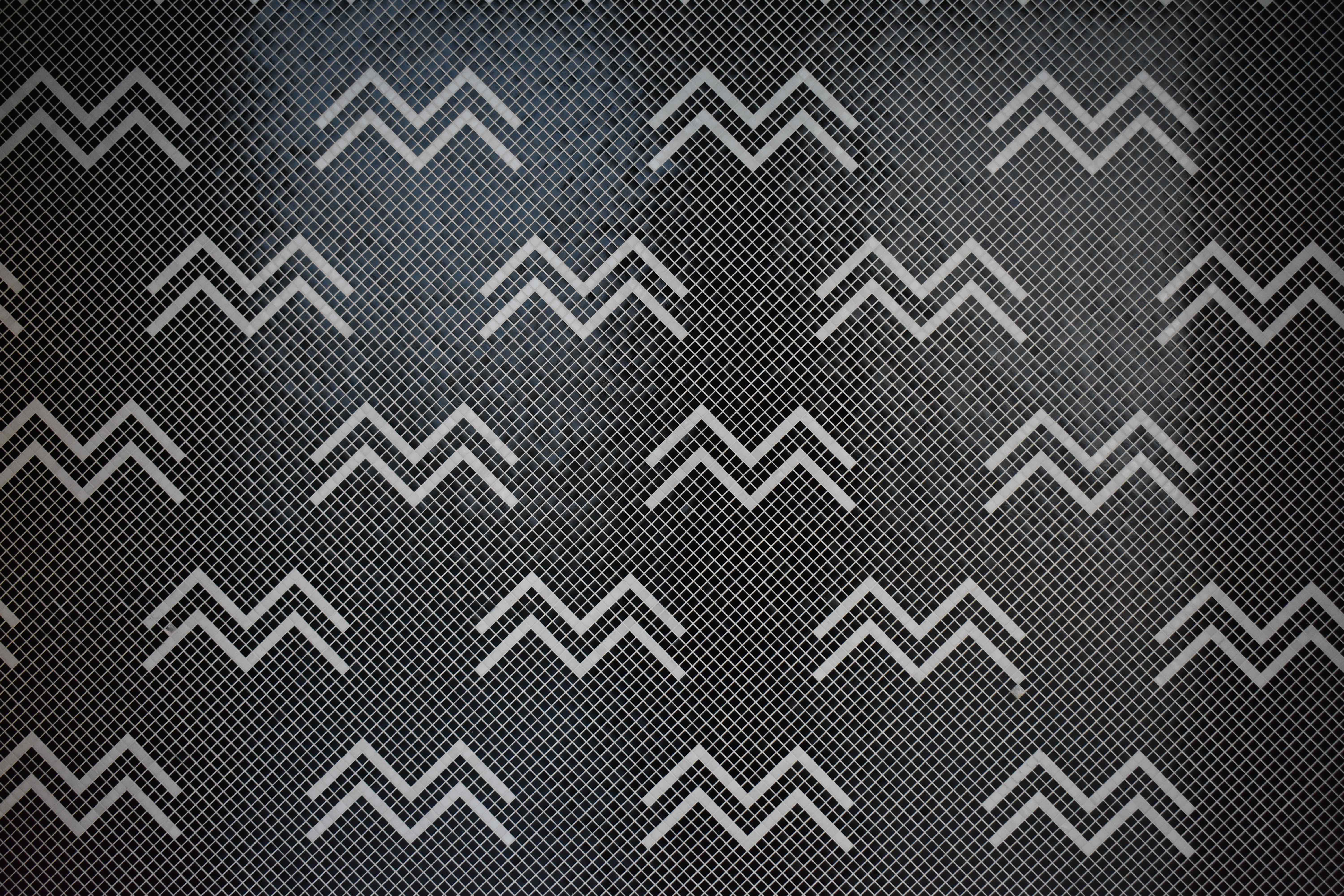


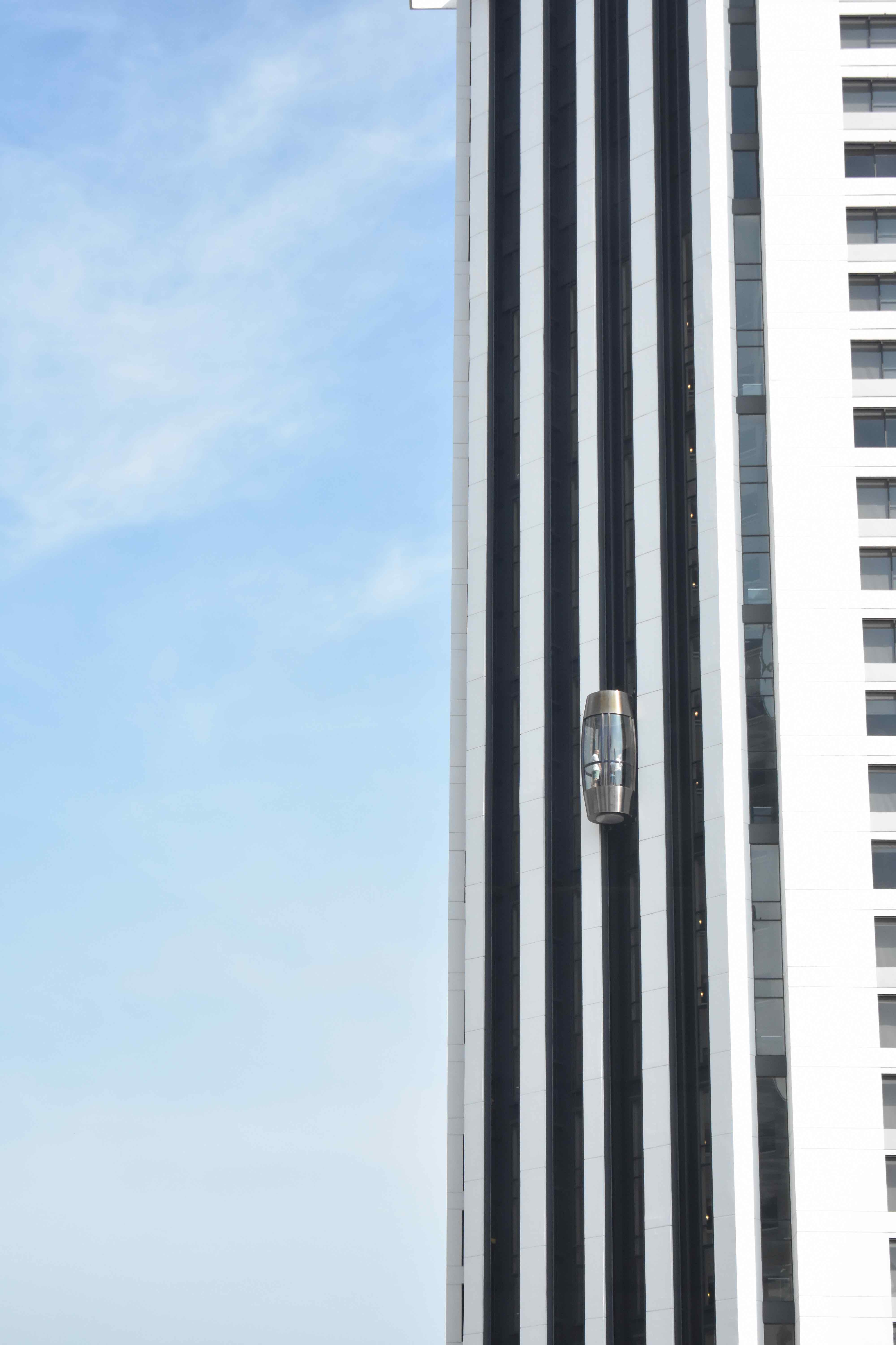

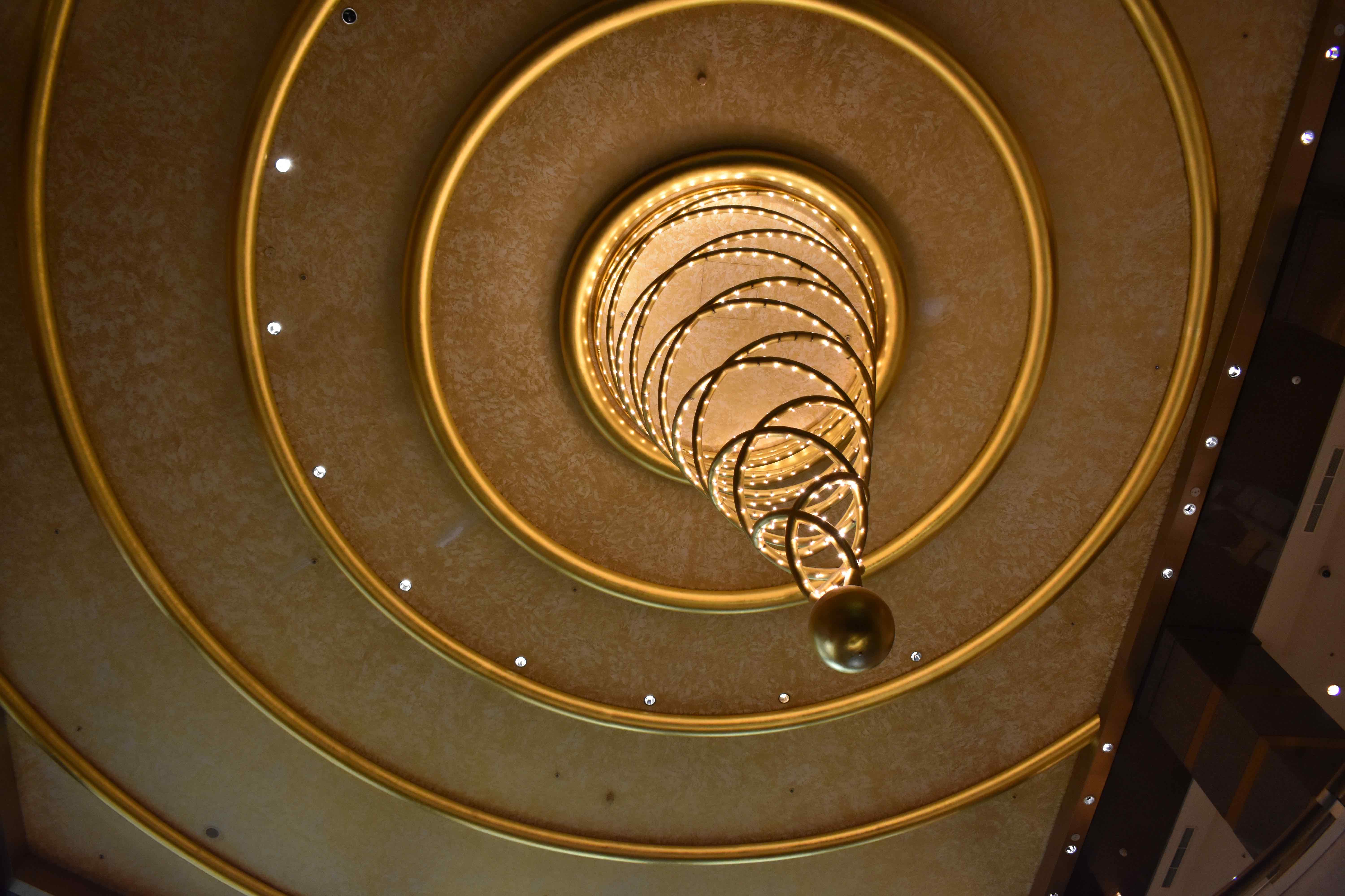

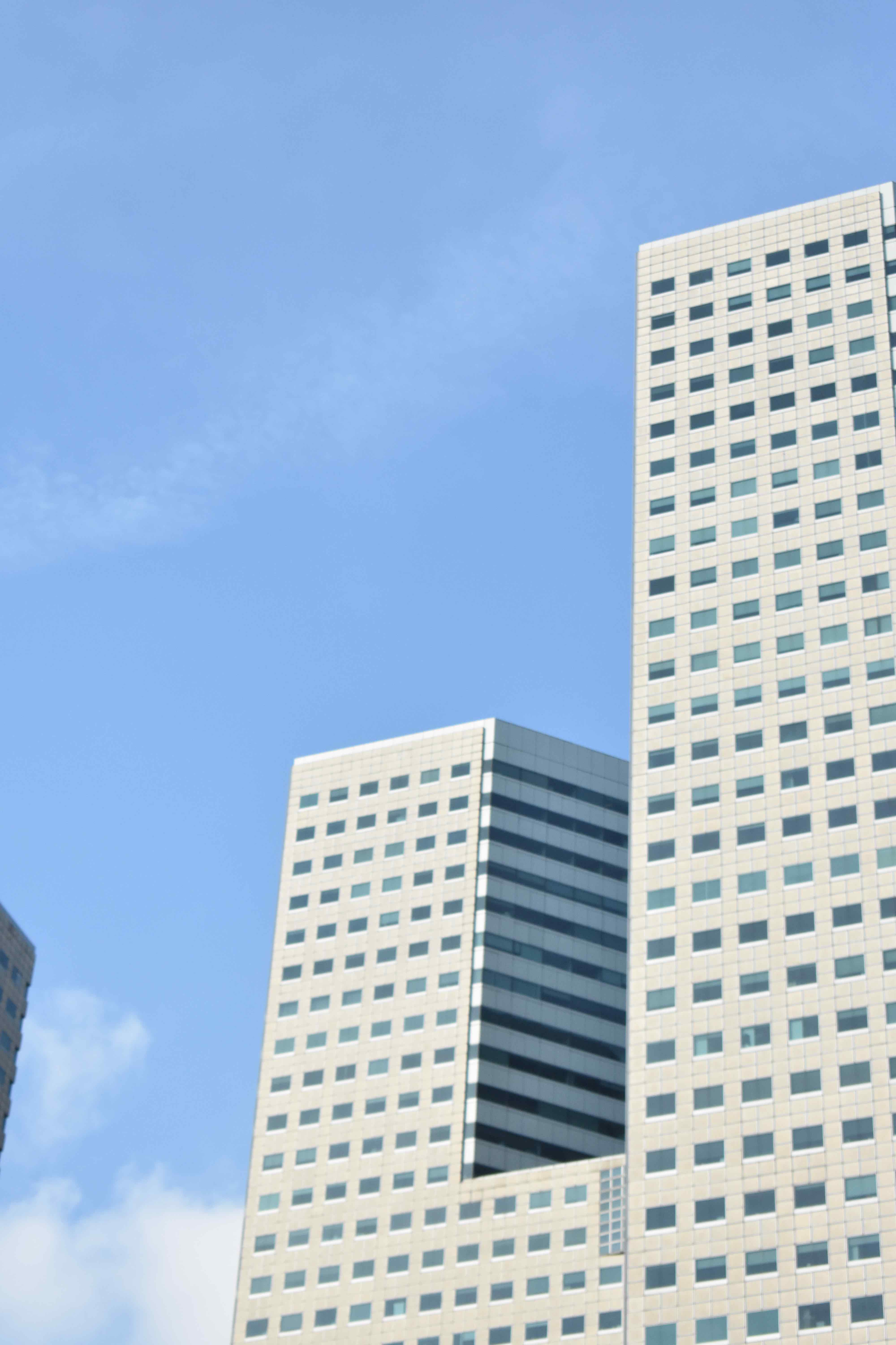

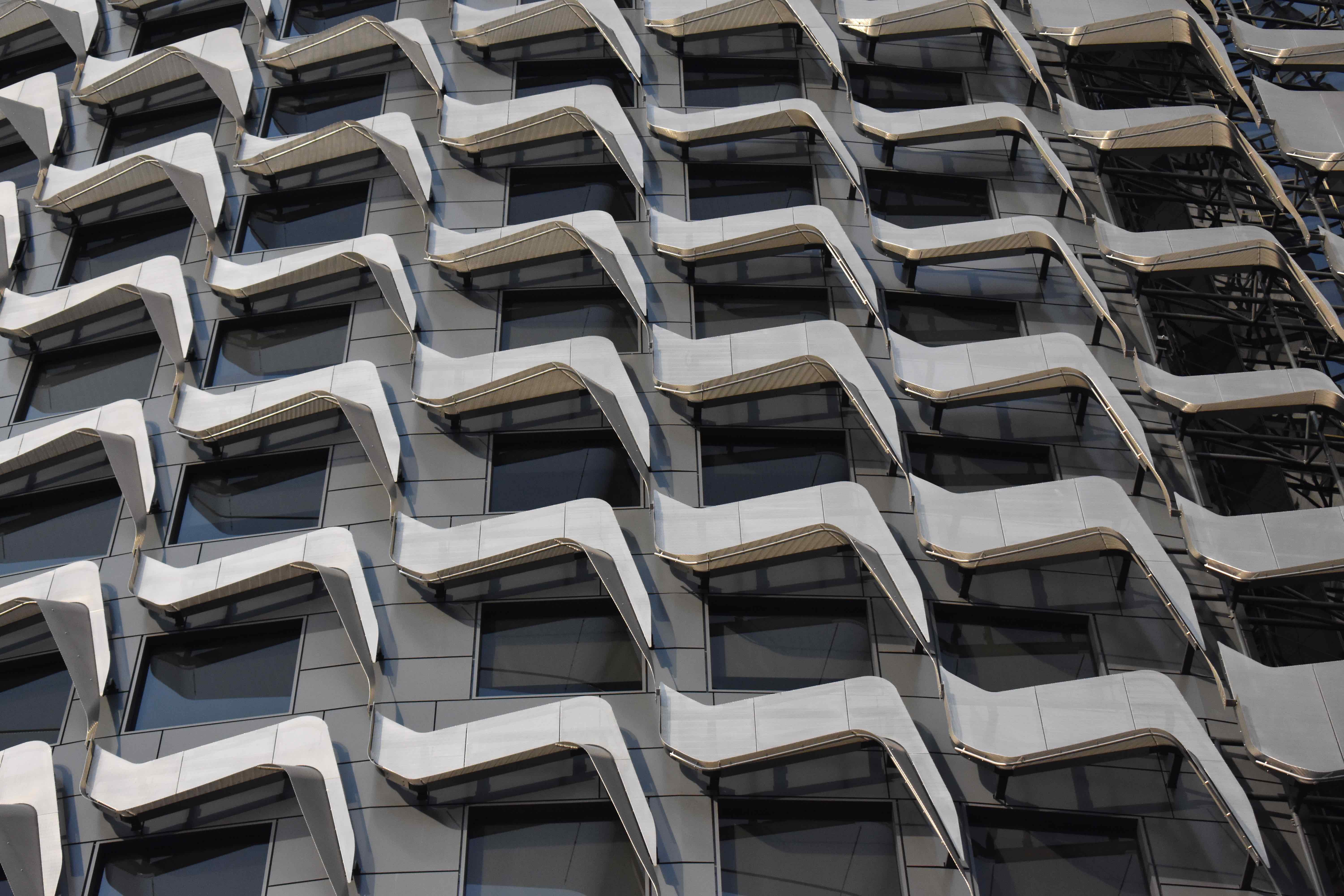
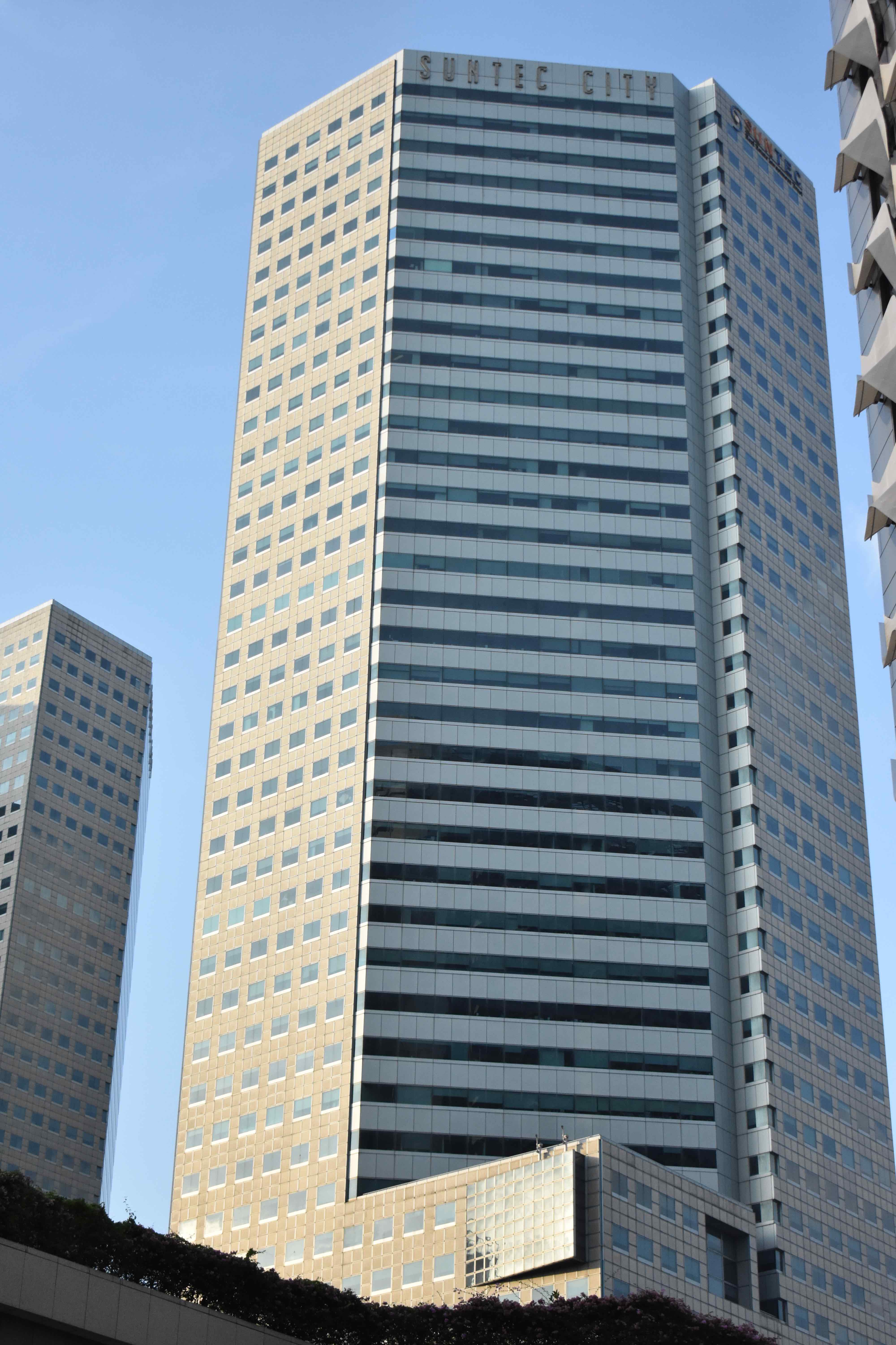
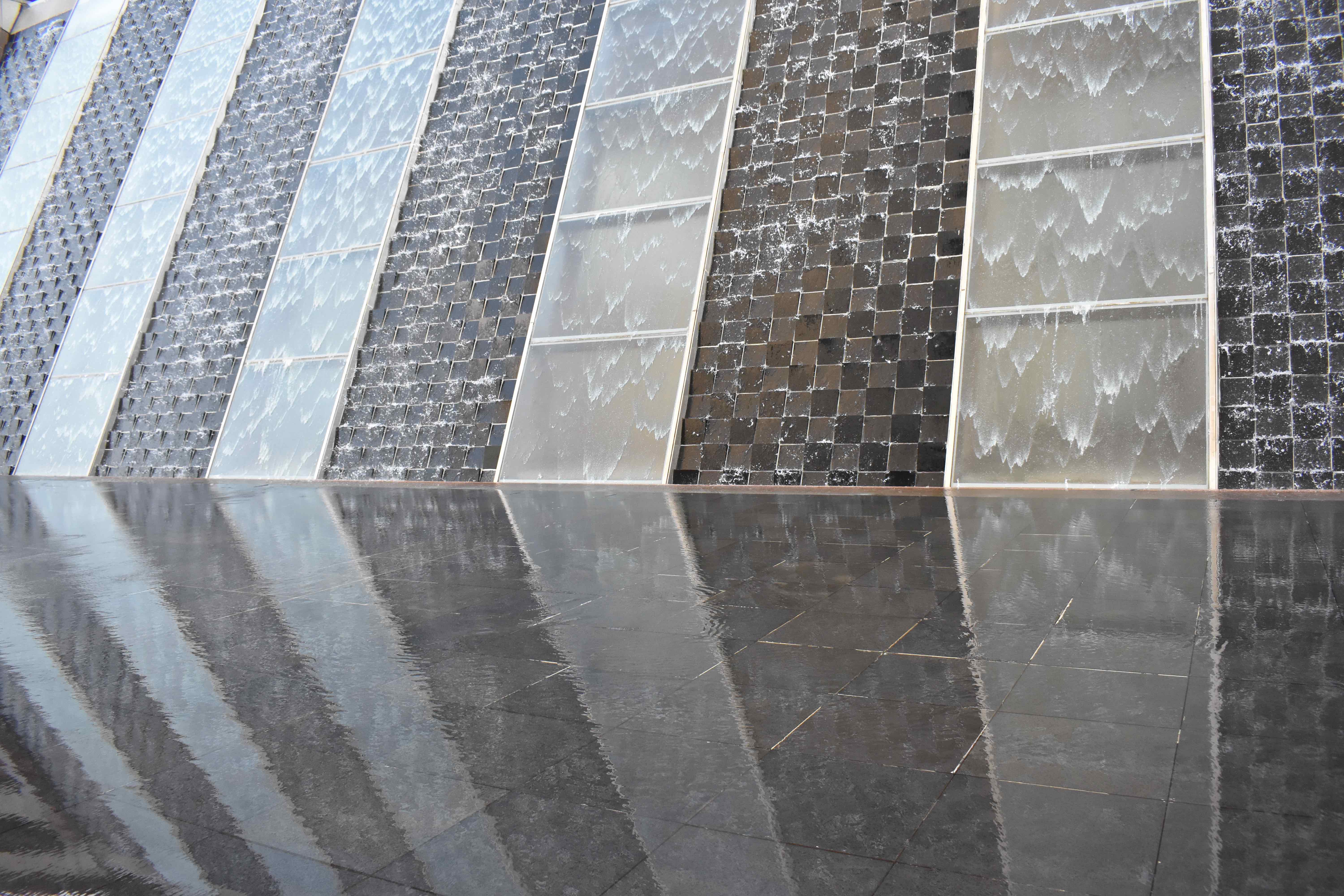
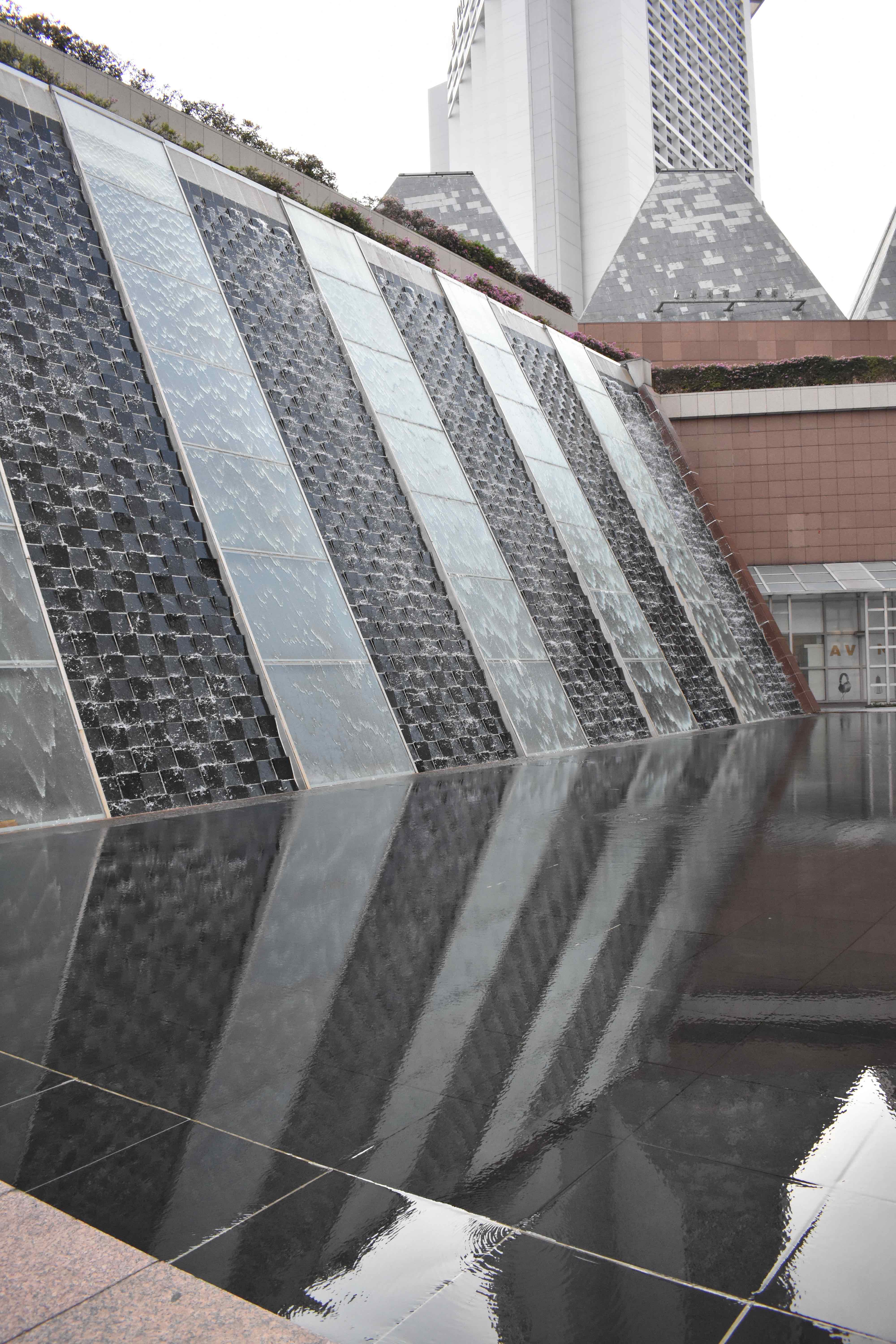


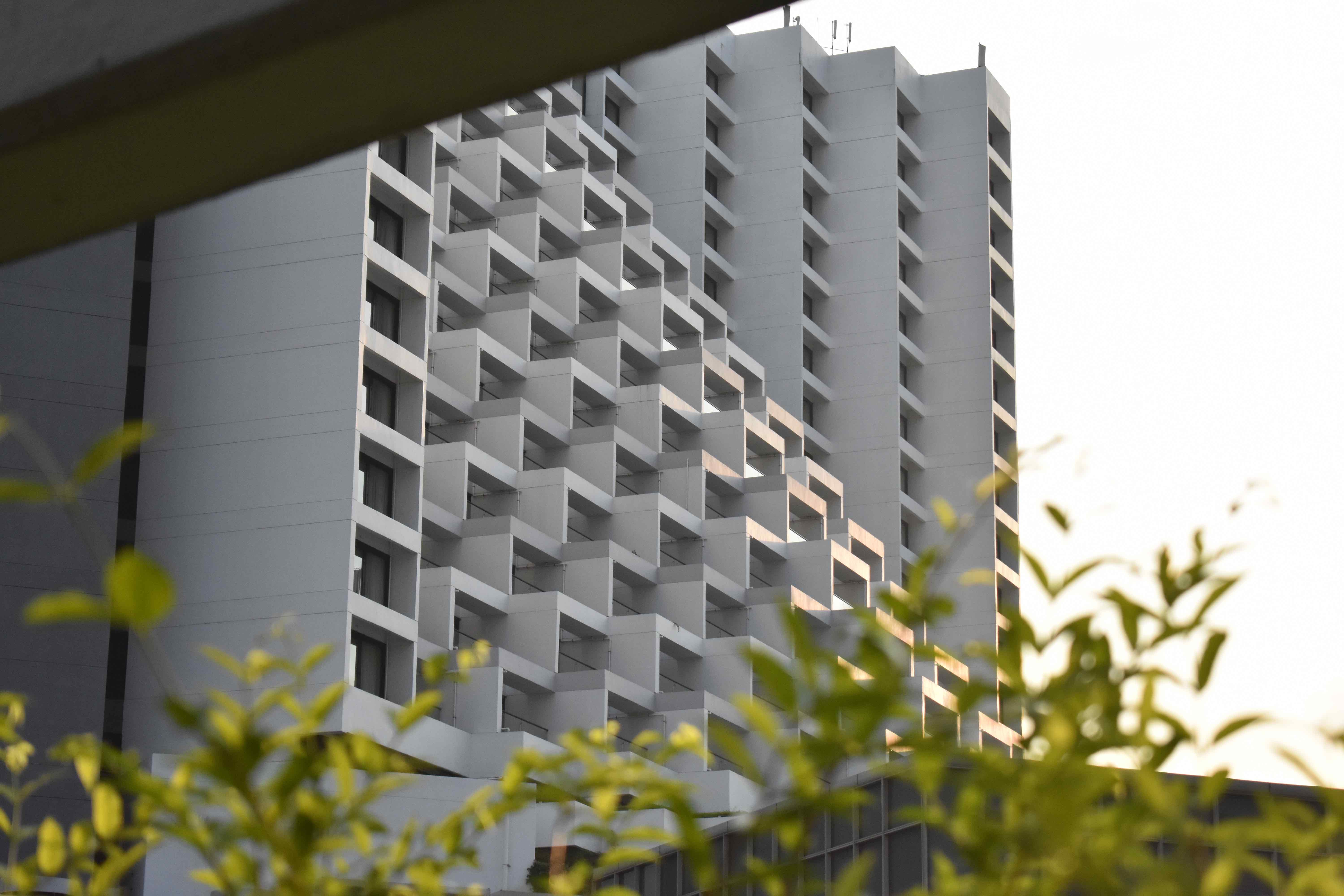

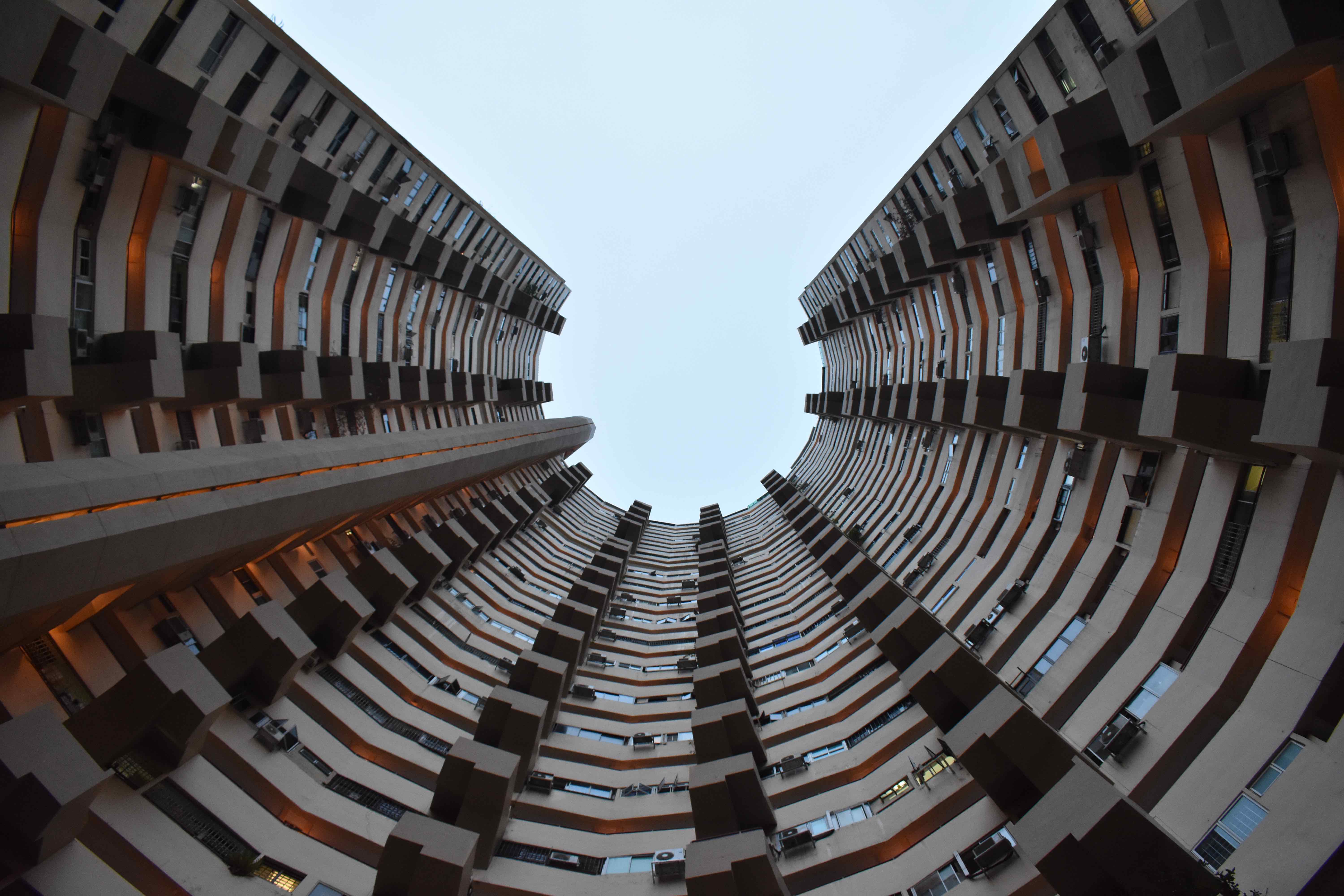
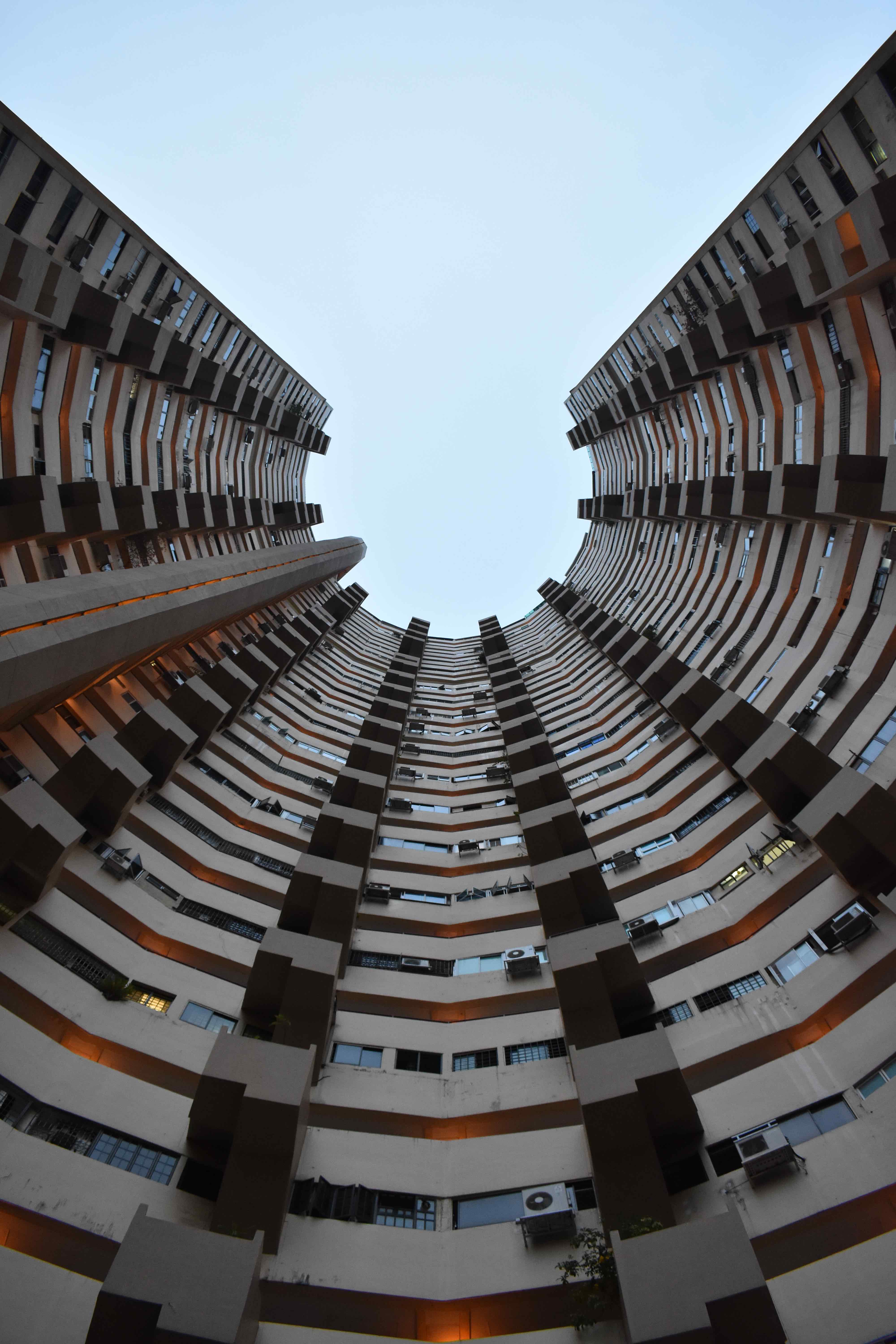
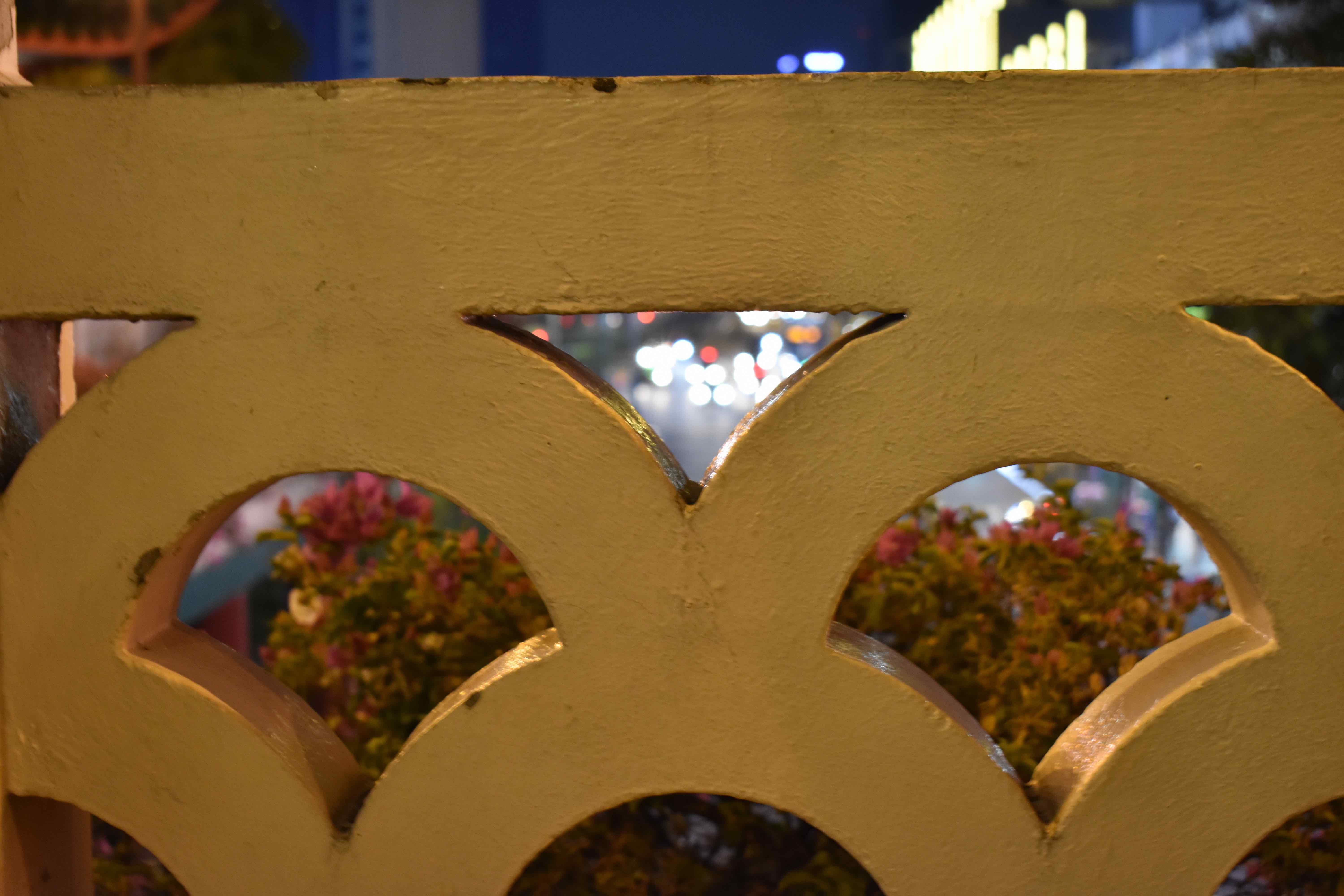
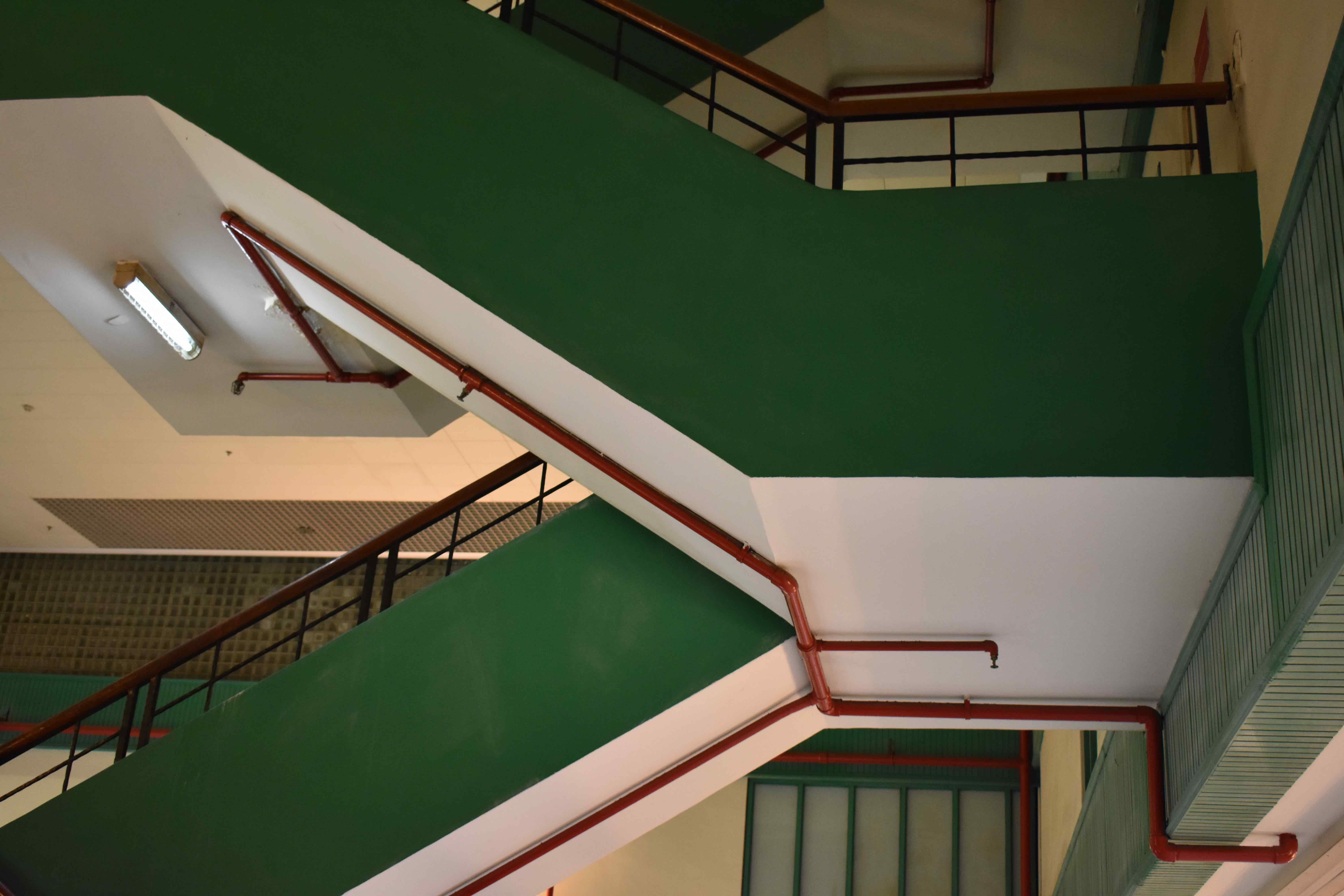
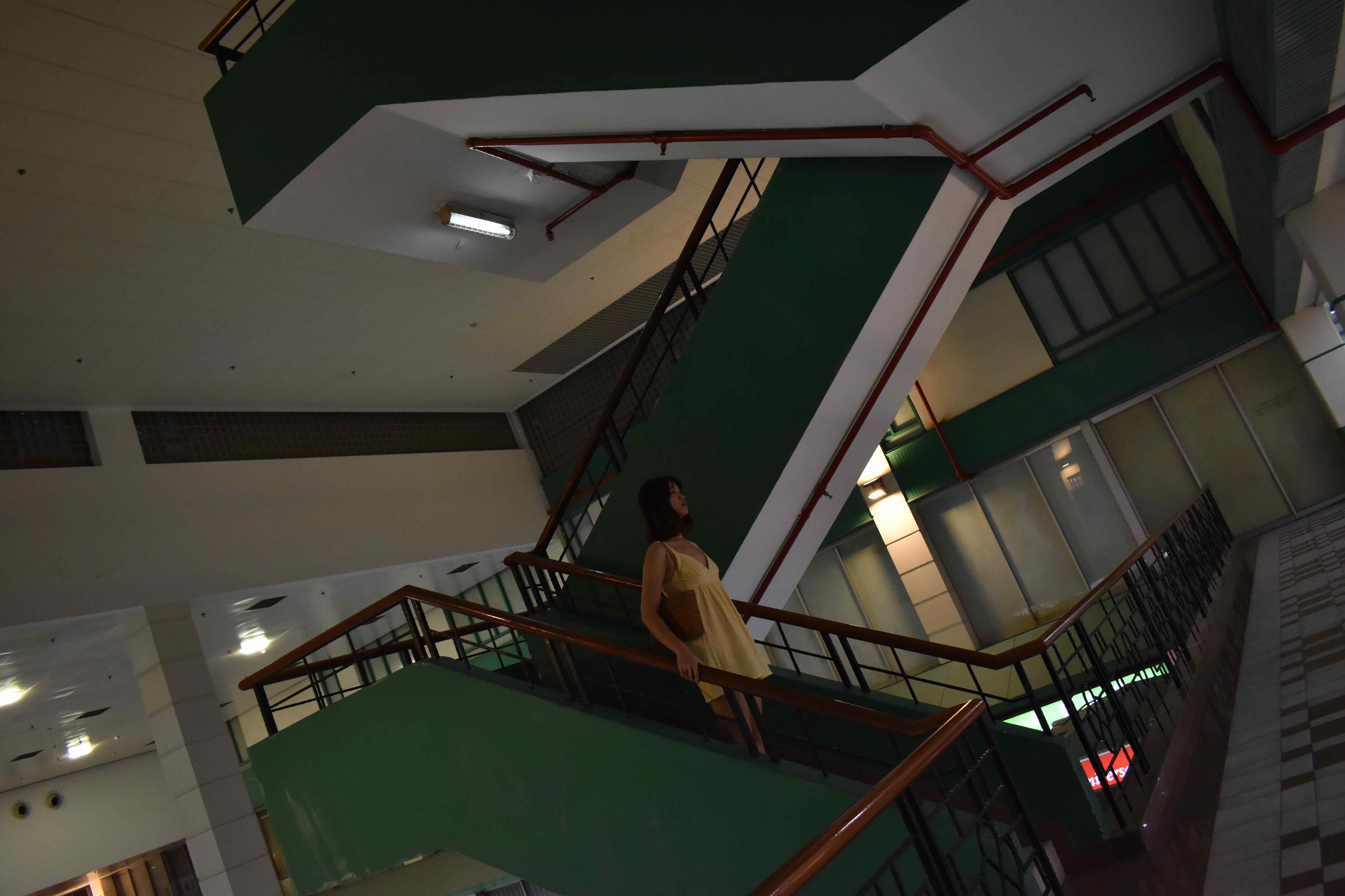
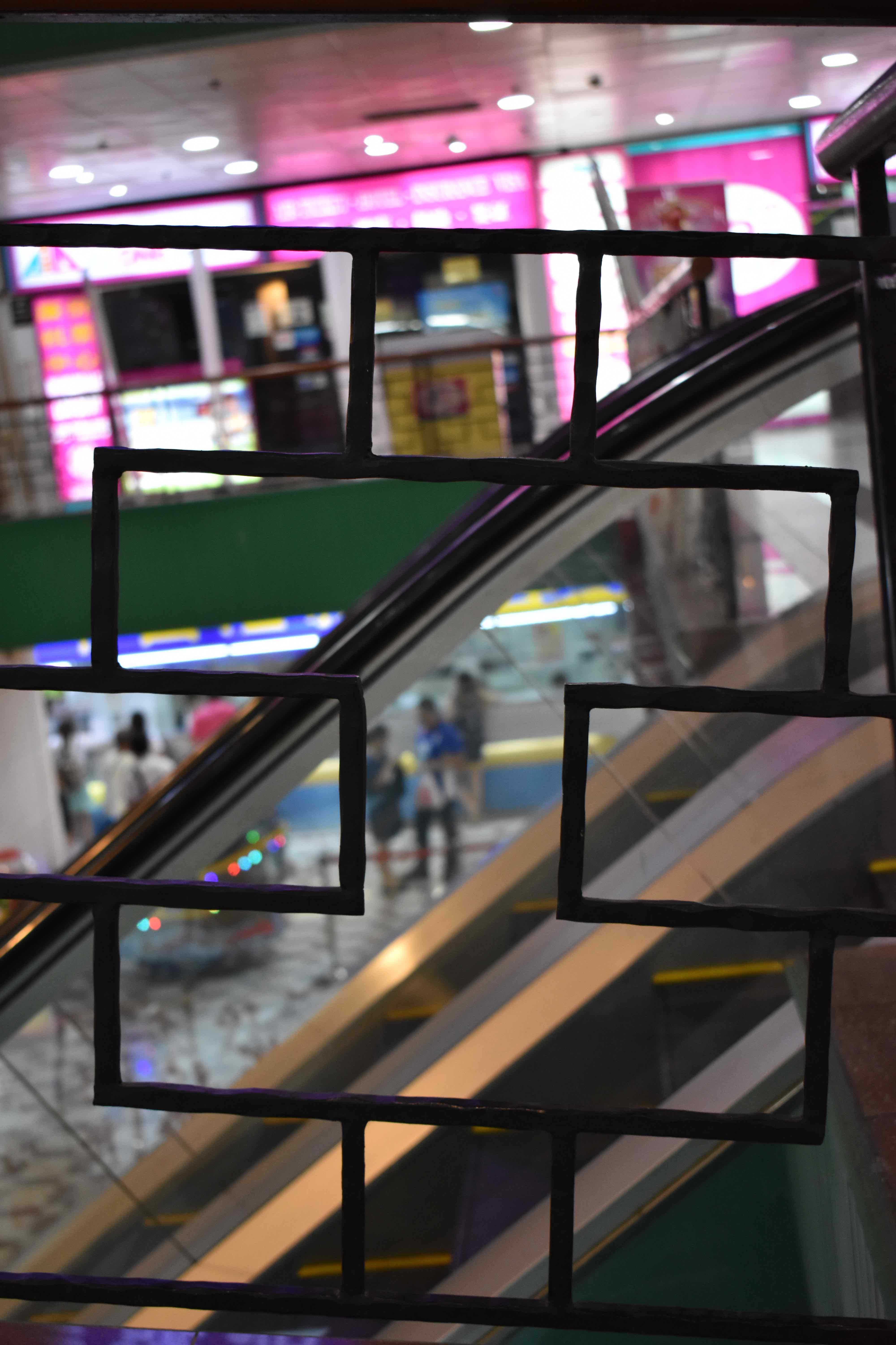
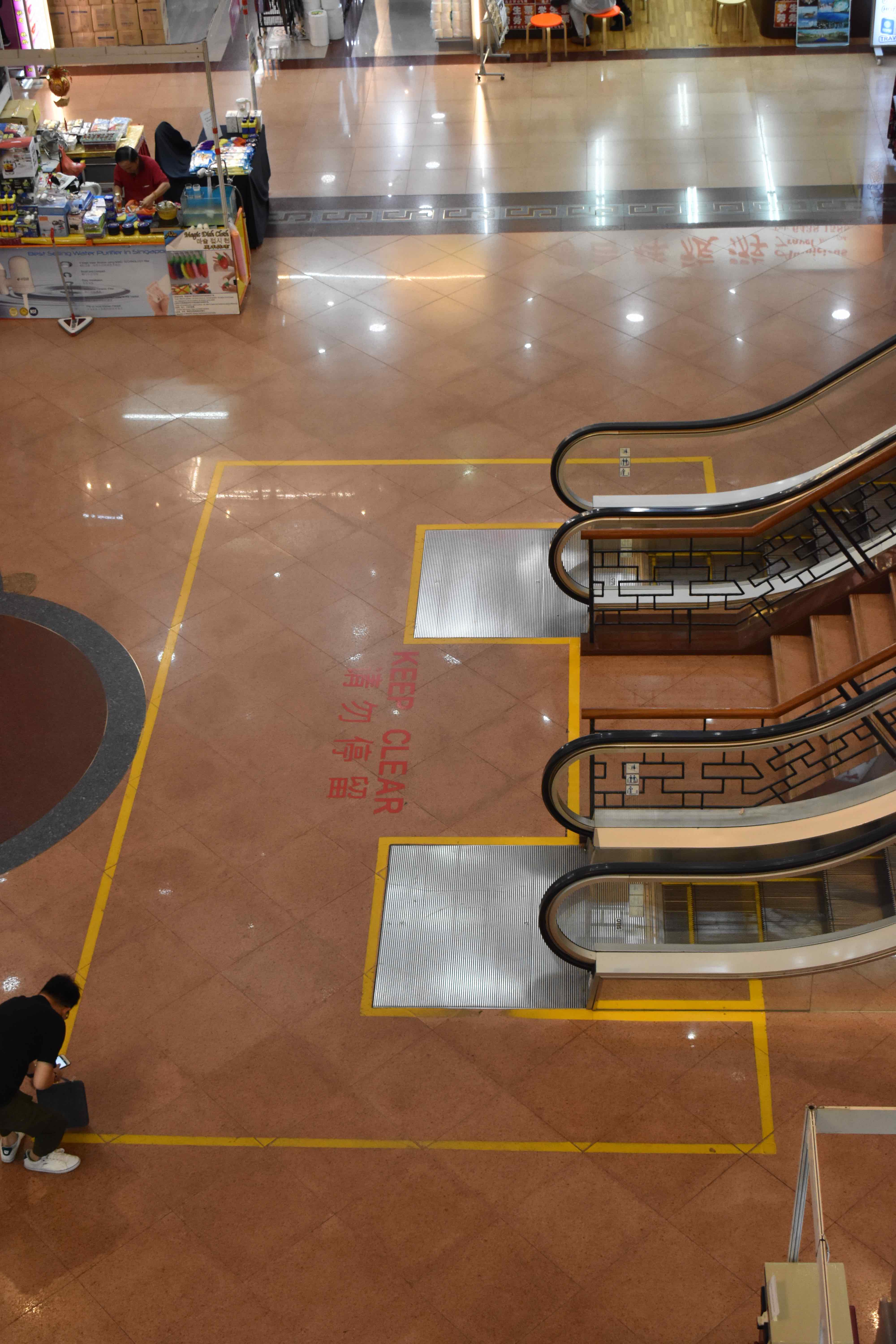
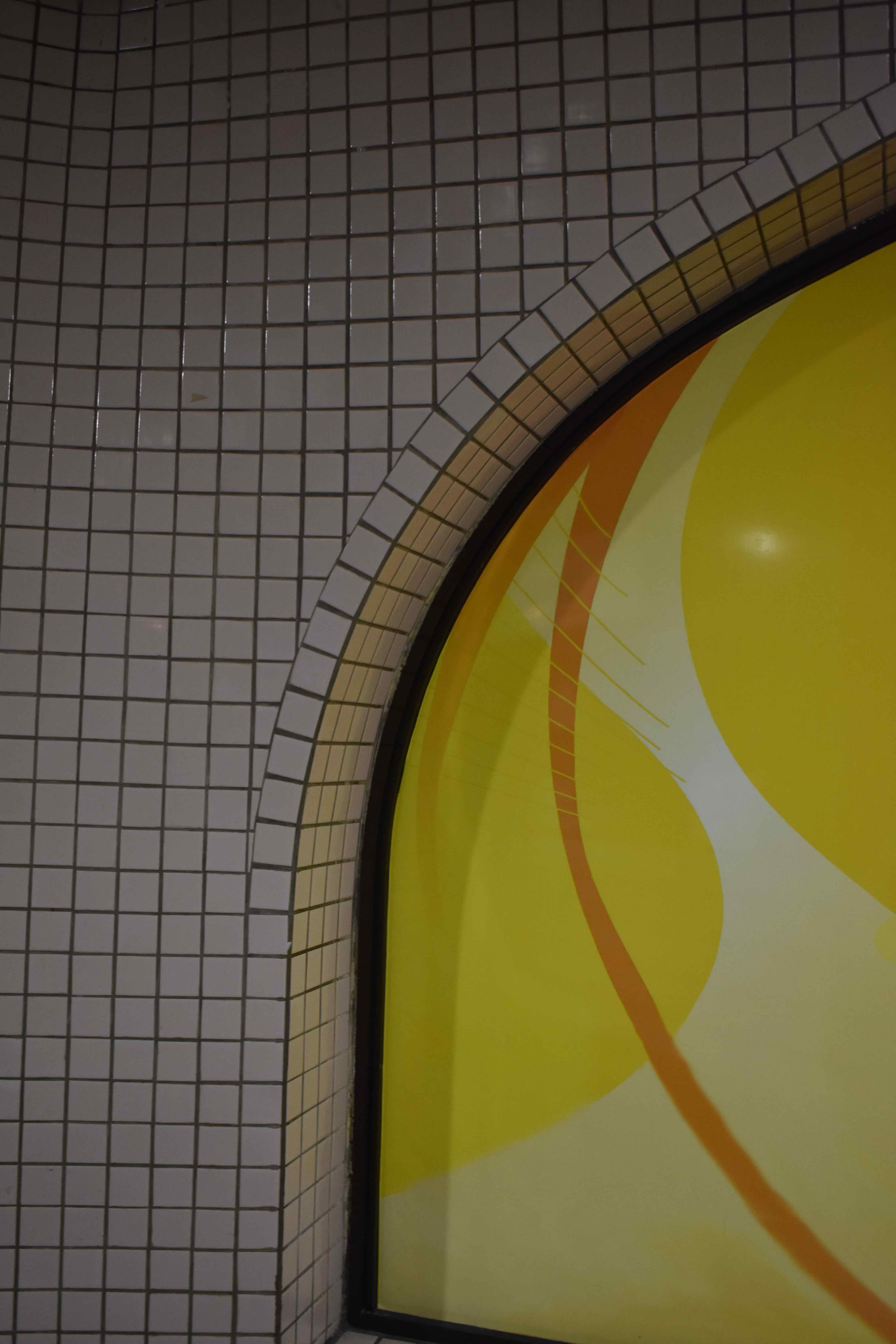
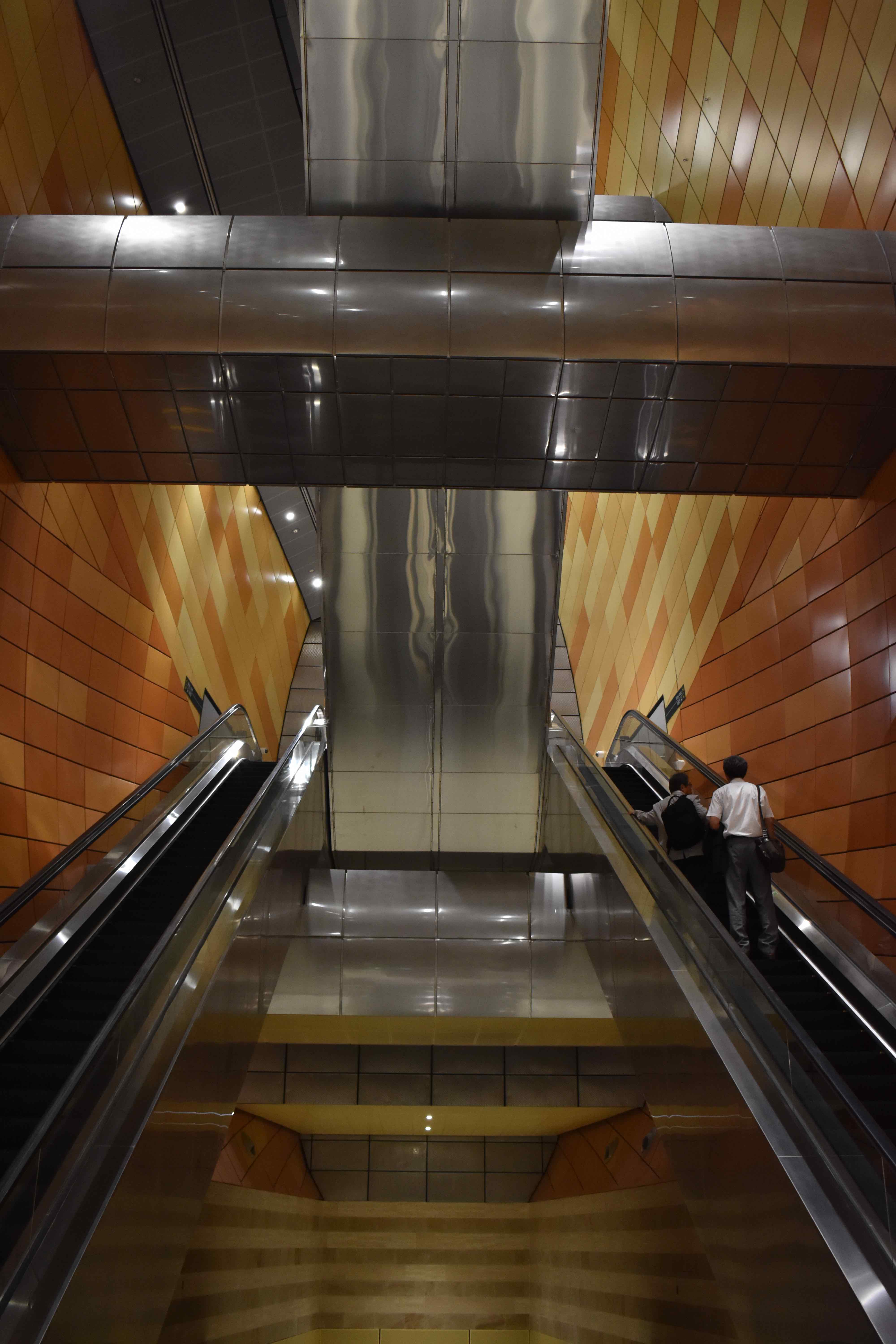
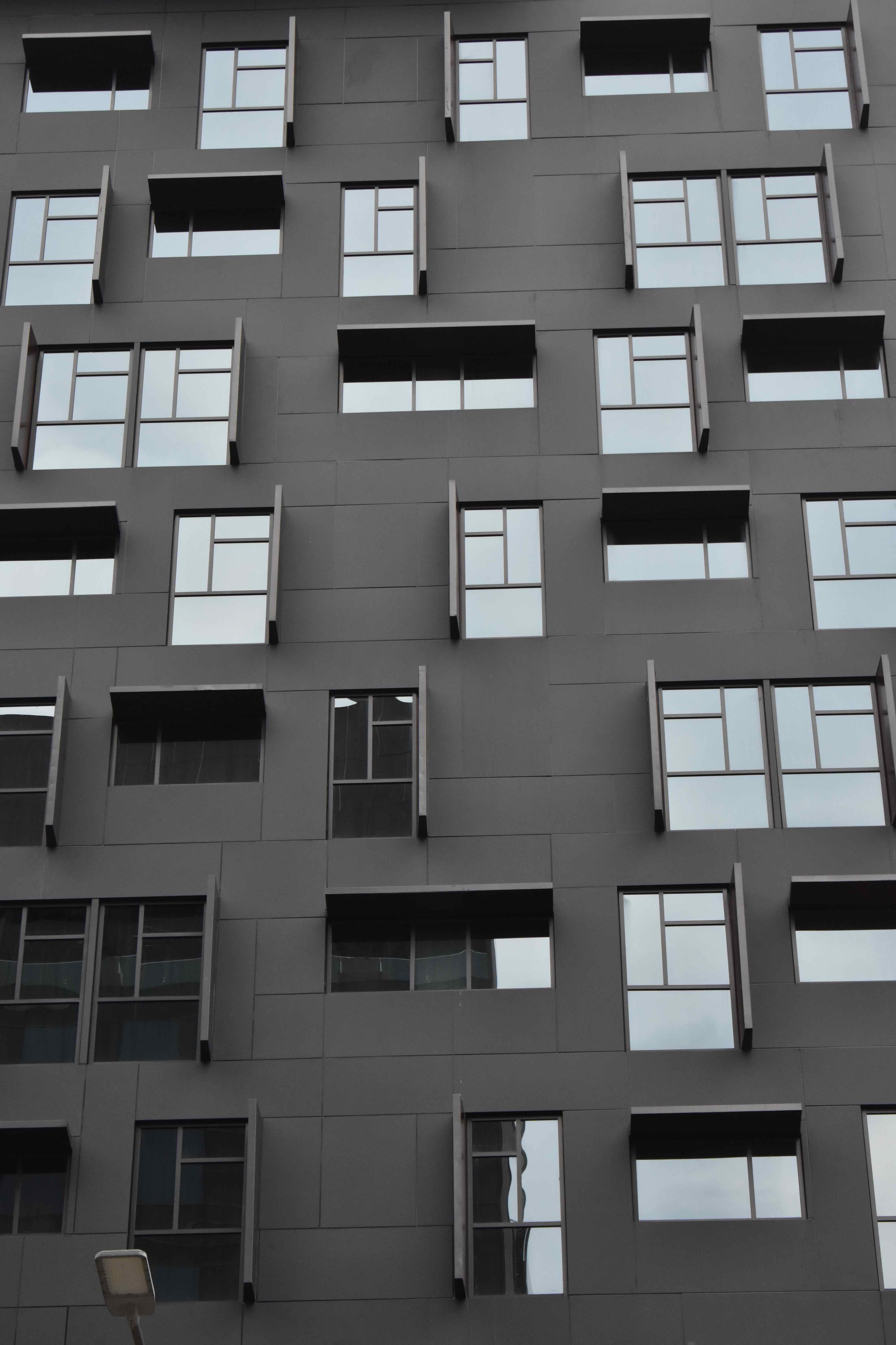
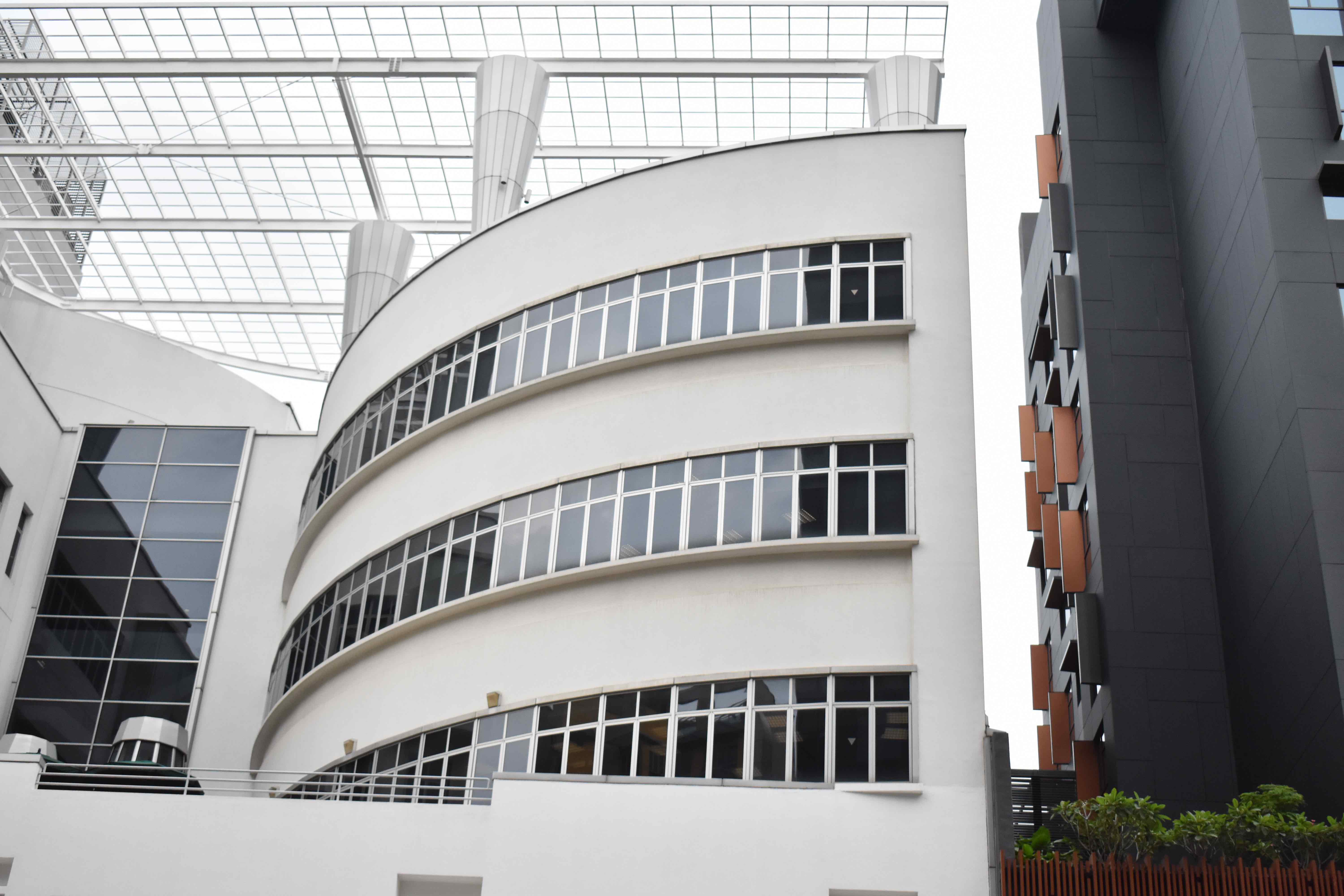
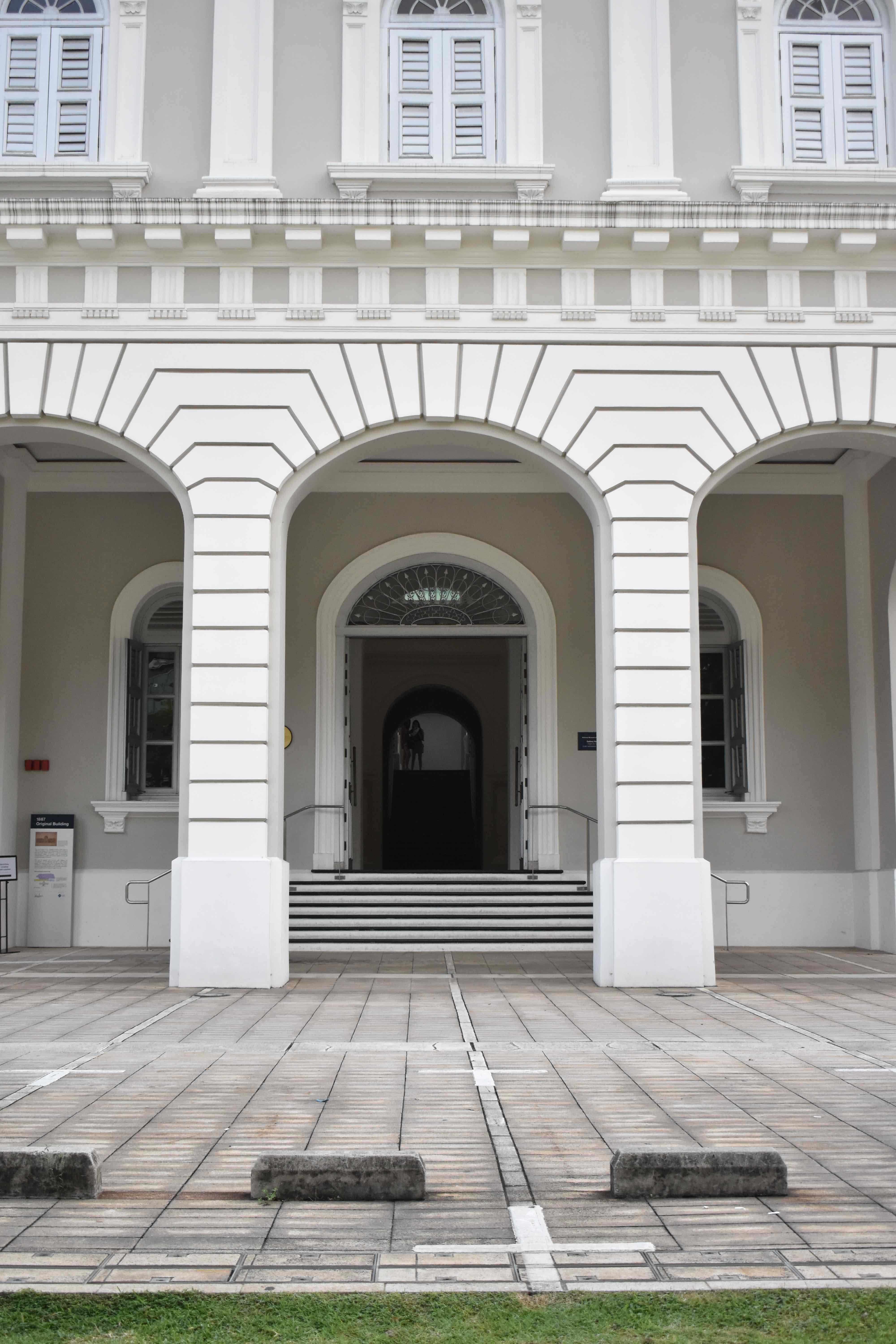
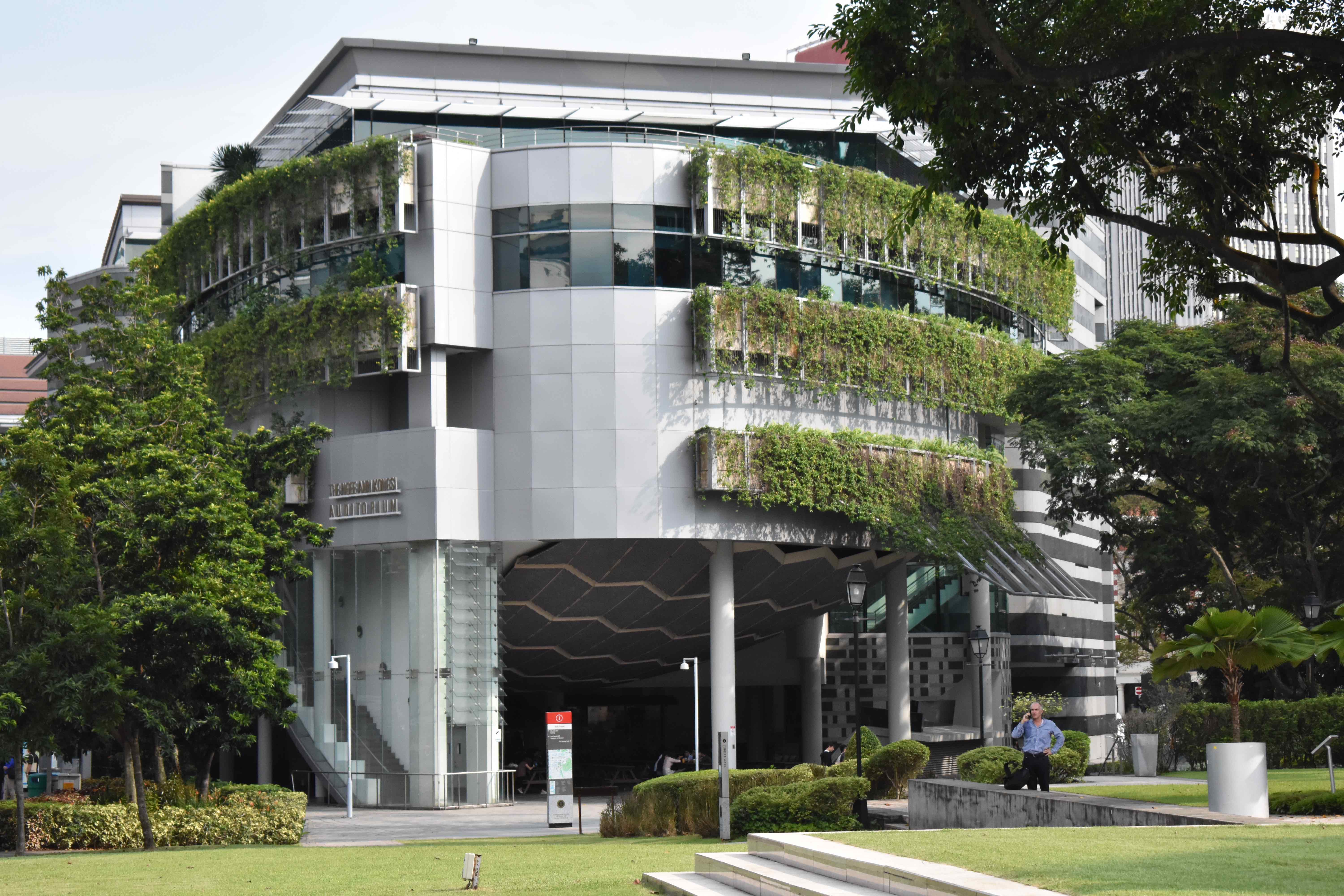
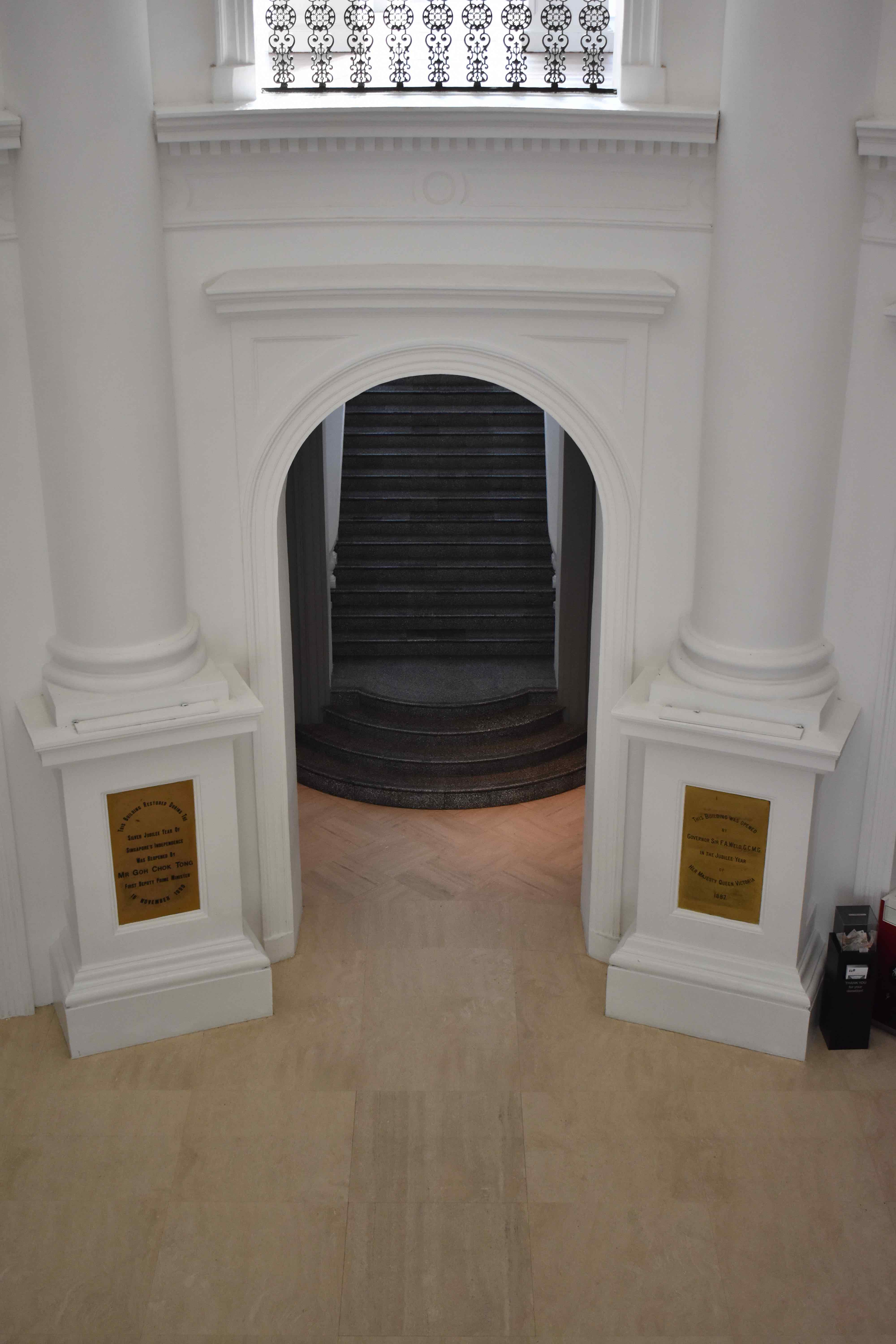
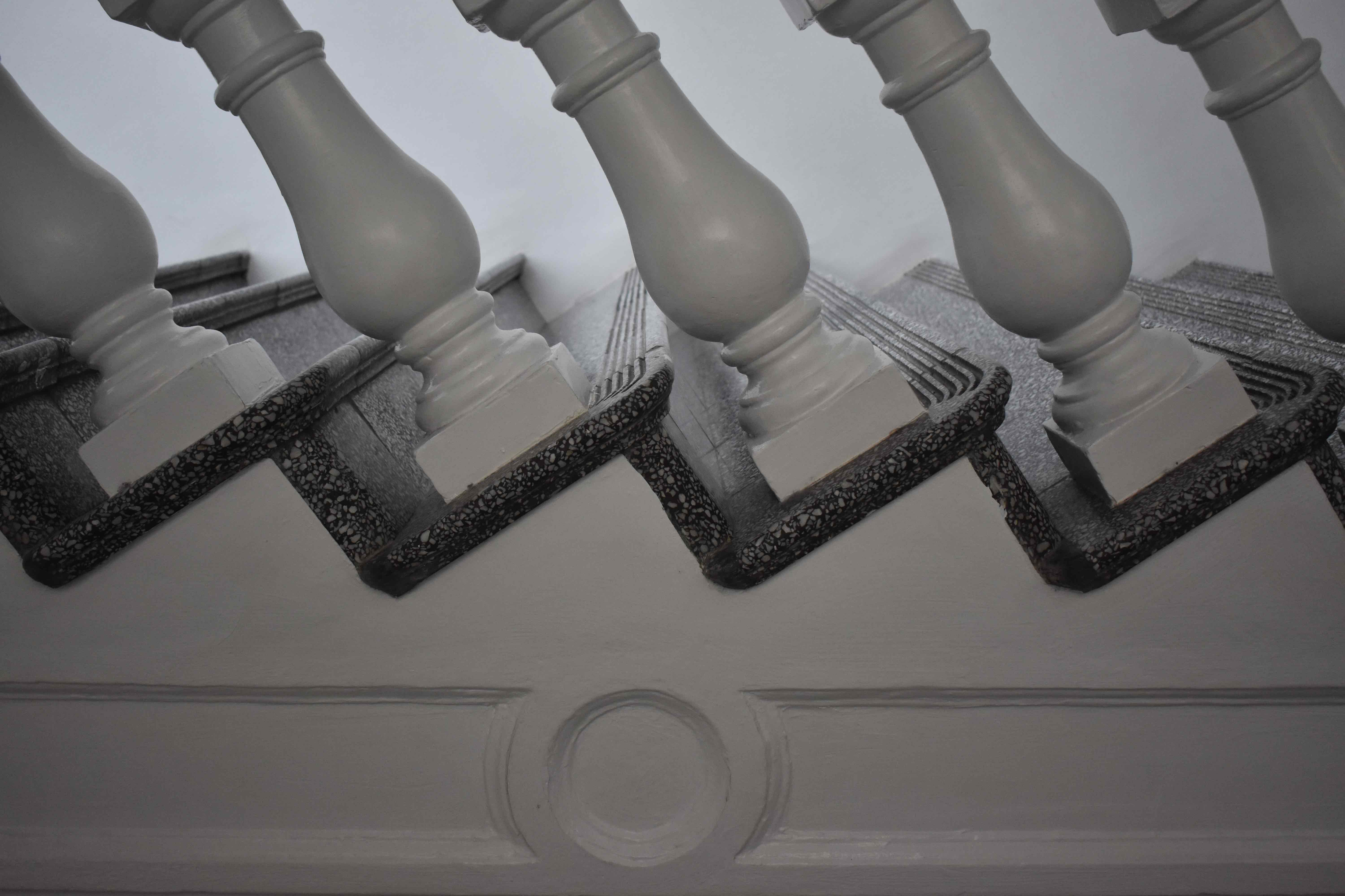
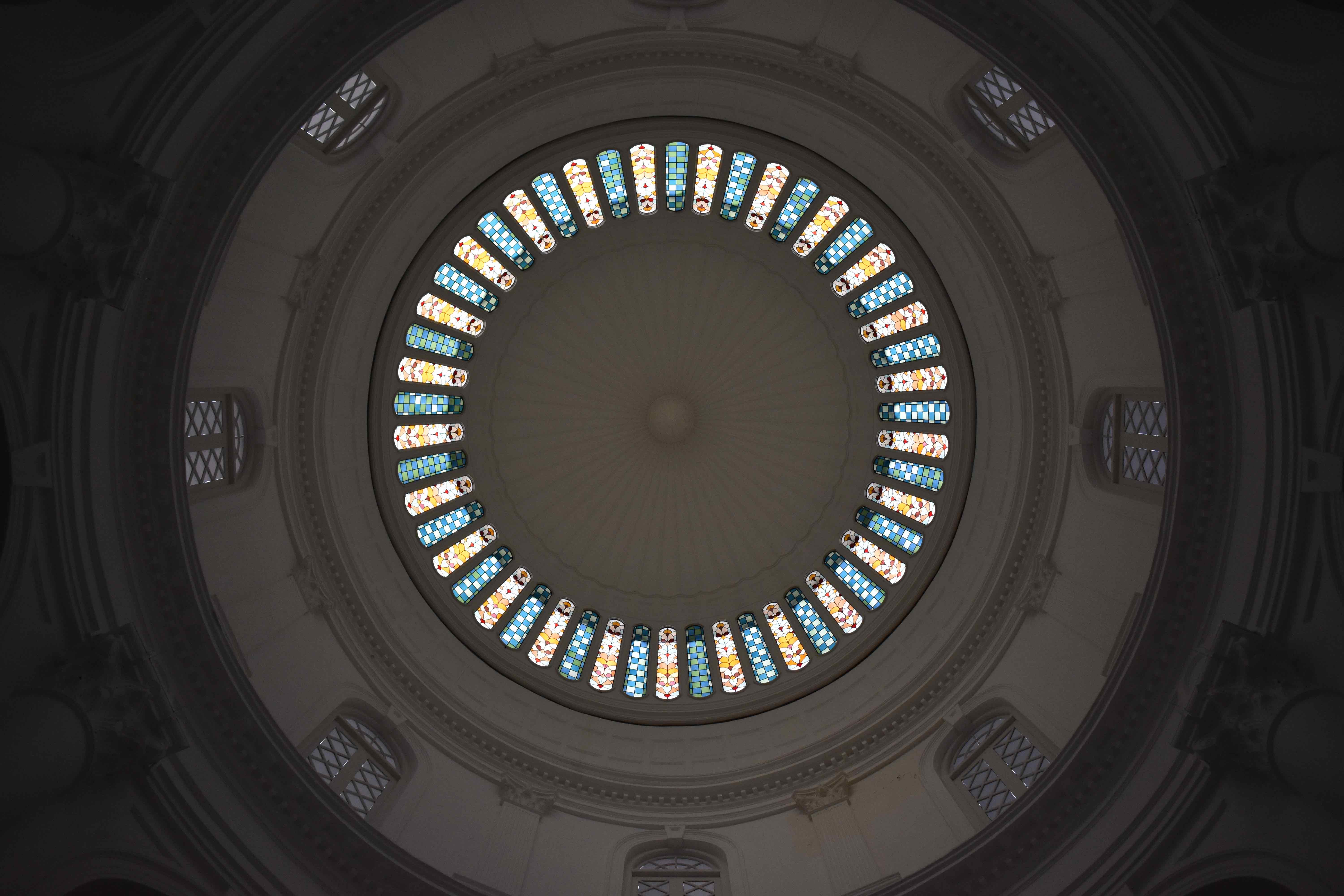
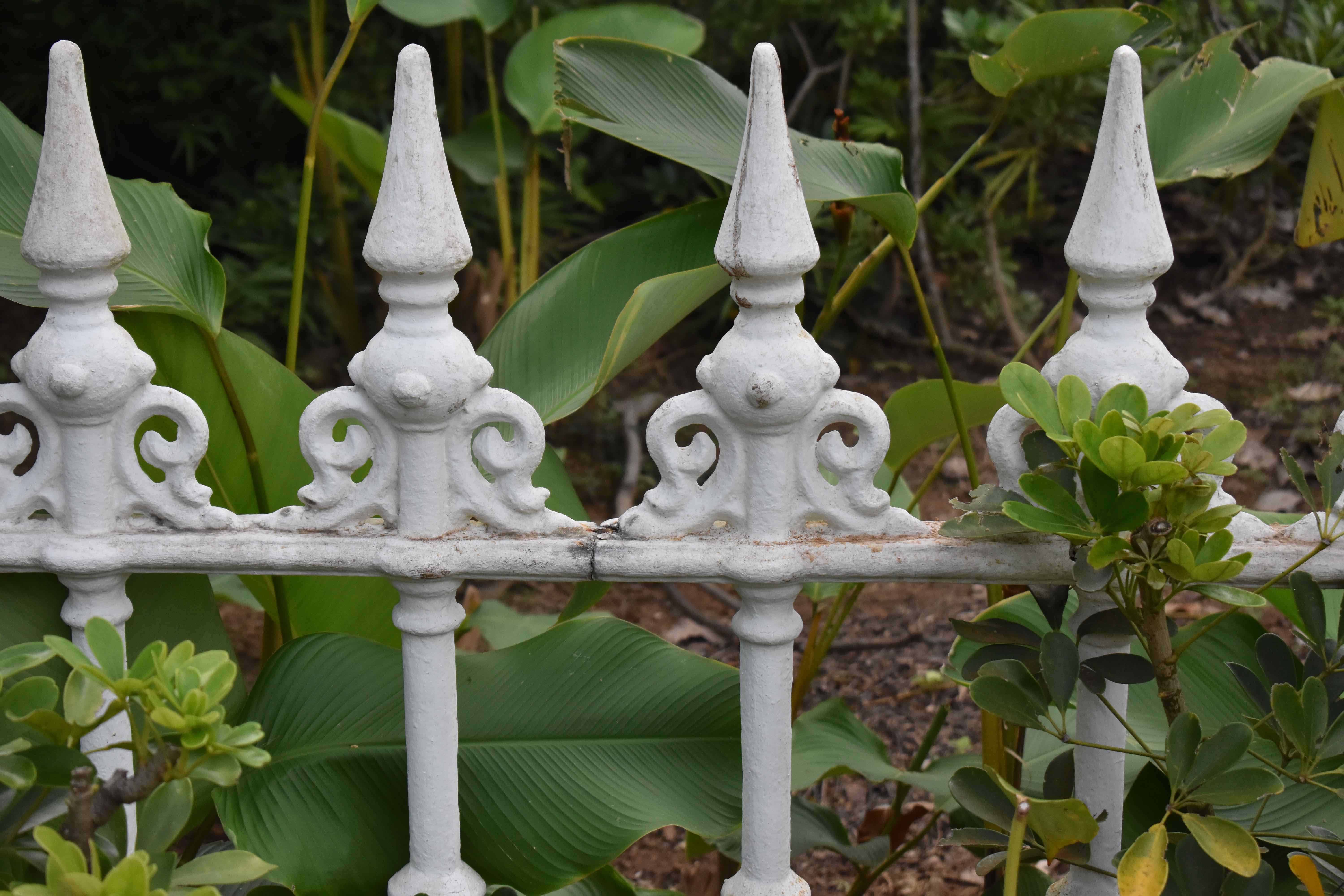

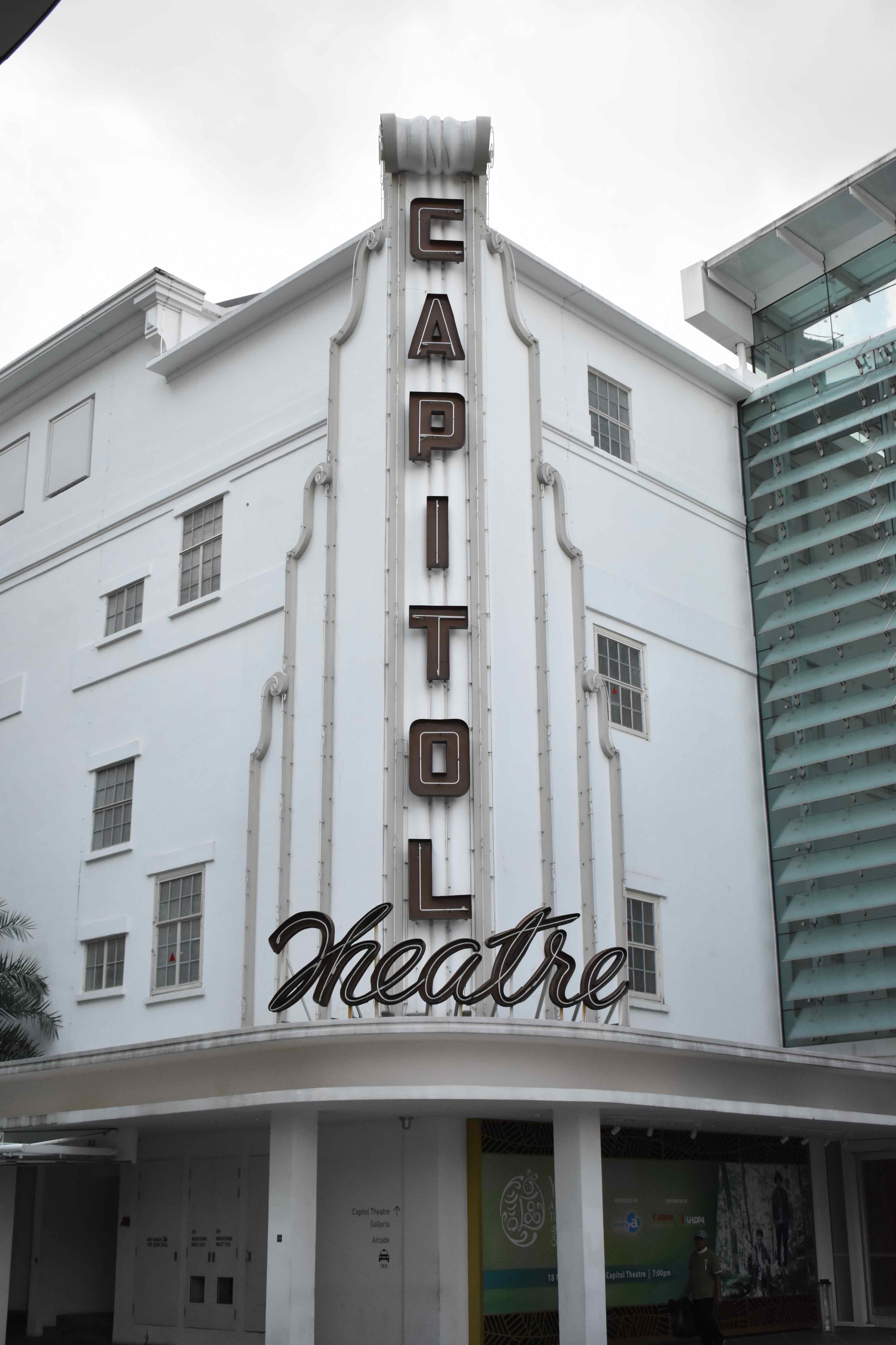
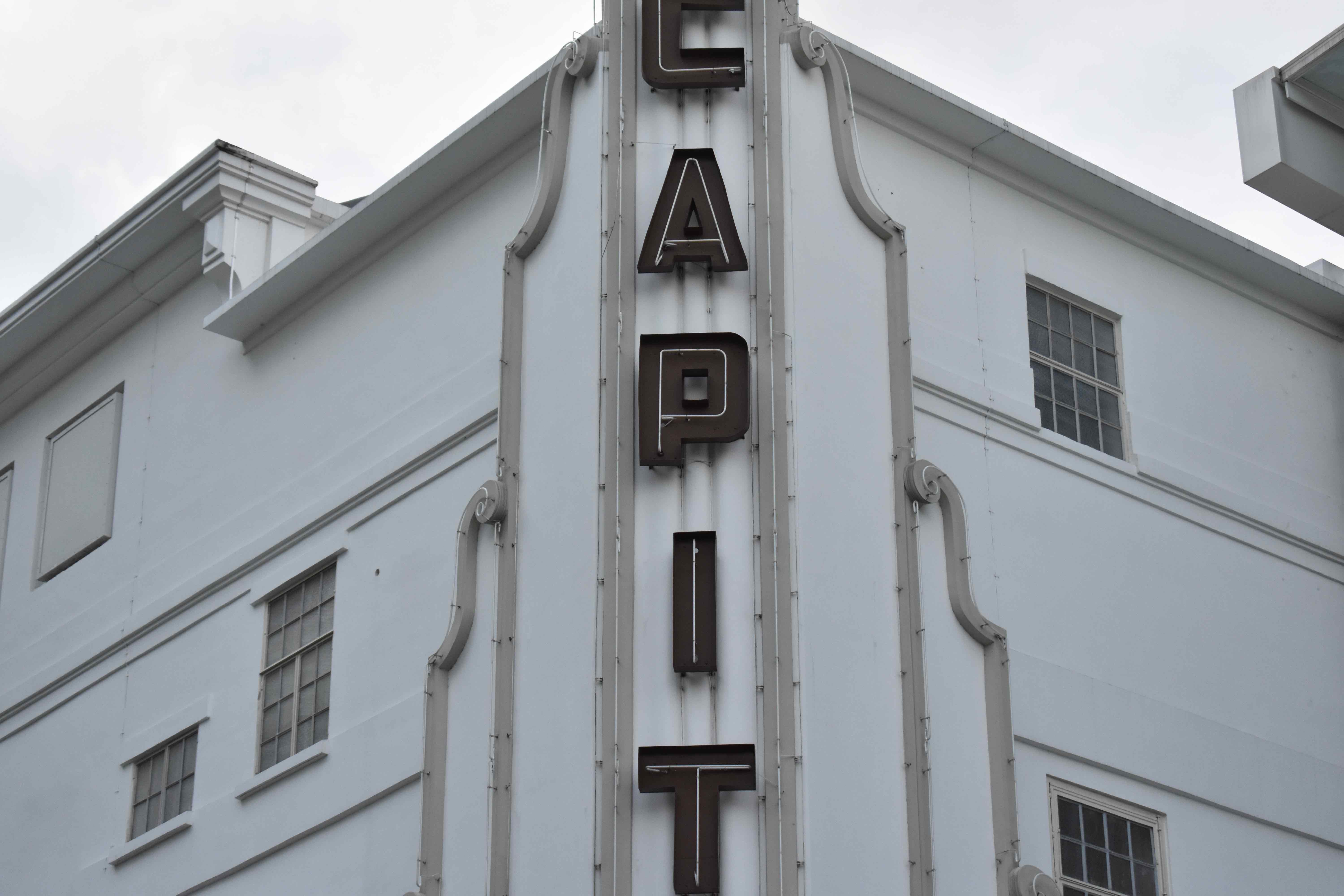
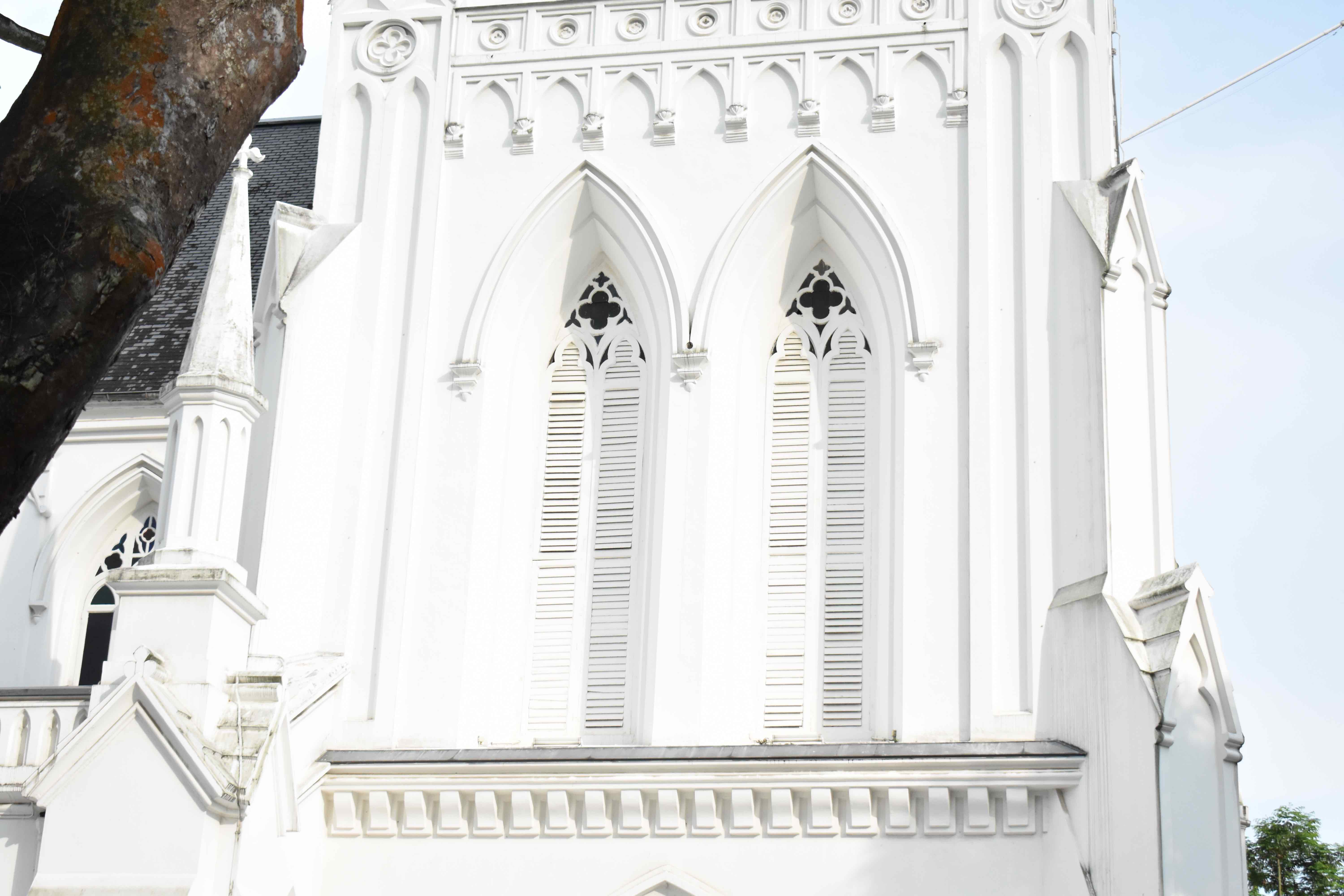
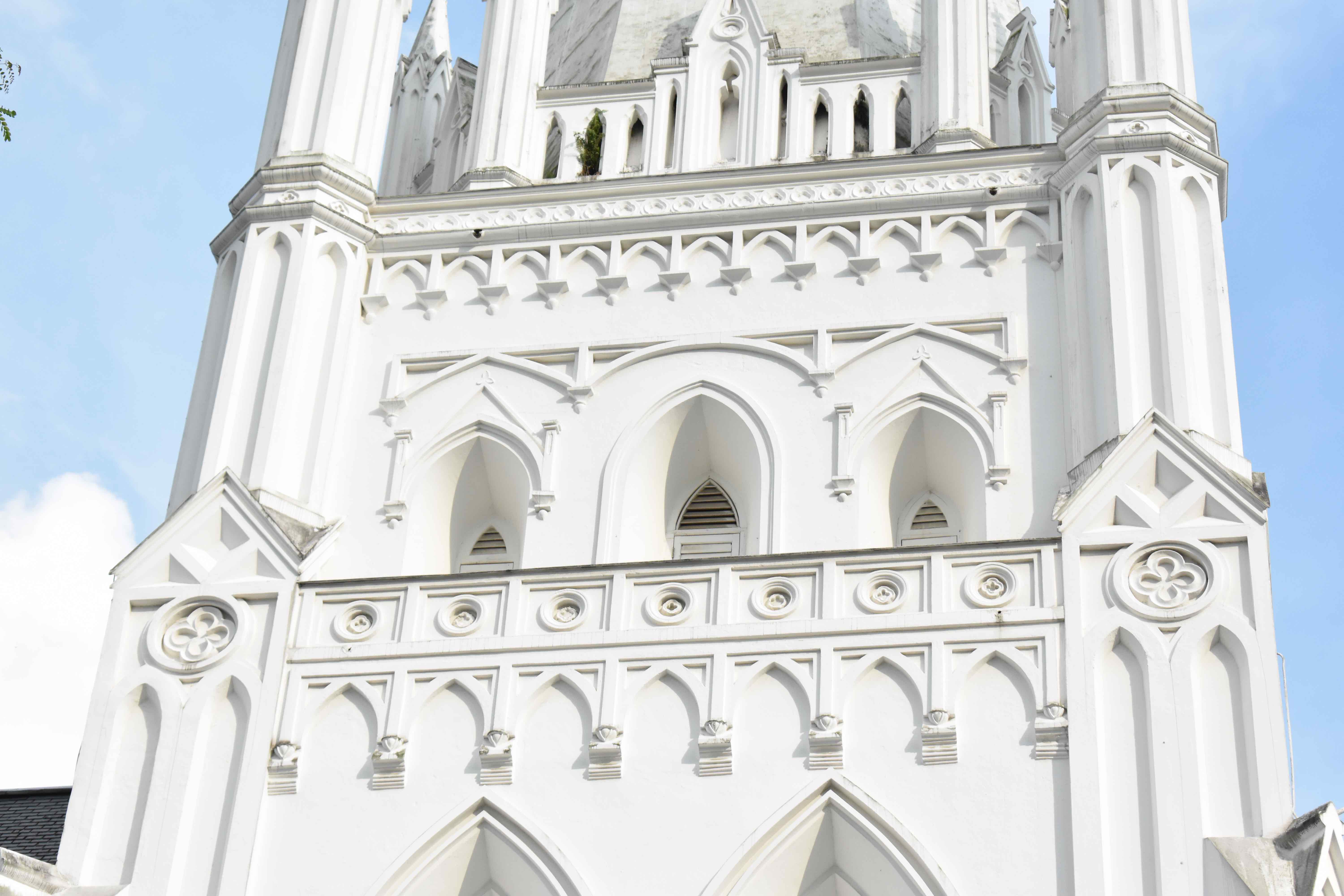
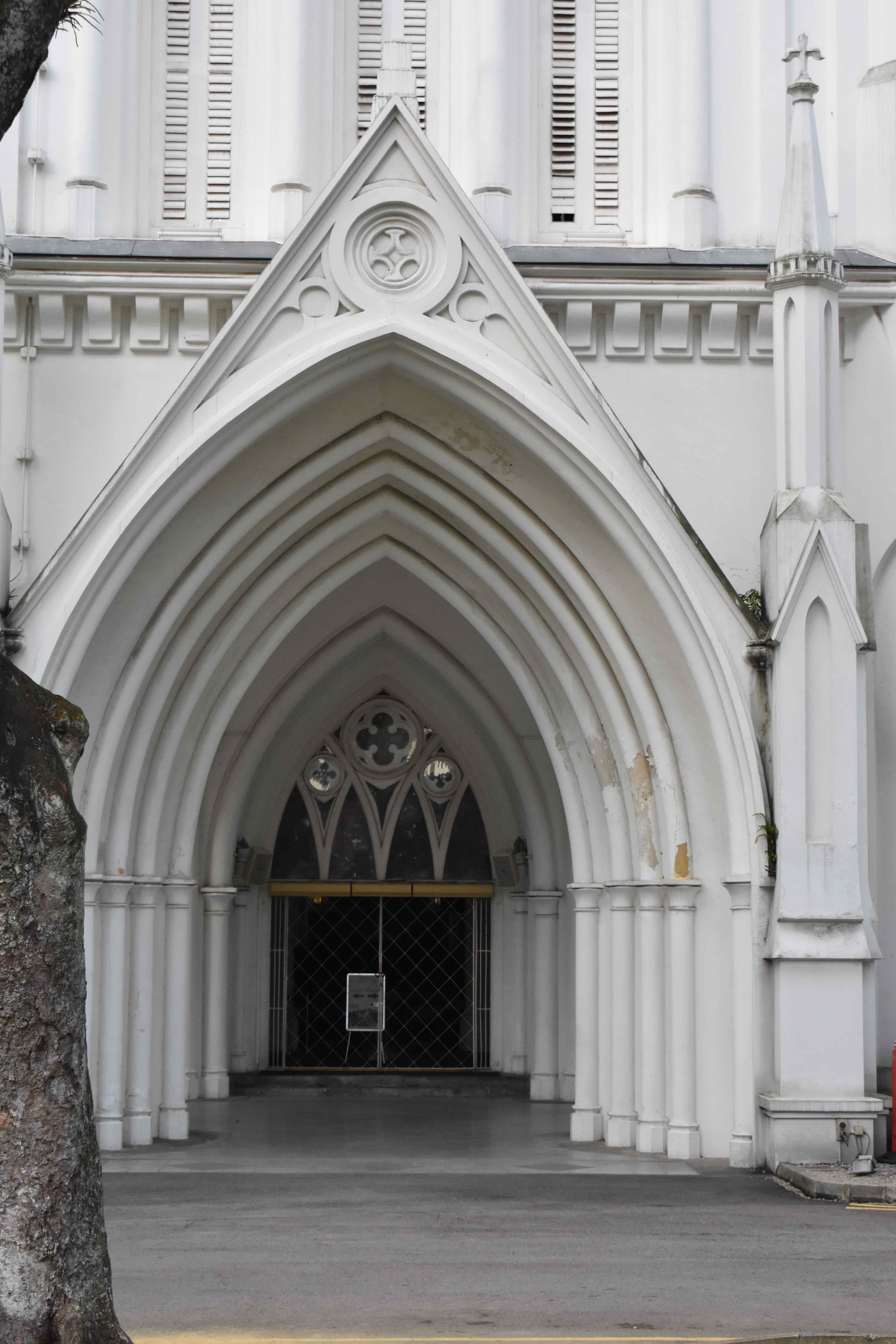

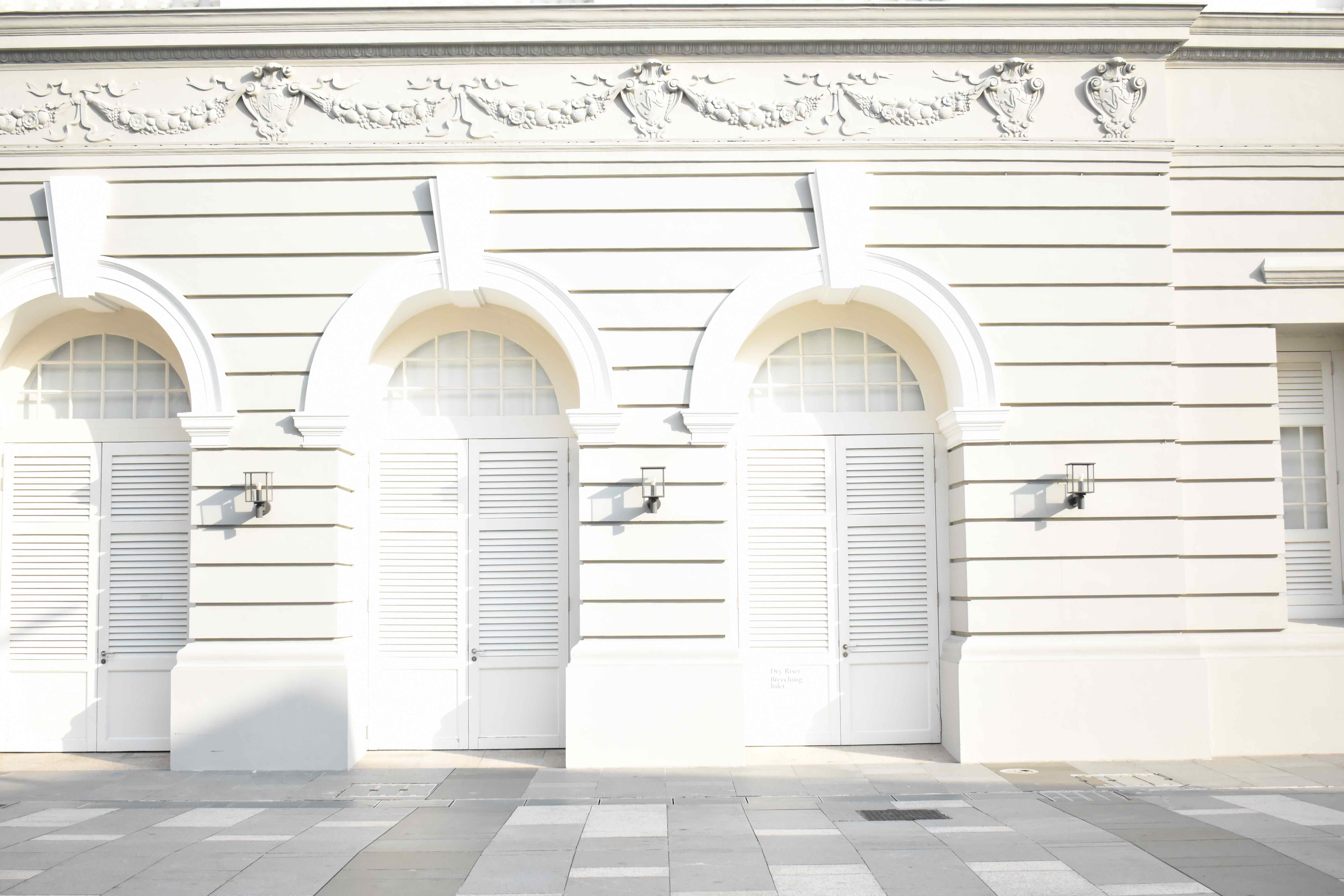

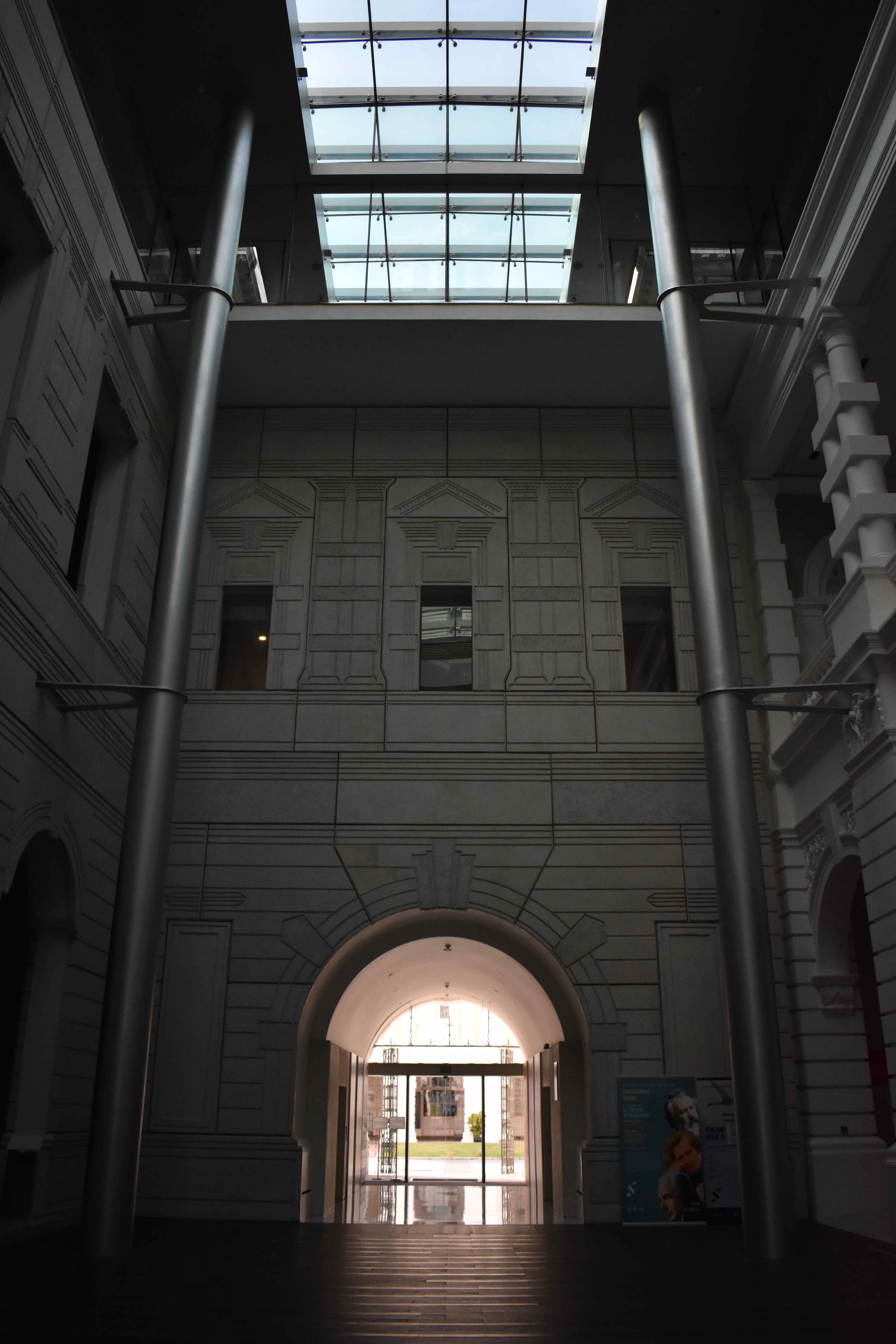
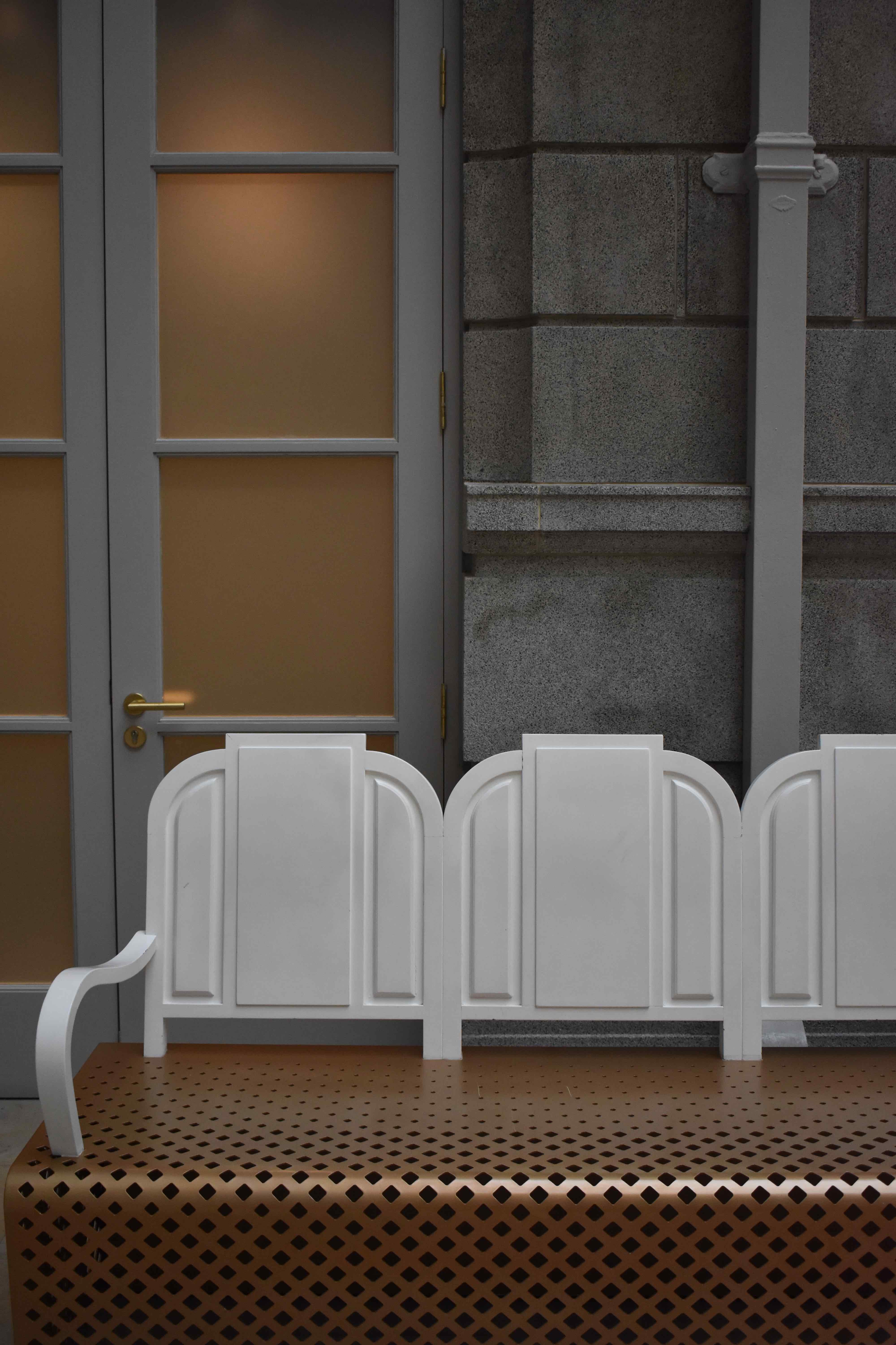
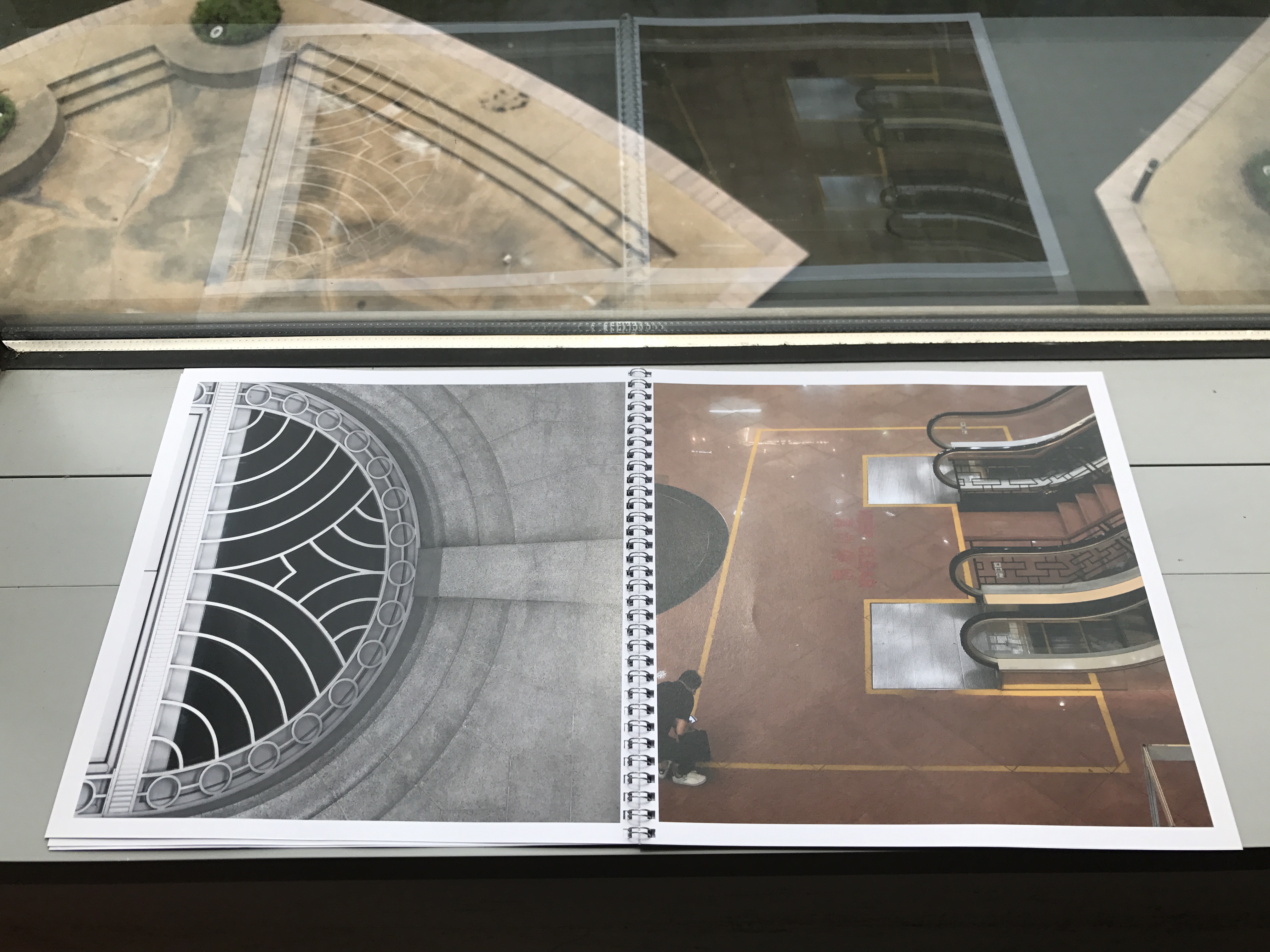
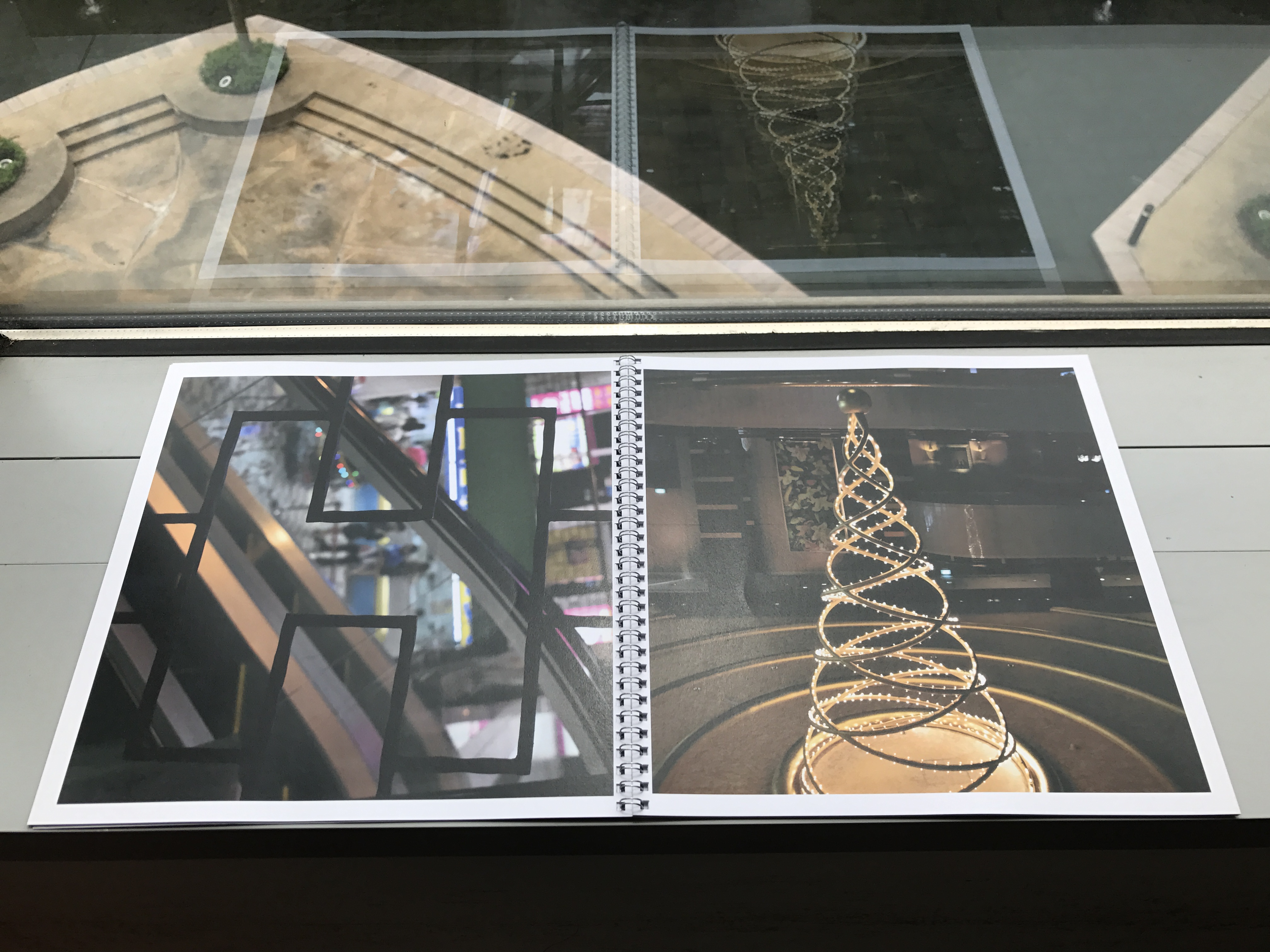
With this compilation of photos, I began to work on creating the alphabet.
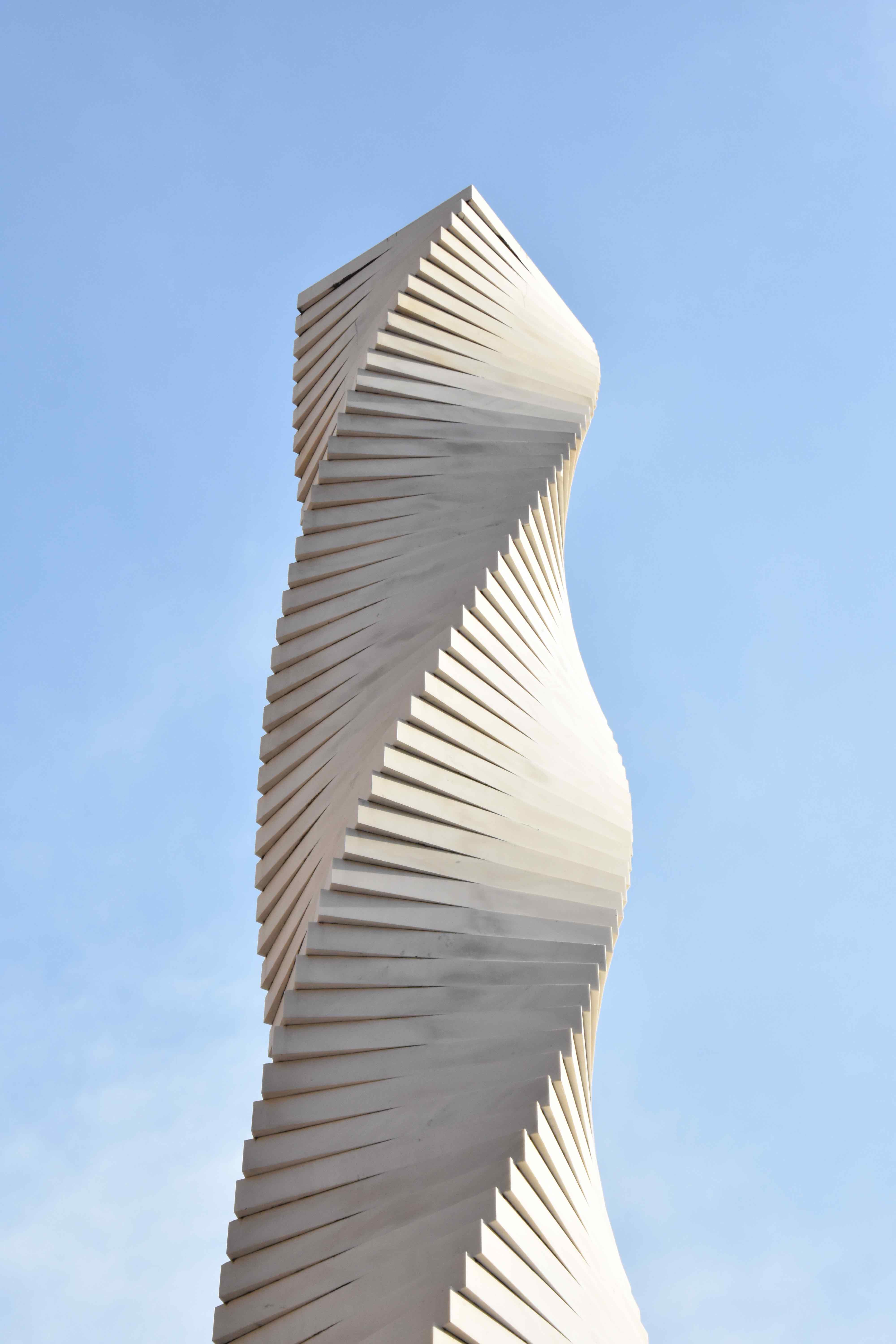
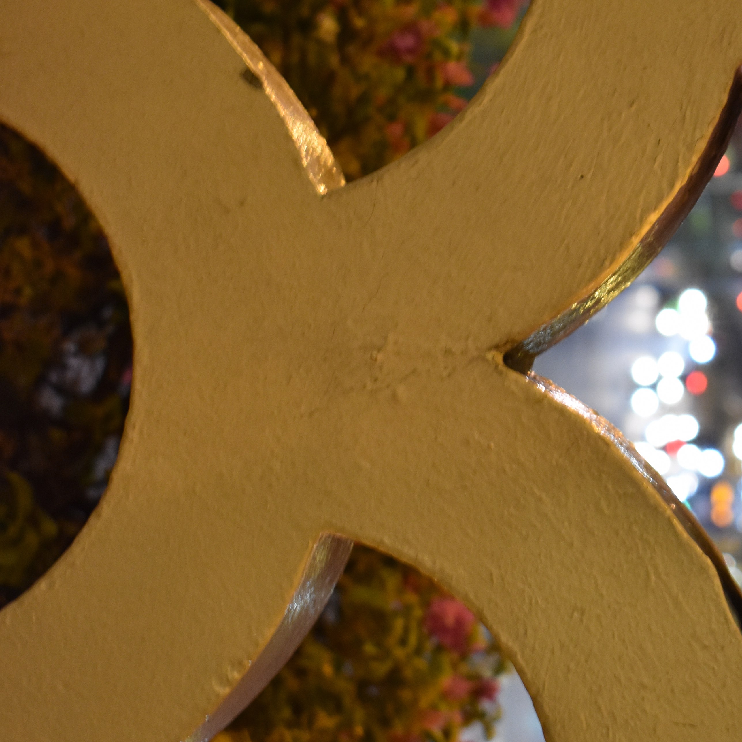
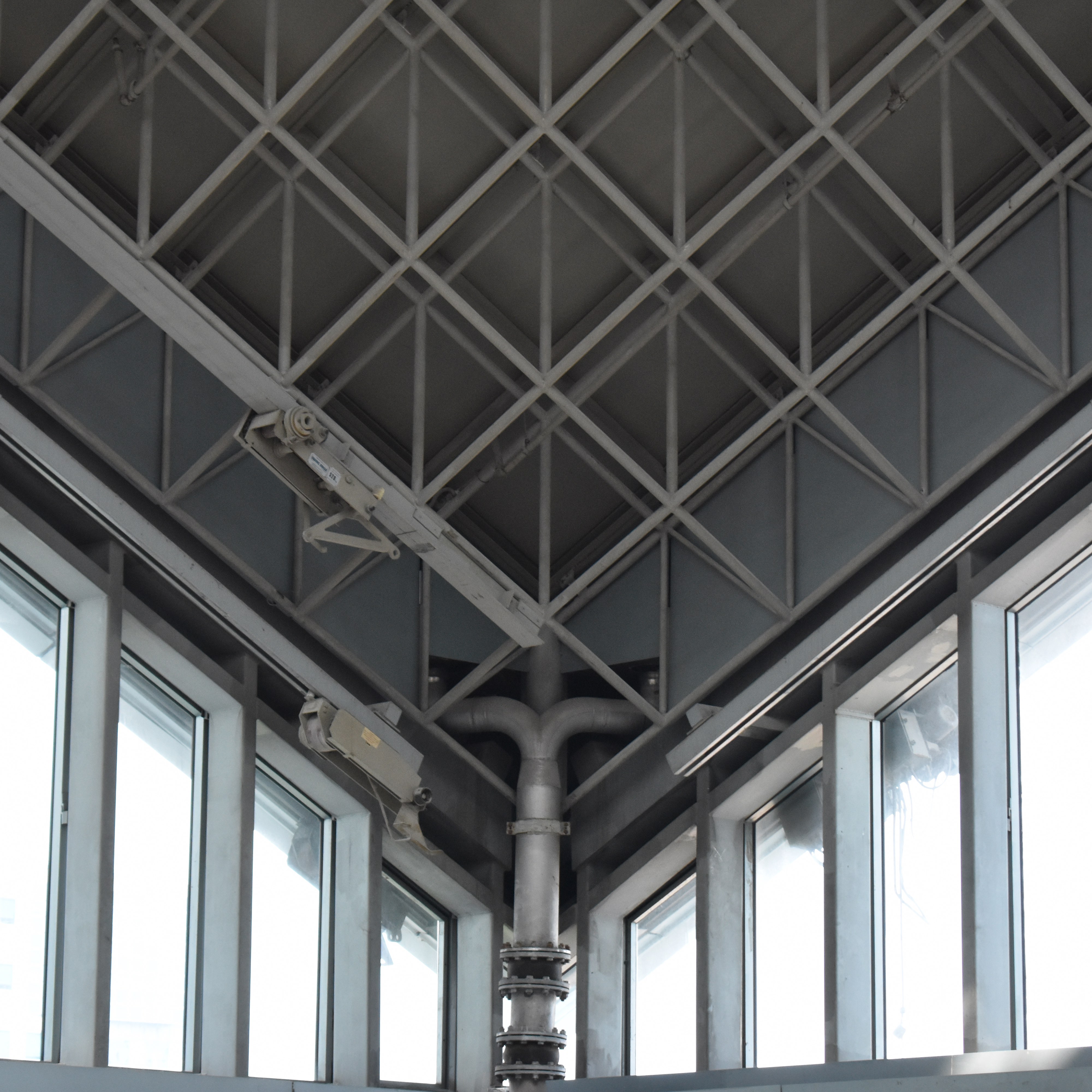
After editing the photos, I managed to come up with the 26 letters.

A
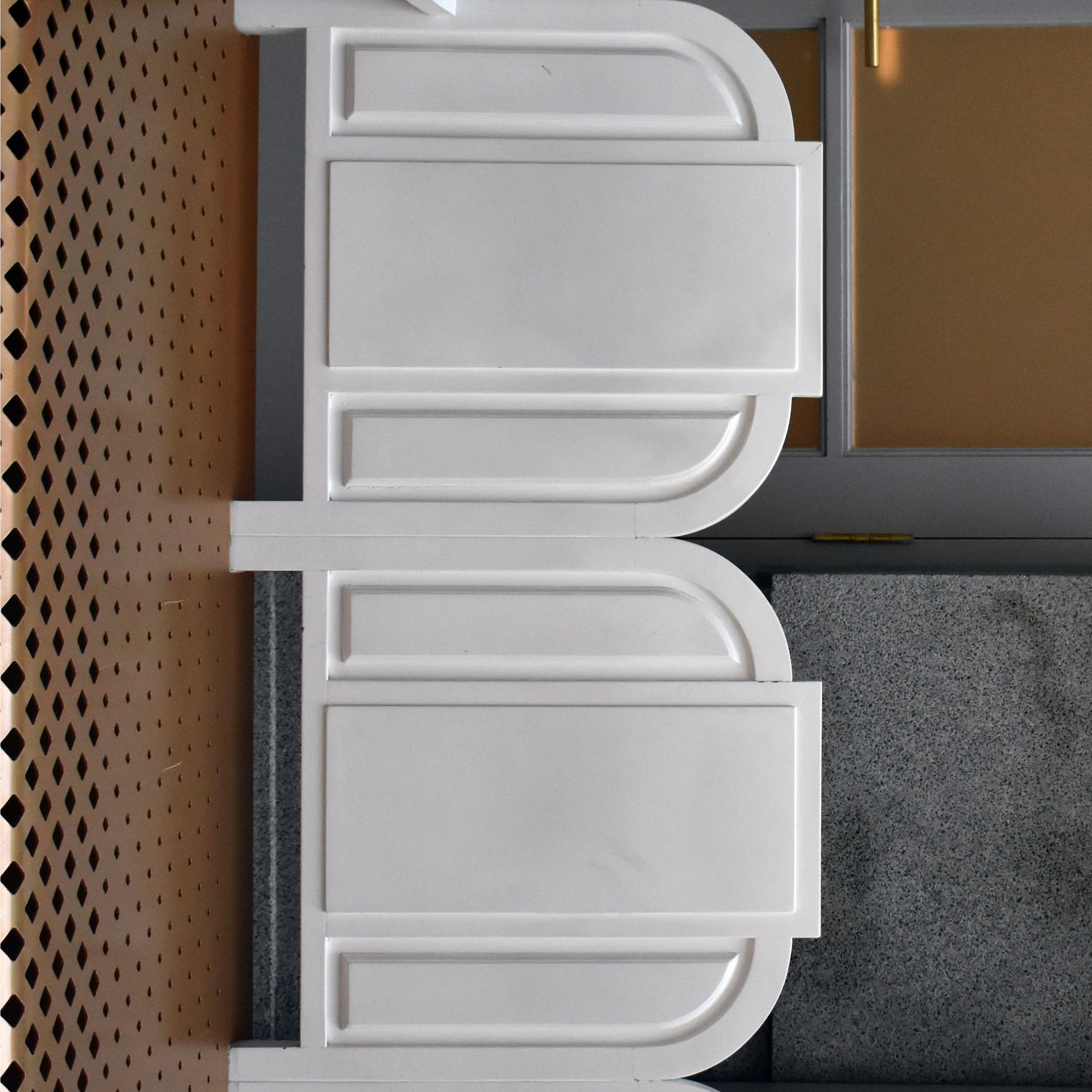
B

C
D

E
F
G
H

I
J
K
L

M

N
O
P
Q

R
S

T

U
V
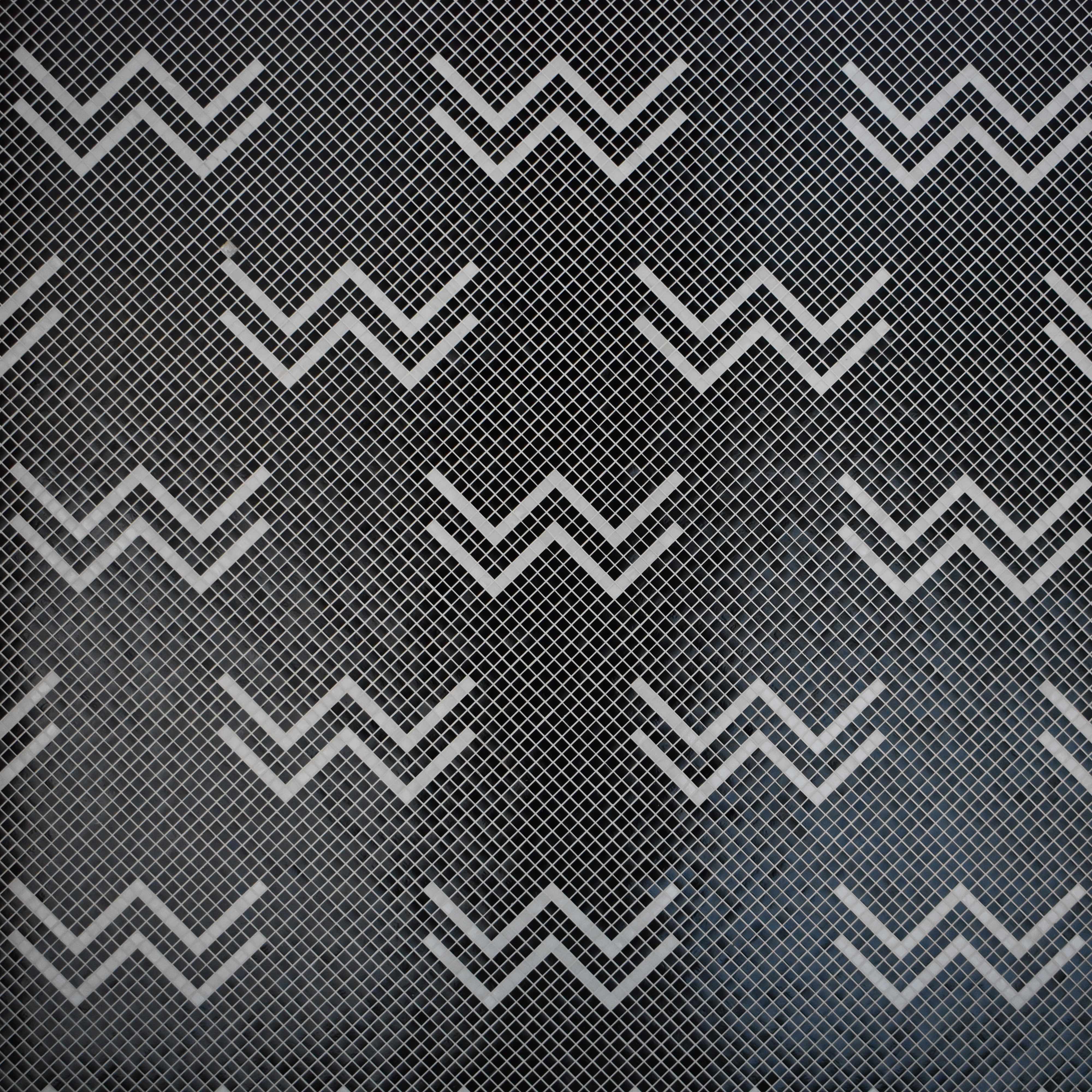
W
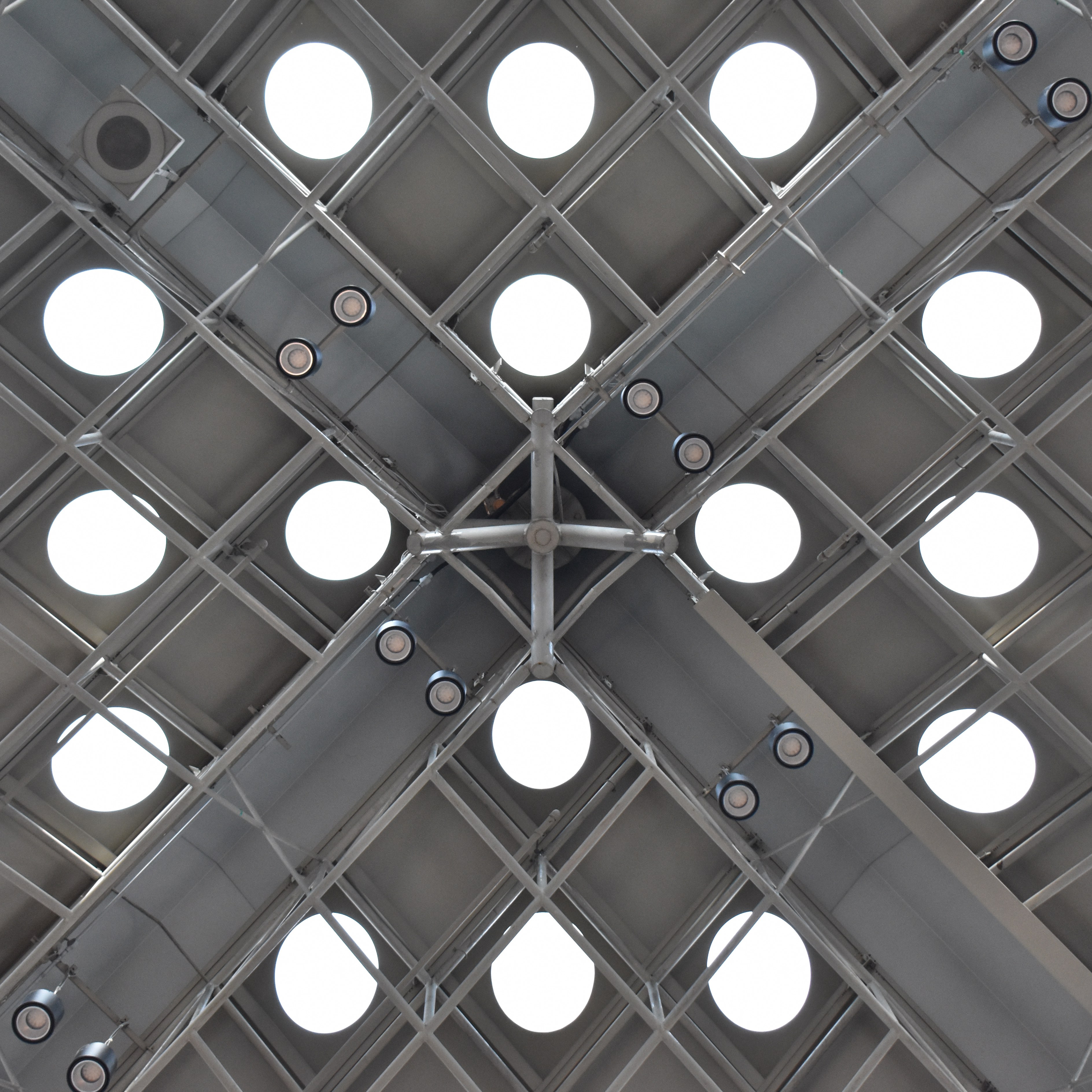
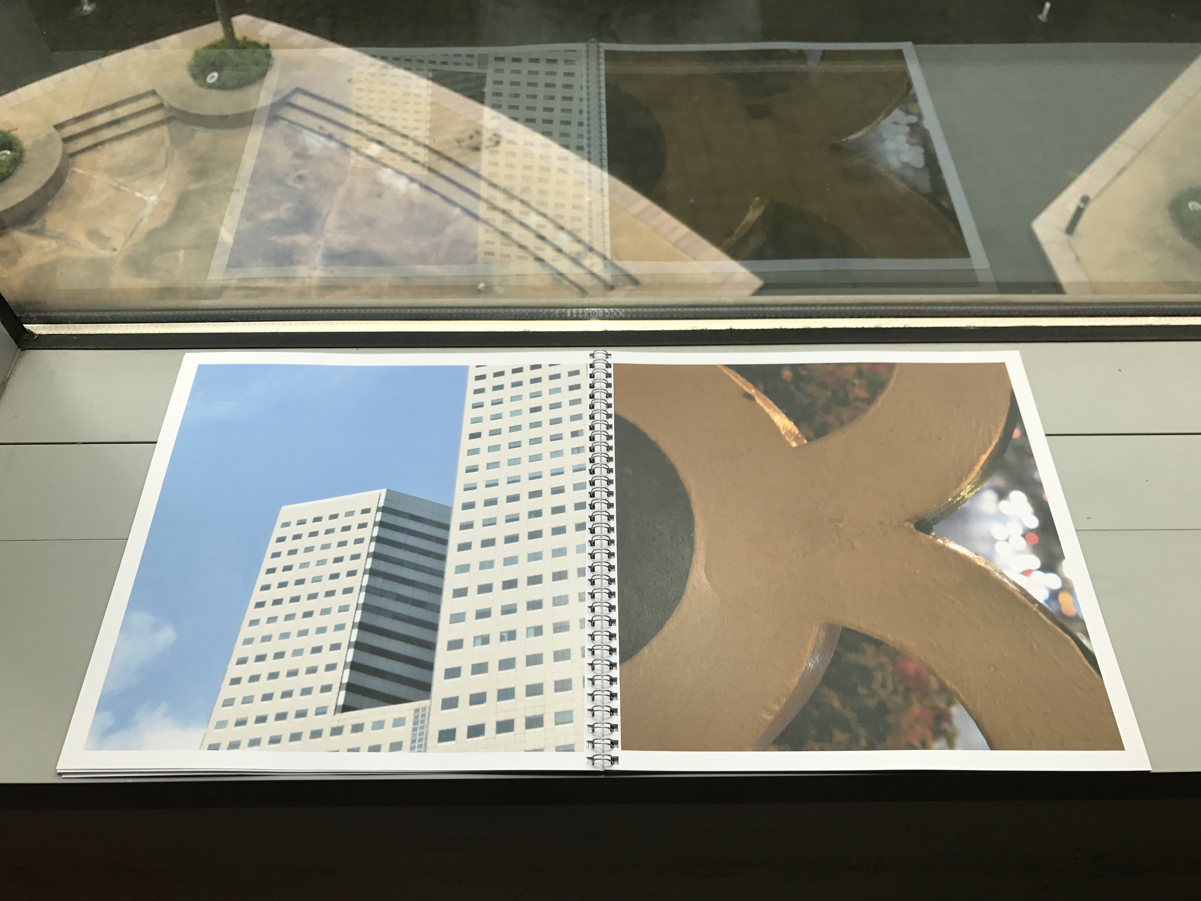
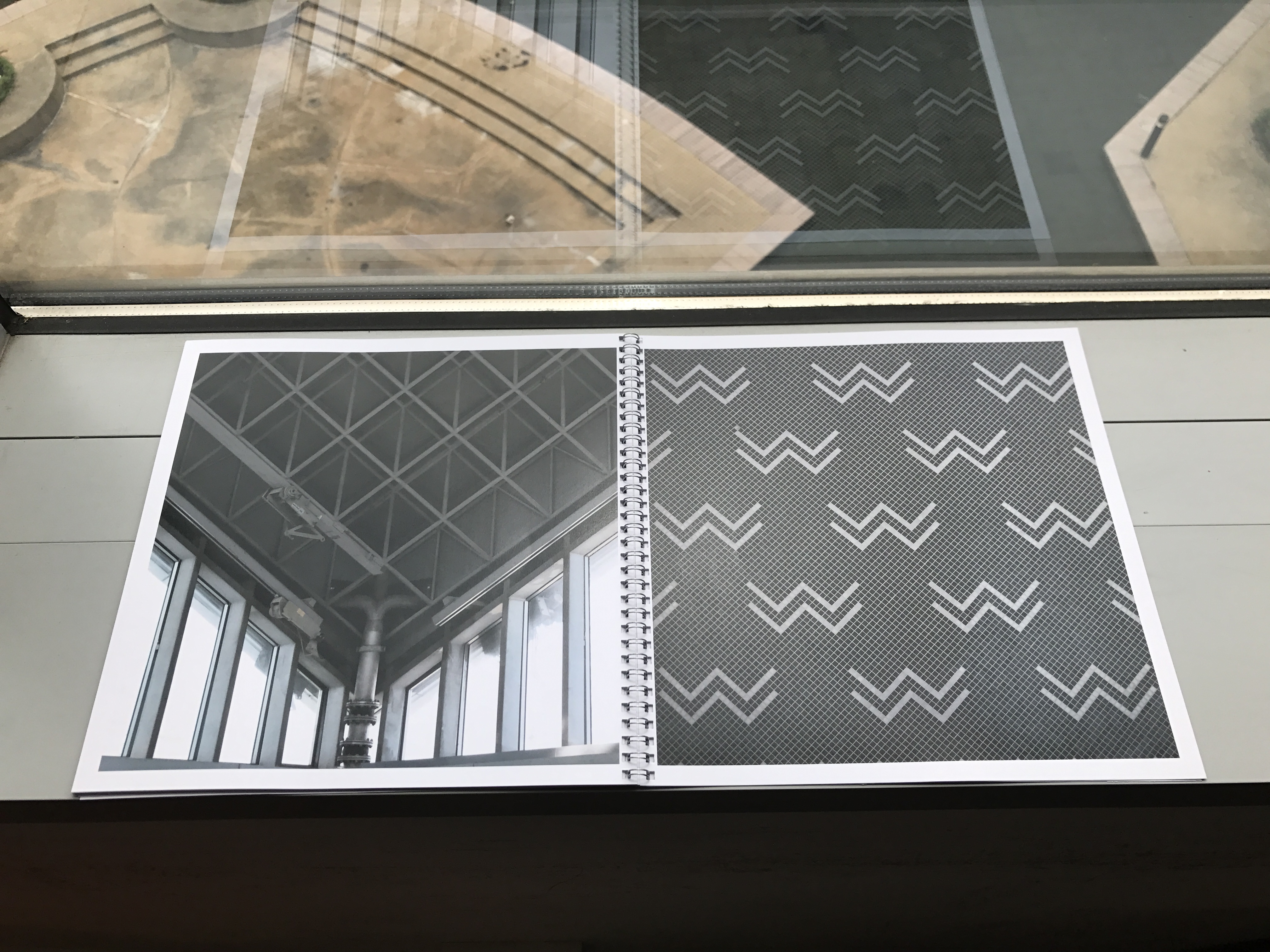
X
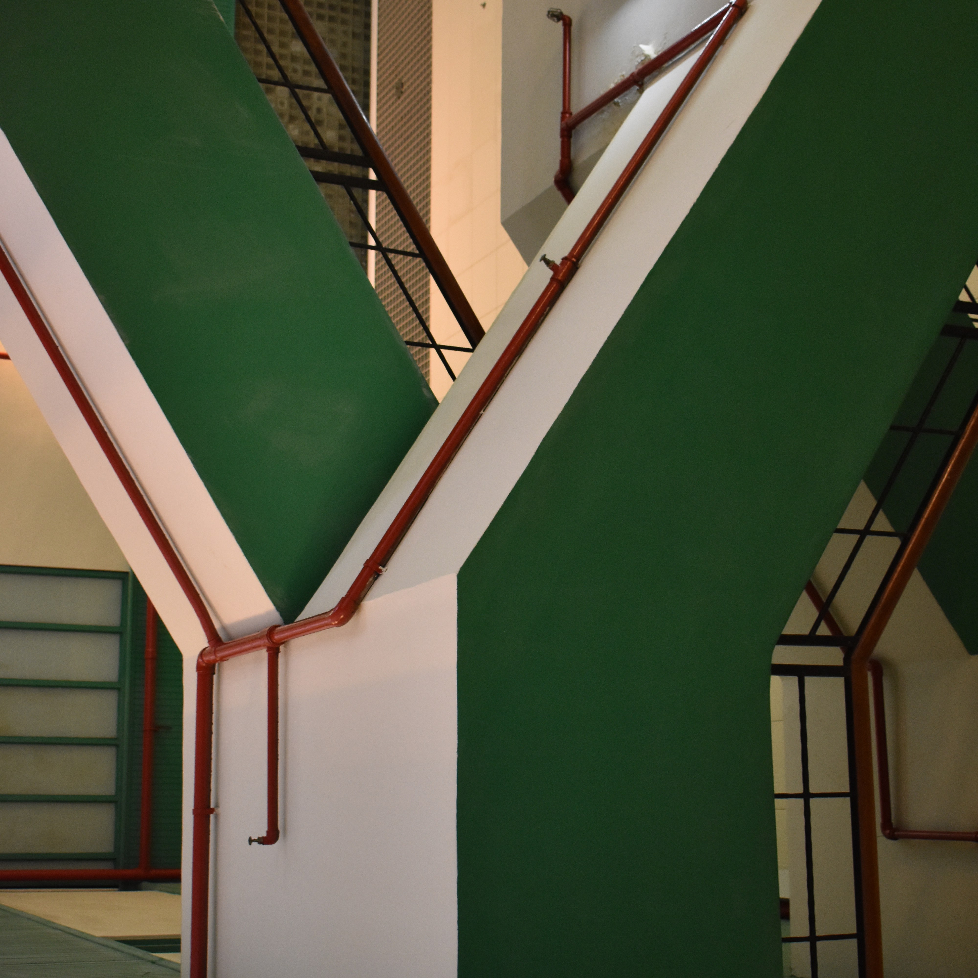
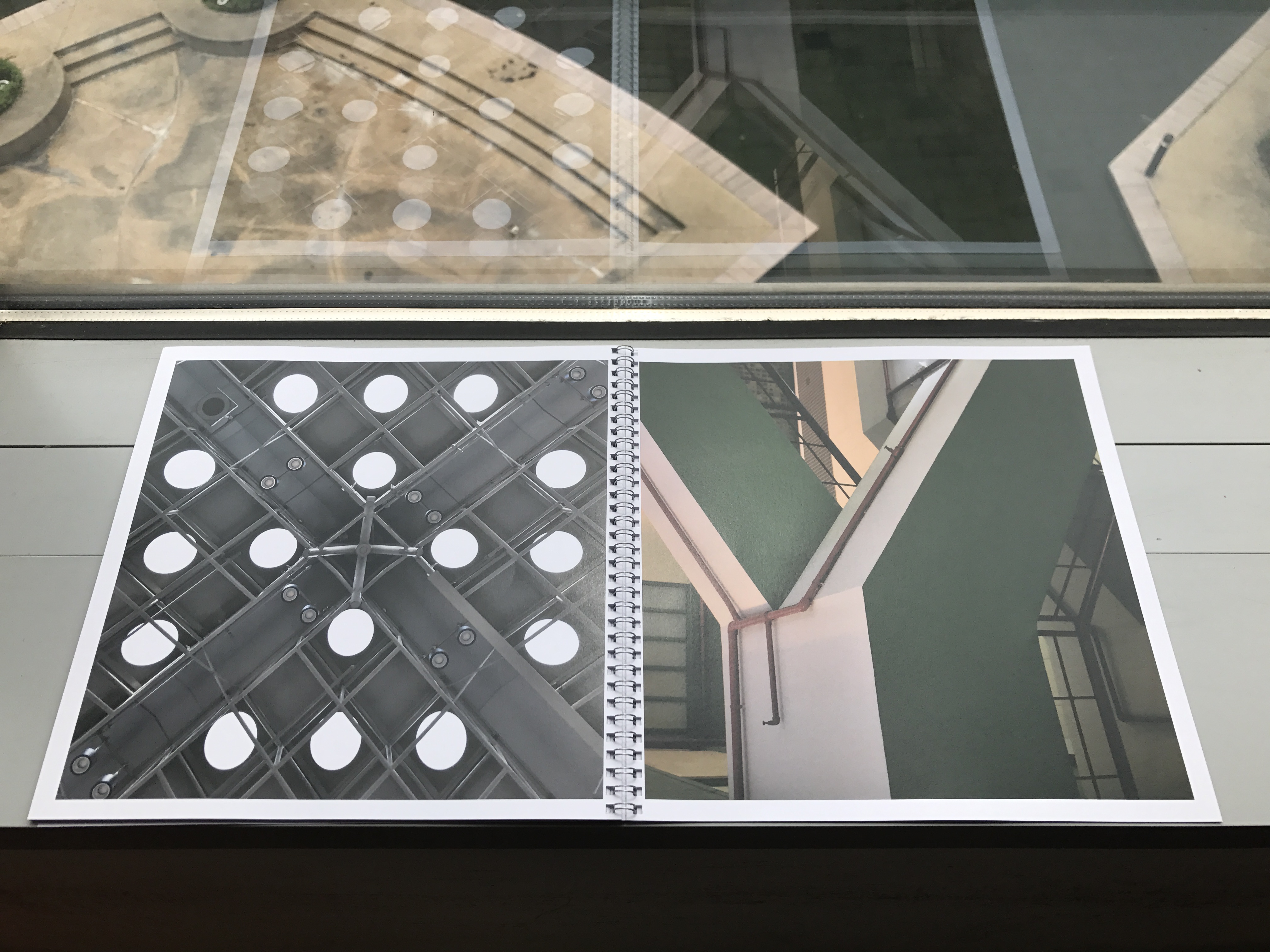
Y
Z

On top of the book, I also designed a promotional poster for architectural photography.
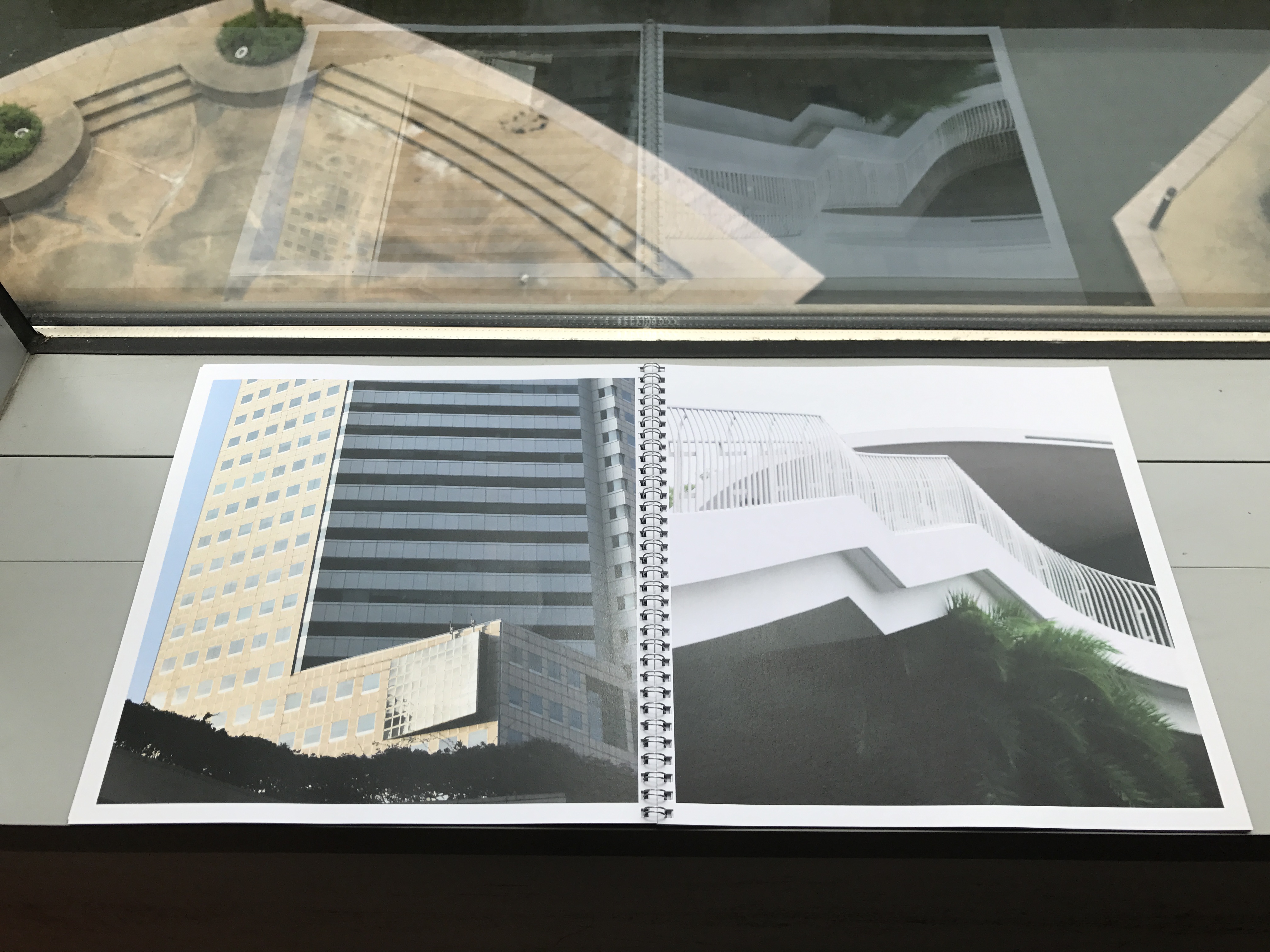
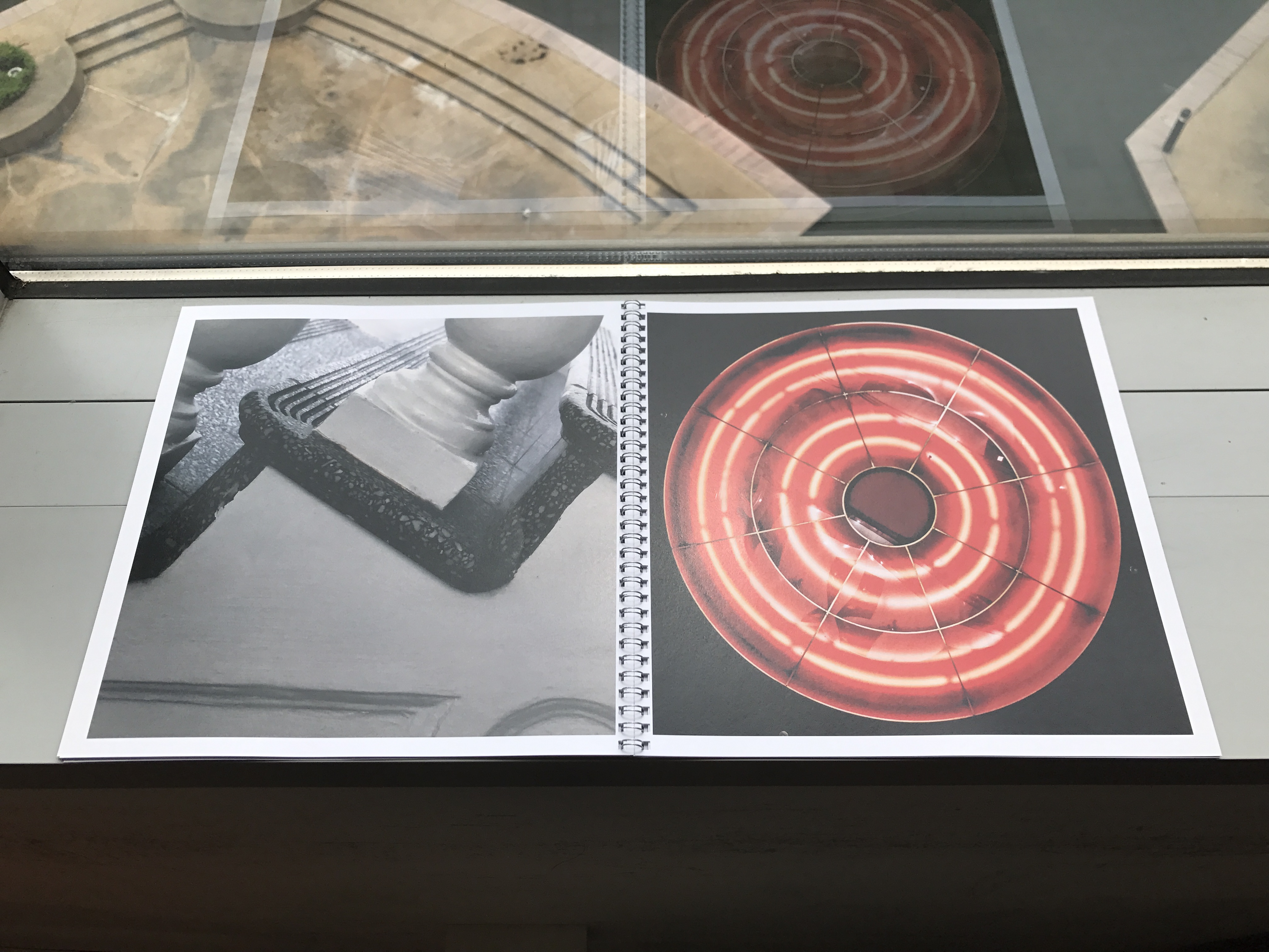
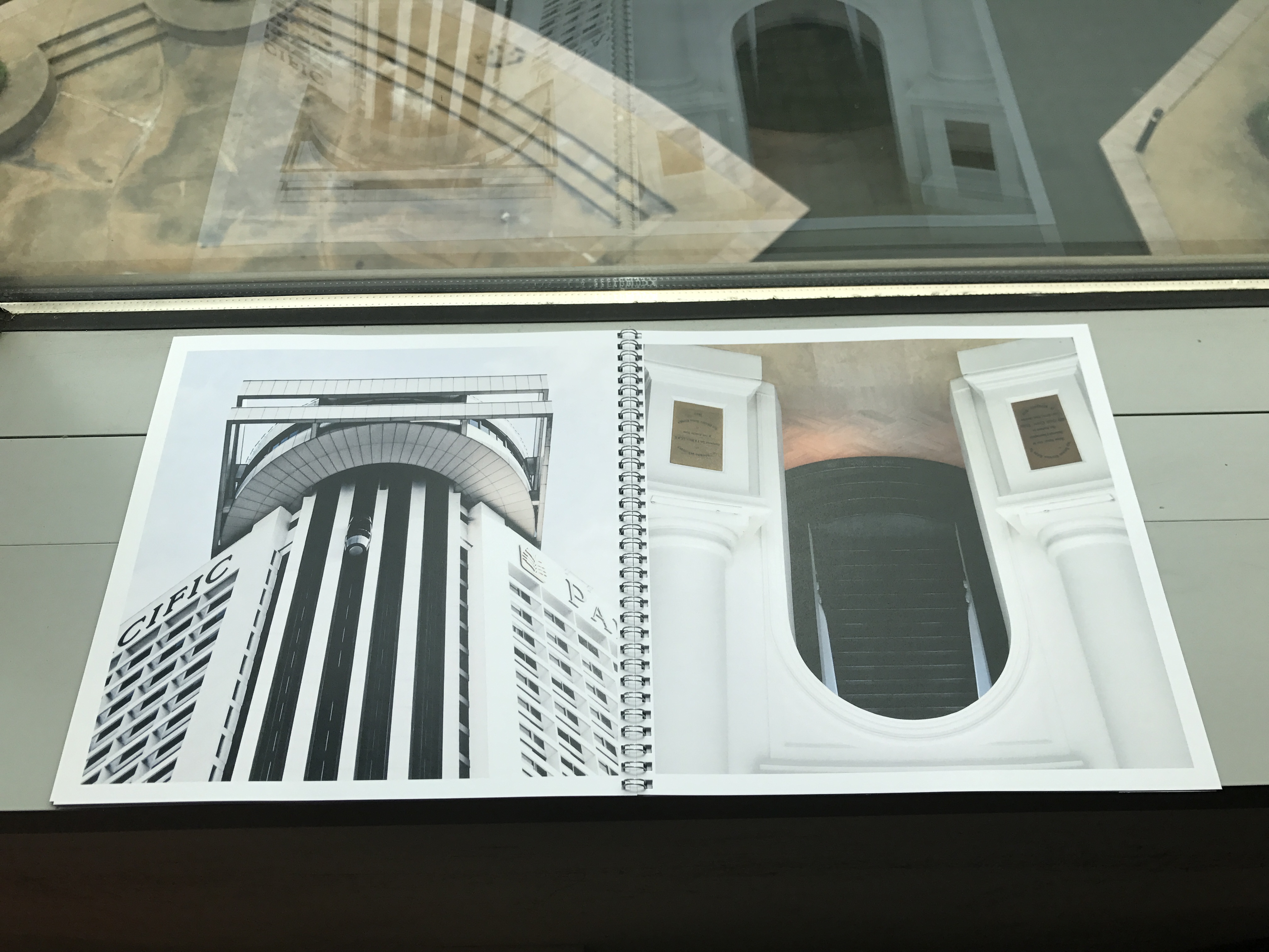
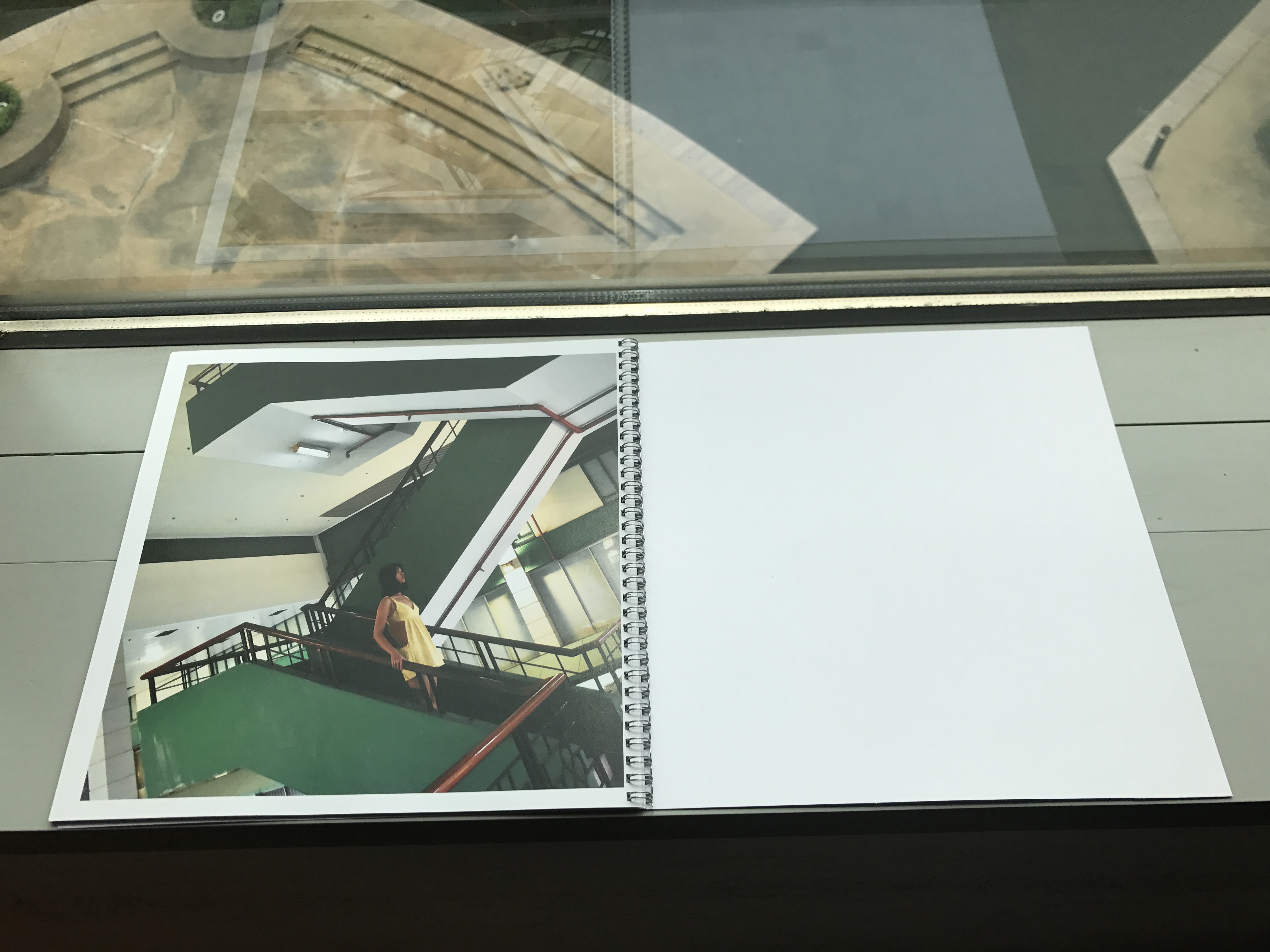
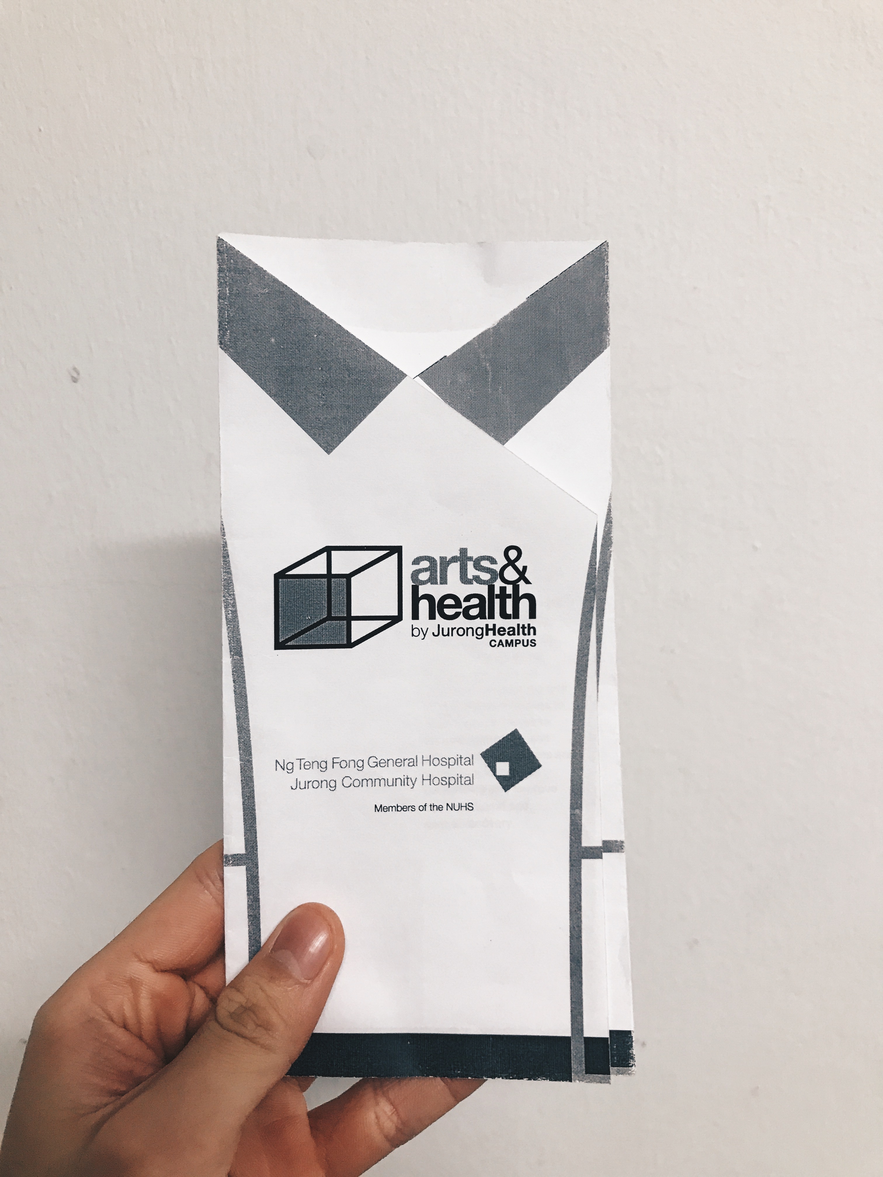
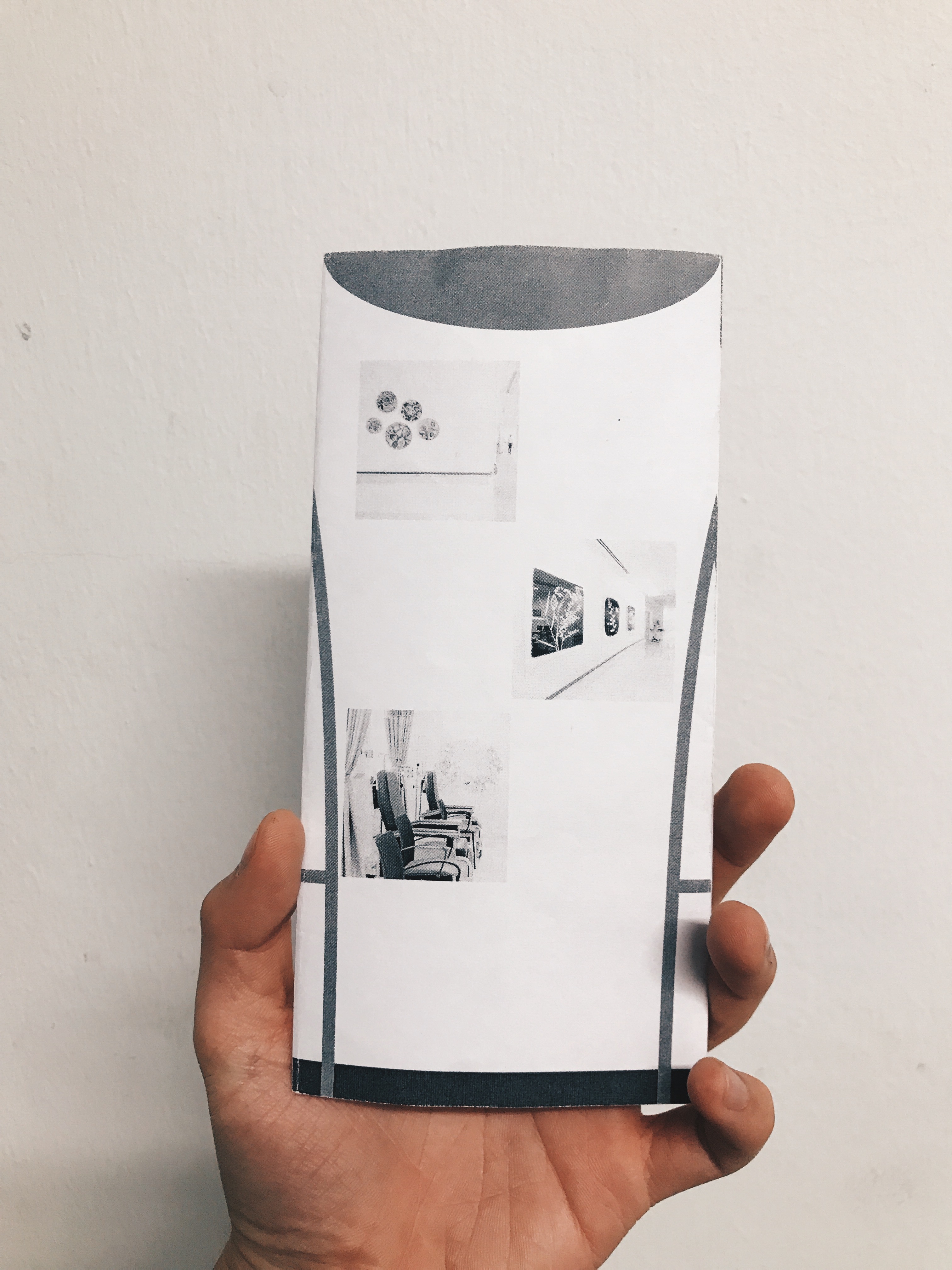
This is the printed version of the typographic book. I chose Futura as the typeface as I felt it was clean, geometric and simple, much like the architectural forms I tried to simplify. I also used ring binding as I felt it would better resemble an architecture lookbook with a skeletal spine exposed, almost like “scaffolding”.


Recent Comments