Category: Process

Design Artefact 2: Process

Design Artefact 2: Website

I started off looking at sleek, efficient websites and collated a moodboard that featured websites with a strong color theme, attractive visuals, shapes and a clean overall composition.

I admired the clean simplicity of websites like these and decided to emulate them. Financial services tend to be complex, and the ability to simplify complex concepts into bite sized chunks would be crucial to communicate effectively with our customers.

I stuck to the gold and brown color theme which on hindsight I should’ve adopted for my other posters but the directive came from above in which they wanted the posters to be more youthful and exuberant, whereas the posters would be more serious and elegant.

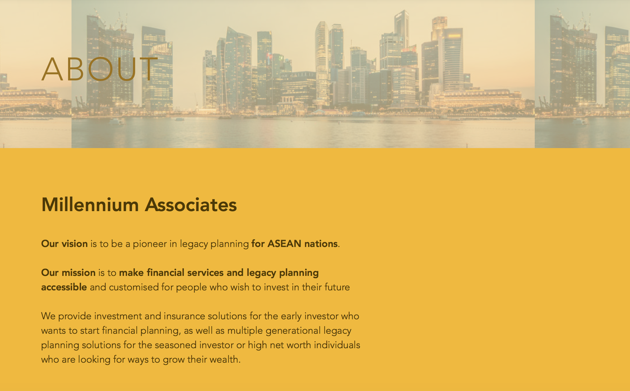
It was important to get our vision and mission statement out early on so that potential clients would know what kind of company we are, and how they can benefit from our services.

The founding team is on the About page; I kept it simple and clean for visitors to take a look at the different skillsets that we bring to the table.

We also needed a page to channel our clients into our sales funnel, and this would be the page where clients could sign up for an introductory portfolio review where our brokers would analyse their portfolio for them.

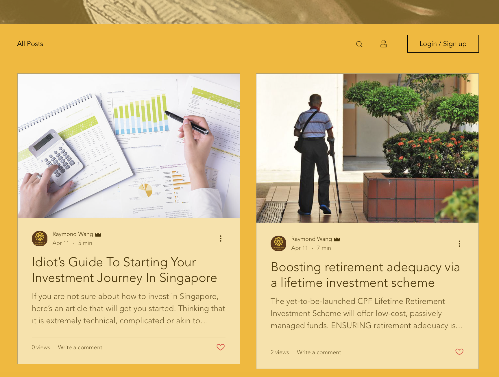
I am a strong believer of giving value before asking for anything. From a marketing perspective, we must be willing to give more than our competitors if we hope to reap the rewards of customer loyalty and brand image. Thus, we provide up-to-date news coverage for early investors and people who want to learn more about the financial markets. These tabs then open into full articles.

I made a few adjustments after the consultation, where the colour scheme was not consistent, and to make the overall design “tighter”.

Design Artefact 1: Process

Design Artefact 1: Posters / EDM

I started off designing posters for the financial brokerage firm Millennium Associates. The posters were intended to target the recently married or married couples who just had children. This would allow the brokers in the company to help to facilitate setting up a trust fund to help with their children’s education and future expenses.

Poster 1: Don’t lose your children’s bread and butter

I started off by taking a simple top down photograph of my baby sister’s cutlery, and rending it in photoshop to make it look better.


The attempt to express a visual metaphor came from the idea of a plate, and playing with the idea of a plate to communicate the urgency of financial planning and ensuring that clients’ families are well protected.

I did not like the outcome of rendering the plate on illustrator, and I felt it may be a bit too boring, hence I decided to merge the mediums of photography and illustration to get a desired effect.

The idea of “loss” is conveyed through putting a couple of dollars on a baby’s plate, communicating the lack of sustainability in the way most couples are going about planning for their children’s education.

This was draft 1 of the poster. I created a table cloth patterned background and information that was placed in a central composition, while the logo was placed in the top right. During the consultation, it was mentioned that the message might be too strong, as “losing your child” can mean many things; like a child dying etc. Therefore, I had to rework on the message, and perhaps make the logo a bit smaller.


Poster 2: The race begins early

I started off with a simple concept of the race track, where every parent wants their children to get a headstart in the rat race. There are different ways to ensure that one’s children have an advantage, but the firm’s focus was to start early to end well. Thus, our ads have to be targeted at children, so that the trust fund has time to grow and deliver the results needed.

Again, it was a blend of vector illustration and photography. This gave the poster an element of youthful playfulness, and would not feel as static as a poster incorporating just one medium.

The advice given during consultation was that the 2 posters had 2 radically different compositions; the first adopted a central composition whereas the second was more dynamic and off-centre. Thus, I worked to ensure that both posters had the same composition, tightening the grids and playing with type to ensure that both posters conveyed the same kind of playfulness and yet gravitas of the message.

Infographic Poster: Process

I began working on the infographic poster by identifying the target audience and looking at what type of poster would best appeal to the target audience.

Target Audience: married couples, above 30, planning to have children or already have children.

Purpose: to explain legacy planning to these people, getting their buy-in and helping them set up a trust fund or engage in tax or legal services to preserve and grow their wealth for their children.

Problem identification: the biggest issue that I faced when doing data collection is the fact that most people are not aware of the avenues available that will counteract the problem of their wealth depreciating over time. A lot of Singaporeans are generally complacent as we think that CPF is sufficient to live a good life after retirement and to pass on to our children but that is hardly the case.

Based on the chart above, I strove to achieve a poster that was declarative and simplified a concept. The reason why was because the poster is meant to sell the consultancy company’s services, by educating clients and simplifying the concept of legacy planning into 3 basic strategies.

The use of a visual metaphor to integrate the information into a singular image would be important to drive home the importance of legacy planning. On top of that, the poster also needs to drive home the big picture framework / process of legacy planning.

First, I came up with the logo for the consultancy firm. This look a while as I looked for a metaphor that was suitable to convey boldness and wealth. I did toy with the idea of using an umbrella / tree but that turned out to be too esoteric.

I finally rested on this design as I felt it best conveys the boldness and wealth of the consultancy group giving tax, legal and advisory services. Another consideration was the target consumer; which eventually will be upper middle to upper class.

Logo: By using a lion masthead moulded into a Chinese infinity symbol, it is a suitable metaphor to convey the longevity and steadfastness of our brand.

Color: The yellow denotes gold and the colour of wealth and vitality while the earthly brown denotes our hardnosed practicality and trustworthiness.


This is the first poster that I came up with, based on a 4 column grid with the use of Futura as a preferred typeface.

During the initial critique, some of the comments that I received were that the titlehead was too small to be visible from afar and more could be done to integrate the information and the artwork. The use of italics and regular font was a bit haphazard as well. The NOW VS 2050 was a bit confusing as it seemed to some that the coffee got bigger over time, as one put it, “issit upsize?

Overall, the first draft had a lack of dynamism that made it feel dry. It was something I would try to overcome over successive drafts and revision of ideas.

Some of them gave the suggestion to turn the stack of Jenga blocks into gold bars. I did initially toy with the idea, creating a few gold bars via vector illustration, but I soon realised even with a Jenga tower with gold bars, it still lacked the human factor; it felt too stiff.

Thus, I explored the idea of walking the tightrope towards the Jenga tower and using that as a metaphor for the timeline of one’s life, and what would happen if left unplanned.