Heelo:)
After receiving our project, The initial idea I had was to list down all the job I wanted to do since young:
I want to be a Doctor
I want to be a Cashier
I want to be a Teacher
I want to be a Lorry Driver
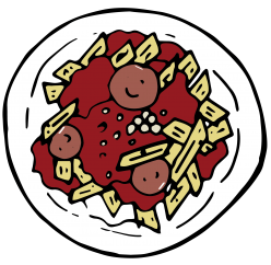
I want to be a Mortuary makeup artist
I want to be a Designer
I want to be a Hair Stylist
After listing them down I decided to create the composition using the material use in various job:)
So I went on to do some research:)
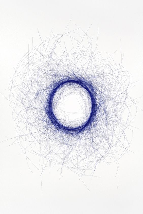
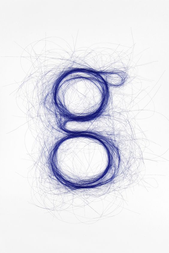
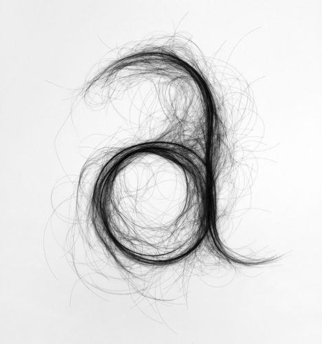
Hairstylist-Hair
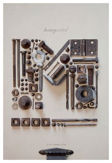
Designer-Tools
Lorry Driver-Diesel Oil
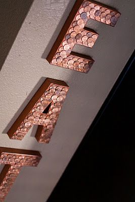
Cashier-Coins
Mortuary Make Up Artist-Make Up
Due to grandfather’s wake I missed out the first individual consultation, so after emailing Joy with my research. I receive feedback regarding the tone and message I’m trying to convey in order to avoid cliches in my work. and also how does these composition relates to me? For example, using tools for product designer doesn’t really tell what I think about the occupation, different types of tools will also be communicating a different message.
So I went on to brain storm on what these occupation means to me and what I wanted to tell people through these jobs. As we know Chinese new year is around the corner and I just remember having to face those aunties and uncle who constantly ask me what you’re doing and what job you’re heading to and when you tell them, they judge you. And so I thought why not use this as my inspiration, I believe as we grow up we face many opinion from people regarding our future, especially towards the design industry. However, we as designer do not agree to that. I decided to use the term:
Stereotype VS My Perspective Towards The Job
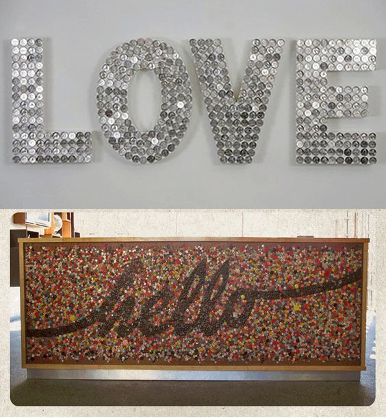
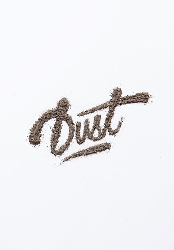
When researching on how I could convey this message in my composition I came across:
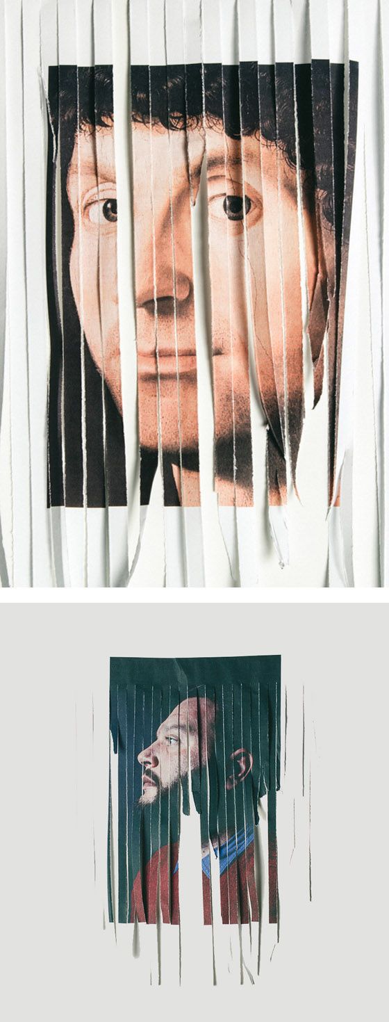
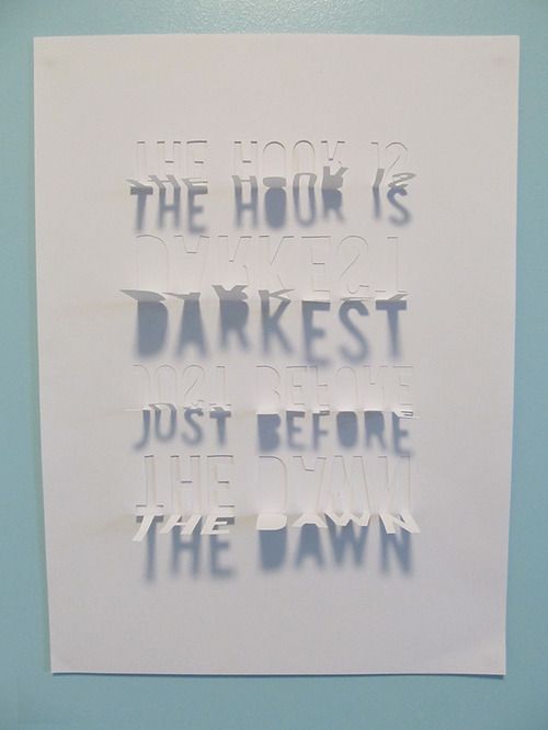
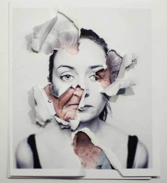
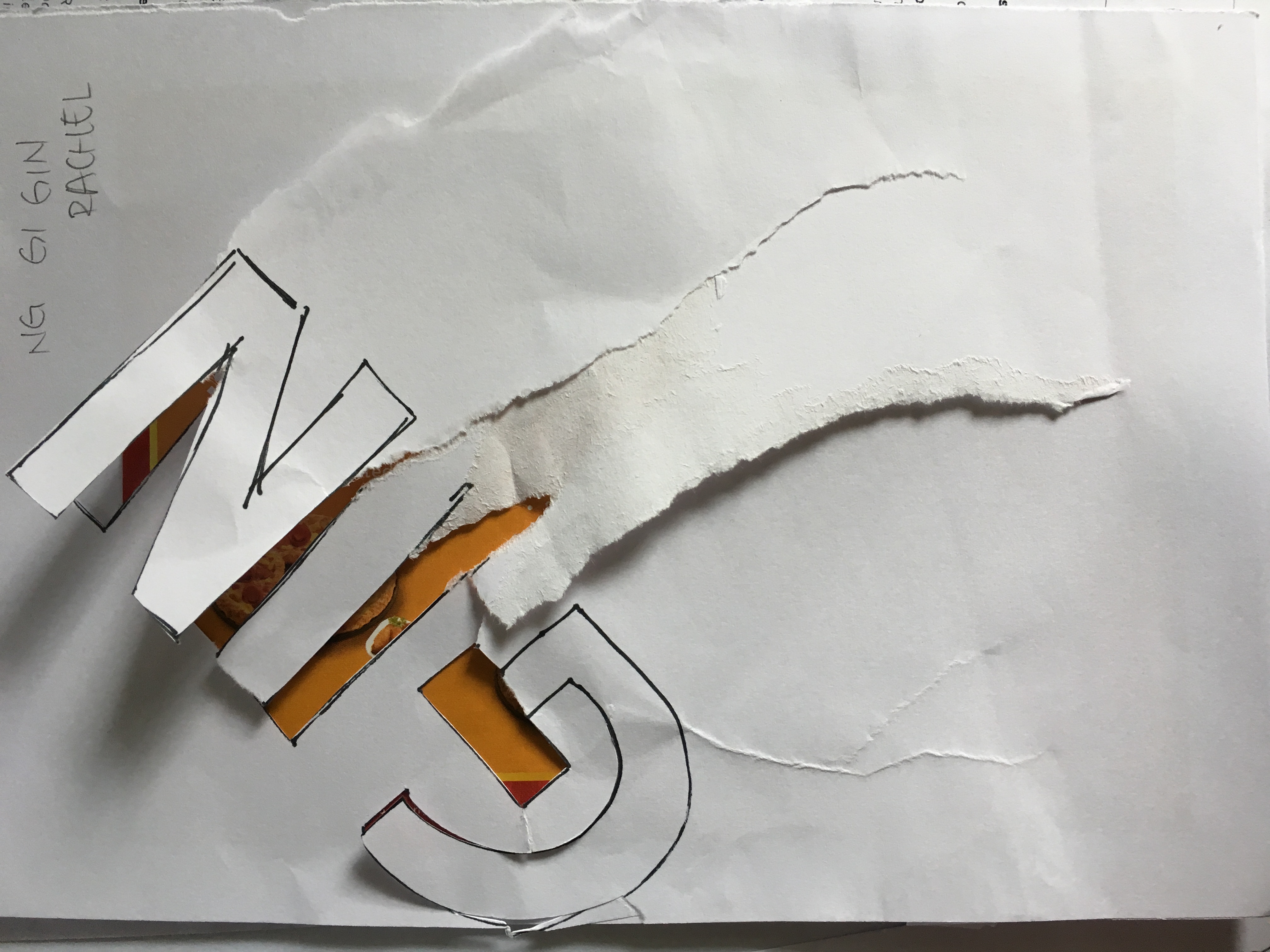
why not go into this format for my composition the tore out part would be what this job actually is and what it actually means to me. Joy suggested that I could go and try tearing different types of paper and explore its effect. (which can be seen in my visual journal). I also wrote down in my journal the different stereotype people have towards the job and also the thoughts I have towards the job to help me manage what I want to include in my compositions.
After exploring, I love how the thicker gsm paper gives a better and harsh effect due to the different layers in between. And also it would fit my message of being frustrated at how people think about my “dream” job. I also tried pasting a colored design paper behind a white one with my name tore out to see the effect:
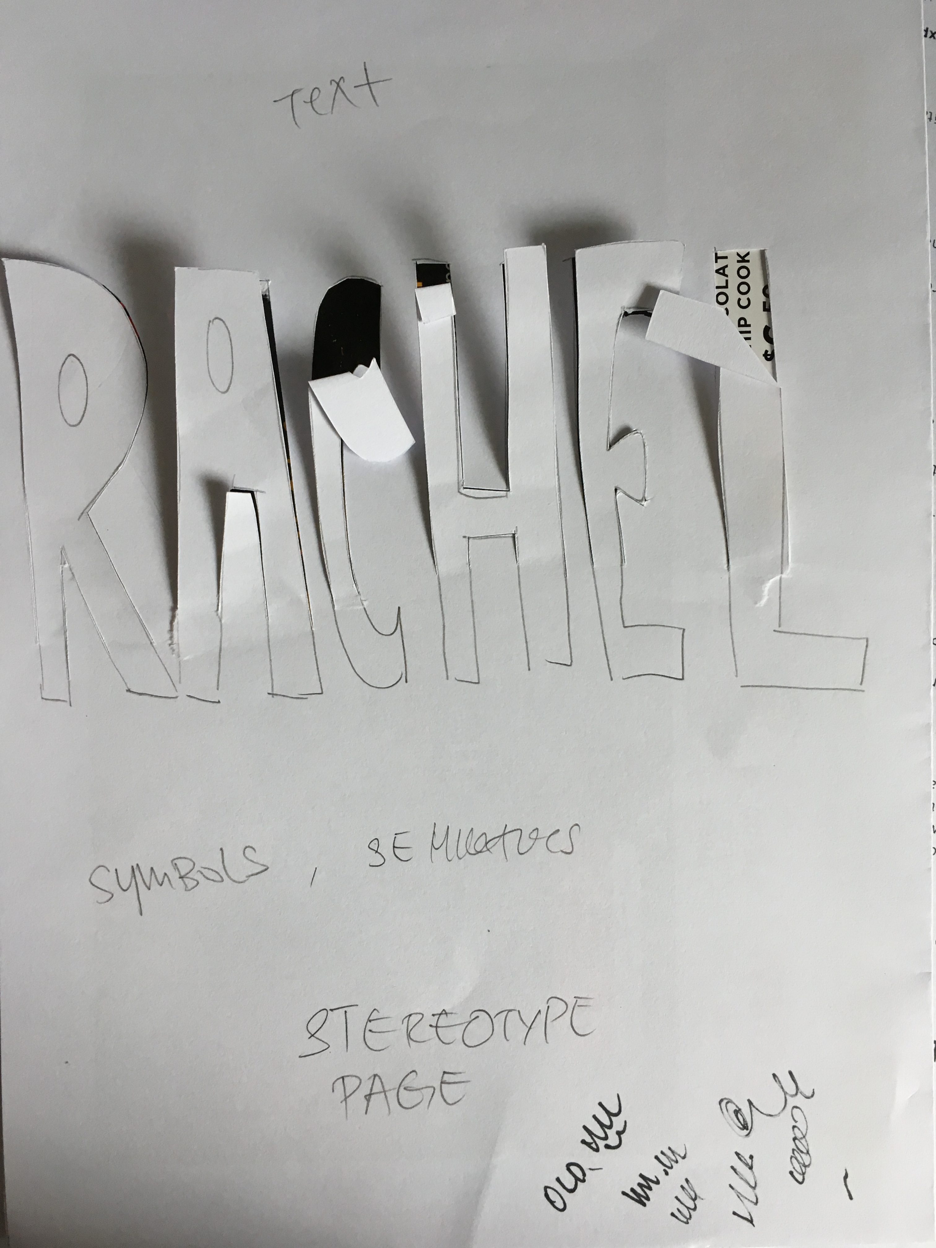
I receive some feedbacks during consultation after I showed my draft composition regarding
-Instead of commercial font, create your own font ( using commercial font would bring in question like why I use this font? why I arrange it in this manner etc)
-From written font to more clean digital font (showing my job changes as i grow up)
-What I want my audience to see? (the link between the front and back (comparison)
-The tore also bring out a certain emotion (mine is too clean doesn’t show frustration)
-Chinese font for traditional stereotype
-Gloss printing surface for top(superficial), Matt at the bottom
So for next step. It’s time for me to explore on
style of my typeface
style of my illustration
colours
Printing surface matt/gloss
and most important getting the composition out!