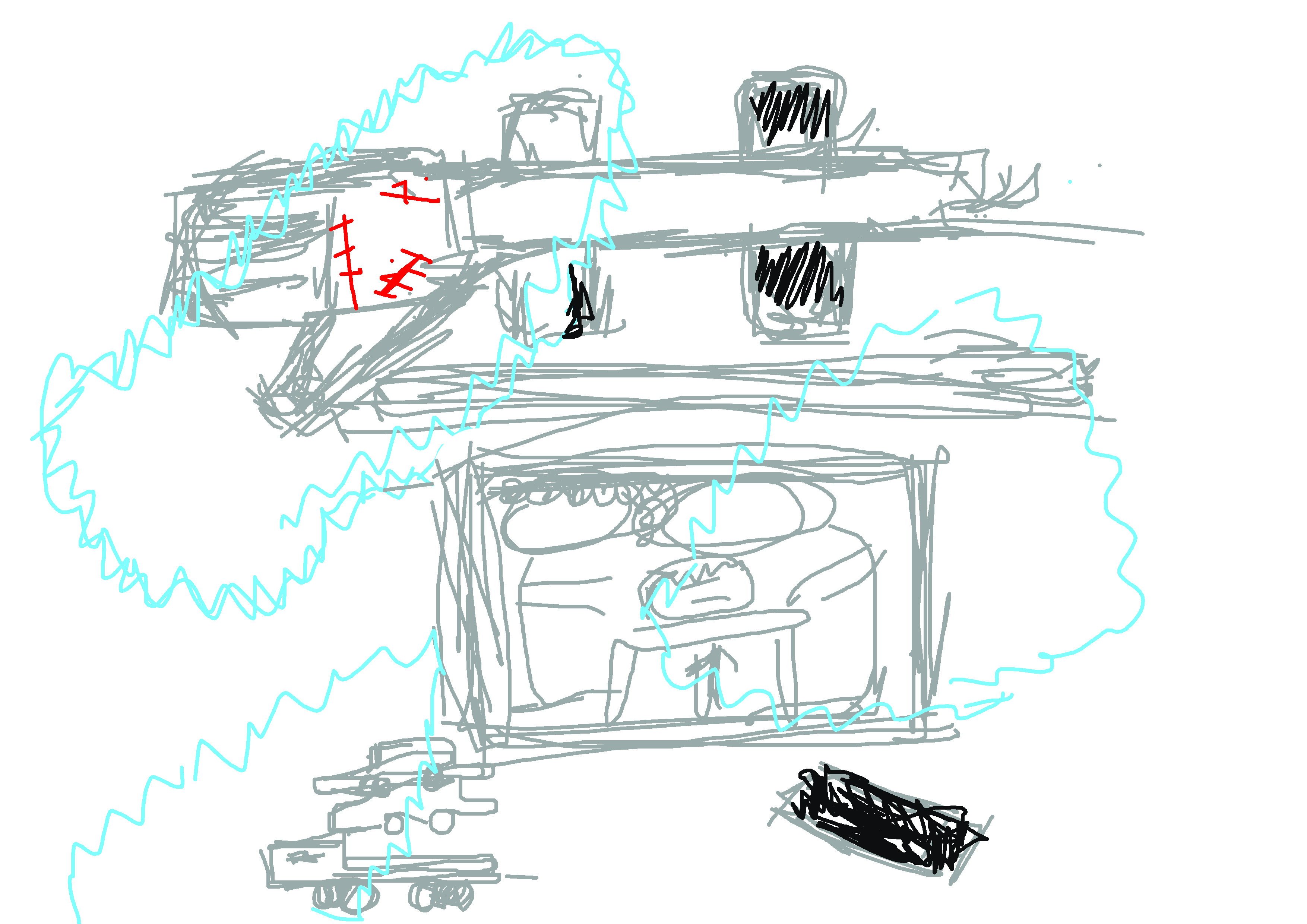
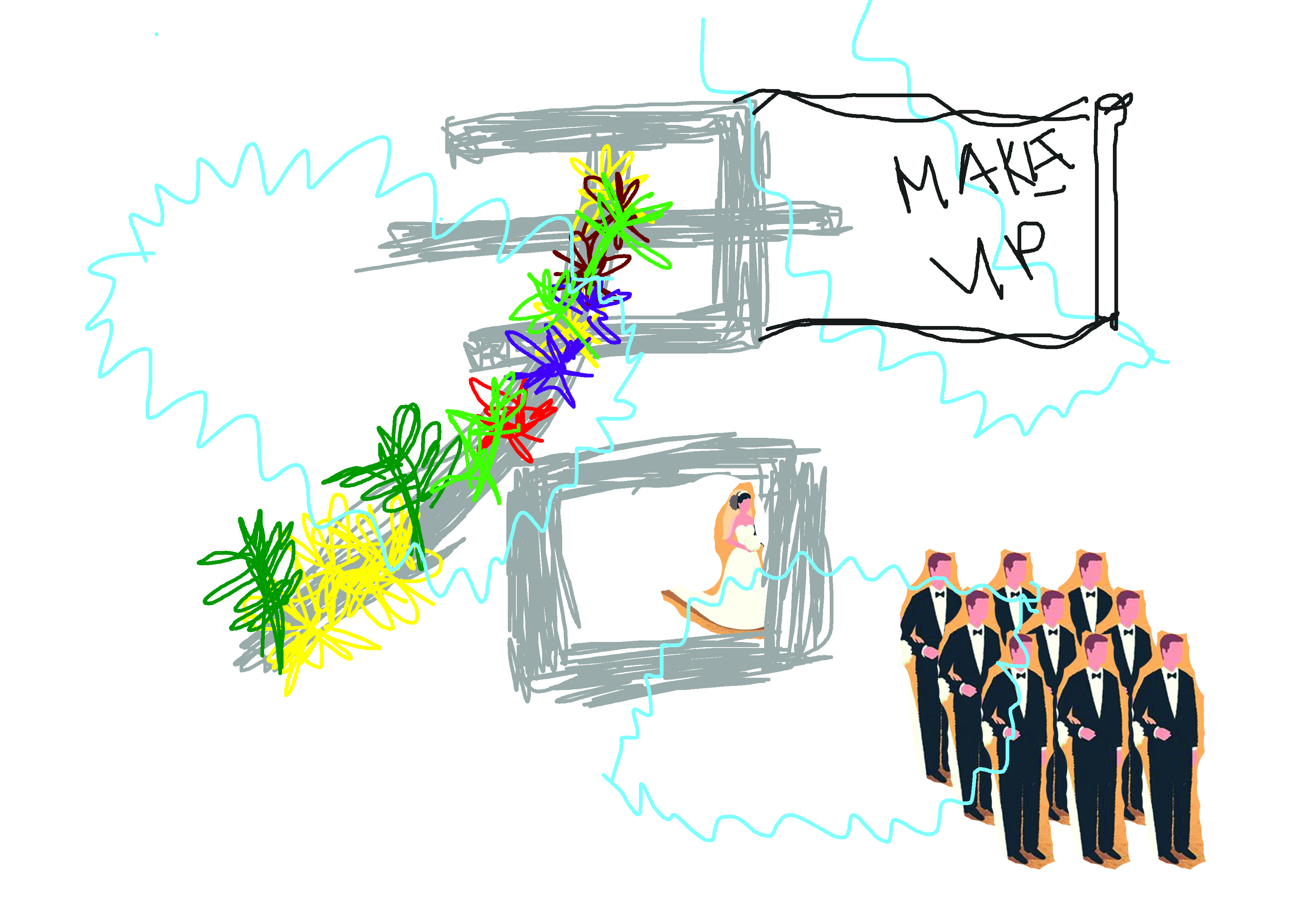
After showing two composition in the last consultation I completed the rest of the draft before I started doing out the final in order to guide me on how I want to arrange my illustration as well as how I want my illustration to interact with the type. I also put in a careful thought on what typeface and which part of my name to use for different composition.
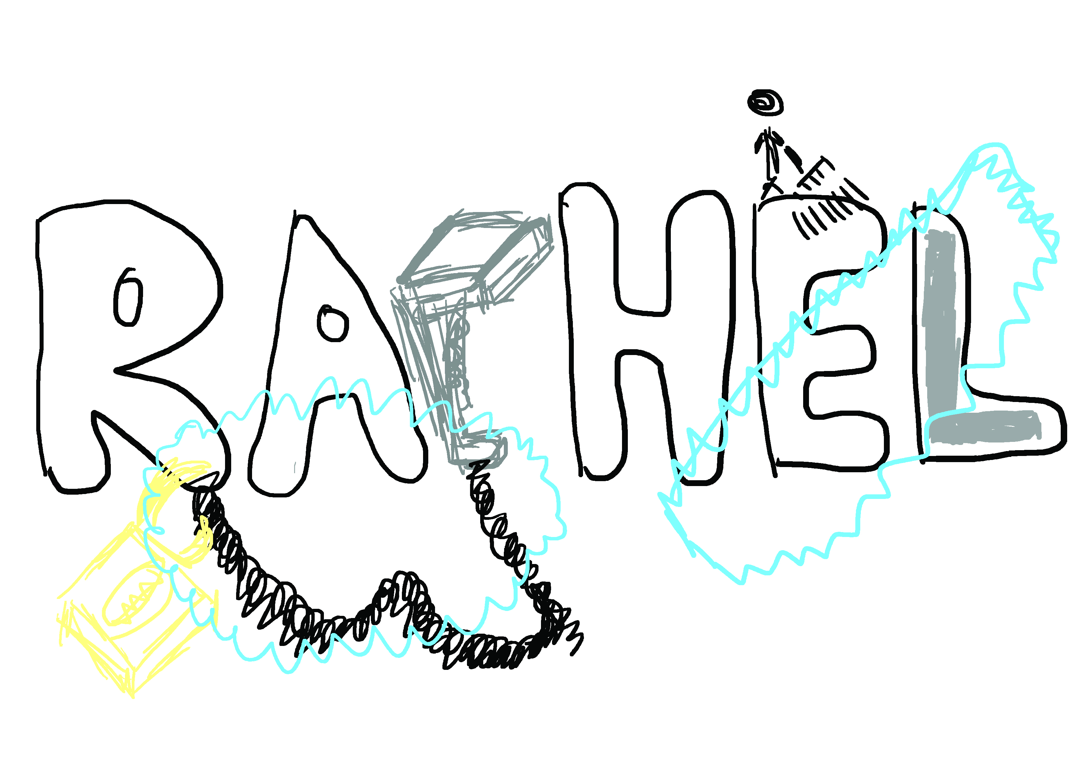
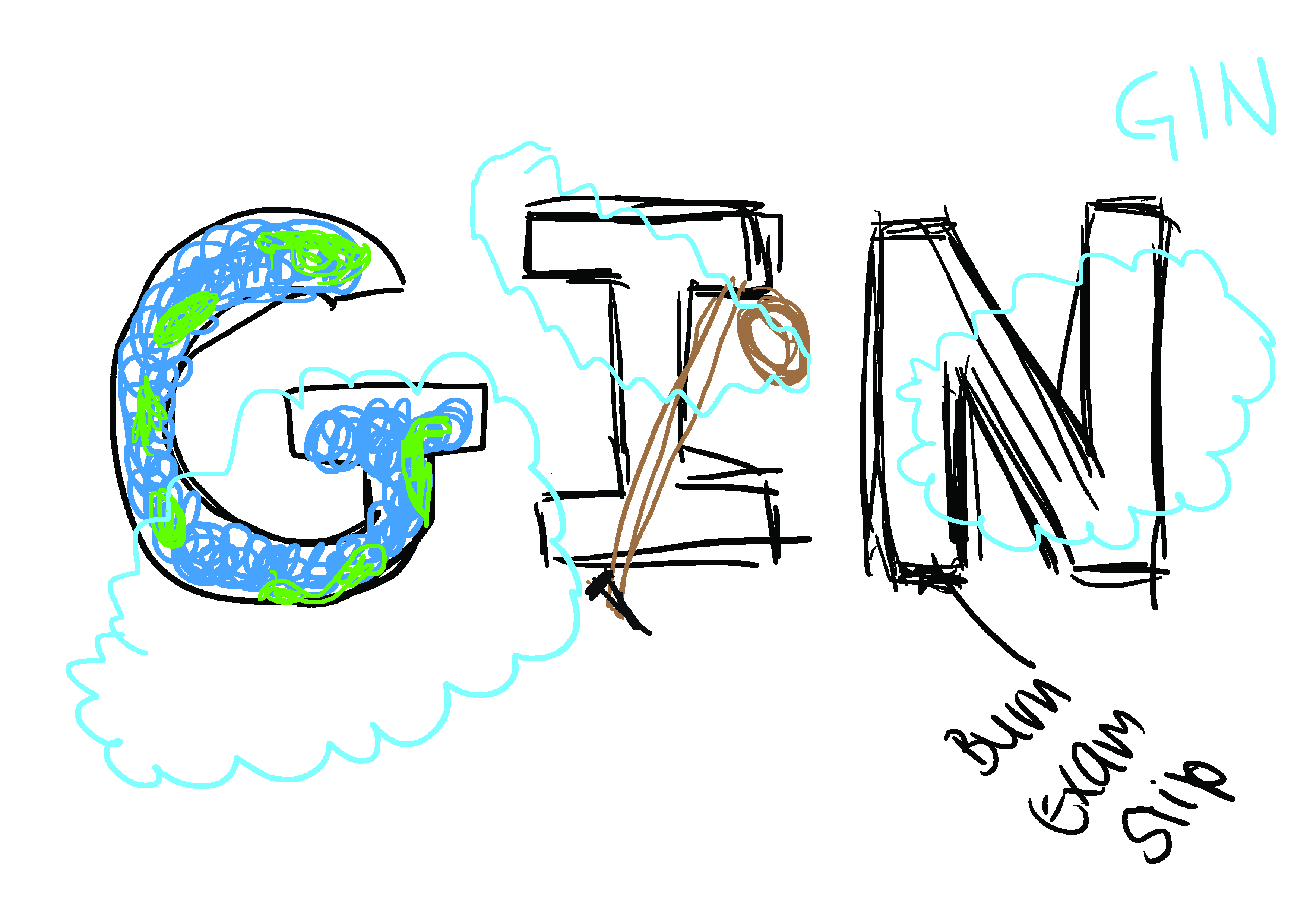
Rachel = Rachel’s very first Job
(Font = bubble, the very first font I use at that young age to draw every time)
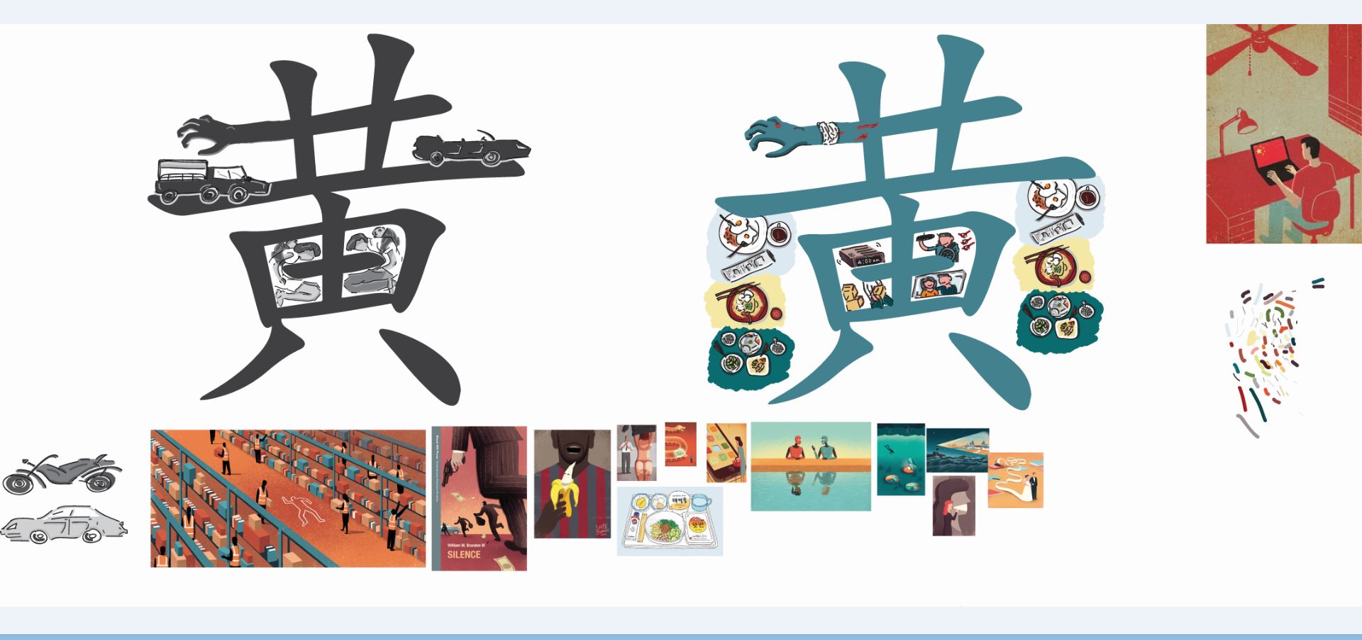
Huang 黄 = Composition inspire from my dad and I am proud of him/he’s and my surname
(Font = Chinese traditional font showing him as a traditional and stubborn person, not rigid)
Jun 君 = Because the stereotype thought on this composition is due to traditional reason therefore Chinese name (Font = This is my dream job when I’m in secondary school, this is how I write jun in secondary school)
GIN = The name I use for design related work and given by my mom, she supported my design path
( Font = clean and more illustrated font)
I also went on to research on artist reference and color reference:)
John Holcroft : http://www.johnholcroft.com/


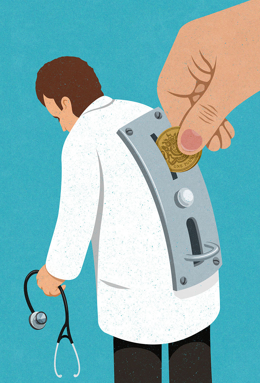


Laura Berger : http://www.lauraberger.com/


Davide bonazzi : http://www.davidebonazzi.com/
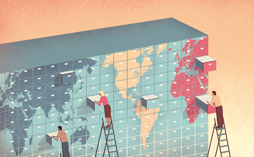


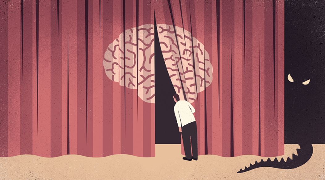
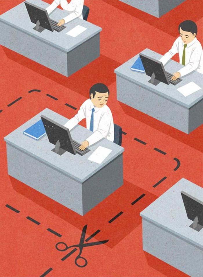
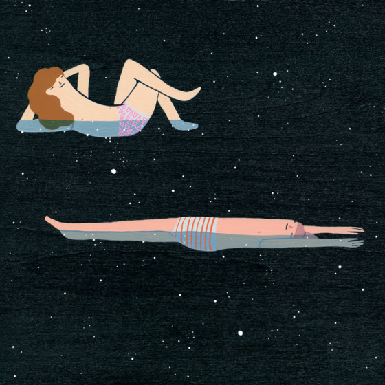
I selected these artist as my reference because through Davide bonazzi and John Holcroft illustration they created simple yet impactful composition, using symbols images and semiotics they created it contains hidden message they are actually pretty harsh in tone. The color tone they use is also pretty much of a warm tone and use no gradient included but mae uses of differenct solid colour in each drawing to create the value and shadow. I also selected Laura Berger because I love how simple her illustration are to create simple drawing without taking much consideration of proportion and realistic on whether the drawing make sense or somewhat whether is it correct in form.
Other reference I took online would be:


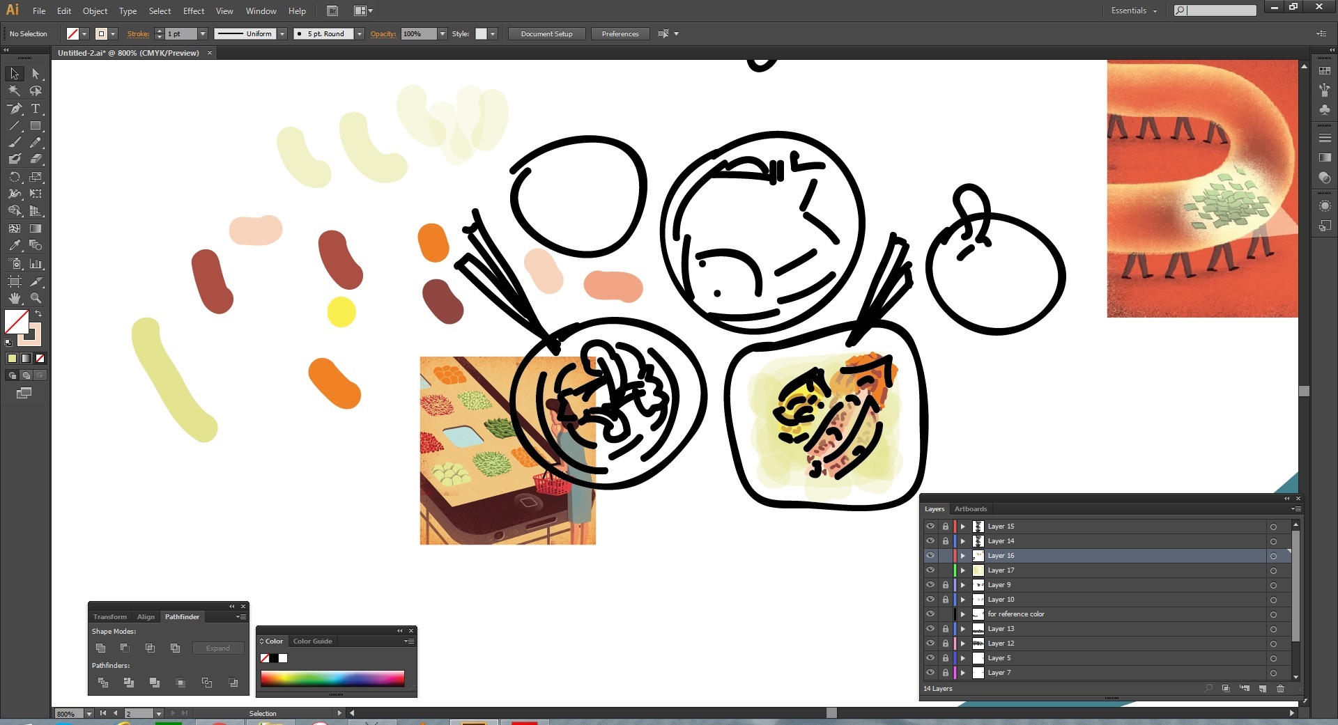
After deciding on style and Color I now start constructing my composition
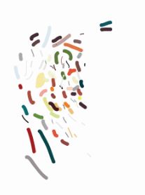
While creating my composition I also invented something called the ” JELLY BEAN COLOUR SWATCHES” nah, its actually just colour I pick out form the artist reference and adjust it to fit my composition and then I would pick colour from the jelly bean colour swatches to fit into different part of my composition.
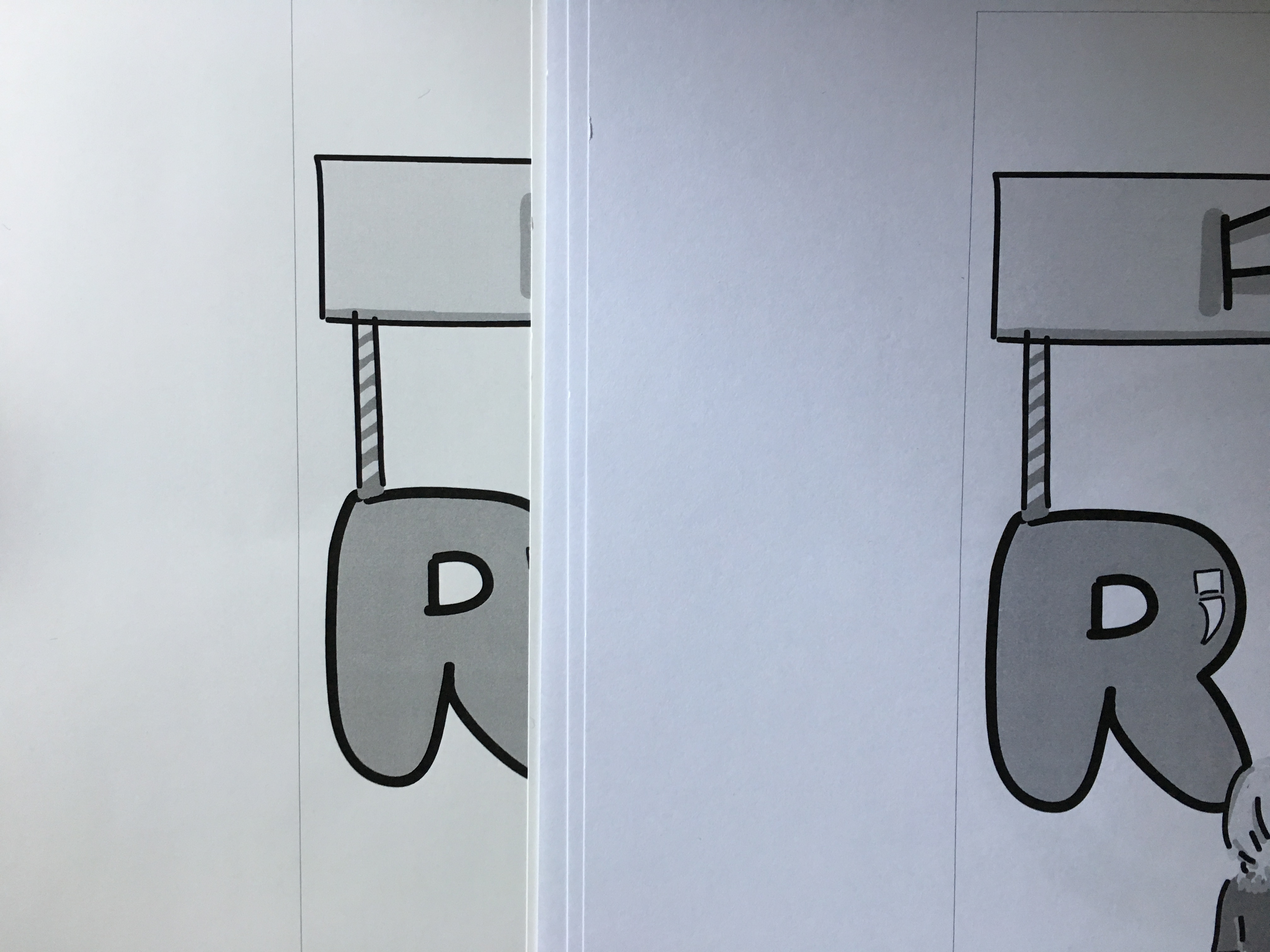
I also did test print on gloss paper just like Joy suggested. However, the gloss paper turns out rather yellowish and it doesn’t match my paper type colour on the back and so I decided to use thick normal paper printing which I think would makes the front and back composition more match.