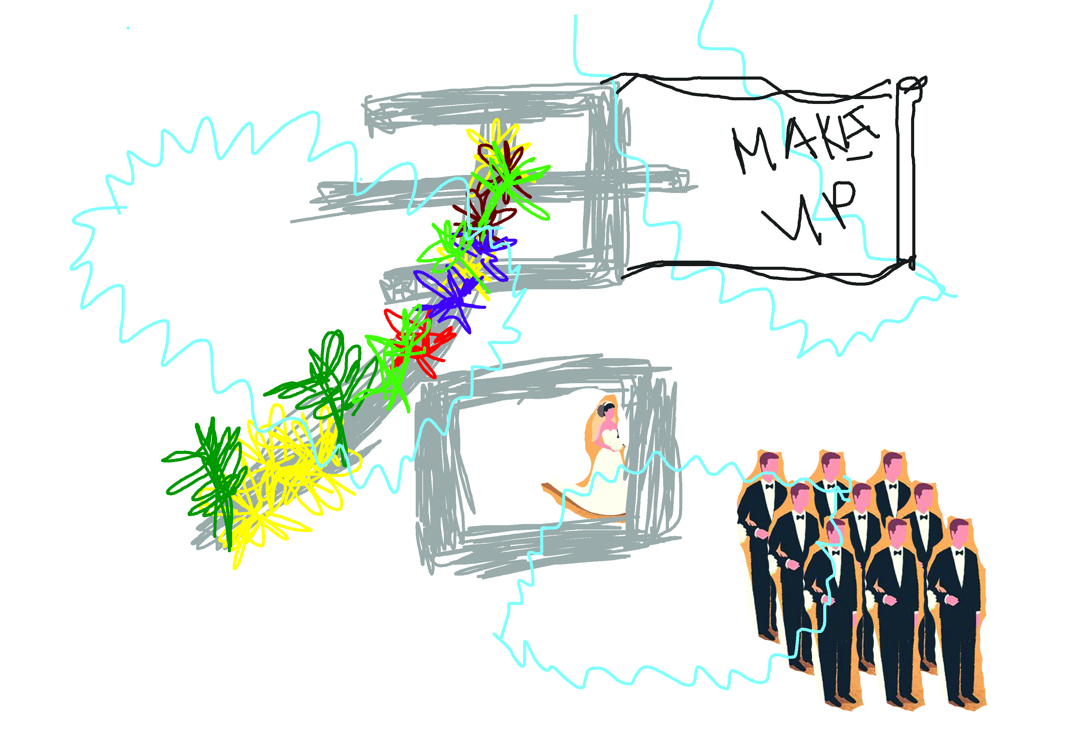
3D II-(Project 2) – Conceptual Object (Concept & Process) – (1)

Process

The word that I was given was Inhibition:) So firstly, what is Inhibition? (Presentation Slide)
 

So after discussing with Peter, he suggested that I could choose either the bad or good inhibition and then critique it. I decided to go with bad inhibition:) I view the bad inhibition as a force that blocks someone to let-go, to open up about who they are and only abandoning his/her inhibition, they can then be who they really are. So, to critique this idea I decided to go with the idea 

“Abandoning your inhibition and opening up is not always the best thing to do, bad emotions,feelings and character  are sometimes more suitable to be kept in”

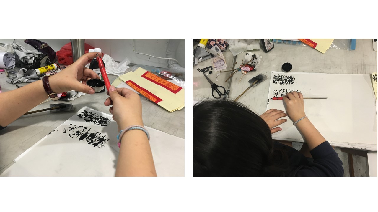
I went on to research on more different conceptual object and installation, Adding on I would also want to try to work with clay this time round:)

I wanted to make big clay head that shows a various of emotions and also with some heads having concept like they are being force or that peeling their skin off (letting go of inhibition) they are actually feeling very naked on the inside. However, I realize the clay was too hard to mold because the air dry clay dries up way too fast and I would be doing carving instead of molding in the end.


Previously, I have work with polymer clay before, and I know that polymer clay would be the best and most suitable clay to mold small and intricate details design. After trying out, I really love the effect, the clay allow me to easily mold various creepy expression and also allow me to add “contour” because of it’s slightly sticky surface. Originally, I thought that 30 heads would be enough but in total 54 heads would then create that fullness inside a acrylic ball.

Make, make, make…………….
 
Bake, bake, bake….

I wanted to create the idea of broken up a sturdy “inhibition” that human created for themselves and flowing out real emotions. So I crack an acrylic ball because I wanted the interior babies head to be seen and acrylic is something that is sturdy. But to explore more, I’ve tried searching online and I’ve got this and I went on to try it out:

You may click on the image, it would link you to this artist:)

But after testing I realize the wet tissue are not strong enough and it doesn’t create the rust effect I wanted to have:( Maybe because of lighting. I should have try placing portable light inside. And also this concept doesn’t allowed the interior babies head to be seen.
After showing peter, he gave me feedbacks such that the acrylic ball is too new looking. The glossy surface doesn’t seem to match the matte babies it took pretty detach. He sad maybe I could frost it ( because on part of it was frost when I tried to remove the price tag using ointment)


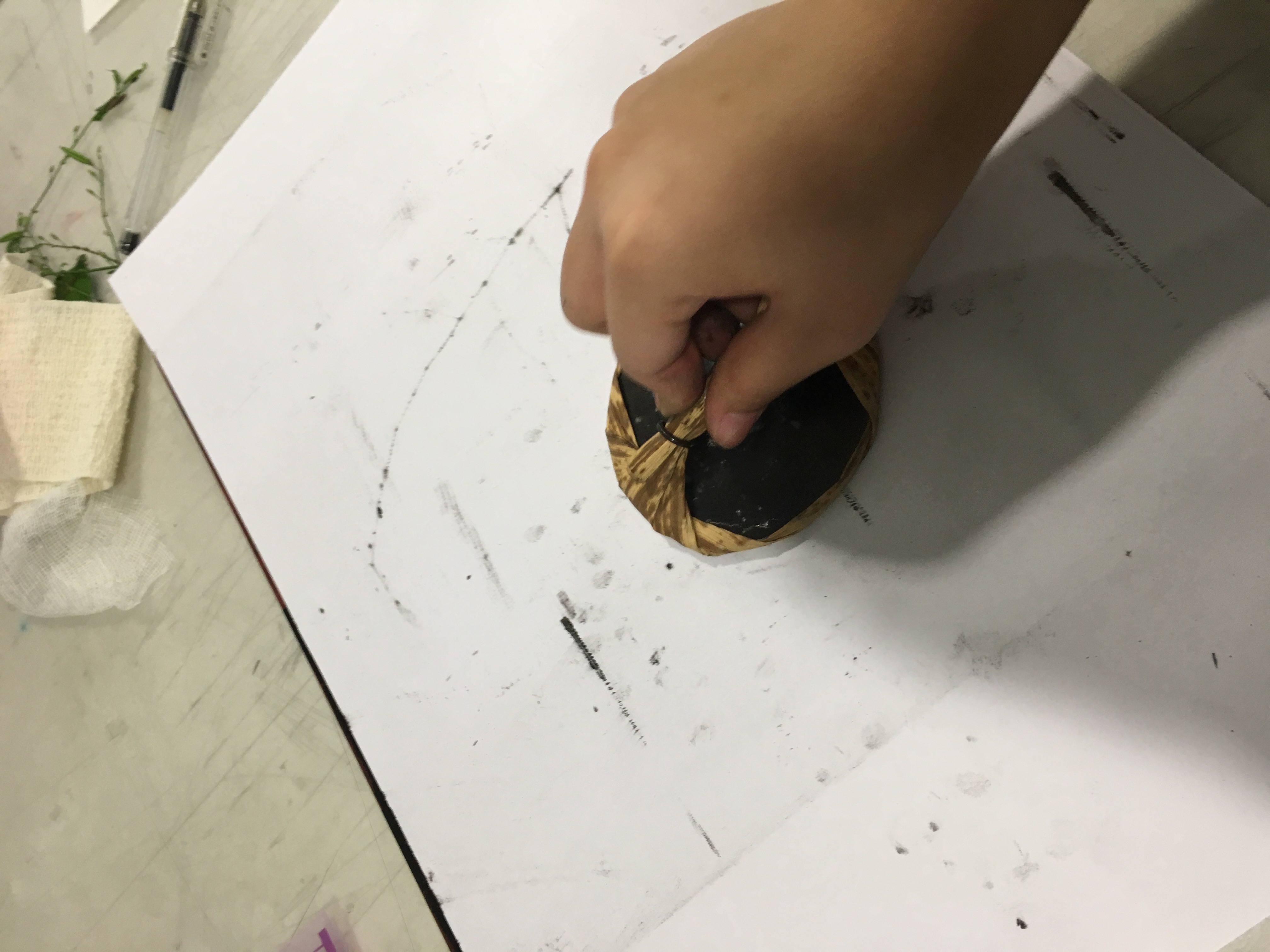
Going back home, I tried using different type of liquid to see which of it gave the best effect. In the end the original frost that I got from Ointment, weirdly I could not get it, reading online it says that it was because originally I have the adhesive  residue left thats why it was frosted. Try, try ,try Finally! the dish washing sponge gave the best effect. Unlike sandpaper, even with the most smooth sandpaper it would still create a very rough and scratchy lines on the ball. But dish washing sponge gave a very natural frosted effect with no lines!
My sister also love to create fake blood for her scars drama effect. So I started having the idea of changing the ball to a mother’s womb. Since womb have always been the protective cover for babies, fitting into the force inhibition cover.
 

FINALL!!

2D II-(Project 1) Que Sera Sera- Visual / Presentation References (2)

com-1com-2

com_3com-4

After showing two composition in the last consultation I completed the rest of the draft before I started doing out the final in order to guide me on how I want to arrange my illustration as well as how I want my illustration to interact with the type. I also put in a careful thought on what typeface and which part of my name to use for different composition. 

Rachel = Rachel’s very first Job
(Font = bubble, the very first font I use at that young age to draw every time)

Huang 黄 = Composition inspire from my dad and I am proud of him/he’s and my surname
(Font = Chinese traditional font showing him as a traditional and stubborn person, not rigid)

Jun 君 = Because the stereotype thought on this composition is due to traditional reason therefore Chinese name (Font = This is my dream job when I’m in secondary school, this is how I write jun in secondary school)

GIN = The name I use for design related work and given by my mom, she supported my design path
( Font = clean and more illustrated font)

I also went on to research on artist reference and color reference:)

John Holcroft : http://www.johnholcroft.com/

Laura Berger : http://www.lauraberger.com/

Davide bonazzi http://www.davidebonazzi.com/

I selected these artist as my reference because through Davide bonazzi and John Holcroft illustration they created simple yet impactful composition, using symbols images and semiotics they created it contains hidden message they are actually pretty harsh in tone. The color tone they use is also pretty much of a warm tone and use no gradient included but mae uses of differenct solid colour in each drawing to create the value and shadow. I also selected Laura Berger because I love how simple her illustration are to create simple drawing without taking much consideration of proportion and realistic on whether the drawing make sense or somewhat whether is it correct in form. 

Other reference I took online would be:

niusnews: Modern Days – Les illustrations drôles et satiriques de Jean Jullien (image): 100 Awesome Graphic Design Work By Jean Jullien: The Mom by Jean Jullien: Cécile Dormeau: claire softley, kitchen, food, illustration, print, editorial, collage, design, colour, mark making: coffee simply #illustration SIMPLE PERO, NO SE PUEDE PRESCINDIR DEL ASA DE LA TAZA !: Rachael Cocker, eggs, food, drawing, design, print, pattern, cooking, illustration:

After deciding on style and Color I now start constructing my composition

capture

f
  Jelly Bean Colour Swatch

1

While creating my composition I also invented something called the ” JELLY BEAN COLOUR SWATCHES” nah, its actually just colour I pick out form the artist reference and adjust it to fit my composition and then I would pick colour from the jelly bean colour swatches to fit into different part of my composition. 

I also did test print on gloss paper just like Joy suggested. However, the gloss paper turns out rather yellowish and it doesn’t match my paper type colour on the back and so I decided to use thick normal paper printing which I think would makes the front and back composition more match.

img_5464

Final!!

2D-(Assignment 1) My Line Is Emo- My “Emo” Journey (2)

Week 1-3

One week ago, before Joy gave us the brief on our project 1. It was the annual Ghost festival, every year during this month I would accompany my family to this nearby coffee shop for a massive gathering prayer with my dads longtime friend.

And the following week after Joy brief us on our assignment, I was like “eh! Why not?” and so i went back home, look through the photos I took and did some research on the ritual and things used during prayer.13892190_1042371339172457_4831935631975631657_nSlide1

Slide2

Also I remember Joy showing us some of our senior work, one did her final work with tree twig, and another one did his work with fish bone. So, after brainstorming, I though “why not i create my work out of material used during the Chinese ghost festival prayers?” It’s kind of creepy I know and I don’t know if i would offend “them”. But oh well, if i didn’t steal from the one used to pray but I buy it for the project, I guess it is just a type of paper medium:)

So, I gather some materials and try it out.

Slide3

Slide4

Slide5

Slide6

Slide7

Slide8

IMG_1366-min

After trying out, I was pretty stuck here because I thought that the strips could only consist of design make up from lines. But after week 3 individual consultation with Joy, I realize what I did previously was wrong. The line represent the strips itself and not the design in it. I also discuss my concept of using prayer material as my medium and she gave me wonderful suggestion whereby i could think about the rituals, e.g praying, splashing alcohol. to create my design.

I try with mediums like :

  • Joss Sticks
  • Tea
  • Candle
  • Rice
  • Salt
  • Paper Money
  • Chinese Ink
  • Paper Coin
  • Dried Vegetation e.g Dao Gi, Facai, Tang Hoon, Mu Er
  • Longan Stem
  • Rambutan Stem

Since I’ve decided to use mainly Chinese Ink and White acrylic ink. I decided to play around with the paper medium and I’ve realize different paper medium fives a total different effect even with the same technique.

  • Newsprint
  • Paper Money (Kim Zhua)
  • White Copy Paper
  • Tracing Paper
  • Black Paper


ee

Back, I tried with Joss sticks. Now without the restriction of creating only lines, I finally realized how fun this project is. I have so much fun creating so many different mark making design with just only joss sticks.

IMG_1886

Week 4

Week 4 marks the end of the Lunar Ghost Festival, as well as the week for group consultation.
2

34

I guess I was having too much fun playing with the praying material and creating different marks before the group consultation, but totally forget that the main aim of this project was to create strips that represent the emotions Love, Fear, Sadness, Surprise, Joy and Anger.

After looking at the marks created I could link them to my emotions. But now that i have decided the strips for the emotions, Problem come. How am i suppose to link my emotions to my concept. Yes I could say that this strip represent this, this strip represent that, but what does it have to do with my concept.

But my wonderful classmate gave me very very very helpful idea during group consultation. They say that I could I use the theme “外面看里面, 里面看外面”, which means how the outside (us humans) see the festival and how the inside (Ghost) see the festival. And I thought this is a wonderful idea!! And i’m so thankful for!:)

Now that I have my concept and Marks ready, it’s time to purchase some papers and construct my final work!!!

2D-(Assignment 1) My Line Is Emo- Mono Printing (1)

To me ( My Line Is Emo) is really an interesting project, not only that I’ve learn new technique, recognized more artist but most importantly I felt like I manage to widen my creativity. I used to be a person that narrows my creativity, not thinking out of the box and always end up stuck in the process of my work. Anyway, photo tells a thousand words so I’m not gonna say much.

Week 2

Week 2 I learn a new technique called mono print, my very first post on oss was about me not knowing anything about mono printing and mark making, now I know!

ad

IMG_1086

Step 1: Roll ink onto mat

Step 2: Place Items on mat( I uses cling wrap in the photo)

IMG_1080 IMG_1075


Step 3: Use a Mono printing machine roll over/ Use a Roller to roll over/ Press it with a flat tool

TADA!!!!IMG_1360-min

We also had a discussion with half of our classmates on the reference artist for this project:) We shared different opinion we have on the artist artwork, style as well as our favorite artists. It was a really helpful activity, even though we research on the same group of artist but eveyone have a different opinion of different artist’s artwork.

For me I choose Andy Warhol because honestly, I can’t get the pee artwork our of my mind HAHA! It was impressive, but errrr………….well, “non-environmental friendly”

P.s I really love the little Cai Guo Qiang my classmate Vania drew on the paper!!!

IMG_1088IMG_1056Artist Research (Reference)

I actually spend quite a lot of time researching on each and every artist, because i don’t really know much artist previously other than Andy Warhol, Leonado Da Vinci or Picasso.

I realize these artist create art in a totally different style. Some creates art based on their family background, some because of political issues, crazy art style and some created art without a story because he doesn’t think there is a need to.

In general, just one week lesson and homework allows me to gain alot of knowledge that I didn’t have before. It was really enjoyable and definitely very helpful for project 1.