Foundation 4D Project: faceTIME

Summary of Project

For our final project in our Foundation 4D class, we were tasked with combining all we have learnt from previous projects to create our final video. While the main focus of our project was time, we could incorporate what ever it is we desired. From photography to video, even an interactive installation piece. For my project, I decided to make a video that depicts a real time footage of two FaceTime calls from different timezones.

Types of Time

Real Time: 

Real Time is also known as clock time, which is the actual time that is passing. It follows the actual, seconds, minutes, hours, days, weeks, and etch perception of time. There is no manipulation or distortion, it is completely raw.
Experienced Time:
Experienced Time is the time that we believe or feel has passed, our experienced time could be longer, shorter, or even exactly the same duration as our real time. Experienced Time has a multitude of different factors, from personal experienced, cultural upbringings, or mental perceptions and schemas.
Biological Time:
Biological Time is the time that is based on our bodily functions. Biological time consists of waking up, going to the bathroom, the time it takes to digest food, and other bodily activities.
Edited Time:
Edited Time is a manipulated version of clock time. Edited Time can range from slow motion to time lapse to even time jumps from one time to another.

(for my project I focused on Real Time that makes you question your Experienced Time)

Project Proposal

4D Project Proposal

Reason Behind Project

The reasoning behind my project stems from personal experience. As a child who has moved around different countries every once and a while, I have had to say goodbye to different friends. These friends either move back to their home country or I end up moving somewhere else. When I was young, keeping in touch was not as important as it is now. This became more of a problem in HighSchool, because our relationship has been through much more and our desire to keep in touch is stronger. However, due to time differences, our means of communication have decreased. We try our best to match each other’s schedule and balance out the video call so that it does not take too much of our sleep time. All these factors have made it very difficult to make video calls frequent, making our video calls that do happen so important and memorable.

Examples of Time Zone Differences

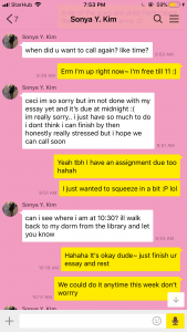
Treasuring every video call because I believed that my friend and I were literally talking to one another at the same time (like we would in the past), I thought we defied the intangible problem of space and time. However, I realized that video call is yet to be perfected, it is constantly lagging and pausing. Messing up our perceived time even more, because I video call that lasted 10 minutes can seem like 15 minutes (filled with pauses and lags). By placing the recordings side by side, I hoped to show that even though it feels like we are in the same room and talking about the same thing, we are actually separated by something more intangible than a mere laptop screen.

I wanted to emphasize the struggle and troubles we go through to talk to our loved ones when we are overseas. And not only is the mode of communication the only problem I wanted to highlight, but also the constant oblivion one feels not knowing what happens to their loved ones who run on an entirely different cycle as them. Specifically, my friend who is studyung in New York is a very close friend of mine; however one day there was an accident involving a man in a truck who injured many people. After hearing this news the next day, I immediately texted my friend and asked if she was alright. My friend responded that she was alright and that after she heard the news the previous afternoon she was worried as well. Though we live in the same world, we experience events and feelings at such different times. This disparity between people and time is the main message I wanted to convey in my project.

World Clock Application

Inspiration for the Video

Modern Family, an American sitcom about an extended family who is quite “modern” and has to deal with the difficulties that come from common social issues such as sexuality, adolescence, cultural identity, judgement, and being connected in such a fast paced society. Modern Family has already reached its ninth season, however, the specific episode that partially inspired this idea was  the sixteenth episode of the sixth season. This episode title “Connection Lost” was filmed entirely on Apple Products, from the Macbook to the iMac to the iPad and iPhone.

Modern Family s6x16 “Connection Lost”

The layout of the entire episode is what you would see on a typical Macbook, as the mother tries to locate the whereabouts of her daughter before her flight back home. This leads to a wild goose chase that involves contacting her entire extended family and creating more moments with one another. While the moral of this story was to draw the line between privacy and technology as well as the importance of taking a break from technology, the way they portrayed this message (through video call) inspired me to try something similar,

Planning the Project

Planning for this video was more tedious then expected. Since the two friends I asked to be a part of my video did not have access to certain equipment, we had to improvise.

For my friend in New York, I had her record the video and audio on her computer while I would record video on my phone (and use someone else’s phone to record the audio). This was difficult because I had to borrow and carry two phones while making it seem natural.

Asking My Friend for the Audio I Recorded on Her Phone

For my friend from Australia, our roles were reversed, I recorded from my computer while she recorded from her phone. The reversal was necessary because her computer was a PC ( and we were unfamiliar with PC’s abilities and was not sure if it could record her computer screen). For many western universities, the past couple of weeks have been exam period; so when my friend and I FaceTimed she was in the library.

Rather than being a difficult video to plan, it was more tedious because of the small trivial inconveniences that arose. I believe this is due to the fact the purpose of this video is to capture a mundane, raw, and every day occurrence. And we can not help these trivial situations to occur because life is full of minor speed bumps that we have to learn to overcome and move on.

Filming the Video

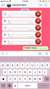
To record the footage, we used the screen recording application on the new IOS for IPhone’s while the audio was recorded using QuickTime’s audio recording function. For the scenes recorded on the computer, we used QuickTIme’s screen recording function.

I  made sure that for my friend in New York that I would be the one who had to film outdoors at night instead of her. This was because I know how dangerous New York can be after dark, even inside her campus. I felt safer if I was the one who had to commute in the dark in NTU because I knew how safe the area was. However, this did end up making her film outside in the cold (slight overcast in Fall).

Making Sure my Friend was Alright After the Call

For some reason the IPhone screen recording disconnects when receiving a call. Which resulted in only having footage from one side of the time zone, the one who made the call. To counteract this problem, one friend was on a computer while the other friend made the call through her phone.

My Friend and I Realizing that only My Screen was Recorded

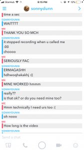
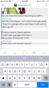
We used GoogleDrive to transfer the files between each other because certain files were too big to fit in one email.

Transferring Files


Editing the Video

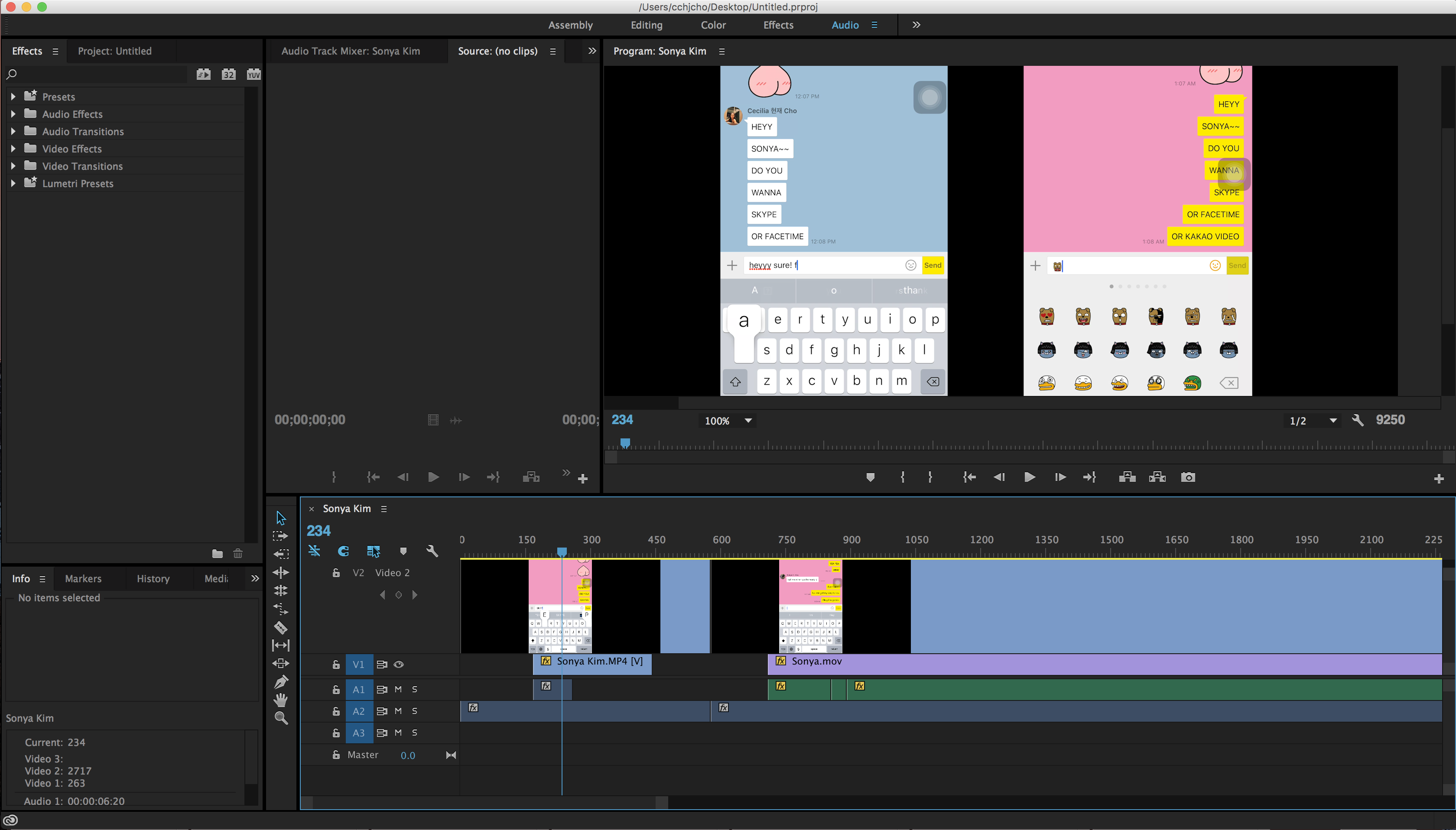
Editing the video was difficult because I have little experience with Premier Pro, however, this was the only application on my laptop that allowed me to create a split screen effect on one composition. This split screen effect was necessary to emphasize the idea of feeling as if we were in the same room but ultimately being in two different parts of the world.

Filming my Friend from New York

However, as I started to work on the video more and more, old memories of how to use Premier Pro came back to me and I was able to create the video with more ease than previous.

Filming my Friend from Australia

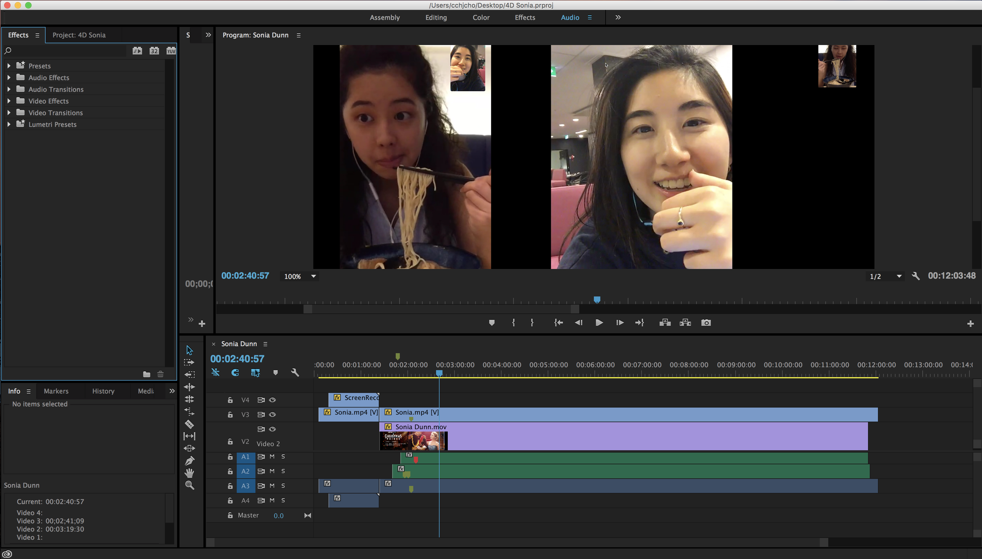
One technicality of this video that was difficult to overcome, was synchronizing the video and audio as accurately as possible. In real life, the audio and the video do not synchronize perfectly instead there are glitches and lags that occur throughout the entire call. And trying to match the audio with the video glitches and the video with audio lags was a very confusing process. In the end I realized that the audio of a certain person will always match the video from that persons phone. This explains why we always feel as if our connection is perfectly fine but there is something wrong with the other person’s connection. Using this as a golden rule, I continued to edit the video.

Displaying the Video

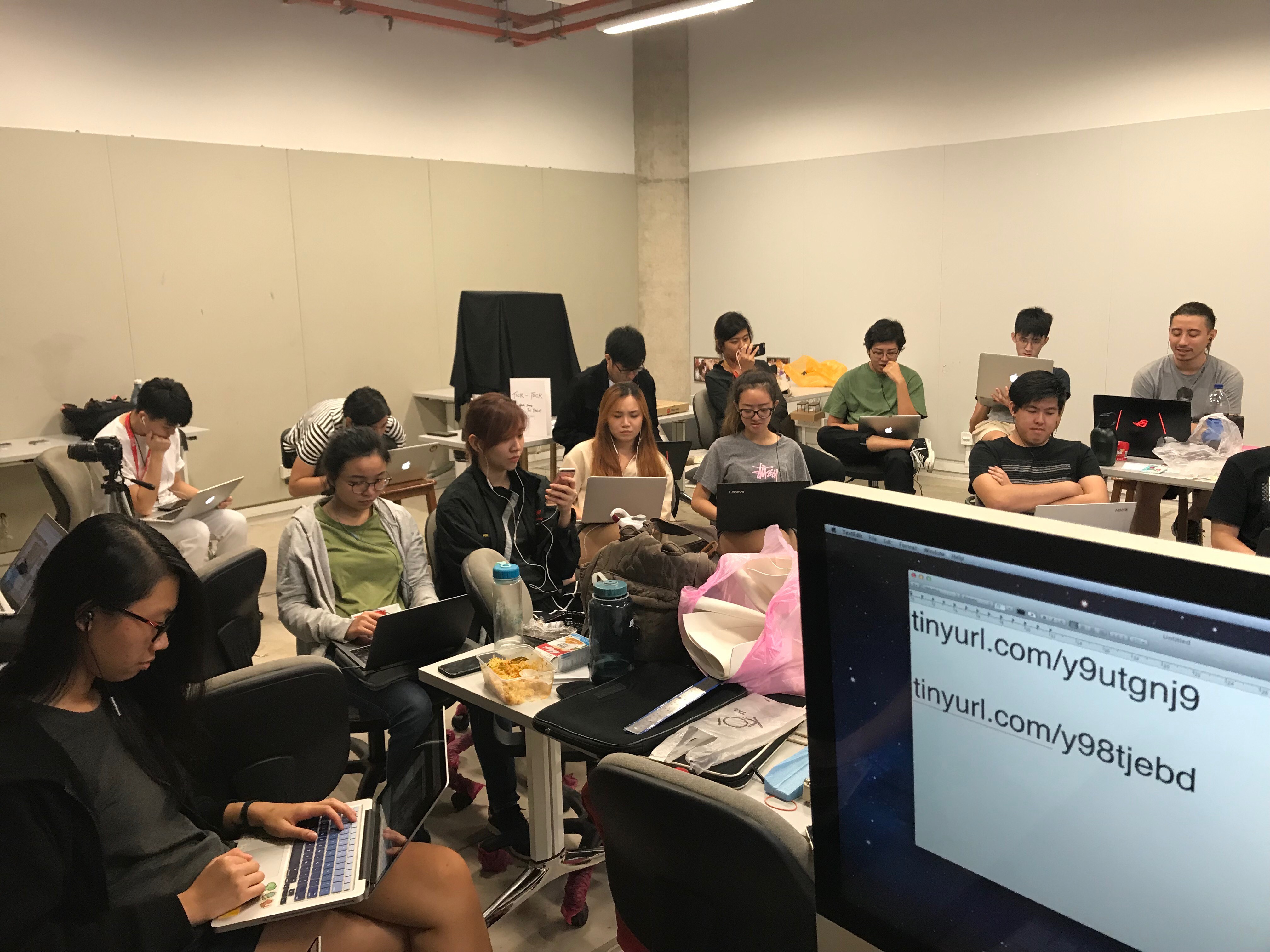
I asked everyone to take out their laptops (or phones) and an earphone when watching my video. This is because I wanted to recreate the same experience one would go through when they are FaceTiming someone. FaceTiming is a very personal one on one experience with the person on the screen and the earphones help block out external noises. My classmates have the option of watching either video, in a way it was more based on chance. I asked my classmates to chose either of the links displayed on the projector screen. Based on the views, I believe that at least 3:4 split between the class.

The Class Watching the Video Individually

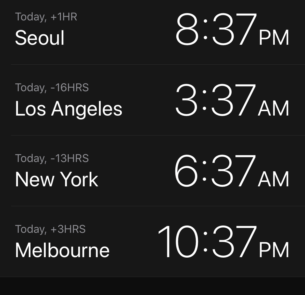
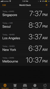
I also named the videos with the respective time difference between me and the friend. One friend who studies in New York City is labeled at -13 because New York is 13 hours earlier than Singapore while my friend who is currently on an exchange program in Australia is labeled as +3 because Australia is 3 hours ahead of Singapore. Choosing to label the video with numbers rather than the country name or my friends name left the viewers wondering what on earth the numbers represented. Not only until they watch the entire video do the viewers start to piece together the clues.

FINAL VIDEOS:

Real Time and Experienced Time

The Real Time:

This project is filmed and projected in real time, so the audience watching the video and the people filming the video are all experiencing real 10 minutes of footage. However, the fact that they are experiencing this clock time of 10 minutes is further confuse the audience after they take note of the time difference and the discrepancies in-between.

The Experienced Time:

I wanted to warp the audiences experienced time by playing with their perception. While they see that the video is roughly 10 minutes long, I hope that in the end they feel as if they watched something longer or something different. I also hope that in the end they wonder what happens after the video and  while my classmates can predict what I could be doing after the video call, I hope that they are curious about what my friends will end up doing as well.

Reflection on the Project

It is so hard sometimes to think about the other side of the world, or even imagine an area that is sleeping soundly while we are commuting from place to place under the bright sun. Social media and Video Platforms may seem like a bane of modern society because of the detrimental effects it has on the youth, but there will always be two sides of a coin. And to me, the positive side of advanced technology is the way it tries its best to connect the world together. Sometimes, technology does not fall through and causes more dissociation through miscommunication and lags; however, in the end it gives us a moment to treasure. Though we live in different countries, cities, and streets or speak different languages and embrace different culture, we still coexist in the same world.

Future Possible Projects

As I was working on this project, I continued to think about other possible projects I could do based off of time. Especially, after the Time Jewelry Series I once sketched a couple years back. Two specific projects, one that deals with the gradual yet unpredictable vulnerability of time and another that like the project above deals with the idea of different times coexisting regardless of A.M. and P.M.


Project 3 Ego

Final Product

Project Summary

As the end of the semester is nearing, so was our final project in Foundation 2D. Unlike the previous 2D projects, this project was different. We got to incorporate color into our compositions. This was a big step for many of us because our previous projects restricted us from using color. I see now, that this was so that we focused on the skill specific to the project. For Project 1, the basis of the project was mark-making. Restricting me from using color helped me focus my attention to making unique and innovative marks. This same revelation can be said for my second project with focused on subverting and composition.

Ego in Different Settings, focused on how us as people are not stationary. We change our behaviour, thought process, and  personality based on different settings or people. Using color to either symbolize or enhance the message we are trying to convey in each row, we created an overall composition containing four rows of three 200mmx200mm boards. The first square represents “me”, the second square represents “the setting/situation”, and the last row represents “the change/ new me”. All the squares are open to our interpretation, it can be abstract or it can be representational. Even our media choices were open ended, we could use traditional or digital medias for any of our squares.

Intro to Color

Color is an important design element that adds, subtracts, or symbolizes certain messages or experiences in a painting. Some people believe that color is embedded within the composition itself and is not just a supplementary addition to embellish an artwork. I believe that it is both, color is a part of our everyday life while adding a little something extra to what we see and experience. Even the absence of color makes us feel and reflect.

With color, there comes color harmony. Specific sets of colors that compliment each other by creating harmony or juxtaposition. Primary colors and Secondary colors fall under a broader harmony set called the Triad color harmony. The triad color harmony creates an equilateral triangle on the color wheel. The Tetrad Color Harmony creates either a square or rectangle on the color wheel (usually contains two sets of complimentary colors). Complimentary Color Harmony is a pair of colors on opposite ends of the color wheel, this pair is compliments each other because of the contrast it creates. From complimentary colors, comes Split Complimentary Color Harmony. Split Complimentary Color Harmony is when you take one color and take the two adjacent colors to the right and left of the complimentary color for the first color. Split complimentary creates the same contrast as complimentary yet it is less jarring in comparison. Analogous Color Harmony is when you take the colors right and left of one base color. And finally Monochrome Color Harmony, which takes one color and plays with the tone, shades, saturation, and tints.

Color Harmony Chart

Row 1

Uncooked Ramen+ Formal Setting= Uncooked Pasta

Summary:

For row 1, I decided to focus on my outer appearance; specifically my hair. My hair has always been a dilemma for me. When I was young, every one wanted and had straight hair; I was the only one with curly hair. This led to a decrease in confidence for my hair for the the longest time in my life. I would rebond my hair frequently, however after seeing the damage it could have to my hair’s health, I decided to grow out my natural curls and merely straighten it with a hair iron during important events. This was because, even though I started to regain my confidence for my hair; curly hair is still quite difficult to manage and visually messy in comparison to straight hair. This is why I straightened my hair during important events or formal situations.

I decided to use acrylic paint not only because it is one of my favorite media but also because it creates a specific texture to the composition.

Color:

Square 1:

Since the original packaging of the instant noodle packaging was red, I decided to work with it and make my first square an analagous of red. Coincidently, red is also the color that represents passion and energy, qualities I have garnered towards my curly hair that can not be tamed. Because the focus on the composition is my instant noodles, I experiemented on ways to make the bachground harmonious with the noodle. Initially I planned on scraping a mixture of red and white onto the canvas. However, that made the overall composition chaotic and messy. My second plan was to take the base color (red) and paint the background a very vibrant and bold hue of red. Yet this decision also distracted the viewers focus from the center object. In the end I went for a slight tint of the base color in the background, enhancing the color harmony while not distracting from the focal point.

Square 2:

For square 2 I decided to go for complimentary colors (with a hint of Tetrad color harmony to pay homage to the first and last composition). The reason why I chose purple to be my base color as purple was because purple is the color commonly associated with royalty and formality. Yellow (purple’s complimentary color) is associated with gold (especially the darker yellow) because of the antiquity of the shade. Royalty and gold was meant to symbolize the importance and formality of the the dining table layout. The small hints of green and red were sneak peaks of what came before and what will come in the last composition.

Square 3:

I specifically looked for a green pasta bag, because I wanted to create the contrast from the first square. The green and red (complimentary color) added to the 180 difference that can be felt from having curly hair to straight hair. And since the last square was supposed to be a mirror of the first square, I chose to use a green analogous color harmony. This worked out in the end because the noodles in square 1 are more orange in hue while the pastas in sqaure 3 are more yellow in hue.

Original Sketch/Brain Storm (refer to sketchbook) :

I chose to use instant ramen to represent my curly hair because of an old illustration I planned on creating. I also specifically chose the “Shin Ramen” brand instant noodles because it is the most popular (both inside and out of Korea) instant noodle brand from my birth country. The second square shows a formal dining setting with a very classy and expensive meal and cutlery. The third square has a painting of uncooked spaghetti noodles. The pasta represents my straight hair, and the foreign brand symbolizes the strange feeling, and even alienation I now feel towards myself when my hair is straight.

Reference Images:

Reference Images Photoshopped to Help Visualize the Overall Composition

Process:

While it was tough getting back into acrylic paint after so long, my hands started to loosen up and get back to the old medium I love.

Painting my Squares

POWER OF WHITE PAINT

White paint served to vital functions in my composition. The first being the color to cover up all my pencil marks and the second being a base for my future colors so that the color could come out more vibrant and clear (especially because the acrylic paint I used was lighter).

Painting my Squares

Row 2

CHOcolate+ Singapura= cHOcolaTe

Summary:

Row 2 talked about a physical reaction I have to a certain environment. Specifically, my bodies reaction to heat. I illustrated the reaction based off of what happens to chocolate in the sun. The first square shows a representation of me, dark chocolate. I chose dark chocolate for two reasons; the first is because I really like dark chocolate, and the second is because my last name “cho” is in the word “CHOcolate”. The second square represents the hot climate of Singapore, by having the Merlion with sunglasses and a parasol. The last square is a picture of the same chocolate from square 1, but it is melting in the corner. This symbolizes me sweating due to the heat of the sun.

I chose to use a digital medium for this row.

Color:

Square 1:

Following the color of dark chocolate, I chose to make my color scheme monochromes of brown (which is a dark shade of red/orange). The grooves and highlights of the chocolate are all just from the same family of brown.

It was very difficult finding the right shade of dark chocolate that was not black.

Finding the Right Dark Chocolate

Square 2:

I decided to settle on yellow monochrome because it symbolizes the sun and heat. A very saturated yellow at times can bring out the vibrancy and happiness felt on a nice sunny day. I was originally going to use a deep blue-green because it was the complimentary hue of red-orange. This was to help create the contrast between chocolate and hot weather, two things that should not mix.

Blue-Green

Square 3:

Since square 3 was merely a reflection of square 1 with a melted corner, the color scheme stayed relatively similar to the original square. There was an addition of one or two darker and lighter shades to add extra emphasis and realism to the melting chocolate.

Original Sketch/Brain Storm (refer to sketchbook) :

The name of the chocolate was a longstanding pun that I hoped I would be able to use sometime in my future works.

Row 3

Seemingly Normal+ Count With Me. 1. 2. 3.= Nevermind

Summary:

For my third row, I decided to focus on my personality. From my exterior appearence one would believe that I am normal, simple– not so different from anyone else. But once you get to know me, truly get to know who I am, I am a very quirky, weird, and 4-Dimensional person. I chose a passion fruit to represent this idea of a seemingly normal but quirky personality of mine.

Color:

Square 1:

For square 1, I decided to use the split complimentary of violet. Violet is the color commonly associated with a passion fruit’s exterior. The Yellow-Orange and green create a sense of contrast and help the violet passion fruit stand out.

Square 2:

Square 2’s color scheme is a monochrome of blue. I chose blue because blue is commonly associated with hospital’s (more specifically surgeries) and it also creates a sterile and clean perception to the square.

Square 3:

For square 3, I chose the tetrad color scheme of (Violet, Yellow, Red, and Green). This encompasses the colors of the passion fruit and adds a quirky combination of different colors.

Original Sketch/Brain Storm (refer to sketchbook):

I alway come off as slightly more reserved towards people who have yet gotten to know me well. This is because I am scared that the reaction upon seeing my personality will be negative. Lately, I have been showing my
“weirdness” to people in small doses so that I can learn to be more confident with myself. The action of opening up is represented in a surgeon getting ready for his procedure (getting to know me). This is because surgeon literally have to open up their patients during surgeries. Before the nurses give you the anaesthetic before surgery, the ask you to “count with me (them). 1. 2. 3.” and as you count, your mind slowly falls asleep.

I chose the passion fruit because the exterior of the passion fruit is seemingly normal, like any other fruit, however, when you open it up it is different, unique, even quirky and strange. This is a very accurate representation of my personality when someone tries to get to know me.

Process:

Compilation of my Water Color Swatches (appears more fluorescent on post)

Row 4

Summary:

Tomato+Tomato Farm+ Toma-NO

For my final row, I focused on something more superficial about me. Nothing too deep but at the same time nothing to obvious. Which is why I decided to focus on my reaction when I am put in a setting where I have to see or smell a tomato. I like tomatos when they are grilled or in salsa, but the smell of the raw tomato itself does not sit well with my stomach.

Color:

For all three squares, I used complimentary colors. I used complimentary colors to reflect the contrast and disparity between the affection I have for tomatos (specifically raw tomatos).

Square 1:

The first square is the pair, blue and orange. While I struggled to find the right shade of blue that did not come out blue-violet on the printer, I chose blue for a a specific reason. According to research, blue is a difficult color to find in nature, specifically in food. And when we see blue food, we tend to be repulsed or confused because of the color. This is why I chose blue for the color of my tomato, to represent the same confusion and unsettling feeling that arises whenever I see a tomato.

Square 2:

Square 2 is yellow and violet because purple represents creativity. I felt that creating a tomato perfume was a very creative feet on my part (yay).

Square 3:

Lastly, square 3 is green and red. I chose green because green is usually assoicaited with sickness, vomit, and other ailments.  Bringing that feeling over and pairing it with a toilet seat gives us the image/ impression of vomiting. This is the same feeling that arises when I smell or eat a raw tomato.

Original Sketch/Brain Storm (refer to sketchbook):

My color scheme and style of the overall row was inspired from Andy Warhol’s Marilyn Diptych.  I took the pop art style of posterizing the image to contrasting colors into consideration when I created my row.

Reflection

Through this project, I have understood the importance of color in the overall visual execution and emotional delivery of an artwork. Though I have a lot more to learn about color harmony and the most effective ways to employ it, I have left the project knowing so much more about color harmony. I hope that in the future I can explore more techniques like color illusion to make my works even more compelling and innovative. This project also gave me more time to reflect about myself and understand who I am, I hope to incorporate more of myself in future artworks.


Final Product with Classmates Critique

I could not add several process works because I exceeded the maximum files I can upload on one post.