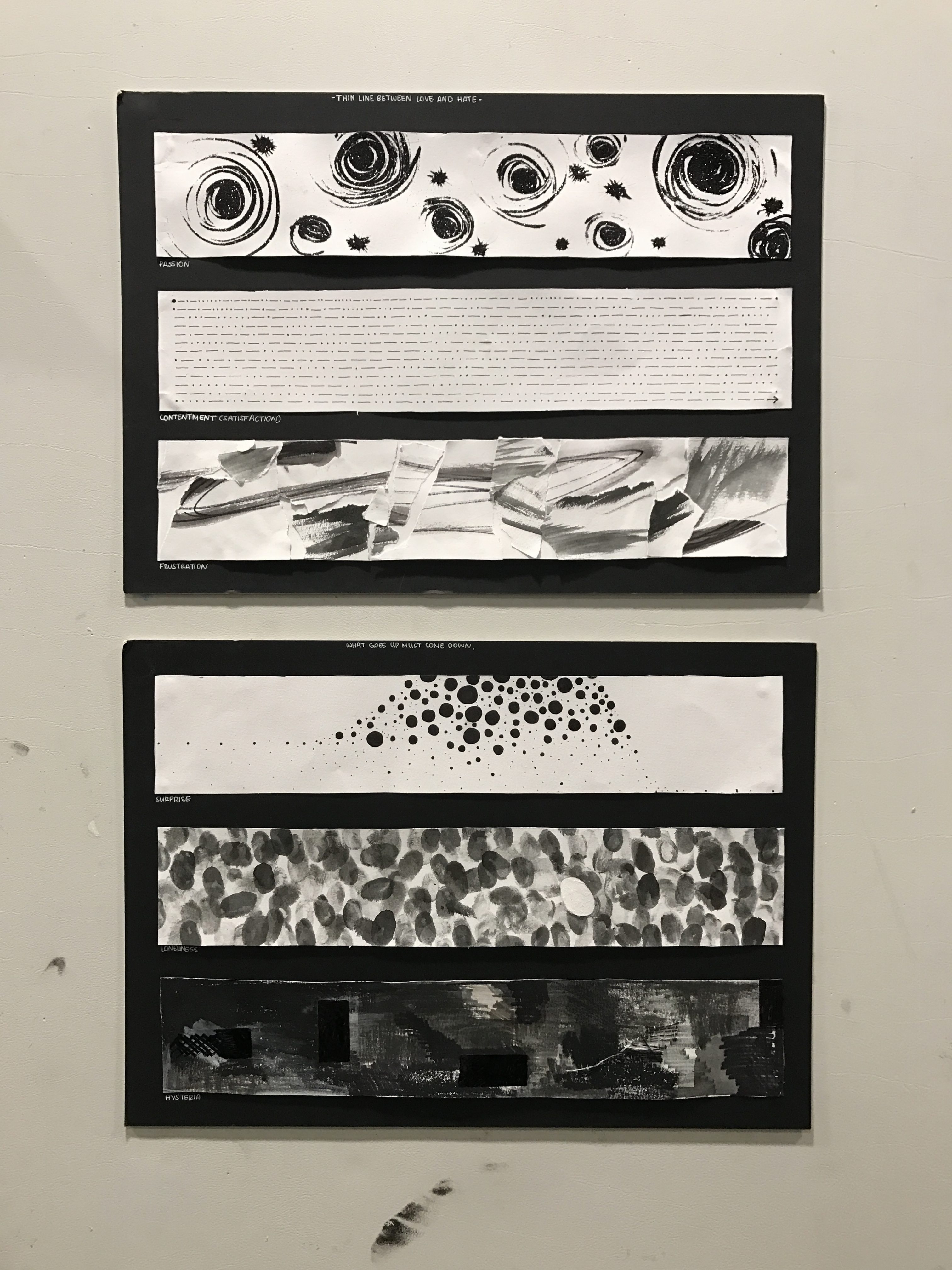
Project Summary
As the end of the semester is nearing, so was our final project in Foundation 2D. Unlike the previous 2D projects, this project was different. We got to incorporate color into our compositions. This was a big step for many of us because our previous projects restricted us from using color. I see now, that this was so that we focused on the skill specific to the project. For Project 1, the basis of the project was mark-making. Restricting me from using color helped me focus my attention to making unique and innovative marks. This same revelation can be said for my second project with focused on subverting and composition.
Ego in Different Settings, focused on how us as people are not stationary. We change our behaviour, thought process, and personality based on different settings or people. Using color to either symbolize or enhance the message we are trying to convey in each row, we created an overall composition containing four rows of three 200mmx200mm boards. The first square represents “me”, the second square represents “the setting/situation”, and the last row represents “the change/ new me”. All the squares are open to our interpretation, it can be abstract or it can be representational. Even our media choices were open ended, we could use traditional or digital medias for any of our squares.
Intro to Color
Color is an important design element that adds, subtracts, or symbolizes certain messages or experiences in a painting. Some people believe that color is embedded within the composition itself and is not just a supplementary addition to embellish an artwork. I believe that it is both, color is a part of our everyday life while adding a little something extra to what we see and experience. Even the absence of color makes us feel and reflect.
With color, there comes color harmony. Specific sets of colors that compliment each other by creating harmony or juxtaposition. Primary colors and Secondary colors fall under a broader harmony set called the Triad color harmony. The triad color harmony creates an equilateral triangle on the color wheel. The Tetrad Color Harmony creates either a square or rectangle on the color wheel (usually contains two sets of complimentary colors). Complimentary Color Harmony is a pair of colors on opposite ends of the color wheel, this pair is compliments each other because of the contrast it creates. From complimentary colors, comes Split Complimentary Color Harmony. Split Complimentary Color Harmony is when you take one color and take the two adjacent colors to the right and left of the complimentary color for the first color. Split complimentary creates the same contrast as complimentary yet it is less jarring in comparison. Analogous Color Harmony is when you take the colors right and left of one base color. And finally Monochrome Color Harmony, which takes one color and plays with the tone, shades, saturation, and tints.

Row 1
Summary:
For row 1, I decided to focus on my outer appearance; specifically my hair. My hair has always been a dilemma for me. When I was young, every one wanted and had straight hair; I was the only one with curly hair. This led to a decrease in confidence for my hair for the the longest time in my life. I would rebond my hair frequently, however after seeing the damage it could have to my hair’s health, I decided to grow out my natural curls and merely straighten it with a hair iron during important events. This was because, even though I started to regain my confidence for my hair; curly hair is still quite difficult to manage and visually messy in comparison to straight hair. This is why I straightened my hair during important events or formal situations.
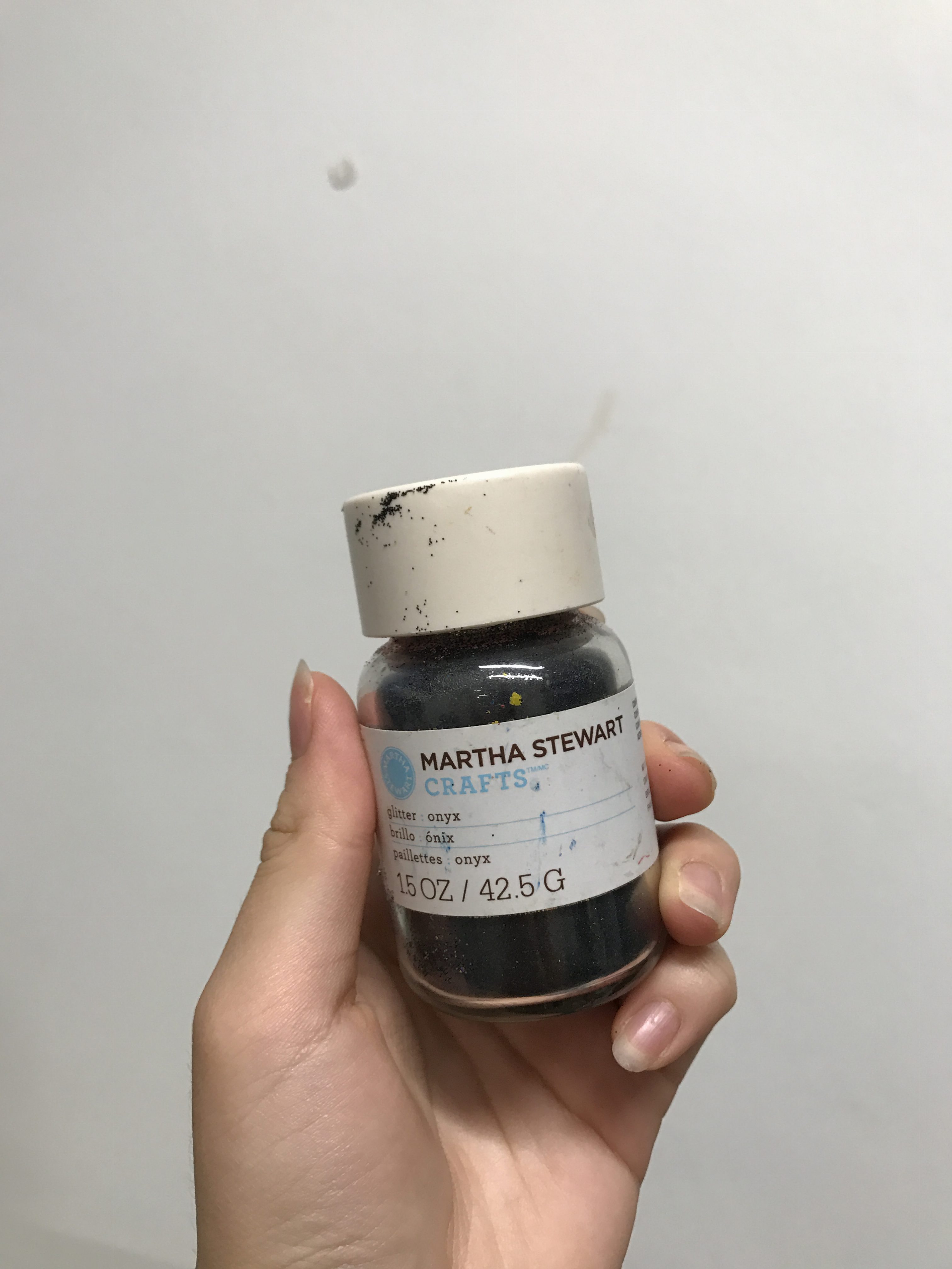
I decided to use acrylic paint not only because it is one of my favorite media but also because it creates a specific texture to the composition.
Color:
Square 1:
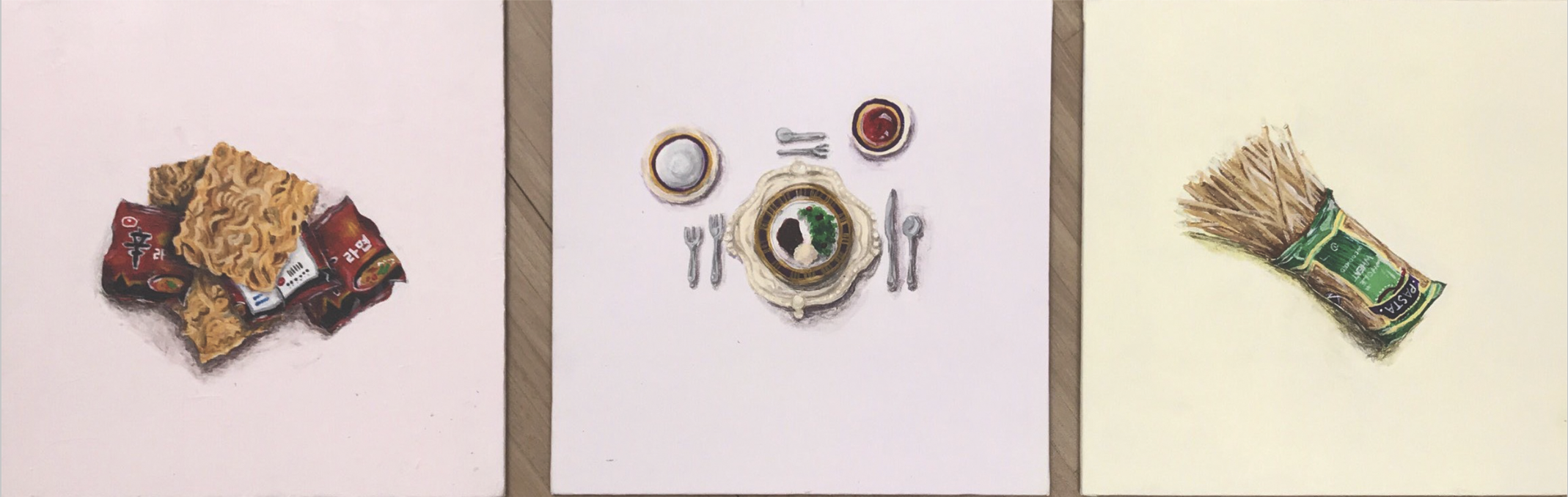
Since the original packaging of the instant noodle packaging was red, I decided to work with it and make my first square an analagous of red. Coincidently, red is also the color that represents passion and energy, qualities I have garnered towards my curly hair that can not be tamed. Because the focus on the composition is my instant noodles, I experiemented on ways to make the bachground harmonious with the noodle. Initially I planned on scraping a mixture of red and white onto the canvas. However, that made the overall composition chaotic and messy. My second plan was to take the base color (red) and paint the background a very vibrant and bold hue of red. Yet this decision also distracted the viewers focus from the center object. In the end I went for a slight tint of the base color in the background, enhancing the color harmony while not distracting from the focal point.
Square 2:
For square 2 I decided to go for complimentary colors (with a hint of Tetrad color harmony to pay homage to the first and last composition). The reason why I chose purple to be my base color as purple was because purple is the color commonly associated with royalty and formality. Yellow (purple’s complimentary color) is associated with gold (especially the darker yellow) because of the antiquity of the shade. Royalty and gold was meant to symbolize the importance and formality of the the dining table layout. The small hints of green and red were sneak peaks of what came before and what will come in the last composition.
Square 3:
I specifically looked for a green pasta bag, because I wanted to create the contrast from the first square. The green and red (complimentary color) added to the 180 difference that can be felt from having curly hair to straight hair. And since the last square was supposed to be a mirror of the first square, I chose to use a green analogous color harmony. This worked out in the end because the noodles in square 1 are more orange in hue while the pastas in sqaure 3 are more yellow in hue.
Original Sketch/Brain Storm (refer to sketchbook) :
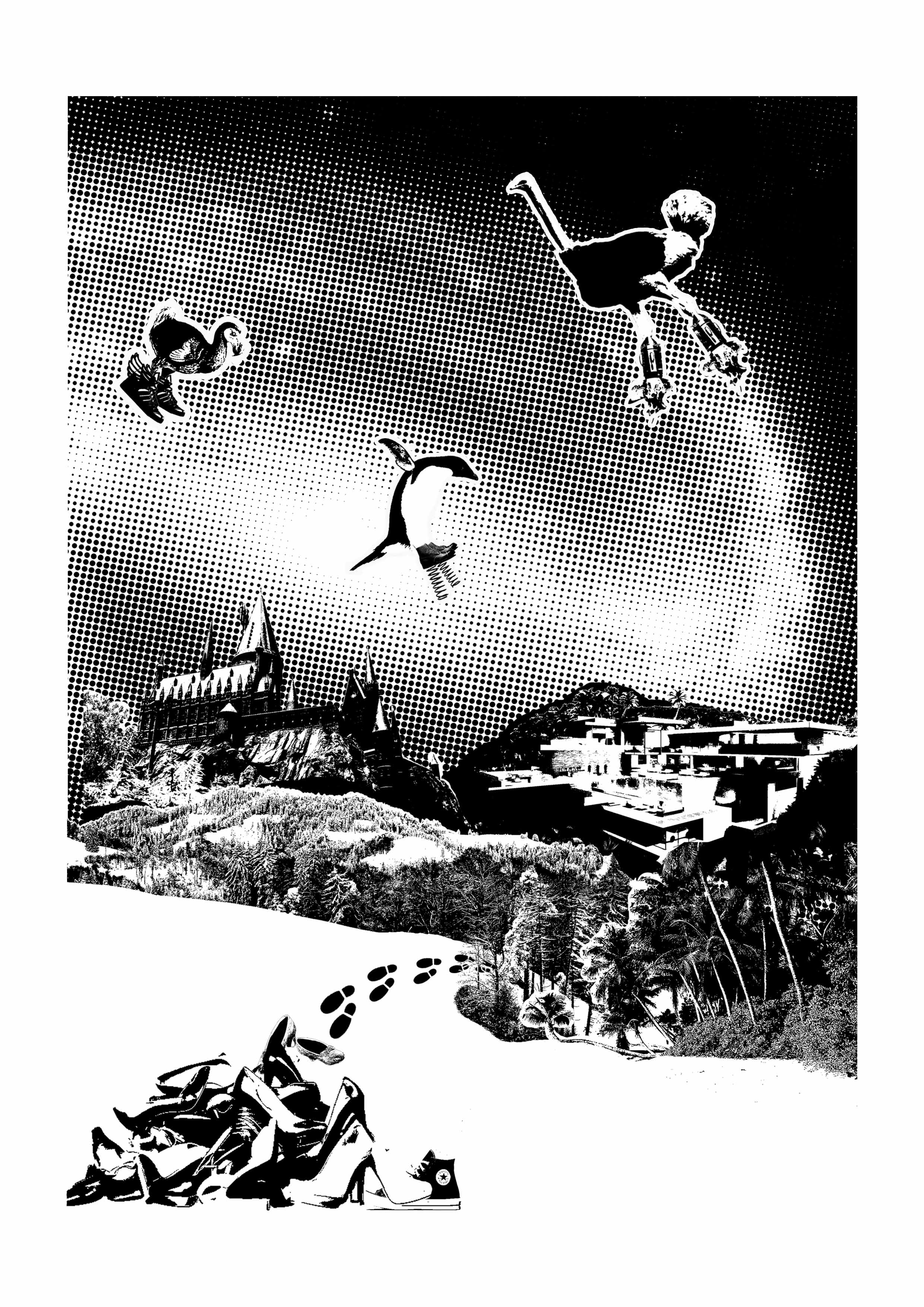
I chose to use instant ramen to represent my curly hair because of an old illustration I planned on creating. I also specifically chose the “Shin Ramen” brand instant noodles because it is the most popular (both inside and out of Korea) instant noodle brand from my birth country. The second square shows a formal dining setting with a very classy and expensive meal and cutlery. The third square has a painting of uncooked spaghetti noodles. The pasta represents my straight hair, and the foreign brand symbolizes the strange feeling, and even alienation I now feel towards myself when my hair is straight.
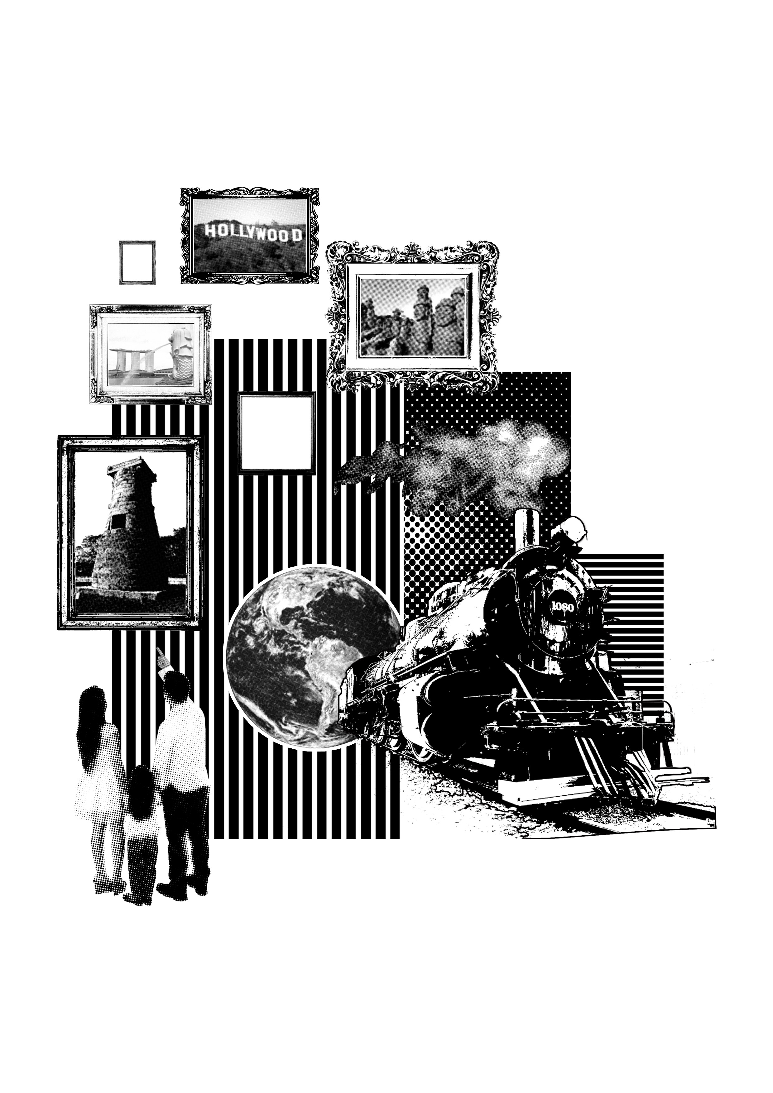
Reference Images:

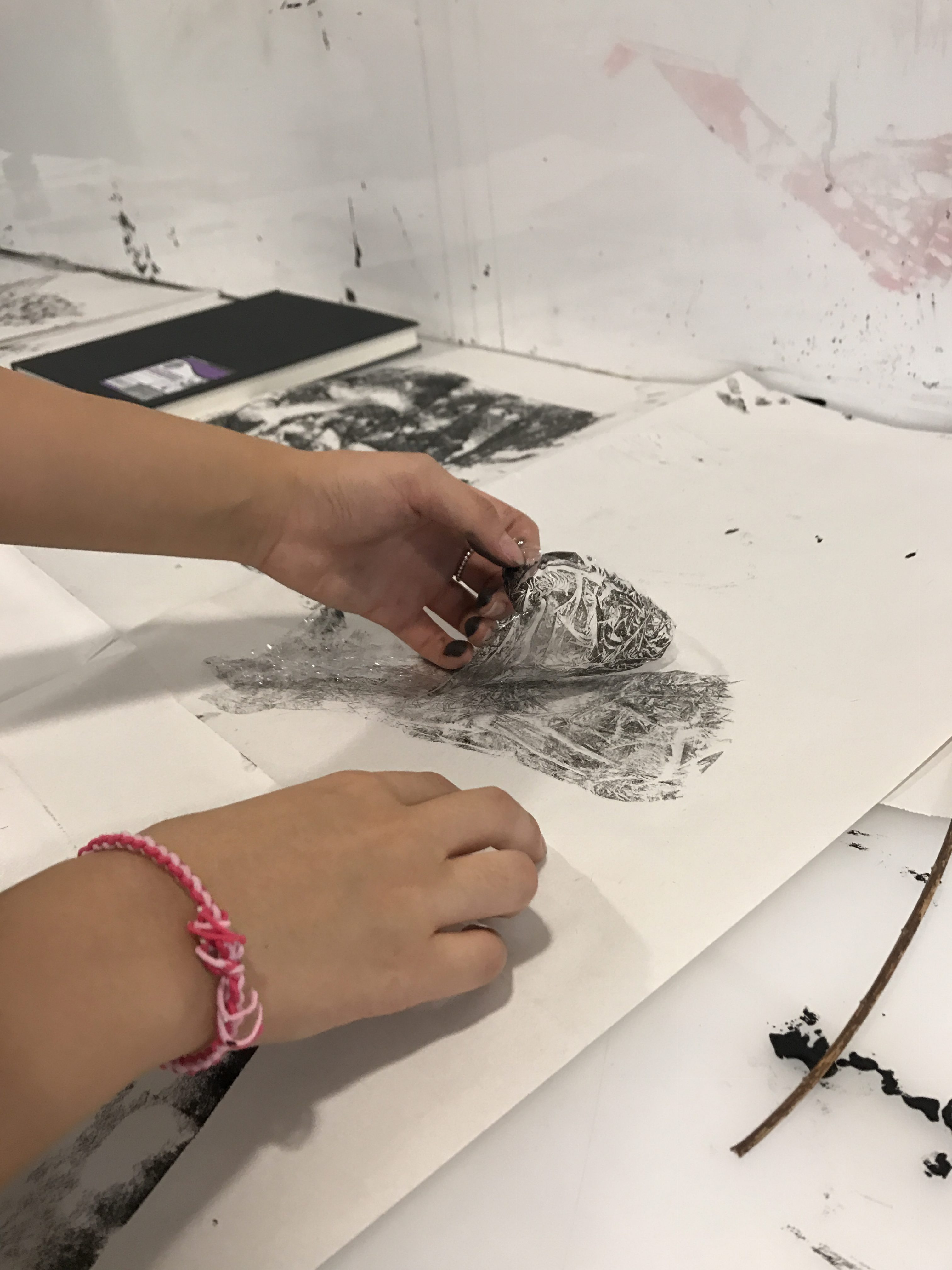
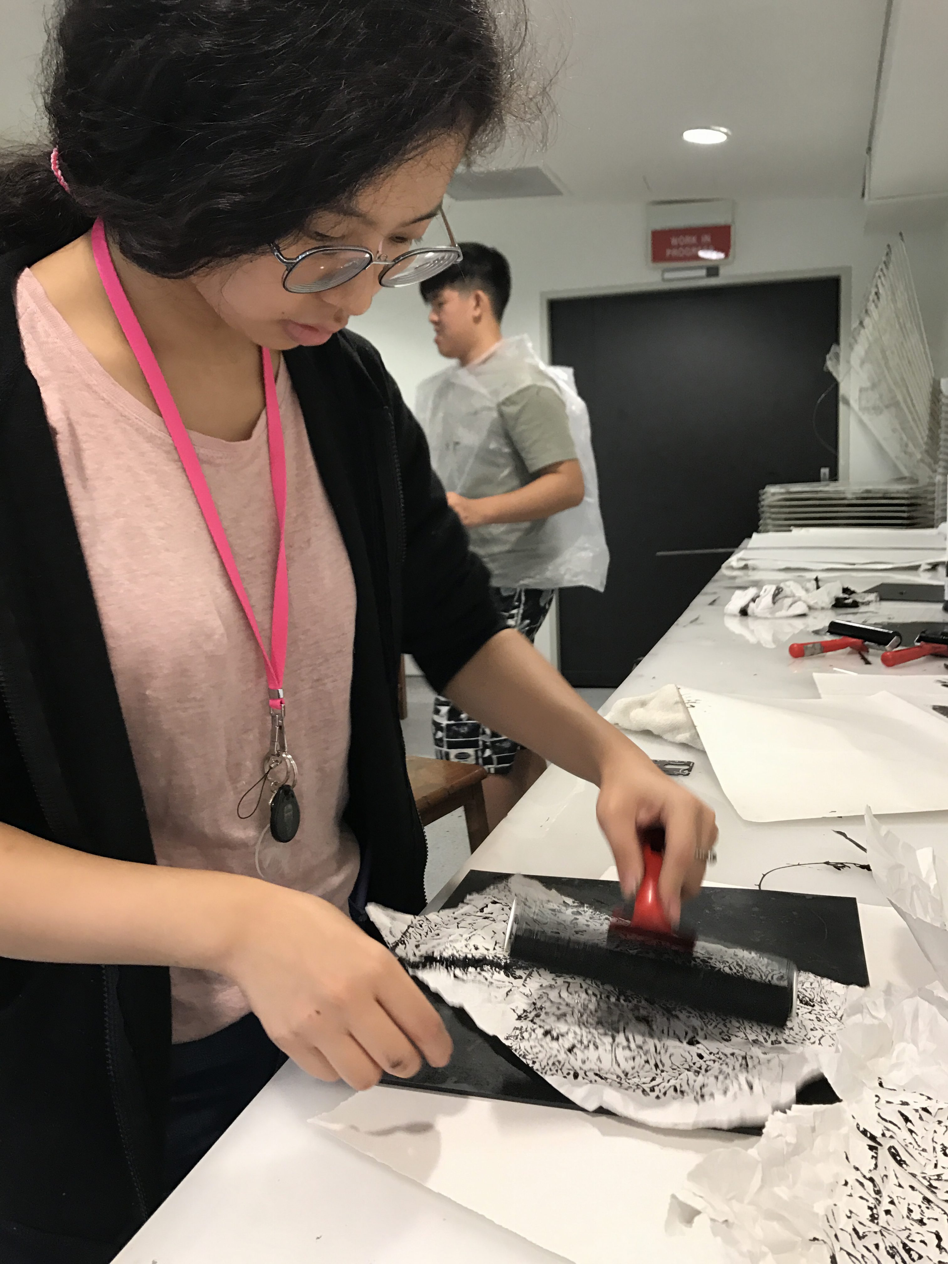
Process:
While it was tough getting back into acrylic paint after so long, my hands started to loosen up and get back to the old medium I love.

POWER OF WHITE PAINT
White paint served to vital functions in my composition. The first being the color to cover up all my pencil marks and the second being a base for my future colors so that the color could come out more vibrant and clear (especially because the acrylic paint I used was lighter).

Row 2

Summary:
Row 2 talked about a physical reaction I have to a certain environment. Specifically, my bodies reaction to heat. I illustrated the reaction based off of what happens to chocolate in the sun. The first square shows a representation of me, dark chocolate. I chose dark chocolate for two reasons; the first is because I really like dark chocolate, and the second is because my last name “cho” is in the word “CHOcolate”. The second square represents the hot climate of Singapore, by having the Merlion with sunglasses and a parasol. The last square is a picture of the same chocolate from square 1, but it is melting in the corner. This symbolizes me sweating due to the heat of the sun.
I chose to use a digital medium for this row.
Color:
Square 1:
Following the color of dark chocolate, I chose to make my color scheme monochromes of brown (which is a dark shade of red/orange). The grooves and highlights of the chocolate are all just from the same family of brown.
It was very difficult finding the right shade of dark chocolate that was not black.

Square 2:
I decided to settle on yellow monochrome because it symbolizes the sun and heat. A very saturated yellow at times can bring out the vibrancy and happiness felt on a nice sunny day. I was originally going to use a deep blue-green because it was the complimentary hue of red-orange. This was to help create the contrast between chocolate and hot weather, two things that should not mix.

Square 3:
Since square 3 was merely a reflection of square 1 with a melted corner, the color scheme stayed relatively similar to the original square. There was an addition of one or two darker and lighter shades to add extra emphasis and realism to the melting chocolate.
Original Sketch/Brain Storm (refer to sketchbook) :
The name of the chocolate was a longstanding pun that I hoped I would be able to use sometime in my future works.
Row 3

Summary:
For my third row, I decided to focus on my personality. From my exterior appearence one would believe that I am normal, simple– not so different from anyone else. But once you get to know me, truly get to know who I am, I am a very quirky, weird, and 4-Dimensional person. I chose a passion fruit to represent this idea of a seemingly normal but quirky personality of mine.
Color:
Square 1:
For square 1, I decided to use the split complimentary of violet. Violet is the color commonly associated with a passion fruit’s exterior. The Yellow-Orange and green create a sense of contrast and help the violet passion fruit stand out.
Square 2:
Square 2’s color scheme is a monochrome of blue. I chose blue because blue is commonly associated with hospital’s (more specifically surgeries) and it also creates a sterile and clean perception to the square.
Square 3:
For square 3, I chose the tetrad color scheme of (Violet, Yellow, Red, and Green). This encompasses the colors of the passion fruit and adds a quirky combination of different colors.
Original Sketch/Brain Storm (refer to sketchbook):
I alway come off as slightly more reserved towards people who have yet gotten to know me well. This is because I am scared that the reaction upon seeing my personality will be negative. Lately, I have been showing my
“weirdness” to people in small doses so that I can learn to be more confident with myself. The action of opening up is represented in a surgeon getting ready for his procedure (getting to know me). This is because surgeon literally have to open up their patients during surgeries. Before the nurses give you the anaesthetic before surgery, the ask you to “count with me (them). 1. 2. 3.” and as you count, your mind slowly falls asleep.
I chose the passion fruit because the exterior of the passion fruit is seemingly normal, like any other fruit, however, when you open it up it is different, unique, even quirky and strange. This is a very accurate representation of my personality when someone tries to get to know me.
Process:

Row 4
Summary:

For my final row, I focused on something more superficial about me. Nothing too deep but at the same time nothing to obvious. Which is why I decided to focus on my reaction when I am put in a setting where I have to see or smell a tomato. I like tomatos when they are grilled or in salsa, but the smell of the raw tomato itself does not sit well with my stomach.
Color:
For all three squares, I used complimentary colors. I used complimentary colors to reflect the contrast and disparity between the affection I have for tomatos (specifically raw tomatos).
Square 1:
The first square is the pair, blue and orange. While I struggled to find the right shade of blue that did not come out blue-violet on the printer, I chose blue for a a specific reason. According to research, blue is a difficult color to find in nature, specifically in food. And when we see blue food, we tend to be repulsed or confused because of the color. This is why I chose blue for the color of my tomato, to represent the same confusion and unsettling feeling that arises whenever I see a tomato.
Square 2:
Square 2 is yellow and violet because purple represents creativity. I felt that creating a tomato perfume was a very creative feet on my part (yay).
Square 3:
Lastly, square 3 is green and red. I chose green because green is usually assoicaited with sickness, vomit, and other ailments. Bringing that feeling over and pairing it with a toilet seat gives us the image/ impression of vomiting. This is the same feeling that arises when I smell or eat a raw tomato.
Original Sketch/Brain Storm (refer to sketchbook):
My color scheme and style of the overall row was inspired from Andy Warhol’s Marilyn Diptych. I took the pop art style of posterizing the image to contrasting colors into consideration when I created my row.
Reflection
Through this project, I have understood the importance of color in the overall visual execution and emotional delivery of an artwork. Though I have a lot more to learn about color harmony and the most effective ways to employ it, I have left the project knowing so much more about color harmony. I hope that in the future I can explore more techniques like color illusion to make my works even more compelling and innovative. This project also gave me more time to reflect about myself and understand who I am, I hope to incorporate more of myself in future artworks.

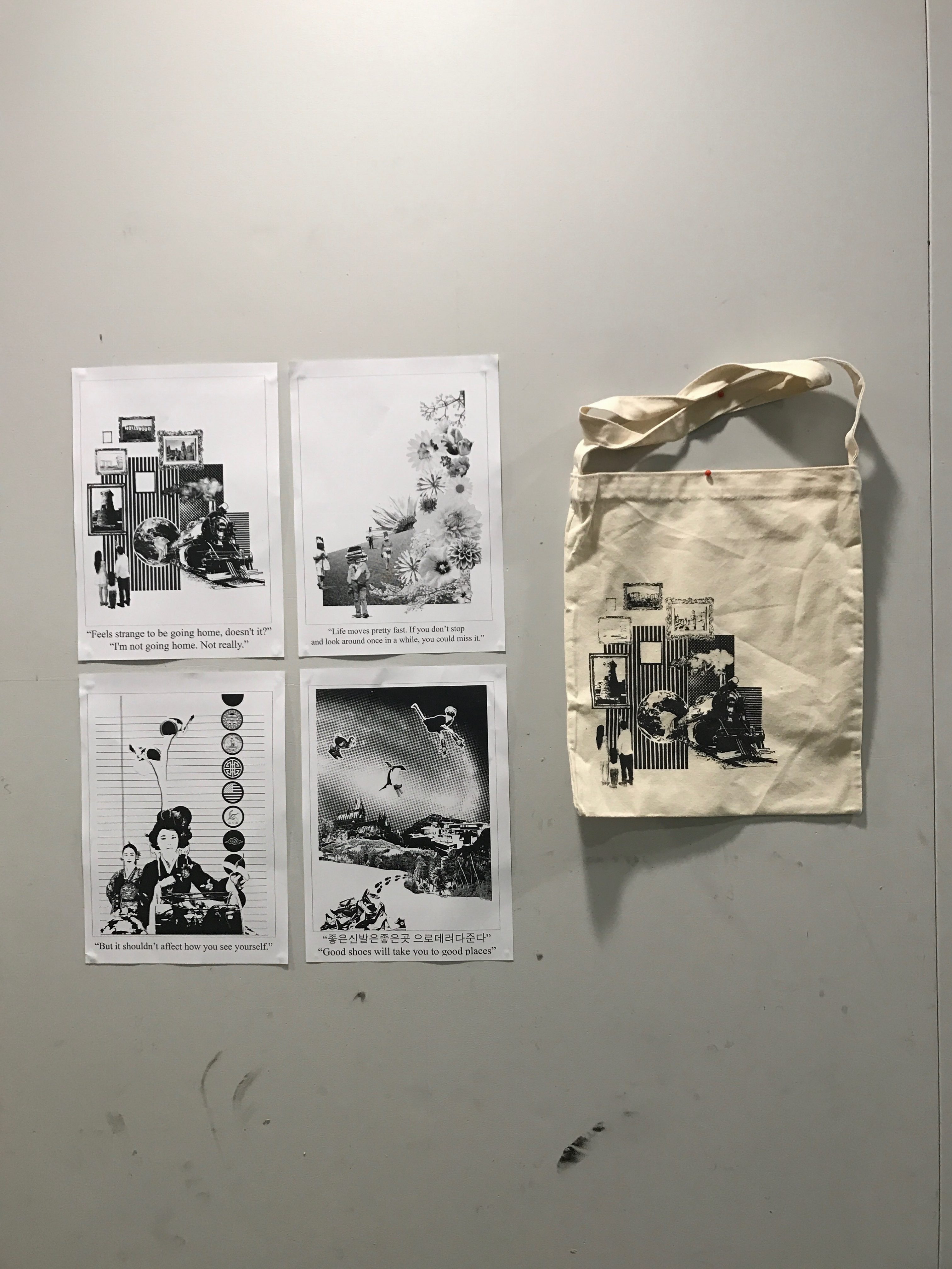
I could not add several process works because I exceeded the maximum files I can upload on one post.