For my video selfie, I chose to record my self taking off my “disguise” and showing my real self. This is because when I was asked to make a video that would capture my “artistic alter-ego”, I thought what kind of artist do I want to be. The answer was simple, an artist who was confident, brave, and strong. But I realized that I can never that kind of artist if I am not willing to be myself first. I always believed that I had to art the way people wanted me to do it, little did I know that I could also do art the way I wanted to. I chose to use the mirror effect on photobooth because it distorted the view of my face as I was stripping myself of my disguise. This represents how I am not recognizable in my disguise but recognizable when I am my true self.
“I am not a performer, I use performance to do research.
I am not a researcher, I use research in my performance pieces.
I am a performer who uses research as a medium.
I am a performer researching encounters.”
— 03 2011 Annie Abrahams
Annie Abrahams is a performance artist born in Hilvarenbeek, Netherlands in 1954. She has a doctoral in biology from the University of Utrecht and a masters from the Academy of Fine Arts of Arnhem. Many of Annie Abrahams’ works are through digital media, creating an omnipresence in our internet driven lives. She takes into consideration the issues of bandwidth, distance, separation, and even alienation that occurs online. We can access her work anytime as well as be participants for her collective pieces.
Though a simple daughter to a farmer in Netherlands has grown into an amazing artist who is credited as the first person to hold a Cyposium. A cyposium is an online symposium conducted over the internet using the internet. Her choice of medium tends to be the internet as it is a place for her to ““study human behaviour without interfering in it.” Annie Abraham likes to ion focus her work on society (specifically the online society), the people in the society as well as they way the people interact within the society. Human’s interactions with the third space has become customary in this generation and sometimes we interact better through the third space than any other.
“I want to know how they function, not by them telling me, but by me almost forcing them to reveal an instance of their ‘hidden code’ in public. I want us to go beyond self-representation and the control that this requires.”
— Annie Abraham from the Please Smile on your Neighbour in the Morning Website
Using the online collaborative platform, Annie Abrahams incorporates the Cyposium with her own ideas in Angry Women.Angry Women is an online collaborative work consisting of different versions but with an overarching theme– anger. One commonality in all these different versions is the anger, the anger each of the different women contain regardless of nationality and physical appearance. Annie Abraham asked participants to come online from the safety of their house to talk about what was irritating them or even angering them that day, sometimes in their native tongue or sometimes in English.
“negotiate ideas together in order to achieve a result that’s not just one person’s problem, one person’s effort, but it’s the effort of a group of people solving a problem collectively.”
–Disentangling the Entanglements from the Art of the Networked Practice
Annie Abrahams new symposium is titled “Online En-semble – Entanglement Training”, which will once again be held over the internet. This symposium serves to be a platform where her collaborative peers can come together to negotiate ideas with one another to find a solution. In this symposium, Annie Abrahams embraces the glitches and errors that occur during live internet calls rather than trying to gloss over them. Not just stopping at embracing, Annie Abrahams uses these “network entanglements” to help her further understand human interaction and behaviors. Her creativity has no bounds as she finds creative solutions to “fix” these entanglements; for example, when one camera started to glitch, Annie Abrahams encouraged the remaining participants to intentionally turn on and off their camera. Annie Abrahams quick thinking and creativity created a beautifully raw image on the screens of each of the participants.
The screenshot shown above is an unfiltered, genuine depiction of my desktop at the present moment. As you can see the files have yet to be organized and usually end up organized either at the end of every month or the end of the semester. This desktop is the evidence of post-cleaning. I generally like to keep my files out in the open during the school year so that I can see everything and have an easier access to it. The desktop picture is a random picture I found online. I chose it not only because it is pink but because I have a fondness towards old/vintage motel/shop signs. My other desktop is a layered picture of a landscape from the perspective of someone on the pier. I personalized my computer so that my name can be seen in the top right corner.
Facebook. The original superficial website transformed and metamorphasized into something completely new and surprisingly meaningful. That is to say that Facebook has forged an entire generation of users connected together by a mere “www” on the internet. FaceBook at its prime was the main source of communication among friends and family, especially those whose loved ones moved overseas. Now, it has become a hubbub community filled with pictures, videos, games, and even companies that communicate with people from all over the world regardless of being “friends”. Through Facebook we have become exposed to so much information globally yet at the same time it still strengthens our relationship with those important to us. For example, we see a video of an amazing icecream parlour in New York, which reminds you of your good friend who you always go out to eat icecream together with. So you tag this friend or share the information with her and you start talking and reminiscing about past icecream dates or plan on a new icecream date. Also when friends update aspects of their life through Facebook, you are given an insight into their life, which fortifies the bond among one another.
In response to D.E. Wittkower’s article, “A Reply to Facebook Critics”, I understand where he is coming from. Facebook though with its own sets of problems should not be slammed by critics or put on a societal blacklist. It has served us so many boons as well as banes. Also, the idea of criticizing the application Facebook is erroneous in the sense that Facebook is not the application but the people behind it. Facebook is what is is because of the people you use it, we decide the way Facebook serves in our life whether it be to send memes to one another or if it is to get an insight into the lives of our friends who ultimately mean something to us or do not mean something to us.
“Facebook, for the most part, is people.”
D.E. Wittkower, “A Reply to Facebook Critics”
Looking through Hasan Elahi’s work a whirlwind of thoughts went through my mind. From sympathy at the assumptions made based on physical appearance to marvel at the dedication behind his piece “Tracking Transience”. To constantly and consistently document ones daily life is a very tedious task that not many people can pursue. Even when I tried the “Super Participation” micro-project, I found it very difficult to document everything from significant events to trivial habits. However, I noticed that as the day went by updating my Facebook became more natural. Hasan Elahi’s work is genuinely candid and truthful yet has a satirical touch that can be experienced by not just the artist himself but also the audience clicking onto his website.
Screenshot from Hasan Elahi’s Tracking Transience Website
Hasan Elahi, a normal professor at the University of Maryland, was brought into questioning at the airport due to a tip off about being a potential terrorist. He was later placed on the most wanted list. Though his innocence has been proven and he has been released from federal custody, he is still being supervised by the government. This led to surveillance art. Hasan Elahi’s surveillance art is comprised of his entire life for the the past several years, from credit card statements to locations and even phone calls. This way, not just the FBI but everyone can see and in a way serve as a witness to his story.
Hasan Elahi stated that when he would tell people he was an artist, many of them would ask him “So what medium do you use?” We have come to the age in human history where art is no longer just limited to the traditional media but has expanded to site-specific instillations to collaborative web based artworks to even experience orientated art. “Tracking Transience 2.0” incorporates the digital with human experience and observation. We as the audience get to experience Hasan Elahi’s life the way he did but yet the experience is only limited to our eyes. This in a sense is like Facebook, we are deliberately entering the website to see what someone we know well or do not know well is doing. We want to know because we care, we care about the lives of others because in a ways it relates to our own lives. And “Tracking Transience 2.0” in a way has done that– relate to our lives. To those who love to post their daily occurrences on social media to those who feel paranoid over a presence even those just like to see how others live their lives. “Tracking Transience 2.0” in a way has touched our inner desire to connect and form relationships with people.
(I cannot add an image. Every time I do, it states that there is an “HTTP error”.)
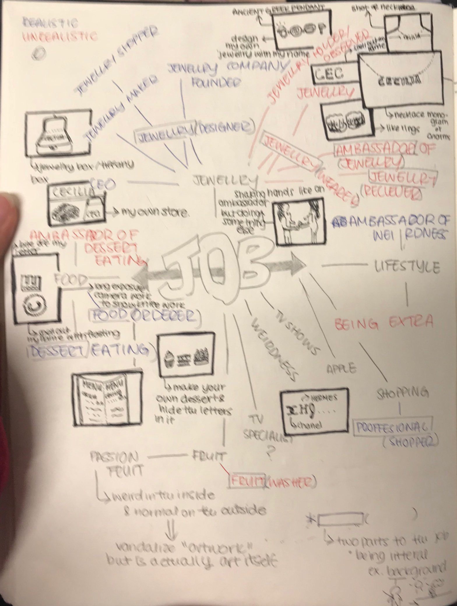
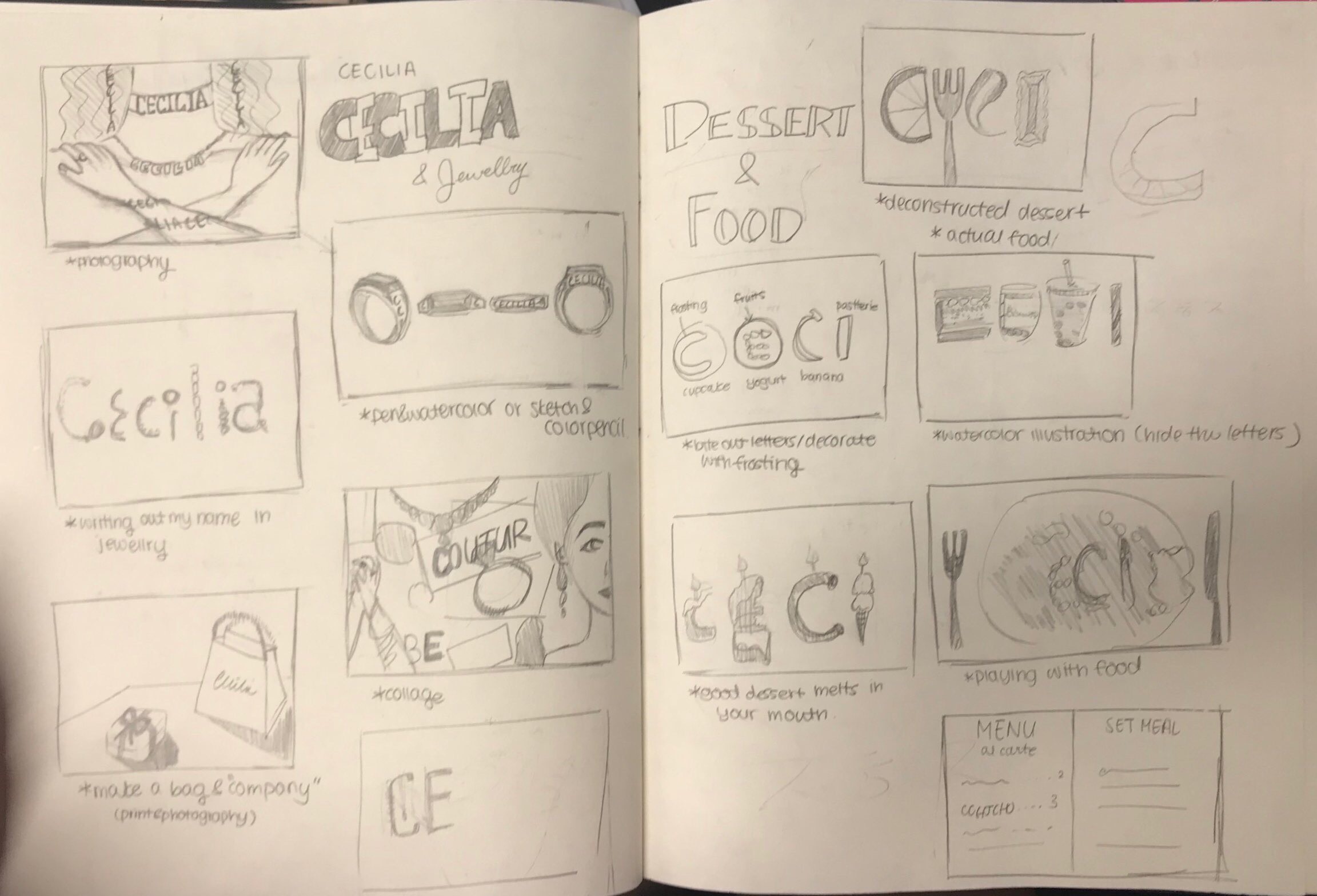
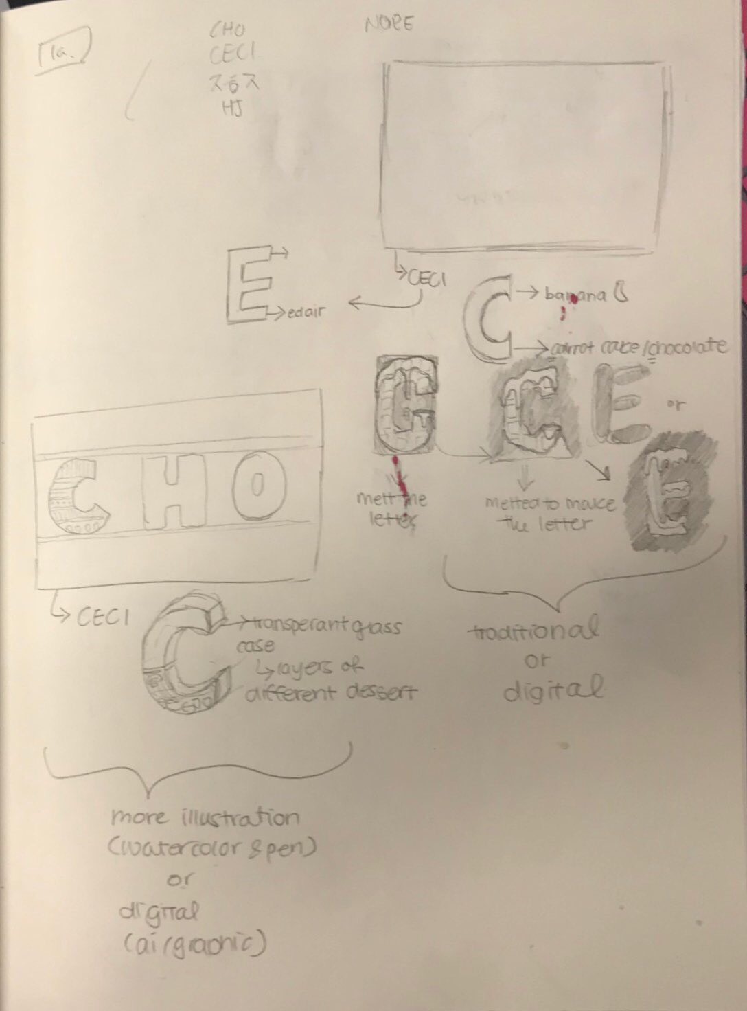
Image Making Through Type was our first project for our Graphic Form class. The first project of the new semester began with a tutorial on Adobe Illustrator and a brainstorm of possible future professions. The project itself was about embedding the text (your name) with the essence and semantics of the our possible future vocation. When we see the type, our first thoughts should not see the piece as an image but decorative lettering. Our jobs and the name we wanted to utilize had no limit or restrictions. We could choose the most wackiest job or a job one genuinely aspired to have. And we could choose the initials of our birth name, called name, nickname or certain letters from any part of our name.
INITIAL IDEATION
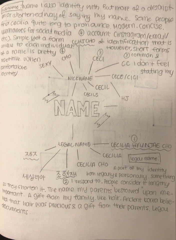
Given a week after the project was revealed to us to think of the four professions, our text, and rough draft thumbnails of our final piece. I began with some mindmaps for name and professions reflectively.
Mind map for Text (Name)
I wanted there to be meaning behind the letter/characters that I would ultimately choose for my four pieces. This is why I decided to balance both my Korean name and English/Church name within my four pieces. Ultimately, two of my pieces contained lettering from my English name, another piece containing the characters of my Korean name, and the other using a letter from my English name with a character from my Korean name to create a combination that sounds like my Korean surname.
The reason why I chose to mix my Korean name and English name, especially in that last piece that incorporates them together in one piece, is because of my upbringing. Though born in Seoul, South Korea, I moved abroad at the age of three due to my father’s work and spent my years in America, Singapore, and eventually South Korea. Due to my diverse upbringing and exposure to different cultures, I have suffered the typical “identity crisis” as well as reaped the benefits of the variety of experiences. This is why many of my works subtly incorporate ideas of culture and identity, whether it be through visuals or symbolism.
Example of Incorporating Both of Korean and American NameMind map for Future Job
I wanted a balance between two realistic jobs, especially two jobs I considered pursuing, and two wacky jobs. The wacky jobs can be anything, fictional or just unrealistic. And though I was not sure about my final four, I knew that I wanted to incorporate food and jewellery in to my pieces as they are some of the essentials in my life.
Initial Drafts and Thumbnails
DIFFICULTIES AND PROBLEMS
There was a misunderstanding of what was expected in our designs. Many of the students were under the impression that the piece could have been very image based and can be the outcome of rearrangement. However, what was expected of us was a text based piece with elements of our job on the text. So many of my ideas focused on the overall image of the piece rather than focusing on the words. Redesigning my ideas was quite difficult in the beginning, however, the ideas started to flow better as time went by.
NARROWING IT DOWN TO FOUR JOBS
In the end, I decided to narrow my job choices to four separate jobs that incorporates my passions and interests. My four jobs are World Renown Dessert Maker, Mythical Smoothie Barista, Full-time Professional Onion, and a Jewellery Maker. Each job is incorporates something I am very interested in with external influences like friends, films and TV shows, and even daily experiences.
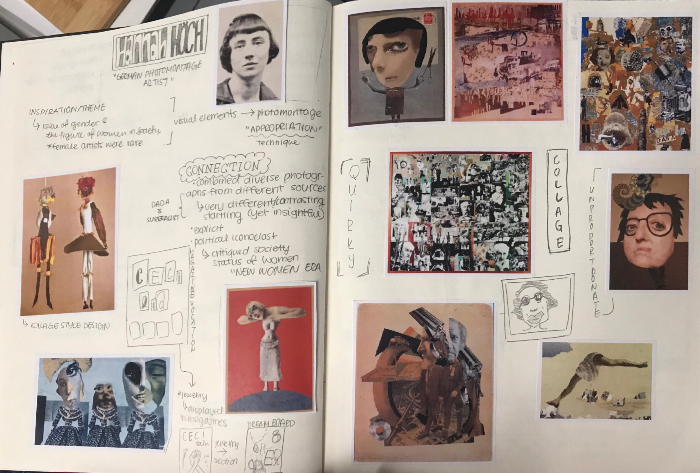
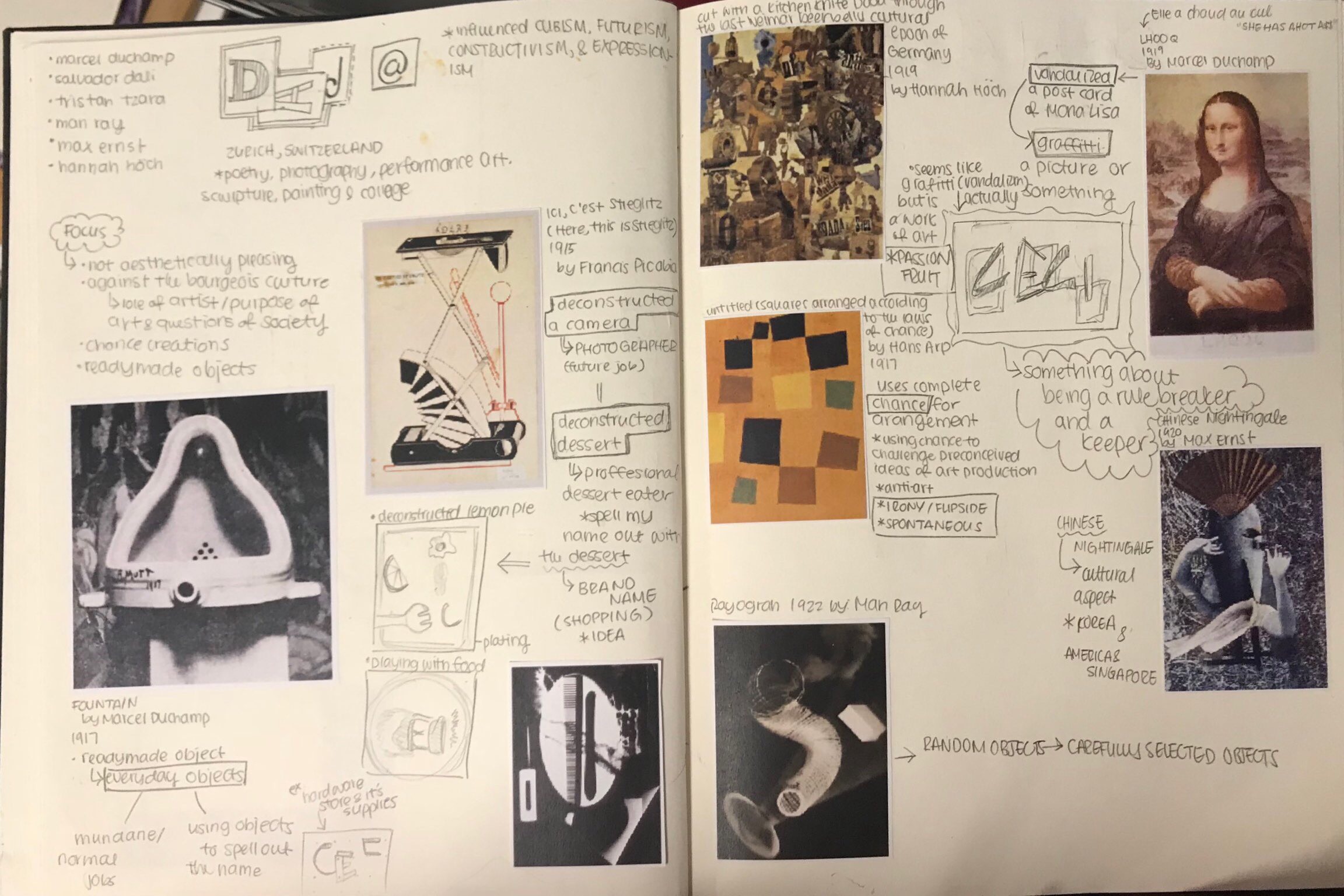
Basic Research
Research on Hannah HochResearch on DaDa
Wanting to use a variety of media for this project, I looked a variety of different inspirations ranging from digital illustrations, water color, acrylic paintings, and clay (sculpting).
WORLD RENOWN DESSERT MAKER
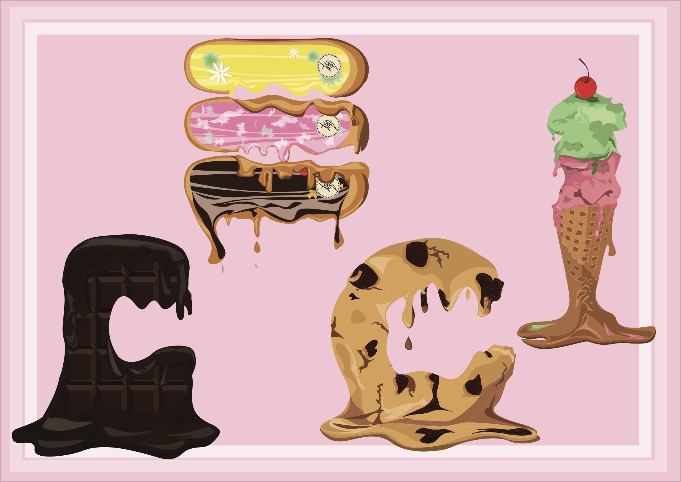
World Renown Dessert Maker (Final Composition)
Name
World Renown Dessert Maker Planning
The name I chose for this piece is CECI. This is my nickname derived from CECILIA. Throughout the years my parents, friends, and even baristas called me CECI. CECI is a nickname that has stuck with me and has remained a constant in my life ever since CECILIA was too long to write or a mouthful to pronounce. And like the consistency of my nickname, the my love for desserts have always been by my side. I have one of the biggest sweet tooth ever, and this has left a big impact on the shows that I watch and the food I seek. Each dessert, while my favorites, were purposely chosen for the fact that the first letter of the dessert matches with CECI.
(C)hocolate
(E)clair
(C)ookie
(I)cecream
Job
I chose World Renown Dessert Maker because of love for sweet food. This was further enforced by cooking shows related to desserts or or bloggers on Instagram that upload dessert pictures. And when people describe or critique the desserts, they always say things like “the chocolate just melts in my mouth”. And I feel that good desserts should not be so delicious that it really does melt in your mouth. A dessert is supposed to be the finishing aspect of your meal and should soothe the mouth after the savoury onslaught of dinner. As a world renown dessert maker, I have a duty to make my desserts as delicious as possible to the extent it just melts in my customers mouth. And like my dessert, so does my text made from my dessert specialty menu.
Research
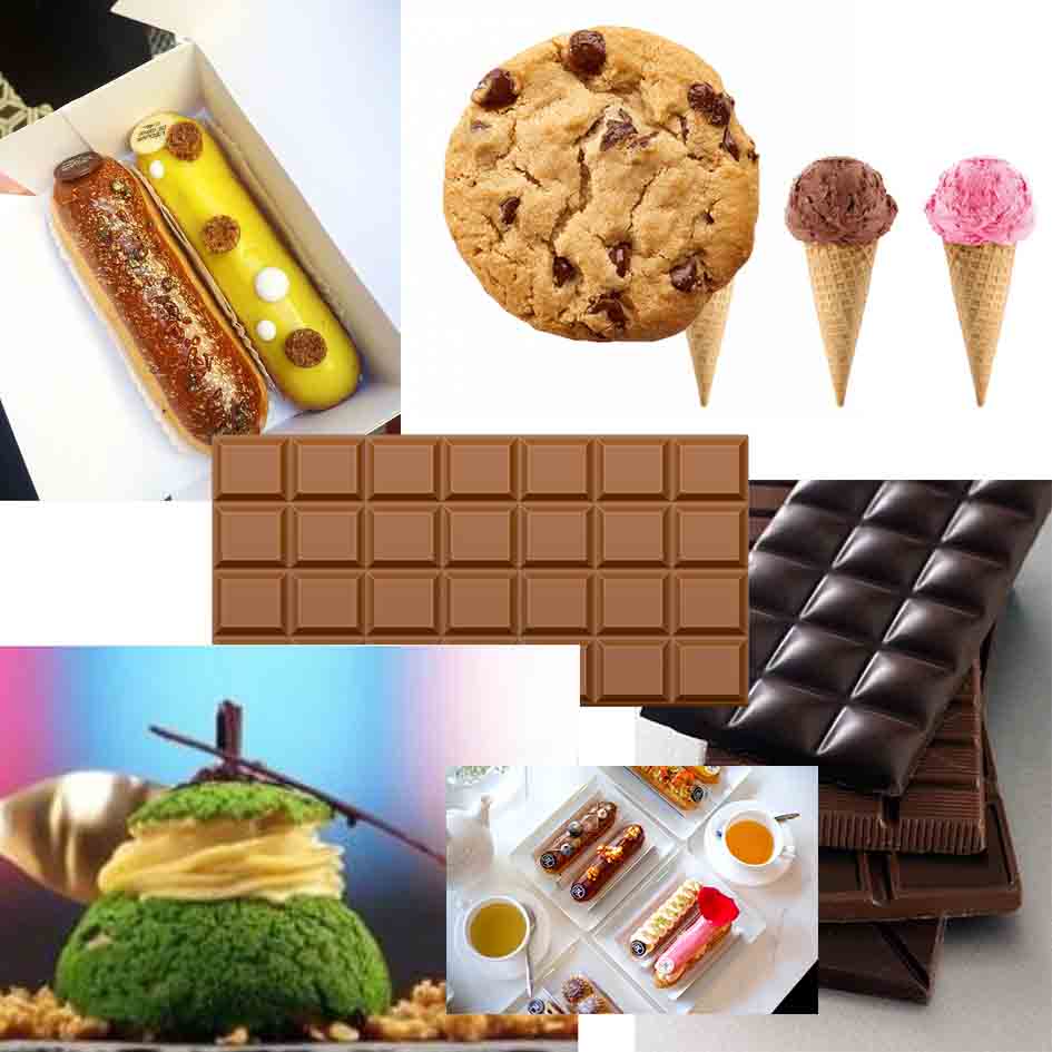
For my research, I mainly focused on vector illustration and looked through many images of desserts. I also looked at images of melted chocolate to get the sense of how a dessert would melt and the highlights and lowlights of the melted area.
Reference Pictures
I also looked at possible background designs associated with candy and desserts. I cam across the candy cane design with the alliterating white and red strips spiral down diagonally.
Pink Candycane
Problems
I had two problems with this piece. One being that it was very difficult to achieve a realistic melted effect for some of my desserts ( the chocolate and eclairs especially). Maybe it had to do with the fact that vector illustration, unless extremely skilled, is hard to create that smooth and gradual melting surface of the dessert. The second problem is that after trying to apply my background idea to my piece, I realized that the overall composition was too messy and cluttered. There was so much detail on the dessert that the background took away from the detail. And from someone who always manages to make their work look cluttered instead of aesthetic. I have learned that it is okay to cut certain ideas from your original plan. In the end, I did cut the candycane design from the overall composition and added two thin white borders around the edges.
Composition with Candycane Stripes
MYTHICAL SMOOTHIE BARISTA
Mythical Smoothie Barista (Final Composition)
Name
For this composition, I chose my last name CHO. The H in CHO is very dynamic compared to the more circular C and O. The dynamism is allows for more variety in my composition. CHO is the Romanization of my Korean last name.
An Example of C and H
Job
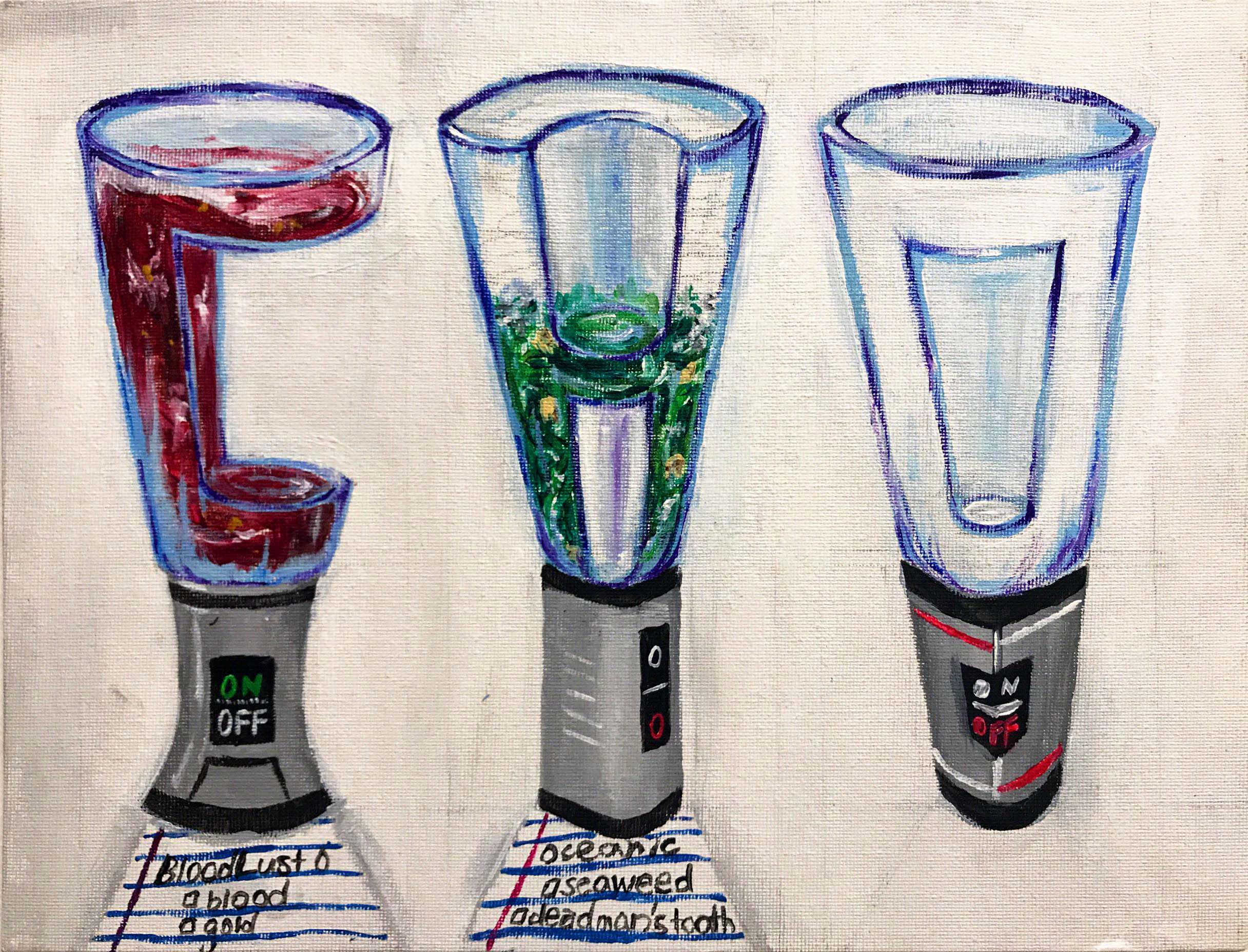
My original idea for this profession was a simple Smoothie Barista; however, I decided to spice it up my combining it with another idea I had. The other idea was a Mythical Creature Hunter. I took the Mythical Creature part from the other idea and combined it with being a Smoothie Barista. Now, I make smoothies for the mythical creatures who come to my Smoothie Booth. If you look closely at the little note underneath the text, you can see that the smoothies being created are called “Bloodlust”, a very popular smoothie drink for Vampires and “Oceanic”, a hit smoothie among the Mermaid community for its pungent flavor yet healthy minerals. I am thinking of expanding my menu to accommodate more of the supernatural community, opening my doors to anyone and everyone who just wants a refreshing smoothie on a hot summer day.
Research
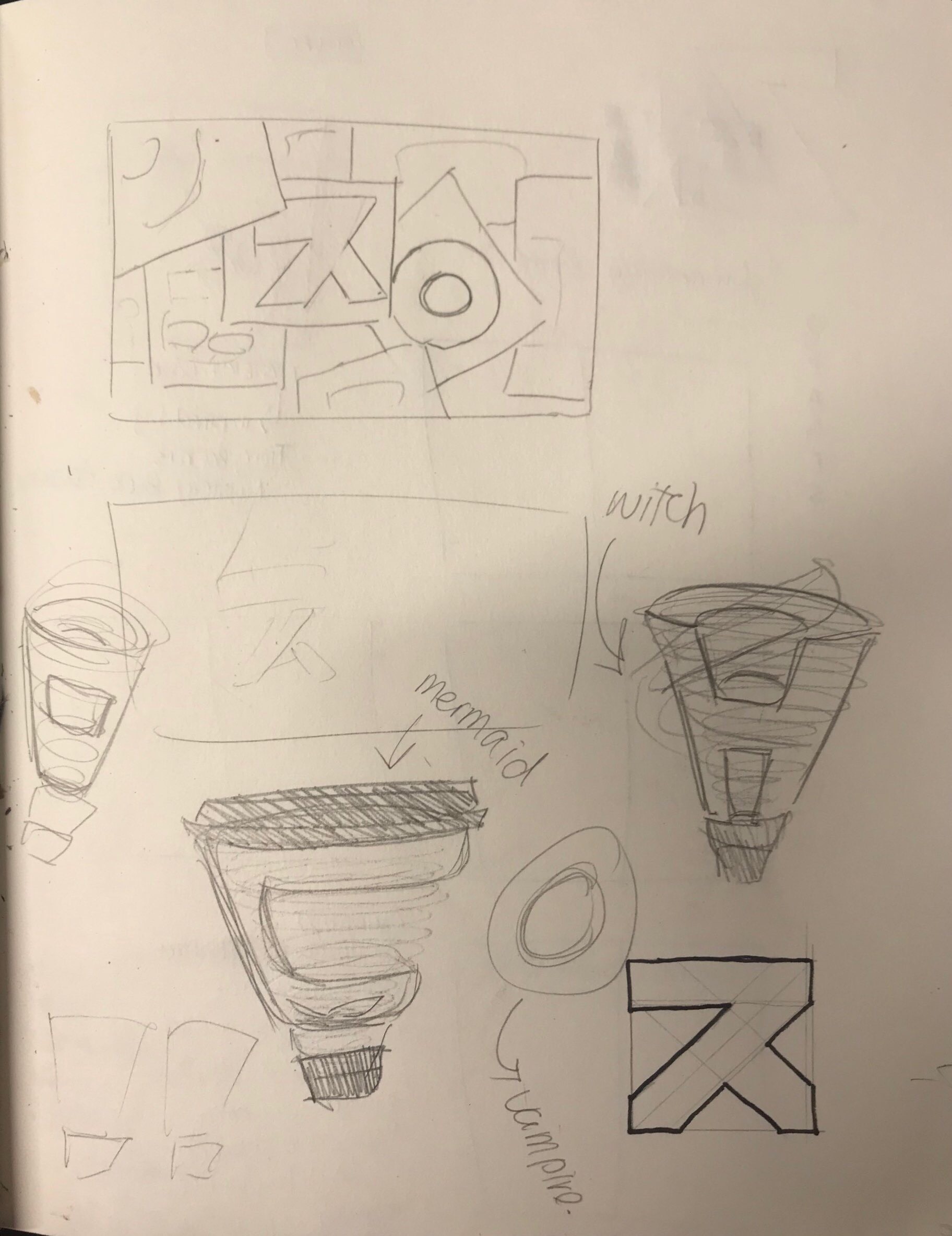
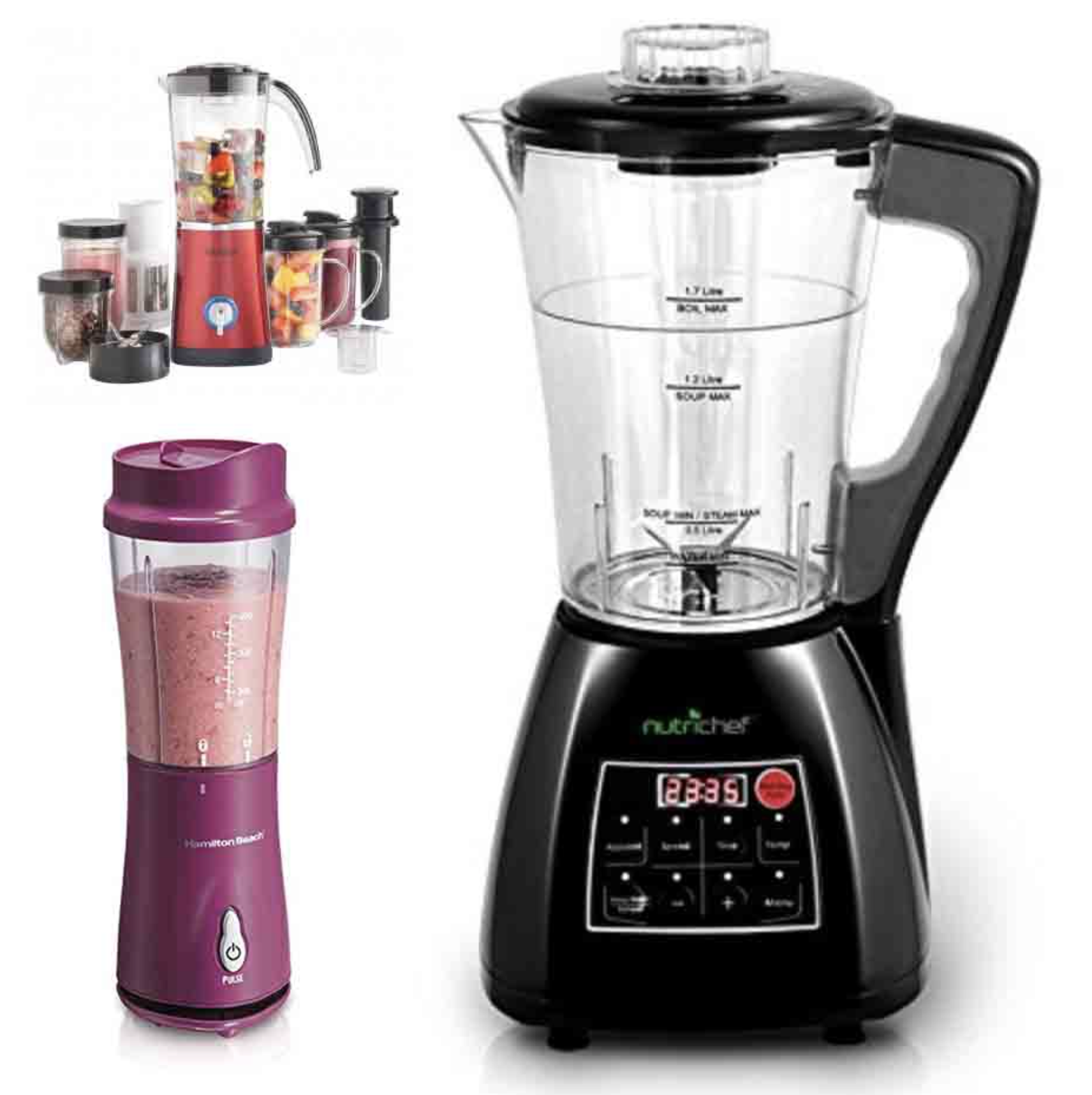
For my research, I focused on looking at smoothie machines before and after the smoothie making process. Focused on creating the font using inspiration from how the smoothie mixes inside the blender. This led a 3-Dimensional font following a circular plane.
Reference Images
Problems
One problem I faced was that since I did not know how to use and Digital Imaging software, I decided to go old school and paint the composition. While this was an experience worth doing and that the end product contains texture that is hard to achieve through computers; I also believe that this would have been a great opportunity for me to experiment with uncharted territory and try my best. However, the fear that I would mess up or that it would not turn out the way I would want it gave me anxiety. However, from this situation I have realized that I should not fear the unknown for I can just start again from the beginning.
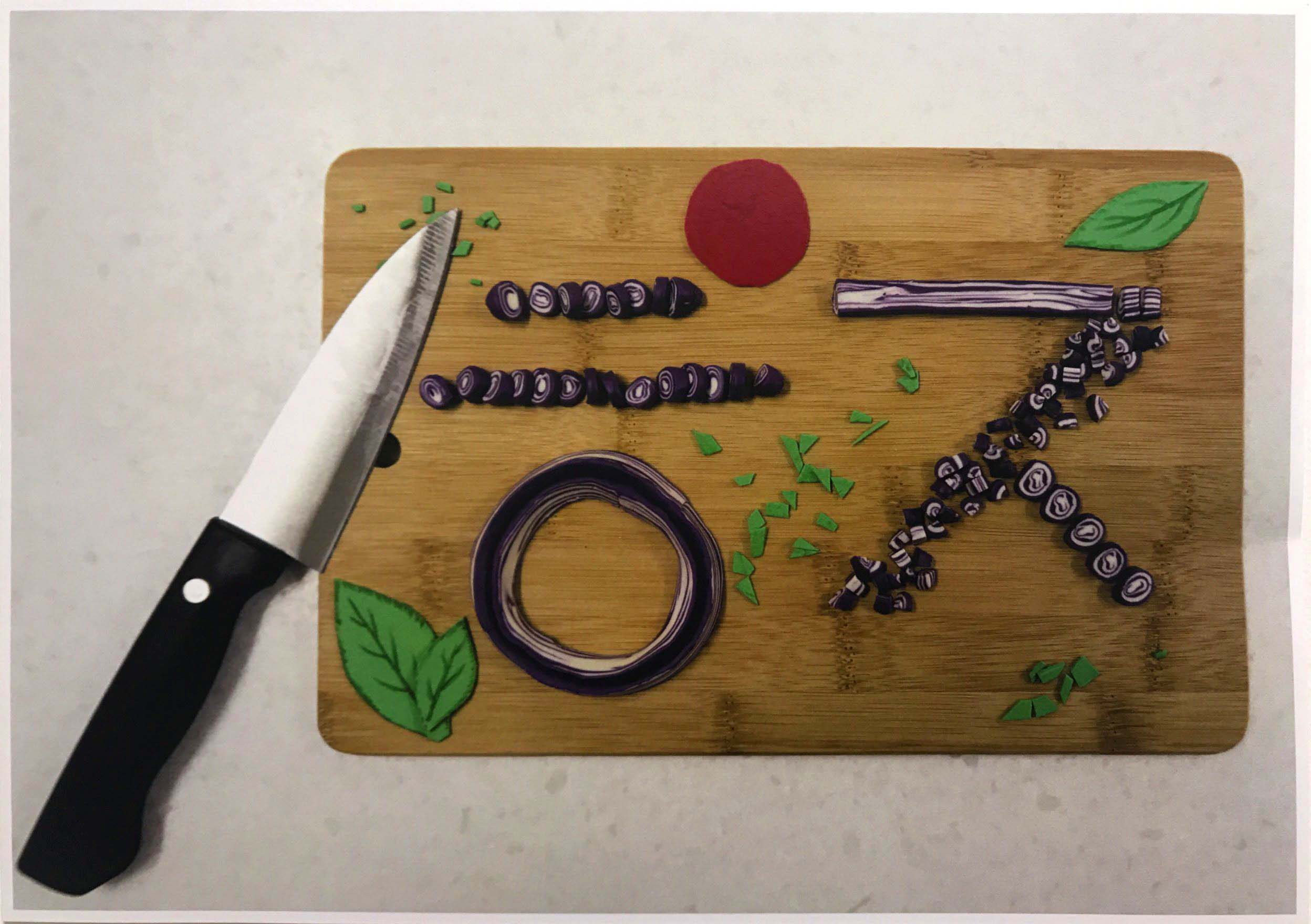
Full Time Professional Onion
Name
For this job, the name I decided to use is “ㅎㅈ”, which are the first characters of my Korean name, 조현재 (Cho HyunJae). As the previous two artworks containe dmy English/Catholic name, I thought that it is only right that I create a work using my Korean name. I am proud of both names as they mean a lot to me and helped create the person I am today.
Progress Image
Job
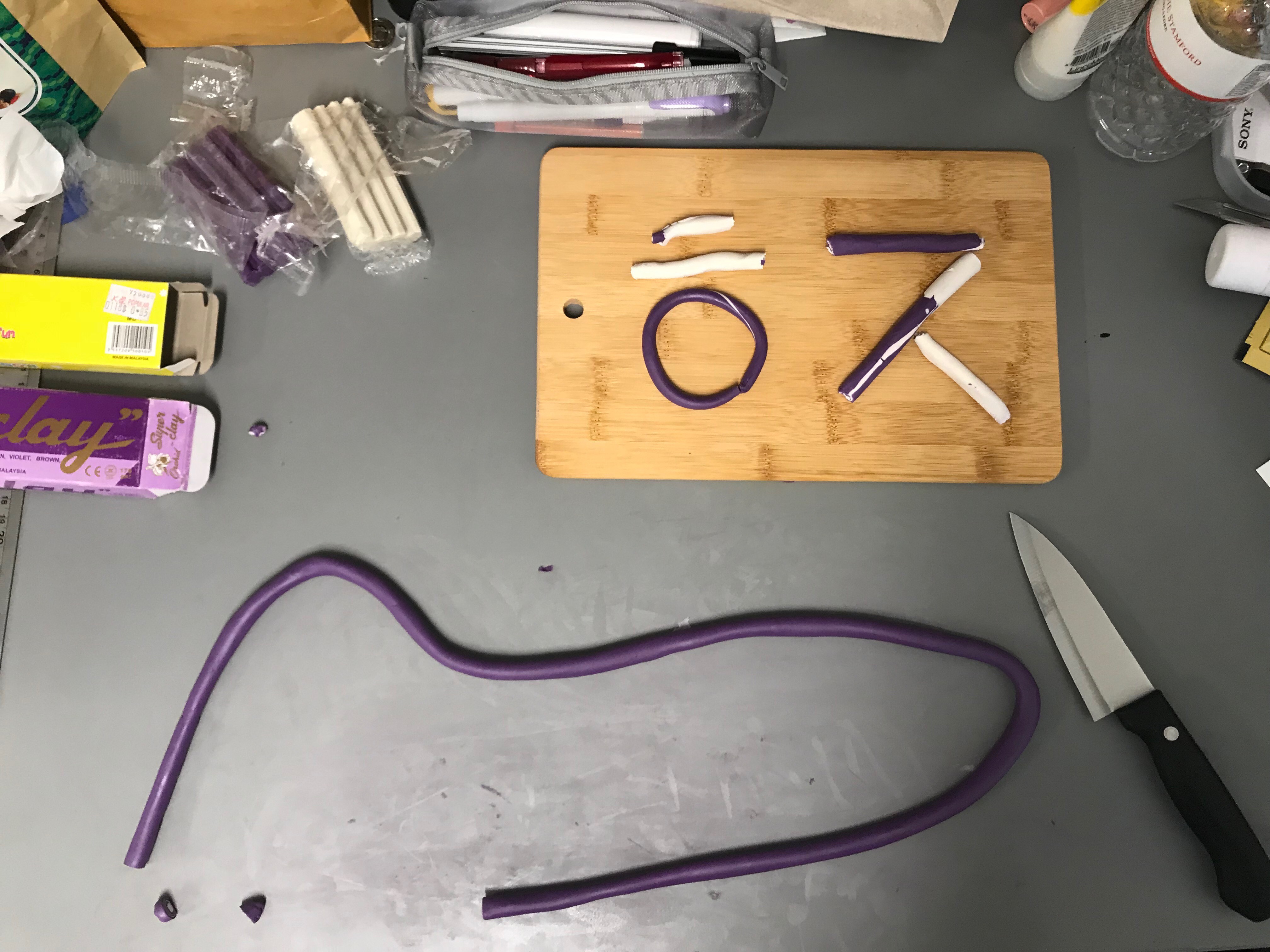
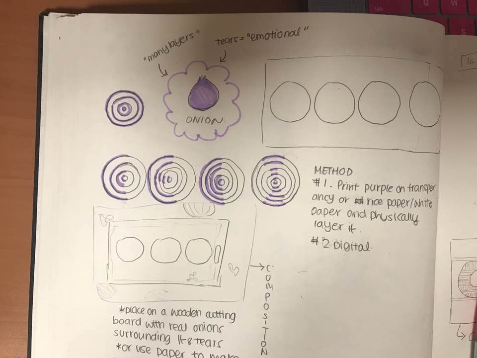
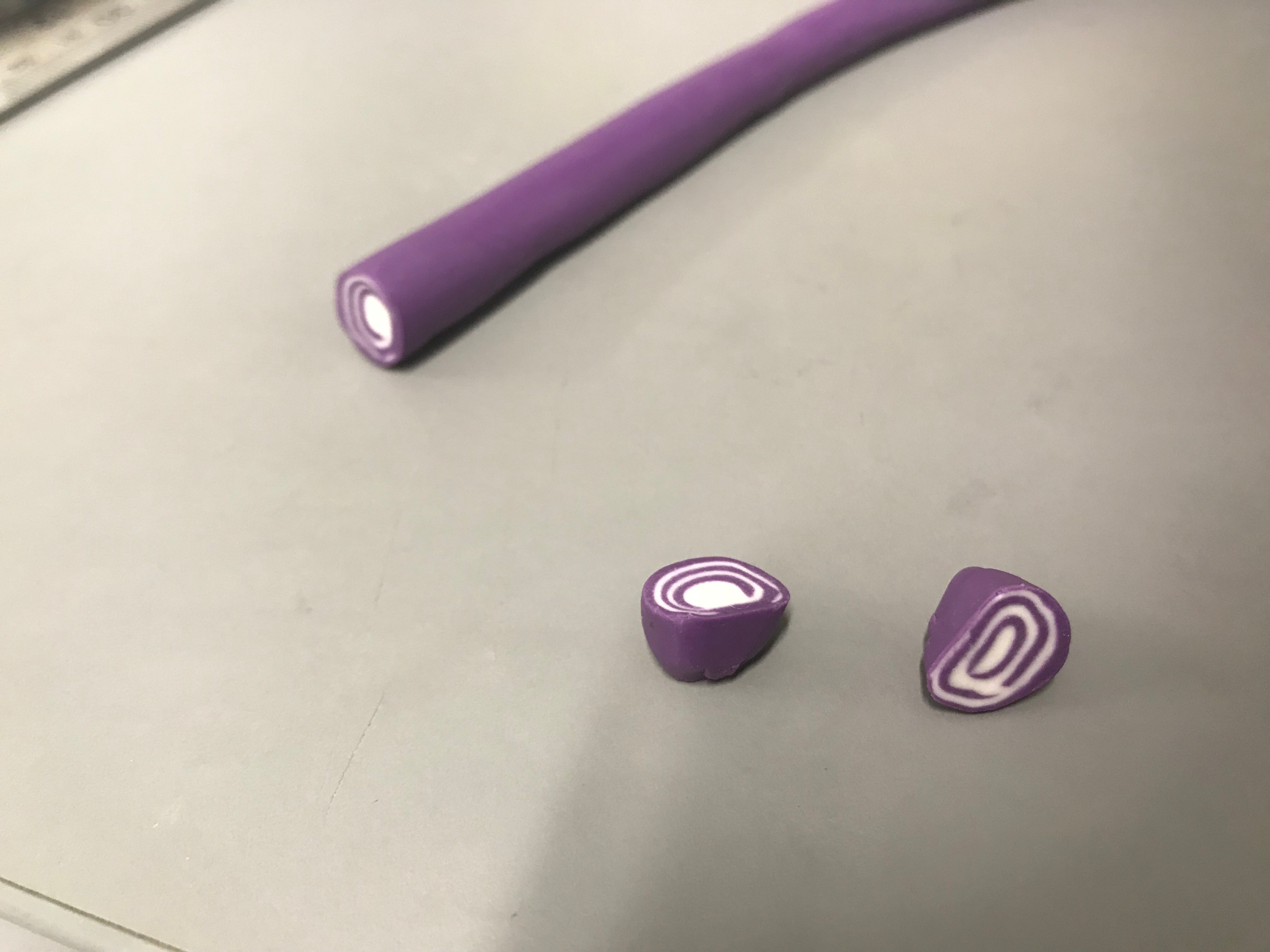
This job, though very unconventional, is a job I think many people will relate to or identify with. I am a Full-Time Professional Onion certified by Korean District of Yangpa and traded internationally by the Californian Trading Association of Yangpa. Onions have many layers, layer upon layer alternating between white and purple. These layers are symbolic of the many sides of me that I can utilize in the future for any job I want. I am not just a one-track minded individual, and because of my upbringing I have learned to embrace and incorporate the many influences thrown at my way. As a full-time Onion, I use these many layers of mine to excell at a task given to me. Not only do these layers apply to a professional me, but also applies to my personality. There are many layers to my personality, and only show different people different sides until I feel absolutely comfortable with him or her.
Research
My original plan for this project was to use the design of an actual onion ring to emphasize the letters of my name as so.
Orignal Onion Idea
However, after consulting with my teacher and thinking more deeply upon the idea of layer. I focused my attention onto a Dimensional interpretation of the layers that like my personality, can be seen from many sides. Looking at the layers, I was reminded of an old candle making video I stumbled upon on Instagram.
Not only did this show the wacky insides of a candle seemingly normal on the outside (like an onion, and just like me), but also played with different knife methods like carving, slicing, and etc. Which led me to think about the different methods of cutting an onion, from simply cutting it longitudinally or even dicing it into little cubes. I decided to use different cutting methods to create the different strokes of my name. I chose to keep it simple and stick with white and purple (no transitory colors) for the sake of simplicity. I wanted to depict the essence of an onion, not an onion itself; which is why I broke down the onions design to its basic components.
Essence of the Onion
The end product reminds me of the Sticky Candy brand which would created intricate designs in there tiny candies by first creating a bigger version and constantly rolling it around until it shrank.
Final Composition Layout Reference
Problem
The only problem I encountered was the mess the clay left on my table as it left some kind of sticky residue. Other than that, I truly enjoyed this project as it allowed me to get my hands dirty and create, an art form I showed great interest in as a child.
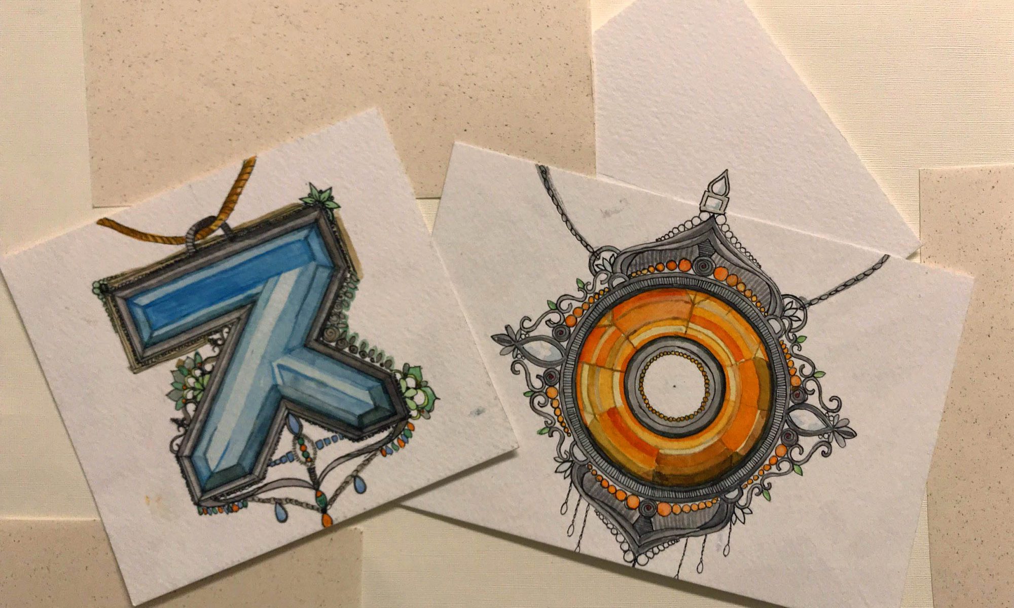
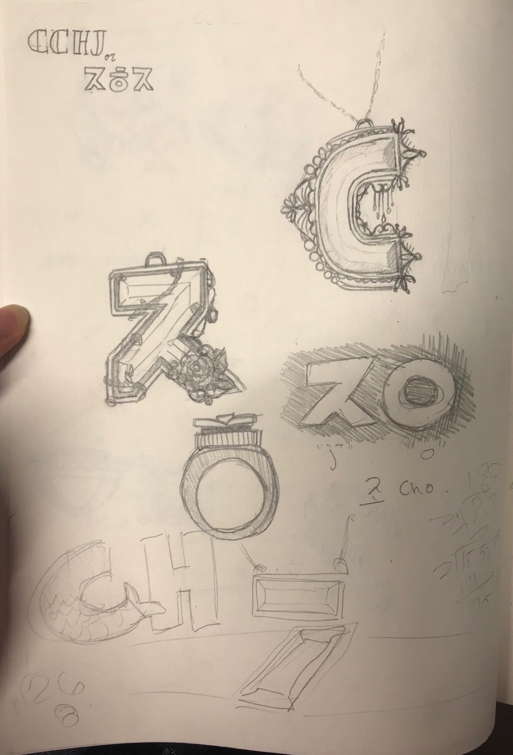
Jewellery Maker (Class Favorite)
Jewellery Maker (Final Composition)
Name
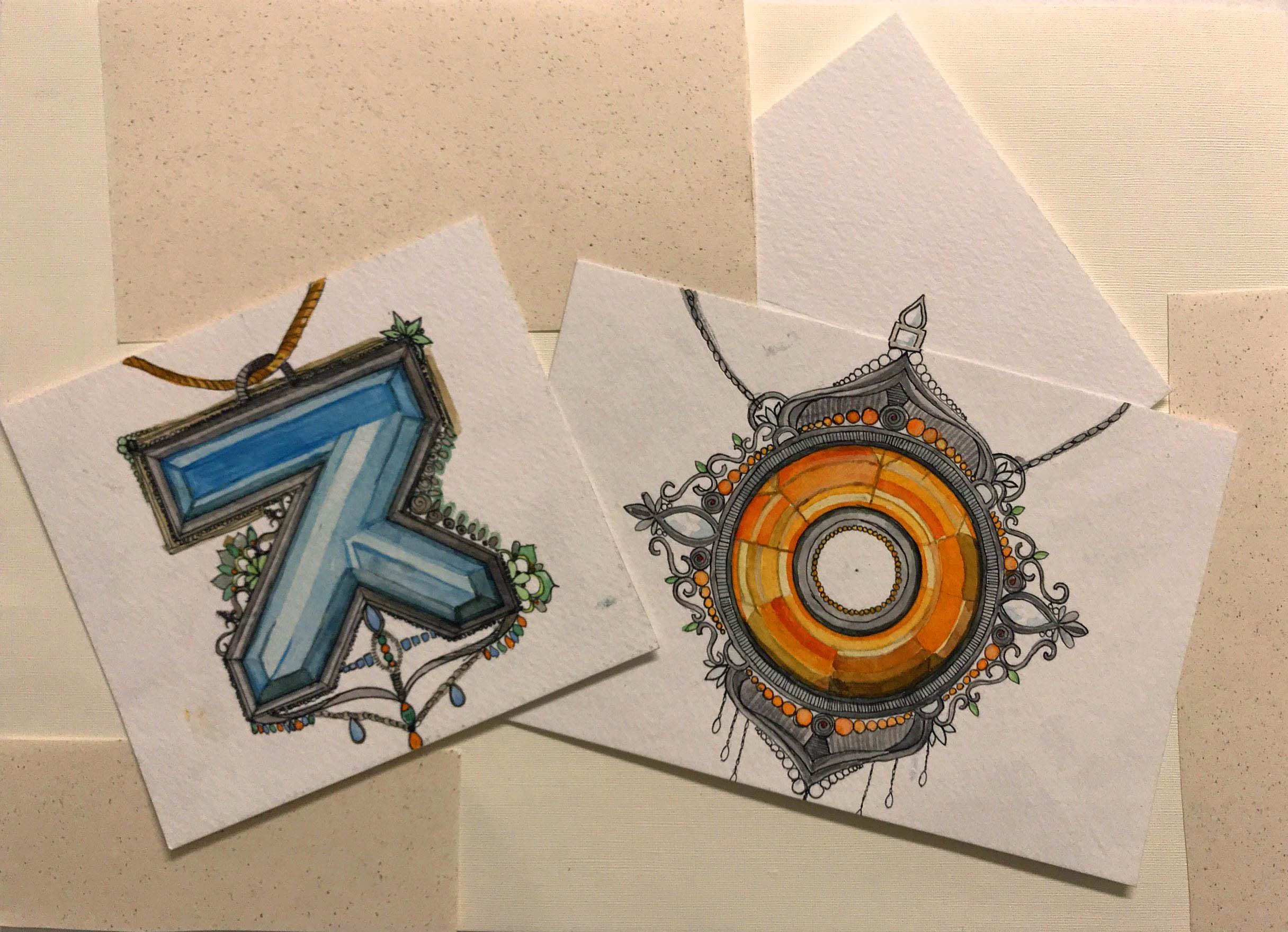
For this job, the name I decided to use is “ㅈO”. As you can see, this is a combination of two different languages, Korean and English. I chose this combination for two specific reasons. The first being that it symbolizes the mixture of two cultures and locations that I consider part of my identity and home. Though I was born in Korea, I lived abroad due to my father’s business. I grew up in the States then Singapore then Korea and finally back to Singapore for University. I wanted to find a way for both sides of myself to be represented in one of my compositions rather than showing a division between the two. This coincides with the fact that jewellery and jewellery designing have always been a passion of mine even back in the states when I was a young girl. Secondly, I found it a clever way for me to show people the proper way to pronounce my last name. Though the romanized translation of my Korean name 조 is CHO, the pronunciation of the two words are different. 조 is pronounced more like JO, and the “J/”JUH” sound comes from the character ㅈ. CHO is the outdated romanization of the surname 조 yet still commonly interchanged with JO. I am comfortable with hearing both CHO and JO.
Job
My job in this composition is a Jewellery Maker who handcrafts her own designs, making each individual piece one-of-a-kind. And due to the multi faceted layers behind why I chose “ㅈO”, I felt that a multi faceted gemstone should be the centerpiece of my necklaces. My jewellery brand has many collections, though still in the early pages of its inception, ranging from chic fashionable wear to symbolic pendants, to even wearable art. In this case, I decided to focus on the style of jewellery that I began doodling with as a student. These haute couture, vintage costume design style pieces have always drawn my eyes as I watched historical dramas and tv shows and I have been inspired by the beauty of the details and how the centerpiece is the main attraction yet the border holds as much story as any other piece. The paper around the two pieces is meant to represent the countless sketches and rough drafts a real jewellery designer must go through. Originally, I planned on showing the different angles or designs, however, in order to focus our attention on the two text I removed the designs and just used different papers.
Research
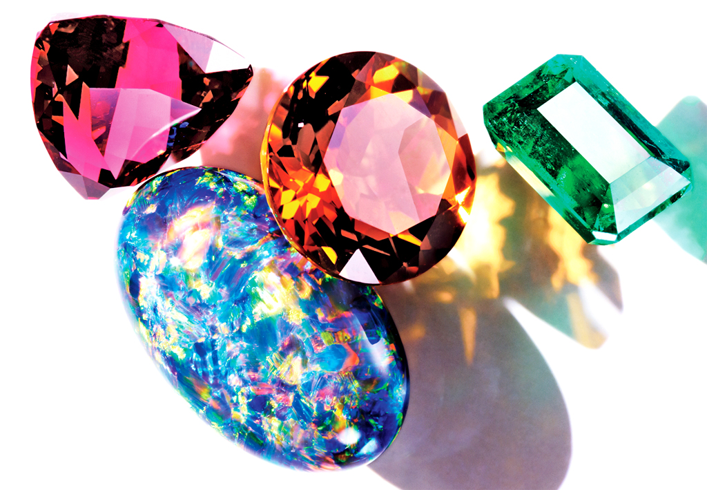
My research for this project mostly consisted of thinking back to old jewellery designs I sketched up in the past along my notebooks and tests. The designs I came up with are entirely my own and only borrow classical elements like the engravings and curves from different references. The gem I used as the centerpiece and aquamarine for the ㅈ and an orange topaz for the O had to be based off of photographs I found on the internet as I did not have the physical gem with me.
The only difficulty I faced with this piece was that there are not gems shaped as ㅈ or O on the internet at least. Making it difficult for me to really understand the highlights, lowlights, and reflections of the gem. I mostly relied on my guess to try to imitate the highly reflective and shiny surface of the gems.
Gemstones
Conclusion
Through this project I discovered personality traits and desires of myself that I would have normally skimmed over. These traits and desires of mine, if properly developed can make a big impact on me and my future. Especially, Jewellery Designer. The meaning behind my love for Jewellery and the choice behind my text shows the passion that I have towards it and has actually inspired me to consider pursuing it as a serious avocation.
I have also learned that it is okay if you fail, you can always just start over with a fresh note and try your hardest. Do not shy from adversity and instead embrace it as we can learn new skills or solutions to old problems from it. Also, I learned to be confident about my ideas. Especially, because I always tend to second guess myself and down-play my creations; which create not only insecurity but also stress.
At first I was very overwhelmed about the amount and the difficulty behind creating a text as were were meant to chose characteristics that embodied our profession rather. However, the more I delved into it, the more I realized how ideas and creation flows one you get the hang of it. I have come to the understanding that just because an idea sounds weird, does not mean it is a bad idea. This came from my Onion composition, the idea behind it seemed ridiculous but in the end the experience and outcome made it worth it.
SIDE NOTE:
I was unable to upload my images because of an “HTTP error”
I will try uploading them in a couple of days in (it usually works after that).
ANT Farm is the name of a group of artists and architects based in San Francisco. These artists produced experimental work between 1968 and 1978, by incorporating a variety of different media such as; architecture, performance, happenings, sculpture, installation, and graphic design. Many of the pieces were archived using camera. And the works often focused its attention on the latest technologies only to critisize it make commentary on the effects it had on the American Culture, specifically video and television. ANT Farm was the product of, like many art movements of the past, a response to a current mode of thinking or predicament. America during the 1960s was full of rebellion, embracing the hippie movement, believing in being a non-conformist, and the birth of rock n roll. ANT Form built itself on these ideas and added a creative twist by incorporating video and new media technology. Examples of ANT Farm’s commentary work on the new technology or television can be seen in Cadillac Ranch, Media Burn, and the Eternal Flame.
“Ant Farm as a media collective was part of the communalism of the 1960s, the rock band, and the emphasis on collaboration and collectivity. Ant Farm also stood for the underground, where ants far from our view build colonies and communities.”
(Quote taken from Randall Packer’s Article on ANT Farm)
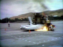
ANT Farm, “Media Burn”
ANT Farm’s Media Burn, made on July 4, 1975 at San Francisco’s Cow Palace, is a performance, spectacle and media critique. The basic premise of Media Burn is that it is that ANT Farm set up a collision between two of America’s most cultural symbols, the automobile and television. Even in Cadilac Ranch, we can see the focus on automobiles as not only a cultural icon but also as a metaphor for an even bigger commentary on society. Eternal Flame also plays on the idea of video and its impact on us as we watch the videos content as a physical and digital audience. The collision previously mentioned before is not just a simple collision of ideas or sides but a physical collision that led to fire and the destruction of the TV wall and the car.
Reflecting the ever growing dependency on television, especially for political purposes or encouraging passivity, Media Burn prerecorded an “Artist-President” who gave a speech on the effect on mass media on society, “Who can deny that we are a nation addicted to television and the constant flow of media? Haven’t you ever wanted to put your foot through your television?” And as the televisions display this speech, a 1959 El Dorado Cadillac convertible crashes into it. This piece uses the car once again, as a cultural symbol (as seen in Cadilac Ranch) to address the pervasive existence of television in everyday life. They even recorded this artwork using the same media ANT Farm was making a commentary about.
This work caught my attention. Not just for the fire or the weird combination of seeing a wall of televisions falling on top of a new car. But because it manages to utilize two different icons in order to depict the commentary about our society. ANT Farm has manage to embed so much meaning into these respective icons and create a breathtaking performance. The irony of this work is that the “artist-dummies” that are driving the car being guided by the elaborate monitoring television system to their inevitable destination, which is a big wall of television sets.