


an inside look
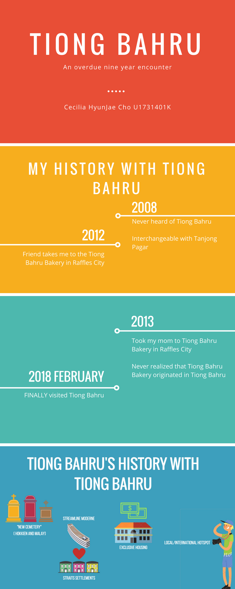
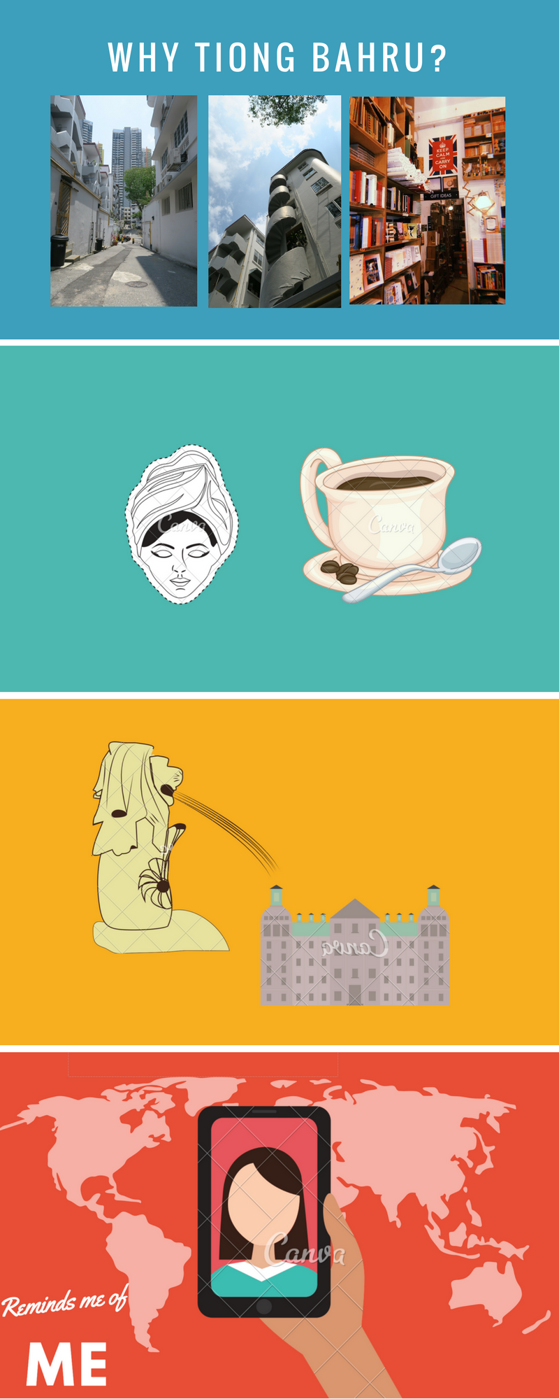
For my second and last project of our Graphic Form class, we were tasked with creating a Zine inspired by a specific locale in Singapore. A zine is a “small-circulation self-published work of original or appropriated texts and images, usually reproduced via photocopier” and can be short for “magazine” or “fanzine”. For this project, we were given the choice to chose any location (preferably a location we were unfamiliar with) and design a design according to our taste. The location I chose is Tiong Bahru. Tiong Bahru is located on the Green Line. Famous for their combination of old and new, hipster cafe joints, and serenity.
The name “Tiong Bahru” itself is a combination of two languages. Tiong Bahru translated loosely means “New Cemetery” with “Tiong” comes from the Hokkien word “thióng 塚” and “Bahru” comes from the Malay word “bahru – Malay. “thióng 塚” meaning cemetery while “bahru” meaning new. This compound word is the parallels the idea of Tiong Bahru being both old and new, quiet but lively. Originally, Tiong Bahru was a cemetery that later turned into a housing district that incorporated the European Streamline Modern (simplified Art Deco) and local Straits Settlement shop-house style. Tiong Bahru has always been about mixture and balance.
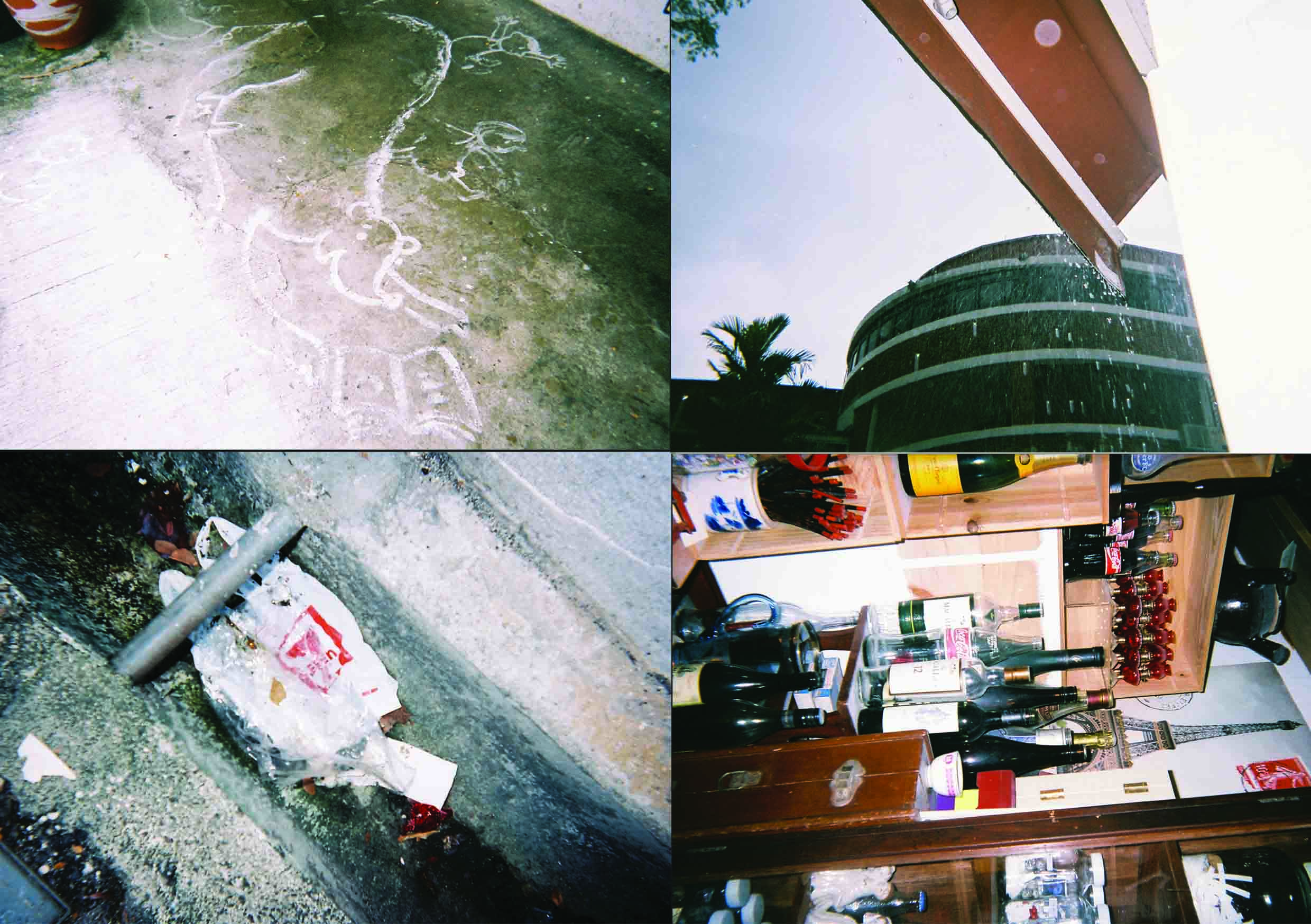
Location Pictures
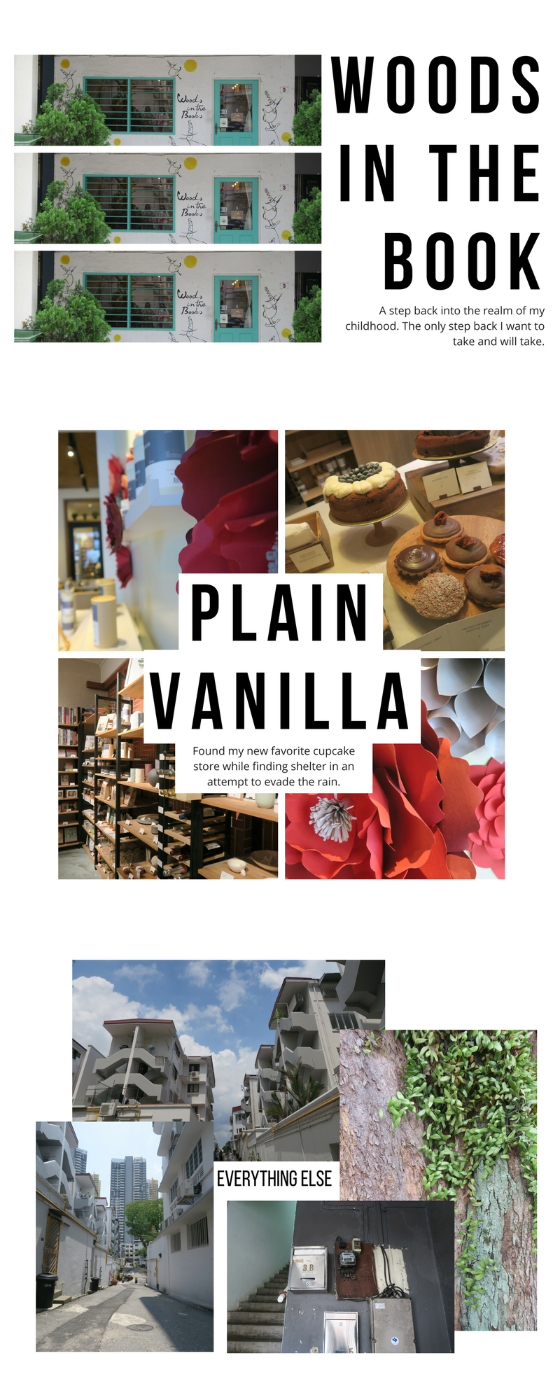
During my first visit to Tiong Bahru, I decided not to have a a specific focus as it was my first time there and did not want to miss out on anything.
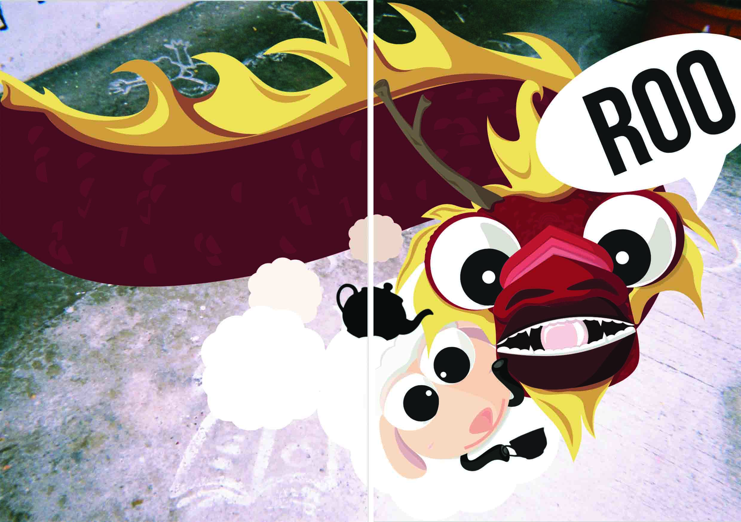
The original plan for my zine was to incorporate the idea of hybrid/mixture/combination in my artwork and then eventually link it to myself and how my mixed upbringing has made me the person I am today. For the cover of the zine, I wanted it to make it quirky and different, much like my personality. I created a character called “Nost” who is a Korean Dragon and her friend “Bah” who is a sheep. I wanted to incorporate these two in the cover of my zine as sneak peak into my zine. Though I did not specifically plan my layout for the pages within, my initial concept was to create a coloring page or mad lib page. Coloring pages and Mad Libs were a big part of my childhood and I felt that it was fitting to add a bit of childhood to not only express myself but also to make the zine more interactive for the reader.
(Insert sketches and examples)
However, upon further development and revision, I decided to focus more on my characters Nost and Bah and their trip to Tiong Bahru.
Inspiration
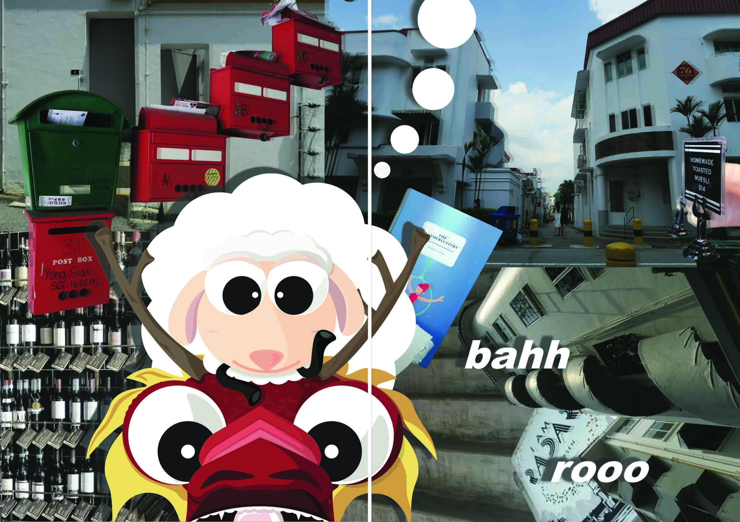
This cover shows a mixture of traditional and modern medium of drawing. Though a little unclear, the background is a photograph taken from a disposable film camera of a floor painting. While the two characters in the foreground are created on my laptop using Adobe Illustrator. My cover shows a close up on my two main characters, Nost and Bah holding a teacup will exclaiming the word “Roo”. This character idea came from the word “Tiong Bahru” itself. I wanted to express my quirky personality by joking around and saying that Tiong Bahru sounds a lot like “Tea-Yong-Bah-Roo”. After some deliberation, I told myself why not and developed on the idea of using “Tea-Yong- Bah- Roo”.
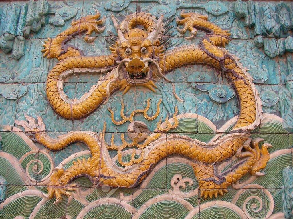
“Yong” sounded like “용” which is the Korean word for dragon.
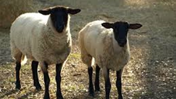
“Bah” was the sound sheep’s make.
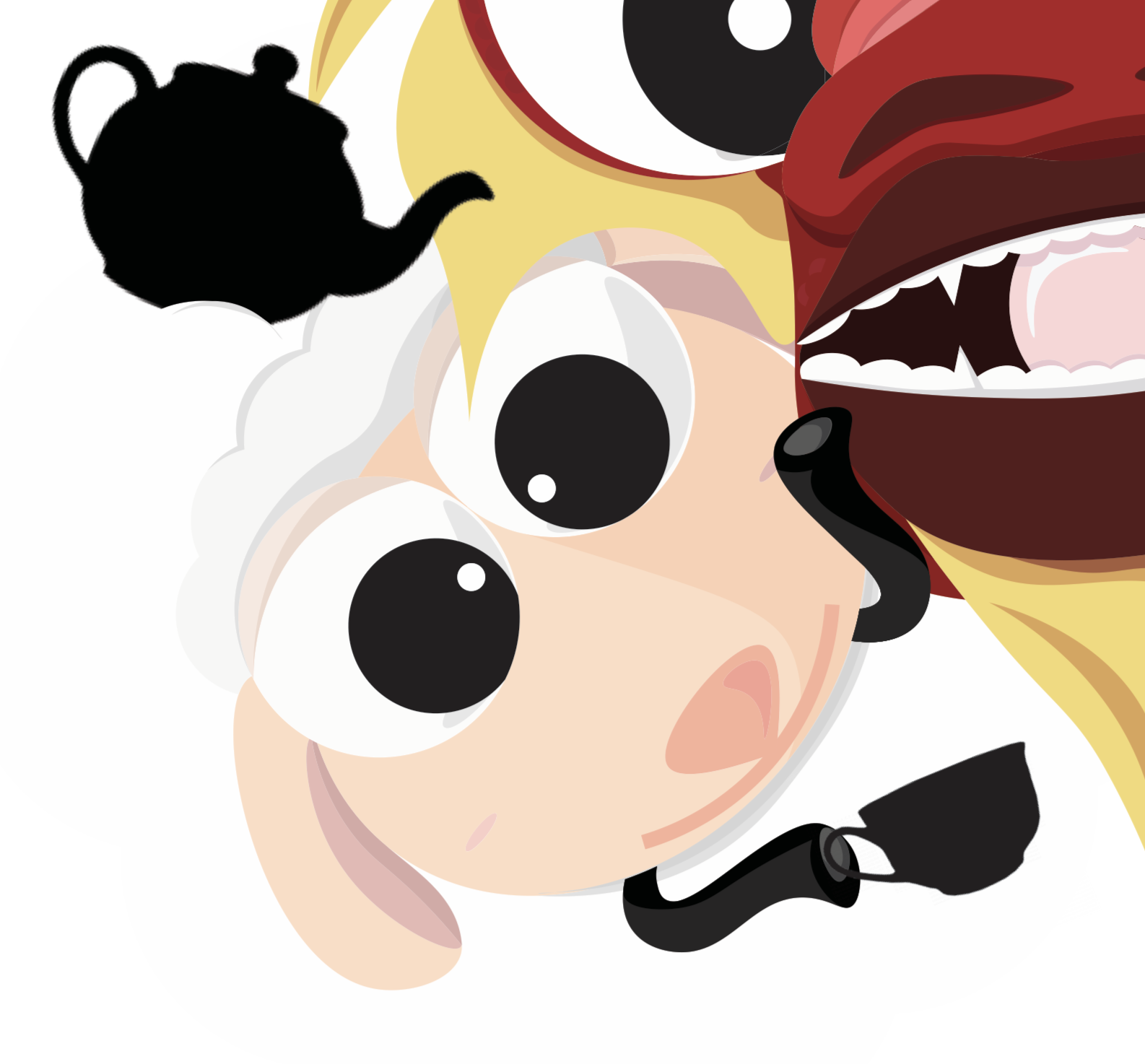
“Tea” means tea and I thought that it would be a nice beverage the dragon and sheep could share together.
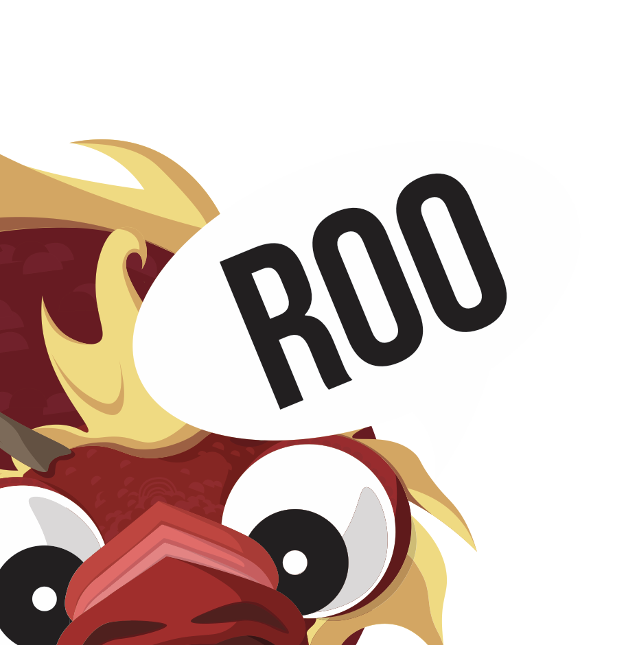
“Roo”, eventually became the sound the dragon would make, much like how the sheep would go “bah”.
Story
This led to the cover page of a sheep and dragon side by side holding a teacup and teapot as the dragon exclaims “Roo”. Nost is a Korean dragon who has come to Singapore with her best friend in order to visit Tiong Bahru for the first time. I myself was born in Korea to Korean parents, though I did grow up overseas. My decision to create a dragon was due to the fact that the “iong” in “Tiong” sounds much like “용” the Korean word for dragon. Making my dragon Korean was more of a homage to my home country and culture. Nost constantly ate at Tiong Bahru Bakery in other locations but was unable to visit the Tiong Bahru itself. After many years she has finally come to the decision to visit Tiong Bahru. Bah is Nost’s faithful bestfriend who has stayed loyal since their childhood. Many believe that it is crazy that a sheep and dragon could be friends but Bah has always been Nost’s support system and helped her through the hard times.
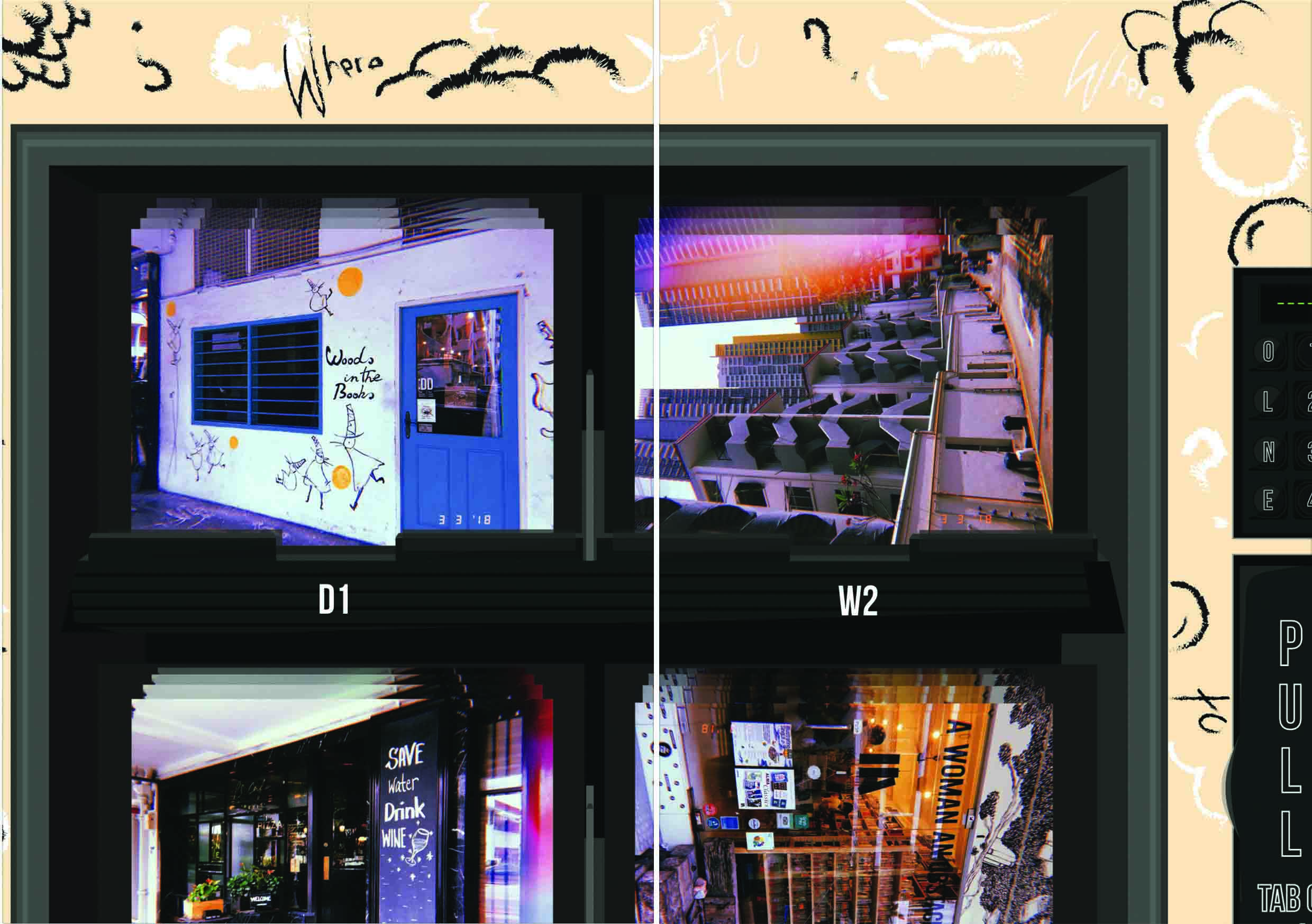
First Spread
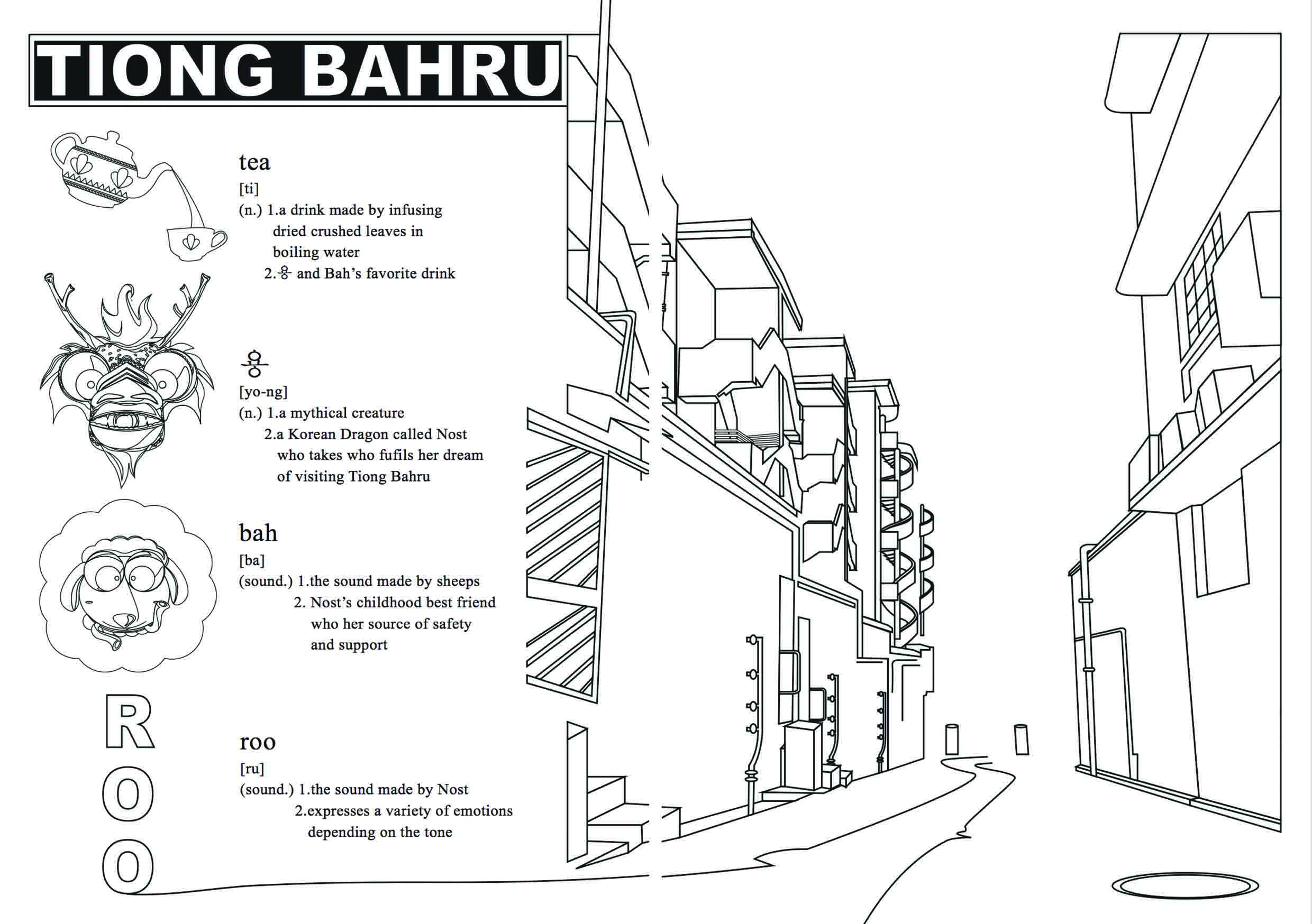
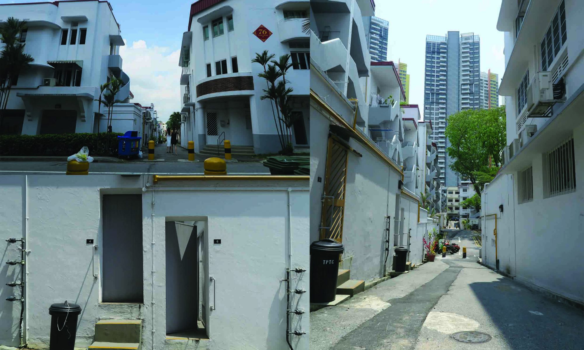
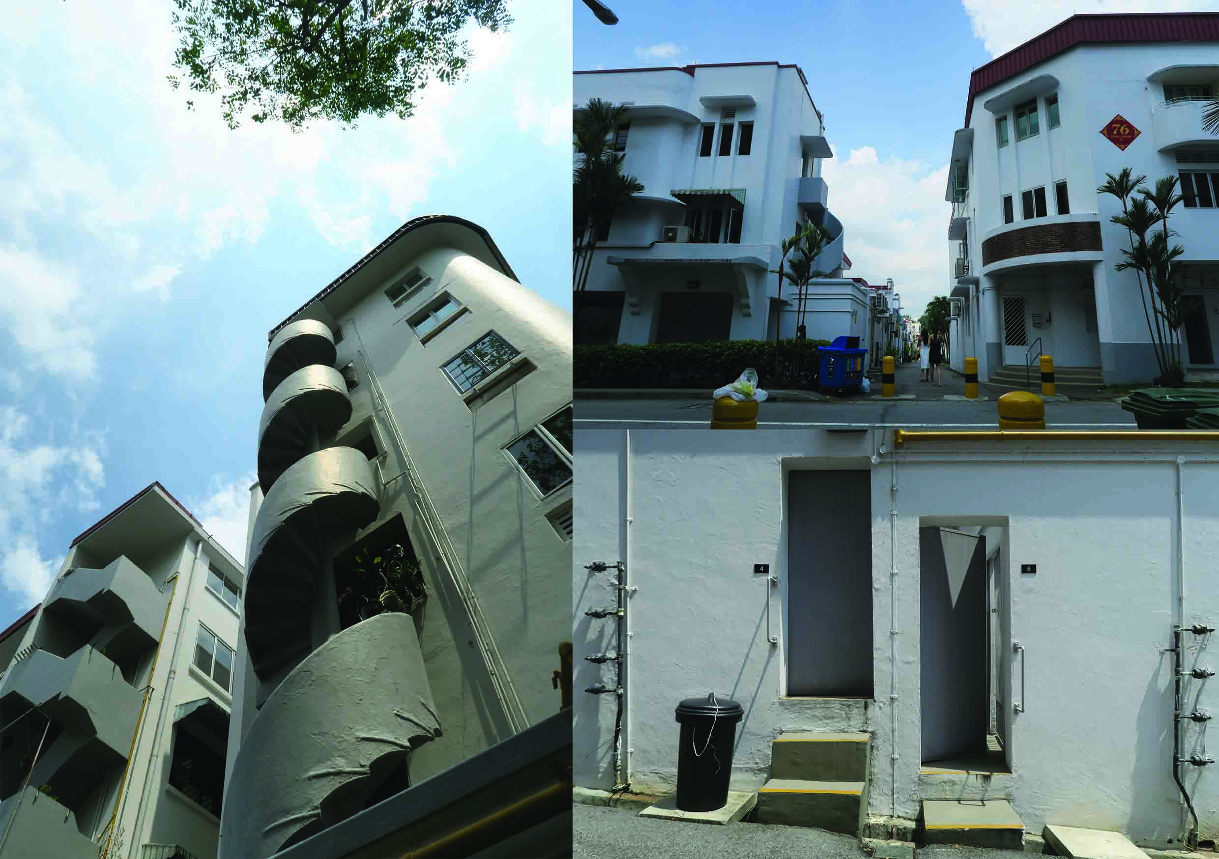
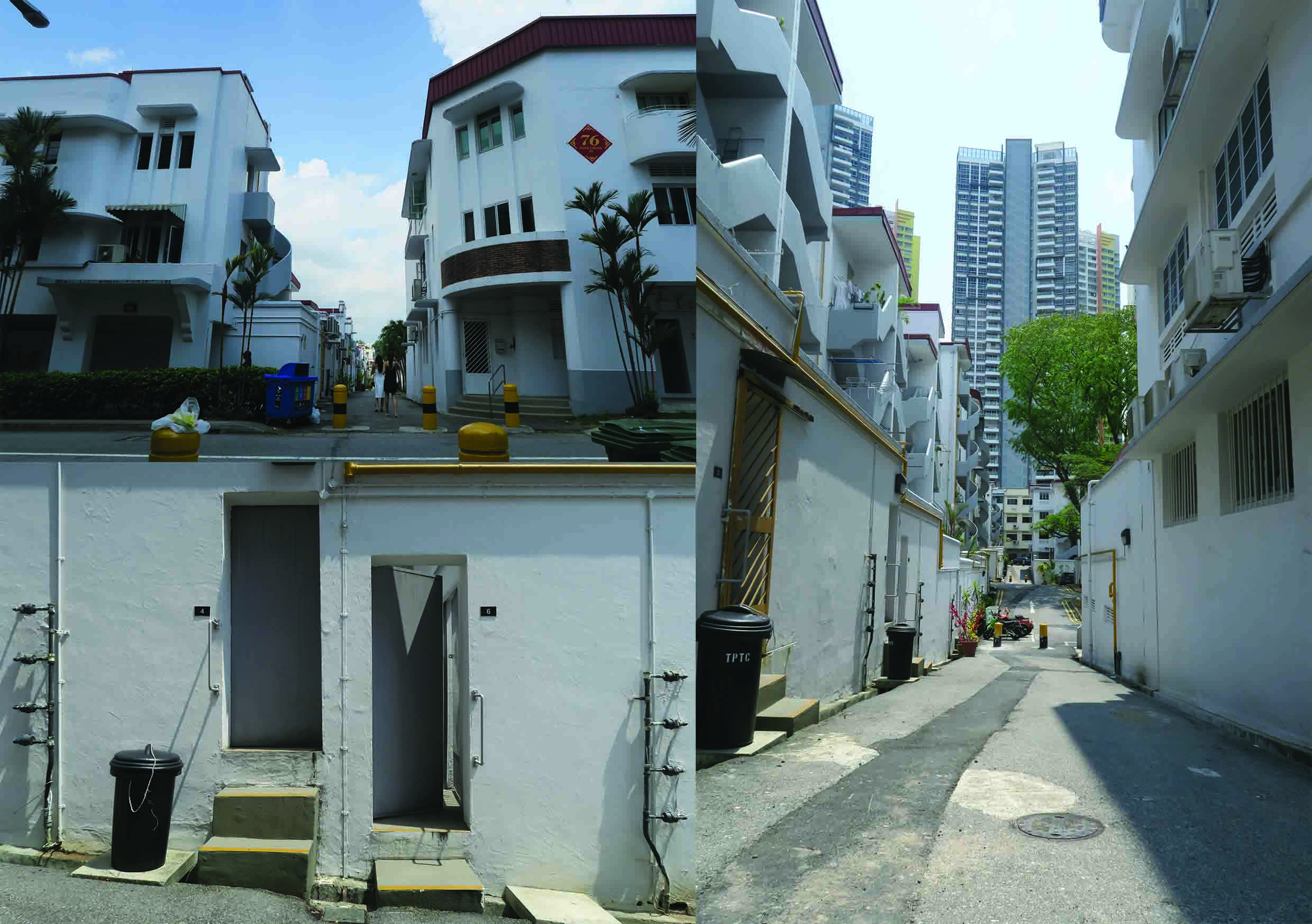
My first spread paid homage to my childhood by doing the entire spread in a coloring book format. The right side has a black and white with a contour of my favorite street in Tiong Bahru. The picture I chose for my coloring book has a linear perspective that ellicits a sense of movement and depth. I feel as if I was being pulled into the main street by a seductive force. Even the street itself exuded this pull. I captured the elements that made this street Tiong Bahru, from the Streamline architecture to the pipes running on the exterior of the walls. While the left side of the spread has an introductory page that explains the “Tea-용- Bah-Ru”. Everything on this page is black and white so that the reader can color whatever he or she wants to.
Inspiration
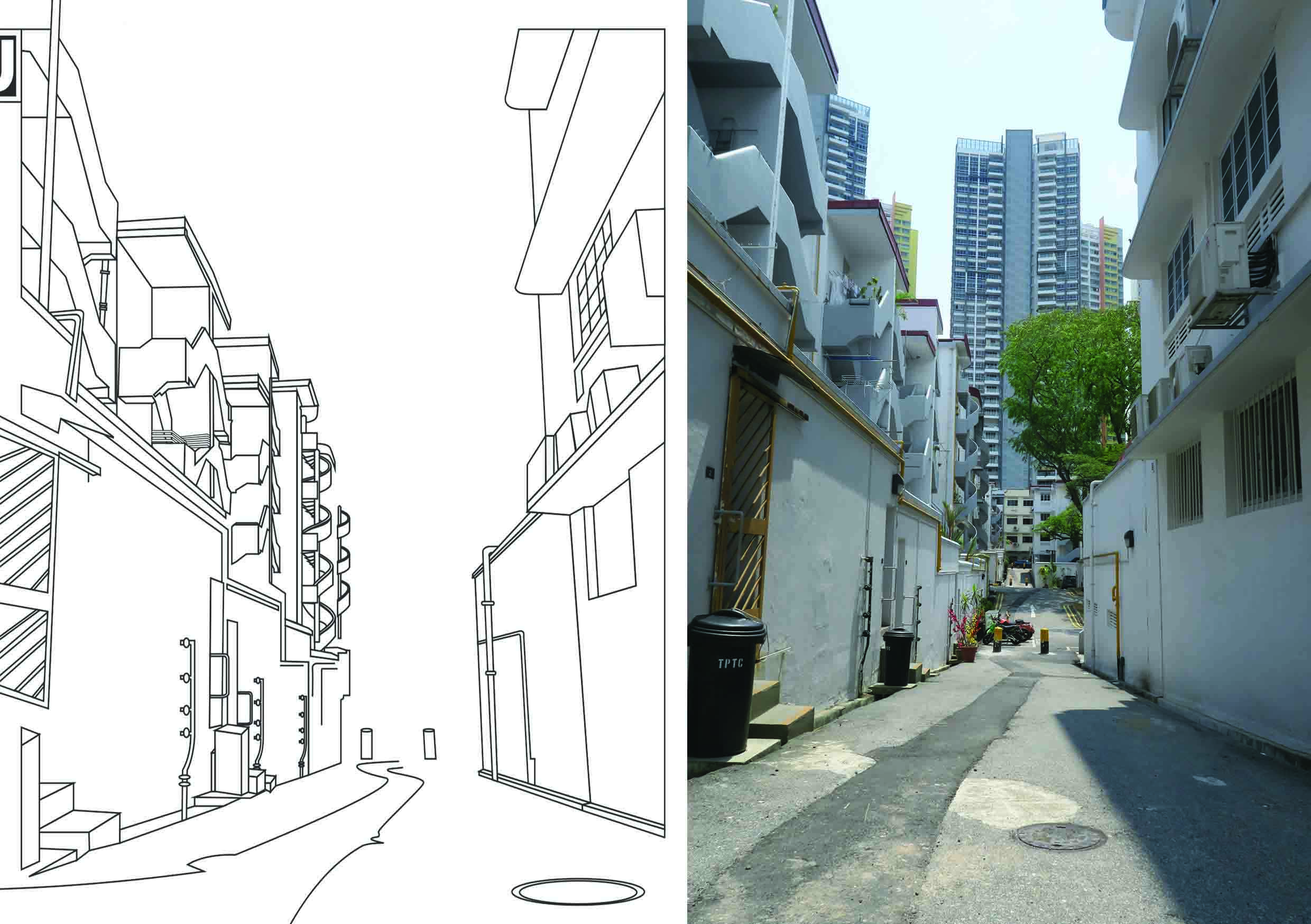
I removed certain elements (the buildings in the background) from the line drawing so as to focus our attention to the essence of Tiong Bahru which can be found in the piping along the walls and the clean cut streamline architecure. The lines (especially the floor) have no end so that we can use the implied lines to create a sense of openness and curiosity. Like coloring books, what is beyond the line is up to the artist with the imagination.
Story
This page is like the beginning of Nost and Bah’s adventure as it is not only the path to the main street of Tiong Bahru but also because it was the place I fell in love with Tiong Bahru.
For the second spread I focused on mixing two different media, Adobe Illustrator Vector and Old School Collage. I chose to use mix media as it alludes to the idea of mixing the old and new. Though collaging is still used today, it is considered an older technique and is commonly associated with either ransom letters or vintage art. Drawing from the idea that collaging is old, I paired it up with another technique used to create a whole image– Illustrator. This juxtaposition of the two techniques create a sense of harmony yet jarring difference due to the solid color and clear lines. The background deals with a multitude of perspectives and tones while the vector is limited to an one point perspective with minimal tonal ranges.
Story
My second spread is depicts my main characters debating on where they should go. There are so many places to visit in Tiong Bahru, from its cafes to its restaurants to even bookstores. Bah is taking his usual position on Nost’s head, resembling a thinking cap. Proving that these two are two pieces to a puzzle. They balance one another and help each other do their best. In this case, they are helping each other strategize on where to go and what to see.
Third Spread
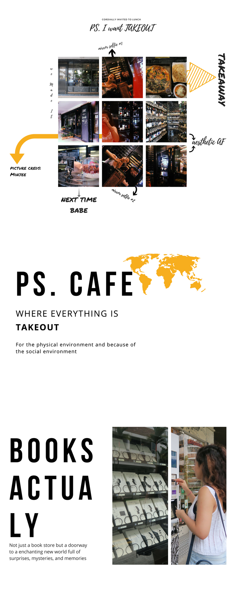
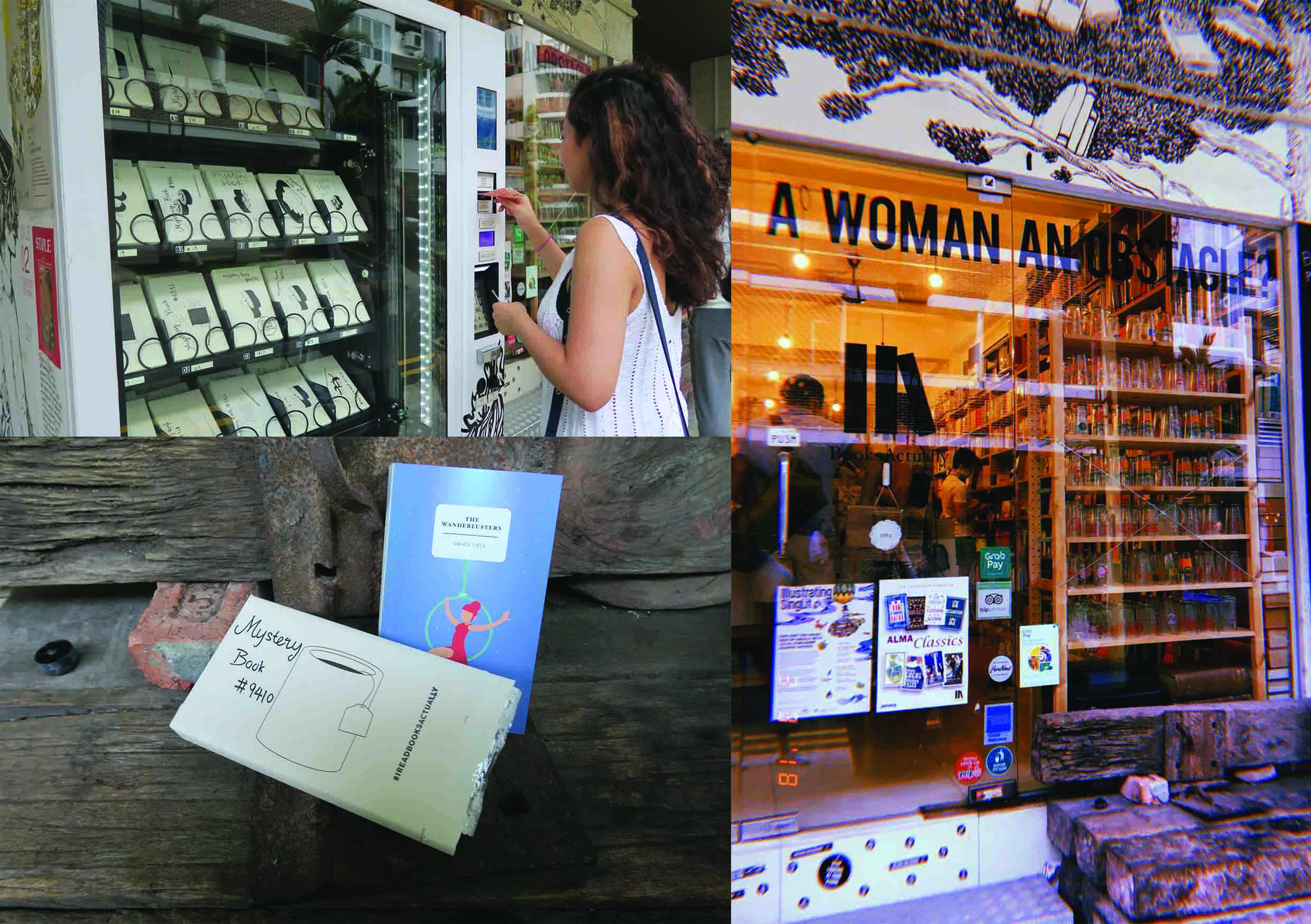
For the last full spread, I chose to take inspiration from the Mystery Book Vending Machine, which I felt best embodied my thoughts as I got ready to go to Tiong Bahru. I did not know what to expect and was open to anything that happened, whether things went according to plan or not. The vending machine itself is etched with hand-drawn marks relating to the two characters. The black markings are inspired by the scales of the dragon while the black orbs are a nod to the 여의주 orbs that the dragons in Eastern mythology carry. The white markings refer to the sheep and the shape of its body. Originally, I intended to put as many pictures on the vending machine and show the entire vending machine from top to bottom. However, I realized then I would not be able to see the images clearly and this would obscure the focus of the page. To counteract this I consulted my instructor who recommended that I spread this across two pages and crop the vending machine so that I focused on the top two or three. This allowed the focus to go on the images and showed the places clearly.
Story
After struggling to come to a conclusion, Nost and Bah stumble across the Mystery Vending Machine (based on the Mystery Book Vending Machine in front of a book story called Books Actually). This vending machine dispenses post cards for travellers to help decide where they should go next or even as a souvenir. In the end Nost and Bah use this machine, much like I did, to help them discover Tiong Bahru. This symbolizes that there is so much more to Tiong Bahru left (as you can only see a portion of the vending machine) meaning that the two main characters (and myself) have yet to even break the surface of Tiong Bahru. Possibly setting up for a sequel *wink*.
Throughout highschool, my art teacher always talked about wanting to make a zine for the class or even for ourselves but due to money restrictions and time constraints, we were unable to make it. However, after this project, I can successfully say that I have created my own personal design. And far from a perfect zine as there are always room for improvement, I am proud to claim this zine as mine. It was a fun experience as I felt that it introduced us to the world of book making and illustration, giving me a taste of what making a children’s book or even a zine in the future would look like. I enjoyed being able to visit Tiong Bahru not for just pleasure but work and creating a piece centered around my interpretation of the place.

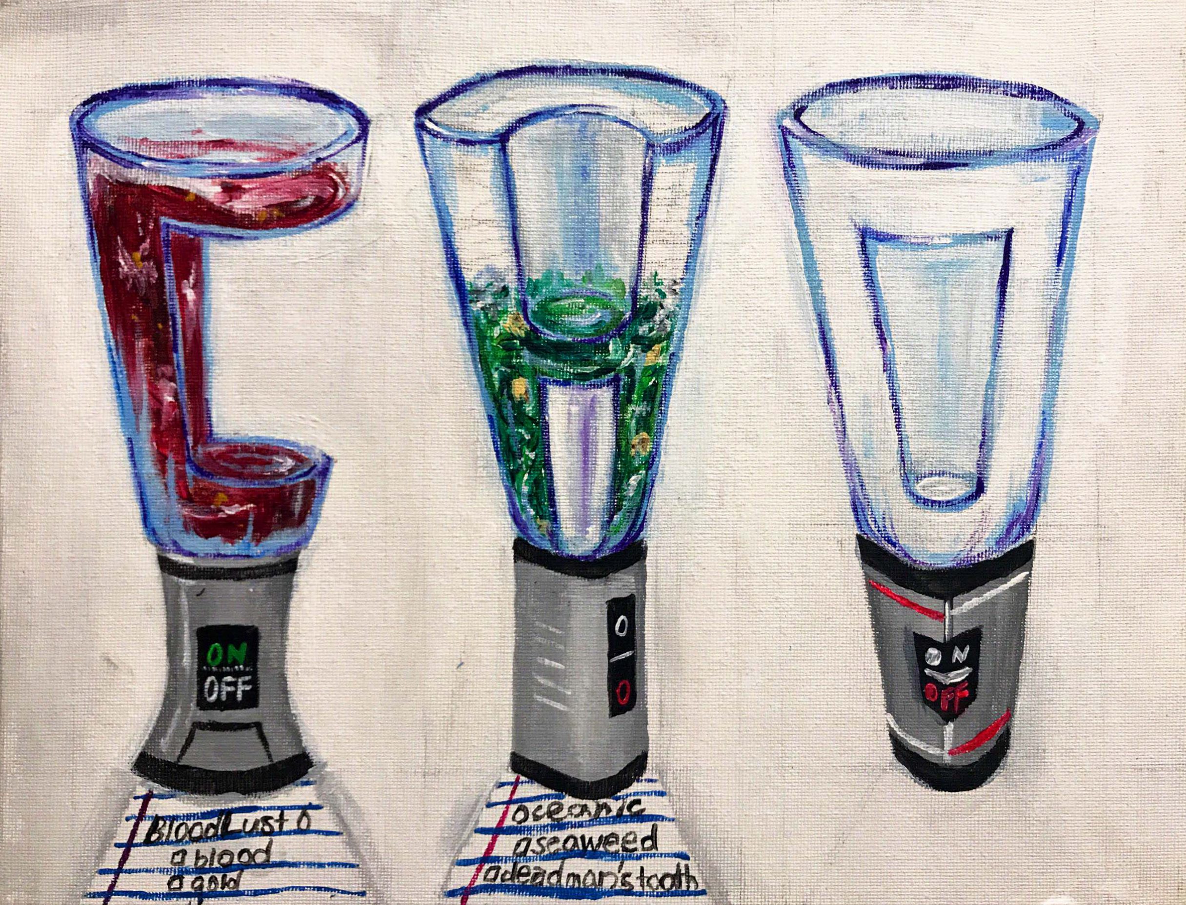
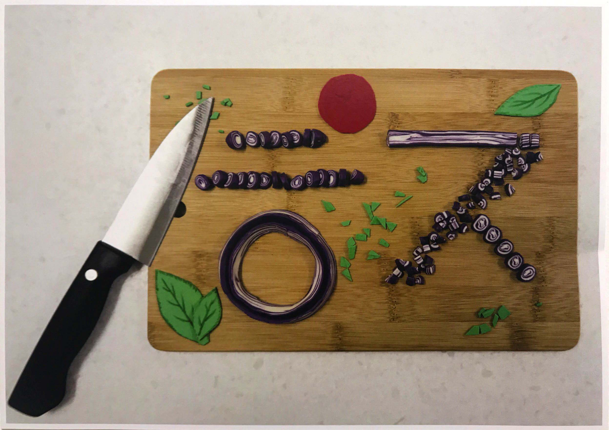
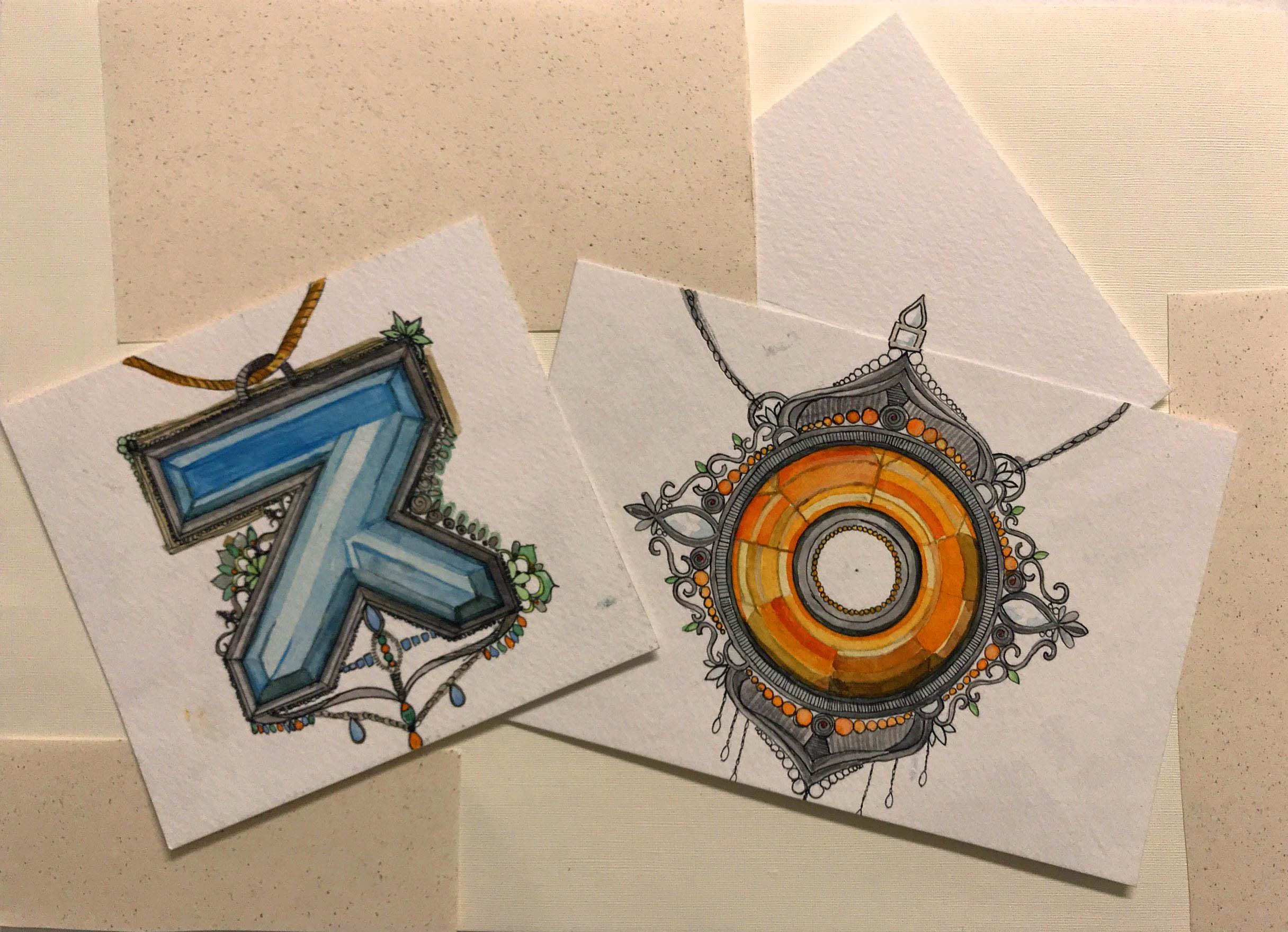
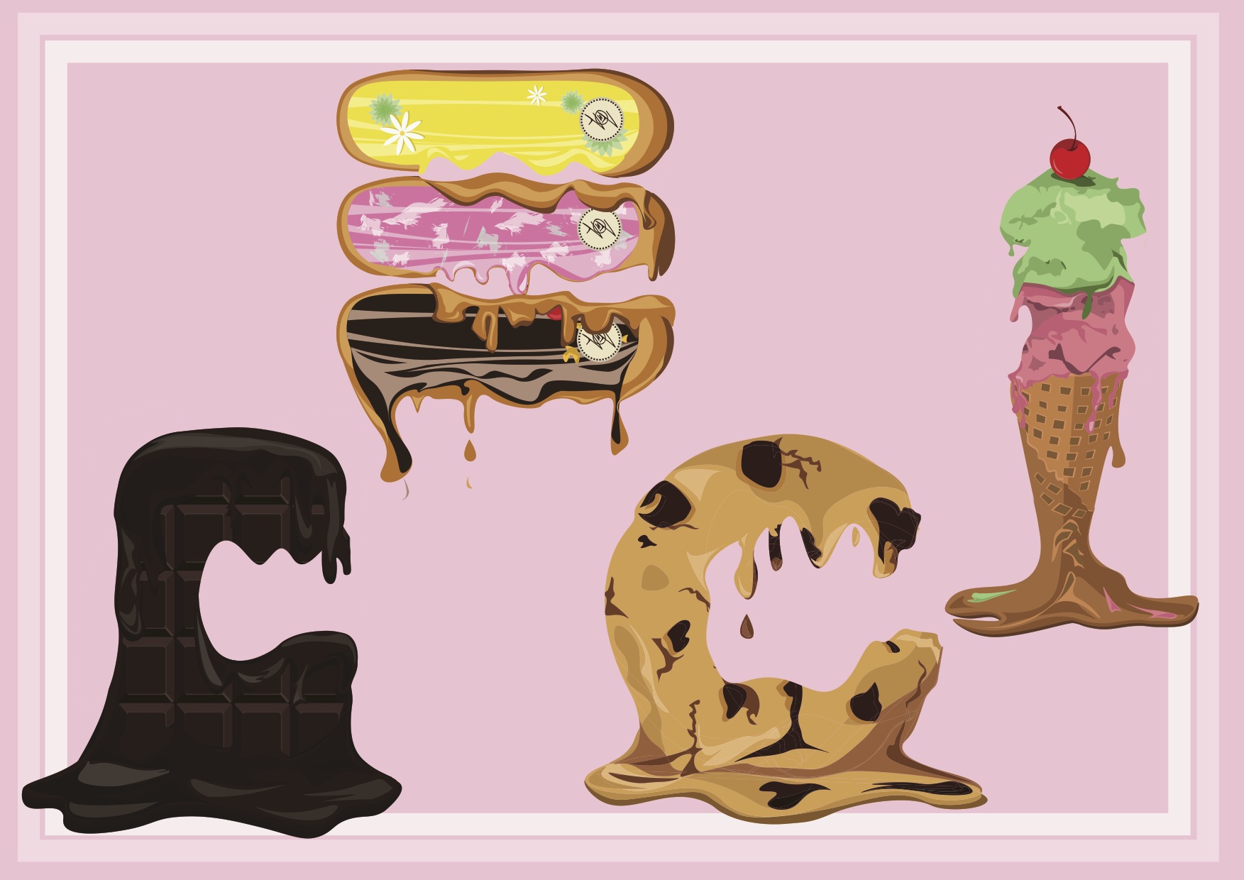
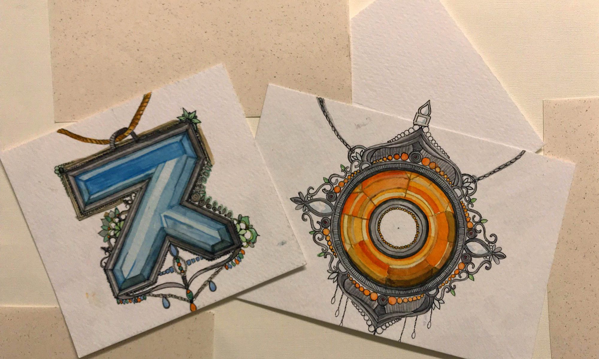
Image Making Through Type was our first project for our Graphic Form class. The first project of the new semester began with a tutorial on Adobe Illustrator and a brainstorm of possible future professions. The project itself was about embedding the text (your name) with the essence and semantics of the our possible future vocation. When we see the type, our first thoughts should not see the piece as an image but decorative lettering. Our jobs and the name we wanted to utilize had no limit or restrictions. We could choose the most wackiest job or a job one genuinely aspired to have. And we could choose the initials of our birth name, called name, nickname or certain letters from any part of our name.
Given a week after the project was revealed to us to think of the four professions, our text, and rough draft thumbnails of our final piece. I began with some mindmaps for name and professions reflectively.
I wanted there to be meaning behind the letter/characters that I would ultimately choose for my four pieces. This is why I decided to balance both my Korean name and English/Church name within my four pieces. Ultimately, two of my pieces contained lettering from my English name, another piece containing the characters of my Korean name, and the other using a letter from my English name with a character from my Korean name to create a combination that sounds like my Korean surname.
The reason why I chose to mix my Korean name and English name, especially in that last piece that incorporates them together in one piece, is because of my upbringing. Though born in Seoul, South Korea, I moved abroad at the age of three due to my father’s work and spent my years in America, Singapore, and eventually South Korea. Due to my diverse upbringing and exposure to different cultures, I have suffered the typical “identity crisis” as well as reaped the benefits of the variety of experiences. This is why many of my works subtly incorporate ideas of culture and identity, whether it be through visuals or symbolism.
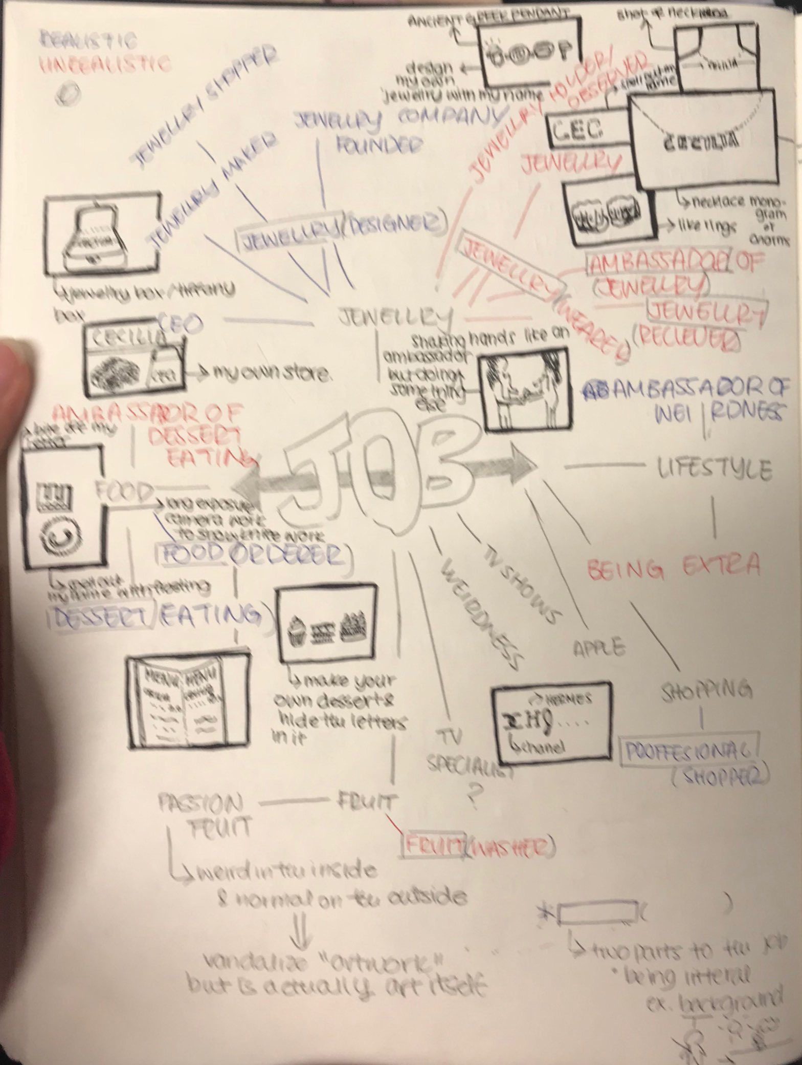
I wanted a balance between two realistic jobs, especially two jobs I considered pursuing, and two wacky jobs. The wacky jobs can be anything, fictional or just unrealistic. And though I was not sure about my final four, I knew that I wanted to incorporate food and jewellery in to my pieces as they are some of the essentials in my life.
There was a misunderstanding of what was expected in our designs. Many of the students were under the impression that the piece could have been very image based and can be the outcome of rearrangement. However, what was expected of us was a text based piece with elements of our job on the text. So many of my ideas focused on the overall image of the piece rather than focusing on the words. Redesigning my ideas was quite difficult in the beginning, however, the ideas started to flow better as time went by.
In the end, I decided to narrow my job choices to four separate jobs that incorporates my passions and interests. My four jobs are World Renown Dessert Maker, Mythical Smoothie Barista, Full-time Professional Onion, and a Jewellery Maker. Each job is incorporates something I am very interested in with external influences like friends, films and TV shows, and even daily experiences.
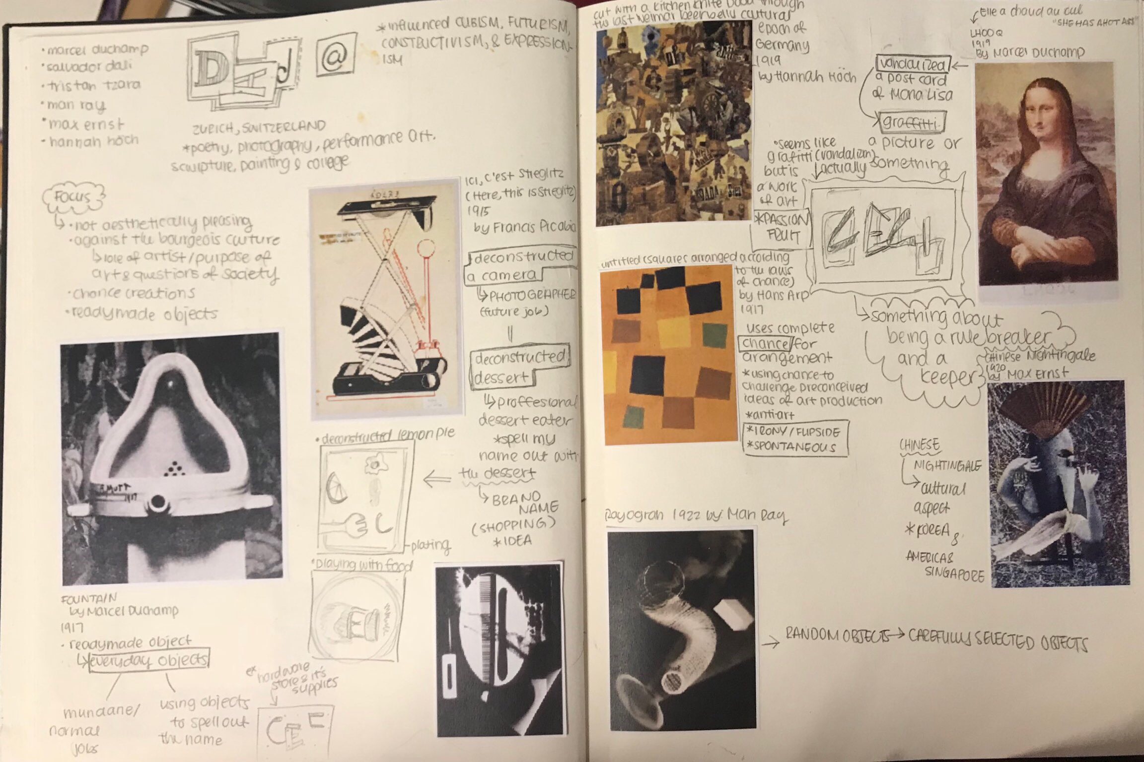
Wanting to use a variety of media for this project, I looked a variety of different inspirations ranging from digital illustrations, water color, acrylic paintings, and clay (sculpting).
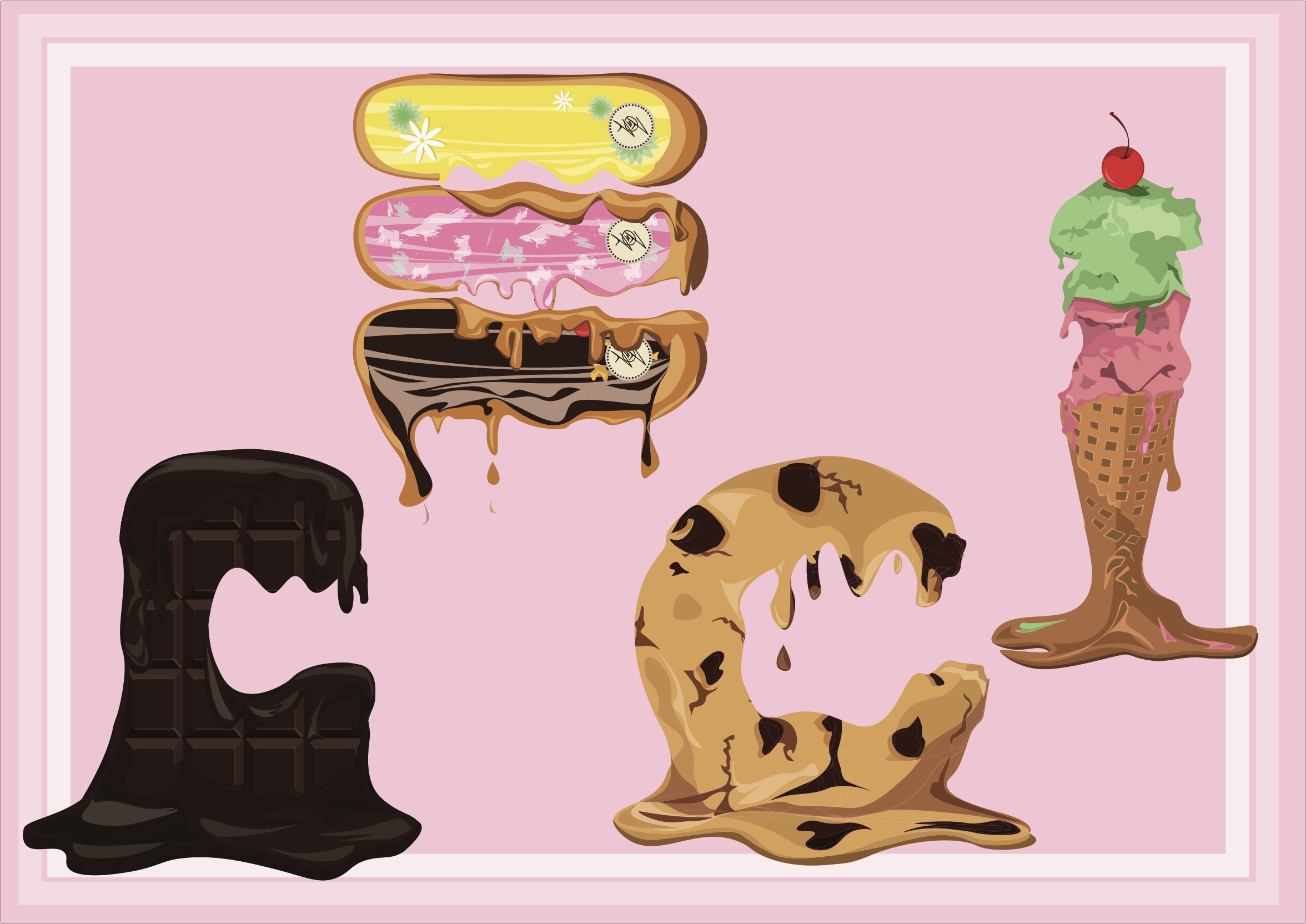
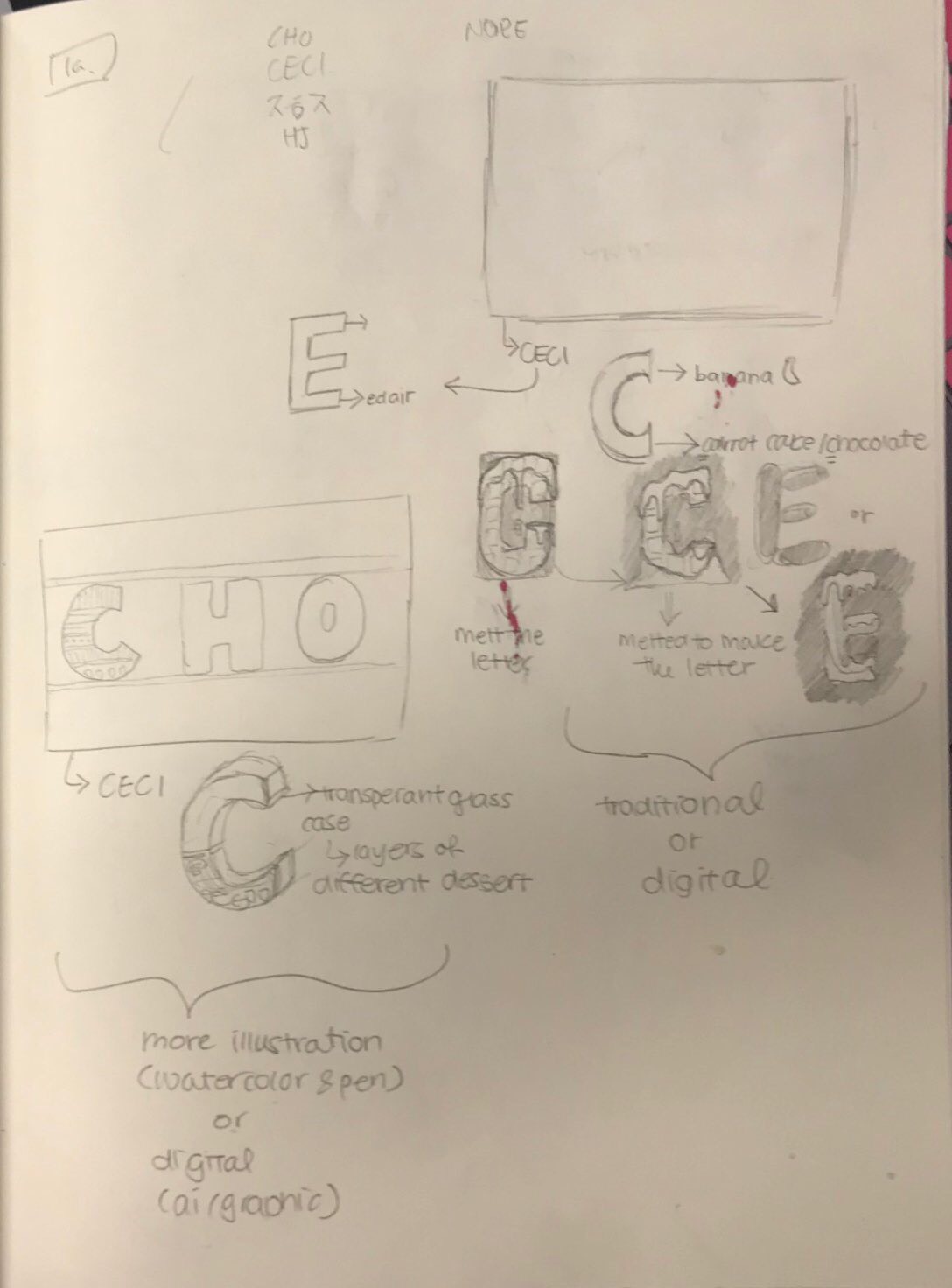
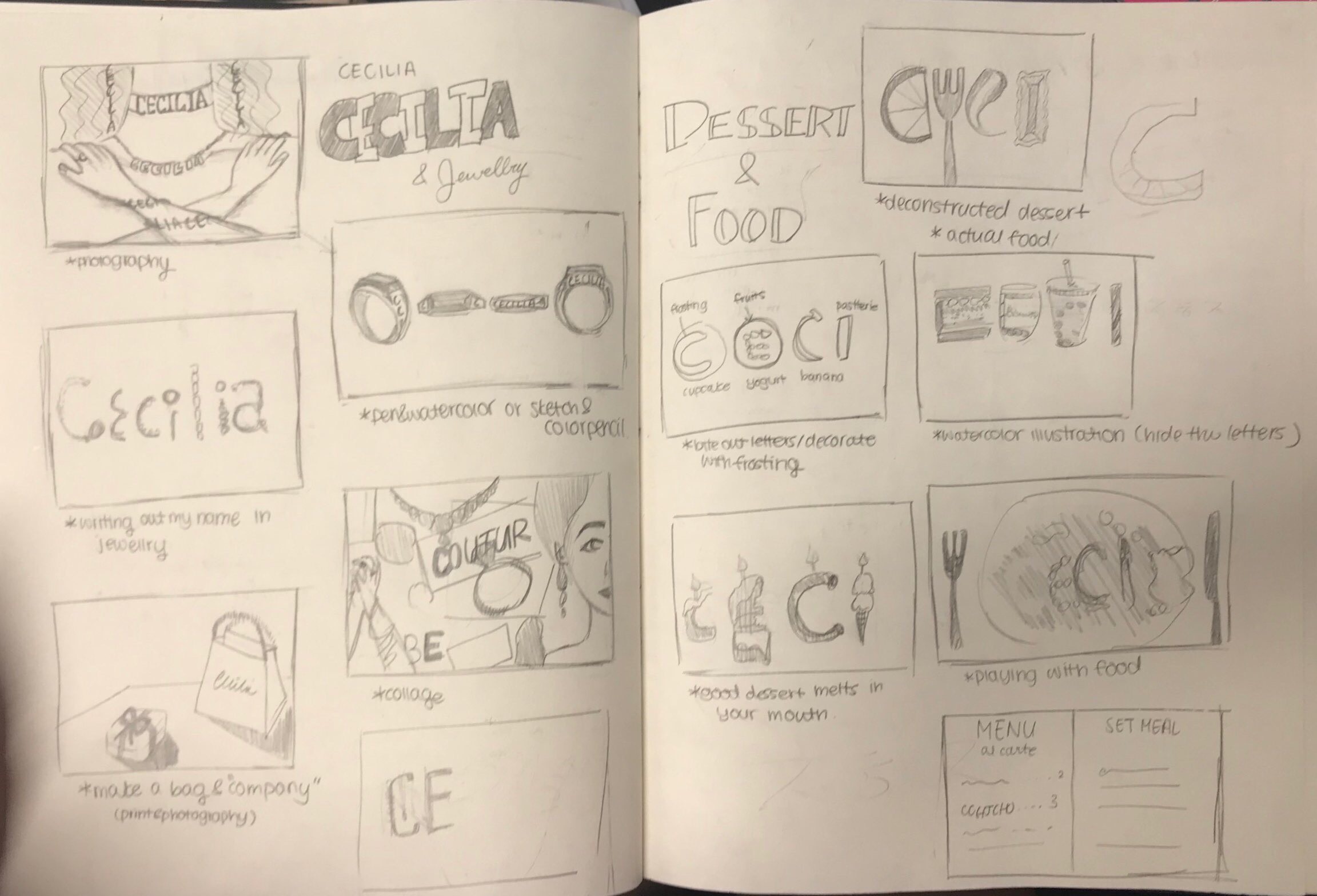
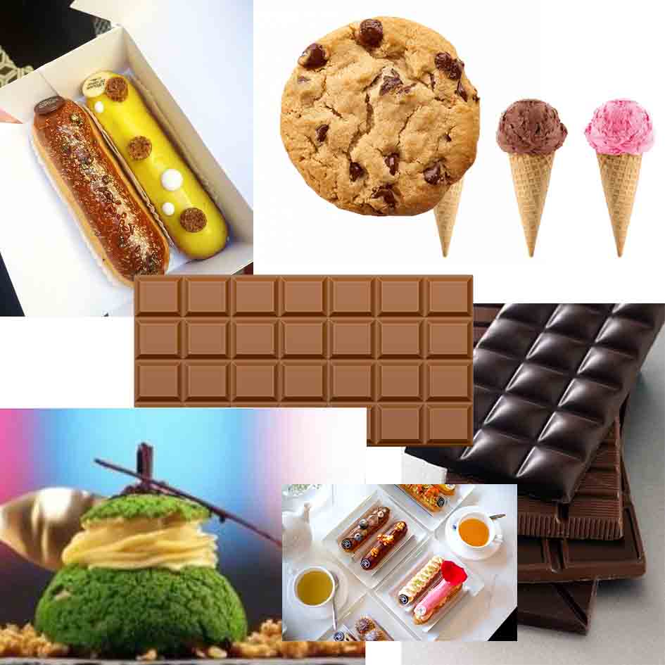
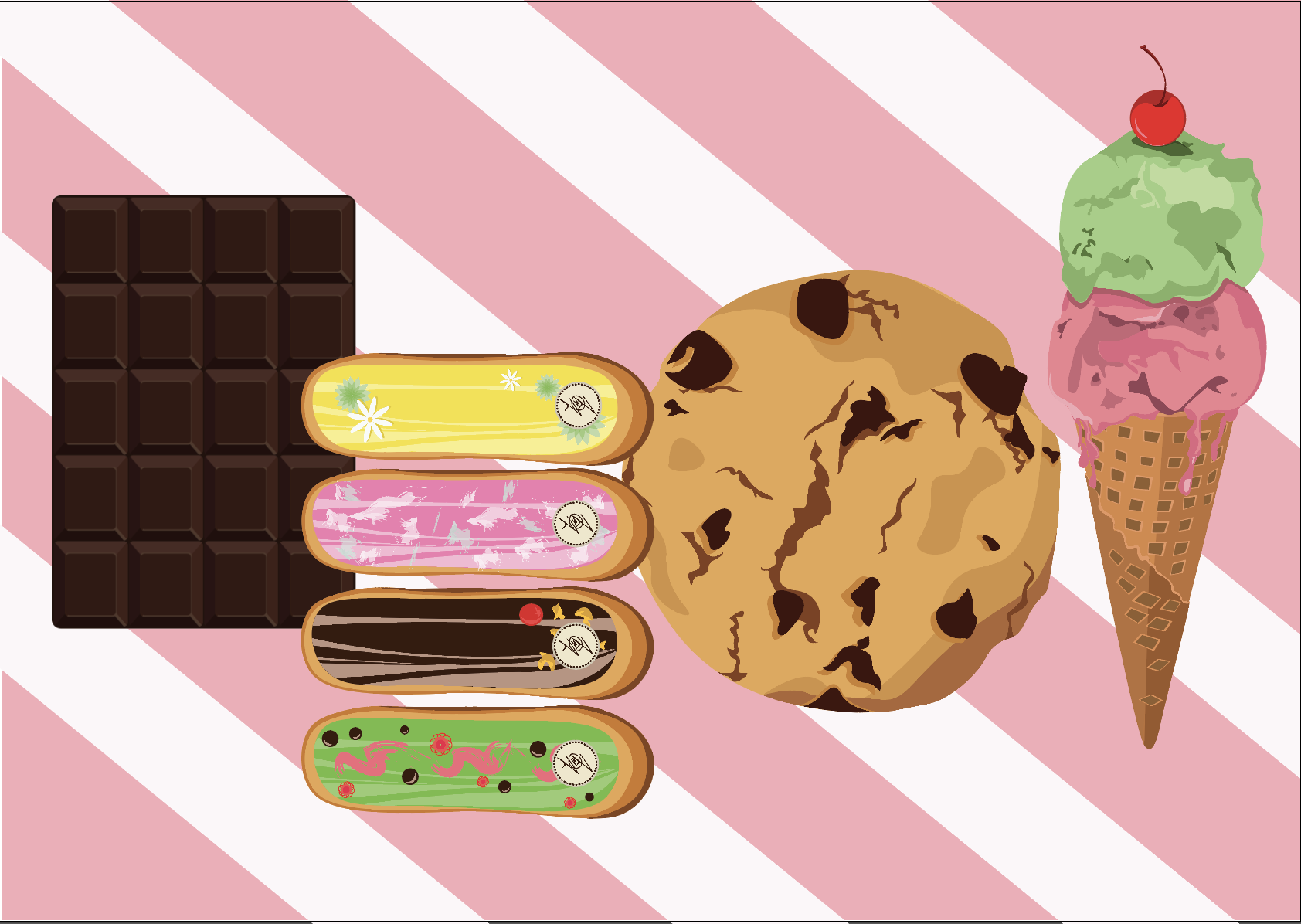
The name I chose for this piece is CECI. This is my nickname derived from CECILIA. Throughout the years my parents, friends, and even baristas called me CECI. CECI is a nickname that has stuck with me and has remained a constant in my life ever since CECILIA was too long to write or a mouthful to pronounce. And like the consistency of my nickname, the my love for desserts have always been by my side. I have one of the biggest sweet tooth ever, and this has left a big impact on the shows that I watch and the food I seek. Each dessert, while my favorites, were purposely chosen for the fact that the first letter of the dessert matches with CECI.
(C)hocolate
(E)clair
(C)ookie
(I)cecream
I chose World Renown Dessert Maker because of love for sweet food. This was further enforced by cooking shows related to desserts or or bloggers on Instagram that upload dessert pictures. And when people describe or critique the desserts, they always say things like “the chocolate just melts in my mouth”. And I feel that good desserts should not be so delicious that it really does melt in your mouth. A dessert is supposed to be the finishing aspect of your meal and should soothe the mouth after the savoury onslaught of dinner. As a world renown dessert maker, I have a duty to make my desserts as delicious as possible to the extent it just melts in my customers mouth. And like my dessert, so does my text made from my dessert specialty menu.
For my research, I mainly focused on vector illustration and looked through many images of desserts. I also looked at images of melted chocolate to get the sense of how a dessert would melt and the highlights and lowlights of the melted area.
I also looked at possible background designs associated with candy and desserts. I cam across the candy cane design with the alliterating white and red strips spiral down diagonally.

I had two problems with this piece. One being that it was very difficult to achieve a realistic melted effect for some of my desserts ( the chocolate and eclairs especially). Maybe it had to do with the fact that vector illustration, unless extremely skilled, is hard to create that smooth and gradual melting surface of the dessert. The second problem is that after trying to apply my background idea to my piece, I realized that the overall composition was too messy and cluttered. There was so much detail on the dessert that the background took away from the detail. And from someone who always manages to make their work look cluttered instead of aesthetic. I have learned that it is okay to cut certain ideas from your original plan. In the end, I did cut the candycane design from the overall composition and added two thin white borders around the edges.
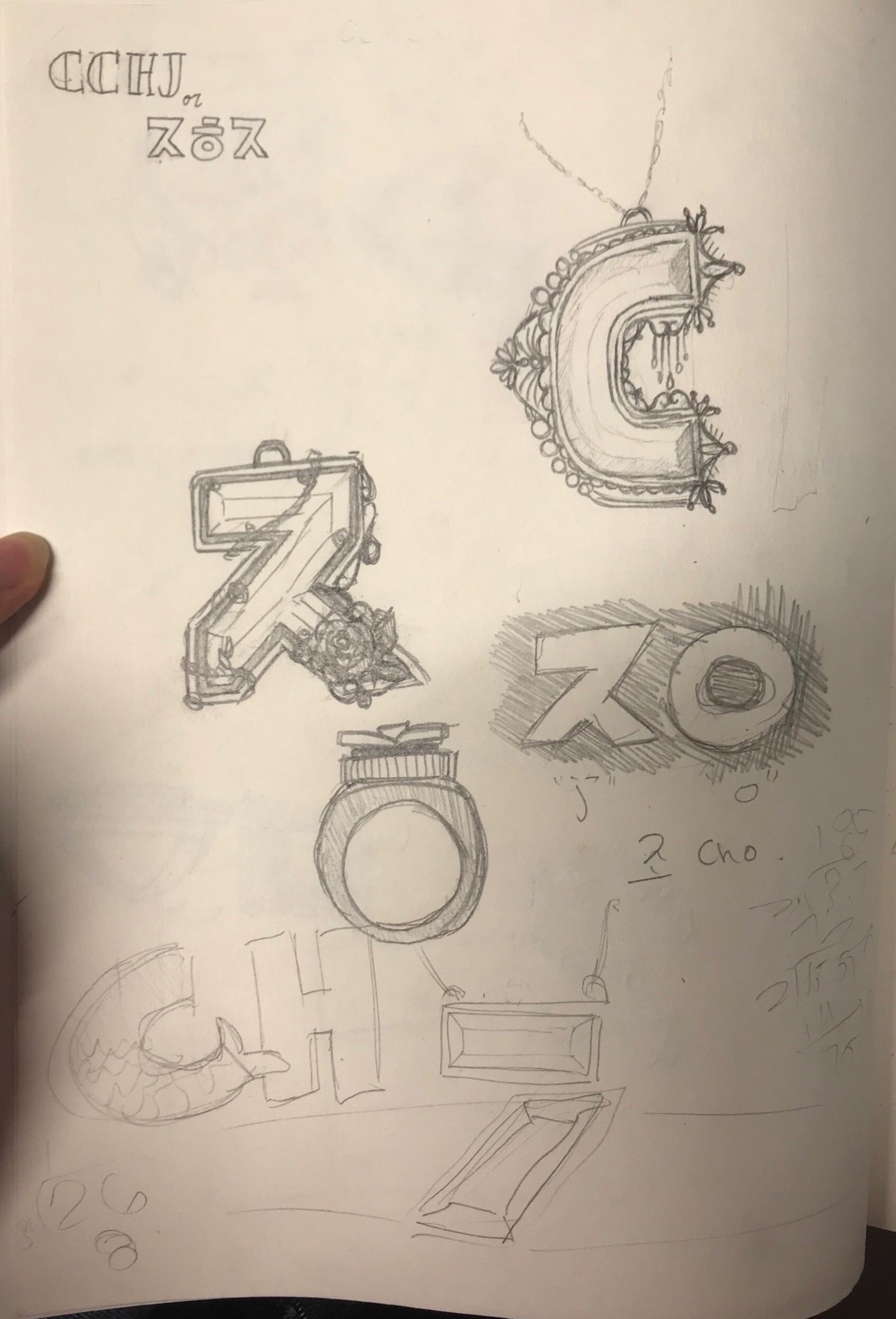
For this composition, I chose my last name CHO. The H in CHO is very dynamic compared to the more circular C and O. The dynamism is allows for more variety in my composition. CHO is the Romanization of my Korean last name.
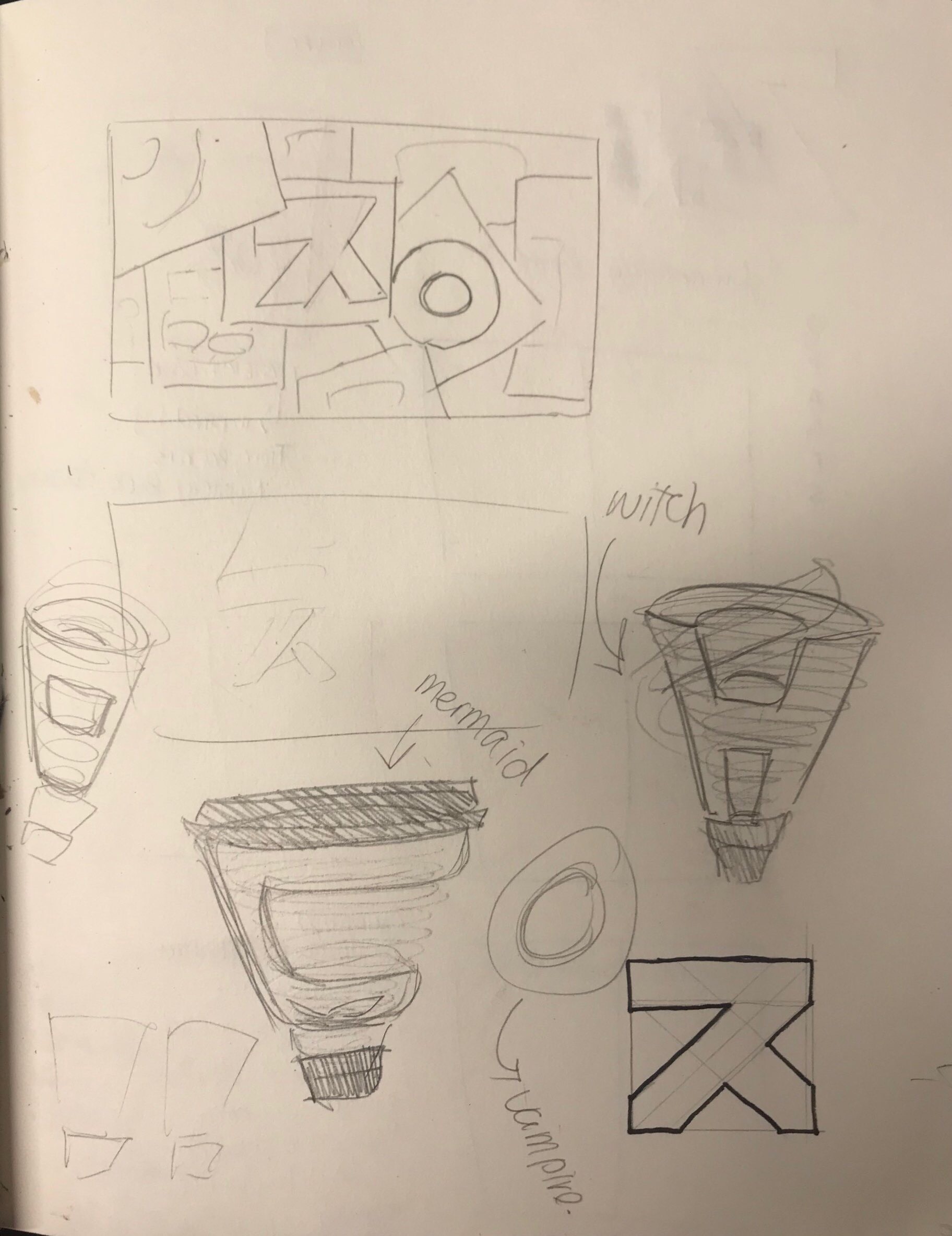
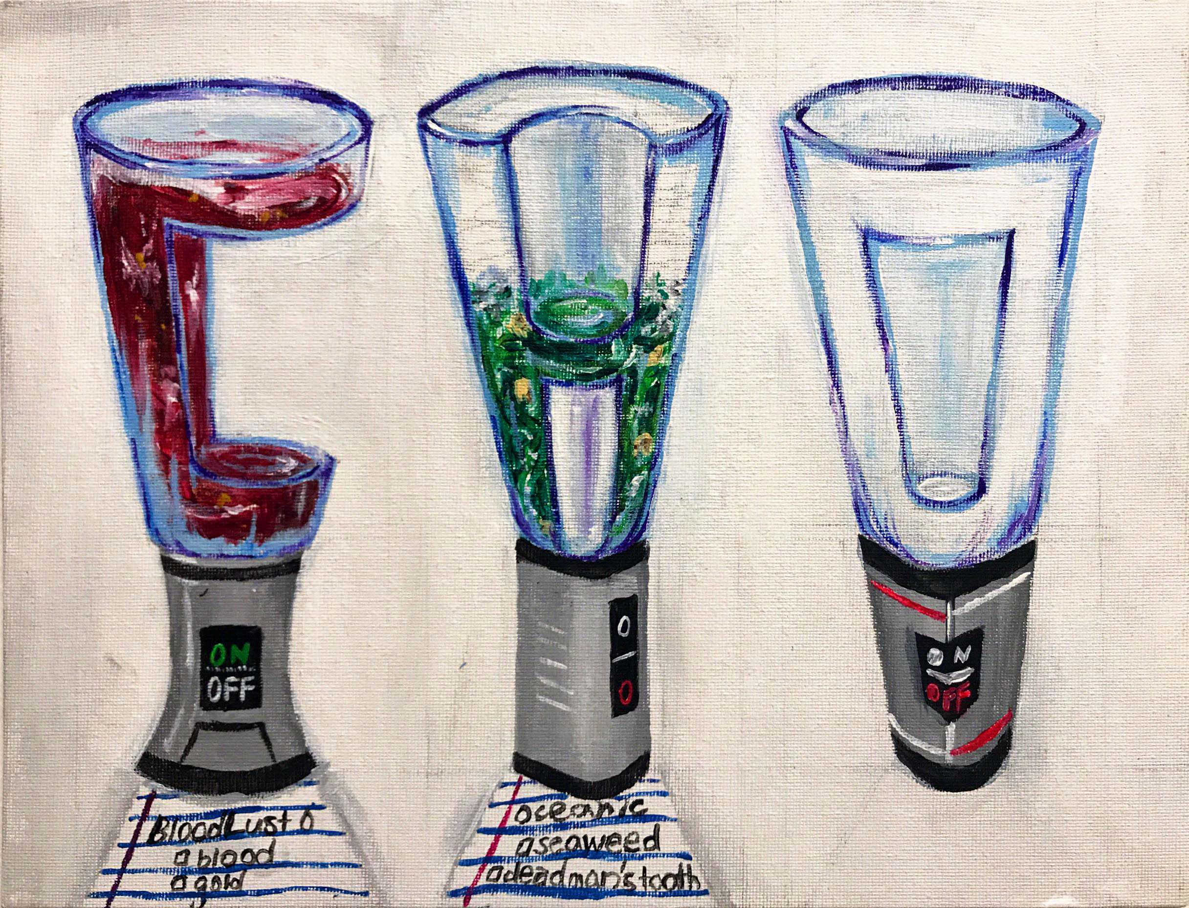
My original idea for this profession was a simple Smoothie Barista; however, I decided to spice it up my combining it with another idea I had. The other idea was a Mythical Creature Hunter. I took the Mythical Creature part from the other idea and combined it with being a Smoothie Barista. Now, I make smoothies for the mythical creatures who come to my Smoothie Booth. If you look closely at the little note underneath the text, you can see that the smoothies being created are called “Bloodlust”, a very popular smoothie drink for Vampires and “Oceanic”, a hit smoothie among the Mermaid community for its pungent flavor yet healthy minerals. I am thinking of expanding my menu to accommodate more of the supernatural community, opening my doors to anyone and everyone who just wants a refreshing smoothie on a hot summer day.
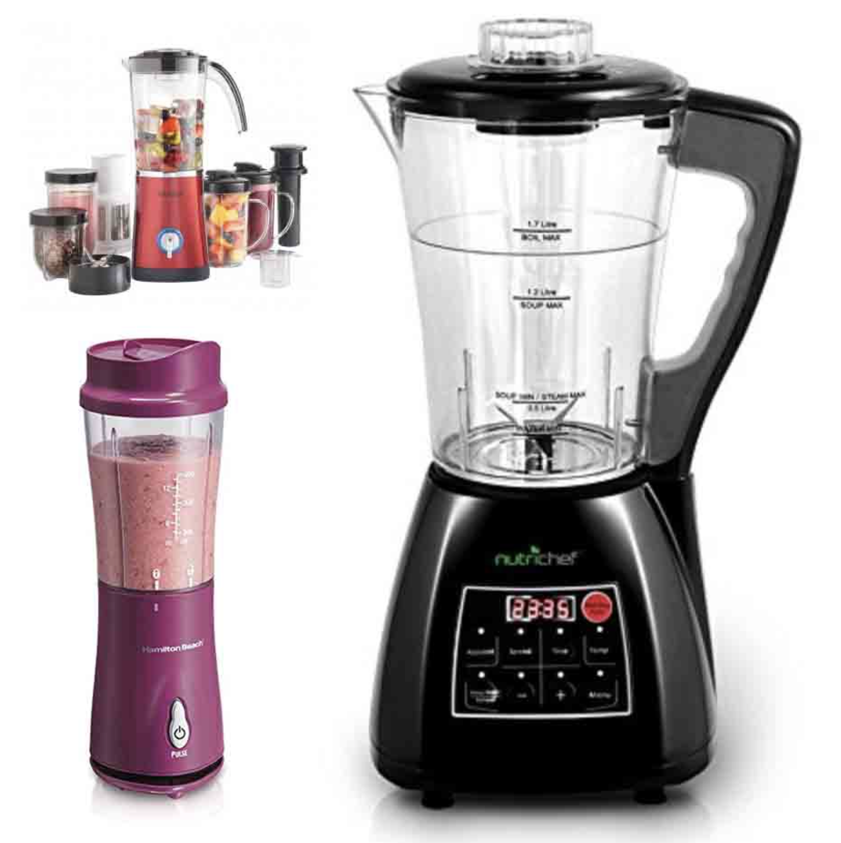
For my research, I focused on looking at smoothie machines before and after the smoothie making process. Focused on creating the font using inspiration from how the smoothie mixes inside the blender. This led a 3-Dimensional font following a circular plane.
One problem I faced was that since I did not know how to use and Digital Imaging software, I decided to go old school and paint the composition. While this was an experience worth doing and that the end product contains texture that is hard to achieve through computers; I also believe that this would have been a great opportunity for me to experiment with uncharted territory and try my best. However, the fear that I would mess up or that it would not turn out the way I would want it gave me anxiety. However, from this situation I have realized that I should not fear the unknown for I can just start again from the beginning.
For this job, the name I decided to use is “ㅎㅈ”, which are the first characters of my Korean name, 조현재 (Cho HyunJae). As the previous two artworks containe dmy English/Catholic name, I thought that it is only right that I create a work using my Korean name. I am proud of both names as they mean a lot to me and helped create the person I am today.
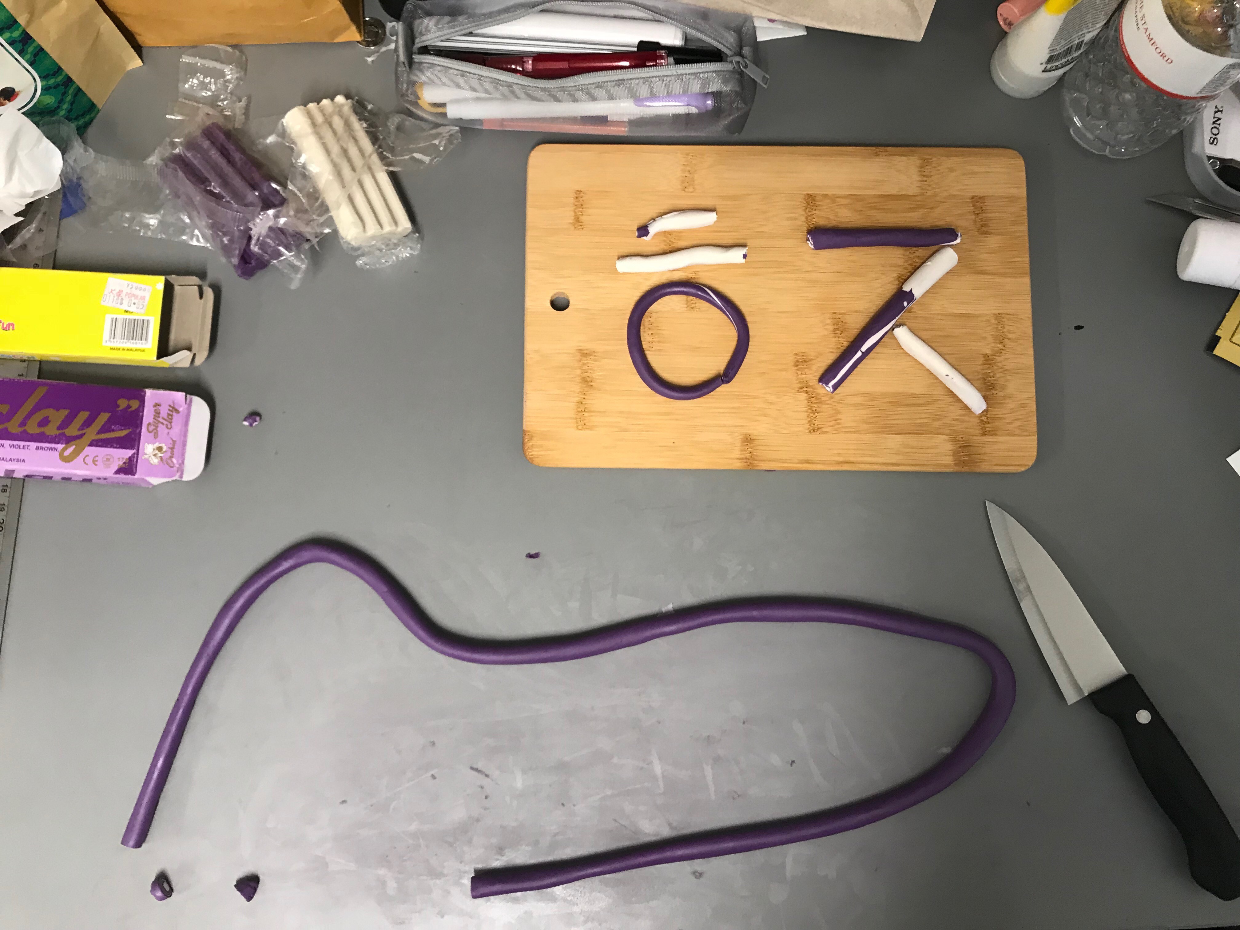
This job, though very unconventional, is a job I think many people will relate to or identify with. I am a Full-Time Professional Onion certified by Korean District of Yangpa and traded internationally by the Californian Trading Association of Yangpa. Onions have many layers, layer upon layer alternating between white and purple. These layers are symbolic of the many sides of me that I can utilize in the future for any job I want. I am not just a one-track minded individual, and because of my upbringing I have learned to embrace and incorporate the many influences thrown at my way. As a full-time Onion, I use these many layers of mine to excell at a task given to me. Not only do these layers apply to a professional me, but also applies to my personality. There are many layers to my personality, and only show different people different sides until I feel absolutely comfortable with him or her.
My original plan for this project was to use the design of an actual onion ring to emphasize the letters of my name as so.
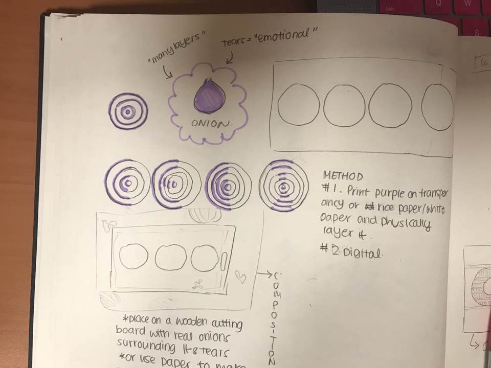
However, after consulting with my teacher and thinking more deeply upon the idea of layer. I focused my attention onto a Dimensional interpretation of the layers that like my personality, can be seen from many sides. Looking at the layers, I was reminded of an old candle making video I stumbled upon on Instagram.
Not only did this show the wacky insides of a candle seemingly normal on the outside (like an onion, and just like me), but also played with different knife methods like carving, slicing, and etc. Which led me to think about the different methods of cutting an onion, from simply cutting it longitudinally or even dicing it into little cubes. I decided to use different cutting methods to create the different strokes of my name. I chose to keep it simple and stick with white and purple (no transitory colors) for the sake of simplicity. I wanted to depict the essence of an onion, not an onion itself; which is why I broke down the onions design to its basic components.
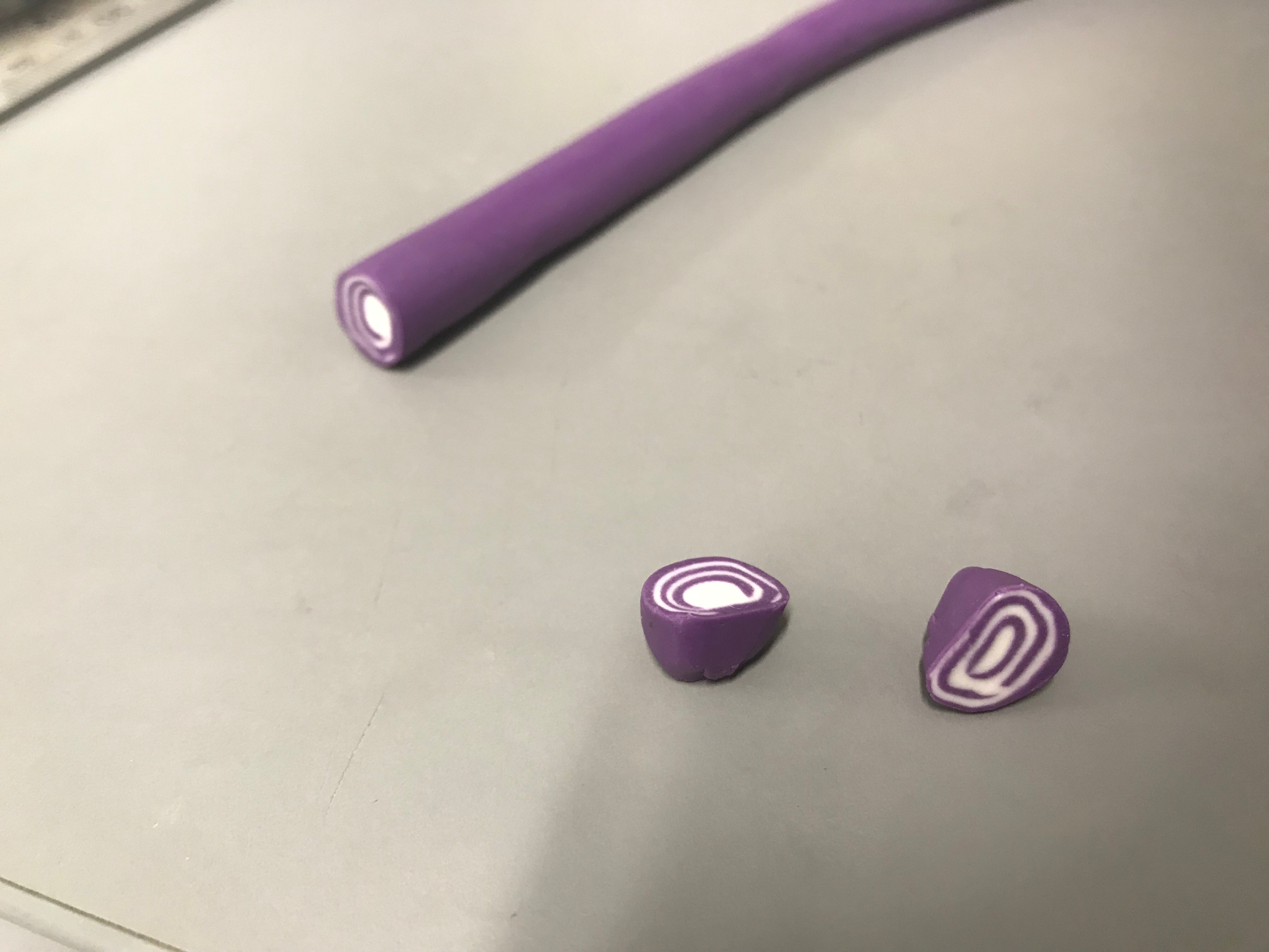
The end product reminds me of the Sticky Candy brand which would created intricate designs in there tiny candies by first creating a bigger version and constantly rolling it around until it shrank.
The only problem I encountered was the mess the clay left on my table as it left some kind of sticky residue. Other than that, I truly enjoyed this project as it allowed me to get my hands dirty and create, an art form I showed great interest in as a child.
For this job, the name I decided to use is “ㅈO”. As you can see, this is a combination of two different languages, Korean and English. I chose this combination for two specific reasons. The first being that it symbolizes the mixture of two cultures and locations that I consider part of my identity and home. Though I was born in Korea, I lived abroad due to my father’s business. I grew up in the States then Singapore then Korea and finally back to Singapore for University. I wanted to find a way for both sides of myself to be represented in one of my compositions rather than showing a division between the two. This coincides with the fact that jewellery and jewellery designing have always been a passion of mine even back in the states when I was a young girl. Secondly, I found it a clever way for me to show people the proper way to pronounce my last name. Though the romanized translation of my Korean name 조 is CHO, the pronunciation of the two words are different. 조 is pronounced more like JO, and the “J/”JUH” sound comes from the character ㅈ. CHO is the outdated romanization of the surname 조 yet still commonly interchanged with JO. I am comfortable with hearing both CHO and JO.
Job
My job in this composition is a Jewellery Maker who handcrafts her own designs, making each individual piece one-of-a-kind. And due to the multi faceted layers behind why I chose “ㅈO”, I felt that a multi faceted gemstone should be the centerpiece of my necklaces. My jewellery brand has many collections, though still in the early pages of its inception, ranging from chic fashionable wear to symbolic pendants, to even wearable art. In this case, I decided to focus on the style of jewellery that I began doodling with as a student. These haute couture, vintage costume design style pieces have always drawn my eyes as I watched historical dramas and tv shows and I have been inspired by the beauty of the details and how the centerpiece is the main attraction yet the border holds as much story as any other piece. The paper around the two pieces is meant to represent the countless sketches and rough drafts a real jewellery designer must go through. Originally, I planned on showing the different angles or designs, however, in order to focus our attention on the two text I removed the designs and just used different papers.
My research for this project mostly consisted of thinking back to old jewellery designs I sketched up in the past along my notebooks and tests. The designs I came up with are entirely my own and only borrow classical elements like the engravings and curves from different references. The gem I used as the centerpiece and aquamarine for the ㅈ and an orange topaz for the O had to be based off of photographs I found on the internet as I did not have the physical gem with me.
The only difficulty I faced with this piece was that there are not gems shaped as ㅈ or O on the internet at least. Making it difficult for me to really understand the highlights, lowlights, and reflections of the gem. I mostly relied on my guess to try to imitate the highly reflective and shiny surface of the gems.
Through this project I discovered personality traits and desires of myself that I would have normally skimmed over. These traits and desires of mine, if properly developed can make a big impact on me and my future. Especially, Jewellery Designer. The meaning behind my love for Jewellery and the choice behind my text shows the passion that I have towards it and has actually inspired me to consider pursuing it as a serious avocation.
I have also learned that it is okay if you fail, you can always just start over with a fresh note and try your hardest. Do not shy from adversity and instead embrace it as we can learn new skills or solutions to old problems from it. Also, I learned to be confident about my ideas. Especially, because I always tend to second guess myself and down-play my creations; which create not only insecurity but also stress.
At first I was very overwhelmed about the amount and the difficulty behind creating a text as were were meant to chose characteristics that embodied our profession rather. However, the more I delved into it, the more I realized how ideas and creation flows one you get the hang of it. I have come to the understanding that just because an idea sounds weird, does not mean it is a bad idea. This came from my Onion composition, the idea behind it seemed ridiculous but in the end the experience and outcome made it worth it.
SIDE NOTE:
I was unable to upload my images because of an “HTTP error”
I will try uploading them in a couple of days in (it usually works after that).
I am very sorry for the inconvenience.

My partner and I were tasked to research and create a presentation regarding the Bauhaus and Modern Movement. Specifically, the effect the movement has left on America as well as the designs associated with the movements.
Though my partner was in charge of collecting the information regarding the Bauhaus Movement and myself in charge of researching about the Modern Movement; we discussed the information together so that the both of us had a clear understanding of one another’s topic.
The PDF version of the presentation seems to be too big for OSS to post. So instead I linked the URL for the presentation below.
https://docs.google.com/presentation/d/1gCyKz-OVoxOhqNp1sRAmstvAtmcEF-_yoE8tugCRnqM/edit?usp=sharing
Through this research session, I have had the chance to truly learn and understand the Modern Movement in America. To narrow down my research I focused on information pertaining to the Modern Movement in America from pre- World War I to post-World War II. My understanding of Graphic Design is no longer limited to “oh it has vintage style” when referring to Image A and B.


Now I know that Image A is a traditional illustration poster made during the initial stages of Lithographic Posters, before the 1900s. While Image B is a Modernist Poster made during 1940 using silkscreening methods and an airbrush finish. Both are “vintage” in the sense that it is antique but not should not be classified under the same style of “vintage”.
“Less is More”