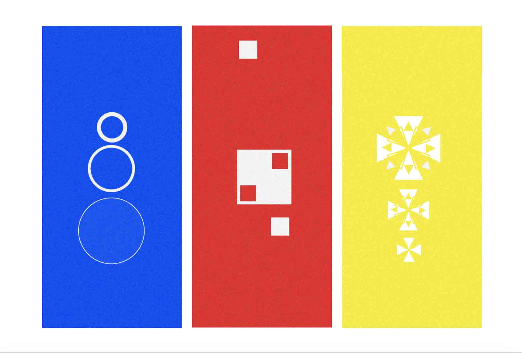
Our final creative response for our History of Design is a piece of work inspired by the Bauhaus school; specifically the ideology set by Wassily Kandinsky. Wassily Kandinsky believed that there was universal connection between basic geometric shapes and colors. Circles should be blue. Squares should be red. Triangles should be yellow. Through a survey taken in class, I discovered that I agree with Kandinsky with the thought process for triangles. Using the connection between color and shape, we were asked to create a piece that ultimately reflects Singaporean culture.
Like Magic
I made two pieces because I could not decide on a part of Singaporean culture to focus on. The first one is titled “Like Magic”. This piece is inspired by a lecture I took for my Integrated Urban Management class. Our professor explained to us that most of the resources in Singapore are either imported and instant, or recycled and reused. The bold and synthetic colors are symbolic of the man-made qualities of Singapore. Thinking back to my lecture, I decided to express the recycled water, imported goods, and instant foliage used in Singapore. Because water is associated with the color blue and circles are often associated with raindrops or ripples, I decided to represent the sudden existence of a water supply. The circles suddenly appear on the blue background, and grow in a short time. For the centerpiece, I chose to express the imported goods using squares and the color red. Squares mirror the shape of the box that goods are imported in or gifts given to one another while the color red is commonly used by business to capture the attention of consumers. The small white boxes are falling in to and out of its original positions inside the big white box. This symbolizes the import and export system in Singapore that can be seen in both a macro (shipping) and micro (shopping) scale. The yellow piece represents the instant foliage in Singapore. According to my professor, most of the original trees and flowers in Singapore are instant trees and flowers brought over from Malaysia. Using the dynamic triangles, I created a floral like pattern that represents the variety of foliage within Singapore. The first flower is smaller and less ornate, but as the flowers go up, the size (in a short span) and details grow. “Like Magic”, Singapore’s resources appeared suddenly and have flourished; from its recycled water to its traded goods to its greenery.
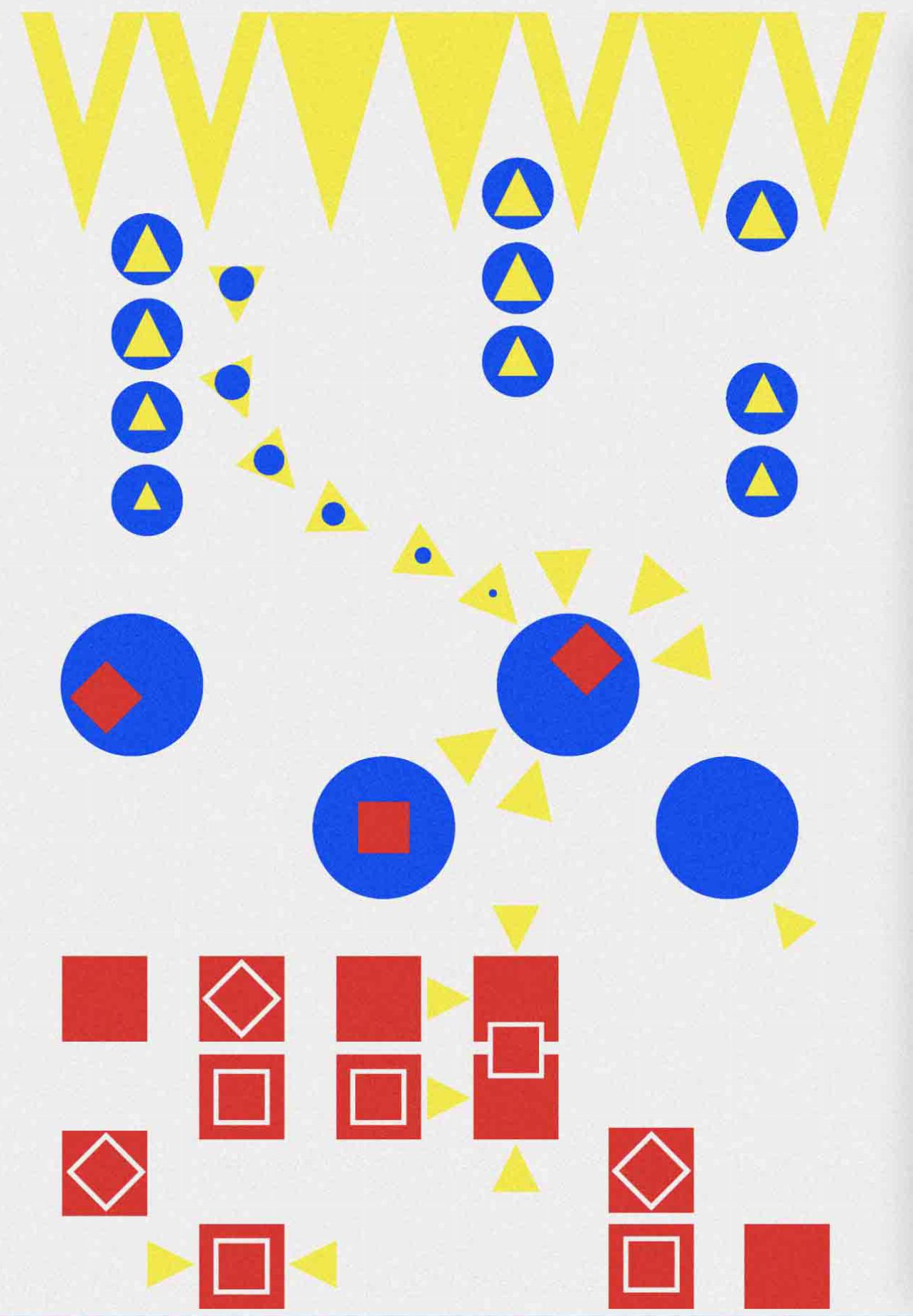
A Hawk Eye’s View
My second piece is called “A Hawk Eye’s View”. This artwork in inspired by the bustling Hawker Centers and Food Courts in Singapore. The professor from my Integrated Urban Management class explained to use that other countries also have Hawker Centers and Food Courts but the aspects of the Singaporean Hawker Center and Food Court that makes it unique and “Singaporean” is its integration. Singaporean food courts are one of the only places where people of different religions, dietary preferences, and cultures can come together to cook, sell, and eat. Taking that into consideration I recreated the eagle eye view of Hawker Centers using triangles to represent the bustling and the lively things (the stalls and people), circles to represent dull or subdued things (waiting in line), and squares to represent a key part of Singapore food court culture (choping with a tissue square). As you can see from the piece, those waiting in line are bored circles with a budding triangle inside, and as they get closer to the stall the triangle grows. Once they receive their food and head towards their table, the dull circle disappears and the excited triangle takes over. Red tissues cover the surface of multiple tables, marking each customers. The colors and shapes I utilized for this piece represent the bustling and vibrant atmosphere of the food courts in Singapore. The portrait orientation of this piece reminds me of tapestries hung on the walls of medieval castles in the dinning halls.