
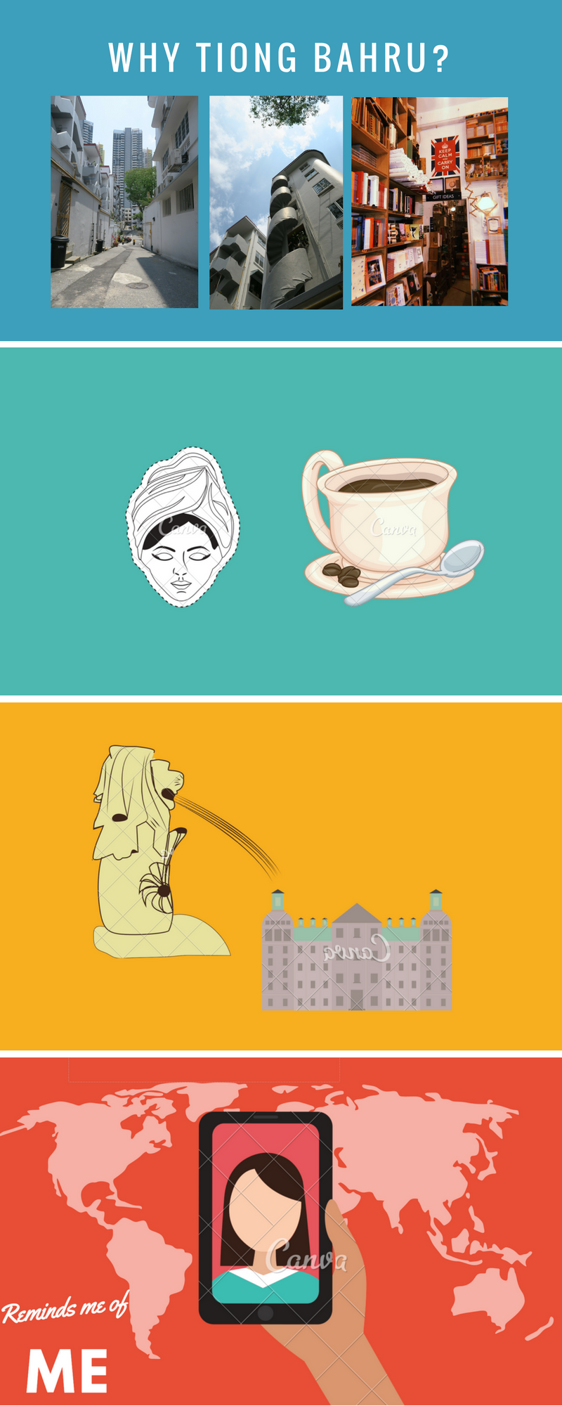
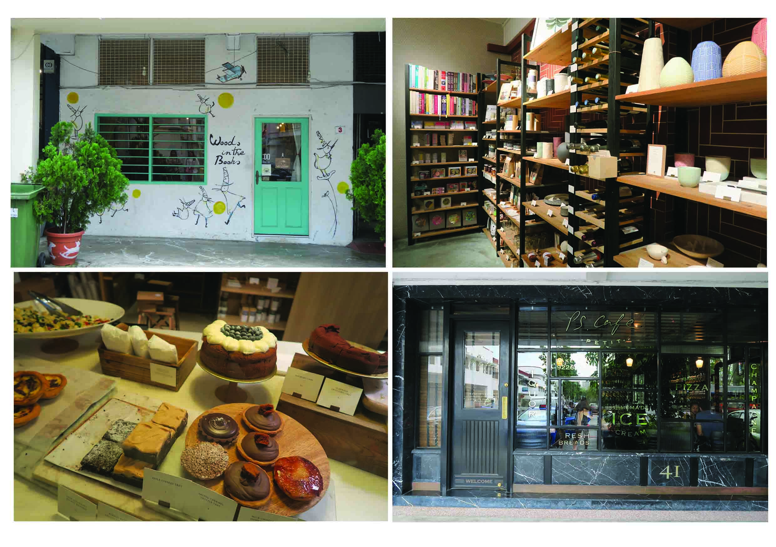
For my second and last project of our Graphic Form class, we were tasked with creating a Zine inspired by a specific locale in Singapore. A zine is a “small-circulation self-published work of original or appropriated texts and images, usually reproduced via photocopier” and can be short for “magazine” or “fanzine”. For this project, we were given the choice to chose any location (preferably a location we were unfamiliar with) and design a design according to our taste. The location I chose is Tiong Bahru. Tiong Bahru is located on the Green Line. Famous for their combination of old and new, hipster cafe joints, and serenity.
Location’s History
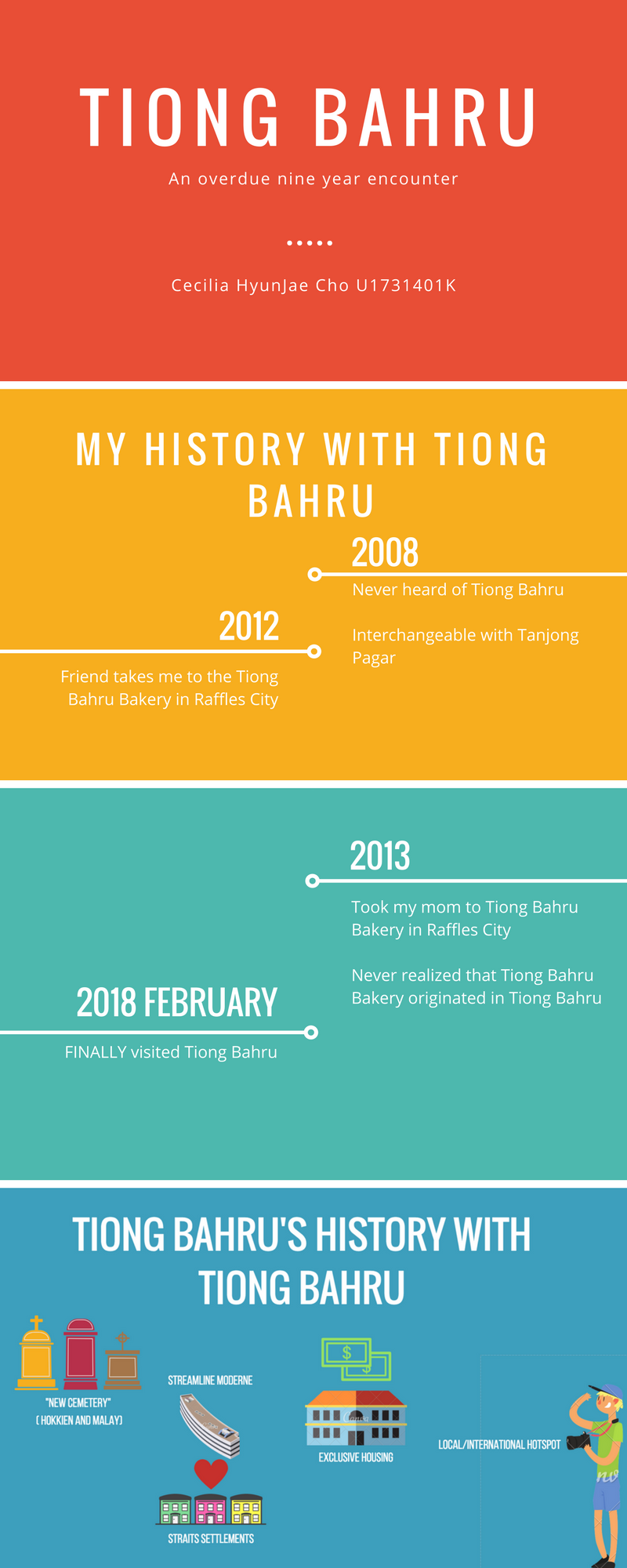
The name “Tiong Bahru” itself is a combination of two languages. Tiong Bahru translated loosely means “New Cemetery” with “Tiong” comes from the Hokkien word “thióng 塚” and “Bahru” comes from the Malay word “bahru – Malay. “thióng 塚” meaning cemetery while “bahru” meaning new. This compound word is the parallels the idea of Tiong Bahru being both old and new, quiet but lively. Originally, Tiong Bahru was a cemetery that later turned into a housing district that incorporated the European Streamline Modern (simplified Art Deco) and local Straits Settlement shop-house style. Tiong Bahru has always been about mixture and balance.
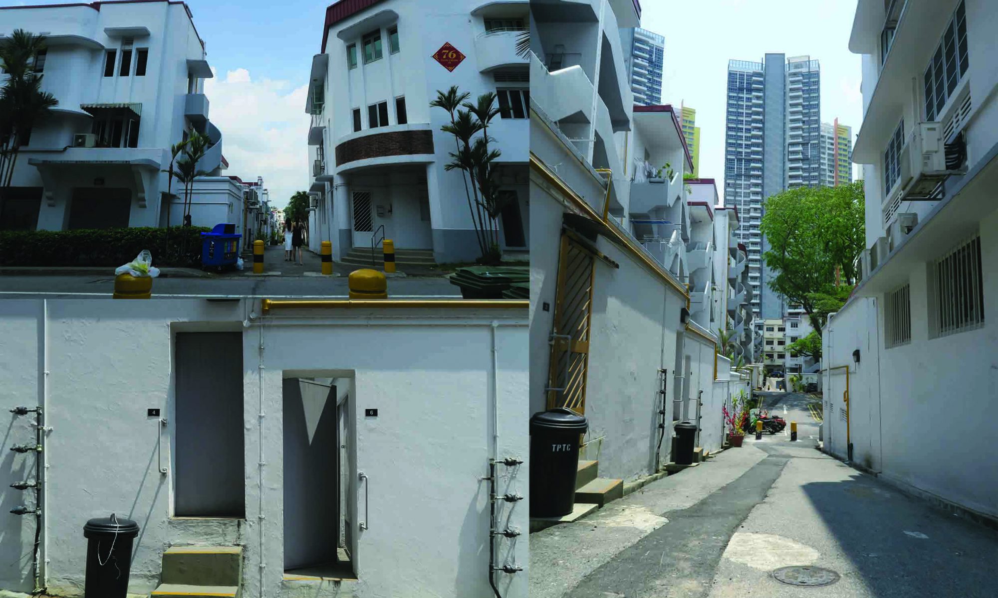
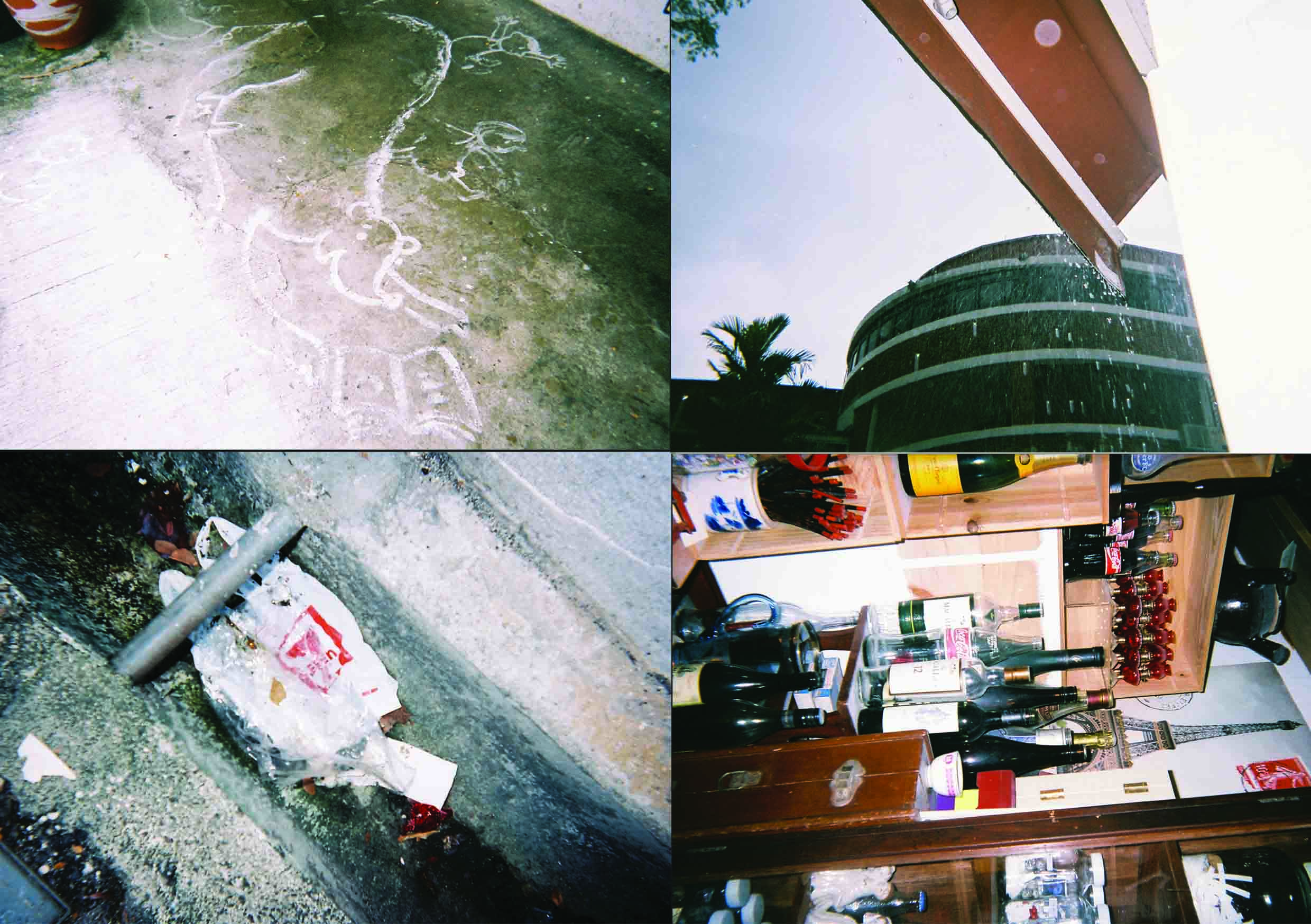
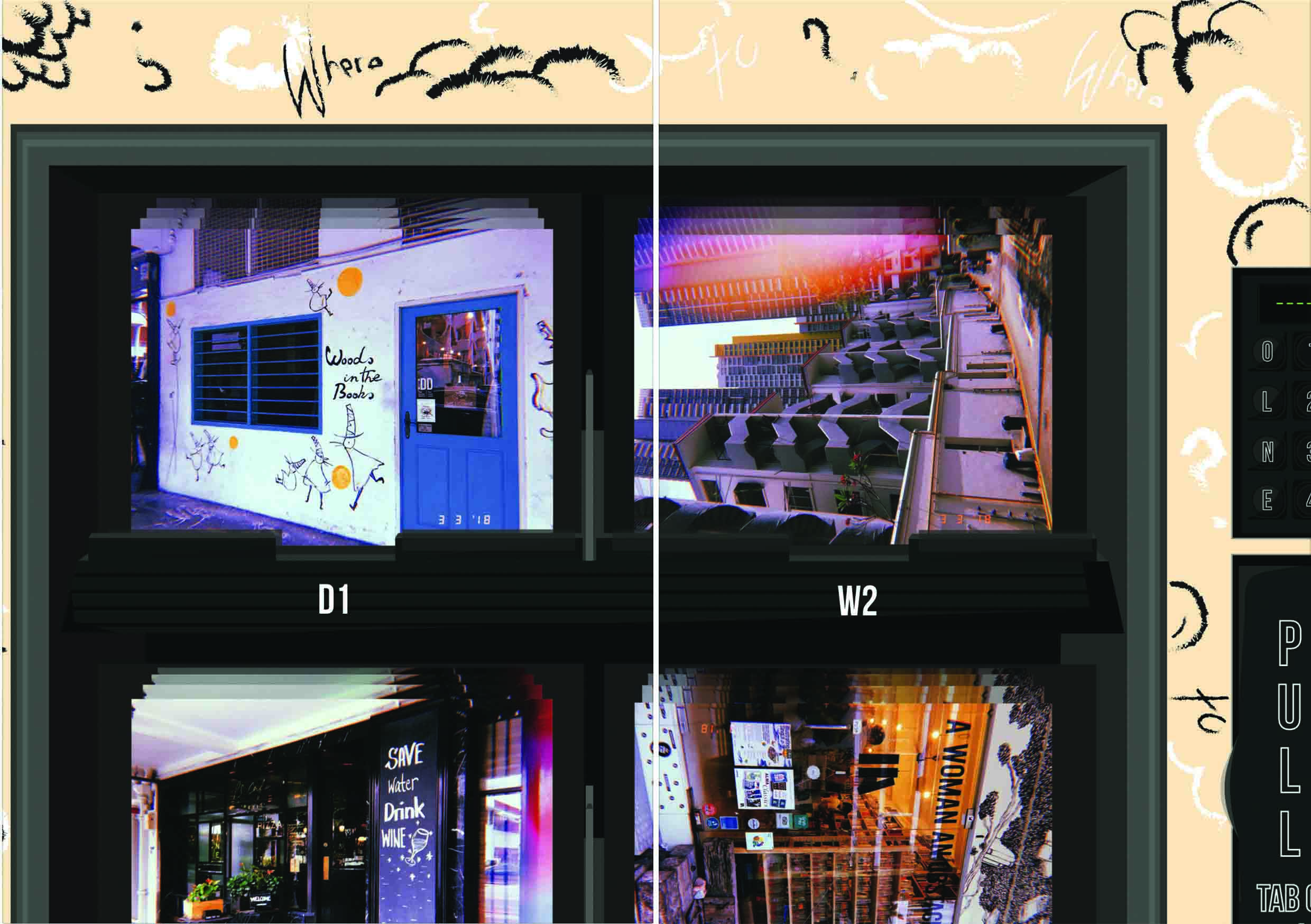
Location Pictures
During my first visit to Tiong Bahru, I decided not to have a a specific focus as it was my first time there and did not want to miss out on anything.
ORIGINAL PLAN
The original plan for my zine was to incorporate the idea of hybrid/mixture/combination in my artwork and then eventually link it to myself and how my mixed upbringing has made me the person I am today. For the cover of the zine, I wanted it to make it quirky and different, much like my personality. I created a character called “Nost” who is a Korean Dragon and her friend “Bah” who is a sheep. I wanted to incorporate these two in the cover of my zine as sneak peak into my zine. Though I did not specifically plan my layout for the pages within, my initial concept was to create a coloring page or mad lib page. Coloring pages and Mad Libs were a big part of my childhood and I felt that it was fitting to add a bit of childhood to not only express myself but also to make the zine more interactive for the reader.
(Insert sketches and examples)
FINALIZED PLAN
However, upon further development and revision, I decided to focus more on my characters Nost and Bah and their trip to Tiong Bahru.
Cover/Back
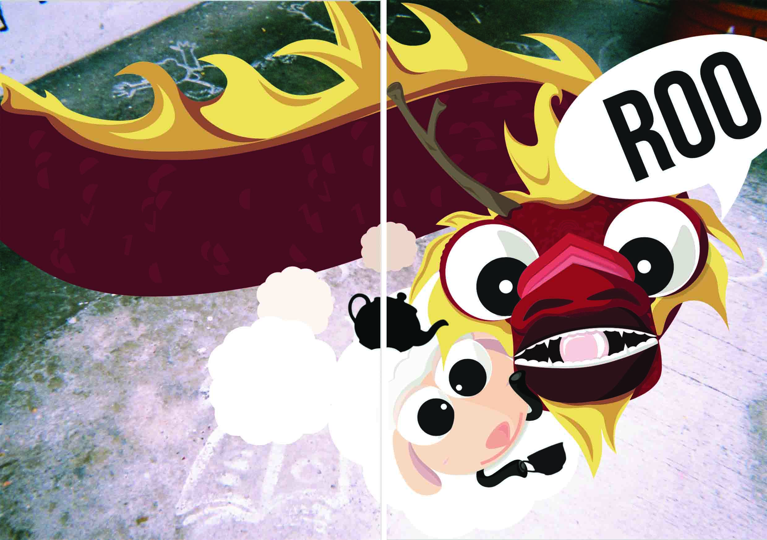
Inspiration
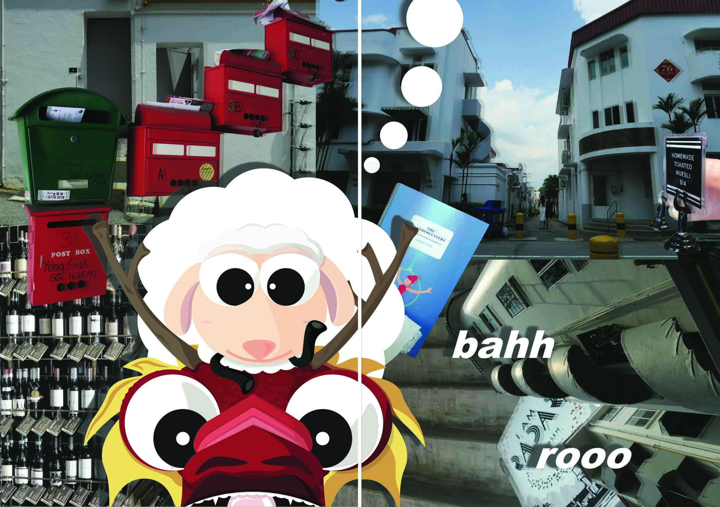
This cover shows a mixture of traditional and modern medium of drawing. Though a little unclear, the background is a photograph taken from a disposable film camera of a floor painting. While the two characters in the foreground are created on my laptop using Adobe Illustrator. My cover shows a close up on my two main characters, Nost and Bah holding a teacup will exclaiming the word “Roo”. This character idea came from the word “Tiong Bahru” itself. I wanted to express my quirky personality by joking around and saying that Tiong Bahru sounds a lot like “Tea-Yong-Bah-Roo”. After some deliberation, I told myself why not and developed on the idea of using “Tea-Yong- Bah- Roo”.
“Yong” sounded like “용” which is the Korean word for dragon.
“Bah” was the sound sheep’s make.
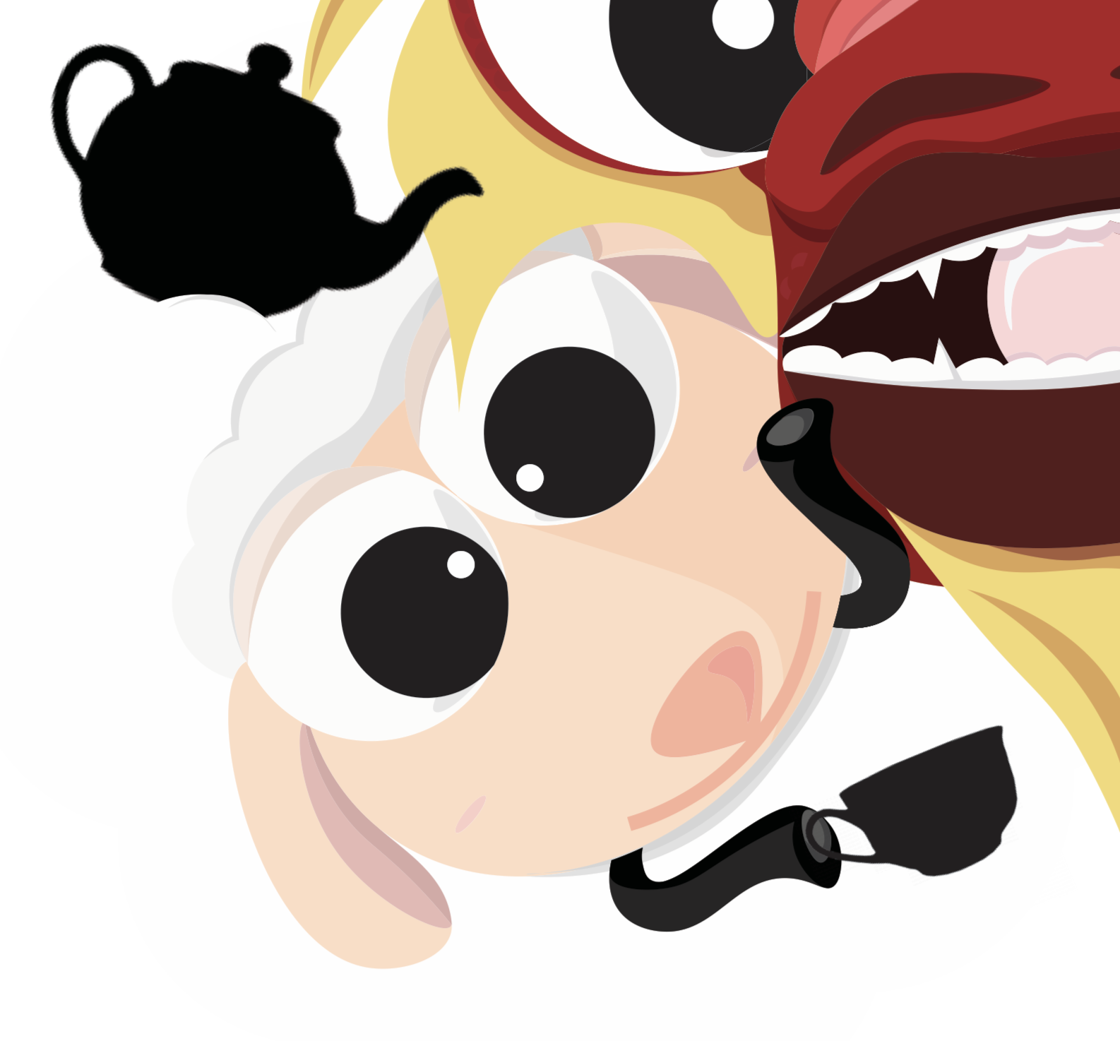
“Tea” means tea and I thought that it would be a nice beverage the dragon and sheep could share together.
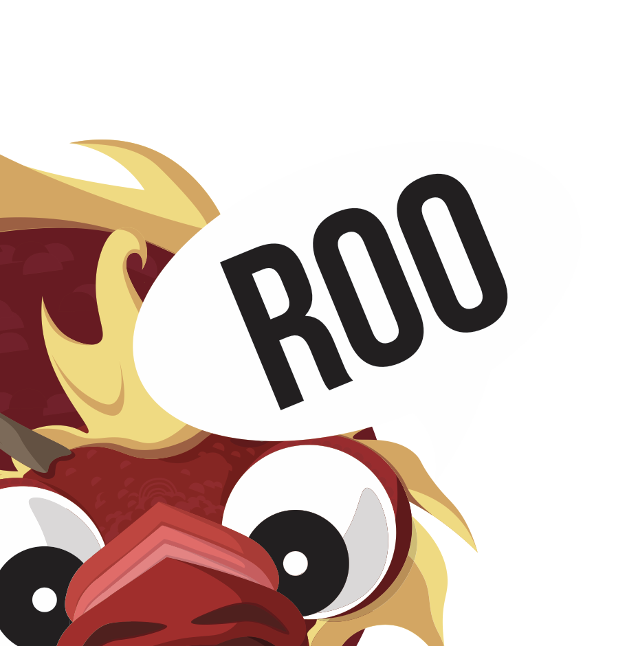
“Roo”, eventually became the sound the dragon would make, much like how the sheep would go “bah”.
Story
This led to the cover page of a sheep and dragon side by side holding a teacup and teapot as the dragon exclaims “Roo”. Nost is a Korean dragon who has come to Singapore with her best friend in order to visit Tiong Bahru for the first time. I myself was born in Korea to Korean parents, though I did grow up overseas. My decision to create a dragon was due to the fact that the “iong” in “Tiong” sounds much like “용” the Korean word for dragon. Making my dragon Korean was more of a homage to my home country and culture. Nost constantly ate at Tiong Bahru Bakery in other locations but was unable to visit the Tiong Bahru itself. After many years she has finally come to the decision to visit Tiong Bahru. Bah is Nost’s faithful bestfriend who has stayed loyal since their childhood. Many believe that it is crazy that a sheep and dragon could be friends but Bah has always been Nost’s support system and helped her through the hard times.
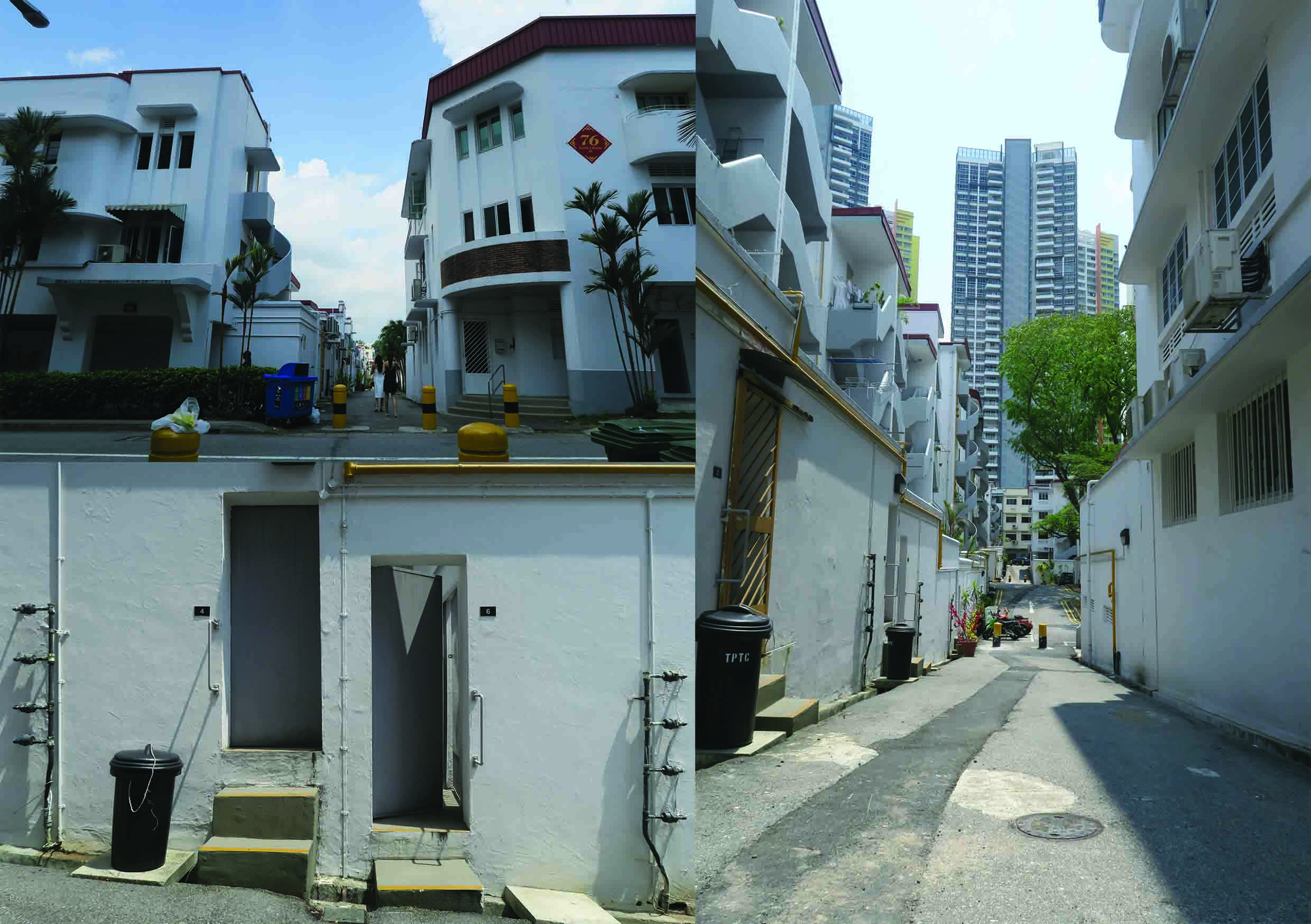
First Spread
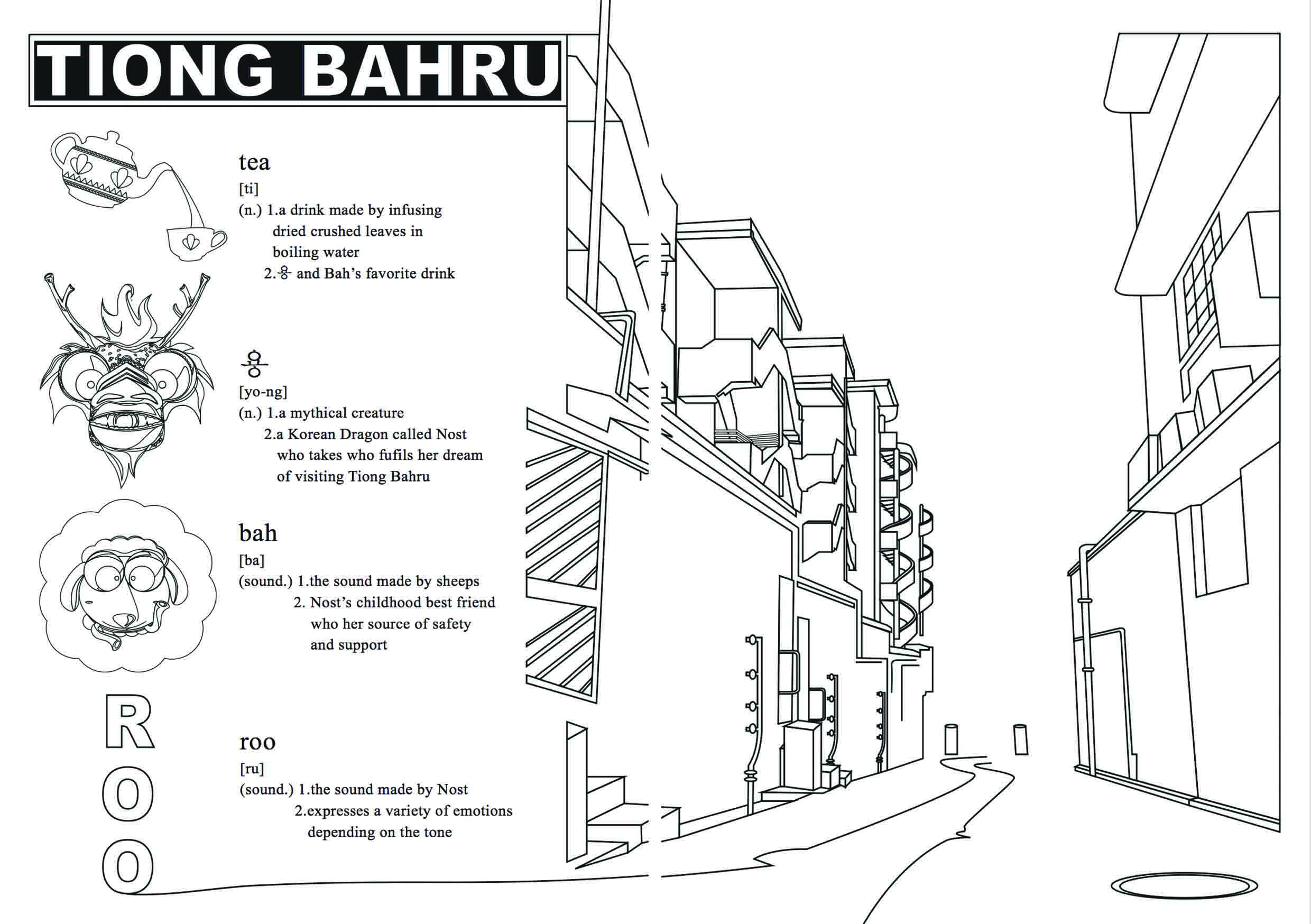
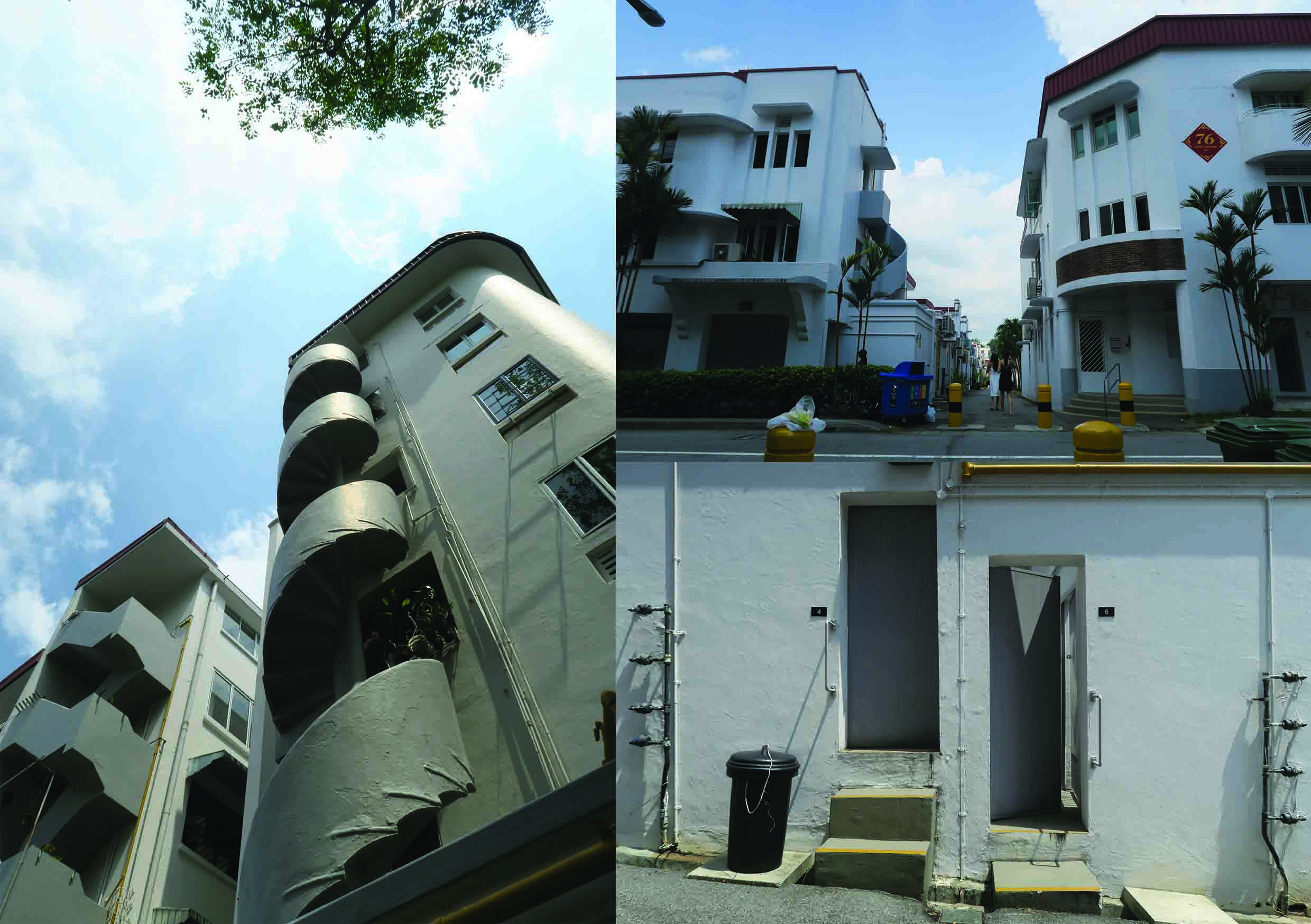
My first spread paid homage to my childhood by doing the entire spread in a coloring book format. The right side has a black and white with a contour of my favorite street in Tiong Bahru. The picture I chose for my coloring book has a linear perspective that ellicits a sense of movement and depth. I feel as if I was being pulled into the main street by a seductive force. Even the street itself exuded this pull. I captured the elements that made this street Tiong Bahru, from the Streamline architecture to the pipes running on the exterior of the walls. While the left side of the spread has an introductory page that explains the “Tea-용- Bah-Ru”. Everything on this page is black and white so that the reader can color whatever he or she wants to.
Inspiration
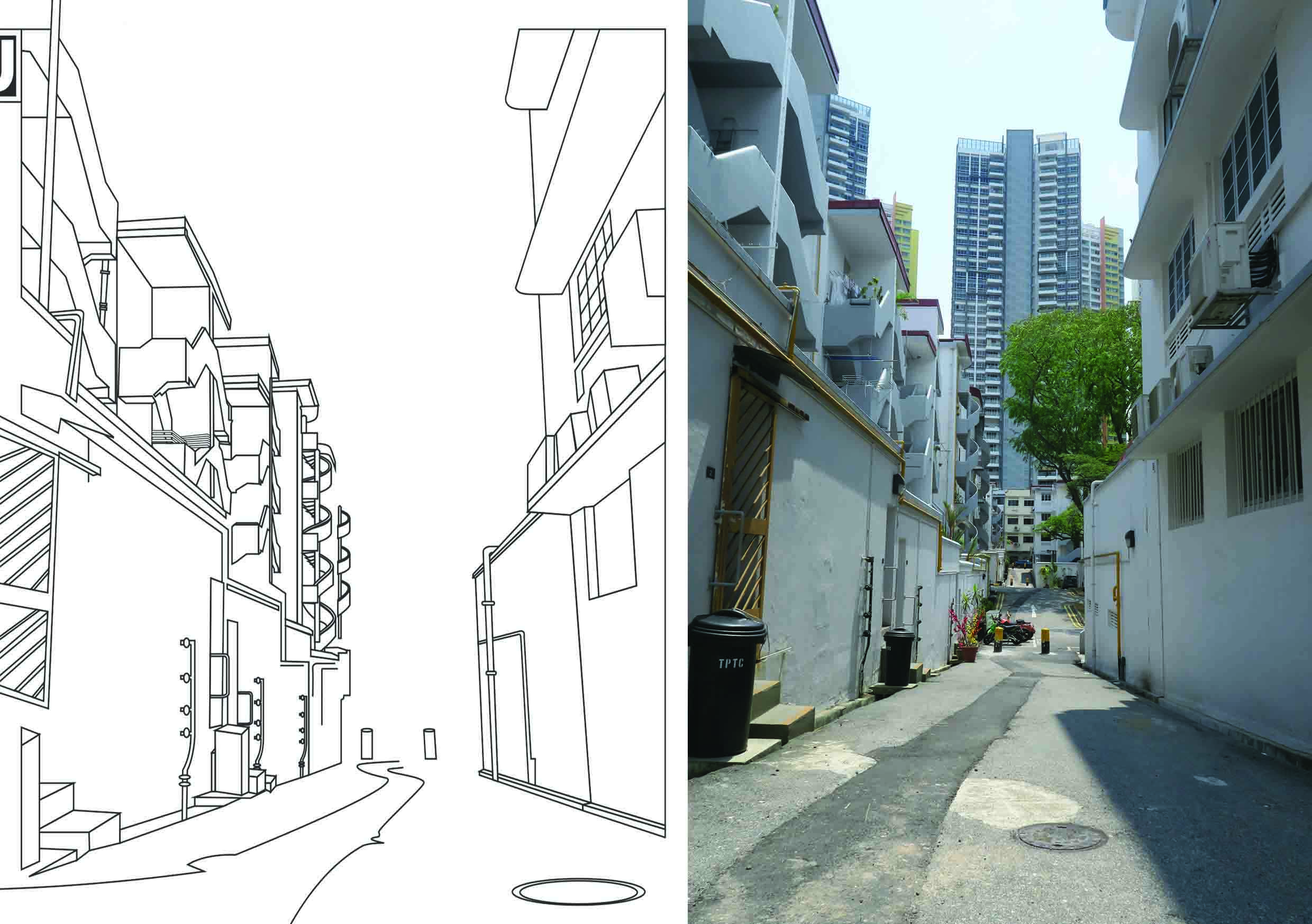
I removed certain elements (the buildings in the background) from the line drawing so as to focus our attention to the essence of Tiong Bahru which can be found in the piping along the walls and the clean cut streamline architecure. The lines (especially the floor) have no end so that we can use the implied lines to create a sense of openness and curiosity. Like coloring books, what is beyond the line is up to the artist with the imagination.
Story
This page is like the beginning of Nost and Bah’s adventure as it is not only the path to the main street of Tiong Bahru but also because it was the place I fell in love with Tiong Bahru.
Second Spread
For the second spread I focused on mixing two different media, Adobe Illustrator Vector and Old School Collage. I chose to use mix media as it alludes to the idea of mixing the old and new. Though collaging is still used today, it is considered an older technique and is commonly associated with either ransom letters or vintage art. Drawing from the idea that collaging is old, I paired it up with another technique used to create a whole image– Illustrator. This juxtaposition of the two techniques create a sense of harmony yet jarring difference due to the solid color and clear lines. The background deals with a multitude of perspectives and tones while the vector is limited to an one point perspective with minimal tonal ranges.
Story
My second spread is depicts my main characters debating on where they should go. There are so many places to visit in Tiong Bahru, from its cafes to its restaurants to even bookstores. Bah is taking his usual position on Nost’s head, resembling a thinking cap. Proving that these two are two pieces to a puzzle. They balance one another and help each other do their best. In this case, they are helping each other strategize on where to go and what to see.
Third Spread
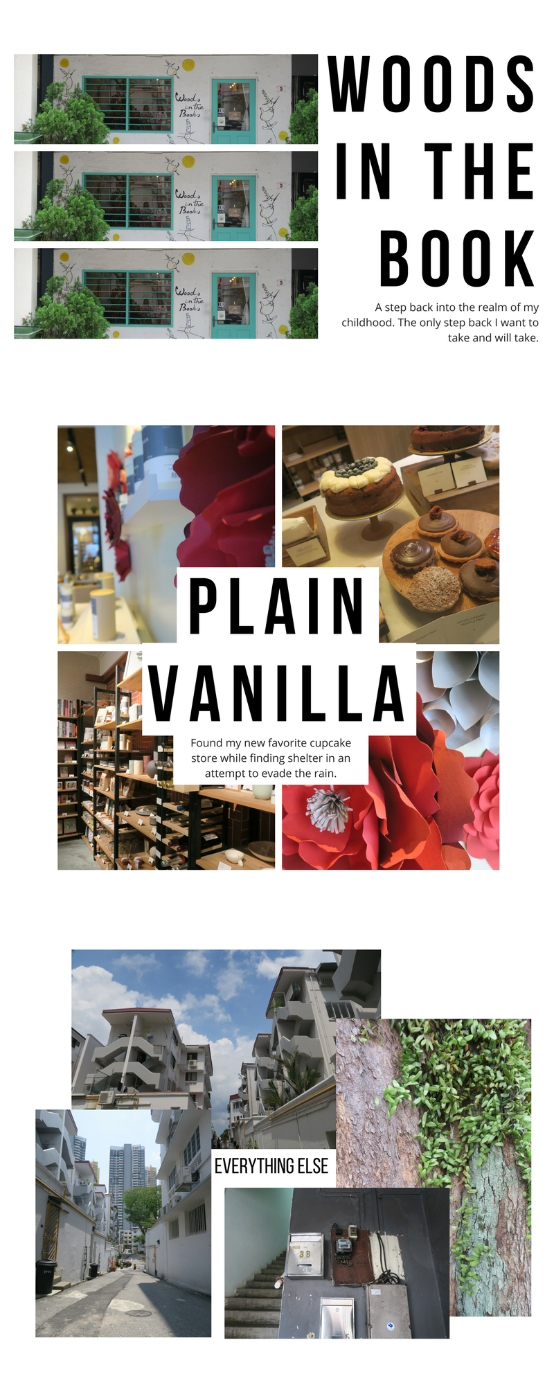
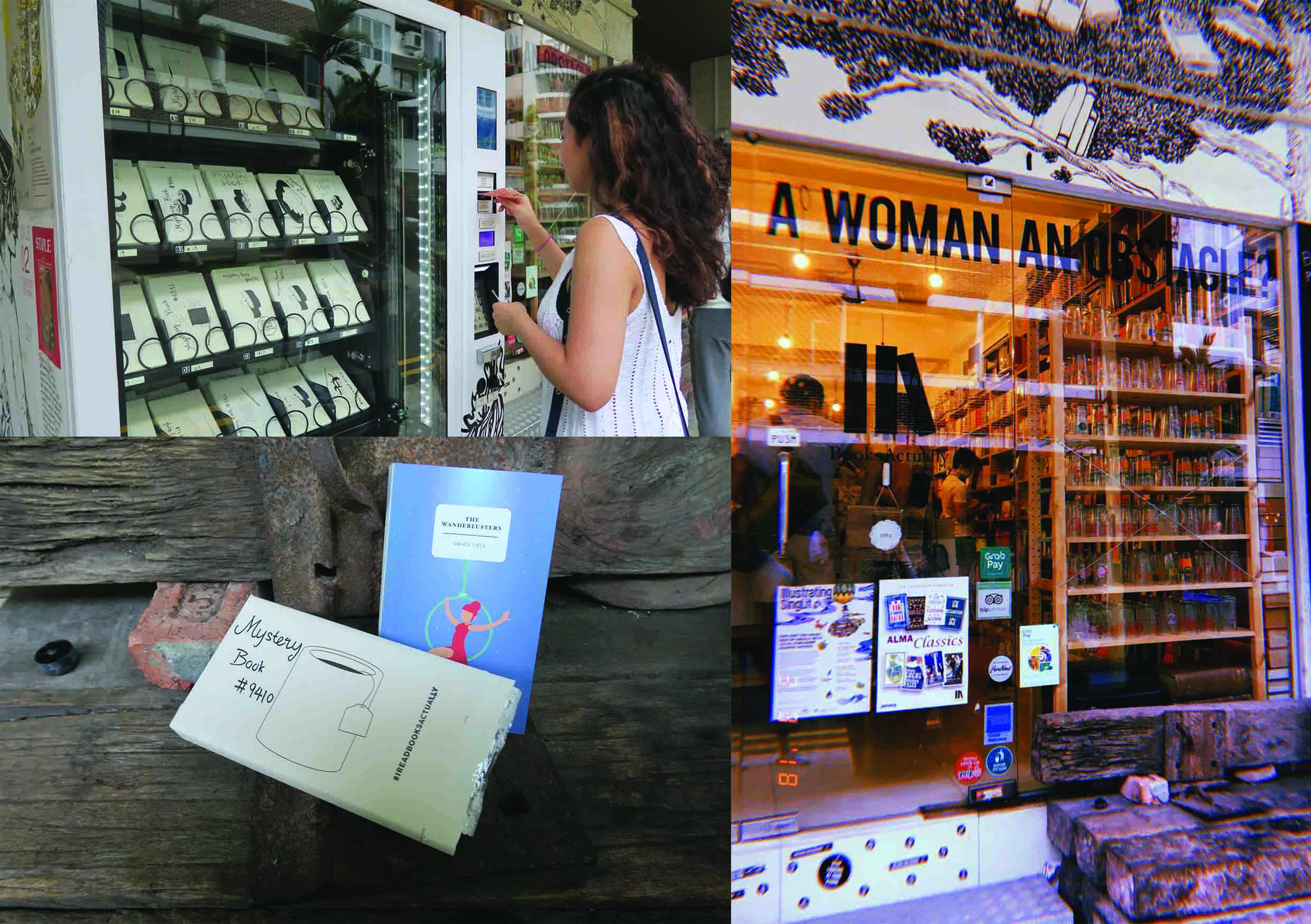
For the last full spread, I chose to take inspiration from the Mystery Book Vending Machine, which I felt best embodied my thoughts as I got ready to go to Tiong Bahru. I did not know what to expect and was open to anything that happened, whether things went according to plan or not. The vending machine itself is etched with hand-drawn marks relating to the two characters. The black markings are inspired by the scales of the dragon while the black orbs are a nod to the 여의주 orbs that the dragons in Eastern mythology carry. The white markings refer to the sheep and the shape of its body. Originally, I intended to put as many pictures on the vending machine and show the entire vending machine from top to bottom. However, I realized then I would not be able to see the images clearly and this would obscure the focus of the page. To counteract this I consulted my instructor who recommended that I spread this across two pages and crop the vending machine so that I focused on the top two or three. This allowed the focus to go on the images and showed the places clearly.
Story
After struggling to come to a conclusion, Nost and Bah stumble across the Mystery Vending Machine (based on the Mystery Book Vending Machine in front of a book story called Books Actually). This vending machine dispenses post cards for travellers to help decide where they should go next or even as a souvenir. In the end Nost and Bah use this machine, much like I did, to help them discover Tiong Bahru. This symbolizes that there is so much more to Tiong Bahru left (as you can only see a portion of the vending machine) meaning that the two main characters (and myself) have yet to even break the surface of Tiong Bahru. Possibly setting up for a sequel *wink*.
REFLECTION
Throughout highschool, my art teacher always talked about wanting to make a zine for the class or even for ourselves but due to money restrictions and time constraints, we were unable to make it. However, after this project, I can successfully say that I have created my own personal design. And far from a perfect zine as there are always room for improvement, I am proud to claim this zine as mine. It was a fun experience as I felt that it introduced us to the world of book making and illustration, giving me a taste of what making a children’s book or even a zine in the future would look like. I enjoyed being able to visit Tiong Bahru not for just pleasure but work and creating a piece centered around my interpretation of the place.