Group 1: Super-participation Micro Project

In this micro project, we (Kai, Samantha, Bryan, Niki & me) kept a five person Facebook group updated on our lives for 24 hours. There were only two rules to the posts; our 24 hours began at 8am on a Wednesday and we agreed to update every time something changes. What we ended up with is an almost intimate yet casual documentation of a day in the life of five individuals.

View our posts here: https://www.facebook.com/pg/Group-1-EI-Super-participation-190058684930622/posts/?ref=page_internal

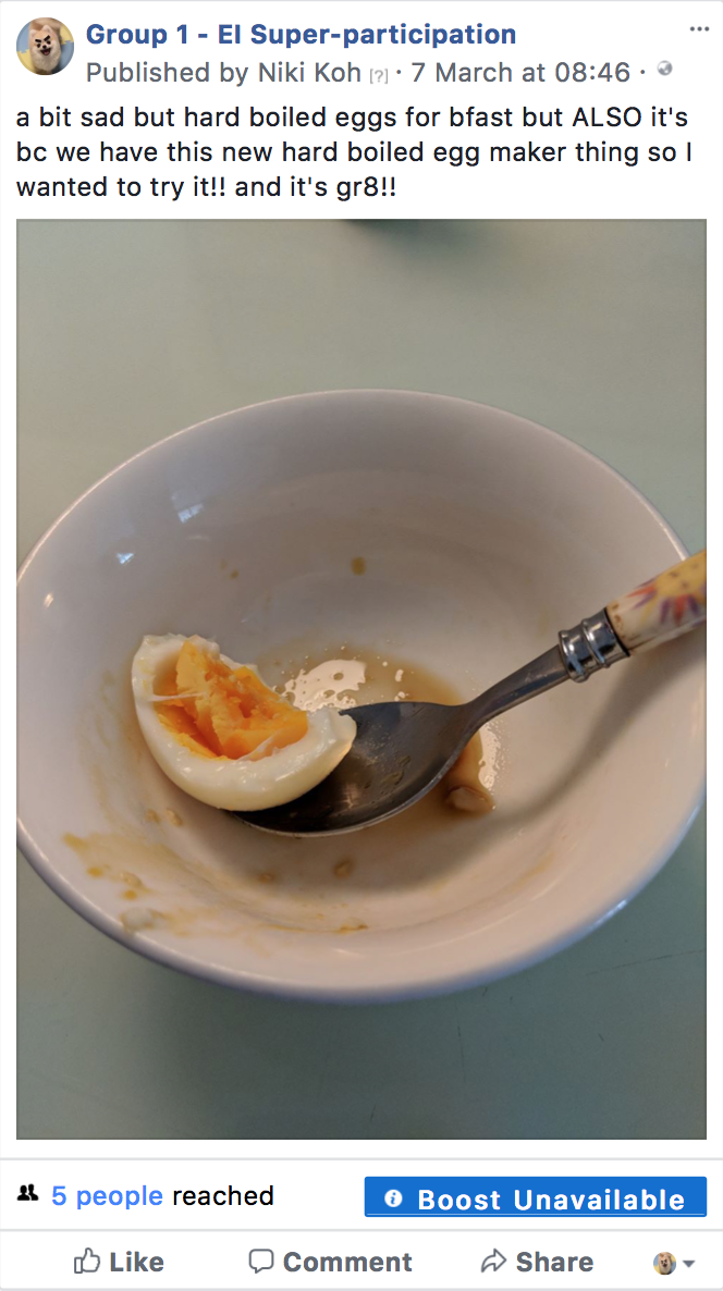
The things we shared in the group were intuitive and straightforward, whether we were waking up, heading out, being late or sleeping in. Something new happens, we update. Sometimes we shared how we were feeling, even if were just to say, “I’m sleepy” or “this egg tastes gr8”.

Throughout the day, I realised we posted more frequently, like we were getting into a familiar motion. I soon felt it was second nature to pick up my phone before doing any small thing and say, “wait I need to take a picture/video for my Facebook page!!!”. In a span of 18 hours, I used a full bar of battery three times over, made possible by the portable chargers of my accommodating friends.

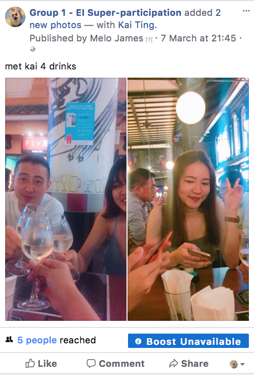
It was an intimate experience in the sense that the five of us knew exactly where each individual was and what they were doing (given that we were all completely honest). Because the target audience of our posts were each other, we felt more inclined to comment and interact in the group. The level of interaction and information exchanged was high compared to real life where we hardly speak or text. What added on to this interaction was the crossover when Bryan and I met in the morning and when Kai and I met in the evening.

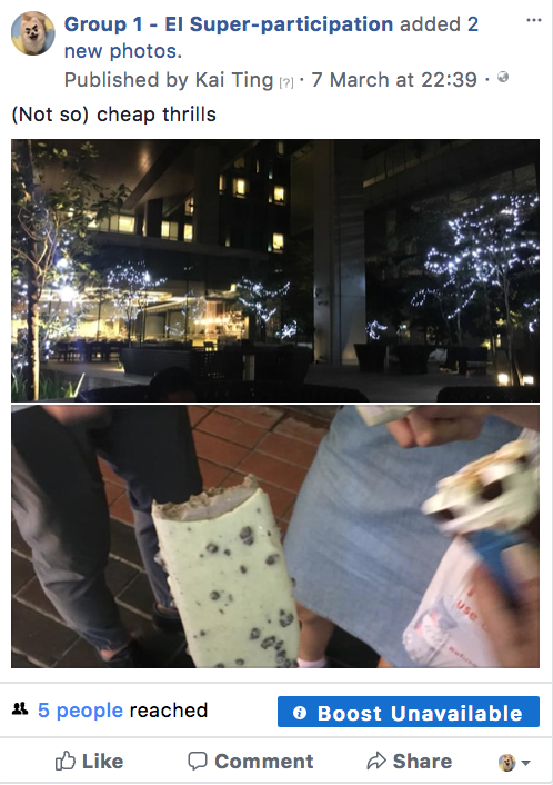
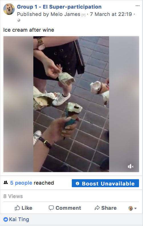
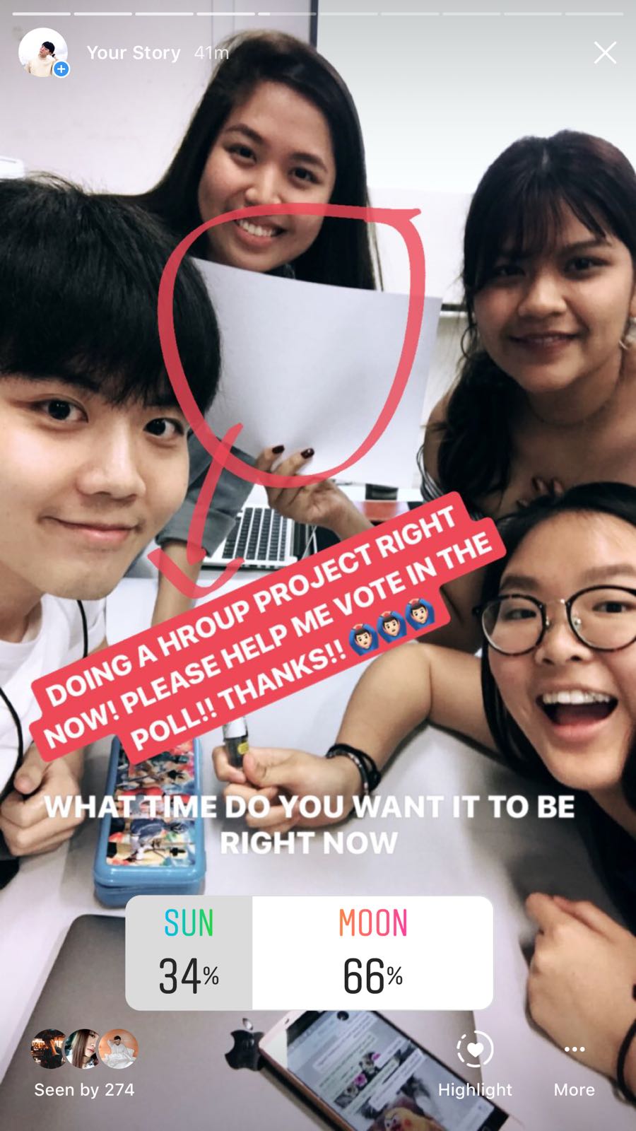
Kai was the realest in the group. She woke up hours after everyone with lots of scheduled posts to remind us she is still in dreamland. The pictures she uploaded were completely unedited and even out of focus. Take for example the ice cream posts from the exact same moment. I took a boomerang (twice) and she took a slanted picture with everyone’s ice cream in motion blur. Our personas are different in the way that I like to portray a more curated version of my life while she just wants to get the point across that she’s having ice cream and she doesn’t care if the audience enjoys her image or not. Then again, maybe she does care, just not for this assignment or this day.

Bryan was the responsible workaholic. When I woke up and checked the group chat, he already posted about getting a head start on his assignment. In the afternoon, he met me to do more work and later in the day he posted about freelance work. It showed his focus and how he got very practical things done in one day.

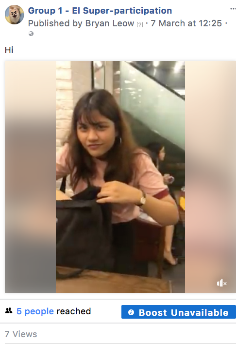
Samantha was the free spirit. Her posts were generally positive even though bad things were happening. She was comfortable with sharing her thoughts and activities freely, like her getting breakfast even though she was late and videos of herself acting and getting water poured over her.

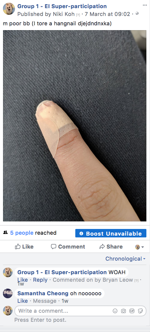
Niki was the clown. Her posts always included an amusing emoji of sorts and surrounded her getting into sad but funny situations which led to a lot of us leaving comments on her post with encouraging words.

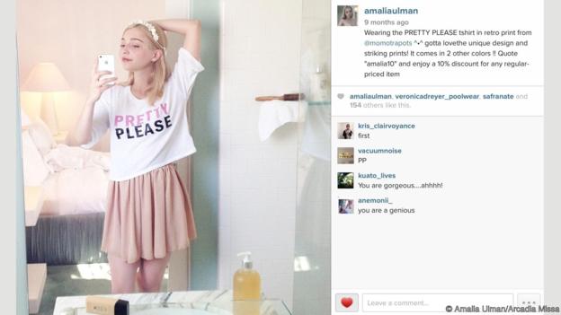
I guess whether we intended to or not, each of us portrayed a digital identity in the group. Analysing each others’ personas from 24 hours of digital interaction may not be accurate, but  perceptions were definitely formed. Since my Wednesday was extremely packed with activities, I met with 4 different groups of people that day with many tasks to fulfil. At the end of 24 hours, my group mates concluded that my life is very “happening” without taking into consideration the day after that – a boring day when I would probably have nothing much to post but a few pictures of my cat and the pink sky. Nonetheless, there is accuracy in the sense that my days can get really busy. Take for example Artist Amalia Ulman who fooled thousands into believing that her as the persona she created was real, purely from her Instagram posts. This shows how easily people form perceptions from personas we create online.

This digital medium may allow people, especially shy ones, to be more comfortable in sharing their thoughts since they don’t have to physically say it out and they are able to edit and curate their words. On the other hand, it still doesn’t allow some people to express their thoughts if they are generally closed up and private people.

Glitch Me

Original Image

1st Glitch: Sihui

2nd Glitch: Me

3rd Glitch: Reuben4th Glitch: Siqi

Glitch Art

Describe how this process of collective image creation and decomposition creates a glitch transformation.

The final collective image was a result of four individuals distorting an image taken by me. We played with Hue/Saturation, Liquify, Line Distortion, Posterise and layering to create the glitch effect at each stage. Randall Pecker describes Glitch Art as the embracing of chaos. The more you mess up, the better. At each stage, we let loose to mess up the image given to us as much as we liked. The transformation can be observed through the four images, how there are some traces of the previous artist’s glitch elements that the next artist decides to retain.

How is each transformation creating a new form of its precursor?

Each transformation builds upon its precursor, whether the artist chooses to retain elements from it or to distort it until its precursor is unrecognisable. A new form is thus created at each stage, no matter how subtle the difference as it is not exactly the same. For example, from stage one to two, the difference is quite huge as the liquify and line distortion are new elements introduced. From stage three to four, the images look mostly similar except for the change in hue and saturation. Therefore, as long as a change is made to its precursor, a new form is created with each transformation.

Research Critique II

I think the third space is a bridge that connects two physical entities into one reality that is virtual and unbound by time or space. The third space can arguably achieve a level of intimacy close to that of two parties being a single setting, while being in completely different locations.

In his article, Randall Packer describes this phenomenon as “the pervasiveness of distributed space and the degree and myriad of ways in which we are constantly connected”.

Packer likens the third space to the fourth dimension, where “spatial trajectories have no boundaries”. Not to say there are no boundaries in the third space, but the extent to which we use the third space can open up new channels for communication and interaction.

In my third micro-project for example, Desmond and I performed an interaction using Facebook live as our bridge to the third space where location was no longer a boundary. We planned to use the third space as a portal to transport an object from my location to his.

The plan was for me (in Location A) to throw a piece of roller coaster snack into Desmond’s mouth (in Location B). I would throw the snack through the “third space”, or out of frame, and we got our friend Samantha to throw the snack to Desmond in his location. This created the virtual illusion of it passing through from my end, and transformed the snack into a third body.

This project allowed us to recreate the intimacy of two people passing items to each other in the same physical space, despite being in separate locations. We connected by speaking to each other over the live video, counting in time so that we were all in sync with the movement of the object.

A project that also transcends locational boundaries through the third space is Hole-in-Space. According to Maria Chatzichristodoulou’s article on Cyberformance, Hole-in-Space was “one of the most celebrated pre-Internet telematic installation/performance works”.

The artists themselves described it as a “public communication sculpture”. People in a certain location were confronted by large, virtual images of people in another city, who they could see and talk to, severing the distance between both locations and creating, like the artists said, an “outrageous pedestrian intersection”.

Micro Project III

Posted by Kwok Quan Rui on Wednesday, 31 January 2018

In this micro project, my partner and I planned to transport an object from one location to the other, using the third space as the portal for that teleportation. The plan was for me (on the right) to throw a piece of roller coaster snack to Desmond (on the left). I would throw the snack through the “third space” and we got our friend Samantha to throw the snack at Desmond in his location to create the illusion of it passing through.

It is challenging to throw a snack into someone’s mouth under normal circumstances, so throwing it through the “third space”. We decided to rotate the phone around and drop the snack into Desmond’s mouth instead. This worked better and we succeeded after a few attempts. I guess what we could have done better was make the object more visible like choosing a bigger object or pouring a larger amount of snacks through the portal. Another challenge we faced was the lag of the video so the snack might have appeared too slowly or quickly through the portal. Even though we counted to three before I dropped the snack, there is still an evident lag in the journey of the snack.

Ultimately, the snack wasn’t really “transported”, rather, there were was a snack double that appeared on the other side. But this project aimed to recreate that intimacy and illusion of an activity across two locations. The intimacy created by the third space can be seen in how two people are coordinated despite being in different locations.


Micro Project II

In our Instagram poll artwork, the viewers’ role is to participate in the decision making of the outcome of an artwork. Viewers get to vote between 2 options at a time and slowly see the artwork come to life based on what they picked.

To a certain extent, us as primary artists are controlling the outcome of this piece of work. We provide the viewer with 2 artistic options at a time – sun or moon, black or white etc. 

If we were to give the audience total control, we would probably ask them to reply to the insta story post with a suggestion or a sketch element of their own. This way, it isn’t just one person controlling the entire artwork. What we did was less interactive because the only people physically making the artwork and providing the options to choose were us.

According to the article, DIWO means that ‘source’ materials are open to all; to remix, re-edit and redistribute, either within a particular DIWO event or project, or elsewhere. The process is as important as the outcome, forming relationally aware peer enactments.

However, our artwork was still social as people got to have their vote change the outcome of the artwork. Sun or Moon as options for example, split the voters into metaphorical team sun and team moon, even though none of the voters knew each other.

In this case, the artist and the viewer each get the chance to take hold of the same canvas; and see how different people can affect the direction of the work.

A similar project to our exercise is Swarmsketch, an ongoing online canvas that explores the possibilities of distributed design by the masses. Each week it randomly chooses a popular search term which becomes the sketch subject for the week. In this way, the collective is sketching what the collective thought was important each week. A new sketch begins after one week, or after the previous sketch reaches one thousand lines, whichever comes first.

Similar to our microproject, Swarmsketch relies on user response in order to complete an artwork. This open source method of continuing an artwork with different artists creates a challenge and renegotiates the power roles between artists and curators, like Marc mentioned in the article.

Ego – Process & Final

INTRO

I am an extremely clumsy person. I’ve made a lot of messes in my life and this project is a documentation of some of the more memorable ones.

I’ve decided to go for the line art style, moving away from flat vector illustration, which is something I’m familiar with and what most people are doing.

ARTIST REFERENCE

I chanced upon a line work artist called Marco Oggian on Pinterest. His art style is fun, quirky and has a vulnerable quality to it that makes it childlike and playful. He also uses bright colours that stand out on on an off-white background. His illustrations below are a series of flyer designs for an event called ‘WASTED‘.

I especially liked the piece above because of how the red and blue overlapped and created a three d, double exposure effect. This was one of the main inspiration points I incorporated from Oggian’s art style into mine. Since my equations were distant memories, I wanted to use this effect to create that vivid illusion of a past, as if it were the actual recollections playing in my mind.


Instead of having messy, childlike lines like him, I went for neater lines. Since my equations are all about the messes I’ve made as a child, the sophisticated lines I opted for are how I represent me looking back on what I’ve done as a child, though I think I still am quite a messy person. The images below are styles I started out with and how I developed them.

To find my style, I started out with simple lines with no background colour. I experimented with both complementary, split complementary and analogous colour schemes, making the back image a pastel version of one colour and the frontal image a striking and bold colour.

Following this, I added florescent yellow strokes and accents in each box. I also coloured the plain background an off-white tone to tie the whole series together.

THE EQUATIONS

I do not recall this memory, but when I asked my mom, she told me this was one of the biggest messes I made as a toddler. She said she left me alone for a few minutes and when she came back it was snowing in the house.

When I was in primary school, our family got a terrapin named Jaq. I wanted to make sure I was taking care of it right, so I googled terrapin care tips. A website forum told me the water should be 35°C for a healthy pet. Being the dumb kid I was, I poured boiling water into the tank, hoping it’ll warm Jaq up a little bit. Jaq swam towards where I was pouring and ended up all blistered. He passed away a few days after and I cried for weeks. I consider this the biggest mess of my life. 🙁

When I was in secondary school my elder brother and younger sister contracted the chicken pox. My mom separated me from them and I could only sit on a small sofa while the both of them got to be together on the big sofa. I felt like I was on another island and like I was the one with the disease instead. I thought I was missing out on something great so I hugged my brother super hard to get infected. I found a red bump behind my ear the next morn, and it was the worst month of my life.

In polytechnic, I had the opportunity to be the art director for a friend’s short film. One of my tasks was to hang up a painting. The original nail was already loose and when I tried to hammer it in even more, the hole got bigger but I tried my luck and hung it up anyway since we had to clear and leave the set. Seconds later, I heard a loud crash and the owner of the house screamed at me. Fun times.

Here’s everything together:

THE PRINT

The print was quite disappointing for me. I chose to print at Fujifilm in Harvey Norman with the photo printer, hoping that paying $35 would make the colours turn out more accurate than usual. I was wrong. My florescent yellows turned mustard and my bright reds turned brown. The whole artwork was dulled down.

Although the people around me, including Ms Mimi liked how it brought a different feel to the artwork, seeing the yellow so dulled down made me hate the print, almost. Looking at it now though, I think I see what they mean by a different feel and how the brown tones made it more moody and feeling.

Overall, it was a fun project. I liked exploring different styles and playing with colour and learning about how colour printing can go horribly wrong. It’s strange how these situations came to me rather quickly and in abundance. I didn’t have to wreck my brain for them, which says a lot about me. So I’d like to think of this project as a documentation of the past, and to remind myself to change my horrid ways. Maybe if I remember how horrible the outcomes of each situation were, I’ll learn to think thrice before doing anything stupid. Thx for reading!!! cool


Forrest Gump

I’ve always enjoyed a good scare. Psychotic killers and grotesque, messed up story plots make horror one of my favourite film genres. A forewarning – all my quotes are from scary movies. I made a list of them and chose the four I could visualise best, bolded below.

“Meats meat, and a man’s gotta eat.” – Motel Hell, 1980 

Help me. Help me be human.” – The Fly, 1986 

“Pain has a face. Allow me to show it to you.” – Hellraiser, 1987
“What do you want?”, “To see what your insides look like.” – Scream, 1996

Instead of visualising each quote in the usual gory way with bloody guts and ugly monsters, I wanted to to portray them in a pleasant sight that is satirical and ironic. The horror of the quote would be underlying and the composition would be surreal. Here are my final designs and how I developed them:

1 · THE FLY (1986)

Thriller/Horror · A brilliant but eccentric scientist begins to transform into a giant man/fly hybrid after one of his experiments goes horribly wrong.

“Help me. Help me be human.”

For this design, I wanted to give the fly human features instead of a human having insect features like it was in the movie because doing that would make it too literal.  
At first, I used the fly’s natural legs and added men’s shoes to the fly. BAD decision. It looked ugly, out of place and the human characteristic was not there. I removed the fly legs and replaced it with a woman’s, wearing high heels. I also replaced the pattern on the fly’s wings with patterns from a floral skirt to add character and pleasantry to the otherwise gross and insecty fly vibe. I was surprised my classmates favoured this fly over the other designs because it is so strange & why would you guys like flies with human legs!! This is the final product.

2 · MOTEL HELL (1980)

Horror/Thriller · A seemingly friendly farmer and his sister kidnap unsuspecting travelers and bury them alive, using them to create the “special meat” they are famous for – human sausages.

“Meat’s meat, and a man’s gotta eat.”

For this design, I was initially inspired by Julia Geiser, a collage artist who produces imaginative work out of both modern and vintage motifs. I was especially excited about her works that filled up the cross section of an image with something surreal.

Following that vein of thought, I used an image of a man’s torso, and created slices out of him that looked like ham or meat. I replaced his head with a roasted chicken with a fork stuck into it and added some drips of dark liquid to look like sauce. Since the movie is about cannibalism, the fork would show that the man is eating himself. I tried both halftone and threshold effects to see which style I preferred.

Turns out, I liked neither. The image i imagined was not reflecting on screen. The message wasn’t bold enough in the halftone and the details were lost in the threshold image. When I asked Mimi, she felt both weren’t strong either. I scraped the idea and thought along the lines of creating a wholesome meal made of organs. I first tried the typical western steak and peas meal but it was too hideous – even to show as process, so no pix for that. I then tried placing the organs into a ramen bowl. Here is a visual representation of my process. 

In the beginning stages, I struggled to find the right images and elements to use. I tried using feet for the veg but it looked disgusting. I thresholded and half-toned the bowl and images but it still looked off. In my last attempt, I used line drawing images that made everything fit together seamlessly.  Brains for the noodles, lungs for the veg, eyeballs for the ramen eggs and heart and intestines for the meat. This is the final product.

This is also the design I chose to silkscreen. I wanted to use this design because ramen is a universally known food and being put on a tote bag, it would surely be a conversation starter.

The initial coating, exposing and washing was pretty easy. I may have spilled the blue goo everywhere, and got a shock from the black suction machine, and nearly froze to death in the spraying room, but it was a good experience. Then came the printing, the hardest part. Thank goodness Yolanda the expert at silkscreening guided me through the process and gave me her special concoction of acrylic + unknown printing ink.


This is how it turned out, hanging in my messy room. If the tote bag was bigger and sturdier I’d definitely use it everyday.

The detailing wasn’t as fine as I expected it to be, but the nature of my design made it hard to get an even coating while being fine. This was the best of my many attempts so it had to do.

This is me with my tote. (Product picture by AJ) I hope it isn’t Cotton On standard.

3 · SCREAM (1996)

Horror · A year after the murder of her mother, a teenage girl is terrorised by a new killer, who targets the girl and her friends by using horror films as part of a deadly game.

“What do you what?”

“To see what your insides look like.”

For this design, I started with a superficial aesthetic image of a goldfish with the sky within it. I wanted to represent the goldfish as someone that is trapped, like the victim in the film, longing to be free. Later on, I tried forming train tracks that lead into an eyeball. Looked messy and didn’t work. Then I used a girl and carved out the space where her tummy should be. Clearly, all of them turned out quite horrible.

I thought deeper about this quote. I decided to show the romantic side of the film, how the killer is actually someone in love. So when the killer says he wants “to see what your insides look like”, he is subconsciously hoping that the girl’s heart is longing for him.

He imagines flowers growing with affection as the sight he will see when he slices her open and that is why I created the heart blooming with plants instead of the bloody insides of the victim. Above is my process of how I added different flowers to fit the shape of the heart valve and below is the final product.

4 · HELLRAISER (1996)

Horror · An unfaithful wife encounters the zombie of her dead lover; demons are pursuing him after he escaped their sadomasochistic underworld.

“Pain has a face, let me show it you.”

This quote holds a warped and messed up take on pain. The main character is a guy called pinhead and he is a sadomasochist. He seems to enjoy and revel in the fact he has nails stuck into different parts of his head.

I wanted to substitute the pins for something more pleasant and the first thing I thought of was the pin cushion replacing the human head to show how nonchalant pinhead is when it comes to pain, just like a pin cushion who doesn’t feel and whose sole purpose is to be pierced by needles, as seen above, but I scraped the idea.


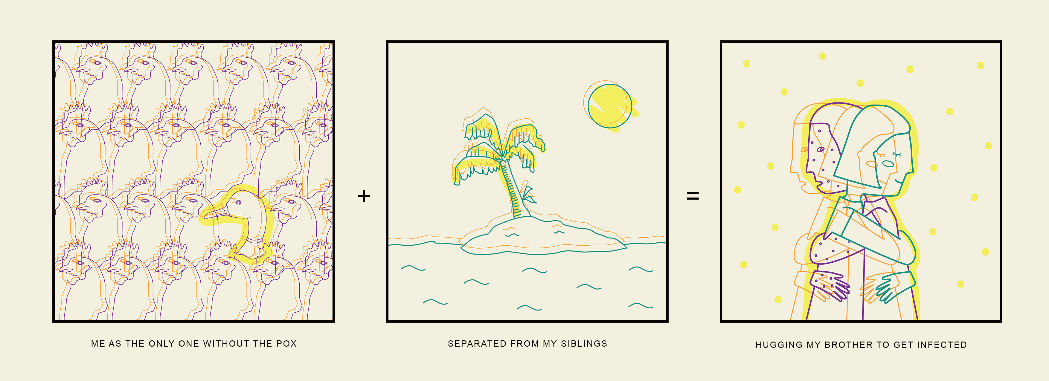
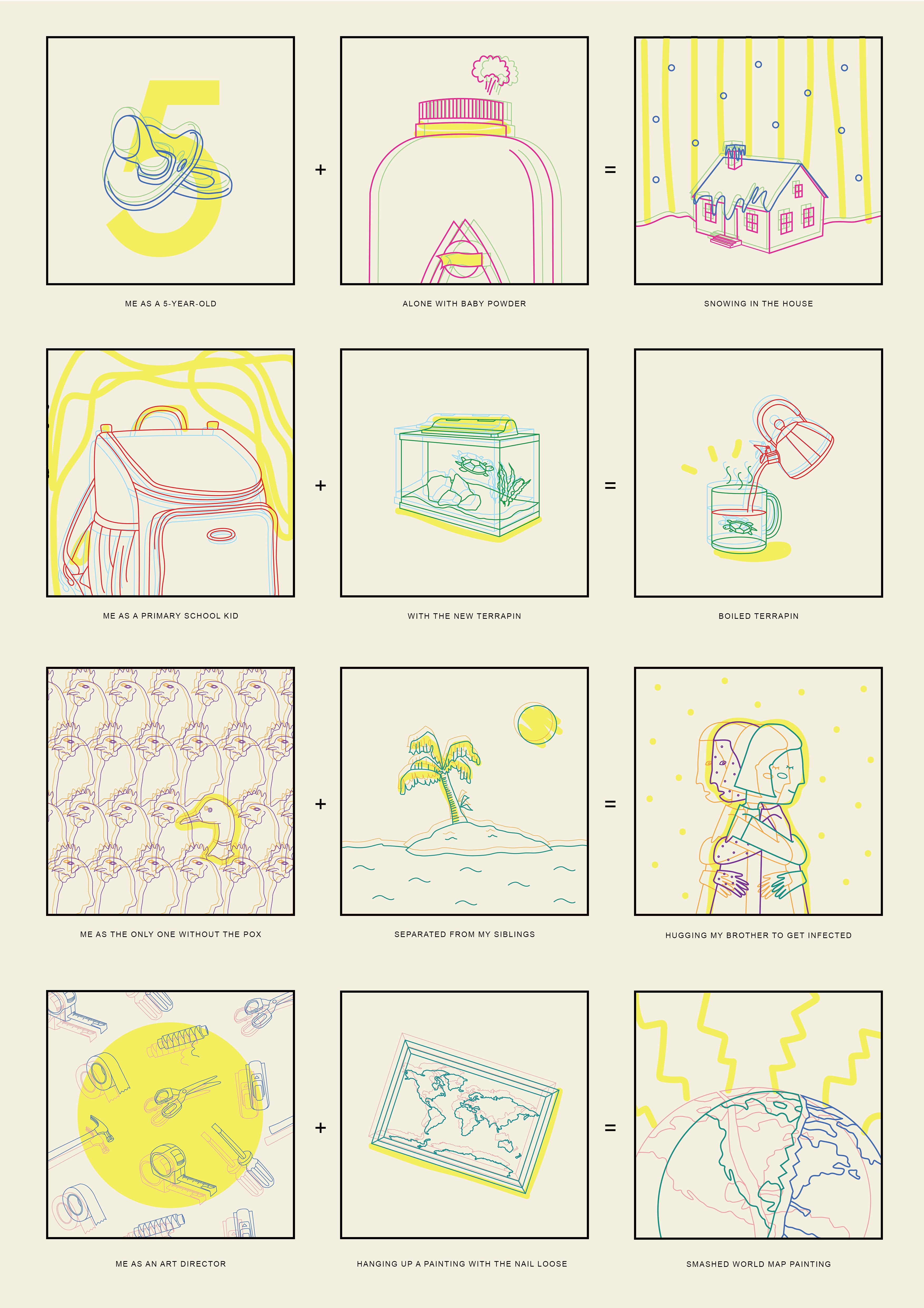
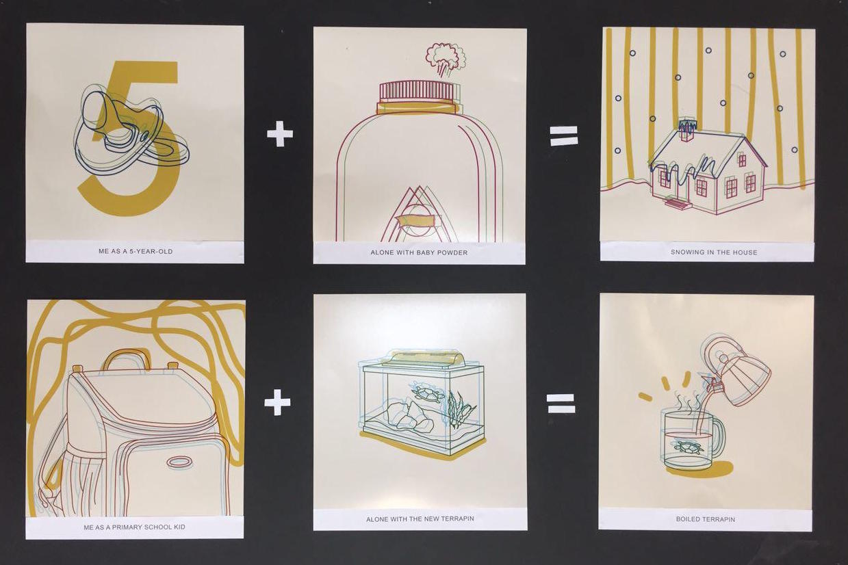
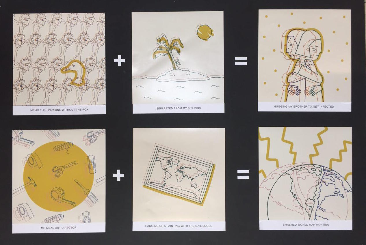
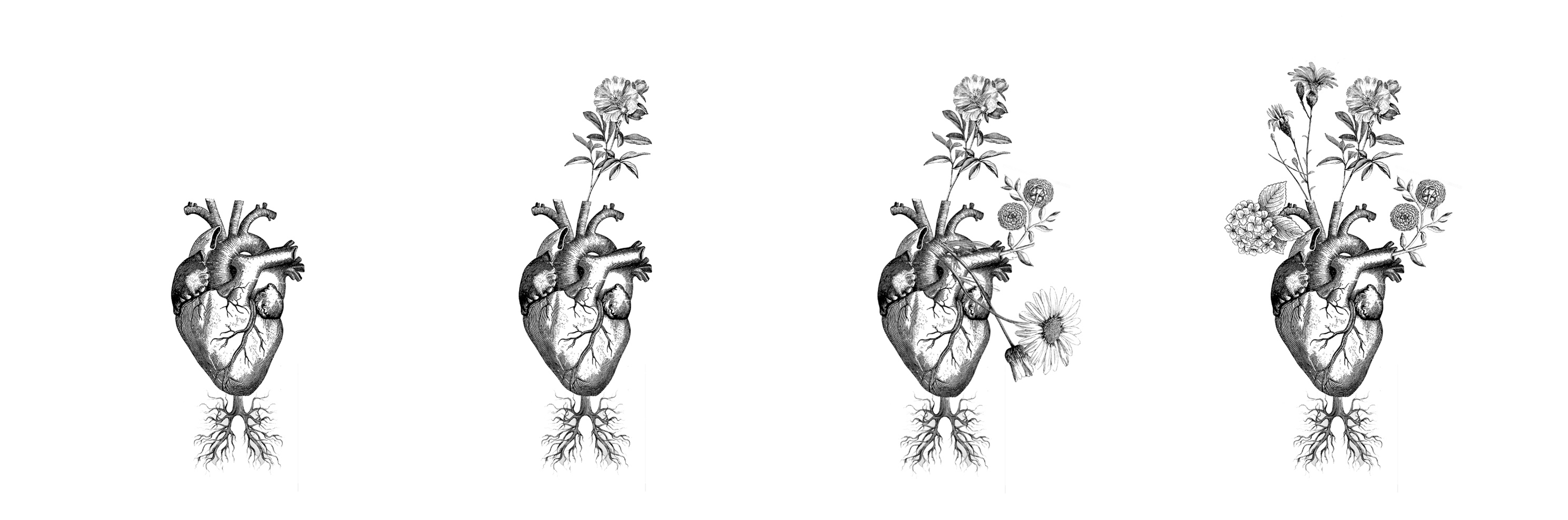
Next, I tried using a human skull pierced with all sorts of candy. The pain in this case would be a toothache but the consumer still can’t get enough of that sugar and they’ll keep injecting more into their system, which represents sadomasochism in a way like an addiction. 

In the first image, I tried arranging the lollipops the way pinhead usually has his but it looked weird so I turned it into a mohawk instead. I also used sour strips for the tears to show sourness and channel that melancholic vibe even with sweetness all injected into this dead skull head. I added sprinkles into the hollows of the eyes to show how clouded and delusional pinhead’s world view is. Lastly, I melted the skull so it looked like dripping honey.

This is the final product.


Overall, I really enjoyed this project and how the possibilities of each creation were endless. I never wanted to stop, even when I had an art history essay to submit. I realised I’d rather make 50 more tote bag designs instead of writing an essay. I didn’t mind making a few hundred drafts that wouldn’t be used because the process of making and scraping pushed me to make a better composition than I had envisioned in the beginning of each artwork.


Gestalt Theory

Hi all,

Here are the slides Loh Kee and I presented on Gestalt Theory for your reference.

Gestalt Theory – Loki & Melo

Even though we didn’t give out candy, we gave you something much sweeter – the fruit of knowledge, hopefully.

Thanks for listening, and we hope you use this design method in your future works of art.

<3 


My Line is Emo · Heart & Brain


P  R  O  C  E  S  S

My Line is Emo has got to be one of the funnest assignments so far. I especially loved letting loose with ink, getting my clothes and body stained black and looking like a beggar for weeks.

The way I approached this assignment was inspired by Jackson Pollock. I got right into making through expression and searched for emotions within the textures and strokes later on, sort of like reverse engineering.

The first medium I experimented with was lino cut. I cut myself in the process. I didn’t use lino after that attempt. Picture proof of beggar hands with cut:

After the lino trauma, I moved on to experimenting with safer, softer but textured mediums like oranges and crackers, bread and sponges to create patterns. I also went a lil’ crazy and filled a spray with ink which resulted in the mess below. My failed lino piece can also be observed in the following picture.

From playing with these foods, I found that the orange created coloured juice stains on the paper which didn’t tie in with the black and white requirement of the assignment. I scraped that idea. The biscuit crumbled all over the lino sheet when I rolled over it with ink so that didn’t go so well either. I resorted to a sponge dipped in ink and started experimenting from there.

Here are the other materials I played with:

  • Cling wrap

The cling wrap gave a really interesting texture that reminded me of suffocation or being repressed.

  • Plastic sheet

I loved how the see through material gave the emotion the dimension of vulnerability.

  • Crumpled paper and sponge

In the first strip, I ran a blackened sponge in circles to create dark churning movements that looked like worry.

  • Dry brush

It was interesting to see how different intensities of the brush stroke created different tones of emotions.

  • Palette knife

The piece on the left seems a lot like guilt to me. I painted over a greyish background with white smears of lines, imitating the feeling of trying to cover up something sinister or dark.

In the second week of the project, I was stuck because I couldn’t come up with a consistent theme or concept. Ms Mimi shared her thoughts on how I could carry on by referencing Jackson Pollock’s style. She told me she liked the variety of line textures I had created and how I could draw emotions and create a concept from observing these lines.

After creating several textures, I organised them into the emotions I felt they portrayed to me. My final boards are representative of the emotions produced by the heart and brain respectively. I’ve named the first board ‘HEART’ and the second ‘BRAIN’.

F  I  N  A  L   ·   B  O  A  R  D  S

“HEART”  Emotions from the heart are strained and deeper. They build slowly and broil like chicken in a broth.

  • Torment

I scrunched up newsprint and brushed a dry black inked brush gently over the creases to create a cracked/marbled texture. Many of my classmates told me this looks serene or calm but I felt it captured the building up of anger, like how torment isn’t an instantaneous form of anger, it is slow building and boiling.

  • Grief

I smeared black and white paint with my fingers and a brush on a piece of newsprint to create the effect of a storm brewing. There are always bright parts in a storm but you can’t quite reach it yet and I think that represents the feeling of grief.

  • Love

I smeared a palette knife with black and white paint on sandpaper for love. I wanted to imitate the movement of butterflies fluttering in one’s tummy, much like the feeling of being in love. I progressively added more white towards the right side to create the illusion of taking flight or reaching a safe place.

“BRAIN”  Emotions from the brain are reactions that are quick and instantaneous. They are pure and candid.

  • Joy

I drizzled white paint on plastic to give joy that translucent, innocent, candid feel. I didn’t want the paint drizzles to be perfect in thickness, no drips, no smears, because I realised that joy is like an ugly, loud, true blue laugh.

  • Surprise

For surprise, I rolled over some tissue with a slightly inked roller and stuck it to a board to create a soft and restful base. I painted a satay stick over with stark black ink to create that bold, surprise element in a sea of soft background.

  • Fear

I got this paper while shopping and I thought it’d be fun to try white paint on it. The crumples were already there and all I had to do was brush a dry white inked brush over the folds to bring out the creased texture of the paper.

All in all, I truly had fun doing this assignment and I’m grateful I’m playing with ink and emotions instead of numbers on an excel sheet.