Invitation Card
Button Badges
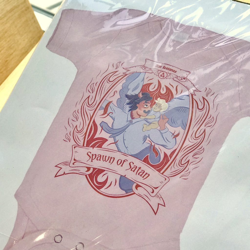
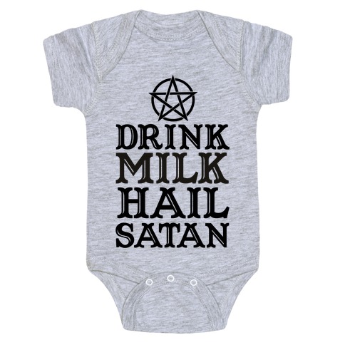
Baby Onesie
![]()
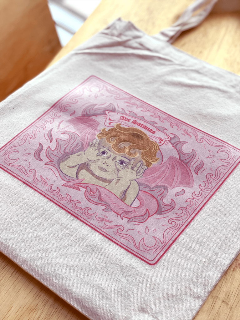
Tote Bag
Process:
Applied Illustration [Research & Process] || Illustration for Designers
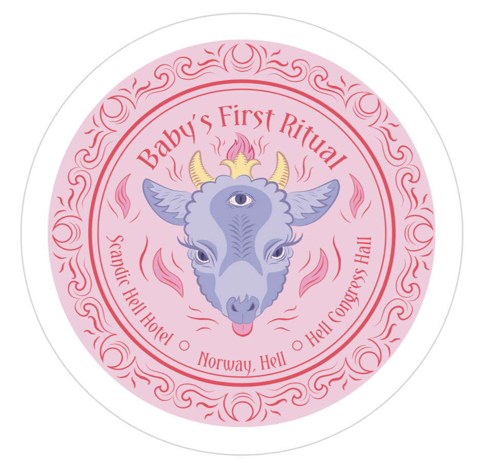
Welcome to the 4th Dimension
![]()
Process:
Applied Illustration [Research & Process] || Illustration for Designers

For this assignment, I was inspired by American Horror Story: Apocalypse, where the main character had been adopted by a group of satanists when he was a baby, and when he grew up they realised that he was “The Chosen One” and his real father is Satan.
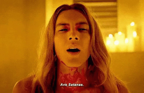
The show tells the story of the difficulties they had when raising him (murdering animals & people, conjuring satan, causing the apocalypse, etc). So I wondered “you know, all these problems could have been avoided if someone helped these satan worshippers parent,”
![]()
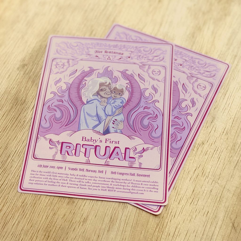
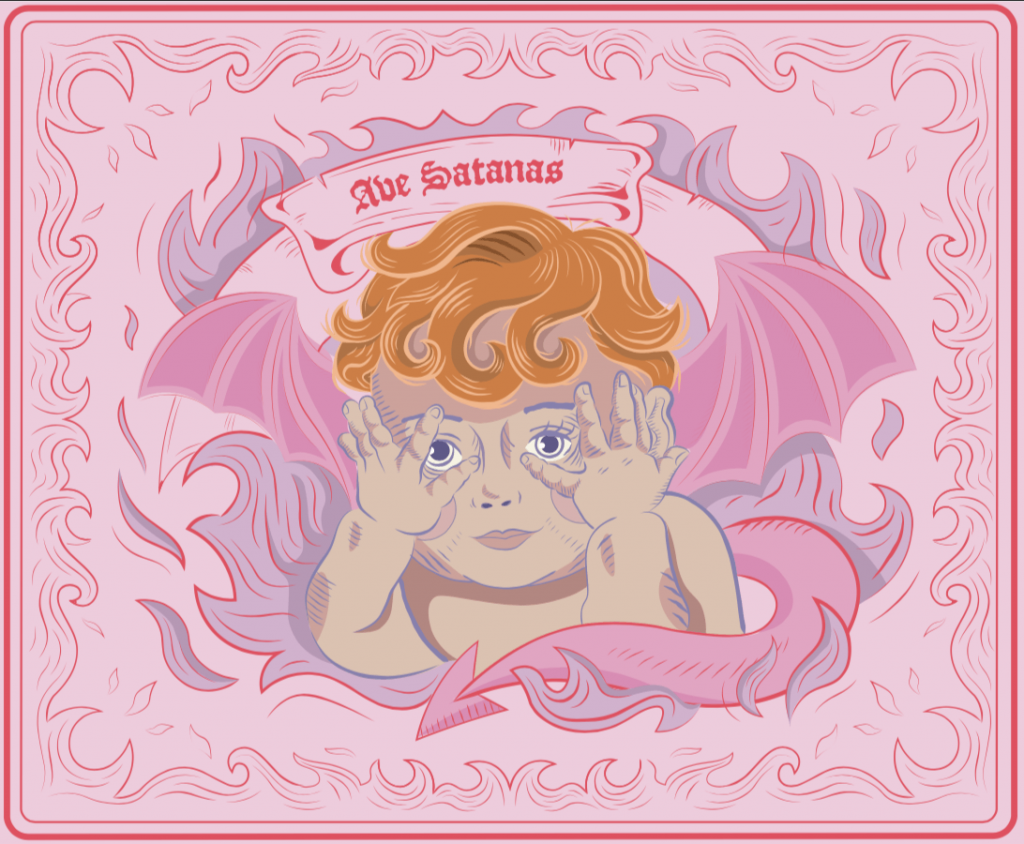
Which is how i came up with the idea of a Mother & Baby Fair: Baby’s First Ritual.
Mother & Baby Fair: Baby’s First Ritual is an invitation only event for young Satan worshipping mothers out there. Some of the incredible things you will receive are:

I will be designing for two groups of satan worshipping people: 1) Mothers 2) Children (infants & toddlers)
From the previous assignment, I felt that coming up with thumbnails and creating a mood board helped me a lot.

While i didn’t use most of these illustrations, I think that’s okay because some of the concepts were used for later illustrations.

Initially, I wanted to do a black and red colour scheme for the illustration to SCREAM satanism. However, later during the illustrating process, I found that it was better to go with a softer version of this mood board, which in turn sets a more ironic tone for my illustrations (will be explained as we go along.)


From my other two illustration assignments, I had a lot of fun exploring line art and how it told stories from different eras. This time, i wanted to use line art to make my work look more like illuminated manuscripts more. I chose this particular design aesthetic because whenever satanism is shown in movies and TV, it’s always some ancient thing from the medieval times.

I had to include that wholesome mother and child element to represent my audience. I used examples from 50s illustration.

After watching more horror movies, i cam top realise that a central and symmetrical composition is always being used to assert the characters in the show. So, for the invitation card, i decided that i should also use a symmetrical composition.

i was also inspired by tarot cards, which in a way, are satanic. It is also because i felt that the layout of the frame and the main graphic could work in my favour.


In draft 2, I established the visual hierarchy. Also i wanted a repeating element in my designs. I went with “Ave Satanas” in blackletter (Hail Satan in latin.) It was not meant to be read easily, rather, act as a symbol that “hey, this thing is satanic okay.” In this draft i also established that the theme of the design elements were going to be the “fires of hell”, which can be seen in the background of the banner in the the draft 2 illustration.


Initially, i wanted to use red and black. i also wanted to limit myself to the number of colours i used.


I thought this was going to be my final, but then i still did not like this very much. It was too satanic and the ironic quality of the event was lost, and this looked more like a poster i would see at a bar or a club. At this point i hadn’t figured out my colours yet, but i just moved on to the next design first.

For the tote bag, the design inspiration came from one of my thumbnails, which was a design which was inspired by one of the paintings of cute babies from the 50s. I liked the fact that this baby’s hands were on it’s face and the main focus was on his piercing little eyes, which gave me the horror element of this illustration.

To put the baby into a more satanic context, I decided to use this imagery of cherubs, which were supposed to be this delicate and cute angels. But then since mine was the fallen angel, i was inspired by depictions of Lucifer.

These are depictions of Lucifer from the horror show I watched and a renaissance painting of Lucifer crying. From here I used design elements of using red curls in the hair.

While i was drawing the curls in the hair, i realised that i could make it look like 666, as a form of subtle satanism.


Above, I coloured it in using the colour scheme that i wanted. However, i still felt that something was off, because it really didn’t say anything about the softness of wholesome motherhood. So i did research on a softer approach to satanism, something that was more mother and child friendly:

I decided to then flip the whole colour scheme that i wanted on it’s head and make it a pastel hell fantasy :D. Below, i was happy with how the colours helped to bring out the ironic quality of my event out:
It worked so good that i decided that i needed to change the colours of my invitation card as well:

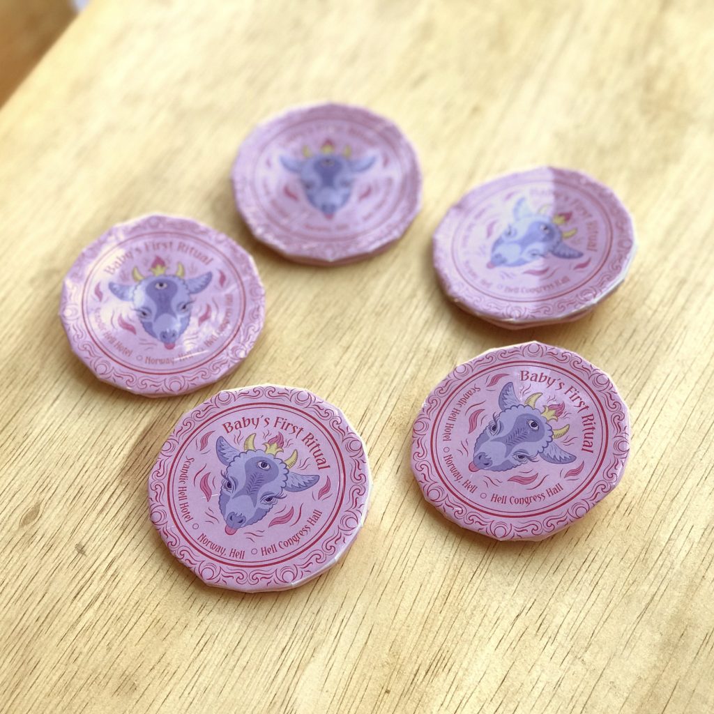
For this button badge, I was inspired by pentagrams, and how they always have a goat in the middle. The Baphomet. Since I had already established my design elements and colour schemes, the illustration for this and the final came easier to me.


I googled cute goat because it was an event for a mother and baby, so of course it had to be cute.
Before the final, i had one version where the goat did not have the middle eye. But after consultation, As it was also going to be a souvenir, i decided that i needed to also put event details in the button badge.
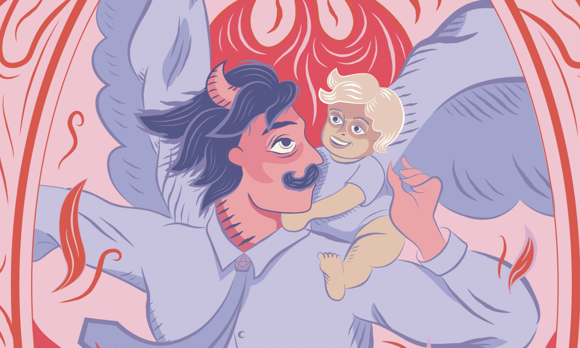
Some quotes for the onesie:
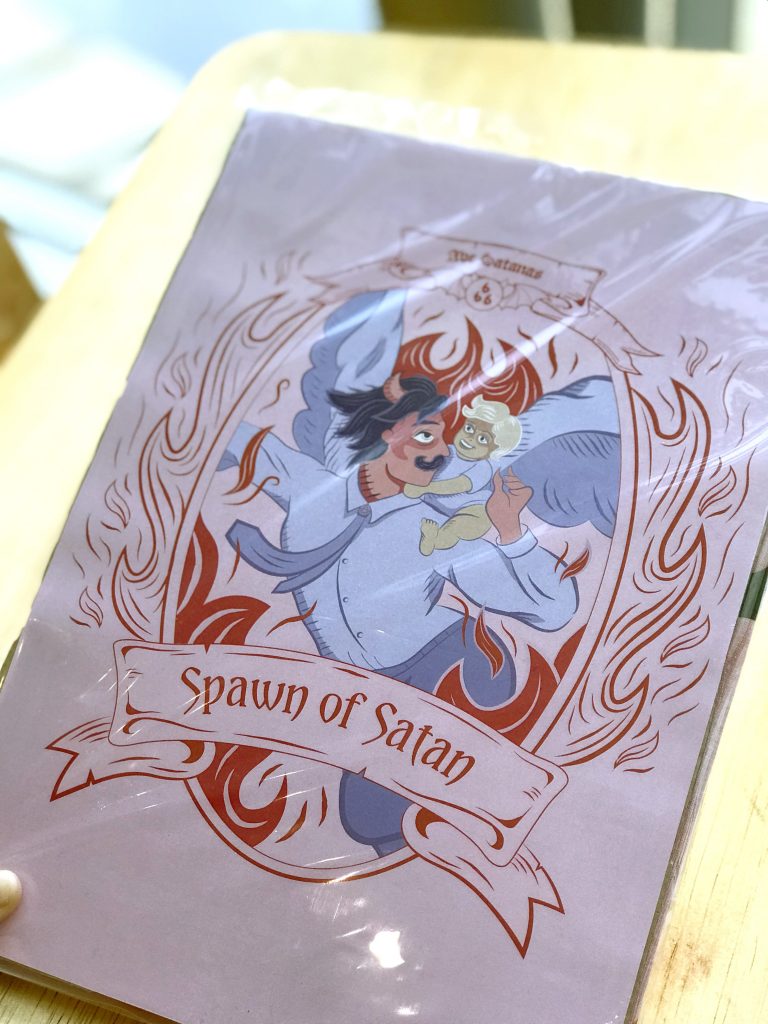
I decided to go with Spawn of Satan, and was inspired by the satan stork concept i had drawn in my thumbnail sketch. In the horror show that i watched, the father of the antichrist was literally satan, so i decided to make satan a dad in my final illustration.

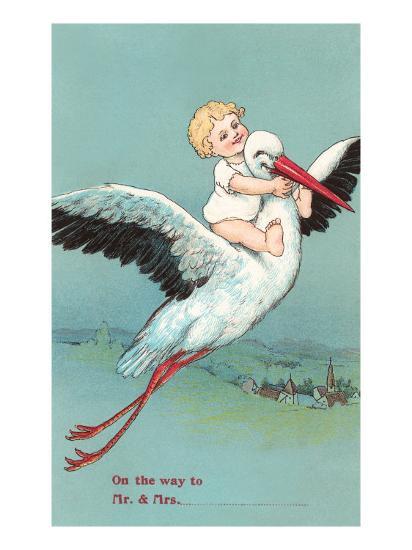

I used the stereotypical look of what satan looked like in pop culture.
![]()
Also i gave hum a tie to make him look more fatherly. :,)
I enjoyed this assignment because i got to experiment with juxtaposing wholesome and not so wholesome things to make something that works :,)


For this project, I chose the topic of Obsession. The obsession for this project is:
Annoyance is a great motivator. Currently, i’m seeing an obsession with the 80s aesthetic and romanticisation of the era in contemporary pop culture, and people my age (who did not grow up in the 80s) are also wishing that they could grow up in this period.
It is annoying for me, when people my age say that they wished they could live in that era, because i’m pretty sure if they were to travel back in time to the 80s, they’d wanna come back to 2019 as soon as possible. It’s like people are obsessing about the 80s but forgetting the crisis and problems happening during the era.Through this illustration, I want to take a critical stance on this nostalgic romanticisation of the 80s.
I’m addressing to people who are into the 80s craze right now. Which is my generation and younger (Millenials and Gen Z). Who never really grew up in the 80s, and are getting a romanticised version of the era. Where the 80s nostalgia affects them in fashion, music, and film, design. People who look to the past for a sense of comfort & escapism, look for hope for a better future.
I also think this is a good opportunity to talk about the AIDS concern, because recently Singaporean HIV positive people are also going through this (because of a cyber attack which outed HIV patients.) I want to take a stance on how Singaporeans are just following trends without realising that they are repeating the wrong side of history.
(((((don’t mind me just using characters from Back To The Future because it’s an 80s theme..)))))


Illustration Ideas:

The common theme of my thumbnails is of a young person enjoying the cultural products of the 80s, dancing around like Cindy Lauper, watching the “80s” shows on TV, while the “older” people are suffering from the crisis and problems of the era.

From my thumbnails, this particular one is my favourite because it’s got a dark humour element. The idea of this concept is…Freddie Mercury on an IV drip, performing his last performance.
The way that I would be showcasing the obsession is by the audience (of millennials) all having their phones up to record the performance, disregarding that he is slowly dying from AIDs.
I chose Freddie Mercury because till this day, he is still very iconic (eg. Bohemian Rhapsody Movie) He is also one of the more famous celebrities who have passed away from the 80s AIDS crisis, which would help me in my critical narrative on nostalgia.


![]()


![]()


This is me, hot n fresh from hell, every morning before i go to school 😀


I drew Rei! Quick 15 minute drawing


After collaborating with someone else, my work somehow turned into a whale with a horn.
