https://jannahsinnersaboteur.tumblr.com/


![]()

Welcome to the 4th Dimension

Final submission time!


SOVEREIGN


FINAL:
CAREGIVER


FINAL:
CREATOR


not kidding i liked my first one…though colours was so difficult for me because i kept wanting to use red, yellow, and blue. finally i just decided that i should just make this part of a blue print.
FINAL:

REBEL


final:
JESTER


this was all hand drawn :’) even the final :’))))
FINAL:
EXPLORER


when lisa showed the typography work made out of wingdings…i was inspired. so i decided to put it into context of an alien language…and because i was quoting bjork, i think it was very suitable.
FINAL:
![]()

Hello! It’s been a while since I posted. Below is the process of the Typography posters 🙂
So the quotes that I had were very, um, questionable. I always stay in the school lounge till very late at night, and conversations with me always end up revolving around a very particular set of topics :,) :
From these I came up with a few concepts for the posters:
For this, I wanted to show the aspect that these quotes were supposed to be some sort of secret that someone kept but everyone else knows it (so its not really a secret anymore, more like a taboo topic)
I wanted to use the gestalt theory for this because i wanted to hide the words between each other;


I had lots of trouble with this concept for the last quote because i had no idea what words were more important than the other, and which two words from the quotes i should put more emphasis on.
I think it’s safe to say that my quotes are pretty gay. especially the first one, which was why i had another concept of just distorting the typeface:


Felt that the concept was not strong enough, but had some potential.
Okay i came up with this idea because i really liked neon and bold colours. I also found my quotes very sexy and scandalous, and it was time i did something daring:

I really liked the photo of the neon lights shop at the bottom most right, which kind of inspired the use of neon signs:


I think for me i was also very concerned with how this concept might be too graphic, because i wanted the typography to stand out instead of the drawings. but after consultation that day, i developed this concept to really work with the corner/angle element that i had going on in the second drawing.
This concept did not win but i think its worth showing my other angle for the project:

because all these were quotes from late night talks at the school lounge, i wondered what if the quotes were written in very typical college food like coffee, ramen noodles, and some actual snacks…. but to be honest i think this concept was a bit weak and safe.
i did my work in black and white first because i found it easier to focus on the layout without having colour distract me:
Quote 1

Quote 2

Quote 3

For the colours, i already had them in mind from the start. since they were of red light district theme, they had to be feminine colours. Also because they are my favourite colours, and it just so happens that my concept allows me to have this colour combination hehe :,)
i’m not that good at colour choosing, but i learned this technique from a youtuber, where you get a picture that has the colour scheme you want, you apply the craqulee filter on it, then it gives you a palette of the photo which then you can pick and choose and see if it fits with your composition:


very proud of my work! even though it was a little embarrassing at the print shop!


![]()

process will be uploaded soon!


The main idea for my menu was a visual violation, and i think i got that aspect done really well. But i still used grids okay! i used converting to text because i find that easier.


Having visited both his individual and studio website, these are some of my opinions!:

I really enjoy his use of pastiche in his work! To me, even though Barnbrook is from the digital age, he shows that you can still be expressive! He reminds me of work by Neville Brody because both are kind of like postmodern rebels.

His experiments with stone lettering capture my attention because it is kind of ancient but he uses machines to engrave them, which puts a whole new twist on his typographic design.
There are some interesting points that Barnbrook mentioned in the video:
For me, these pieces of advices and new perspectives are very useful for me as an aspiring designer!!

My understanding is that these are the first three principles:
This is not to say that type shouldn’t be invisible, rather it is saying that type should be able to make the written word clear. The type has to draw attention to itself before it will be read, but at the same time mist relinquish that attention once the person has been captured to read it. If you ask me, that’s a pretty bold task to do.
The economic value of type has changed to becoming an illusion of superhuman speed, stamina patience, and precision to the writing hand. What about hand written typefaces? Maybe the fact that the handwriting typeface is consistent is what makes it more superior. Typography makes the letters come alive. Does this mean that type brings form to the spoken word?
Type has the power to move freely in the whole domain, as something that is durable and adaptable. It serves a s a function to step in a way that is graceful and vital, instead of lacking in originality, making it cliche and boring. It can be taken as a form of slow performing art which houses many deep emotions. For example, when I read this, I was reminded of the Hallmark greeting cards. Even though it might seem like an arbitrary thing to buy (it’s just a piece of paper i’m buying for someone else), the typeface being used is important when trying to convey a certain type of emotion. The same typeface could be used for a sister’s birthday card or a Christmas card. Maybe style here refers to more than just the design, but maybe the way the design of the typeface is being used?
In the reading, the authors wrote so many different types of ‘tactics’ to accomplish the principles above. Maybe because i’m a ~*~*millennial*~*~, i’m starting to design for mobile and web design. Here are some of mine (disclaimer: i’m not that smart):
Not only is this for legibility, but it also should be able to stick with you throughout your entire website brand. Like, play with weights and size variants, and if you’re feeling a little crazy, italicise it. But this doesn’t mean you can’t have a another typeface. The other one should compliment your branded ™ typeface. Maybe just stick to 1-3 typefaces. This way you can honour both the words & the brand.
Bad:
Good:
Readability would be another important aspect to take note of. In a world of clickbait titles and fake news, everyone’s just trying to get their information to the most amount of readers of possible. If I find it difficult to read your words…bye! i’m going to read the same news from another news website now. As the laptop/mobile screen is limited, the size matters a lot, so maybe a very small font size for the mobile website isn’t such a good choice.
Bad:

Good:

Another aspect is also to take into consideration the visual layout of it all. Your website type shouldn’t have a huge chunk of text in random corners which just deters readers who now want quick and easy information. This also goes back to making sure that the kerning and tracking of the typeface you chose doesn’t unintentionally overlap each other from desktop website to mobile website.
Bad:

Good:
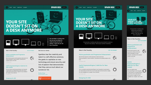
With the limited space on mobile, two levels would be a good limitation on hierarchy, which is different to the desktop site which is usually 3 levels. For the mobile, the copy is also lesser than the web face, so the contrast becomes exaggerated. Then, you’d have to weaken the contrast.
Bad:

Good:

All work and no play makes jack a dull boy
All work and no play makes jack a dull boy
All work and no play makes jack a dull boy
All work and no play makes jack a dull boy
For this, i didn’t want to play nice. Also because i watched a thriller movie last night, i made an inspired design:

HERE’S JOHNNY