Have you ever seen a crime scene in Singaporean public hawker centres? Tissue packets strewn across the tables, their innocent plastic bodies displayed to show it’s owner’s power during the busy lunch period?
Something unique to Singapore eating spaces is the use of tissue packets to reserve seats during lunch time, as a way to assert your dominance to other people that THIS IS YOUR SPOT. Here I drew a Chope War. Chope means ‘Reserve’ in colloquial Singlish, and in this image there are two people fighting over the table.
Blue for the table because it is the usual colour for hawker centre tables next to white.
Redfor angry people fighting against each other
Yellow for the innocent tissue packets being used as weapons of mass reservation.
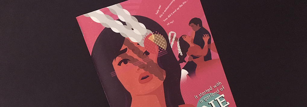
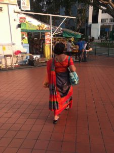
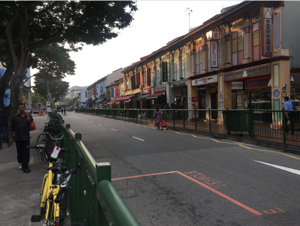
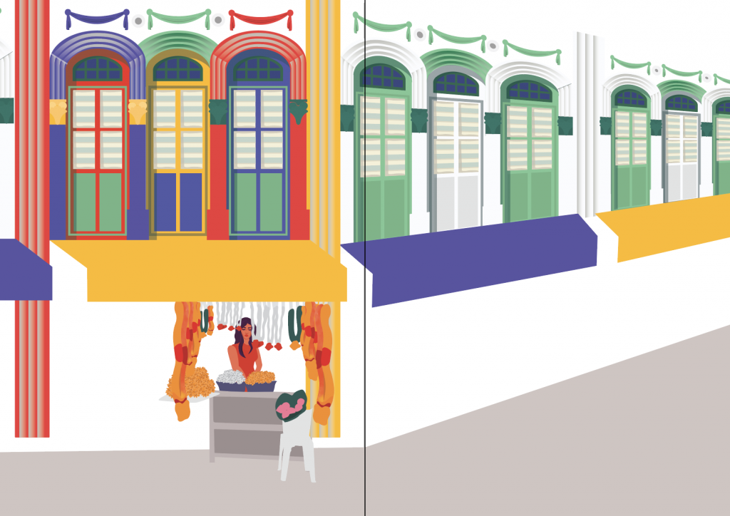
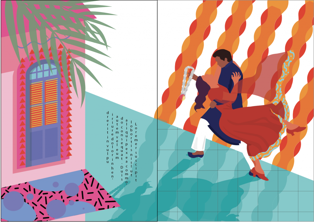
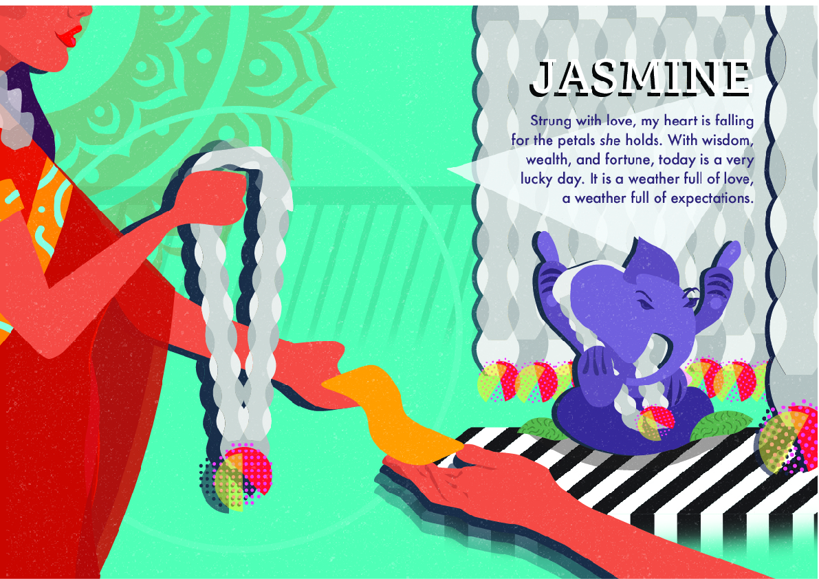
The place that I was assigned was Little India. For me, some of the words that came to mind were colourful, loud, exciting and fun. For me, I also wanted to include a cliche and fun narrative that flows throughout the story, because i felt like appreciating the basics. In terms of design, I also wanted to reduce the shapes seen in little India into the most basic forms, so that my work would be more graphic.
Things I wanted to feature:
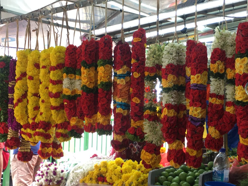
Garlands
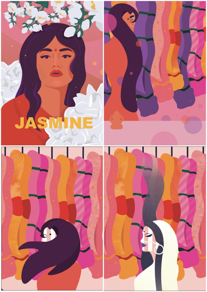
No matter which corner you go to in Little India, Garland shops were everywhere, and there was always someone buying something. I felt that this was an iconic symbol of Little India, so I wanted to make the zine focus on the garlands and garland shops.
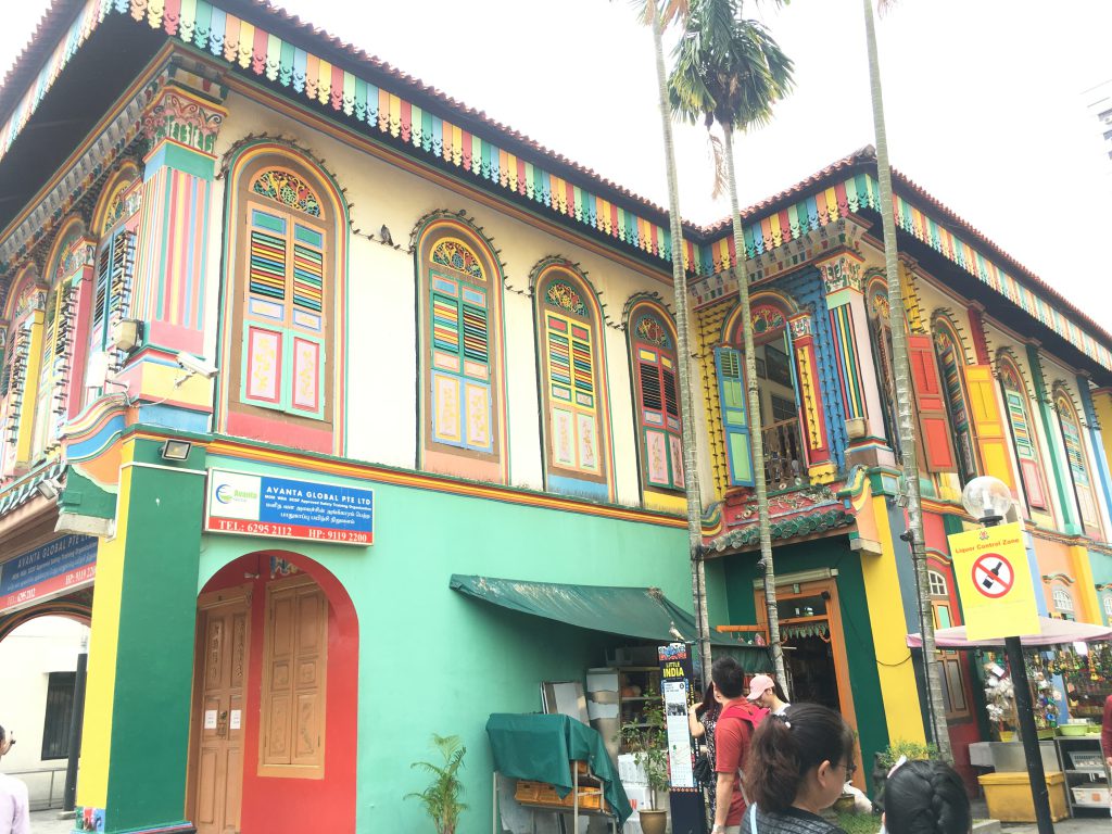
Tan Teng Niah House
The Tan Teng Niah house is a very colourful landmark in Little India.
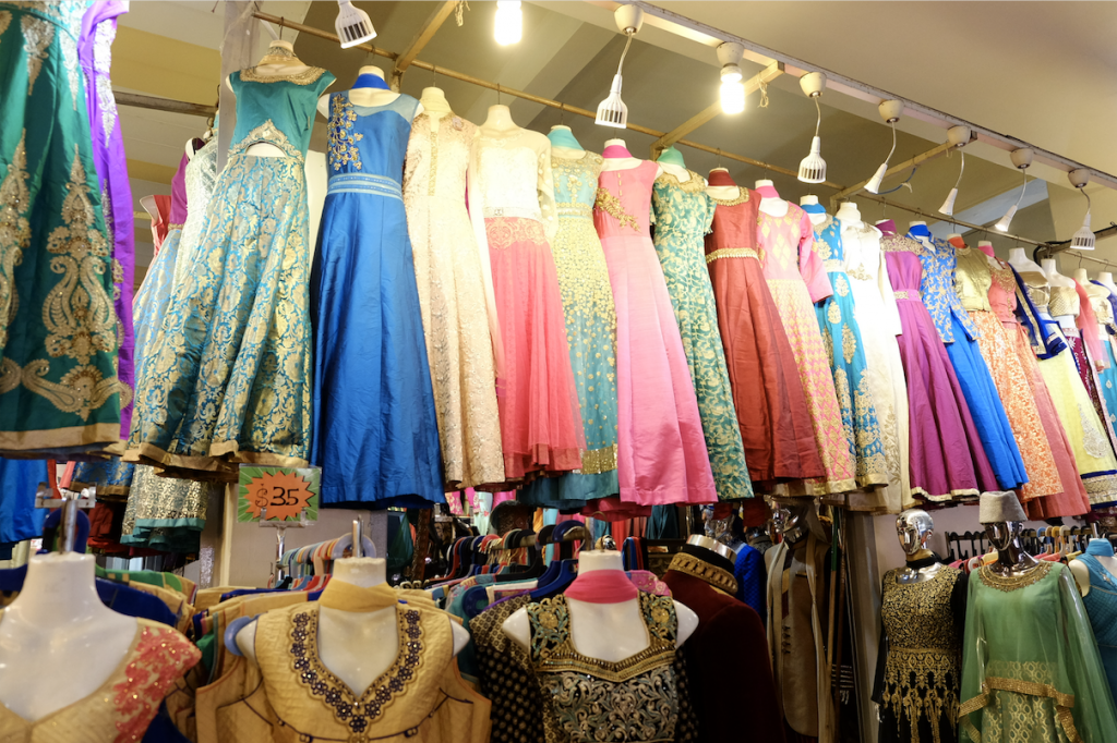
Traditional Clothes
Tekka Centre / Traditional clothes
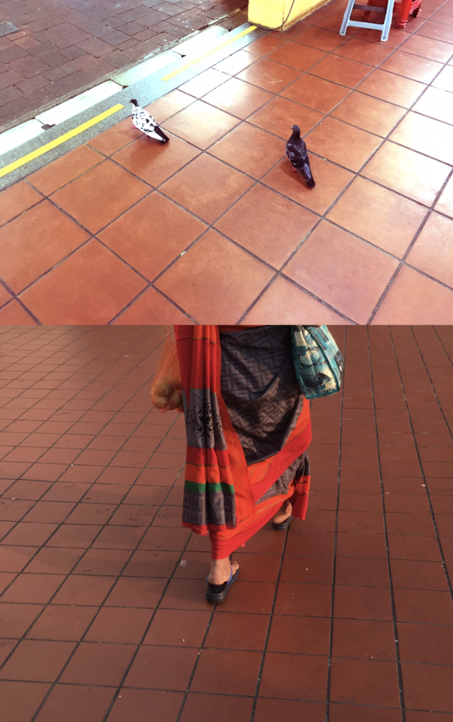
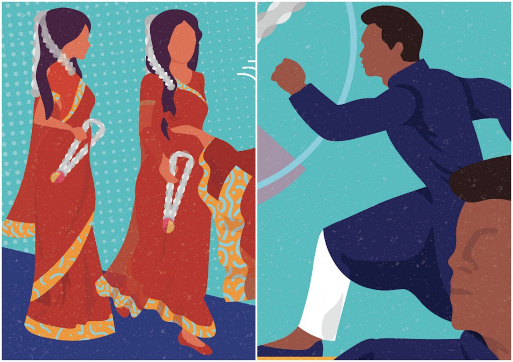
Little India is a place where people still wore traditional clothes, and it made the precinct very colourful.
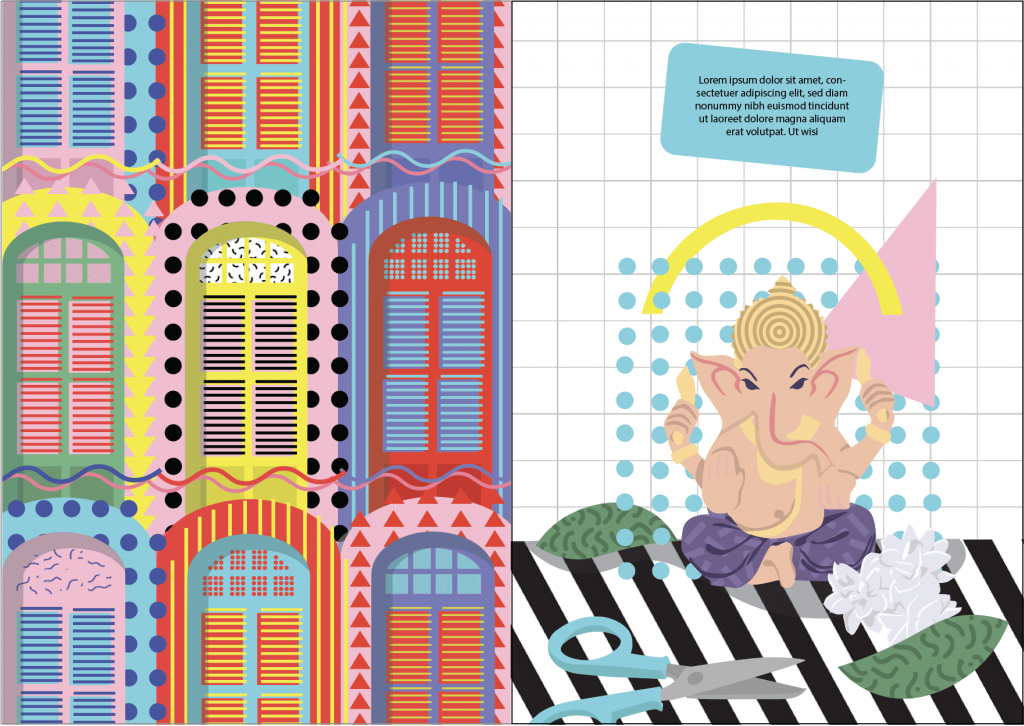
Hinduism
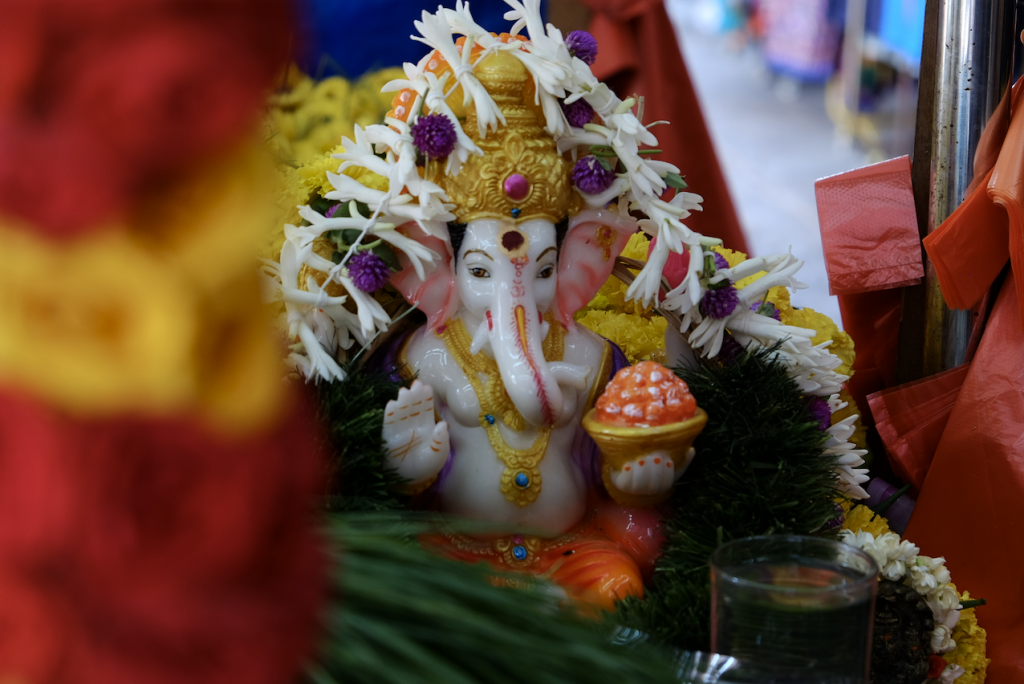
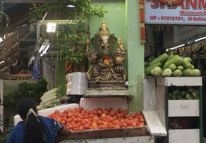
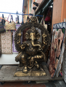
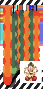
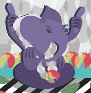
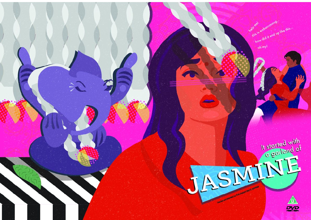
I chose the image of Ganesha as I observed that the god was very prominent in Little India, because he would be put in shops and stalls because he represented prosperity and good luck.
Infrastructure
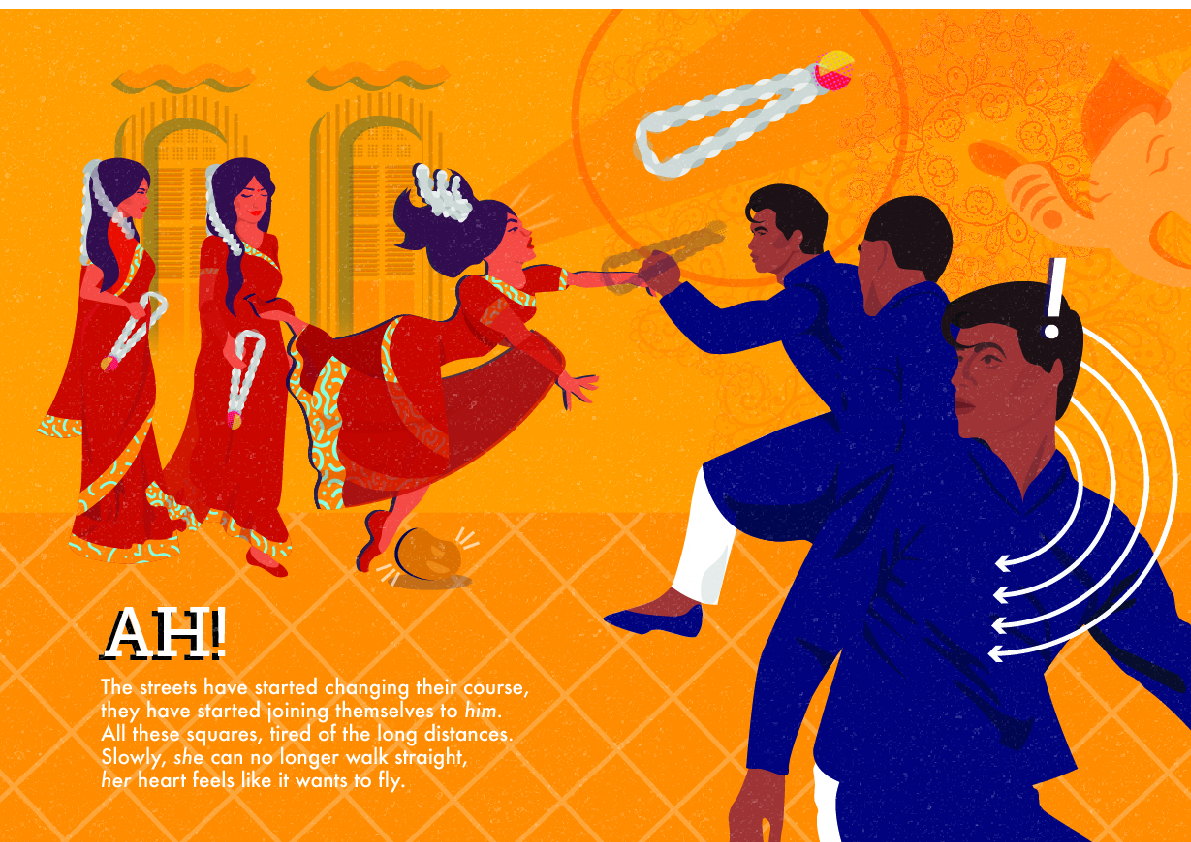
In order to separate from India and Little India, i felt that railings and shophouses made the precinct distinctively Singaporean. I also felt that the orange tiles were a subtle icon of Little India.
Infrastructure, such as railings and shophousesOrange tiles
Process
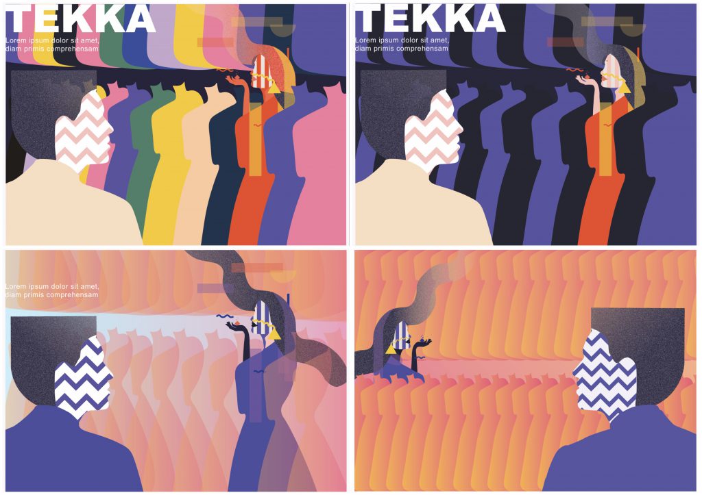
Tekka Centre
Initially, i was very inspired by the Memphis design movement, but after feedback, i felt that it did not represent Little India, rather it represented India. Below is a draft of my first design for the two main characters of the story:
I tried to represent the Tekka Centre by reducing the shape of the traditional clothes displayed and hung into a basic form, however i felt that I could not tell what it is when out of context. As such, I decided that i did not want to include an image of the Tekka centre in the zine because I felt that I was not able to represent it well.
Here, I decided to showcase traditional clothes on the main characters themselves:
Garlands
In the first picture, it is the first design of garlands that i had, which featured almost close to reality jasmine flowers. However, I felt that it was still too illustrative, so I tried to reduce it to a basic shape, as seen in picture 2,3, and 4. I had issues trying to represent the garlands using the basic shape, as i felt that it did not look or feel like garlands. After looking at other designs, I was inspired to design my work as seen below, as I felt it looked more like garlands.
Shophouses
Here, I had illustrated shophouses to be close to reality. I also tried to put a garland shop there, but whilst I was doing this i felt unsatisfied because it did not push any boundaries and looked very normal.
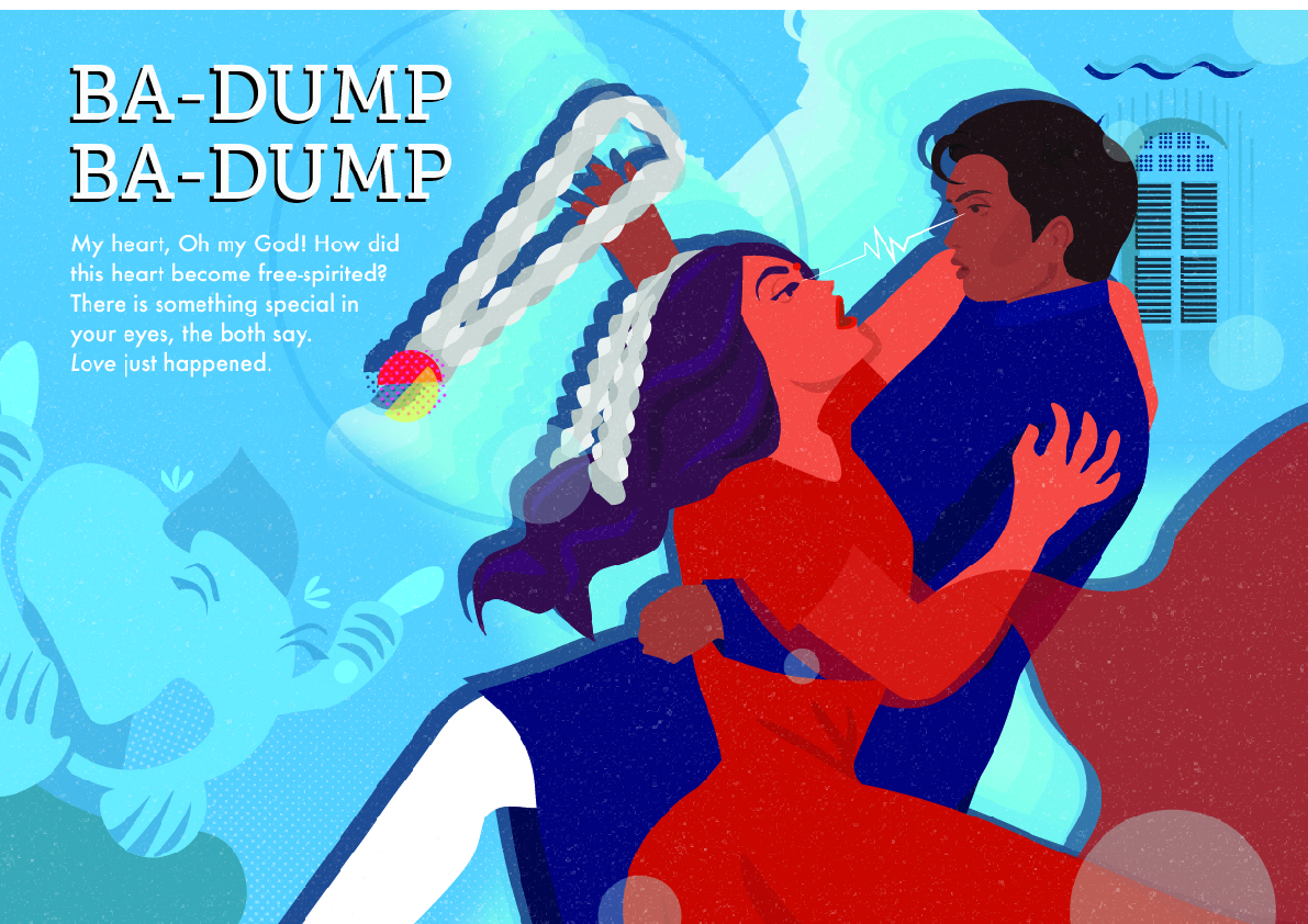
Here, I tried to manipulate the shophouse windows to look more graphic. I felt that the page is too messy as there were too many elements and colours fighting for attention. I also wanted Ganesha to be featured on every page of the zine, because I wanted to make it seem as if he is the one who is in control of the two characters meeting each other. On the right, it is my initial design of Ganesha, which was still illustrative at the time, which i decided to change it for the final.
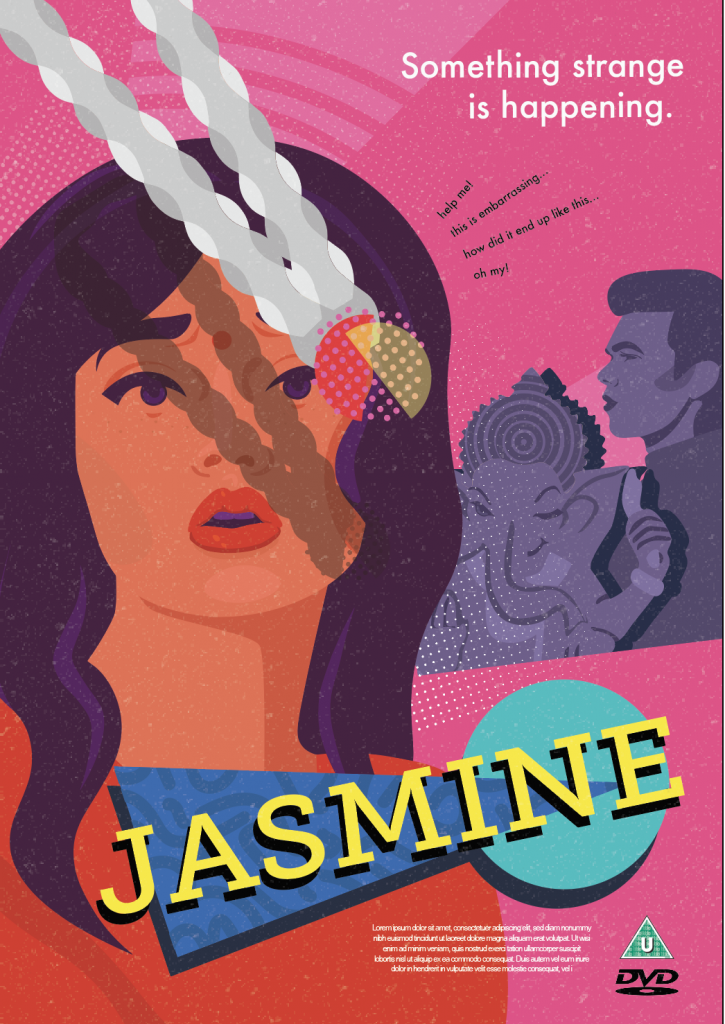
In my final, i decided to still use the design created, however made the windows blend in with the back ground in order to make the zine less cluttered with colourFinal design of Ganesha
Layouts
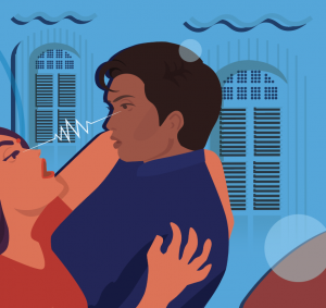
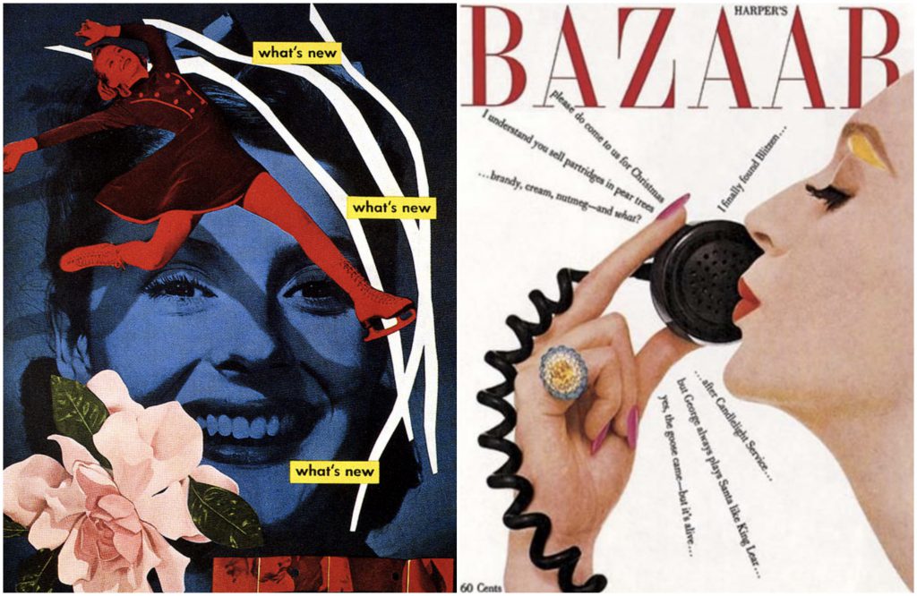
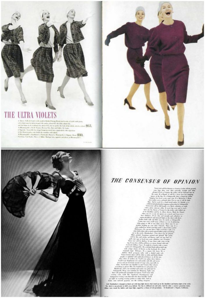
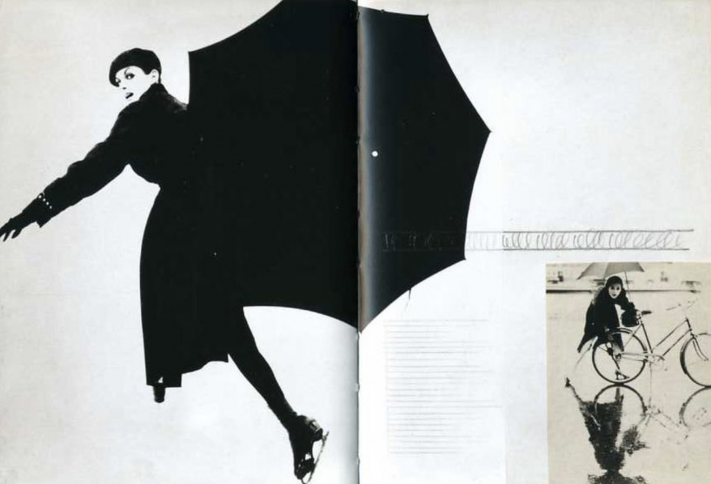
Inspired by Lester Beall and Alexey Brodovitch, I liked the way that their graphics were able to tell a narrative without much use of text. An example of this is the cover page, where I obstructed the main character’s face with the garland and garland’s shadow:
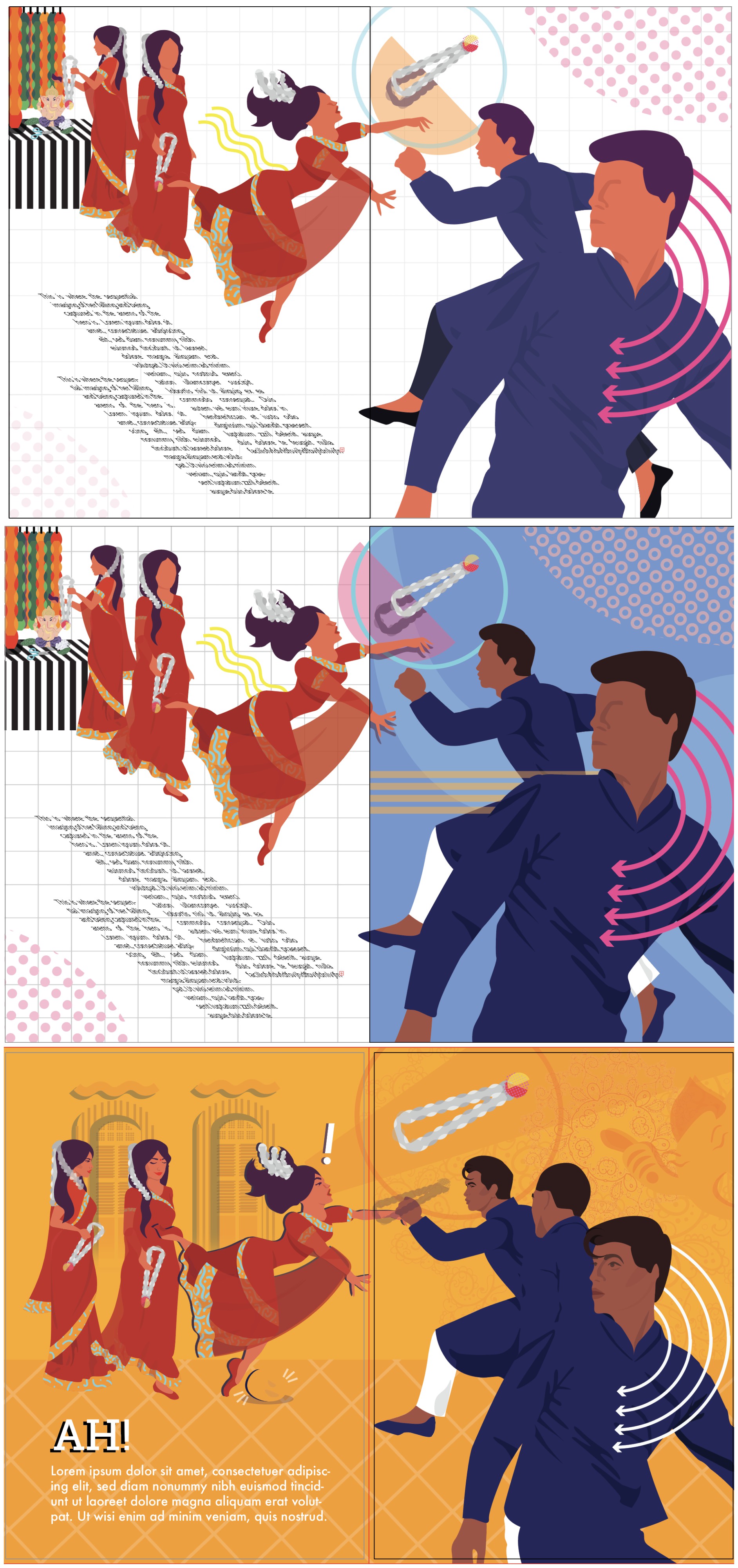
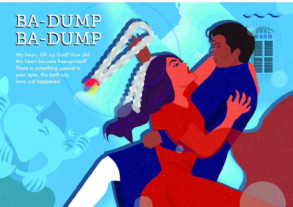
Another page was the scene where the female character falls, where I wanted a more horizontal line for the layout. In the first two pictures, i was inspired to use the sequential imaging and slanted text, but i felt that there were too many things fighting for attention. I also wanted to explore using directional lines to show movement in the work, inspired by Lester Beall:
In the last page, I wanted to make it dynamic because it was the climax of the story. As such, i wanted to use diagonal lines for the layout. In the initial design, I found it too messy. In the final, I added drop shadows behind the human figures, to sort of show a fast-motion direction of which the male character caught the female character. I also had to be wary of leaving a space for Ganesha’s character.
initial design
Colours & Text
As I was not able to showcase the Tan Teng Niah house, I decided that i would use a colourful palette, similar to the building, throughout the zine, which also represented the colourful and exciting atmosphere of Little India.
For the text, they were all from translations of Bollywood songs that sung about love at first sight, which would explain why they might not make so much sense. However, i felt that the content of the text was not that crucial in this project, because i was more focused on creating the forms.
Reflection
For me, i felt that this project was very difficult because I was very out of my comfort zone in creating graphics instead of illustrating. I had never actually considered graphic design. However, I felt that this being my first try in trying to differentiate myself from what i know, there was still a lot of my personality being injected into the final outcome. After this project, I think i want to explore more into creating a visual language.
Fot project Ego, we needed to come up with 4 equations about ourselves, a situation, and how we change because of it. With this, i decided to use the theme of self-identity. Below is a list of equations in which i had comem up with when i was brainstrorming:
Me, girl + two brothers = tomboy
Me, sloppy + first week of school = fashion queen
me , creative + accounting = anxiety
Me, straight + surrounded by pretty girls = questioning myself
However, i could not visualize how these equations would turn out on the panels. In the end, the equations that i settled for were:
Me, living a normal life + look into my wardrobe = become different people (self identity: multiple identitites)
Good child + social pressures = rebellion (self identitiy: non-conformist)
Introvert + another introvert = chatty me (extroverted)
Single + dissappointing boys = independant woman
Illustration style
When i got the brief to the project, i immediately thought of comics due to the delivarables benig in forms of equations and squares. As such, i decided that i had wanted to create work that was similar to comic style. Initially I drew inspiration from Roy Litchenstein, him being one of my favourite artists. I liked his use of colours However, after seeing examples online, I knew that I was not going to be able to do the Ben-Day dots, as I opted for the traditional method. With this, I branched out to other artists, solely focusing on comic artists. I wanted my work to look like a comic because I find that it is able to tell a story through the use of visuals effectively, and has an element of sequential storytelling. Using less words, this also helps to ensure that the visuals are able to convey the message, which is what I like about comics.
After consultation, Ms Mimi suggested that I should follow the aesthetic style of retro comic books. With this, I decided to reference the work of Dan Parent. I really liked his comic style because if it’s simplicity as compared to other comic artists, and also because I grew up reading Archie, and I also wanted a retro theme to my work because of the charm that it had. As such, I decided to incorporate his illustration style in my final project. As I am not very proficient in digital drawing or painting, my only option was watercolour. The way i apply watercolour is to get very strong pgments so that the colour is vibrant, and am able to get them as flat as i could get.
Colours
In terms of colours, i wanted it to already play a part in my work as a whole. I was inspired by the sunset in which are all warm colours, which i feel represent me best because i am bright, bold, and loves the drama. I liked the analogous colour scheme, As such, the colours that would set the tone for my work was red, yellow, orange and pink.
For my work, I wanted the colour harmonies to also play a meaning from the first column to the last column. I also waned to change the meaning of the colour that is associated with it, from negative to positive (refer to table below). With this, the first column was to be monochromatic to symbolize mundaneness or “normal” me. However, for the 2nd and 3rd column, I had the choice of doing analogous, complimentary and split complimentary, or analogous. With this, I tested it out on the computer first.
Colour
Positive Connotation
Negative Connotation
Yellow
optimism, self-esteem, confidence
boredom
Orange
passion, abundance, fun, childish
deprivation, frustration, frivolity, immaturity
Red
excitement, physical courage
a tense situation
Pink
femininity, love, sexuality
emotional, claustrophobia
Me, living a normal life + wardrobe = become different people (self identity: multiple identities)
This was the first panel that i worked on. It is a story about how i am able to live only one life, but through clothes and dressing up, i get to be different people and characters. That would be a fun experience for me because i would be able to be fashionable as well.
This was before i started to explore Dan Parent’s illustration and colour harmonies. I did not look like the way it all looked different from each other, and did no have a consistent illustration style. After consultation, i decided to plan out my colours better. For me, this was going to be the yellow sequence because i wanted to portray boredom, and change the meaning to confidence and somersetting that was fun.
As you can see, i had played around with the option of complimentary and analogous in the 2nd row, and split complimentary and a wider analogous range in the third row. I liked the outcome of both, but i still had to decide which colours i wanted to start painting with. All i knew was that my entire work had to look cohesive as a whole. After doing a comparison with other colour drafts I did, i had settled for a warm analogous for this panel. i liked the way t turned out:
Here, the meaning of the colour yellow from being a yucky, boring colour becomes a vibrant and energetic one.
Good child + social pressures = rebellion (self identitity: non-conformist)
For the colour orange, i thought that i should tackle this with a childish subject. This is a story about when i was younger, i would always listen to my parents. as i grew older, people started to keep telling me what to do, like going to university, getting married, having a child, getting a house and getting money. The last panel depict my reaction to all the social pressures i faced with. for the monochrome, i experimented what it would look like if it were a yellow monochrome. of course, it looked muddy, so i decided to go for the orange monochrome. it looked better and delivered the message of the story better.
At this point, i knew that i was going to have to go for a warm colour analogous colour scheme. Above is my experimentation of what hues and tones were going to go where, so that i knew what i was going to paint. But if course, as i was doiing traditional medium, colour mixing was one of the most difficult parts of the wok because i could not get the specific colour that i wanted. As seen from above, the last panel was supposed to be reddish-pink on reddish-orange background, however the traditional outcome came out a little but different. Below is the final product:
Here, the meaning of the colour orange from being immature and childish becomes aggressive and rebellious.
Introvert + another introvert = chatty me (extroverted)
This is a story about how i met my best friend. we were at a social gathering and he was being shy, so i decided to stop being shy myself and introduced myself to him. till this day, he is my best friend. Here, i wanted to use the colour red to symbolize the tense situation. Below is are my colour schemes:
For this, i also experimented with complimentary and split complimentary colour harmonies. it felt like it could work in theory, but when i put it on digital it did not work at all because of the contrast. it was also difficult for me for the last panel especially, because at the time i did not know how to compose the picture.
after getting inspiration from the Archie comics on how to frame two people and a dialogue the colour harmony for the last panel was still difficult even when i opted for the analogous route. the colours were supposed to be good in theory but somehow was not showing in the digital. Because of this, i decided to mix the watercolours to try and get close to the digital, but also come up with a colour that would be of cohesive tone and hue:
with this the red transforms its meaning from being a colour to represent a tense situation to a colour that is passionate and excited. (did you spot archie andrew in the first panel? :p)
Single + disappointing boys = independent woman
This is a story of my life almost daily. In fact, this was inspired by me being caught as a third wheel between my best friend and his boyfriend (THANKS A LOT GUYS ). This is lso a story of my experience with almost every guy i encounter who tries to flirt with me; they end up to all be the same, disappointing. and so, at the end of the day, i become an indpendant woman who dont need no man (and punches cupids). For this, i used pink, the colour of love. to syMBOLZE THEIR LOVE NOT MY LOVE:
for these panels, i did not have much difficulties because i had been doing this for the past 9 panels. when it came to this, i tested the colours digitally and liked how it came out.
when i mixed the watercolour colours, i wanted the character of myself to have a little bit more warmer pink to set myself aside from the other characters and background. As such, the pink in the first panel was to symbolize love, but at the last panel it now shows a sense of authority as it now has been accompanied with the blue.
FINAL
i legit had fun with this assigment because im a lover of comics and colours. all in all, i was satisfied with my work and managed to make my own title with the Archie Comics typeface.
Some Takeaways:
I learnt about the bezold theory and did not even know i’ve been applying it to my work my whole life. for me, ive always thought bout it as simple outlining and defining my work, but now i’m more aware of the fact that it does give an illusion of making my colours darker when i surround my colours with black lines, or lighter with white lines.
Colour mixing is so difficult but so rewarding. personally i have always gone into colouring my work blindly, choosing colours that would work well in theory, and mixing pure colours from paint tubes and seeing where it goes. i think thats the fun in it; creating colours you’ve never seen before. also, god bless copic markers, i should really start investing in them.
Finally I could use non-abstract images to convey my message! For this project, I decided that to take quotes from chick flicks because I grew up watching them, but never truly understood the meaning behind these stories. As I grew older, I realised the deep meaning behind the movies, and felt that it was clever in trying to showcase important issues through the use of humour and making light of it. As such, I wanted to try and extract the deep meaning of the quotes.
DEVIL WEARS PRADA
quote 1
Even though the line was delivered for comedic purposes, this quote hit me because I had a history with Bulimia. The context of this quote was that the person was already skinny, but wanted to become skinnier by using bulimia. I decided to take a visual approach to generating my piece:
DRAFT 1
I decided to pick out the elements of this movie and use literal images to show the context of the movie. To say the least, i really did not like this composition because it was too cliche, and did not show any element of the word weight or stomach flu.
DRAFT 2
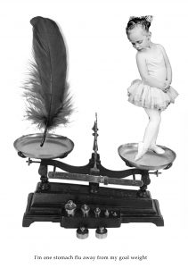
Yes so I really hated this composition. For this I decided to focus on the word weight, and so I used the weighing scale. However, it did not show any elements of devil wears Prada or stomach flu, so I moved on.
DRAFT 3
I think it is pretty clear that i also hated this composition because whilst i was doing the work halfway, i stopped and moved on. I was still not able to get inspiration.
DRAFT 4
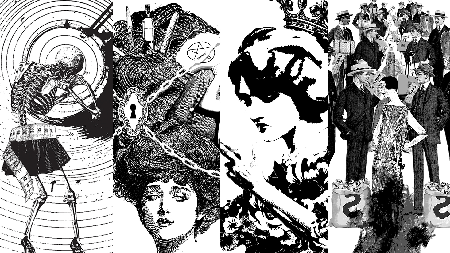
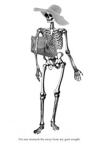
There was more thought put into this one but i still did not like it. For this, I was able to show the elements of stomach flue, the burger and the flies, and the devil wears prada through the skeleton with the luscious locks. I wanted to try and use negative space for this composition because I was bored of a white background.
I wanted to try and create depth by playing with proportions of the skeleton and the flies. In this composition, i was still not able to show the three elements of stomach flu, skinny, and devil wears prada into one. I also felt that the negative space added no benefit to the overall composition, so i decided to stick to a white background.
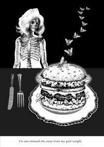
DRAFT 5 (Final Draft)
I was running low on ideas before I took a step back and decided to use my word association method to generate keywords to search:
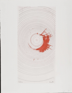
When i searched the word Insane in tate.org.uk, i was introduced to an artist called Damien Hirst. I was intrigued because I felt that there was something in his work i could use to kickstart my composition. I liked his series of spirals because i felt that it looked like vomit after someone had spun around for so much. With this, I decided to use “Oh my God…and for those really stubborn stains!!!!!??”.
“Oh my God…and for those really stubborn stains!!!!!??” by Damien Hirst
As such, I used this particular work to become the “vomit” and background of my composition, showing the element of Stomach flu. As the characters were walking up the steps as the quote was being said, i felt that the circles helped show an element of “migrane” when it is near the skeleton’s head, and when it was near the feet it looked like steps. It also was in line with the Gestalt theory of line of enclosure, in which i heightened the contrast of the circles so that the circles were implied in some areas. This was because i wanted it to imply subtlety (because you cant see a migraine), and wanted to make the splotch very obvious.
As for the character, i still wanted to use the skeleton because it was skinny, like the character, but i needed it to be hunched over. A simple search in google of “skeleton hunched over” brought me to the perfect picture. However, i was still struggling with showing the element of weight, when a friend suggested that i could try and use a measuring tape. As such, i decided to make the measuring tape also a fashion accessory to the skeleton, together with the skirt and heels, which also showed the element of devil wears prada.
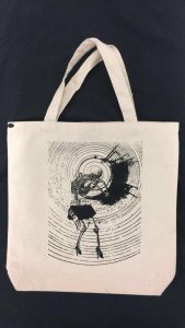
With this, i was finally satisfied with this composition as i felt that it was complete and conveyed the quote well. With this, i decided to make this my print on my tote bag.
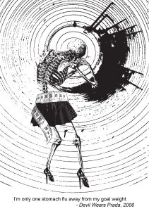
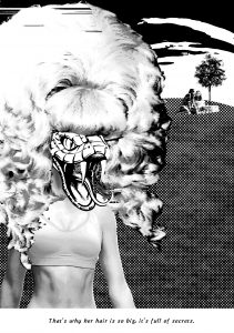
MEAN GIRLS
Quote 2
This quote is one iconic quotes from Mean Girls that is just very funny to me. I decided to use this to set the tone of my work. In order to start, I played a word association game. Some of the words generated were:
Big Hair | Secrets | Tea (spill the tea hunty!)| Boxers | Lips whispering | Tape
I also decided to take a visual approach to generating my piece:
DRAFT 1
For the first draft, I started out very literal. The quote was said when the main characters were having a picnic in the school yard, and the protagonist was having a gym class at the other end.
Making the antagonist the main point of the composition, the I used the combination of an athlete’s body, a drag queen’s wig, and a snake head to make the character. I tried to create depth for our protagonists by making them small and using a tree to show that they are in the distance.
I did not like this composition because I felt that at this stage I had not unpacked the meaning of the quote, as well as the elements not being in sync with each other. However, the aspect that I liked about it was using a snake to represent the antagonist, because it was subtle in showing the negative quality about the character, as the snake is the modern slang for backstabber.
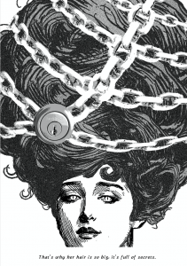
DRAFT 2
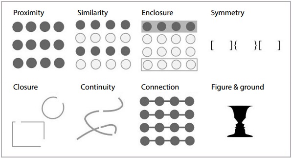
For my second draft, I decided to look into the gestalt theory and elements of design.
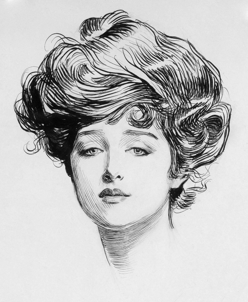
Elements of DesignGestalt TheoryGibson Girl
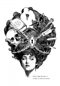
For this I was inspired to use the illustration of the Gibson Girl to portray the antagonist. This was because the antagonist was the “most beautiful girl” in school, and the Gibson girl was an old beauty standard. In order to make her hair big, I wanted to create patterns with the lines in her hair so that it looked like a seamless organic pattern that was able to become the form for the main point of the composition. I did this by layering enlarging the Gibson Girl slightly bigger and layering her at the back.
In order to show the secrecy, I was inspired to make my work look surreal, so I had chains and a door lock on top of her hair. Lastly, I incorporated the snake symbolism through the eyes to make it more subtle. However, i still did not like this composition because i felt that it was too simple, and that there was something else missing but did not know what. So i presented this to my friends and Ms Mimi for feedback.
DRAFT 3
After receiving feedback, Ms Mimi suggested that I could play around with the idea of the element of secret by showing the secrets. As such, i decided to add some fun elements into her hair by adding some possible secrets she could keep, such as alcoholism, sex, murder, satanism, witchcraft etc etc. For the lock and chains, i wanted to make them fit the vintage aesthetic more, so i made the chains white and used a drop shadow to imply them, and used a drawing of an old lock. The elements of the snake eyes remained.
I tried to apply the gestalt theory of similarity in the choosing of my elements, such as the broomstick, alcohol bottle, dildo and knife, being objects that were long and slender. However, this isolated them with the other secrets being the skull, satan book, couple and satan because they were not similar in shape or colour. I liked this composition better than my first one, however I felt that there was something wrong with the placement of the elements in her hair, like it did not balance well and the contrast with the background was not there for some of the elements. As such, I decided to seek feedback from my friends.
DRAFT 4 (Final Draft)
After receiving feedback, my friend suggested that I could look into the golden ratio to decide how to place my secret elements.
I found this to be very helpful because I could now decide on what elements I did not want to include into the composition. For this, i decided to make the couple the main focus of the secrets, and the other secrets start to slowly reveal themselves as your eyes read the work from right to left. After feedback from friends, they also mentioned that the couple i used in draft 3 added to much white to my composition. Therefore I decided to use a less contrasting image of the couple in the hair. As for the chain and lock, i placed it at the other side of the golden spiral to offset the spiral made by the secret elements, in order to create contrast. this was experimental but i liked the outcome of it.
With this, i finally felt that this work was finished and i was satisfied with the outcome of this composition.
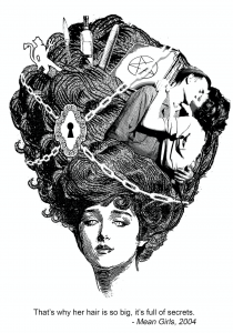
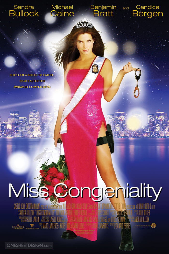
MISS CONGENIALITY
Quote 3
I liked the ring of this quote and the message behind it: to be positive. However, i felt that for this quote i wanted to contextualise it more. For this i also had to generate my composition visually.
DRAFT 1
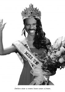
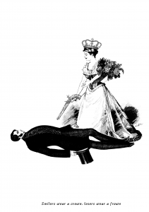
Don’t mind me just being weird. Okay so my initial idea was when i remembered Steve Harvey announcing the wrong winner for Miss Universe which caused a big hooha. I felt that in that moment, he was the real winner of Miss Universe, because he was the one who became viral after that. So I wanted to make Steve Harvey the queen that won. However this idea was very shallow because it did not show the frown aspect of the quote. Initially i had wanted to put Miss Colombia at the background, sobbing, but i felt that was too silly and very cliche.
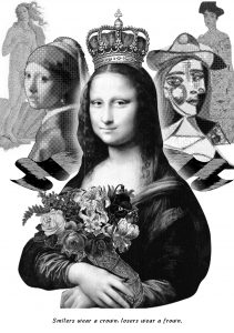
DRAFT 2
Self-Hybridisation by Orlan. Light Box Photography, 1994
For this composition i was inspired by the concept being this work i saw in the Art Science Museum. The work talked about beauty standards across the timelines, set by the paintings by old masters. For me, i saw a correlation of this and beauty pageants, and decided to have fun and use women in famous paintings by old masters.
For this composition, i felt that it was able to answer the first part of the quote very well, being mona lisa’s smile has been topic of debate. For me, she was the “real winner” due to the virality. As for the paintings in the background i tried to show the message of “losers wear a frown” by lining them up such that it resembled a line up in a pageant contest. However, i also felt that this composition was still weak in trying to show the last part of the quote.
DRAFT 3
After consultation, I was encouraged by Ms Mimi to understand what is the context of the quote. I decided to speed watch Miss Congeniality again to remember exactly what was the context of the quote. After that, i decided to be very literal with the composition, but use a vintage aesthetic.
In the movie, the protagonist’s manager is trying to motivate her to be happy and practice for her pageant. However, she was very tired and was eating a donut. The manager took it away from her, but her being a very pissed of FBI agent, pulled a gun out and pointed it at the manager.
As such, i created this literal composition to get warmed up to make the final one. I did not particularly like this composition because there was a lack of balance, and no clear focus. It also was not able to show the smilers wearing a crown, as the girl in the picture is frowning, however did shoe the last part of the quote being losers wear a frown, because the guy is lying down on the floor.
DRAFT 4
I tried to focus on the elements of design next. For this composition, i wanted to play with the element of shape and optical illusions. Some of the words i generated during my word association were:
motivation | man | angry | trying to get into her head | gun | loser
Through this, i liked the fact that the manager was trying to get into her head and motivate her, which sparked an idea to make a smiling face appear near the head of the pageant queen. After considering this, i suddenly remembered the optical illusion of the old woman and young woman.
Old woman, Young Woman
From here, i decided to make a composition using gestalt’s theory of figure & ground. With this, i created a smiling face in the hair of the frowning pageant queen using lines and subtlety. This was to show that the Hair (the man) was the real one wearing the crown. I felt that this was my super genius moment. For the second half of the quote, i decided to use a hand showing the gun sign to show the context of the movie of the protagonist holding out the gun.
This was because the hand gun also looked like the loser sign. As such, i made sure that the “gun” was very near to the face of the girl, who was smiling. I added found images of a sash and flowers to show that the girl is a pageant queen. With this, i really liked this composition, but i did not know if it met the requirement of being vintage. However, i liked this composition and wanted to refine it a little bit more when-
—–TECHNICAL ERROR—–
my computer breaks down and i only have the first two compositions in my thumb drive.
this meant that i had to redo which ate my time up :’)
DRAFT 5 (FINAL DRAFT)
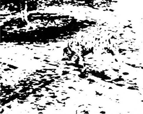
Picture of Labrador
After going through the seven stages of grief, I decided to re-make the composition but use vintage elements to it. For this, i still applied the gestalt theory of figure and ground, and was inspired by the picture of the Labrador that my friends had presented about. For this, i wanted to imply the hands and the flowers. However, i did not do such a good job because it turned out to be messy and unstructured.
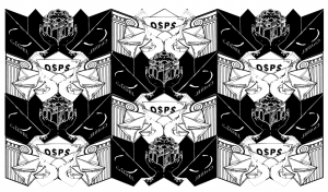
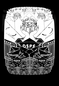
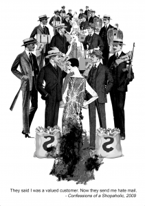
CONFESSIONS OF A SHOPAHOLIC
Quote 4
For this composition i needed to show “valued customer” and “hate”. I was inspired by MS Escher’s concept of tessellations because the concept of having the background also becoming a foreground was good to show the meaning of this quote. As such, i tried to make my own tessellations.
DRAFT 1
MC Escher Angels and Demons
Okay so i had made my own tessellations, however this could only work in a horizontal setting. For this, the black parts showed the valued customer element, whilst the white parts are supposed to be the hate mail element. The black part showcased 2 shopping bags (at an angle) and white hands holding a gift. The white parts were two ionic pillars (to show banks) and envelopes being sprawled around black hands. However, i felt that the black and white were not arranged properly so i tried again.
DRAFT 2
For this, i had switched the hand colours. It looked much better here, but i still felt incomplete because i still felt that the message was not being shows strongly.
DRAFT 3
For this i inverted the colours to make the white the valued customer element and the black the hate mail element. I tried to create a circular shape with the tessellations to show the infinity of the problem presented by the quote, but it did not work because the tessellation only worked from top to bottom. I also felt that the first three drafts i made looked drastically different from the the other three.
DRAFT 4 (Final Draft)
Okay, i know this might look like a random work created after experimenting with tessellations. However, i was still inspired by the concept of tessellations as the general shape of the row of people are still the same. For this, i wanted to add more vintage and obvious elements in the work.
Personally, i don’t like this work because it did not do justice to the quote enough. From feedback during the presentation, i also have to agree with Ms Mimi that this composition was not the best as it did not push the quote out well enough. However, in my defence, i still had to try and come up with something even though i had to redo one more composition and generate a whole new one from scratch within a short period of time. In hindsight, i think the concept of my first few drafts of tessellations was interesting, and if i were to have more time, i could have developed it further.
Some takeaways:
BACK UP YOUR FILLLLEESSSSSSSS or do save your work in the cloud or something. Murphy’s law is alive and well.
tessellations were difficult but fun to make, i think i might explore in that because i’ve always been mesmerised by MC Escher.
Silk Screening was a fun experience, 10/10 would try that again.
i learnt a lot about the elements of design and gestalt theory which i will now proceed to try and apply it in everything that i do. I think it makes for interesting visuals that prove that the work has been well thought through. they also give me the spark of motivation when i start to consider how i want my message to be presented, be it in patterns, forms, etc etc.
Overall, i had fun doing this project! Thank you for reading!
Gabriel Dawe’s Plexus 28White light going through prismA complex hyperboloid structure
Inspired by Gabriel Dawe’s Plexus 28, I wanted to create something that would distort the different planes such as the plastic material and the string. Using nature as an inspiration, I was inspired by light travelling through prisms. I also wanted to incorporate hyperboloids in my structure because I felt that it was interesting from all sides.
Study Models
Strings
For the first study model, I made a crescent shape with the paper. For this, I wanted to first establish a hyperboloid, and test if “cutting” through the plane was possible. Using red thread, I created another plane that ‘twists’ when it entered through the hyperboloid structure. I felt that this was a successful study model that encapsulated what I wanted my strings to do. Next, I wanted tested out what I wanted my paper plane to do.
Twisting Paper Planes
Initially, I had created an S shape with the paper during class. However, this was not successful because the tension got lost, and it could not be supported unless it was being pulled from the top and the bottom.
Next, I decided to have a different take on the S shape. For the above, I created to crescent shapes, and wanted to join them together with another hyperboloid thread sculpture. However, I found this to be very tedious as the strings would snag into each other, and it was too ambitious for me. It also did not work out the way I wanted it, because the hyperboloid structure that joined the two crescent planes would become a normal cylinder shape when I let go of it, ruining the “continuity” of the hyperboloids.
Lastly, I decided that I should focus on having only one paper plane to work with. In order to create the S shape, this time I decided that I could work with a gradual S instead of a harsh one. As such, I sew the top of the paper to its side as pictured above, and found that it created an S structure that used gravity to create tension, able to survive on its own. Below is a picture of me testing the tension I created with the gradual S shape.
The Final
Combining all these elements together, I started to work on the final. Below are pictures of the process:
Using the points created at the top and side of the plastic plane, the thread created lines that were being pulled at each direction caused by the weight and natural direction that the plastic was supposed bend (as shown with the red arrows).
Using the same points that were used to create the shape of the paper plane, I created the ‘light ray’ to cut through the hyperboloid structure.
Below are the pictures of the final:
Front view
Side View
Close Up
Some takeaways:
Patience is key…
There could be more attention to detail and proper execution of the structure, such as not using the hot glue to help secure the string onto the plane
I would have liked to make the hyperboloid structure continuous, throughout the whole plane, creating a “portal”, but i had to work on it in two parts because i was not very skilled in controlling my string.
This opened up my eyes to three dimensional art as this was my first attempt at creating something that was not 2D.
This sculpture that I conceptualised was ambitious, however I am happy with what it ended up to be considering I do not have prior knowledge in sewing or 3D
Emotion is unique to every individual, and each emotion has varying levels depending on the person’s situation. To me, emotions are signs of humanity; without it, we would be lifeless and cannot function properly. This also means that the negative and hurtful emotions we feel are natural, and are a sign of you being alive.
Throughout my experimenting, the emotions I felt for my abusive ex boyfriend kept looping in my head over and over again. I felt that this would be the perfect opportunity to tell this particular story as the emotions felt were still very strong, as the event only took place less than a month ago. As such, even though it was very painful, I present to you DA(M)N.
But first, let me show you the process of it’s creation.
Initial Stages
Initially, I had a concept of what emotions I wanted to show. I wanted my work to be perceived as a whole, instead of having separate themes on each panel. However, my first overall concept was too large, and I felt that I was being constricted by my own idea. As such, I decided to not go forward with the idea, and just experiment with different styles, and mediums.
Words & line work
One of the styles of automatic drawing that i tried was listening to music and tap into my subconscious , letting the pen flow.It resulted in four different styles, in which i listened to four different genres. From here, i could tell that pen was not the medium of choice if i wanted to do this method of automatic drawing. Automatic drawing using different genres of music was also too difficult for me because i found it difficult to express music through 2D.
Fake Calligraphy: I held my pen tightly in my hand as i closed my eyes, and wrote without thinking, not caring much about weather my writing was neat. I liked the fact that my words were not written clearly, but it still feels like words because of it’s horizontal quality.
This then led to a series called “Slut”, a word that my ex used to throw at me (that wasn’t the worse word…). I tried to distort the word so that it would look abstract, but would still be visible if a person were to scrutinise closely. I used a spoilt brush (has globs of paint that cant be removed) and tried to create texture by dragging the brush to create a very cursive version of the word.
Fire and Calligraphy: I used a lighter to burn the paper, to show how the words “burn”. However, after feedback from Ms Mimi, the burning was seen as too purposeful, in which i can agree to when looking at it again.This is another work from the “Slut” series. Using pliers, I scratched the paper, tearing the paper vertically across the panel. This was because i wanted to incorporate the “weapon” that my ex threatened me with, wanting to put meaning even in the process. I tried to make the scratches visible through using the pain, just wiping the whole panel with paint ever so slightly so that paint can be caught in the scratches.
Gestural & Splatters
Inspired largely by Jackson Pollock, this area of experimentation was more gestural, and I tried to experiment with various splatters.
inspired by Jackson Pollock’s splatter style
1st: i did the traditional method of splatter painting. Whilst I liked the elements, such as the differing line qualities and spots, i wanted to approach the splatter with different materials.
2nd: I used cotton balls and dipped it in paint, and dragged it across the panel, creating texture to it.
3rd: I splattered paint, and used a straw to blow the ink to random directions.
Inspired by my kindergarten activity of using a toothbrush and splattering paint all over
4th: I used splatters to show movement, and “stopped” the spread with imprint of my lips. On the splatter, i decided to use the clippers to scratch the surface of the paper. I wanted to show a story of my fear being stopped by my own words, but i felt that this became too representational.
5th: Using a bottle spray, i mixed paint and water together so that the pigment would spread out in. The pigment turned out to be light, which which I didn’t like. I also felt that it was too representational if i wanted to show “shock: or “fear”
6th: Using a toothbrush, i tried to do splatter on a negative space. This created a “galaxy” feel, but it did not correspond to any of the emotions that i wanted. So, i did not use it.
After doing the splatter method, I liked the effect that came out on the third panel. I also felt that the splatters could represent an emotion that is spontaneous, due to the nature of the method and the way that the splatters spread out.
Mono print
Not having using the mono print before, i tried to play with the limitations of the machine.
First attempt at mono printing: i placed thread onto the lino board, but when the print came out, did not come out well
Even though my first attempt at mono printing did not turn out well, i liked the “grungy” effect that it gave the background, as seen in the darker side of the print. As such, i felt that it could best represent a “past memory” as it looked like it was fading away.
I then decided to see what else i could do with the machine.
I put thread on the lino board and tightened the machine. whilst i was spinning the wheel, i simultaneously un-tightened the machine.Mistake: I accidentally created depth when i was too lazy to clean the lino board and reapply the paint between rearranging my sticks on the board. i liked the different tones visible on this strip, so i wanted to create more pieces that had depth.
Three layers of mono-print: upon learning that i could create depth, i wanted to see how many layers i could make before the ink ran out. It didn’t turn out so great because by third printing, the colours faded and the “grunge” effect was no longer that obvious anymore. As such, i could only print twice before the effect was no longer there.
Others
Some other experiments were unclassifiable, so i put them under “Others” 🙂
“White on White” – Using white paint on white newsprint, I experimented with what effects would appear. What ended up happening that it did create texture, but was not visually strong. For this, i felt that it symbolised purity, which was not what i had intended.
.
“Paper’s characteristics” – I painted a white paper black, and i tore the strip apart to reveal the white underneath. I liked the effect that this created, however it became representational when i associated it with “anger”. As for the one on the right, i used black paper as a base and drew lines using UHU glue; this created a nice effect of “glittery”, but when i tried to associate it with the emotions, i did not feel much for this except for it being just aesthetics.
“Too many emotions” – Cotton balls were used to dip into the paint, and different levels of pressure were applied to create different patterns on the paper. This produced a nice “ombre” of patterns, however after receiving feedback, this strip was seemingly trying to convey too many emotions. With that, i also did not use this for my final.
“Crushed paper aesthetic” – To me, i wanted to use the crushed paper to symbolise “trying to get back to the straight path, but can never be the same again.” For this, i crushed the paper, flattened it, and tried to draw a straight line across with ink. I wanted the ink to be captured in the folds, letting it flow wherever it wanted. However, this did not showcase “hope” enough, so i did not use this for my final.
The Final: DA(M)N
DA(M)N is a play on words because the abusive person’s name was Dan, and I damn him to hell (haha yes very funny pun about my abusive relationship).
The six emotions i chose were:
Love (Adoration)
Sadness (Suffering)
Surprise (Shock)
Fear (Unflappable)
Anger
Joy (Hope)
Before starting on my work, I wanted every tone to play a part in my story telling. As such, only the 2nd through the 5th i used newsprint as my base, as they gave a sepia-like tone. This added to my story as i wanted to symbolise the sepia-like tone to be a past memory. As you go on further, you will also notice that the four panels also have a grainy or “splatter” quality about them. As mentioned, i felt that this symbolised something that is fading. With the combination of the sepia-like tones and grainy quality, i wanted to show that the emotions from panel 2 to 5 are memories of the past that i do not want to keep.
As for the first and last emotions, i wanted them to stand out and have a brighter contrast, but still a “dreamlike” state. For these panels, you will notice that i did not use newsprint, however i used 100% black and 100% white paper to create that contrast. For these two panels, i also worked with water to give a flow-y, “dreamlike” state, to show a “zen” mood that i was in during these moments that i do not want to forget. Due to the principle of art of unity, these two panels also have a “circular” shape to them.
1. Love [Adoration]: Meeting him
initial drafts for this adoration
When i made this, I wanted to simulate a coffee cup stain, because we both met at a cafe. I did this on newsprint. It did not turn out so well because the white was too faint against the newsprint. Both the marks were also not obvious because the newsprint was at a mid-tone level, so both of them looked “dissolved into the background.”
major inspiration for this panel
I wanted to show that we were from two different backgrounds, upbringings, interests and priorities, but we came together despite that. For this, i was inspired by the Yin Yang, because it gives me the notion of two different entities coexisting. I also wanted to play with the contrast created with the paper, so i tore 100% black and 100% white paper. After gluing the paper together, i was still not satisfied because it did not feel like the two worlds were connecting. As such, after imprinting the two circular shapes, i used water to push the pigments towards each other.
using water on acrylic
I tried to do this with watercolour, but what ended up happening was that the pigment dissolved to much into the water and the circular shapes did not become visible. I then resorted to acrylic to see what would happen if i were to push the water towards each other, with some acrylic paint in the mix.
From there, i liked the fact that the acrylic gave enough pigment to show that there is some movement, but not cover the whole panel. The end product also had more contrast from my initial exploration. Below is the final.
2. Sadness [Suffering]: When he started acting differently
initial drafts of sadness
At this point of the relationship, he started to act differently. For this panel, i wanted to show the suffering that i went through, and the suffering that i thought he would gave went through when i did not do things to his way.
I applied the basics that i set for myself: newsprint and grainy quality. As i wanted each tone to carry meaning, i would have needed at least three tones, to symbolise each of us. When I did the mono print of my of my twigs, i liked the fact that the three tones came in naturally.
inspiration for this panel
As such i decided to use the mono-print method for this panel. In order to show suffering, i decided to use vertical lines to mimic jail cells. This was because i also wanted to show a long and slow process of sadness and suffering, as the change happened over a period of time.
From there, I worked more with the twigs that i had lined up, and used mono-print to recreate the panel. Whilst i wanted to show that we were both suffering, i wanted to show that one of the entities were suffering more. So, the arrangement of the twigs that were supposed to be lighter were more fanned out, whilst the twigs that were going to be in black were to be “parallel”, showing the entity represented by it was projected the problems that they already had onto the other entity. As such, below is the final.
3. Surprise [Shock]: To show that everyday was a bad surprise
initial drafts of the shock
For this panel, i wanted to show how things just kept on becoming worse, that i knew that i had something new to cry about every single day, but i never knew what it was. I had many ideas of this panel, such as using calligraphy of the word that he used on me. However, i
inspired by my daily planner, i wanted the shape of my work to show a timeline
felt that it was too specific of a word, and wanted to show that the torture was varied. From here, i wanted to create a timeline sort of pattern, such as the middle strip (left).
Using pollock’s splatter principle, i had decided during my experimentation that i would use this for something more spontaneous. However, since i wanted to show a repetitive type of spontaneity, I wanted to apply implied lines into my work. Using a toothbrush, slightly diluted acrylic, and a piece of paper to act as a stencil, I worked on my final by covering the the strip with the paper, part by part, and played with the tone i could create with the dots caused by the splatter.
I wanted to also use the natural way of reading from left to right to show that the torture got worse, so as you look at my work from left to right, you will see that the tone gets darker and darker. With darker tone, i wanted to symbolise that the torture became worse, and the darkest was the most shocking of all. The biggest spot on the panel is linked to the next, fear. Below is the final.
4. Fear [Unflappable]: Staying calm in the face of immediate death
initial drafts for fear
The biggest shock came with a great sense of fear. At this time, the abuse had gotten so bad that he wanted to stab me. Being in a public place that was secluded, i did not want to attract attention to us, so i had to be calm in that situation. I had to hold his hand that he was holding the garden scissors with, and talk in a calm and soothing voice for him to “put the scissors down, please”.
As such, for this panel, i wanted to show that the surprise was a negative one, and it was one that i
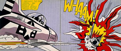
Roy Litchenstein’s imagery of an exploding plane served as inspiration for where the lines in my panel would go.
could not react to. From the initial drafts, i really liked the middle strip as it simulated the garden scissors dragging across the paper (even though i mono printed some thread.) After consultation, i felt that i needed something to make my strip pop out, and felt that the elements of the ink splatter in the bottom slip was a different kind of ink splatter that could really take centre stage.
For this panel, i took inspiration from an imagery of a plane explosion, and combined the two elements that i liked; the thread and splatter. As the lines are supposed to show the calm setting become terrible, but still have to remain calm, they are moving downwards to the splatter explosion. The splatter was purposely put as the front as i wanted to show that it was fear, and that fear was the ultimate feeling i had at that time. Below is the final.
5. Anger: Running out of patience
initial drafts for anger
During this time, my patience was running thin. I was tired of his abuse and tired of internalising everything. For this panel, i wanted to show an anger that brew over time, not a spontaneous anger (unlike show in the first strip in the initial drafts). At first, i liked the mono print i did in the third and fourth strip, but i felt that it did not represent the anger that i had. Same for the last panel, it did not convey anger the way i wanted to.
i had to ball my fists a lot, and i realized that this created a nice natural line.
Remembering the way i internalised my anger, i wanted to recreate lines that i made when i had to ball up my fists. In order to do this, i reflected back on my “crushed paper aesthetics”, and felt that it created similar looking lines to these. As such, i decided to crush some papers.
For me to create the gradient, i had a choice of mono printing or using the roller to roll paint on it. For me, i decided that i would go for the rolling paint directly using a roller onto the crushed paper, as i felt that it would give a rough looking texture, and i could control how hard i wanted to press the roller down.
As for the choice of lines in my final piece, i still wanted to show the calmness that i had to show even when i was angry. With this, i decided to use the implied horizontal lines to show a serene setting, but is being contrasted with the harsh lines created by the harsh paper. Below is the final.
6. Joy [hope]: Leaving him
initial drafts for hope
Once I ended relations with him, it was the best moment of my life, as all the people i loved started to flood my life with positivity. As this was a memory that i wanted to remember, i used 100% black paper because i wanted to show something “light up the darkness” – terminator. However, that did not stop me from experimenting with other styles (but they all ended up looking bad anyway.)
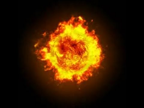
For this panel, i was much inspired by orbs of fire, and wanted to make mine look like one whilst not looking like one (because i wanted to avoid representation)
For this last panel, i was drawn to the pieces of acrylic paint that floated around in the water whilst i wash washing acrylic off my brush. As i could manipulate the pieces of acrylic to show direction, i wanted the movement that will be shown in the las panel to go inwards. Due to the principle of unity, i decided to show a circular focus, but in a fuller form and more abstract.
As i was doing the mixing of acrylic and paint, i wanted to give a “translucent” feel to the panel as i wanted to show a “process” of trying to light up the darkness. as such, i used some diluted water to make the black panel slightly greyish, whilst still keeping the centre circular. Below is the final.
Feedback from critique:
Generally, my work was well received and I feel that i was able to tie my task and story well. A lot of supportive comments were made, and i am personally content with the work that i produced.
Reflections and take aways:
“It’s difficult to give you an A, because we want you to learn that there’s always room for improvement.” – My O-Level Art teacher
when tackling a task, i feel that i should not start by constraining myself. as i had an idea in my head for the first week, i was struggling to get my emotions and story right. i feel that the time during the first week could have been used for better purposes, such as experiementing with even more mediums and techniques.
I struggled the most with the last panel because at this point, i had run out of ideas. in hindsight, i think i could have made my panel more contrasting with the background.
One of the most challenging thing for me was trying not to make my panels look similar to other students’. As i am gathering inspiration, i might be subject to accidentally making the same thing as other students. With that, i think that i should learn to find other sources of inspiration, such aa nature, etc
Another big challenge was making everything abstract. As a person who works with illustration and posters, this was different from what i’ve been working with. However, i felt that this experience gave me an insight to the abstract world, and i can safely say that i have dabbled in abstract and know what it’s like. i have a new found respect for abstract artists…
All in all, i enjoyed this task. would i ever do it again? sure, it’s actually kind of fun..but you have to pay me first :p
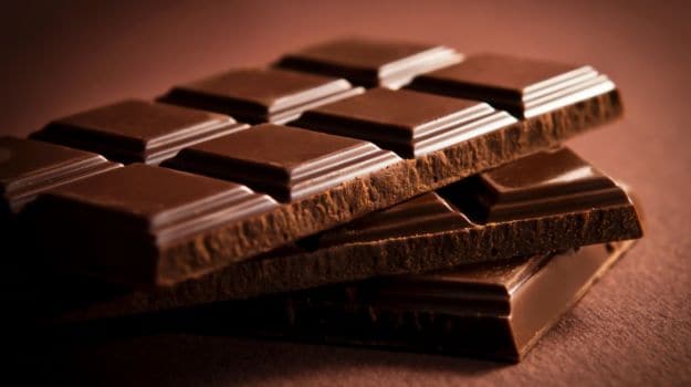
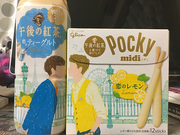
The item that I was randomly assigned to was Chocolate Pocky. Some of the words that I immediately associated it with are as follows:
I got Chocolate Pocky
Red
Chocolate
Stick
Long
Thin
Japan
Valentines
Pocky Game
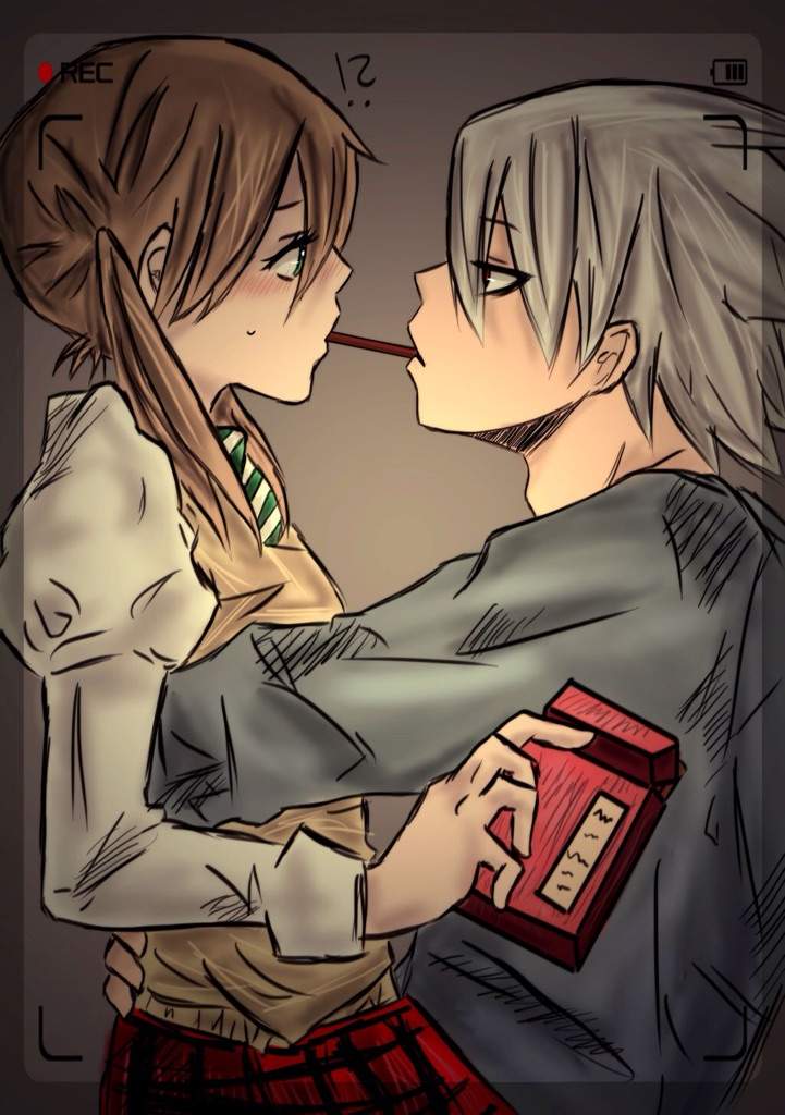
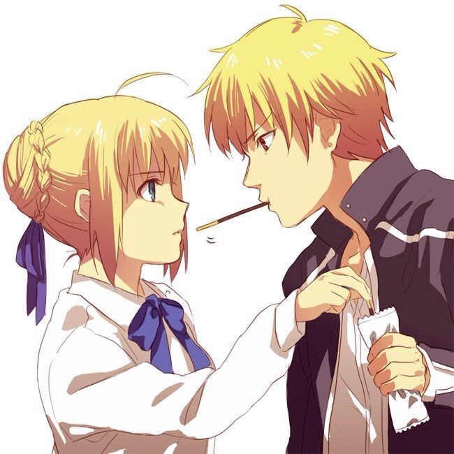
Before designing the pocky advertisement, i decided to take a look at how Pocky already advertises themselves:
From this I could gather that Pocky positioned themselves as a playful, fun, and cute snack and company, with many recurring themes of “love”. From this, I decided to use this to influence my final artwork:
So my work is about love, fighting, and it’s all about the humor behind this. Though, i can recognise that my work might be for a niche audience. I wanted to play with the fact that Pocky was a Japanese brand, so i had the manga captions and cliche “senpai” aesthetic (when a character sees their crush in an anime”
The choice of subject matter was of Mayweather and Mcgreggor. I chose them as they are part of popular culture, something that i felt that pop culture was an important thing in Japan. As such, the quote that i chose was “love is worth fighting for” because they were both wrestlers, and i wanted to poke fun at the tense situation to become a cutesy cutesy one.
“Is it possible for me to capture movement in a simple black and white strip of paper?” The answer is yes.
For the picture above, I wanted to create a visual of the concept of “Hope”. I wanted the circular focus (made by placing a bottle of paint in the centre of the paper, blocking the paint off) to be the symbol of “Hope”, and everything that happens around it to be some sort of movement.
For the first strip of paper, the paint has an outward movement from the circular focus. This can be a sign of breaking free, which is slightly different from the concept i was going for, but not too far off.
As for the second strip of paper, the ink has an inward movement towards the circular focus. This was not what i had planned, because to me it looks more like something “cowering” and “anxiety”. From this I found a new way to express emotions that I didn’t even plan to express.
Negative Space
Bored of white newsprint paper, I decided to switch things up a bit by using black paper and white paint. The first time I placed white on black paper, it gave me a different sort of vividness which made up for a more interesting visual. Limited to white chalk and white acrylic.
I realised i have an unhealthy obsession of having a circular focus in the centre of my strips of paper. If i wanted this aesthetic to be a recurring theme in my work, i’m going to have to step it up a bit (give different variations of the circular focus), or else everything is going to look the same.
Some takeaways from these experiments:
The movement of the paint in relevance to the focus of the paper plays a huge part in conveying my message
White paint on black paper makes your work stand out a little bit more (if the black paper is surrounded by white paper, it becomes more vivid)
New things to try: black on black, white on white, fabric, clear plastic & black lipstick


 For this, i also experimented with complimentary and split complimentary colour harmonies. it felt like it could work in theory, but when i put it on digital it did not work at all because of the contrast. it was also difficult for me for the last panel especially, because at the time i did not know how to compose the picture.


 For my second draft, I decided to look into the gestalt theory and elements of design.


 .
.