
Finally I could use non-abstract images to convey my message! For this project, I decided that to take quotes from chick flicks because I grew up watching them, but never truly understood the meaning behind these stories. As I grew older, I realised the deep meaning behind the movies, and felt that it was clever in trying to showcase important issues through the use of humour and making light of it. As such, I wanted to try and extract the deep meaning of the quotes.
DEVIL WEARS PRADA


Even though the line was delivered for comedic purposes, this quote hit me because I had a history with Bulimia. The context of this quote was that the person was already skinny, but wanted to become skinnier by using bulimia. I decided to take a visual approach to generating my piece:
DRAFT 1
I decided to pick out the elements of this movie and use literal images to show the context of the movie. To say the least, i really did not like this composition because it was too cliche, and did not show any element of the word weight or stomach flu.
DRAFT 2
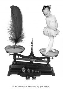
Yes so I really hated this composition. For this I decided to focus on the word weight, and so I used the weighing scale. However, it did not show any elements of devil wears Prada or stomach flu, so I moved on.
DRAFT 3
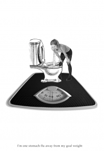
I think it is pretty clear that i also hated this composition because whilst i was doing the work halfway, i stopped and moved on. I was still not able to get inspiration.
DRAFT 4
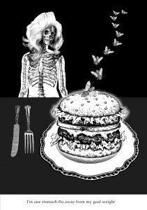
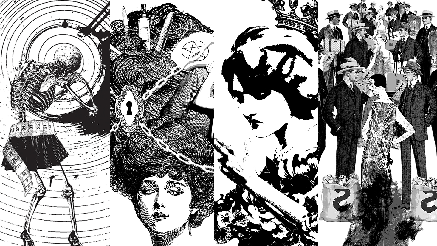
There was more thought put into this one but i still did not like it. For this, I was able to show the elements of stomach flue, the burger and the flies, and the devil wears prada through the skeleton with the luscious locks. I wanted to try and use negative space for this composition because I was bored of a white background.
I wanted to try and create depth by playing with proportions of the skeleton and the flies. In this composition, i was still not able to show the three elements of stomach flu, skinny, and devil wears prada into one. I also felt that the negative space added no benefit to the overall composition, so i decided to stick to a white background.
DRAFT 5 (Final Draft)
I was running low on ideas before I took a step back and decided to use my word association method to generate keywords to search:
weight | fashion | sick | insane | skinny | yucks | food
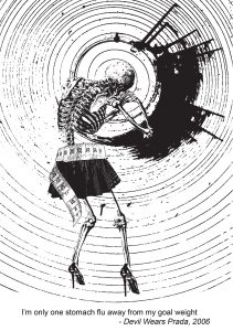
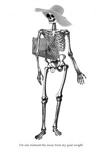
When i searched the word Insane in tate.org.uk, i was introduced to an artist called Damien Hirst. I was intrigued because I felt that there was something in his work i could use to kickstart my composition. I liked his series of spirals because i felt that it looked like vomit after someone had spun around for so much. With this, I decided to use “Oh my God…and for those really stubborn stains!!!!!??”.
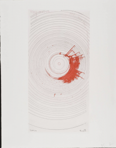
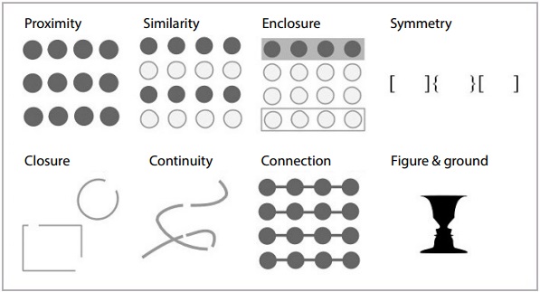
As such, I used this particular work to become the “vomit” and background of my composition, showing the element of Stomach flu. As the characters were walking up the steps as the quote was being said, i felt that the circles helped show an element of “migrane” when it is near the skeleton’s head, and when it was near the feet it looked like steps. It also was in line with the Gestalt theory of line of enclosure, in which i heightened the contrast of the circles so that the circles were implied in some areas. This was because i wanted it to imply subtlety (because you cant see a migraine), and wanted to make the splotch very obvious.
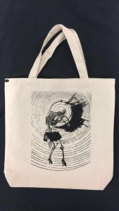
As for the character, i still wanted to use the skeleton because it was skinny, like the character, but i needed it to be hunched over. A simple search in google of “skeleton hunched over” brought me to the perfect picture. However, i was still struggling with showing the element of weight, when a friend suggested that i could try and use a measuring tape. As such, i decided to make the measuring tape also a fashion accessory to the skeleton, together with the skirt and heels, which also showed the element of devil wears prada.
With this, i was finally satisfied with this composition as i felt that it was complete and conveyed the quote well. With this, i decided to make this my print on my tote bag.
MEAN GIRLS


This quote is one iconic quotes from Mean Girls that is just very funny to me. I decided to use this to set the tone of my work. In order to start, I played a word association game. Some of the words generated were:
Big Hair | Secrets | Tea (spill the tea hunty!)| Boxers | Lips whispering | Tape
I also decided to take a visual approach to generating my piece:
DRAFT 1
For the first draft, I started out very literal. The quote was said when the main characters were having a picnic in the school yard, and the protagonist was having a gym class at the other end.
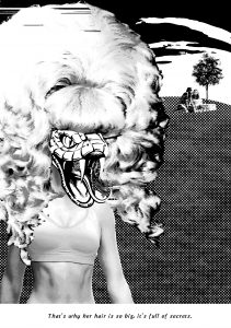
Making the antagonist the main point of the composition, the I used the combination of an athlete’s body, a drag queen’s wig, and a snake head to make the character. I tried to create depth for our protagonists by making them small and using a tree to show that they are in the distance.
I did not like this composition because I felt that at this stage I had not unpacked the meaning of the quote, as well as the elements not being in sync with each other. However, the aspect that I liked about it was using a snake to represent the antagonist, because it was subtle in showing the negative quality about the character, as the snake is the modern slang for backstabber.
DRAFT 2
 For my second draft, I decided to look into the gestalt theory and elements of design.
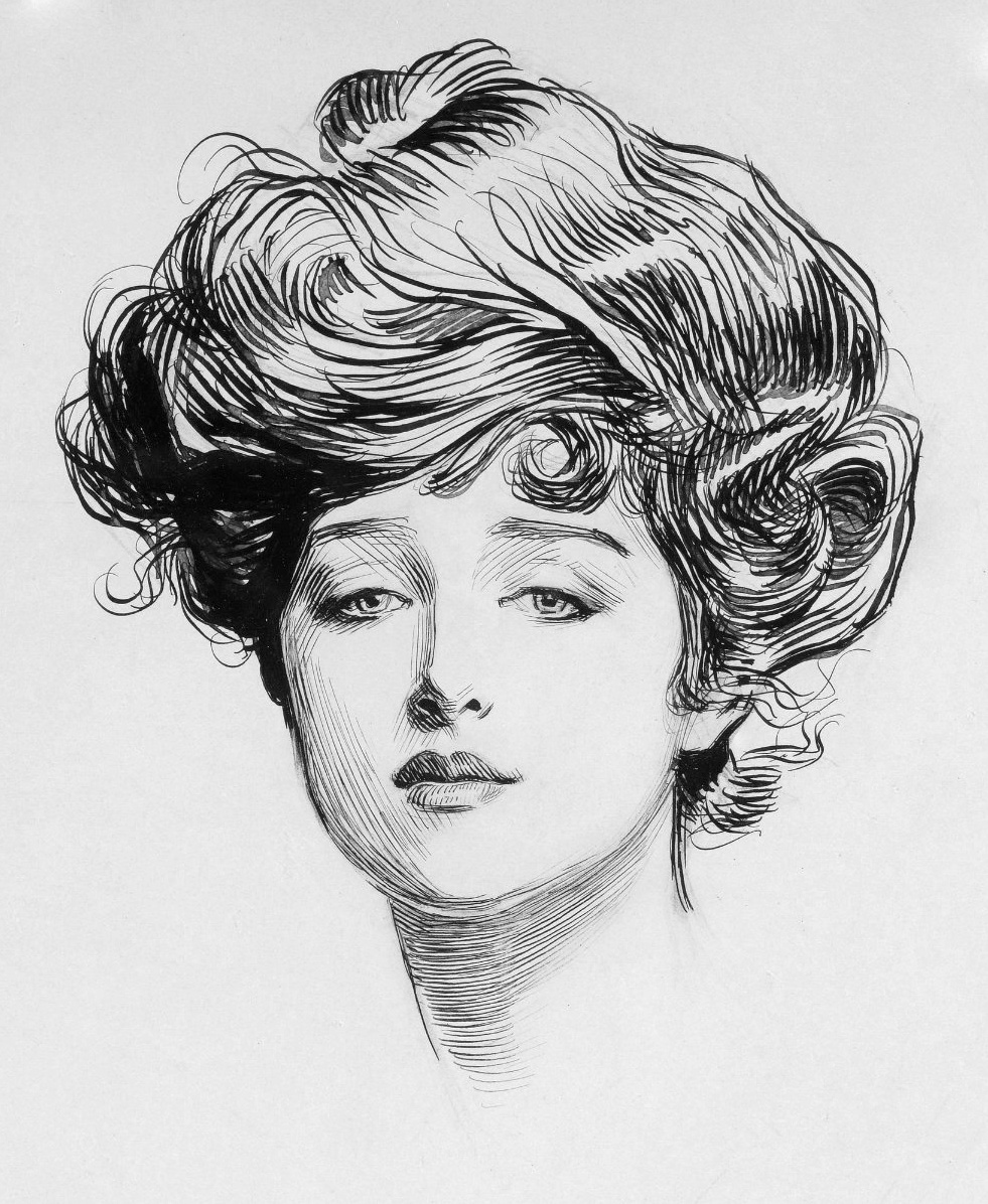
For this I was inspired to use the illustration of the Gibson Girl to portray the antagonist. This was because the antagonist was the “most beautiful girl” in school, and the Gibson girl was an old beauty standard. In order to make her hair big, I wanted to create patterns with the lines in her hair so that it looked like a seamless organic pattern that was able to become the form for the main point of the composition. I did this by layering enlarging the Gibson Girl slightly bigger and layering her at the back.
In order to show the secrecy, I was inspired to make my work look surreal, so I had chains and a door lock on top of her hair. Lastly, I incorporated the snake symbolism through the eyes to make it more subtle. However, i still did not like this composition because i felt that it was too simple, and that there was something else missing but did not know what. So i presented this to my friends and Ms Mimi for feedback.
DRAFT 3
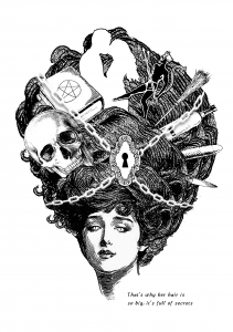
After receiving feedback, Ms Mimi suggested that I could play around with the idea of the element of secret by showing the secrets. As such, i decided to add some fun elements into her hair by adding some possible secrets she could keep, such as alcoholism, sex, murder, satanism, witchcraft etc etc. For the lock and chains, i wanted to make them fit the vintage aesthetic more, so i made the chains white and used a drop shadow to imply them, and used a drawing of an old lock. The elements of the snake eyes remained.
I tried to apply the gestalt theory of similarity in the choosing of my elements, such as the broomstick, alcohol bottle, dildo and knife, being objects that were long and slender. However, this isolated them with the other secrets being the skull, satan book, couple and satan because they were not similar in shape or colour. I liked this composition better than my first one, however I felt that there was something wrong with the placement of the elements in her hair, like it did not balance well and the contrast with the background was not there for some of the elements. As such, I decided to seek feedback from my friends.
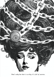
DRAFT 4 (Final Draft)
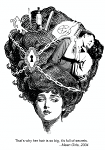
After receiving feedback, my friend suggested that I could look into the golden ratio to decide how to place my secret elements.

I found this to be very helpful because I could now decide on what elements I did not want to include into the composition. For this, i decided to make the couple the main focus of the secrets, and the other secrets start to slowly reveal themselves as your eyes read the work from right to left. After feedback from friends, they also mentioned that the couple i used in draft 3 added to much white to my composition. Therefore I decided to use a less contrasting image of the couple in the hair. As for the chain and lock, i placed it at the other side of the golden spiral to offset the spiral made by the secret elements, in order to create contrast. this was experimental but i liked the outcome of it.
With this, i finally felt that this work was finished and i was satisfied with the outcome of this composition.
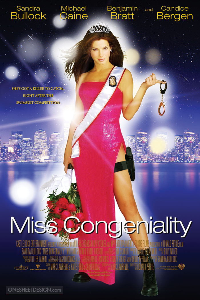
MISS CONGENIALITY

I liked the ring of this quote and the message behind it: to be positive. However, i felt that for this quote i wanted to contextualise it more. For this i also had to generate my composition visually.
DRAFT 1
Don’t mind me just being weird. Okay so my initial idea was when i remembered Steve Harvey announcing the wrong winner for Miss Universe which caused a big hooha. I felt that in that moment, he was the real winner of Miss Universe, because he was the one who became viral after that. So I wanted to make Steve Harvey the queen that won. However this idea was very shallow because it did not show the frown aspect of the quote. Initially i had wanted to put Miss Colombia at the background, sobbing, but i felt that was too silly and very cliche.
DRAFT 2
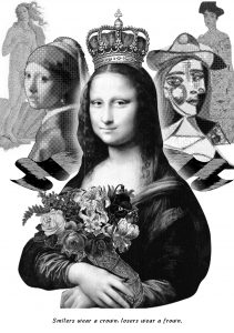
For this composition i was inspired by the concept being this work i saw in the Art Science Museum. The work talked about beauty standards across the timelines, set by the paintings by old masters. For me, i saw a correlation of this and beauty pageants, and decided to have fun and use women in famous paintings by old masters.
For this composition, i felt that it was able to answer the first part of the quote very well, being mona lisa’s smile has been topic of debate. For me, she was the “real winner” due to the virality. As for the paintings in the background i tried to show the message of “losers wear a frown” by lining them up such that it resembled a line up in a pageant contest. However, i also felt that this composition was still weak in trying to show the last part of the quote.
DRAFT 3
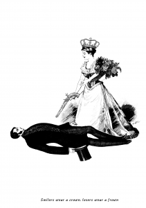
After consultation, I was encouraged by Ms Mimi to understand what is the context of the quote. I decided to speed watch Miss Congeniality again to remember exactly what was the context of the quote. After that, i decided to be very literal with the composition, but use a vintage aesthetic.
In the movie, the protagonist’s manager is trying to motivate her to be happy and practice for her pageant. However, she was very tired and was eating a donut. The manager took it away from her, but her being a very pissed of FBI agent, pulled a gun out and pointed it at the manager.
As such, i created this literal composition to get warmed up to make the final one. I did not particularly like this composition because there was a lack of balance, and no clear focus. It also was not able to show the smilers wearing a crown, as the girl in the picture is frowning, however did shoe the last part of the quote being losers wear a frown, because the guy is lying down on the floor.
DRAFT 4
I tried to focus on the elements of design next. For this composition, i wanted to play with the element of shape and optical illusions. Some of the words i generated during my word association were:
motivation | man | angry | trying to get into her head | gun | loser
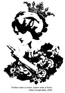
Through this, i liked the fact that the manager was trying to get into her head and motivate her, which sparked an idea to make a smiling face appear near the head of the pageant queen. After considering this, i suddenly remembered the optical illusion of the old woman and young woman.

From here, i decided to make a composition using gestalt’s theory of figure & ground. With this, i created a smiling face in the hair of the frowning pageant queen using lines and subtlety. This was to show that the Hair (the man) was the real one wearing the crown. I felt that this was my super genius moment. For the second half of the quote, i decided to use a hand showing the gun sign to show the context of the movie of the protagonist holding out the gun.
This was because the hand gun also looked like the loser sign. As such, i made sure that the “gun” was very near to the face of the girl, who was smiling. I added found images of a sash and flowers to show that the girl is a pageant queen. With this, i really liked this composition, but i did not know if it met the requirement of being vintage. However, i liked this composition and wanted to refine it a little bit more when-
—–TECHNICAL ERROR—–
my computer breaks down and i only have the first two compositions in my thumb drive.
this meant that i had to redo which ate my time up :’)

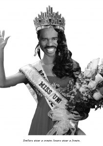
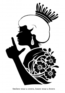
DRAFT 5 (FINAL DRAFT)
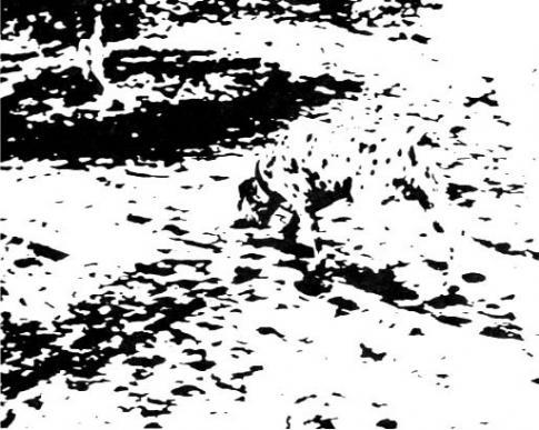
After going through the seven stages of grief, I decided to re-make the composition but use vintage elements to it. For this, i still applied the gestalt theory of figure and ground, and was inspired by the picture of the Labrador that my friends had presented about. For this, i wanted to imply the hands and the flowers. However, i did not do such a good job because it turned out to be messy and unstructured.
CONFESSIONS OF A SHOPAHOLIC


For this composition i needed to show “valued customer” and “hate”. I was inspired by MS Escher’s concept of tessellations because the concept of having the background also becoming a foreground was good to show the meaning of this quote. As such, i tried to make my own tessellations.
DRAFT 1
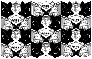

Okay so i had made my own tessellations, however this could only work in a horizontal setting. For this, the black parts showed the valued customer element, whilst the white parts are supposed to be the hate mail element. The black part showcased 2 shopping bags (at an angle) and white hands holding a gift. The white parts were two ionic pillars (to show banks) and envelopes being sprawled around black hands. However, i felt that the black and white were not arranged properly so i tried again.
DRAFT 2
For this, i had switched the hand colours. It looked much better here, but i still felt incomplete because i still felt that the message was not being shows strongly.
DRAFT 3
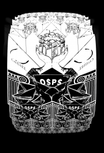
For this i inverted the colours to make the white the valued customer element and the black the hate mail element. I tried to create a circular shape with the tessellations to show the infinity of the problem presented by the quote, but it did not work because the tessellation only worked from top to bottom. I also felt that the first three drafts i made looked drastically different from the the other three.
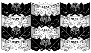
DRAFT 4 (Final Draft)
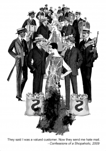
Okay, i know this might look like a random work created after experimenting with tessellations. However, i was still inspired by the concept of tessellations as the general shape of the row of people are still the same. For this, i wanted to add more vintage and obvious elements in the work.
Personally, i don’t like this work because it did not do justice to the quote enough. From feedback during the presentation, i also have to agree with Ms Mimi that this composition was not the best as it did not push the quote out well enough. However, in my defence, i still had to try and come up with something even though i had to redo one more composition and generate a whole new one from scratch within a short period of time. In hindsight, i think the concept of my first few drafts of tessellations was interesting, and if i were to have more time, i could have developed it further.
Some takeaways:
- BACK UP YOUR FILLLLEESSSSSSSS or do save your work in the cloud or something. Murphy’s law is alive and well.
- tessellations were difficult but fun to make, i think i might explore in that because i’ve always been mesmerised by MC Escher.
- Silk Screening was a fun experience, 10/10 would try that again.
- i learnt a lot about the elements of design and gestalt theory which i will now proceed to try and apply it in everything that i do. I think it makes for interesting visuals that prove that the work has been well thought through. they also give me the spark of motivation when i start to consider how i want my message to be presented, be it in patterns, forms, etc etc.
Overall, i had fun doing this project! Thank you for reading!