The screens below are my first phase of mock ups for the website as I tried to visualise how they will look like. The designs are not panel-by-panel but rather frame-by-frame as it is quite hard to also include the animation/transition of the elements.
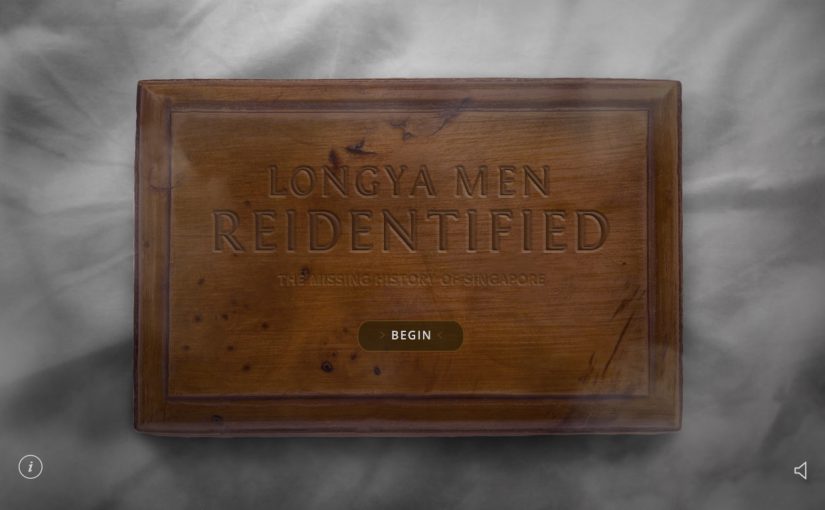
Splash Page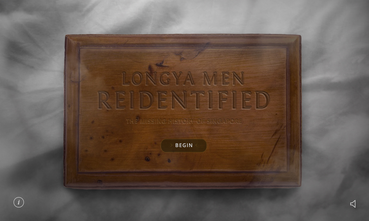
Intro Video Play
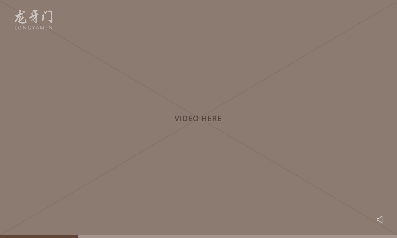
(video ends with this frame)

Start of Web page
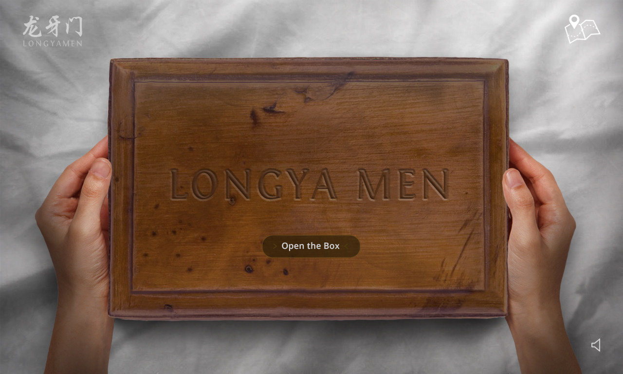

(there will be objects scattered around for user to click on)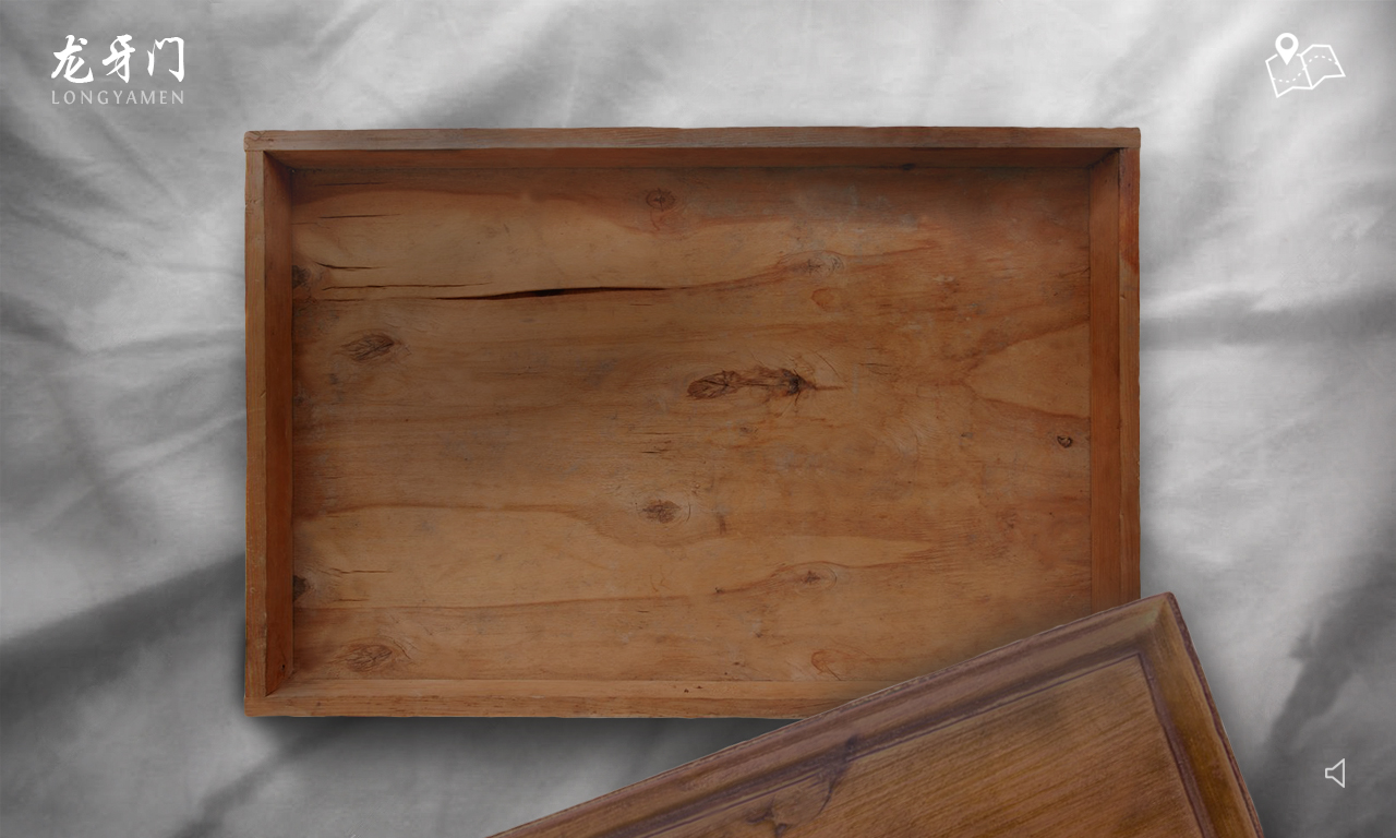
Object 1 – Map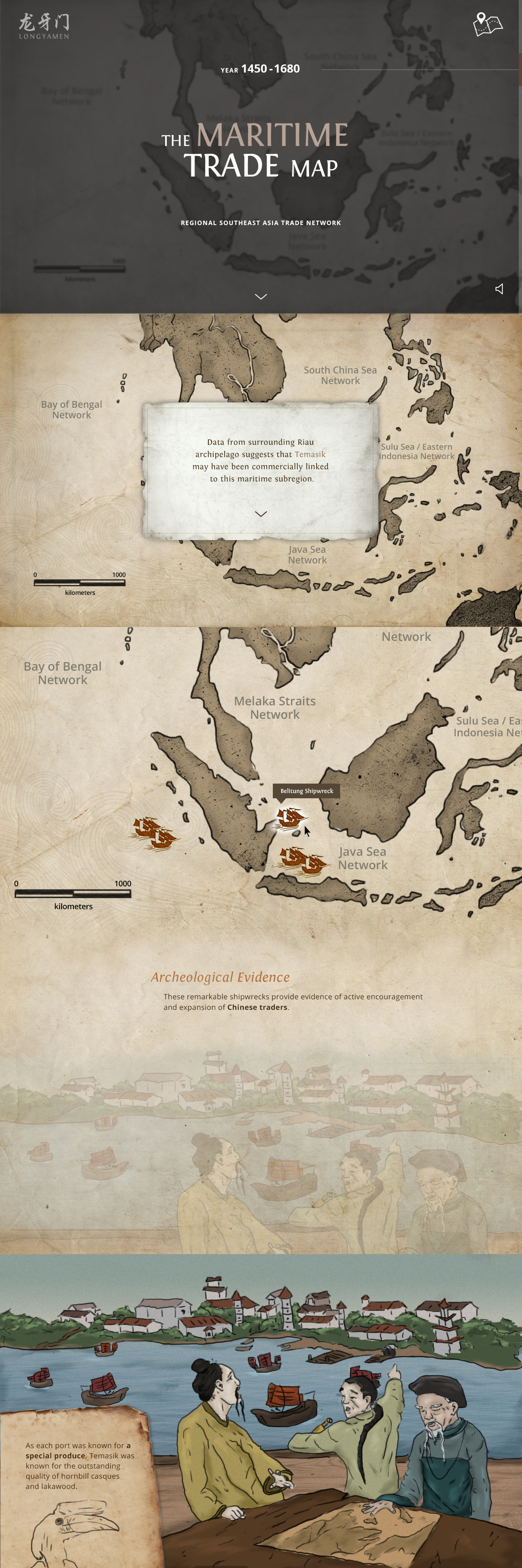
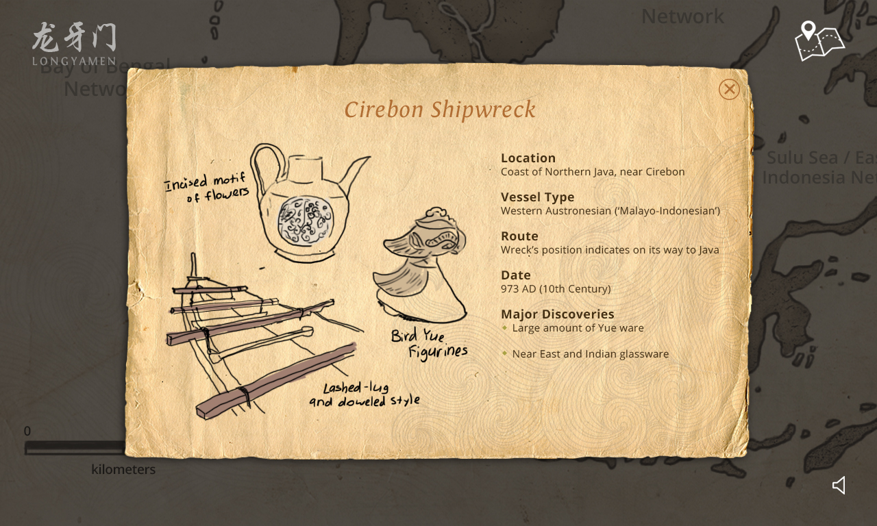
(when user clicks on the red ships on the map above)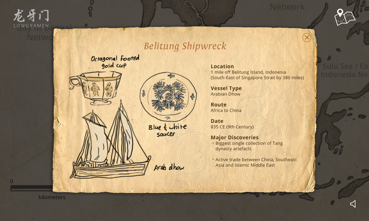
Object 2 – Journal
Object 3 – Wubei Zhi Map
Feedbacks
– Make it unify (as some are sketches, some colour with shadow/highlight, some block colours)
– Make it minimal
– Flat then suddenly got a shadow 3D element
– The shipwreck pop up looks nice as the illustration and background look subtle
Layout-wise
– Logo, same treatment with the volume and ending icons
– Why some paragraph are indented? Make it consistent
– Why are the text ‘floating’ around? To make it less rigid (as compared to when you put on the left or right)
Overall
– Make the illustrations unify
– Maybe use lesser colours or use 1 colour scheme and style