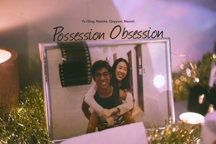

Final Submission of the semester!
Bedok Zine


Changing Opinions to Facts
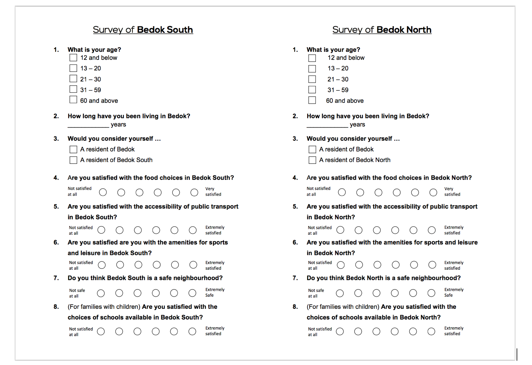
In Part 1, I created an infographic about ratings by Bedok residents of their neighbourhood. Moving on, I decided to work on the facts about Bedok. I wanted the readers to find out for themselves if the opinions of Bedok residents truly reflects the state of the neighbourhood.

Flat Game
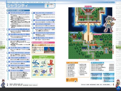
As an extended idea from Part 1, I decided to keep the flat game aesthetic consistent. This was to show cohesiveness for a 2-parts project. However, I narrowed the game concept to a game-guide inspired booklet for my zine. I wanted it to be like these Pokemon guides. This layout allows texts to be integrated and locations to be identified- a game-guide to Bedok.


This one has too much texts though.


The tricky part of flat graphics game is its readability. Due to the lack of interactivity and 3-dimensional graphics, my background and foreground could easily fall flat and may affect the readability of my zine. Hence, I had wandered through many many many game design pins and here are my top three favourite references.
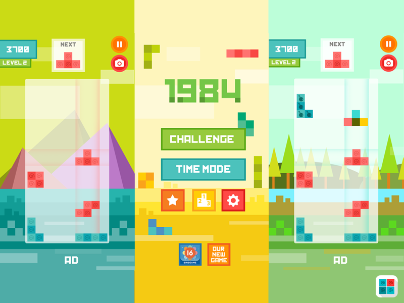
Tetris Flat IOS Game by Igor Radivojevic

Ecokids by Vola Kuzmich

Flat GUI Pack by ricimi
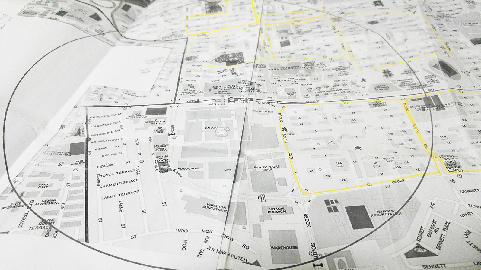
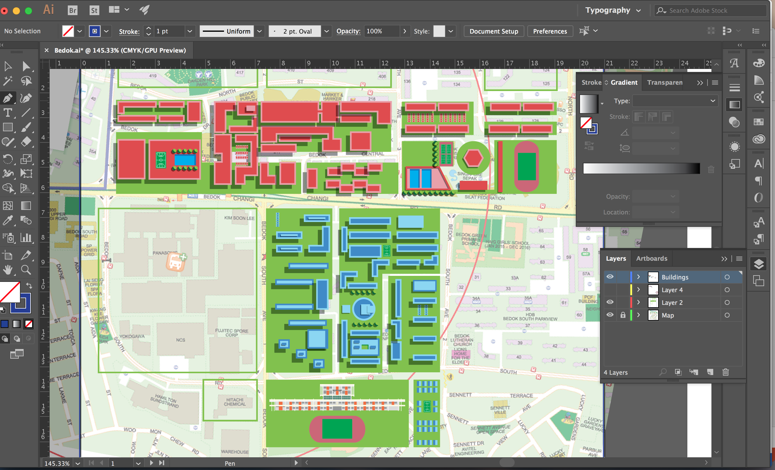
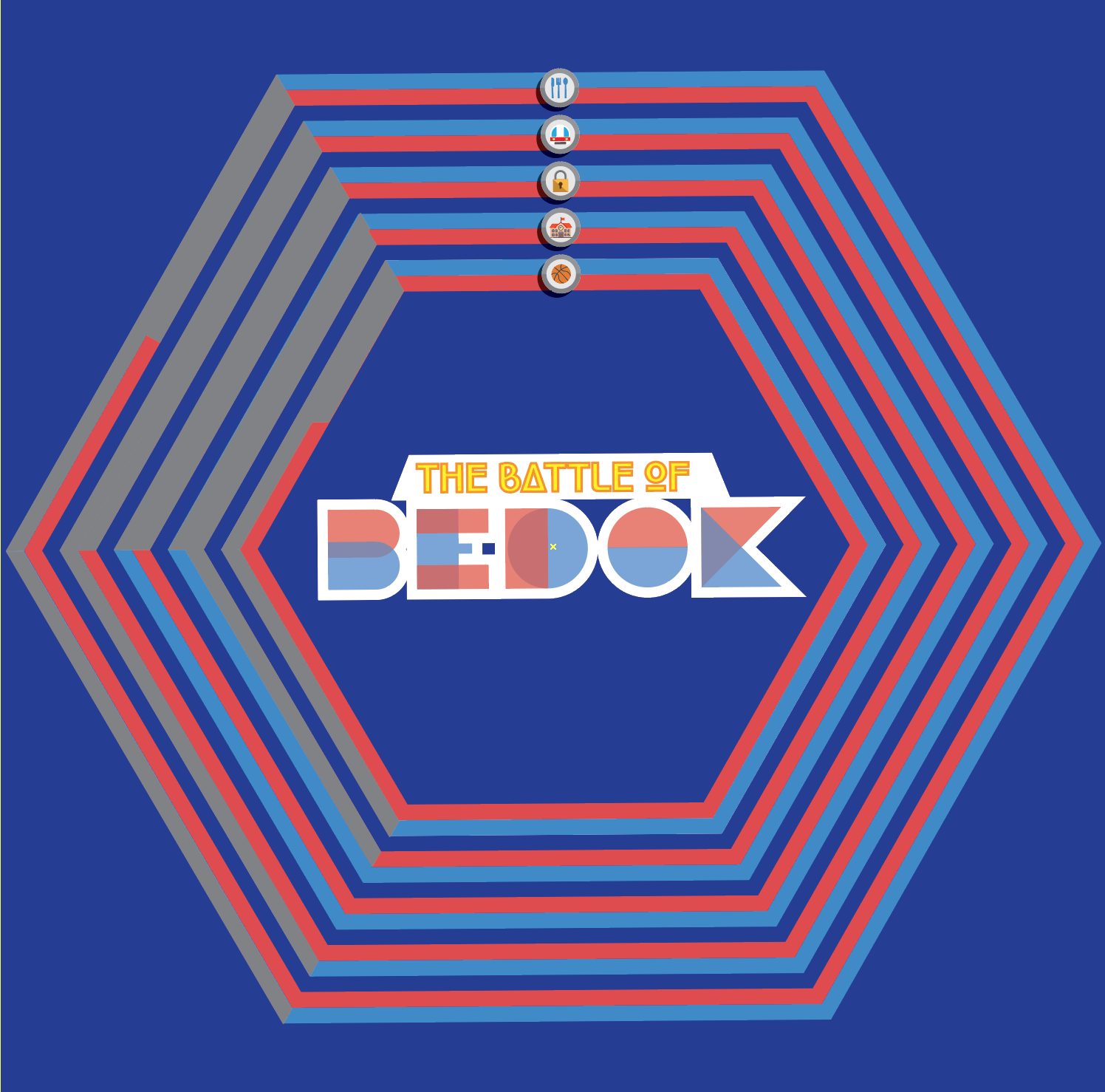
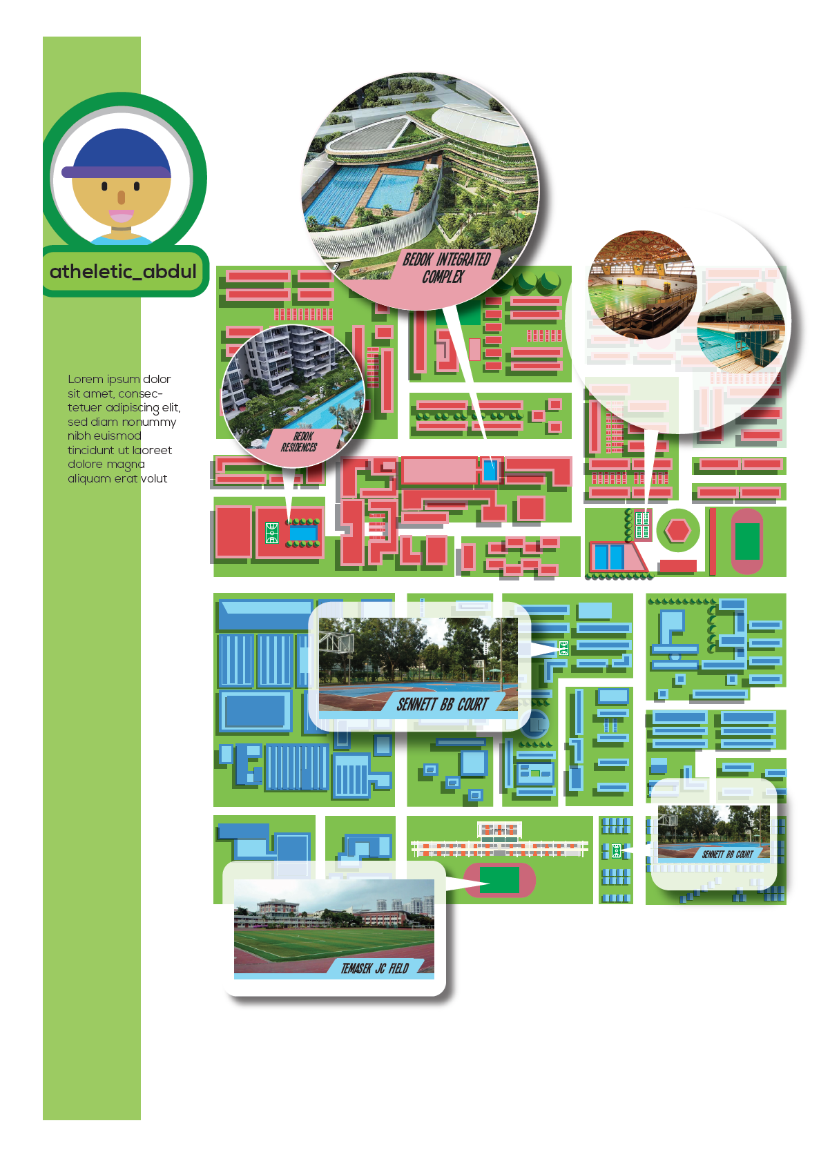
Maps takes up a large portion of my layout and is an important element of my zine. They serve as the bond for the theme of Bedok and sub-topics for each spread. The map should be visible but not too much such that it diverts attention from the specific sub-topics, which is the highlight of each page. Hence, I like these graphic maps projects by Philippe Nicolas.
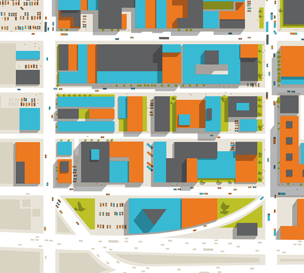

In this gridded layout, the buildings are so neatly arranged such that they formed a pattern of sort. In order to dress Bedok in this style, I needed to tweak it a bit. This was the best compromise since an accurate map of Bedok is not necessary for my zine. Afterall, some of the most famous maps were not designed to depict accuracy.
I tried to follow the original map of Bedok as much as possible.
The above map was the original colour scheme of my map. And was initially used for spread 1 (below). However, the colours are too ‘pop-ish’ that visibility was an issue.
Hence, I tried toning down the colours and Gerald taught me to use transparency to overlay as a shortcut to mute the colours of map. Works like magic.
![]()
Left: Before transparency added
Right: Transparency added
This method was eventually used for the map on spread 2.

The original colour scheme

The ‘tone-down’ colour scheme

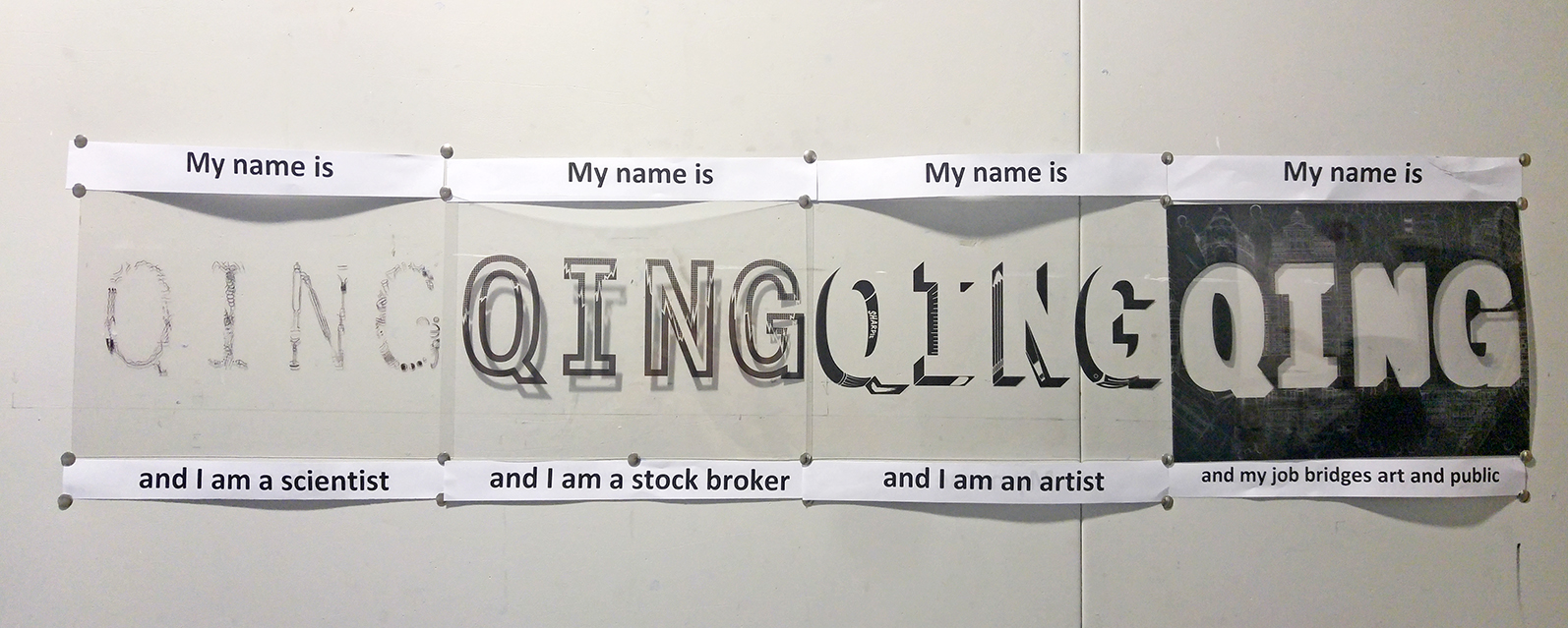
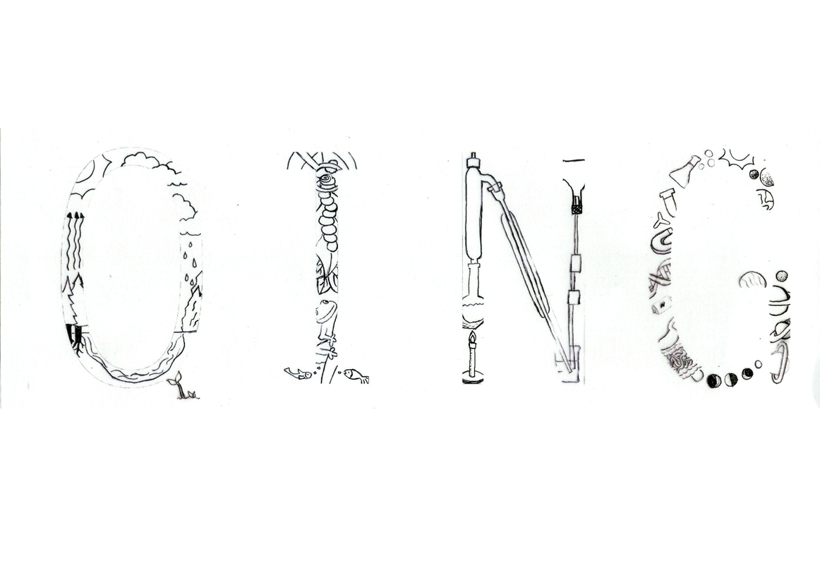
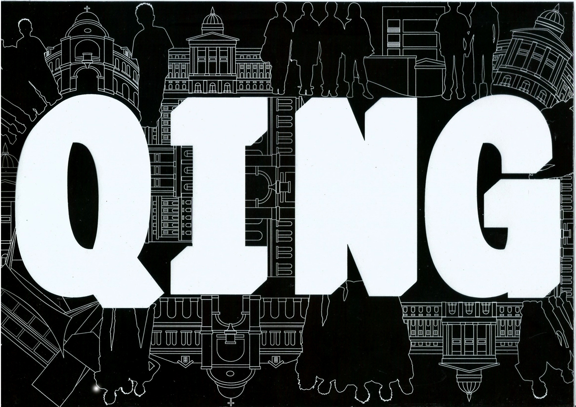
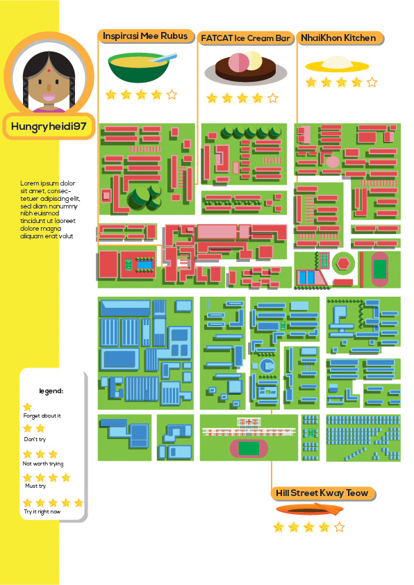
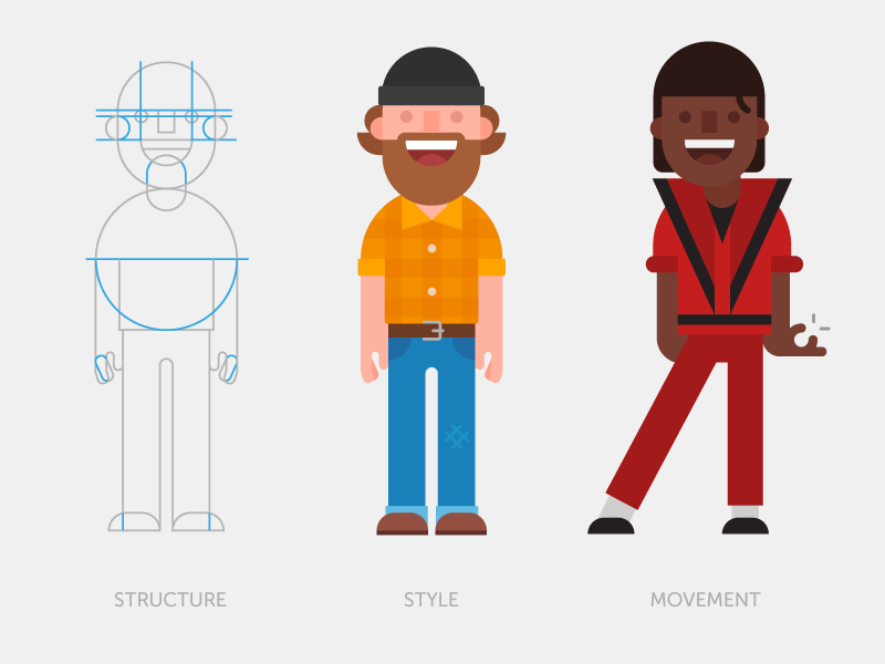
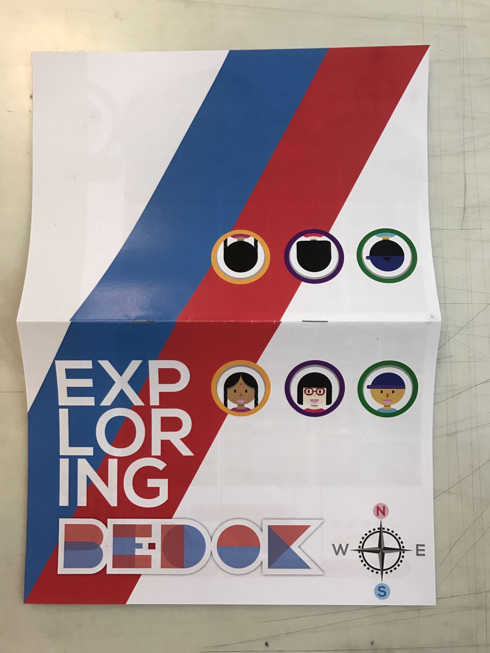
From the earlier study of game layout, I had identified the importance of avatar. Avatars are usually about the gamer themselves but I could manipulate it to introduce the topic for each spread through their usernames. The characters are also designed with the similar style of flat and geometrical graphics. I heavily referenced duolingo characters (but not too much that I stole their style). I like their simple use of geometric shapes to represent humans of different gender and race.
![]()

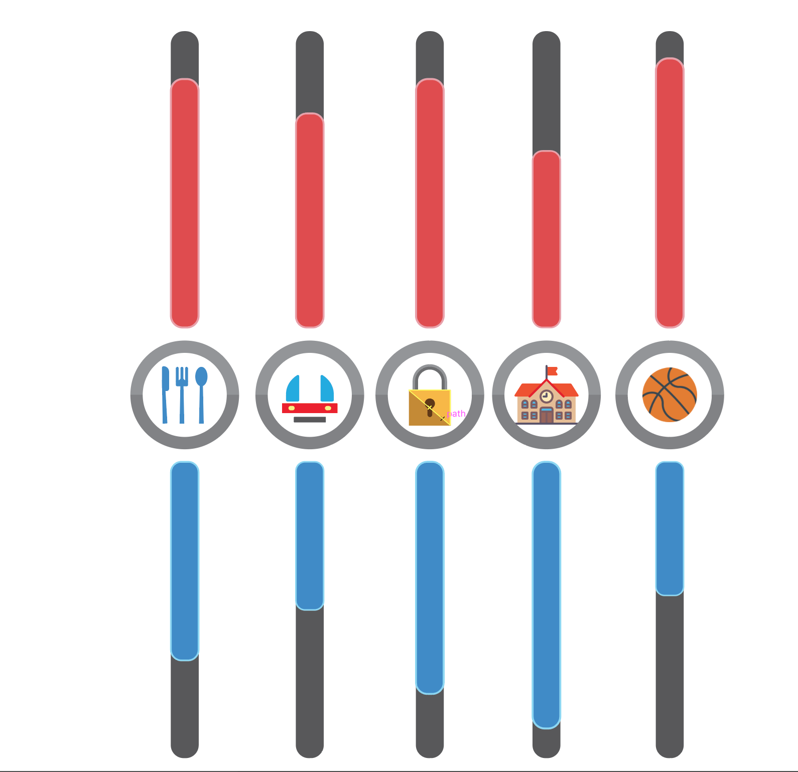
Indicators were a real struggle for me when designing the layout. Partly because I have poor colour sense. Furthermore, I want to vary the indicators for all three spreads to keep things interesting. The first two spreads didn’t pose much a problem but when I came to the last spread, I couldn’t come up with much interesting ways of depicting the sports area. Initially, I wanted to create a hologram effect that is used in many games .

sort of like this effect
Try-out 1
Try-out 2
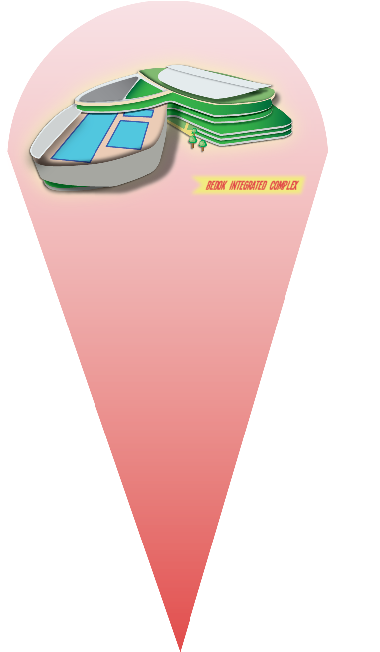
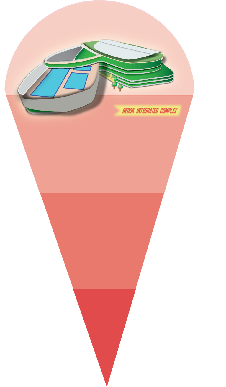
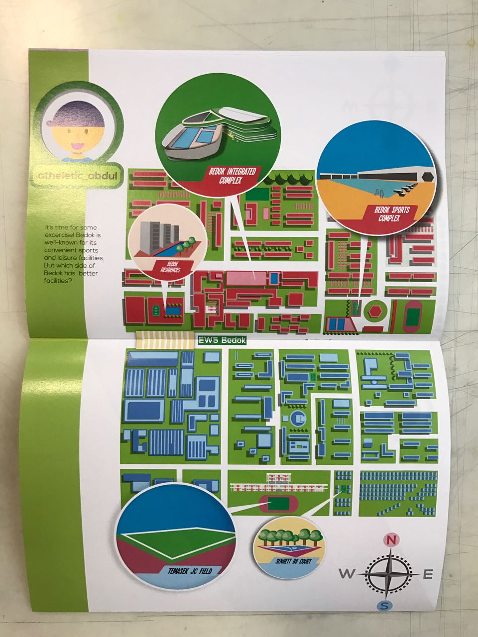
However, it is hard to create a convincing hologram effect with flat graphics and minimal gradient. Furthermore, my colour scheme did not suit. Hence, I referenced this map to create the same visual effect. Firstly, enlarging the location in circles could show us details of the space. Secondly, the use of shadow highlights the specific location pointed out.

Credit: Pinterest
WIP: Testing out with different shapes and labels
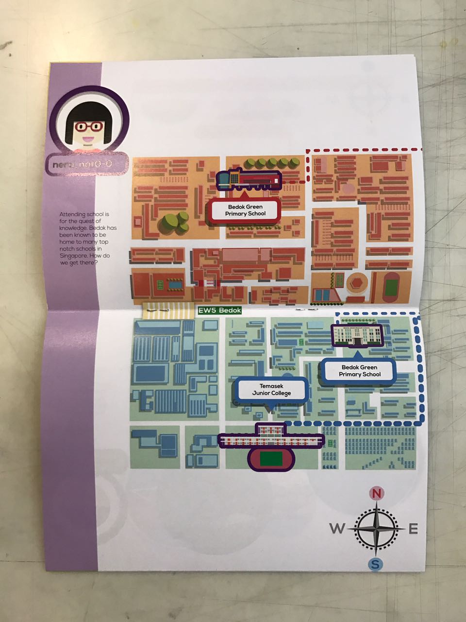
The compass is another important indicator in the layout. This was added in after the last group consultation where Ayesha acutely pointed out that first-time readers like her did not know the division of Bedok. I had fallen into the pitfall of getting too comfortable with my own work and thankful that she pointed it out.
Lastly, Bedok MRT station was added after the last group consultation. As my roads were not labelled, the map seems generic. The addition of Bedok MRT station could help reader to easily identify the place and gauge the distance of each specific location.

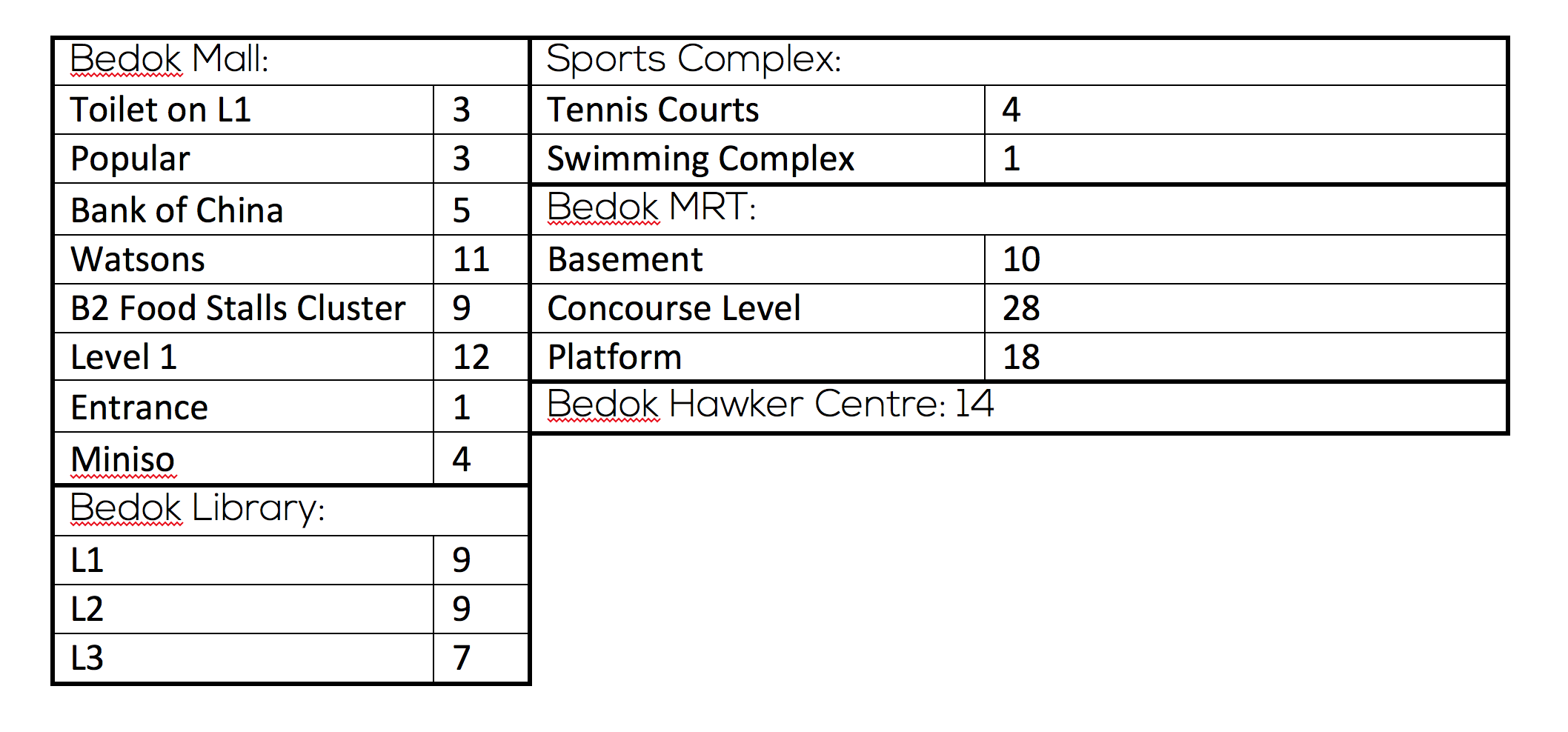
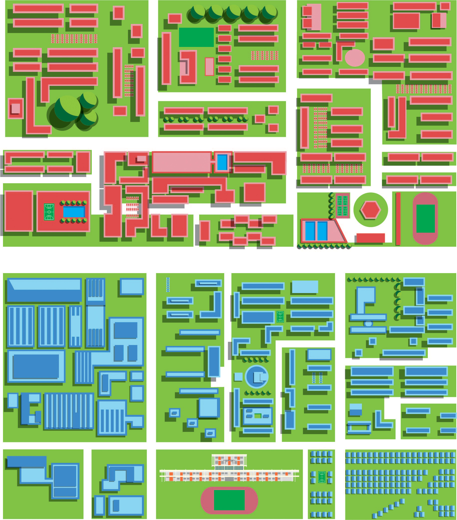
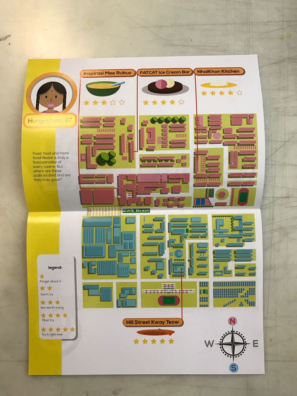
Food
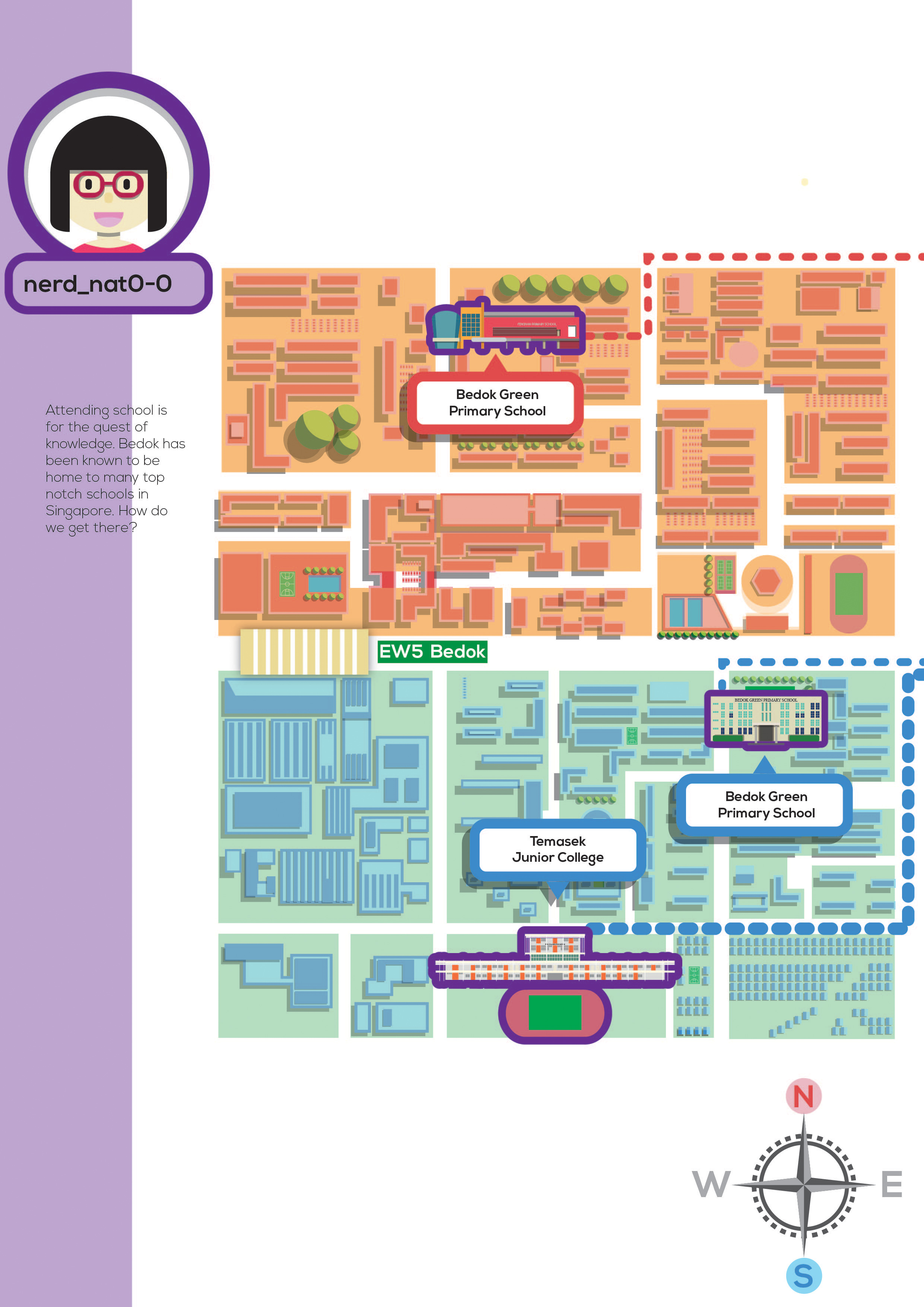
 Schools
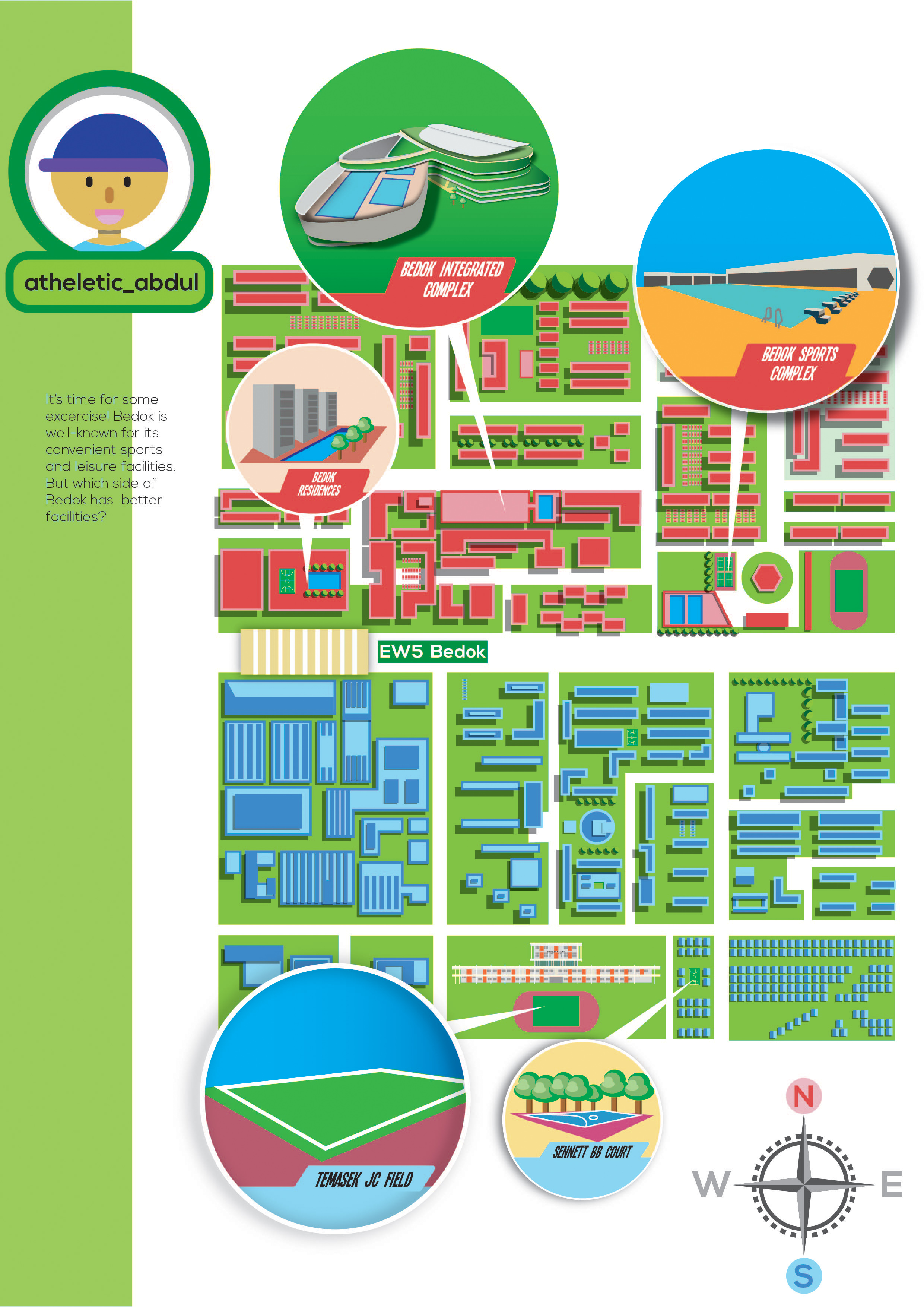
 Sport Facilities
Click here to view digital zine.
I took 2h to get this up so pls just click for support. tyvm <3
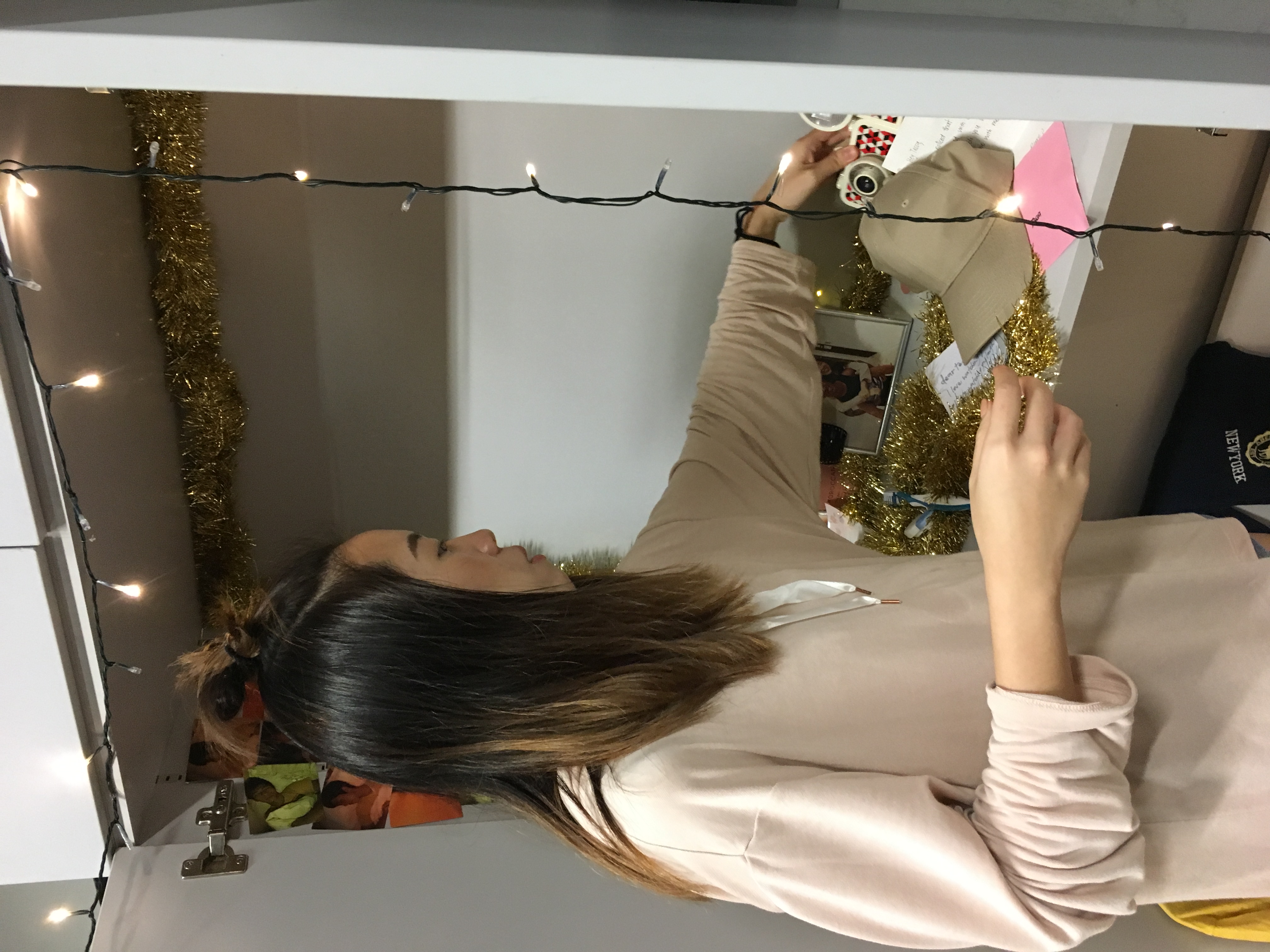
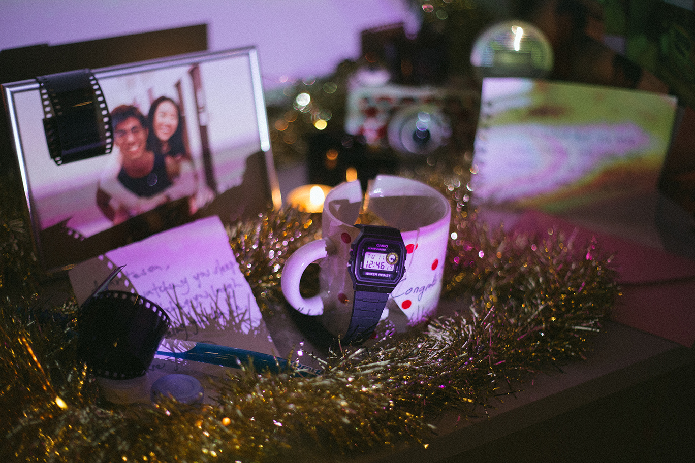
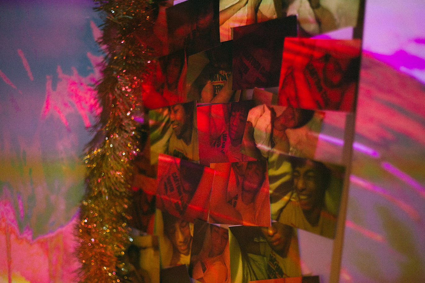
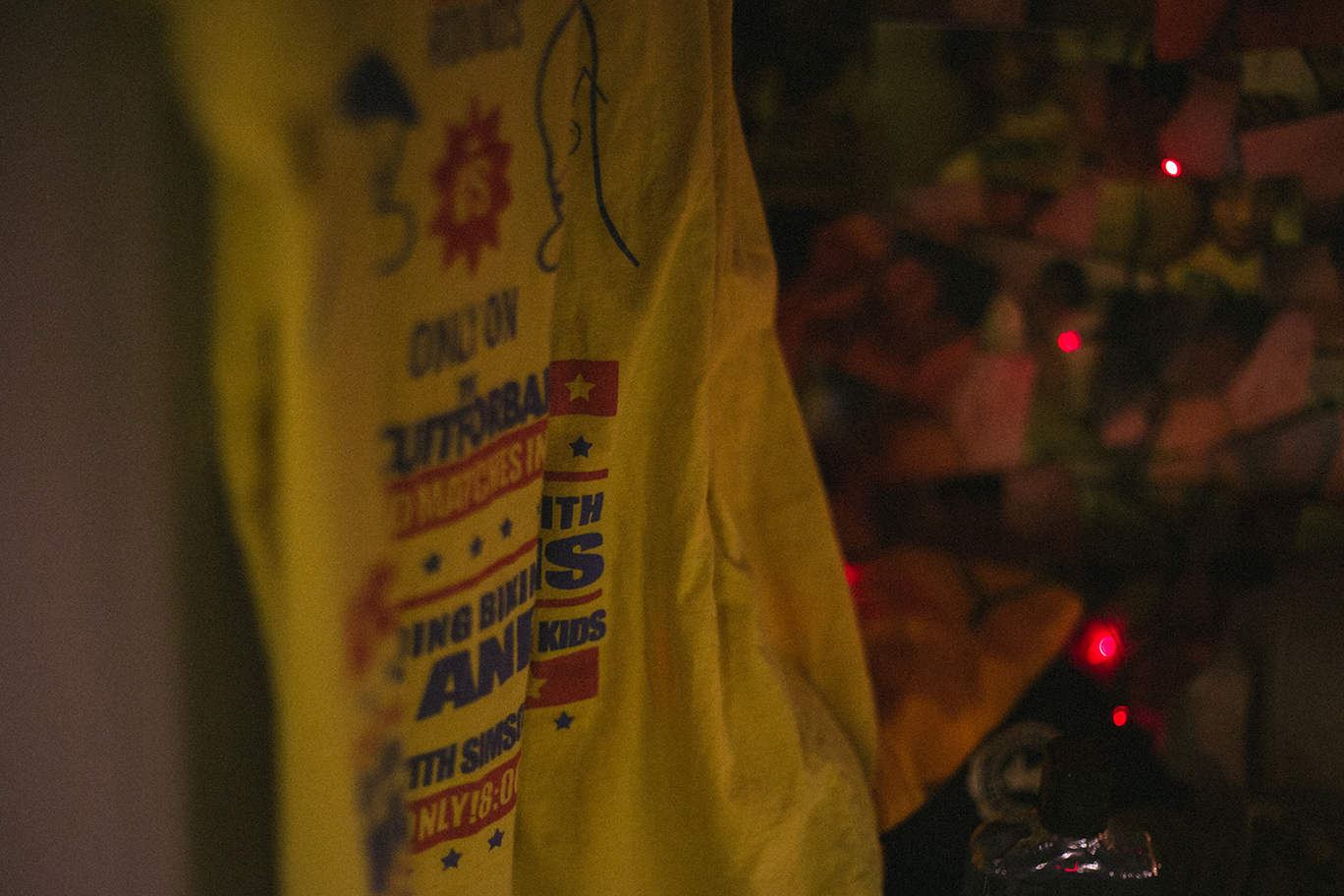
(crappy) Photos of my printed zine.
Sorry, these photos were taken in a rush so pardon the bad quality. I wanted to eat pizza.

Comments from Friends:
- The compass is placed too low
- The avatar on the last page is dangerously close to the edge.
- Colours could have been better controlled.
- A legend could have been added for spread 2 and spread 3
- Spread 2 seems to be lacking
- Header could have been added for each page
- They enjoy the game concept
- They like how the usernames introduces the sub-topics
Additional Comments by Lecturer:
- Concept: For my project, part 1 and part 2 ties together cohesively and that’s great.
- Layout: Everything ties together well except the compass which stands alone awkwardly at the bottom corner of the page.
- By breaking up the word ‘exploring’ into ‘EXP-LOR-ING’, it becomes misleading as the middle syllabus seem to resemble a singlish word to my target audience- Singaporeans at a first glance.
 Alignment and heavy-illustration
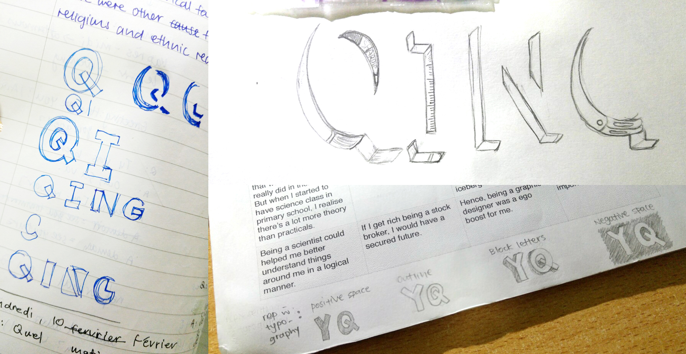
I find this project much more manageable because the concept and ideas were largely decided in part 1. It gives me more time to focus on layouts and the graphics. There is, however, greater emphasis for technical skills in this project. I struggled a lot with alignment because I was unfamiliar with InDesign. To aggravate the situation, I left my alignment right to the last minute and rushed through it. I had underestimated the time and effort needed to get the right alignment. It was a decision I regret because it diminishes the quality of my work. Another issue I struggled with was to be too absorbed with the illustrations. As my design concept is illustration-heavy, I was too engrossed with designing each vector that I forgot to consider the overall layout of each spread- how each element and text relates to one another. This affects the readability as they may not be sufficient hints or keywords to convey the idea of each spread at the first glance. Instead, readers must spend time studying each element before the idea for each spread comes through. To improve, I could have included a header at the top or an icon at the corner so that the overview of the spread could be understood at one glance.
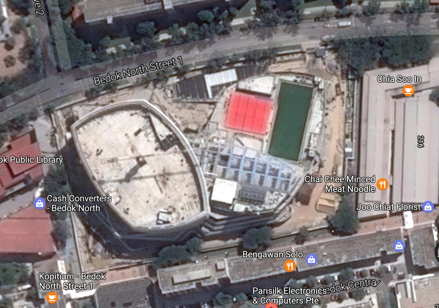
what i see.

what i did.

what i change it too. (Cos the bird’s eye view is too ambiguous)
what was eventually printed. (so puny!!!)
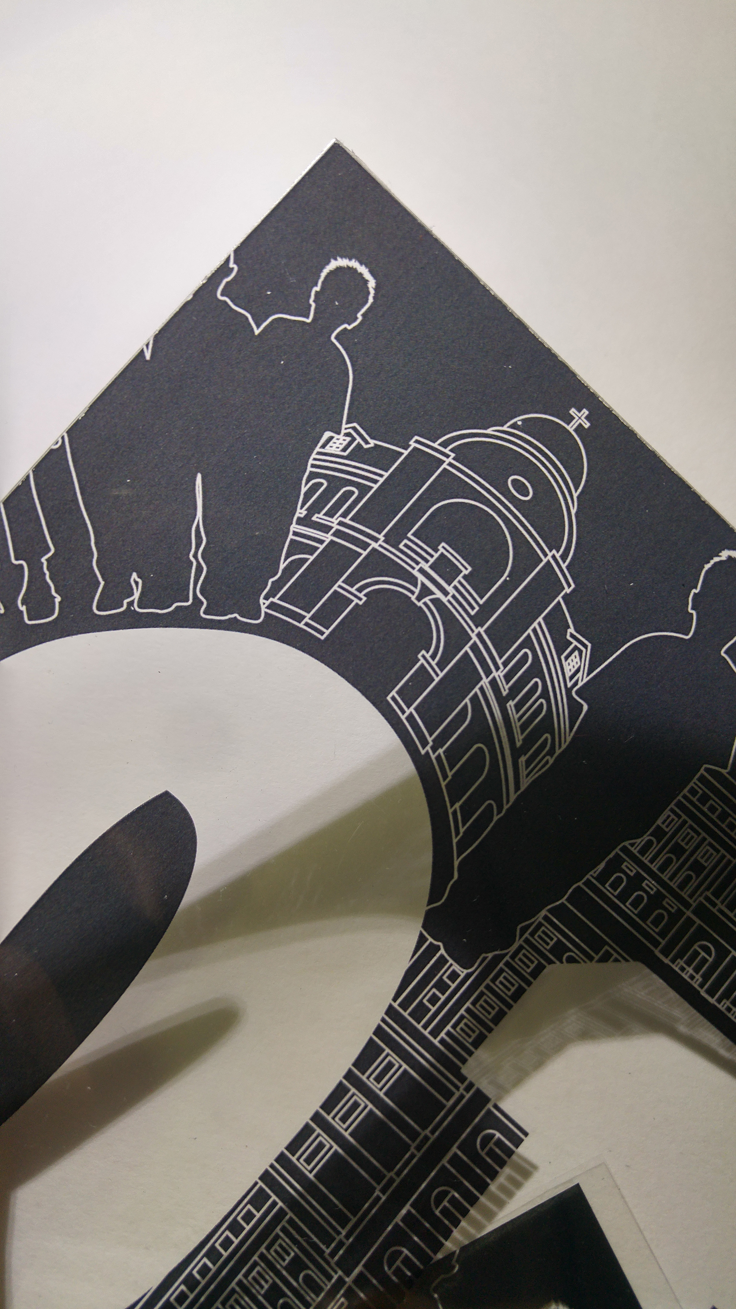
Eg. I spent A LOT of time designing the vectors of the integrated complex. But at the end, I realise the smaller details were actually not necessary. I could have just use the general shapes of the building to create an impression.
Nevertheless, this was an exciting project as we start to create ‘marketable’ work of art. Well, not exactly they can be sold for money but at least they can be published. Another interesting lesson I’ve learnt was the great difference between ‘on screen’ and ‘on print’. Even if the colours and size are correct, the physical state of the book is never the same as the spread on screen. The tactile quality makes a whole load of difference. Hence, test print is extremely important if we want to create a good zine or book. It’s pushes budget but makes it worthwhile. In all, I’m glad that the last submission of my freshman year ended on a high note.