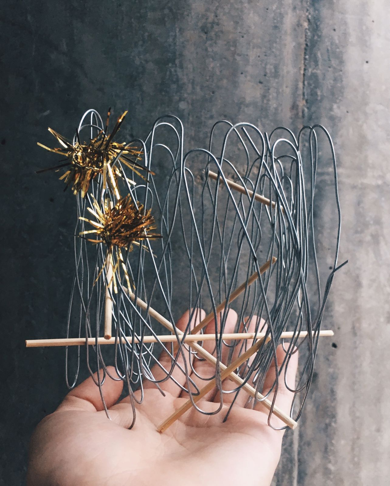
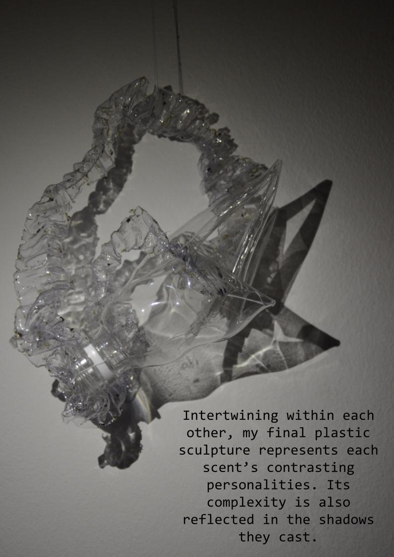
Amongst the 2 sound compositions that my group created, I worked with the second composition to create my moodbox.
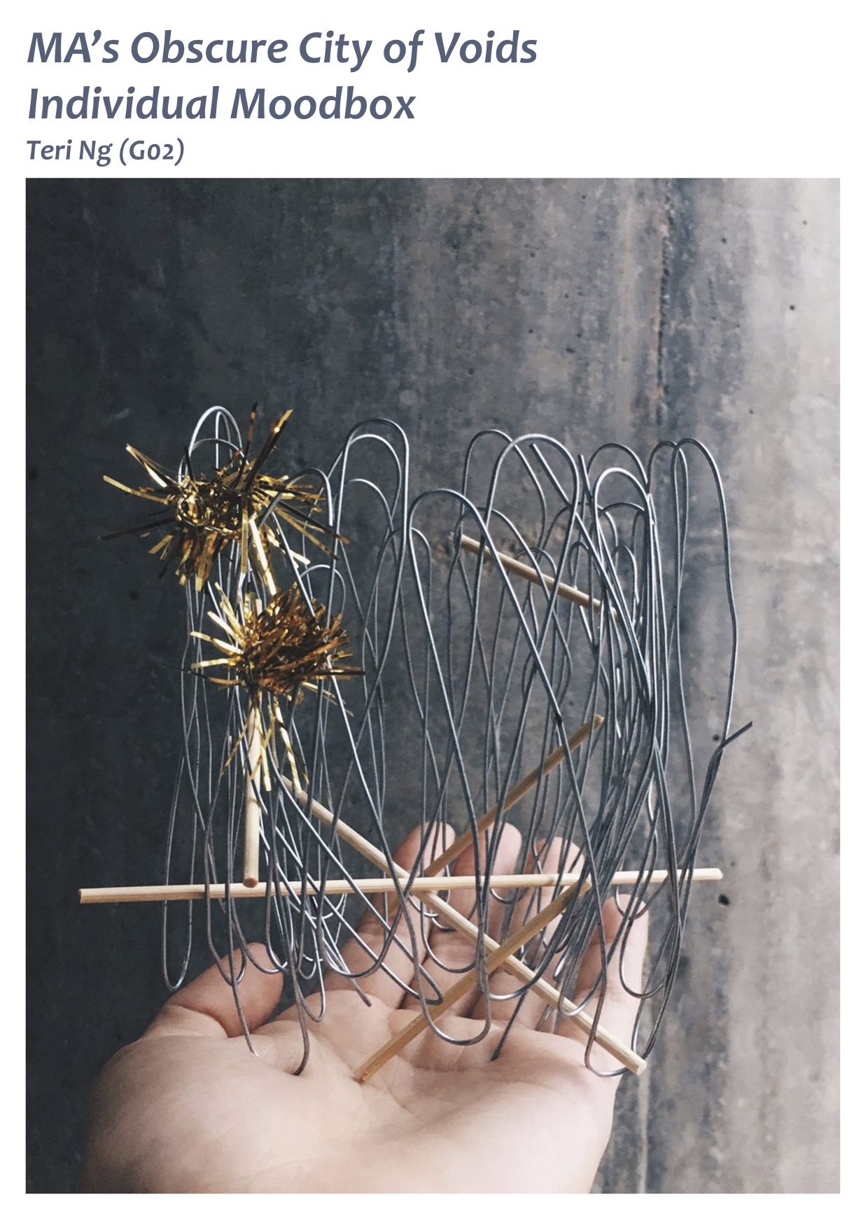
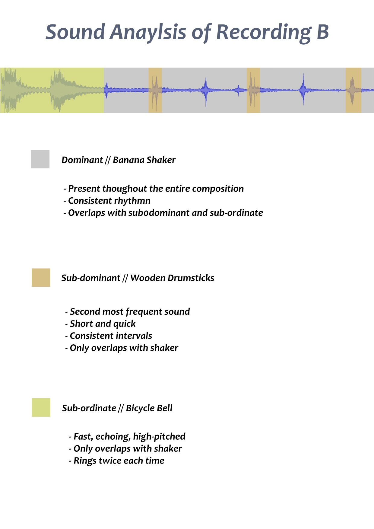
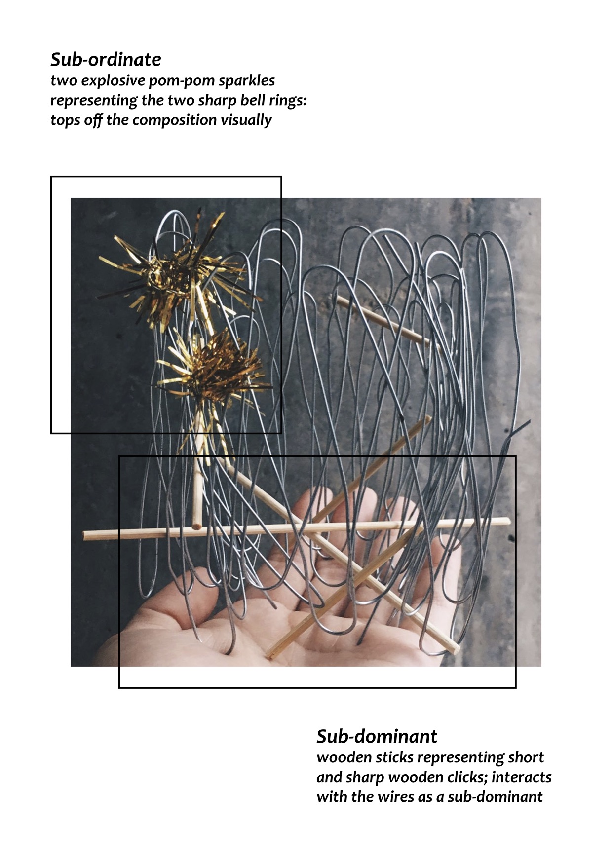

Amongst the 2 sound compositions that my group created, I worked with the second composition to create my moodbox.

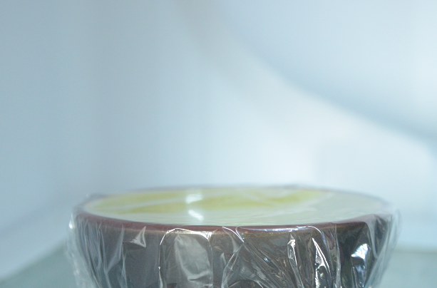
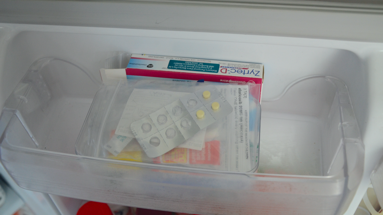
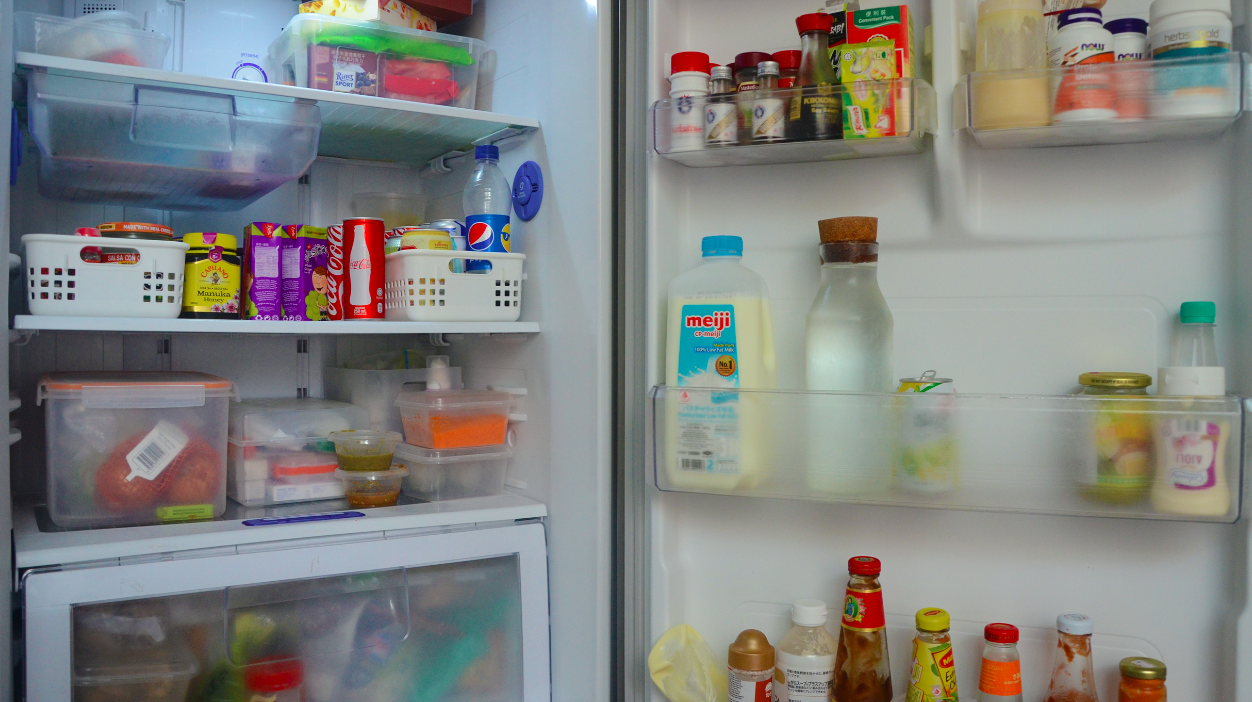
To kick off project 3, we brainstormed lists of places and sounds during class. Assigned to list locations where we’ve never been to, one of my favourite place that I thought of was a ziplock bag. However, upon tasked with project 3 which was to create a 3o second video about an encounter with my location, I felt a bit restricted working with a ziplock bag. As I progressed on getting started with creating my lo-fi storyboard, I decided to change my location to a fridge instead since it gave me a clearer space to work with.
For my very first lo-fi storyboard draft, I sketched an eight frame storyboard focusing on the fridge as a whole object and a literal interpretation of my first discovery with it. Since the focus of this project was soundscape, I decided that I wanted to create a video with edited sounds recorded by a zoom recorder over it.

rough sketch of draft storyboard // discovery of fridge
This storyboard embodies my first encounter with a fridge during the night as I am alerted by the fridge’s buzzing noise. I had envisioned for it to be a rather magical discovery.
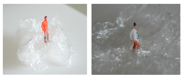
After the first consult with Lei, she suggested that maybe instead of discovering the fridge as an object from its exterior, I could slowly reveal it from the inside. The discussion came to the idea of a miniature world occurring within the life of the fridge and we looked at some inspirations online. Inspiration was then taken from images like these below, but for my project will be altered to fit with the context of a fridge.

http://editorial.designtaxi.com/editorial-images/PoyMiniFig28102015/1.jpg
http://www.ebaumsworld.com/pictures/36-amazing-miniature-scenes-using-everyday-objects/85244657/
Inspiration was then taken from images like these above but food items will be altered to fit with the context of a fridge for my project.
Moving on to the new concept, I developed my hi-fi storyboard based on plans for my still images since it wasn’t possible for me to film a miniature life in the form of a video. Starting off with items that I could commonly find in a fridge, I used inspiration from images found online to help me plan out some possible activities that could occur.
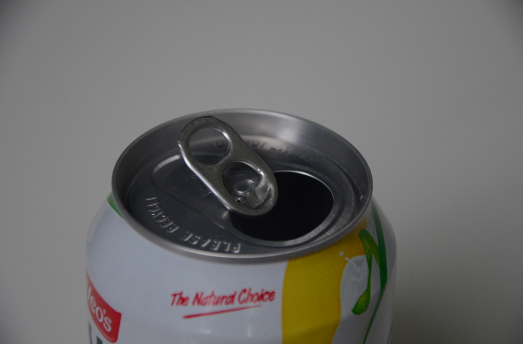
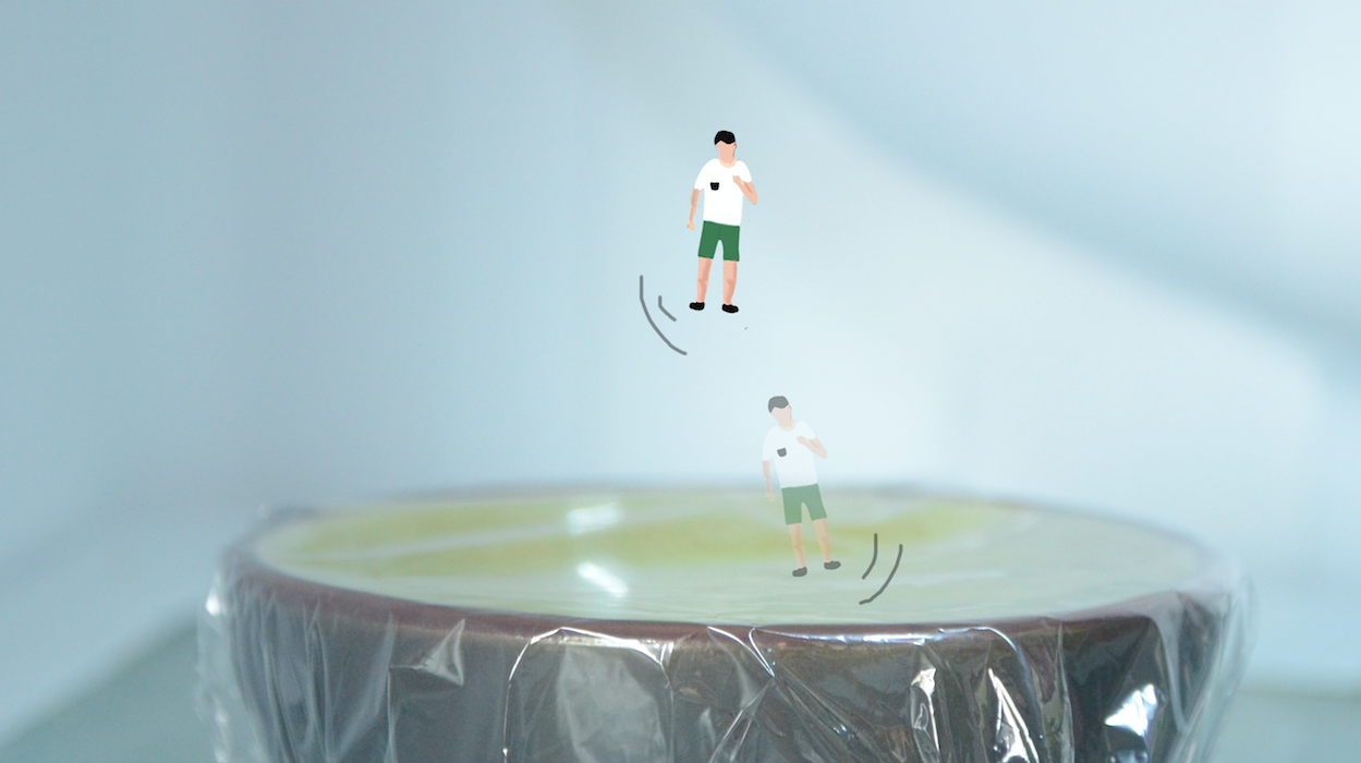
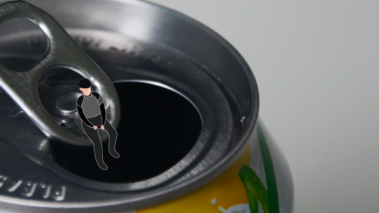
Can Drink
The transition of Sounds:
1. Pool sounds
2. Talking by the pool
3. Can opening
4. Placing can in fridge
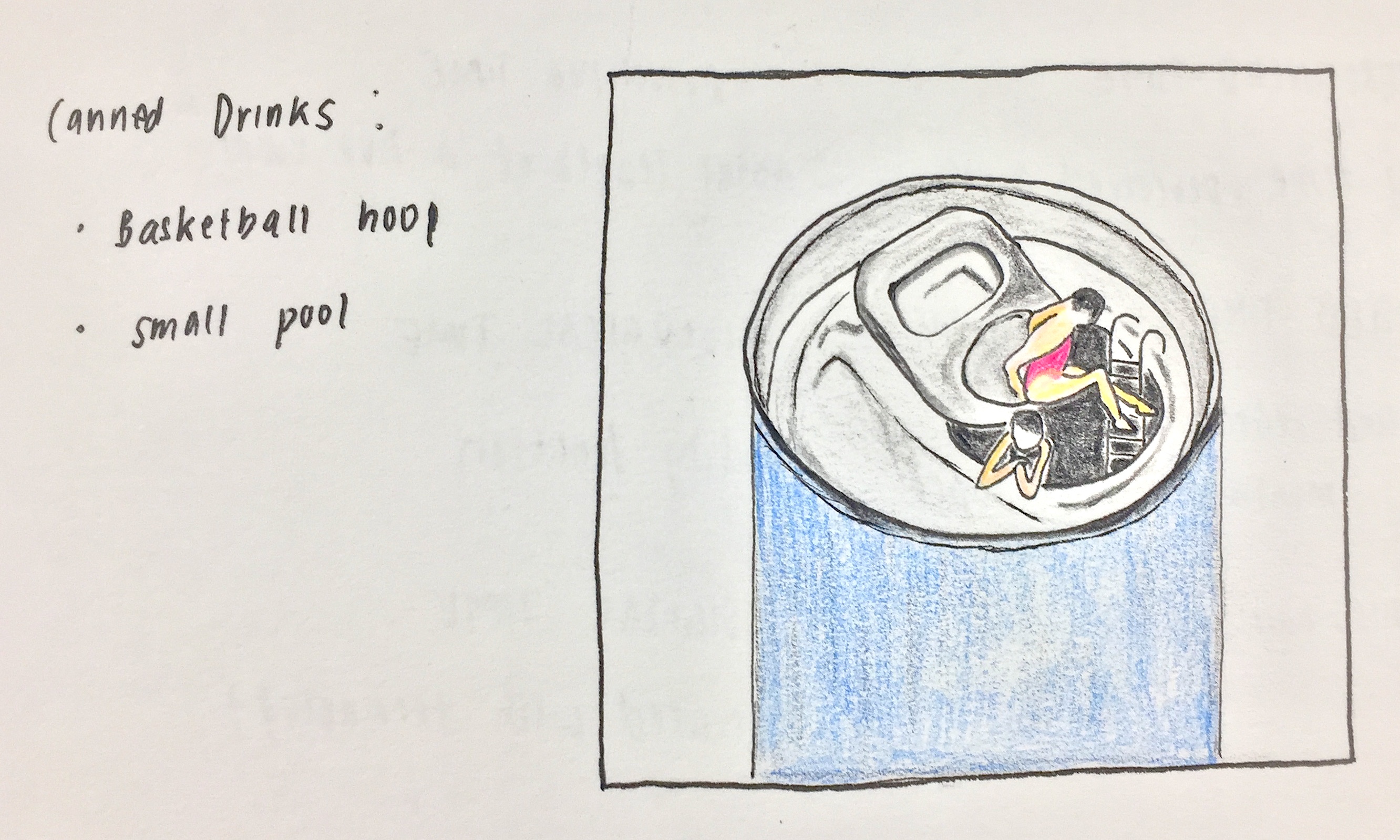
Can drink // swimming pool
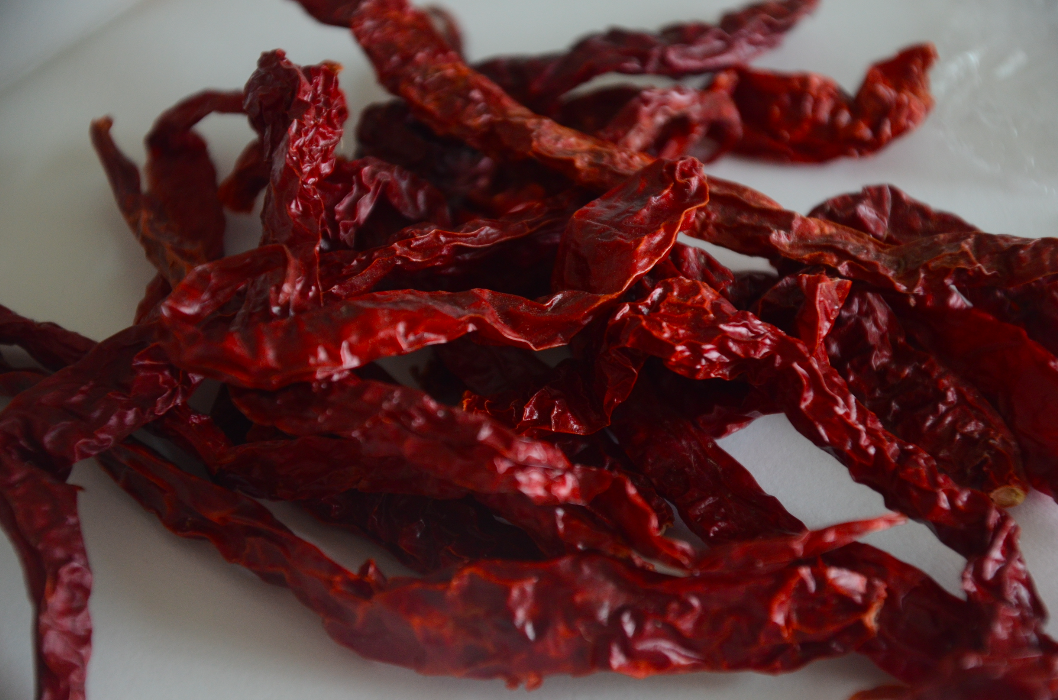
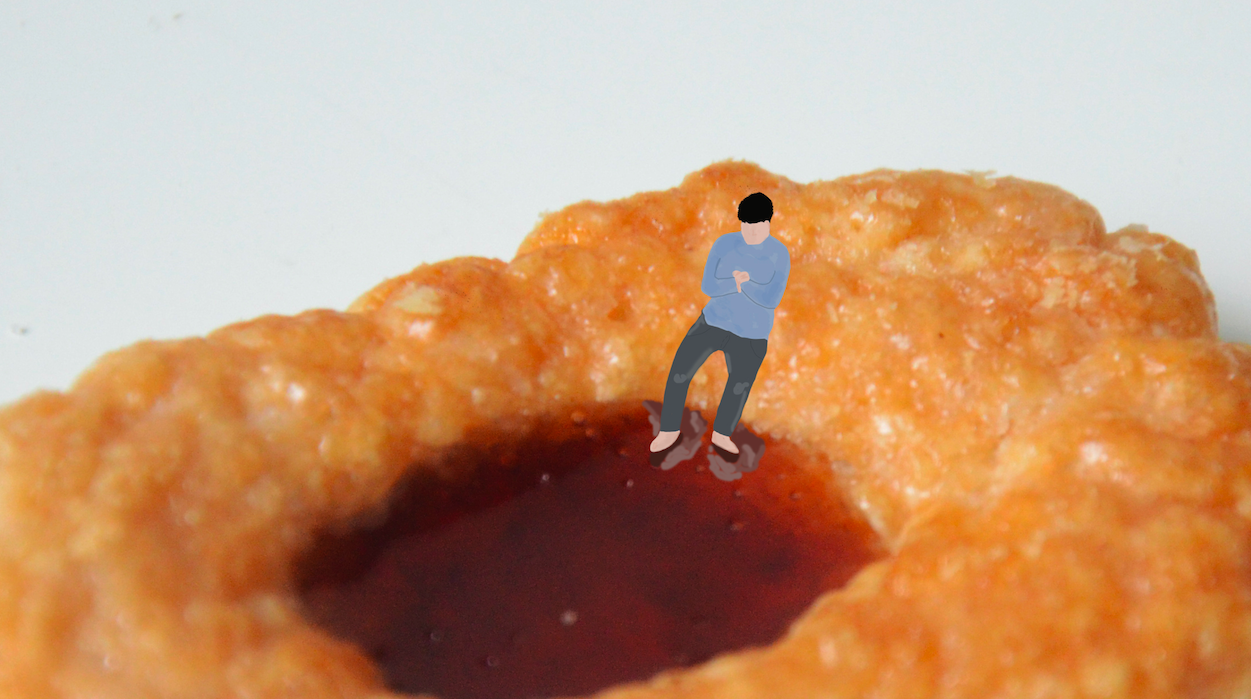
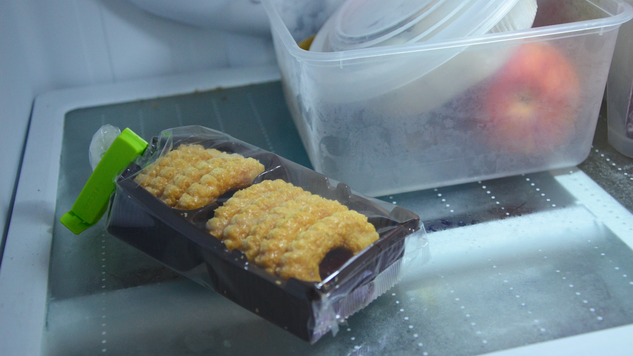
Dried Chilli
The transition of Sounds:
1. Rowing/water sounds
2. Conversation
3. Ruffling of dried chilli
4. Plastic sound from chilli packet
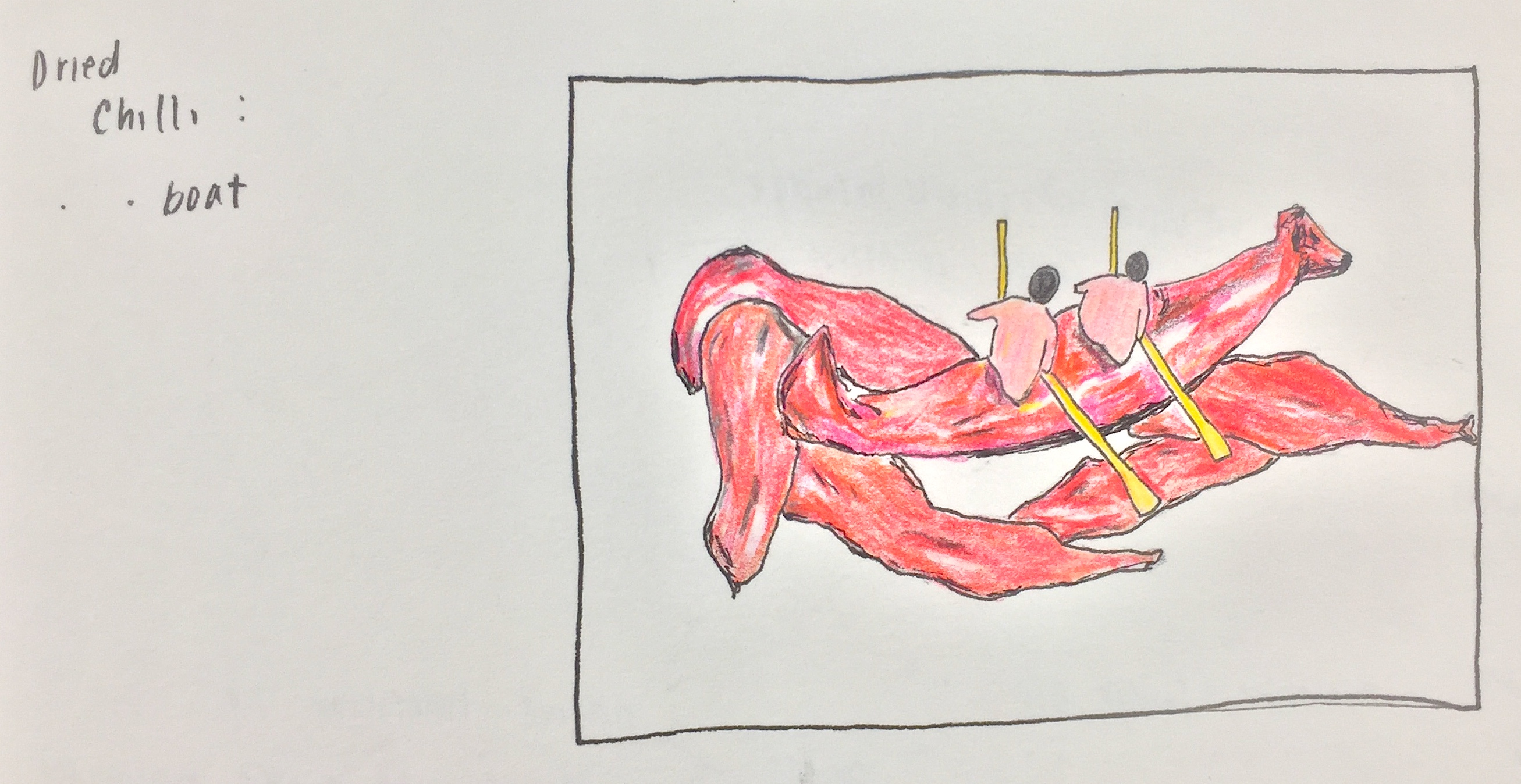
Dried chilli // rowing boat
Trampoline
The transition of Sounds:
1. Cheering sounds
2. Bouncing on trampoline
3. Cling wrap sound
4. Rubberband over bowl
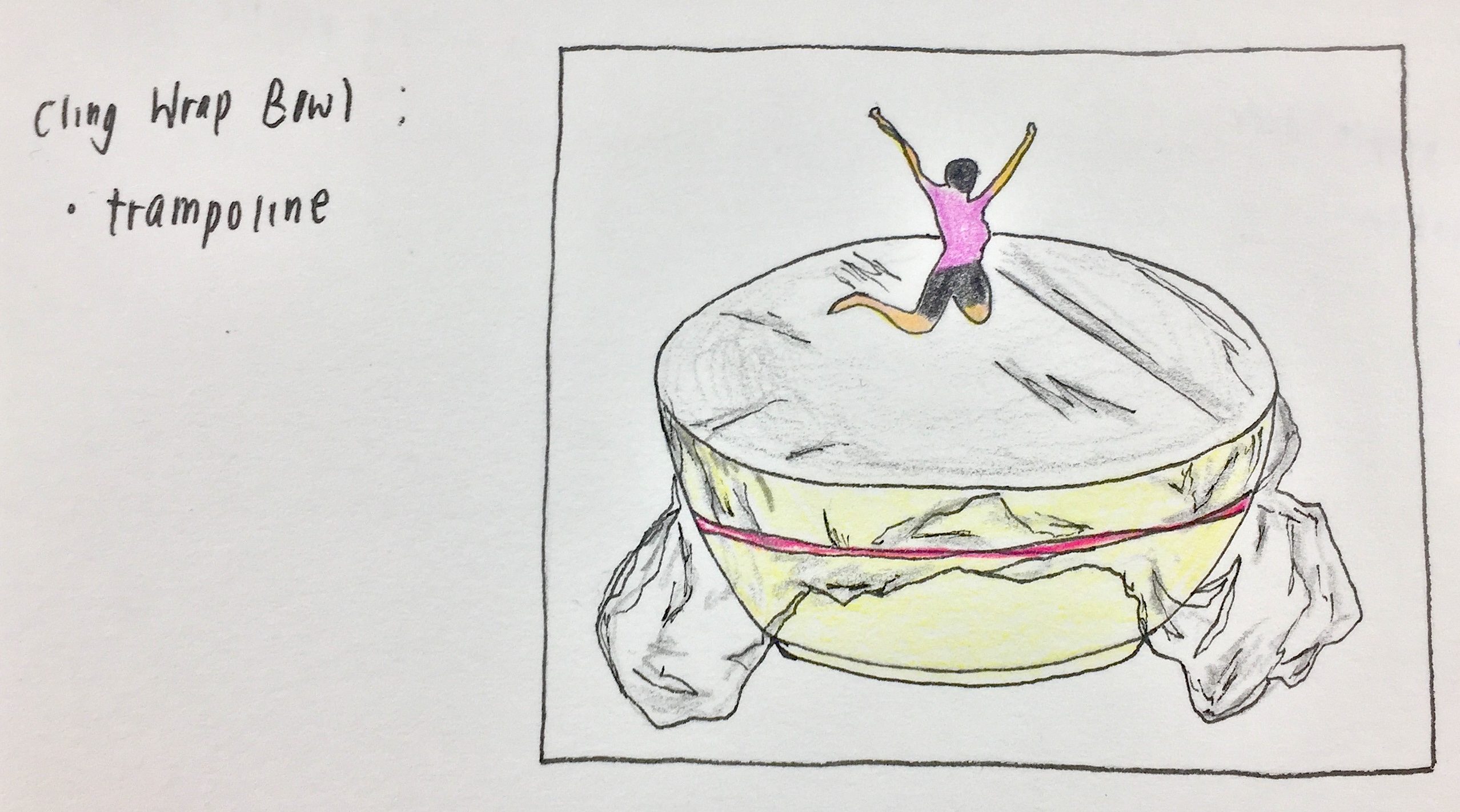
Cling wrap bowl // trampoline
Since the plan now was to work with images, I arranged the order of my different scenarios in a way whereby the close-up images would be shown first, followed by the reveal of the location with a zoomed out shot.
| 1. Blank screen, sounds of pool area | 2. Can drink image, volume increases, the transition to boat sounds | 3. Rowing/water sounds, conversations, transition into cheering | 4.Trampoline image, jumping sounds |
| 5. Zoom out image of the can in fridge | 6. Image of dried chilli packet | 7. Cling wrap bowl sitting on shelf |
Images of my close up settings:
ended up removing this setting because the colors did not fit with the rest
replacement of chilli scenario
additional scenario because video had to be a minute long
When I started the process of taking my images, I had originally wanted to use these tiny human figures that I had previously purchased at a very low price. Unfortunately, the quality of it wasn’t the best, especially the colours and how it had been painted. Even though including the actual figures would have included a much most realistic quality within the scenarios itself, I felt that the low quality of these figures ruined the visuals.
Hence, I resorted to photoshopping them into the close-up shots of the items and using them as a guide to creating my own illustrations of small humans instead.
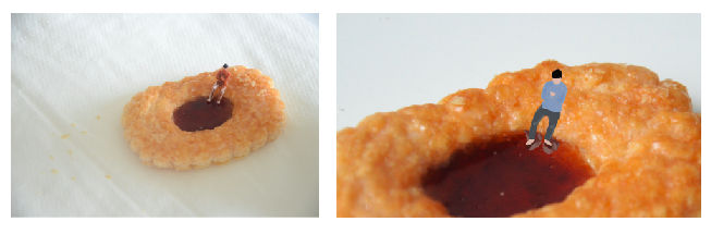
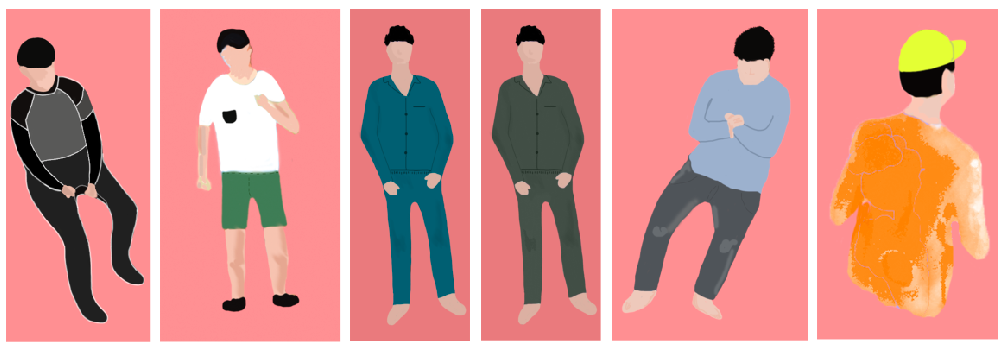
Illustration of humans for all scenarios
To create these illustrations, I painted over the previous images with the use of a Wacom.
Images of humans in the respective settings:
These 4 scenes appeared in the first half of my video with sounds that match according to the setting. The following half consisted of the zoomed out images that revealed the setting of a fridge.
Images of fridge settings:

After editing all my images that were taken with a DSLR, I compiled everything in order with iMovie and inserted the appropriate audio over it.
During the critique, the feedback that I received was that the video would have been more realistic if the humans were not illustrated. I also felt that since we were limited to 1 minute, maybe it would have been better if I had stuck to 3 scenarios since it turned out to be a little rush.
To sum up project 3, I had a really good time experimenting with both realistic and illustrated qualities. Although the process was rather time-consuming with the photoshop and additional sound recording, I am very glad that I got to experience working with iMovie and piecing every part of this together.

My mama always said, “Life was like a box of chocolates. You never know what you’re gonna get.” – Forrest Gump, 1994
Tasked to pick four movie quotes and create a visual narrative that expresses each quote using found images, project two challenges us to break away from translating literature into visuals that are too literal. The artist influences for this project are from art movements such as Surrealism, DADA, and Russian Constructivism.
Surrealism is an art movement involving visual art and literature that grew out of the earlier Dada movement. Its emphasis was on positive expression and revolves around hyper-realistic styles. Art created in this art movement was a reaction against what people saw as a destruction wrought by the “rationalism” that had guided European culture through the horrors of WW1.

https://en.wikipedia.org/wiki/The_Empire_of_Light#/media/File:The_Empire_of_Light_Guggenheim.jpg
This surrealistic piece by Rene Magritte represents a fictional scene whereby day and night exist at the same time. Although portrayed in a very subtle manner, this piece allows me to appreciate surrealism.

http://www.joewebbart.com/
Another artist that I referenced for this project was Joe Webb. As an artist who works with collaging, the play on colour and scale in his works were very inspiring when creating my compositions.
The first movie that I looked at for my quotes was Mission Impossible Rogue Nation (2005). Although I gathered a total of 5 quotes initially, I realized that it was more challenging to interpret some of them rather than the others visually. Hence, only two out of four of my final quotes were from this movie. An example of a quote that I struggled with was “Sir, Hunt is the living manifestation of destiny, and he’s made you, his mission.” – Alan Huntley. When trying to develop ideas from this quote, I realized that not only was it a little too specific to the characters in the movie, the words had too broad of a spectrum that I struggled with visuals that could interpret it best.
“Human Nature, my weapon of choice…” – Soloman Lane, Mission Impossible Rogue Nation 2005
“What we’ve got here is a failure to communicate” – Cool Hand Luke, 1967
The approach that I took in creating my compositions was through dissecting various words in the quotes and piecing them together visually.
Composition 1

Final Tote Print
For my first composition that I had printed on my tote bag, this design portrays the ‘control’ in the first quote through the use of a vending machine as the main subject as well as a repeated pattern of joysticks in the background. Inspired by Rene Magritte’s Golconda, the inclusion of joysticks in the background creates depth. With the vending machine portraying choice and control over what the person wants, the context of ‘human nature’ comes into the content of the machine. Replacing the typical items such as food and drinks, I decided to work with elements of human nature which include emotions, senses and the physical human body. Emotions portrayed through the use of emojis, senses through the use of eyes, nose and mouth, and the physical body portrayed through the use of limbs.
Initially, when the application of halftone was compulsory, my composition looked very flat as a whole due to the lack of contrast. However, after we had the option of removing the use of halftone, I decided to only apply it in the background so as to not take too much focus of the vending machine.
Composition 2
In this next composition of the same quote, I wanted to portray control in the setting of a gamer playing a game. Using an image of a person holding a console to convey the control that they have in their hands, the weapons that are available to them on the screen shows imagery that reflects control over humans. The first one being a puppet master controlling its puppet, followed by images that represent mind control in the other two. The rippling background adds additional effect and focal point to the tv screen.
During the critique, it was brought up that the words within the ‘weapon’ frame were too distracting and it would have been better visually if I could find a different image to replace it.
Composition 3

The first composition for this quote was rendered through the exploration of communication which includes verbal and signs language. I decided to bring in a blender as the main focus because I was inspired by the use of a quirky object such as a vending machine in the first composition. Out of the many household objects, the blender was also one that produced a lot of noise which I thought was fitting since verbal communication is normally a failure when the environment is very noisy. Going against the norm of having hands pressing the buttons of the blender, I placed hands that form letters of sign language inside the blender. Although the five hands spell out the word ‘hello’, the messy blended motion jumbles the letters up to show a failure in communication. Another play of scale is shown in the smoke clouds that are placed by the wires on the bottom right corner.
Forming ideas that involve placing random everyday objects into a quirky context reflects a part of creativity that I really enjoy and hope to incorporate more into future creations.
Composition 4
Through this last composition, I portrayed the idea of realization that communication has broken down between two individuals in a relationship. Unknowingly, they are drowning each other literally and figuratively. Ironically, the person on the left is a lifeguard who is blind to see that he is drowning his friend. The weight towards the left of the composition portrays him as the dominating figure. The structure of the lifeguard house was also strategically placed to symbolize the form of a human body.

Compositions of the first quote on the top and second quote at the bottom.
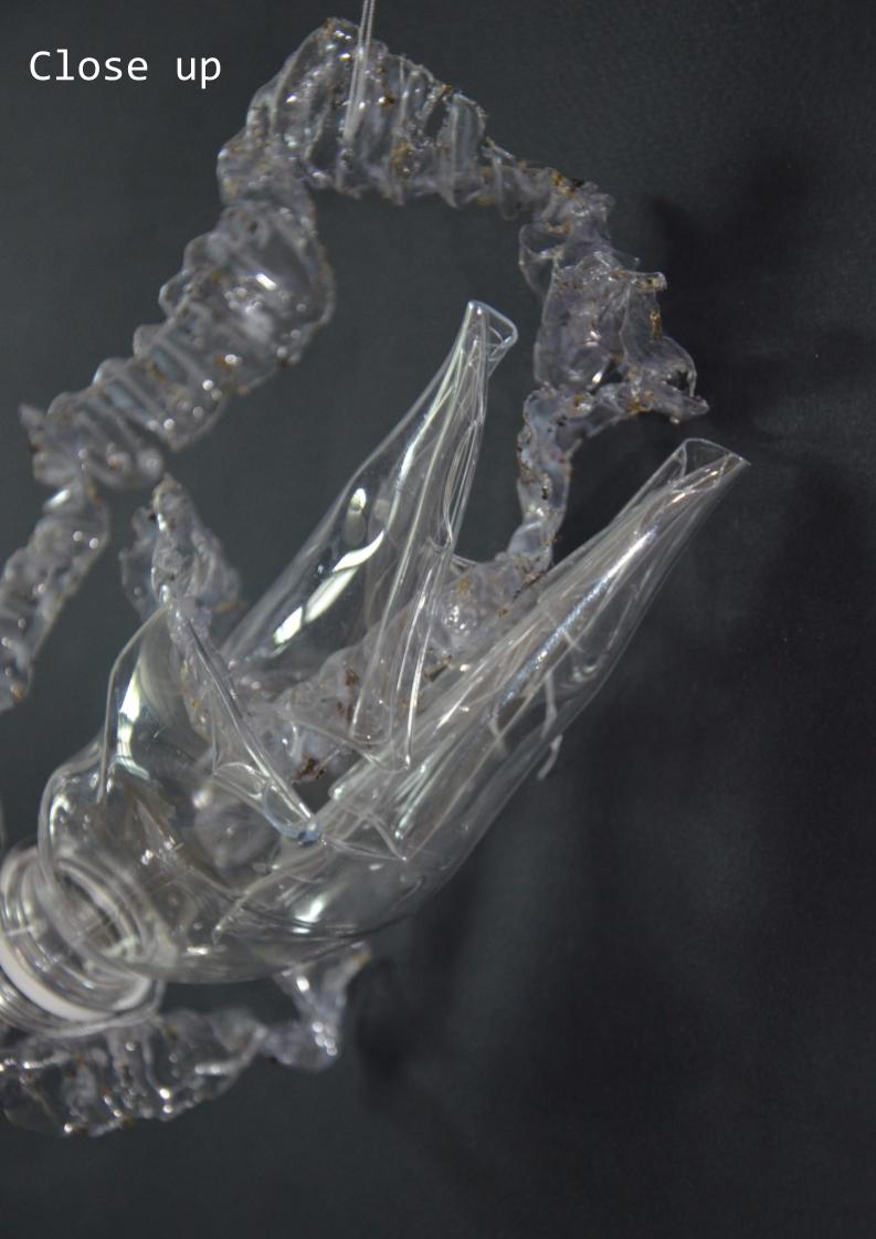
Ending off this digital project manually, we experimented with the process of silk screening. Although long and tedious, the process was still very fun and receiving an outcome felt rewarding. Unfortunately, since a large portion of the process took place in the darkroom, I was unable to record as many process pictures. I do however have an image of my exposed silkscreen. Exposed at 18 seconds, my second attempt with fewer halftones was more successful as the contrast turned out a lot greater.

Exposed silkscreen
After washing our exposed silkscreen, the next step was to create prints with it. This involved the process of applying ink to one end of the silkscreen and using a squidgy to glide the ink over evenly by applying even pressure.

Ink on silkscreen before print
Since this was the first time I had tried silk screening, I learnt a lot about a new process of producing art 🙂
Improvements to be made
During the critique, it was mentioned that the outcome of two of my compositions was better, the vending machine and blender. Unfortunately, the other two did not portray the quote as well and it could have been because I kept going back to make changes hence losing the original meaning. Since the majority of some compositions were in greyscale, I could’ve contrasted them more to improve on its visual components. In conclusion, although I did struggle quite a lot in creating my compositions and making sure that the meaning of my quotes came through, I was pleased with the final result.


 You can view the PDF file here!
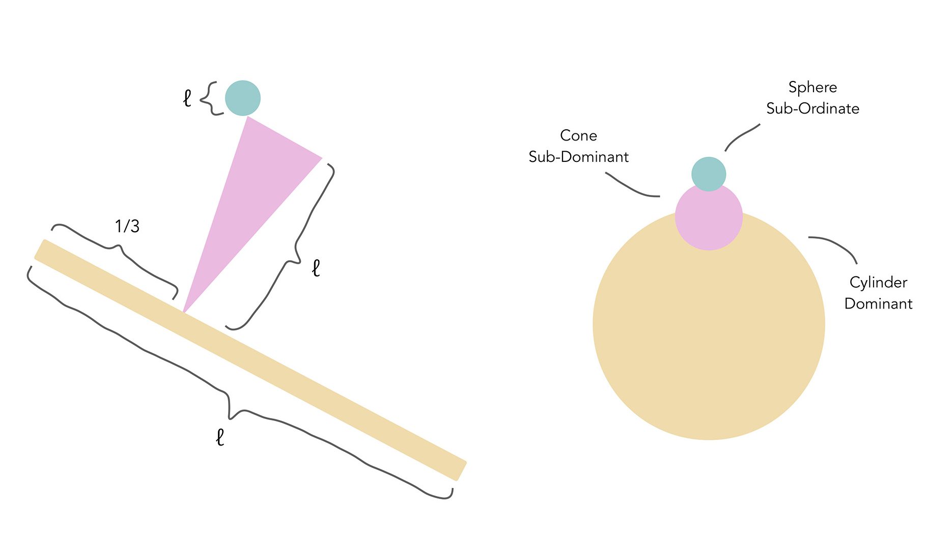
Moving on from the explorations of rectilinear volumes in project one, we are now working with curvilinear forms such as spheres, cones and cylinders. Also, instead of arranging our volumes in perpendicular alignments, we will be experimenting with the angle of tilt.
Angle of tilt
Independent: Smaller than 45 degrees in relation to right angle line,
can hold itself up
Precarious: Greater than 45 degrees in relation to right angle line,
it will fall
Dependent: Volumes are holding each other up and are
dependent on one another
5 Components of our models:
Some requirements for the structure is that the volumes are placed on a 5mm thick base and if possible, try to prevent showing the model’s support.
Ikebana Research

https://s3-ap-southeast-2.amazonaws.com/ish-oncourse-scc/2bd5b556-9108-44a1-bfaa-29906685db5c
Ikebana is a disciplined art form revolving around the arrangement of flowers in Japan. “It is steeped in the philosophy of developing a closeness with nature.” The development of floral art in Japan stems from the Japanese love for nature and how much they appreciate natural beauty. As a huge part of their culture, many are often seen displaying flowers as a form of decoration. The art of Ikebana contains a variety of plants, flowers and branches to suggest the whole of nature.
Moving along from the consideration and inspiration from Ikebana, we are also required to incorporate elements of a season into our models. Since my season was spring, I decided to brainstorm different elements of it to see which would fit best into my model.
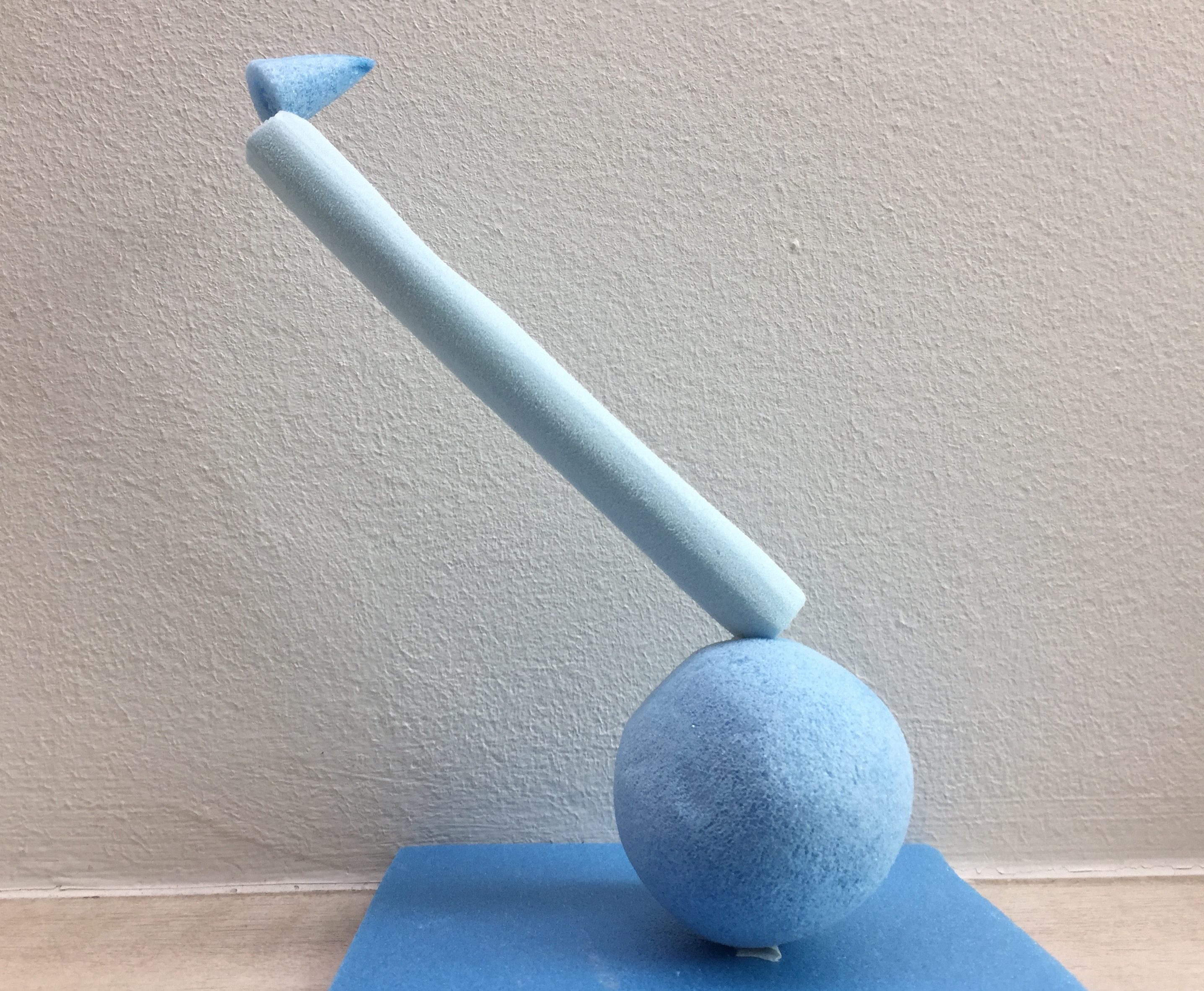
Sketch Model 1
With this project, it was more challenging to create our sketch models since there was more to work with for the different shapes and volumes. To achieve our various volumes, I worked a lot with the cutter as well as the sandpaper in order to smoothen the surfaces out.
First Attempt:
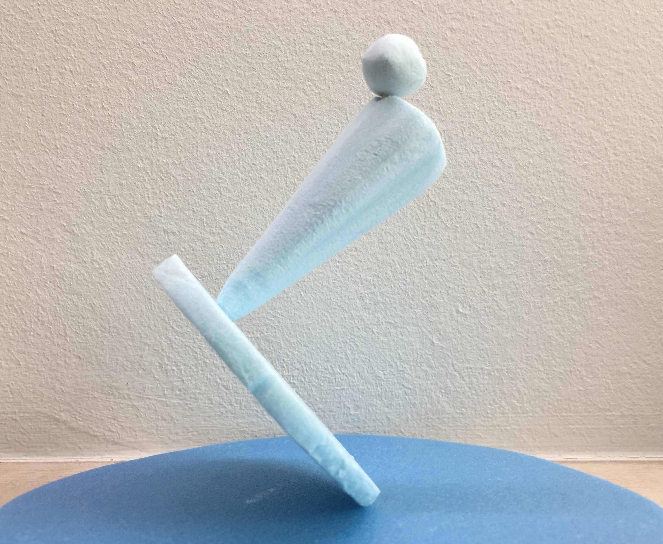
3D Sketch Model 1st attempt
This was the first 3D sketch model that I created. By targeting to place each volume at an angle, the overall model formed a zig-zag motion.
2D Sketch Analysis (1st Attempt) – Model Length ~ Model Diameter
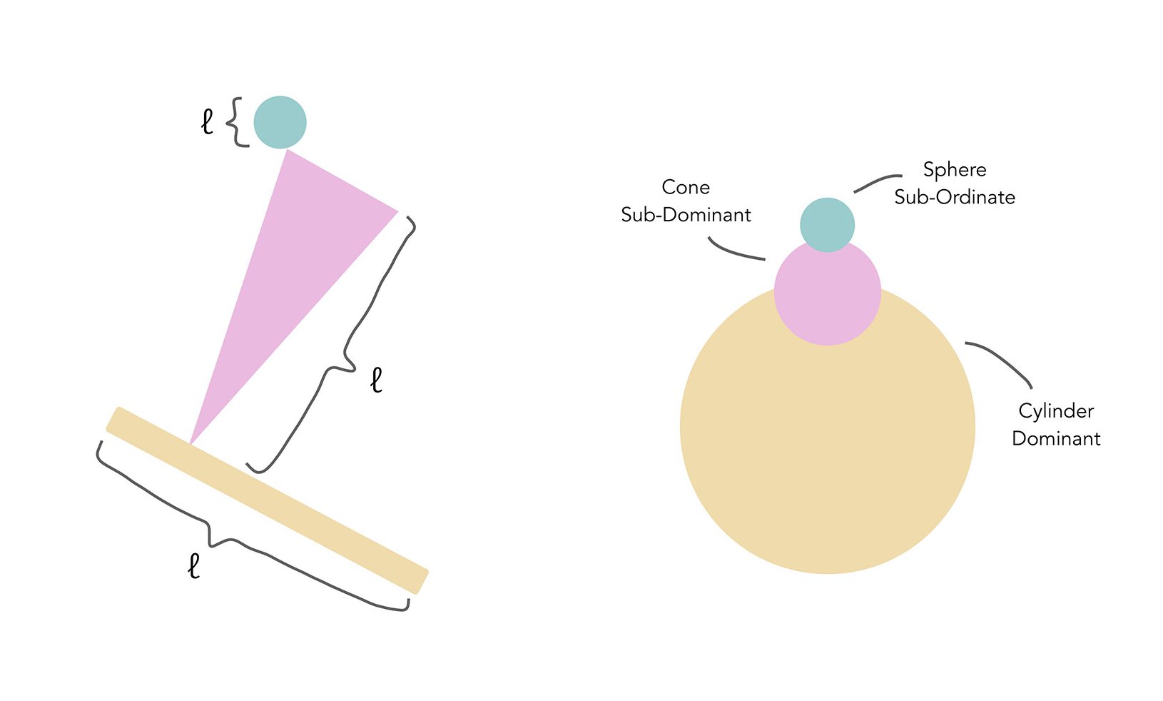
After creating my 2D sketch analysis and observing the length and diameter of the model, I realized that the dominant cylinder was too small in relation to the sub-dominant because the length was almost the same. To improve on that, I just had to change it to a much wider cylinder.
Second Attempt:

3D Sketch Model 2nd attempt
2D Sketch Analysis (2nd Attempt) – Model Length ~ Model Diameter
After altering the size of the cylinder, it has become more evident that the cylinder is the dominant volume while the cone is the sub-dominant.
Sketch Model 2
3D Sketch Model
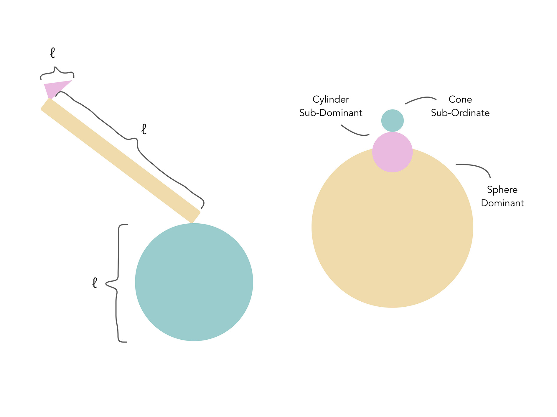
2D Sketch Analysis – Model Length ~ Model Diameter
For my second 3D sketch model, I realized that the length of my cylinder and sphere was quite similar so it would be better if the sphere was larger. As for the diameter of the volumes, the cone and cylinder turned out to be similar so it would be better if my cone had a thinner base.

SPRING Mindmap
Continuing on from the consideration and inspiration of Ikebana, we were also required to incorporate elements of a season into our models. Since my season was spring, I decided to brainstorm different elements of it to see which would fit best into my model.
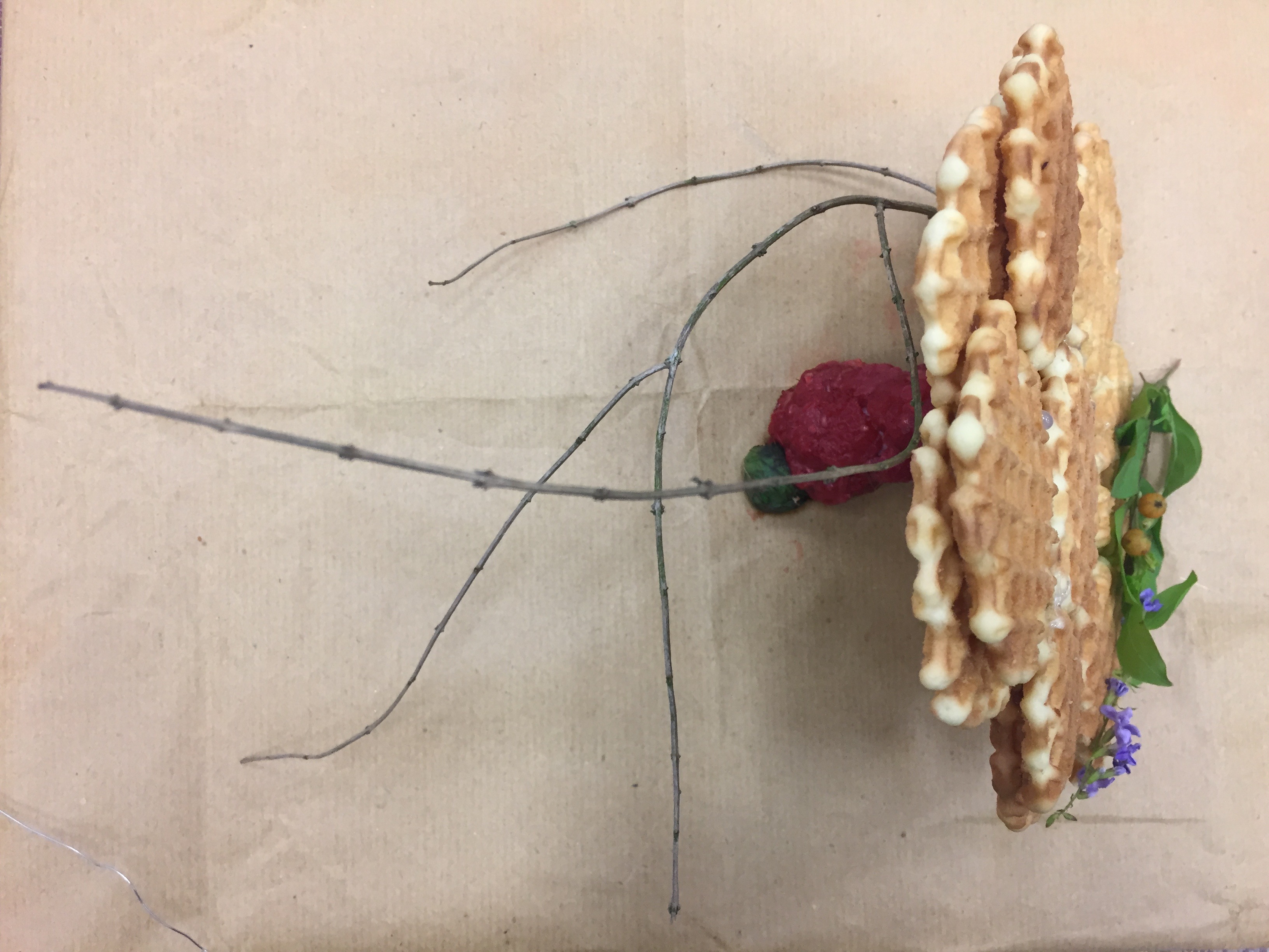
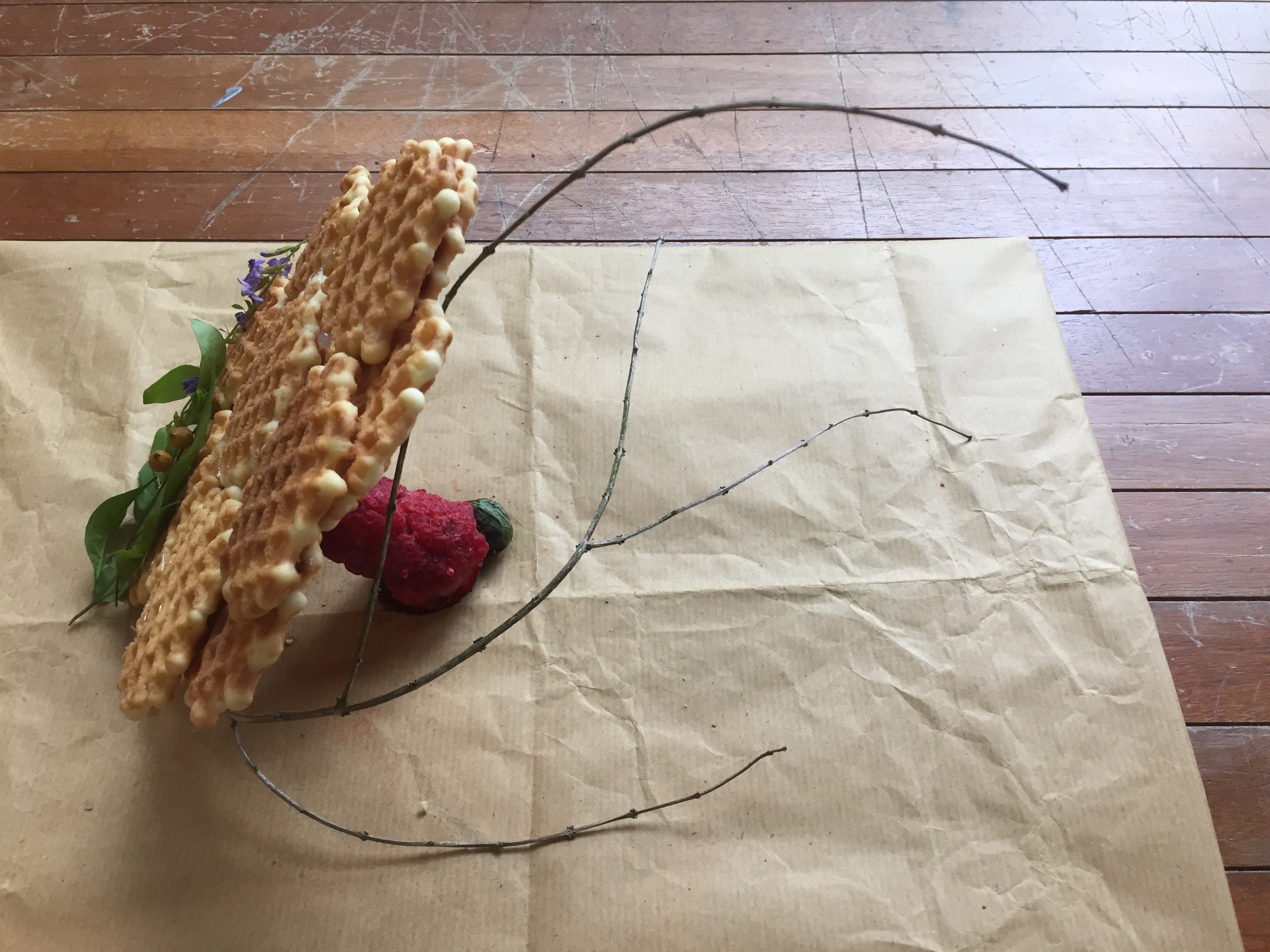
Final Food Model
The plan that I had for my food model was to create a dessert that incorporated elements of spring. Following the structure of my first sketch model, I wanted to make the dominant cylinder a waffle, followed by a raspberry cone and a mint sphere subordinate.
To create my cylindrical waffle dominant, I bought a pack of butter waffles and hot glue gunned them together in order to form a larger cylinder since I could not find a waffle that was larger enough on its own. Unfortunately, since it was quite a messy procedure, I did not manage to take photos of the process but this was how the waffle turned out to be.
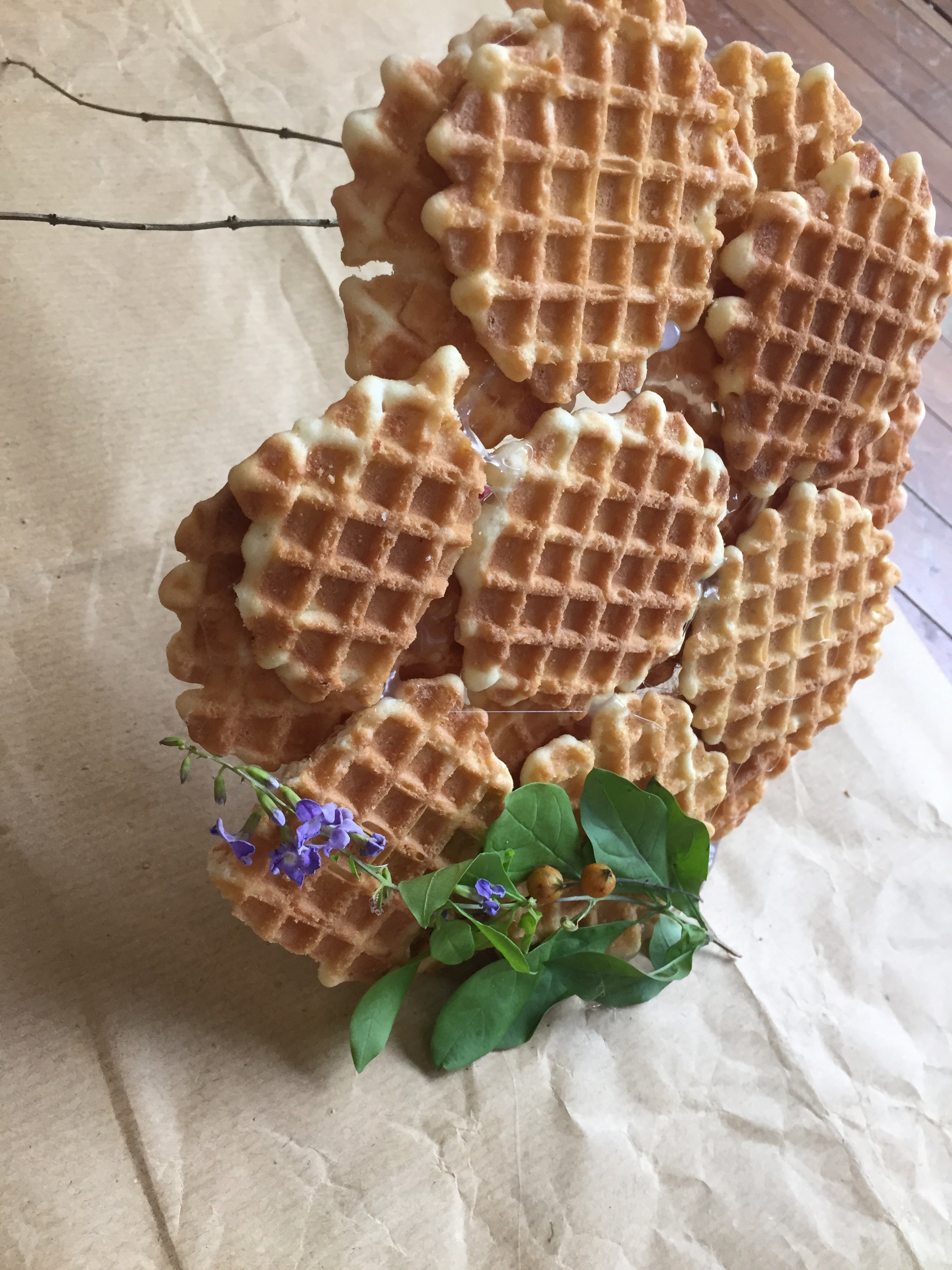
Waffle Dominant
For my raspberry cone, I decided on raspberry because it is a common fruit that is harvested during the spring season and I thought that its bright color would bring a refreshing pop of red into the model. To form the raspberry cone, I started off with a cone foam model as my base. From there, I took my half-chopped raspberries and placed them onto the cone, surrounding the entire foam cone. To keep the raspberries secure in place, I stuck toothpicks through the raspberry and into the foam cone.
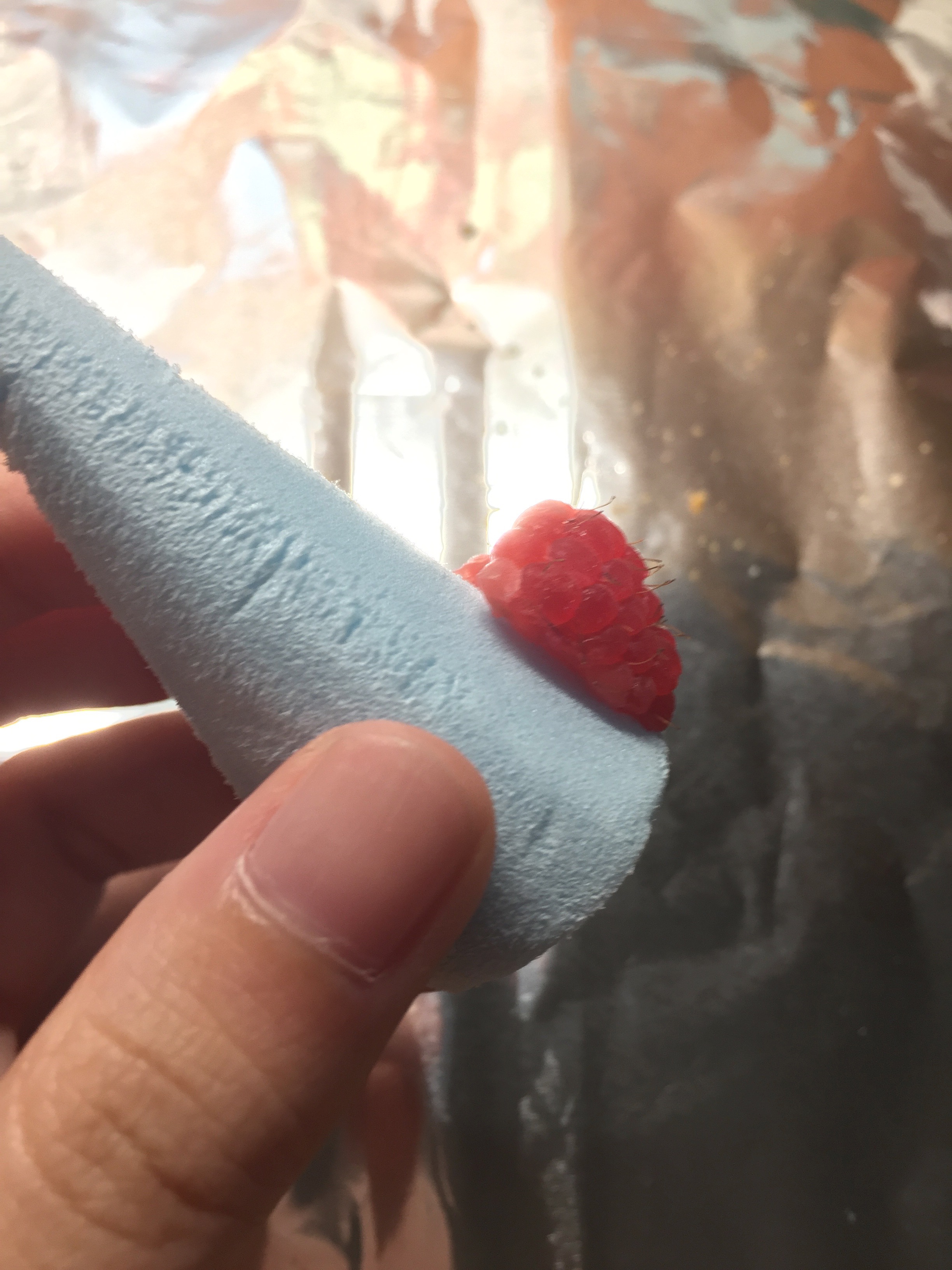
Half-chopped raspberry on cone
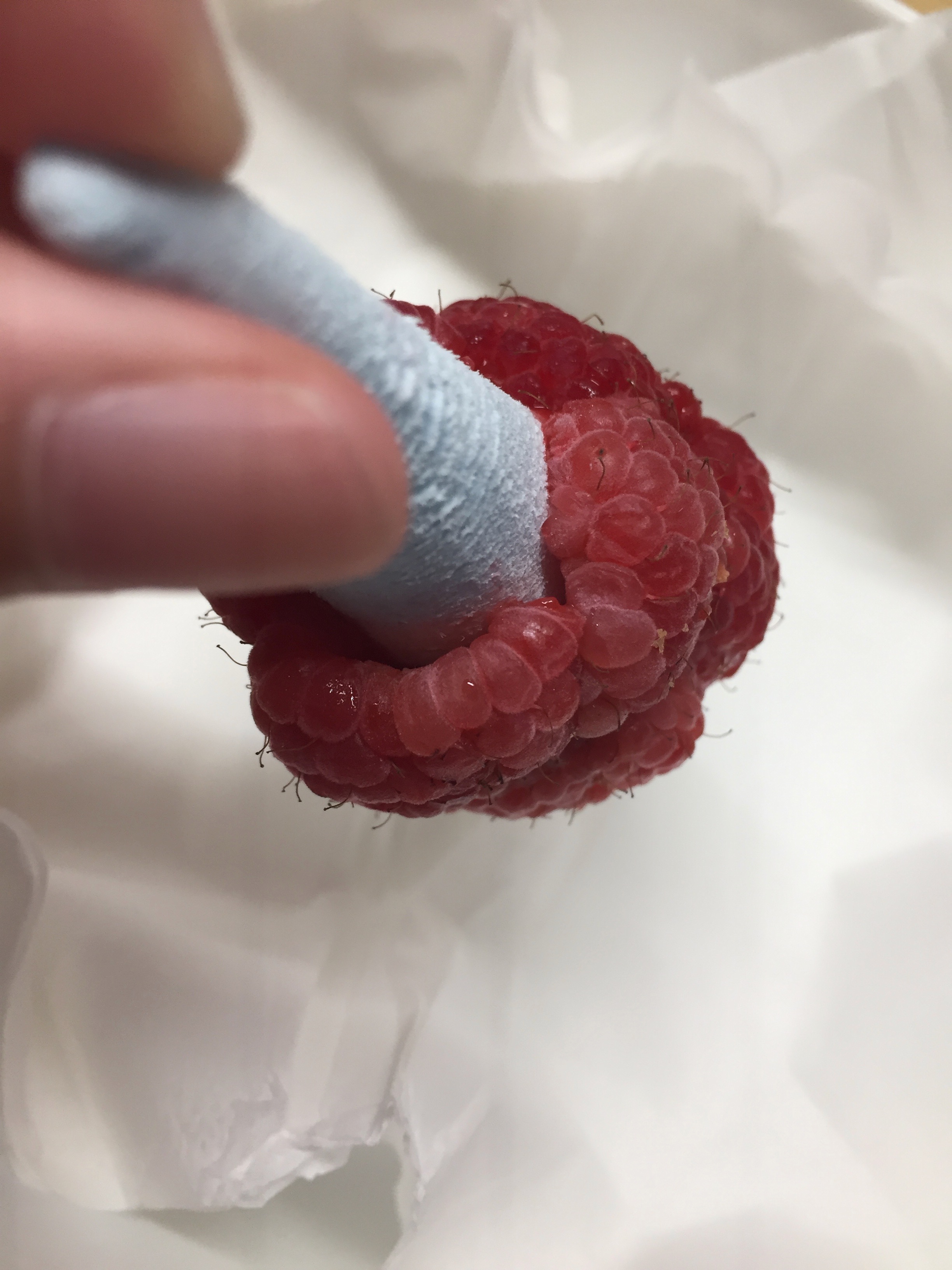
Surrounding the foam cone
Lastly, for my subordinate, I decided to create a tiny mint sphere ball to add a touch of mintiness into the desert. Working with a box of mint leaves, I wrapped the leaves over and over each other until it formed a small sphere. To hold them together, I secured it with toothpicks again. Unfortunately, the leaves started turning brown after bringing my model to class so the green wasn’t as prominent when the model was looked at as a whole.

After a long process of piecing each component together, this turned out to be my final food model. It incorporates the three rectilinear volumes, an extra object which is the purple flower on the waffle and lastly a branch. I included the purple flowers and leaves as an added touch of “spring” and choose to curve my branch towards the direction of the waffle to create a nice flow as well as to form a void within that area.
However, as you might have noticed, the arrangement of my volumes here is different from the structure of my first sketch model.
Initially, this was the structure that I planned on following for my food model. However, due to unforeseen circumstances when piecing the food volumes together, it was not very practical due to the weight of the food. After struggling to hold my waffle cylinder up on its own, I realized that the raspberry cone was too heavy and that the waffle did not have enough support for it. Since the original plan did not succeed, my backup alternative was to shift my cone underneath the waffle so that they could support each other up (making them dependent on each other).
 Despite the struggles that I had with the food, especially with the last minute changes of the model structure itself, I am very glad that it all turned out all right. Overall, this project was very fun and it was very inspiring to see everyone else’s model and how they choose to include food differently 🙂

Moving into Project 2, we explored semiotics which refers to the study of signs and symbols along with their use of interpretation. Different types of signs include an icon, index and symbols. Icons resembling the thing it presents, indexes implying another object and symbols which are purely conventional. During class, we also looked into some artists including Ferdinand de Saussure, Charles Sanders Peirce and Roland Barthes.
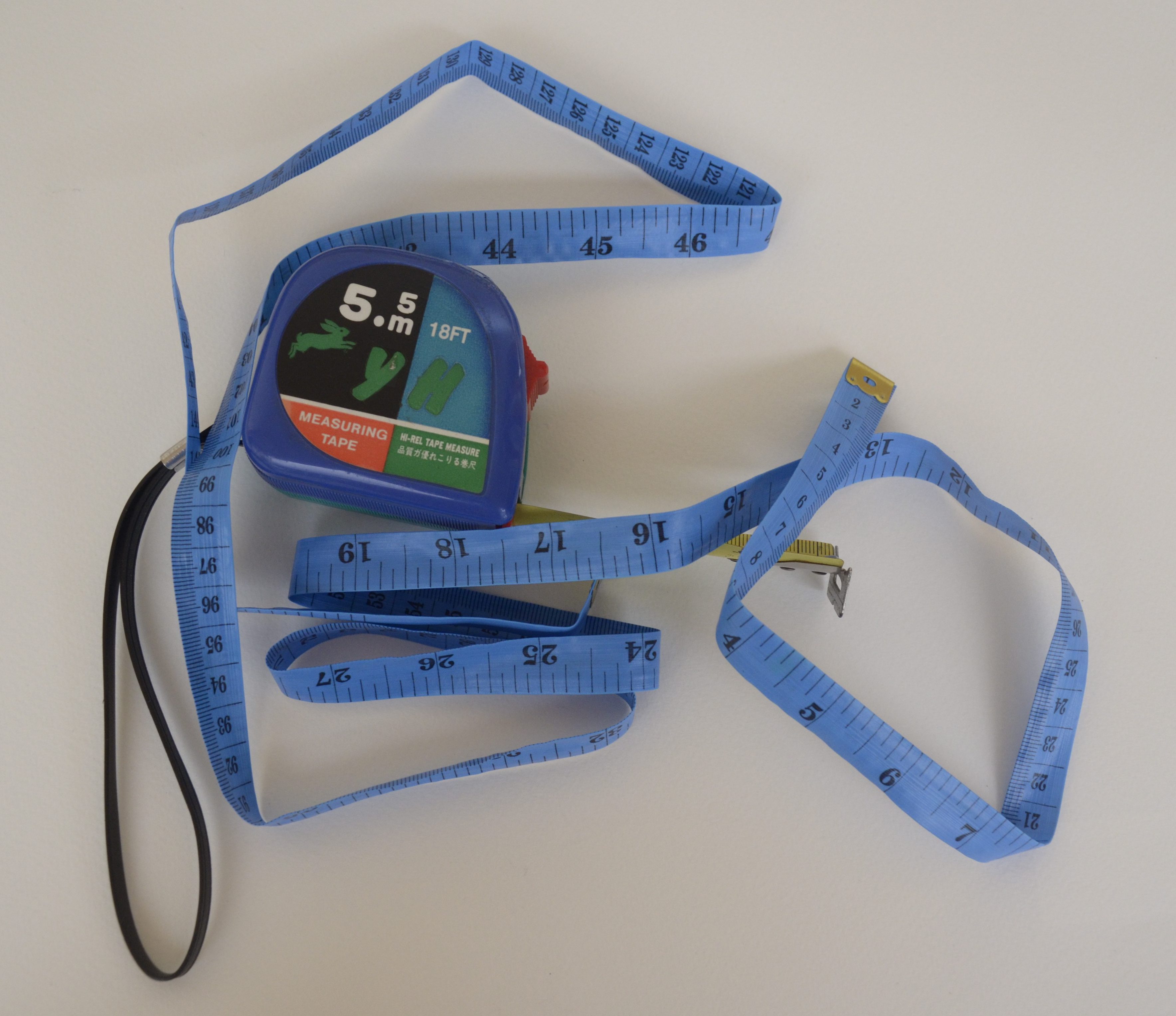
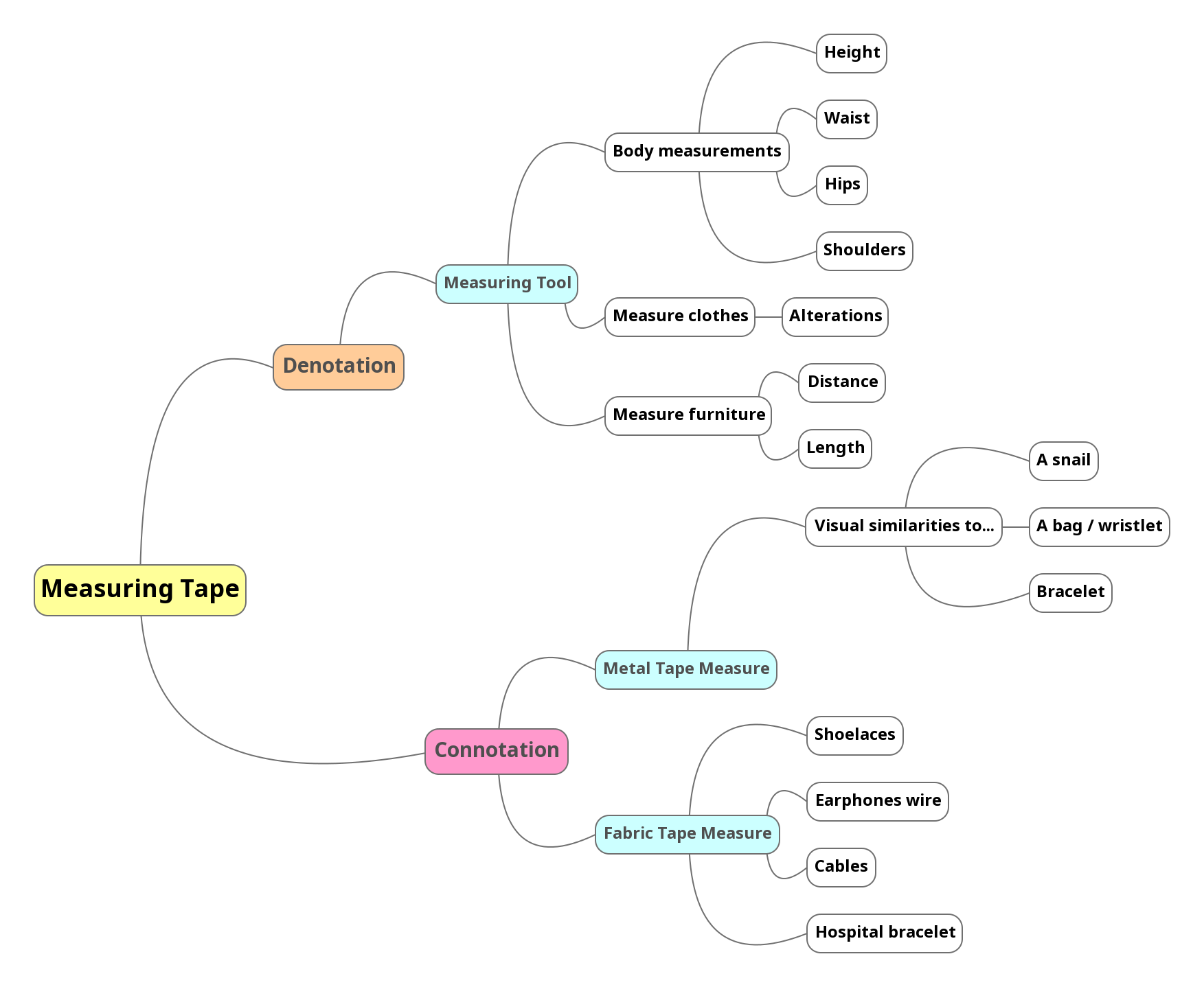
For the series of images that we were to produce for this project, the aim is to study and apply how semiotics affects the interpretation of the image. The object that I had picked was a measuring tape. This mind map contains ideas that came to mind revolving around measuring tapes.
Mindmap ~ Ideation
After my consultation with Lei, for task 1 I decided to focus on capturing the contrast between the stiffness and softness of both types of measuring tapes. While for task 2, I decided to focus on the topic of body image.
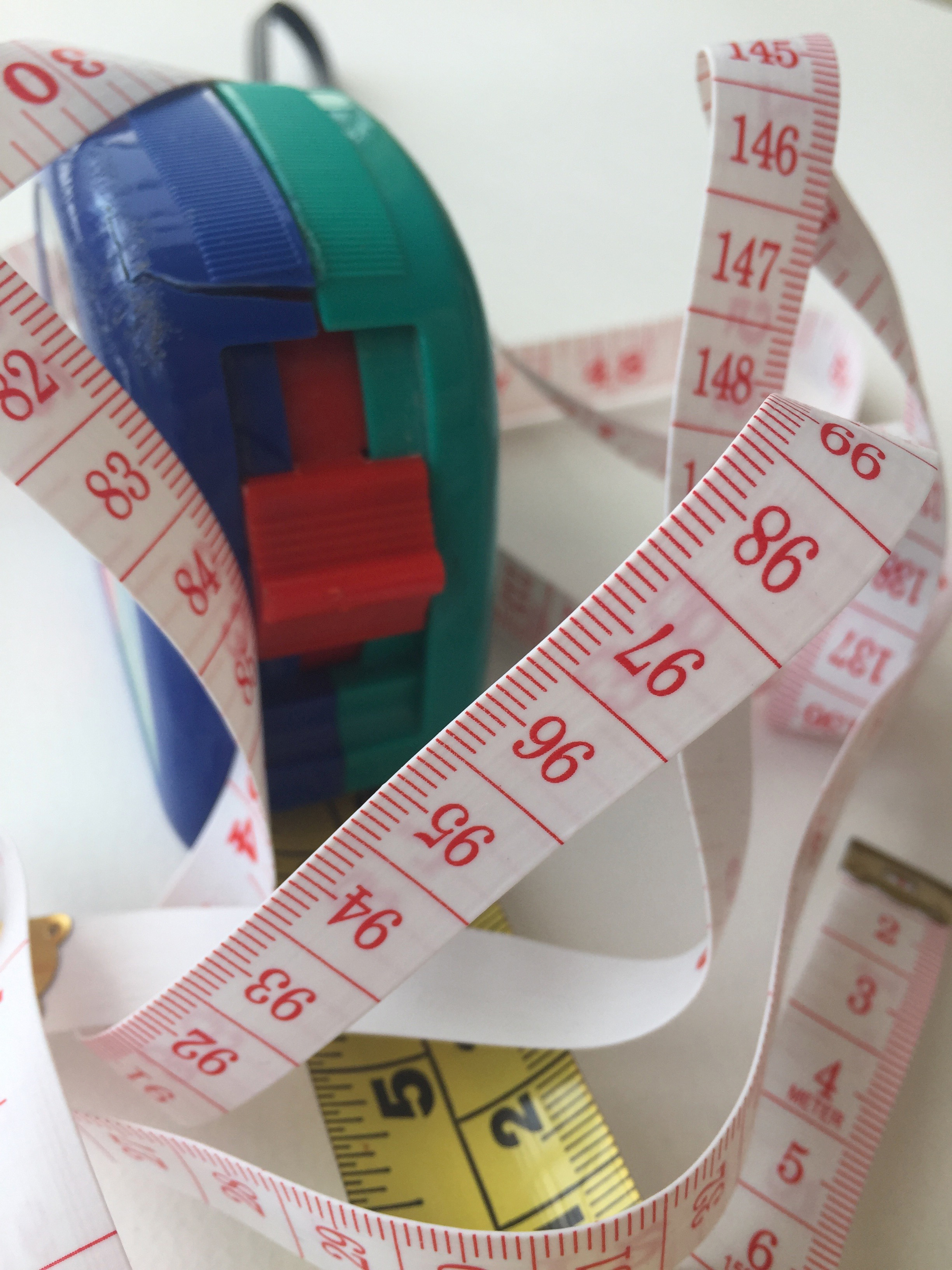
Image 1
The first image in task 1 captures the physical attributes of both kinds of measuring tape to portray contrast between the stiffness of the industrial tape measure and the softness of the fabric tape measure (as it wraps around the other). I chose to approach this image with a close-up shot in order to capture details such as the cracks and scratches on the metal tape measure to show the rougher use of it.
Image 2
This second image depicts the flexible measuring tape in a fashion context where it is placed amongst the presence of other tools that are used for tailoring clothes. In this low angle shot, the focus on the starting numbers of the measuring tape leads the viewer’s eyes into the rest of the image in the background. The warm tones present in the image was set up in order to complement the red number and line details on the tape.
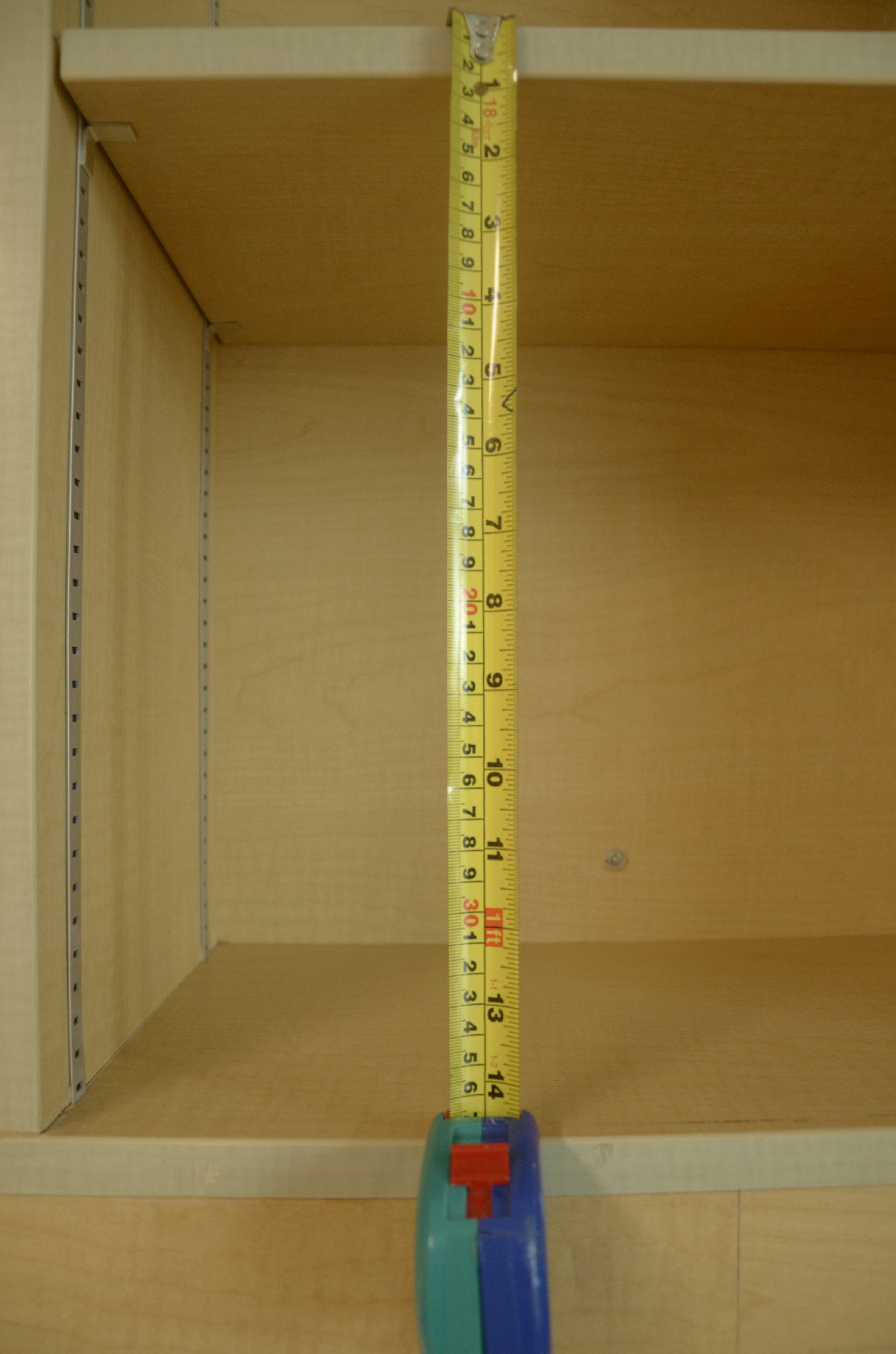
Image 3
The last image for this task captures an eye level shot of the metal measuring tape in use for measuring furniture. The intent was to portray its stiffness through the presence of lines and depth and is taken at eye-level as we normally view it at for accurate reading. The image captures the practical function of the object.
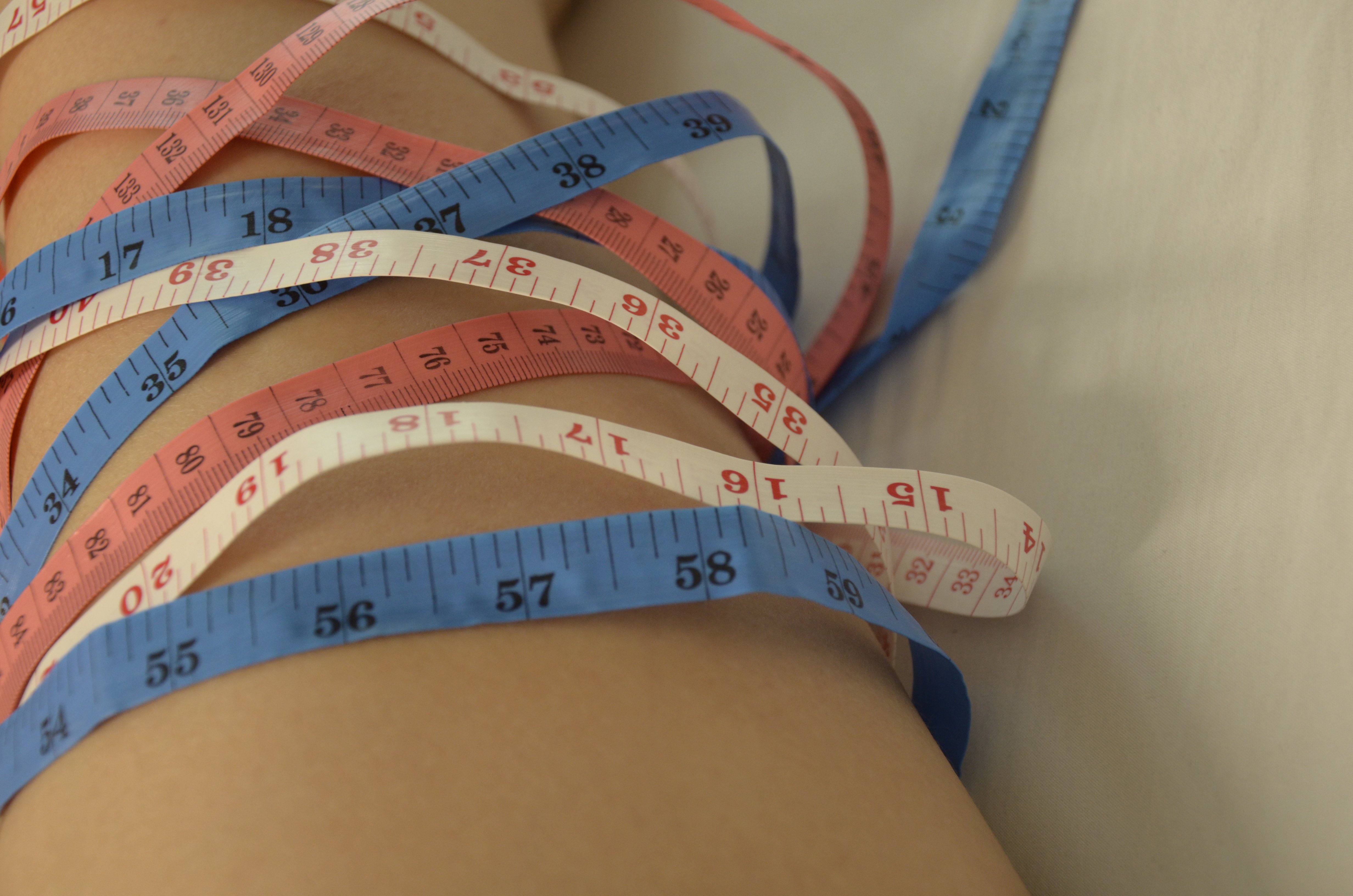
Image 1
Referencing the cultural stigma in today’s media revolving around people, especially females, achieving “the ideal weight”, this image portrays the overwhelming nature of numbers through the use of not just one but three different measuring tapes. In order to convey the obsessive thought over wanting to lose weight, the close-up shot focuses on the rows of numbers.
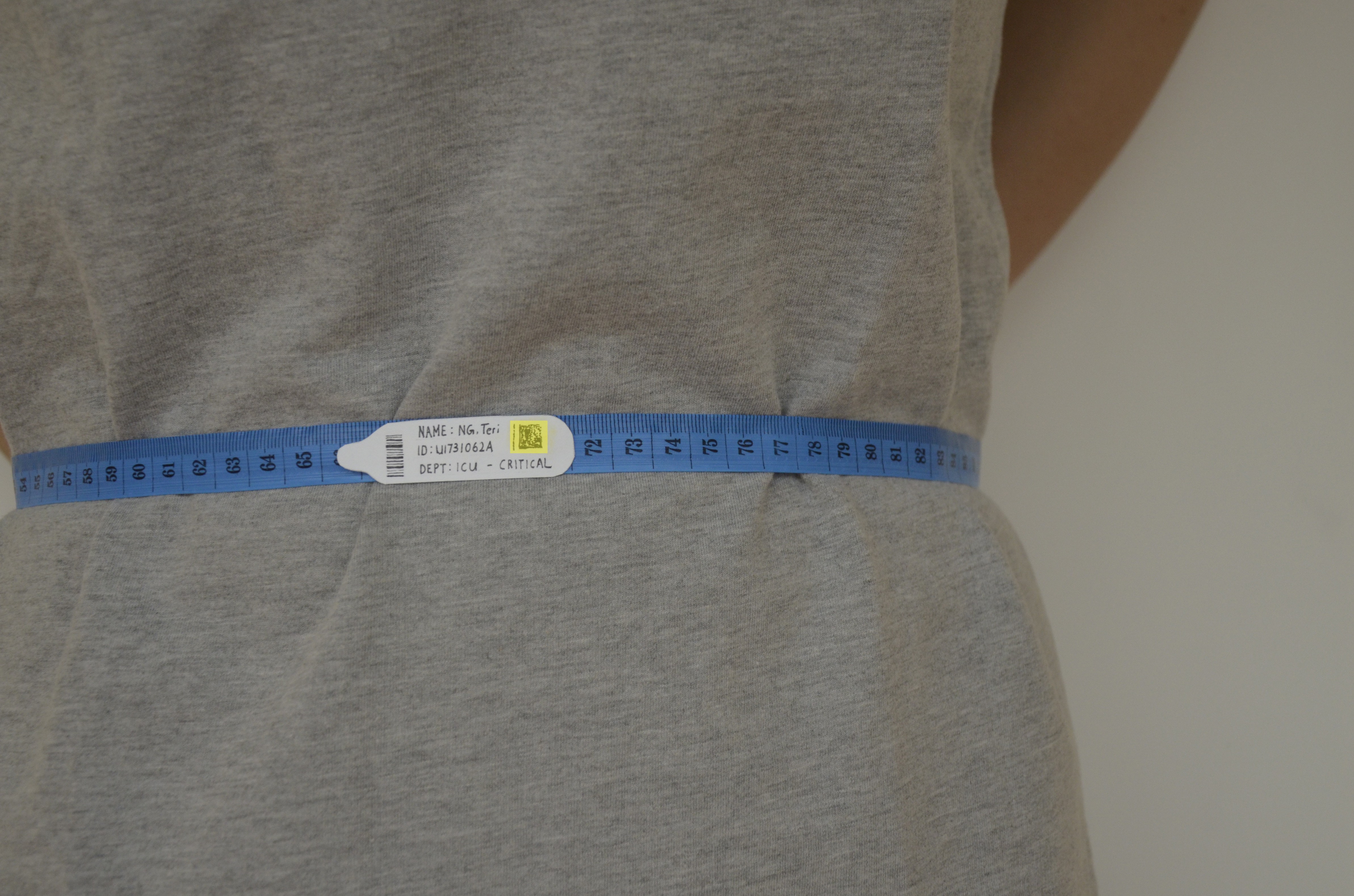
Image 2
Following the theme regarding the “standard of numbers”, I subverted the measuring tape into the context of a hospital bracelet. Replacing the regular band around a patient’s wrist, I stuck on a label which I created stating my name, identity number and condition onto the measuring tape. In this image, I subverted the object as a bracelet into a band of a larger scale that wraps around the waist. I decided to choose a blue measuring tape specifically as it a colour normally present in a hospital environment. The cool tones in this image such as grey and blue were also used to bring out a gloomy atmosphere.
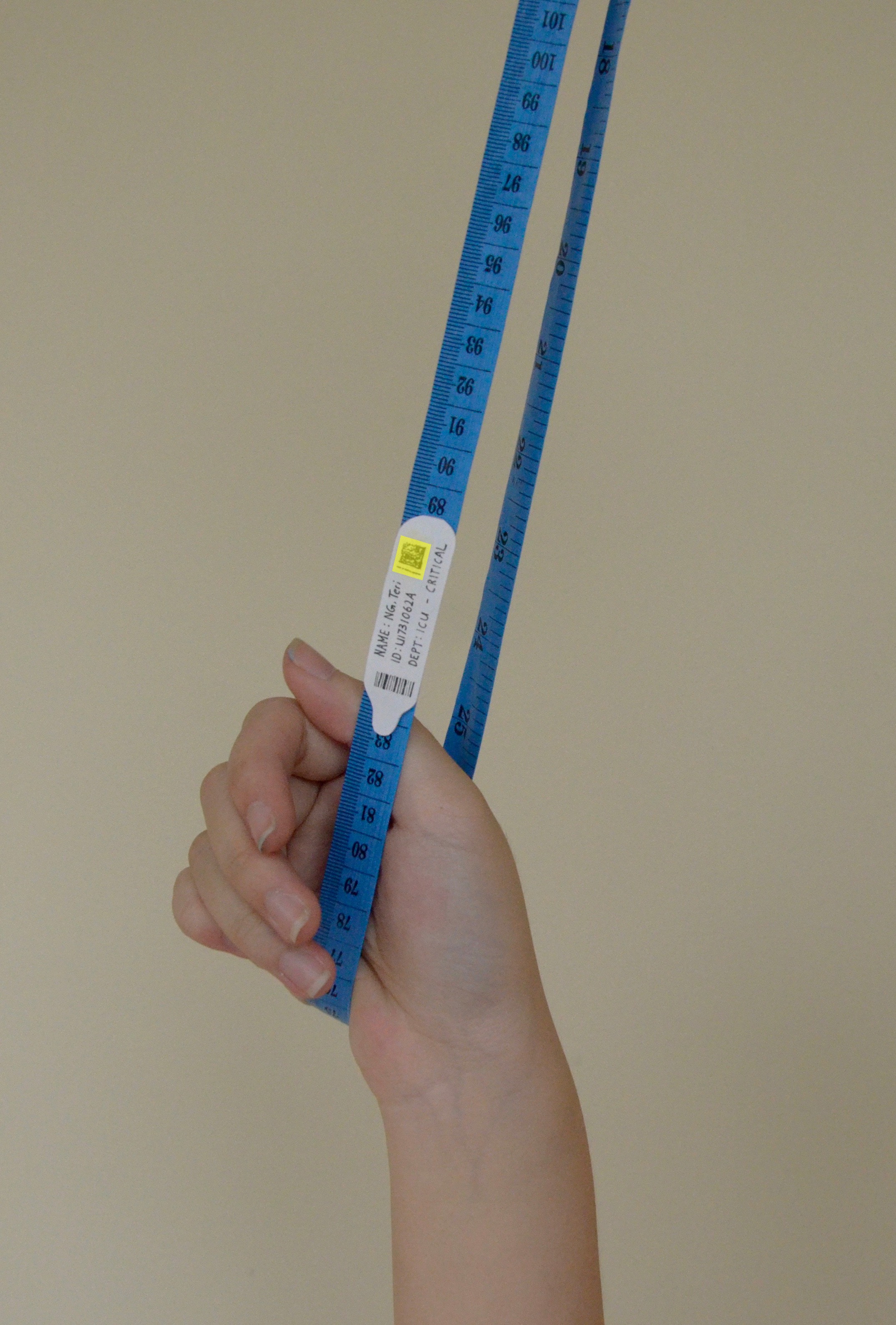
Image 3
This image was selected for task 3 as my A2 poster. Encompassing the same intentions as image 2 in task 2, the measuring tape now portrays connotation of death and is symbolic of a noose. Since the last three images in this project flow as a story about the consequences of giving in to society’s standard of an ideal weight as a key to beauty, I wanted the last image to convey how people’s obsession with weight can reach a point of “breaking” where it leads to a critical state. I included a yellow background over the QR code because, in hospital terms, the colour yellow on someone’s bracelet means that they are very weak and will have the tendency to fall.
Not only does the measuring tape represent negative connotations of death as a noose, it also conveys an image of the patient trying to cling onto anything for support.

Unfortunately for my A2 poster, the colour that it was printed out in turned out very different from the original hence changing the effect of it. This took my awareness that I should check for the colour coordination for different printers in the future.
Wholesome Wave: Eggplant, Bananas, Carrots
Photographer: Anderson Santos
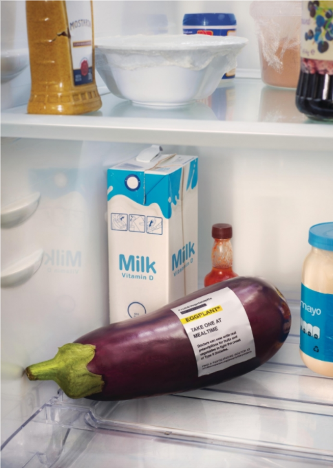
http://www.adeevee.com/2017/07/wholesome-wave-eggplant-bananas-carrots-print/
Amongst a series of photographs titled “Wholesome wave” by Anderson Santos, this image portrays an eggplant as a medication. Since presenting on this image in class, I realized that the label that I created somewhat resembled the medical label in this series. Despite the differences in hospital bracelet or medication design labels everywhere, it is a template that can be recognized universally and hence viewers tend to not need prior knowledge about these objects to understand the image.
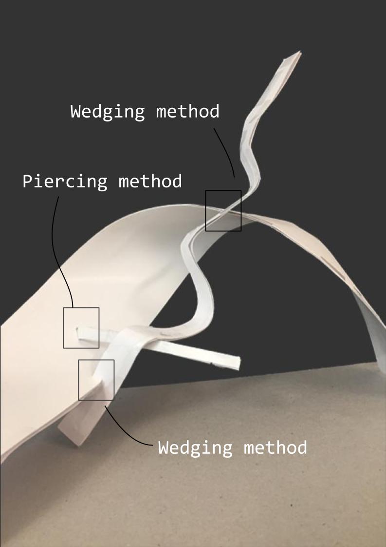
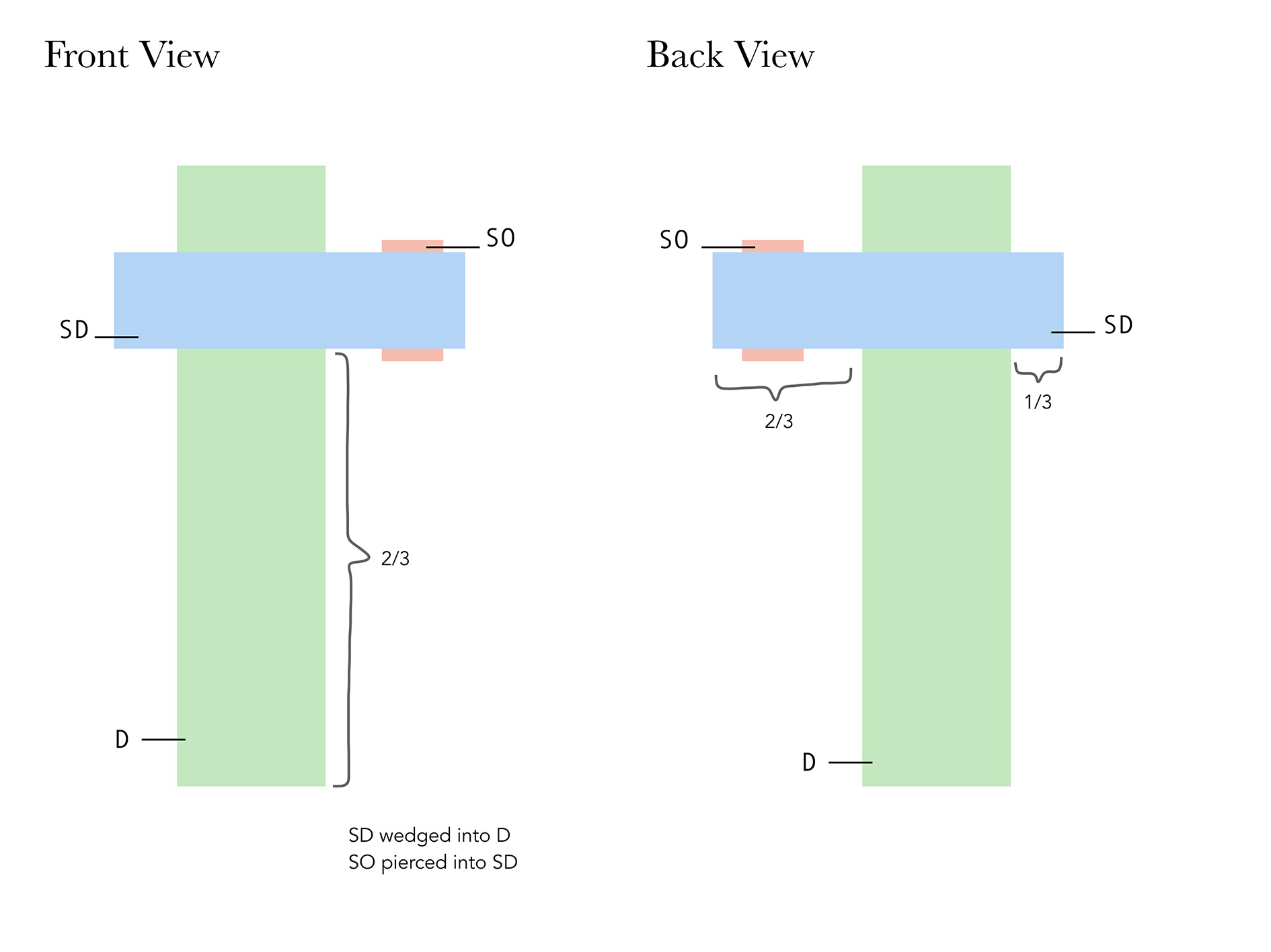
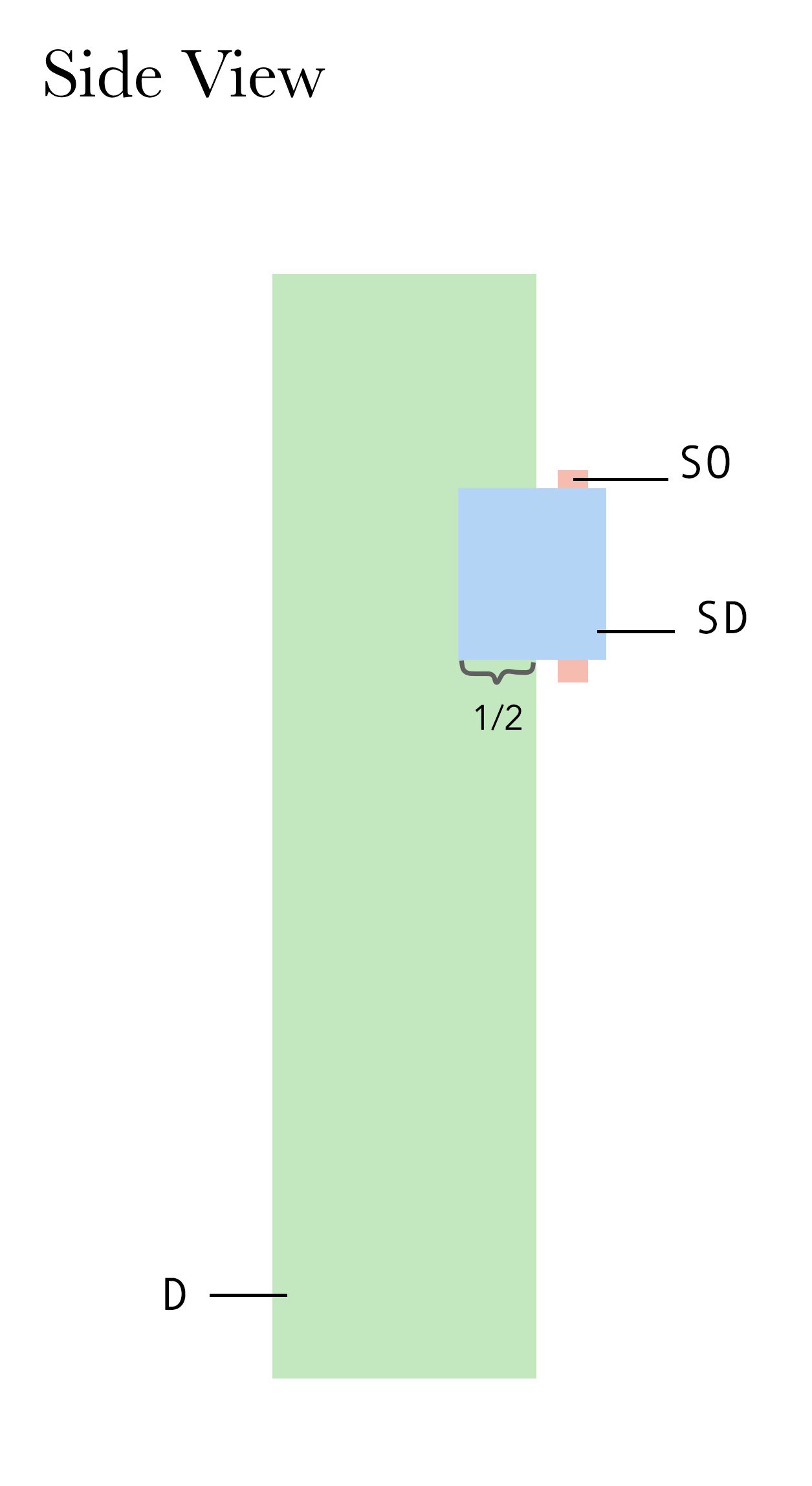
Following our second 3D lesson and first consultation, we learned about different ways on how to mount our individual rectilinear boxes together neatly. After a discussion about my first attempt at creating two sketch models, Cheryl advised me on how to further improve them to better represent my term Hirerachy as well as improving the technical qualities. After speaking with her, I thought more carefully about the sizing of my boxes, the relationship between each of the axis, and how the piercing and wedging method could allow me to construct more interesting compositions.
Methods of creating our 3D models
Wedging Method: When two shapes are slotted into each other
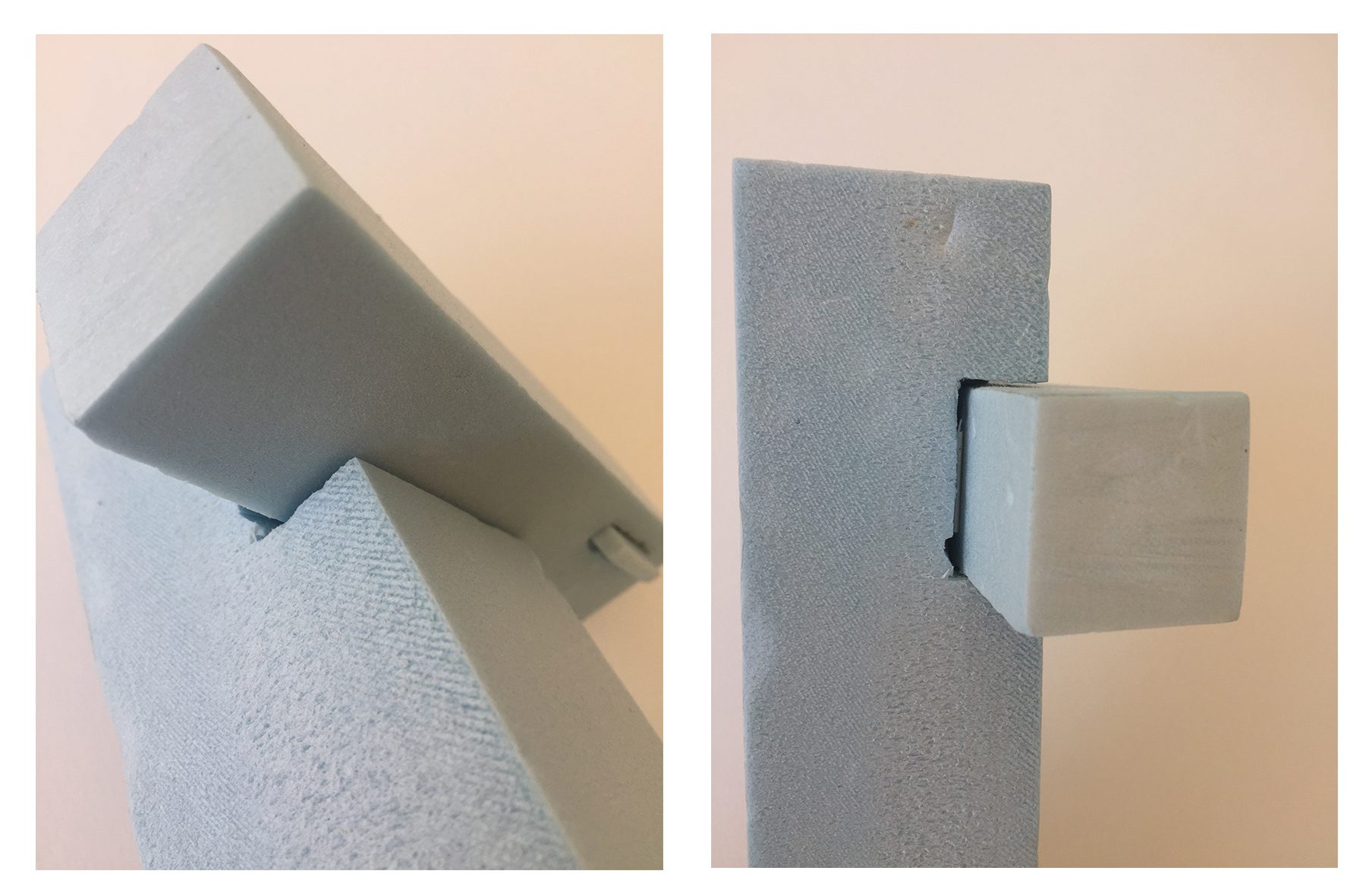
Piercing Method: When a volume goes through another
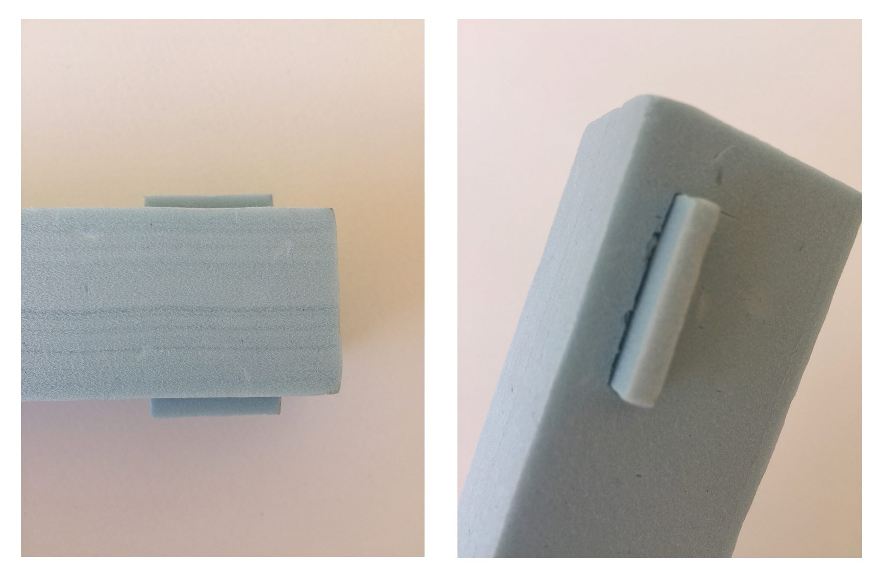

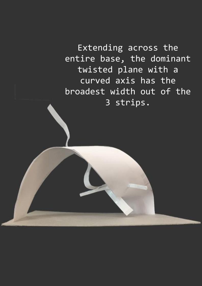
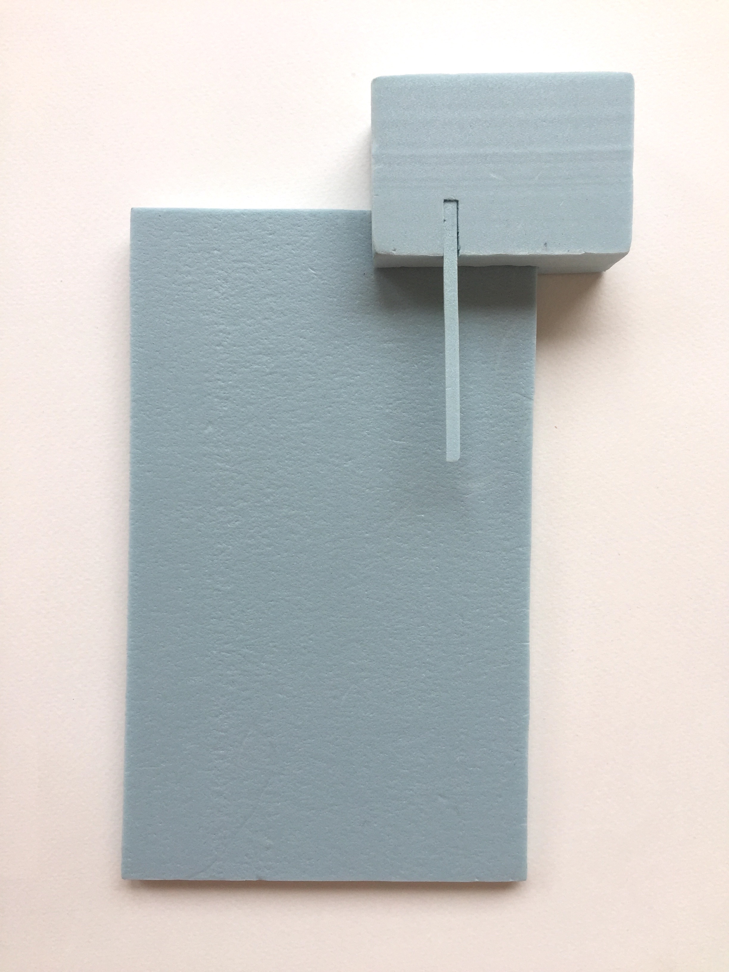
Blue Foam Model 1
In order to clearly represent each volume in my sketch models, I color coordinated the boxes for easy reference.
SO: Sub-ordinate (Long and thin)
SD: Sub-dominant (Long with a square cross-section)
D: Dominant (Long with a square cross-section)
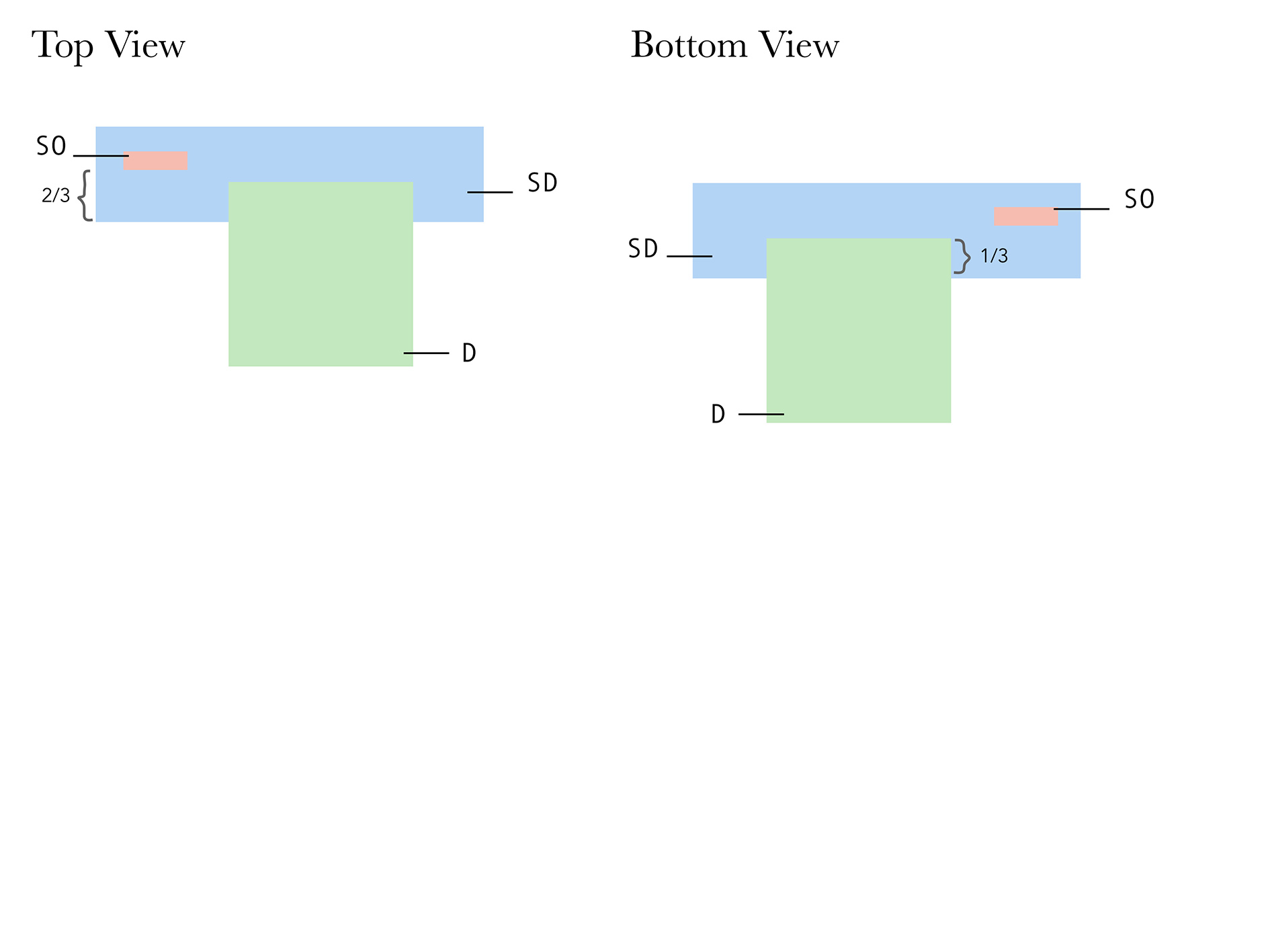
After analyzing this sketch model, I realized that although the SD and D varied quite a lot in size, it had very similar properties which tempted me to change the dimensions of either one. However, one advantage of this model is that the subordinate can be seen from all angles.
The dominant volume appears clearly as the largest volume except when the model is viewed from the top and bottom. Perhaps if the SD was slightly thinner, the dominant would seem larger.
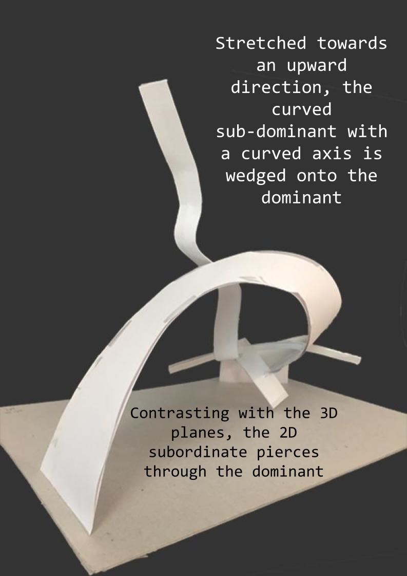
Blue Foam Model 2
SO: Sub-ordinate (Long and thin)
SD: Sub-dominant (Rectangular)
D: Dominant (Wide and thin)

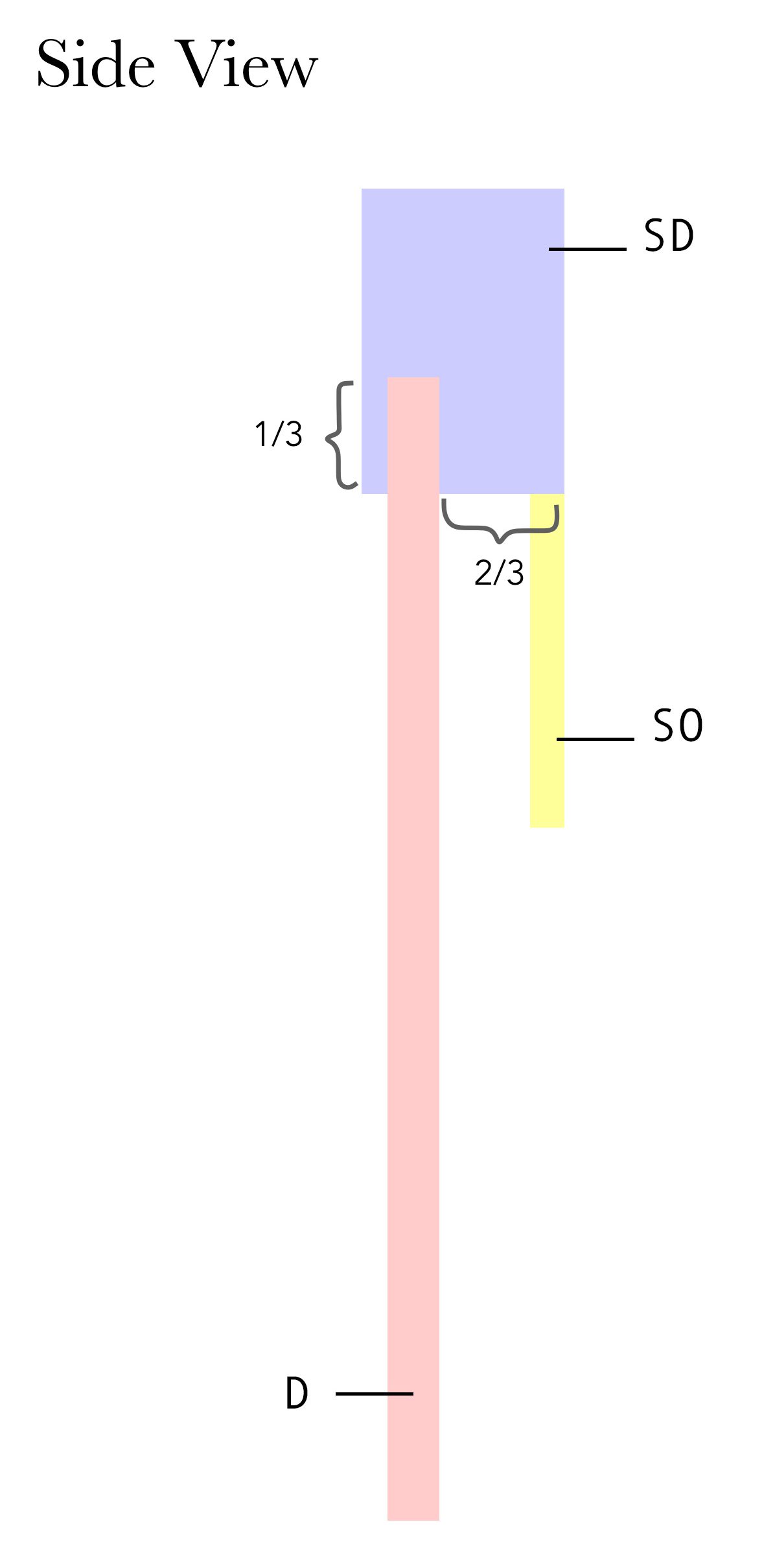
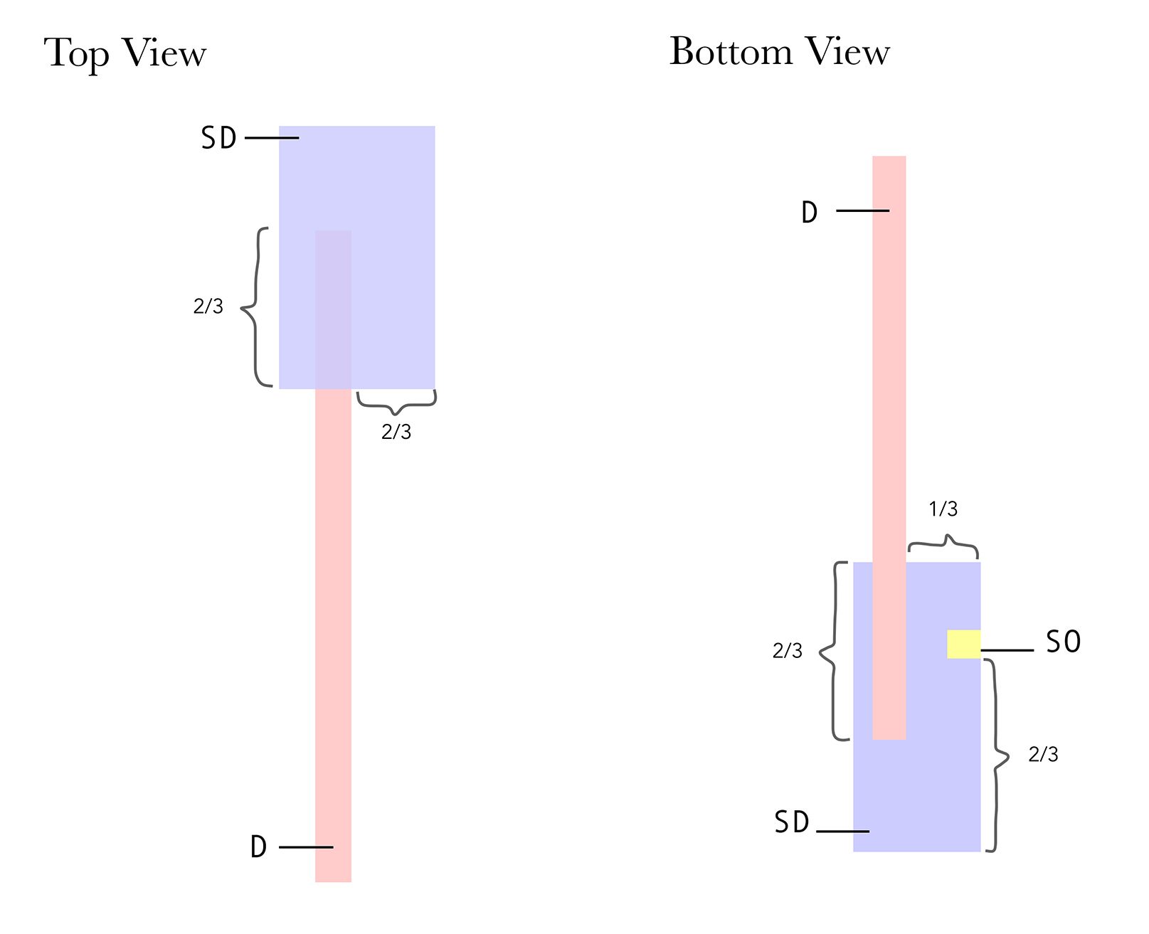
In this model, since the end of my SO was wedged into the SD and not pierced, it was not visible from the top as well as the back. However, by judging the visual qualities of both models, I actually prefer the second one because the three rectilinear shapes were of greater contrasting volumes compared to those in the first model. I ended up using the second model to create my final Pandora.
Hierarchy – Food Pyramid
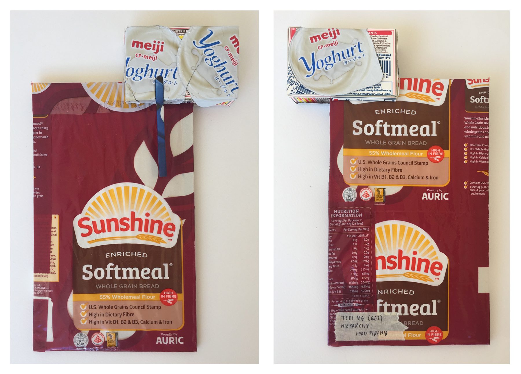
Front // Back

Side // Bottom
D – Healthiest (wheat bread)
SD – Eat moderately (dairy products)
SO – Consume the least (chocolate and sweets)
Before deciding my final theme (Food Pyramid), the term “hierarchy” generated other ideas in my mind such as:
Eventually, I thought of the idea of incorporating the food pyramid into my choice of materials as there are many food packages I could choose to work with from the pyramid’s various levels.
http://www.safefood.eu/Healthy-Eating/What-is-a-balanced-diet/The-Food-Pyramid.aspx
With reference to this particular food pyramid, I selected food from the first, fourth and fifth tier.
Dominant
As seen in my final model, I choose to cover my dominant in the plastic package of whole grain bread. The main focus was to include the healthy facts about it as well as the nutrition information chart stated on the packaging.
Since there were areas of the packaging that was transparent, I wrapped my blue foam in some paper to create a white base.

Wrapped blue foam

Sub-dominant & Sub-ordinate
For my selection of dairy products, I chose to use the lid of yogurt cups as well as parts from milk cartons. The yogurt lids created a crinkled texture while the carton was smooth and flat.


Nutrition Fact Label from Milk Carton
Cover blank areas in between the yogurt lids
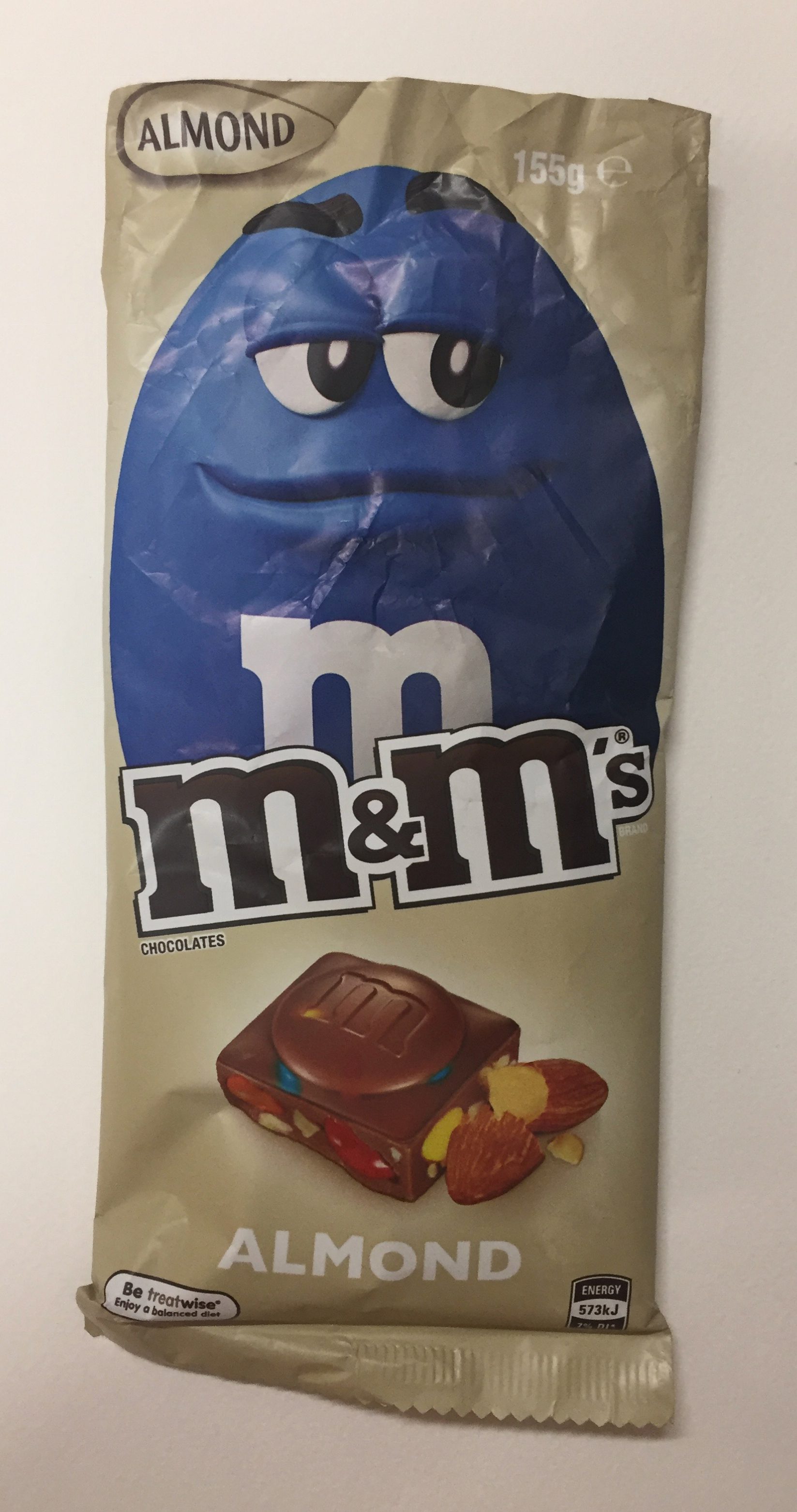
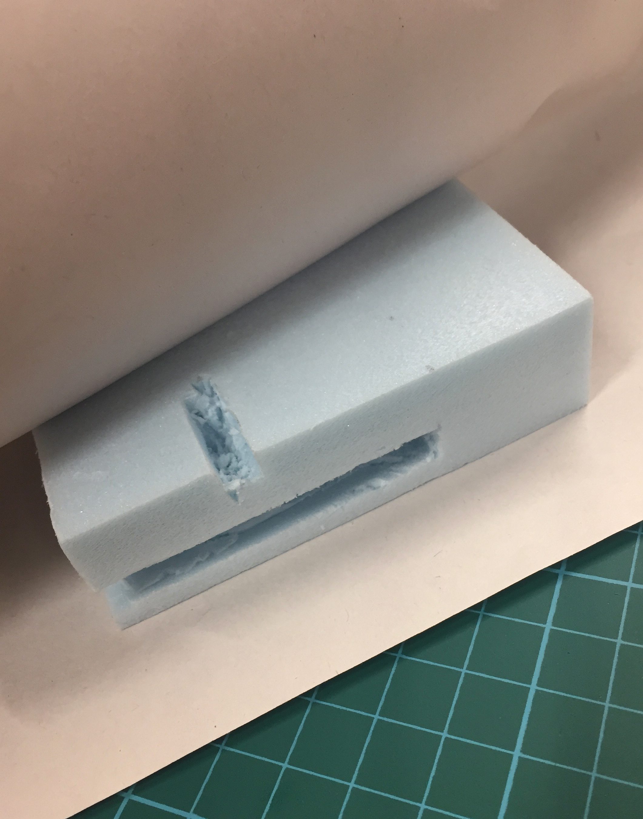
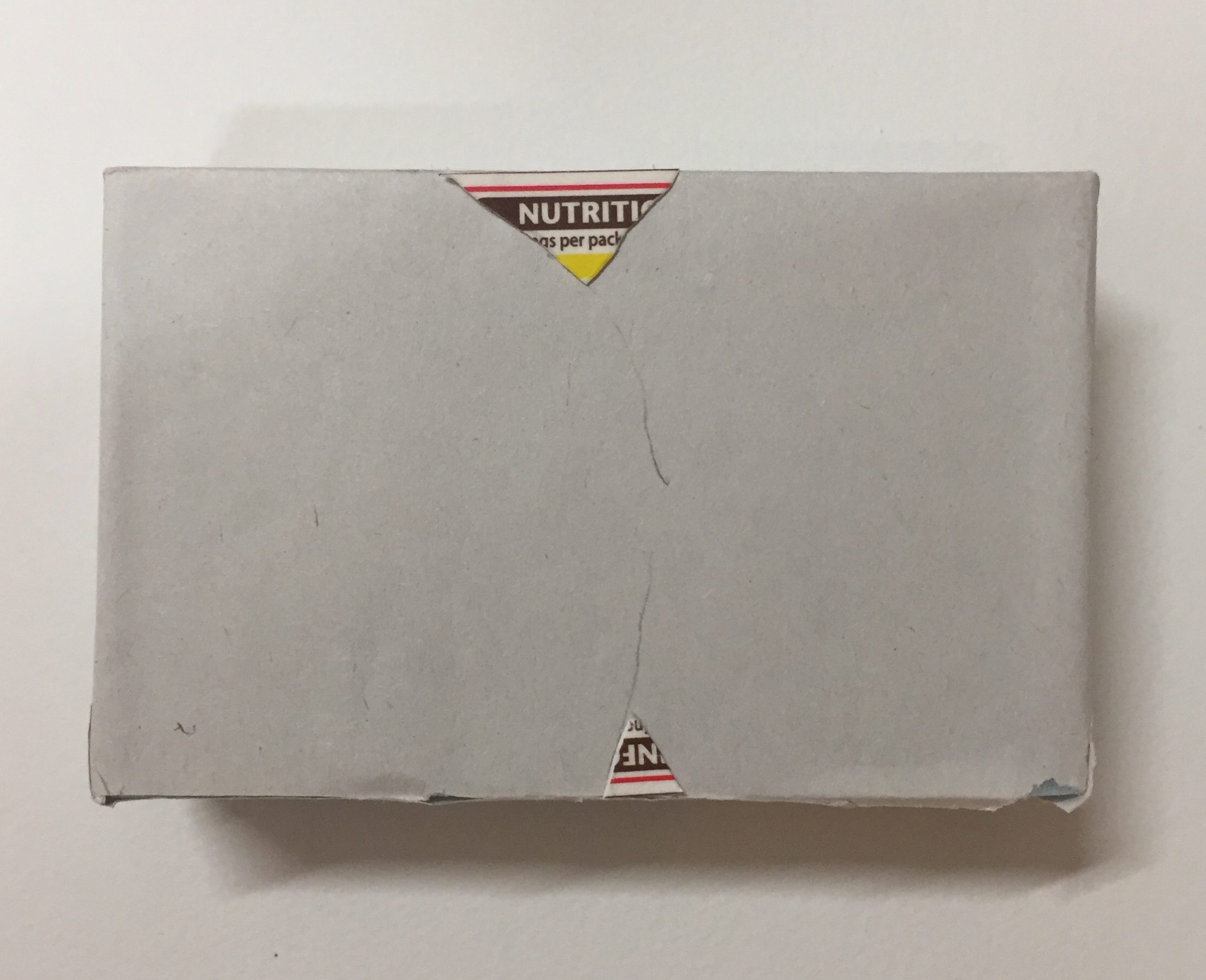
M&M chocolate bar
Lastly, for my SO, I decided to use the packaging of an M&M chocolate bar. Unfortunately, the size of my SO was very small that there wasn’t much surface area for me to cover with the material. Improvements for this model would be to possibly pierce my SO through the SD so that it could be visible from all angles and also to enlarge my model in order to have enough surface area for the material.
For my large application, I thought my model could fit the structure of a shower. With a glass backing and wood covered heater, this shower could belong in an outdoor area.
Shower design:
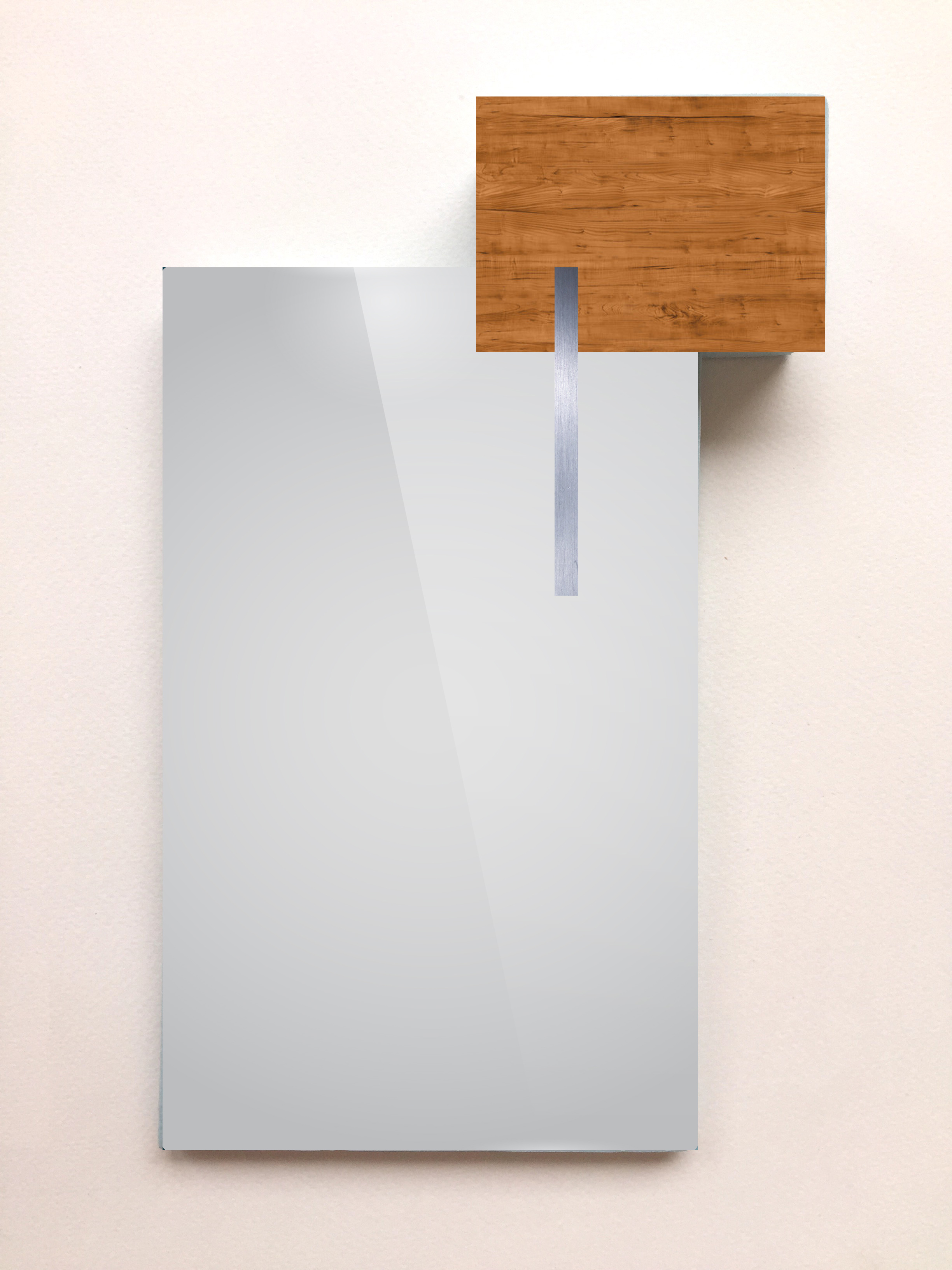
Glass backing, Wooden Heater, Metal shower head
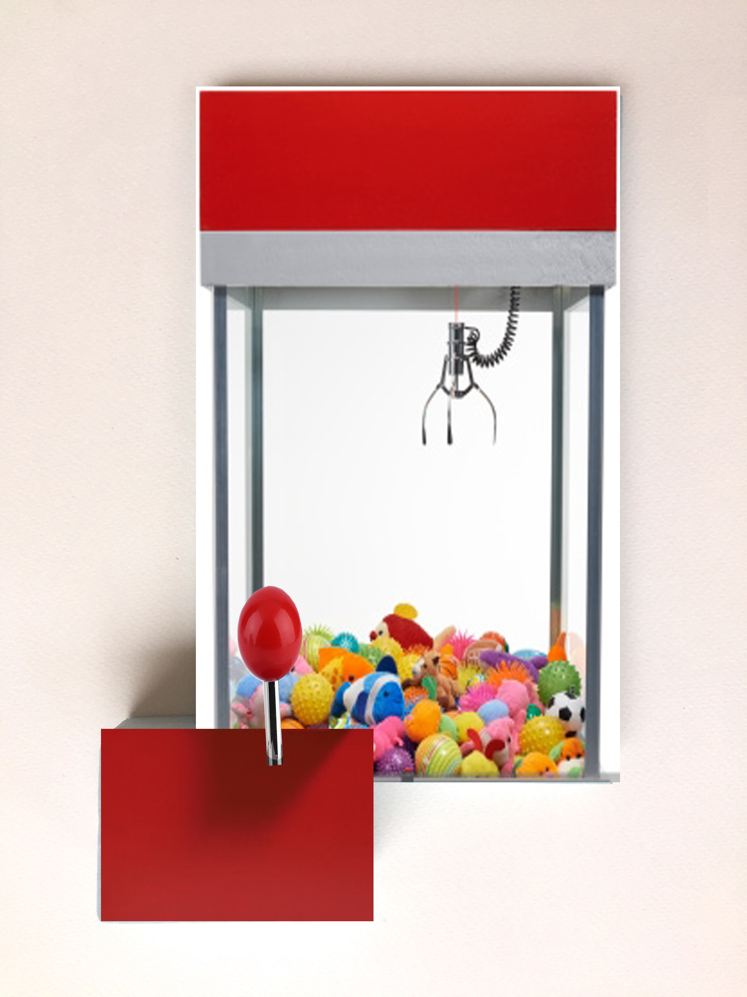
For my smaller application, I flipped my model upside down and turned it into a small claw machine. With the joystick being subordinate, the support of the machine will be the subdominant and the plastic top containing toys would be the transparent dominant.
Claw Machine:
For this exercise, I took images of Daphne at different locations in the school. We were to consider which attributes about our partner we found most interesting and convey it through different framing angle and shot scale. Out of the many shots, these are the 3 that I choose!
The first two images were taken in a stairway at level B1 but I kind of cheated for the last one as it was taken outdoors. I really wanted to include a close-up shot and the only one that was captured nicely with nice lighting was the last image.
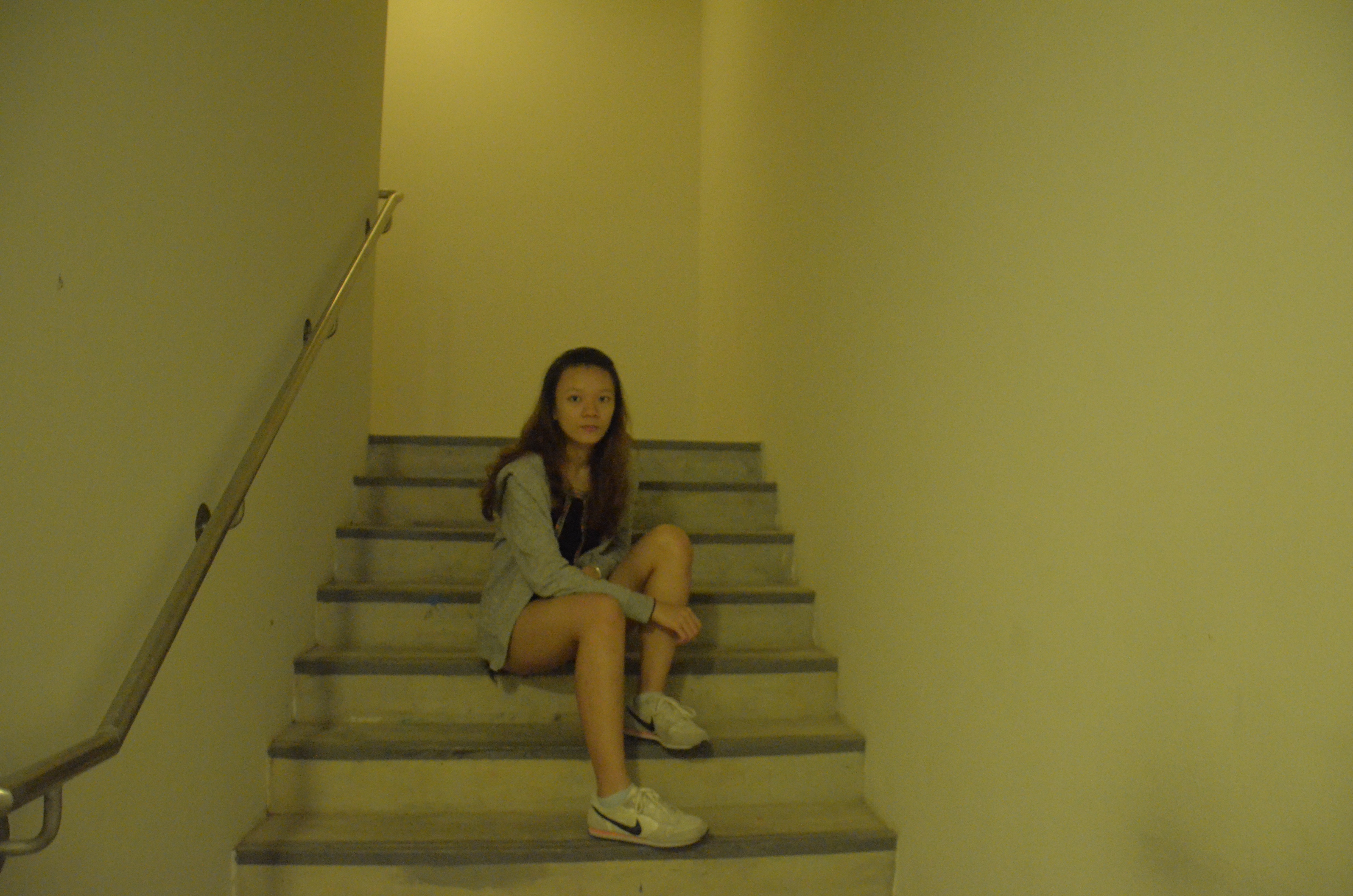
After learning more about Daphne after the first 4D project where she spoke about how she tends to be a rather private person, I felt like the space between me as the photographer and her in the first image shows the distance between her and the viewer before she opens up to them.
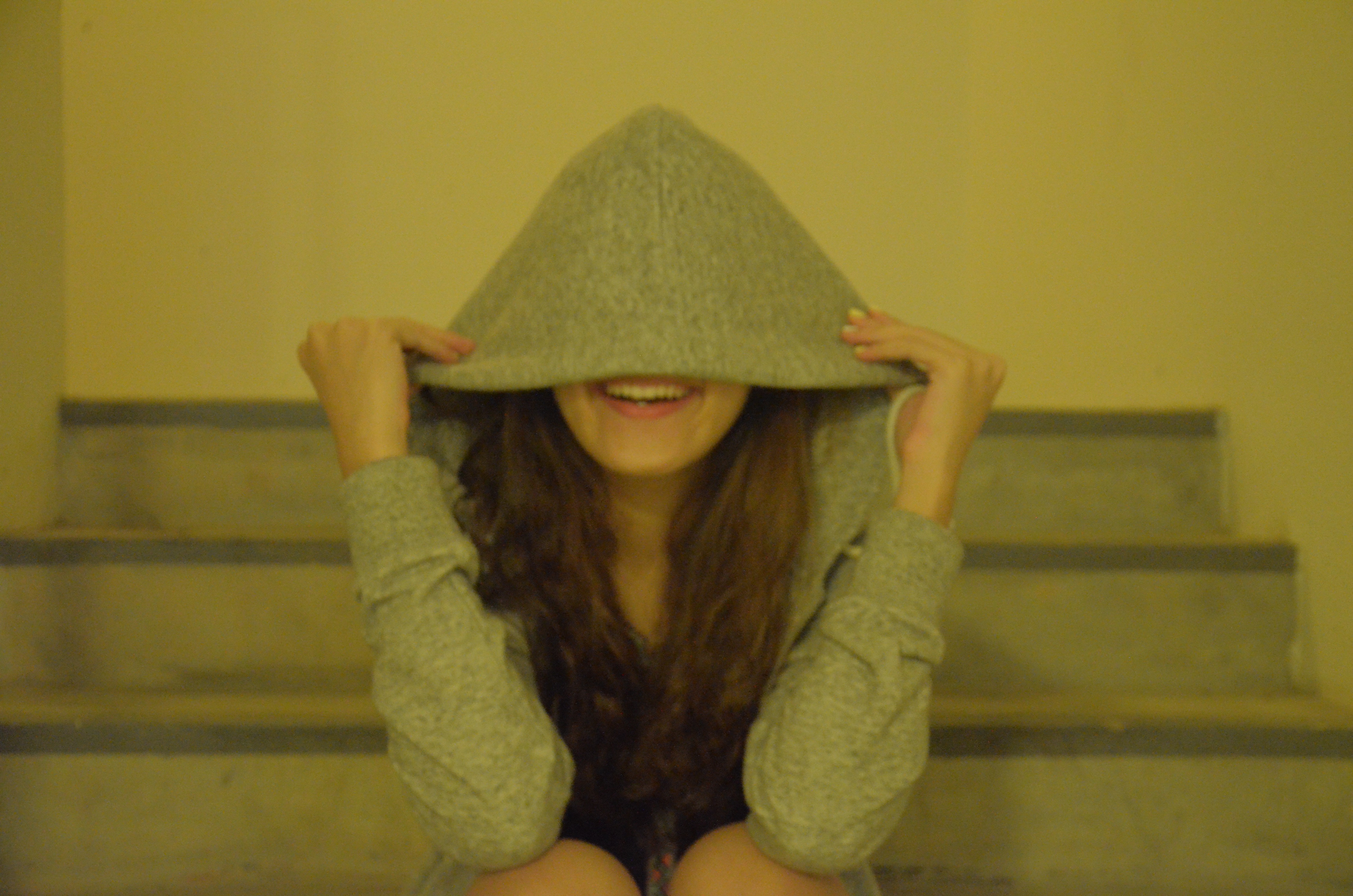
The second picture captures an image of Daphne’s smile which portrays a bubbly side of her personality that the viewer would get to know as they become closer to her.

Lastly, this shot of her close up face and shoulder conveys a more developed relationship that the viewer has with her.