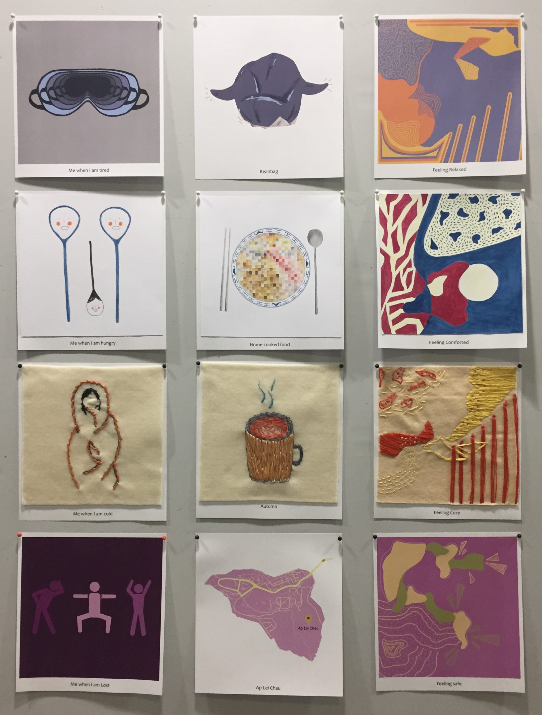
As the last third of this semester approaches, our final project requires us to create a total of 12 compositions. We were given the freedom to use any 2D medium that we wish in order to portray our “egos in different settings”. The 12 compositions will be split into 4 rows of threes and amongst each row, we had to represent ourselves, a setting and our reaction in that setting.
Since the style of this project was entirely up to us, the one rule we had to follow was to match our use of colours with various colour theories. Hence, I started this project with research on colour theories.
Research on Colour Theories
http://designingfortheweb.co.uk/part4/part4_chapter16.php
Monochromes Harmony
http://designingfortheweb.co.uk/part4/part4_chapter16.php
In the monochromatic colour scheme, the lightness and saturation of a single colour are altered. Derived from a single hue, a variety of shades and tones are achieved by adding a darker colour, grey or black. It can also be lightened with the addition of white.
Analogous Harmony

https://30daysweater.com/ultimate-guide-color-theory-sweater-knitters-part-2-basic-color-schemes/
Colours in the analogous colour scheme are adjacent to each other on the colour wheel. Out of two colours, one is the dominant colour while the other is used to enrich the scheme. Since the colours are rather close to each other on the wheel, they do not create much contrast.
Analogous Harmony Warm and Cool
The warm and cool analogous harmony are differentiated through the warm and cool portions of the colour scheme. The range of colours from red to yellow can be paired together as warm analogous harmony while colours ranging from violet to green can be paired together as cool analogous harmony.
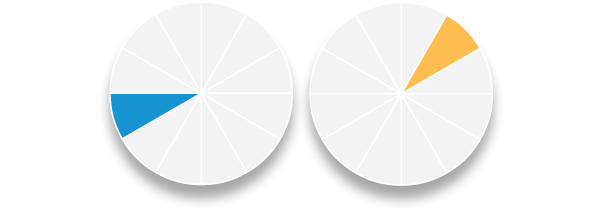
Complementary Hues
http://designingfortheweb.co.uk/part4/part4_chapter16.php
Made of two colours that are directly opposite each other on the colour wheel, the complementary colour schemes offer a great contrast between warm and cool colours. Its high contrast draws a lot of attention and is eye-catching.
Split Complementary

https://designmodo.com/wp-content/uploads/2011/12/Split-Complementary.jpg
Expanding on the standard complementary colour scheme, the split complementary uses a colour and the two colours adjacent to its complementary. It provides high contrast but is not as strong as the complementary colour scheme. It is harder to balance in comparison to the other colour schemes.
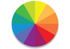
Triad

https://www.homedit.com/triadic-color-scheme/
The triadic colour scheme essentially involves the use of three colours that are equally spaced on the colour wheel. The use of colours that falls under this scheme will look create contrast and look harmonious simultaneously. To allow for a nice balance, normally one colour will dominate while the other two will be used as accents.
Ideation
In the midst of missing many aspects of Hong Kong after having lived there for the majority of my childhood, I decided to incorporate these feelings into my compositions as an overarching theme. After mind mapping on things that I am reminiscent of in Hong Kong (which can be found in my visual journal), I decided on the top few and came up with 4 equations.
First plan
- tired me + in my bean bag = relaxed (digital)
- cozy me + during autumn = at peace (embroidery on felt)
- walking home + at Ap Lei Chau/Hong Kong = safe, comforted and homey (colour pencil)
- hungry me + eating home cooked food = comforted (watercolour)
As for the colour scheme of each row, I decided to stick with a base colour and use it to work with various colour schemes for each individual compositions.
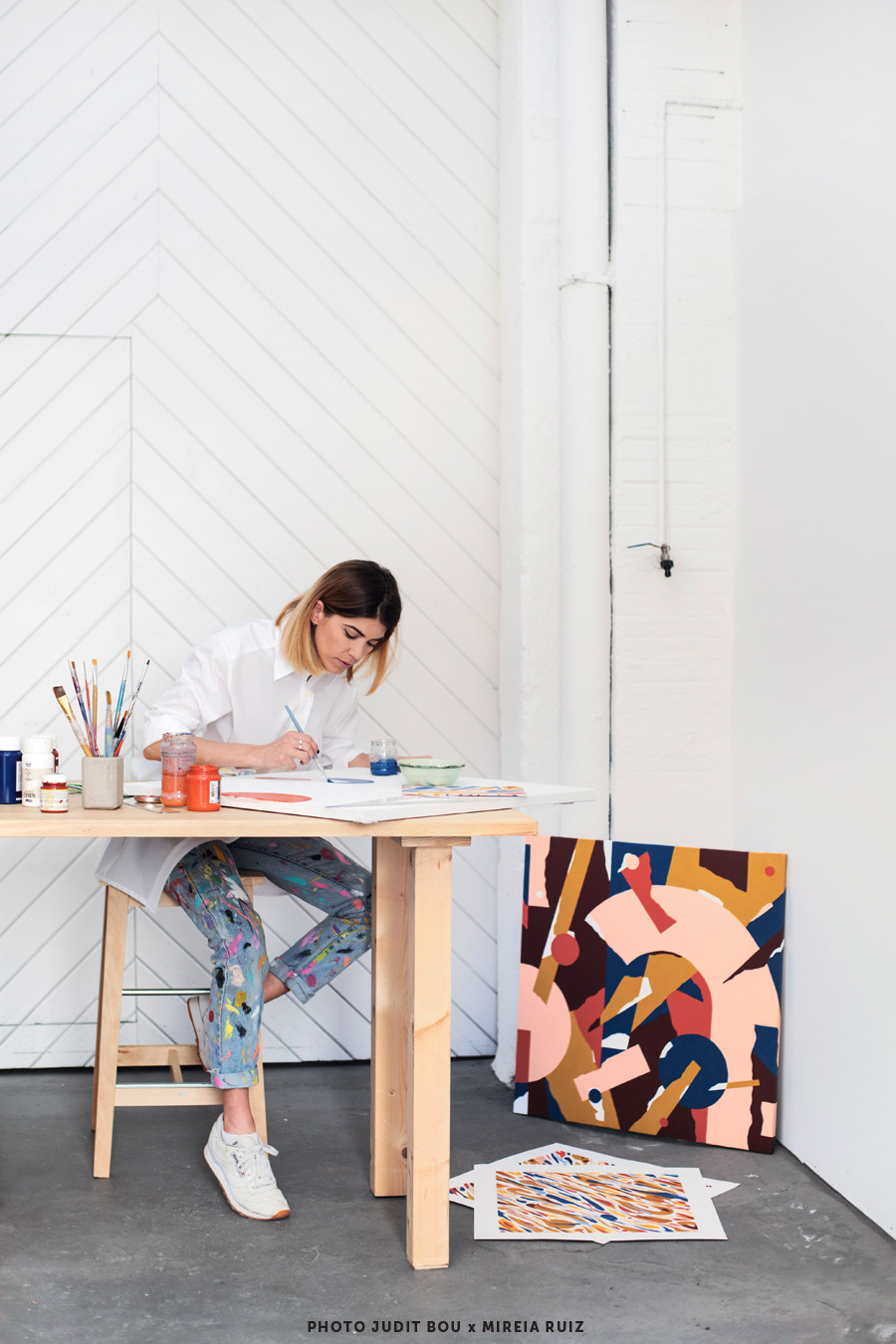
artist inspiration ” Mireia Ruiz

http://mireiaysuscosas.tumblr.com/
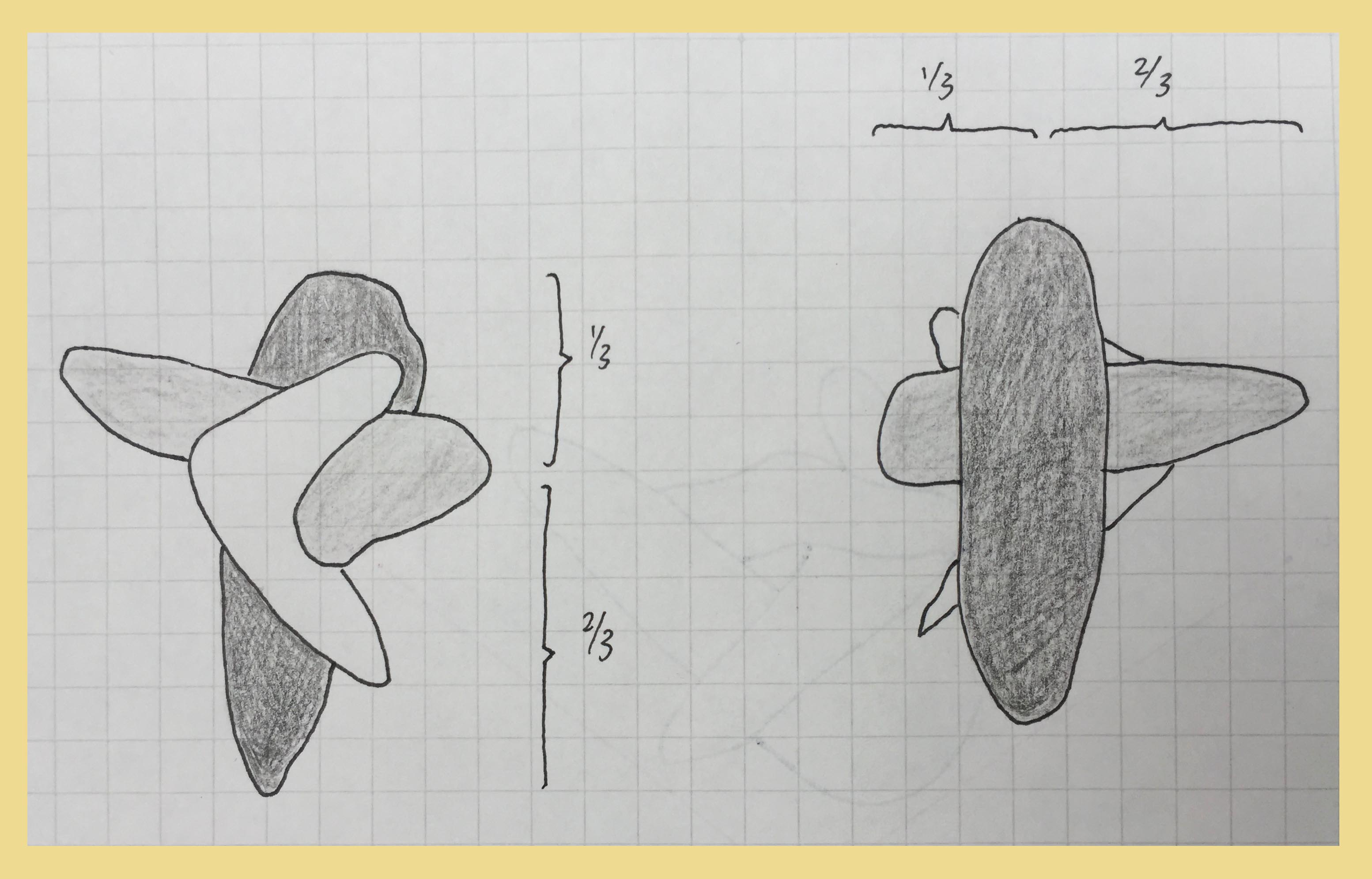
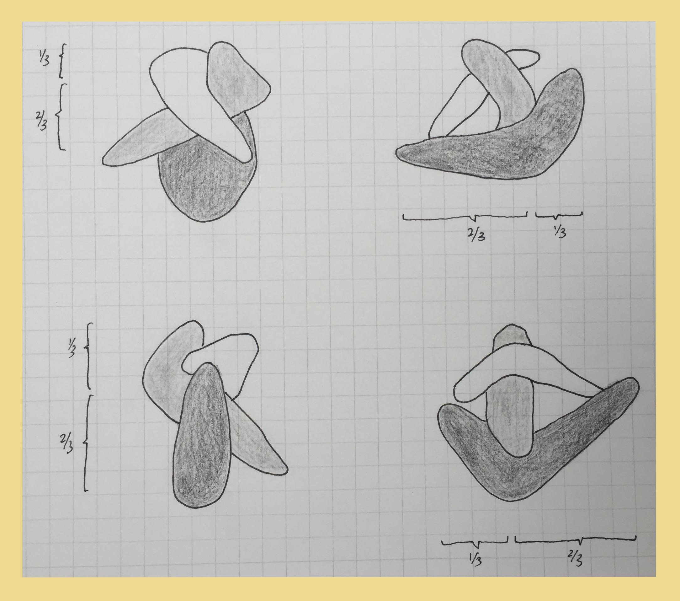
Mireia Ruiz was the inspiration for the last compositions of each of my four rows. During the planning of my compositions, I struggled with coming up with ideas for “me and my reaction to the setting” as I didn’t know how to express my emotions through the application of objects. Having stumbled across an interview with artist Mireia Ruiz in a magazine, I was intrigued by her abstract creations, especially her use of colours.

http://mireiaysuscosas.tumblr.com/
Although all her works were abstract pieces, the variety of form, colours, lines, negative and positive space present in her work really gave each painting its own unique quality. Thereafter, I was inspired to create abstract pieces to express my various emotions of me in my comforting setting.
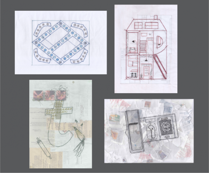
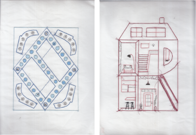
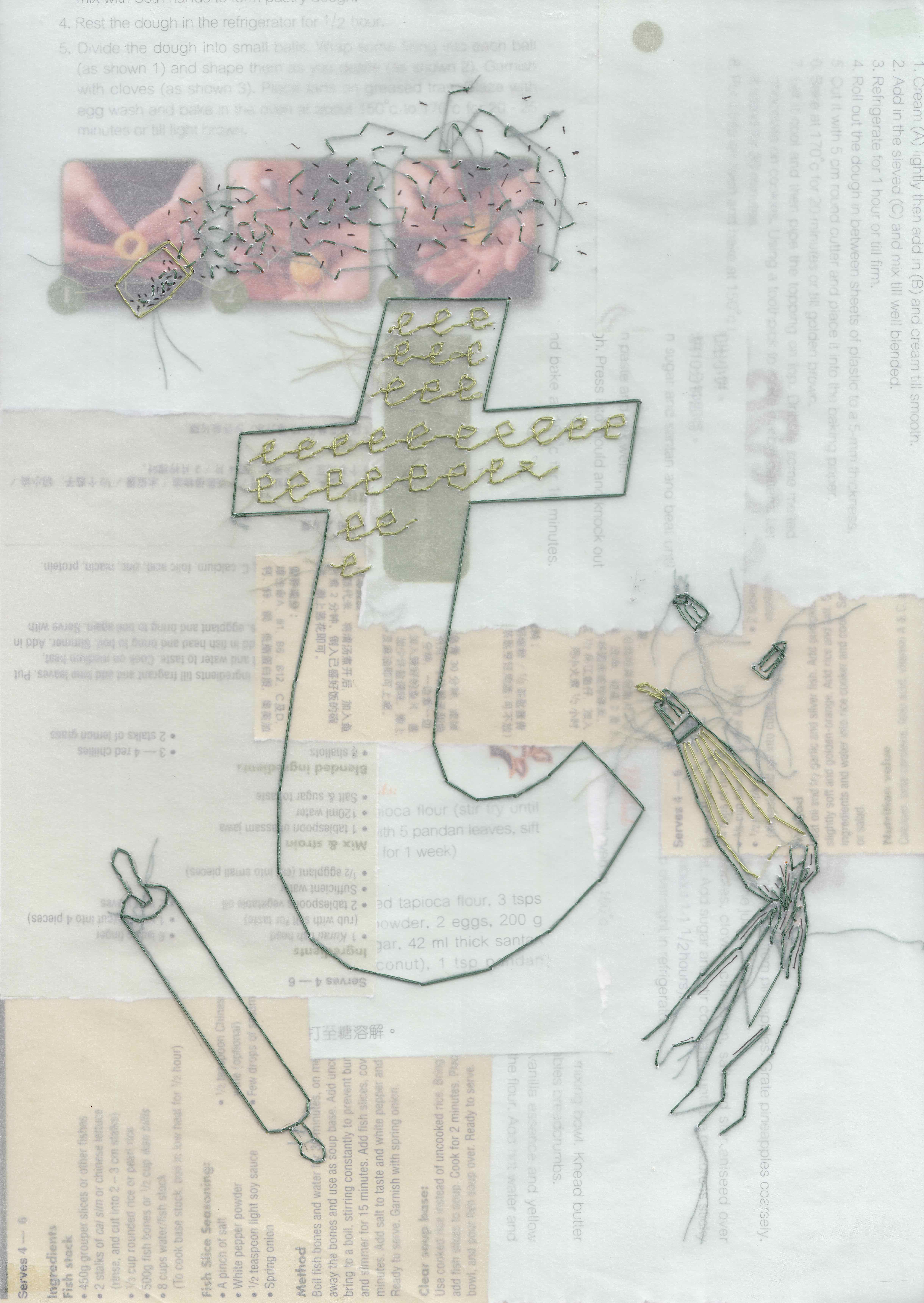
first row

My 1st row of compositions portrays the reunion of tired me and my beanbag which I use to always take naps on after returning from a long day of school. The layered placement of the eye mask was executed in order to convey the deterioration of my energy during school; further emphasised with the monochromatic scheme that creates a depth within the piece. As for the setting, my beanbag is ‘personified’ in the sense that I had given it arms as a way to show its openness and invitation for me to join it. Coloured in a dark greyish blue hue, its dullness shows the absence of a companionship which in this scenario is me.
|
Tired Me |
Beanbag |
Feeling relaxed |
| Colour scheme |
Monochromatic |
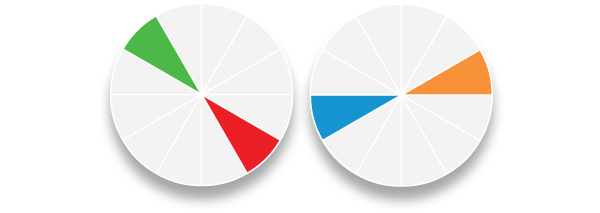
Complementary |
Spilt complementary (blue, red-orange, yellow-orange) |

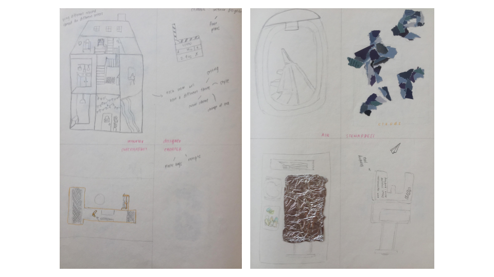
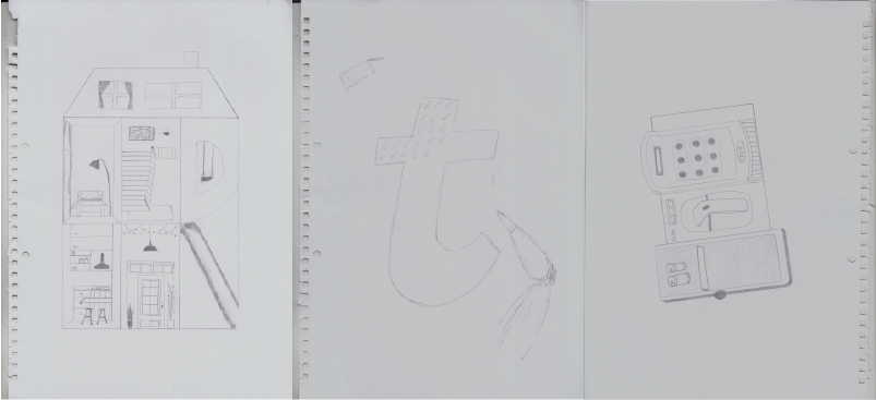
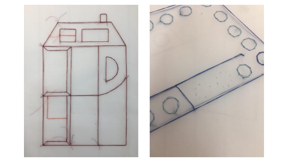
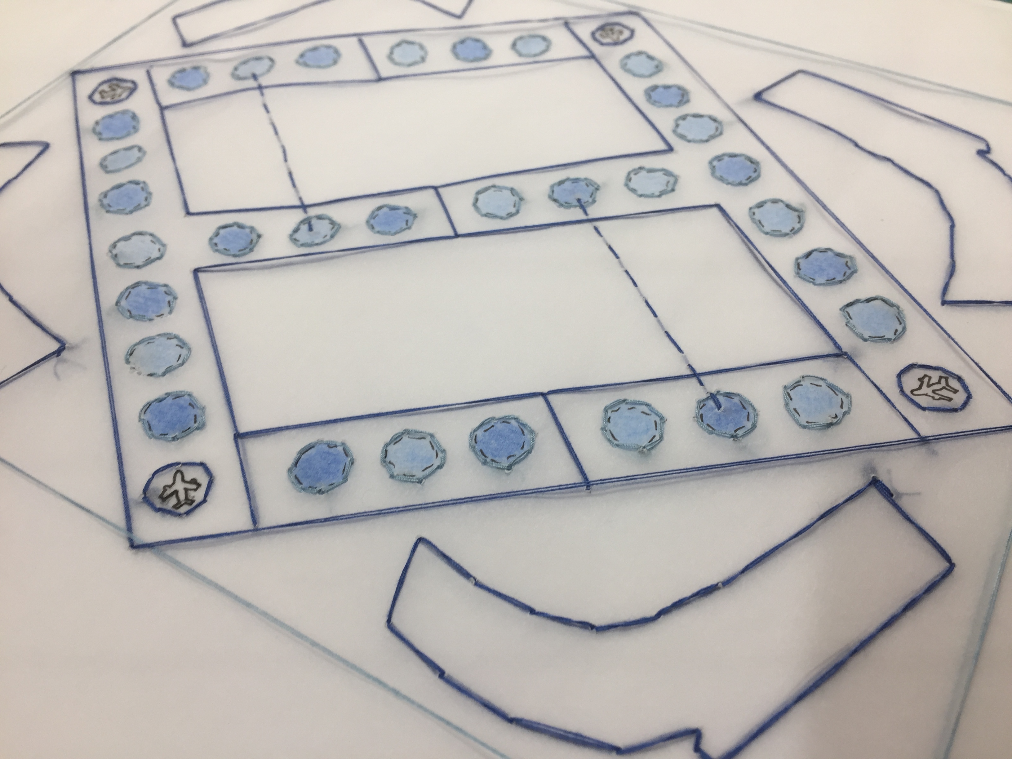
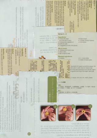
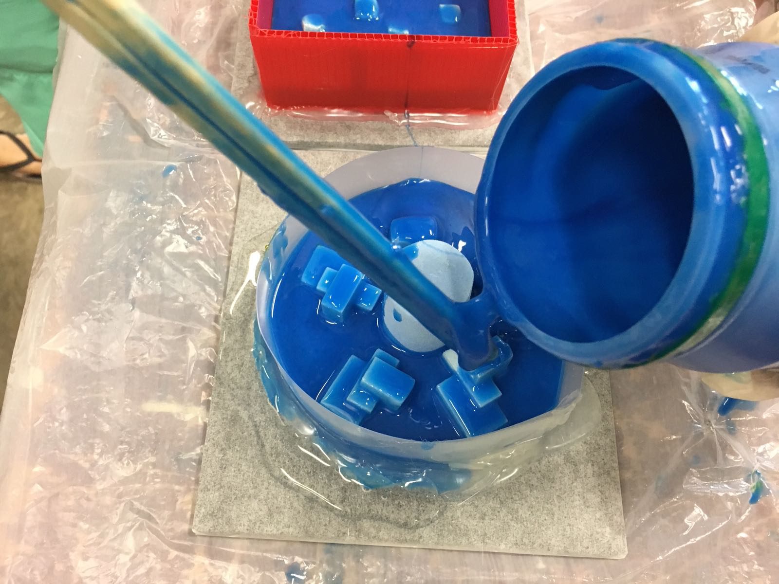
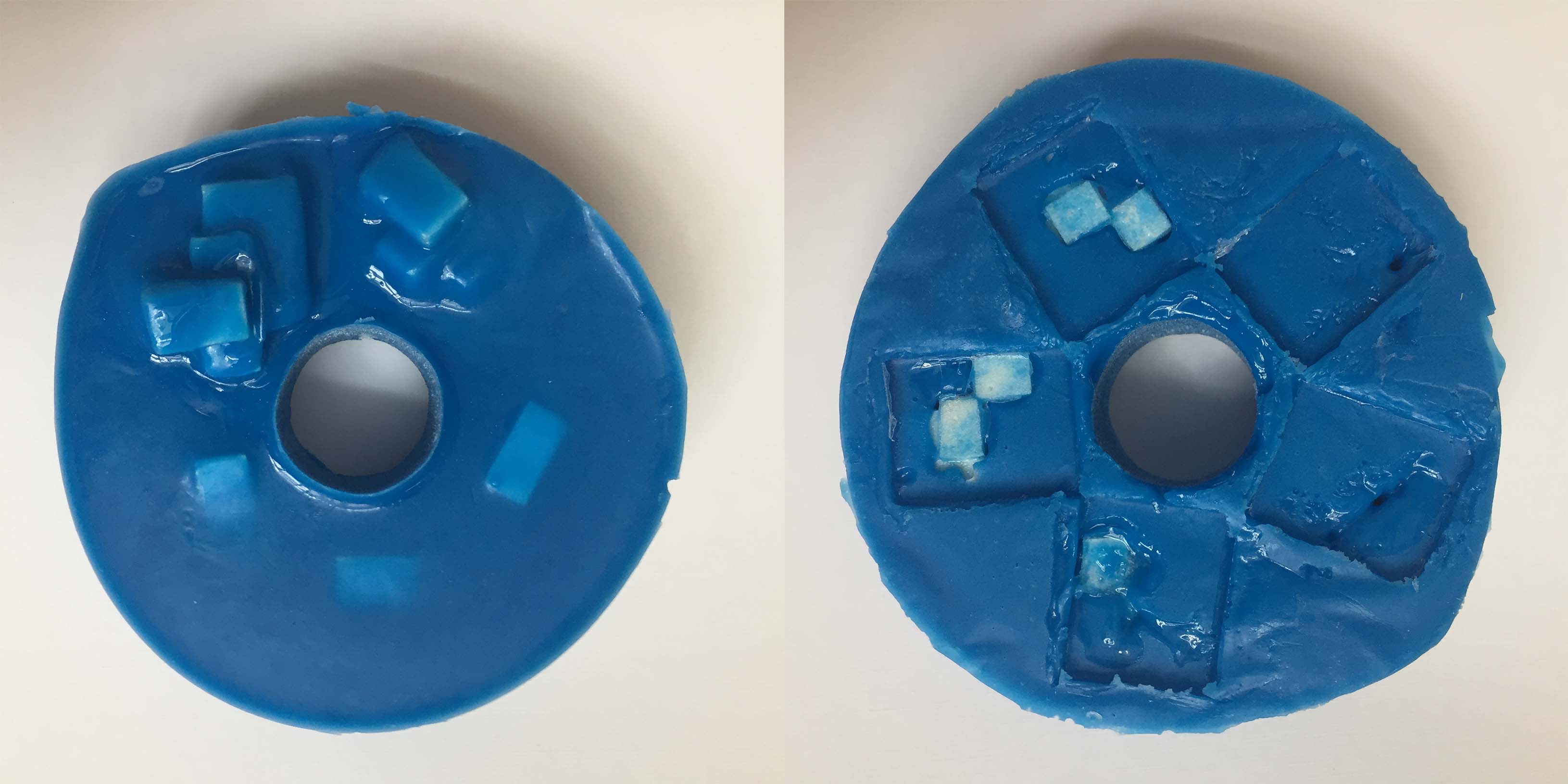
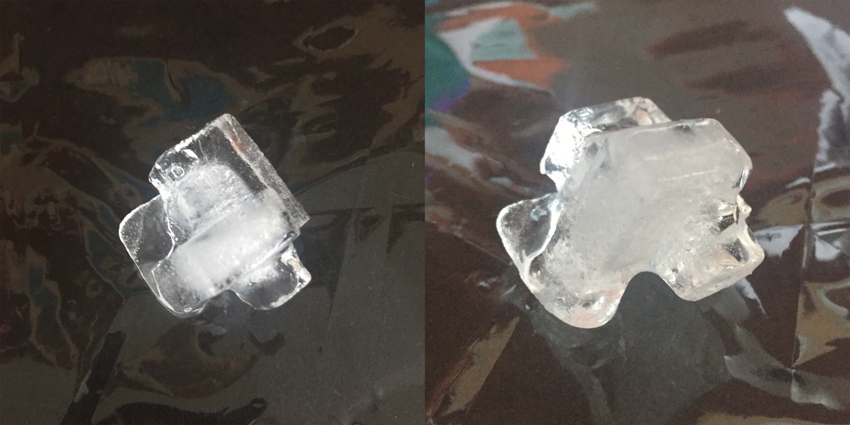
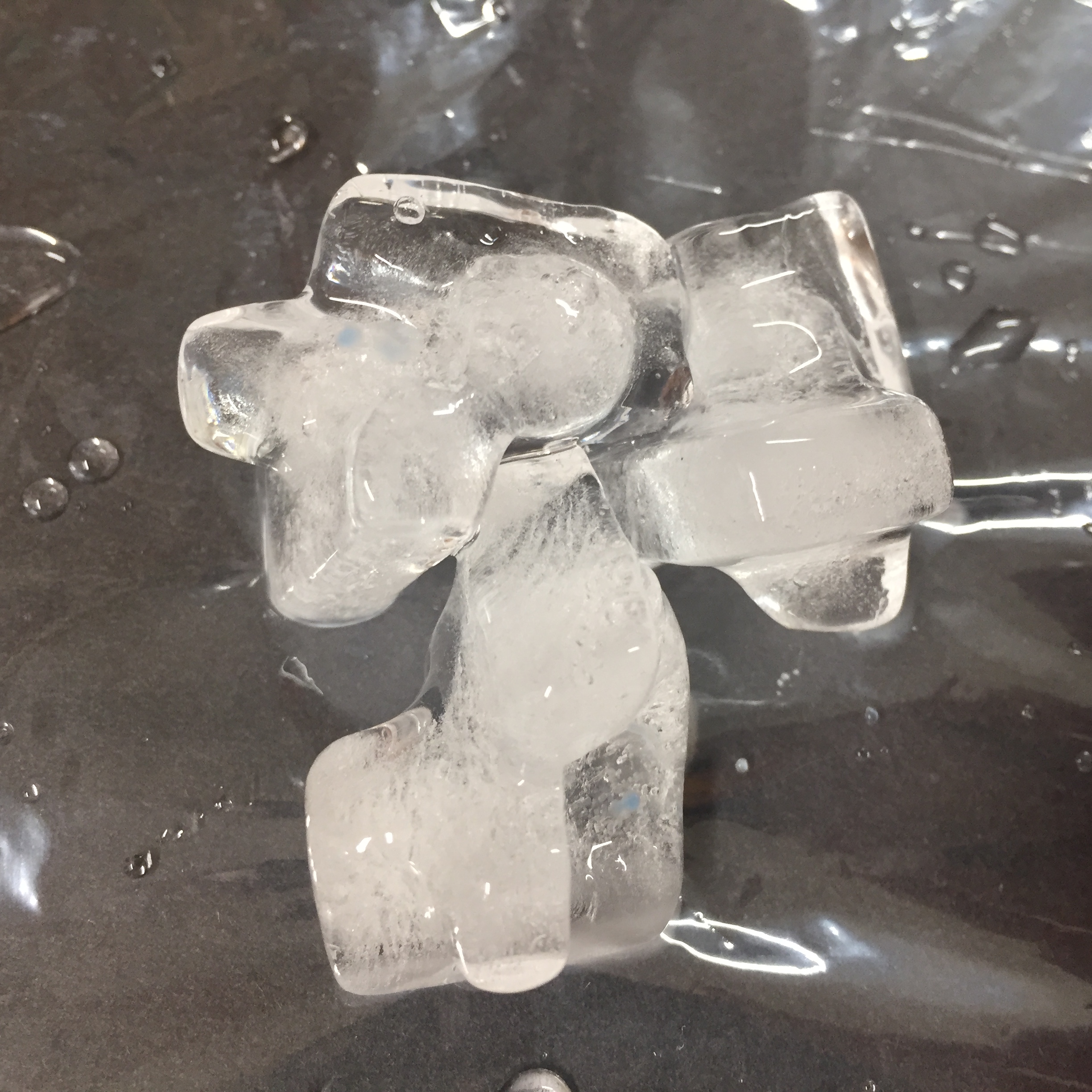
Eye Mask trials
After deciding on the second version amongst these two, Joy and I discussed during our first consult that the eye masks could be portrayed more clearly as eye masked and hence I added the straps for a clearer image.

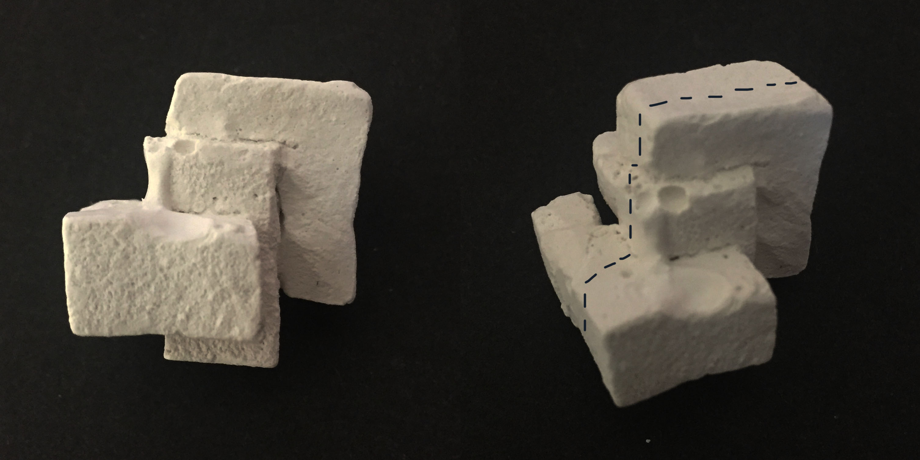
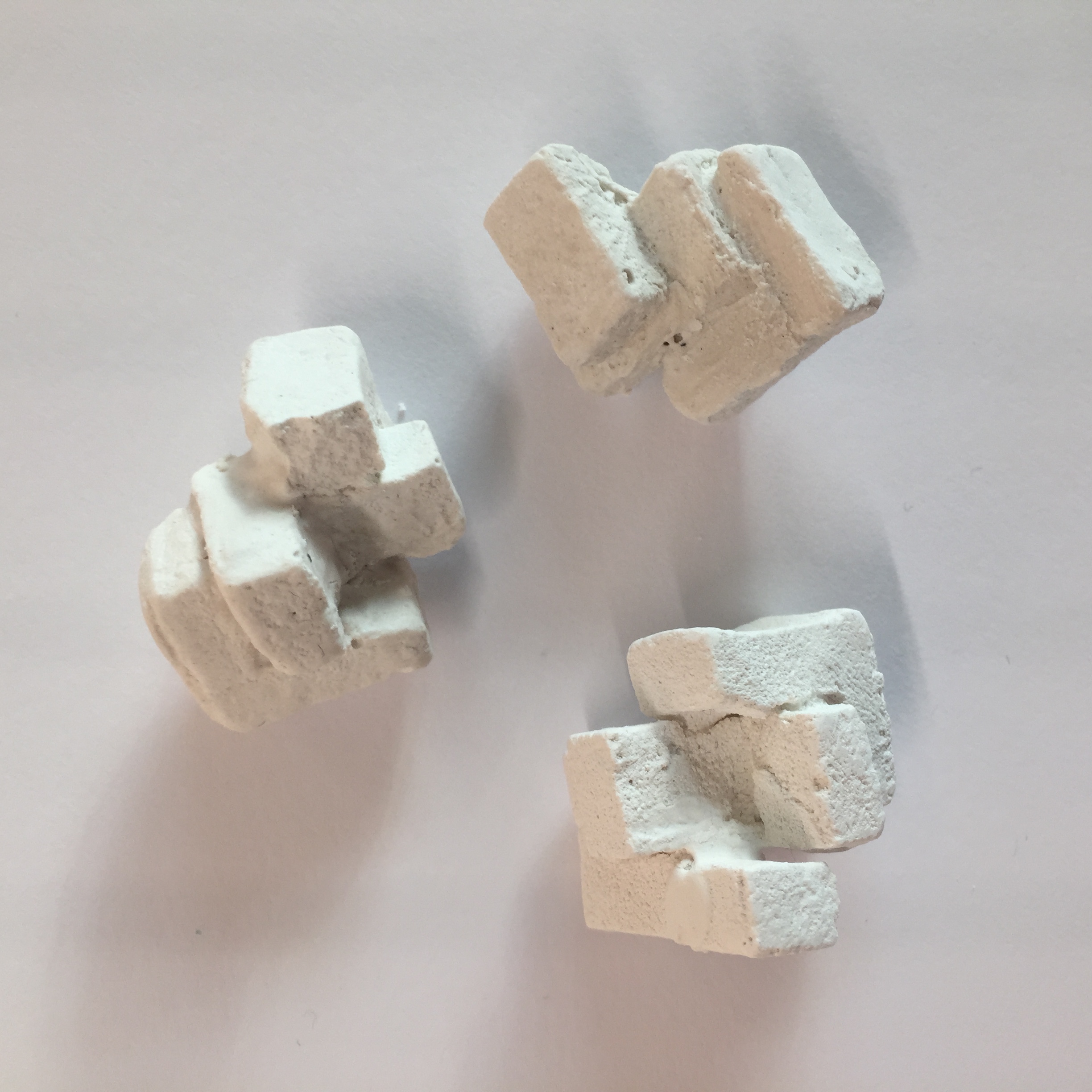
Bean Bag trials
After my consult with Joy where she suggested I could try including features that related to the context of Hong Kong such as dim sum basket texture, food textures, etc…, the piece on the right was my attempt for that which didn’t work out quite well. Since I wasn’t able to capture the texture of a dim sum basket, I decided to go with the paper below steamed buns and dim sum dishes instead which is present in my final composition.

First Attempt // Final
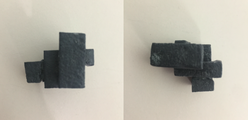
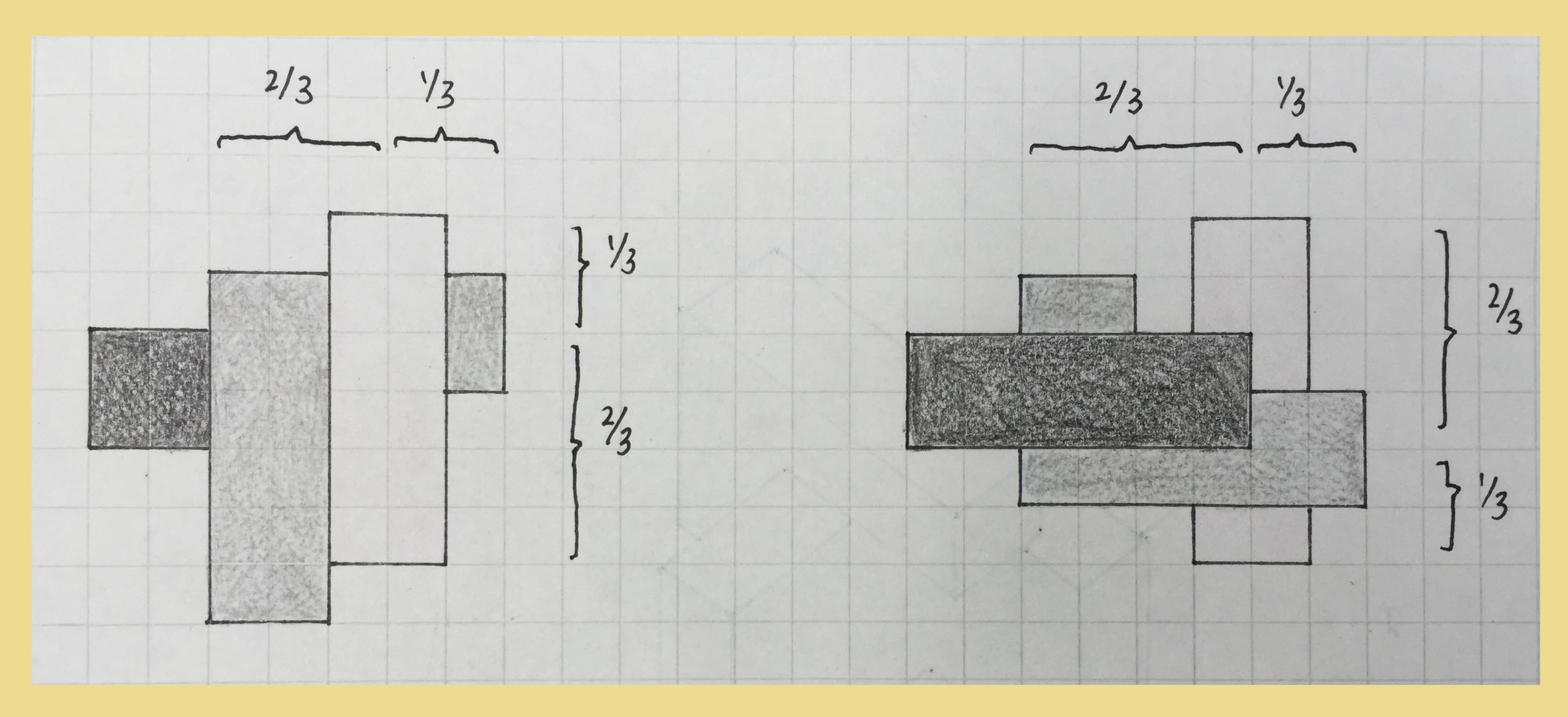
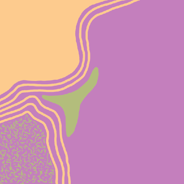
The last composition for this row was the first abstract piece I tried to create. The piece on the right was my first attempt at it whereby the colours did not match well with the split complementary colour theory. Since I felt like the placement of lines and shape were also not as concise, I redid this piece which turned out to be the one on the right, that I choose for the final.
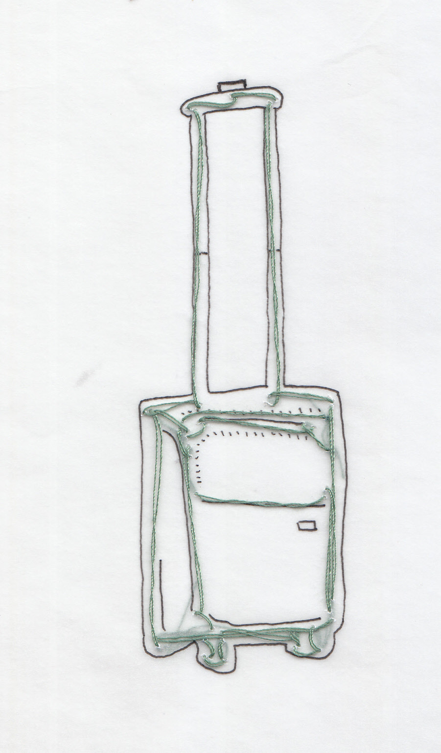
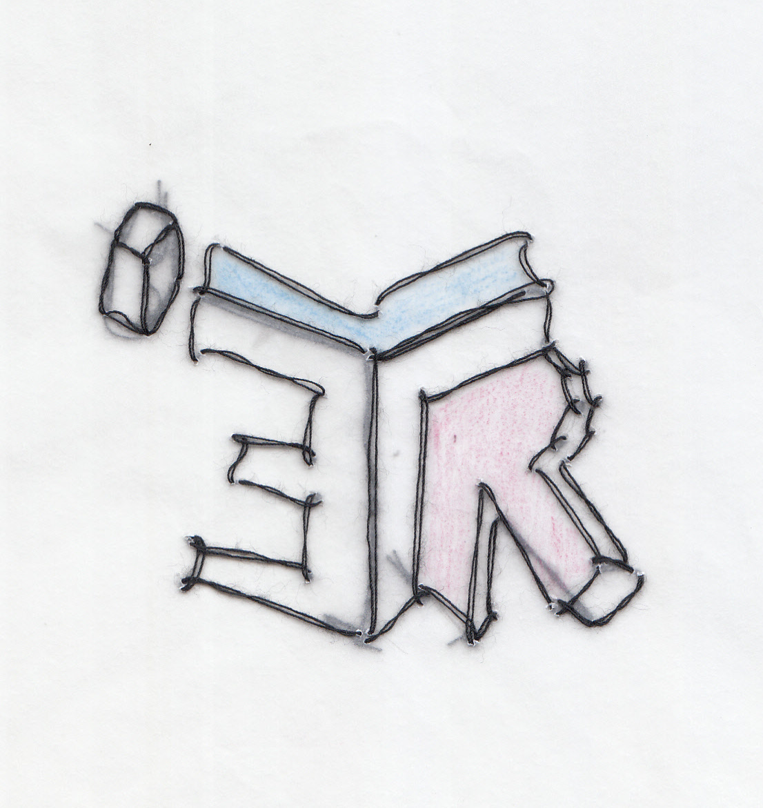
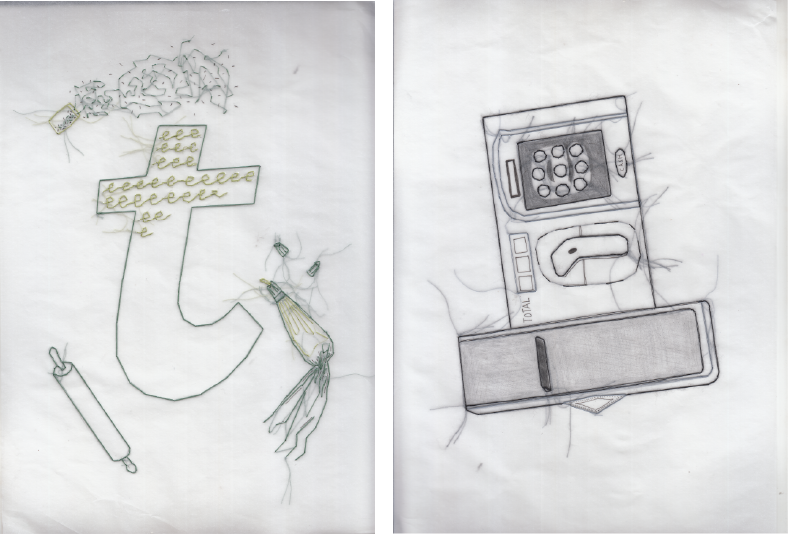
second row

This second row portrays my cravings for home-cooked food since living in hall at university. The distressed looked on the spoons in the first compositions represent my longing for home-cooked food and the placement of it also resembles tears of desperation. As for the second piece, the image of home-cooked food has been pixelated in attempt to show that although I still have memories of it, it is currently not present in my life and hence blurred.
|
Hungry Me |
Home-cooked food |
Feeling Comforted |
| Colour scheme |
Complementary |
Triadic |
Triadic |
The triadic scheme adopted in the majority of this row is blue, red and yellow. Specifically because blue and red to me are iconic colours that represent Hong Kong. To allow for the presence of both these colours, I had to include yellow for them to fit as a colour theory. Hence for the paleness of yellow.
third row

Working with autumn as my favourite season out of the four seasons, I wanted to portray the cosiness and comfort that this weather brings me. Specifically for this row, I decided that I wanted to work with embroidery because it was suitable for portraying the theme of warmth and thicker clothes. The first composition is of myself being wrapped in a blanket as I do during the majority of autumn. Secondly, I conveyed autumn as my setting through an image of autumn being in a cozy cup of a hot drink.
|
Cold Me |
Autumn |
Feeling Cozy |
| Colour scheme |
Spilt complementary (orange, blue-green, blue-violet) |
Spilt complementary (orange, blue-green, blue-violet) |
Analogous |
Orange used as the base colour to represent autumn, while the other two colours were used to create depth and shadow.

Photoshop sketches before embroidery

Digital draft of the third composition before embroidery
Before starting to embroider straight onto my felt, I created digital sketches and drafts of the compositions that I wanted to sew in order to get the measurements right and have a clear idea of what I was embroidering.
fourth row

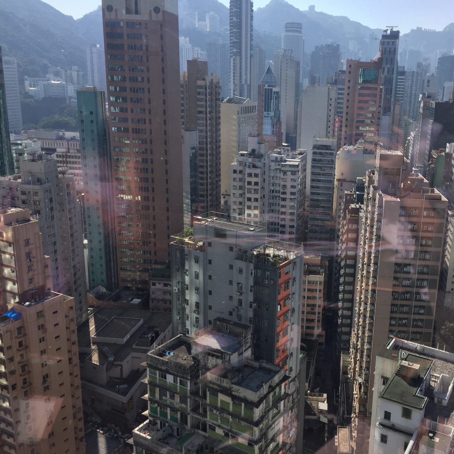
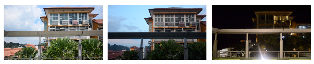
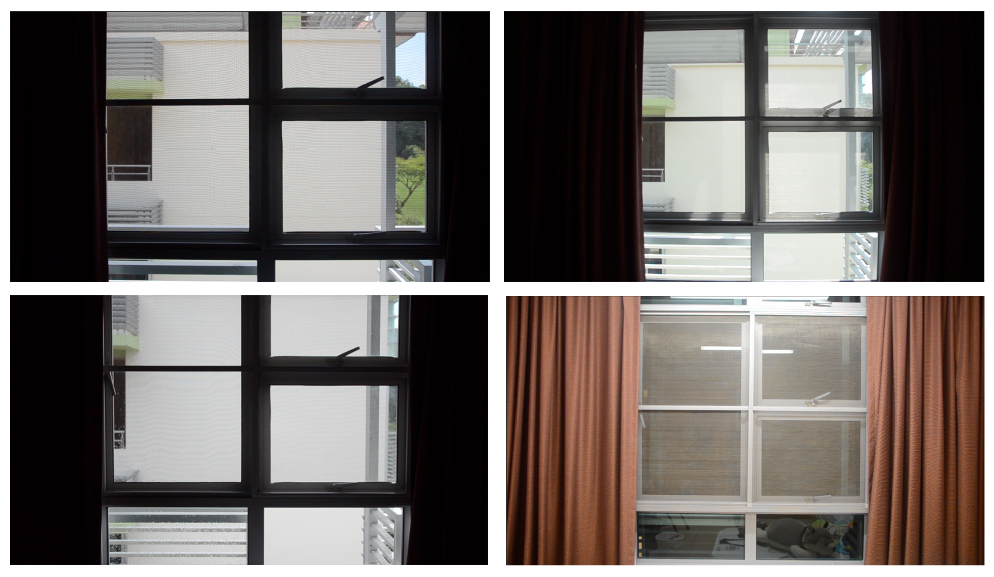
Lastly, my fourth row of composition encompasses my feeling of comfort and safeness on the island of “Ap Lei Chau” in Hong Kong where I have lived all my childhood. I portrayed myself being lost, which could be interpreted mentally or physically, with darker hues of purple to express a sense of mis-belonging. In the second piece of this row, the use of lighter purple was intended to express a sense of nostalgia.
|
Lost Me |
Ap Lei Chau |
Feeling Safe |
| Colour scheme |
Monochromatic |
Complementary |
Spilt complementary (violet, yellow-orange, yellow-green) |

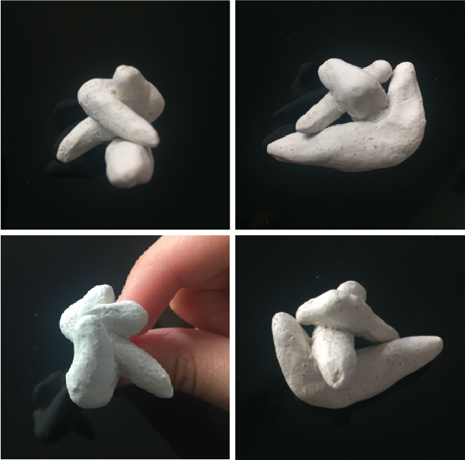
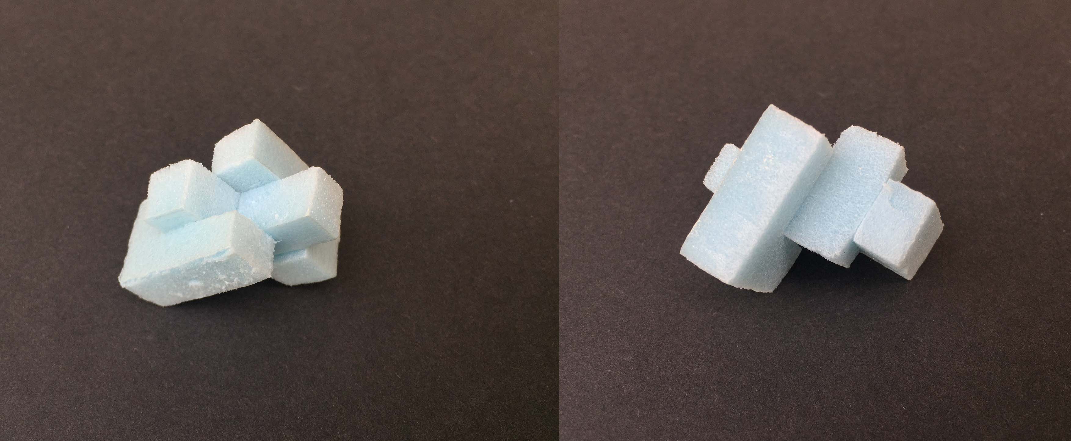
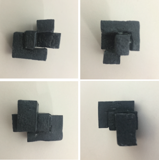
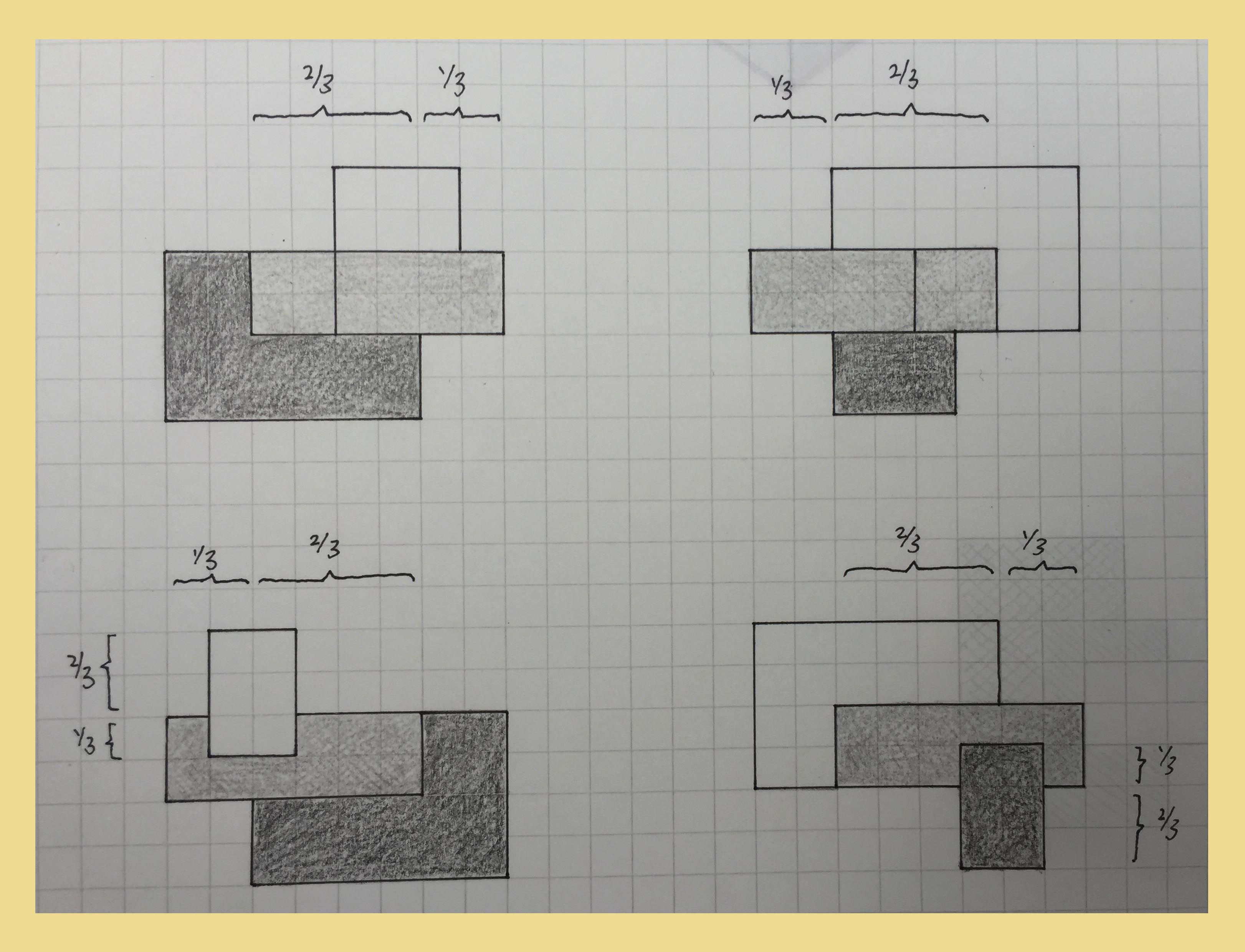
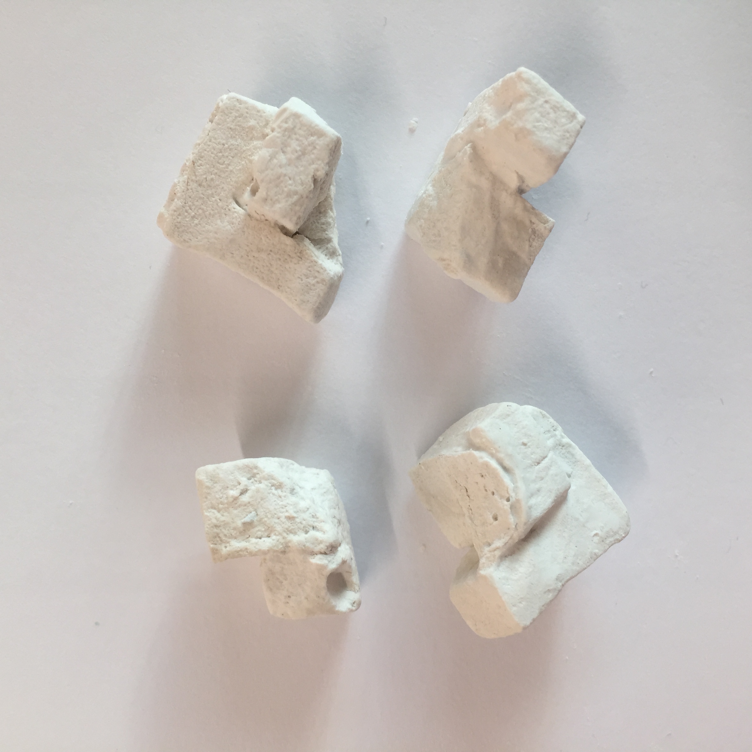
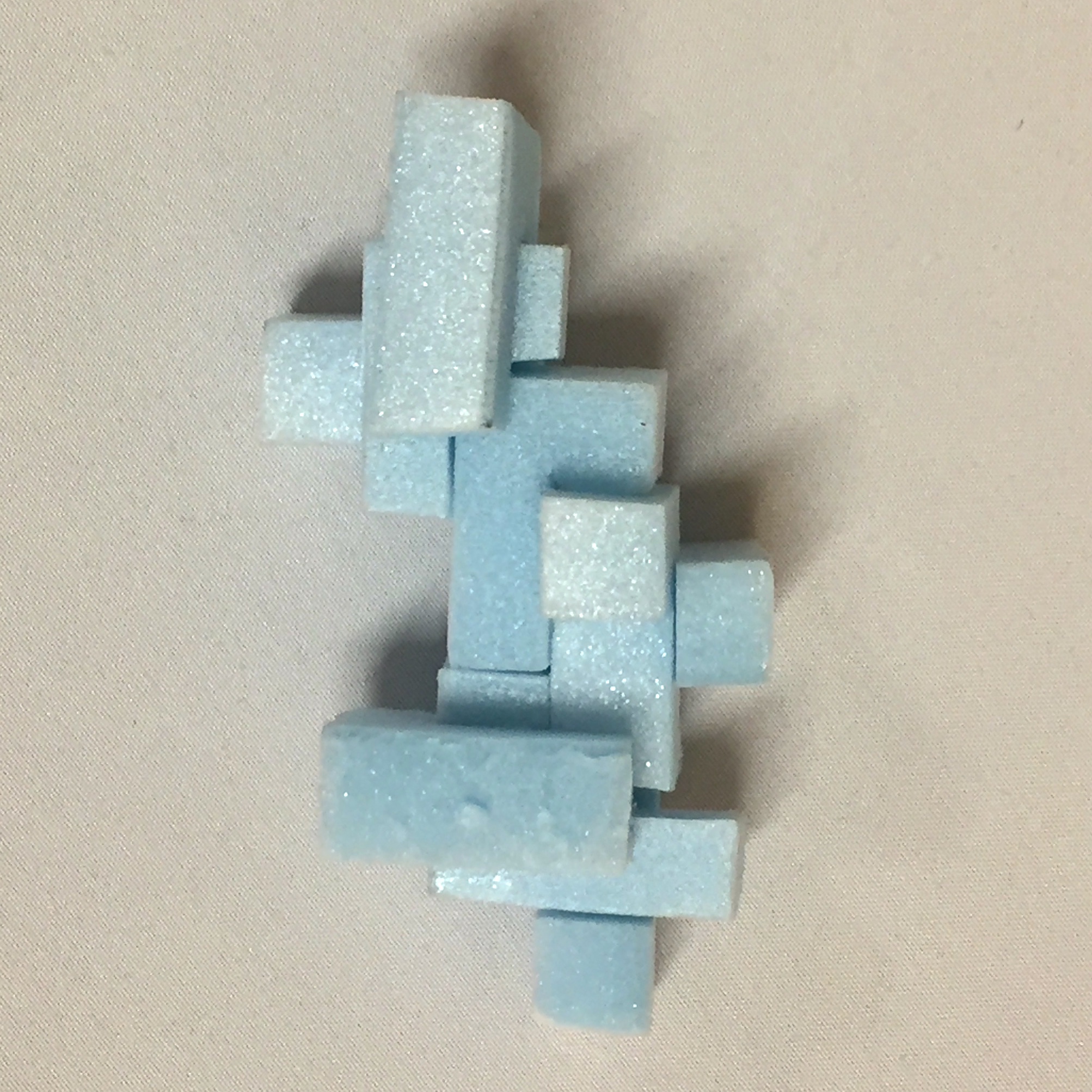
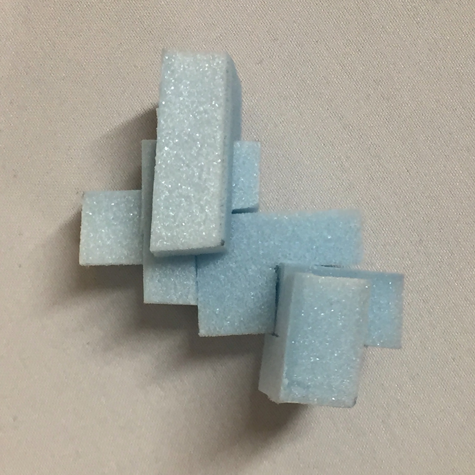
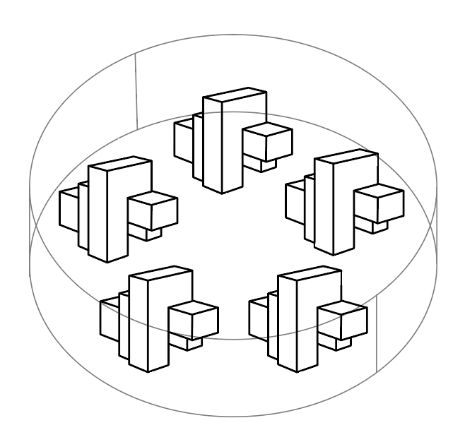
First attempt
During the process of creating my abstract pieces, I actually found it quite challenging to piece together lines and forms that would somehow look neat yet random. This process resulted in many half-completed pieces as I redid them.
final presentation

To end of the first semester of foundation 2D, I really enjoyed implementing a style of my own into this project as well as experimenting with a variety of mediums. Although it was time-consuming and stressful at times, it was a great experience and I had a great time admiring the amazing work that my classmates created 🙂