The weeks following the previous post was further experimentation and learning the technical aspects of what i want to achieve. I’ll be breaking these down into a few posts. In this one I’ll be covering the earliest weeks.
MOTION BLUR
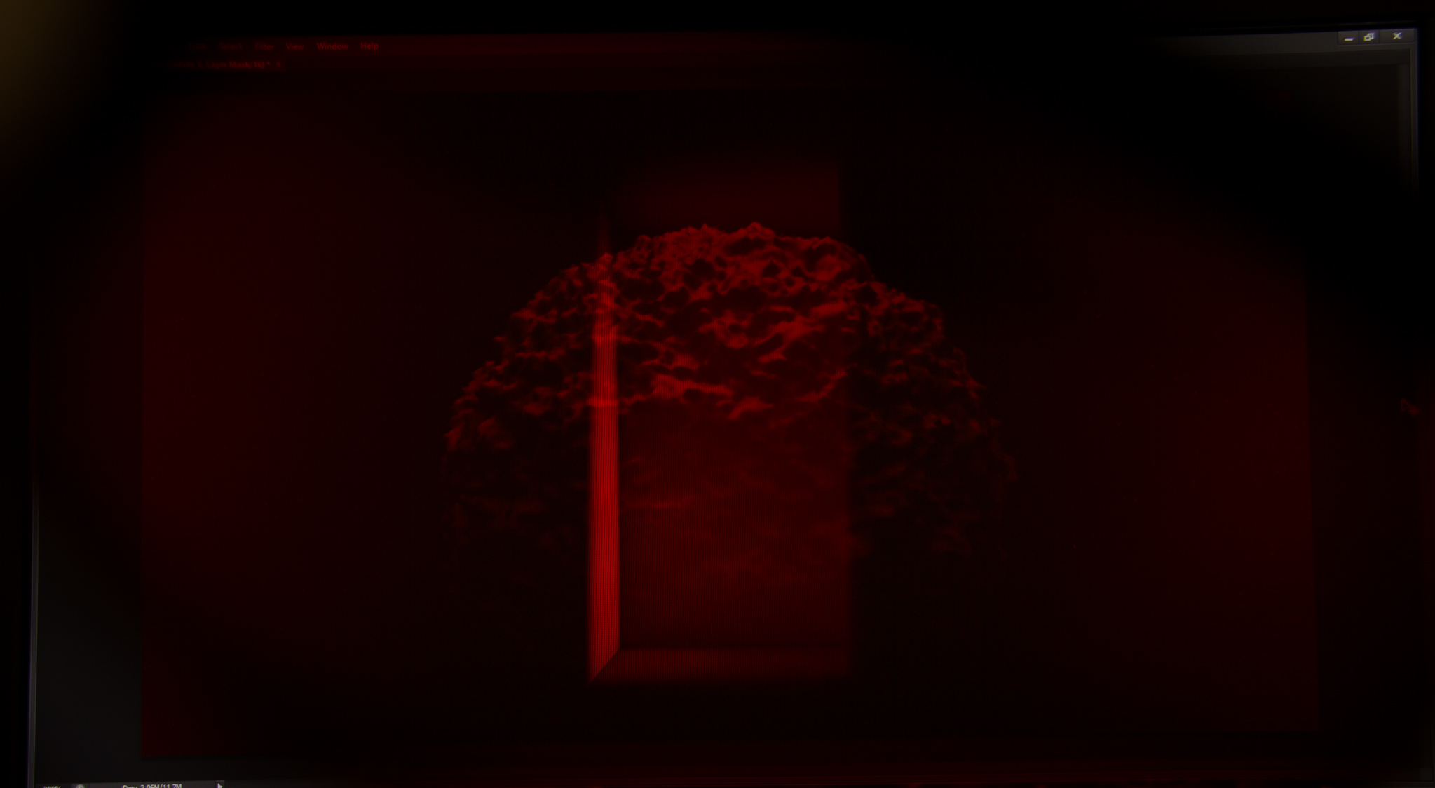
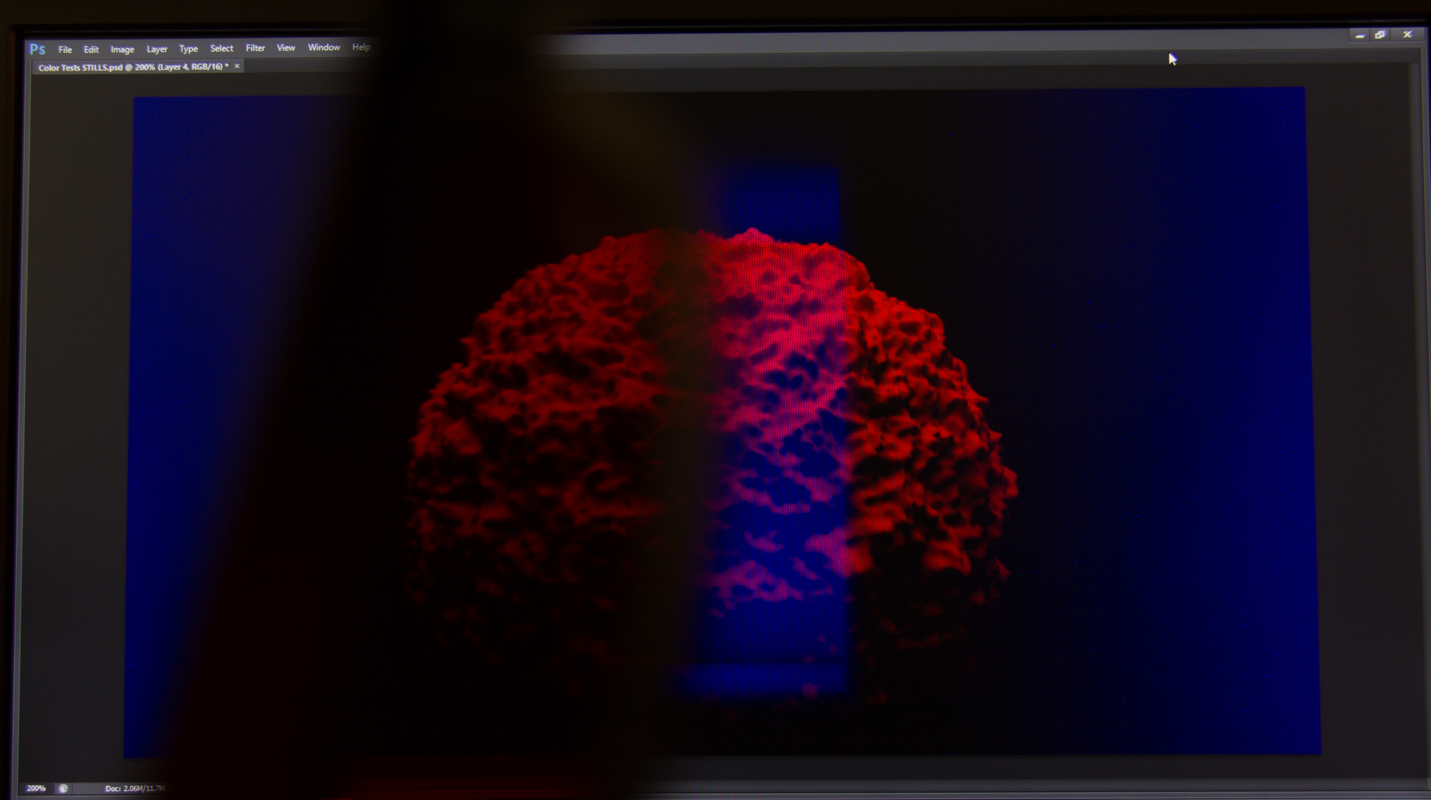
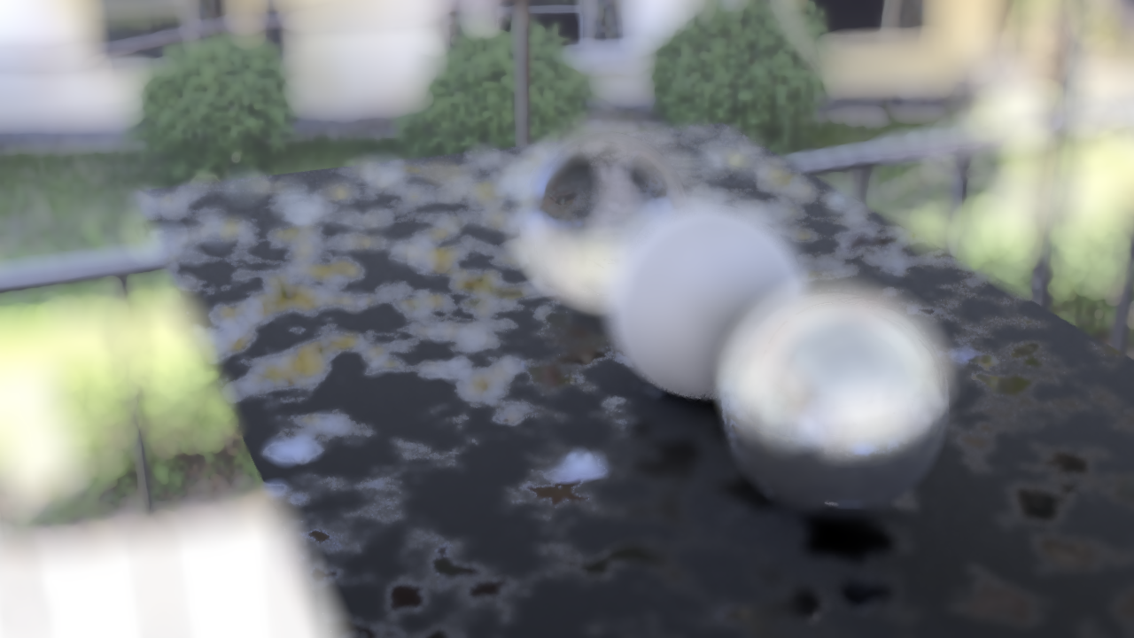
One of the problems I found was that my camera pans in C4D came out looking very flat, like a Ken Burns effect, but terrible. I’ve chalked this up to a few things, one being that the RED/BLUE tinting processing removes some depth from the image, the way I light the 3D models, the combination of both layers being too similarly flat and lastly, the lack of motion blur.
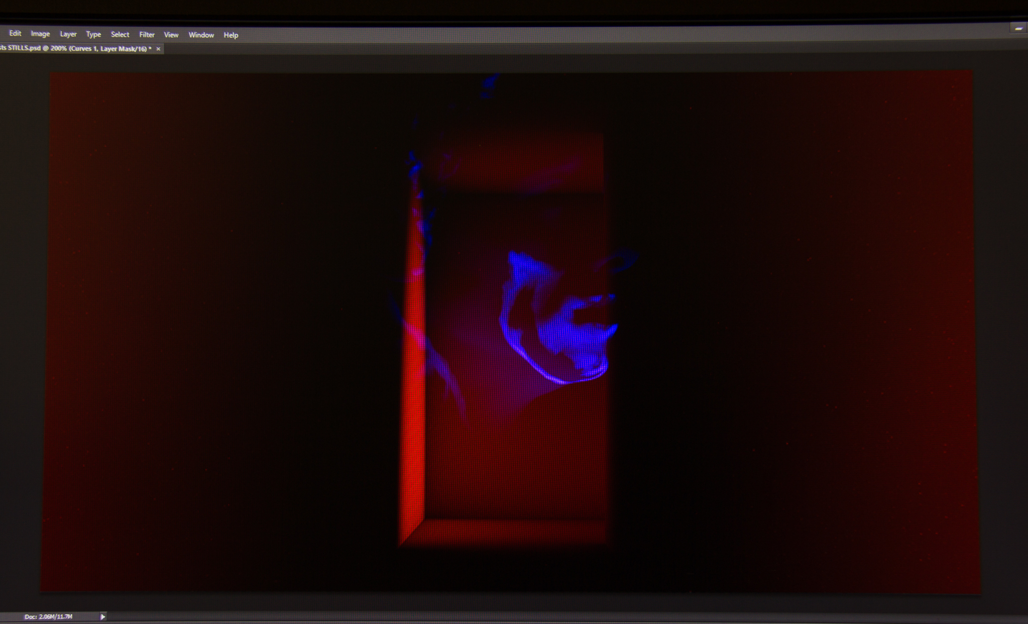
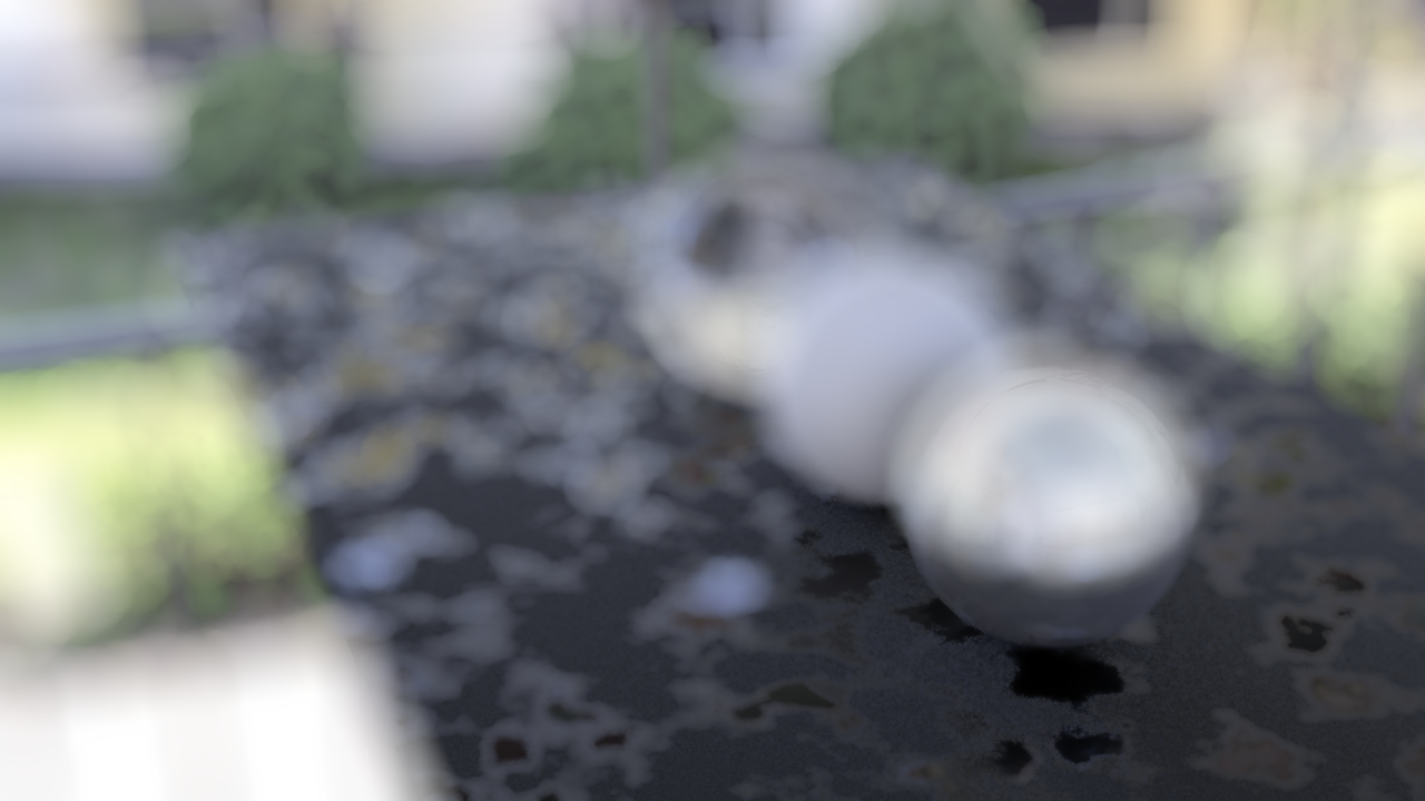
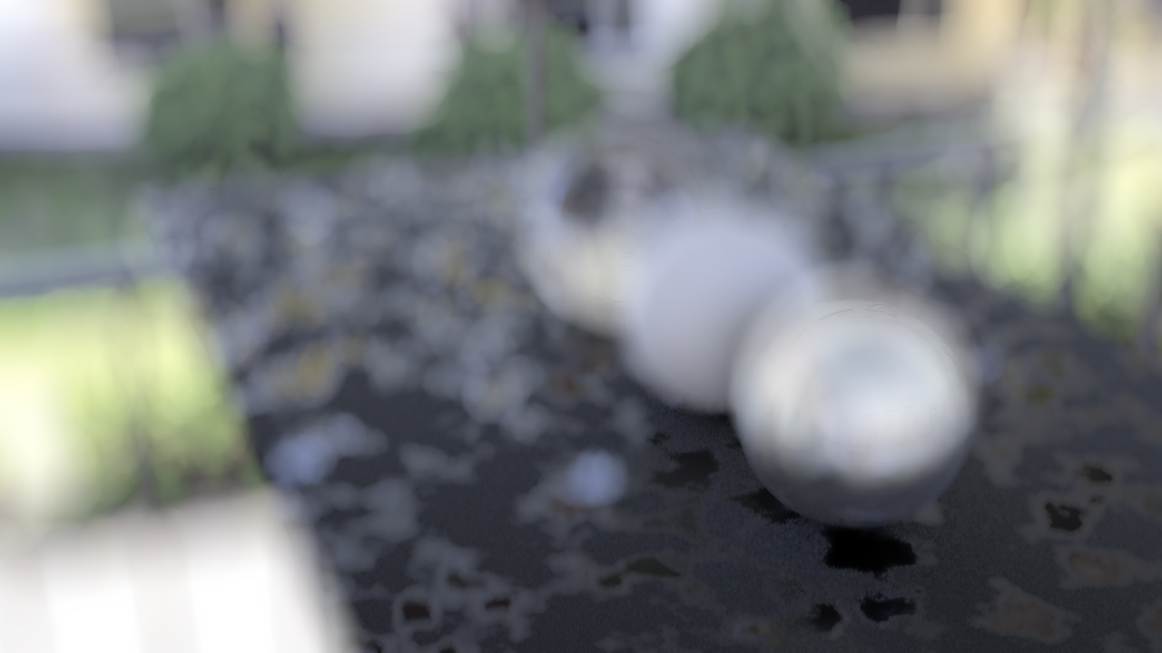
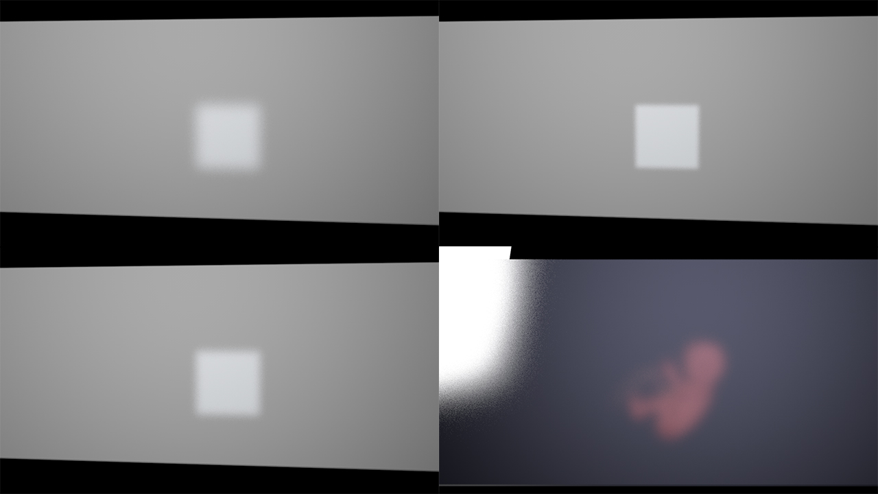
Here are some Gifs of the variations in motion blur settings, default settings, 1 sample and 2 samples. Sample rates drastically increase the render time and this is a reason to force motion blur in post, and the settings in post is something I’m still trying to dial in, especially with more subtle movements.

Default C4D Settings

In post

2 Samples

1 Sample
Another reason to get motion blur in post is because as much as possible, I’d like to render the image with flexibility to make adjustments; this applies to things such as colour, motion blur and focus. “Baking” these into the frame (especially the latter two) makes adjustments troublesome. For example, if I render the focus into the image, if parts that I want in focus slip out of focus I’d have to re-render the entire sequence.
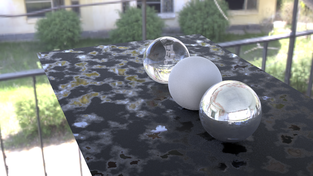
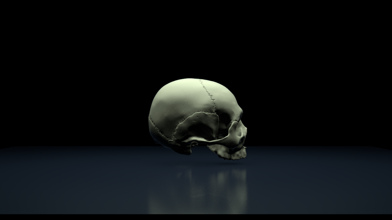
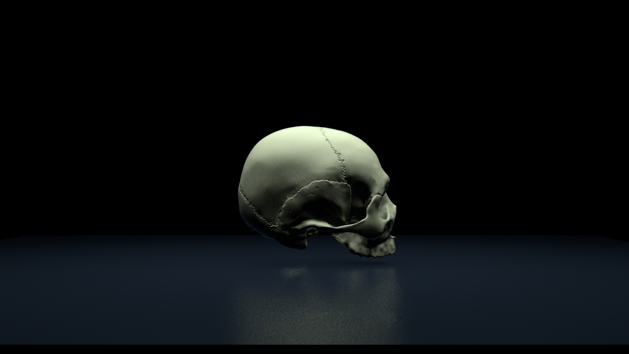
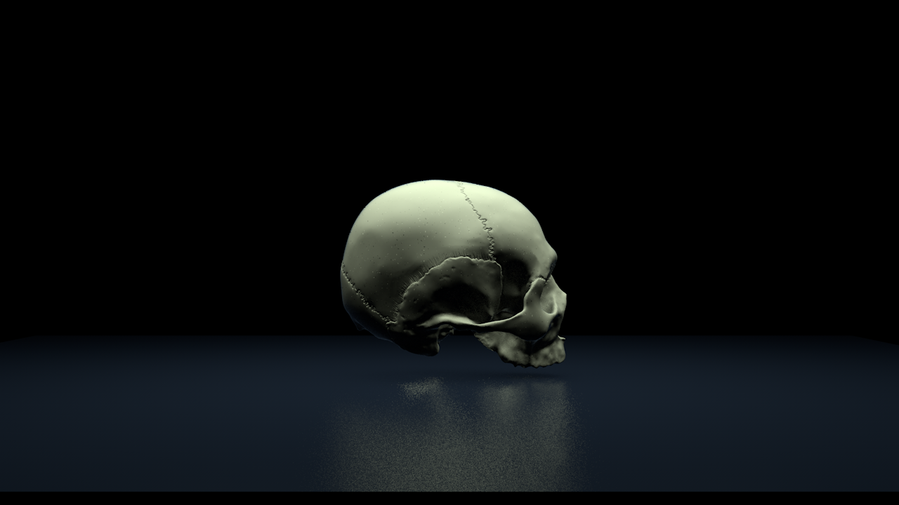
Materials + Lighting
Another thing that I’ve been spending a lot of time on is trying to make good materials. In 3D software you have to adjust the parameters of a material to get it to look the way you want to; the way light interacts with the surface, is it rough, glossy etc.
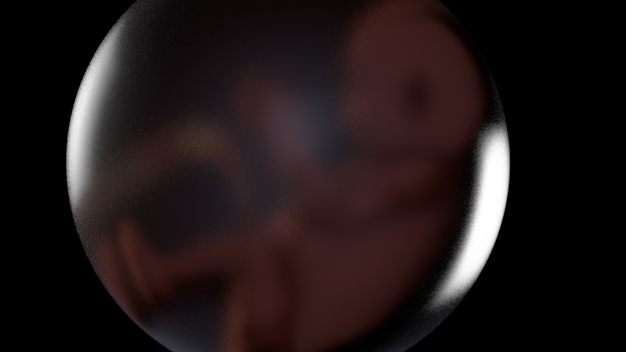
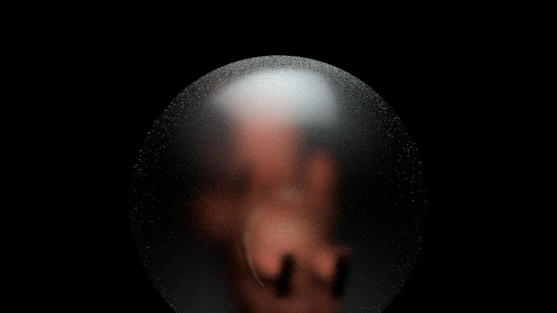
Frosted Glass Tests
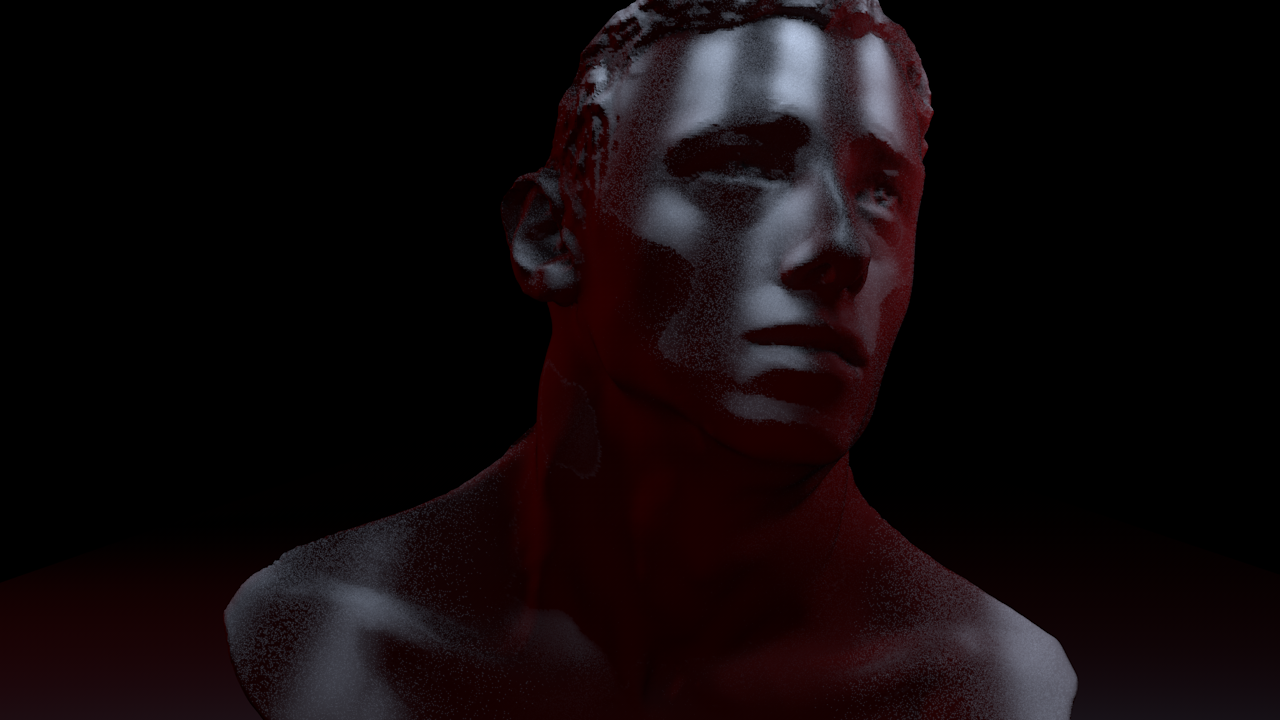
Same Lighting Different Materials
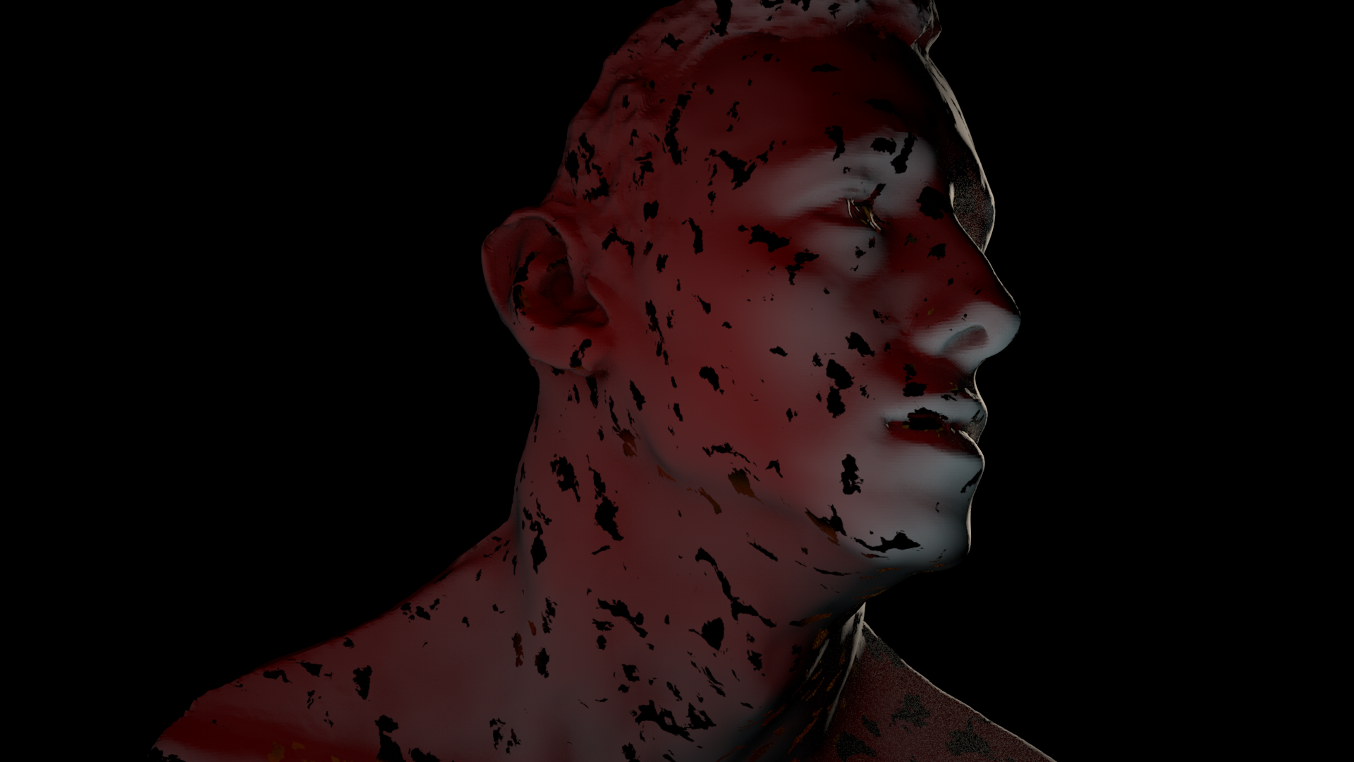
Materials can also drastically alter how a model looks, though the texturing on the left isn’t placed correctly, the way light reflects off it is much more pleasing in my opinion.
You can even see in this example above that the rim light catches the figure differently, in fact, I had to boost the brightness by about 5 times when switching between the two materials. The black patches on the left figure were supposed to be gold flakes. I was trying to replicate a marble with gold combination, the reason they show up as black is because reflective materials need an environment to reflect.
Some inspiration was @Billelis on Instagram.
He has such masterful blends of materials and textures that its something I aspire towards and hope to achieve beyond this FYP. At least I hope to capture something of my own both visually and on a technical basis.
These tests eventually led to my Midterm assignment for my Lighting and Rendering Pipeline Module, with the final version on the far right.
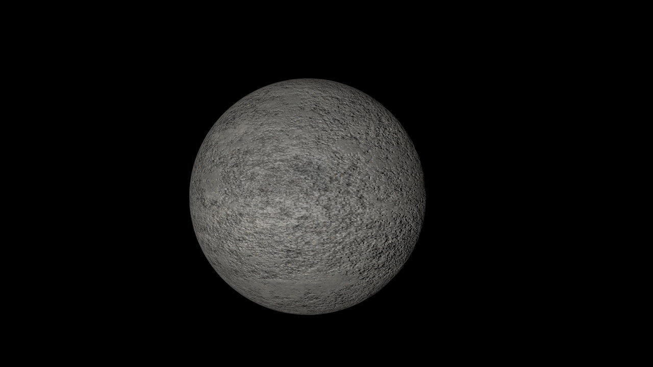
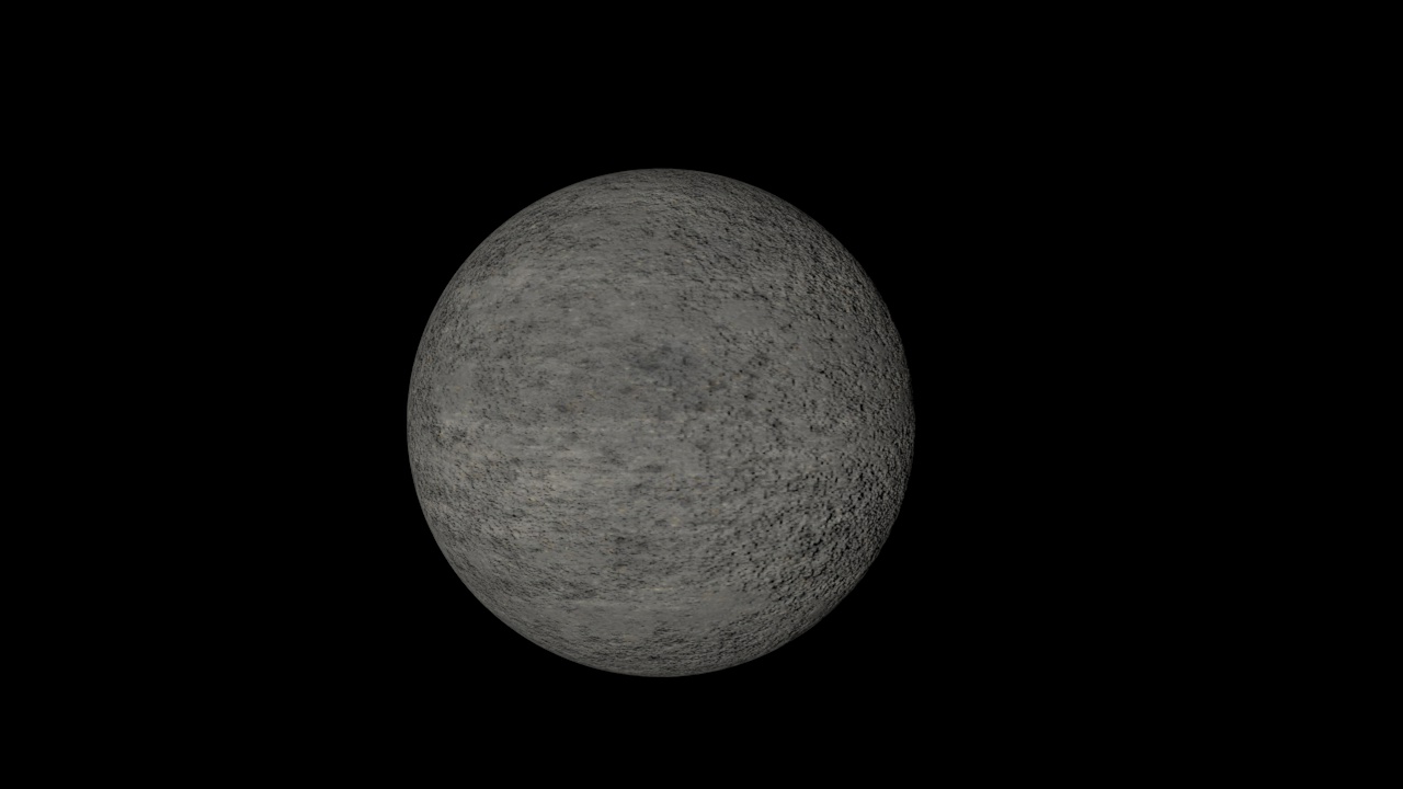
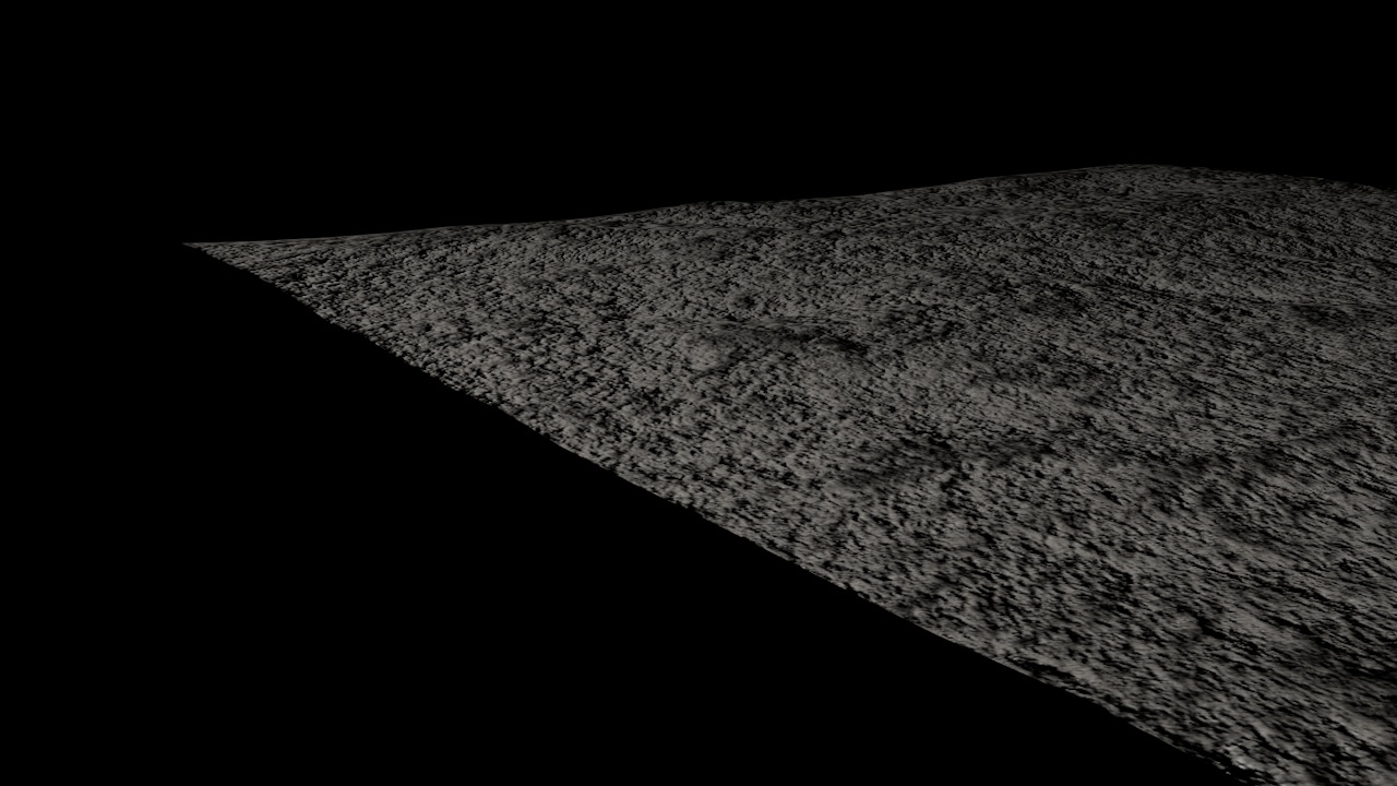
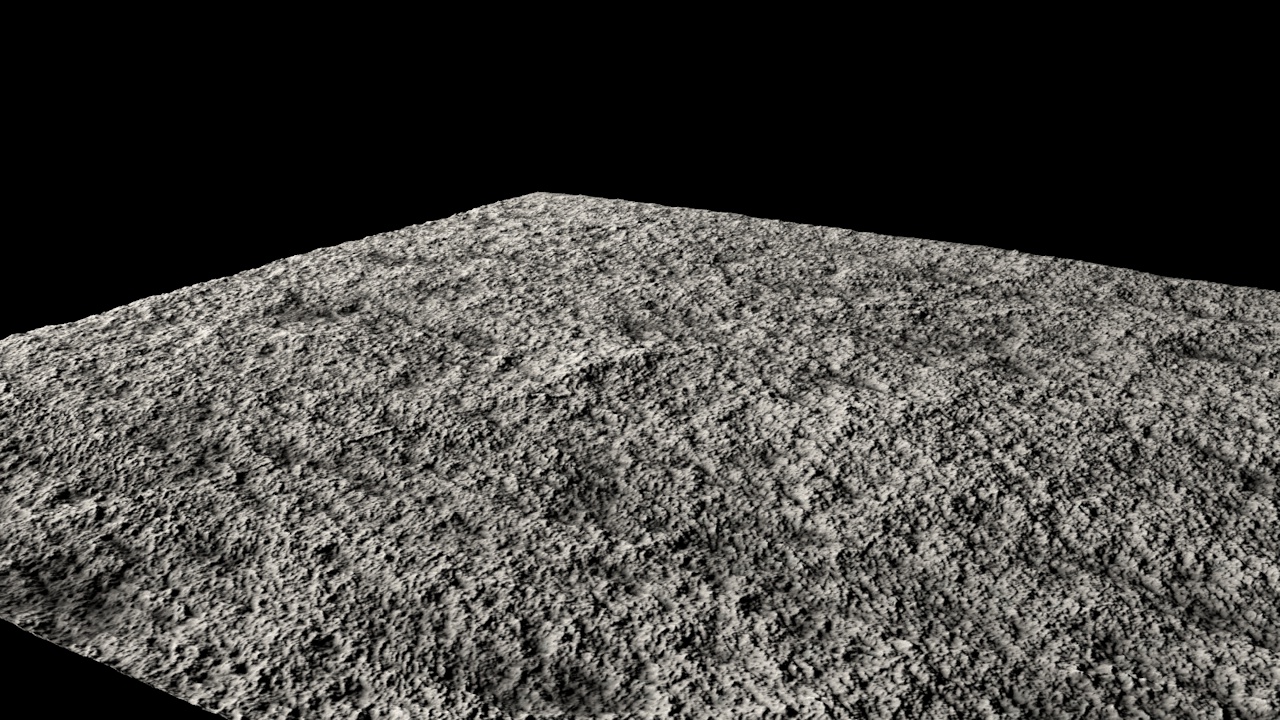
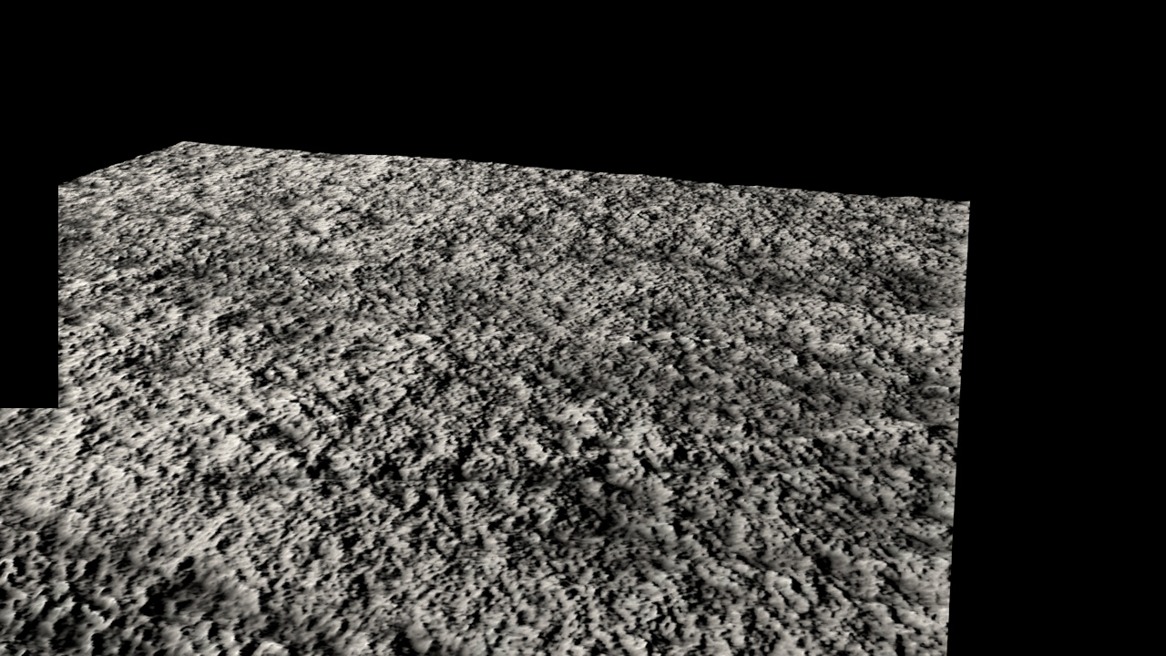
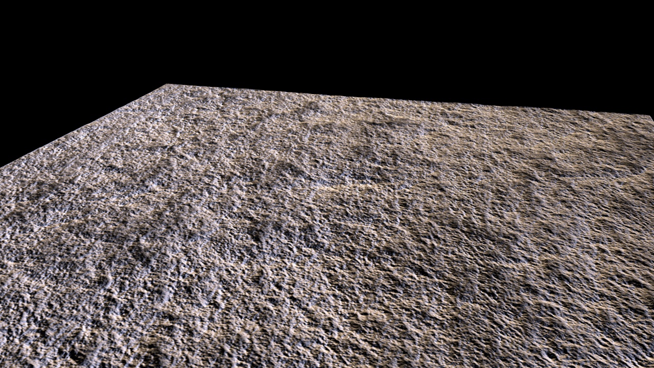
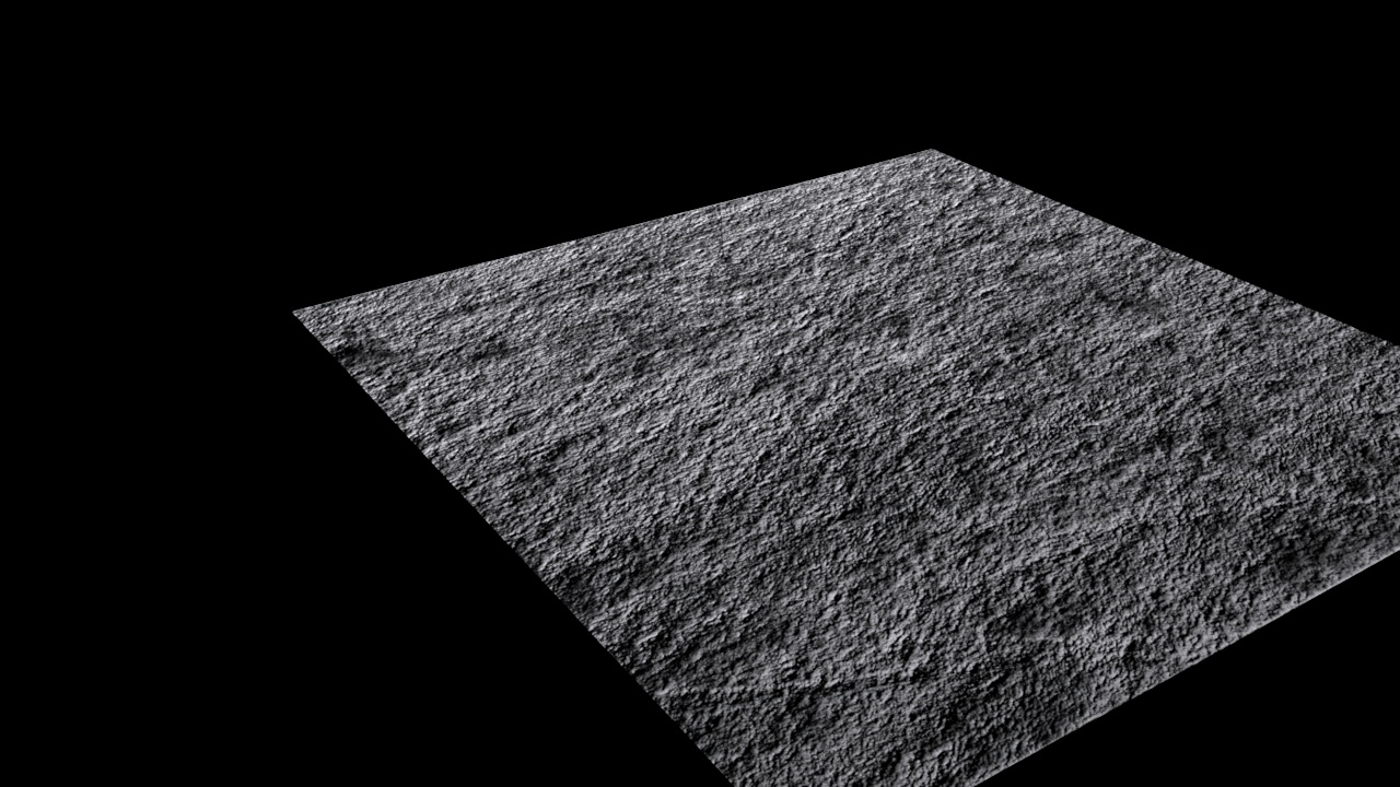
A lot of time was also spent trying to find textures and materials. Textures were especially tricky as high res versions for close-up shots usually cost money, so I’ve been dabbling in procedural textures that scale better. Below are a collection of tests of 1k – 4k res textures that haven’t made it anywhere, but I’m trying to figure out a good texture for the walls and various objects and what kinda limits they have in terms of standing up to closeups and on various forms.
-

-
-

-
Texture displacement looks inverted
-

-
Floor 1
-

-

-
Up close jankiness
-

-
Floor 2
-

-
Wide shot
-

-
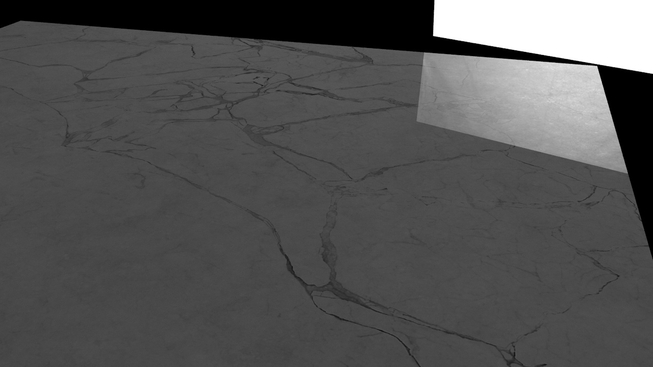
Marble Test
-

-
Displacement Test
-

-
Displacement Map
On the left you can see a displacement test. That was essentially a flat plane in Cinema 4D but using the map on the right causes it to displace according to the colour (tweakable with parameters). This test was just an exploration into displacement maps and textural visuals.
TO BE CONTINUED in the next post – [ HDRIs, DOF, R/B color Tests + more ]