The Links below are the slides for my FYP pitch and folders for files that were not integrated in the slides themselves. (Little India Soundscape + Japan Video of the atmosphere/vibe)
It was funnily coincidental that Rose Bond started her presentation by showing us her reels of hand-painted animation clear lead film. Having done similar work just a few weeks prior in my Experimental Film class really helped me connect with the process of when viewing her work.
Sadly, that’s where the similarities between me and Rose Bond end.
Her repertoire of work is quite impressive. From execution to scale, layout and even the themes.
The work is made even more astounding to me, especially on a technical level purely because she’s been doing this from long before a lot of modern conveniences were around.
The imagery she displays on buildings often are tied to the history of the building itself
Broadsided!, Exeter, UK, 2012
Which I feel leads to a greater connection between the projection, the site and the audience.
A nice refresher from the usual more abstract or “3D’ style projections we’ve come to see often at various events in the recent past.
Another thing that she noted was that she much prefers the audio on the street mixing in with the crowd and harks to that as the experience as opposed to just the clean sound design from the work itself.
Considering all this it makes me wonder about Singapore’s potential for projection mapping.
Not that it’s under utilized, but with the wealth of history in Singapore, old buildings gone or still here. The types of projections done so far, have been while still enjoyable and quite stunning, not quite tapping into the potential of the buildings themselves. That is to say, whatever visuals they project on to one building, could very well be transferred to another without much significance being lost.
Art Deco Buildings in Tiong Bahru
Especially with the recent push for the Arts, “real” or “not”, there is still support for it, and thus, opportunity for works of the aforementioned manner to emerge.
Tho, some would argue that it’s already begun, what with the recent projections on the old supreme court now turned National Gallery.
Lastly, I really enjoyed her Oregon Symphony collaboration work, Turangalila from 2017.
Both visually and aurally captivating, the visuals spilling forth from the walls, light bouncing around the symphonic swells.
It’s like Disney’s Fantasia /Fantasia 2000, both of which i enjoyed as a kid, but with Rose Bonds work, unconfined by the screen format.
Even in 2007, 3D audio such as the virtual barber shop (linked above) has been around. It simulated a convincing replica of real world sounds, especially for it’s time. (1:15 into the video is eerily convincing)
Since then some musicians have delved into simulating the acoustics of audio in the room that it’s recorded in. Eg. Pogo with his binaural mix of his song Upular
Non – 3D : LINK
However, despite having been around for a long time, I don’t feel like it’s been utilized so much nor explored as widely commercially speaking, as visual mediums.
My idea is to create an immersive experience utilizing binaural audio and transport the user to another location.
Binaural audio of the sort I am going for are generally recorded using a Left Right audio configuration and using molded ears to replicate the way sound is shaped before entering the ear canal.
I find the ability to disassociate from your current location to another in such a manner very calming.
Ironically, by not taking in their current environment and transporting them elsewhere, it can create a mental space to be in the moment.
I find this to be a very meditative experience and does provide respite from the mental stresses of life by dropping everything in that moment to take in the totality of the scene.
I intend to do this through a mix of both audio and visual means. With binaural audio as the focus, and the visuals as a complimentary choice.
I find the visuals to be immensely helpful as while some might find the audio experience with eyes closed to be stronger, with the visuals I intend to use, which are specific places as opposed to a situation like in the case of the virtual barber shop, the sounds are very much tied to the visuals that occur.
For example, if we hear the snap of a twig or the rustle of some bushes, being able to open your eyes and see the bush rustle or a branch bend will help actualize the place in the minds eye as opposed to being swung back to the users current location the moment they open their eyes.
We’ve seen 3D come and go, and now Virtual Reality and Augmented Reality being taking center stage.
Virtual reality has it’s entry level limit for both headset hardware and computing hardware to support the system while AR seems to be a good blend of accessibility with phones and integration with the existing environment, which i think makes it a strong contender as a medium of the future. Perhaps because the requirements of binaural audio requiring headphones to be effective limits the experience to the individual AND on top of that, the quality of their headphones. Whereas cinemas can make use of a singular screen and sound system for simultaneous usage.
This makes me wonder about subsequent exploration for perhaps mass binaural audio experiences, but for another time.
Going through the reading, one product jumps to mind, and its smartphones.
It’s hard not to gravitate to them especially since they’ve laid claim to such an wide variety of tasks; from photography, to e-mails, regular texting and social media.
Each of those facets could having their own length and breath in the design process before coming to fruition as an app and icon on a homescreen.
But the smartphone itself needed to be far forward thinking enough that despite all the iterations up till this point, the skeleton of the smartphone has remained largely the same.
And it is that core that’s quite intriguing. When the reading mentioned the ‘Aunt Edna’ persona, I couldn’t help but picture a regular old auntie using her smartphone to play some random app store game to fill her time.
To say everyone and their mothers have a smartphone would not be an understatement. Such a ubiquitous product just speaks as to how efficient and easy it was for a large audience to pick it up.
However, at this point there has been numerous articles of how we’ve become a slave to the smartphone and numerous other articles of how the writer did a social media cleanse and how that made them feel like a crack addict feeling their phone vibrate in their pocket when it wasn’t even there.
But stepping away from comedic hyperbole for a moment, there definitely is something to the smartphone overuse in society.
The smartphone has made itself it’s own pocket to fill and without it, something feels amiss without nowadays; a regular person’s capabilities suddenly feel cut short by the lack of utility the device gave us.
Vox recently did a video essay on the addictive nature of smartphones
It states that our phones are designed to be addictive.
It also mentions that push notifications were initially made as a way for us to check our phones less.
By showing a small snippet of an e-mail on the 2003 blackberry, it allowed the user to check which were important or not at a glance, reducing the need to open up and check them individually.
However as most people with a smartphone will know, just about every app nowadays asks for permissions for notifications.
One aspect that surprised me was the stated intentional design of pulling to reload a page and how it was similar to the pull of a lever on a slot machine.
A question I often ask myself is in regards to the intent of the design, take push notifications mentioned earlier as an example, designed intent and evolved use over time has drastically changed.
This harks back to the reading where they mentioned that ‘experience design’ is a presumptuous term, assuming the users behaviour and perspectives that they bring to the product.
It now makes total sense to me why Instagram changed their timelines from a chronological one to one that’s churned through an algorithm. That way the user has more reason to stay on the app and keep refreshing for “new” content.
Despite the cries of creators and artists that have their content shafted by the new system, Instagram made the change knowing that it’ll keep users scrolling through their infinite timelines; and that feels pretty insidious to me.
(There’s been a new app though, that’s popped up called Vero, which has been touted as a potential “Instagram Killer” with its chronological timeline)
I don’t think it’s possible to ever have the foresight to expect the potential for change and evolution of an intended design being that humans are quite varied creatures despite our predictability over the ages. And even though from a user perspective it’s easy to go “how are they gonna improve on this” the companies continue to streamline and draw people further into the rabbit hole of smart devices. (but it does seem to be hitting areas of redundancy in my opinion, selfie emojis and stuff like Alexa and the like feel like redundant conveniences in my opinion; also no one really needs a smart fridge with a small monitor on it)
My main questions are these
Where is the line between helping a user accomplish their goals and creating one for the user/design morality?
How do we structure the learning process of design to be as collaborative between the different disciplines in the school setting as in the real world?
The reading, Thoughtful Interaction Design by Jonas Löwgren and Erik Stolterman, at first, felt very obtuse and dense. Putting everything in abstract with highly academic analytical approach it was a more intense articulated approach to something I was more used to handling from a more intuitive and ‘gut-feeling’ perspective; not that I don’t enjoy the philosophical and academic aspects. This was on a whole other level.
It detailed the designer and their position in the world and their responsibilities; that their works define the way in which people interact and in turn adapt with the object and interface that was designed. Especially with the large portions on technology, the parallels between the tech and design were interesting to pour over. How both are perpetually intertwined around their “problem” and how the “solutions” are approaching the situations from a mass of perspectives; this was preceded with the detailing of good design being a complex can of worms which to me was an interesting thing to note. I think it’s especially useful to artists and students who often pine over attaining perfection.
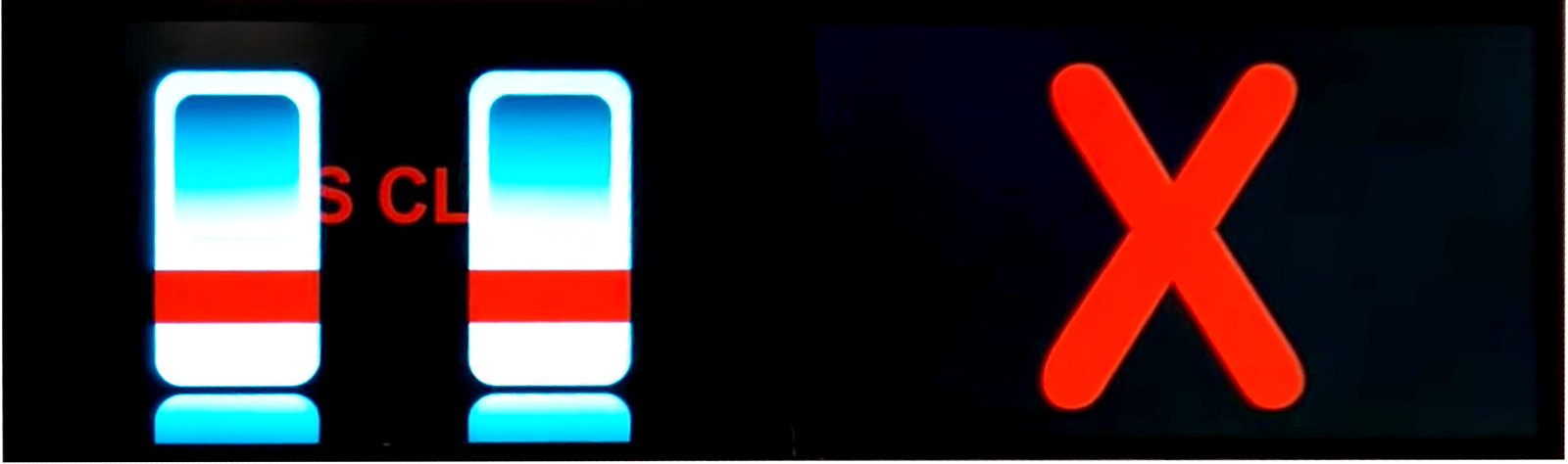
While not an artwork per se, I think something relevant to this reading is the recent MRT line’s mess of a visual style. Having swapped in digital displays into some of their trains, this change was accompanied with some of the most inefficient display of visual information. STARiS 2.0, the SMRT Active Route Map Information System as it’s known was revamped in April 2017 and rolled out on a few trains. Pictured below, we start to see the cracks in the system. Firstly, there is no context as to the previous stations or the subsequent ones save for the next 3.
Lack of context to the rest of the line’s stations
Additionally, the landmark pictured has no indication of which building it is. People who are unfamiliar with the area have no assistance as to the relevance of the pictured building and hence, it ends up being just a graphical filler.
And while good design was said to be a multi-faceted discussion, I’d personally say that the graphical elements were not up to snuff.
I think this speaks for itself
Poor layouts for commuters, lack of context, a mess of visual clarity, STARiS 2.0 needless to say has it’s fair share of negative points. It does however, helps future designers avoid repeating such heinous mistakes and for companies to take note on what not to do. And as mentioned before, it is a process, each new piece that comes out helps users and creators alike comment and critique on what does and doesn’t work. At the same time, this does show very strongly that there is a responsibility that designers have to their audience, and that the audience, even without formal training, can tell when things go wrong.
(Untitled) Anagrams and Objects for RU & RU (2015) – Newell Harry
Large anagrams hang on tapa cloths (softened bark) at NTU CCA’s exhibit The Oceanic. Made by Australian born artist Newell Harry, these large scale words take up the entire wall and surely don’t go unnoticed. They were inspired by word games often which include some aspect of anagrams or wordplay; the artist himself liken these words to “dumbed down poems”.
From artists to Star Wars and even Japanese (GOYA, DALI, YODA, DESU) the words cover a lot of ground. Limiting himself to four letters, he wanted to touch on a wide variety of subject matter nevertheless. His interests in culture, religion and the language do shine through his works the more you dig into them. In the words chosen, some can be read differently or mean different things depending on how the word is read. This is Newell’s way of subverting meaning through the use of anagrams.
Additionally, the tapa cloth is used as a form of currency in the South Pacific and is exchanged in various occasions in the culture. He wanted to utilize the material out of it’s usual cultural context as a means of exploration with the medium.
L4L formply tables, ceramics, various artifacts, found objects, paper, ink, Tongan Ngatu, chalk Table dimensions: H 90cm x W 79cm x L 190cm (ea.)
His artworks elsewhere, are on occasion exhibiting with accompanying items that are usually cobbled together anonymously with miscellaneous items, often given to him or acquired cheaply though auction or by chance.
While this wasn’t entirely the case at NTU CCA, i couldn’t help but draw parallels between those previous exhibitions accompaniments with the one we saw on site of The Oceanic. Right in front of Newell Harry’s work, was the lovely and intricate costumes by Laura Anderson Barbata (Costumes seen below).
Queen | Tapa Cloth, Shells and Mixed Material
Bird Fish Prince
Unlike the casually placed items of Newell’s other exhibits, these costumes, made for the performance Ocean Calling, are much more intricate and are reminiscent of tribal ritual garb and ancient Japanese straw raincoats. But the connections between the two are more likely to be a happy coincidence in my mind.
I thought the pieces were quite visually stunning, especially the costumes. It was also quite interesting to find out that tapa cloth was used as currency, which made me ponder about swapping the tapa cloth banners for that of other worldwide currency, no doubt there’d be more of a stir as is the nature of big money. My ruminations continue to percolate on that note (ha!), but fortunately this post has an end,