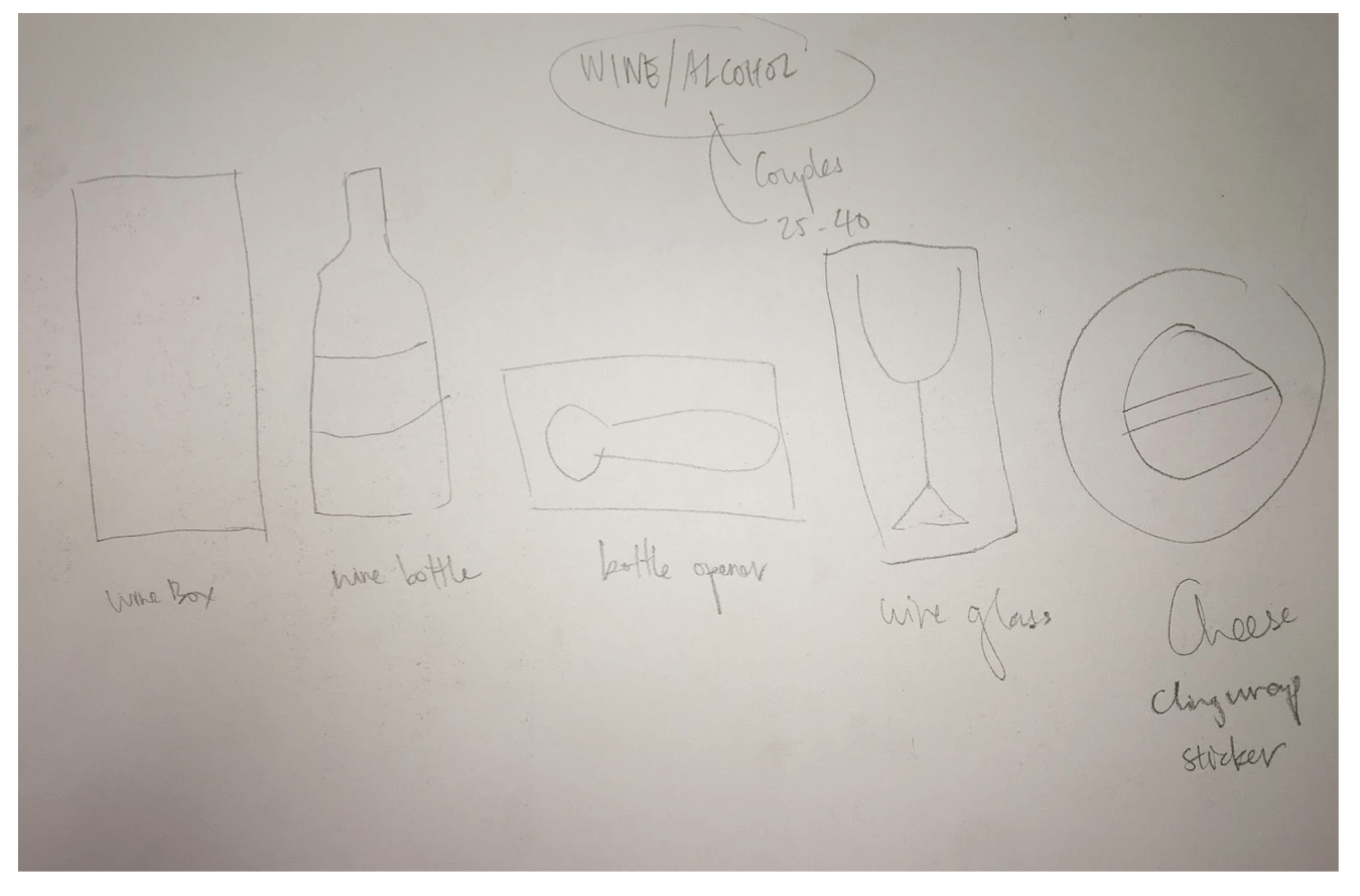
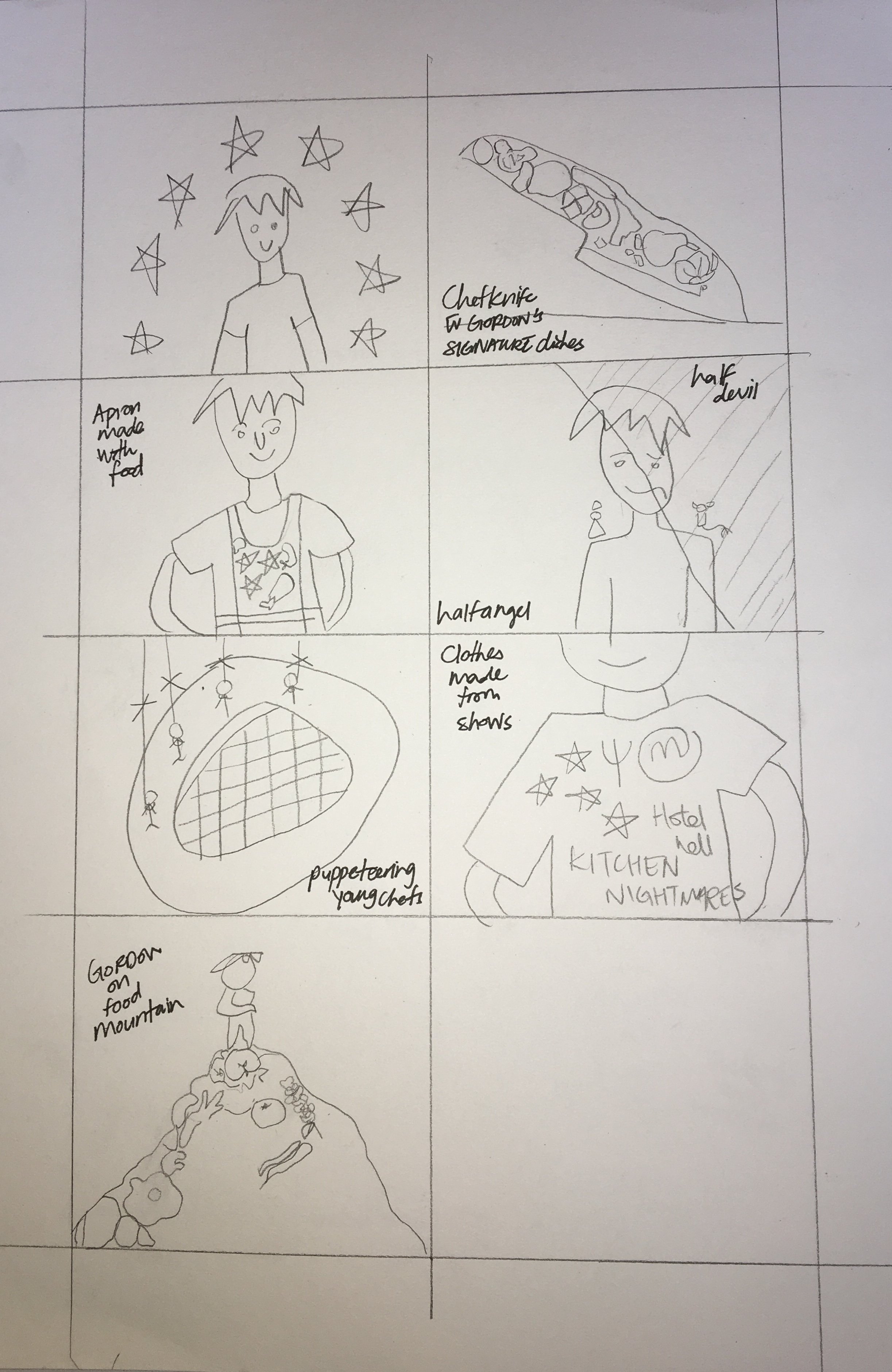
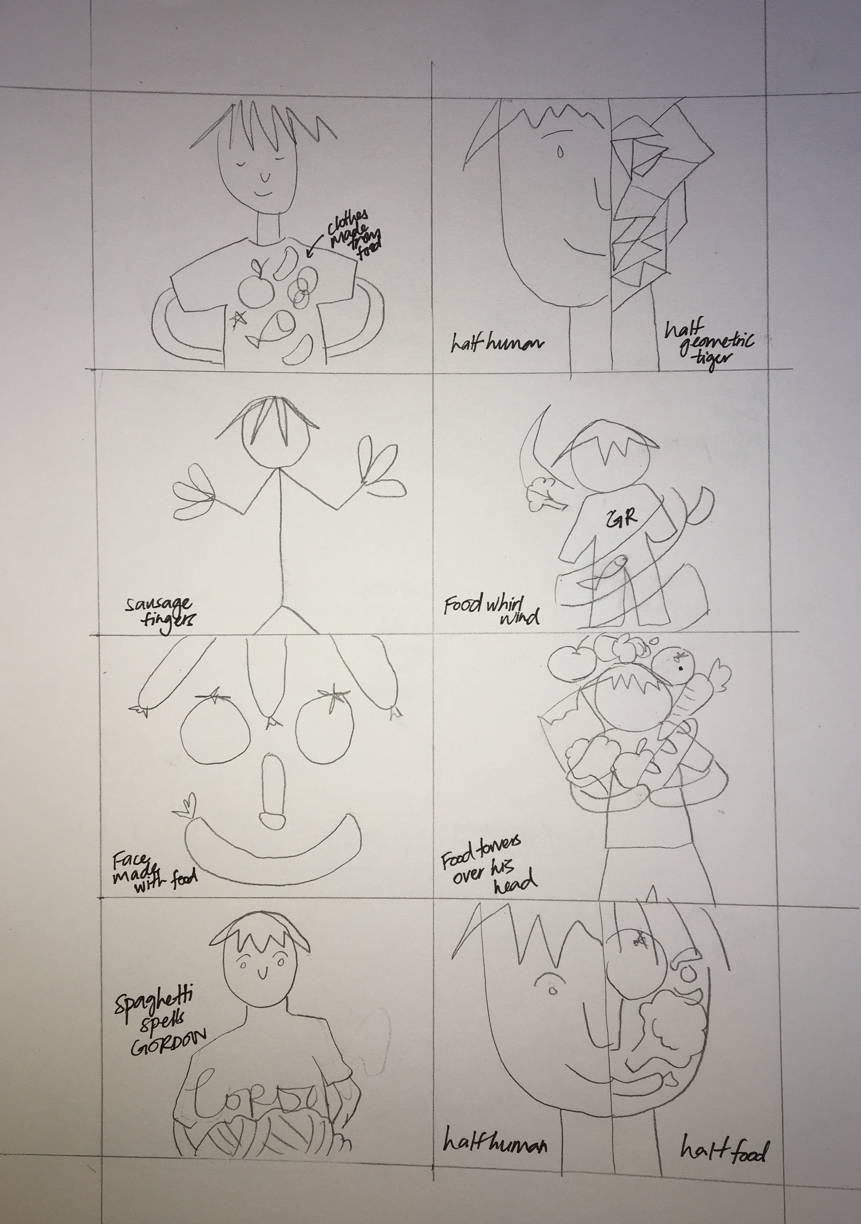
For this project we were tasked to produce a set of illustrated items that looked like they had the same theme/belonged to the same family. I began researching on applied illustrations and an event that I could possibly design products for.In order to streamline my thoughts better I decided to come up with 3 separate events, products and come up with 5 thumbnails sketches for each one, so I would have a variety of sketches to choose from.
Event 1 : Toiletries event for hotels/gyms/spas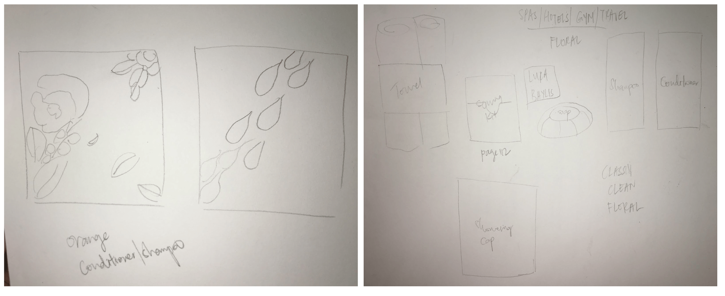
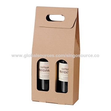
Event 2 : Couple wine event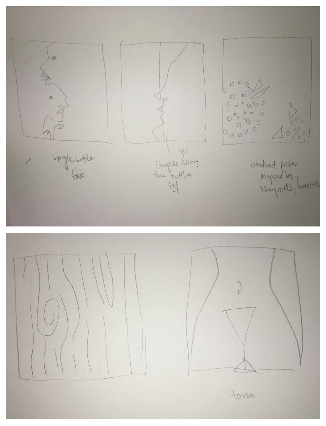
Event 3: Cosmetic
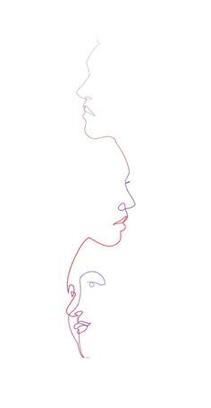
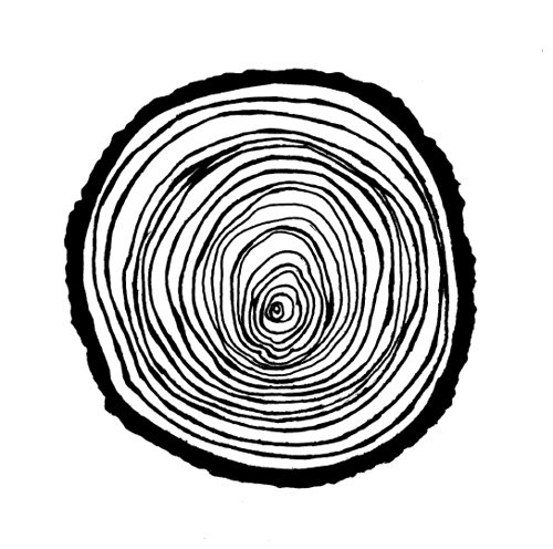
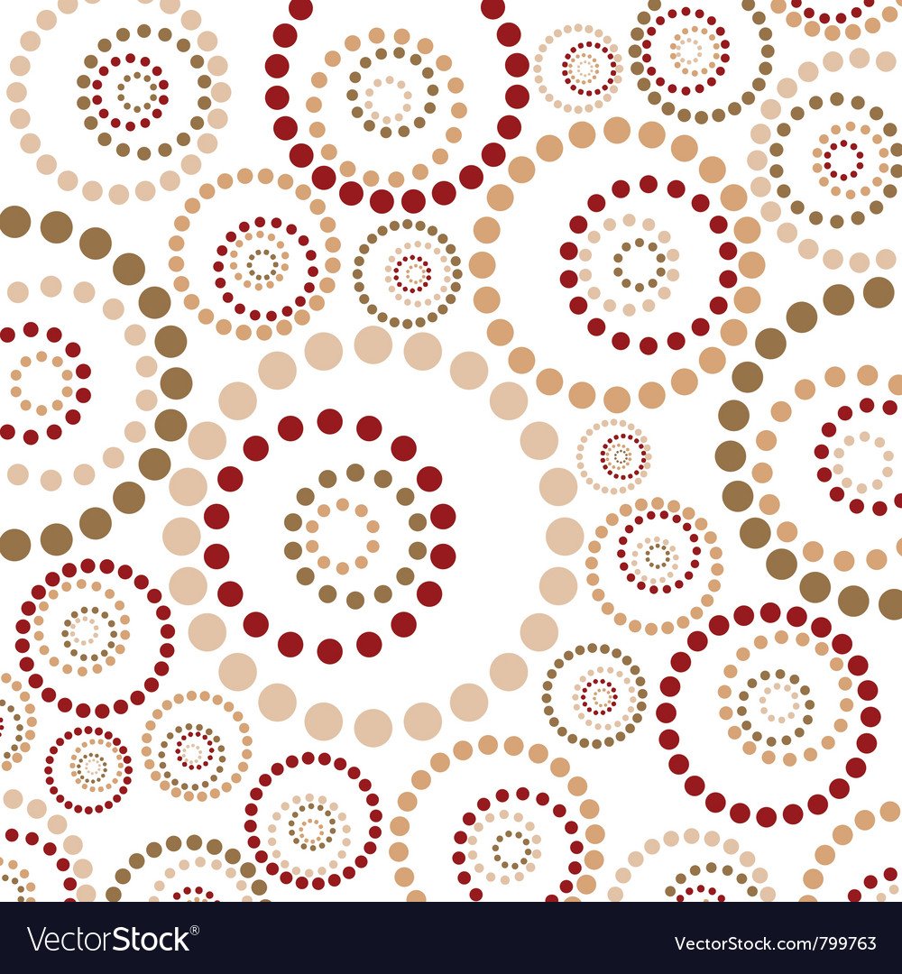
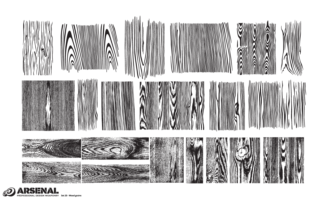
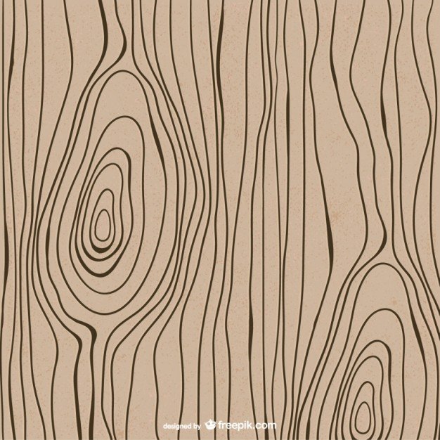
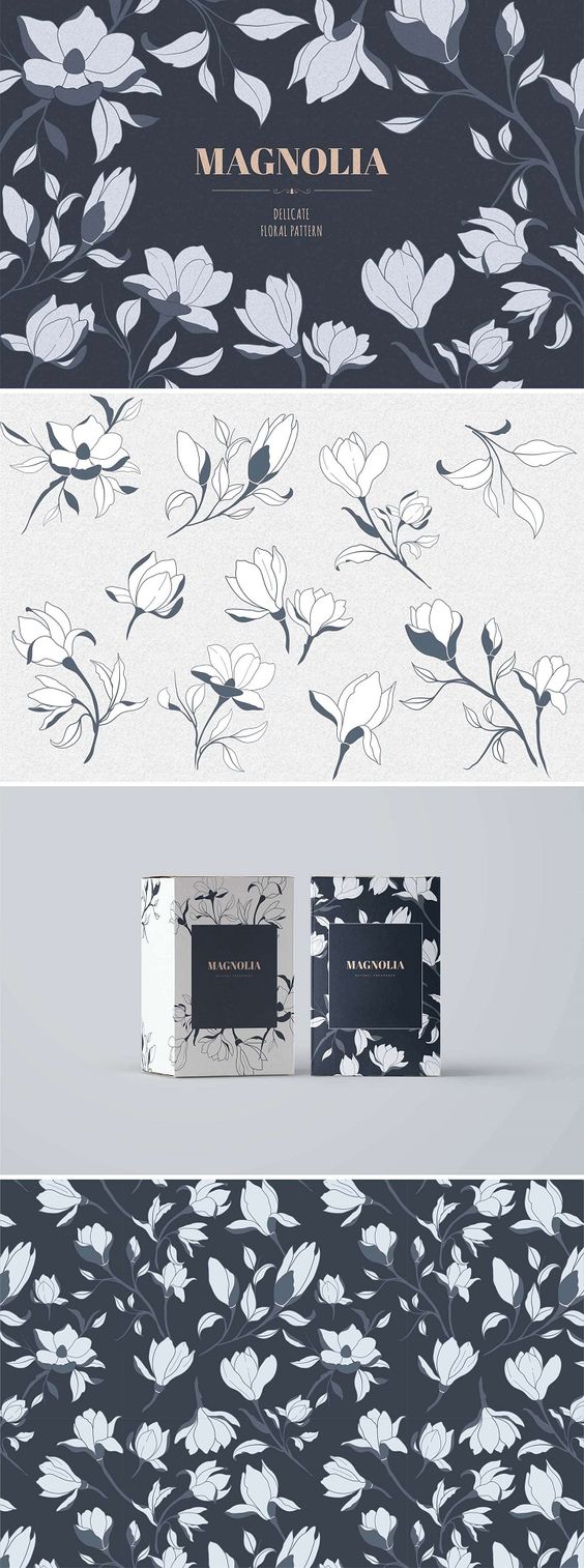
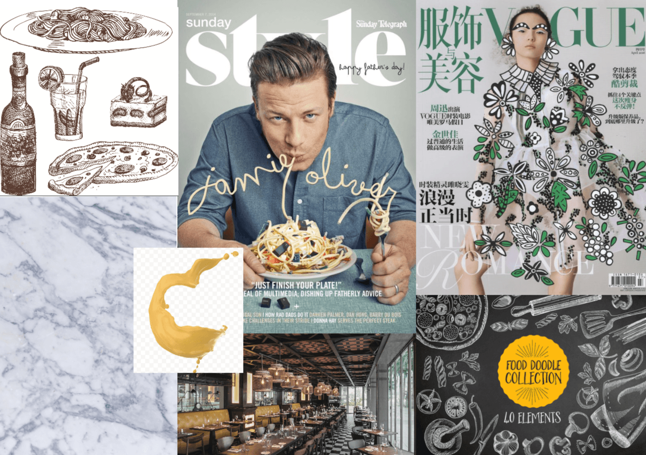
I scoured the net for inspiration images for each event.These were some of the images that spoke to me and some of my thumbnail sketches were based off of these found images.
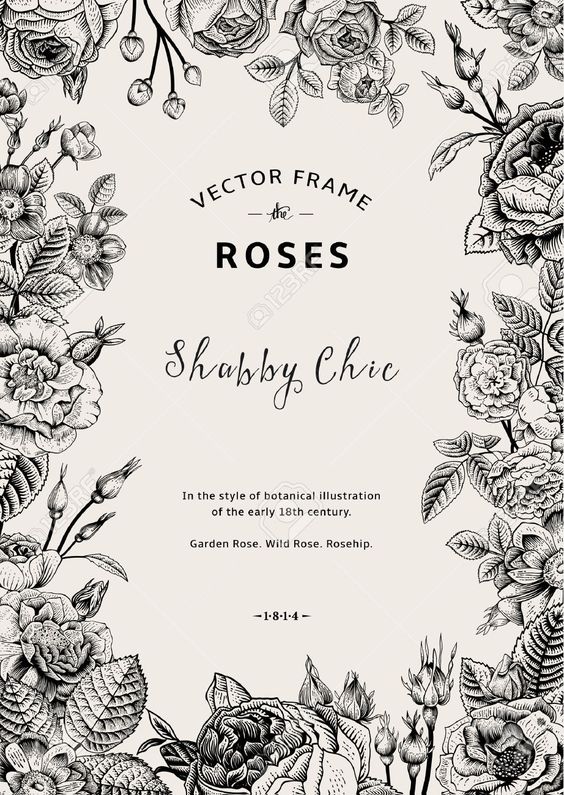
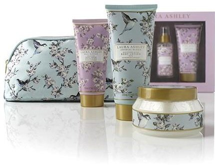
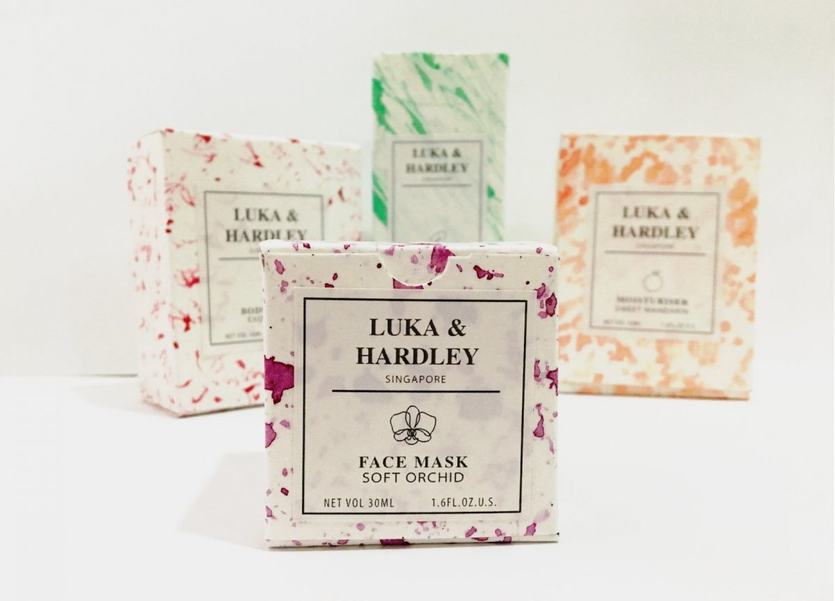
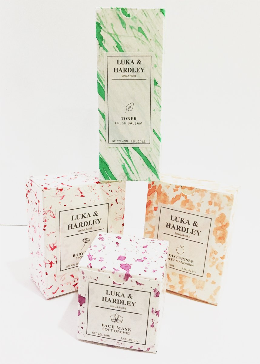
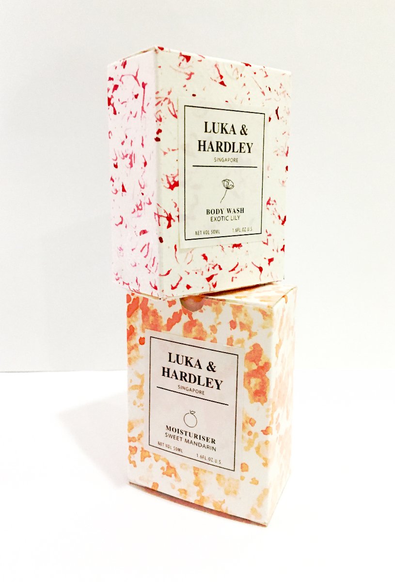
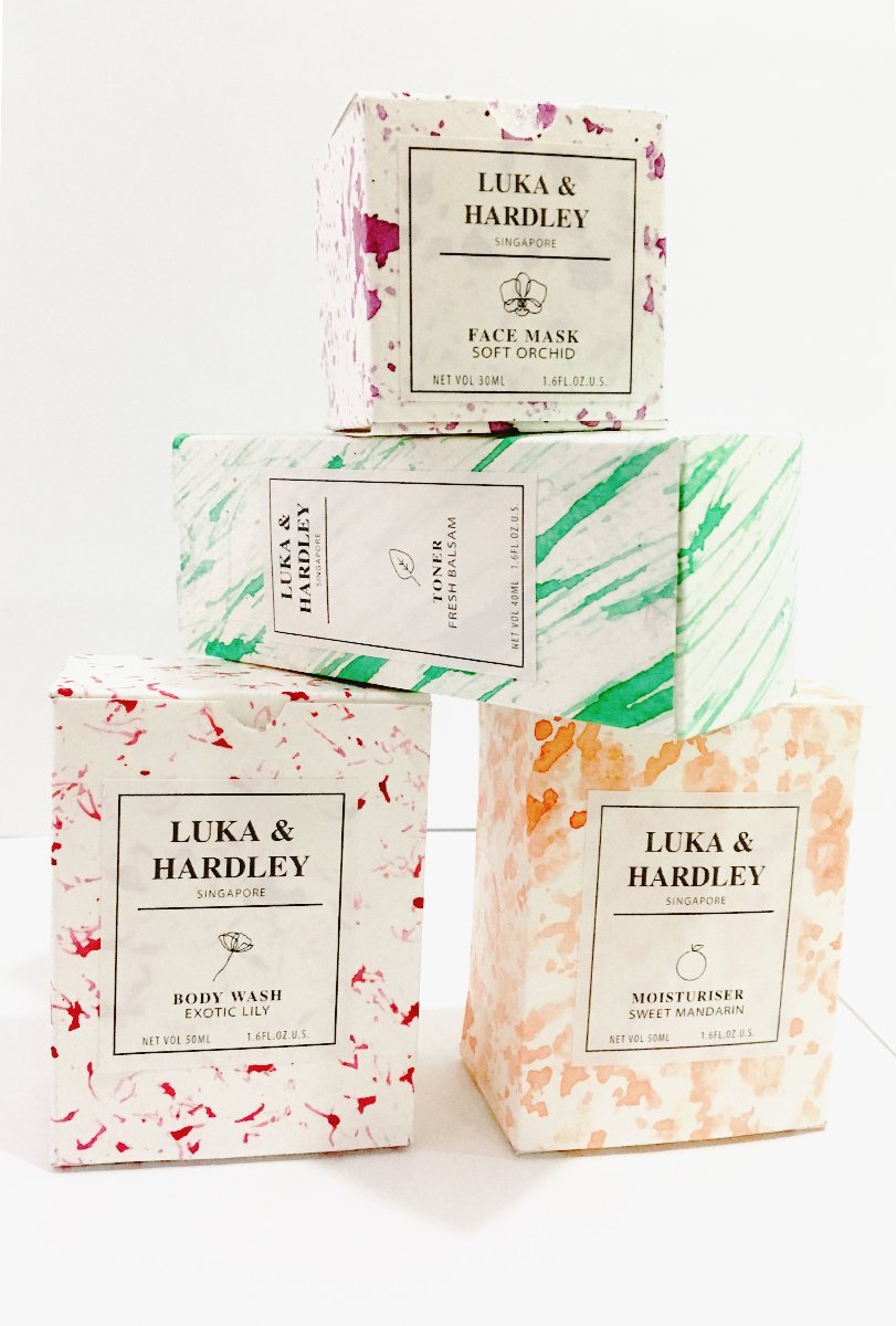
I was particularly attracted to this packaging because of the contrast between intricate patterns and minimalistic branding. It reminded me of me of luxurious skincare products for example those from crabtree and Evelyn.I decided to develop this idea for this illustration project and do a ‘pick n mix’ skincare event. However I knew I wanted to go in an abstract direction so I started conceptualising on how I was going to create this abstract pattern.I wanted to incorporate local flowers and also create a local brand, So I made my way to Botanic Gardens to take a look at the kind of flowers I could use.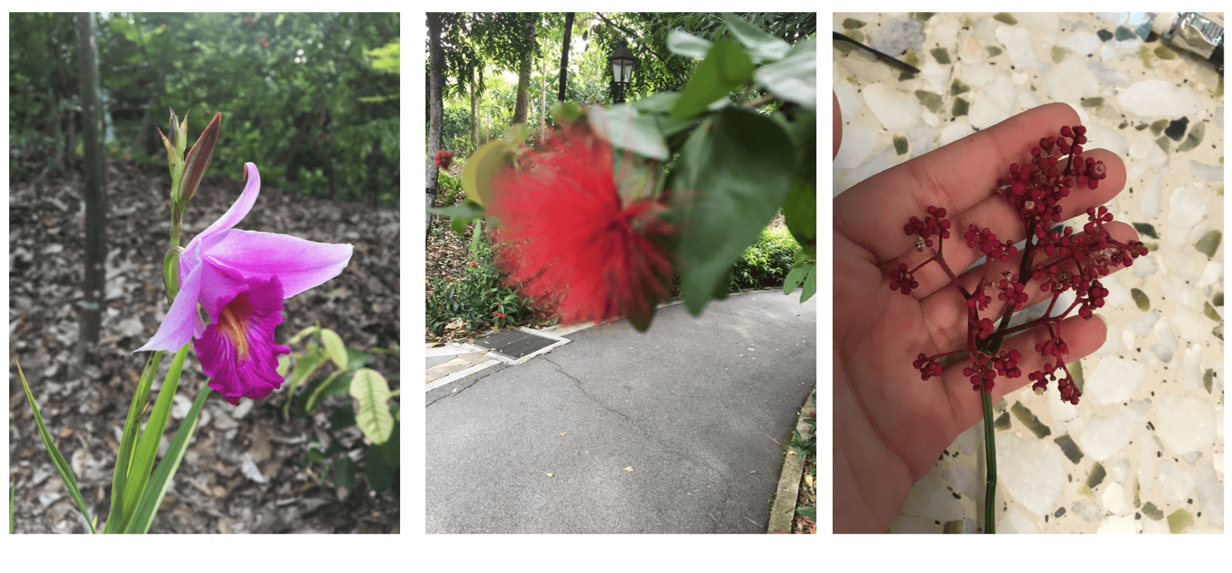
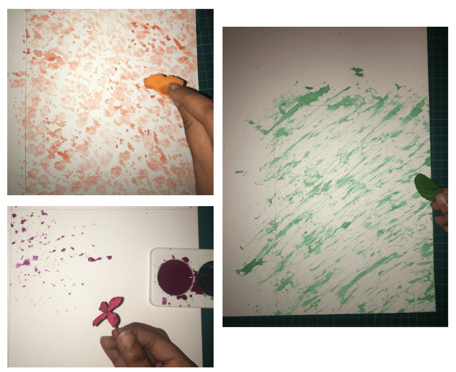
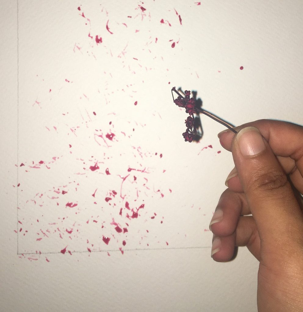
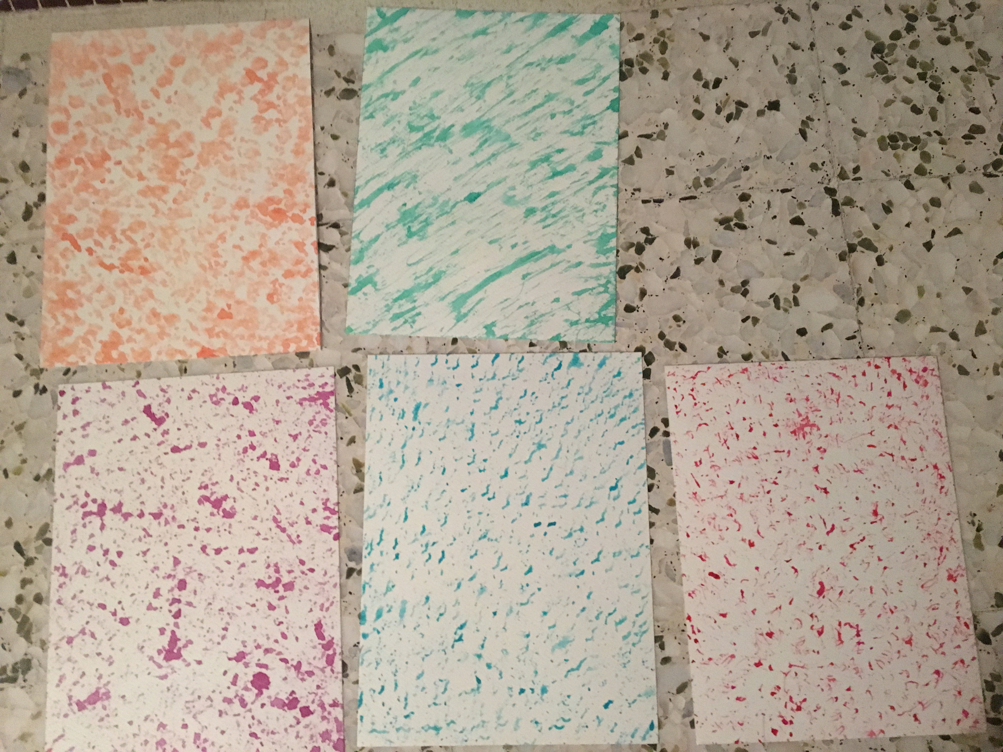
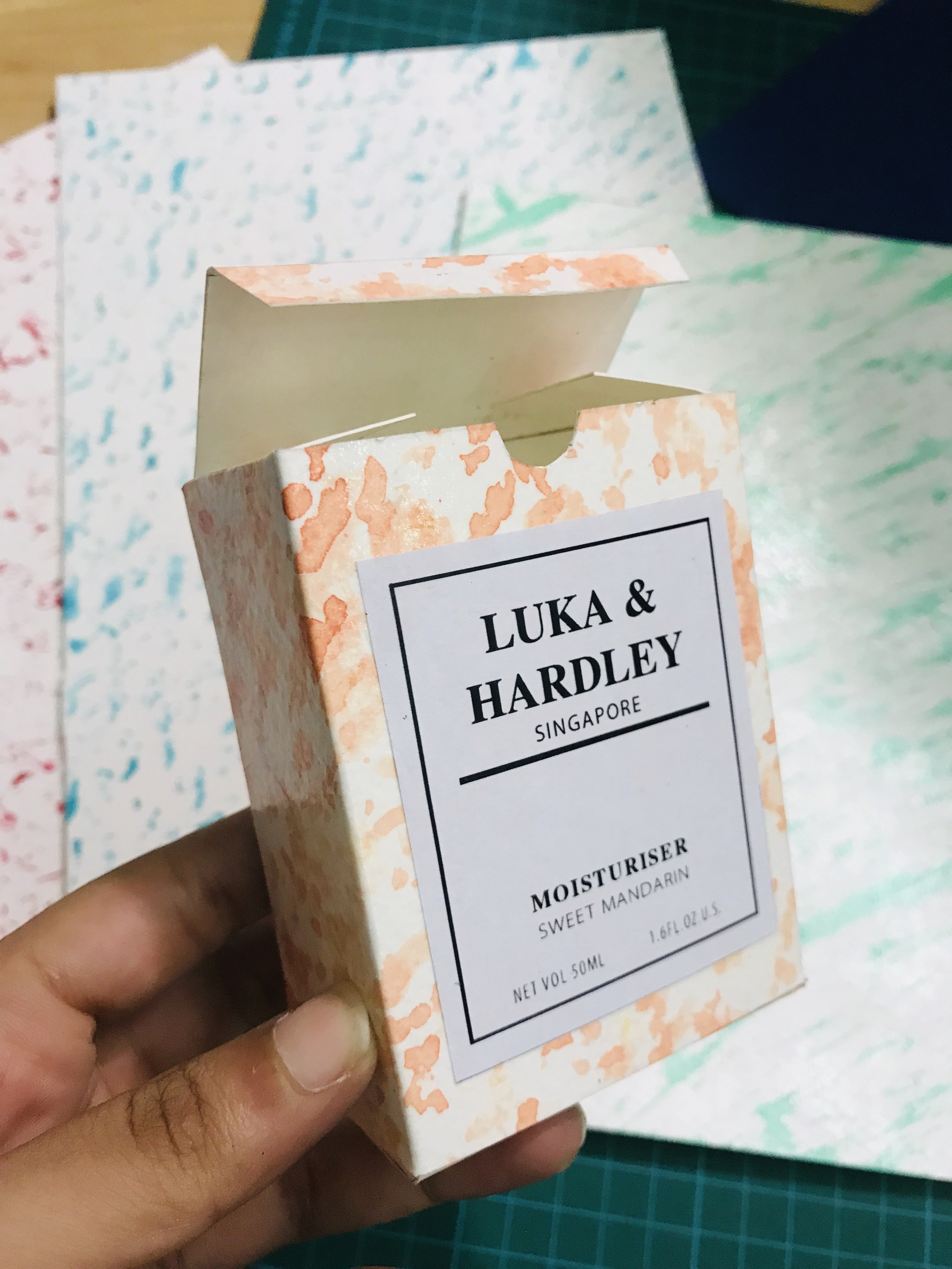
I decided on 5 different plants that I was going to use for my packaging: Orchid, Lily,Ixora,mandarin and balsam. These were flowers that could be found in Singapore, and I decided to use watercolour , for that softer more fluid look and create patterns via mark making. I experimented with the textures and the water content in my paint to achieve a set of patterns. I stuck to jewel tones for my colour scheme as I thought it would bring out the luxurious skin care vibe out in my packaging.
Then I proceeded to create a unique pattern for each product I was making using the plant itself.For the mandarin and balsam I used the skin of an orange and a leaf for the balsam.
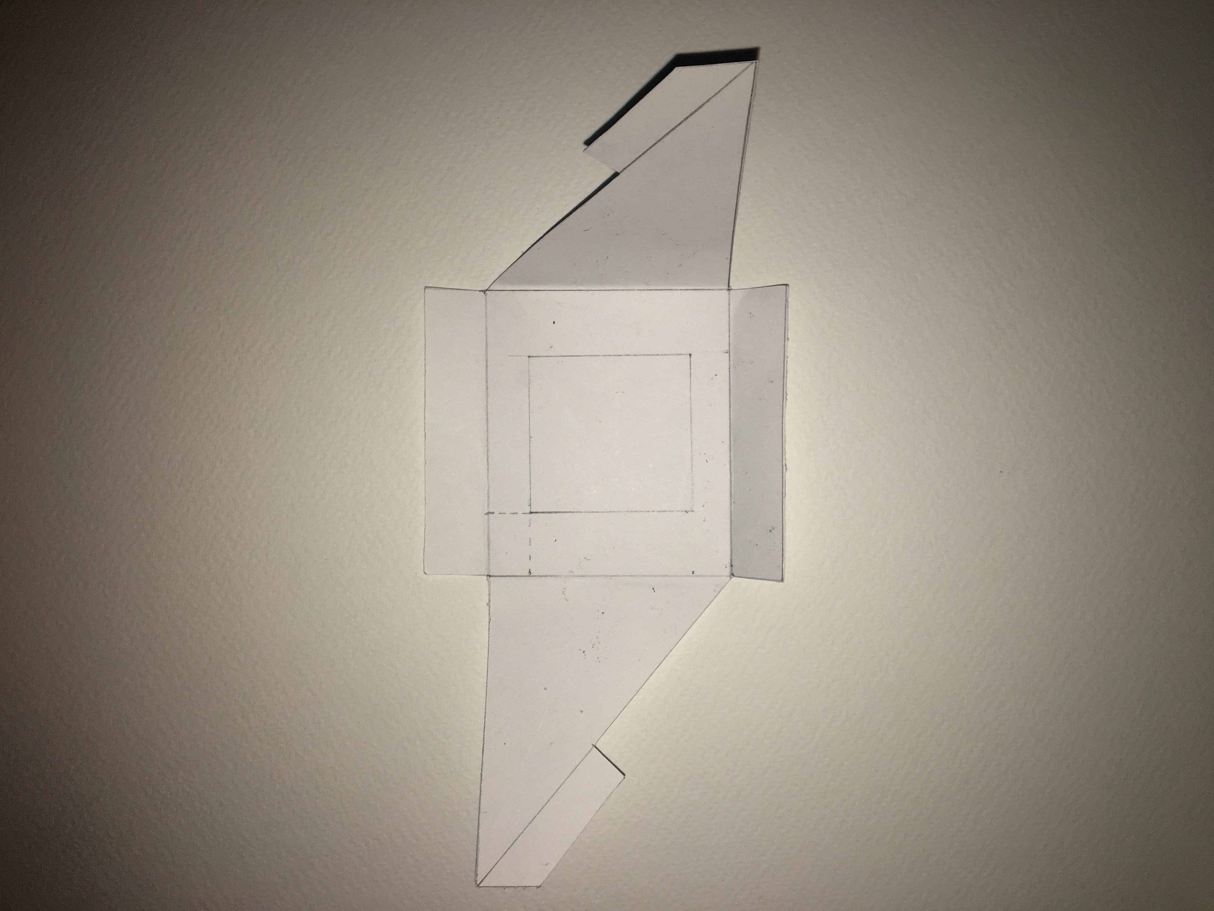
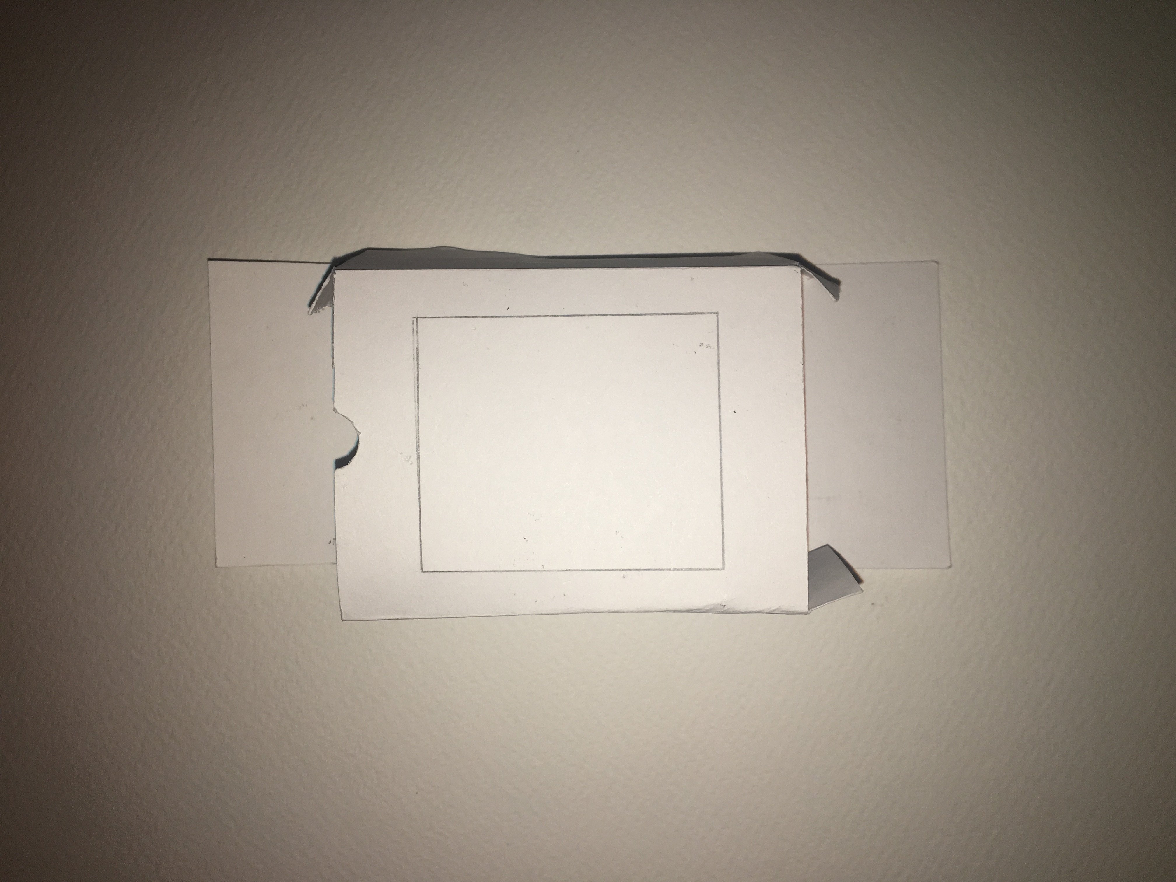
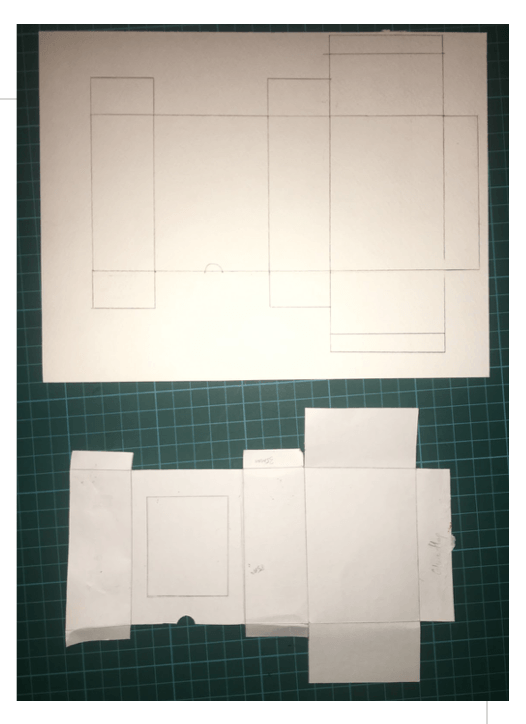
I experimented with drawing nets for the packaging itself and also different types of packaging.I narrowed it down to one type of package but after consultation with Lisa she said it was not innovative, so I created packages with varying sizes and heights to create visual interest .Then I proceeded to work on the branding and I was inspired by high end English luxury bath and body products.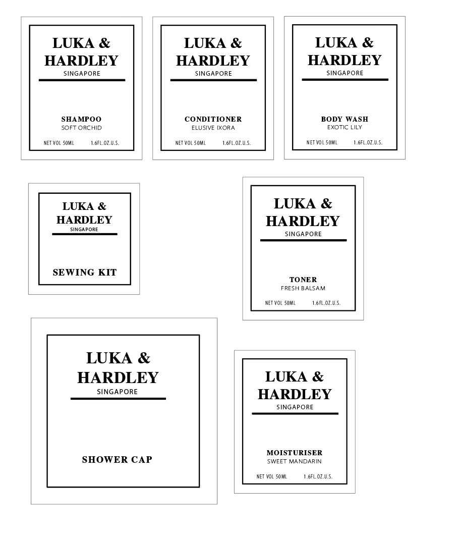
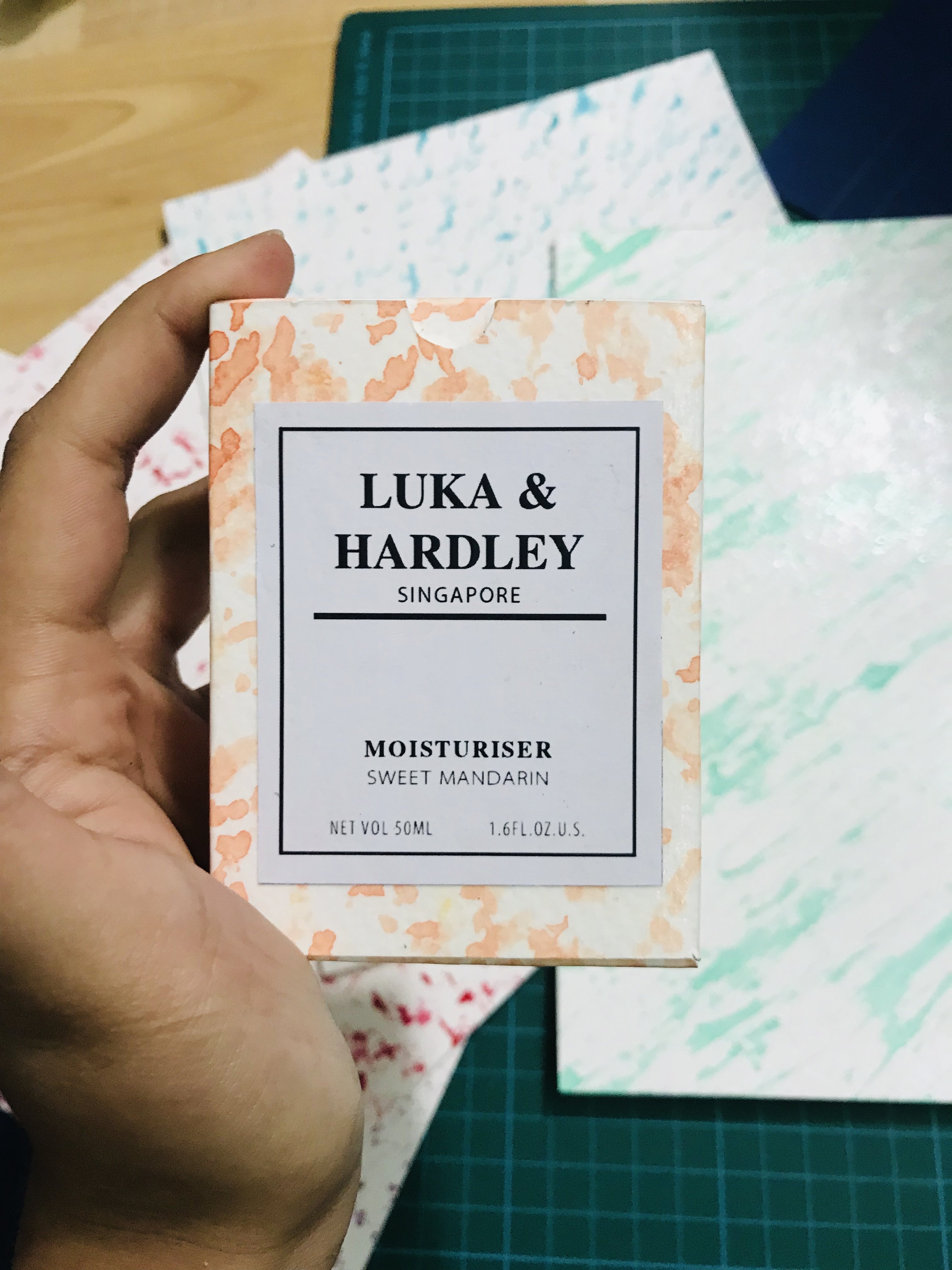
Lisa suggested on adding an icon for each of the products as there was space I could more efficiently use. I thought the addition of the icons really brought the branding closer to my design objective.The use of black in the branding was very jarring as my colour scheme was light bright and soft, thus I changed the black to grey to match the soft look of the products.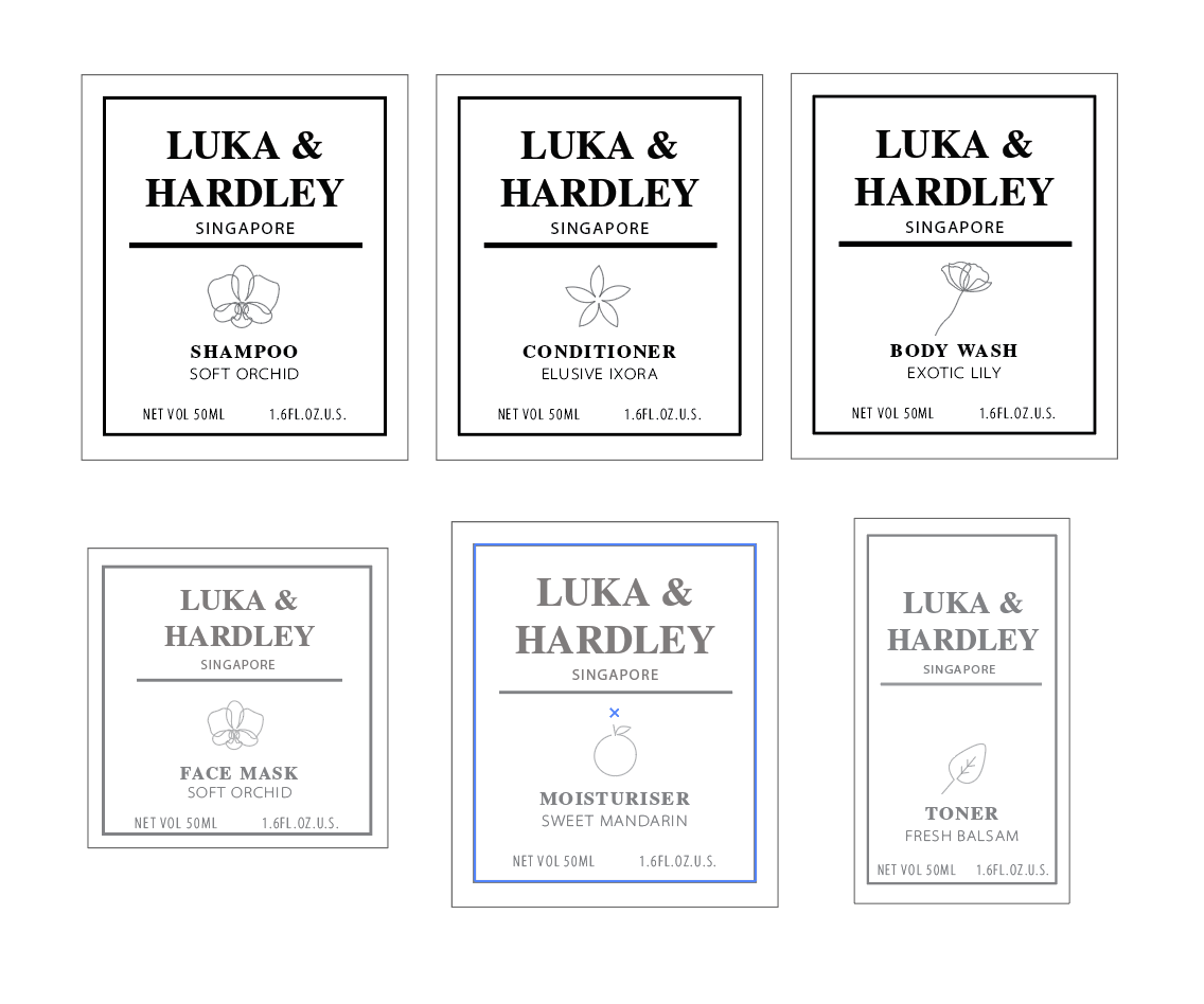
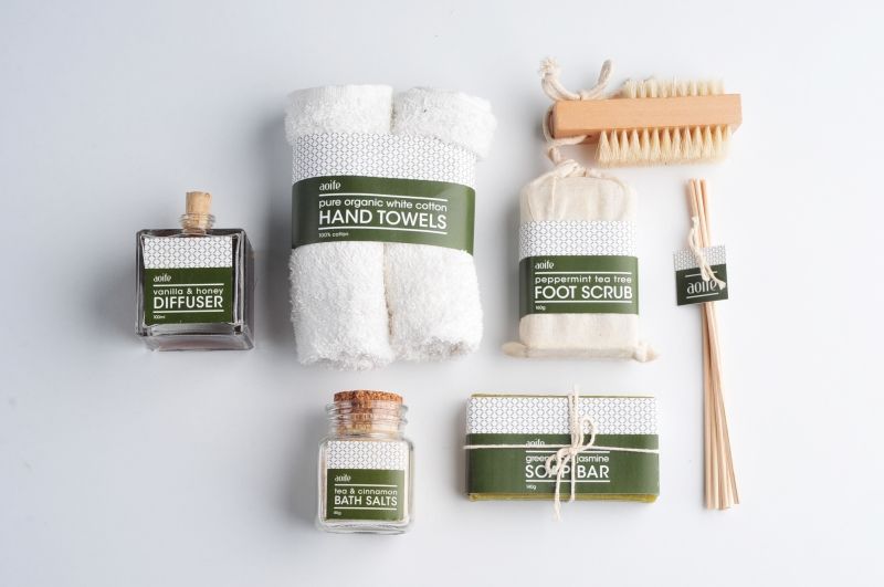
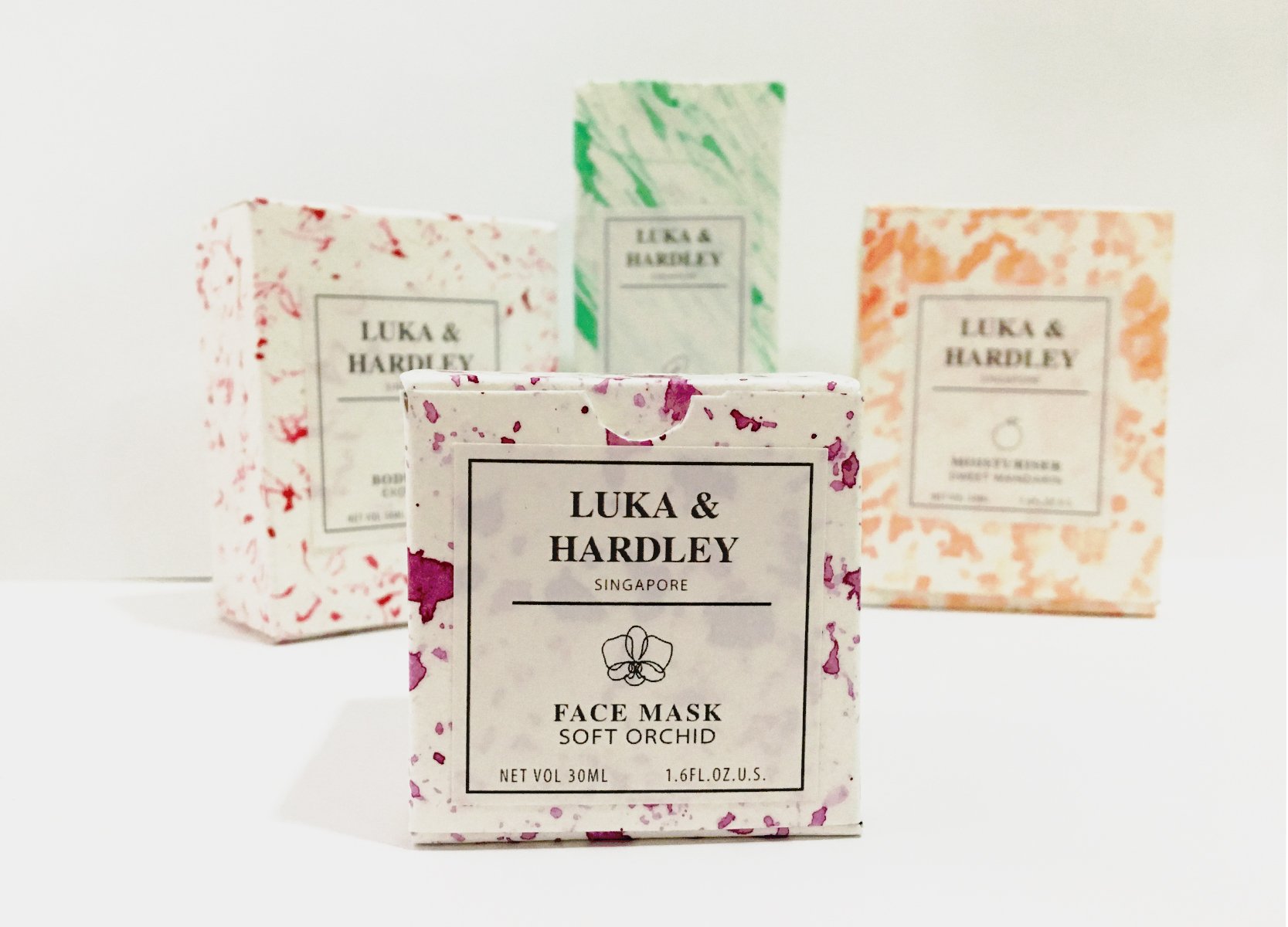
After creating all the nets, prints and the branding. I finally came to my final products as seen in the photographs below.


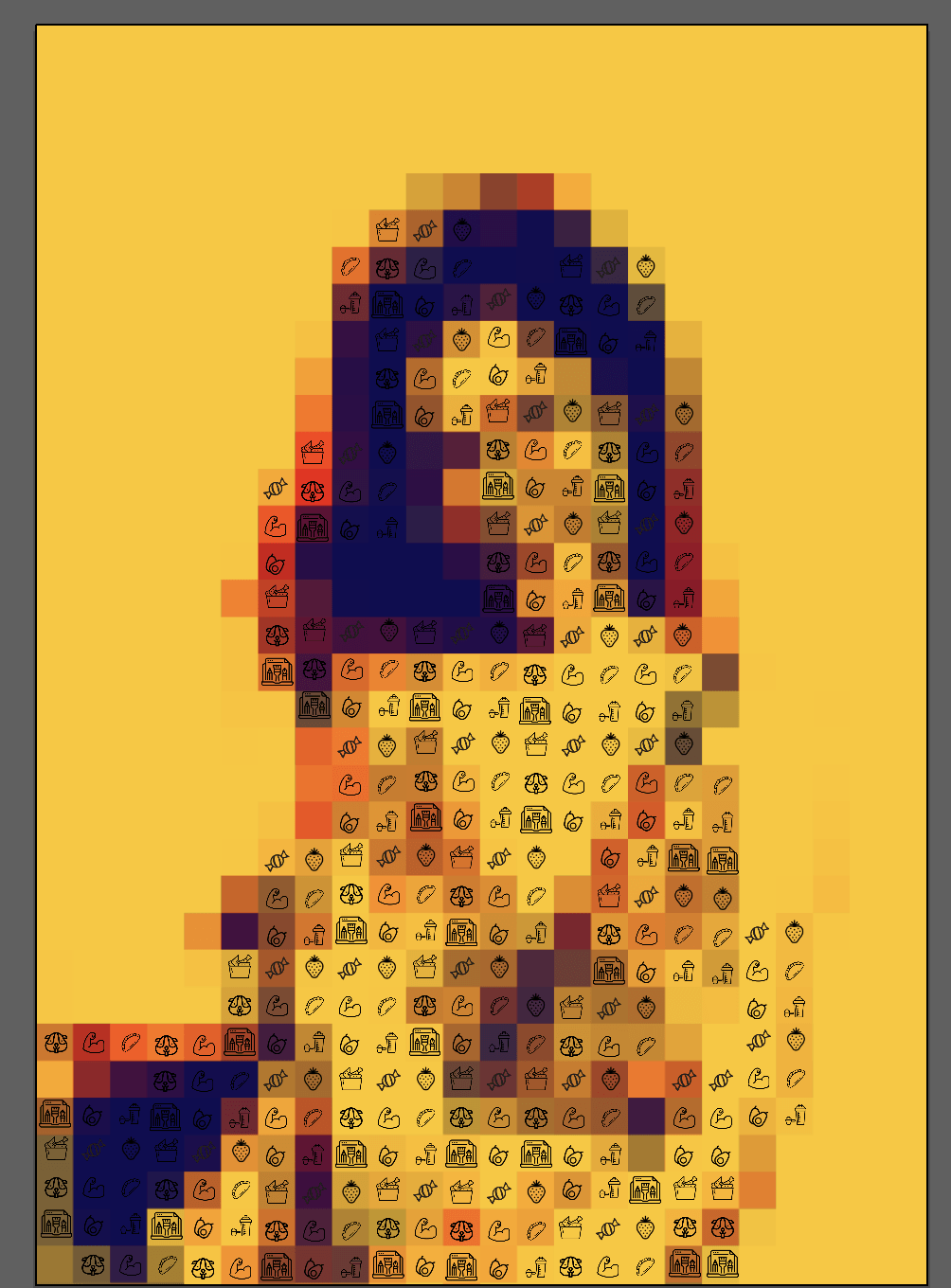
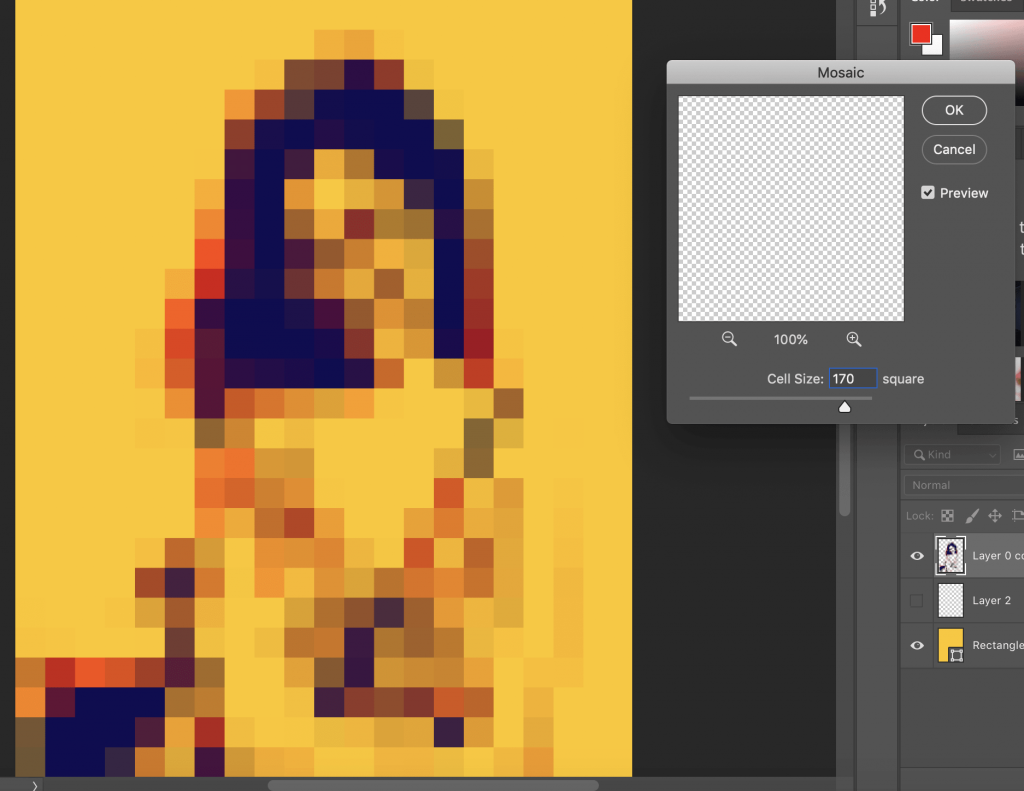 Cell size :170
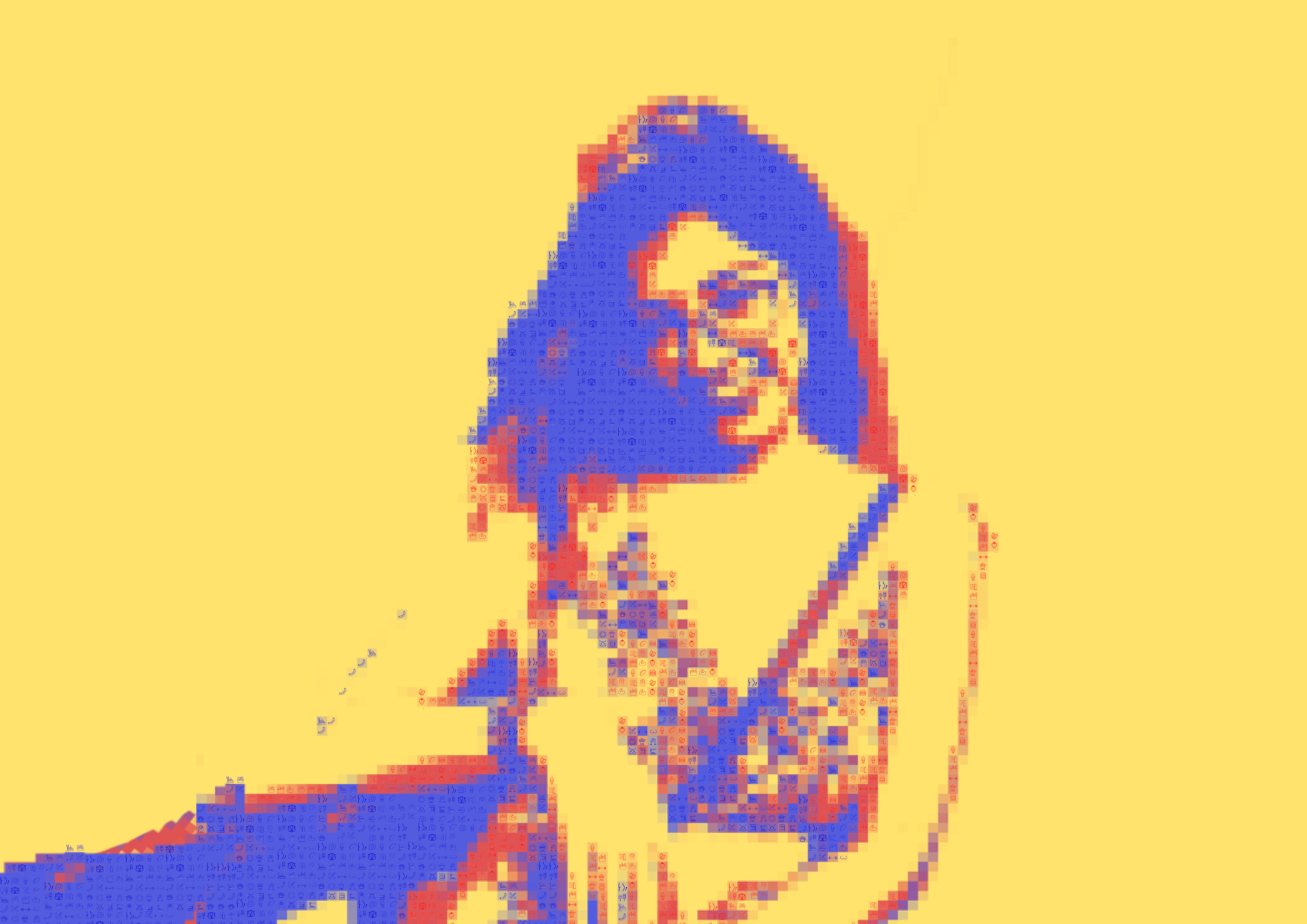
 Cell size:130
 Cell size:40