Vis com 1 – Pygmy marmoset Brochure

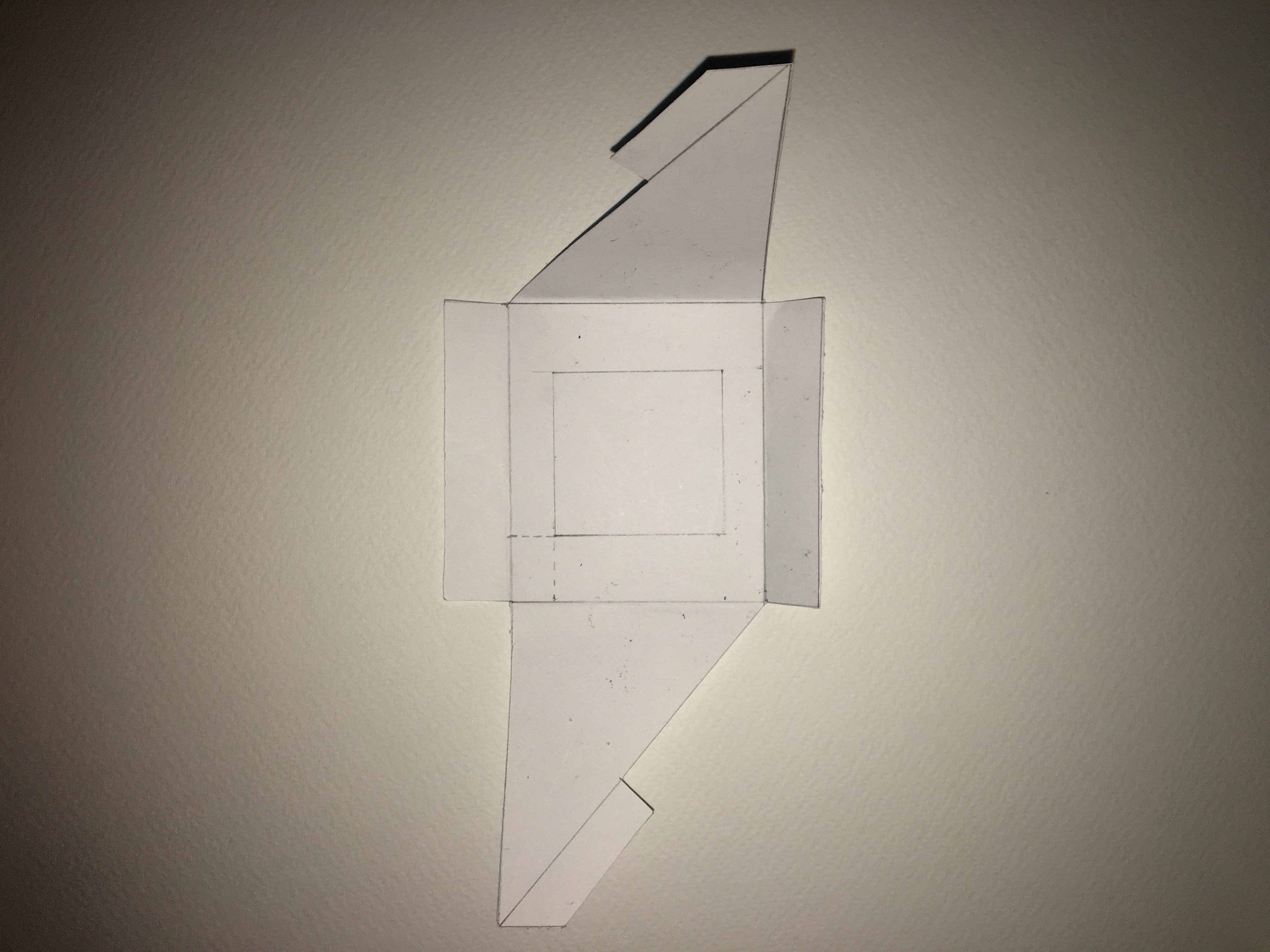
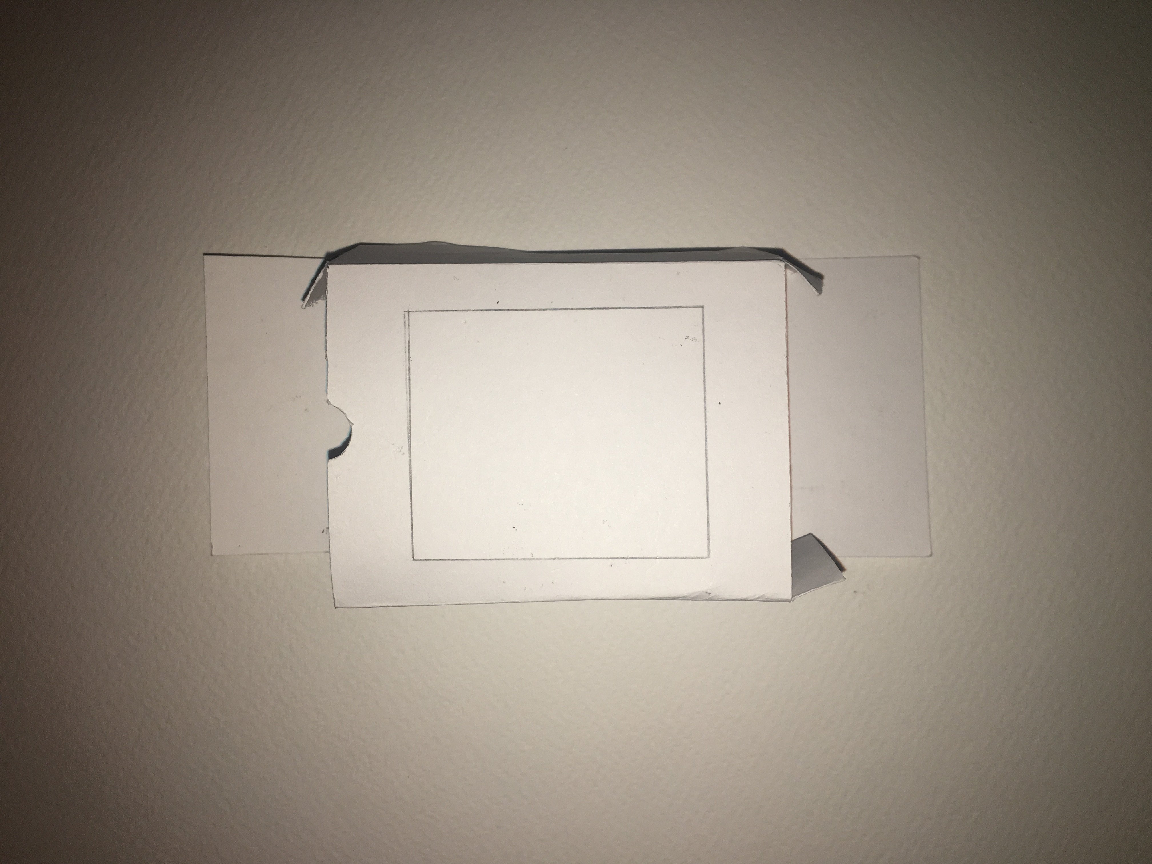
My initial idea when I began this brief was to  create a card that would allow monkey to jump from one side of the card to the other upon being opened. However after researching, the mechanisms behind that technique were very advanced and I wanted something simpler so I could manage my time better.I decided to follow this tutorial to make a twist pop up card. The idea of the monkeys popping out as you opened the card i thought was very representative of the fun, playful nature of the monkey.

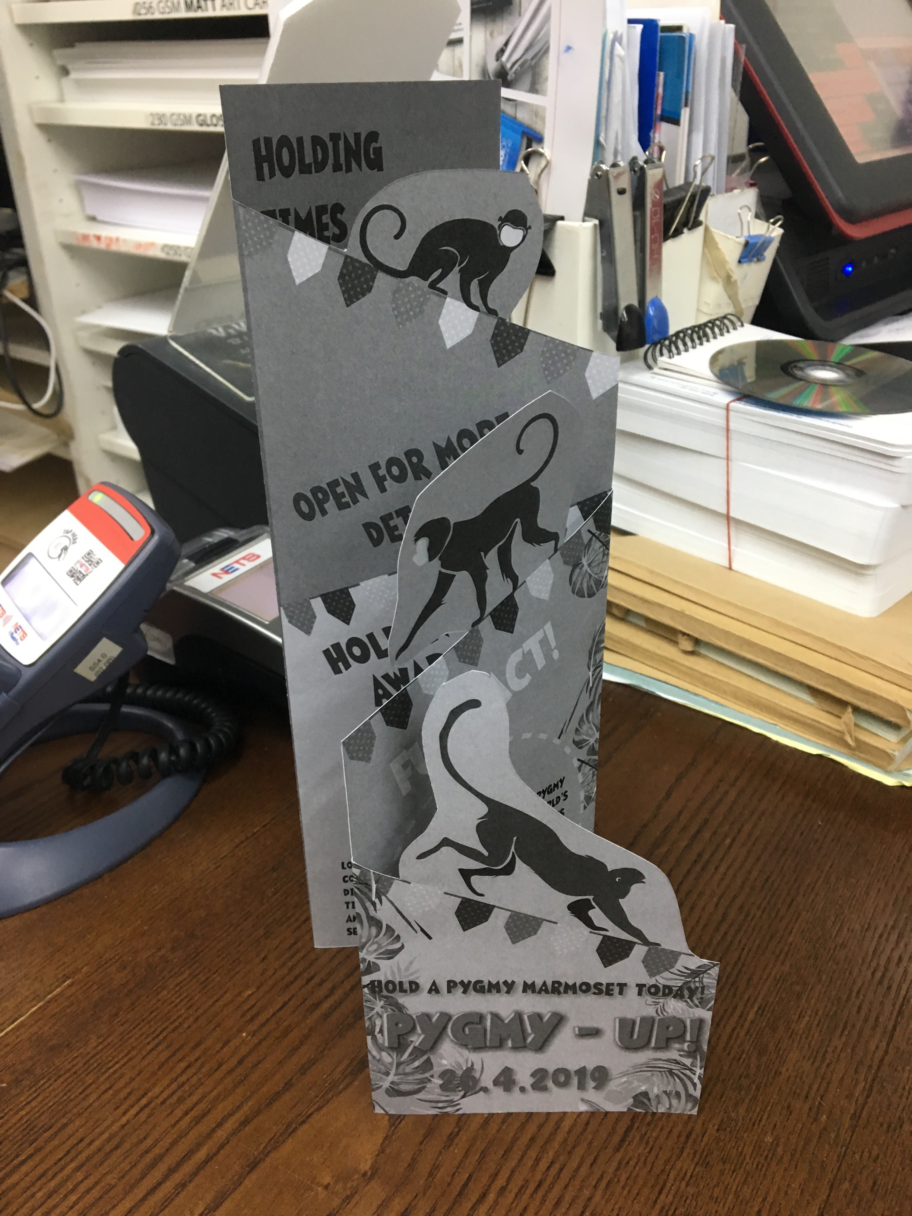
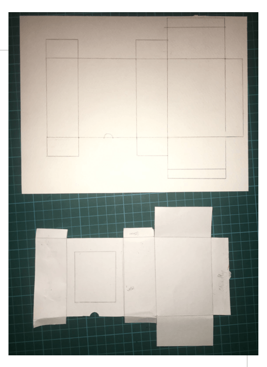
I realised the measurements given in the card tutorial were for a card thats of a smaller dimension.It was too small , so I had to double it in size. After doing so, the increase in size made the card itself to heavy which jeopardised the pop up effect and also my monkey cut outs made the paper structurally weak.

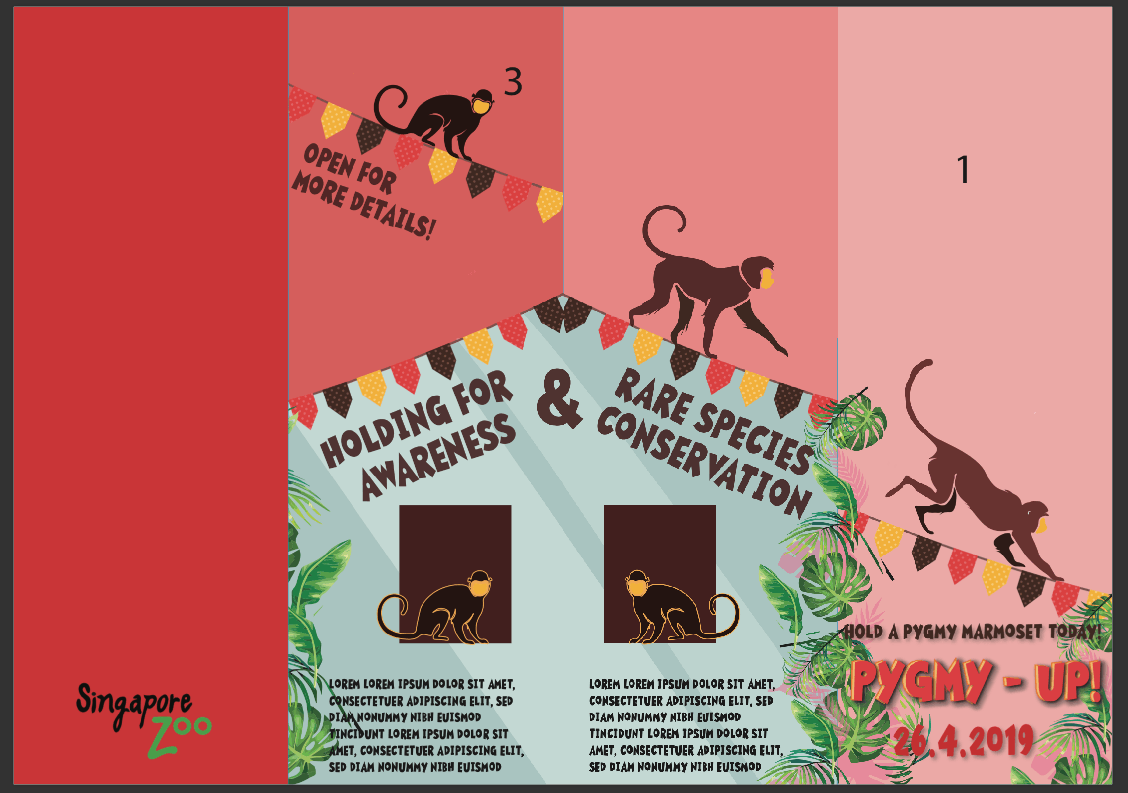
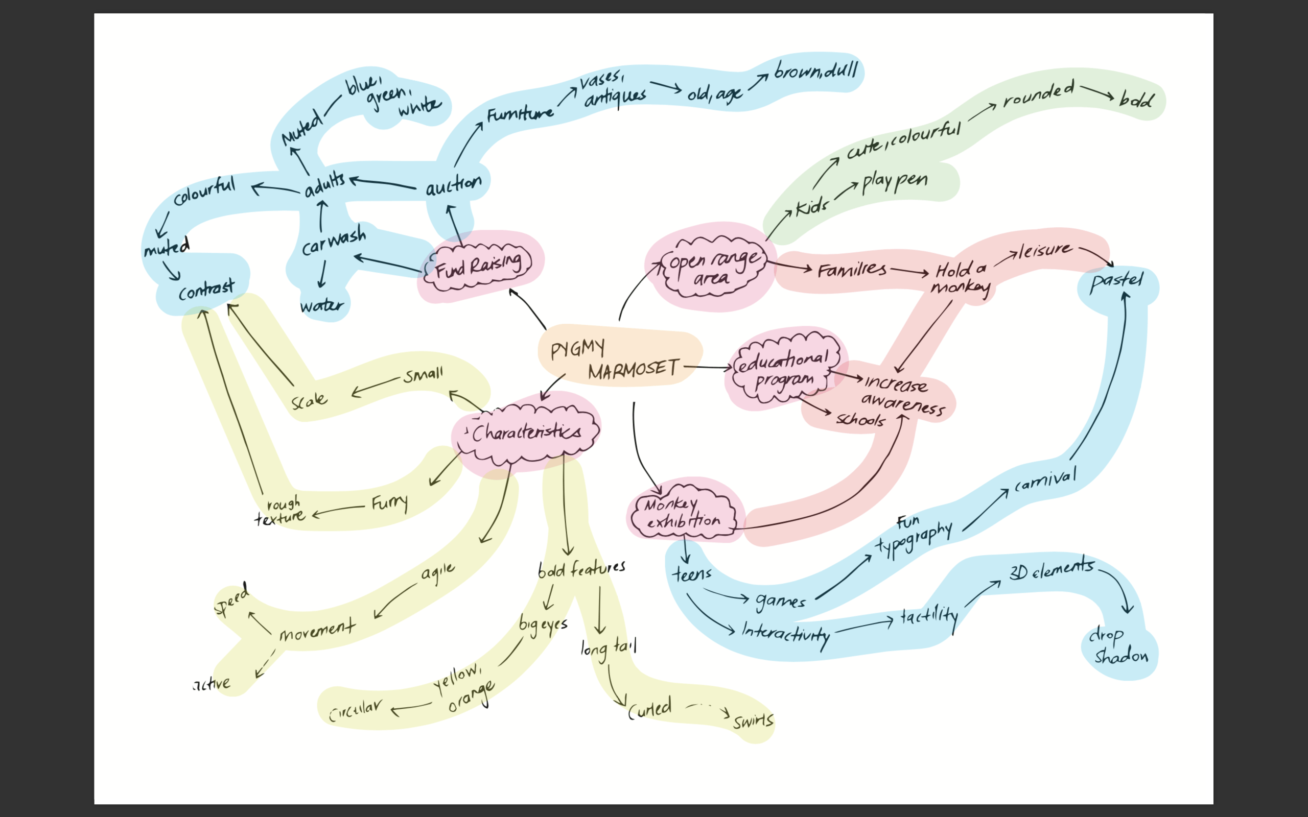
After consulting Lisa she suggested that I play with the layers that I have in my poster and I decided on an accordion folding technique.

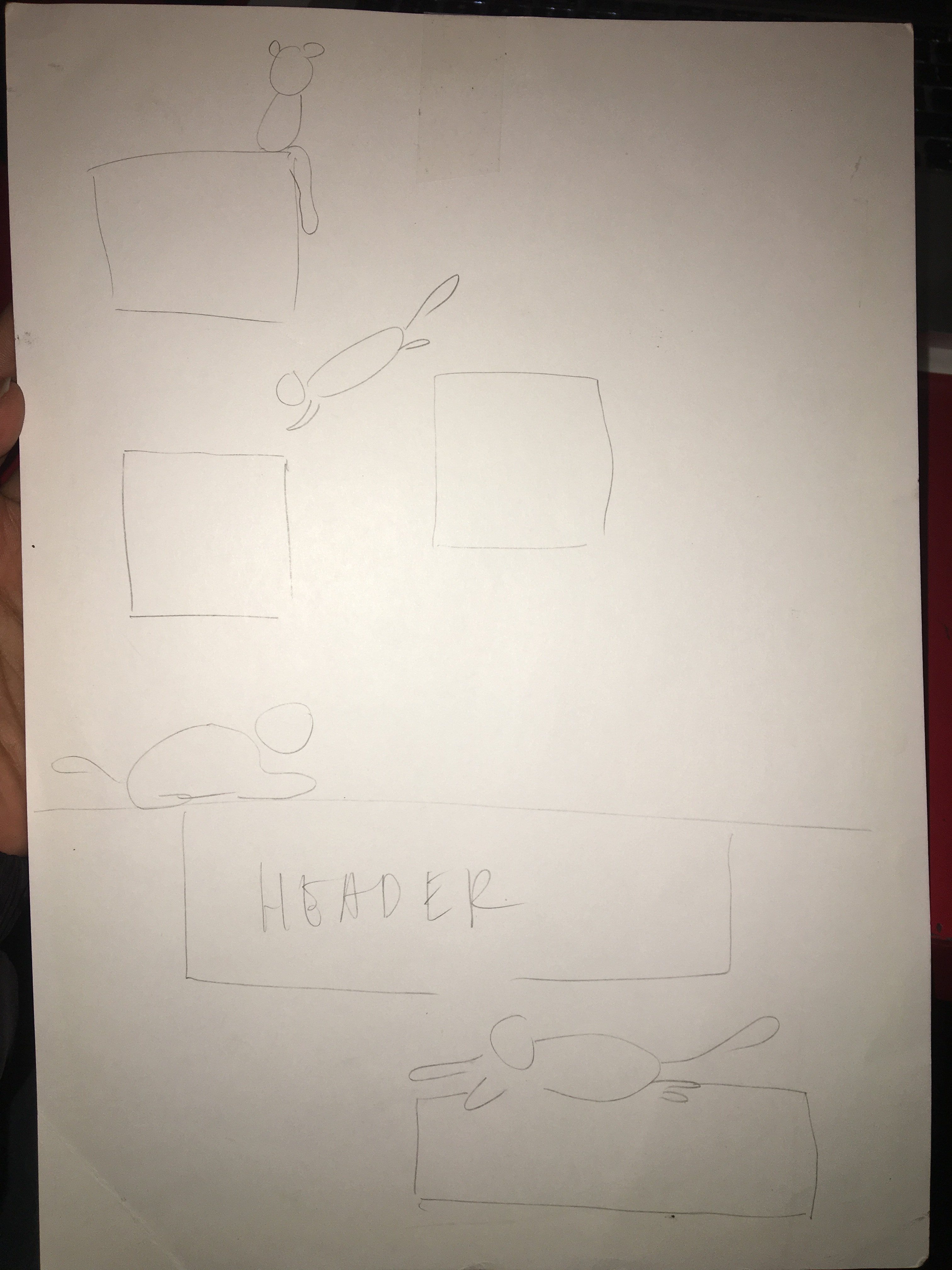
I labelled the panels on both sides on the paper to make it easier for me to layout my graphics.I adopted my design elements from the poster and I achieved the results below.

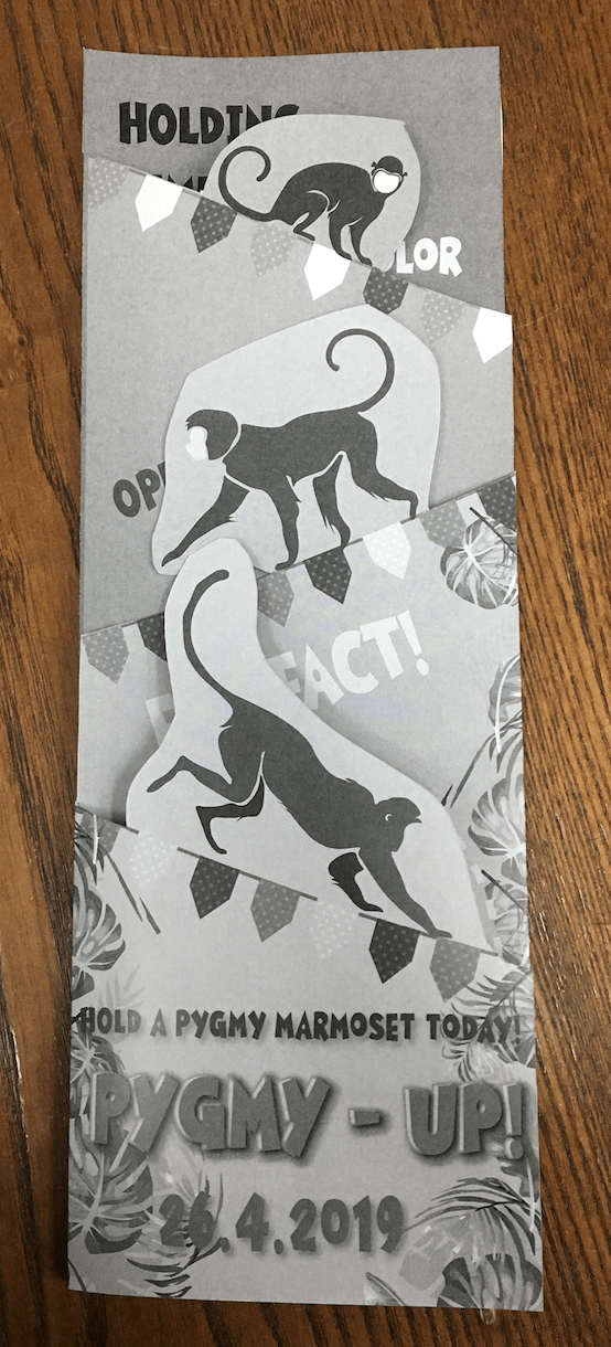
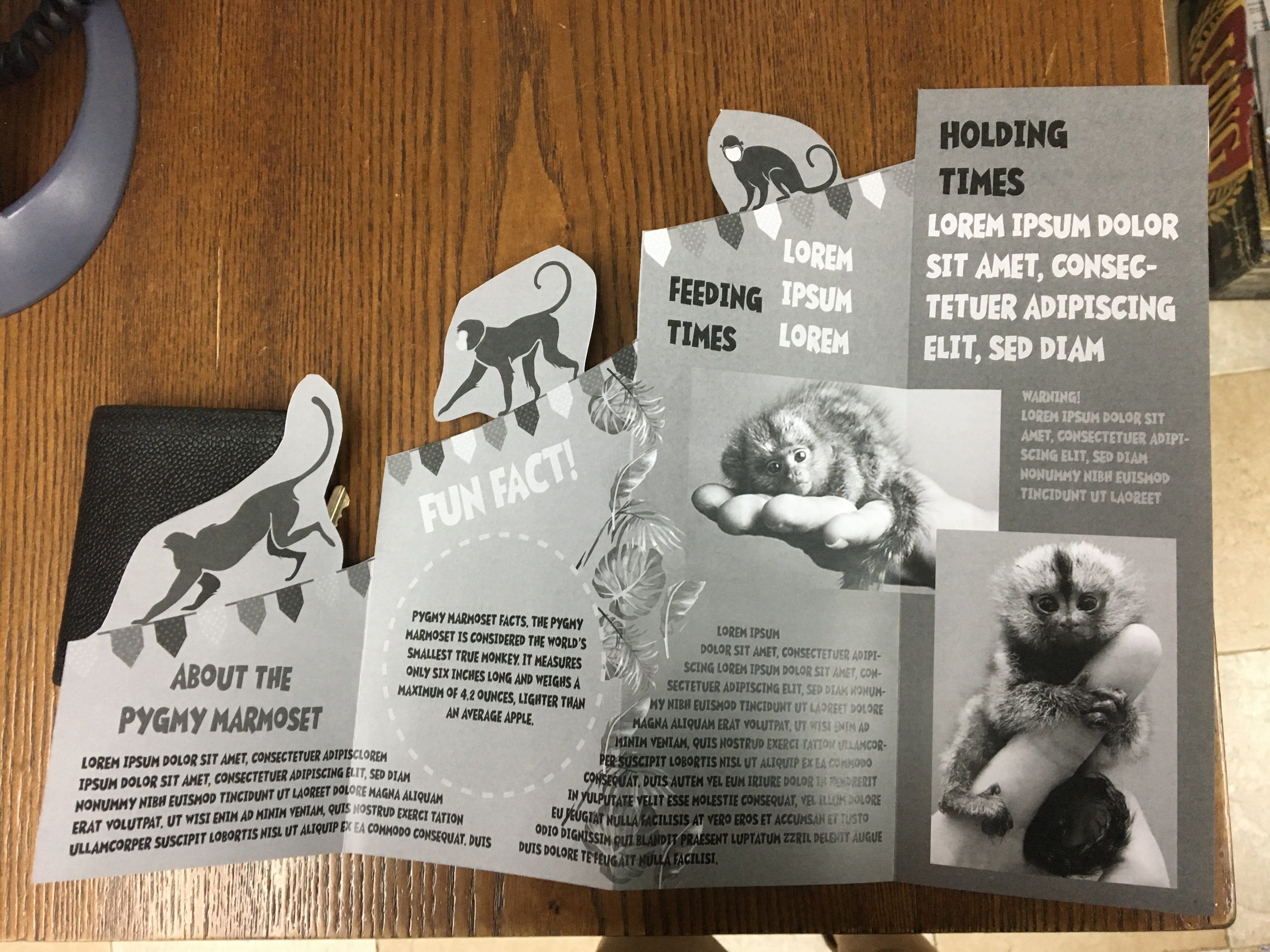
I proceeded to do a b&w test print and my layout issues were made obvious.The design elements from the pages behind the cover page were showing through and the monkeys were blocking out the texts beneath it.So I made the necessary adjustments and came up with a new layout

Also the font in my body text, graham cracker, existed only in uppercase which made reading very difficult so I opted for Avenir next bold instead.

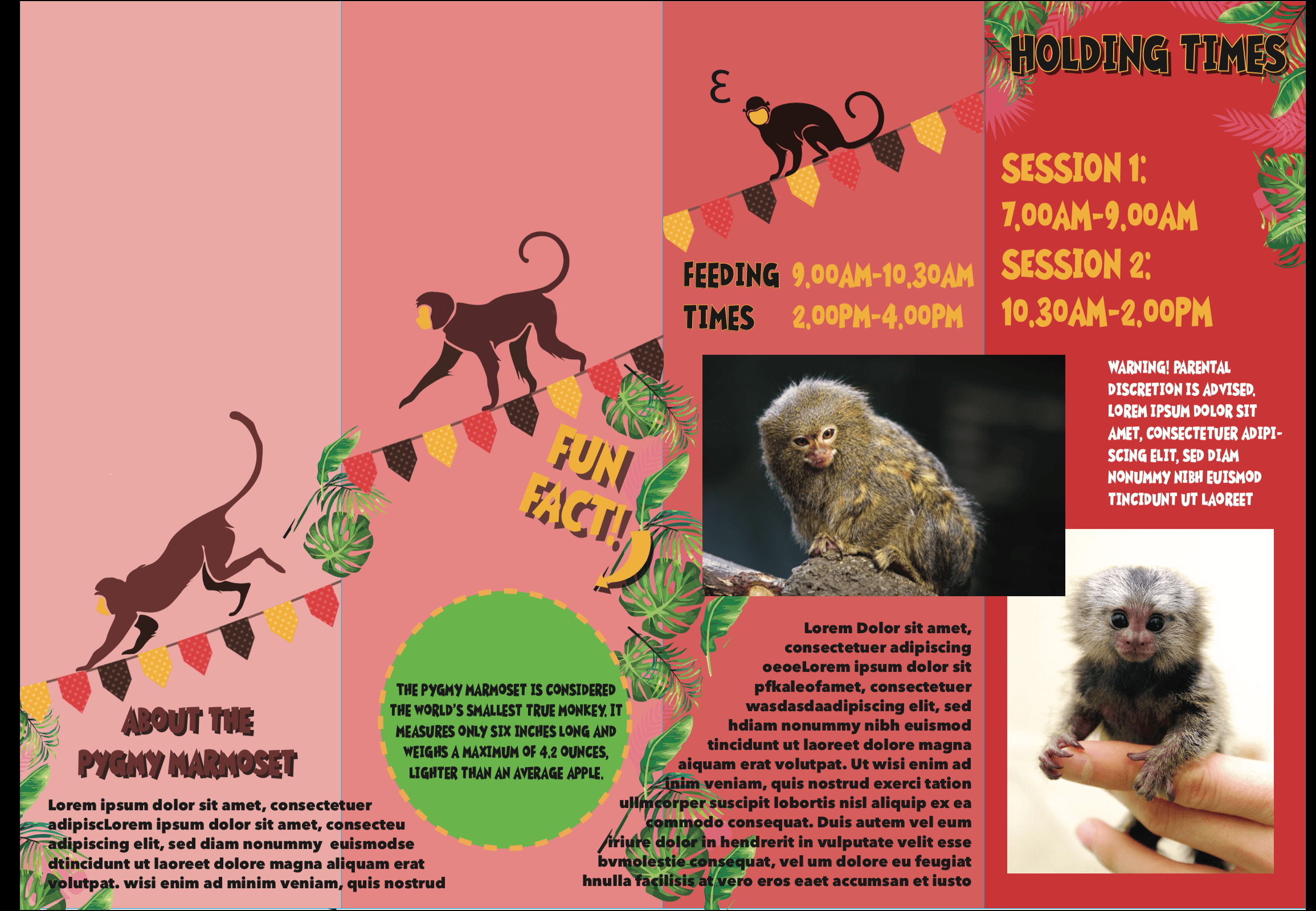
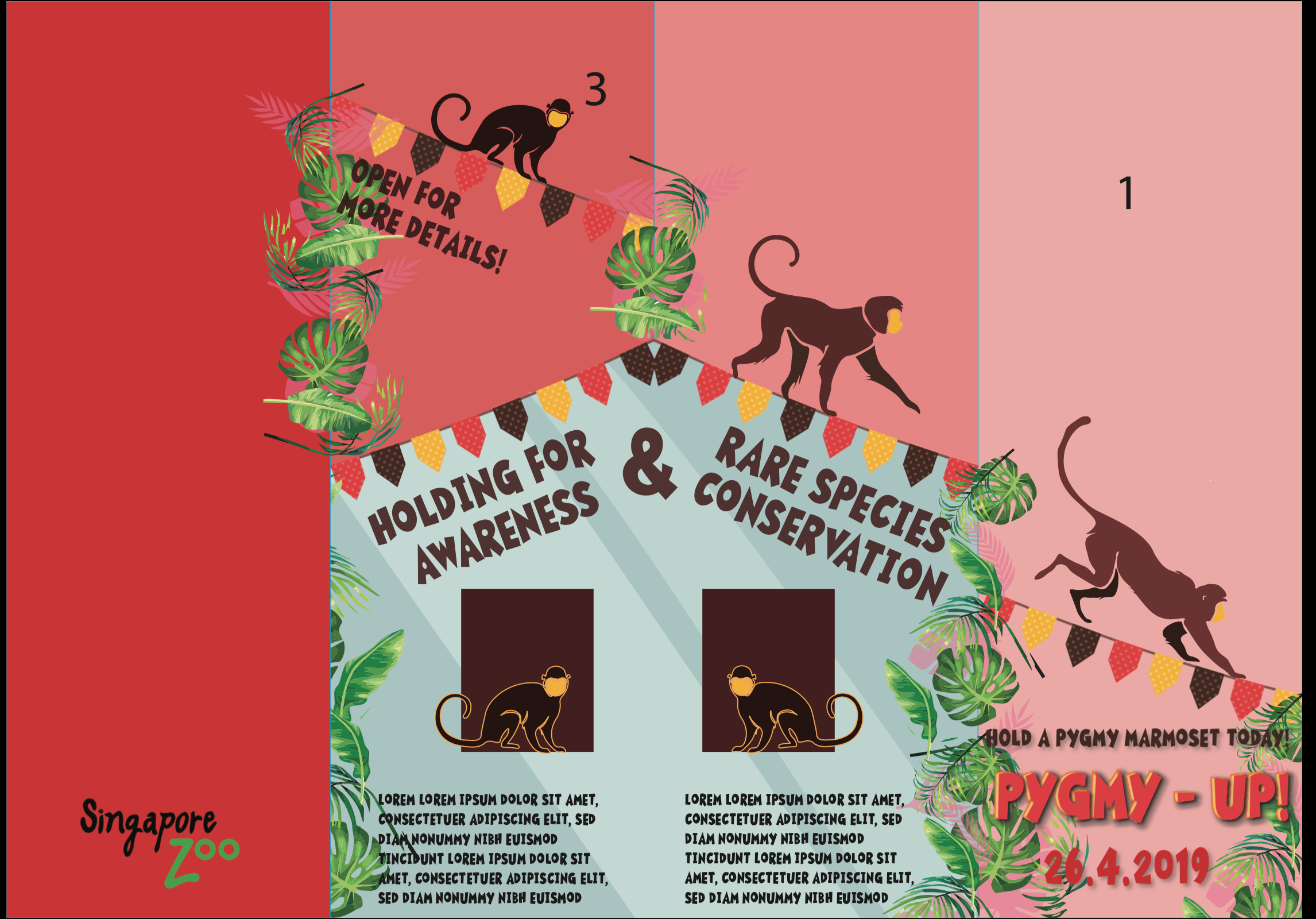
With that I made few more minor changes to the typography to help them stand out more and also added more details to the blue enclosure illustrations.This led me to the final brochure.

Applied illustration – LUKA & HARDLEY

For this project we were tasked to produce a set of illustrated items that looked like they had the same theme/belonged to the same family. I began researching on applied illustrations and an event that I could possibly design products for.In order to streamline my thoughts better I decided to come up with 3 separate events, products and come up with 5 thumbnails sketches for each one, so I would have a variety of sketches to choose from.

Event 1 : Toiletries event for hotels/gyms/spas

Event 2 : Couple wine event

Event 3: Cosmetic

I scoured the net for inspiration images for each event.These were some of the images that spoke to me and some of my thumbnail sketches were based off of these found images.


I was particularly attracted to this packaging because of the contrast between intricate patterns and minimalistic branding. It reminded me of me of luxurious skincare products for example those from crabtree and Evelyn.I decided to develop this idea for this illustration project and do a ‘pick n mix’ skincare event. However I knew I wanted to go in an abstract direction so I started conceptualising on how I was going to create this abstract pattern.I wanted to incorporate local flowers and also create a local brand, So I made my way to Botanic Gardens to take a look at the kind of flowers I could use.

I decided on 5 different plants that I was going to use for my packaging: Orchid, Lily,Ixora,mandarin and balsam. These were flowers that could be found in Singapore, and I decided to use watercolour , for that softer more fluid look and create patterns via mark making. I experimented with the textures and the water content in my paint to achieve a set of patterns. I stuck to jewel tones for my colour scheme as I thought it would bring out the luxurious skin care vibe out in my packaging.

Then I proceeded to create a unique pattern for each product I was making using the plant itself.For the mandarin and balsam I used the skin of an orange and a leaf for the balsam.

I experimented with drawing nets for the packaging itself and also different types of packaging.I narrowed it down to one type of package but after consultation with Lisa she said it was not innovative, so I created packages with varying sizes and heights to create visual interest .Then I proceeded to work on the branding and I was inspired by high end English luxury bath and body products.

Lisa suggested on adding an icon for each of the products as there was space I could more efficiently use. I thought the addition of the icons really brought the branding closer to my design objective.The use of black in the branding was very jarring as my colour scheme was light bright and soft, thus I changed the black to grey to match the soft look of the products.

After creating all the nets, prints and the branding. I finally came to my final products as seen in the photographs below.


Pygmy Marmoset Poster Progress

I created a mind map to help me think of the creative direction of my poster.

Due to the fun and cute nature of the animal that I chose, I decided on a playpen for kids so that they can engage with the animal at the same time be educated on it. Leading on from assignment 8, I came up with 3 rough sketches of my layout with a sentence accompanying each sketch.

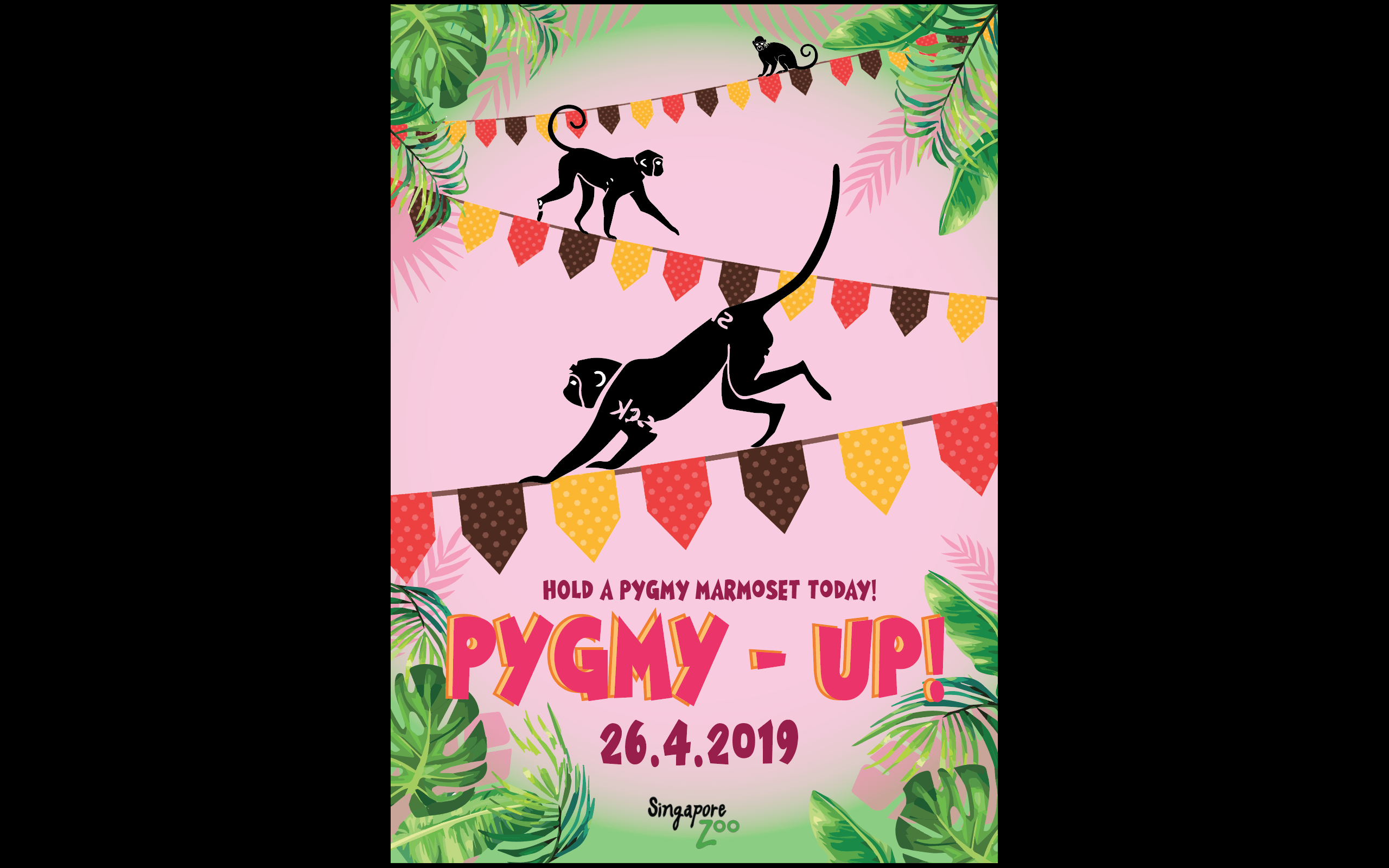
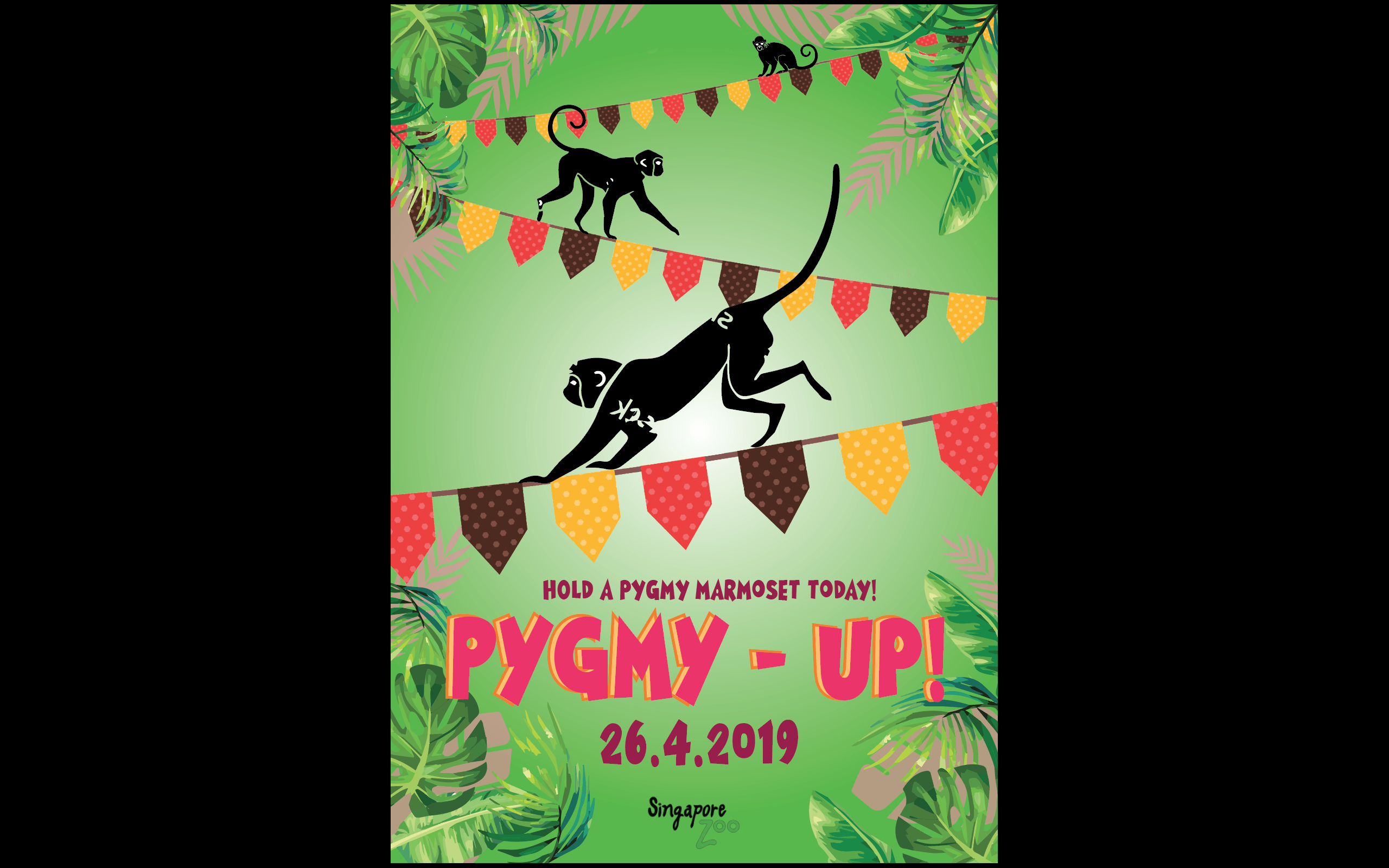
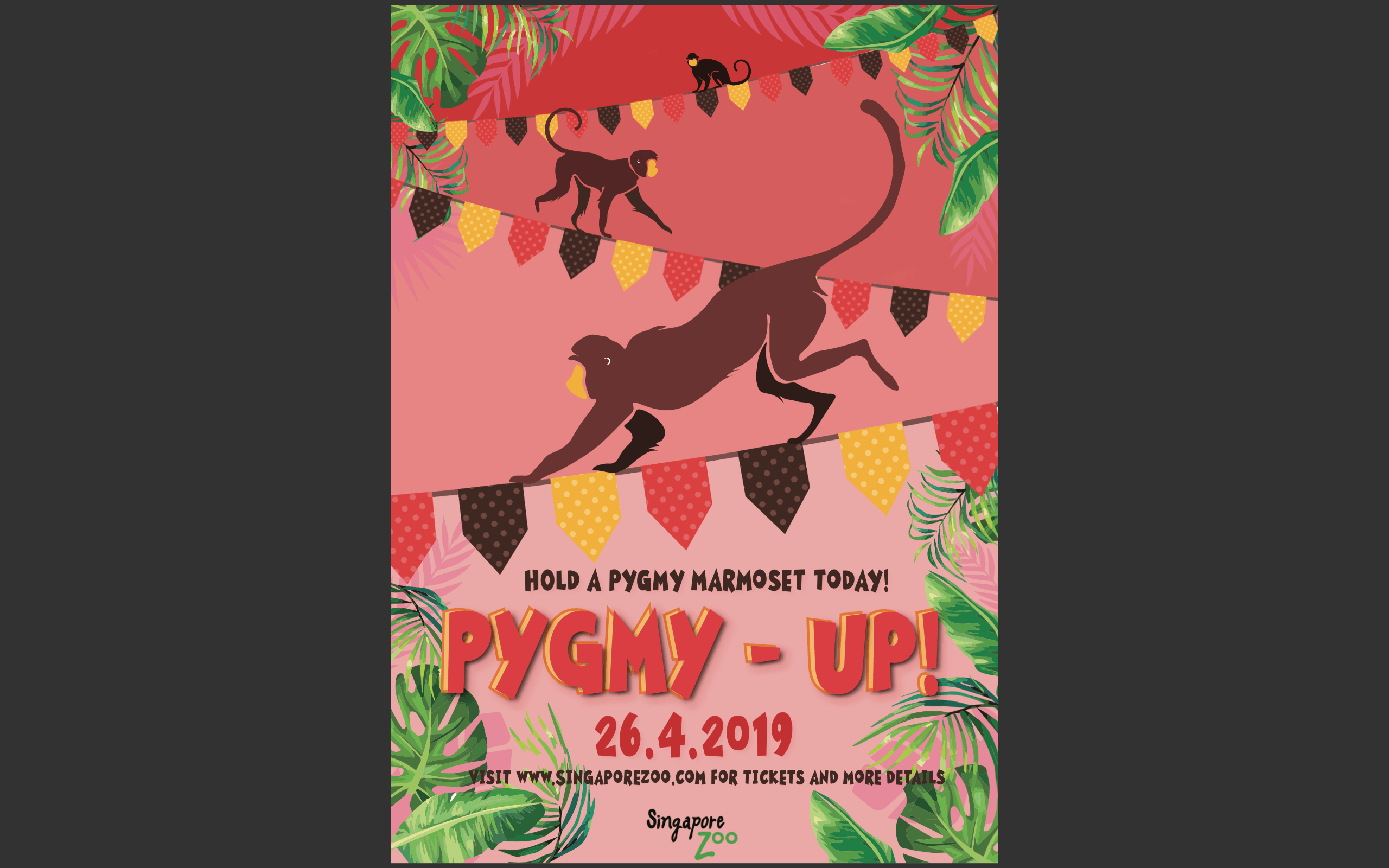
 Sentence 1:Movement and agility is key 
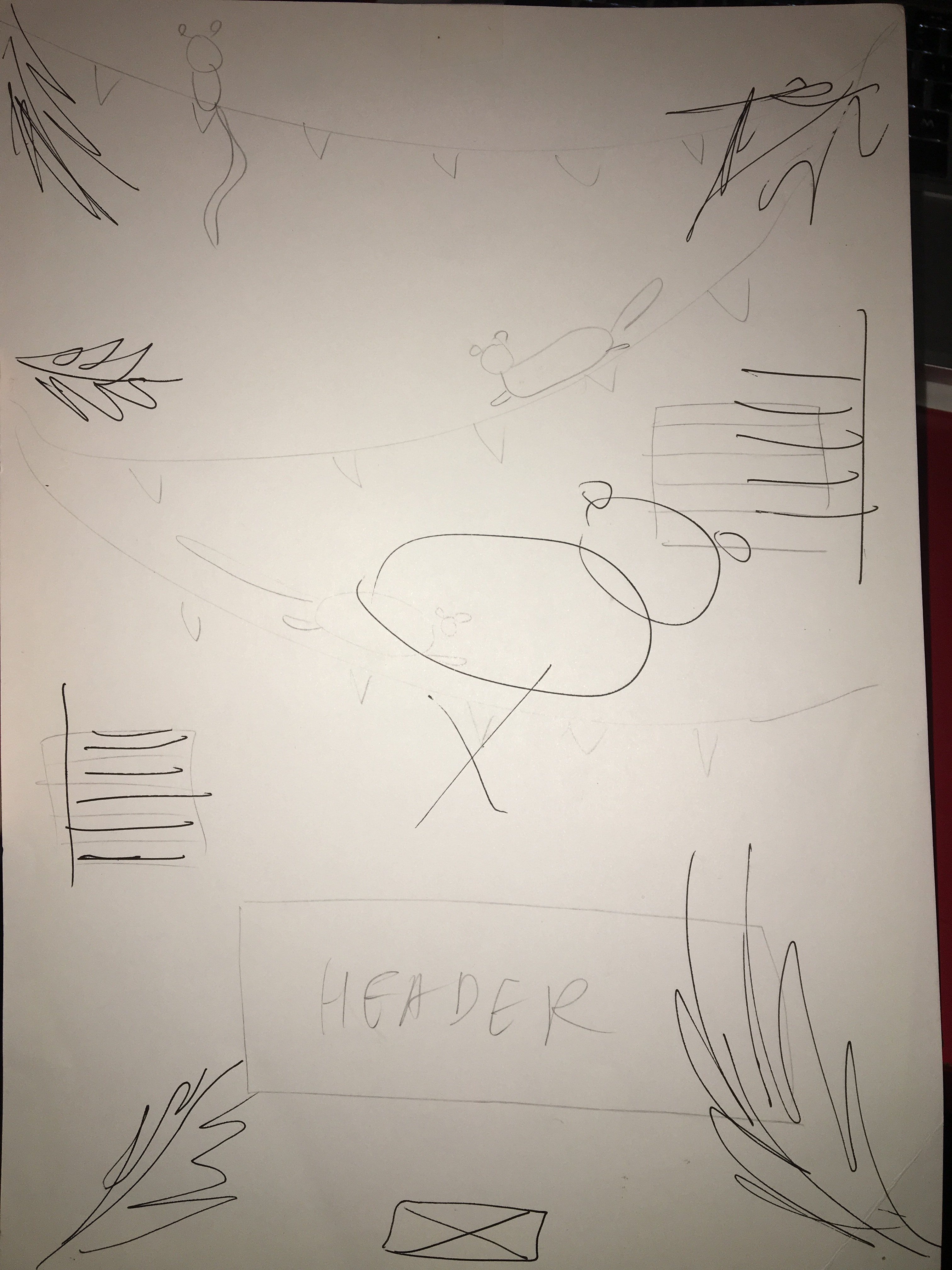
Sentence 2: Celebrating summer with popsicles and watermelonSentence 3: Monkey see Monkey do(symmetrical)

From here I developed the second sketch as I thought the summer theme would allow me to use colours to entice kids, at the same time pygmy marmosets thrive in tropical climates so it was apt considering the direction I was going.I proceeded to create a digital version of the second sketch.I applied the watermelon colour scheme and also added party flags to emphasise the idea of fun and summer. I thought that the agility of the monkey would be exaggerated if I used the party flags as a tightrope. I choose bold and colourful typography as well to cater to the children who might be interested in my design.I chose to include tropical leaves and use them to frame the macro elements to draw attention to the middle of the poster because my macro and typography were aligned to the middle.At the same time I adjusted the opacity of the leaves(lighter pink) to act as shadows for the tropical leaves, again to add to the idea of depth.

My design looked rather flat and the macro elements lacked visual hierarchy. After consultation with Lisa, she suggested on increasing the contrast in relation to the scale of the monkeys as well as adding layers of different opacities within the area under the tightropes to give the idea of a receding background and protruding foreground, which led me to my next draft.

This draft conveys the idea of depth a a little better,However there were too many jarring colours.I decided to use the eyedropper tool and pick the red of the flag as a base instead of the magenta colour I originally used.

I wanted to use green against the red as they are contrasting colours which would add to the boldness of the poster. But the green was dividing my poster into half which affected the coherency of it. Thus, I decided to stick to the red as a base maintaining the lightness as it came downwards to the foreground.I proceeded to use the eyedropper tool to select the brown colour from the party flags and colour my monkeys to limit the colour scheme at the same time gel the entire look together.I applied the same concept with the shades of the monkeys as I did with the background – darker as they got further away.I removed the placeholder monkeys and made a similar rendition of it and it led me to my final poster.