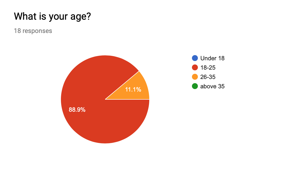
After researching the 4 topics, I narrowed down to climate change and it will be the focus of my infographic poster as well as my next few deliverables.Within climate change I had a few subtopics that I wanted to explore while researching, namely, bleaching coral reefs, the melting ice caps and how the trash in the ocean affects climate change.Before diving into these subtopics I wanted to see the current attitude and understanding of my target audience (18-25) so I could cater the content within the poster more effectively.
These are the questions as well as the responses of my survey.
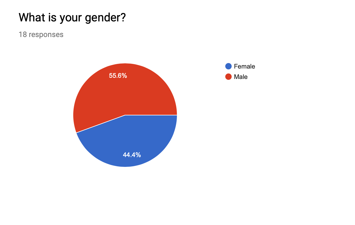 Majority of those who participated in the survey are male.So this encouraged me to keep the design a little bit more “masculine” By using a bold fonts, graphics and avoiding softer girlier colours.
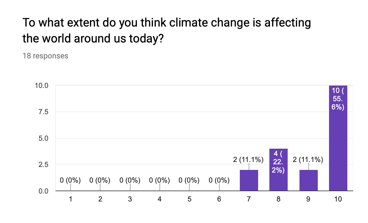
Here we can see that the target audience understands this is a pressing issue and their concern towards it. They also have some form of understanding on some of the factors causing climate change such as deforestation, extinction and melting ice caps.The most popular topic seemed to be melting of the ice caps. 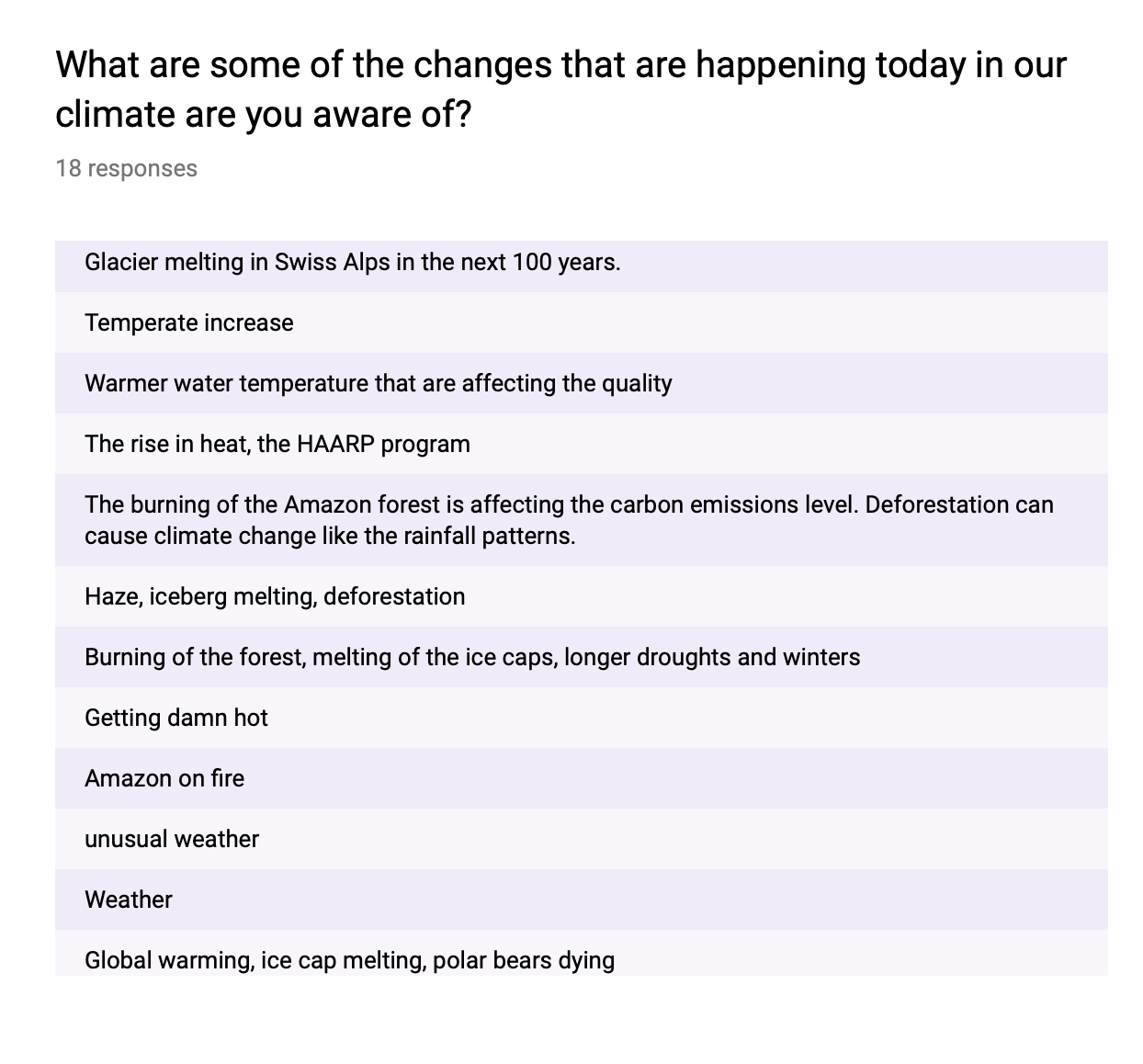
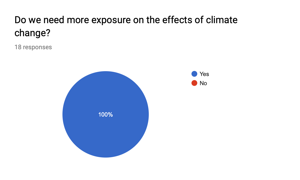 This confirms the need for me to spread more awareness on the topic of climate change using my infographic poster. In my poster I want to cover a few statistics as some shocking facts going on in the current world of today to deepen their understanding on the effects of climate change.
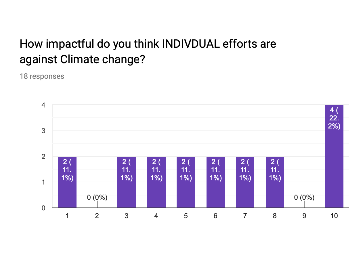
Out of the 18 responses 10 participants are leaning towards Individual efforts are quite impactful against climate change. This makes me believe that these participants understand that as individuals are able to make the change, where the most impactful option “10” gathered 4 votes.
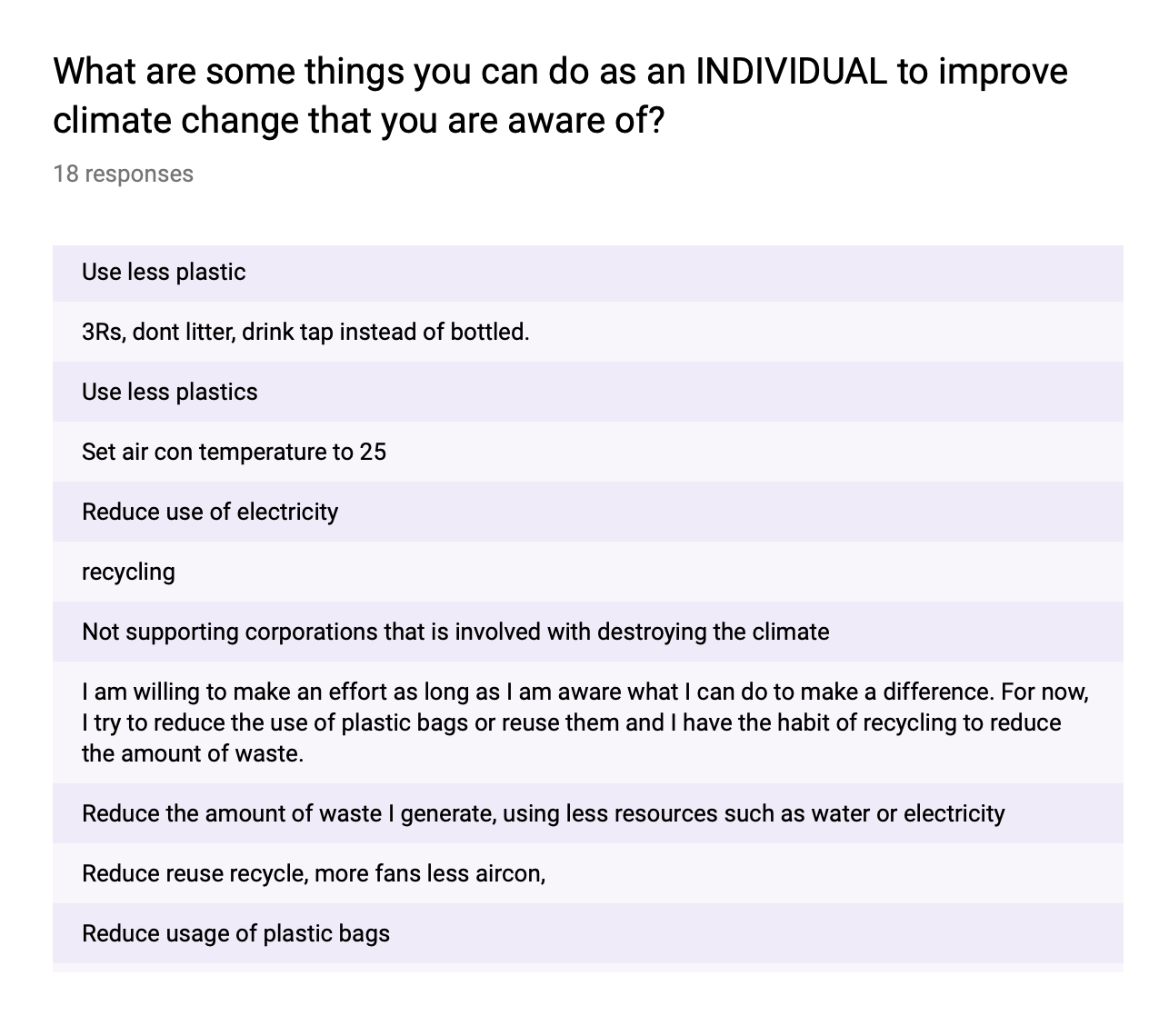
Most of the participants showed a lack of awareness in individual efforts besides reducing plastic, electricity and recycling.So even though they knew that climate change is a pressing issue and individual efforts are impactful in combatting it, they didn’t really know how to go about working towards it other then the ways mentioned above.There are more simple and effective ways an individual can engage in without it being to inconvenient which I will cover in the later deliverables.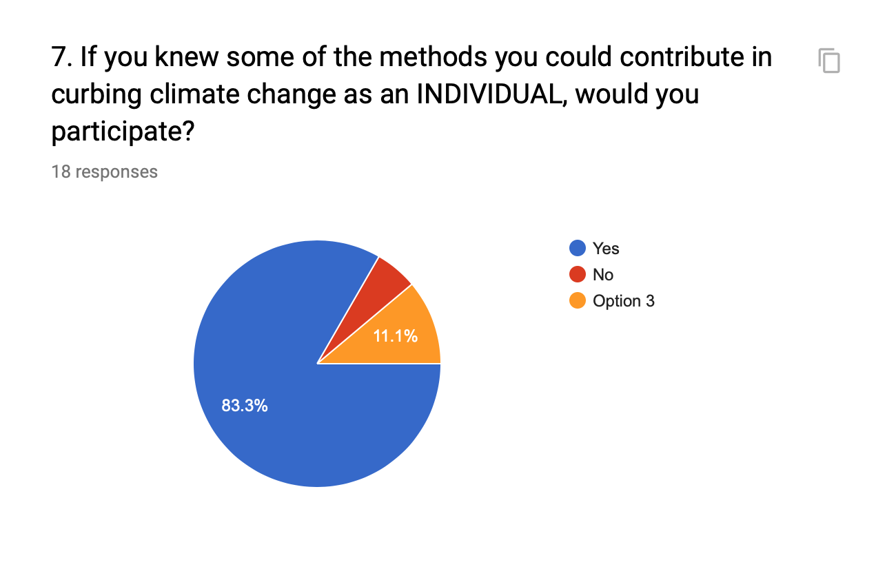
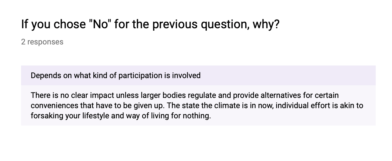
“Individual effort Is akin to forsaking your lifestyle and way of living for nothing” was a concern raised by a participant. Although this is a valid point whereby the damage we have done to the planet requires so much work that an individual himself is unable to rectify, it forced. me to think of ways to encourage people to participate in individual efforts without feeling like they are “forsaking” their lifestyle for nothing. So simplicity and convenience was a key factor in my project.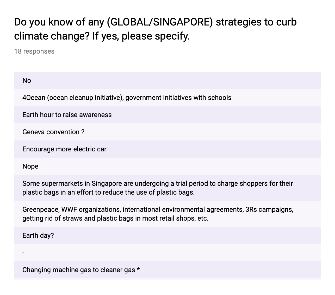
After analysing the results of my survey I proceeded to do a sketch on each of the 3 subtopics I wanted to explore in order to decide which one I can execute the best and was powerful in its imagery.My sketches are below.
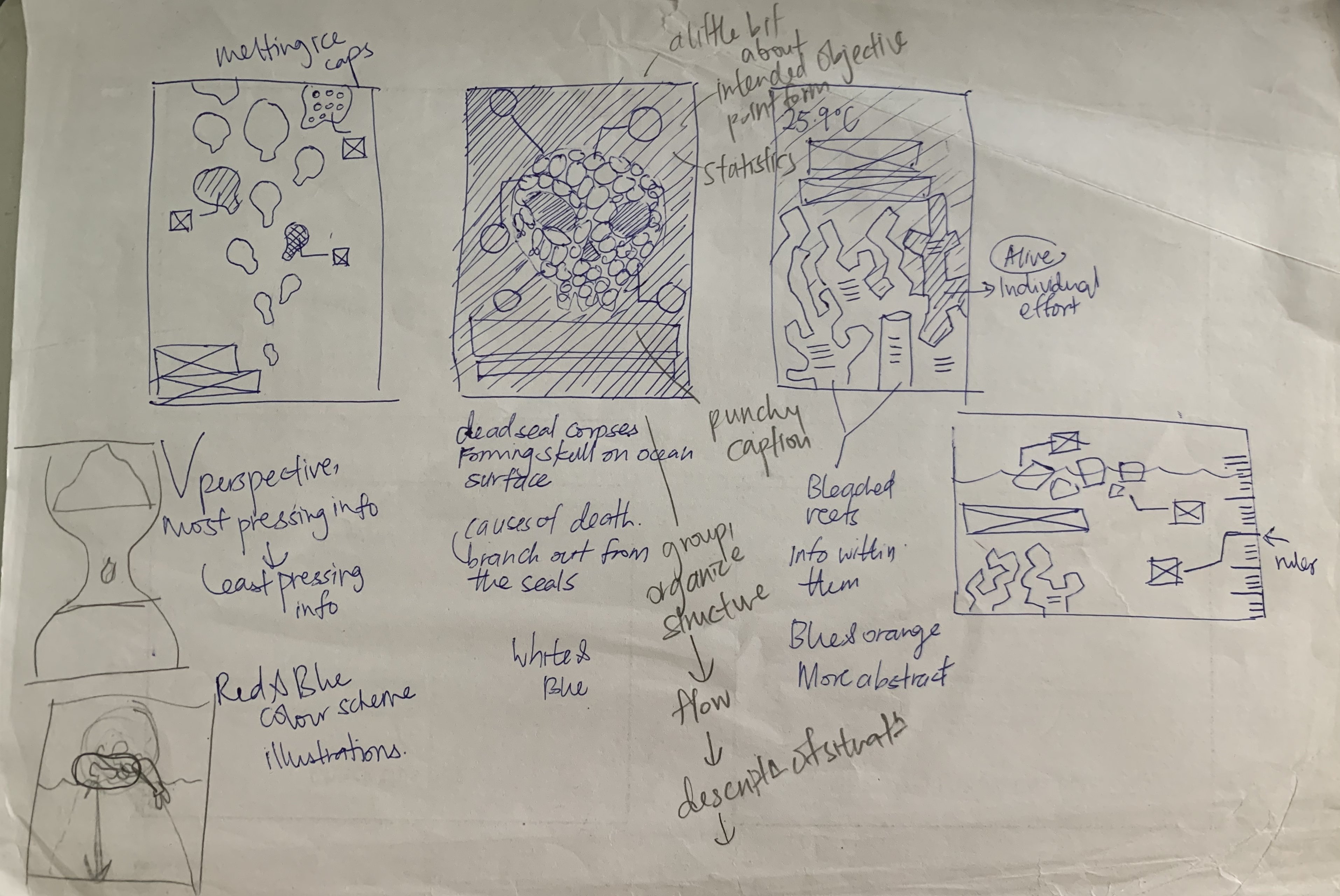
From left to right : An abstract interpretation of melting ice caps, skull symbol made with seal bodies, bleaching of coral reefs.
- I intended on exploring the forms and scale of the melting ice caps on the life in the north pole, while using a downward perspective to direct the readers eyes from the most important info to the least important. The title would take up the bottom left of the poster.
- using a skull symbol to depict the idea of death and destruction to show the detrimental effects of climate change in this case the extinction of harp seals. The info will be clustered around the skull and each seal will point out to information regarding the “death of the seal” which is also a impact of climate change.
- A literal depiction of bleached coral reefs under the sea.Each coral reef would contain a piece of info regarding climate change. One non bleached reef to depict how individuals can contribute in saving the reefs and in turn the eco system.
I felt that the second option was the most powerful in depicting the concept of climate change. I proceeded to create an initial digital sketch of it below.The ovals represent the seals and the scale of the skull in relation to the poster is the portion for the illustration.
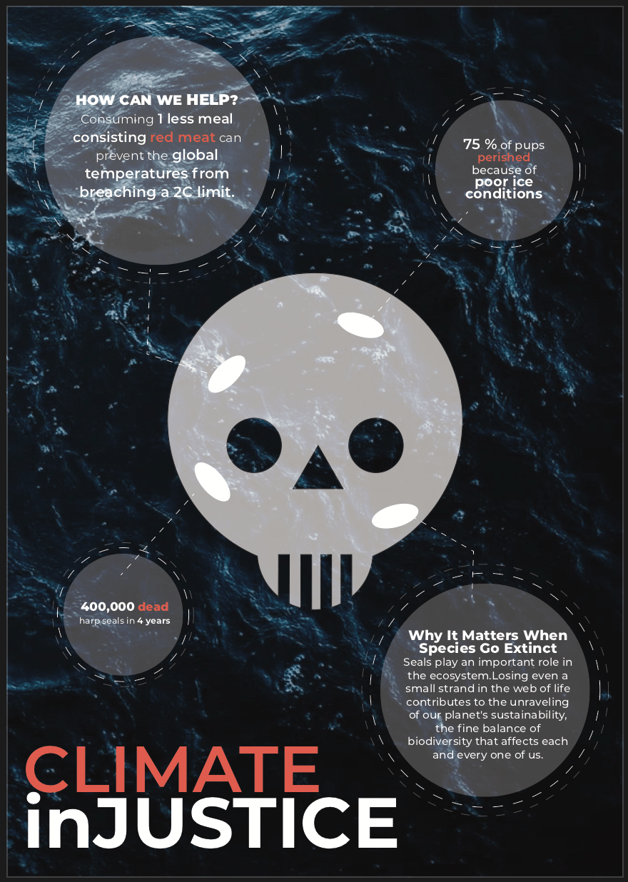
I received feedback from my classmates as well as Prof Michael.The idea of the death of the seals were not clear, my title caused some confusion because of the lowercase “in”. There was also no clear flow , where do I lead the readers eyes? The readers randomly reading from different parts of the poster, so I had to think of a way to link pieces of information together as well as fix the visual hierarchy of the content.I also had alignment issues because my skull was in the centre which restrained me in how I could position my information. There was a lack of space hence I could not get in more content into to the poster.There were some unnecessary details around the circles containing the info as well as my colour coding for the text within them. There were too many weights, colours which distracted readers from the true focus of the message in each of the circles.There was also a lack of icons and images to accompany the information to help readers visualise the content.
This is my second digital sketch of the poster with adjustments made. 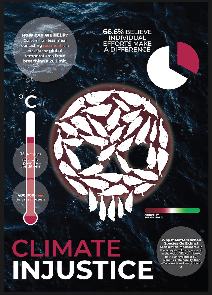
After adding in the pie chart, thermometer and other chunks of info around the skull, I felt that the poster became too cluttered.There was a lack of hierarchy still. I used a split complimentary colour scheme to make the colours more balanced.The images also were too jarring in scale and clashed with my information. I still had a lack of space for the information hence the lack in the content.Therefore, I decided to ditch the idea of having the skull in the middle to free up some space as well as scale down the images and pie chart , Resulting in draft 3/ Final below.
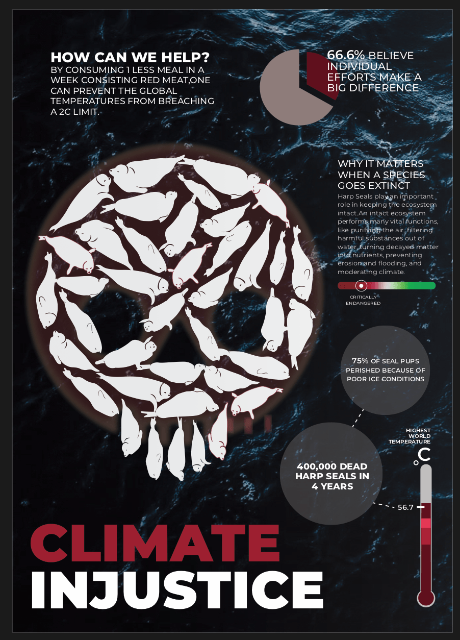
Reducing the scale of the images, as well as shifting the skull allowed me more room to beef up my content. The hierarchy is also clearer from the title, to the right where the thermometer is placed, following the leading lines upwards in an upside down “L” formation.It can Also be read from top down after the title as the section of info in the extreme top left is the biggest in scale.I wanted it to one of the main takeaways of the poster. How can people help towards curbing climate change? followed by 66.6% of people believe in individual efforts encouraging the readers to participate individually towards climate change.I also muted the colours of the pie chart as white made it stand out too much. Also for the texts, I removed all colours and instead created hierarch with font weights instead which made my content a lot neater as well as created a clearer sense of focus.If I could change one thing I would fix my aligning up and not make the margin too narrow.