1.What are some of the current issues confronting our world today?
1. Climate change
Climate change has always been a concern to many and in the recent days, it is becoming more alarming and prevalent of an issue in the eyes of society. As the greenhouse gases accumulate within the atmosphere, the surface temperature of the world rises causing the arctic permafrost to thaw. This further accelerates climate change as the softened soil is releasing vestiges of ancient life—masses of carbon enter the atmosphere as methane or carbon dioxide—that have been locked in frozen dirt for millennia. In turn, this hinders the natural biological development of wildlife, destroying the ecosystem and causing a massive impact on our world today.
Eg. Drowning of harp seals
In 2007, for example, more than 75 percent of pups in Canada perished because of poor ice conditions—in 2010, almost none survived, Johnston said.
Eg. Slowing down of hurricanes
“Nothing good comes out of a slowing storm,” says James Kossin, “It can increase storm surge. It can increase the amount of time that structures are subjected to strong wind. And it increases rainfall.”
Eg. Bleaching of coral reefs
In half the sites surveyed, live corals populated less than one percent of a given reef. At 80 percent of the Samoan sites, live corals were below 10 percent. The scientists estimate that these reefs may have previously had live coverage between 60 and 80 percent
https://www.nationalgeographic.com/environment/2019/08/arctic-permafrost-is-thawing-it-could-speed-up-climate-change-feature/
https://www.nationalgeographic.com/news/2018/06/hurricanes-cyclones-move-slower-drop-more-rain-climate-change-science/
https://www.nationalgeographic.com/news/2012/1/120106-harp-seals-global-warming-sea-ice-science-environment/
https://www.nationalgeographic.com/news/2018/05/samoan-islands-upolu-coral-reef-bleaching-climate-change-science-spd/
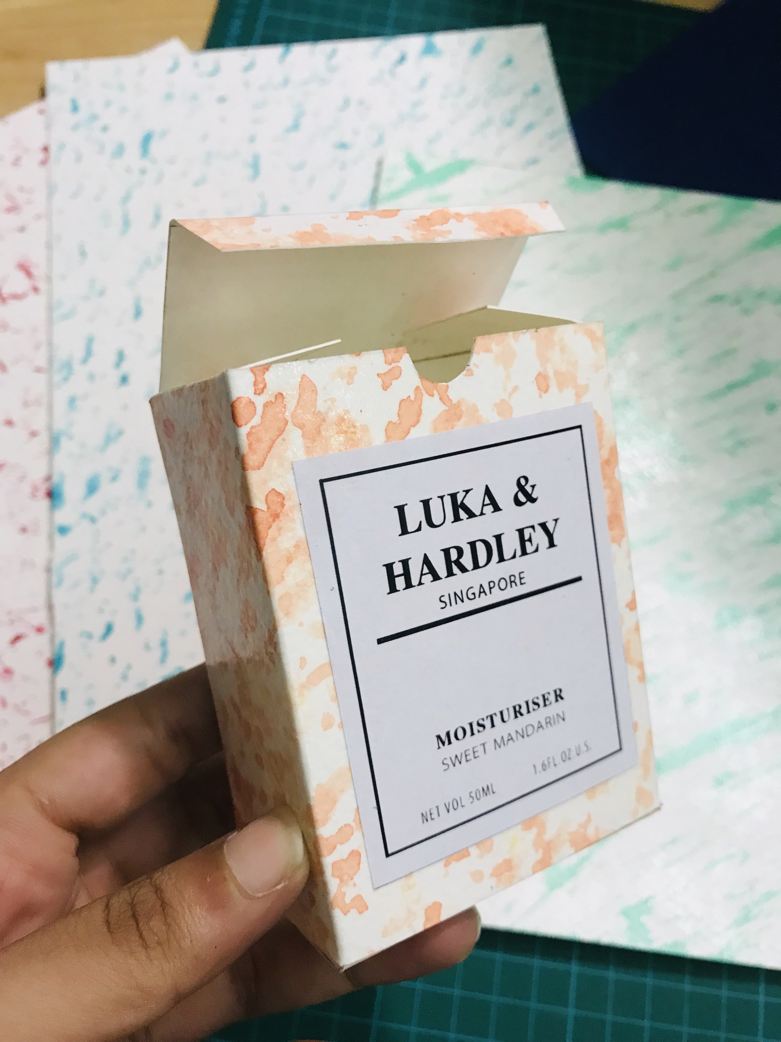
2. Health & the Law
Progressively over the years , there is an increase in awareness and understanding about drugs such as marijuana, and the relationship it has with mental health. More people slowly became exposed to it and its benefits, proven and tested by scientists all over the world. One cannot deny the medicinal properties that marijuana has on its consumers and liberalising it would benefit the society in many ways. Instead of criminalising marijuana consumption, which results in a disproportioned incarceration rate (The United Nations reports that, by the beginning of the 21st century, an estimated 185 million people over the age of 15 were consuming drugs globally) and illegal drug trafficking, we could shift our perspective to see it as a form of medicine and understand that legalising it could potentially save many lives.
Number of new drug abusers remains high, CNB figures show
While the number of drug abusers arrested fell from 3,265 in 2016 to 3,089 last year, about 40 per cent of them were new abusers.Of the 1,249 new abusers arrested, about 64 per cent were below the age of 30.
https://www.straitstimes.com/singapore/number-of-new-drug-abusers-remains-high-cnb-figures-show
Can CBD help treat depression?
Cannabidiol, or CBD, is a natural compound that has gained popularity in recent years, thanks in part to a growing body of research into its potential health benefits, which may include treating depression. The initial results of some studies into CBD and depression look promising.
https://www.medicalnewstoday.com/articles/324846.php
How depressed are Singaporeans?
Depression was the most common mental illness in Singapore (among the conditions assessed in the study), with one in 16 people (6.3 per cent) having had the condition at some point in their lives
https://www.businessinsider.sg/6-common-mental-disorders-affecting-singaporeans-today-and-where-you-can-go-to-get-help/
STILL A STIGMA
Another reason why it can be hard to identify individuals with “high-functioning” depression is because many sufferers hide their conditions.
https://www.todayonline.com/singapore/well-dressed-successful-and-depressed-high-functioning-depression-seen-more-patients
https://www.ibhinc.org/drug-legalization
3. Sustainability & Conservation
Our planet is now in the midst of its sixth mass extinction of plants and animals — the sixth wave of extinctions in the past half-billion years. As of 2019, there are too many animals that are on the critically endangered list because of human behaviour. To sustain the growing human population, we poach, we contaminate bodies of water, destroy forests and the habitats of wild animals.The extinction of a single species not only means that we no longer get to co exist with them but it also accelerates the rate at which other animals within the food web go extinct too.This contributes to the unraveling of our planets sustainability. Fortunately, conservation efforts around the world are bent on helping these endangered animals revitalise their dwindling populations through a variety of humanitarian efforts, including curtailing illegal poaching, halting pollution, and habitat destruction, and curtailing the introduction of exotic species into new habitats.
“A single species’ disappearance can, in fact, make a huge difference on a global scale. Like pieces of yarn in a woven tapestry, the removal of one can start unraveling the whole system.When you remove one element from a fragile ecosystem, it has far-reaching and long-lasting effects on biodiversity.”
China’s medicinal tiger bones and rhino horns: Tradition or travesty?
Tiger bones and rhino horns may have a role in traditional Chinese medicine, but critics say that trendy health products with no medical value made from endangered animals are only a status symbol for the wealthy.
https://www.dw.com/en/chinas-medicinal-tiger-bones-and-rhino-horns-tradition-or-travesty/a-46193315
https://www.thoughtco.com/why-it-matters-when-species-go-extinct-1182006
https://www.biologicaldiversity.org/programs/biodiversity/elements_of_biodiversity/extinction_crisis/
https://www.thoughtco.com/how-species-become-endangered-1181928
4.Poverty and inequality
Colombia is the seventh most unequal country in the world and faces extreme disparity in terms of income. Where the top 10% earners receiving 39% of the total income in Columbia.The current laws and policies widen the income gap further.The inequality causes stark differences in the standard of living between columbians and this definitely bears its consequences on the columbian society. Since about 34% (12.7 million) of columbians live below the poverty line -earning less than $2 USD a day, they do not have access to food, basic healthcare and to survive ,are more inclined to contribute to the rampant illegal drug industries.
high child mortality rate
higher number of crimes
lack of basic healthcare
distributive conflict and social tension
Ineffective taxation laws?
” The personal income tax system in Colombia is regressive. This means that the richer you are, the lower is your tax effective rate. The Government proposes to overcome this problem by introducing a progressive tax system, i.e. to let the richer households pay a relatively higher effective tax rate. “
https://www.worldbank.org/en/news/opinion/2012/12/17/why-colombia-needs-a-more-progressive-tax-system
https://colombiareports.com/colombia-poverty-inequality-statistics/
https://colombiareports.com/understanding-colombias-conflict-inequality/
2.Why is the issue important? Who does it affect and how?
Global climate change has already resulted in a wide range of impacts across every region of the country and many sectors of the economy. Increasing temperatures, rising sea levels, extinction of animals, human health, deterioration of the atmosphere are just some of the many pressing issues brought about by climate change. It affects all life on earth, as it becomes increasingly disruptive throughout this century and beyond.
https://www.globalchange.gov/climate-change
3.Who do you need to communicate to and why?
Target audience:
Millennials aged 18-34 tend to generally be more interested and understanding of current affairs/progressive and it is necessary to mould and equip the current generation with the knowledge to change to world in whatever small way that they can. Have the power to contribute to small changes which eventually leads to a global change.In essence, the issues that I have brought up eventually affects the individual himself in one way or another. With an increase in awareness, these millennials may try to lessen the impacts of climate change in small ways,eg.using metal straws.If empowered, they would be more inclined to make changes to their lifestyle that would impact the world.
4.How has visual communication contributed to address the cause?
The loud contrasting colours create a bold and eye catching look which is necessary especially in increasing awareness.Yellow and black are used on roads and signs to draw attention to it. The font is a bold san serif, the boldness further emphasises the importance of the message and the san serif removes unnecessary distractions from the purpose of the text.Normally when I see posters related to climate change, very expected colours are used, like blue for the seas as well as green for the earth etc, however in this case its nothing related to those earthy colour schemes.
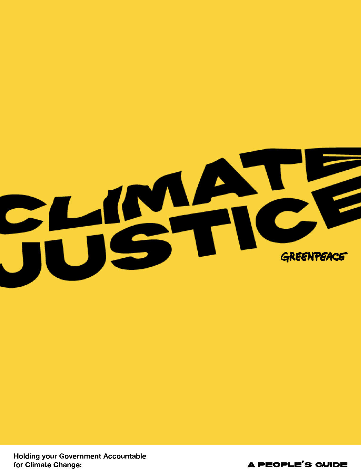
Greenpeace USA
11 December 2018
Dezeen.com
Volunteer artists

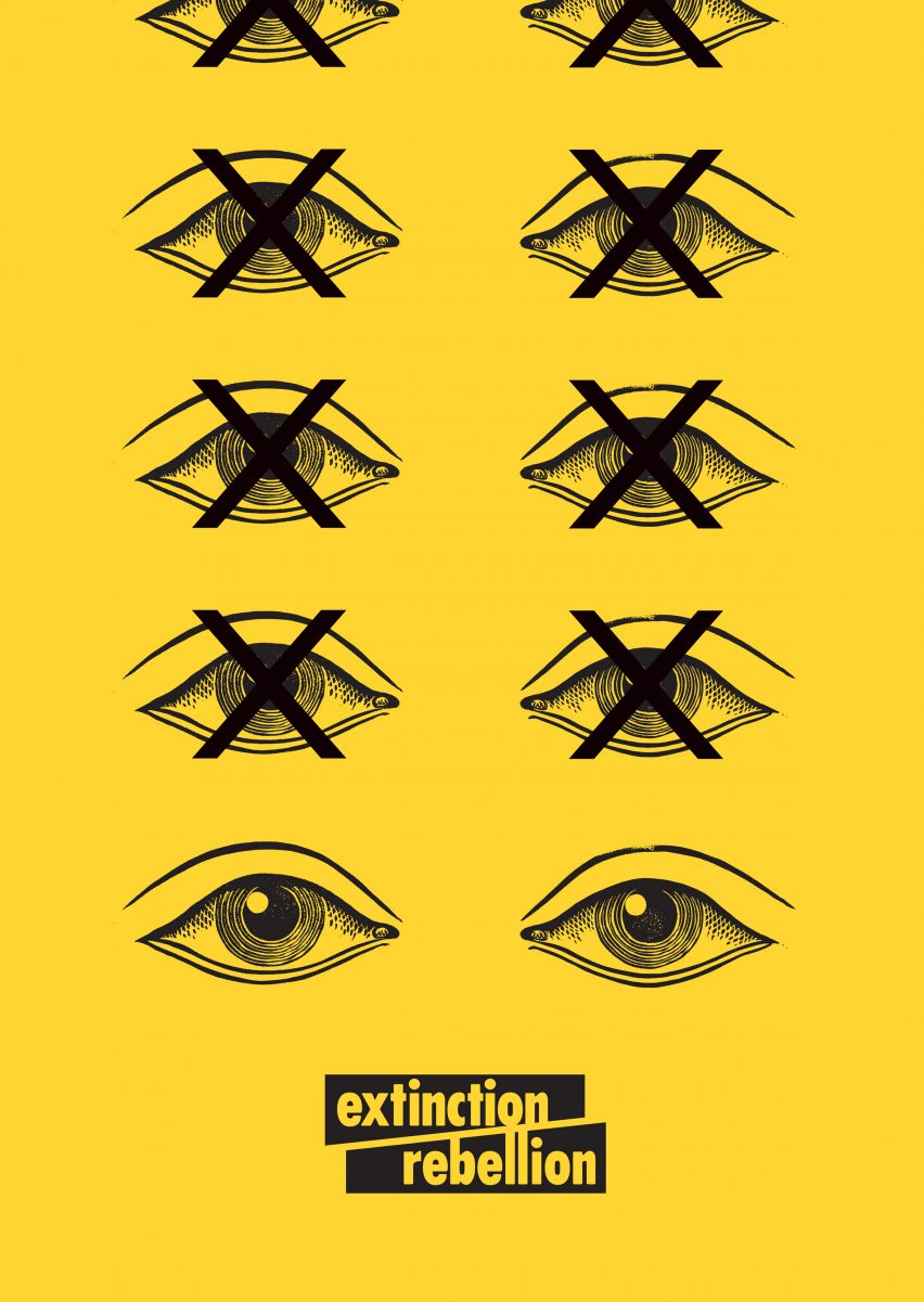
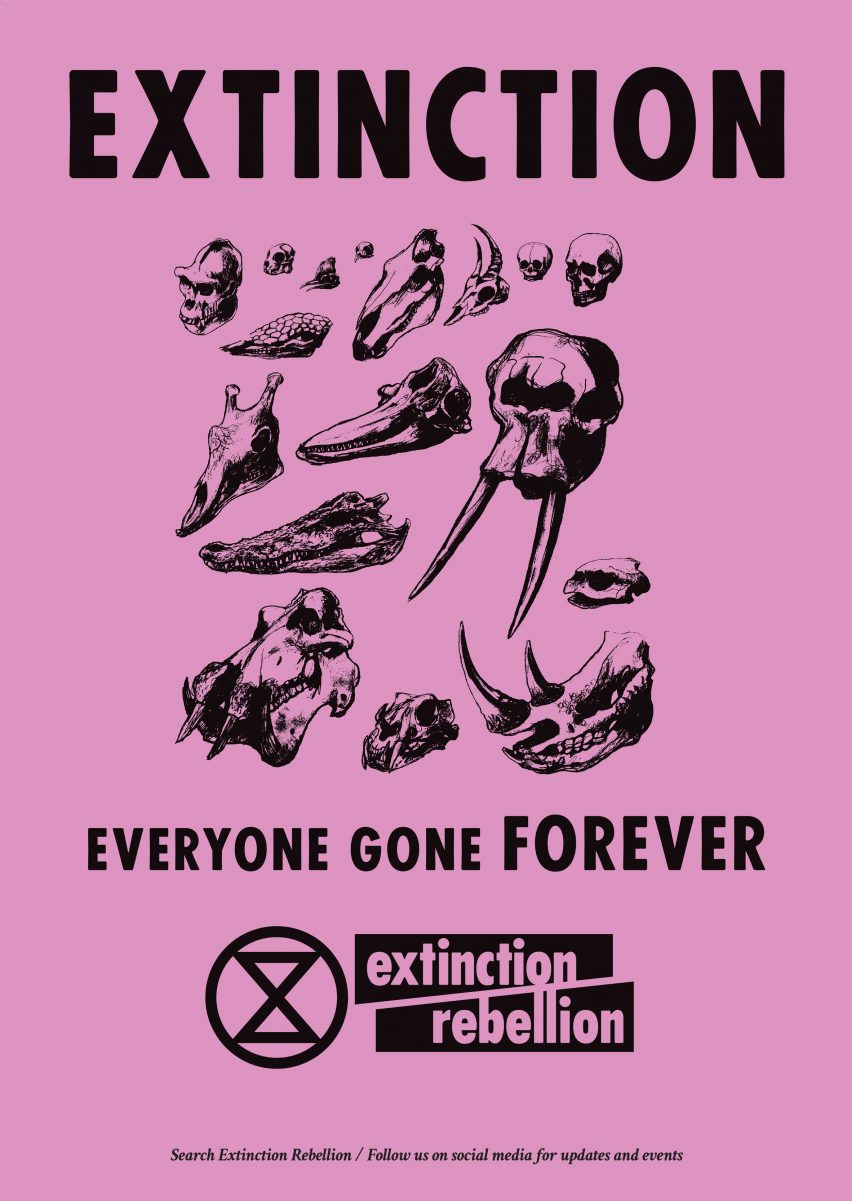
Design elements to consider- animal skulls, endangered animals , hourglass, earth, thermometer , love/hearts ,loud clashing colours
AGAINST EXTINCTION!!


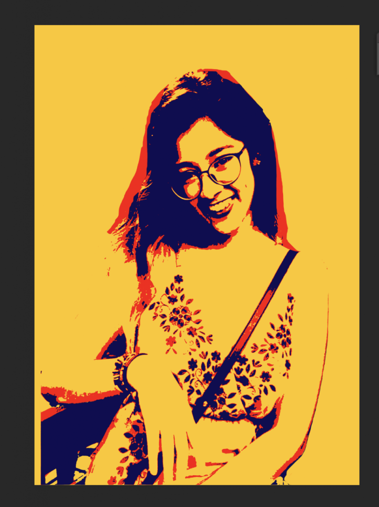
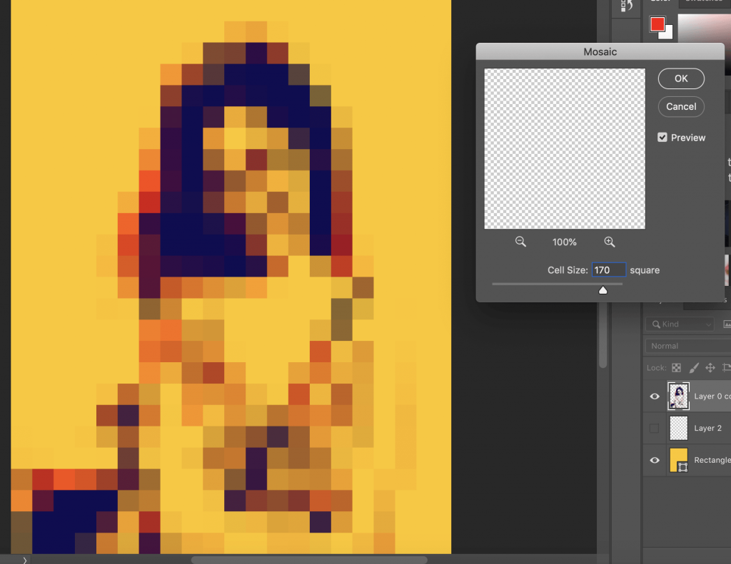 Cell size :170
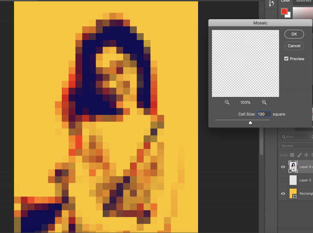 Cell size:130
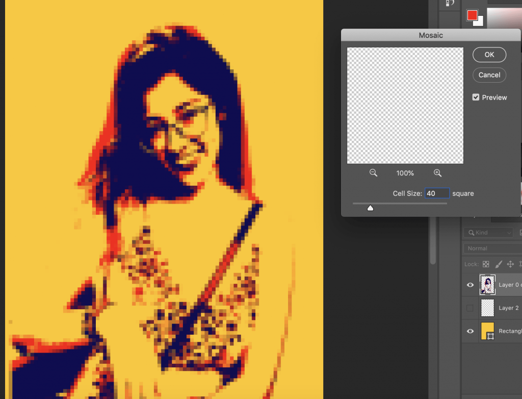 Cell size:40
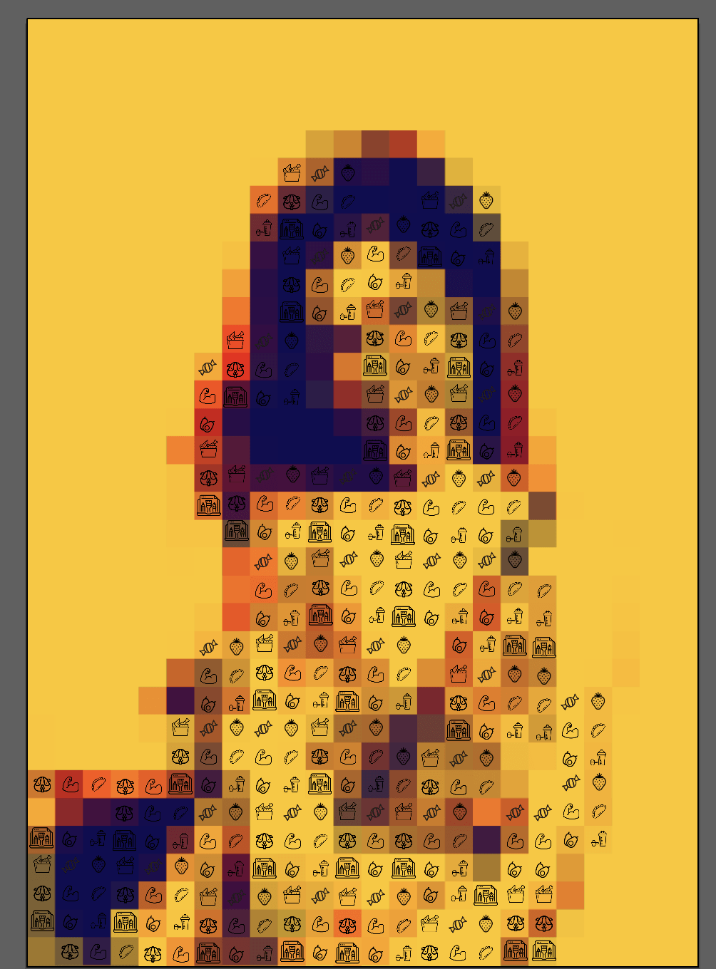
/https://public-media.smithsonianmag.com/filer/20130318034045flight-crop.jpg)
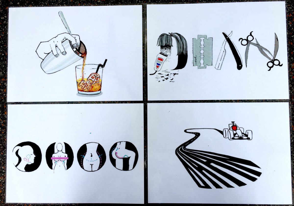

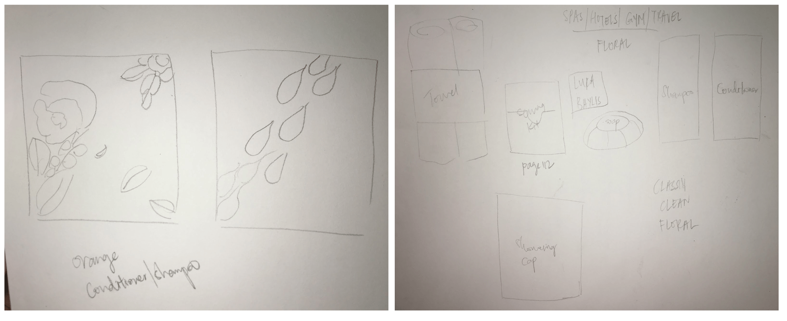
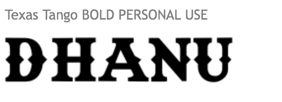
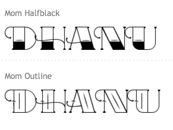
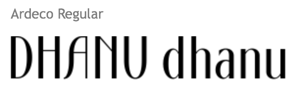
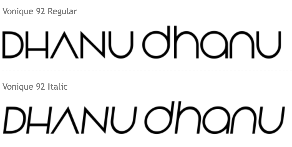
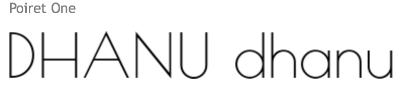
 In Project 1, we were tasked to express 4 jobs via typography. Since the project gives us a lot of freedom in the jobs we could explore, I narrowed it into these jobs: Plastic surgeon,Barber,Race car driver and Bartender.For each job I proceeded to create a mood box and select a few colour schemes, to give me a starting point in my research and also for some inspiration.
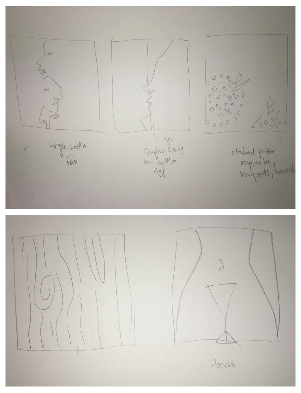
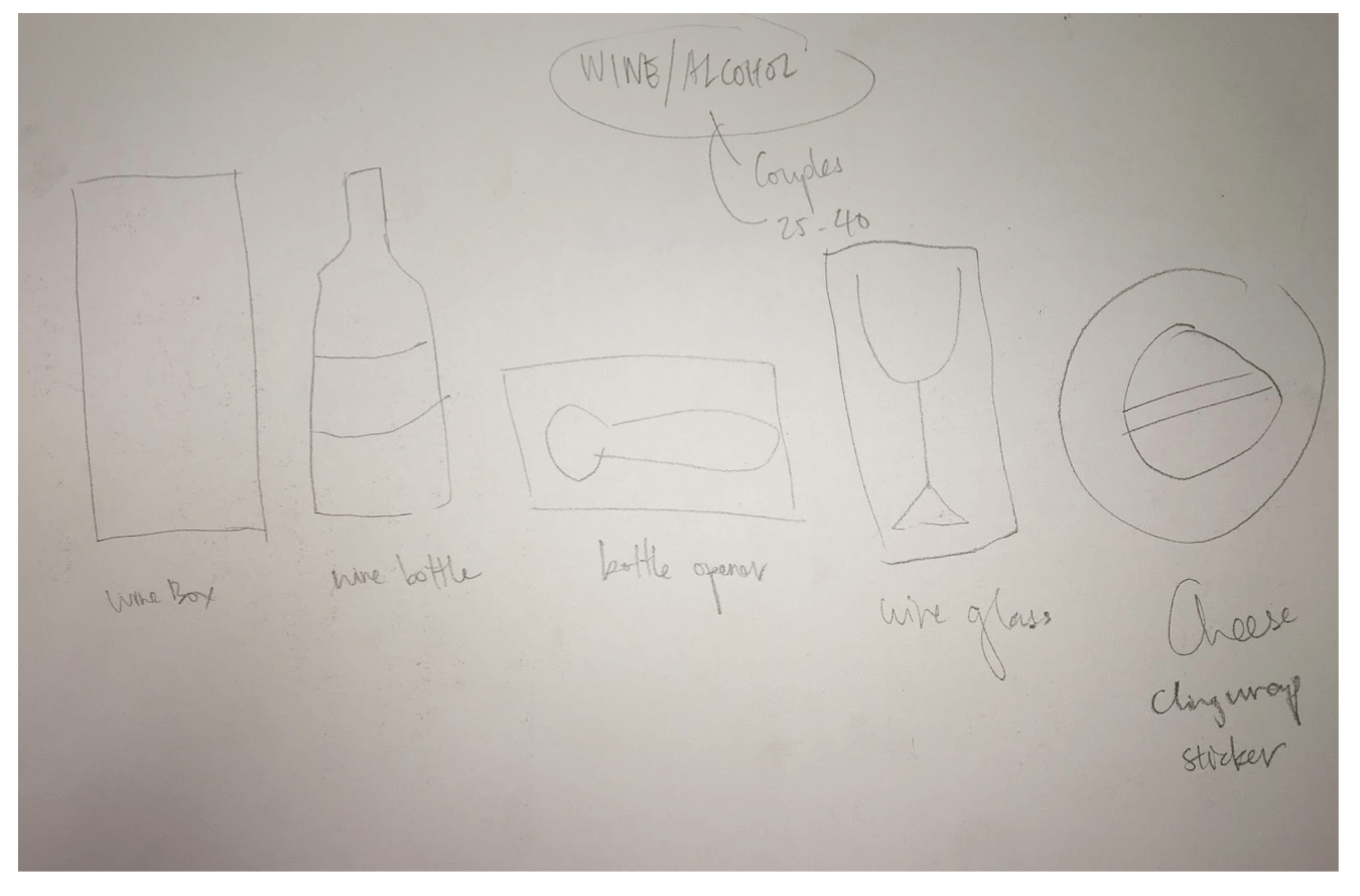
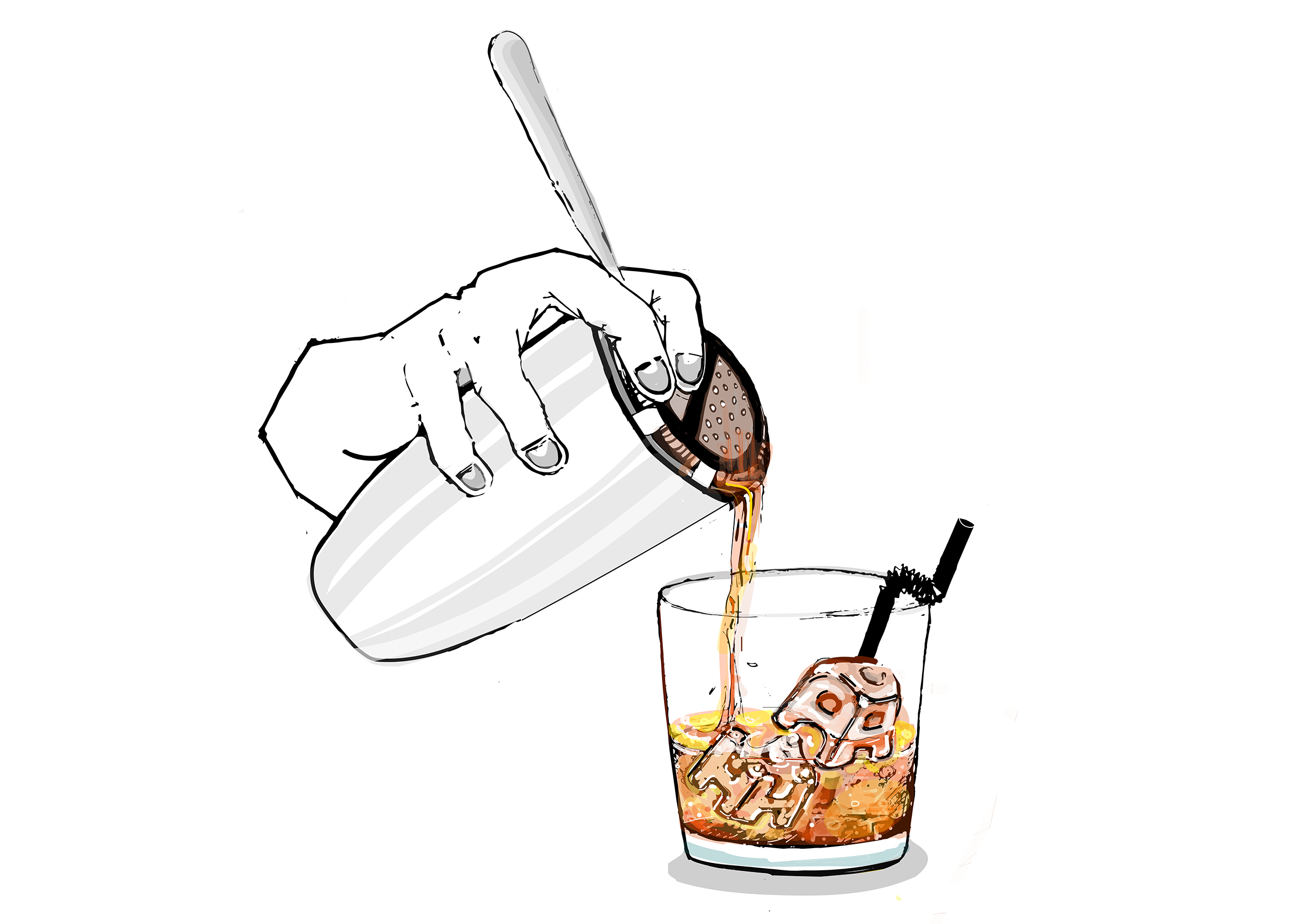
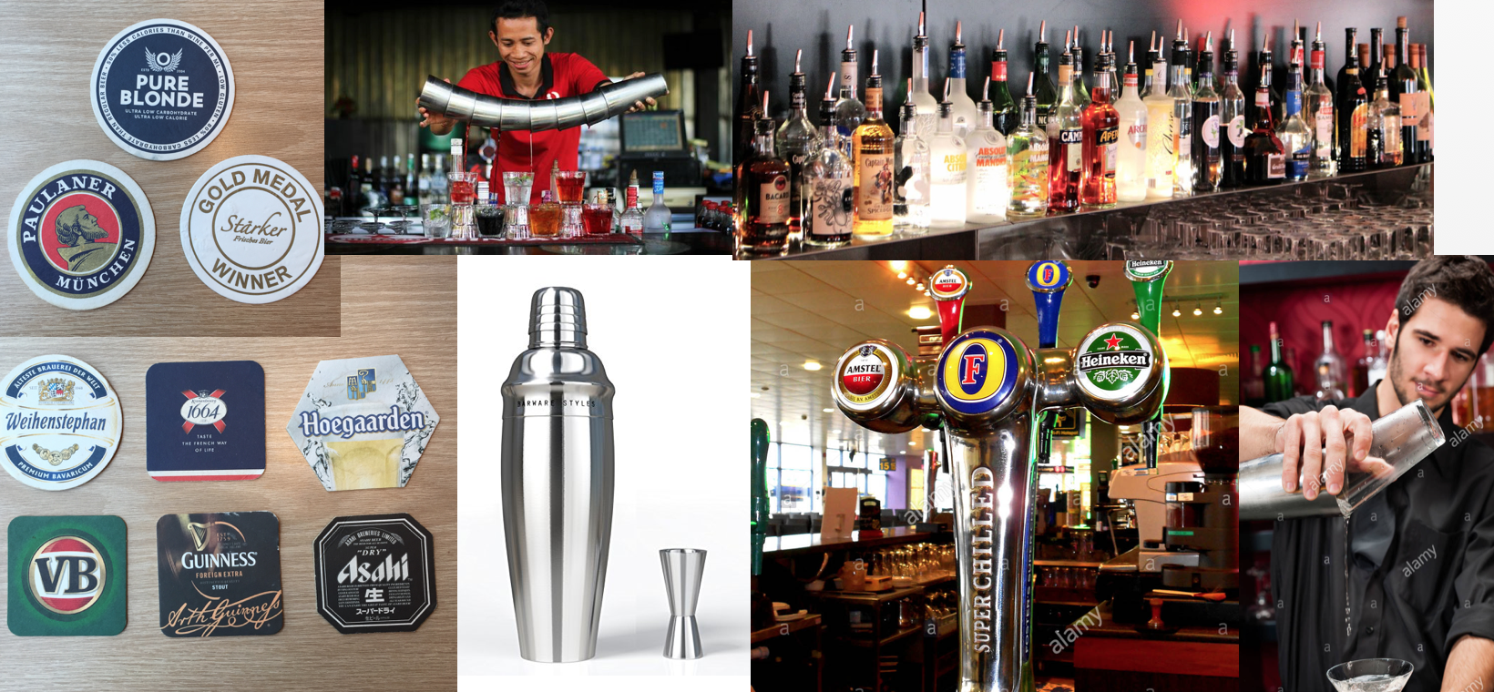 For this composition,I was inspired by how bartenders perform tricks and mix different types of alcohol using their cocktail shakers. Also the alcohol bottles comes in a variety of colours and forms which provide me more material to see patterns .Font wise,i decided to use some of the coasters I've collected from bars to give me an idea of what font to base my design off. I notice from the coasters that font varies from Thick and bold, cursive and elegant and thin.The colour scheme I've selected for this design is based off the colour of whiskey,which comprises of mainly orange,red,and yellow.
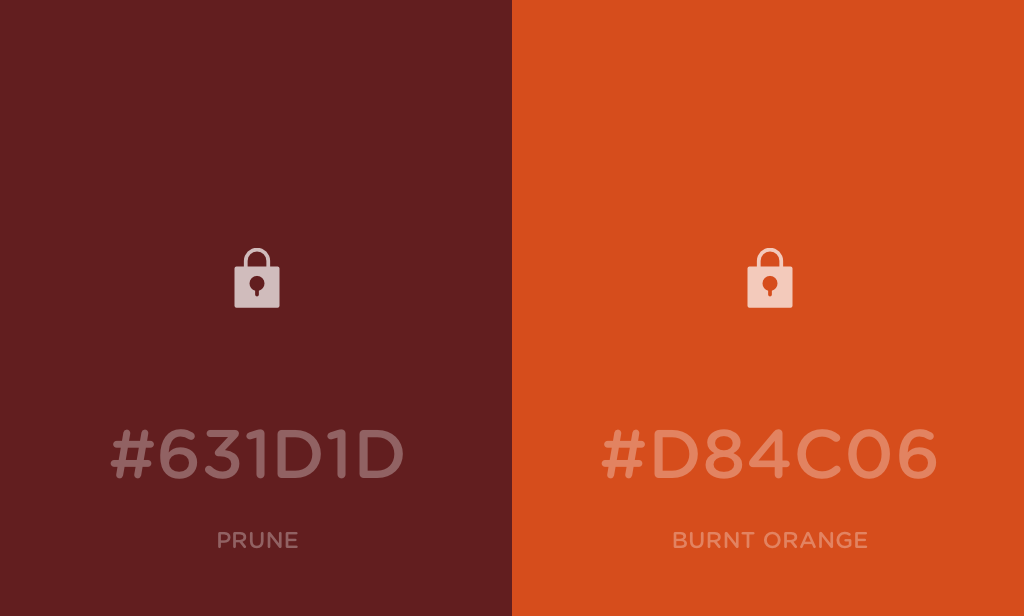
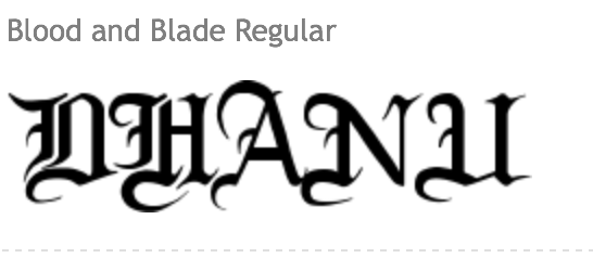
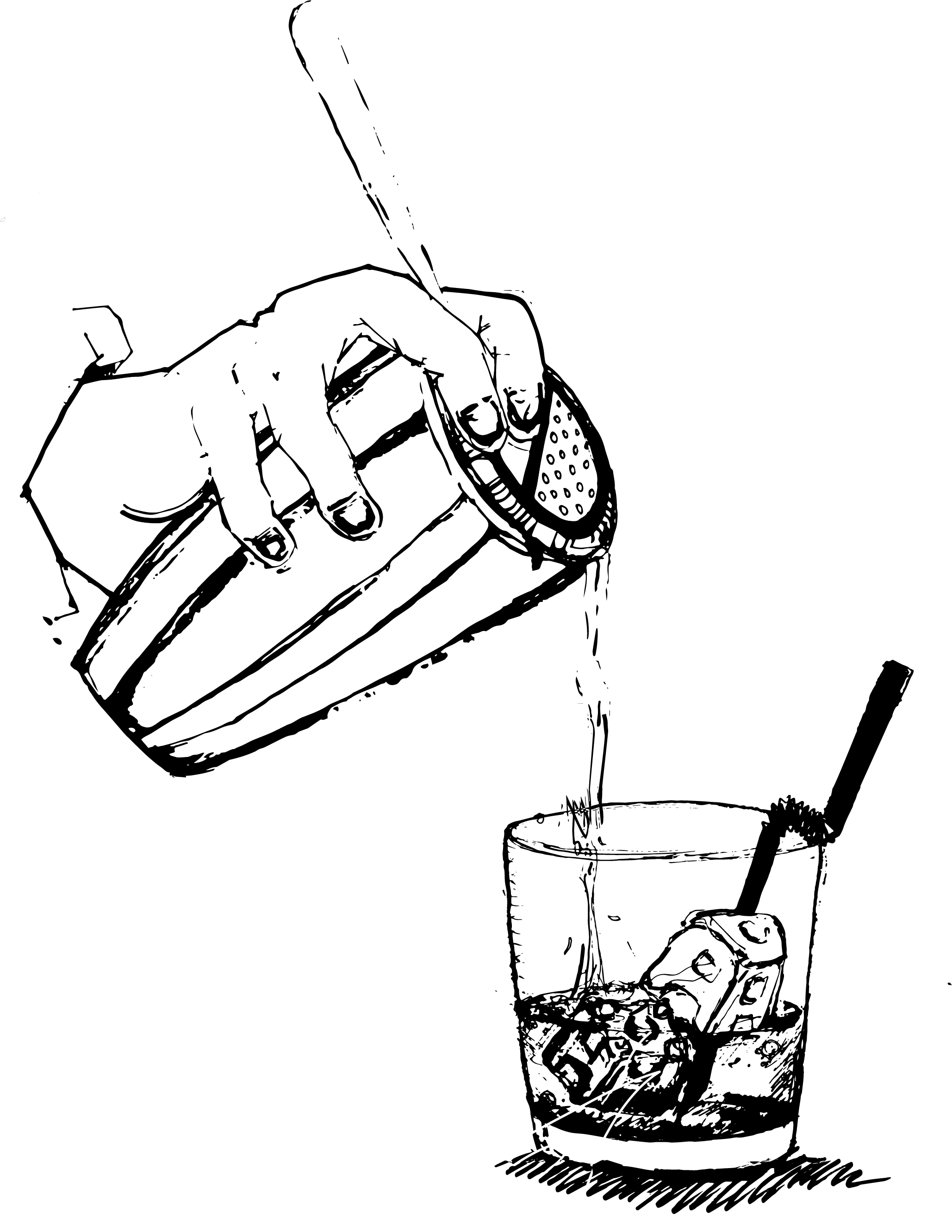 There was too much details on the cocktail shaker drawing attention away from my lettering,thus the letter D was drowned out.I decided to thicken the line quality for the D H and A, and removed the unnecessary details from the ice cubes and shaker making my name more prominent in my design.Orange is an energetic colour and pops compared to grey which is dull and recedes into the background.I coloured the lettering in orange to bring it out more.
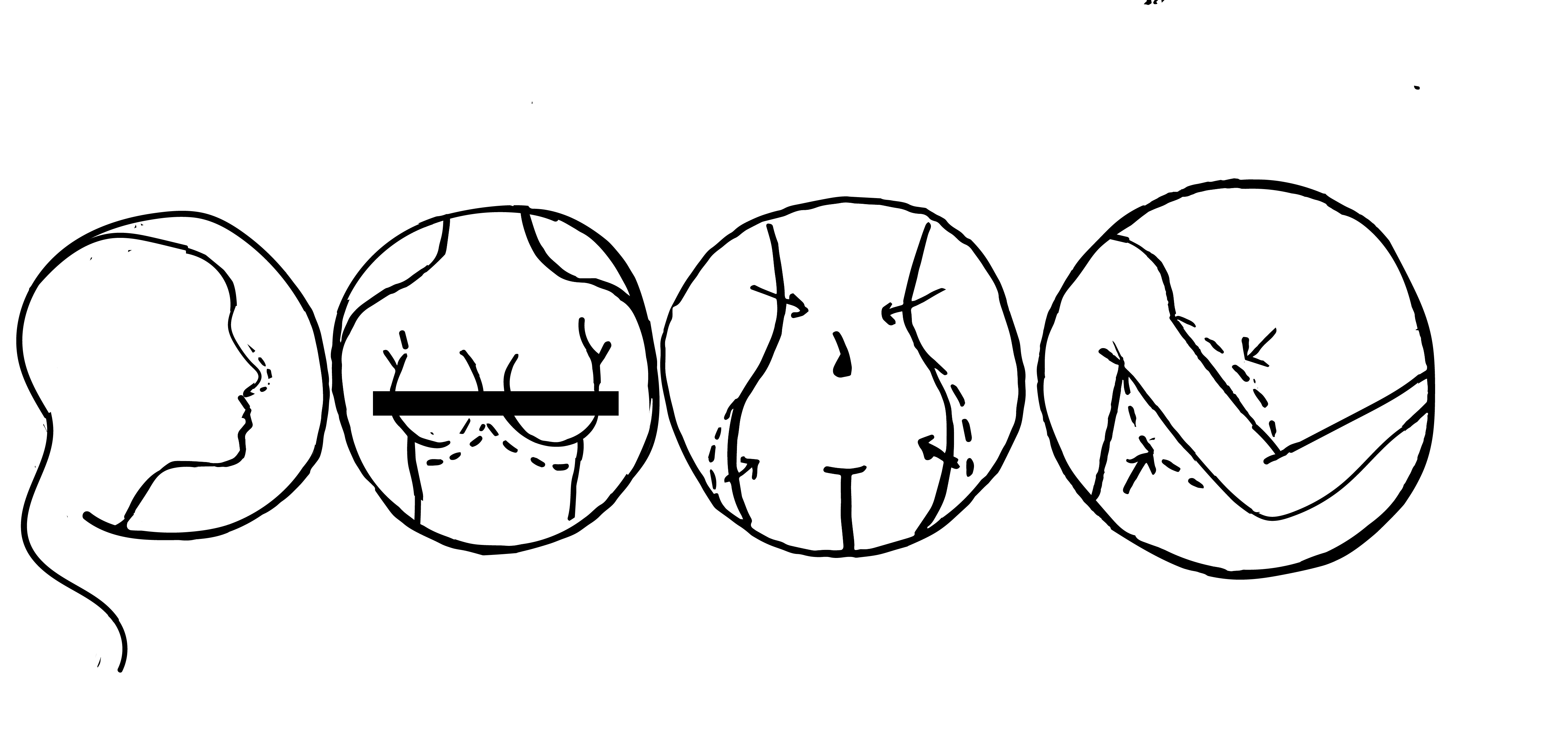
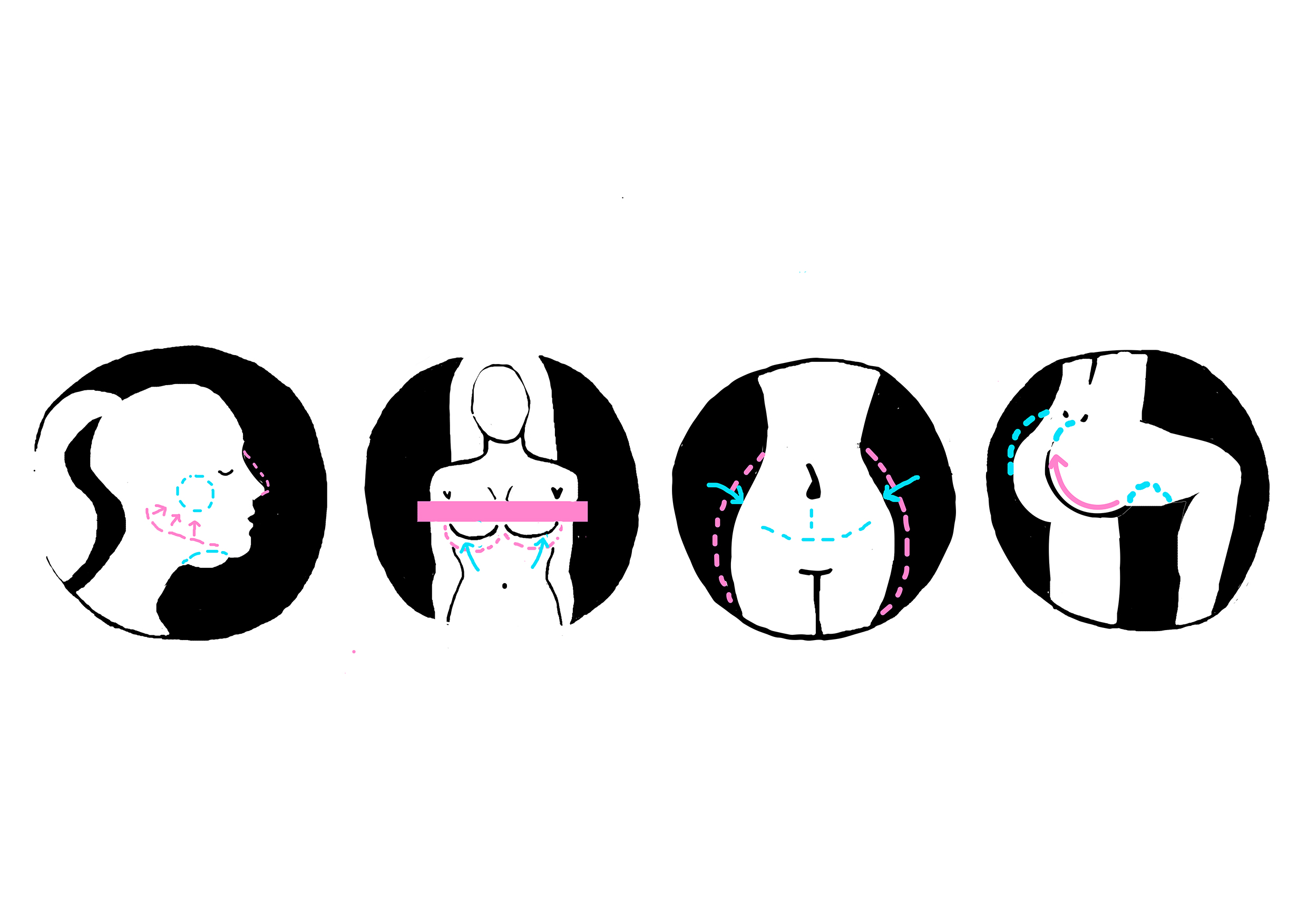
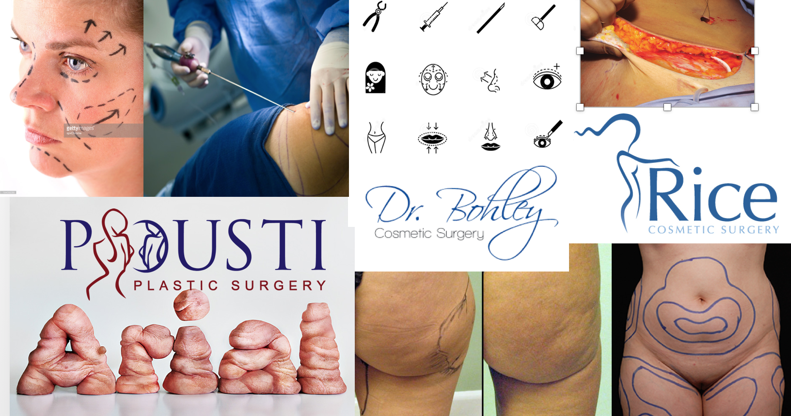 When I think of plastic surgery,liposuction,lip fillers, botox and breast augmentation surgery are the few procedures that come to mind.I decided to create lettering based off of these surgeries.Cosmetic surgery focuses on "before and after" effect.The font tends to be more aesthetic,whereby the fonts are more elegant,clean and minimalistic with more 'curves'.Pink is sometimes used in the logos as it is a feminine colour,while teal gives off the normal clinic/medical vibe.
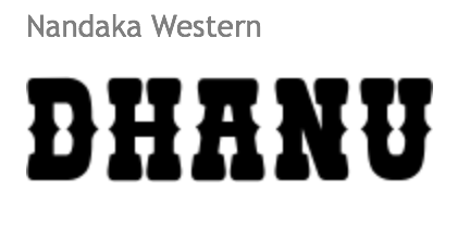
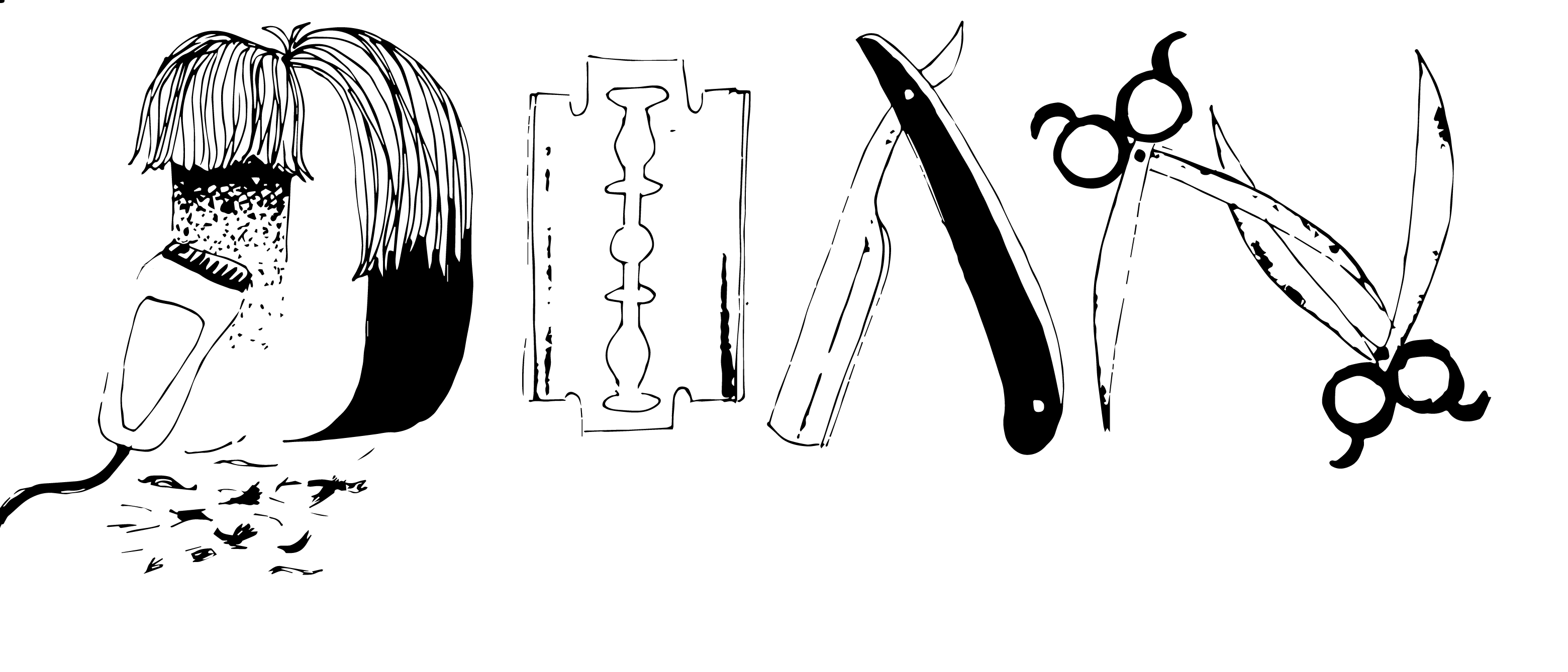
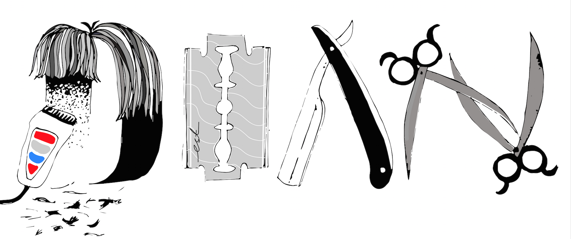
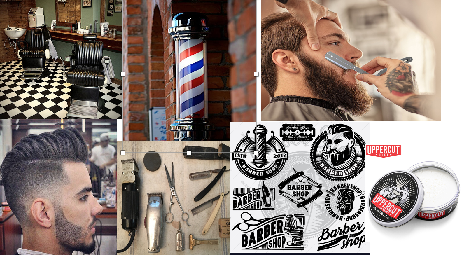 Emblematic logos seem to be a running theme when I looked into barber shop logo designs. An emblem logo consists of font inside a symbol or an icon; think badges, seals and crests,which means that within the emblem itself,there are repeating motifs:scissors,combs,razors..etc. The font tends to be capitalised and bolded with minimal spacing between the letters.For this composition I decided to create my initials using the repeating motifs. Apart from the blue and red colour scheme normally associated with barber shops because of the barber pole,black,white and green is used.
 5
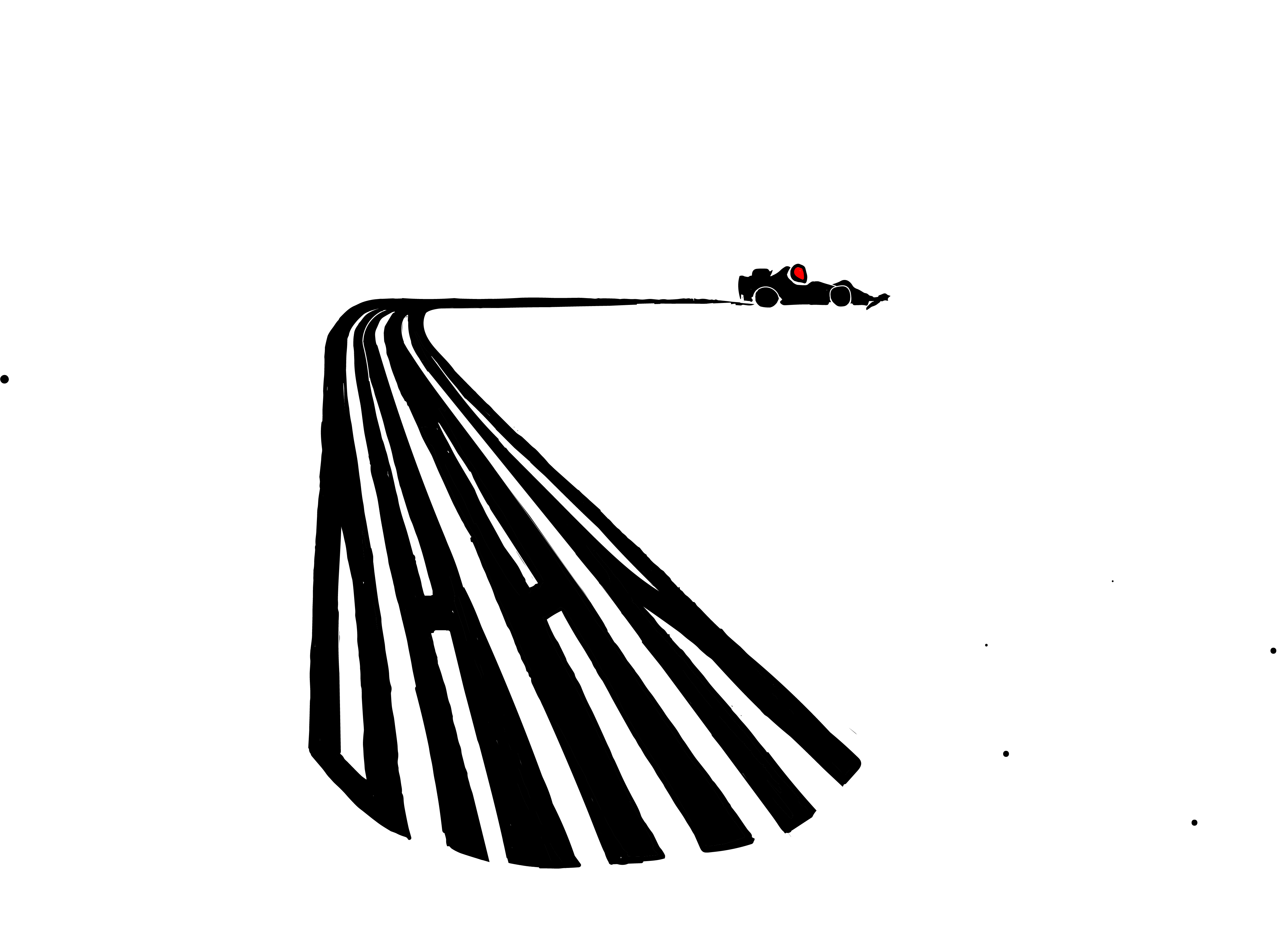
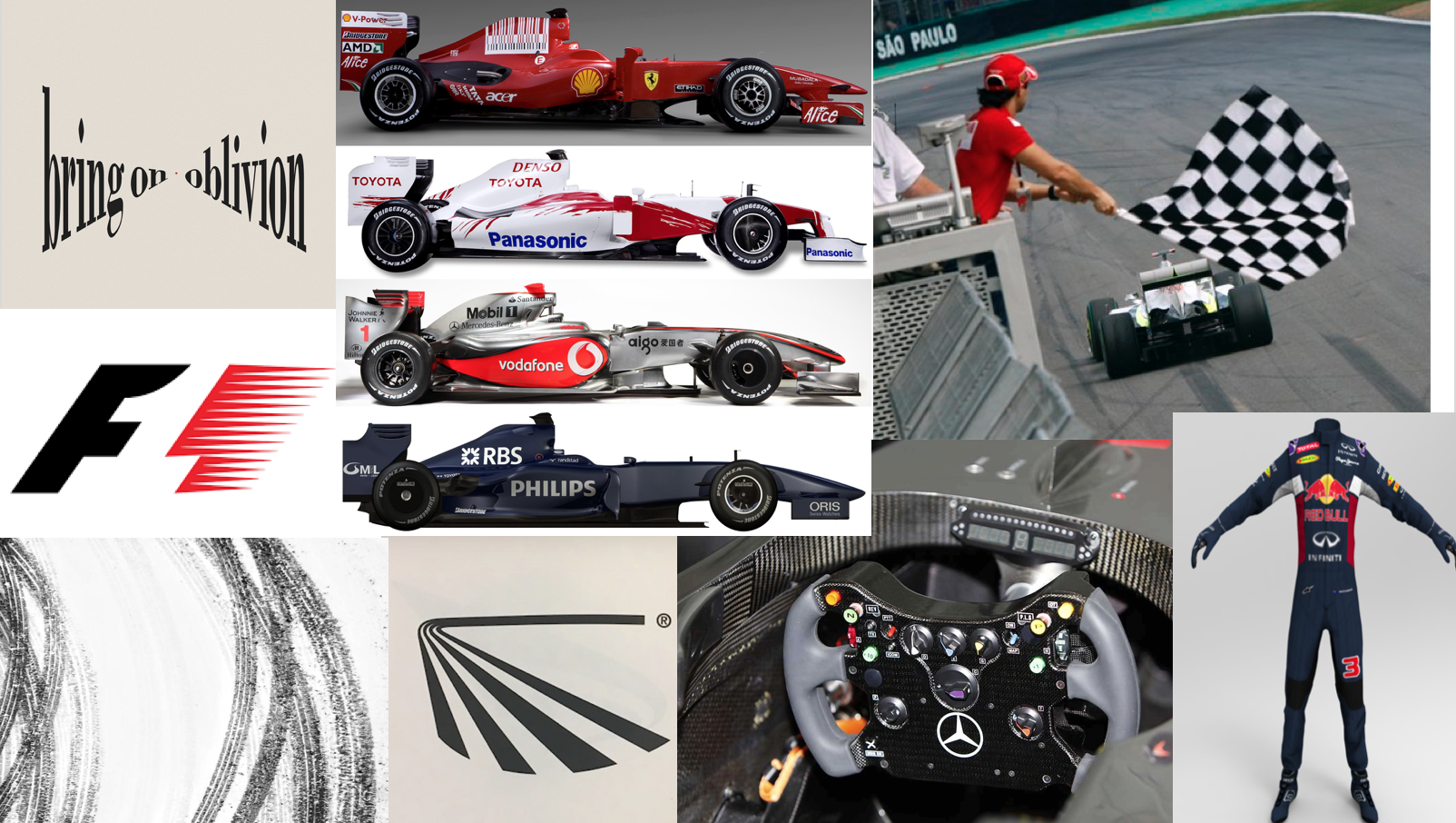
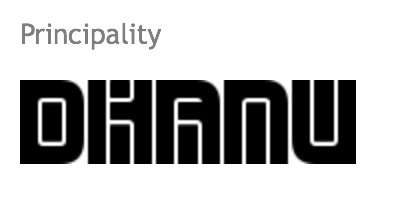
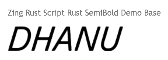
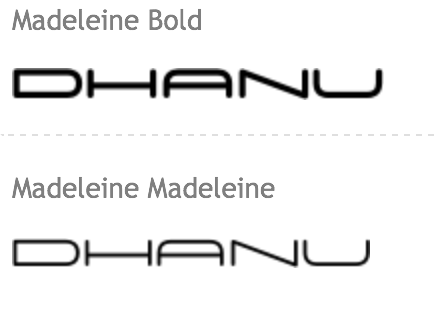
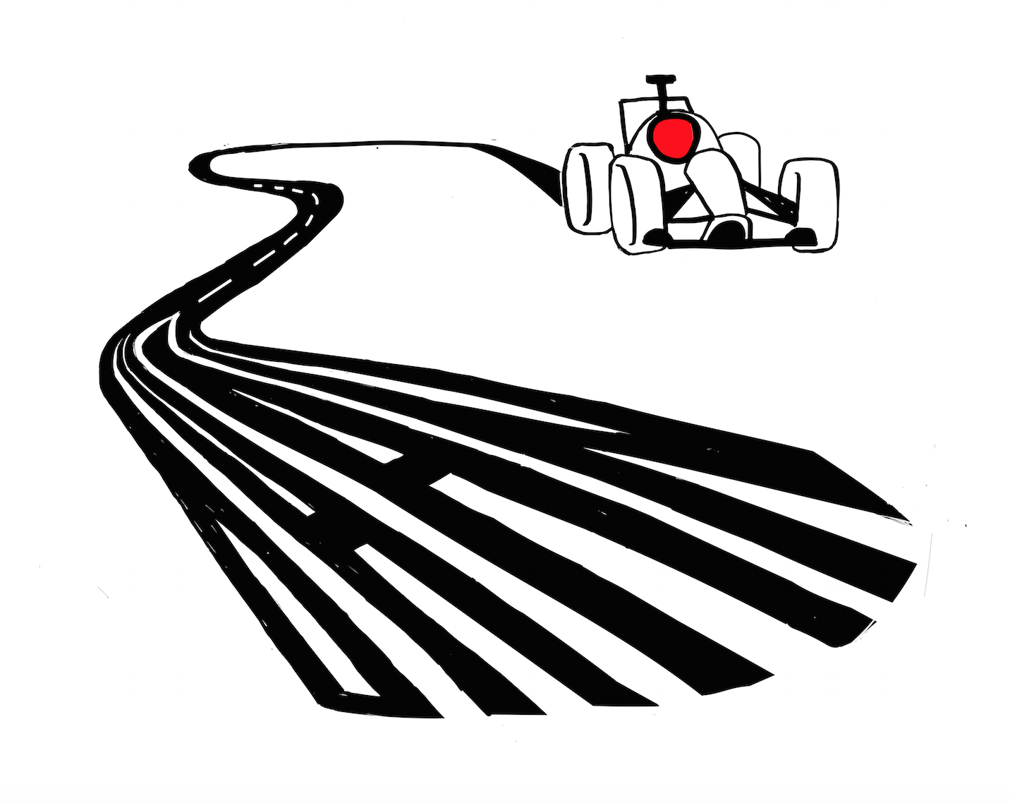
Inspired by the negative space used in the F1 logo I decided to do racer for the final composition.The F1 cars have many brand sponsors that can be seen on the drivers' suit cars itself,ranging from cigarette brands,electronic brands and even telcos.These companies' logos have fonts that tend to be minimalistic but bold,focusing on the lettering themselves.Since most of these logos are rather flat and just text,i wanted to incorporate some perspective to make the design more convincing.The colours seem to be mainly red,black and white with hints of yellow.
5
Inspired by the negative space used in the F1 logo I decided to do racer for the final composition.The F1 cars have many brand sponsors that can be seen on the drivers' suit cars itself,ranging from cigarette brands,electronic brands and even telcos.These companies' logos have fonts that tend to be minimalistic but bold,focusing on the lettering themselves.Since most of these logos are rather flat and just text,i wanted to incorporate some perspective to make the design more convincing.The colours seem to be mainly red,black and white with hints of yellow.


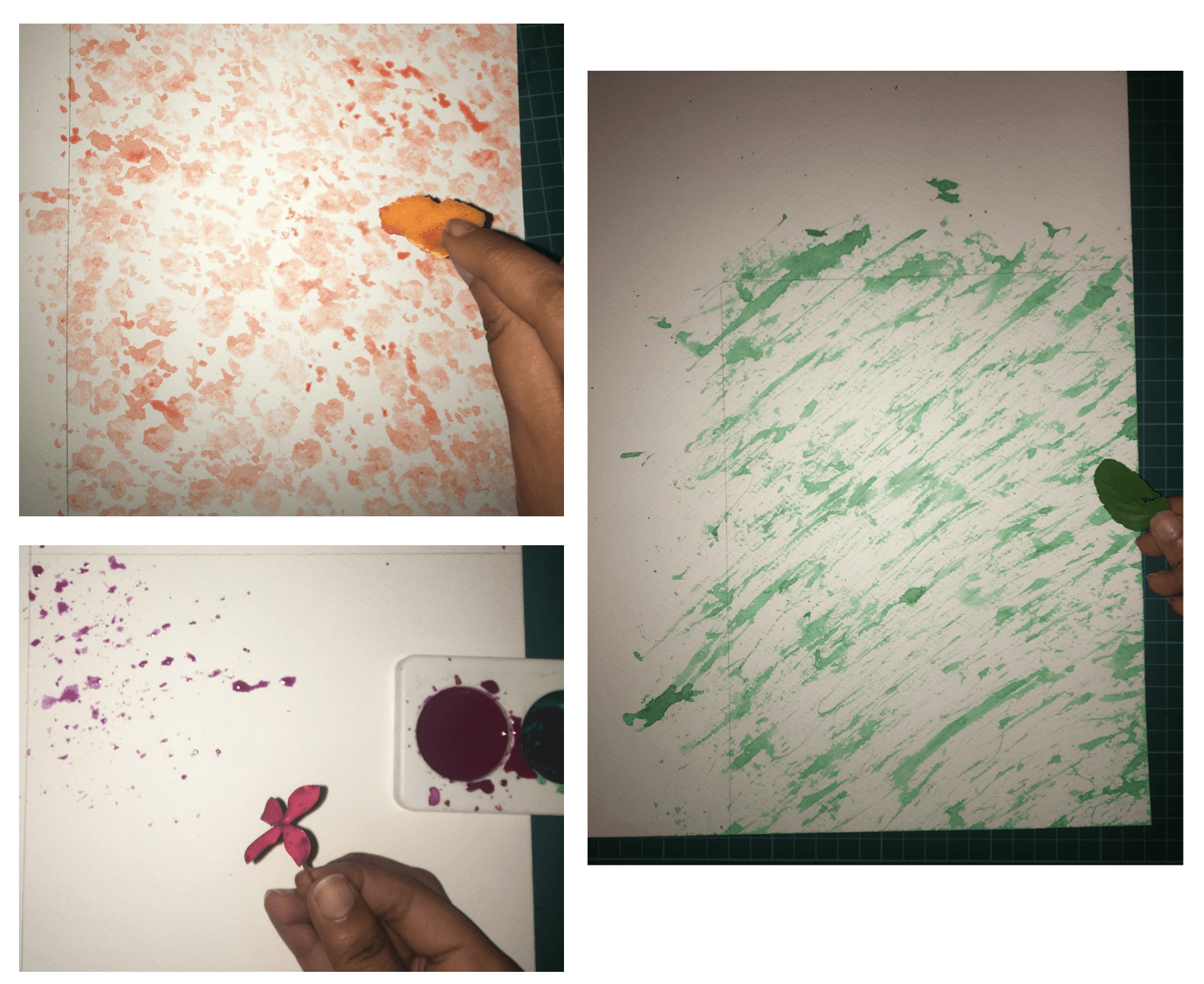
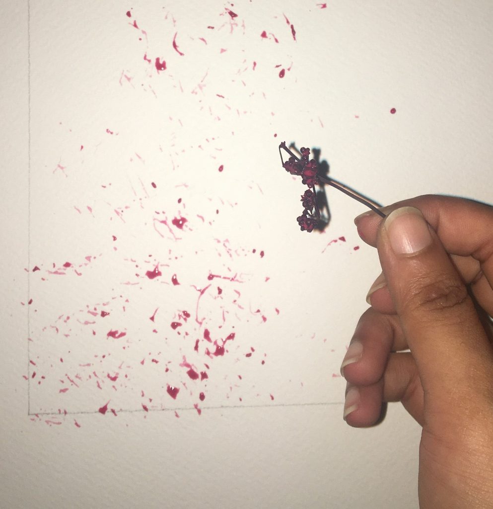
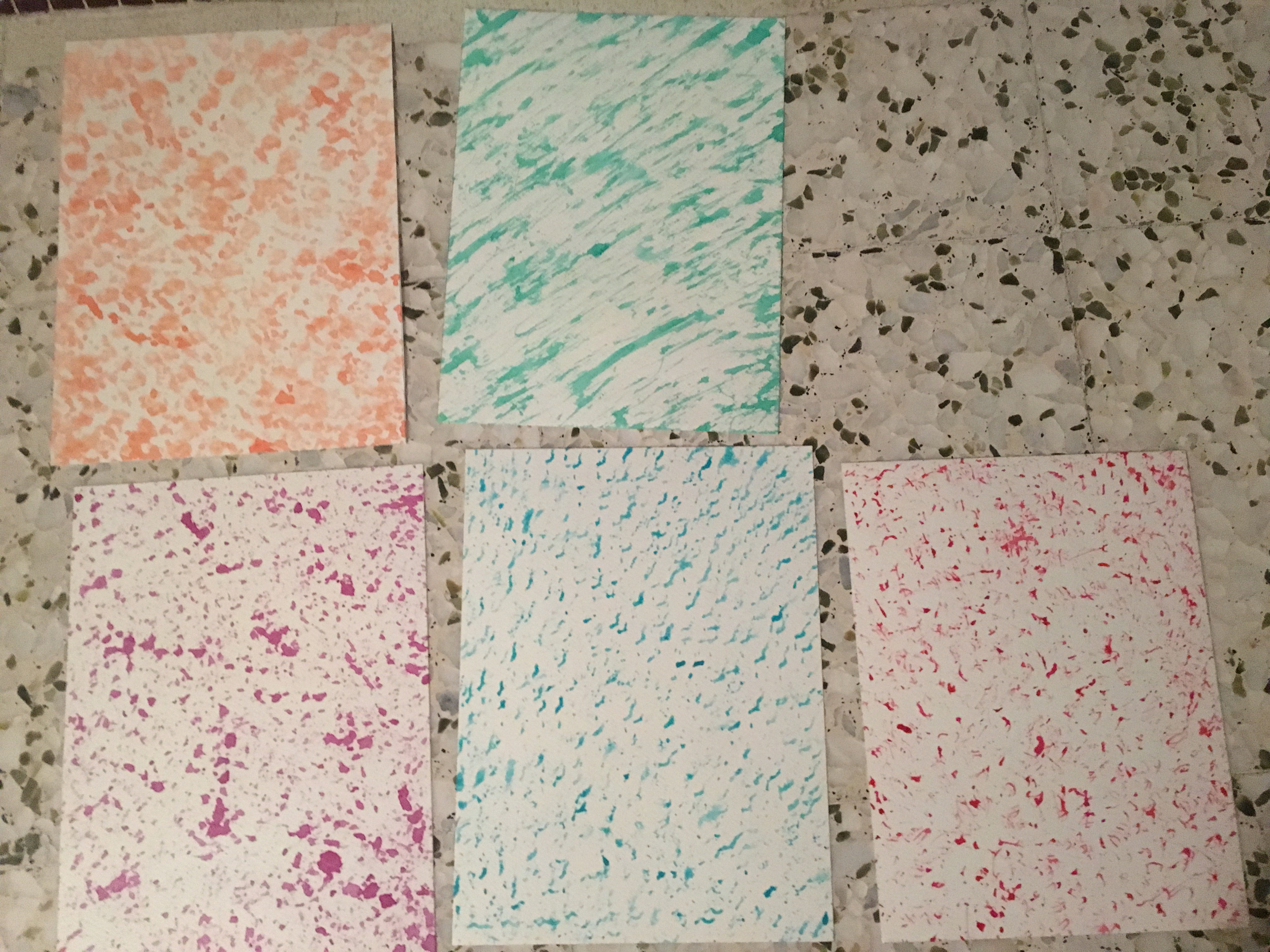
 The idea you suggested for surprise was to play with the shapes,Since you pointed out i tend to create patterns for my other strips.I tried thinking along these lines and felt what i came with was very flat in terms of tone.I dipped cups into ink and forcefully to create circlular marks and the bottom of the chinese ink bottle to create rectangular shapes.I realised that the ink i was using was too thick so it was not splattering that much,so i tested out inks at different dilution levels.From here i thought i could base the idea of surprise using different tones of ink. The rings splattered too messily which was too distracting, so i wanted to concentrate on keeping most of the rings very clean and uniform.I created a pattern with the circles to have a few focal points instead, as i wanted to show more of a person being “Startled” .Originally the circles were spaced randomly,hence,there was a lack of focus.I thought creating a few focal points would give the appropriate degree of the idea of distraction.
 Same goes for Joy.I repeated the print over and over with the mark making tool i made at different wavelengths,or how much they overlapped which determines how the linesintertwined.The slightly more intertwined lines looked more harmonious to me as they flow very nicely together and fills up the negative space a little more making the contrast between the background and the ink itself not too stark. The idea of different sized,soft,wavy lines it is i wanted it to look soothing so i avoided sudden harsh peaks.I also wanted a mixture of dark and light tones as the entire idea of different types of lines and tones blending together very smoothly made me happy.


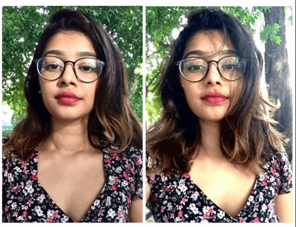
 On the left was one of the test shots, I felt that it was quite impersonal and also there were too many distractions.


