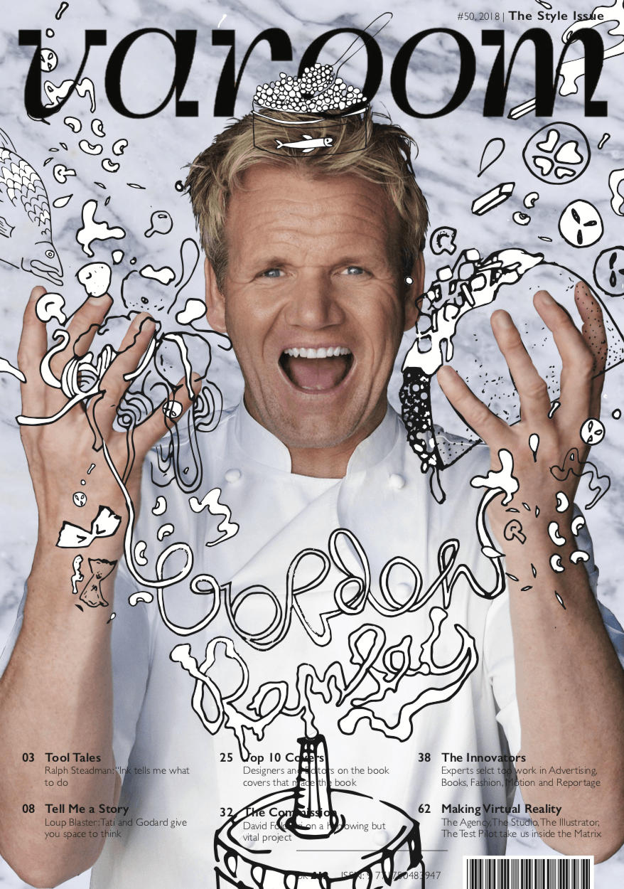
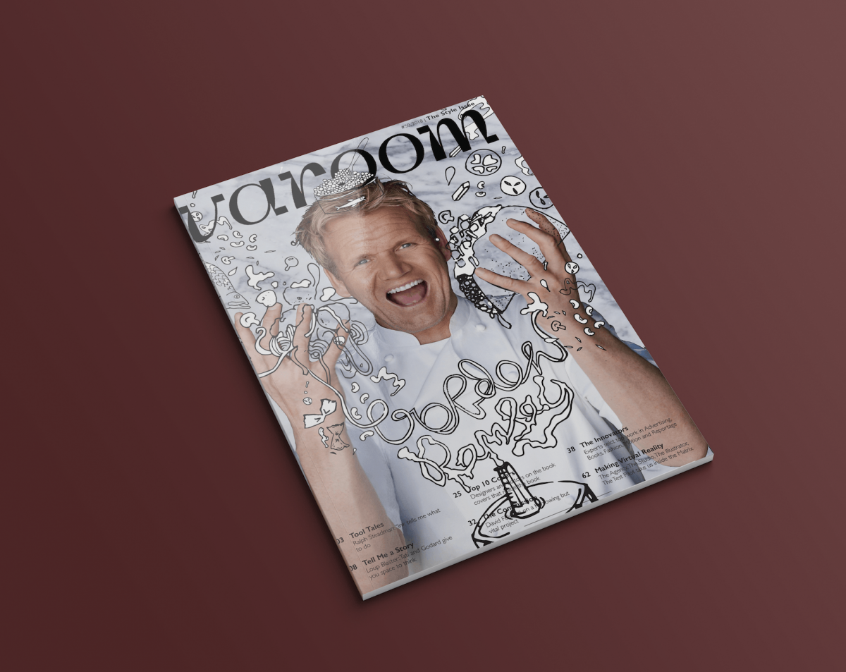
I opted for a dynamic composition for my illustrations as I thought it suited the concept of Gordon being overwhelmed by food. The triangular shape of the composition adds movement and energy to the magazine cover giving it visual interest.There are multiple elements within the design which have varying sizes and also different line weights, as pens with different thicknesses were used. This contributes to the sketchy and fun look I was going for. Overlapping the magazine template over the illustrations which are over Gordon Ramsay himself gives the design more depth and in turn makes it more exciting compared to a flat 2D design.
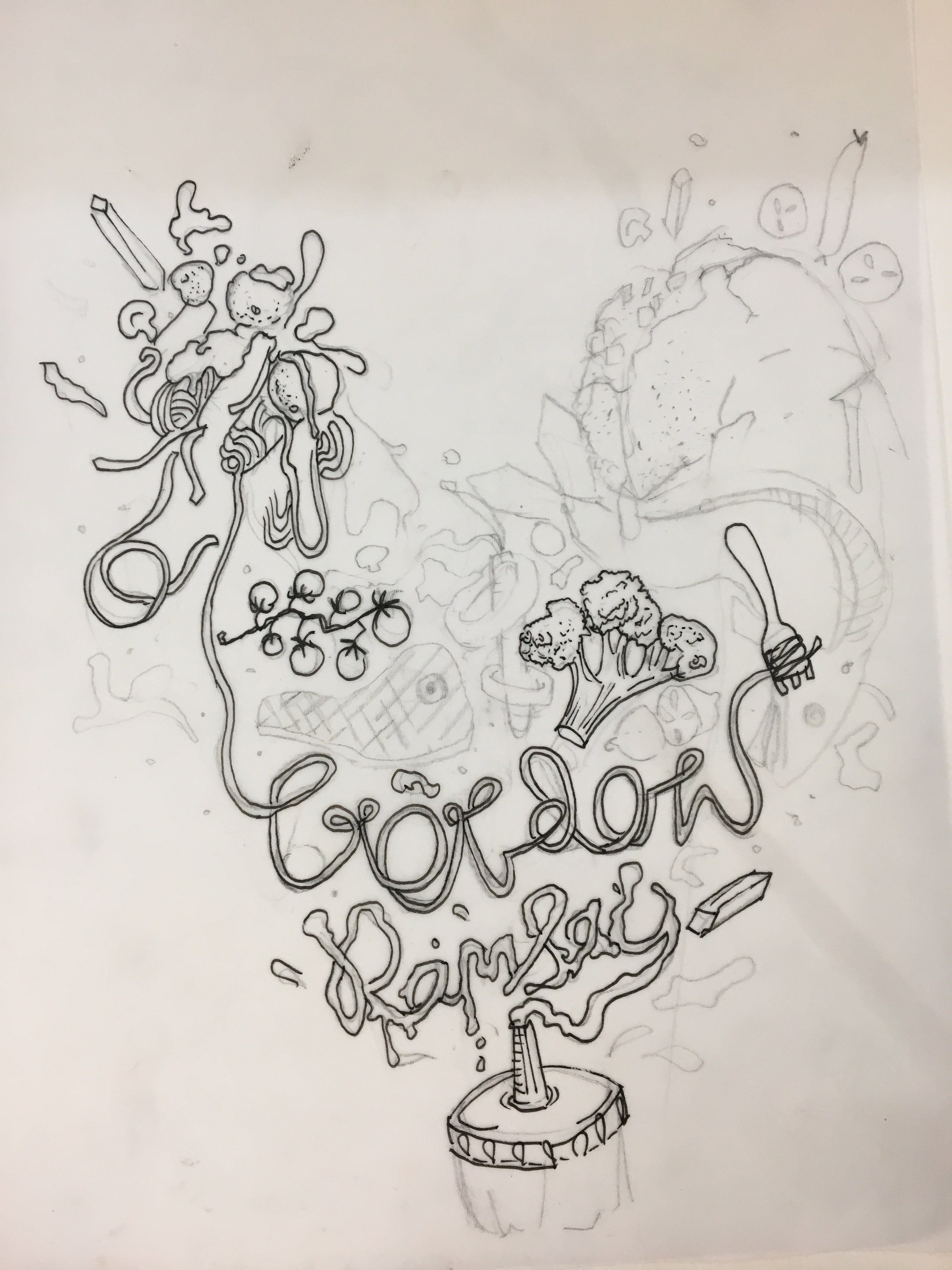
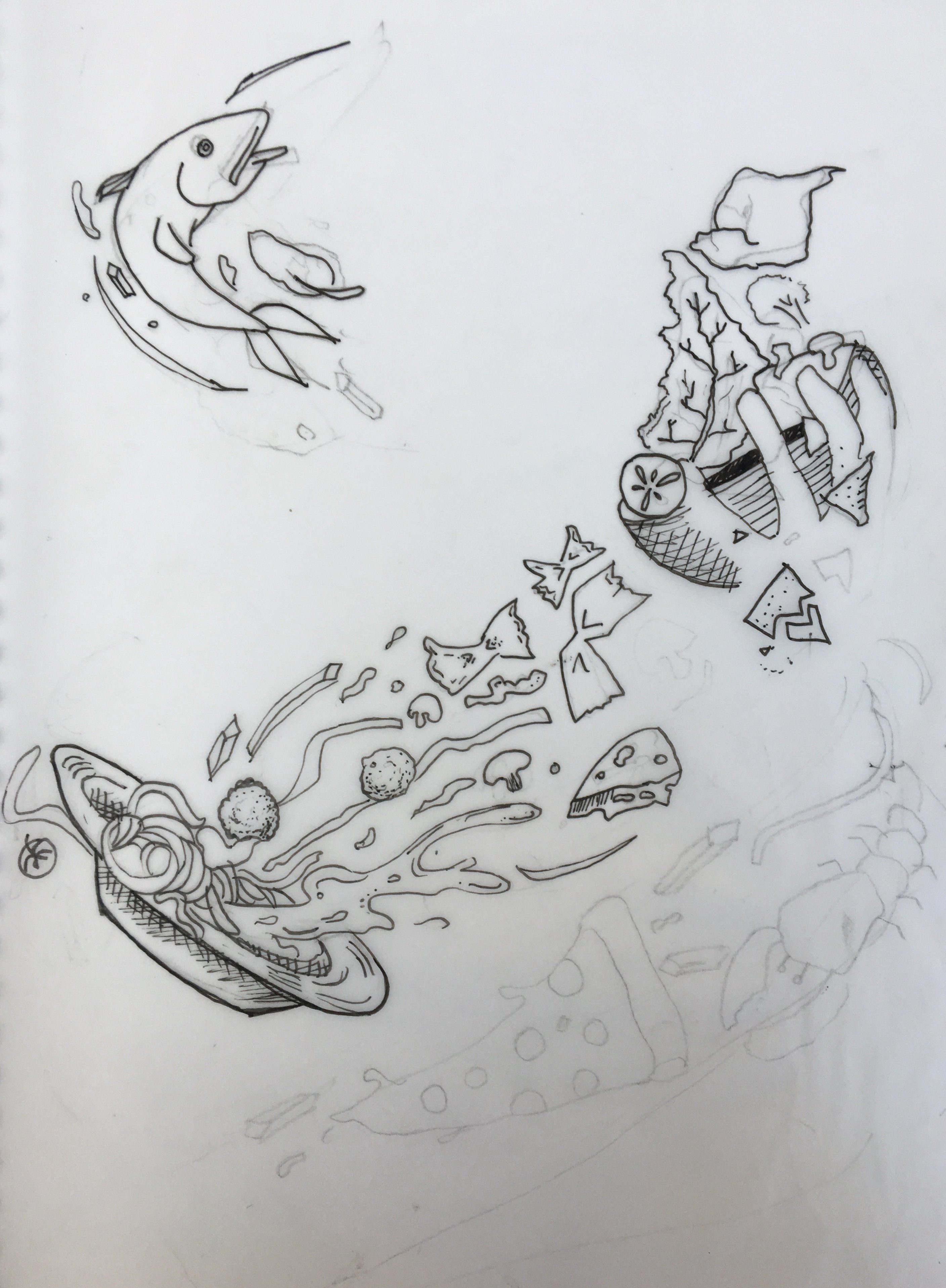
PENCIL COMPS: Drawn on tracing paper
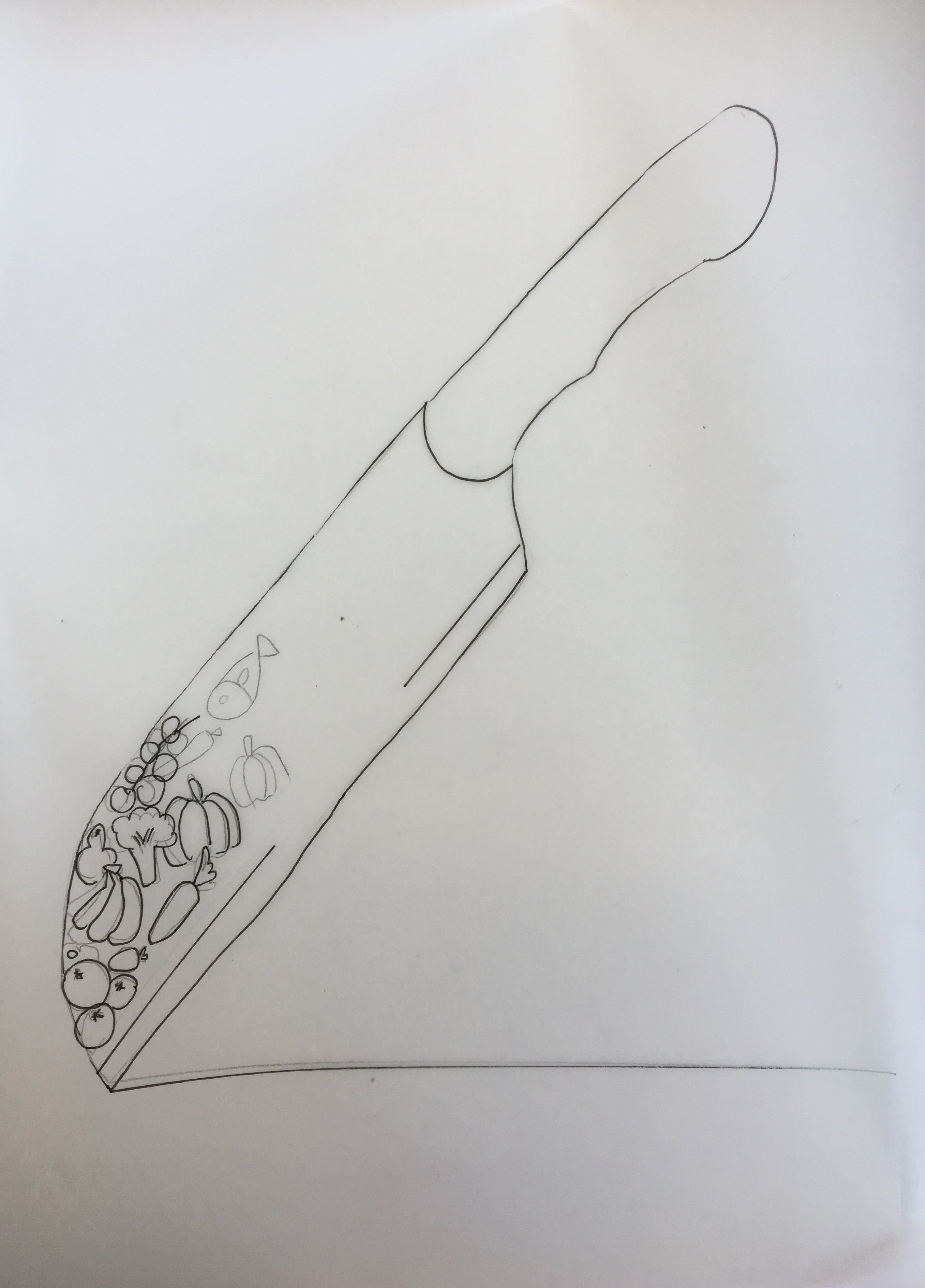
PROCESS:
I began by printing an image of Gordon and illustrating over him using tracing paper, So I could get a rough idea of how the final magazine cover would look like and also to align my illustrations with the image.I laid over the pencil comps over the image and chose the one I liked best.

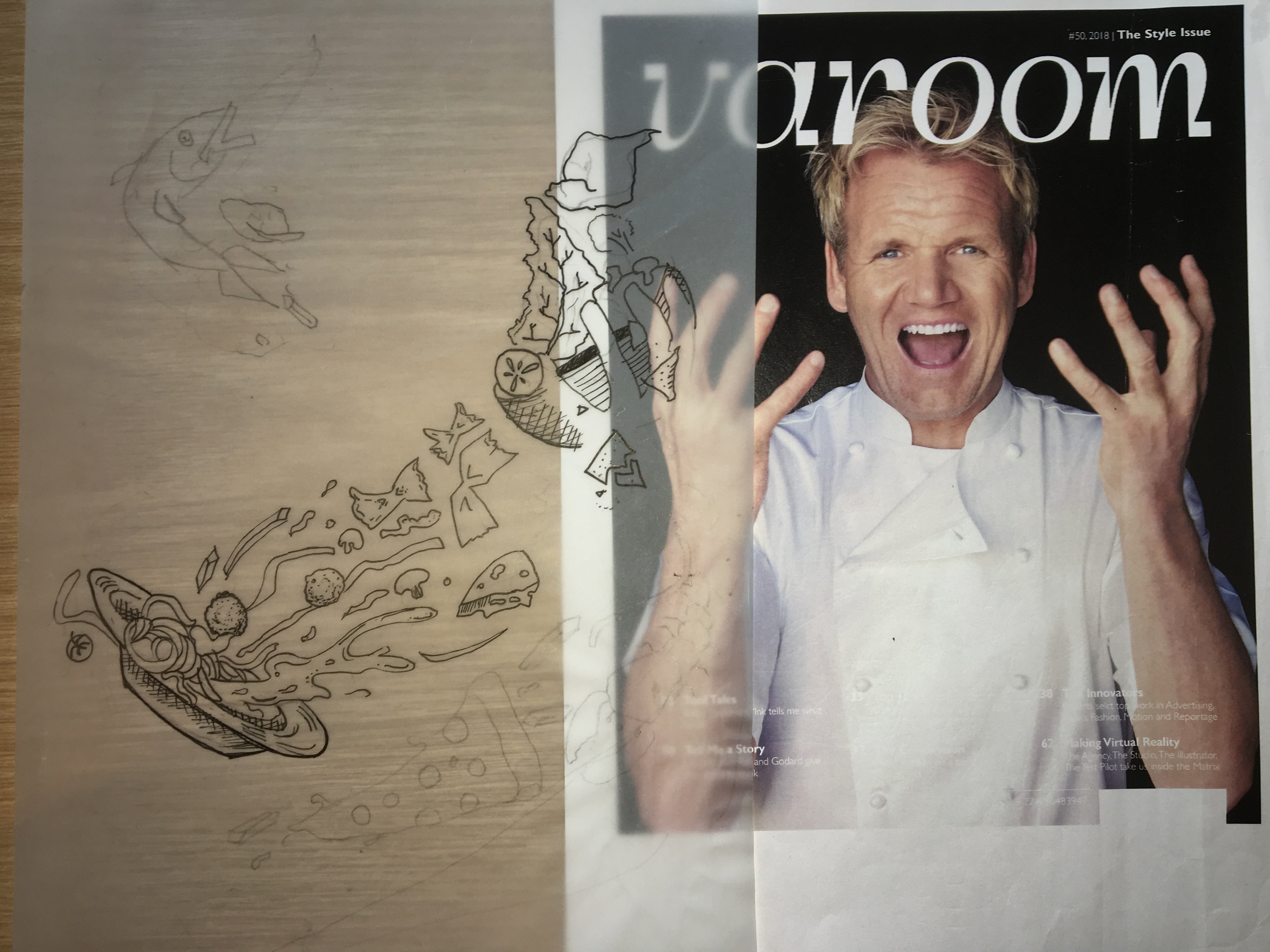
I picked the first design and proceeded to digitise my work using image trace in illustrator.The original image of Gordon came with a black background and my illustrations were also black, So I decided to switch out the background for a marble one, which adds to culinary theme of my cover the as it reminds me of an expensive kitchen counter.The marble background was a soft grey colour which allowed my black pen illustrations to stand out.I cropped gordon out, added the marble background and a drop shadow for depth.

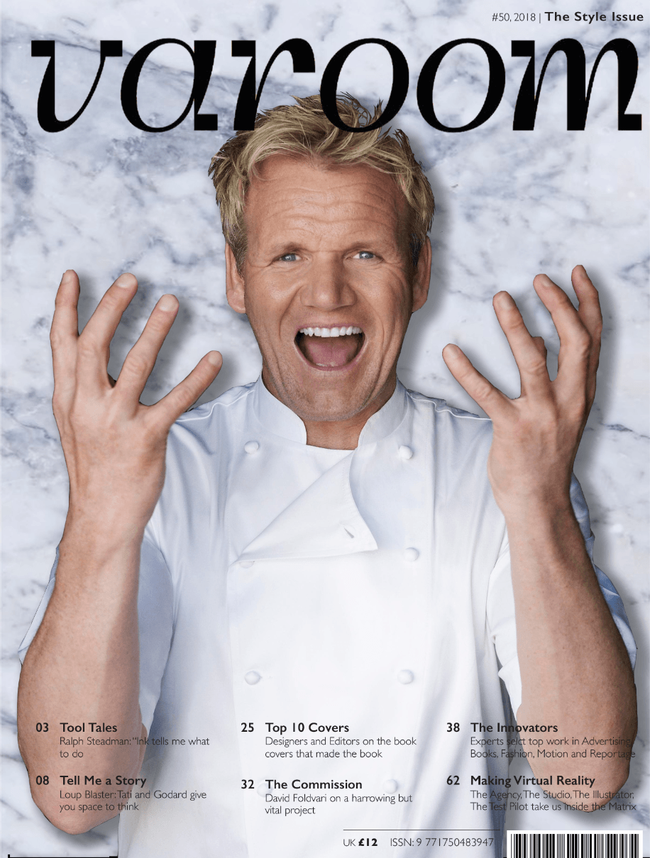
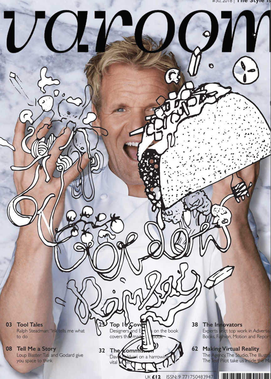
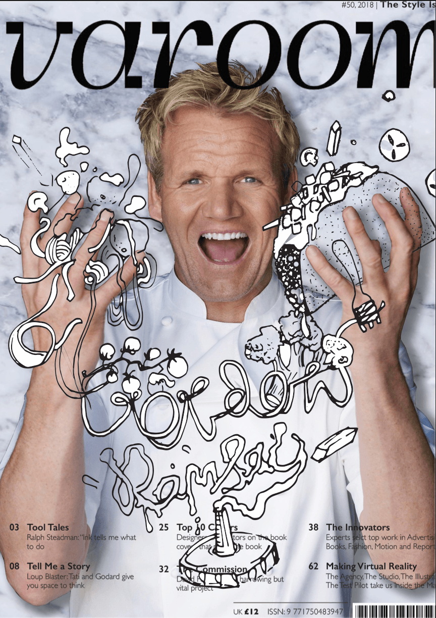
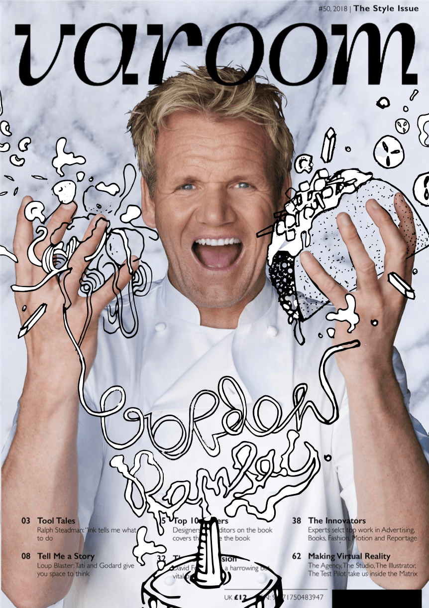
After consulting Lisa, she suggested to declutter and improve the legibility of the “Gordon Ramsay” illustration. She also suggested drawing over his face, but since it is a focal point, I omitted laying illustrations over his face and instead on his head.I had to keep the amount white on both sides even for a more balanced design.Initially my design was imbalanced as there were more elements and more white on the right than left.The taco was reduced in size so that it would not compete too much with the face. This led me to my Final magazine cover.
