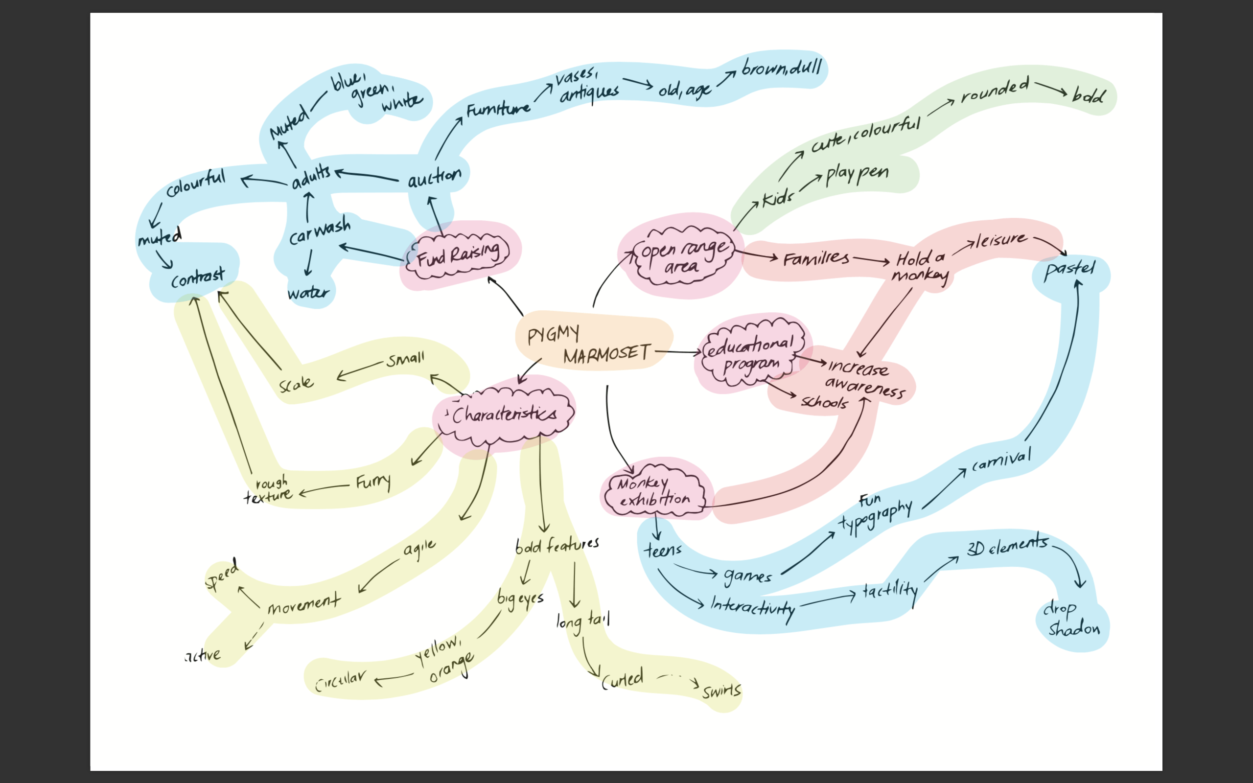
I created a mind map to help me think of the creative direction of my poster.
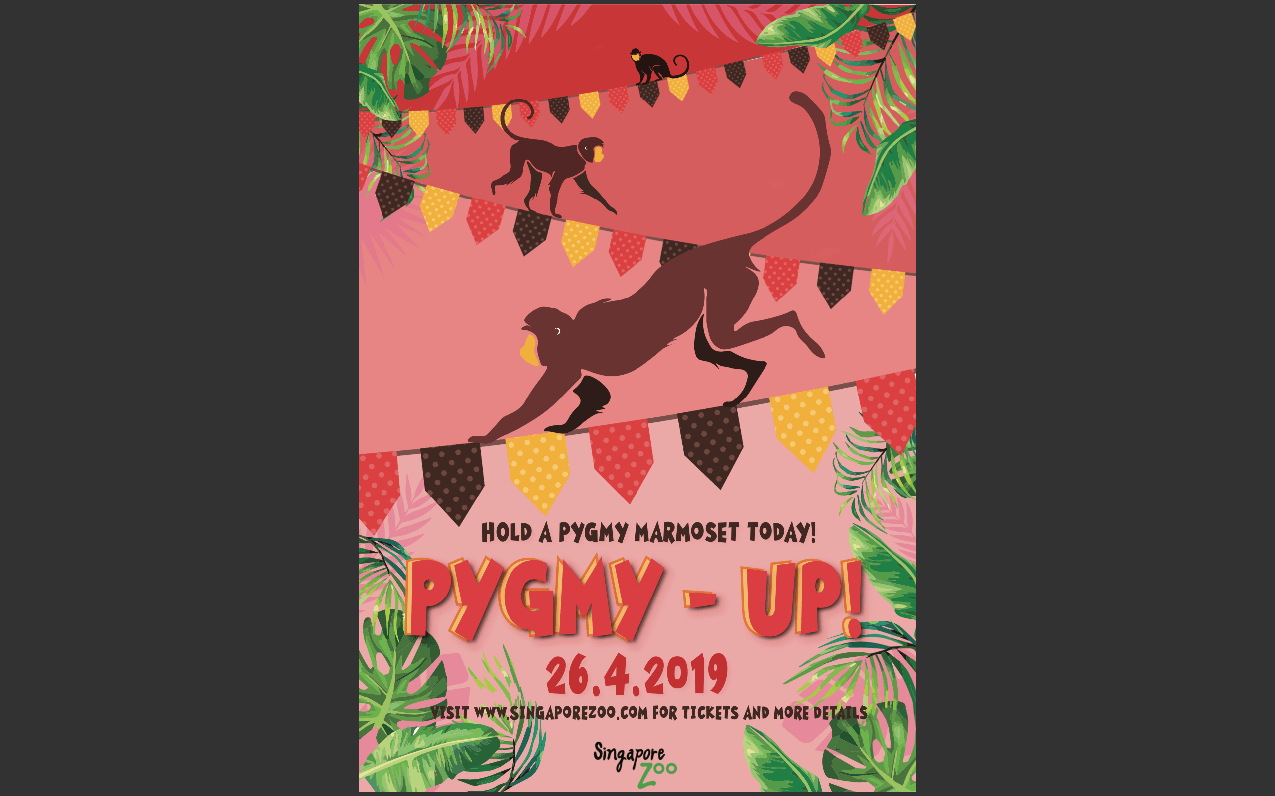
Due to the fun and cute nature of the animal that I chose, I decided on a playpen for kids so that they can engage with the animal at the same time be educated on it. Leading on from assignment 8, I came up with 3 rough sketches of my layout with a sentence accompanying each sketch.
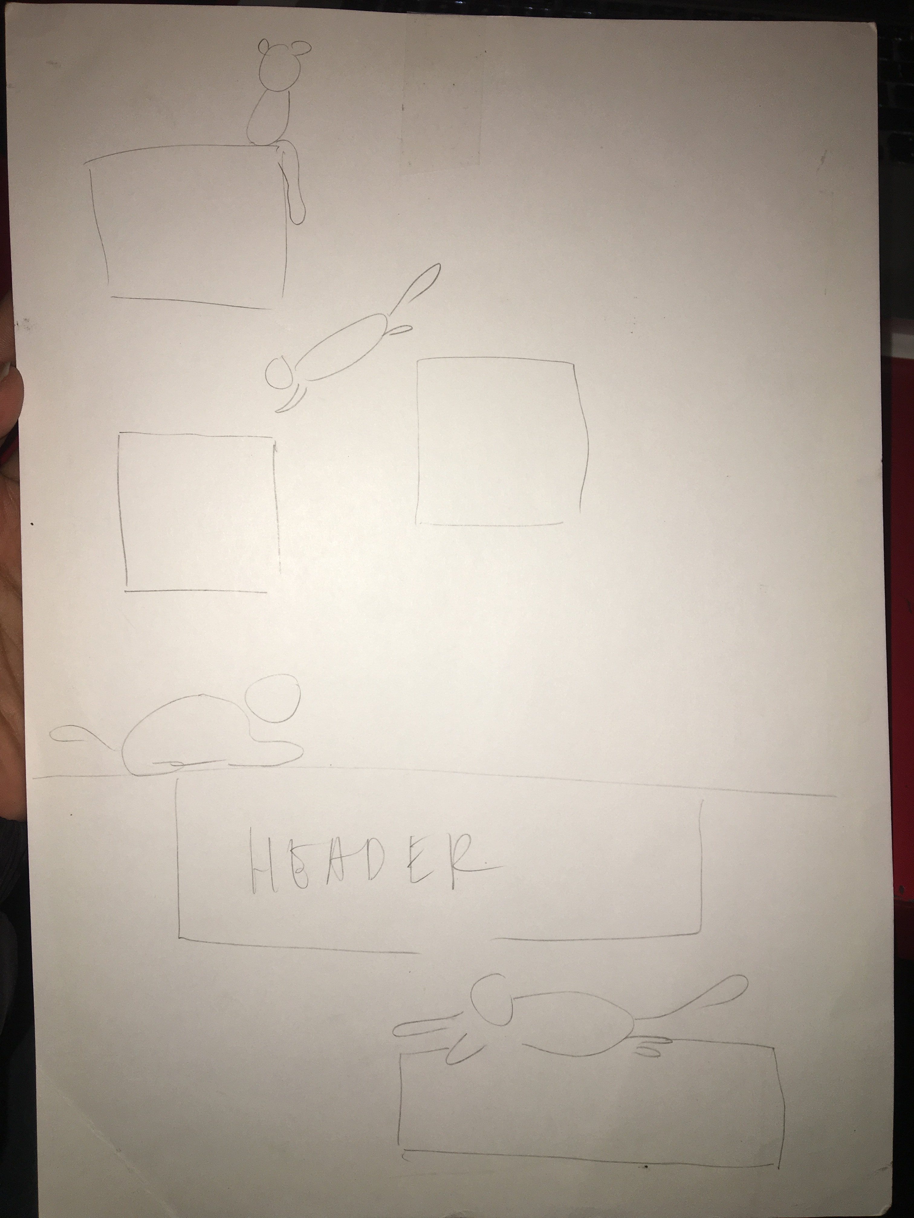 Sentence 1:Movement and agility is key
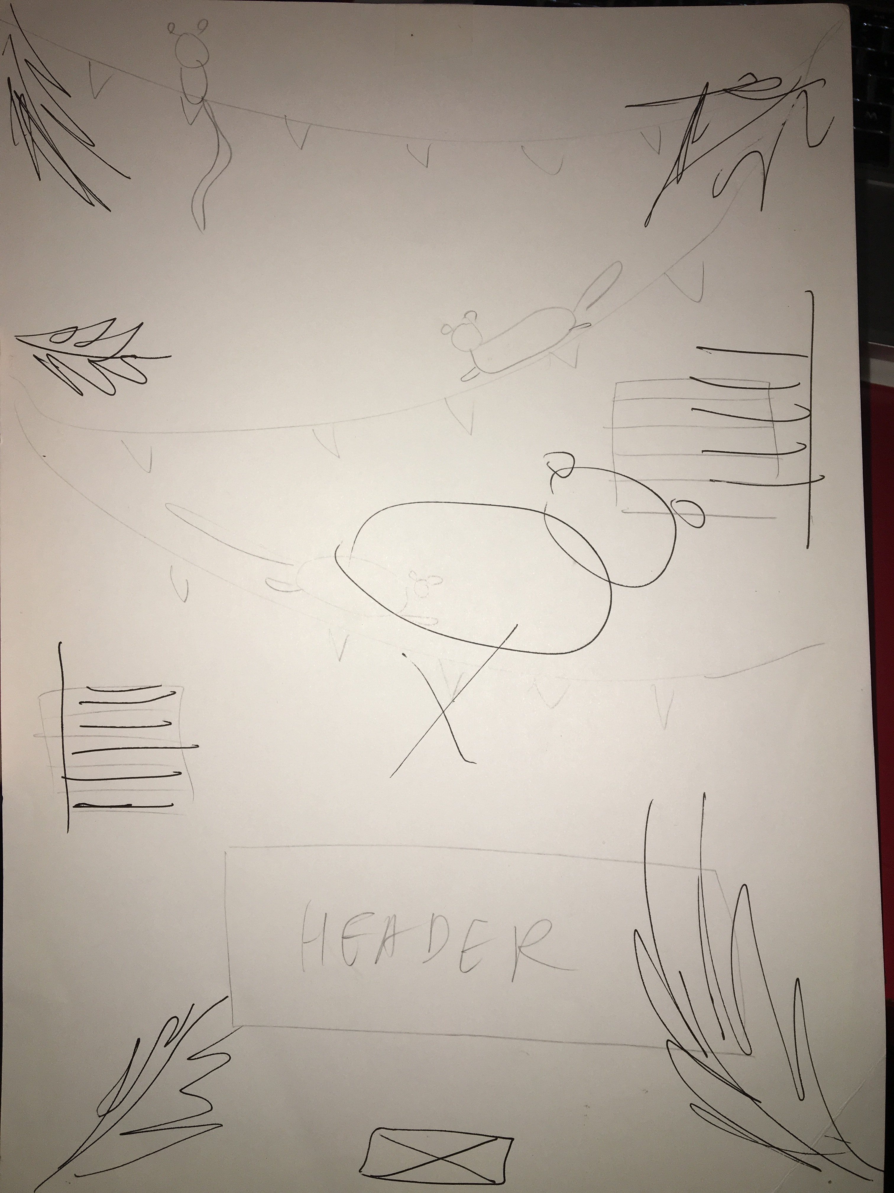 Sentence 2: Celebrating summer with popsicles and watermelon
 Sentence 3: Monkey see Monkey do(symmetrical)
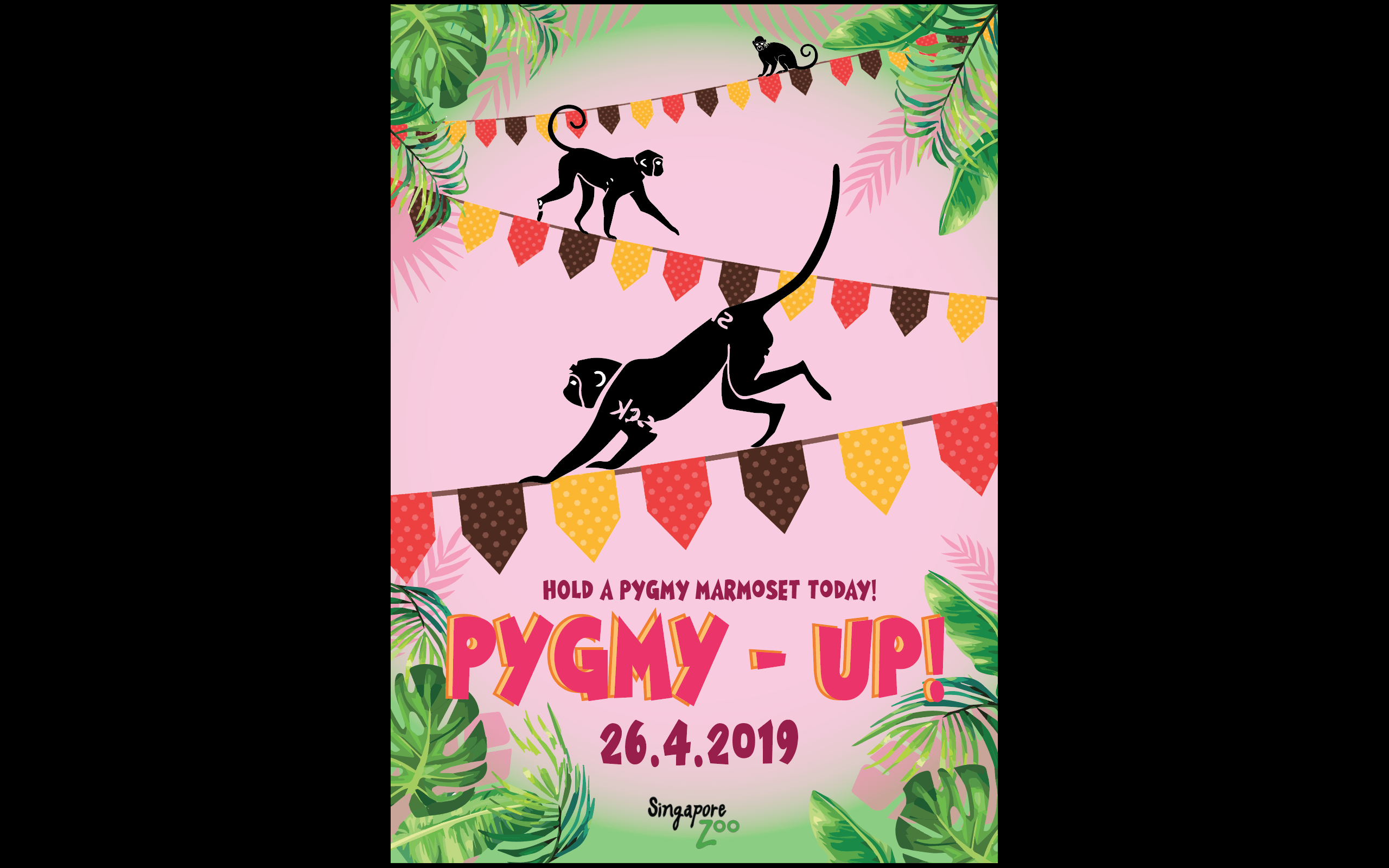
From here I developed the second sketch as I thought the summer theme would allow me to use colours to entice kids, at the same time pygmy marmosets thrive in tropical climates so it was apt considering the direction I was going.I proceeded to create a digital version of the second sketch.I applied the watermelon colour scheme and also added party flags to emphasise the idea of fun and summer. I thought that the agility of the monkey would be exaggerated if I used the party flags as a tightrope. I choose bold and colourful typography as well to cater to the children who might be interested in my design.I chose to include tropical leaves and use them to frame the macro elements to draw attention to the middle of the poster because my macro and typography were aligned to the middle.At the same time I adjusted the opacity of the leaves(lighter pink) to act as shadows for the tropical leaves, again to add to the idea of depth.
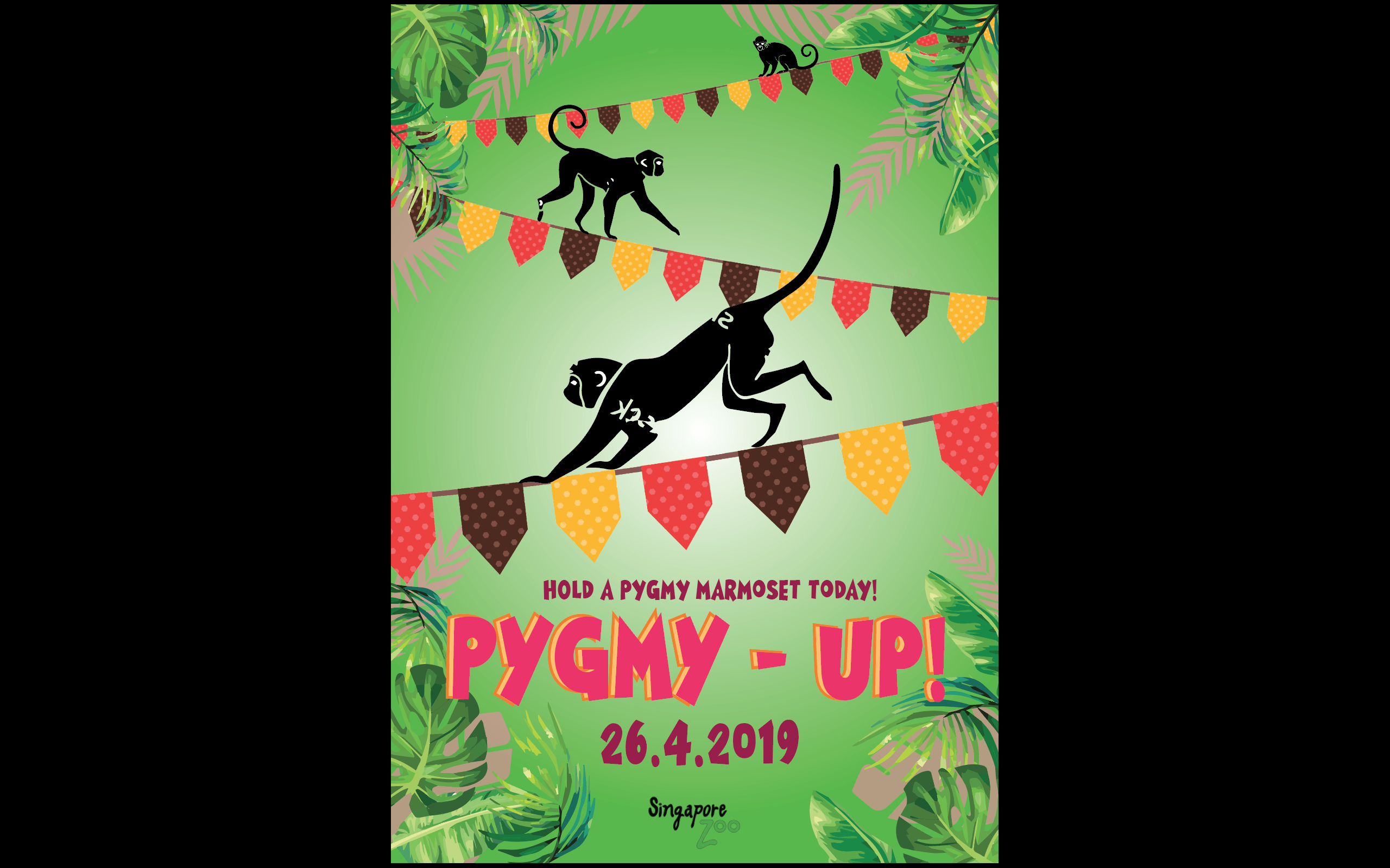
My design looked rather flat and the macro elements lacked visual hierarchy. After consultation with Lisa, she suggested on increasing the contrast in relation to the scale of the monkeys as well as adding layers of different opacities within the area under the tightropes to give the idea of a receding background and protruding foreground, which led me to my next draft.
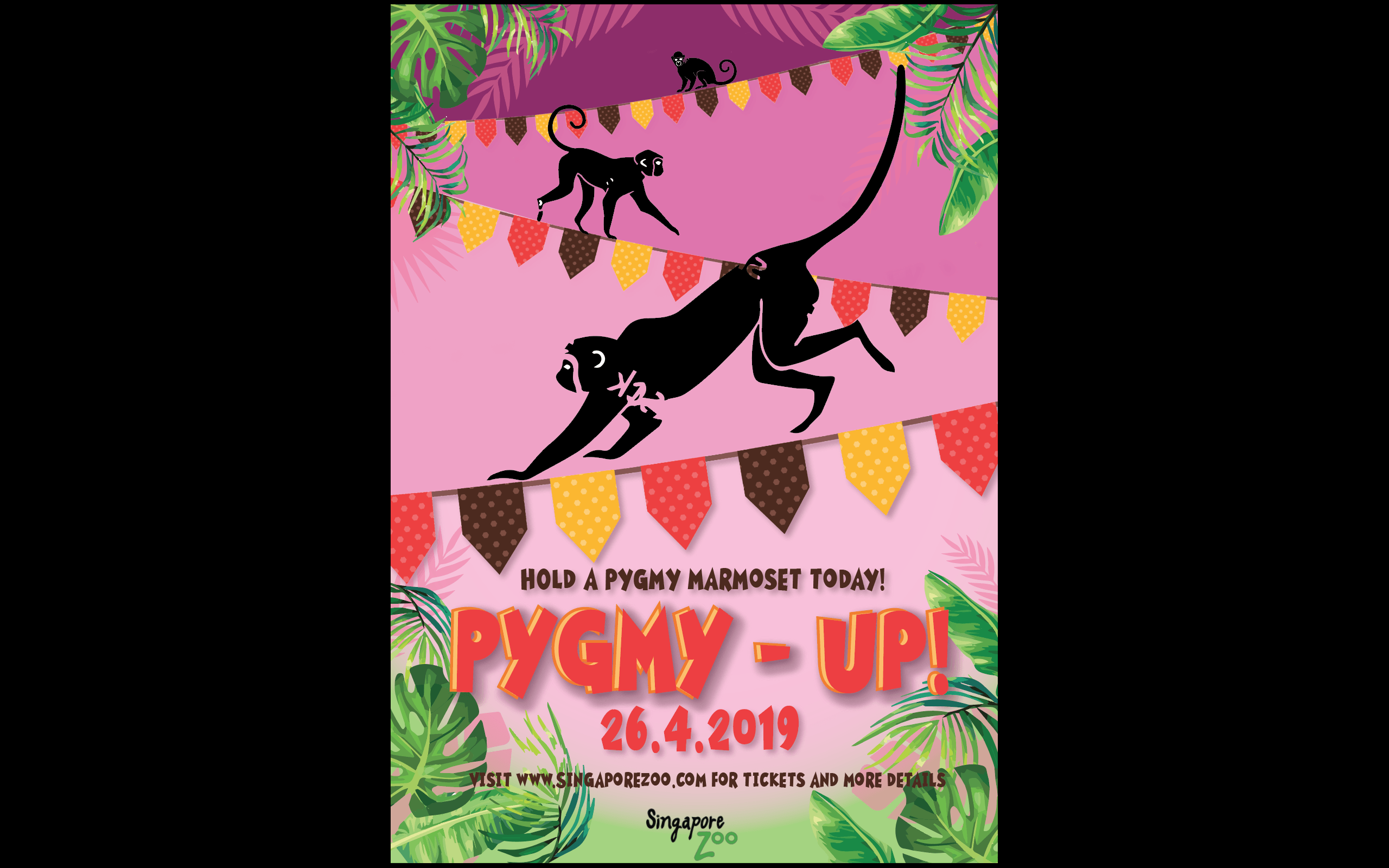
This draft conveys the idea of depth a a little better,However there were too many jarring colours.I decided to use the eyedropper tool and pick the red of the flag as a base instead of the magenta colour I originally used.
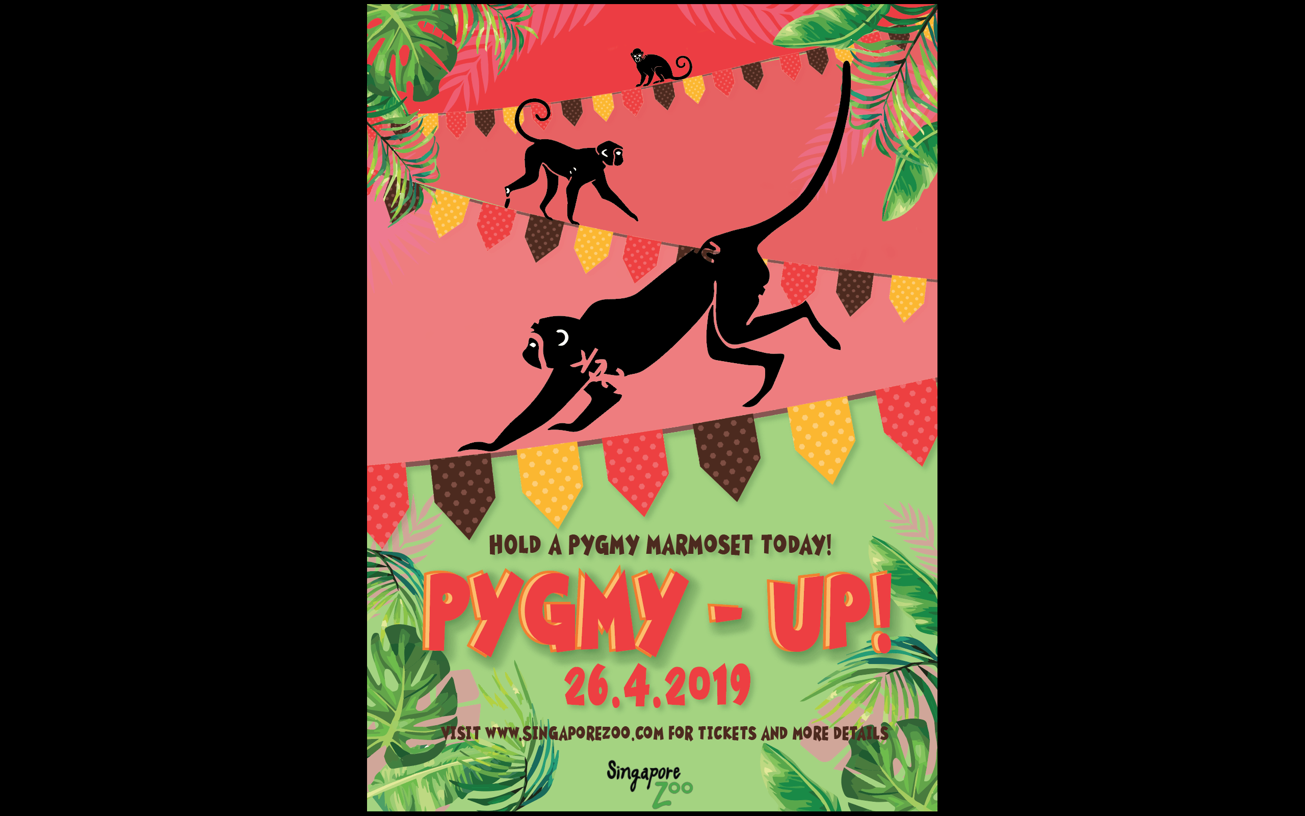
I wanted to use green against the red as they are contrasting colours which would add to the boldness of the poster. But the green was dividing my poster into half which affected the coherency of it. Thus, I decided to stick to the red as a base maintaining the lightness as it came downwards to the foreground.I proceeded to use the eyedropper tool to select the brown colour from the party flags and colour my monkeys to limit the colour scheme at the same time gel the entire look together.I applied the same concept with the shades of the monkeys as I did with the background – darker as they got further away.I removed the placeholder monkeys and made a similar rendition of it and it led me to my final poster.