In this post you will find:
1) Final
2) Experimentation Process
3) Reflection
–
1) FINAL: Dion’s 5-Month Emotional Roller Coaster Ride
After much consideration, the context I chose to base my project on was about the emotional rollercoaster ride that I experienced through the 5 month holiday I had prior to starting university.
During my brainstorm, I noted down in chronological order the most prominent emotions I felt during different times of the holiday starting from when I ended my final year polytechnic internship in February. This was the outcome:

That being said, as the project only required 6 final strips, I chose the 6 emotions I thought were the most impactful and were the most varied:
Stress, relief, courageous, ecstatic, grief and nostalgic.
Here are the final strips that I chose to showcase, of which I will be explaining why I chose these particular emotions as well as how and why I decided to mark-make them this way. Why I chose these emotions might be quite a grandmother’s story but I’ll try to keep it short.
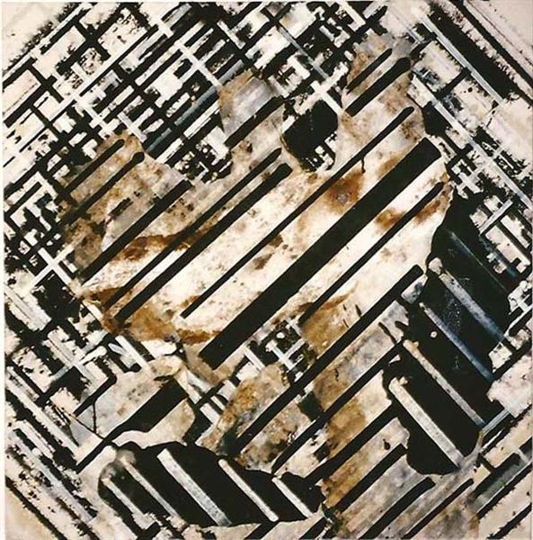
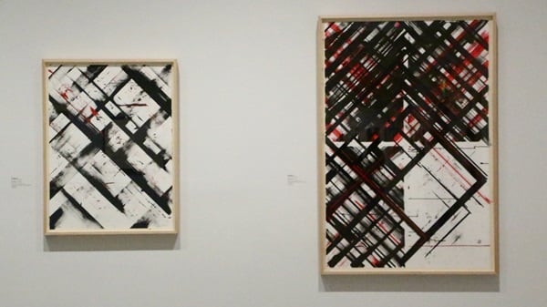
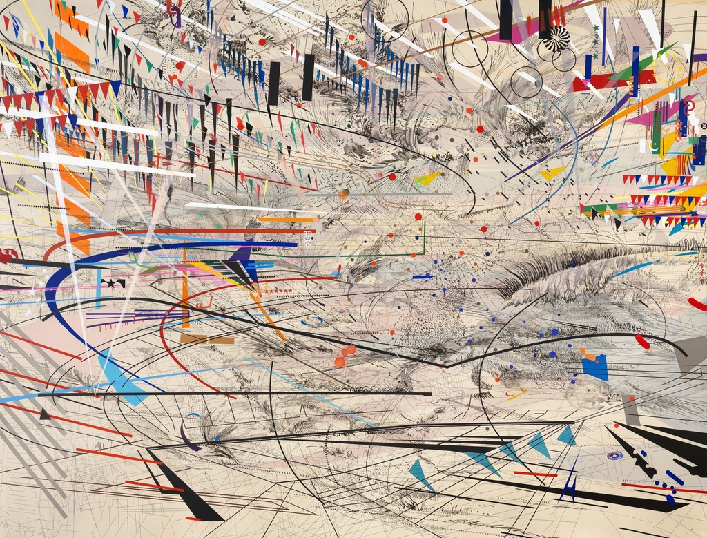
Overall, I was not particularly inspired by any artist in the sense that I wanted to follow their style or replicate their works, but rather it was through Julie Mehretu‘s work that kept the idea of layers in my mind. (View artists’ research here). This really helped me along the way as adding layers helped to portray how I wanted to show the emotions better such as by creating depth, as well as helping to show different kinds of ‘physical feelings’ within one emotion, whenever I was having a creative block.
–
1. STRESSED

Reason for emotion:
As my polytechnic life was coming to an end, I was stressed over choosing a degree and whether or not I would be able to make it into any local universities. Ending my internship late February, I then had to finish my final internship report for school which would have determined my final GPA by a big difference, as well as complete my ADM application at the same time.
Reason for mark-making:
Materials used: Cotton buds, ink roller corner/edge, scalpel, masking tape
Overall, I wanted the strip to show a sense of darkness, uncontrolled pressure and messiness to show how a lot of things are going on (both physically and mentally) when one is under stress. To do so, I used cotton buds covered in ink (at different percentages) to roll all around the paper, creating different pressures and thickness of ink with the composition of the cotton bud. This was originally the end of my idea for the strip, but I felt that it was too cliché and boring. Hence, I added on… layers!
Next, I added on to the mess by using the edge of the roller to add hard, pressured stripes in random directions. After that I decided to use a scalpel to make scratches on only the right side of the strip so as to show that I am actually right-handed, and there was a lot of stress due to my lack of skill in drawing needed for my ADM application (I originally did it all over then decided against it. Not to mention, I did it while pretending I was stressed and actually ripped the paper twice). Finally, I used a small piece of masking tape to make tears in random places, to simulate the effect when I tend to erase my artwork too hard out of stress and frustration and accidentally tear the paper.
–
2. RELIEF

Reason for emotion:
I literally flew off to Taiwan with a group of friends the day after I submitted my ADM application. A huge weight was lifted off my shoulders having finished my 3 years in polytechnic and applying for university. It really felt like FREEDOM.
Reason for mark-making:
Materials used:
3 levels of Chinese ink concentration: Concentrated, diluted, and even more diluted
For this strip, I wanted to show the effect of weight being lifted off one’s shoulders, or how one is no longer being weighed down. Originally, I wanted to use my shoes to show how I’m no longer weighed down, but of course… I did not want to stain my shoes. It would have also been too literal for my liking.
I first dipped the full bottom edge of the strip into concentrated ink to get the dark part, showing the weight. I then pressed the rest of the bottom half in diluted ink, letting the paper absorb the watery ink like chromatography in Chemistry which gave the illusion of the ink fading upwards, and lastly, I dipped only parts of the top in the most diluted ink. I only pressed parts of the top in ink so that some parts would be left blank, to show how the weight is fading away completely.
–
3. COURAGEOUS

Reason for emotion:
In Taiwan, despite not having experience or training, I plucked up all the courage I had in myself and joined an international dance battle. During the auditions, there were hundreds of people from all over the world watching with only three people dancing at one time. Sure did take me a lot of courage to push myself out there…
Reason for mark-making:
Materials used:
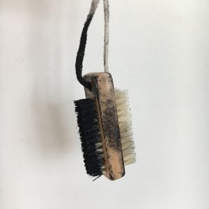
Brush-thing as pictured, a strip of masking tape
The idea that I had was ‘throwing myself into the fire’, because that is what I always do when I want to see what I’m capable of in the worst situations, in this case, being unprepared for an international dance battle of over 400 people from all over the world. So, I taped masking tape across the centre of the strip and used a brush to create messy motions to represent ‘chaos’, which somewhat also looks like fire, over the masking tape. This created the idea that even when I know that chaos is up ahead (looking at the line from left to right), I will still gather up the courage and persevere through.
The messiness of the clear line created by the masking tape was unintentional, and I actually had a more clean-cut version of this piece. However, I decided to use the messy one instead as I realised that it goes to show how even when you’re courageous and you brave through unfavourable situations, it is not all the time that your best comes out of you. Let’s just say that my battle audition round didn’t go so well… But I still had the courage to persevere anyway.
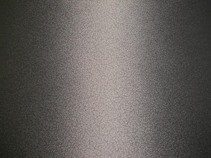
To add on, only after I finished the line did I realise that it actually resembles Sol LeWitt’s “Scribbles” a little bit. His art piece was a very pleasant, neat looking line made out of messy scribbles, while mine is a straight line piercing through the mess. I guess I was subconsciously inspired by Sol LeWitt while doing my project 

Originally, I did experiment with the idea of using actual fire to burn the paper. However, I decided against using it as it did not depict the kind of chaos that I would be afraid of going through, as much as using the scrub did. Furthermore, there already seemed to be a handful of people who were using fire as one of their materials, and I just felt the desire to explore other options of materials.
–
4. ECSTATIC

Reason for emotion:
Simply saying, I met one of my dance idols in Taiwan 🙂
Reason for mark-making:
Materials used:


A yellow ball (P.S. yellow because it’s my favourite colour and it makes me happy. Suits the emotion of the line!)
A textured sponge as pictured
In this strip I wanted to show the different ways that one/different people can experience the same emotion. When people think of ‘esctatic’, the thought that comes will usually be something very hyper and excited, with fast motions. However, in that moment when I met my idol, I felt more tingly inside hence the dotty effect created by dabbing the sponge with little ink, along with the bubbles of joy created by pressing the ball onto the paper (a bit cliché, but I have to admit it was really how I felt).
It was this piece that the technique of ‘layers’ from Julie Mehretu really helped me. I originally only played with the ball marks (without the intention of it being ecstatic), leaving the whole thing very boring since there’s only one type of texture, despite there being layers of ball marks. With Julie’s work in mind, I managed to think of layering something else on top of the ball marks to show that there are several ways that one can physically feel just one emotion.

–
5. GRIEF

Reason for emotion:
Unfortunately, things took a turn halfway through my holidays when my uncle passed away. On top of that, my sister also moved to work in Hong Kong permanently.
Reason for mark-making:
Materials used: Crushed paper
When you grief over somebody, you feel like a part of you is missing, thus why I only mark-maked one part of the entire strip. You also feel like you are being crushed inside, explaining the usage of crushed paper texture. Originally, I was actually going to flip the strip horizontally so that the crushed print would be on the left, to show where the heart is. However, I realised that the print will actually be facing the audience during presentation, so it is actually on the left from its perspective.
For this line, I did not feel the need to excessively layer textures, because I felt that this one use of crushed paper in one spot allowed the image to speak the thousand words of the story behind it.
–
6. NOSTALGIC

Reason for emotion:
As the start of my journey in ADM got closer, I couldn’t believe that I was already going to university. I still felt (and feel) like a child. So of course, I thought a lot about how I’ve come so far.
Reason for mark-making:
Materials used:

Comb’s teeth, thumb/fingers, smooth sponge
(P.S. the entire comb is covered in ink because I used different parts of it for experiment)
The dots, made by dabbing the comb’s teeth in lines, represent memories. Some memories in our minds are stronger, hence the thicker and darker dots. Then there are the ones that are fading away, thus the lighter dots/ blank spots and of course, there are the memories that are not as pleasant, thus the rough parts with exploding strokes made by dragging the comb out in different directions after dotting the teeth. The thumb prints represent the different people who have made marks in my life, the pressure indicating the significance of them. I used a sponge with little ink on its surface to dab all over the paper, just to give the piece a sort of fading, grainy (noisy) background texture for the nostalgic effect instead of just having a blank canvas.
Some comments received from peers:
- The story really helped everyone live through my holidays as I went through my lines
- Good exploration of materials. In the future, I can show a picture or bring the object used if I don’t have a name for it
- Good reference to artists
- A lot of thought went through each emotion and how I want to portray each one through the various ways of mark-making
- Nice use of layers
- Have pointers for future presentations so I don’t forget to mention things (I’m sorry, I forget everything when I’m nervous)
- Some explanations were more in depth while some were more touch-and-go
(A/N: As explained for grief, I felt that the simplicity of it allowed it to speak) - Poetic delivery
- Nice subtle delivery of messages (e.g. the messiness of the courageous line)
- “The grief placement on the left was MINDBLOWING!!!”
2) EXPERIMENTATION PROCESS
When we were first assigned this project, I had no idea what direction it was that I wanted to head towards (i.e. context). Hence, for the first few sessions I had in the studio, all I was doing was aimlessly exploring different types of textures and mark-making without the thought of what emotion I wanted to portray through them. Hence, what I did was to observe the marks I made with the different objects and see if I could see any emotions through them, similar to how I observed the artists’ works while doing artists’ research.
Below are some of the random mark-makings I tried with different objects and several of the emotional observations I made. A lot of my interpretations of my mark-making attempts did however, come to me on the spot while I was making my lines, so those stated below are only those that I managed to observe DURING experimentation:


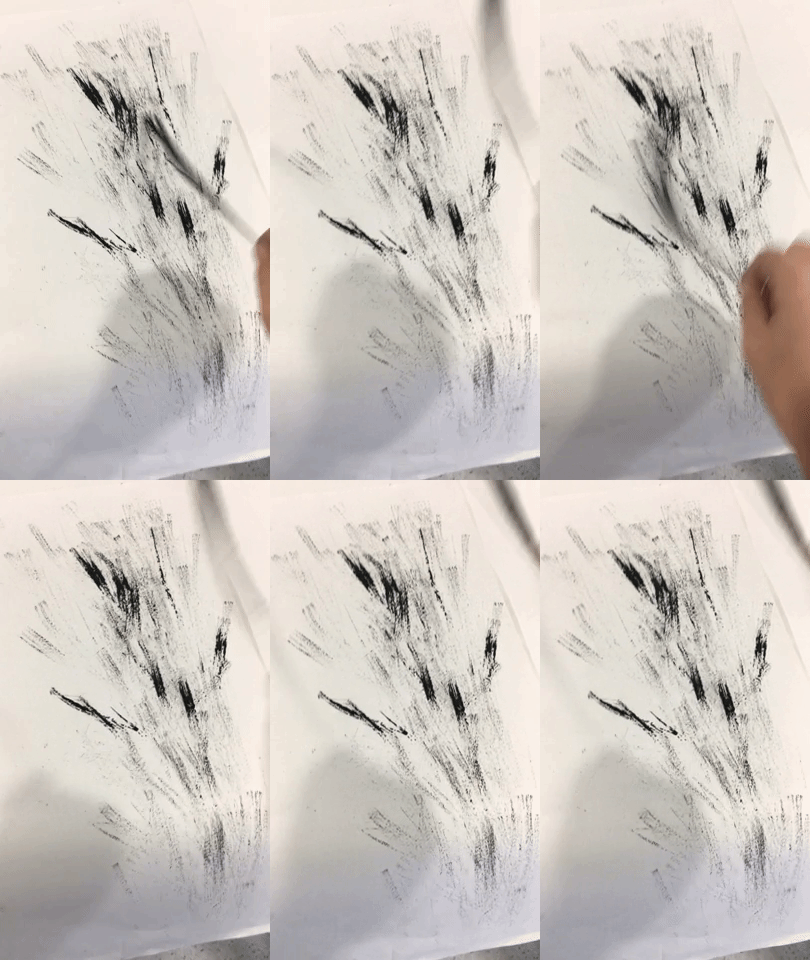
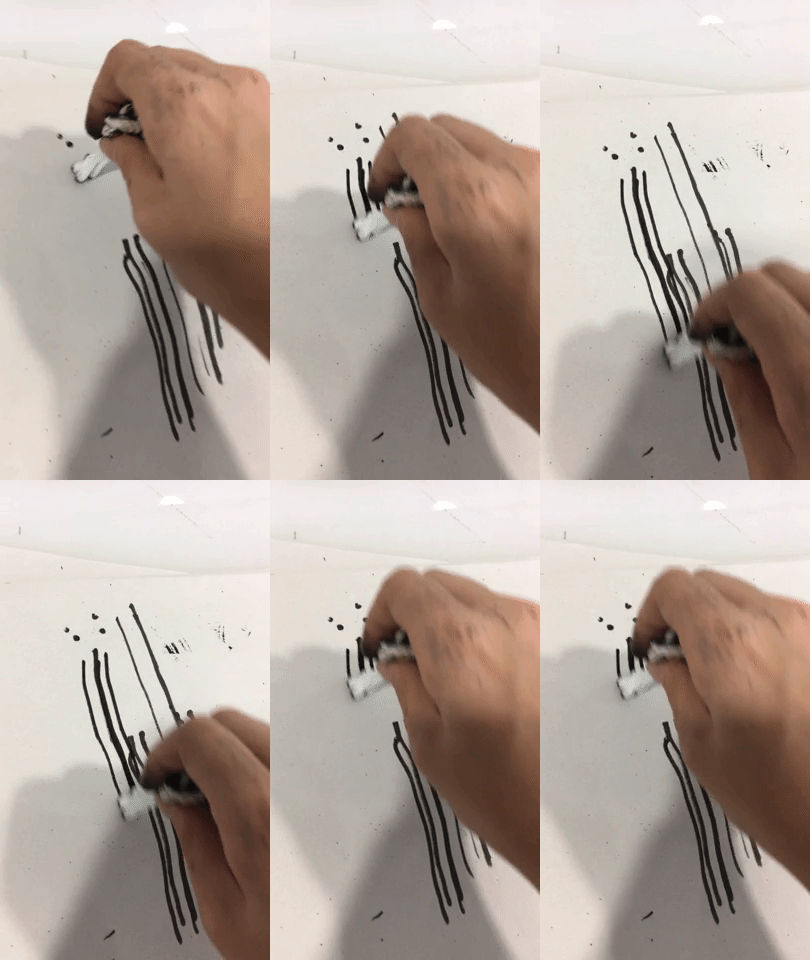
This is a little strand-thing that fell off my broom. I really liked the texture of the print made from the second roll of the linoleum. However, I decided against exploring this texture further as the idea that it gave me was a surge of dark energy to match the negative connotation of lust, which was not an emotion that fit in with my final decided concept.
I also tried smacking the little piece of broom on paper:
–
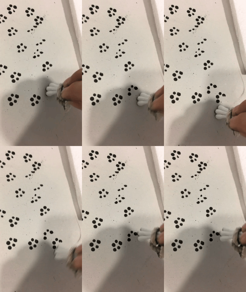
Object used: Cotton buds

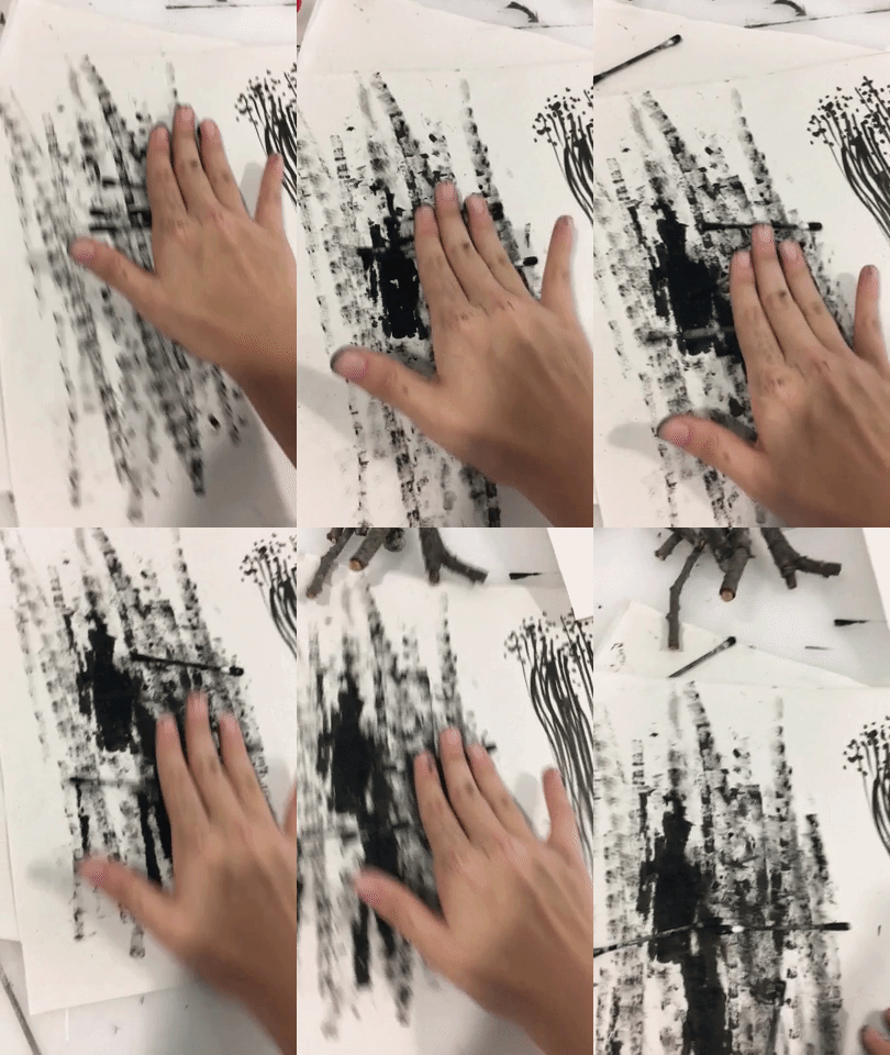
I observed that the use of rolling the cotton buds did show a feeling of frustration with the thickness and pressure. Frustration is one of the feelings I feel when I’m stressed, hence why I decided to use this mark-making method as the base for my final stress line.
–
Left to right:
Dragging cotton buds, dabbing cotton buds, dragging styrofoam, dabbing styrofoam
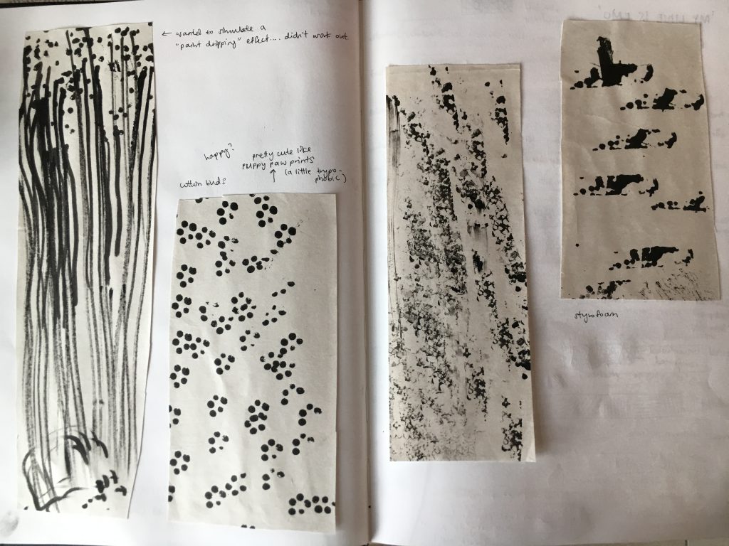
–
Object used:

A sponge
Top left to right:
Dabbing the textured side, dragging the textured side
Bottom:
Dabbing the smooth side

Left to right:
Dabbing the edge of a paper tag, dragging the paper tag

Left top to bottom:
Using the weirdly-textured sponge as pictured above in the final showcase to
dab, drag in circular motions and drag in a straight line
Right top to bottom:
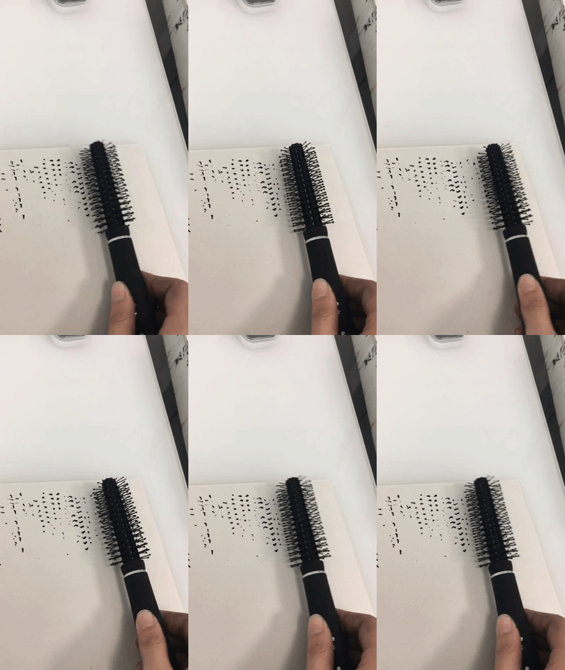
Different bottle caps, rolling a curling brush, dabbing a comb’s teeth, dragging the comb’s teeth and dabbing the long edge of the comb
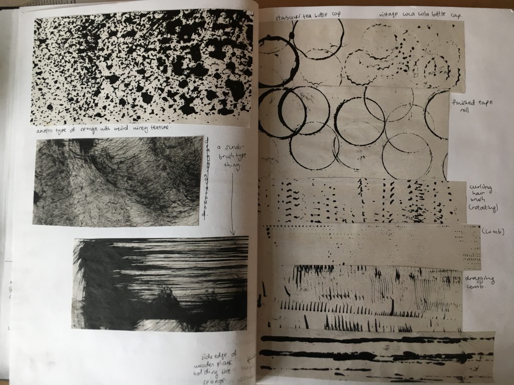
–
Object used: The yellow ball as mentioned in the final showcase
Used to: Roll around, pressed hard, pressed soft

After realising that while aimlessly experimenting textures was going to help in letting me decide which textures I could potentially use for my final lines, it was not efficient enough in terms of getting to my final pieces. Hence, I decided to pen out some ideas for a whole variety of emotions. However, at this point, I still had not decided on a concept thus it still wasted a lot of my time in exploring ideas for emotions that I was not going to use. Furthermore, it was difficult thinking of line designs when the pen only allowed lines and not textures of different objects.
Brain vomit of my interpretation of the emotions:

I also looked up Google definitions of emotions and added my own interpretations of them:

After doing so, I then translated these definitions and interpretations into lines, so as to explore the ways I can later on choose to drag, dab, etc. my objects once I have chosen my context and emotions.

Finally, after consultation, I was able to come up with my concept of following the emotions through my holidays, and I was then able to focus on choosing which textures that I have explored that could help me portray my interpretations of the emotions. While I did waste a good amount of time exploring textures and emotions that I ended up not using, the experimentation did help make it easier for me to decide how I want to portray my final emotions.
And that was how I eventually managed to come up with my final 6 lines! 
—
Originally, I was also thinking of using ‘fear’ as one of my emotions, as while I was deciding on my choice of degree, I became fearful of what the future has prepared for me. I felt lost for the fact that I was unsure of what I wanted to do, hence I had the idea of falling down into an abyss. Alternatively, I also thought of it as depression, where one mentally spirals down a pit of darkness. But of course, my holidays weren’t too bad so I didn’t choose that as an emotion.
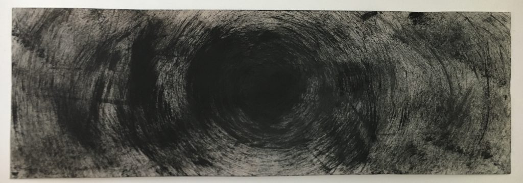
However, after attempting my idea, I decided against using this in my final showcase as the idea felt too literal and obvious. Furthermore, the emotion of fear would have also given my final 6 choices less variation.
3) REFLECTION
Overall, I am very happy with what I have managed to showcase to the class. This is because at the start of the project, I was one of the few who stood there staring at everyone making amazing prints, while my prints were just….. un-aesthetically meaningless. I’m glad I managed to step out to randomly experiment with objects which eventually led me to finding my direction of the project.
I feel that I could have taken a step further to explore various paper textures other than newsprint, as it could have helped me bring my portrayal of the emotions to the next level. While I did think about exploring paper textures and felt that it was not necessary, I now feel that there would have been no harm trying (apart from possibly wasting more time than I already did).
To add on, I also hope that in the future, I will be more sought out with my project direction from the beginning. This will allow me to make good use of the time that I have to complete the project, so that I wouldn’t have to panic and rush towards the end (P.S. I didn’t have to rush that much, it’s just that I really did waste a lot of time).
I also hope to be less nervous in the future so I don’t forget my points while presenting. 
And that’s the end of Project 1 – My Line is Emo!
Now… Run, Forrest, Run!
