Both menus use a simple two column grid, with just the logo moved. I did want to have it so that the right column of the first menu would start up at the top, but there wasn’t enough content… so… well. Negative space… is always… great.
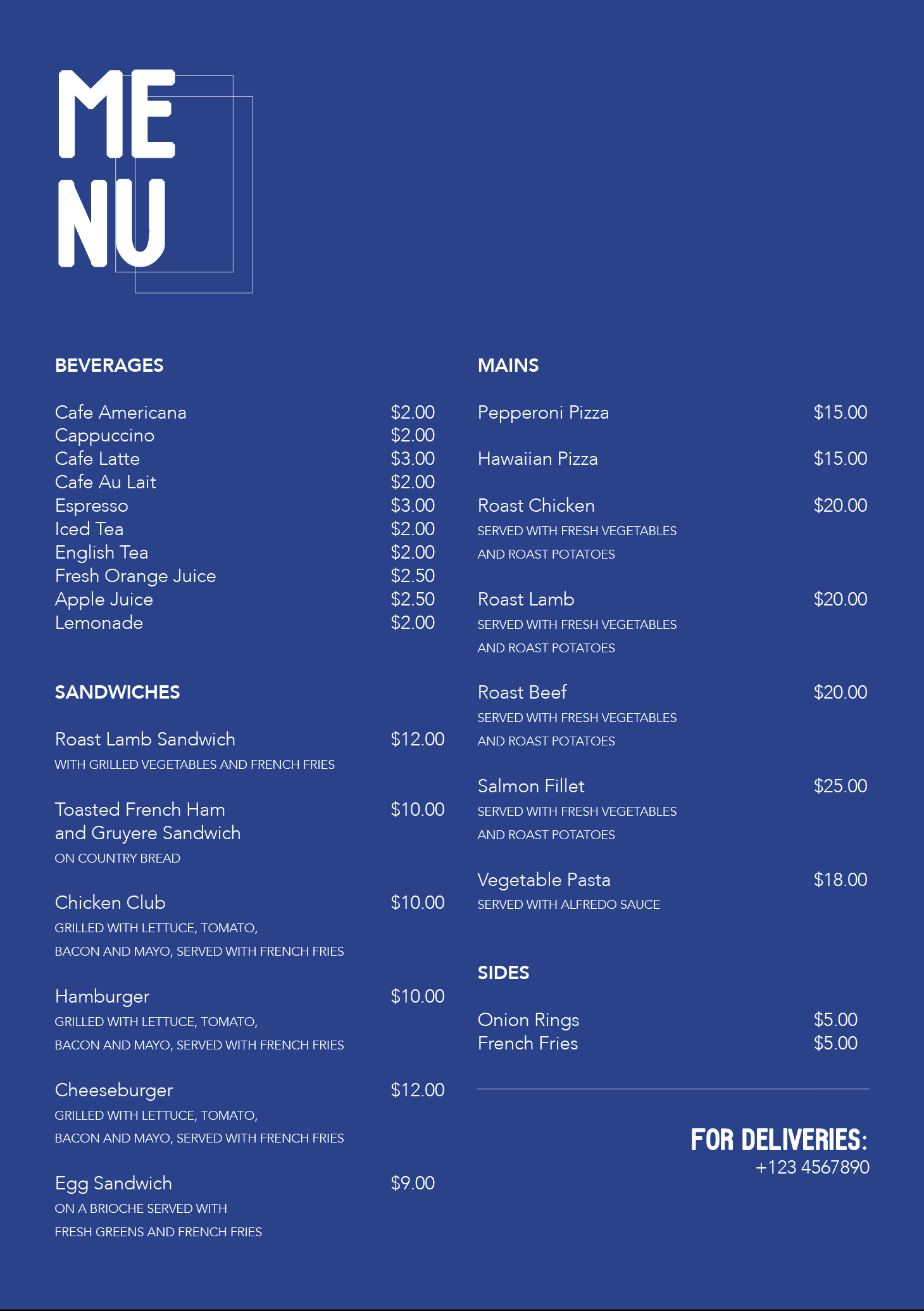

Both menus use a simple two column grid, with just the logo moved. I did want to have it so that the right column of the first menu would start up at the top, but there wasn’t enough content… so… well. Negative space… is always… great.

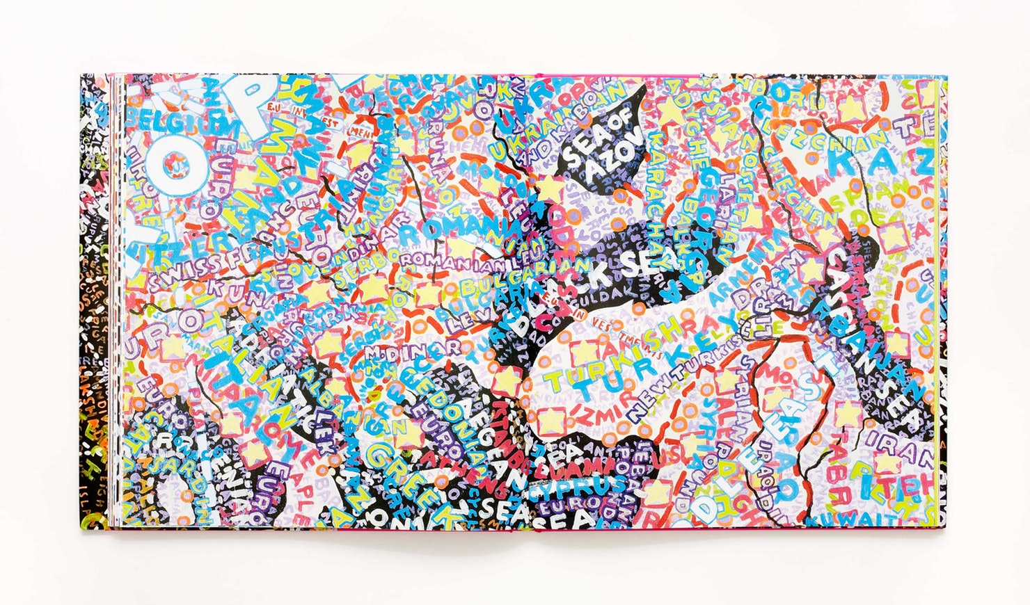
I”m not the best hand letterer.


Following a pretty straightforward concept, the isometric style creates an empty depth for Hollow and a filled one for Solid.
Suggestions include further exploration of style, such as maybe turning hollow into a sort of hole in the ground with tree roots coming out of it, as well as to adjust the font style where hollow could be more rounded.

I’d actually written three haikus in total:
Haiku #1: Jupiter
The Great Red Spot looks
like a ginormous pimple
Rest well, Jupiter
Haiku #2: Oh No
1, 2, cha cha cha
3, 4, oh no no no no
I fell on the floor
Haiku #3: Help
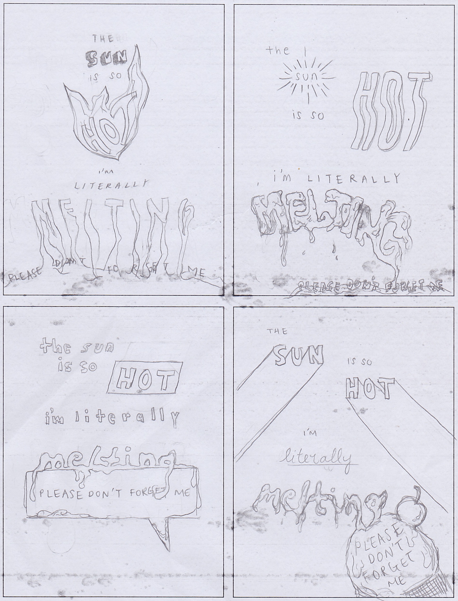
The sun is so hot
I’m literally melting
Please don’t forget me
If I had the time I would love to come up with sketches for all of them, but I decided to go with the third one since it’s the most applicable one to how I was and am feeling.
One refined version:
While creating different sketches, I realised that I worked towards automatically placing emphasis on certain keywords in the poem – specifically sun, hot, literally and melting, by creating completely separate looks for these particular words, in contrast to other filler words. I wonder then, how could I make it so that all the words of the poem gel together well in one style, while still having emphasis be put in the right places?
It was a fun challenge though, to see how my brain could come up with different ways to represent certain words such as for ‘sun’ and ‘hot’. You could be literal with representation, using rays for ‘sun’ and fire for ‘hot’, or you could also use elements that suggest similarly, like a shadow for ‘sun’ and heat waves for ‘hot’. I definitely struggled with ‘melting’ though, and wonder if there are any other ways I could have done it without being so literal.
I also wanted the last line of the poem, “please don’t forget me”, to be small and/or hidden… because… yea. It’s like pleading to not be forgotten.

Beatrice Warde’s exceptional metaphor of comparing the values of good typography and design to that of focus on an exquisite gold goblet against wine in a crystal clear glass, has opened my mind to a new perspective of observing what it means for there to be proper communication value, say purpose, behind design. She says, “for if you have no feelings about wine one way or the other, you will want the sensation of drinking the stuff out of a vessel that may have cost thousands of pounds.” This leads me to think of modern day and age where young designers are so focused on ‘aesthetics’ and making things ‘pretty’ that despite their ability to create designs that are perhaps pleasing to the eyes, their designs could potentially hold no value off surface, or rather there was never an intention for deeper value.
Warde’s main belief in printing is that it is meant to convey some sort of message from one mind to another, where “it is sheer magic that (one) should be able to hold a one-sided conversation by means of black marks on paper with an unknown person half-way across the world”. This puts into perspective her belief of the power of print, which she compares to that of fine art in which she describes as letting your “aesthetic sensibilities enjoy themselves unimpeded by your reasoning faculties”. While fine art was traditionally developed primarily for aesthetics or beauty, it could be argued that it is not true that all fine arts are intended for this sole purpose, and that fine artists not just today but also back then, could have had similar purposes of conveying such thoughts, ideas and images through their works just like printing does today.
What I derive from how she defines “type well used is invisible as type” is that the message should be allowed to speak for itself, and anything visually present does not have to be overly decorated in order to convey, for the wine should be seen in its own value through the transparent glass. This could perhaps parallel the possibility of fine arts having that similar purpose of conveying messages from one to another – maybe strokes well used is invisible as strokes, and words are not needed to bring an idea across. I could perhaps be interpreting her words entirely different from how she meant to convey them, and maybe you could say that this is in itself bad communication, but then again could this also be emphasising her point of how “type well used is invisible as type, just as the perfect talking voice is the unnoticed vehicle for the transmission of words, ideas”? (P.S. This is just something I thought of, and could totally not be making any sense at all.)
I must say though, if I am thinking from her perspective that I understand when she says that “printing in English will not qualify as an art until the present English language no longer conveys ideas”. Should the language be generally understood by the audience, their minds would likely be unable steer away from rational thinking and type would likely not be able to be used as invisible.
At the end of all this, I agree when Warde talks about how those who think are “ten times better as typographers” who are able to pull off the skill of letting type speak for itself as invisible, because a lot of times the most minimal amount of aesthetic details require the most questioning of where things should go. As Warde says, the first thing a good modernist typographer asks is not “How should it look?” but “What must it do?”.

I really loved the article by Alex Bigman, titled “Get to know Paula Scher, titan of postmodern design”, especially the portion where it highlights through quotes Paula Scher’s beliefs on not just typography and design, but also on one’s attitude.
Majority of these I don’t really have words for, rather I’ve decided to leave them here as they serve as some really good reminders – in terms of how I can grow, as well as how sometime’s… “it’s ok”.
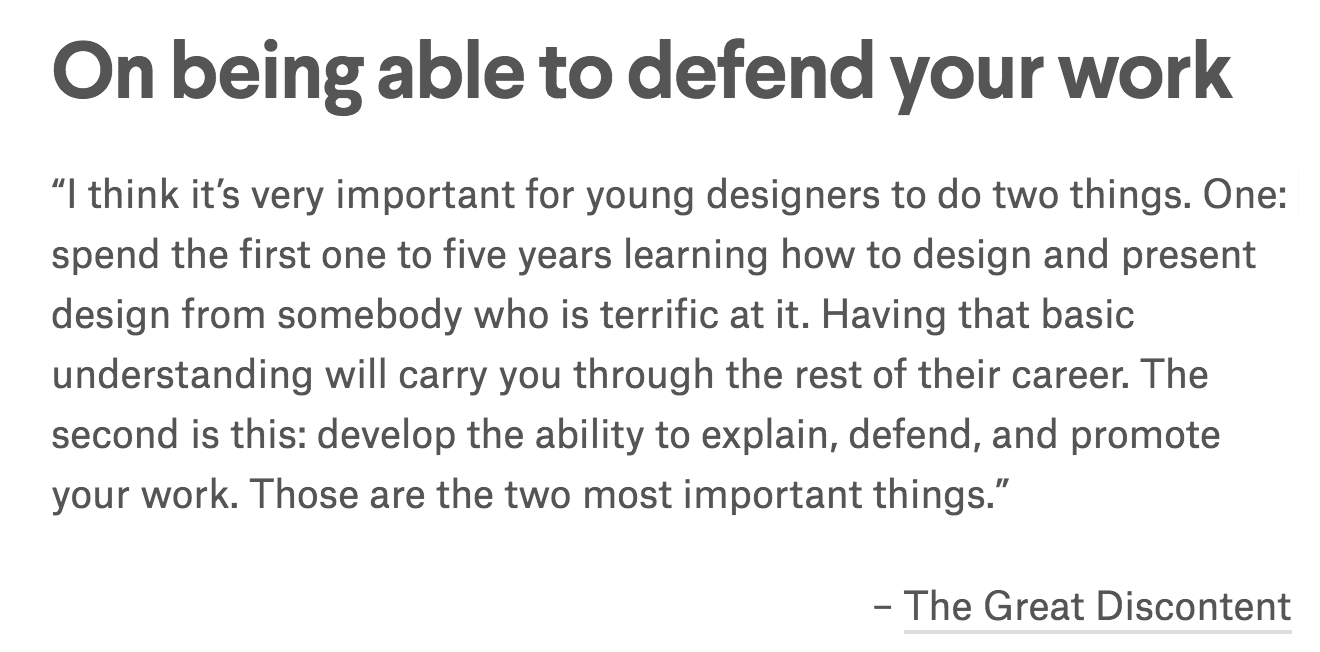
As a fresh designer, it is definitely important to take in as much as you can so as to build up a strong foundation for yourself. While it is always encouraged to do what you believe in and to not let others’ opinions affect your work, I take what she says as a reminder to not get too defensive as a beginner as it would become difficult for yourself to develop, and that when you’ve reached a somewhat ‘qualifying’ level, then you should learn how to “explain, defend, and promote your work” because YOU DO YOU!
I don’t have much to say about this one, but just leaving this here because I believe we’re all guilty of being really close minded one way or another!

To all the people who hold their expectations too high for me: I’m not God.
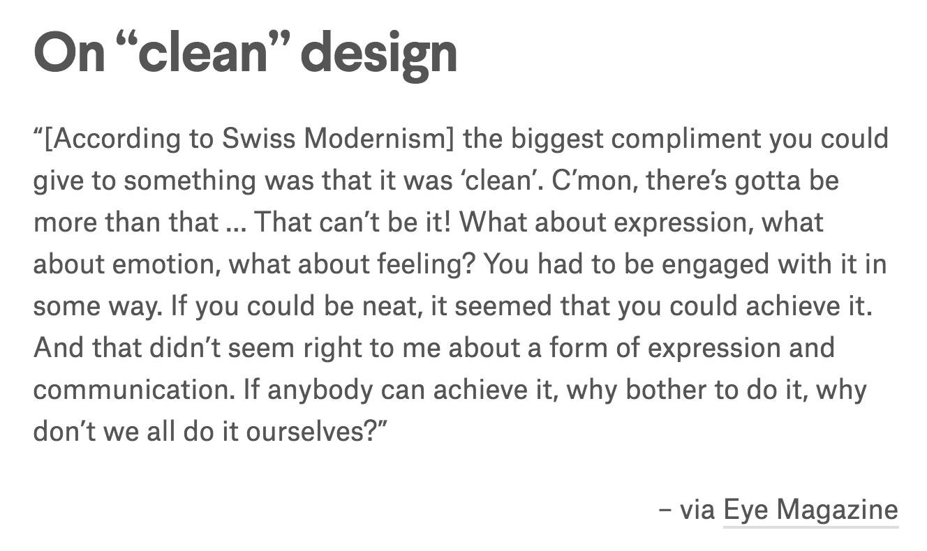
I’ve always struggled with creating ‘minimalist’ designs, and I guess this probably explains why – because I’ve realised, and have been told, that I always produce work better when I relate to them on a personal level, and when I try to create clean designs I’m struggling with the lack of ability to express and be engaged with my design. However, it is still a goal for me to learn how to produce ‘clean’ and ‘minimalist’ works, just because it is such a struggle for me. Hehhh.
–
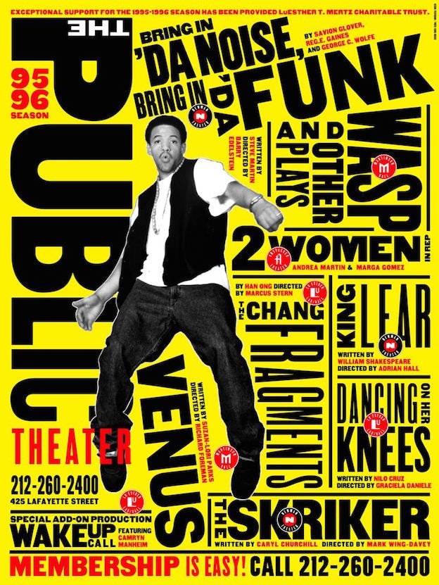
I find it astonishing that Scher is able to pull off both corporate and “fun” designs, comparing the Citibank logo to her “loudly expressive poster designs of historic Public Theatre productions like Bring in ‘Da Noise, Bring in ‘Da Funk”.
![]()
On top of these, I also admire her style and ability to create really expressive type designs while still somehow staying clean at the same time! It’s like a combination of the last two quotes that I had attached to this post above. Perhaps this could be a style I could look towards when I try to create clean designs while still trying to hold expression.
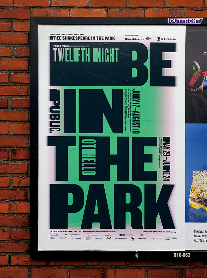
And the ones below are super duper expressive, but she still balances it off with the clean layout. Hmm. Love it.


I wish I’d known of this website earlier, when I was thrown into designing magazines and newspapers for group projects in my previous school without any proper ‘education’ on the do’s and don’ts. Heck, we weren’t even taught how to use InDesign!
First of all, I like that this website literally puts all of the basics that you need to know about type right there, all in one page, so that it’s easy to make comparisons and/or look back when you forget what something means. Like a typography bible of sorts.
While the super analytical portions of the site that recaps most of the information we’ve covered in class really helps me refresh my memory and see very distinctly what they mean, I really appreciate the use of different fonts and typefaces (as well as stating their names) to demonstrate concepts and make comparisons.

This, for example, really shows the differences between typefaces within a font, to understand the adjustments made specifically to the letters, that it’s not just simply making a font look “thicker” for a “bold” typeface, and that italicising =/= slanting.

I especially appreciate this portion of mixing typefaces, where actual fonts are put side by side for a real comparison so that we can easily see the good and the bad of mixes. Stating the fonts also provide a good ‘fall back’ option of what fonts I could possibly consider in the future should I face any difficulty with finding fonts to use, although I would of course source for better paired fonts first.

I’d also like to believe that I had managed to pick up on some of the do’s of mixing typefaces in the past, as I observe some similarities between this extract as well as one from an old newspaper design. PLEASE FORGIVE ANY ELEMENTS THAT MAKE YOUR EYES BLEED, I HAD 0 EXPERIENCE WITH DESIGN (ESPECIALLY, TYPOGRAPHY) AND I CAN ALREADY SEE MANY HORRIFYING MISTAKES MADE IN THE SCREENSHOT BELOW. Still, I think my font choices weren’t all too bad for a beginner.

Now with this website and this class, I hope I’ll be able to make even more beautiful designs with beautiful typography.