Kelly Lauren, better known as Kel Lauren, is a Creative Director and Graphic Designer currently based in Portland, Oregon. She specialises in merchandise design, and was up until most recently, a full-time merchandise designer at Live Nation Entertainment in Los Angeles, California. At her full-time job, she designed merchandise for artists such as for singers going on tours, including Carly Rae Jepsen, the Jonas Brothers, Kesha, and more.
YouTube Content Creator/ Influencer
For many years she has run a channel on YouTube on the side of her prior full-time job, where she shares content mostly surrounding the topic of graphic design and her experiences, but often times about lifestyle, fashion, and beauty as well. As of October 2020, she has a subscriber count of 307k, comprising of an audience of many young and aspiring designers.
She has been open about sharing her journey as a graphic designer since her days in university, where she started off with majoring in fashion design at the Fashion Institute of Design & Merchandising (FIDM), then making a switch to graphic design. She shares about how she has spent years in jobs that she did not enjoy including agency work, before managing to find her niche, a whole 5 years after graduation.
Unlike many other “designer-influencers” that like to tell the rights and wrongs, it is admirable that she shares through her own experiences that life and career never happens in a straight line—and that is absolutely fine.
Works
Apart from that, I greatly appreciate that she does not portray a specialisation in just one graphic style, but rather a flexibility to do many, yet still somehow making them hers. It relieves the pressure about not having to be a specialist (i.e. master of one), yet at the same time she manages to not have her generalisation be taken advantage of, which is what I would like to learn from her.
Lastly, Kel is a great reminder to me that design is voice. She uses her skills and following to create and share works that stand for what she believes in such as designing posters for the Black Lives Matter movement, and rebranding products like Playtex to fight gender stereotypes and conformity. While she still makes profit off of these projects whether means extra cash or gaining more subscribers on YouTube, it is still commendable that she engages in such works outside of the bigger client-paying jobs.
Hello. Buckle up your seatbelt, you’re in for a ride.
Not really, just a story.
I remember a period of time, last year, where I became obsessed with looking at illustrators’ works online (specifically non-vector ones). I saved Pinterest post after Pinterest post, appreciated tons of Behance projects and followed new Instagram accounts. I wissssshed so badly that I could draw like those artists.
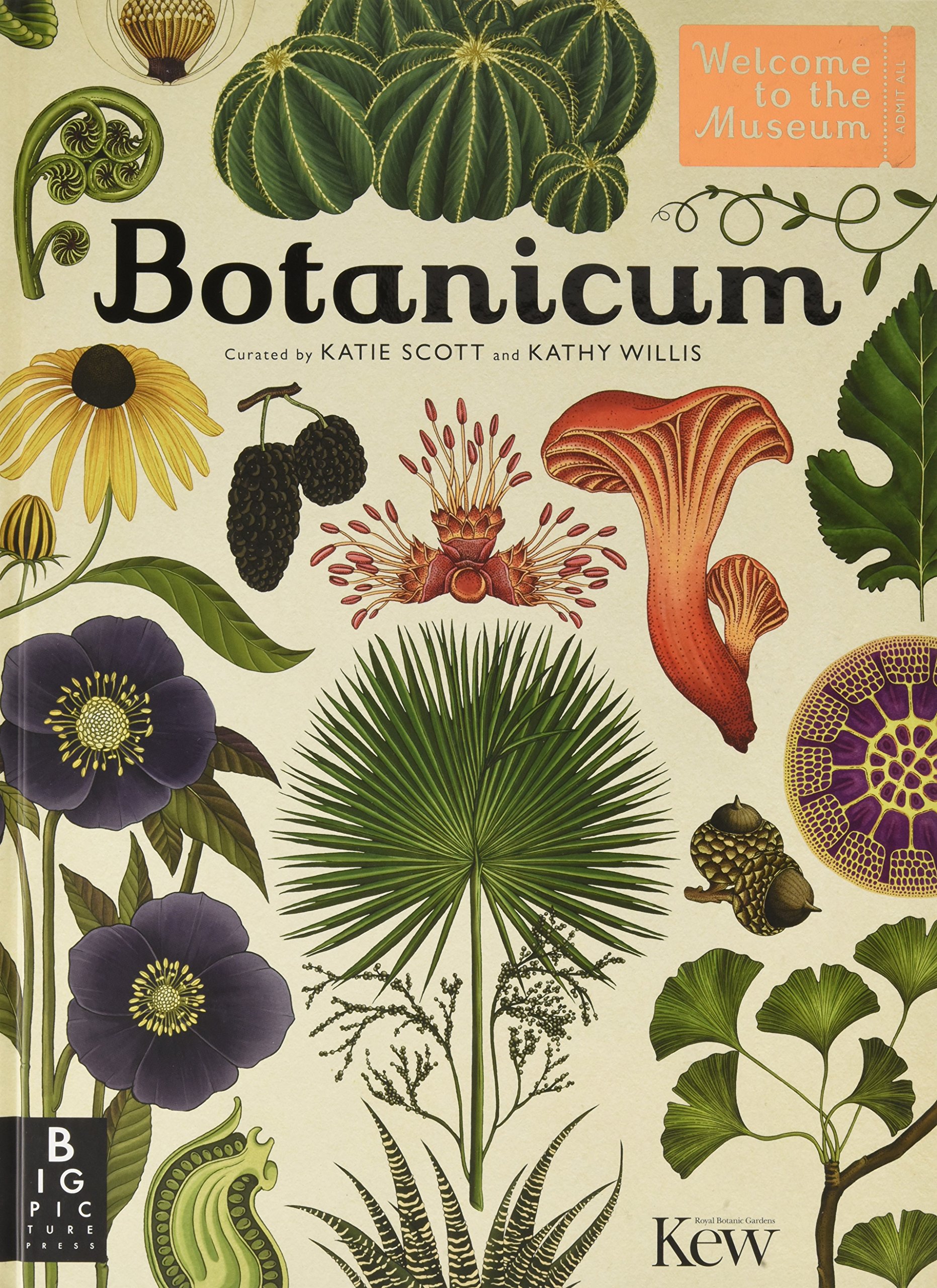
Heck, I even took the opportunity with my time on exchange in the UK (at Hertfordshire!) to get merchandise from Yeaaah! Studio’s store based in France. Actually my friend got it for me for my birthday, but, same thing. AND, even better, the first time I went to London, I stepped into ARKET, and saw a beautiful, beautiful, illustrated book. It was selling at £19. I hadn’t even dared buy myself a turtle neck sweater (that I very much needed) for £19. But I knew I wanted it. I needed it. I bought it. It was this book:
By who? Katie freaking Scott! I didn’t even know! It was fate! Could’ve gotten it cheaper off Amazon or something, I was new to the UK, don’t come at me.
Anyway, prior to this class, I hadn’t illustrated much of anything since my foundation year in ADM, and any illustrations I’d done so far were all vectors. So I was really itching to learn how to draw, lines, with my actual hand. I watched YouTube videos, and wanted an iPad to draw on Procreate so badly (because I’m a sucker for technology), but had no money to get one, I almost sold my new DSLR for it (because I was in a photography obsession phase before this).
Eventually the obsession with learning how to draw ended, and I decided against buying an iPad for myself. My mom had offered to get me one, but the offer came with conditions, and I wasn’t up for that, but I’d already lost the fire anyway.
And guess what? My mom decided to surprise me with an iPad anyway while I was in the UK! (With an apple staff discount from my uncle, thanks uncle).
Boy did I feel PRESSURED. I’d lost the fire to learn the new skill, but now I have an iPad in my hands, that didn’t come from my money, and so I HAVE TO MAKE USE OF IT. So, I knew, I was going to take Illustration in my next semester back in Singapore.
—
So hello, again. Here I am.
Starting off the semester, I was motivated, I was excited to learn a new skill in the new year.
Then school actually started, and I was like, dammit, I don’t want to do this anymore (hadn’t even started anything).
But then I was like, ok, you’re already here, in this class, with a damn iPad that you bought Procreate on, so suck it up and do great things in 2020.
And so I did.
—
I forced myself to use Procreate for the first Inanimate Portraits assignment. That was fun. Thank God it was in black and white, because I think I’d have been overwhelmed if I had to colour in the drawings too.
Then came the Varoom assignment.
To be honest, I wanted to get back to vectors at this point, partially because I thought it would be easier/quicker and also because I had inspiration from several vector works. BUT, it’s like the world was pushing me to draw with my hand, because my macbook DIED. Actually it was dying progressively, and it wasn’t actually dead but it could be considered dead, so I had no choice but to draw on my iPad (again, because me+pencil+paper don’t go together).
And so my Varoom cover was born. Drawn by my hand.
—
Then came the last assignment, and whoops, it’s in vectors!
Well, my main goal of the semester was to really just to try new things, and maybe do things how I wanted to and not listen to my professors all the time. I’m happy I tried this new style of simple vectors, even mixed with photographs, and even freaking motion graphics. I’ve barely touched After Effects ever, and now I don’t feel the need to take the Design in Motion class next year as a UE-that’s-too-heavy.
Also, might I add, I’ve never been naturally inclined to the creative side of things — my best and favourite subjects back in primary and secondary school were math and science, but I somehow ended up in Mass Communication and then in ADM doing Visual Communication. I don’t know where the heck I’m going with my life, I don’t know how the heck I ended up in an illustration class when I like math, science, and logic, but I feel like I’ve conquered a mountain in this class lol. So thank you Lisa for your enthusiasm and open-mindedness with the class!
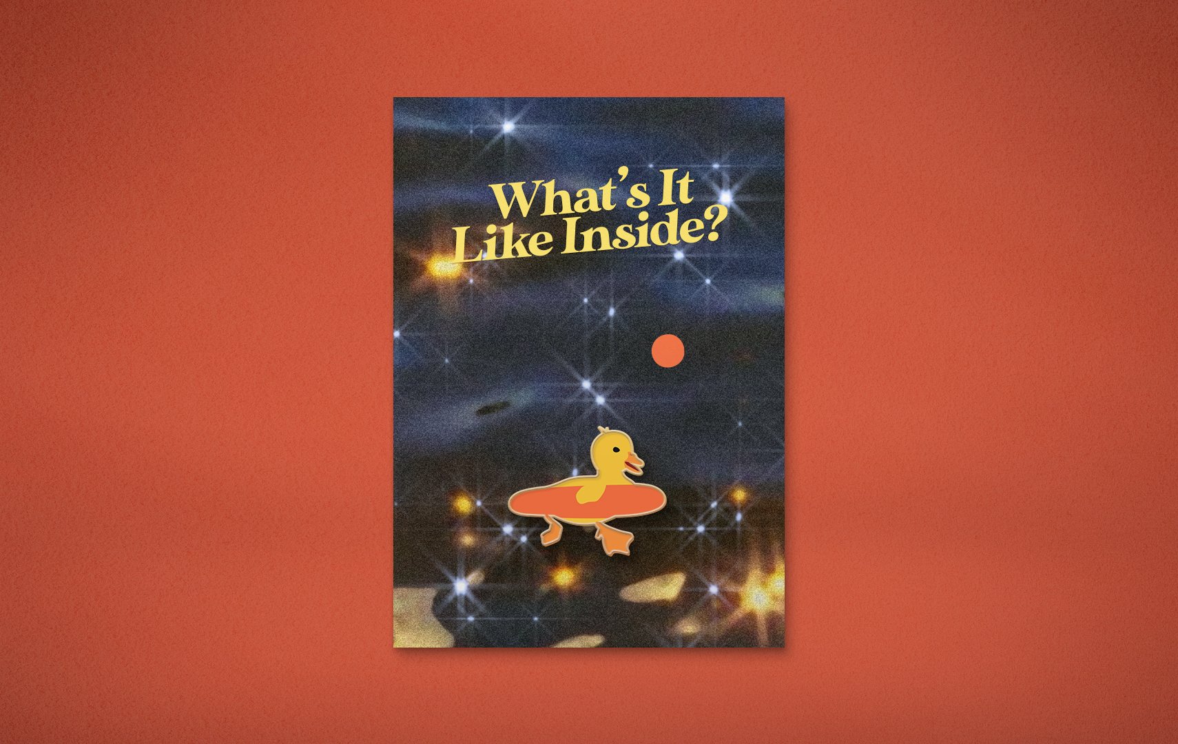
What’s It Like Inside: An Animal Party is an event where animals from ‘around the world’ gather to find out what it’s like inside, indoors, inspired by our world’s current situation. The event will be streamed live on Instagram, on the 20th of April, 2020, at 1PM (no it won’t).
On a grander scale of things, the event is to inspire and remind people to ask each other “what’s it like inside?”, in a time where we are all confined to our homes, our minds, and our feelings.
Animated Trailer
(P.S. Rendering really messed with the colours, and after consulting three film/animation experts and Google, this was the closest I could get it to be like what it’s supposed to be!)
Animated Instagram Stories
Because it’s covid season. Who needs physical posters?
(P.S. Same rendering issue, ugh!!!)
(Definitely looks a lot more pink-toned than what it’s supposed to be- orangey)
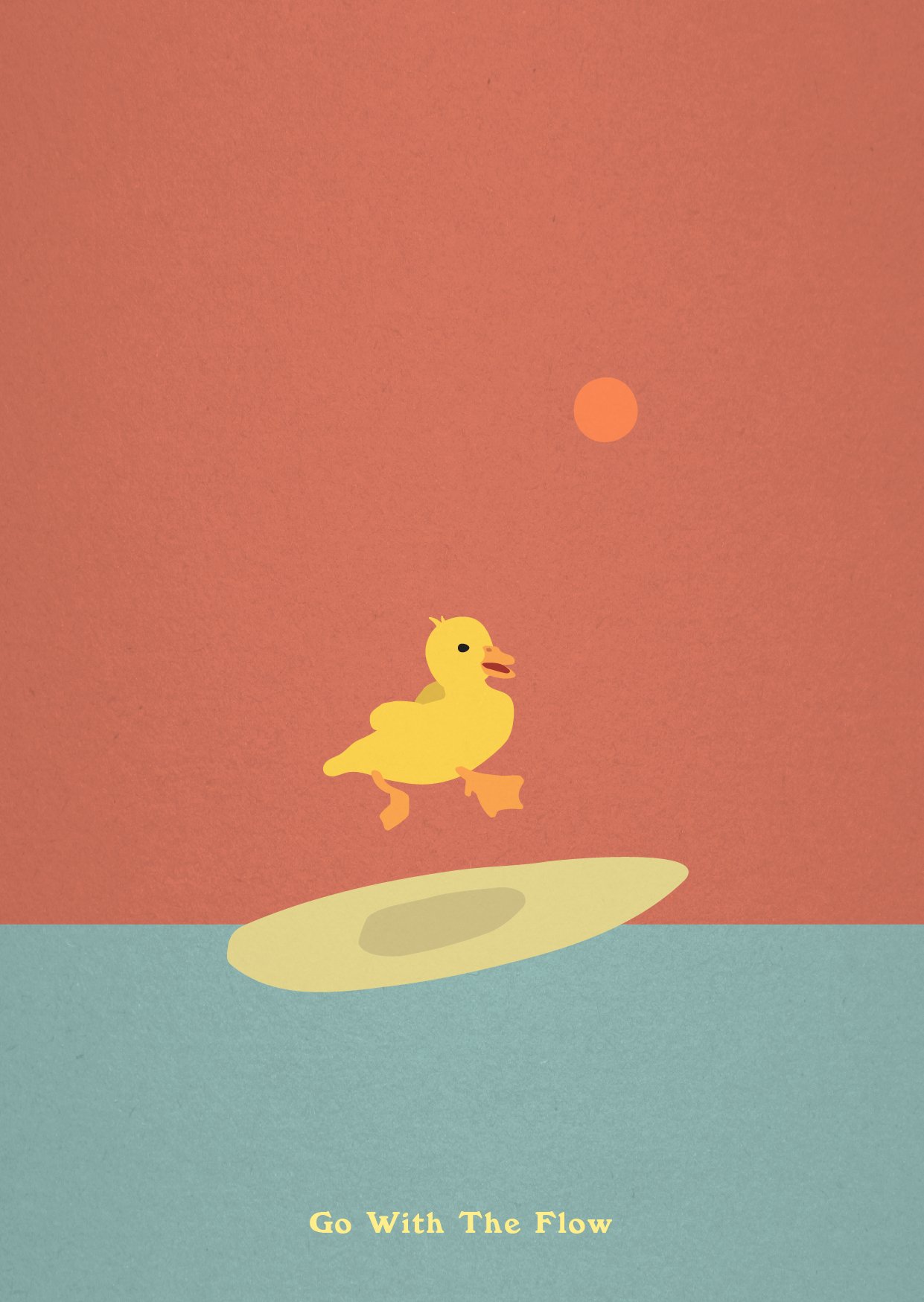
(Yes I’m aware it looks like he’s surfing in the sky. I left it like that on purpose, because fun.)
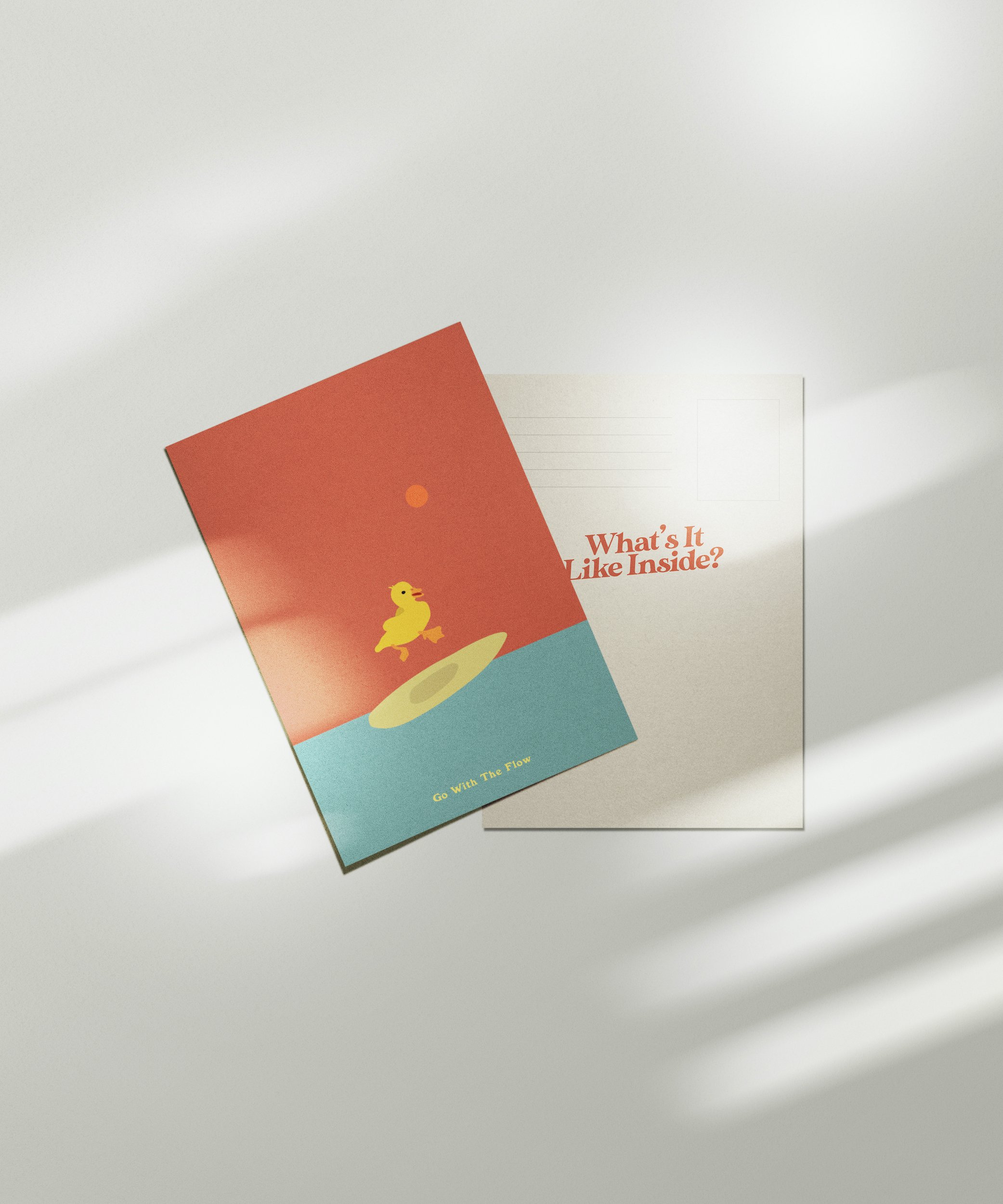
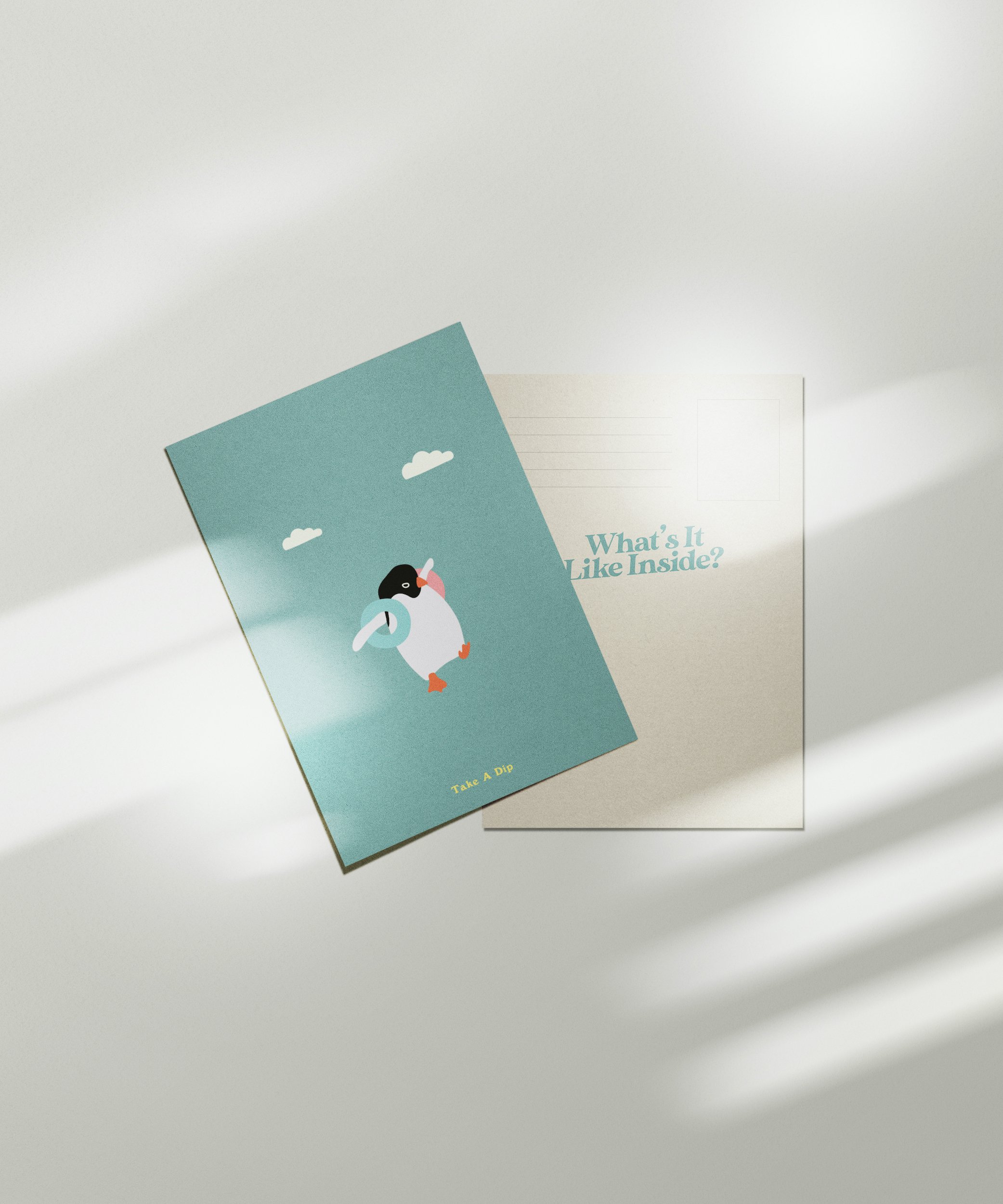
Postcards
To be sold on the corresponding e-shop, “www.whatsitlikeinside.com”.
For people to buy and write to their families, lovers, friends, enemies, to ask them about how they’re doing, and what it’s like (being) inside.
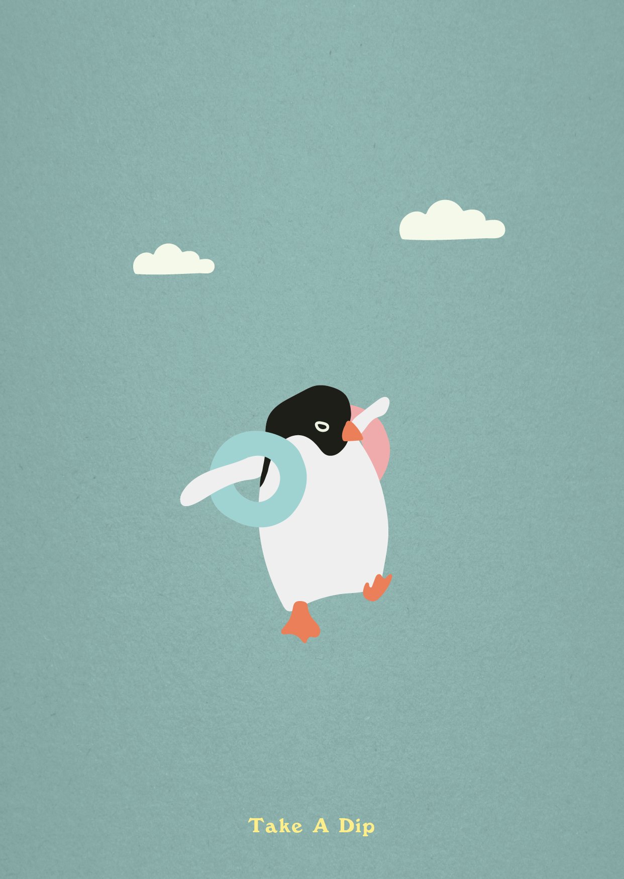
The quotes, while accompanying the illustrations, are also to give people a few little tips to survive the quarantine. Listen to the birds! Stay calm and ride the waves. Take a dip! In the shower, in the bath tub, in a pool if you’re allowed or if you have one in your backyard!
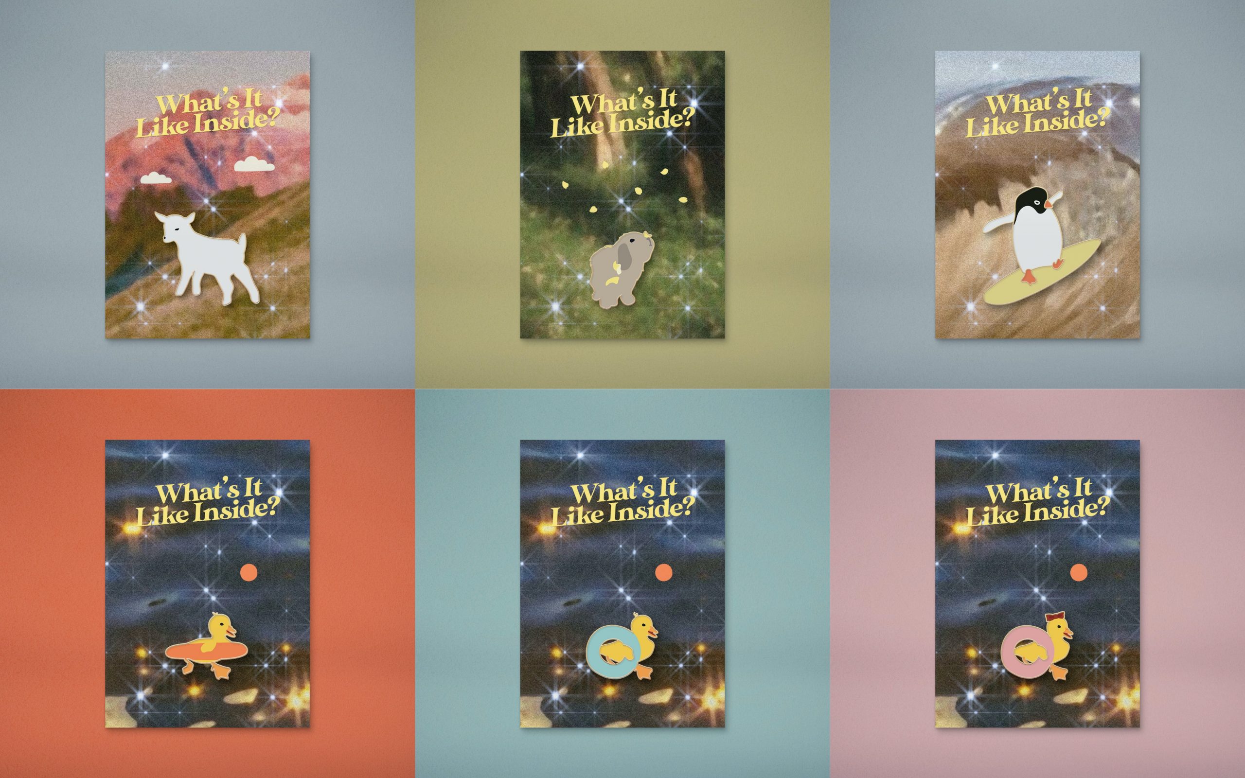
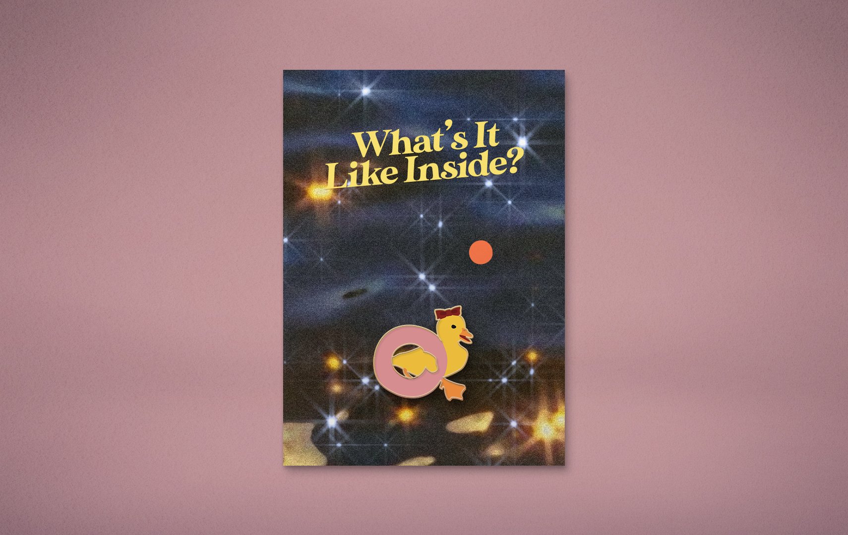
Enamel Pins
Also on the e-shop, “www.whatsitlikeinside.com”.
A little souvenir, for all the humans that couldn’t make it to party. You can also gift it to a friend or yourself, if you’re feeling nice.
Here’s a collage, but I uploaded all of them in full size because shiok.
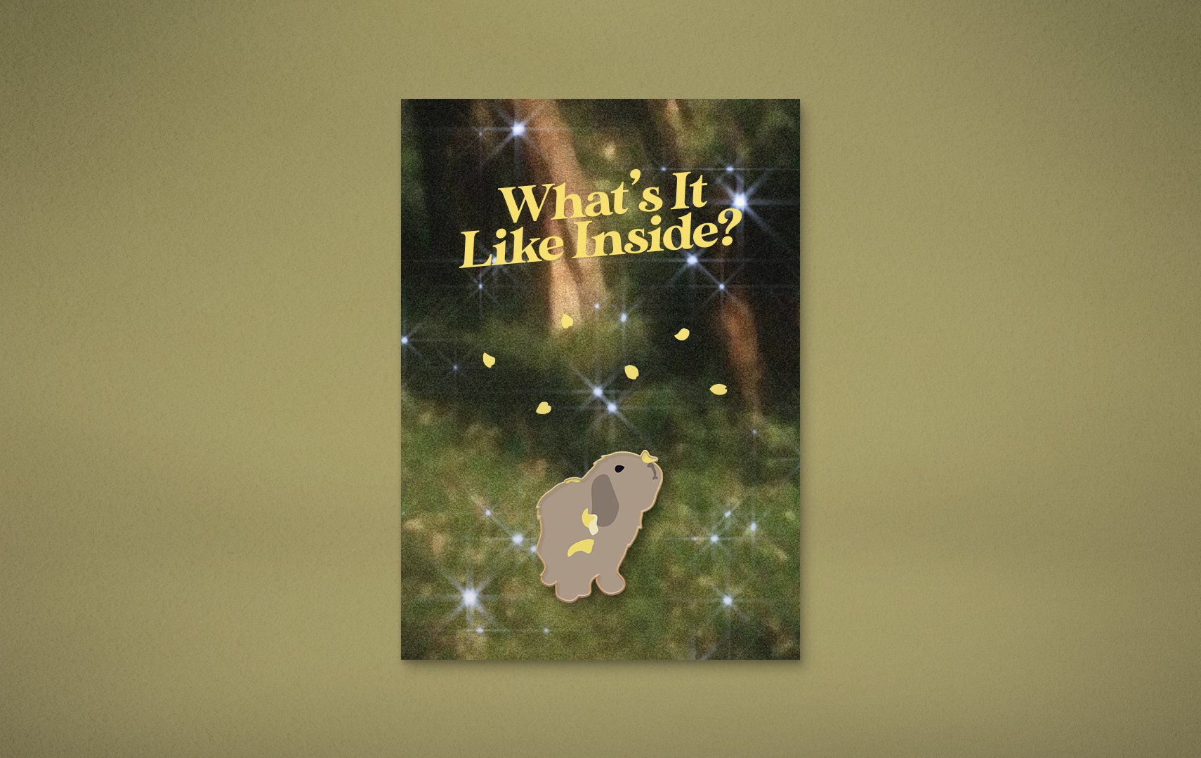
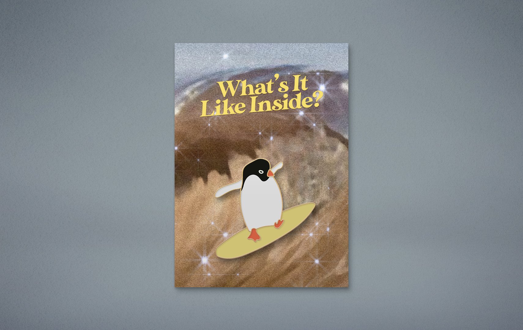
The penguin’s composition was by far the simplest, yet gave me the most pain in the a**. Colours are painful. It was tough to pick a colour for the surfboard because I needed it to match the penguin’s feet, stand out from the penguin’s background, but also from the orange float duck and its feet because I had plans that it was going to steal the surfboard in another collateral.
I also removed the little waves from the previous draft video, because I didn’t like them. Watching the penguin flip is enough!
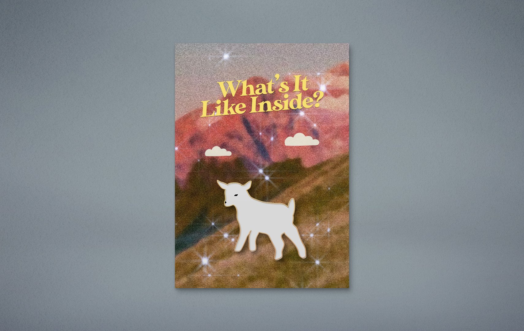
Lamb’s Accessories
At some point I realised the lamb was the only animal without an “accessory” attached to it, which gave it a lack of colour as an ‘identity’ when it came to compositions for the other collaterals. So I started dressing it up. I even tried giving him (yes, now he’s a him) socks.
Eventually I decided against all these, because heck it, lamby boi is a clean plain white boi with floating grass and flowers and clouds!
Duck Tails In The Float
Feedback was to have the blue and pink float ducks’ tails “inside” the float. I tried it, but no! Doesn’t make sense, and I didn’t like how it looked anyway. They’re holding the floats by their side with their wing. They’re not in the float!
It was an instant undo and I have no evidence of this.
Finalised Concept
Geeeeez, you would think I should’ve had this done weeks ago.
I initially thought of the whole thing as a campaign, rather than an event, but then I realised the brief called for it to be an event for a client, so… It’s an event in a campaign, sort of, kind of.
Many of my ideas came as ‘jokes’ about the current quarantine situation with Covid, but eventually while the event is still inspired by the situation, I decided against having the tone of the project be a joke.
What’s It Like Inside: An Animal Party is an event where animals from
‘around the world’ gather to find out what it’s like inside, indoors,
inspired by our world’s current situation. The event will be streamed
live on Instagram, on the 20th of April, 2020, at 1PM.On a grander scale of things, the event is to inspire and remind people
to ask each other “what’s it like inside?”, in a time where we are all
confined to our homes, our minds, and our feelings.
Greetings, from day (I wasn’t even counting) of circuit breaker.
I have good news and bad news.
The good news is, I’m still really enjoying this project.
The bad news is, I still have no idea where it’s headed, and it’s due in a week.
WEEELLLL I have a little bit of an idea, that’s better than before… but it’s still not concrete. I’ve swear I’ve been thinking A LOT about it. I went to bed at 5AM last night thinking about it and jumped out of bed at 12PM literally still thinking about it. And it gave me an actual headache before I could even get to brushing my teeth.
I feel like it’s been hard trying to get creative while stuck at home, which is quite odd to say. My logic is — the times I get my best ideas are during my free times away from life, so like poop time and shower time, but now every time is ‘free’ time and my brain has essentially lost its grasp on the concept of time. Anyway…
Progress
I’ve done a lot of work, but progress looks minimal overall because all the work was done on the motion graphics collateral. I went forward and backtracked a couple of times with a few ideas.
I expanded on the animal illustrations wherever needed, so that more could go on with each scene. I struggled a lot with colours — because the backgrounds don’t follow a colour scheme, I needed colours that could pop on each background individually, yet still look coherent to the rest of the illustrations.
I put a hat on the penguin at some point.
I’m even a layer namer now, because I’ll do anything for a sense of routine and order during this period of time.
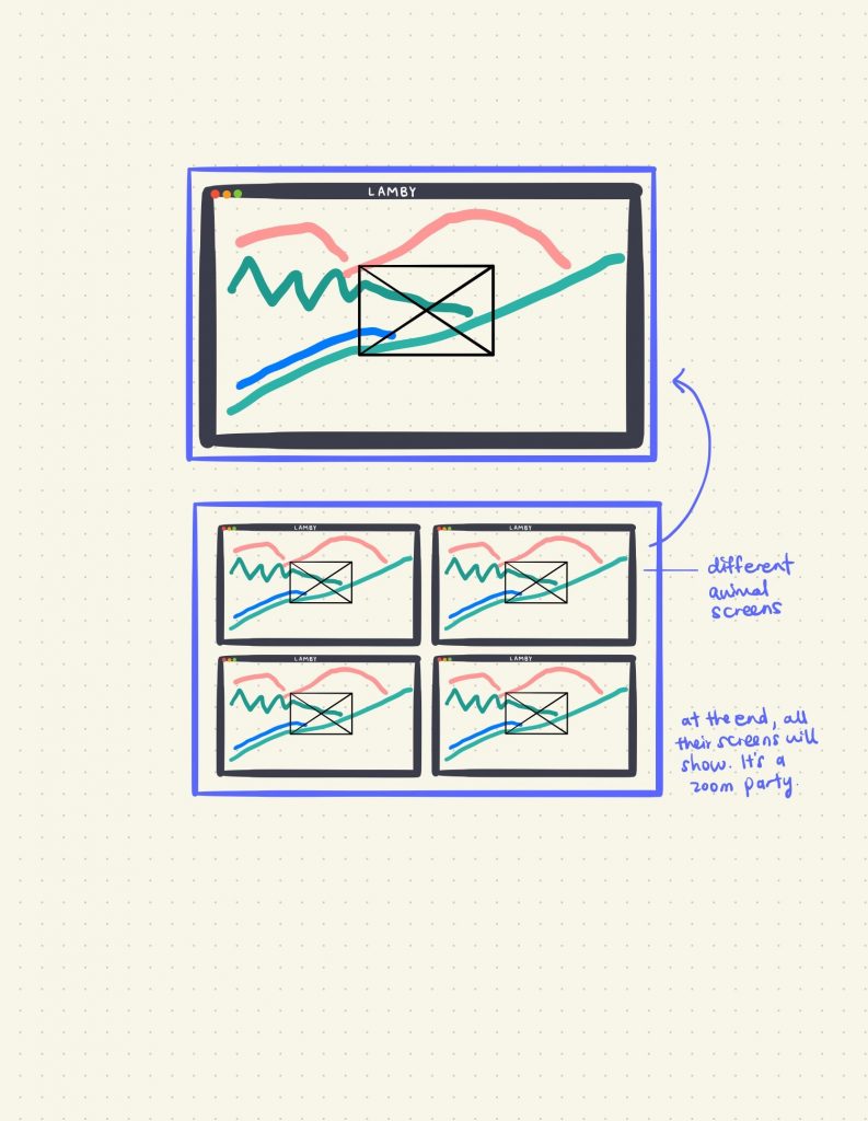
Animal Zooming / Animal Conferencing
Based off the idea of this event being “a virtual tour of these animals while we’re all stuck inside”, I had the idea of turning this into an Animal Zooming or Animal Conferencing thing, a parody on Zoom and the Nintendo Switch Animal Crossing craze amidst quarantine. They’re zooming around the world, they’re zooming on Zoom! So I did this, and even though it’s cute, I decided against the idea because I didn’t want to turn the project into a “joke”.
While doing this, I was wondering, why the heck should the animals have to be partying on zoom, when nothing’s stopping them from partying in real life? So, I finally figured out where the animals were headed:
Spotted in Quarantine
I thought about making this into some sort of documentary/film about what the animals were doing while the world was asleep (in quarantine).
I’ve not yet eliminated this idea, but I’m close to doing so because I can’t yet imagine how the other collaterals will be, because I don’t want to put this film border on everything. Though, I can still imagine this to just be the trailer and everything else will be promotional/merchandise. I also feel like the border isn’t necessary, but it would make the “spotted” idea come across more clearly.
Motion Graphics Trailer
(Ignore the opening)
I’ll still have to make an opening which will involve the title of the event that will be illustrated across all/most of the collaterals. Details are still to come for the ending.
Trying to Figure Out What This Project Is
If it's a movie about what the animals were doing while the world was on lockdown:

Motion Graphics Trailer (with release date)
Movie Poster (with release date)
Enamel Pins (merchandise)

Instagram Posts (?) (like how some Netflix shows have their own pages)
Premiere Photo Taking Wall (?)
Premiere Invitation Cards (?)
Phone Covers (merchandise) (?)
If it's a quarantine party that only animals were invited to:

Motion Graphics Trailer (more like 'event coverage')
Enamel Pins (because you didn't get to go)
Phone Covers (because you didn't get to go)
Photo Book (because you didn't get to go, so take a look at what went down)
Invitation Card (that you didn't receive)
Title Inspiration:
Enamel Pins
Pins to be sold on an e-shop as merchandise. The title will go on top, and I might give them names and put them at the bottom.
In Conclusion
This is probably the worst way one should go about planning and creating a project. At this point my brain has turned into mush, but I trust that all will be well… I hope. 🤞
I’d already begun self-isolating from awhile ago, and now I’m already bored before the official start of lockdown and am on the verge of piercing my own ears!!!! Help.
First E-mail Consult
Inspired by the Instagram account @mignonettetakespictures that posts some of the most aesthetic, CUTEST small animals, I decided to base my final project on cute animals.
I had various ideas that were based on reality, like renting a pet for a day (kind of like dog-sitting), having a day care centre, a see-but-no-touch exhibition that’s pretty much like a zoo, and struggled to come up with something that really HIT it for me. I also really worried about people abusing these babies.
Lisa suggested that I try going out of reality and not have logistics run this project, and even referred me to these works below that honestly scared (still do) me (insert laughing emoji here). Thank you for the references Lisa, but I kind of want to stick to doing something cute and innocent hahahaha. Not trying to ruin anyone’s perceptions of cute fluffy animals!
Somewhere along the way I had the idea of having a Grand Mansion that had different unrealistic rooms, like one room would be a never-ending field for a baby lamb, one would be a room full of mirrors for a narcissistic cat, etc. It’s kind of like minecraft where people build crazy mansions, and it’s also kind of like The Chronicles of Narnia. However I ended up not going with that idea… because, well, I let the project run its course.
Progress
Inspired by Lolita Chiong, a very, very, very talented local artist who’s struggling to finance herself for CalArts 2024, I wanted to try mixing image backgrounds with illustrations. (You can see the reference from the thumbnails, but do give these a watch when you have the time!)
So here’s the process of first attempt. I honestly laughed so hard at my very first attempt at mimicking Lolita’s simple use of shapes and black outlines. The cat looked like Doge?!?!?!?!
While it’s easier for the illustration to stand out with outlines, after playing around with different stroke widths, I decided against it as the style just wasn’t doing it for me.
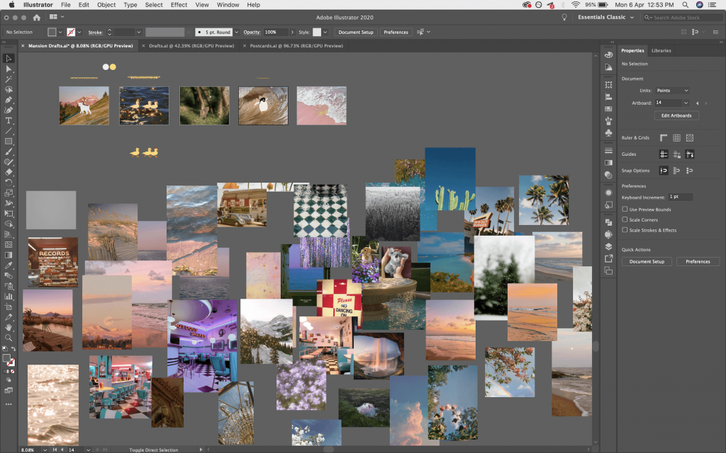
I dove into the world of Pinterest and created a huge board with all the potential images I could use for my animals. While picking out images, I thought about whether I wanted the animals to be placed in a realistic scenario (e.g. field for lamb), if I wanted them to be extracted from reality , or if I even just wanted an aesthetic background that could suggest a scenario but not actually show it (e.g. just water ripples, plants). I went through 1001 images and eventually decided not to fixate on just one, that it could be “realistic” but also out of reality, and it could also just portray a sort of mood that is coherent to the rest.
A few questions that helped me imagine scenarios:
If this animal could have it better, what would it be like? (their reality, but enhanced)
If this animal was in an alternate reality, what would it be like?
Something else I also considered was whether I wanted to place the animals within human civilisation, or just a ‘human’ environment (like in a house, at a picnic, etc.). I tried putting the penguin in roller skates at one point, in a roller disco/ those retro diners with checkered floors where the servers skate. The background images were all bad so I didn’t go with it, but I also eventually decided to keep the backgrounds to nature for coherence, hence I don’t think I will be using the house cat.
(Trust me, I spent a LONG time finding the best backgrounds for these lovelies).
At first I did not mind the background images to be of low quality, inspired by Lolita’s works, however the images were turning out to be on wayyy different levels of quality, so I had to do something to make them the same. I brought my backgrounds to Photoshop and applied the same Dust and Scratches+10 and Noise+15 effect to all of them. The blur effect that the dust and scratches gave the images also allowed my illustrations to eventually pop out more.
Postcards
Now, where is this project headed, you suppose? I’m not so sure myself. I believe I’ve drifted away from the idea of the mansion because I’d have to imply that these scenarios are through the doors of a mansion somewhere. At some point I thought the mansion could be “tourist attraction” that people could come to, and would literally be visiting several attractions at a time, and could walk away with postcards. So I have postcards, with little inspirational “movie” captions relating to either the scene or the animal.
Right now it seems like I’m creating a sort of grand tour to visit these cute animals “around the world”, and the overall art direction is a feel-good aesthetic. The only problem I have with “around the world” is that the ducks aren’t placed in a proper scenario.
Here’s me playing around with compositions:
(I tried making the animals big, but nah.)
So, now I’m at this point, where I’m deciding whether to have the animals directly interact with their scenarios. For example the penguin is on a surfboard on a wave (interacting), but the duck has a whole sun to itself, the lambs with clouds flowers and grass. I’m currently leaning towards letting it be a mix, as long as the overall look is coherent. Actually, maybe if I just added little waves around the penguin then it would all be matched up…!
I also decided to have them all centred rather than have them interact with the background too much, for reasons I’m struggling to put into words, but I really just quite like it like that.
Motion Graphics
And,,,, the reason why I expanded on the illustrations of each animal was so that I could create a little motion graphics video for the project, where each animal would have their own set of… assets. Here’s what I have so far:
(PS I forgot to cut the video length before uploading. You can stop after the animals are gone. Also ignore the beginning! Not sure what to put there yet.)
So far only the penguin has slightly more excitement to its animation (it FLIPPED! for heck’s sake! wow!), and I’m working on thinking of what I could do with the rest. I really went with the flow with this, and the animals zooming in and out like “ayyy”, “bye bye!” really does make it look like we’re going from place to place. So it’s really turning into a tour kind of thing like I mentioned earlier!
For the opening I’m imagining there to be a zooming-in, spinning, retro title, or a spam of travel-esque vehicle images following the beat of the BGM. This video could be a promotional video of sorts.
I’m no character animator, in fact I’ve barely ever animated anything in my life, so I’m not looking to do anything super drastic… like… MOVE THE HEAD OF THE LAMB TO EAT THE GRASS? How in the world!
Remaining Assets, Moving On
For the remaining assets I’m still exploring my options. Right now I’m thinking of enamel pins, tote bags and whatever, but I’m really trying to think of what I could make that would not just be planting the same illustration on different products.
Moving on to my next step, I know I have to solidify my idea of what this ‘event’ actually is so that I can better tie everything together.
That’s all.
Sorry (am I really…?) for being long-winded. I just really want to show everything!
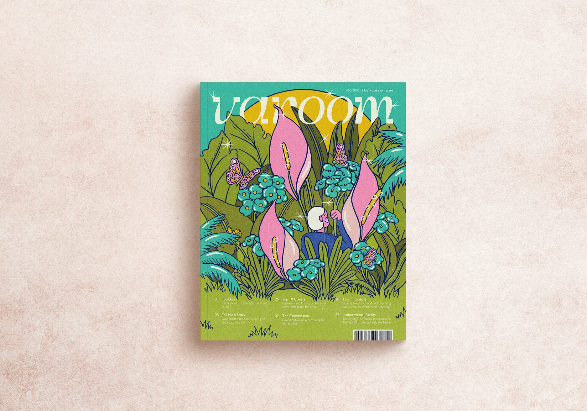
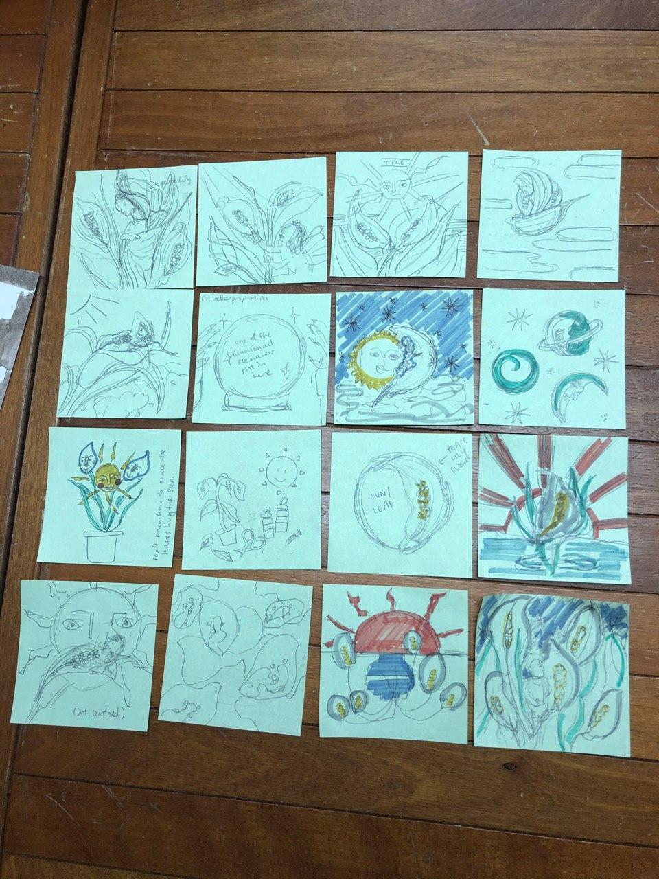
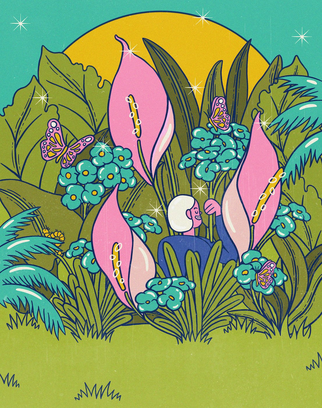
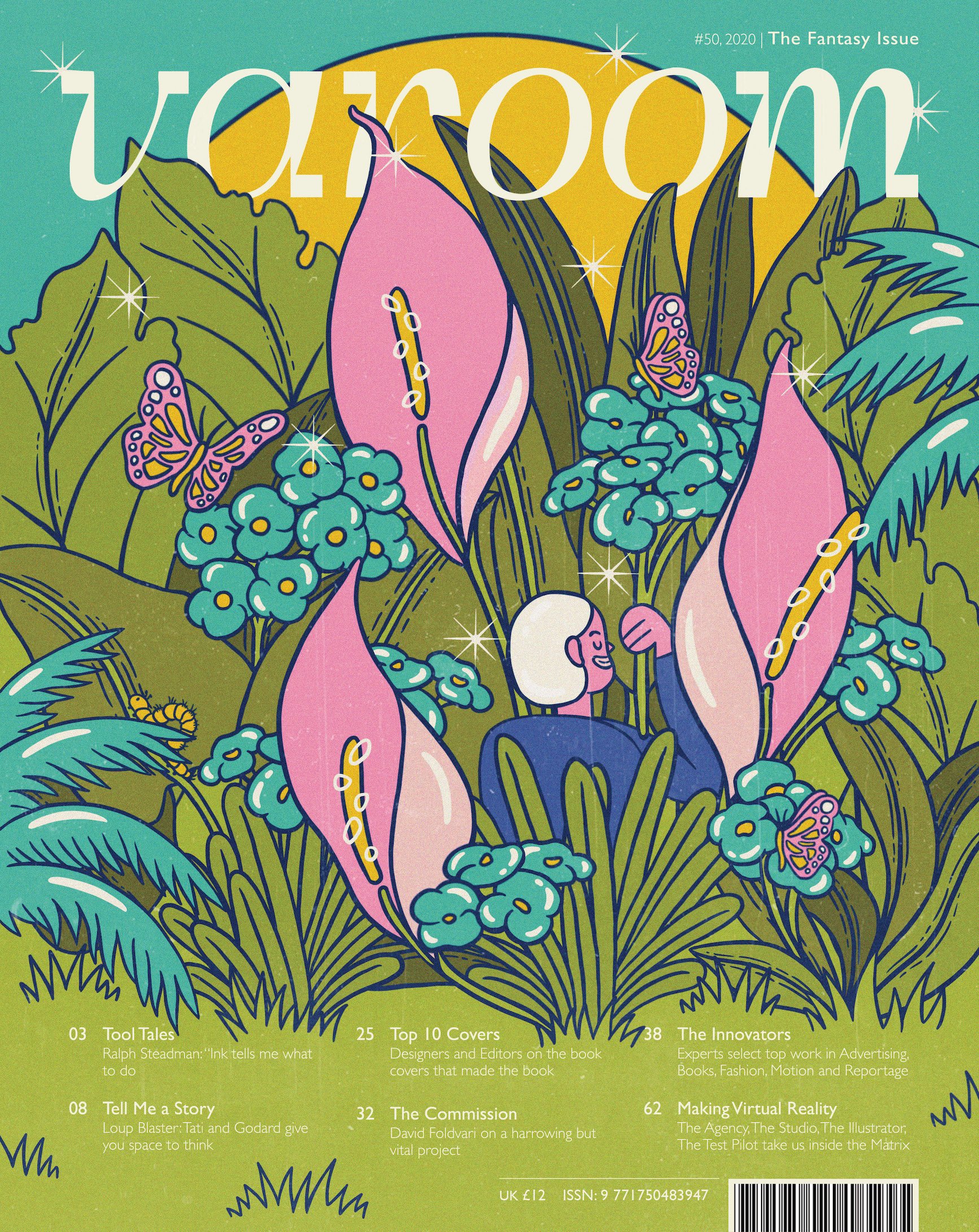
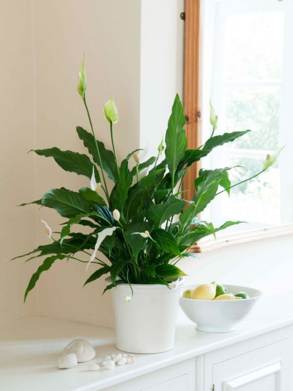
My illustration for the theme of fantasy revolves simply around the story of my mother who has been trying very hard, and failing, to propagate Peace Lilies at home as they always burn into crisps under our extra hot Singapore sun.
I illustrated each plant individually and played around with tens of thousands of arrangements to see which ones worked best. I faced an issue with figuring out where the plants could sprout from, because starting them from above the text would look odd, but starting them from the bottom of the page would interfere with text legibility. So I tried adding pots, and then a flat ground. I eventually realised I could use patches of grass to cover up the stems.
CLEANING UP
I re-illustrated each and every element because all my sketches had been resized to the point of… myopia. Downside of not using vectors. (I did at some point convert all my lines to vectors but it didn’t feel right!)
FAUNA TO THE FLORA
I added fauna to the flora, although only subtle-ly to balance out the composition. I tried adding a hanging chimpanzee from the “a”, and also a giant dragonfly, because my mom loves those long-arms-chimpanzee toys and dragonflies, but they were fighting for attention with the lilies hence I decided with small creatures (though that is actually one giant butterfly if you compare it to the character). Amidst all my trial and errors and hundreds of layers I also have no idea where the monkey and dragonfly have gone, hence they are not pictured. 🙁
COLOUR PALETTES
I played around with different colour palettes. I personally prefer the dark green-orange palette, but the blue-pink one tied in with the theme of fantasy the most.
CHARACTER
I tried different characters/positions and chose the one I felt fit best. I also tried making the character hold a ‘leaf umbrella’ (pictured in the latest gif above) like in Totoro, but that didn’t work as well as holding flowers.
DETAILS
Added details — “shadows” and highlights, grass patches, bling blings.
INTO THE COVER
I transferred the illustration from Procreate to Photoshop and adjusted the hues again. I added noise and texture, changed the colour of the masthead to match the highlights and layered it with the leaves. I initially thought of fiddling the leaves through the letters, but felt that it would also fight for too much attention with the rest of the illustration that is already very detailed. Adjusting the hues and textures were for aesthetic, to give the illustration more warmth, and the slight ruggedness for a ‘vintage’ feel like its been well used/made by hand, much like how gardening (more like turning house plants into a forest) requires a lot of handy work and love.
Me Mom’s Fantasy: In a world where Peace Lilies would grow in this hot sun.
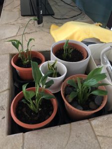
Here’s an expectation vs. reality of my mom’s journey in propagating them:
(This is a new batch so they’re not all burnt to a crisp yet)
Refreshin’ your memory on the three selected thumbnails to work on:
Detailed Sketch #1
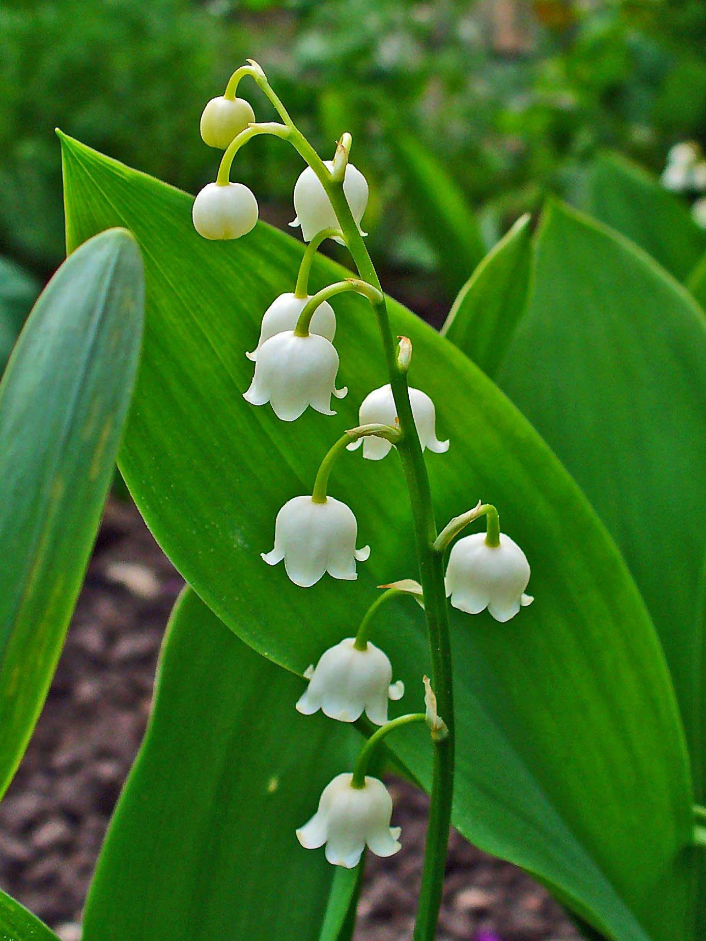
The first sketch is a combination of the first and third thumbnail, with the concept of the ‘dead’ flowers rising up towards the sun, but in the composition of the third tarot card thumbnail.
However, instead of Peace Lilies, I worked with a flower called the Lily of the Valley instead because I found it only fitting to flip this flower that actually grows downwards, upright.
Detailed Sketch #2
The second sketch is based on the second thumbnail, of a figure in a giant Peace Lily forest. It’s currently Alice because I needed a reference figure… but I’ll change her appearance if I do end up working on this sketch.
I added another plant called the Euphorbia milii/ Christ plant, which is another species that my mom has actually been able to grow very well. It’s just to add a little variety to the composition.
I haven’t figured out how the composition will be placed, whether it’ll be boxed in the centre, whether there’ll be an imaginary box boxing it in (plants just cut off before hitting the text), or whether it’ll be incorporated into the entire cover.
the faculty or activity of imagining impossible or improbable things.
activism
/ˈaktɪvɪz(ə)m/
the policy or action of using vigorous campaigning to bring about political or social change.
—
For the reason that I just feel like drawing plants for this project, I was torn between doing fantasy and activism because while I wanted to do a fantasy, plants are very easily associated with topics of sustainability. I then thought, why not create an activist’s fantasy? Or… not so much an activist but just an avid plant potter.
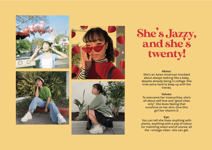
USER PERSONA…S
With my indecisiveness, I created two user personas. Thankfully I made a decision in the end, going with the second one (Jazzy).
*I’m sorry about the orphan
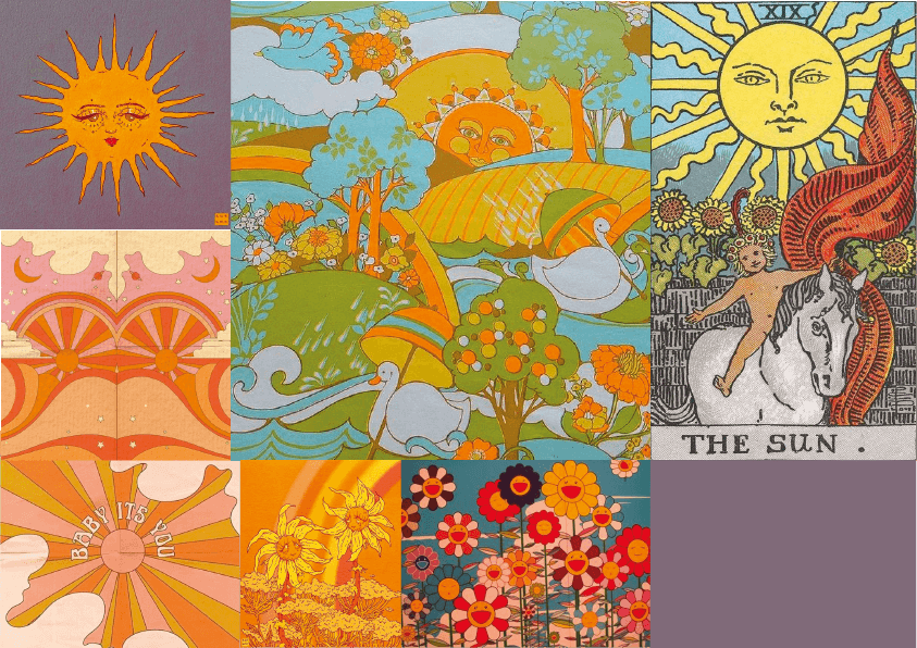
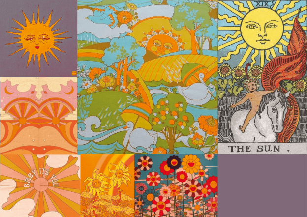
MOOD BOARDS
Again, being indecisive, I created a few mood boards to see which styles would be more fitting for my ideas. After going through my thumbnail sketches, I am most likely going with a tarot card style with a hint of Alice in Wonderland surrealism.
However, I still plan to take inspirations in different parts of the first three mood boards, like colour scheme from the first, art style from the second, and composition from the third. Please don’t @ me if I change my mind.
THUMBNAIL SKETCHES
The general concept that runs across most if not all my thumbnails is simply the story of my mother who has been trying very hard and failing to propagate some Peace Lily plants, because they keep burning in this Singapore weather. Her fantasy would hence be a world where Peace Lilies would grow in this hot sun.
These were the three selected thumbnails to work on. The first one had the strongest concept, while the other two were more visually appealing.
First:
If you look at the potted Peace Lily upright, it would show that the flowers are dying, but as a whole image with the pot upside down, the dead flowers are actually rising up towards the sun.
Second:
A small figure in a giant Peace Lily forest.
What do you find inspiring? What’s inspiring is that we get to see a full range of expressions through illustrations by illustrators across the globe, across a spectrum of subjects.
What type of information is in the magazine? Varoom is the globally leading illustration magazine featuring a unique combination of industry insight and critical analysis of the field of illustration.
Explained well by Varoom 36 Rhythm, “Varoom showcases some of the most striking image-making from the crop of 2017 art school graduates, guided by the AOI’s global network of professional bodies and educational institutions. The images are a sample of outstanding work from Kristiana to Kingston to South Korea – from children’s stories to social observation to fashion and politics, there are new rhythms emerging. Follow these young image-makers as they take the pulse of changing time.”
Who is the target audience? Each Varoom magazine caters to a different target audience with its specific theme/topic. The target audience of each magazine would hence be anyone who can find a connection between themselves and the topic, especially if they appreciate the expression through art and illustration.
(MORE THAN) THREE ARTISTS (FROM VAROOM)
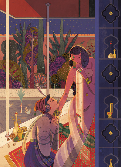
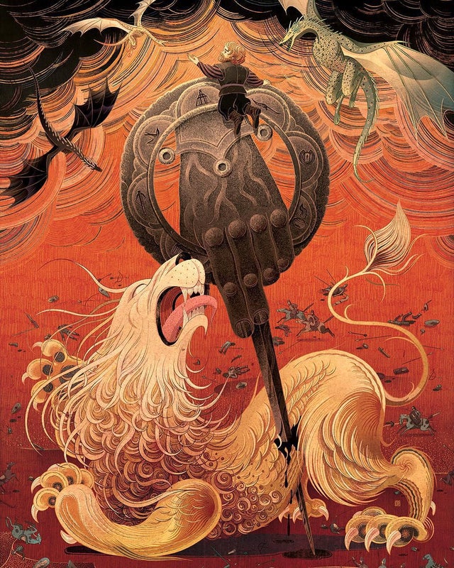
i. Victo Ngai, of course (in Fantasy)
What do you find inspiring? Her insane amount of detail!!!!!!!!!!!!!!!!!!!!!!!!!!!! Nothing is just for decoration.
What medium(s) do they use? I’m not sure. On paper then digitised?
How do they creatively interpret the text for the article? To be fair, the article is about herself and her work, so it’s not much about creatively interpreting the text for the article but just explaining her own interpretation of art and her fantasies.
“Art is a space where I can be my own master – I love that within that space, I can disregard the rules of our reality, and yet manage to create worlds that people can get lost in.”
“By draping subjects in a cloak of fantasy, it becomes easier to explore difficult topics and reflect upon ourselves a few degrees removed.”
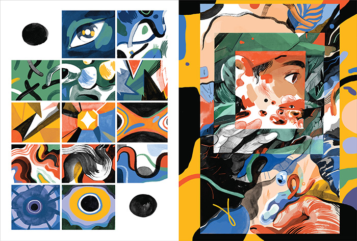
ii. Molly Mendoza (in Fantasy)
Digital Fantasy from Messy Reality Billie Muraben investigates immersive indie games Heaven’s Vault and Telling Lies.
What do you find inspiring? I like that Mendoza did not conform to the stereotypical visuals of fantasy, as pictured in the Google and Pinterest searches below.
What medium(s) do they use? Traditional
How do they creatively interpret the text for the article? As described by Victo Ngai where fantasy is just looking at subjects “a few degrees moved”, I like how Mendoza takes recognisable objects and distorts them in an abstract manner to create a distorted reality.
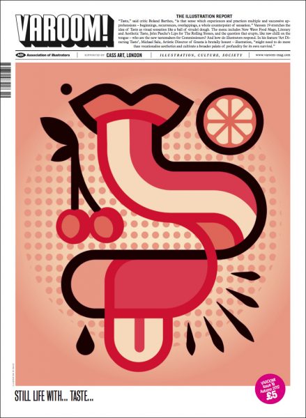
iii. Radio (in Taste)
Cover illustration created for Varoom by Radio.
Varoom 19 stretches the idea of Taste as visual sensation like a ball of strudel dough. The menu includes New Wave Food Mags, Literary and Aesthetic Taste, John Pasche’s Lips for The Rolling Stones, and the question that erupts, like raw chilli on the tongue – who are the new tastemakers for Commissioners? And how do illustrators respond. In his feature ‘Art Directing Taste’, Michael Salu, Artistic Director of Granta is brutally honest – illustration, “might need to do more than vocationalise aesthetics and cultivate a broader palate of profundity for its own survival.
What do you find inspiring? Radio’s ability to portray not just a mouth, but taste, and not just one taste, through such a simple vector image.
What medium(s) do they use? Digital vectors
How do they creatively interpret the text for the article? The Taste issue of Varoom talks about not just the taste of food, but also on people’s literary, aesthetic, and music taste. By not using realistic food illustrations, we are directed away from believing that the magazine will talk about only food. The use of red also makes it seem like the content’s gonna be spicy.
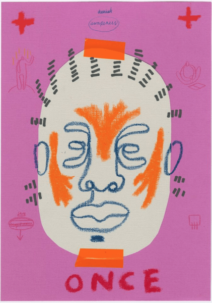
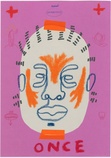
iv. Joy Miessi (in Nostalgia)
Awareness by Joy Miessi | Aisha Ayoade talks to Joy Miessi about preserving memory in mixed media for her most recent exhibition.
What do you find inspiring? The mad simplicity…!!
What medium(s) do they use? Traditional, looks like crayon, maybe colour pencils? Tape, paper
How do they creatively interpret the text for the article? Nostalgia? Crayons? Simple, rough, almost scribbly lines? About preserving memory? The art style couldn’t be more appropriate for the article.
—
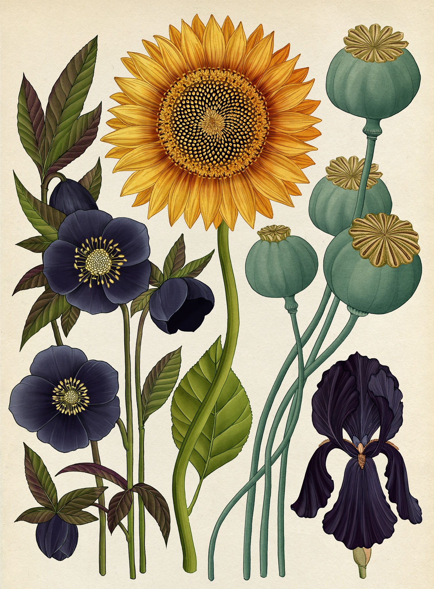
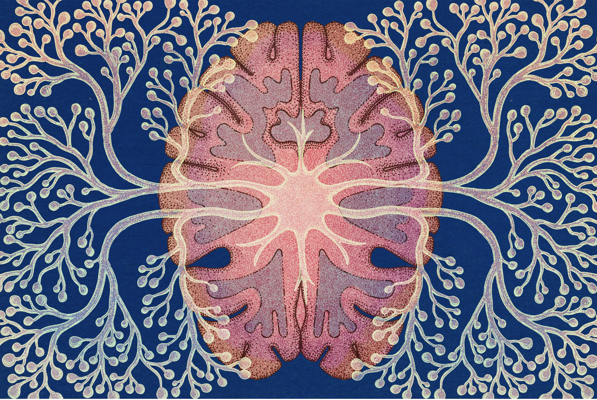
(Not from Varoom). Katie Scott
What do you find inspiring? I love Katie Scott’s works. She turns her research of ancient science and scientific theories about the world into fantasy-like illustrations of regular biological things like plants, animals, fungus, evolution (dinosaurs), etc. They look so normal, so calm, yet so odd, some of the time. They’re so real, yet sometimes look like they’re not from this world.
What medium(s) do they use? Pen on paper, scanned watercolour swatches with adjusted hues
How do they creatively interpret the text for the article? Oops. Katie Scott isn’t from Varoom. I did this before I realised the artists were supposed to be from Varoom.