
CONCEPT

The original inspiration came from Nuno Andrade’s Urban Geometry series, where his compositions often contrasted urban geometry with a wide sky or space.
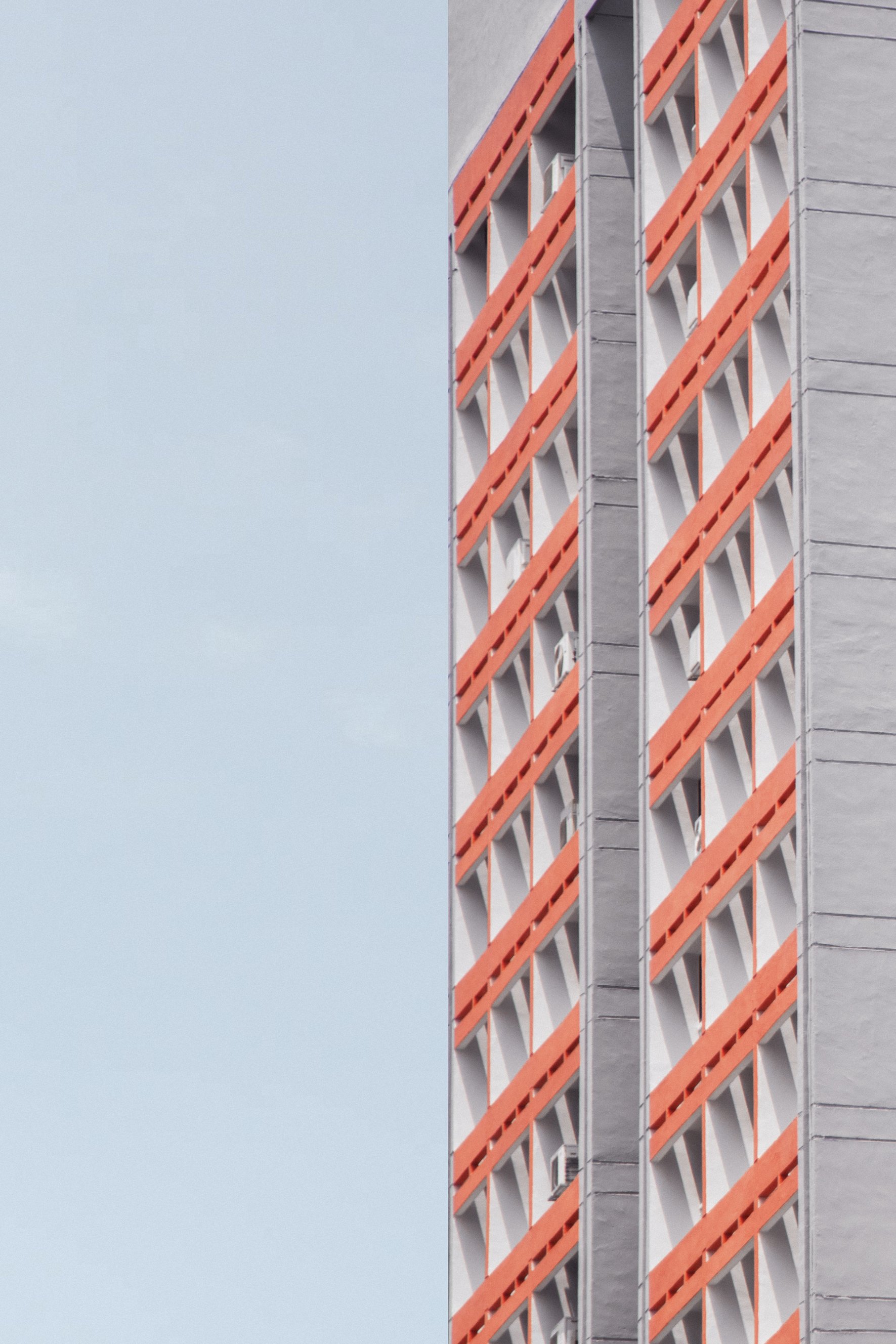
In Singapore, however, it is almost impossible to get a full, open view of the sky because of how much of an urban, high-rise jungle we are. Instead of a full sky, we get interrupted by tall buildings or structures, hence came about Look Up – what happens when you look up in Singapore.
[Click on images to open and compare]
AN OVERVIEW


TECHNICAL DECISIONS
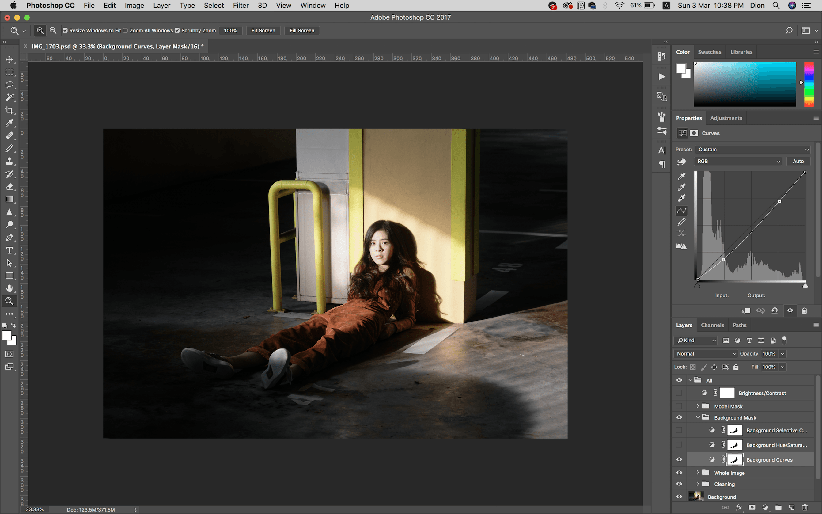
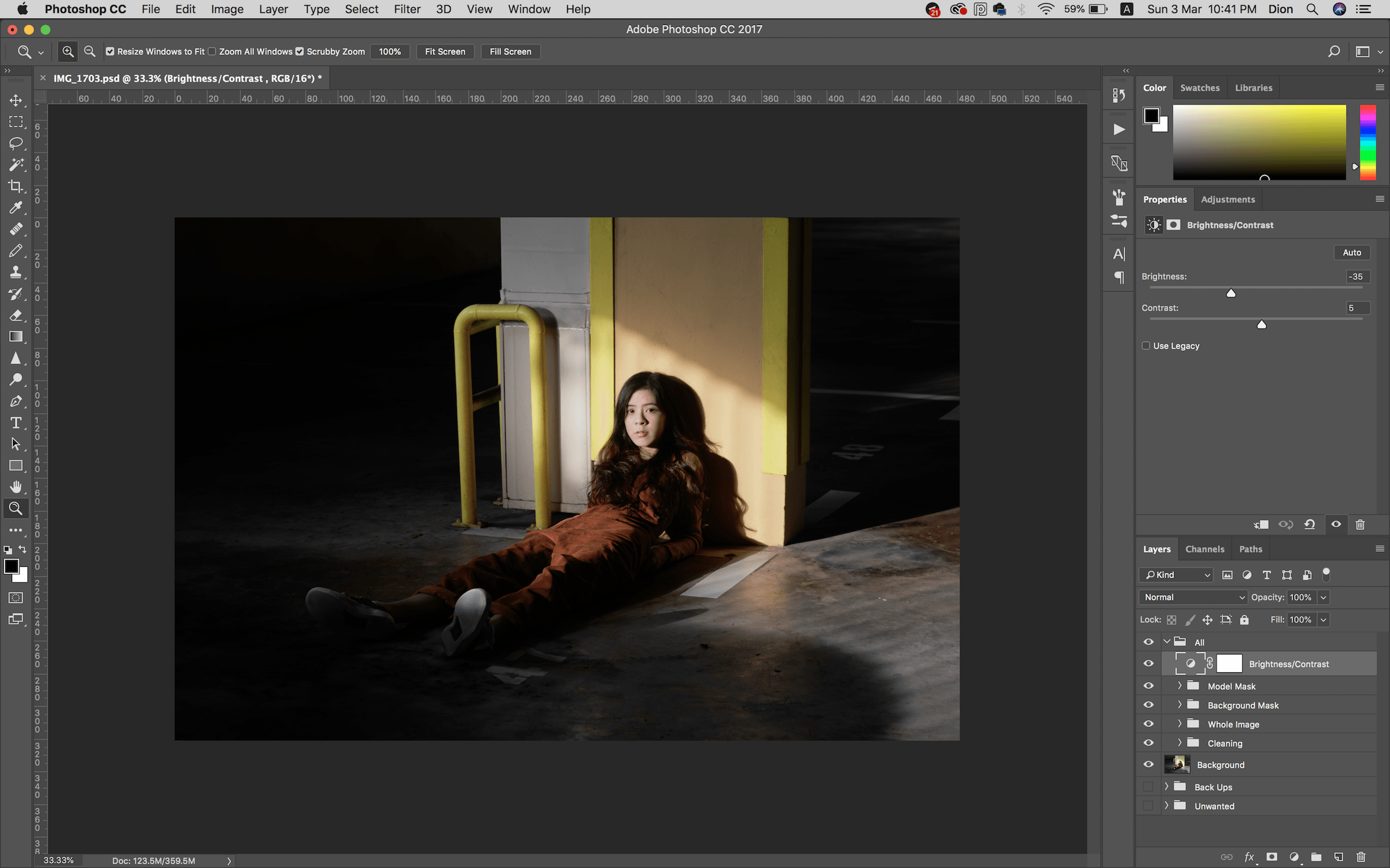
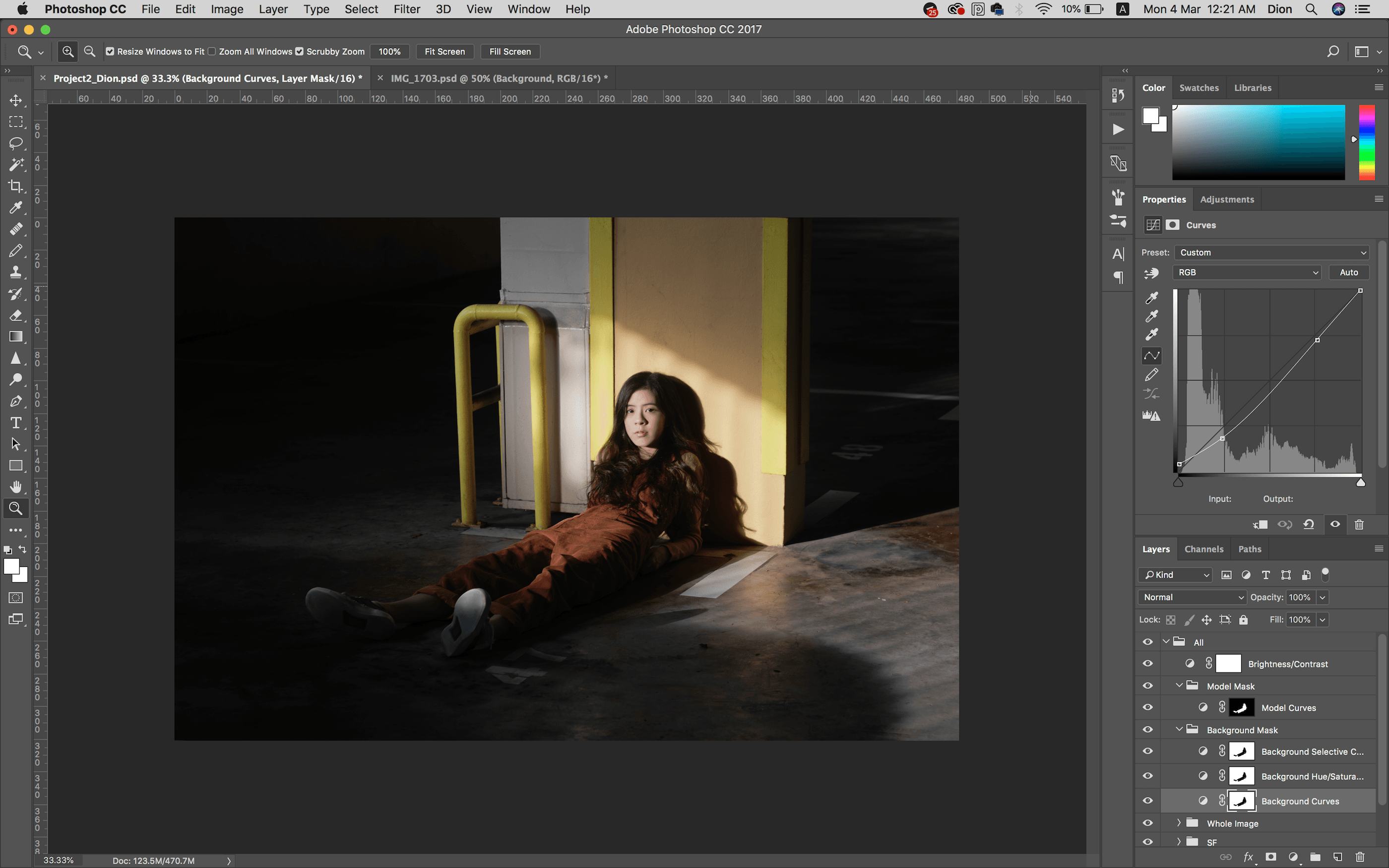
Camera Process:
Shot on a Canon EOS 77D, EF-S 18-135mm f/3.5-5.6 IS USM
Content:
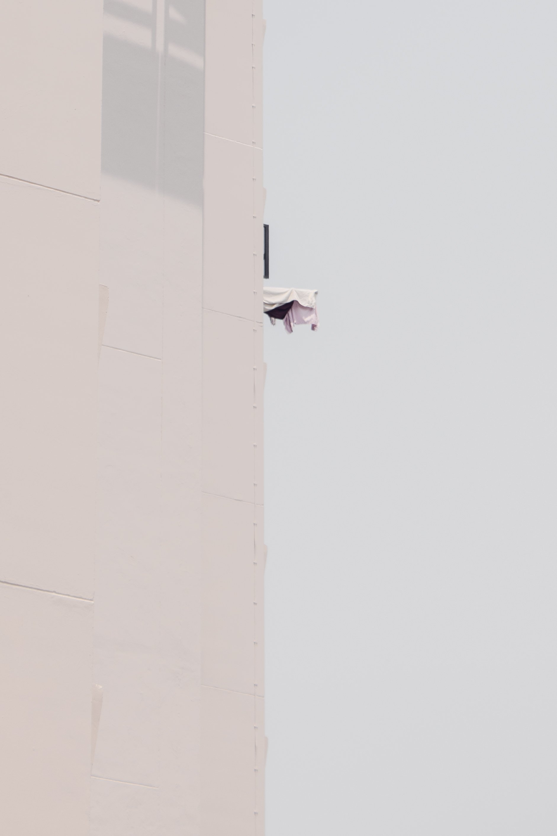
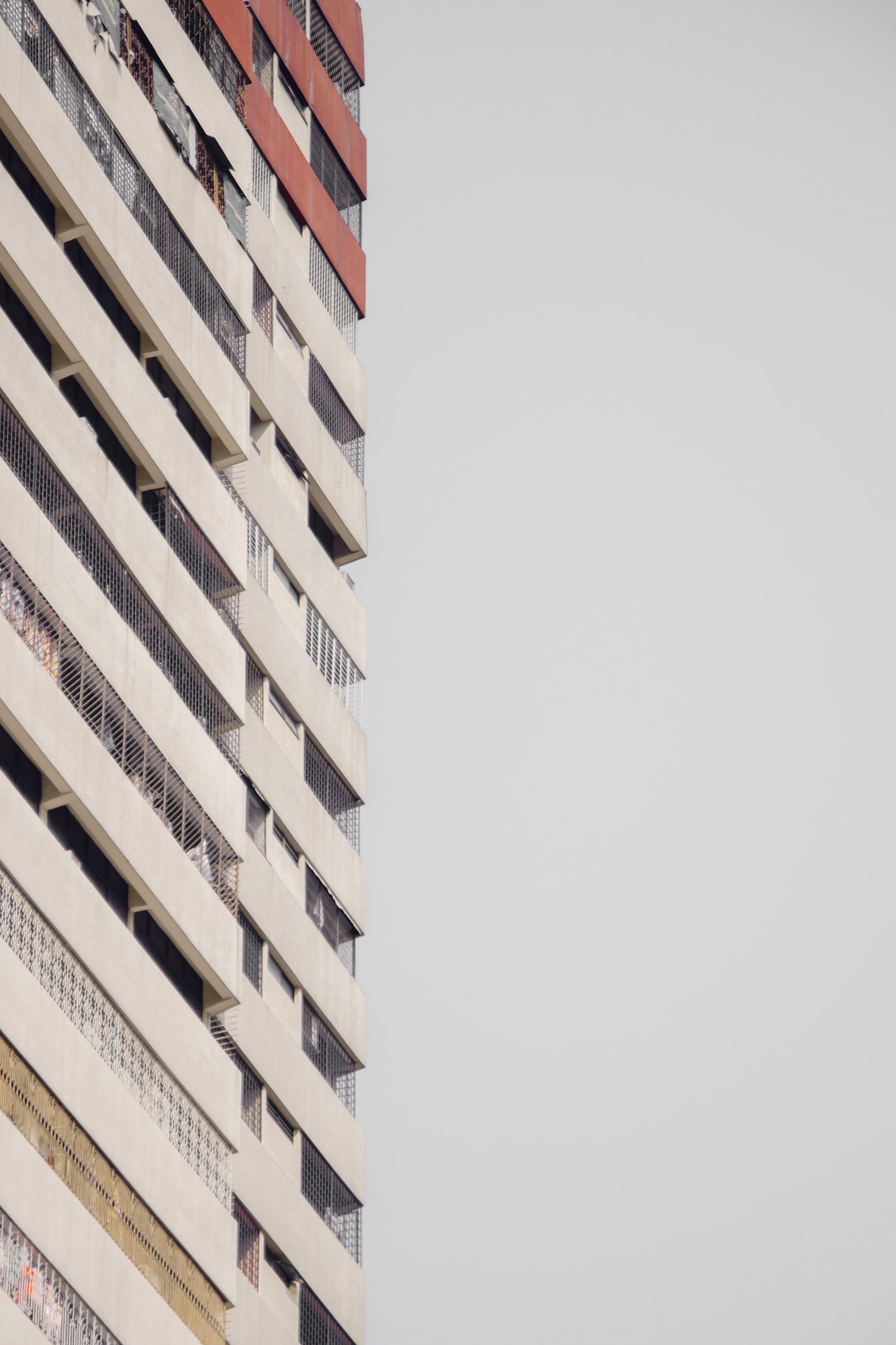
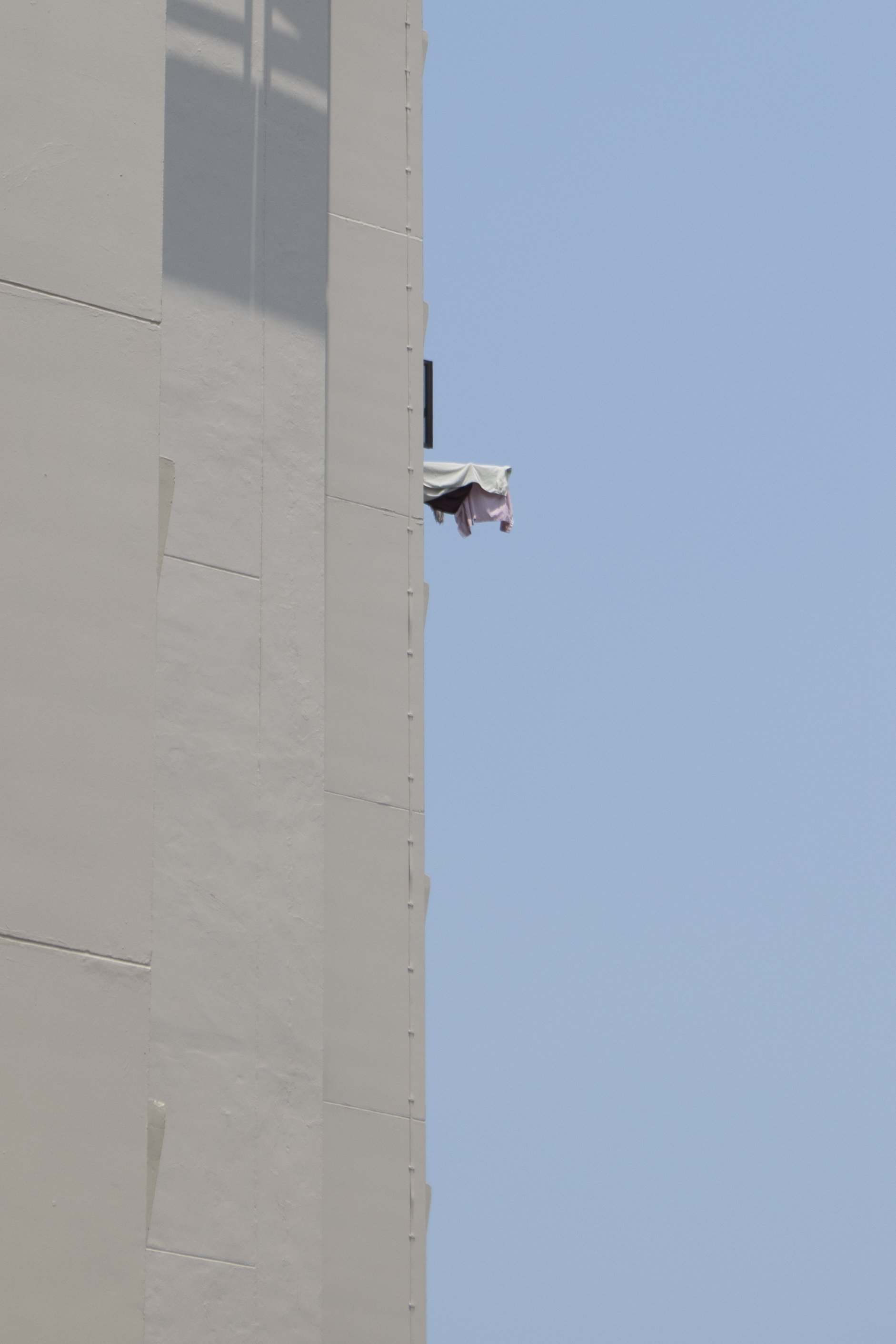
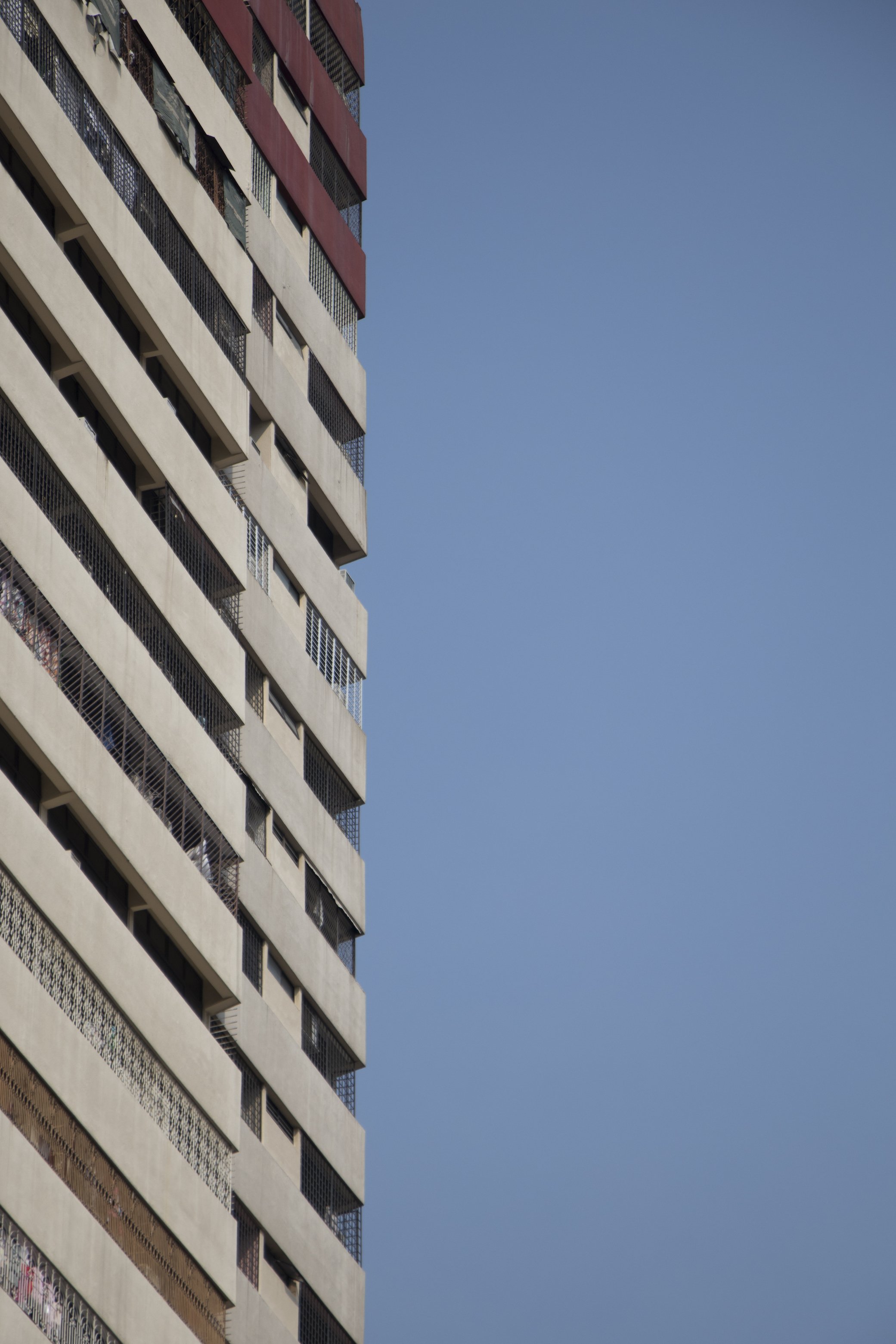
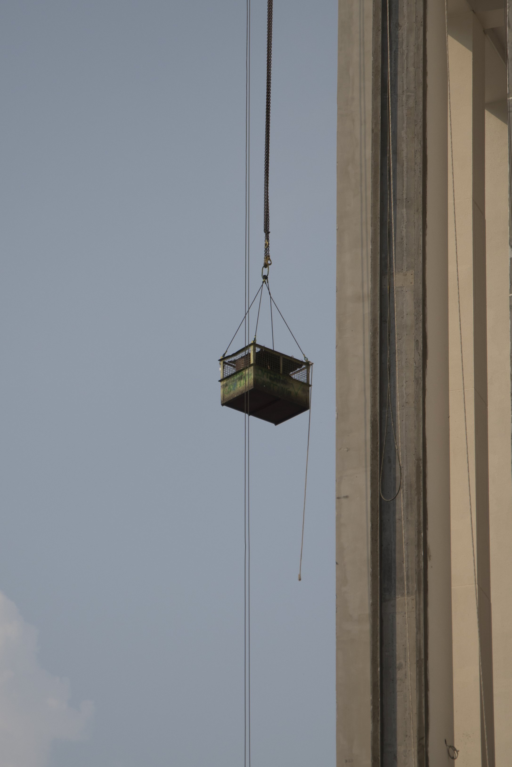
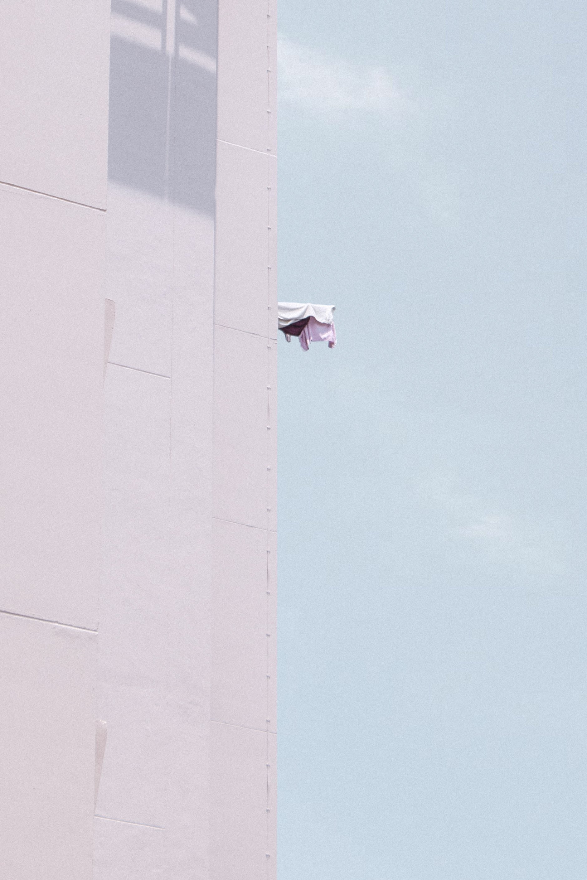
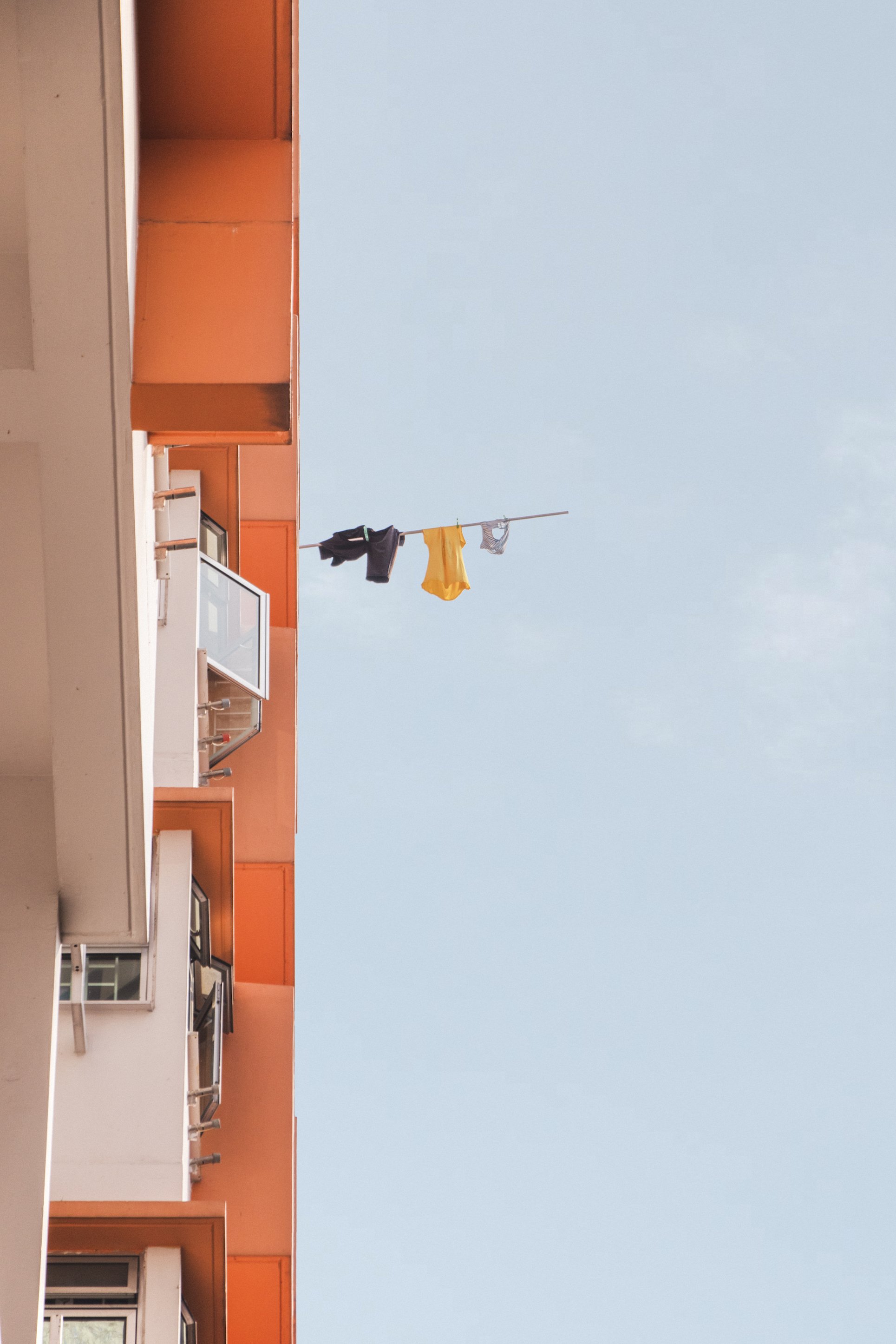
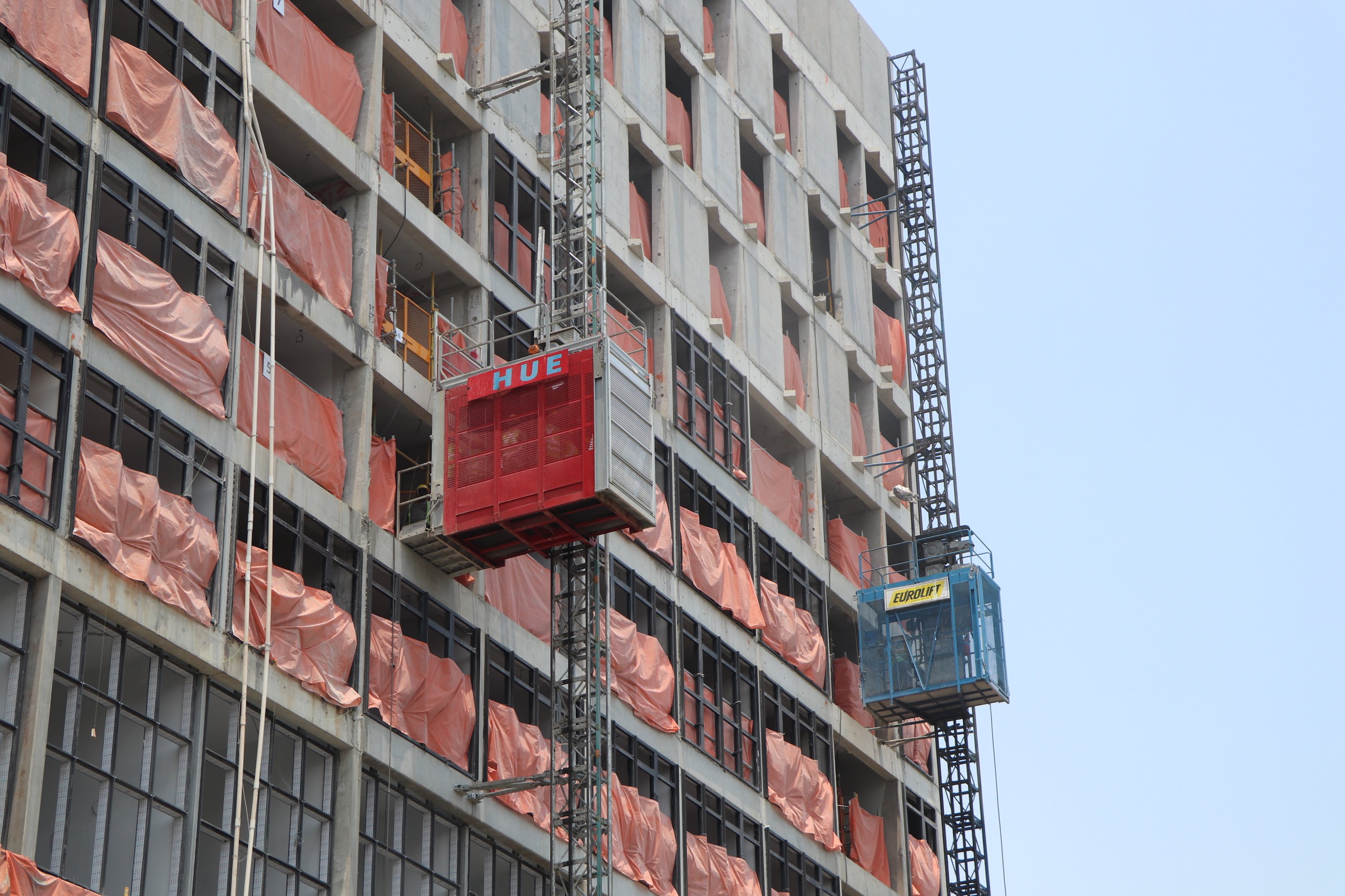
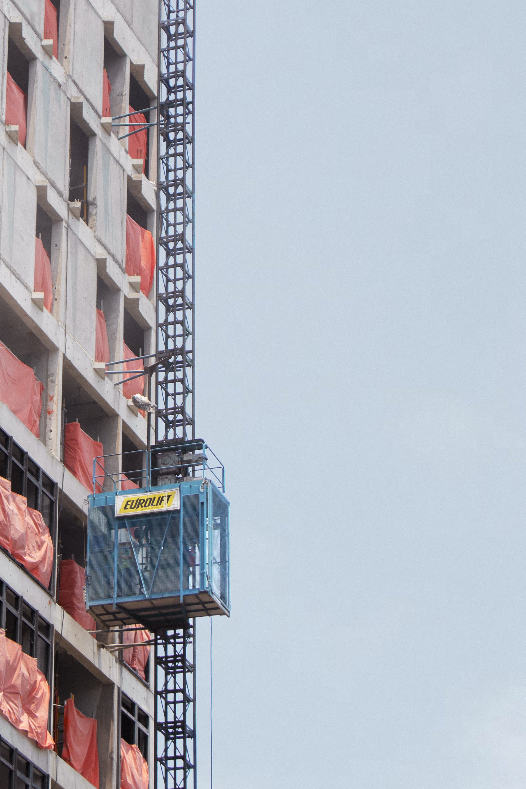
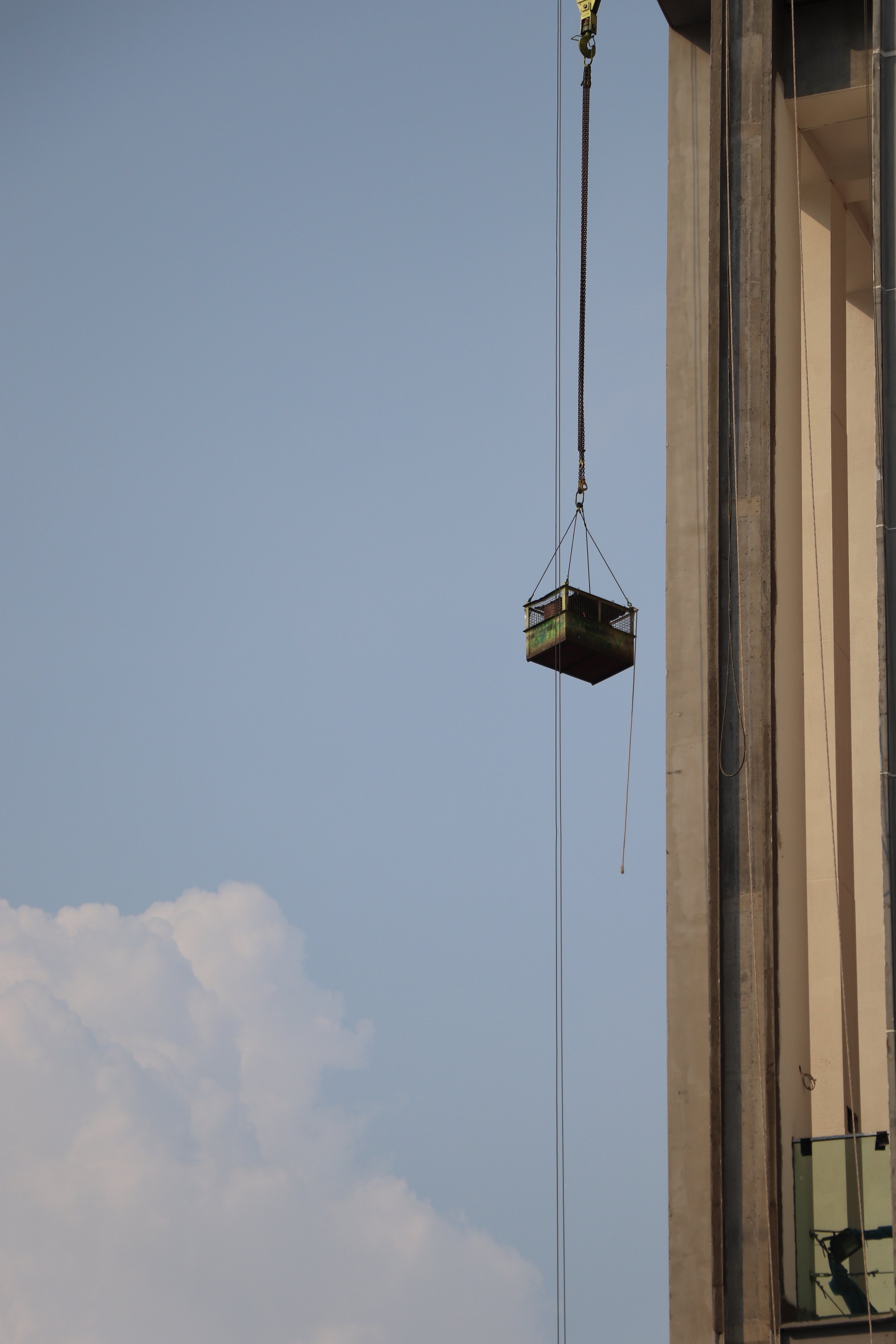
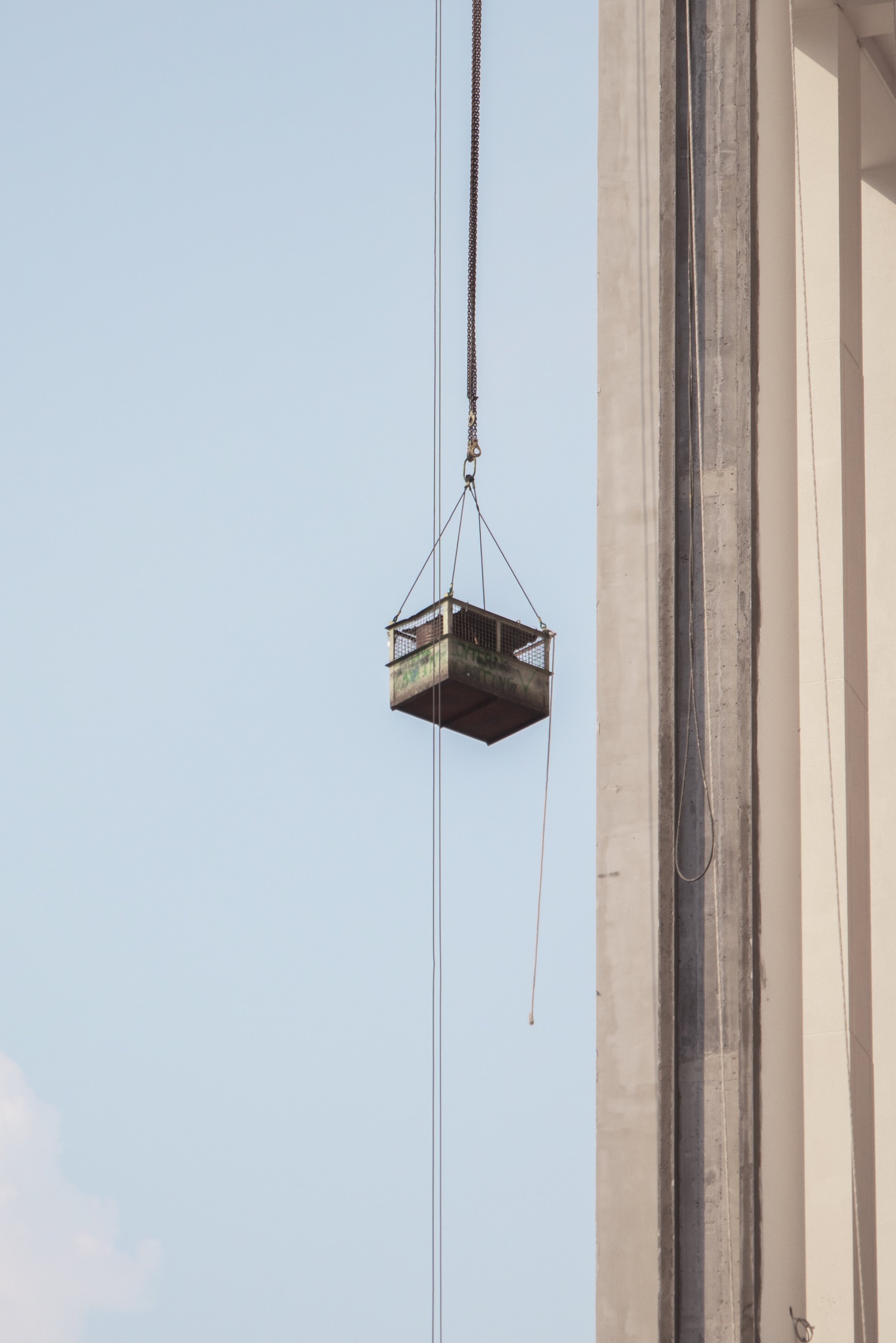
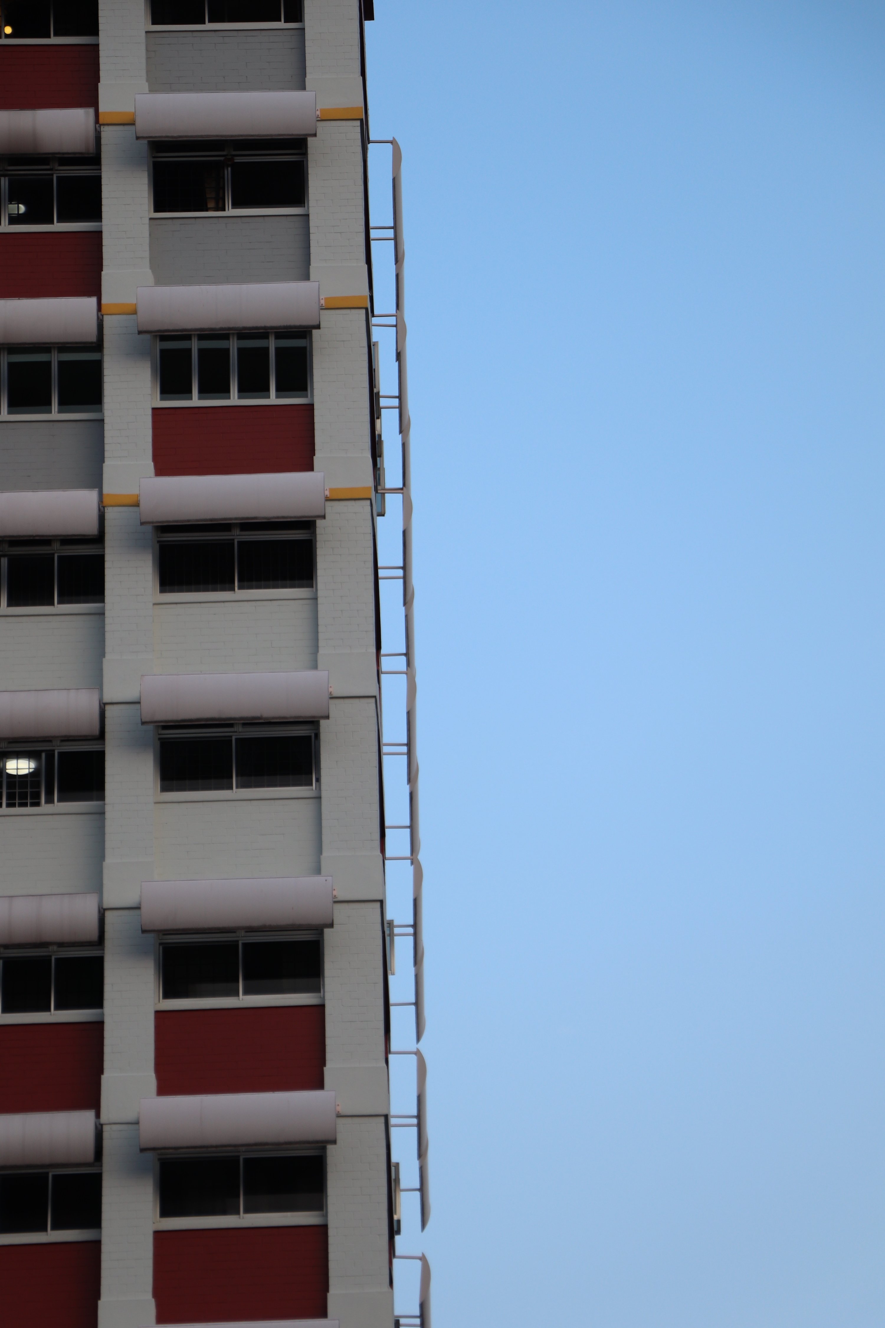
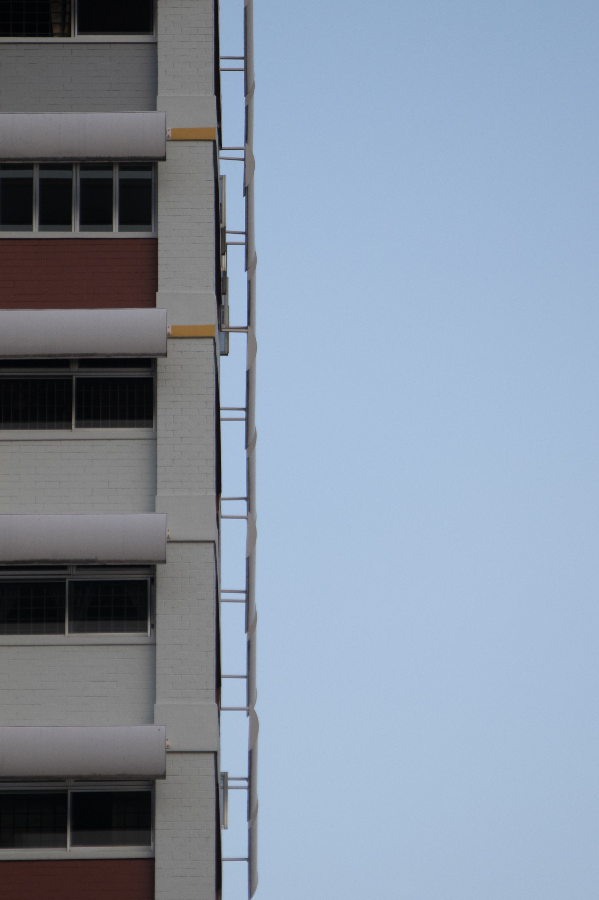
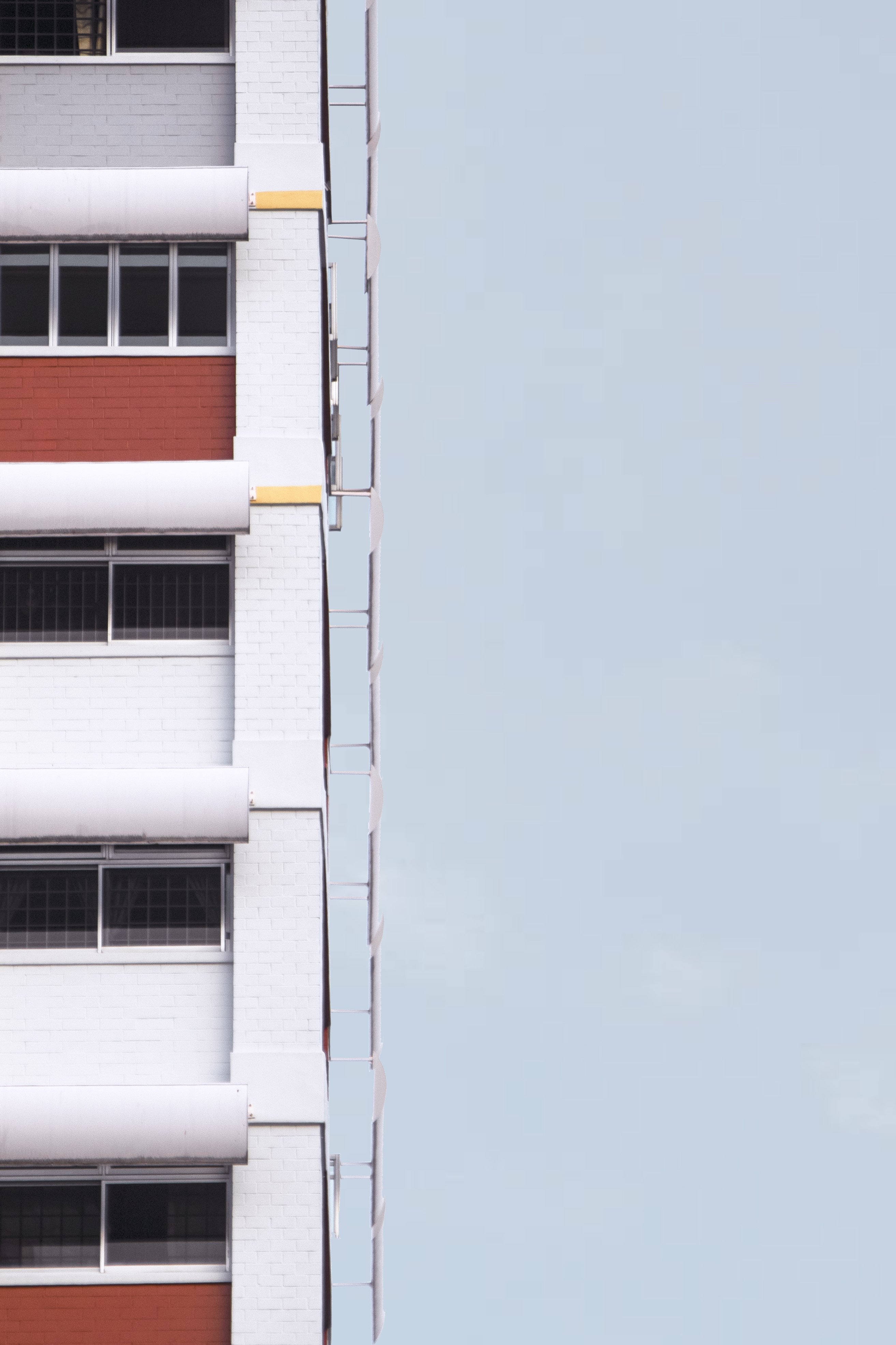
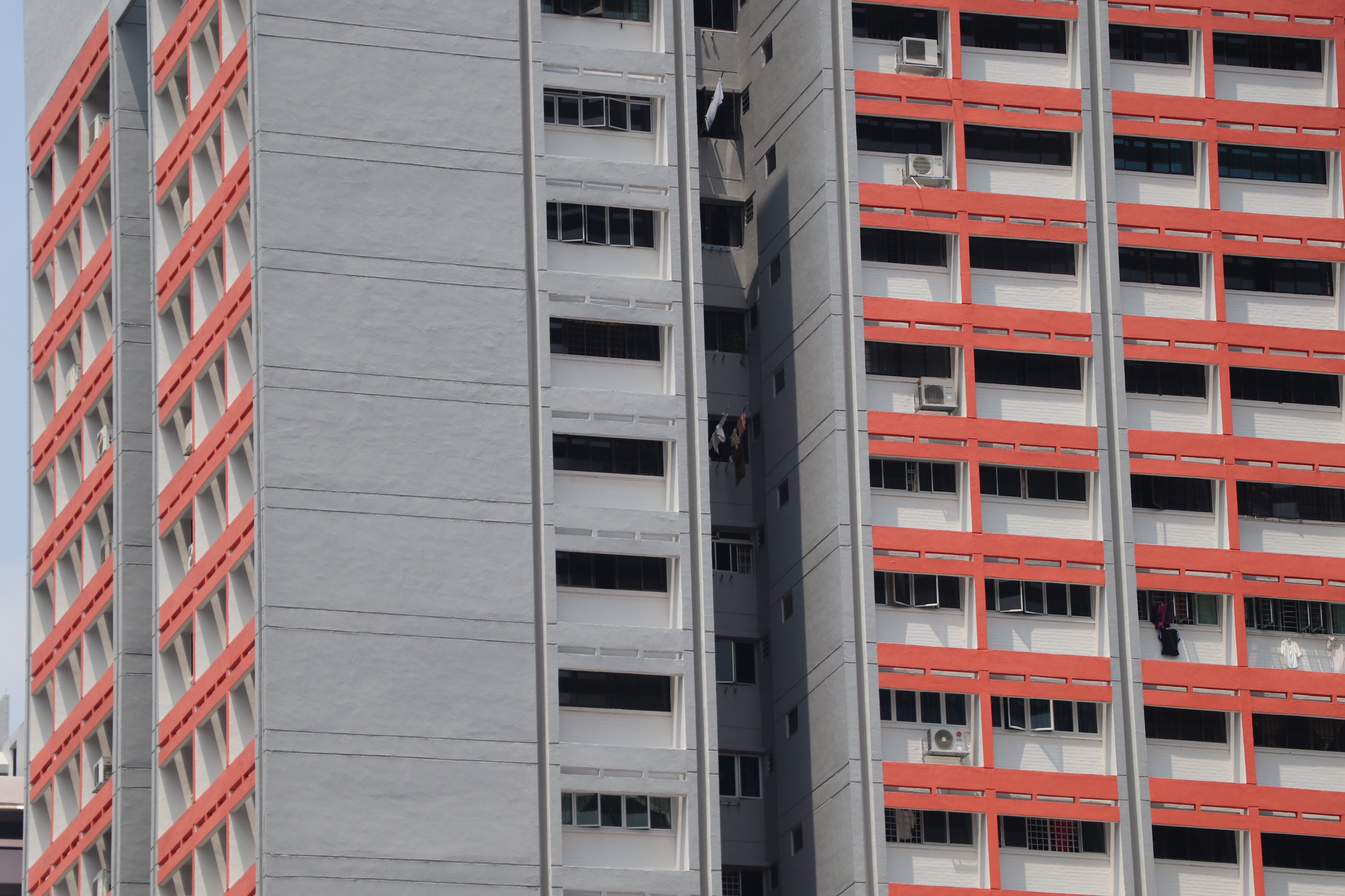
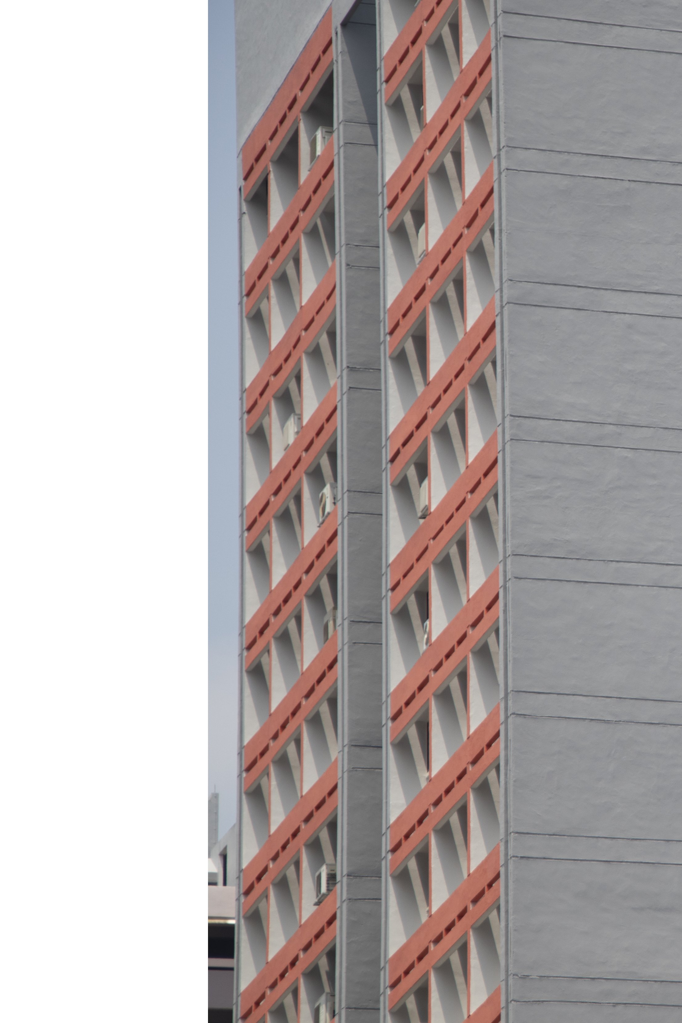
Framing involves a clean vertical ‘half’ cut between sky-structure – images are halved in different ratios for variation. An exploration of the different ways of seeing, the varieties of what would be considered the same type of structure (e.g. housing blocks, construction works).
Real vs. Manipulate:
Real images to of course, keep it real, and image manipulations to add a compelling twist – either to add a little pop of something or to make things seem a little abstract.
ONE
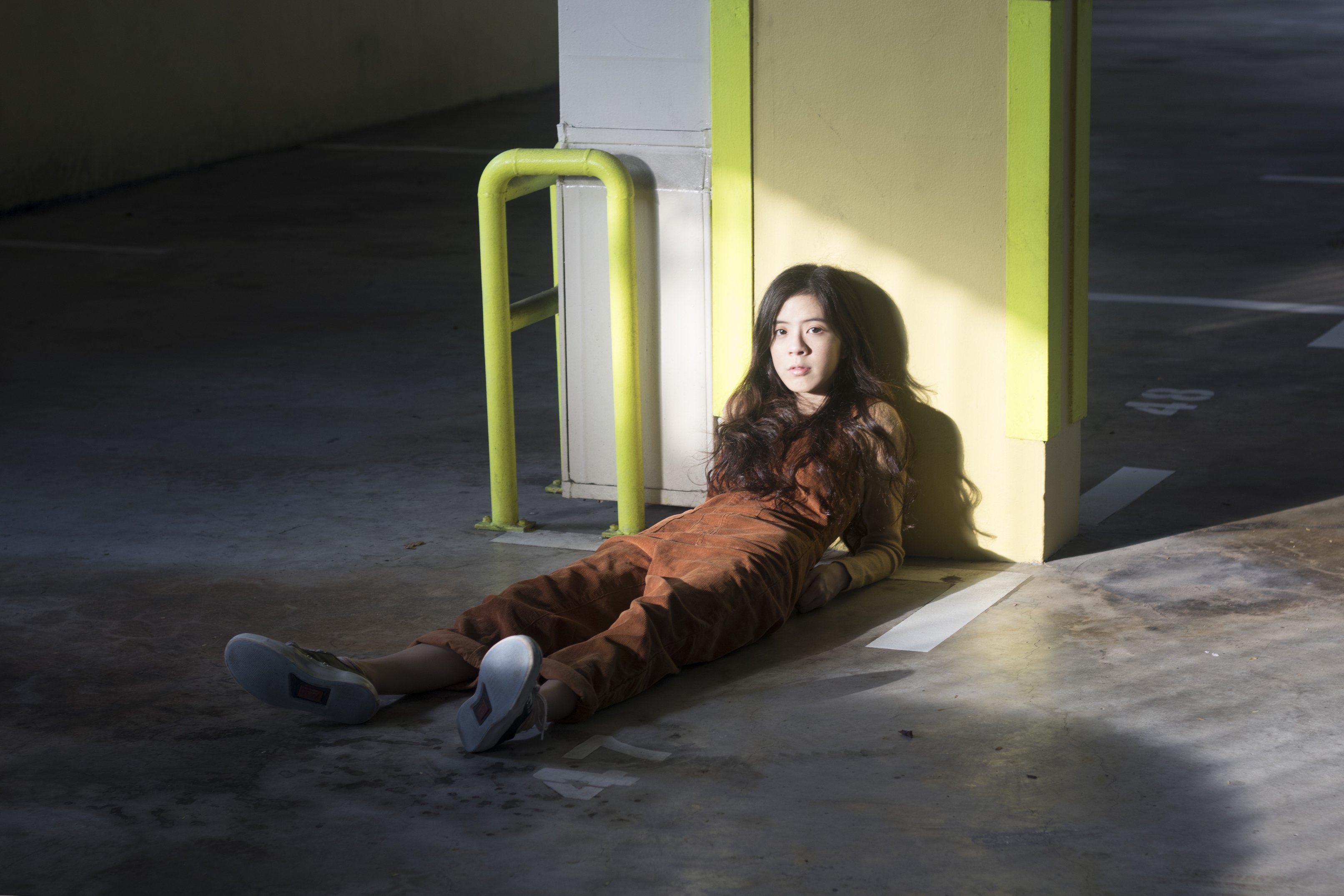
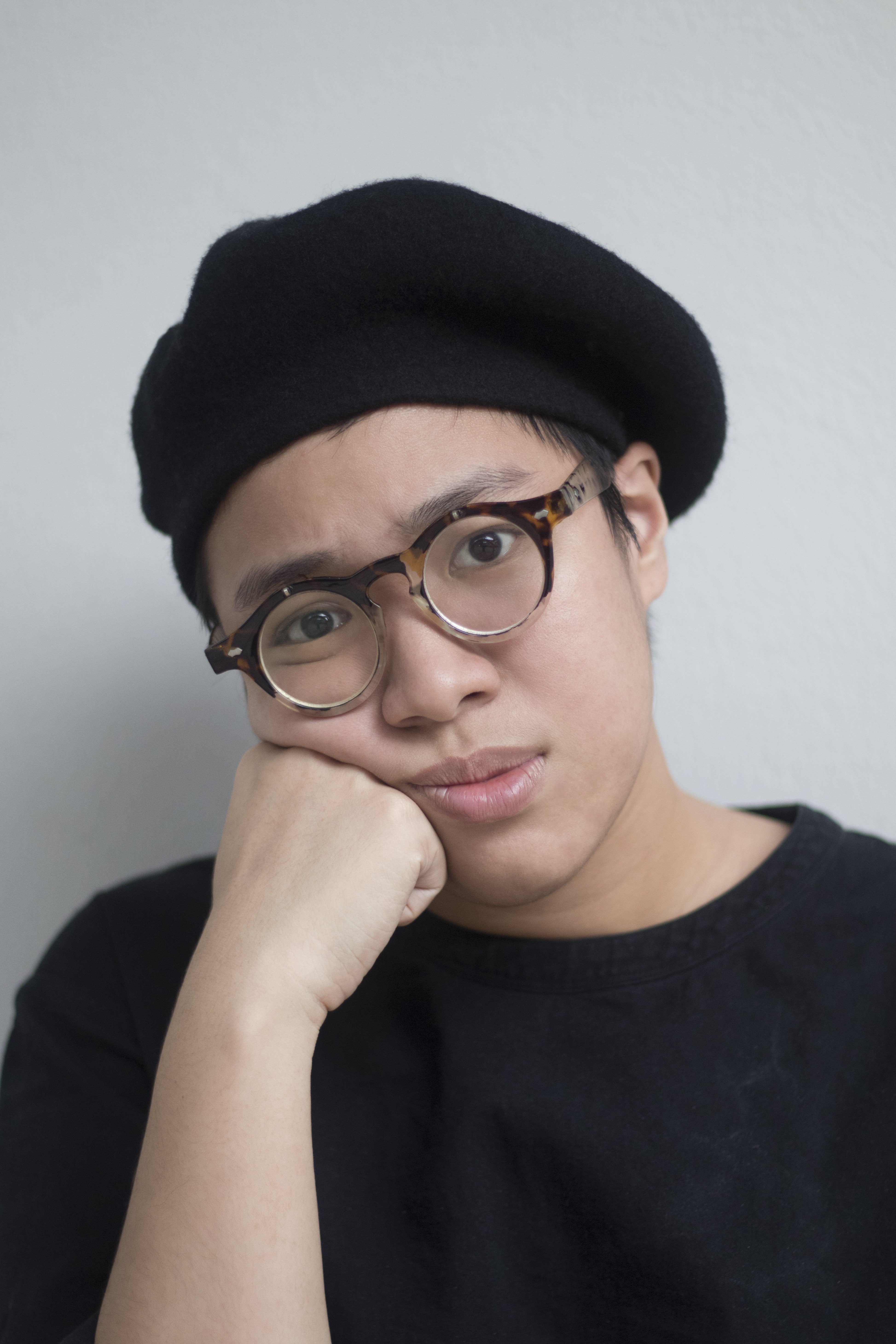
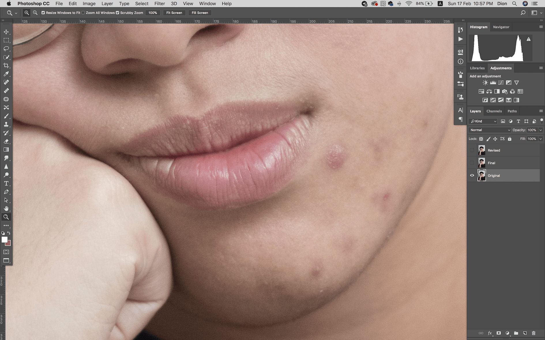
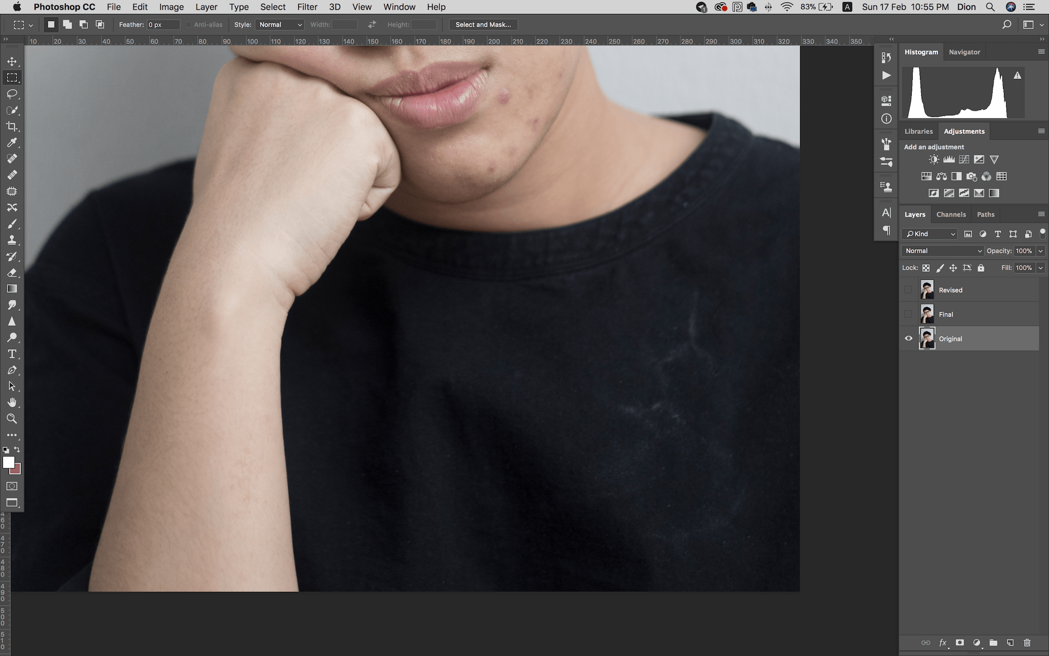
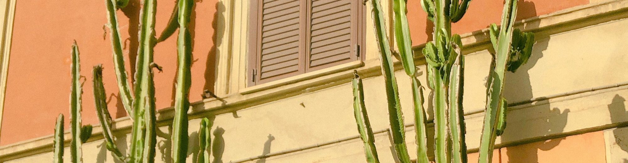
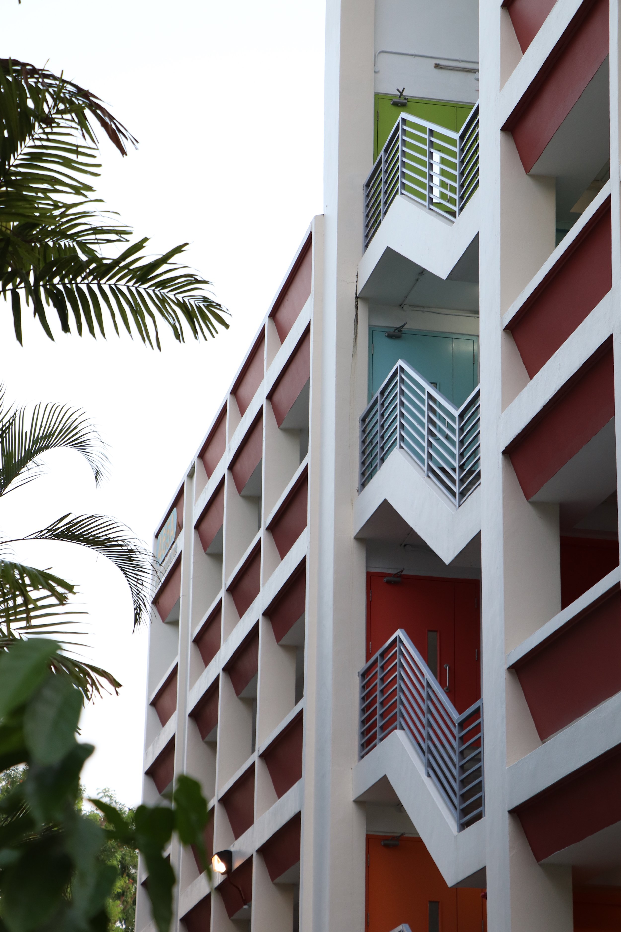
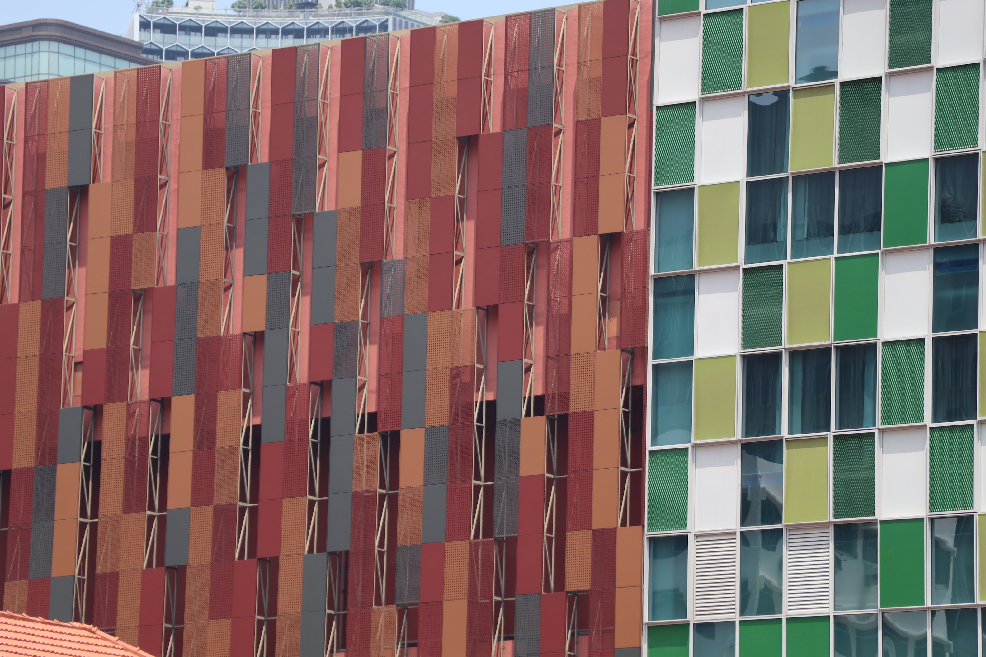
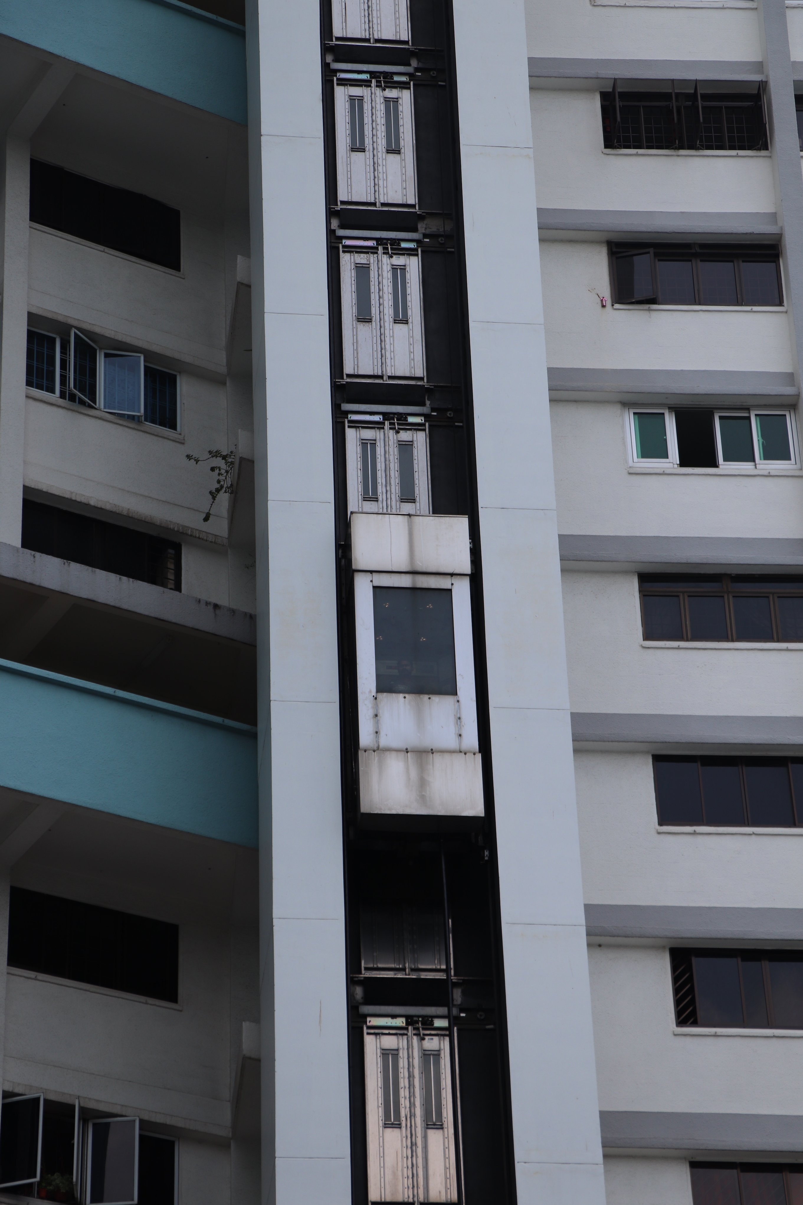
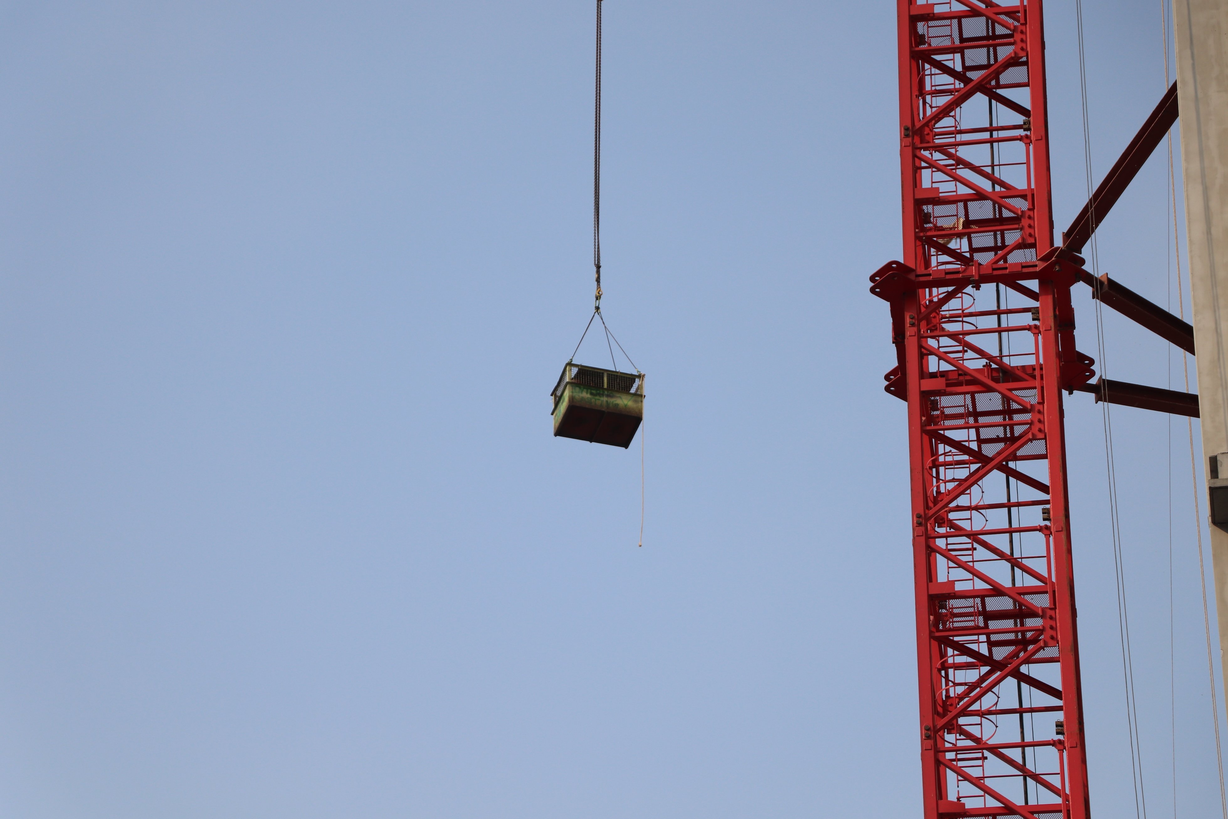
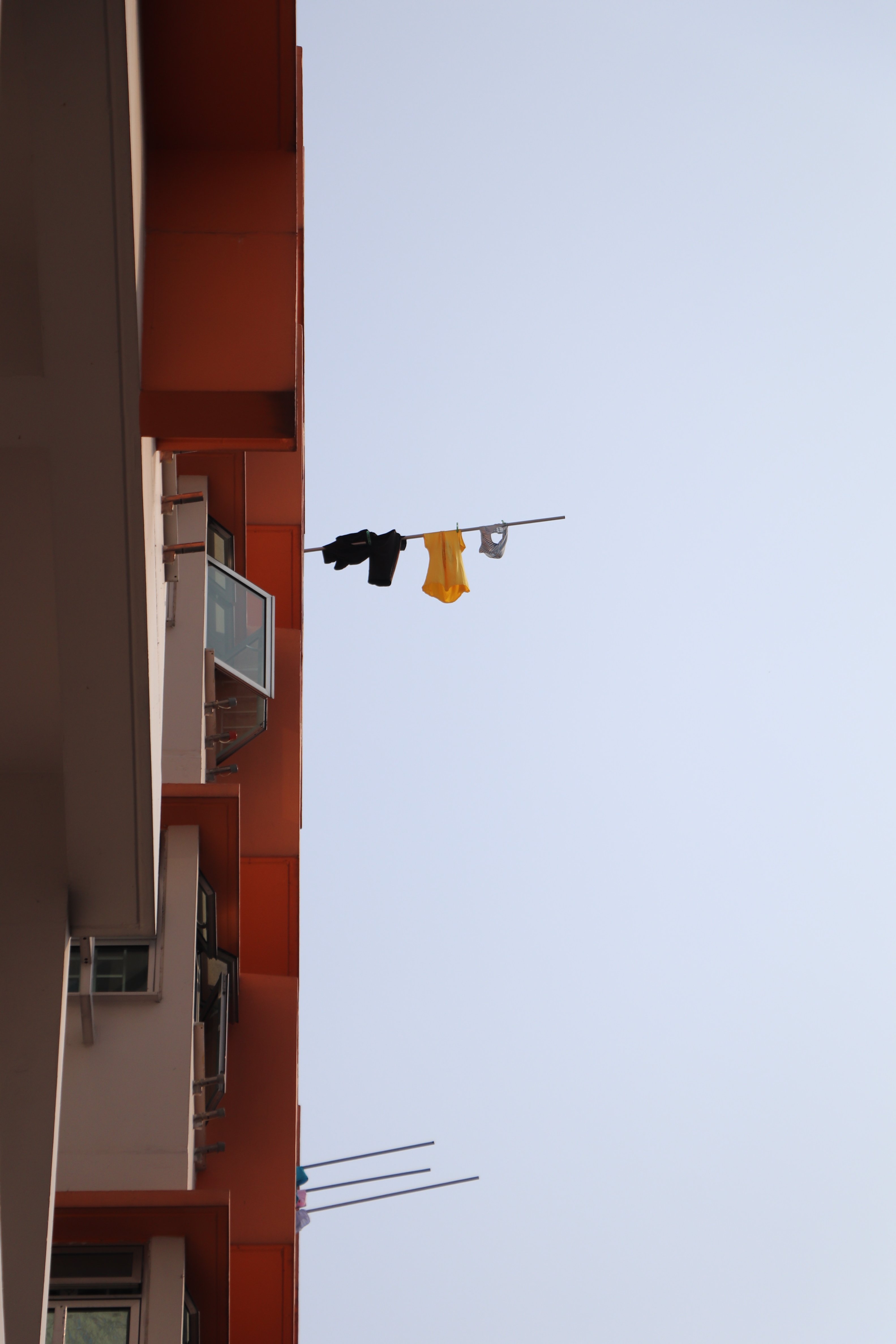
Original

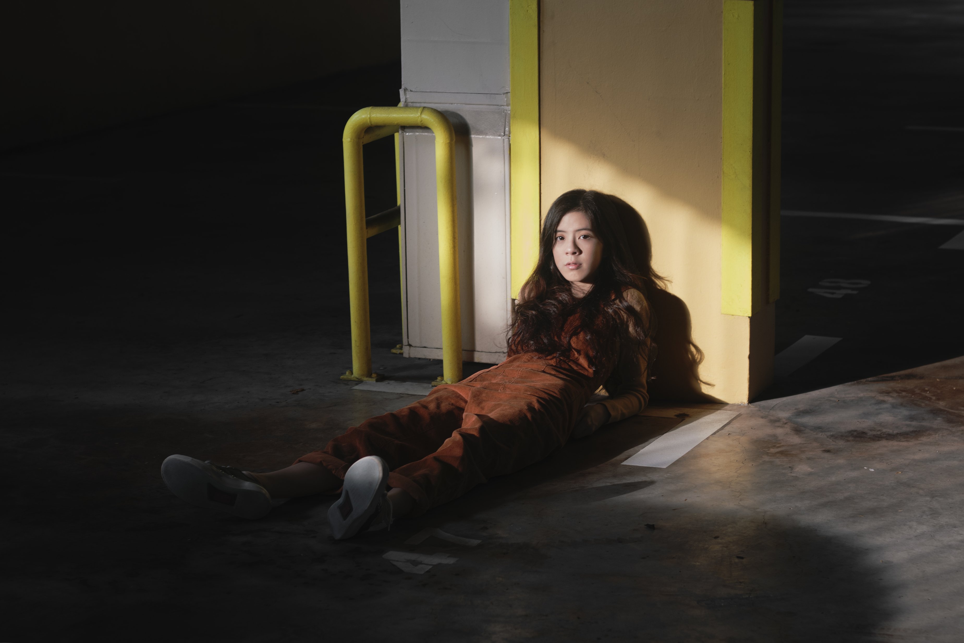
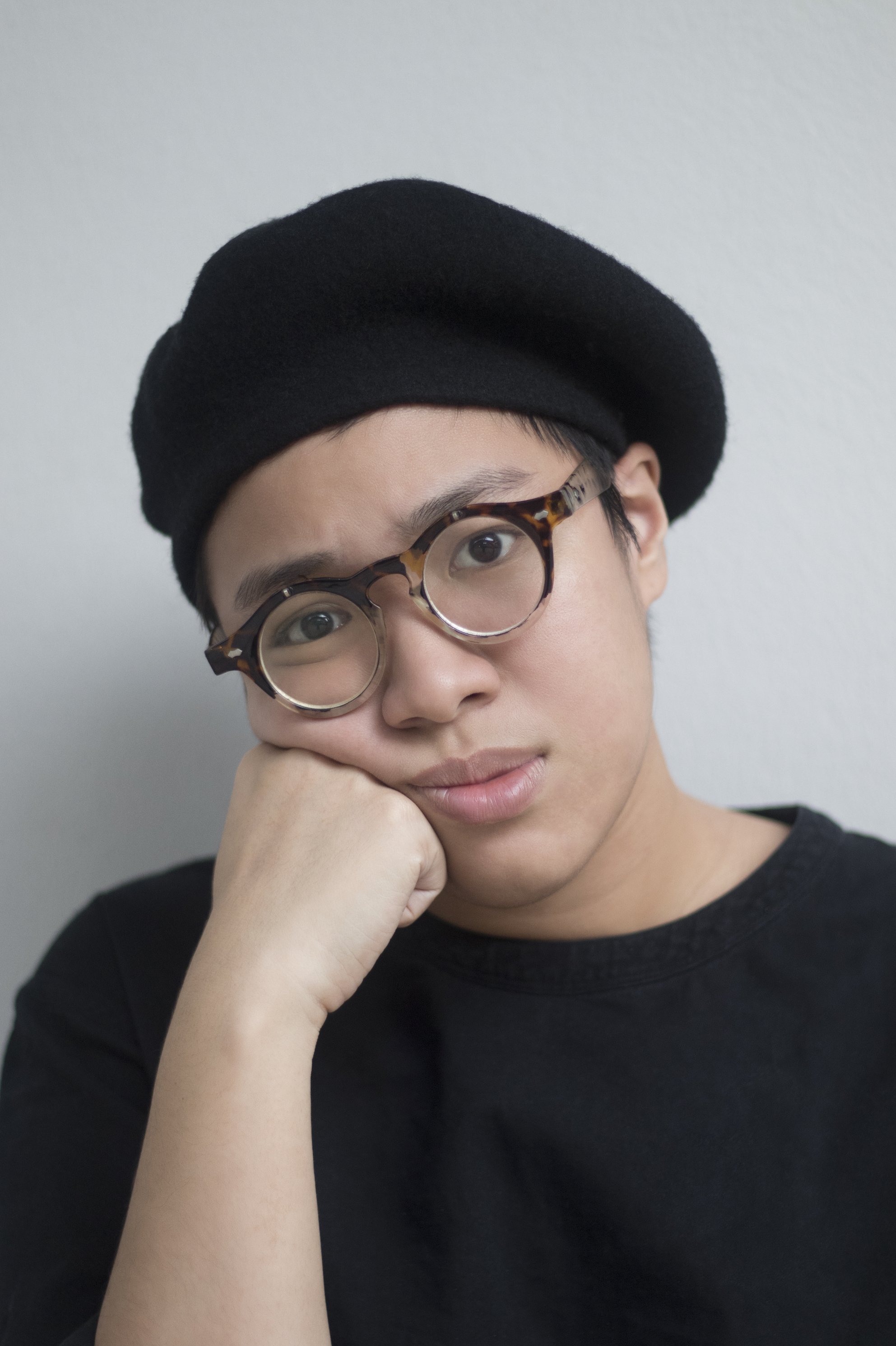
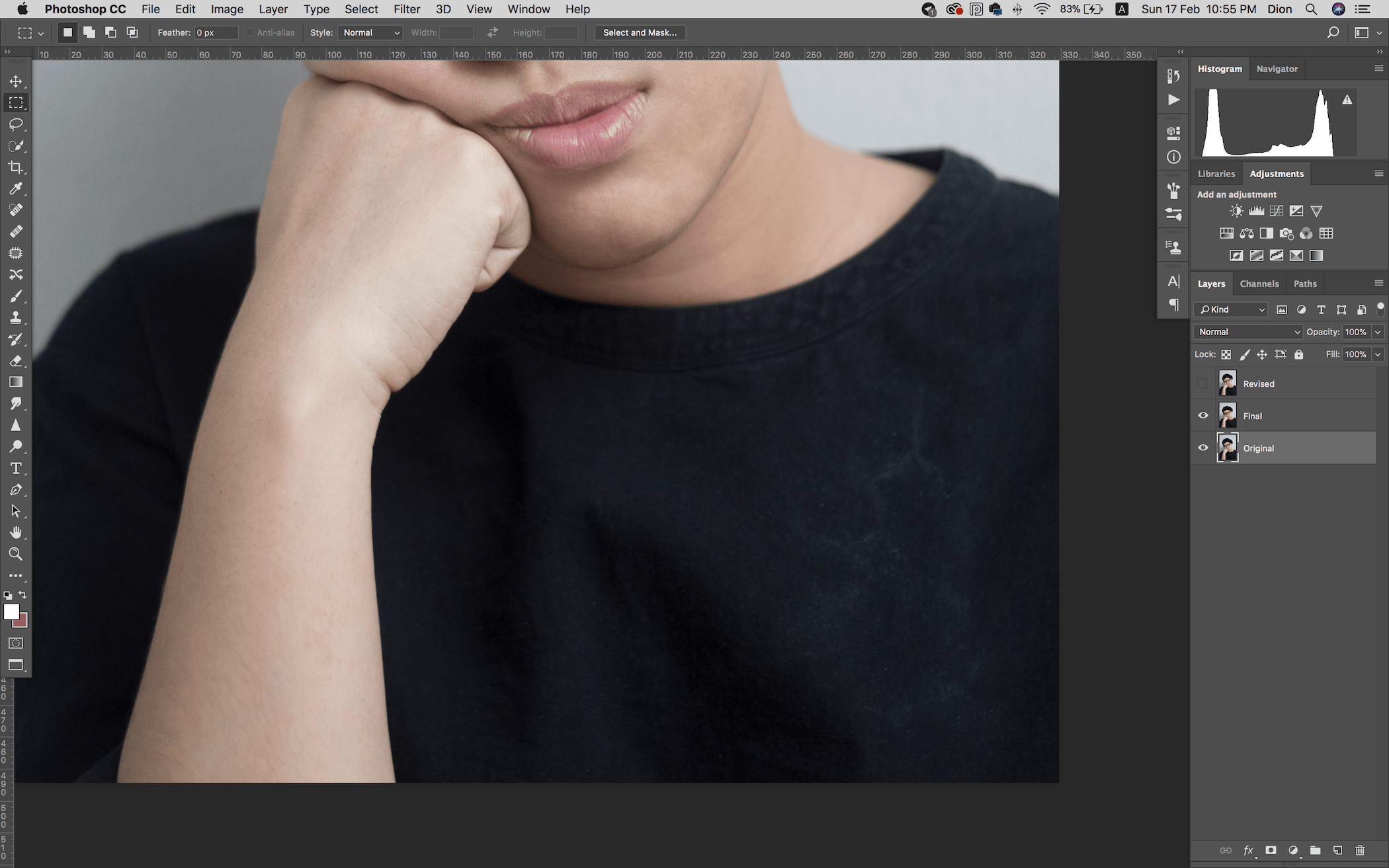
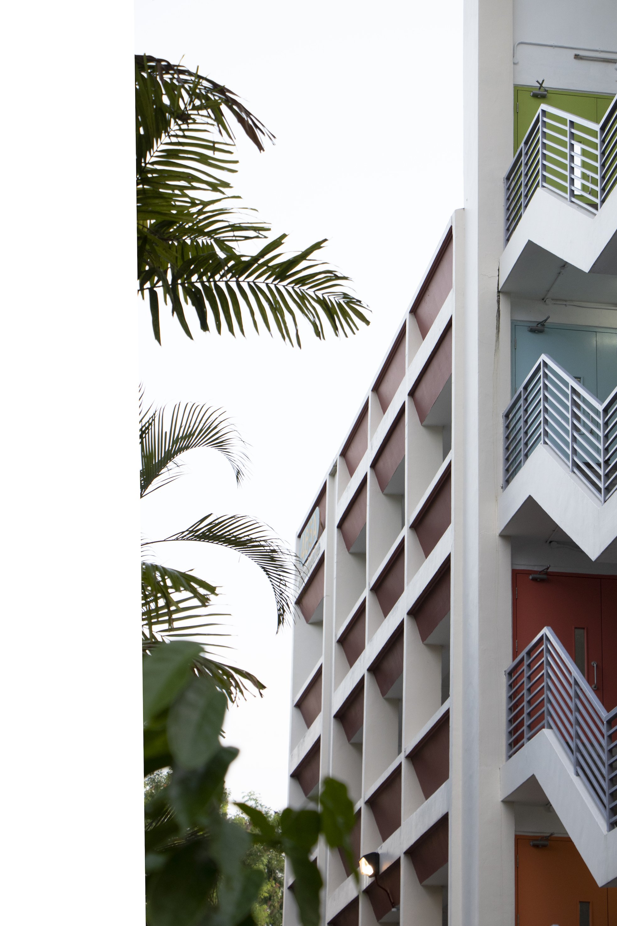
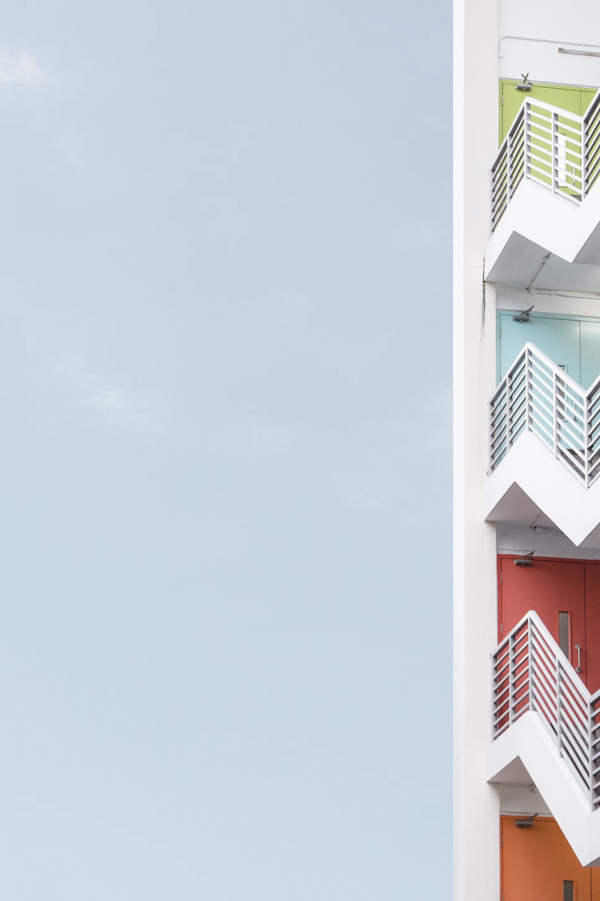
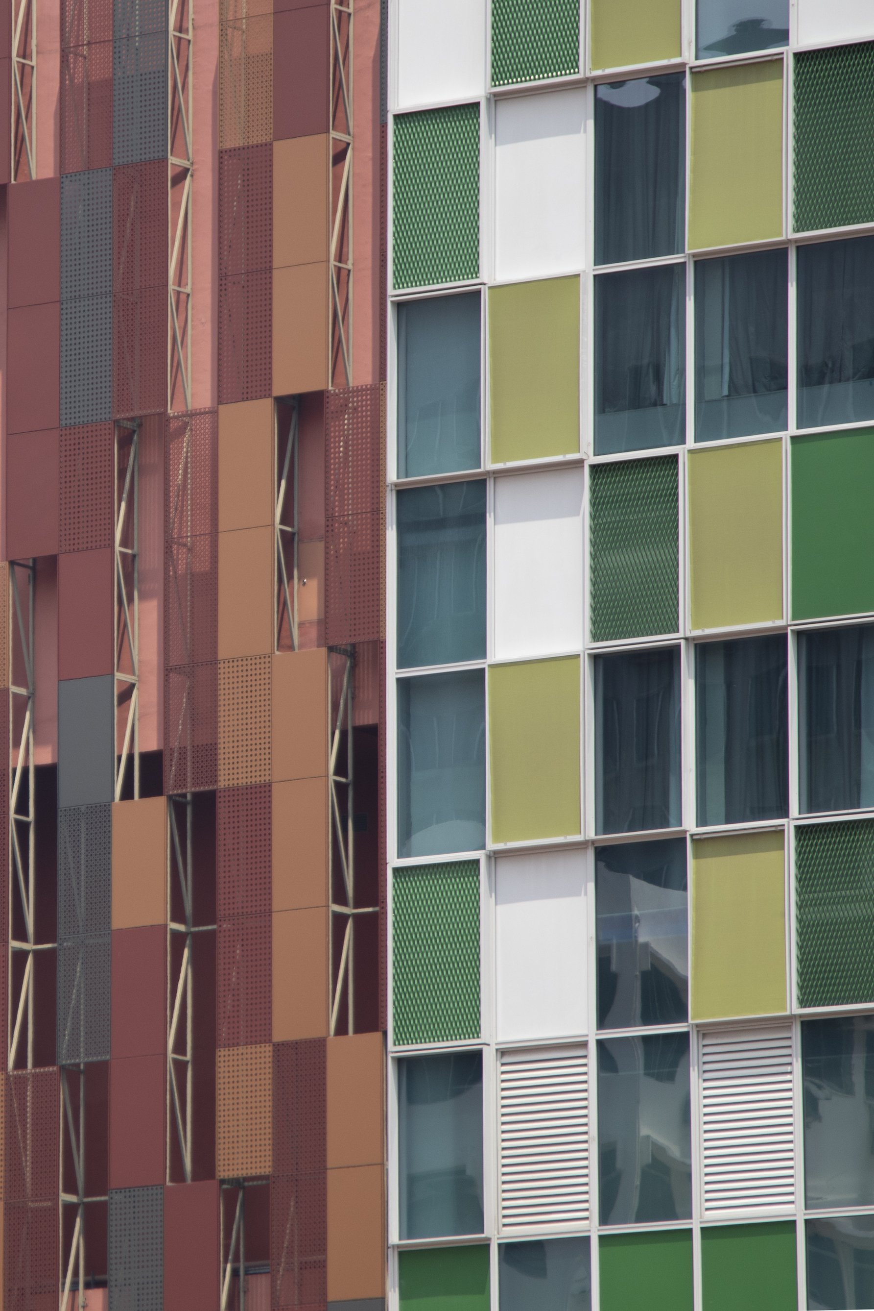
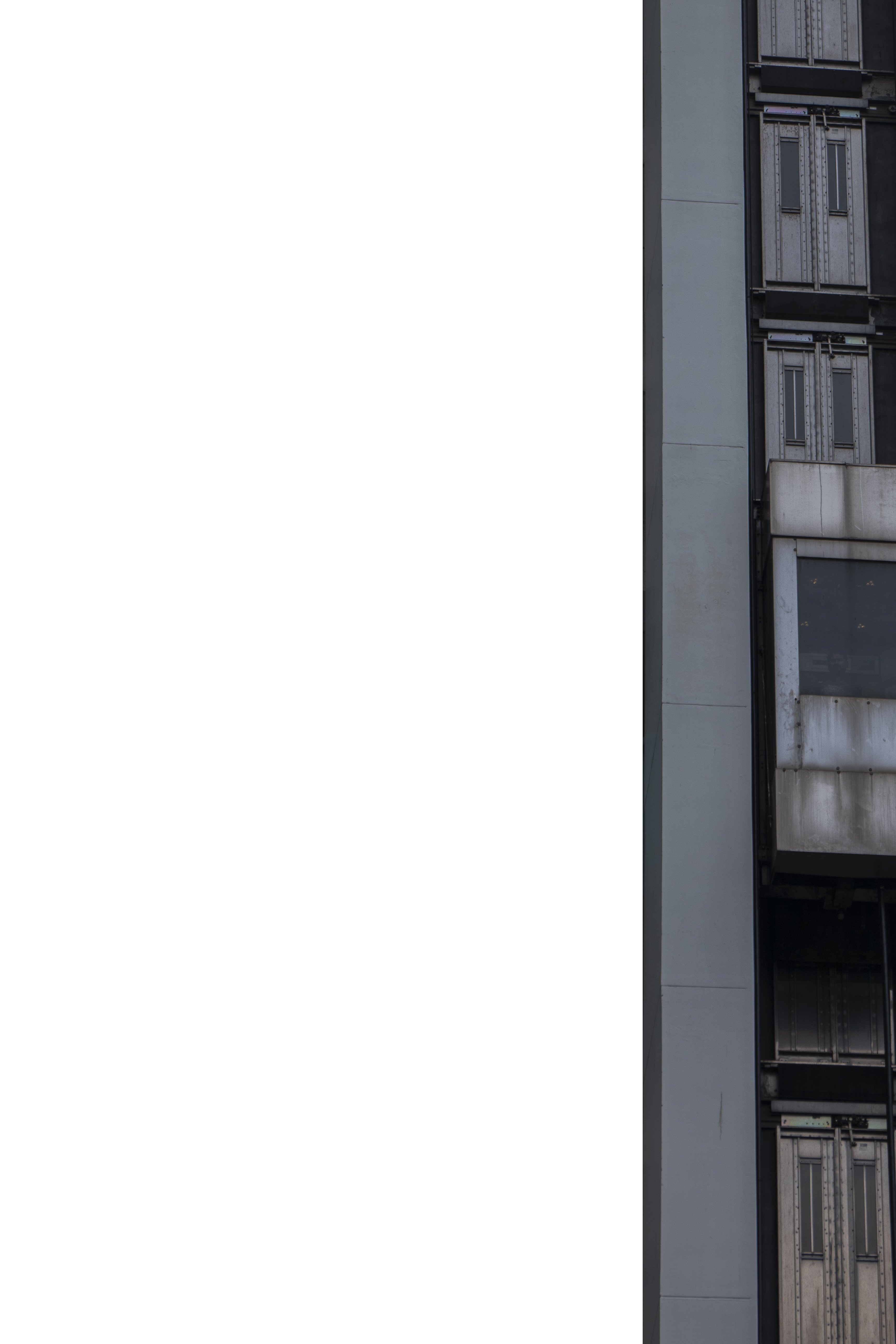
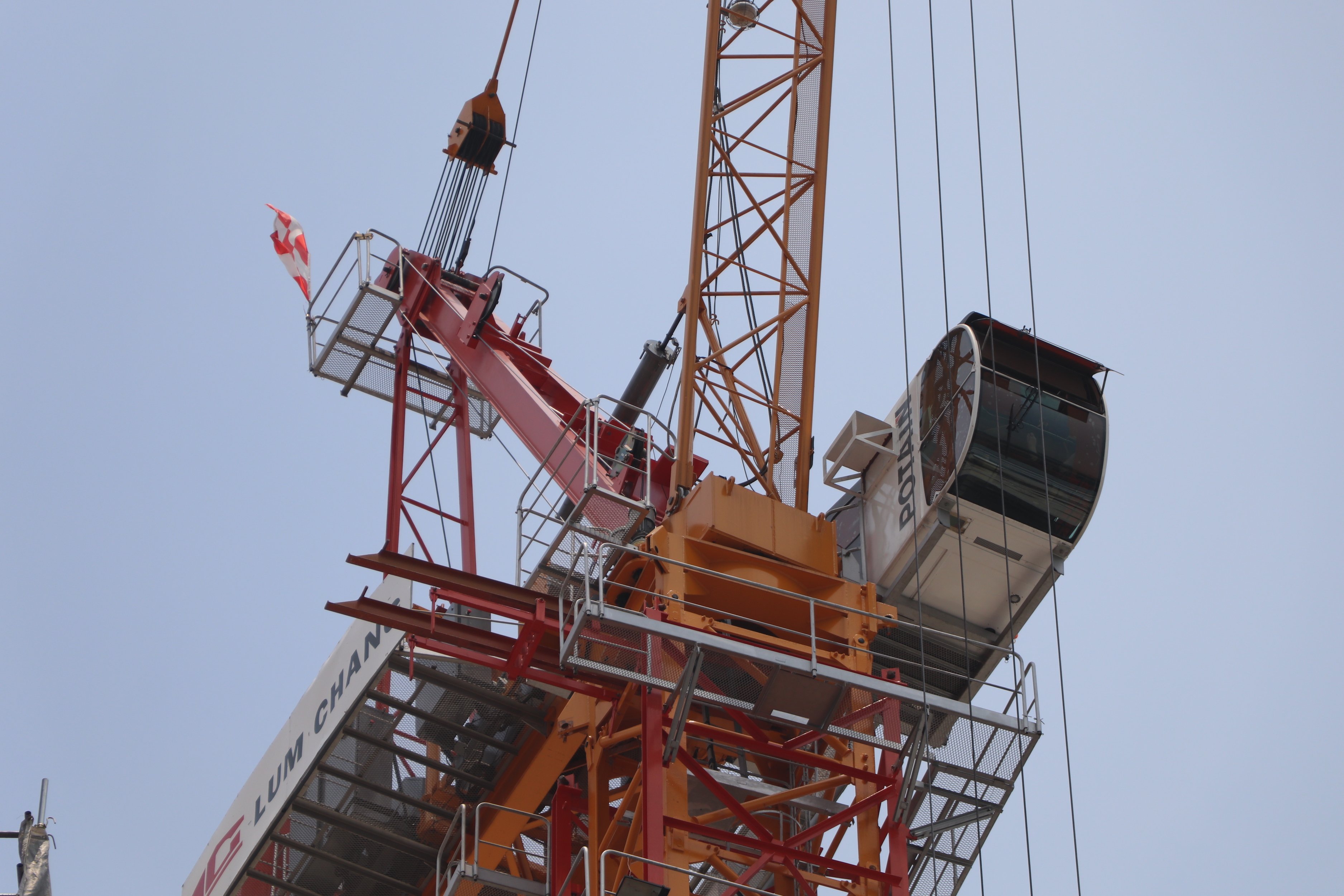
Cropped & Final

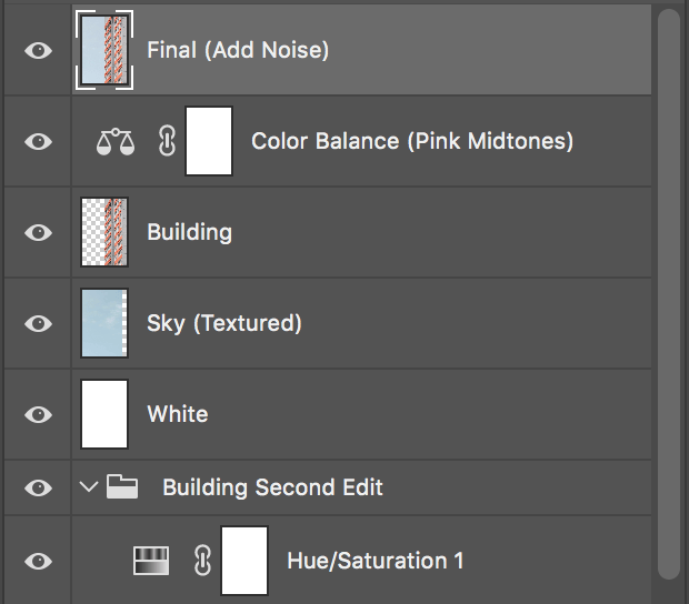
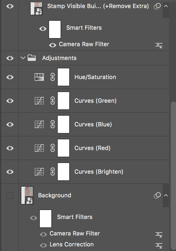
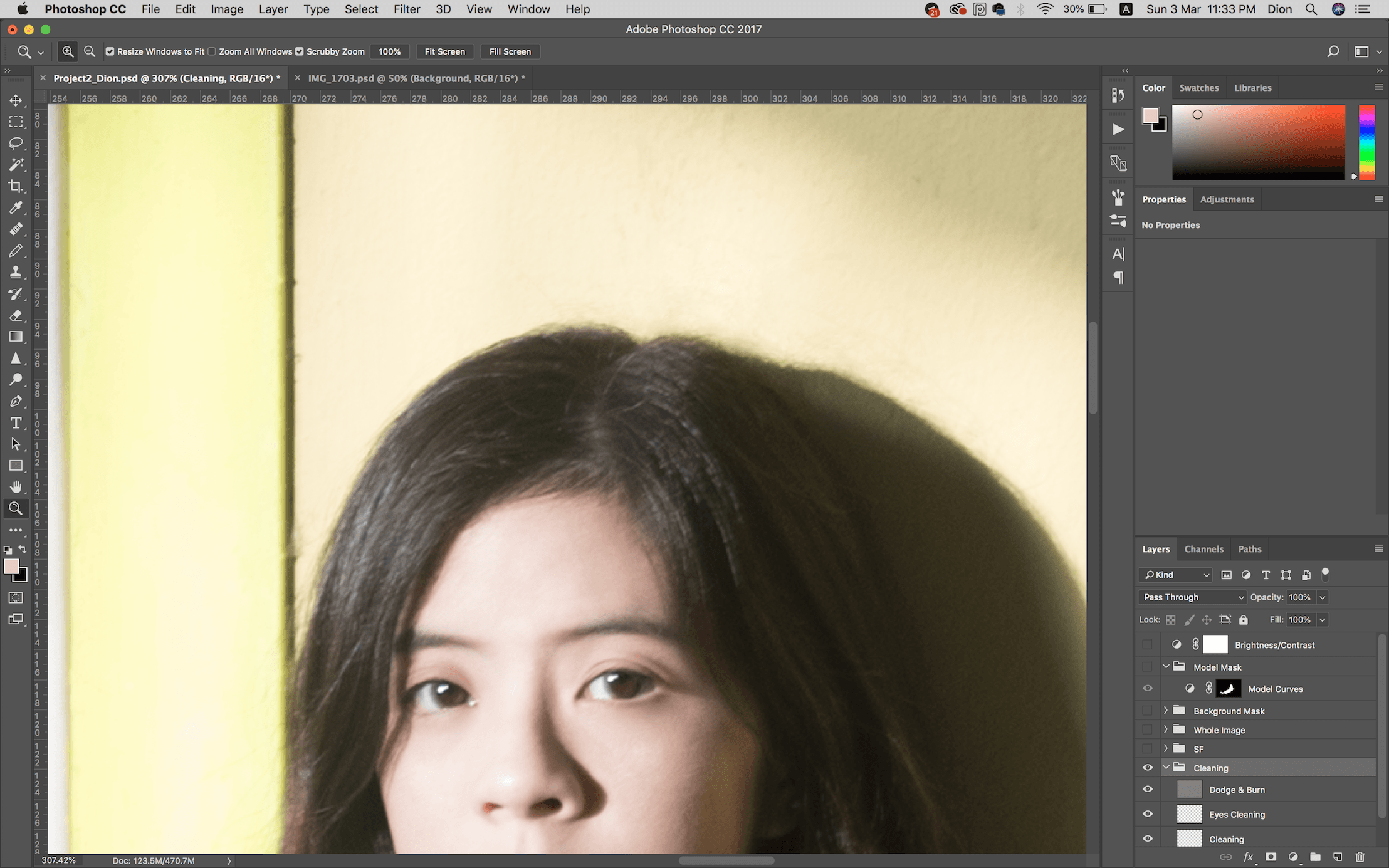
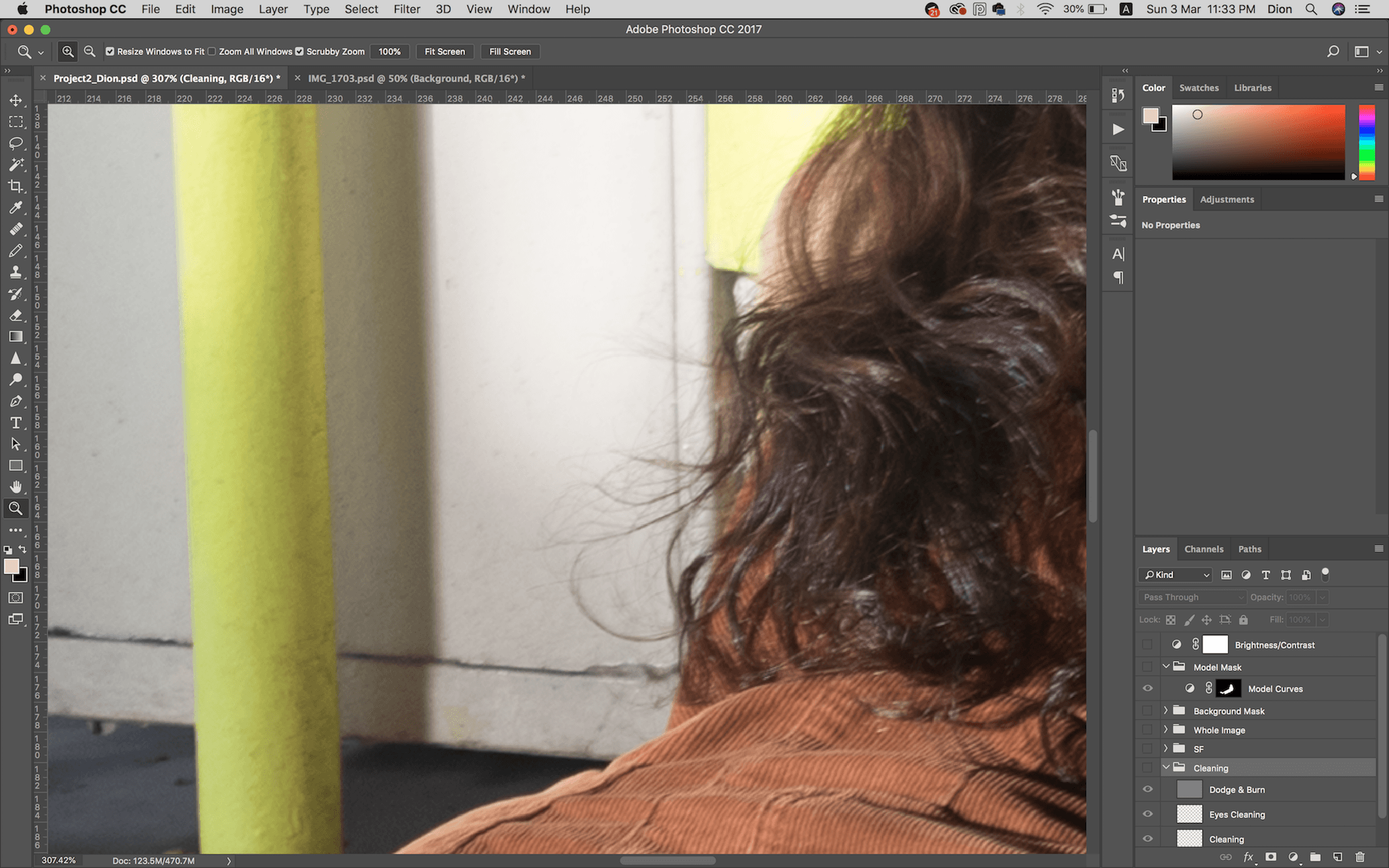
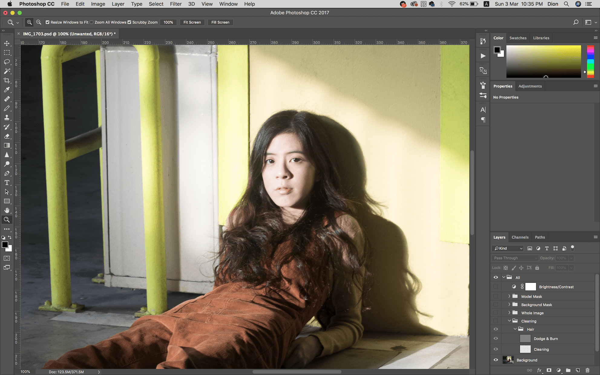
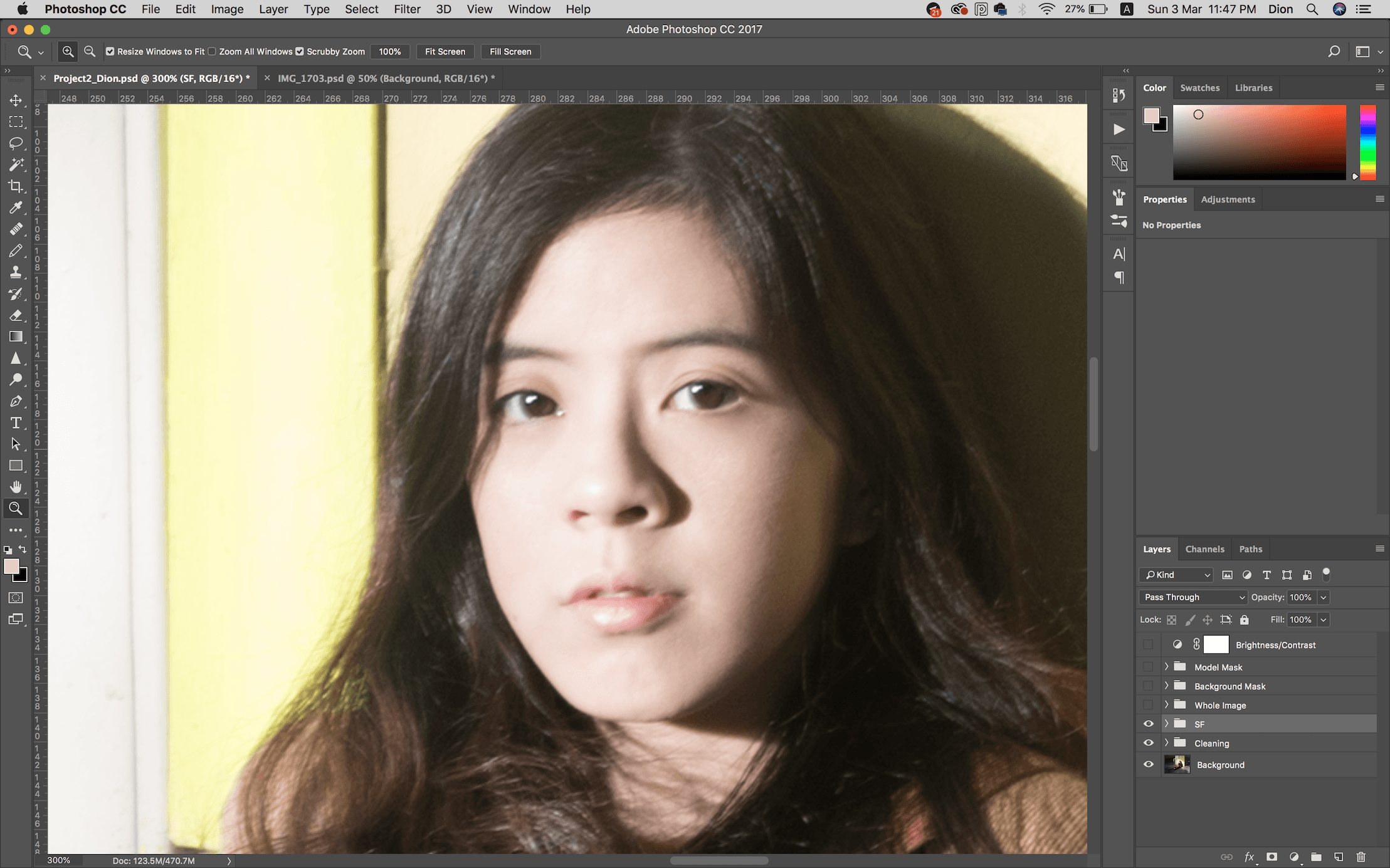
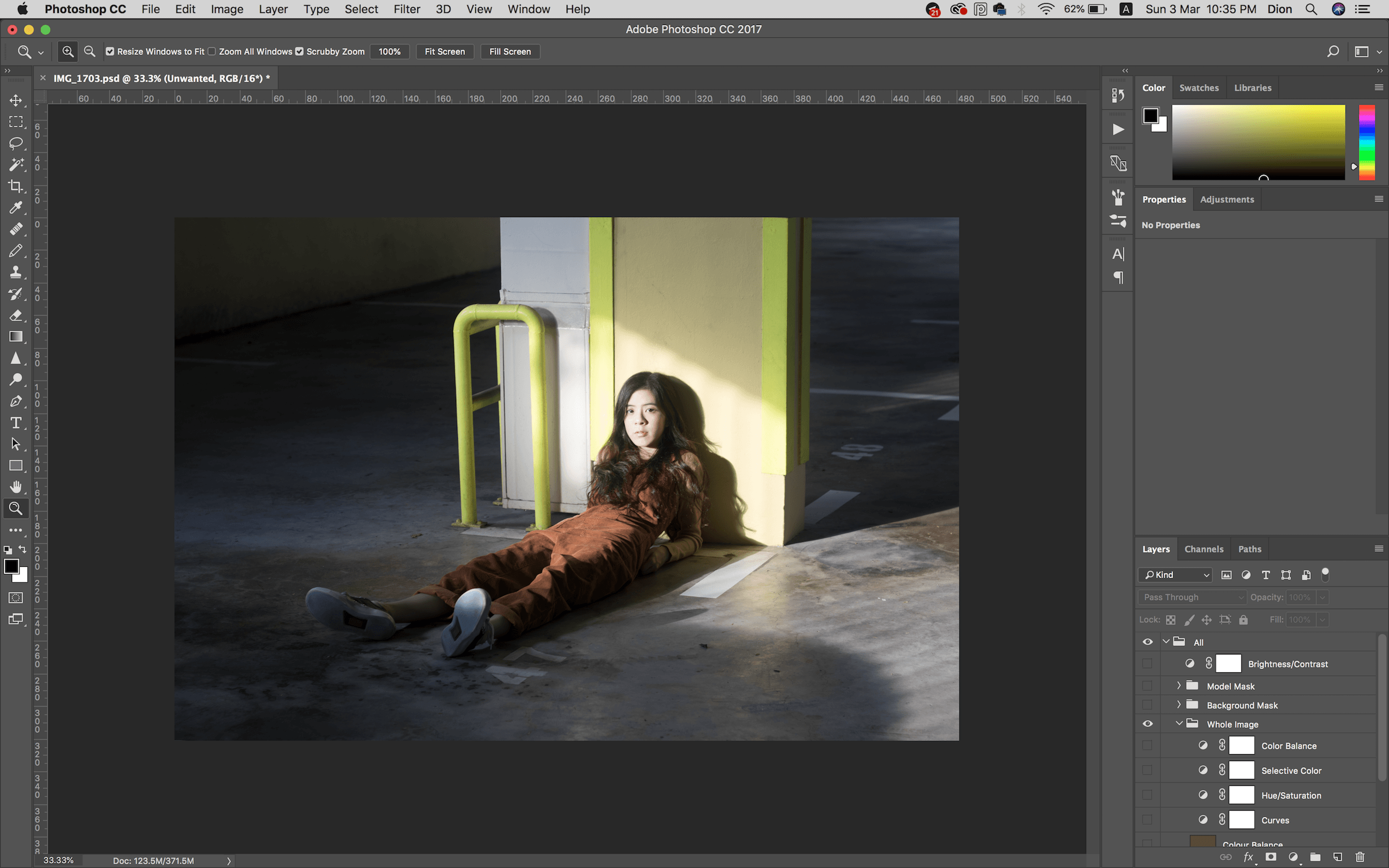
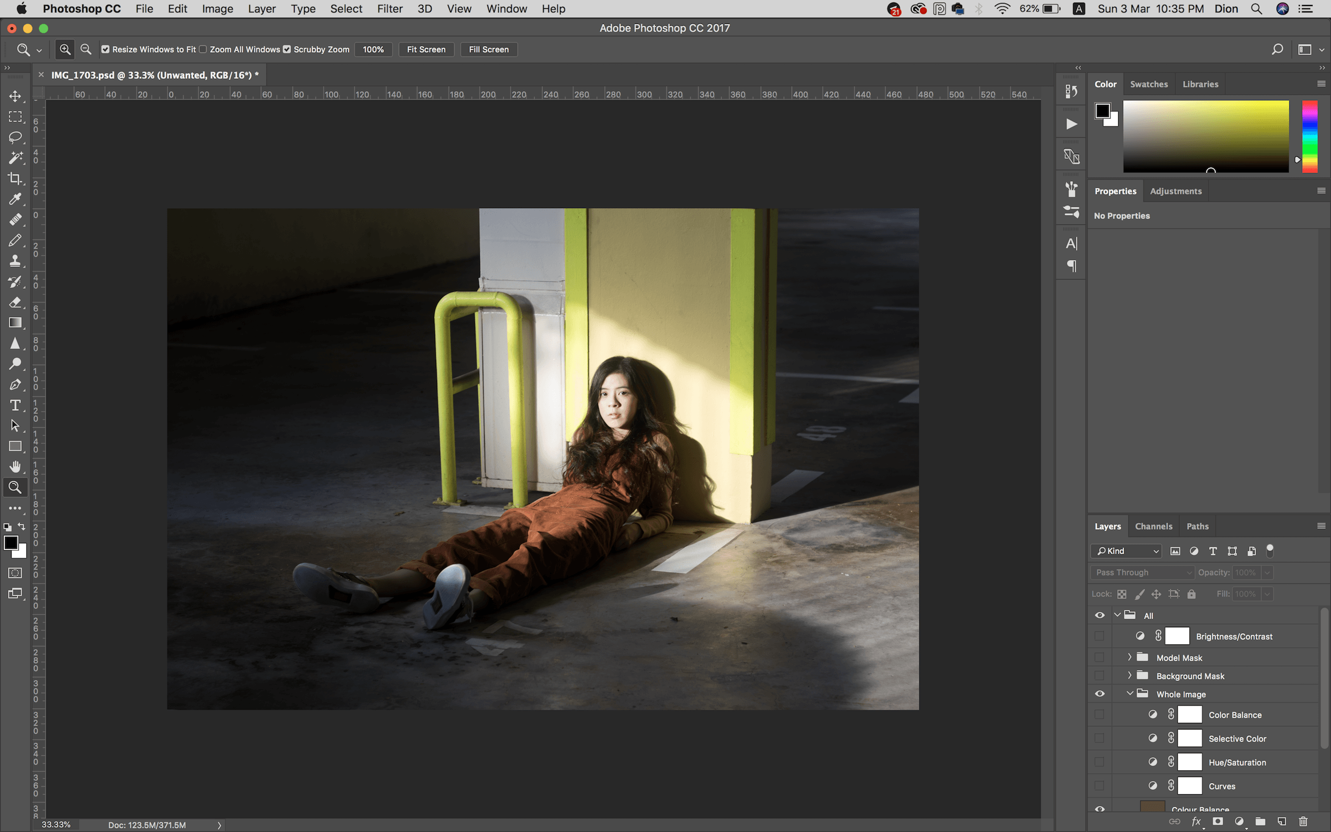
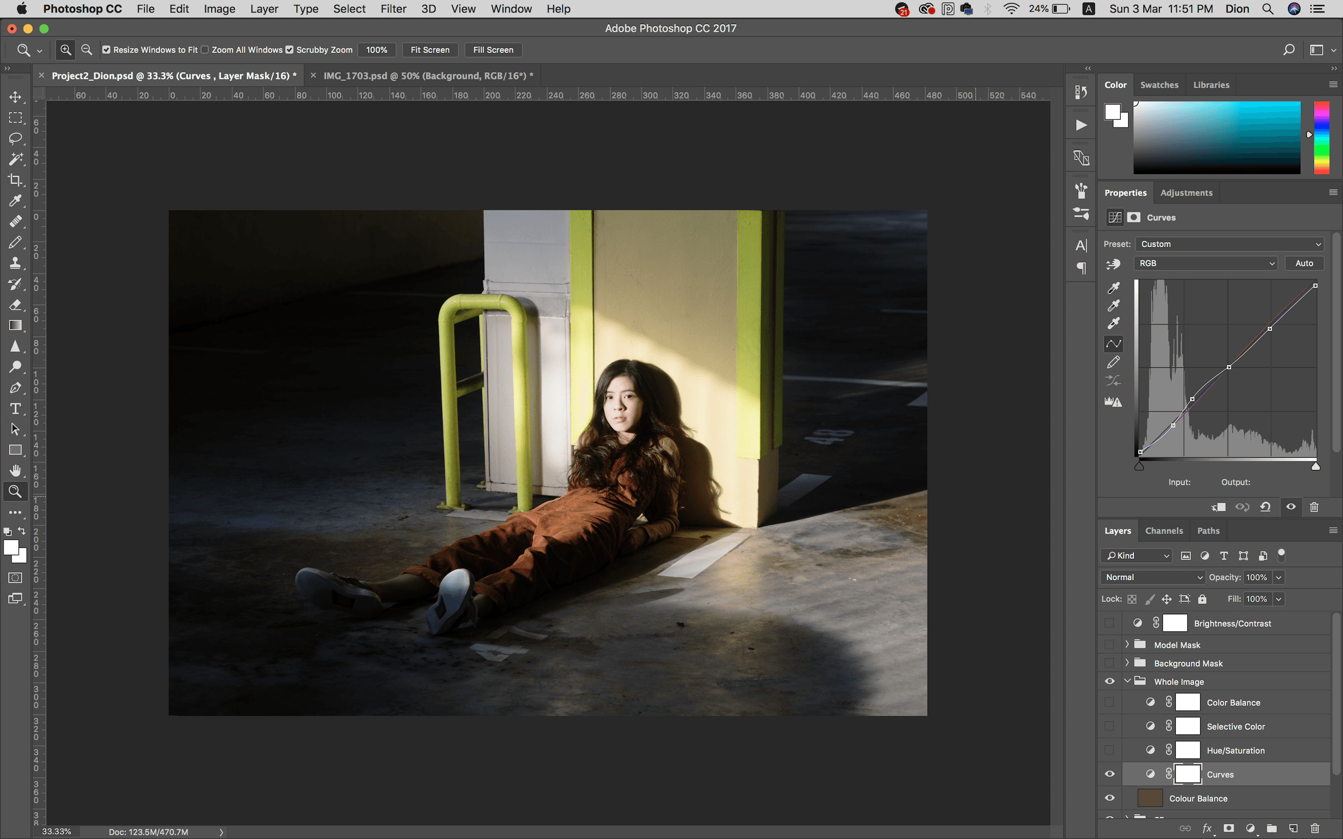
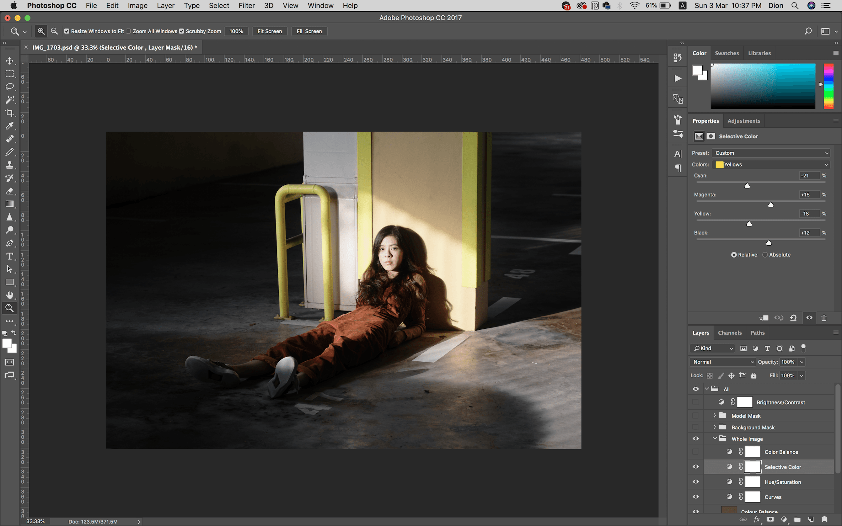
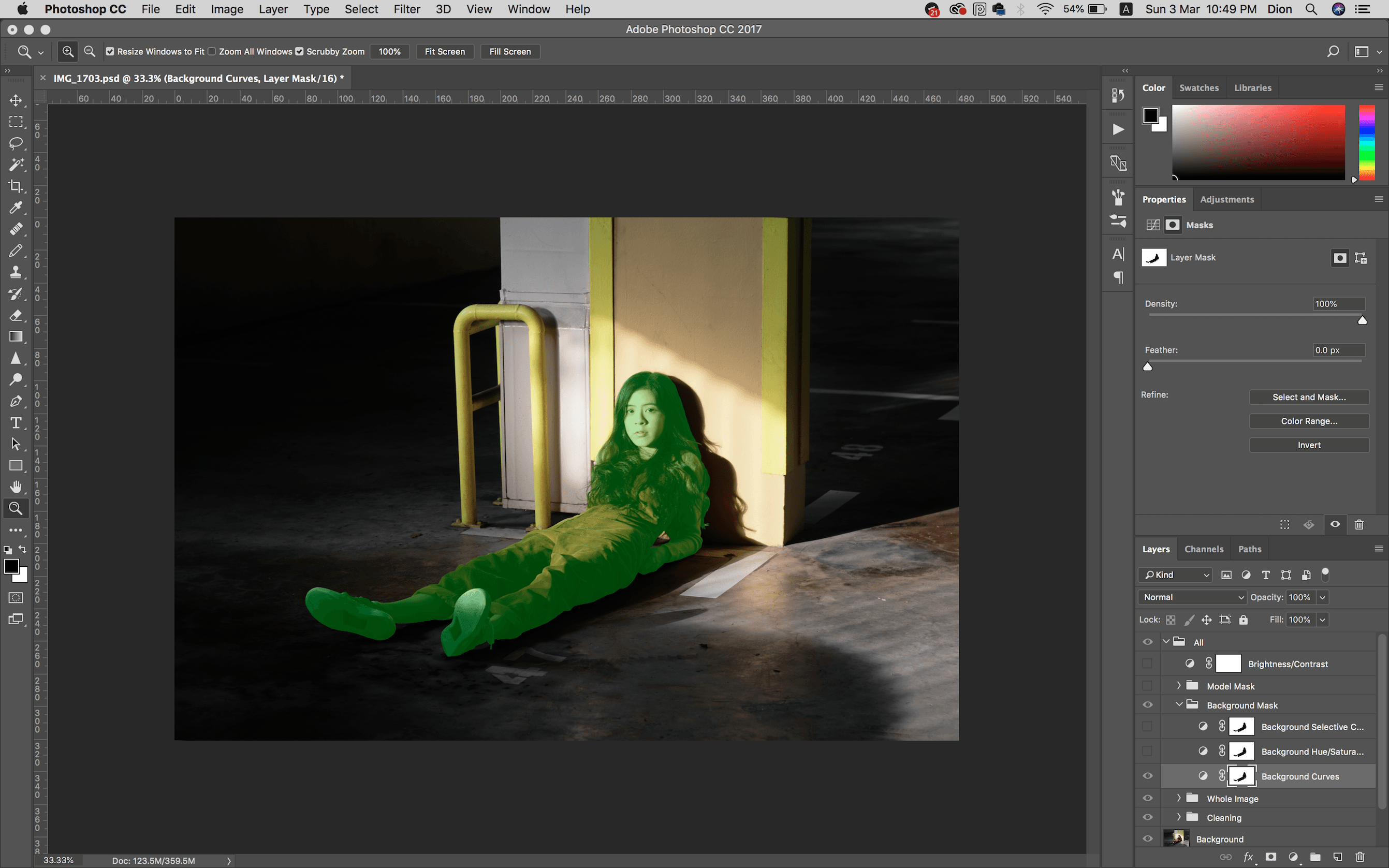
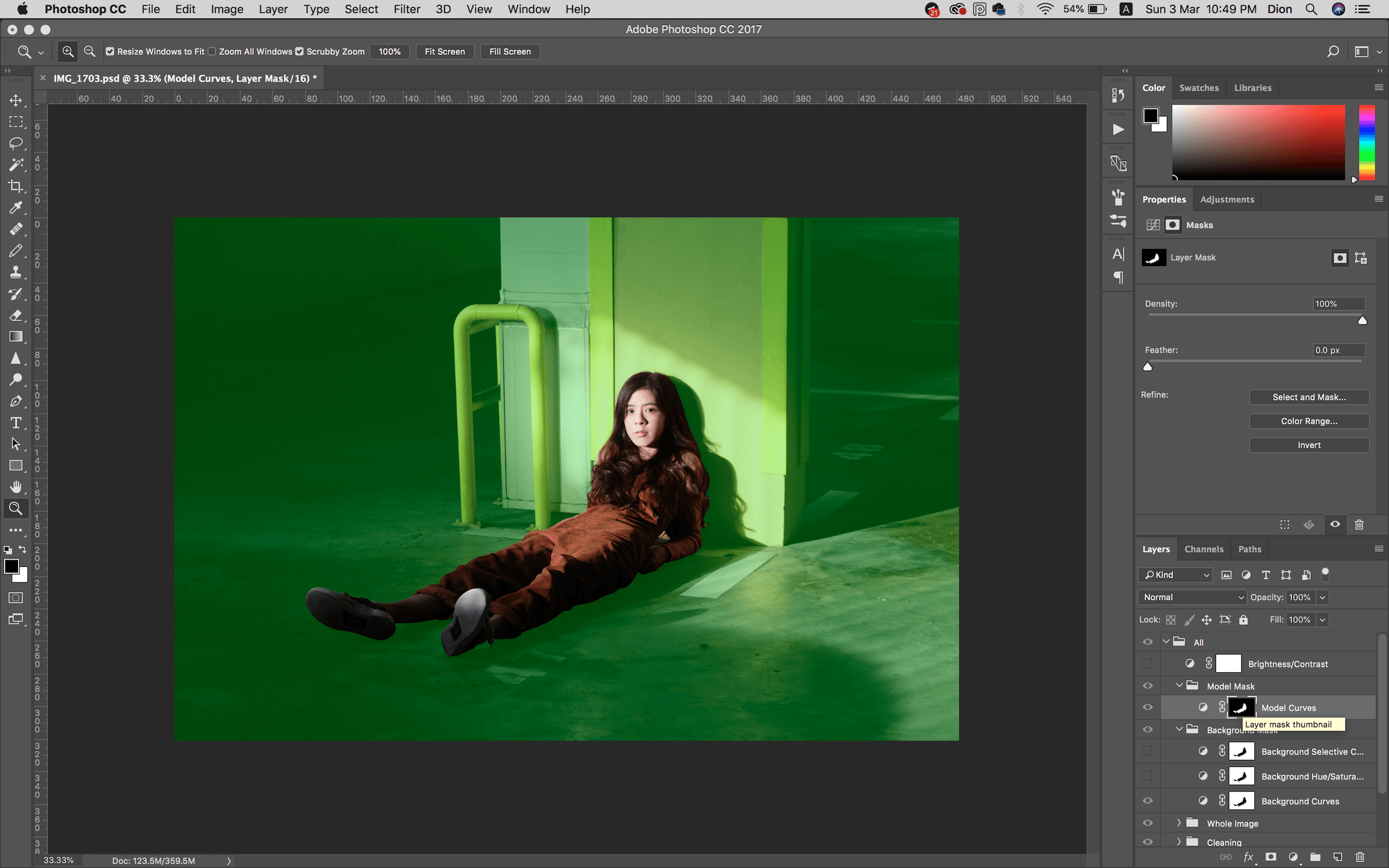
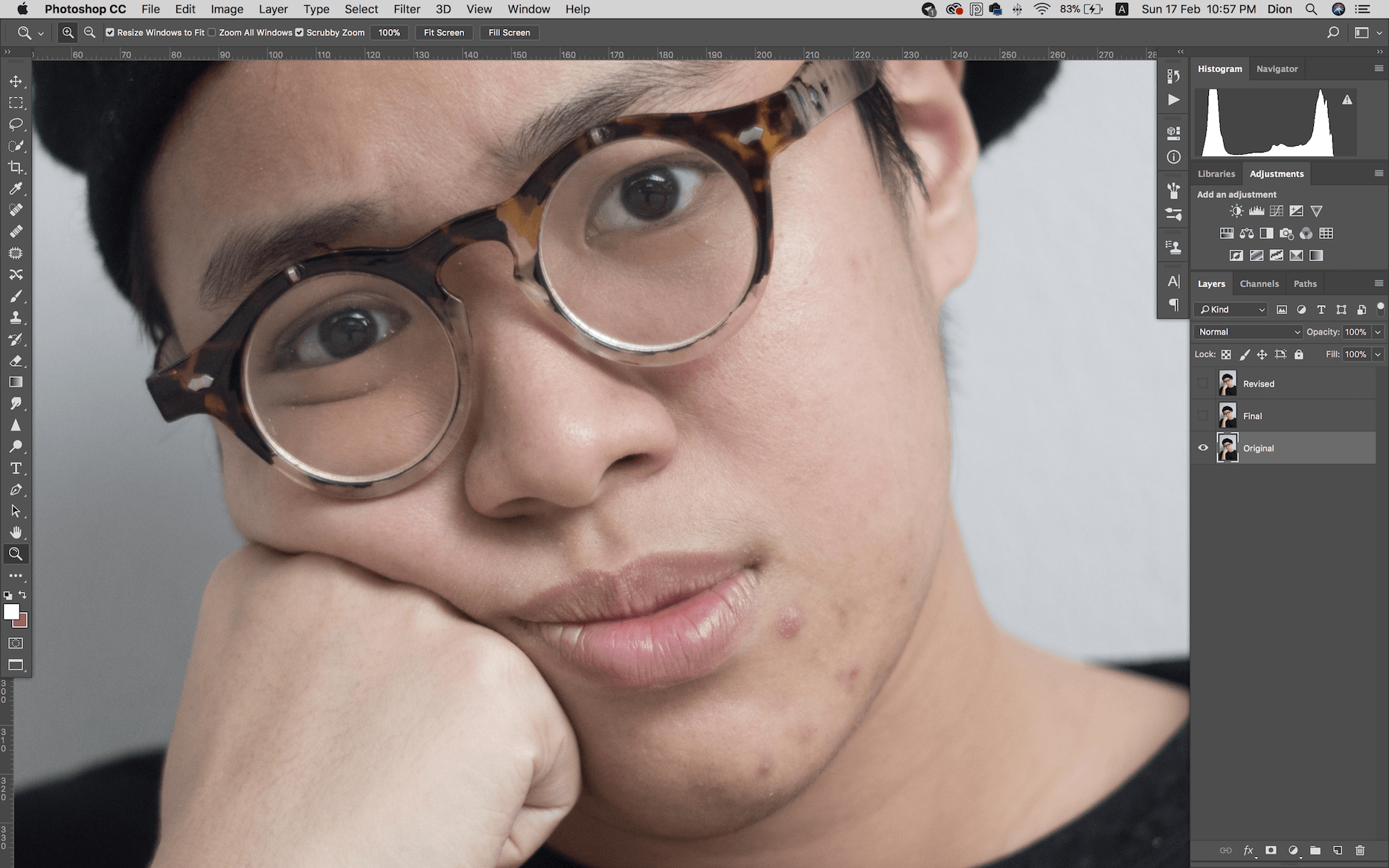
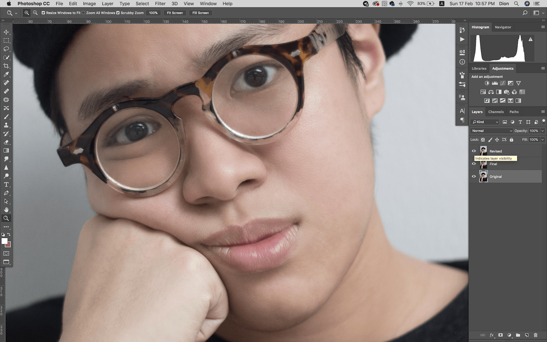
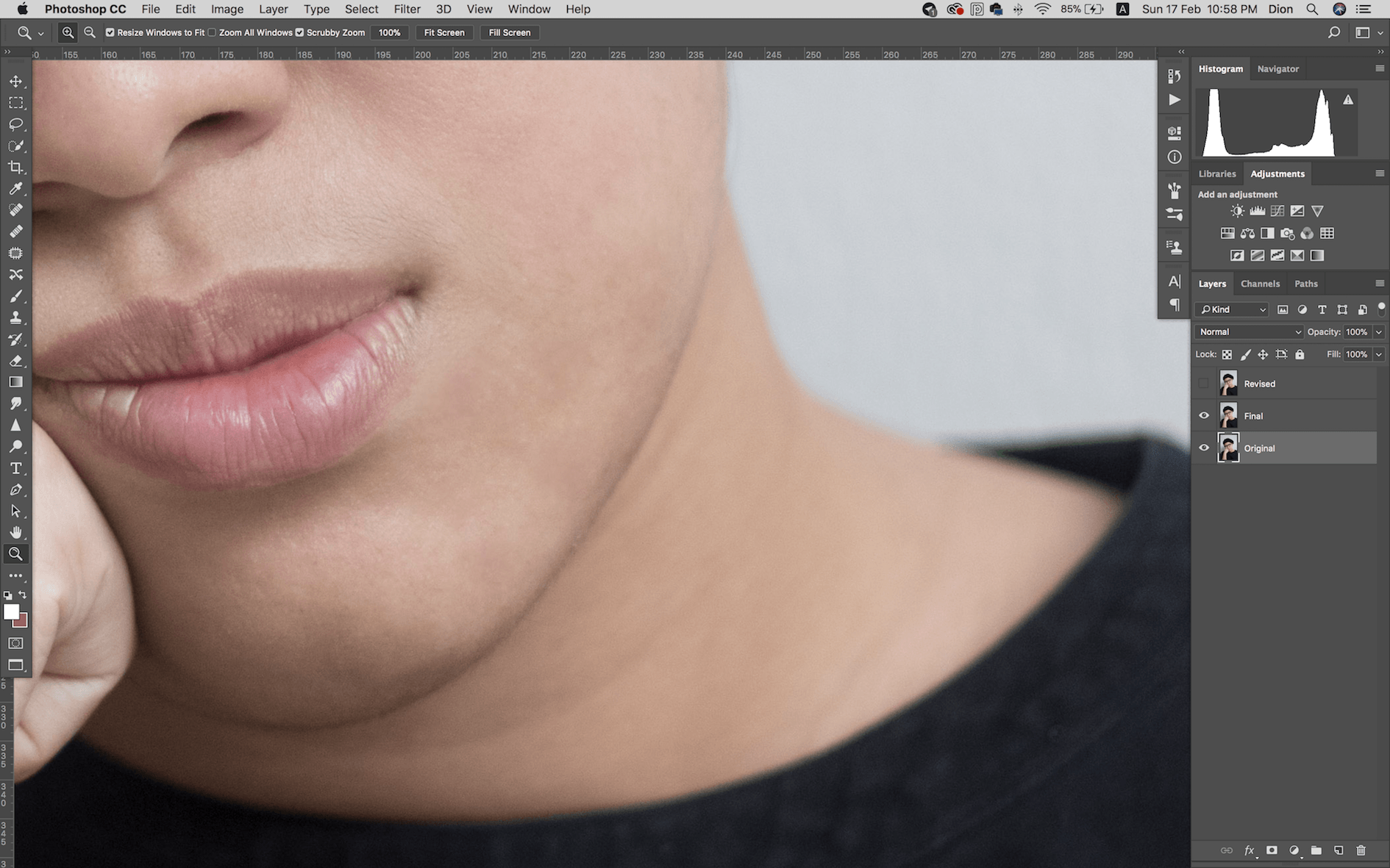
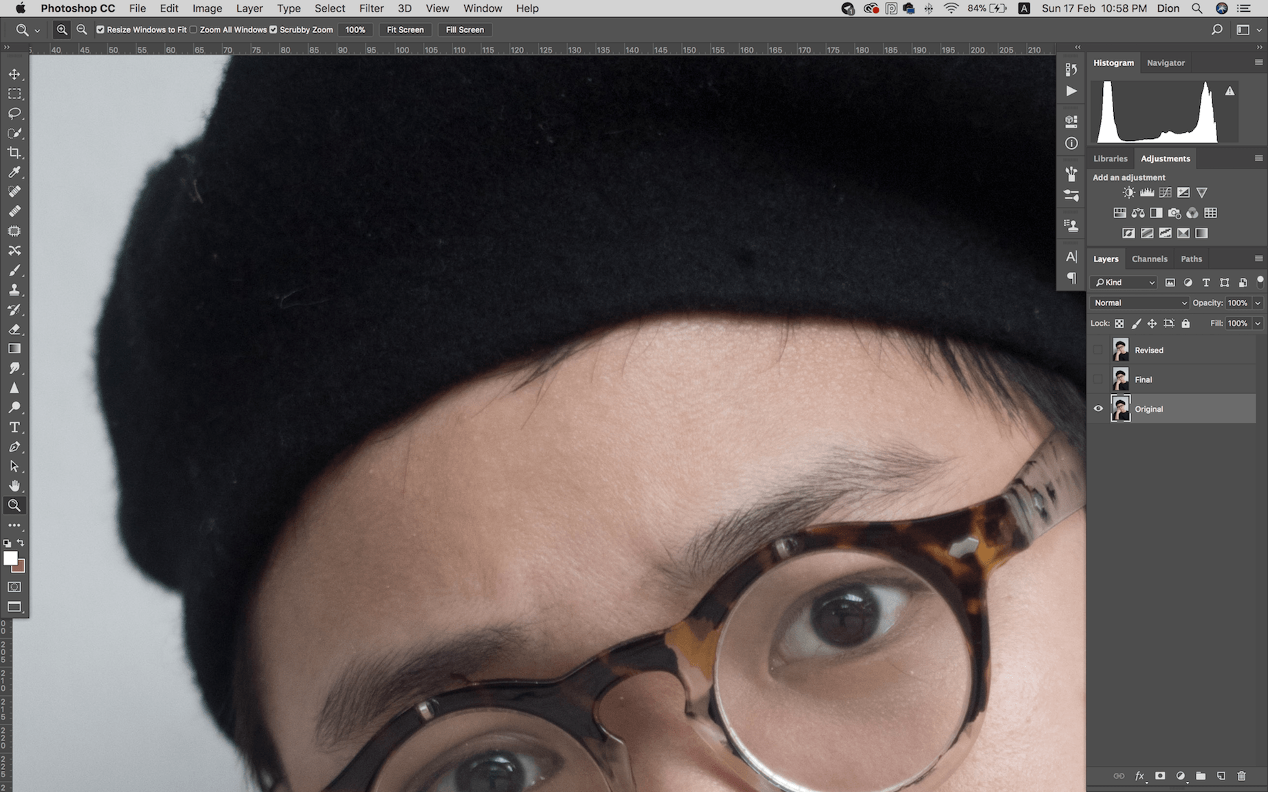
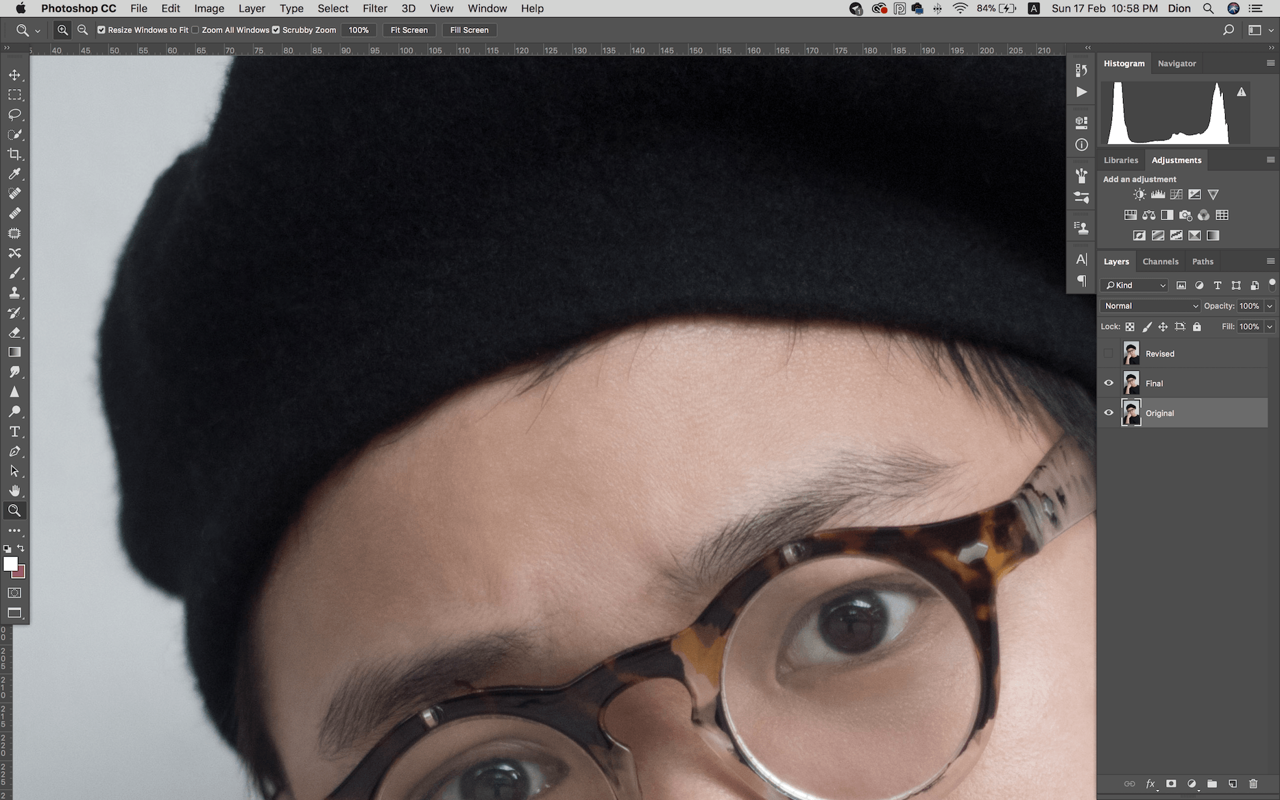
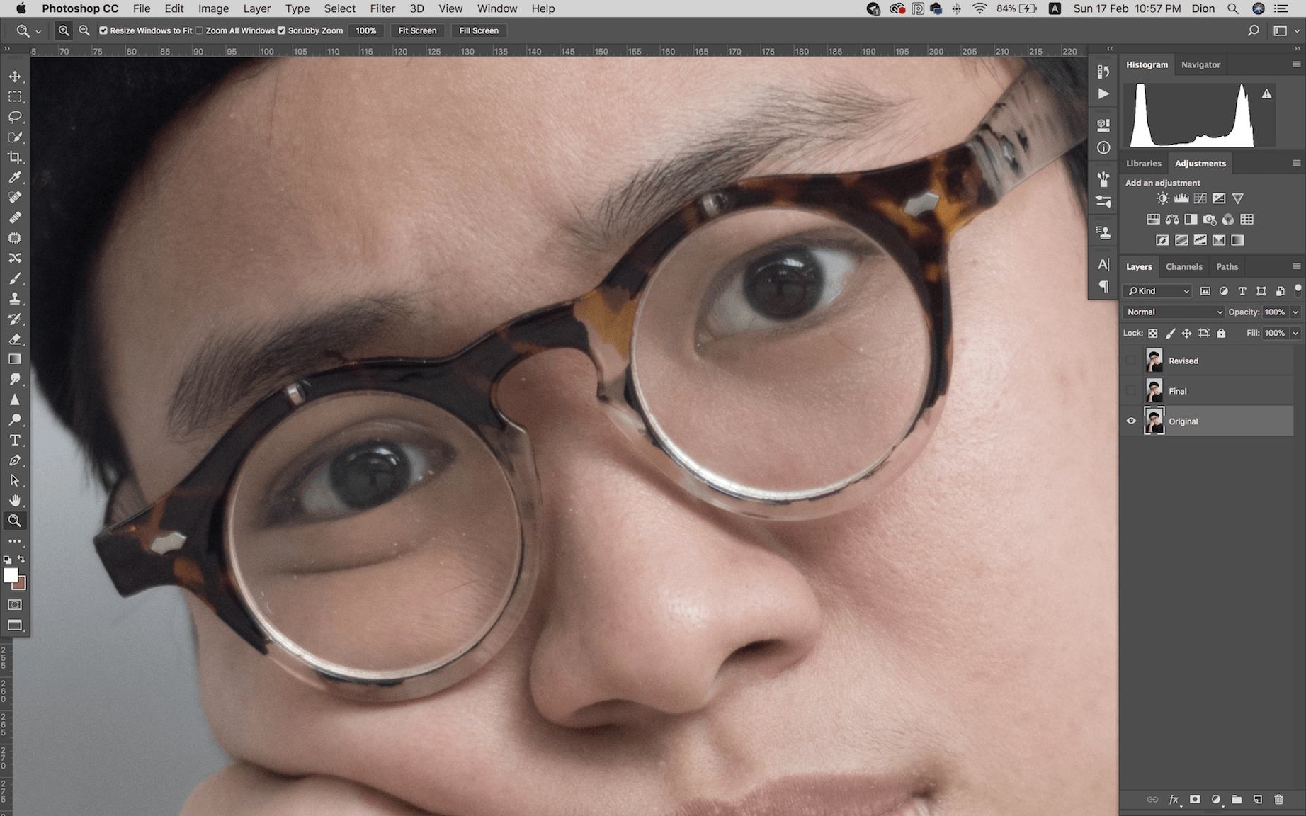
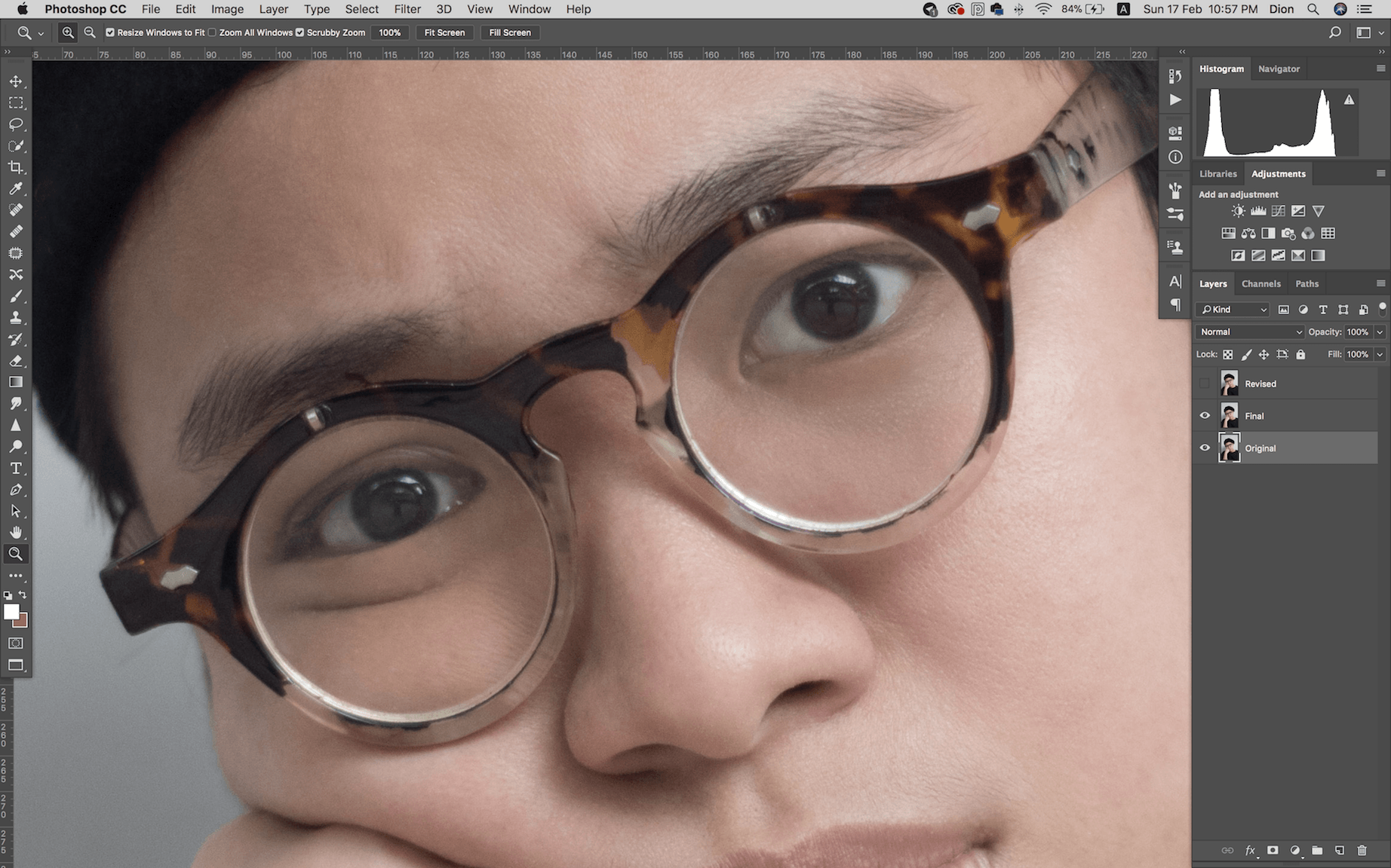
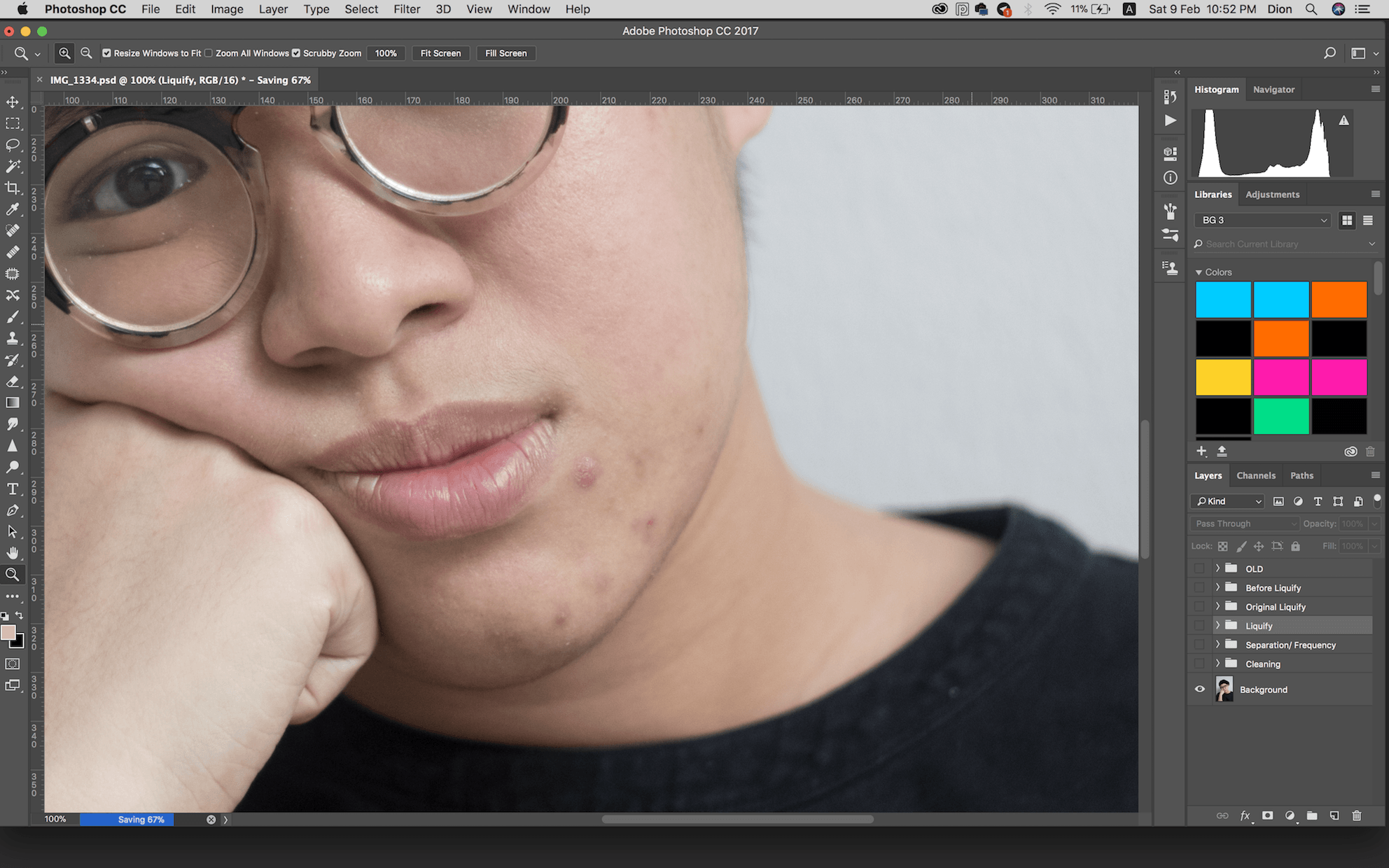
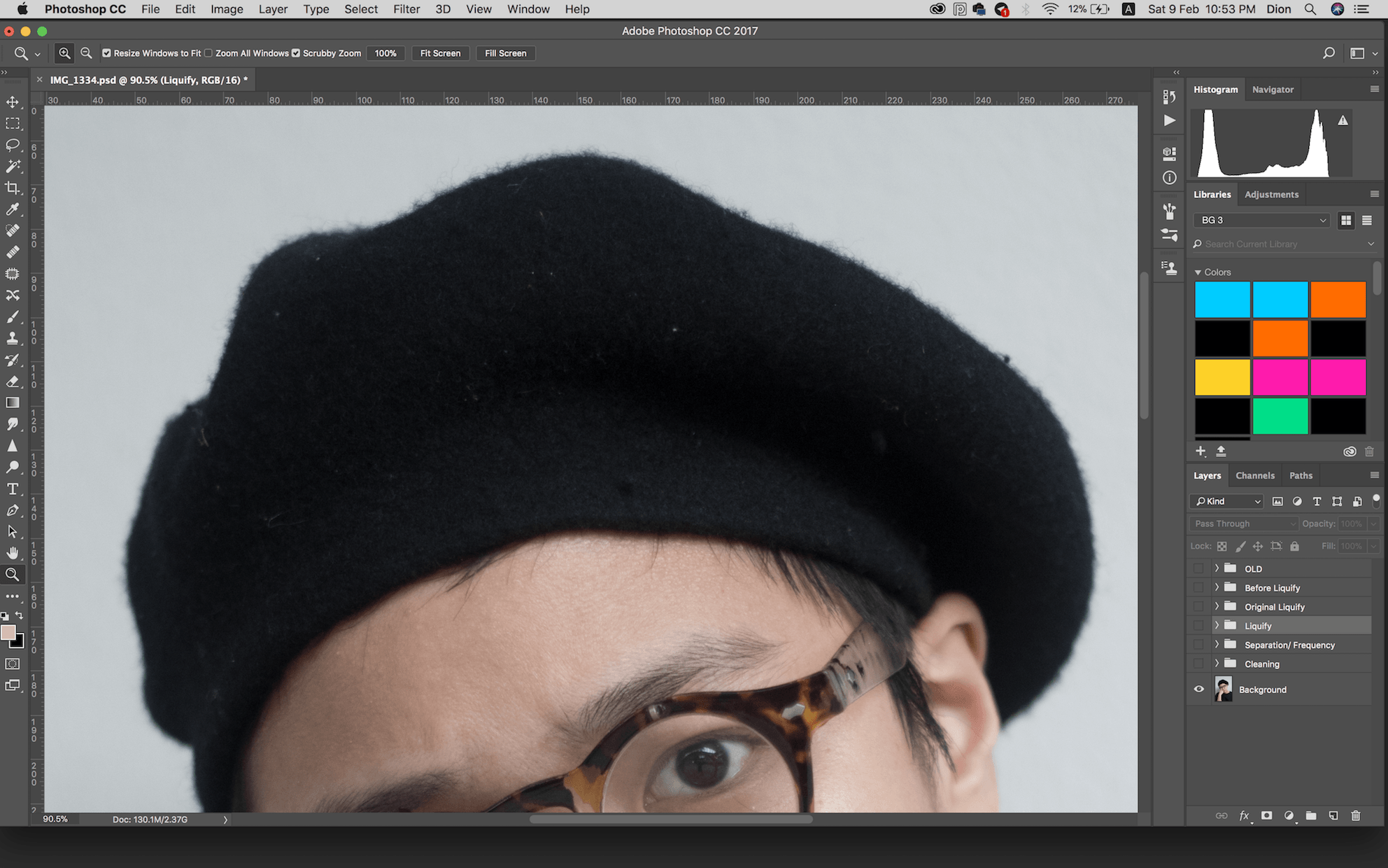
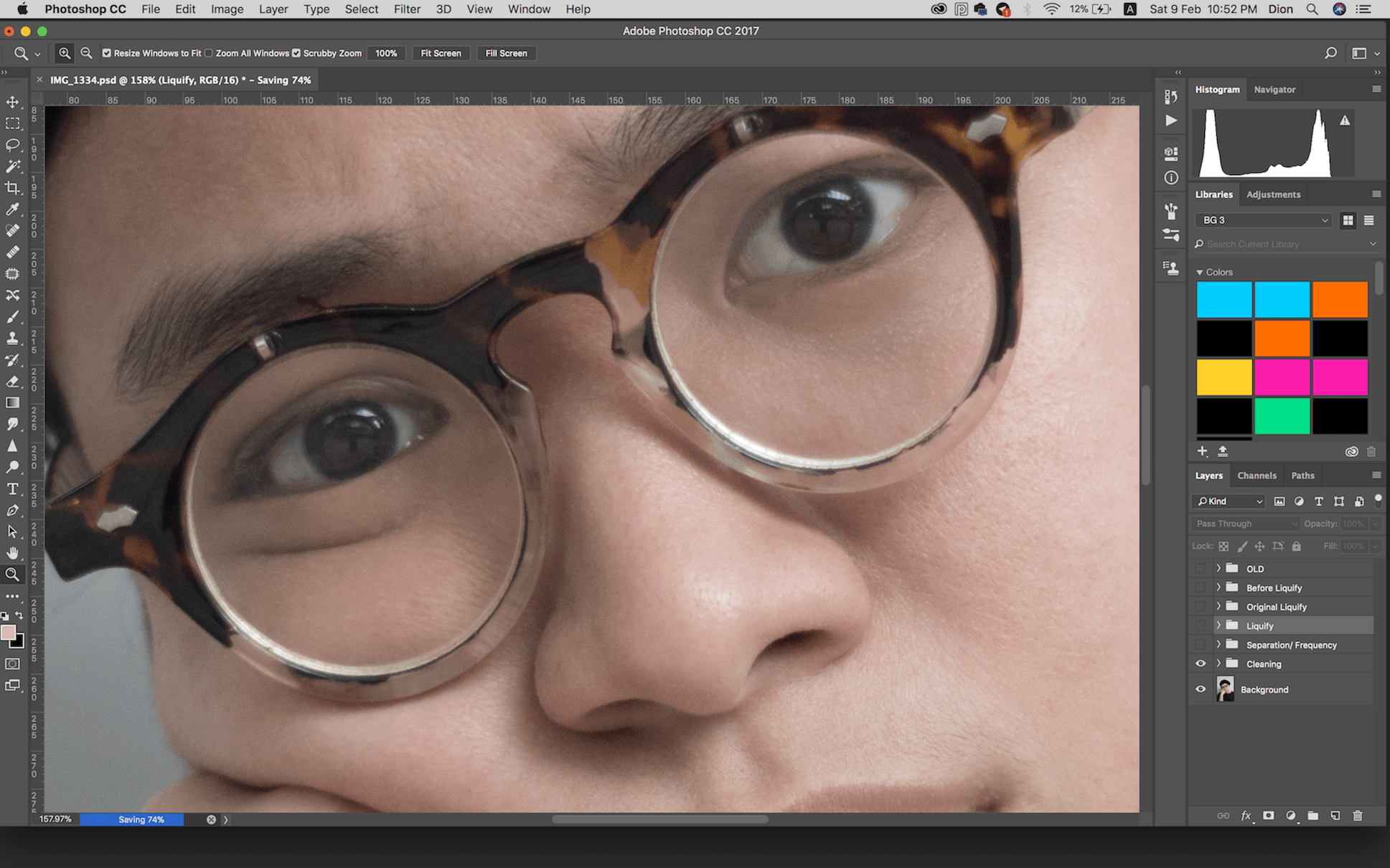
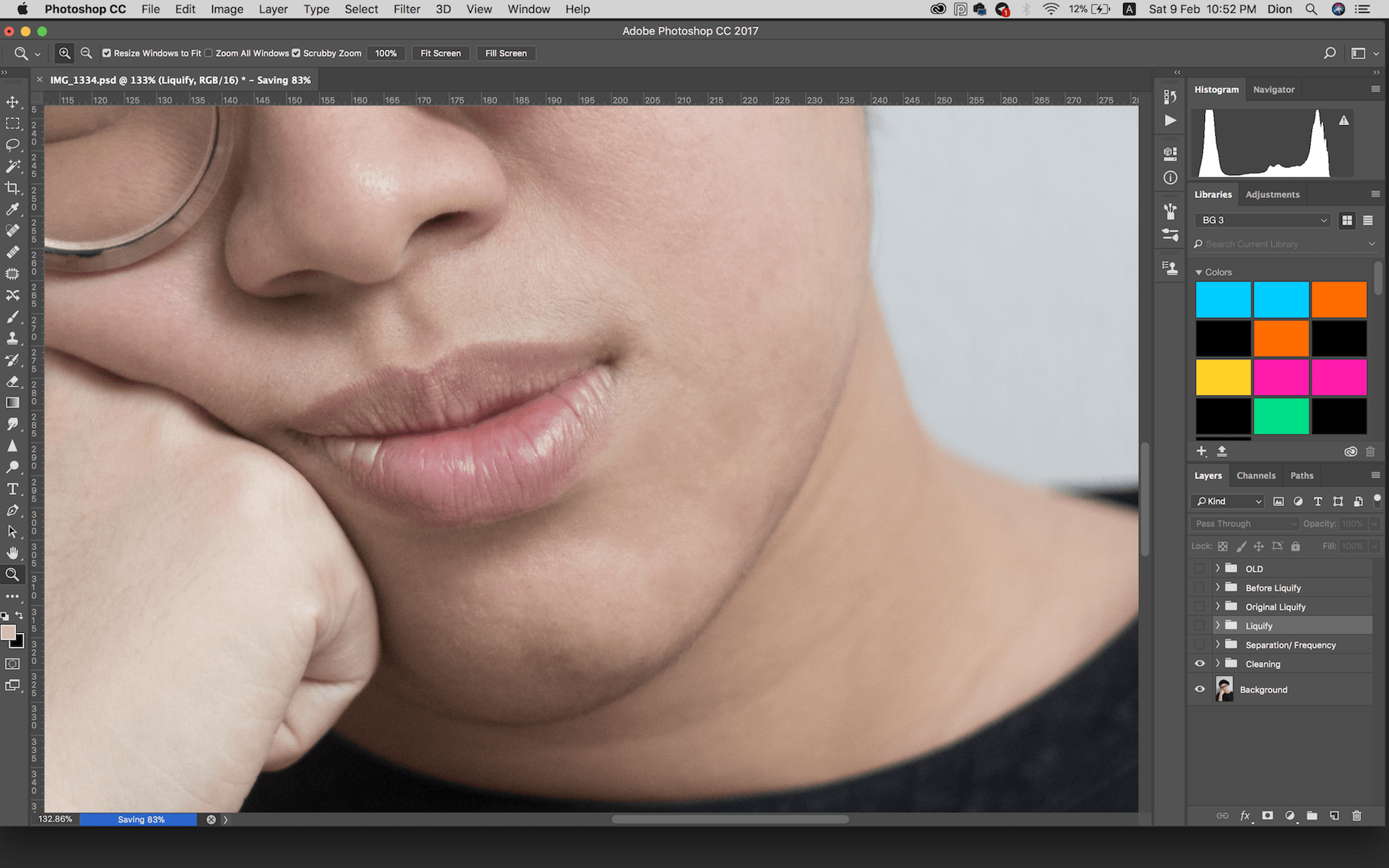
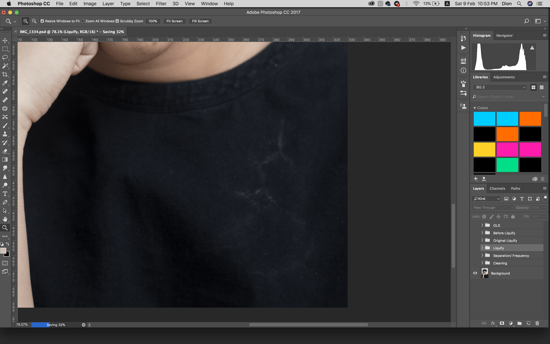
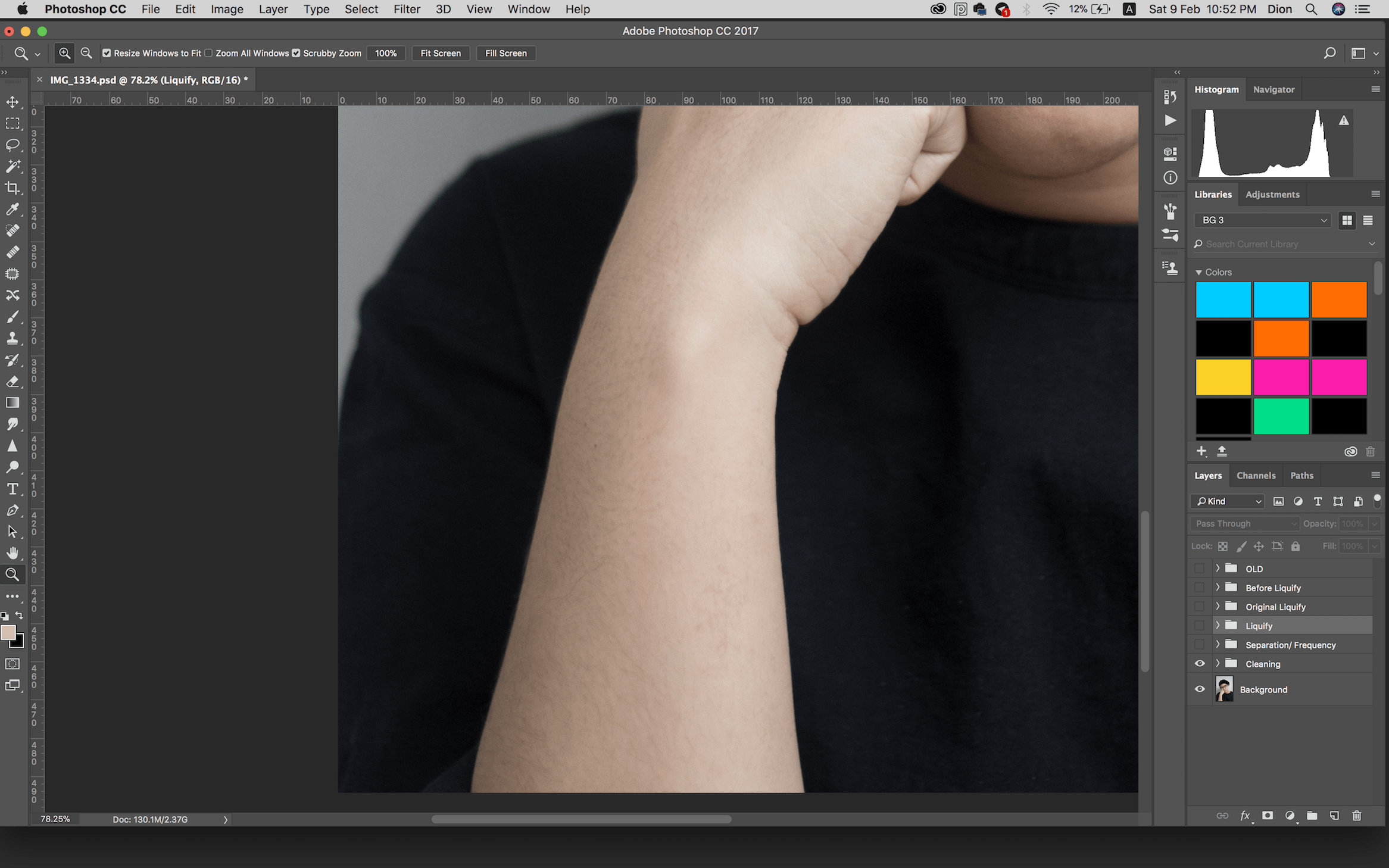
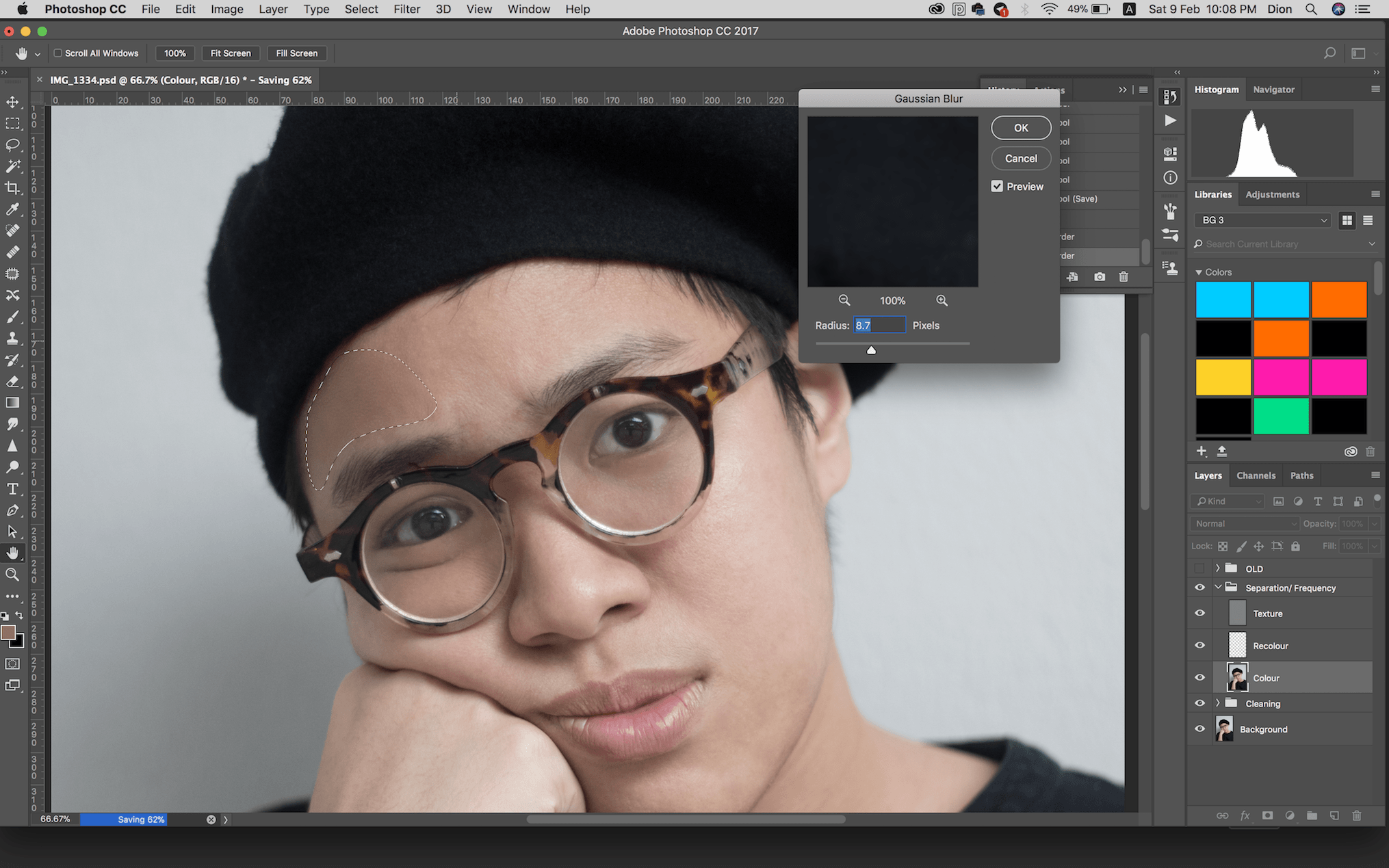
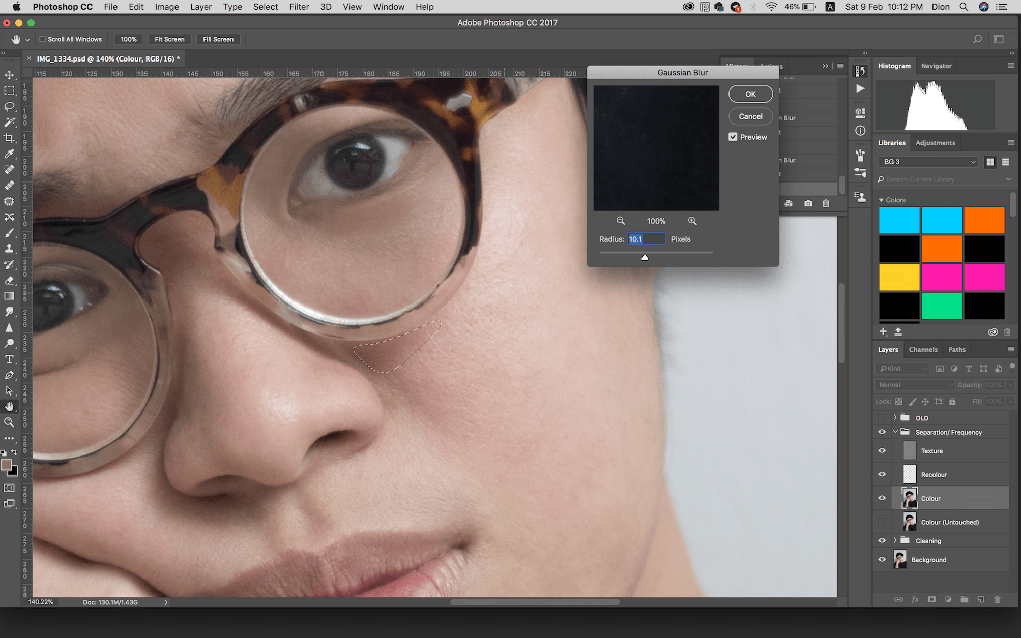
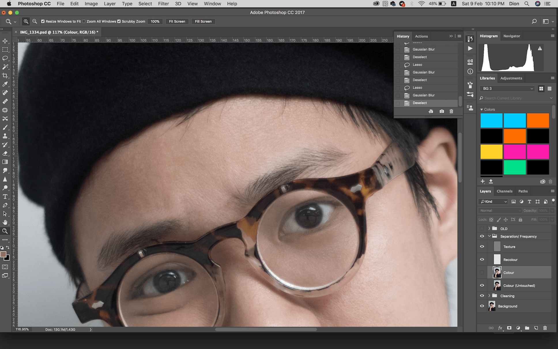
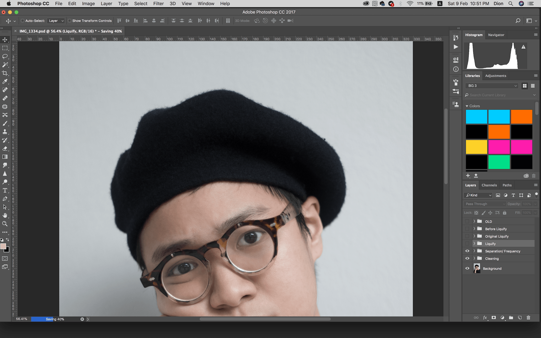
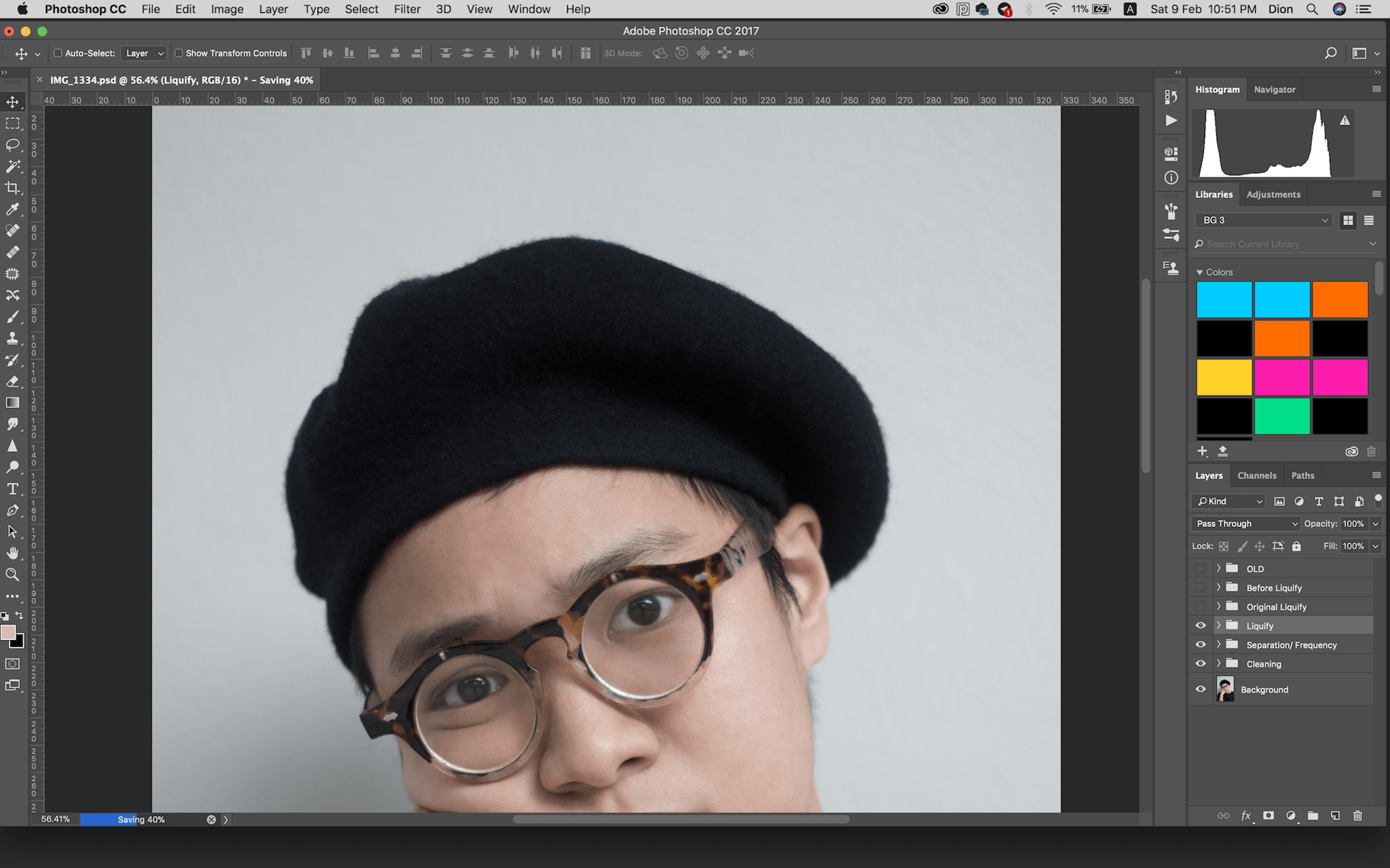
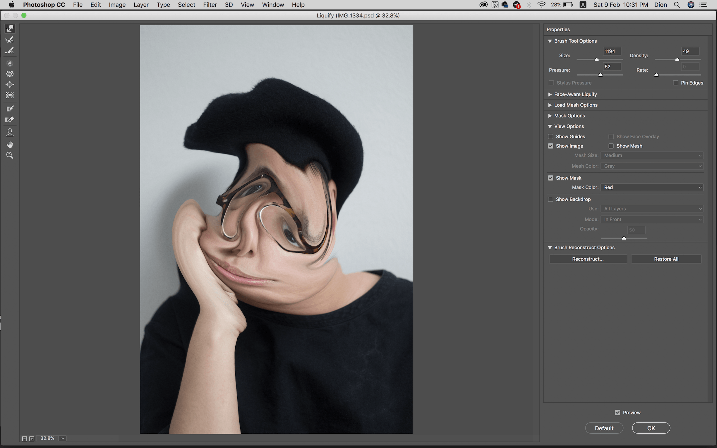
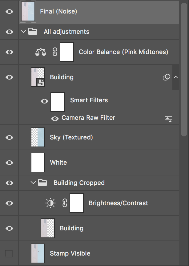
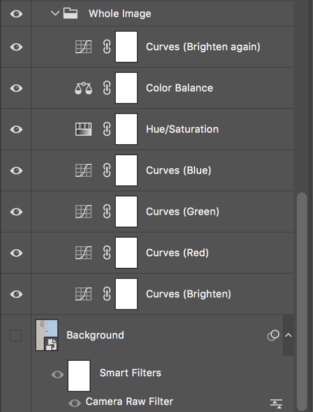
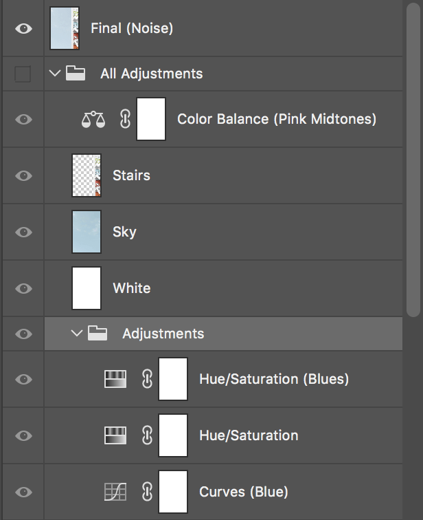
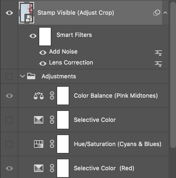
Technical Process
TWO
Original
Cropped & Final
Technical Process
THREE
Original
Cropped & Final

Technical Process
FOUR
Original
Cropped & Final

Technical Process

FIVE
Original + Additional Image (Flag)
Cropped Original

Final

Technical Process

SIX
Original & Final
Technical Process


SEVEN
Original
Cropped & Final

Technical Process


EIGHT
Original
Cropped & Final

Technical Process
NINE
Original
Cropped & Final
Technical Process


TEN
Original
Cropped & Final
Technical Process