Tag Archives: typographer

Typography: Typographer of the Week: Paula Scher

HER WORDS

I really loved the article by Alex Bigman, titled “Get to know Paula Scher, titan of postmodern design”, especially the portion where it highlights through quotes Paula Scher’s beliefs on not just typography and design, but also on one’s attitude.

Majority of these I don’t really have words for, rather I’ve decided to leave them here as they serve as some really good reminders – in terms of how I can grow, as well as how sometime’s… “it’s ok”.

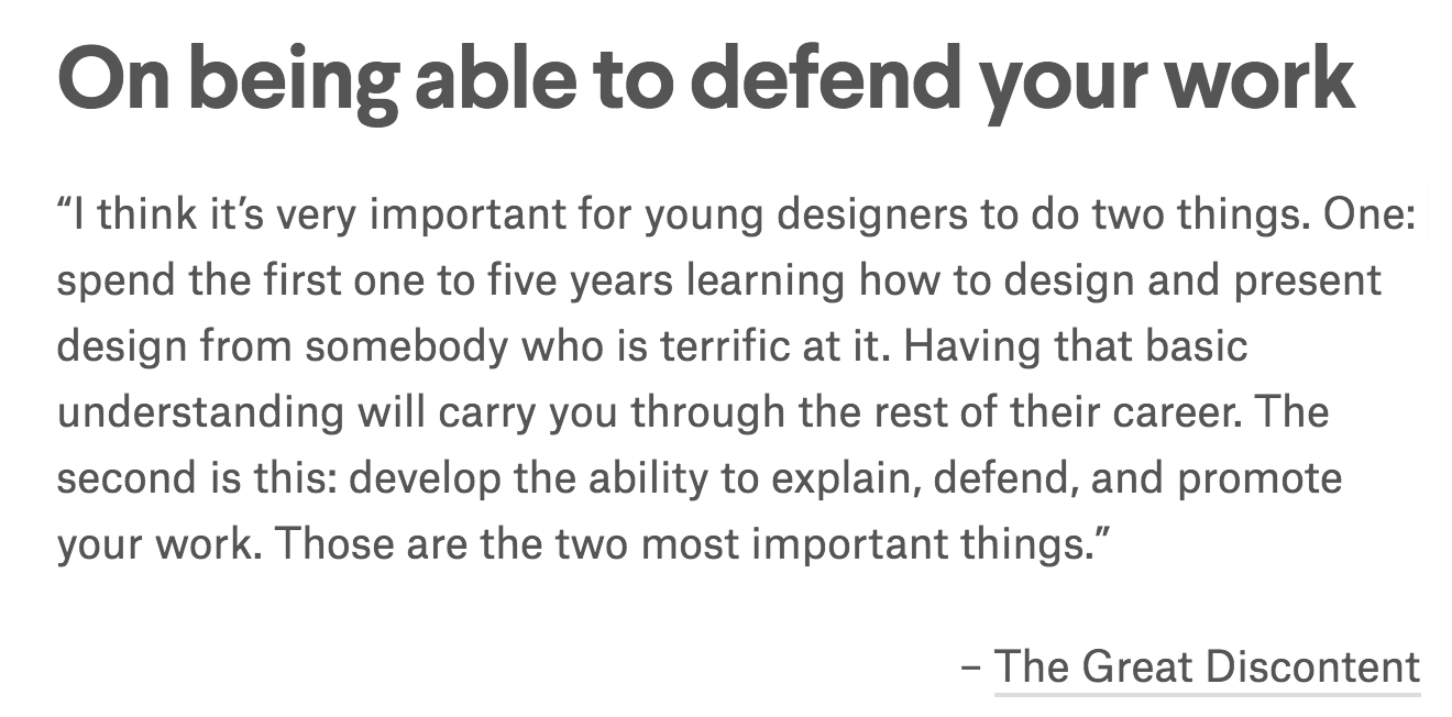
As a fresh designer, it is definitely important to take in as much as you can so as to build up a strong foundation for yourself. While it is always encouraged to do what you believe in and to not let others’ opinions affect your work, I take what she says as a reminder to not get too defensive as a beginner as it would become difficult for yourself to develop, and that when you’ve reached a somewhat ‘qualifying’ level, then you should learn how to “explain, defend, and promote your work” because YOU DO YOU!

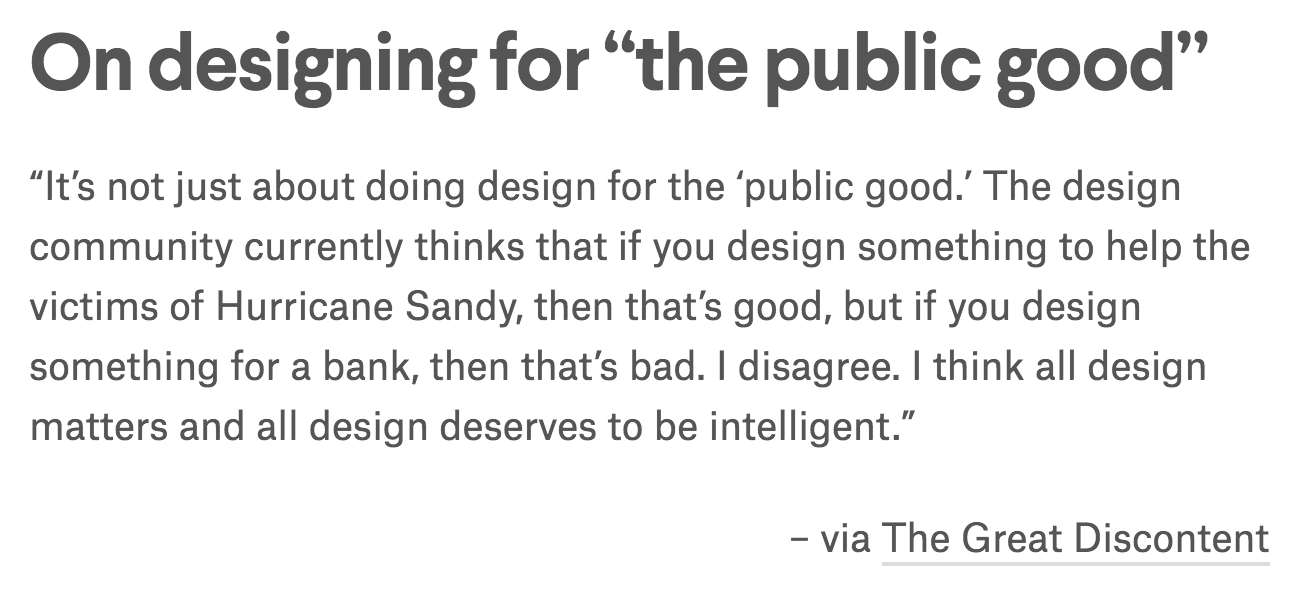
I don’t have much to say about this one, but just leaving this here because I believe we’re all guilty of being really close minded one way or another!


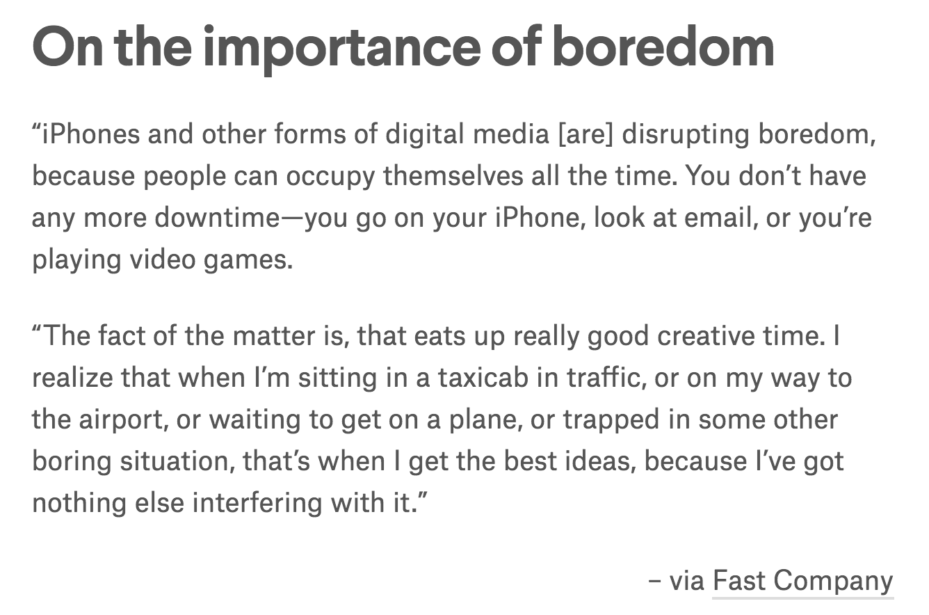
To all the people who hold their expectations too high for me: I’m not God.


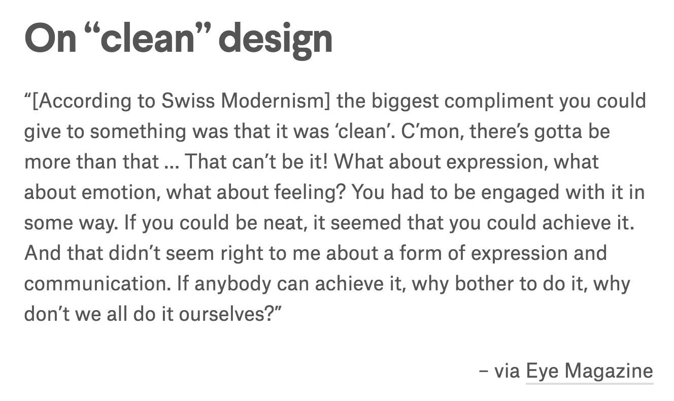
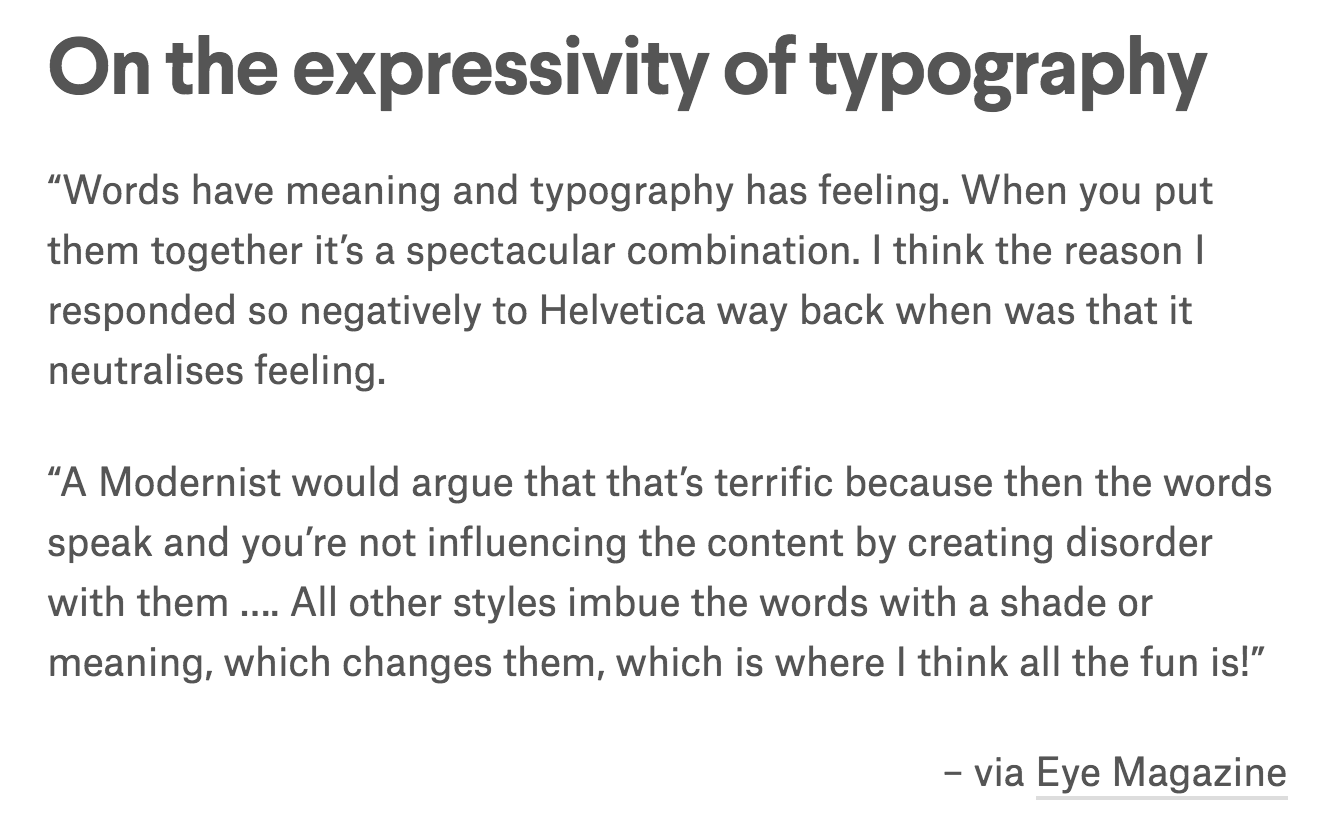
I’ve always struggled with creating ‘minimalist’ designs, and I guess this probably explains why – because I’ve realised, and have been told, that I always produce work better when I relate to them on a personal level, and when I try to create clean designs I’m struggling with the lack of ability to express and be engaged with my design. However, it is still a goal for me to learn how to produce ‘clean’ and ‘minimalist’ works, just because it is such a struggle for me. Hehhh.


HER WORKS

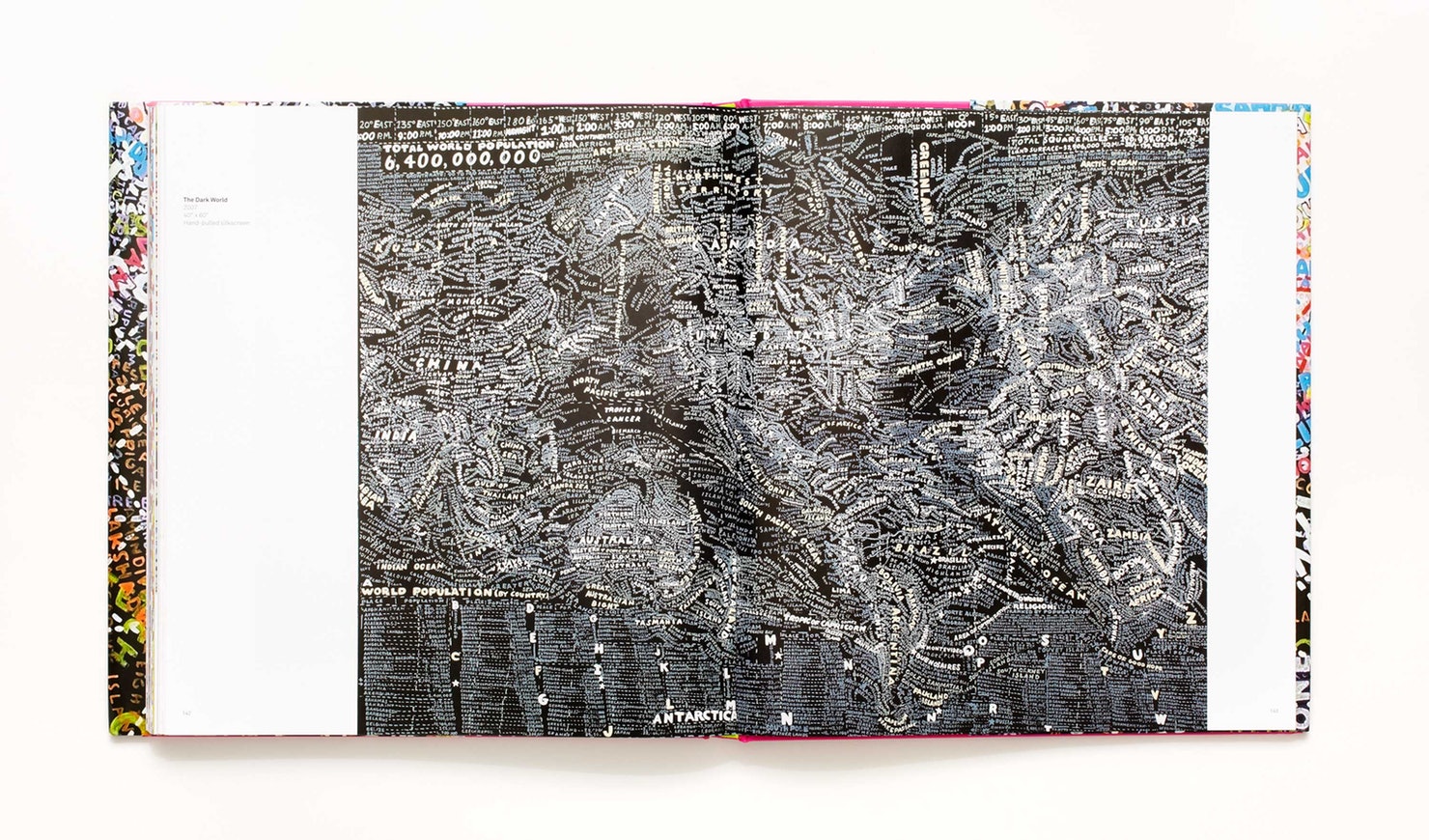
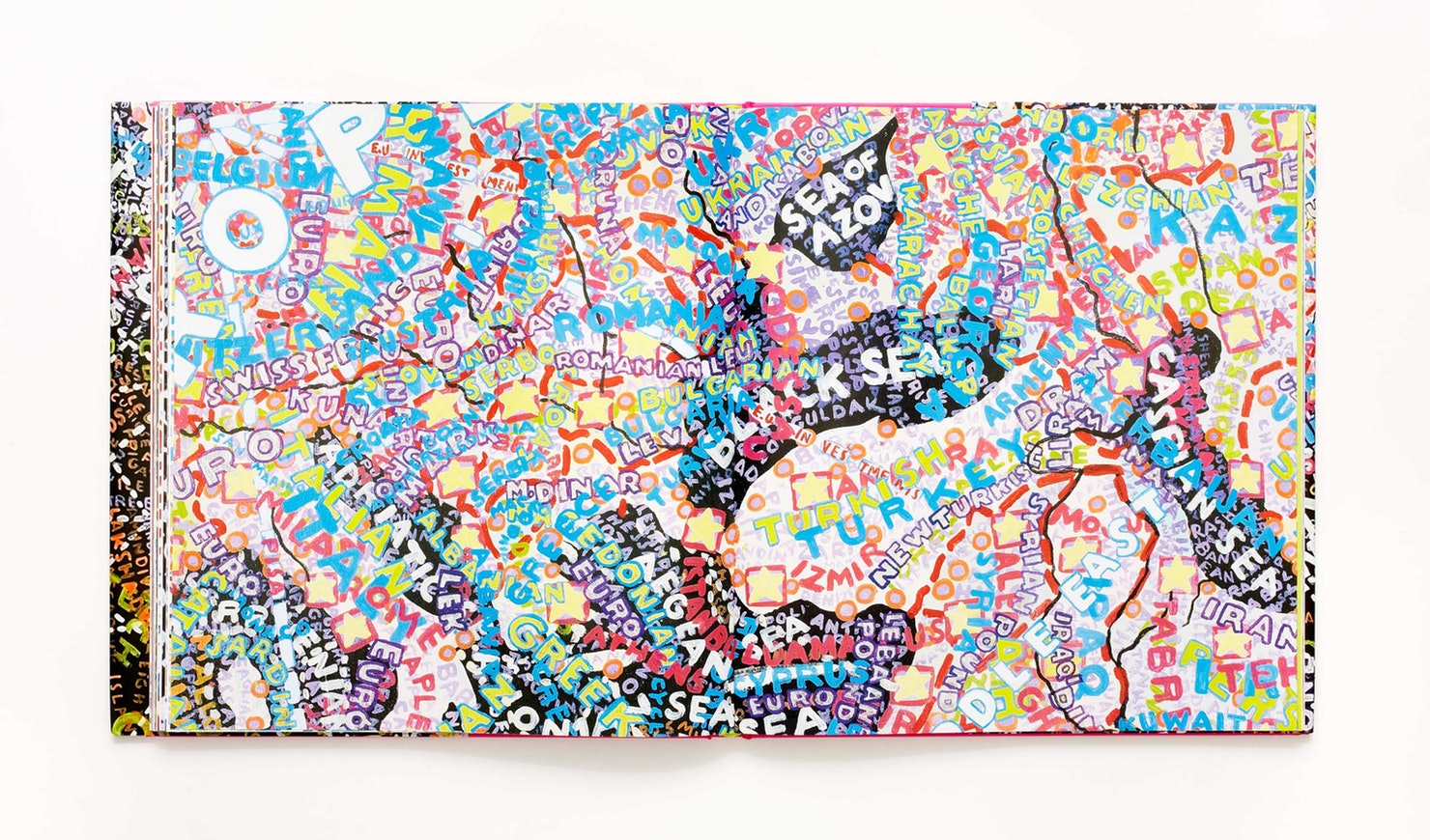
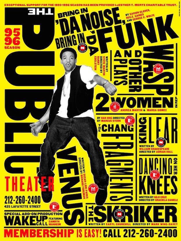
I find it astonishing that Scher is able to pull off both corporate and “fun” designs, comparing the Citibank logo to her “loudly expressive poster designs of historic Public Theatre productions like Bring in ‘Da Noise, Bring in ‘Da Funk”. 

Citibank Identity 6

6a00d834550b5f69e20120a6a7b388970c-800wi


On top of these, I also admire her style and ability to create really expressive type designs while still somehow staying clean at the same time! It’s like a combination of the last two quotes that I had attached to this post above. Perhaps this could be a style I could look towards when I try to create clean designs while still trying to hold expression.

Free Shakespeare In The Park 2018 7Reflect Us 4

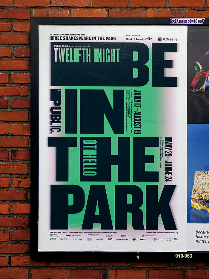
And the ones below are super duper expressive, but she still balances it off with the clean layout. Hmm. Love it.

Typography: Typographer of the Week – Neville Brody

NEVILLE BRODY

The most outstanding characteristic of Neville Brody would be his bravery in being adventurous, not allowing the opinions of others, even those of higher authority such as having his works be “condemned as uncommercial” by his teachers as well as almost getting expelled from college, to restrict his exploration of “new boundaries in graphic” design.

Brody sets himself as an inspiring figure, reminding us that while “safe and tested economic strategies” will always be, well, safe and tested, experimentation will always be needed for things to consistently evolve. And who knows, the results of your experimentation could lead to what becomes the next “safe and tested economic strategy”, seeing that “his experimental and challenging artwork gave new meaning to visual language.” 🙂

Additionally, I also like that Brody took inspiration from his surroundings (maybe not literally), such as the era of punk rock that heavily influenced his work and motivation. I tend to appreciate art (no matter their form) a lot more when they are instilled with meaning from the artist’s life and/or passions, hence this reading was a great reminder of how I may take inspiration from what’s going on in my own life at the moment to influence my work.

STYLE INSPIRATION

Neville Brody

Unlike Massimo Vignelli who focuses on improving on a “signature” style with every new piece of work, I’ve noticed that Brody explores a very wide range of dynamic styles. I’m not sure which method of approach would work better for me, but Brody reminds me that while I am unsure of what my “style” is, I should never be afraid of playing around.

Typography: Typographer of the Week – Jan Tschihold

JAN TSCHIHOLD

Reading about the life that Jan Tschihold dedicated to typography and graphic design has got me feeling all inspired, yet 100% worthless at the same time. How could one have devoted that much of his life to one passion? Thank God for him that his efforts had obviously paid off, seeing his impression left upon the world up till this day.

FROM BAUHAUS

Perhaps what inspires me the most about Tschihold is his boldness when he came about a change of style after visiting that Bauhaus exhibition in 1924. Despite being so completely new to this experimentation of modernist type, he dove right in to producing works the direct opposite of what he believed in not too long ago. The fact that he persevered years without fear for his beliefs to become recognised and eventually made himself known through both appreciation AND hatred for going against the norm, shows the sort of confidence that any artist should have – although it could turn out overbearingly arrogant.

THE SECRET CANON

The next thing that really caught my attention was Tschihold’s method of approach towards creating a perfect page: Tschihold’s Secret Canon. Who would have thought, apart from the simple rules like rule of thirds and golden ratio, that so much math could be involved with graphic design? I would also have never imagined there being so much specific calculation involved in creating ‘aesthetic’ calculating up to fractions of 1/15, etc. Having been exposed to both news, feature and interactive magazine design back in polytechnic, Tschihold’s approach to perfect layouts has no doubt opened my mind to understand that there are always ways of doing things that you would never think of. 

Jan Tschihold is unquestionably someone to be respected for the impact that he has had on the world of typography/graphic design today. It’s interesting to see how SO much thought and process has gone through (like, years) what we have now come to see as very apparent ‘aesthetic’.